7 minute read
BASIC SANS
free of personality. This of course can be what is desired for your design, however, there is always an opportunity to use something more specific rather than generic. Grotesques are typically more geometric in their proportions but nowhere near the extremes of Geometric Sans Serifs like Futura. Basic Sans shows its more humanist side in its slightly looser letterforms that don’t conform as strictly to their geometric origins. A very subtle touch of the artists hand is present in these letterforms.

Advertisement


Another detail about this typeface is its breath of language support with almost every accent character under the sun. Although designer Daniel Hernández does not speak of it directly, I believe this may be the result of his proud Latino heritage and cultural awareness. As an English only speaker, it could be easy to disregard accent characters as English does not have any of its own. Basic Sans supports over 200 languages with copious different accent characters to be used.
The Designer. Born in Chile, Daniel Hernández began his type design career rather early in his career when he left for Buenos Aires, Argentina. Before he was even out of school he won a 2006 award from Argentinian magazine tipoGráfica for his first typeface Stgotic, a stylish 8-bit (eight pixels tall) blackletter design. After graduating, desiring freedom in his work, Daniel partnered with Miguel Hernández and Luciano Vergara to start the Latinotype foundry. They desired to professionalize their discipline in Chile, a place not well known at the time for its type design, and as a means to distribute Latin American type to the world.
Daniel believes it important that Chile does not have the same typographic tradition that stands in the United States and in Europe as it allows him to try new things “without fear, without prejudices, without a past and with a lot of future” -Daniel
Basic Sans Black Basic Sans Bold Basic Sans SemiBold Basic Sans Regular Basic Sans Light Basic Sans ExtraLight Basic Sans Thin
Basic Sans comes in a variety of weights as well as a matching set of true italics (as opposed to oblique) and proper small caps. The numerals are tabular lining meaning that each number is given its own spacing and all numerals sit on or above the baseline. It consists of mostly uniform stroke contrast with slight variations on the shoulders of characters like the lowercase m, n, and r. In terms of readability, the x-height would be classified as medium to slightly tall making it very legible and it sits on the wider side with a slightly wider set width than average which does not make it ideal for when condense type is needed, however there are narrow and condensed versions for this purpose. The letter-forms are quite geometric in nature however the humanist and grotesque influences mean it does not follow as strict a structure as actual geometric faces.
OpenType Features
Like many typefaces, the letter a and g, when two story, will switch to a single-story variant when italicized. However basic sans allows you to use the single story version even in non-italics through OpenType’s stylistic alternatives. Another character that can be adjusted is the uppercase I, which without a crossbar can be confused with a lowercase L.
aaaaaaa
A Little Quirky

Basic Sans has many quirks you would not see in other similar typefaces, examples of this are; the terminals are angled slightly off of the horizontal on characters like a, n, and s; The letter-form C’s upper terminal is angled more horizontal whereas its lower terminal is angled more vertical; The italics for this typeface adds curved strokes where they were once strait as seen in the letter K. This can change the look and feel quite a bit which might come as a surprise if you were expecting standard italics.
BEATRICE DISPLAY
Beatrice Display is a san serif typeface published by Sharp Type in 2018. It is meant to accompany Beatrice, a much more traditional san serif designed for large sections of text. The creators of Beatrice set out to design something entirely new. By ignoring the rules that govern most typefaces, Beatrice explores an entirely new realm of type through a new system of contrast. The display version takes this system to the extreme by offering up a super high contrast sans serif with inner thin strokes.

PROCESS
Lucas Sharp, the founder of Sharp Type, is not interested in “digging through the ancient tomes and finding something to revive,” but is always seeking to create something new. Beatrice is evident of this, as it was created with a unique set of “physics and rules.” Despite its unique look, the design of Beatrice began with the skeletal structure of a traditional American Gothic typeface. Its radical look and feel can be attributed to the new system of “internal contrast” (Sharp). This system puts emphasis on the outside of the letterform while turning the inner portion of the letterform into hairlines strokes.

Inner Contrast System
Sharp explains that, “the classic sans-serif convention of pinching at the intersections of
way as a standard high-contrast expansionist sans-serif, even though aesthetically it is wildly different” (Sharp). strokes and bowls creates a texture of thicks and thins that behave functionally in much the same
Inner Contrast Strokes

Having only been published two years ago, Beatrice is a typeface not yet widely known by the design community. The unexpected warping of the letterforms have made it an interesting display type for posters and book covers, while its feature in Communication Arts has helped to spread awareness of the typeface. Sharp Type hopes that Beatrice Display will be used as a tool by creatives of all kinds to explore the boundaries of typography. The playful, exuberant, and strong qualities of the typeface are what led Sharp to name the typeface after his mother, who was a non-conformist in the creative world.
S
G


After growing up in Fairfax, Cafilornia, Lucas Sharp attended Parsons School of Design where he graduated with a degree in Communication Design. In 2011 Sharp published his first typeface Hera Big as part of his thesis. Since then, Lucas has released a number of typeface families and opened up Sharp Type, a digital type foundry based in New York. DESIGNER
Sharp Type is Lucas Sharp’s latest venture after closing doors on his first design studio Pagan & Sharp Studio which was co-founded with Juan Pagan. Started by Sharp and co-founder Chantra Malee in 2015, Sharp Type has released fourteen different type families, and has recived seven international typography and design awards.
Beatrice and Beatrice Display are the latest releases by Sharp Type, with help from co-designers Connor Davenport and Kia Tasbihgou. This type family is the 2018 winner of the Communication Arts Annual Typography Competition.
abcdefghijklmn
opqrstuvwxyz
1234567890
Beatrice Display Regular
X-Height
Base Line
display Ascenders

Descenders
Beatrice Display Regular Italic
abcdefghijklmn
opqrstuvwxyz
1234567890
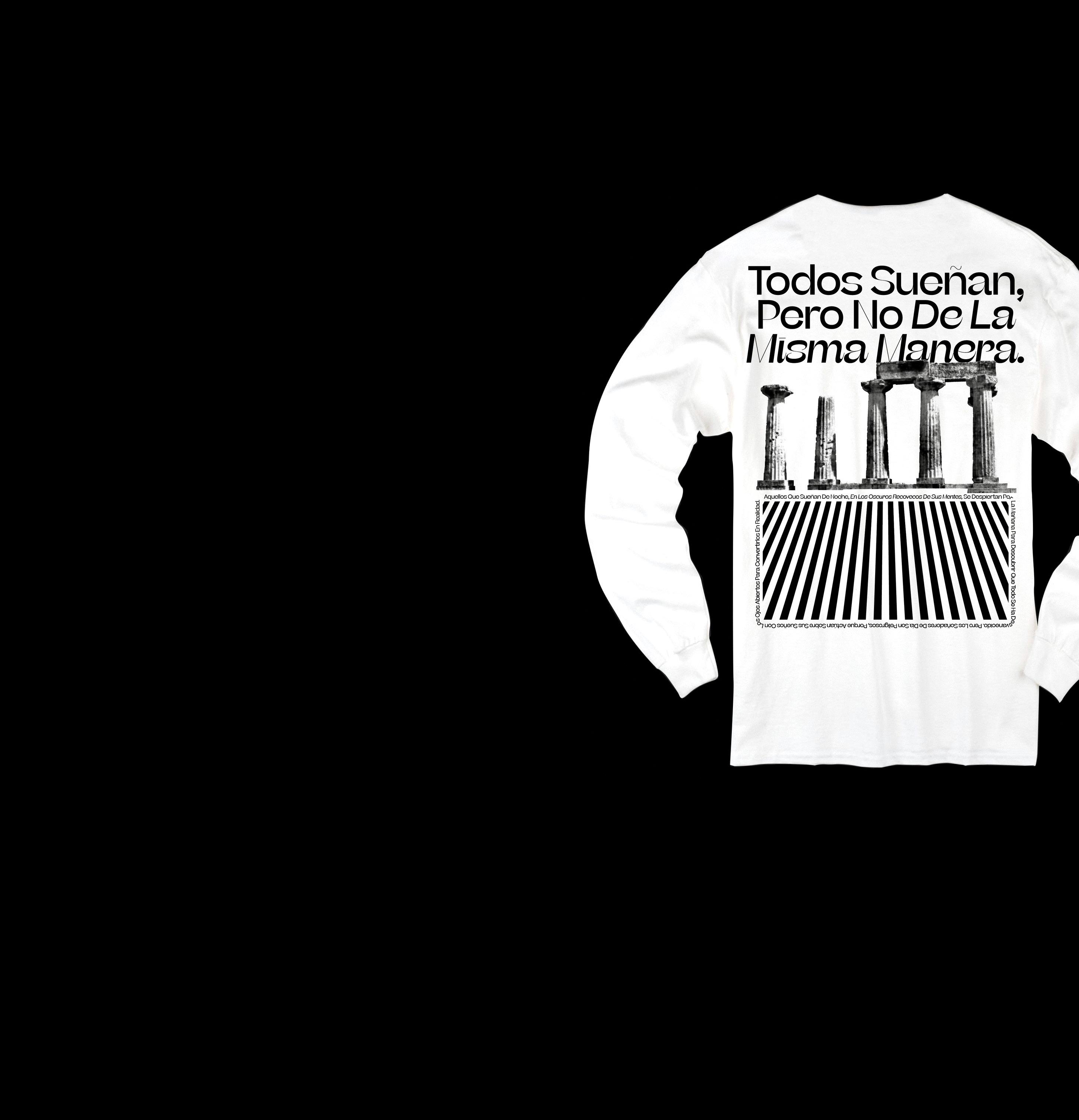
Shirt designed by Justin Sloane to celebrate Beatrice.

ANALYSIS
Beatrice Display’s ultra high contrast and very tight spacing make it extremely difficult to read at body copy sizes, but an elegant and bold choice for a display type. Beatrice has a very tall x-height with shortened ascenders and descenders. Included in the family are numerous alternate characters that are available to customize the look and feel of the type.
These characters include a straight sided “a,” and a wide variety of different numerals and case sensitive parentheses. The unique horizontal hairline tittle above the “i” and “j” can also be swapped out for alternate characters with a more conventional circular tittle. The capital “E” and “W” have alternate characters that play with the stroke and weight to give a different look and feel.
One of the most unique characteristics of the Beatrice Display family is in how the italicized weights are constructed. The terminals on the italic characters come to a hairline point and curl upwards, adding some calligraphic influence to the letterforms. On some characters, this curl comes all the way around to form a closed counter. This is evident on the “g,” “a,” and “k” characters.
Beatrice Display should not be used at sizes under 36pts in order to ensure legibility. One of the best pairings for smaller texts is Beatrice, as it is designed to accompany Beatrice Display. Beatrice still functions within the “internal contrat” system, but has much more subtle stroke contrast, making it easy to read at smaller sizes. In addition to Beatrice, most American Gothic typefaces will pair nicely with Beatrice Display because of their similar structure.


