Last-mile Delivery of Parcels
IDEA9105_ASSIGNMENT 03


Eddie Xiaochen ZHENG
SID|480000987
Michelle
SID|520303634 520343630

IDEA9105_ASSIGNMENT 03


Eddie Xiaochen ZHENG
SID|480000987
Michelle
SID|520303634 520343630
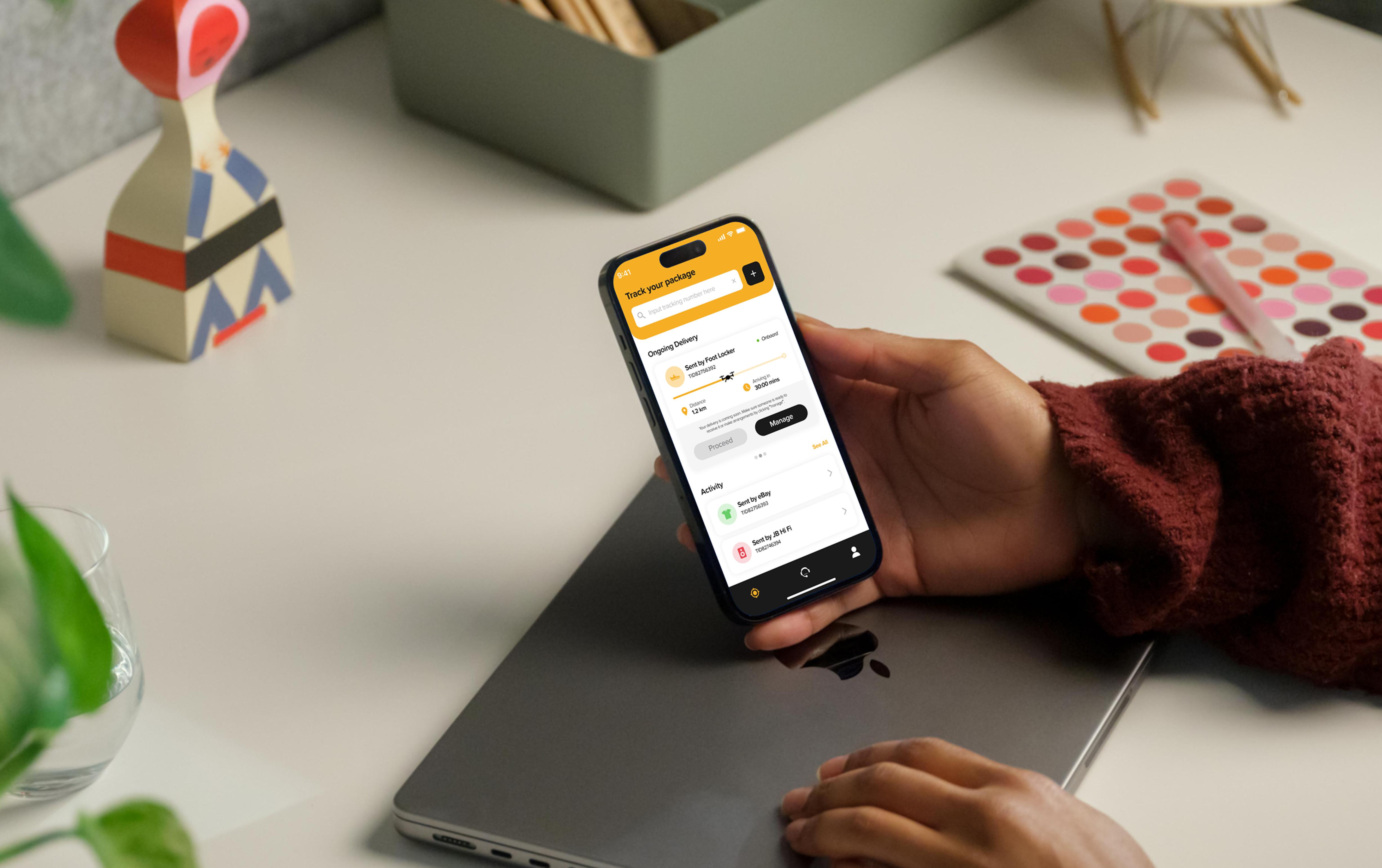
This design report showcases the design solutions trigging last-mile delivery issues for drone delivery company Nozama, which includes outcomes of highfidelity prototypes, and users flow as interface design for IOS mobile devices (Michelle) and smartwatches (Eddie).
Nozama is an e-commerce giant company that operates worldwide and specialises in selling various ranges of products. Targeting the market of automated last-mile delivery, the company aims to develop a speculative concept for customers to manage their parcel delivery seamlessly. The user interface design plays a pivotal role in building a friendly user experience, facilitating the delivery service, and allowing customers to track, manage, and follow up on their parcel deliveries via the digital platform on mobile devices and smartwatches.
Building up based on the previous research, our design prioritises creating a superior user experience on both mobile and smartwatch platforms for users to track, manage, and follow up on their drone deliveries. Providing easy accessibility, portabilities, and well-considered functionalities on the platforms to thereby ensure a positive response from the market for Nozama.
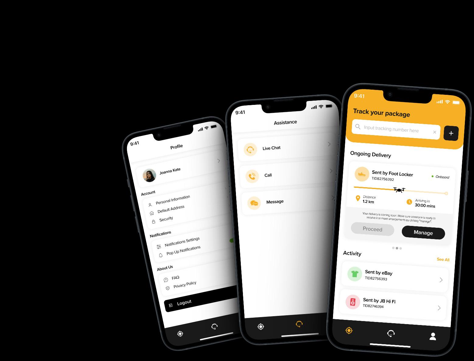
Joanna is a 25 years old freelancer who prefers to buy the things she needs online and get everything delivered in front of the house to save time and effort. Most of her package was successfully delivered but one of them was delayed while being sent to the wrong address.

Mobile apps have become an important part in users' daily lives because of their effectiveness and convenience, allowing users to access it without limitations of time and place while being able to personalize it based on their needs and preferences.
Presented workflow: Joanna would like to change the ongoing delivery address to a different address and schedule the delivery time. Regarding her delayed deliveries, she would like to pick up the deliveries instead but she wants to contact customer service first for further assistance.

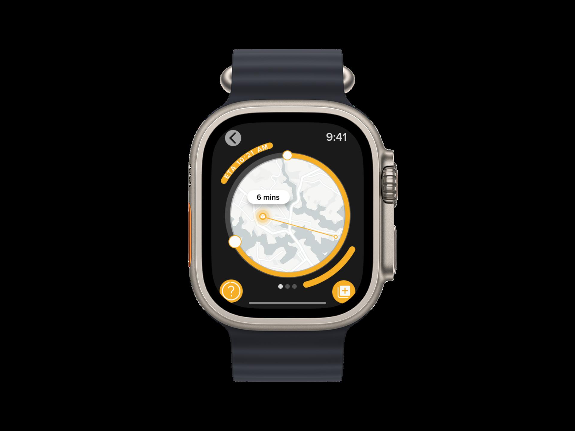
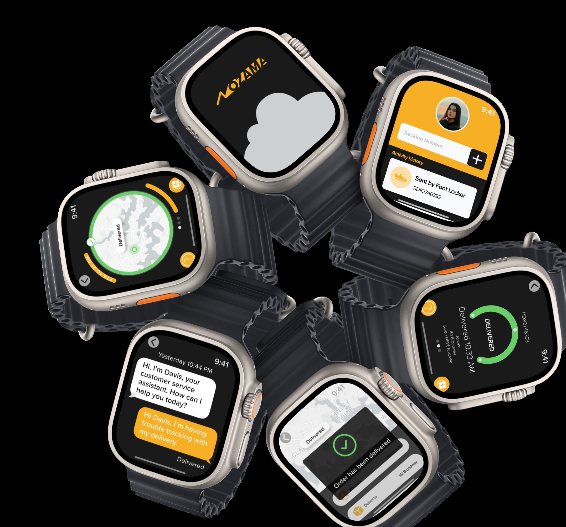
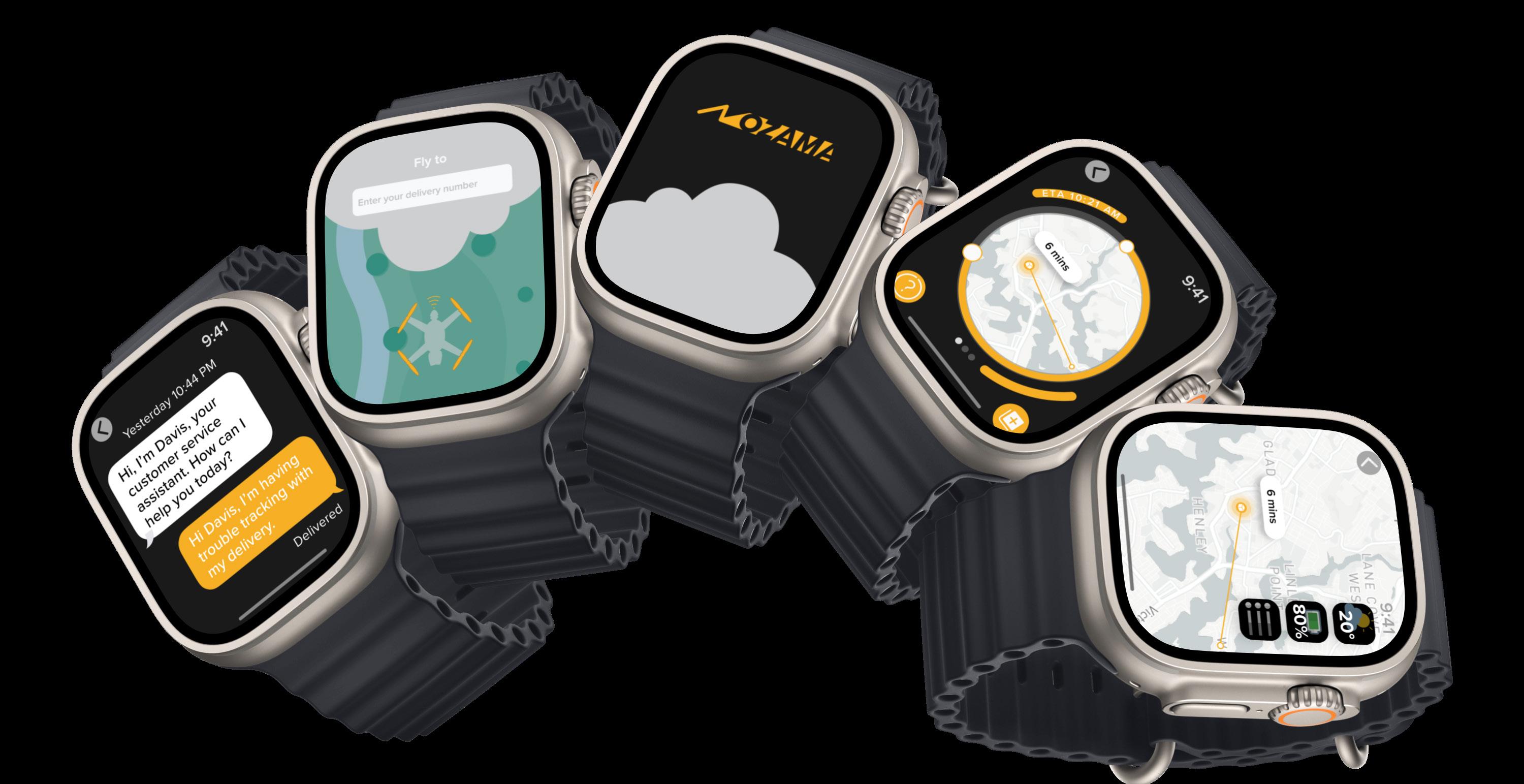
Smartwatches provide significant convenience to their users on a daily basis, which is also the reason our design team launches the Nozama design in watches instead of other digital devices. The portable device fits perfectly with many usabilities of Nozama smartwatches, which will be brought up in the later pages.
Presented workflow: Joanna receives a notification of delivery arrival, and she turns on the map from Nozama on her smartwatch where she found the drone is dropping the delivery in her yard, and ‘rain’ is shown in the weather status. Joanna then wears a rain coat before picking up the delivery.





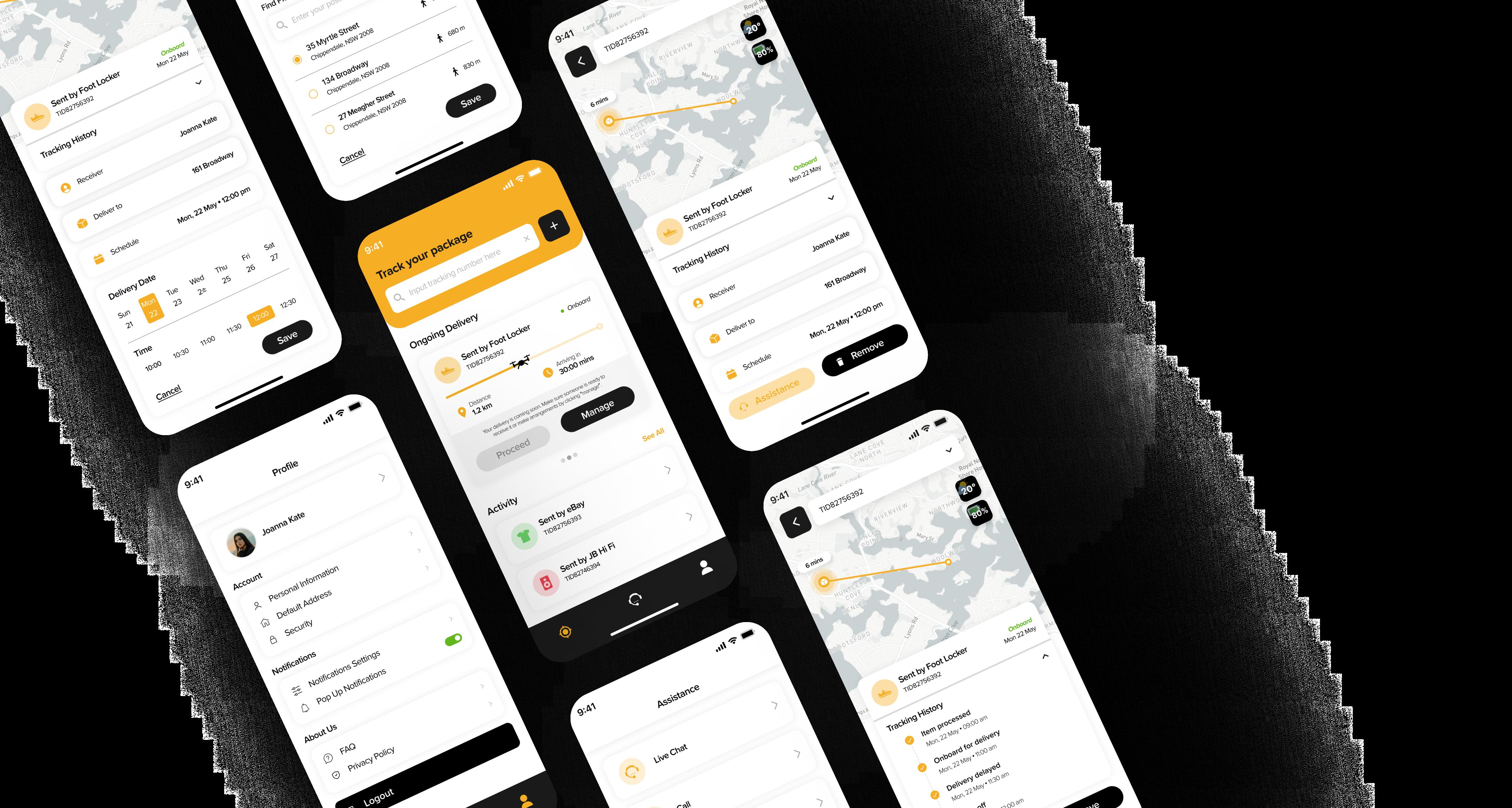


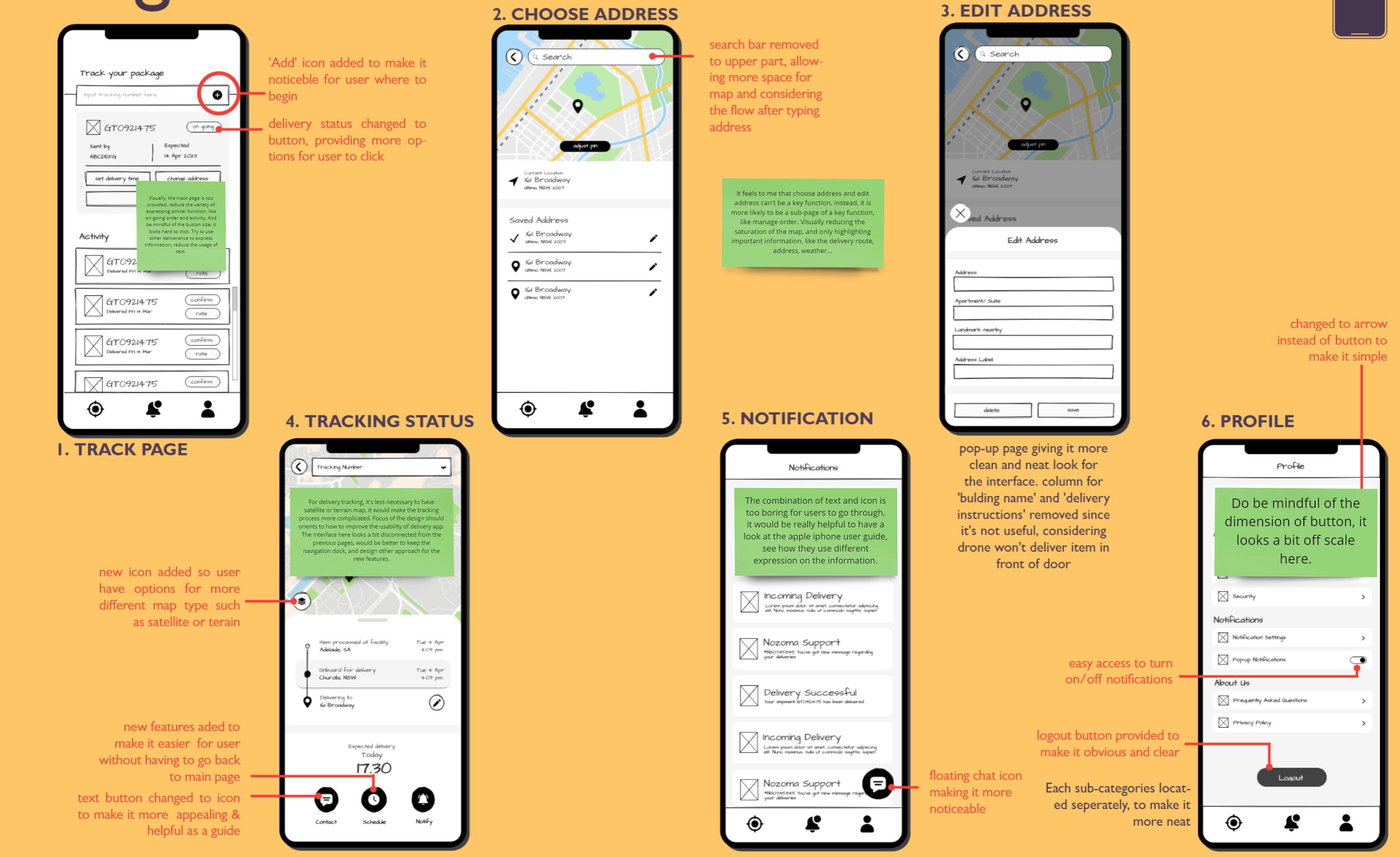
Here are the previous pages from Assignment 2 that iterated based on feedback from tutor, peers and teammates in order to gain a different perspective and improve the usability.
Feedback:
too crowded
button size looks hard to click reduce the usage of text give delivery option for unreachable location
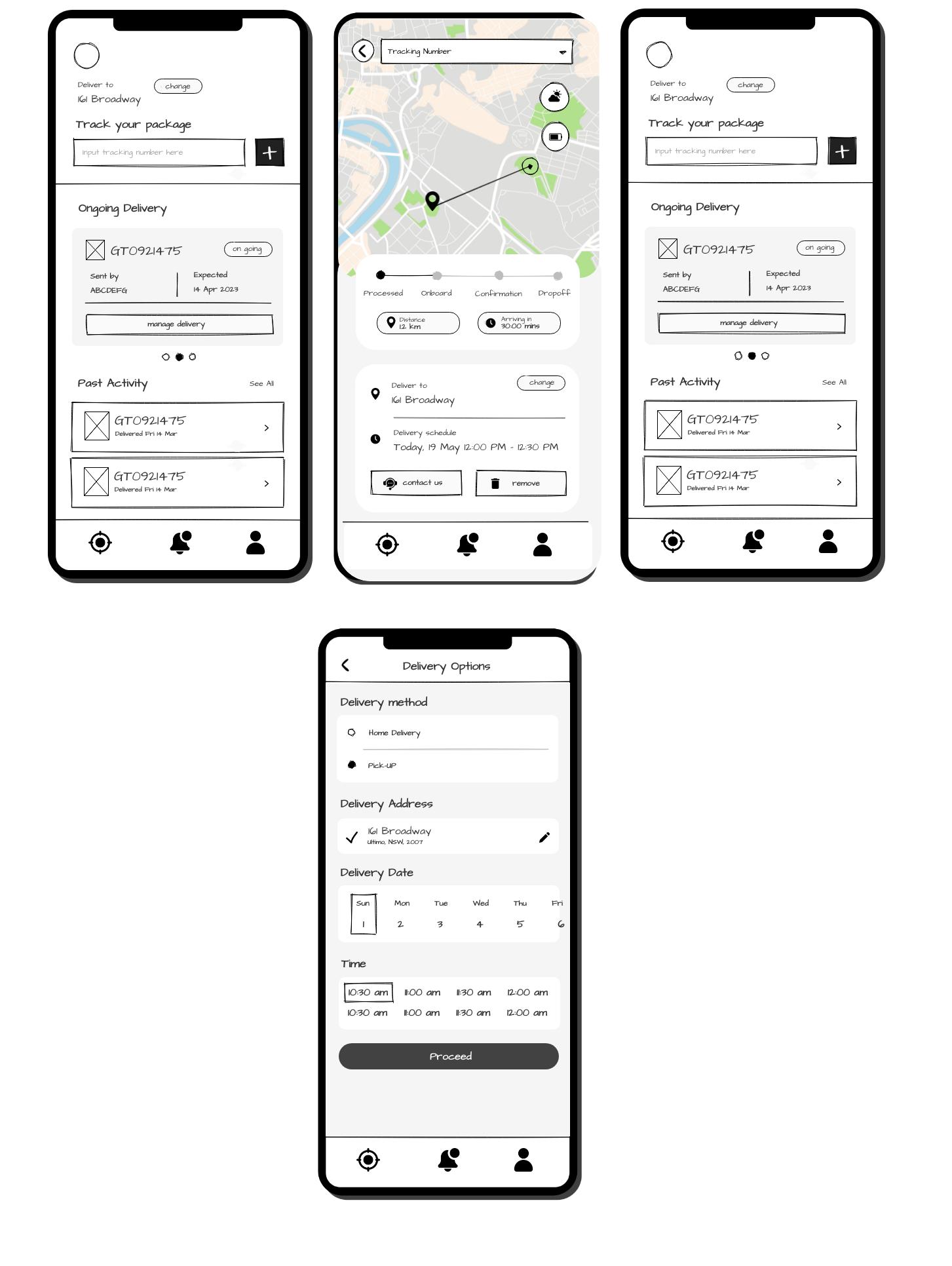
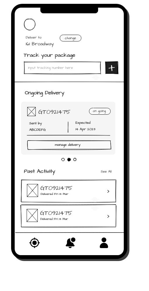
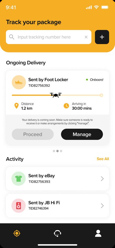
In the previous wireframe, interface shown too much information in one page, search bar for tracking number might be unnoticeable and too much elements. Therefore, improvements were made such as reducing the button in on going delivery to only one button, enlarge the tracking number section, also making past activity section more neat.
Feedback: function
this page is a sub-page of a key
reduce the saturation of the map highlight important information
Feedback:
satellite or terrain map not necessary improve the usability of delivery app interface looks disconnected from previous pages keep the navigation dock design other approach for new features
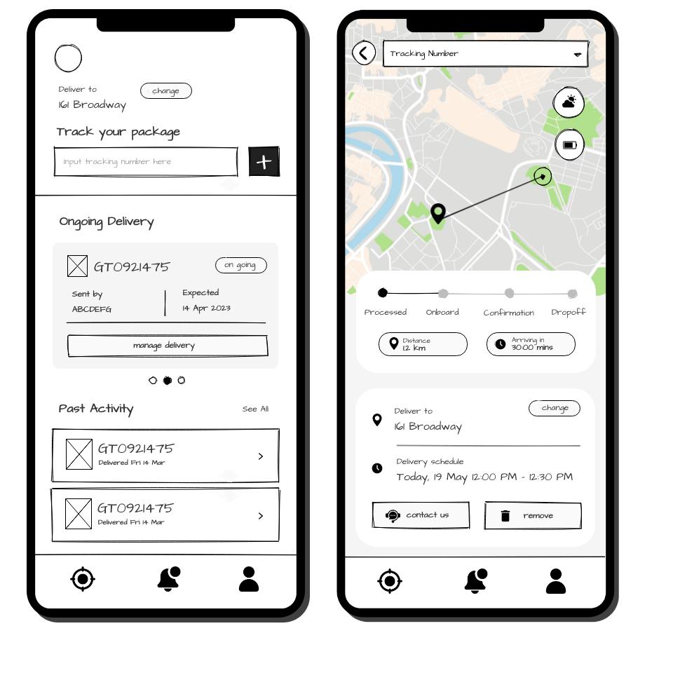
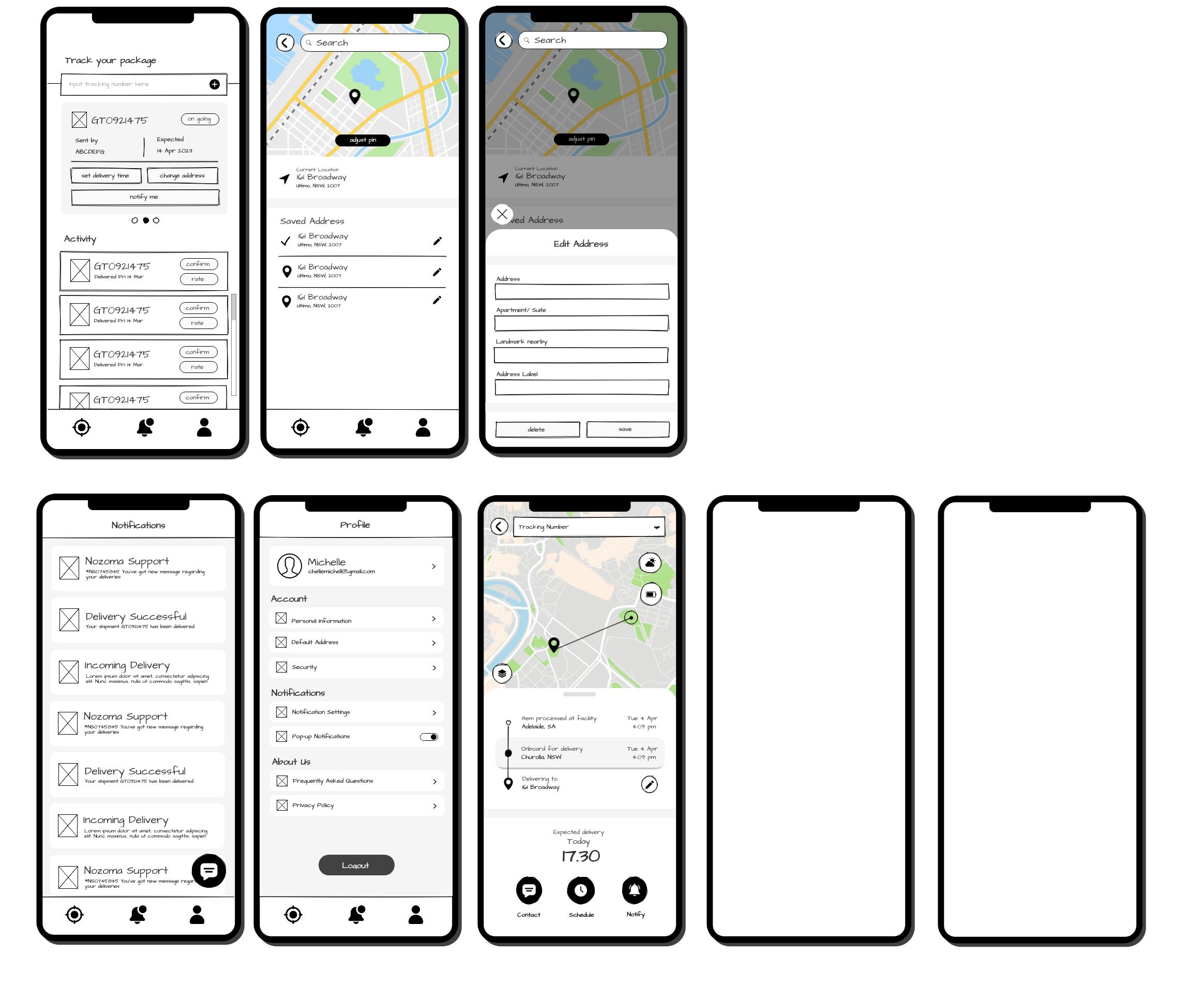

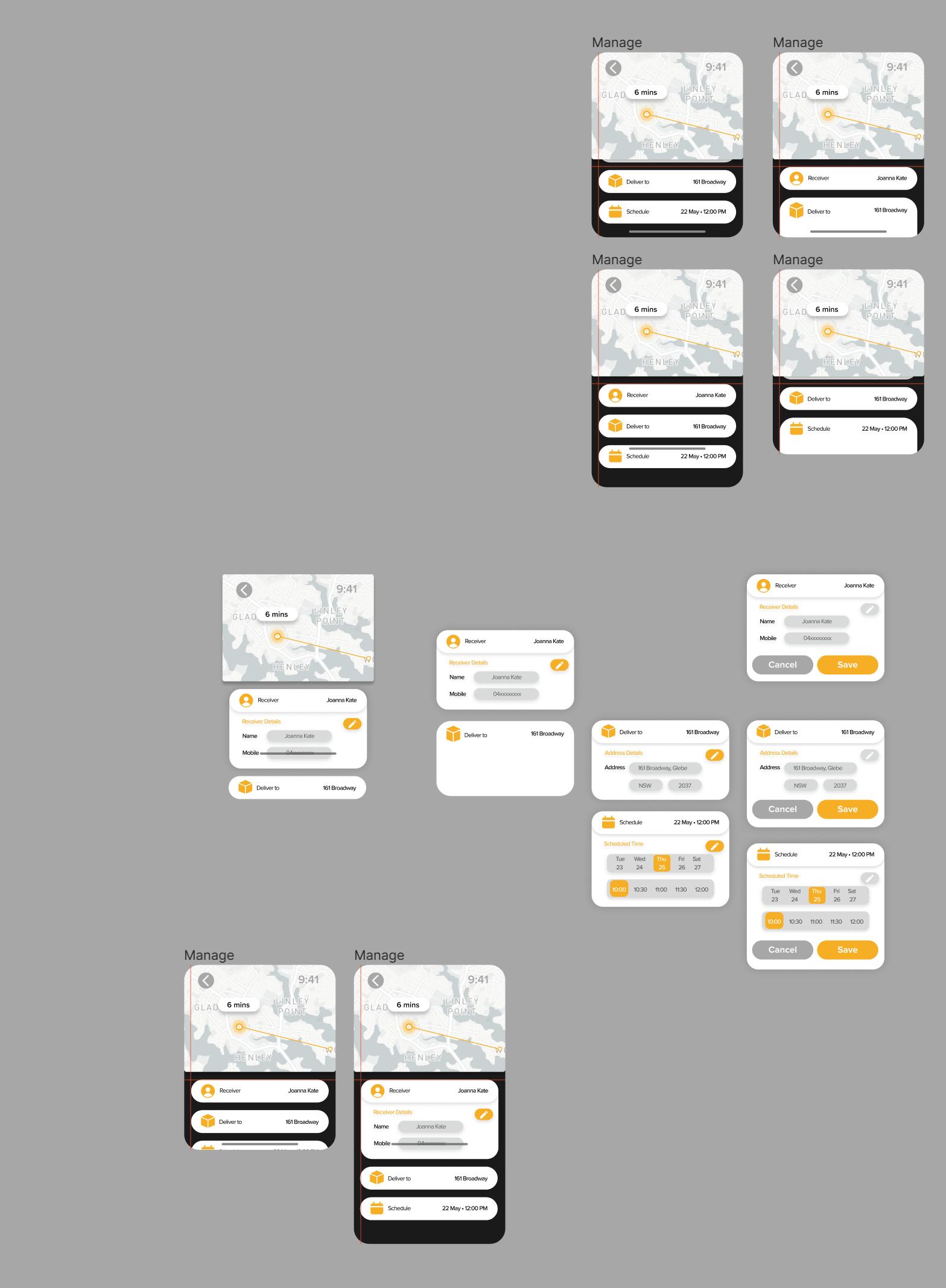
The past wireflows in A2 was users are navigated to "Tracking Status" page when clicked on "manage delivery" from "Tracking page" , but after hearing from the feedback we found that it's not effective for users to gain information and the buttons looks inconsistent. The "choose & edit address" is a sub-page that allows users to change the delivery address. Eventually after exploring different options, we decided to re-arrange the layout and put important information together in one page to make it clear & convenient. A new option to pick up deliveries is also added, giving more flexibility for users to pick it up on dedicated locations also considering users whose address couldn't be found or have no landing yard for drones.

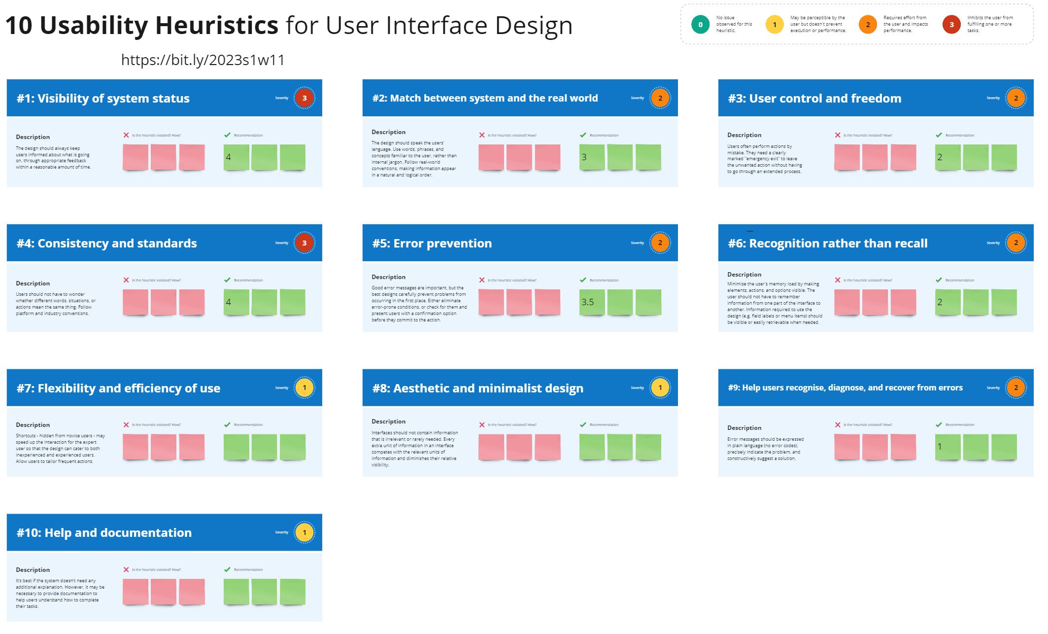
The high-fidelity prototype is iterated based on Nielsen’s Heuristic (1994) which works as a guideline and helps to identify areas of improvements, enhance user experiences while ensuring that usability issues are addressed early
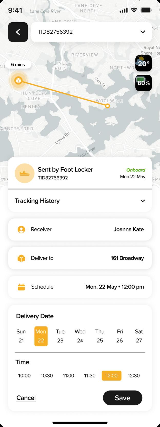
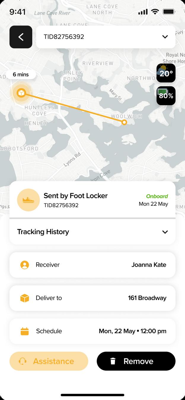

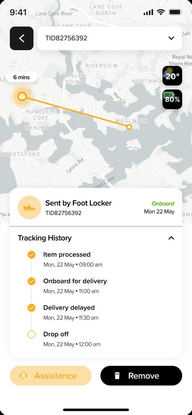
Rather than showing text-based information, we decided to make it more visualize like showing the distance & time. This is done in order to increase the visibility of the status, making sure that users always informed on a reasonable timeline. To help users recognize, diagnose, and recover from errors, there is color given in icon on the "activity" part as an indicator, green shows delivery sent while red means delayed.
When designing this page we were thinking how to update details like delivery address conveniently without going through so much pages. Therefore, it is important to prioritize its flexibility and efficiency of use to minimize user's confusion. We also remove unnecessary elements to make this part aesthetic and minimalist.

By putting every information separately on each rectangle gives users control and freedom, making them able to easily change details or correct mistakes. Moreover, we are maintaining the same consistency and standards on each pages we design to create sense of familiarity so users can quickly understand and navigate.


1.
Tracking page
What the users need to do the first time they open the app, a co umn for users to wr te down tracking number Once t's added it wil shown it s current status underneath

A designated area where users cou d v ew the de ivery's current status d stance and how ong t s going to arrive
When drone is near to the del very address, users wi l get a notif cat on asking confirmation and the "proceed" button w l be c ickab e Once its cl cked del very w ll be processed
Where all the past del veries placed Green means parcel successful y sent whi e red means t was delayed/ pend ng
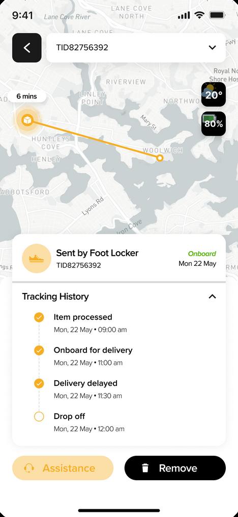
Details of what track ng history looks like when c icked Checked button means the action has been completed
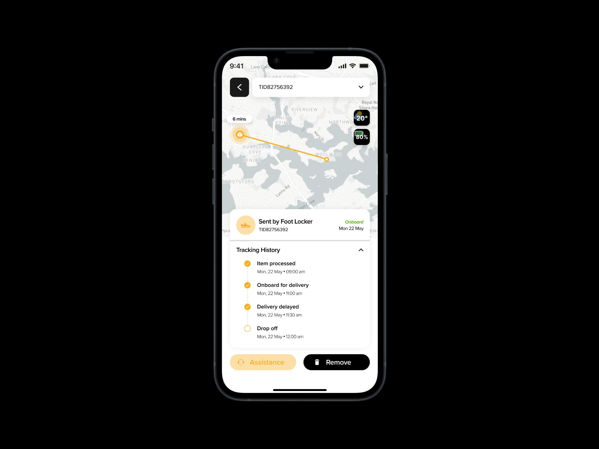
Map provided to et user see progress of the r delivery n reat me and visual representation of the delivery ocations
Once the low-fidelity prototype finished, I received feedback from friends and teammates ensuring that I explored any possible ideas for improvement. Therefore, this final high-fidelity prototype has been revised based on the feedback I got, including the tiny details to make it clear for users to understand.
F rst icon showing the current weather condit ons (usefu for general informat on/ plann ng) whi e the second is the battery status of the drone
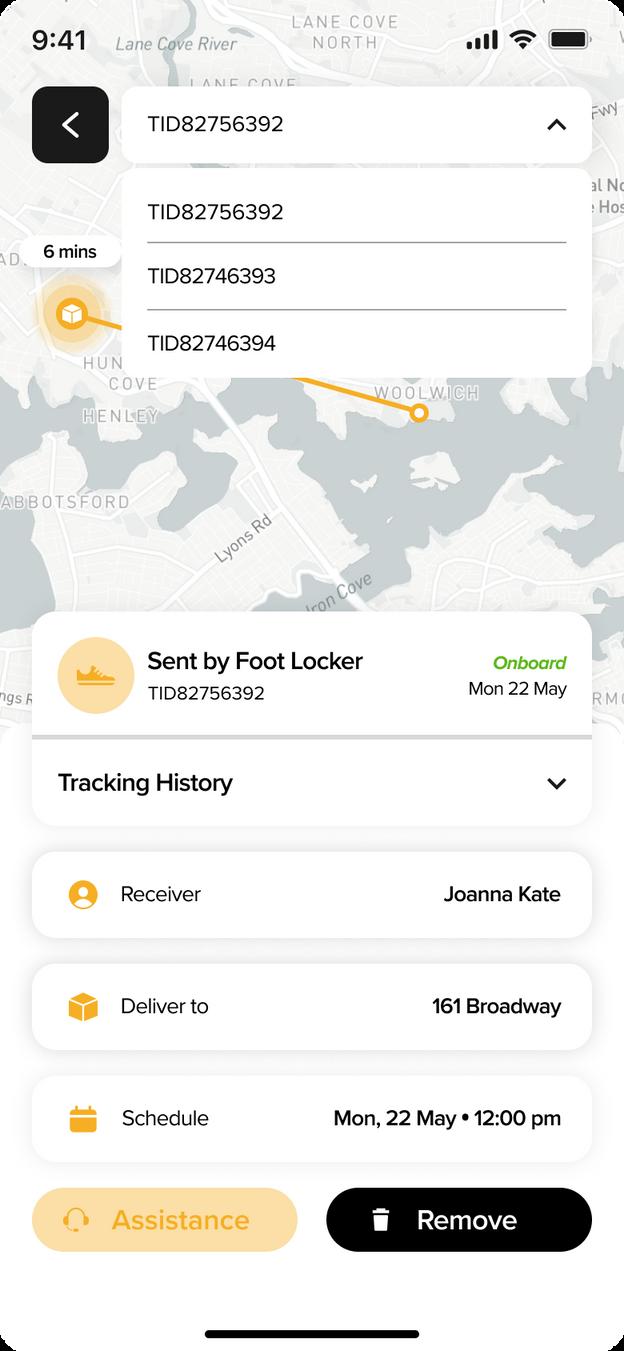
Accordion menu consists a ists of ongoing delivery Eas er for user to access w thout having to go back to main page Track ng history show ng current status/ updates of the del very able to be h dden to ach eve neat looks and organ zed information
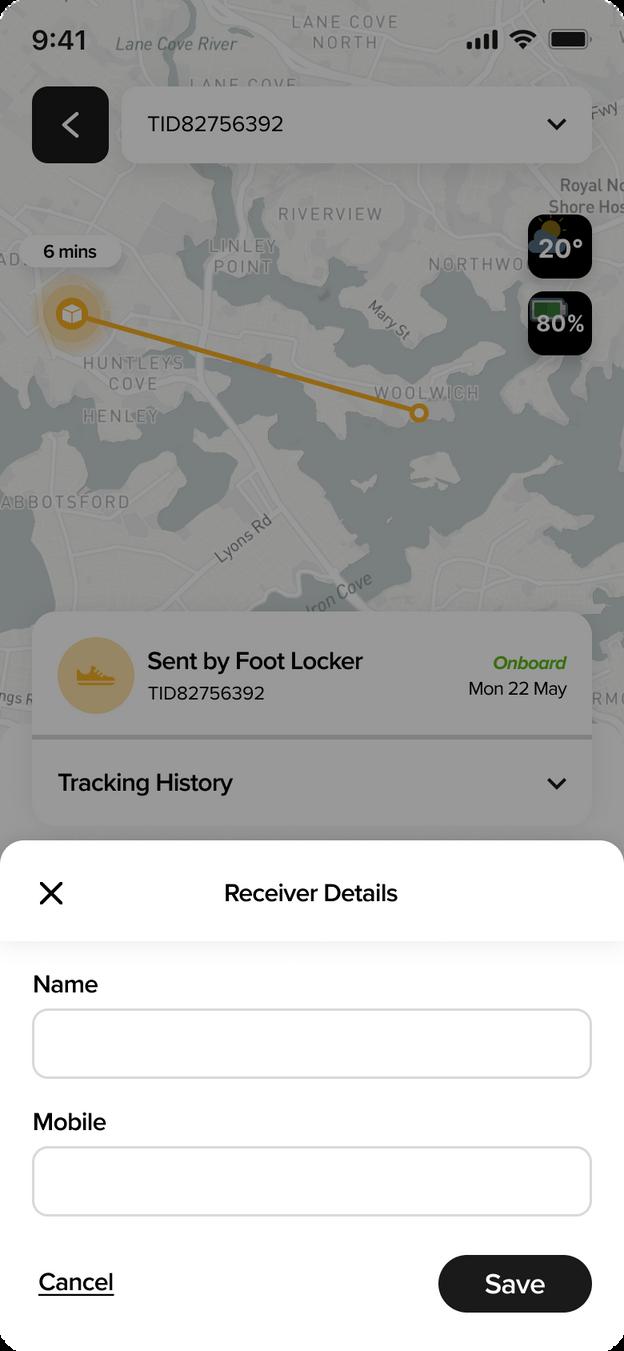
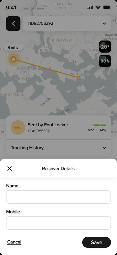
When cl cked users ab e to change deta ls (name & mob le) Users able to change their del very address or change into pick up
Set a t me and date for de ivery
When "receiver" clicked users able to change the details, s nce recipients might be different w th the user s account
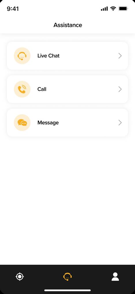
Easy access for users to get mmed ate help regarding the r de ivery
De ete track ng if no onger needed
Users are ab e to get immed ate response


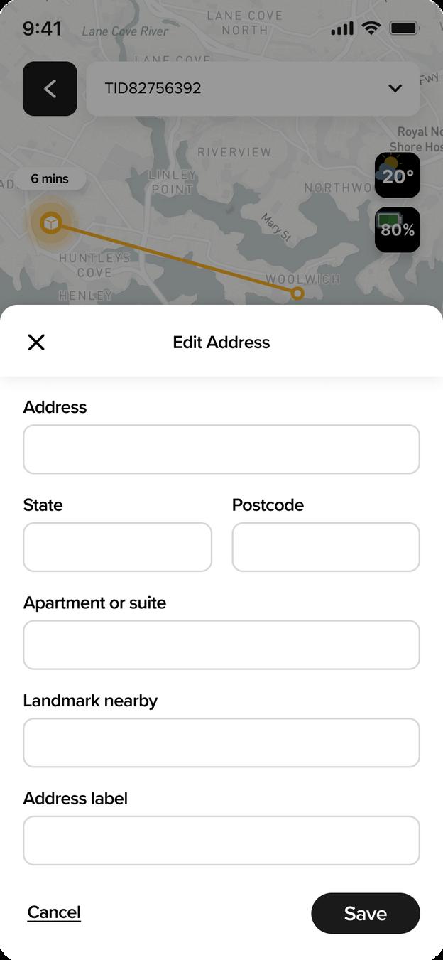
In this page users are able to put detai s of the r address name of the bui d ng, to prevent any deliveries not sent any known p aces, to give s gn can be saved as "home" or "off ce" , to prevent choosing the wrong address
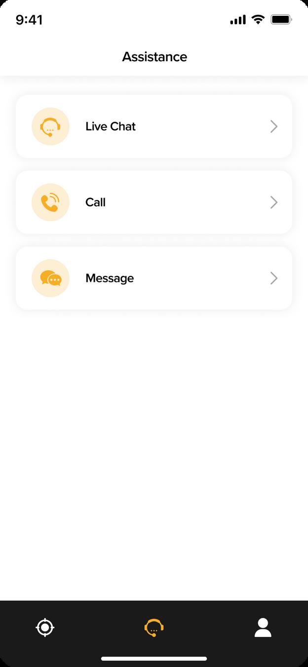
Works l ke hotline cal , where user can talk mmediately to service center
Wr te a messages regard ng del very ssues or any inquiries but response m ght take coup e days
Sw tch opt on to do pick up
When the button c icked, user able to drag hold and move the map unti found the exact location wanted
Address changed regard ng the map but adjustable f users what to give more detai s
Add button lead to new page that al ows user put the new address
Pen con means ed t when c icked, users are navigated through another page
Flexib lity to set the del very date regard ng user s preferences
When clicked there w ll be orange hover
Time can be sw ped left (carouse ) unt l user found the desired time
Foward navigation
Alternative navigation




Back navigation

Click here to view prototype
(On Apple Watch)















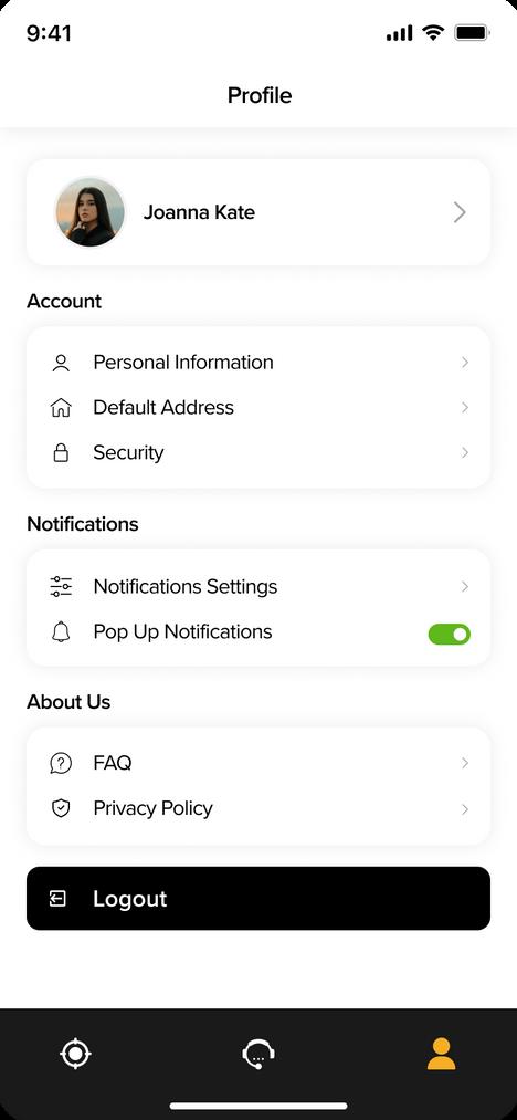
Profile that links to the watch user.


Searching bar to add new tracking orders.
Tap to add new tracking
Confirming Notification of adding new tracking. (auto turn off, and navigate to the next page)
Notification is shown to confirm and new tracking can be found
Activity history shows all orders which have been placed under the same profile, listed from ‘New to old’. Status of the orders are indicated by their icons, where ‘yellow’ is ongoing order, ‘green’ is completed order, and ‘red’ is pending order. Information like sender and tracking number are also shown.
Tap/slide up to access navigation dock Tap ‘home’ can be back to home page
Navigation Dock
Tracking button that navigates to the tracking pages.
Assistance button that navigates to the customer assisting page.

New update that show the lastest added tracking.
Order tabs that links to more details of specific tracking.


Go back button that takes user back to the home page.
Scheduled address visualises the delivery address (reduce delivery mistake).


Pages indication (slide to tracking detail pages)
Scheduled time bar shows estimated time of arrival.
Scheduled time consumption shows estimated time to be delivered.
Map shows information like scheduled route of delivery, address of sender and receiver.


Go back button that takes user back tracking page.

Weather shows current weather status to help customer wear suitably before pick up delivery.


Battery of drone indicates the battery condition (help customer understand the situation when pending).
Manage that nagivates manage pages.


Tracking Pages (Different situation)







Tap to manage delivery details

Change button tap to make changes.
Receiver details.


Tap to change delivery details
Mange schedule time tab (tap to manage), current scheduled time is shown.
Mange address tab (tap to manage), current delivery address is shown.

Mange receiver information tab (tap to manage), current receiver detail is shown.








Tap to change details
Change button tap to make changes. Change button tap to make changes.




Delivery address details.


Schedule time.
Tap to change delivery details
Tap to change details
Select time to make change


Order status (6mins away from being delivered)


Order status (Order has been delivered)


Order status (Order is pending)
Order update (Change has made)
Order update (Order has been delivered)
Order update (Further instruction)


Through peer critic of the heuristic evaluation, most confuses and issues are found in the visual designs which were still using the mobile language. Applying mobile expression in smartwatches certainly would not work at the most ideal.
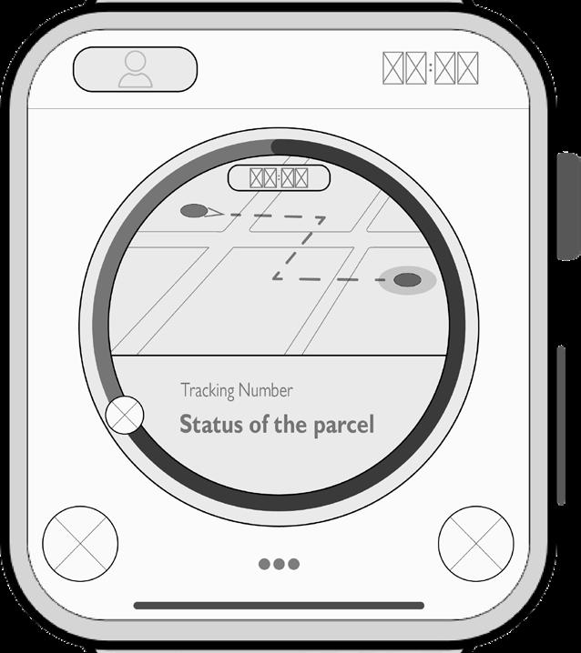
Therefore, some major adjustments are made to delivery tracking and delivery managing interfrace.


As spotted during the peer critic, it makes less sense to have the ‘profile’ icon on the top left corner which navigates back to the home page. And changing it to the ‘go back’ button after the evaluation.

In the size of smartwatches, it would be hard to have too much information presented all in one page like having a tracking map and text description of the delivery process on the A2 tracking page. And the information is now presented in two pages.

For the managing page, although attempts of using smartwatches can be seen with the sliding circles, they are still hard to manage the order details, which takes unnecessary effort by sliding and tapping to view further information. And in the new design, managing buttons are changed to tabs with the current status indicated on them.
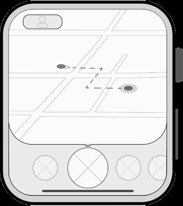 A2 Managing Page
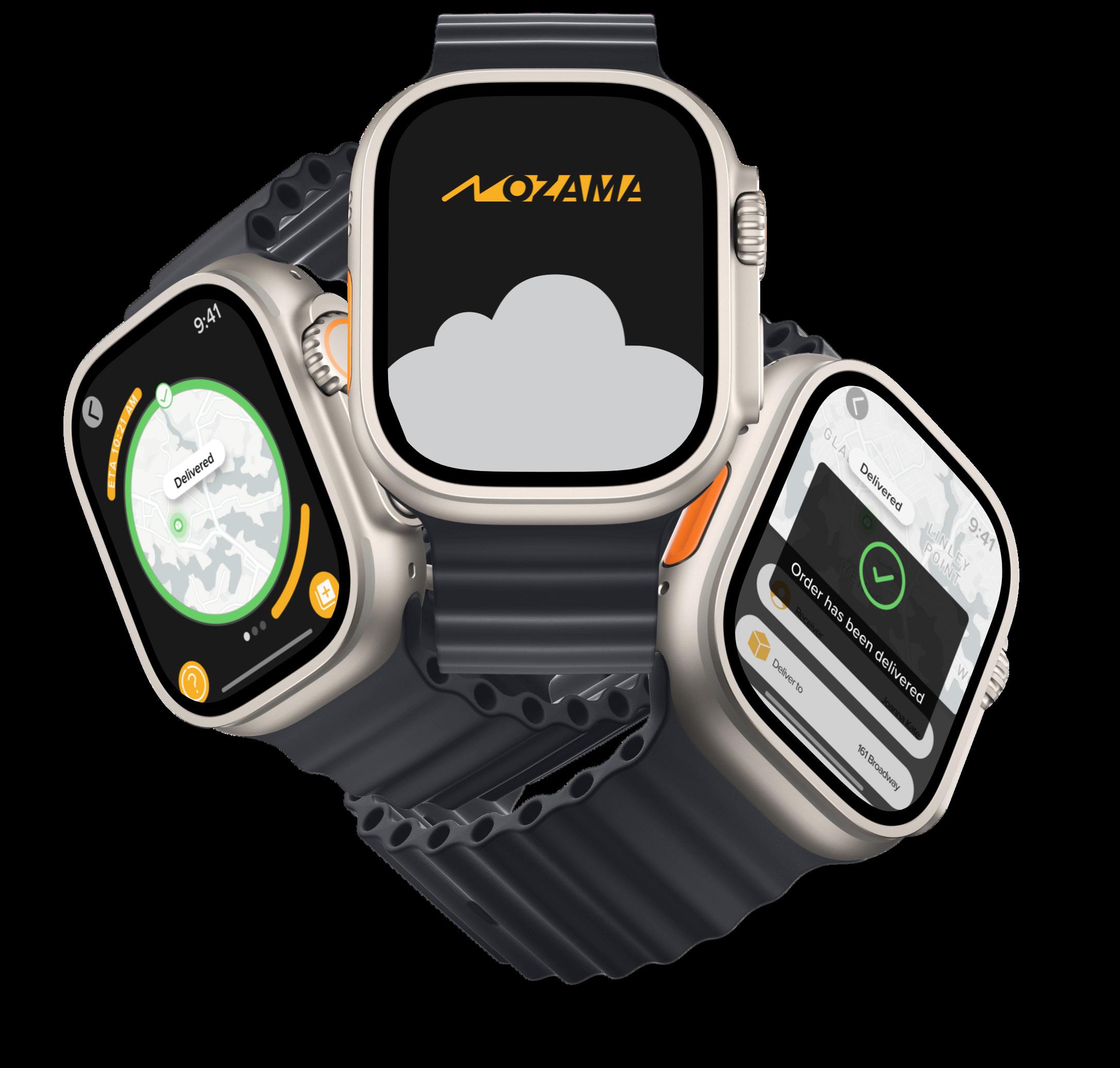

Manage buttons

