EXPLORING VISUAL COMMUNICATION IN COLOR
AN-CHIEH, HO

Written and Published by An-Chieh, Ho
Elston Education and Training
3059 Surfers Paradise Blvd, Surfers Paradise
QLD 4217
First published 2022 Publisher (Elston Education and Training ) , 2022 © 2022 by An-Chieh, Ho. All rights reserved.
No part of this publication maybe reproduced, stored in a retrieval system, or transmitted in any form, or by any means, eletronic, mechanical, photocopying, recording or otherwise without the prior written permission of the publisher.
Visual communication is the use of visual elements to convey ideas and information which include but are not limited to, signs, typogra phy, drawing, graphic design, illustration, industrial design, advertis ing, animation, and electronic resources. Humans have used visual communication since prehistoric times.
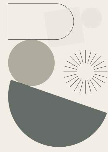
Within modern culture, there are several types of characteristics when it comes to visual elements, they consist of objects, models, graphs, diagrams, maps, and photographs. Outside the different types of characteristics and elements, there are seven components of visual communication: color, shape, tonews, texture, figure-ground, balance, and hierarchy.
Color psychology is a very important part of art knowledge learning. What it studies is that color triggers changes in people’s emotions and senses through visual stimulation and summarizes the psychological expectations of human beings on color through the accumulation of people’s experience in applying color in daily life.
In life, color psychology has a great influence on people’s perception of color. Why do traffic lights show stop traffic in red instead of green? Why do most fast-food restaurants use red or yellow as the main color of the brand? This is all relevant knowledge of color psychology.
Color psychology is widely used in various design fields. From daily groceries to LOGO design, color plays an increasingly important role. It is one of the most important factors in transmitting information to users.
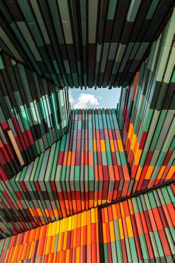
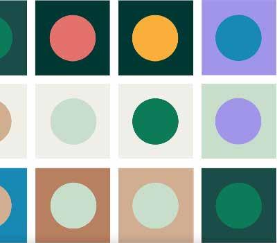
Color is a matter of taste and it is relative. That’s the nature of color that always gives impression for human life. There is a dark color, light, bright, opaque, heat and cold. All can give color when combined in harmony.
Black
color
openness,
Orange
warmth, joy, splendor,
sunshine, youth, gorgeousness,
Yellow represents confidence, youth, intelligence and is a vibrant color.
Green represents health, life, youth, tranquillity, nature, and is a color full of hope.
Blue represents calm, technology is a color full of rationality. Blue is the color of the sky and the color
the sea.
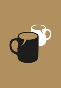
It is the most powerful of all colors and grabs the user’s attention quickly. Often associated with death, nothingness and emptiness, black holds its effect in the luxury sector. A large majority of the most prestigious brands have logos decorated with the color black. Black brings a strict but elegant and sophisticated side.

When white and black are put together, even if they already know they are the same weight, people’s perception will be misled by the color, thinking that black should be heavier. When you want to express freshness and simplicity, white or light colors are more suitable, and if you want to show a sense of stability and heaviness, black or dark colors will feel more reliable.

‘‘Black represents quality, highend, fashion, low-key and is a color full of texture.’’
White isn’t usually used on its own, but when it’s combined with other colors, white stands out well, leaving enough space for other elements to stand out. In interface design, as achromatic white, it is often used as the background color to ease the conflict of various colors, set off other colors, improve the brightness of the picture, and improve the readability of the text.
White is the color you will never get tired of. In design, you can use white to breathe life into your interfaces and make them look clean. Even if minimalism is the trend of the moment choose a bit of color to inspire your visuals and avoid bland or empty effects. Especially since white has no limits, it matches all the colors of the palette, put it to good use!

‘‘White represents purity, simplicity, innocence, simplicity, trust, openness, elegance, and white is often considered “colorless”, that is not a color.’’
Between black and white, it is also achromatic, with no hue or purity, only changes in lightness. It goes well with any color and is often used as a background color or to accentuate other colors.
Grey is not as hard and harsh as black, he is more elastic, it has a deeper strength than black. Therefore, in the picture, pure black rarely appears. Basically, dark grey is used to replace black, and light grey can also be used to replace white.

‘‘Grey represents wisdom, honesty, persistence, seriousness, depression and calmness.”
It brings us a feeling of warmth and adrenaline; it gives us the taste for risk. It is the more powerful and dynamic color with the most potential of action. Red immediately catches our attention. We can’t escape and resist the red!
Red light has the longest wavelength and is most likely to attract people’s attention while giving the vision a sense of proximity and expansion, which is called advancing color. Therefore, in graphic de sign, red is often used to convey important information or to increase the intensity of the picture to highlight the key points.

“Red is the symbol of love, warmth, sensuality, seduction and passion.”
The wavelength of orange is between red and yellow. It has the luminosity of the sun in the tangible realm and among all the colors, orange is the warmest. Orange is also a color that can arouse appe tite, giving people a fragrant, sweet and slightly sour taste.

Orange is a vibrant and energetic color. Soft orange is reminiscent of the earth and autumn colors. Because it is associated with the changing seasons, orange is generally used to express the feeling of change and movement.
Often associated with creativity and communication, orange brings optimism and openness. Like yellow, it symbolizes energy and joy. Very trendy during the 70’s, some people say that the color is kitsch.
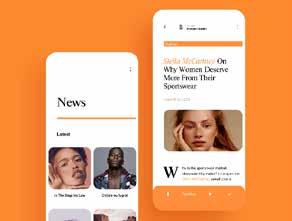
‘‘Orange represents warmth, joy, splendor, health, sunshine, youth, gorgeousness, and is a vibrant color.’’
Yellow is a very bright color, and its bright hue makes it stand out among the array of icons. Although the warning effect is not as obvious and strong as red, it can still give people a very eye-catching and dangerous feeling, such as road warning signs.
Like the sun who spread ray of happiness, yellow is the color of life, energy and motion. Also representing optimism, this color gives so much joy! Although it is a source of happiness, it also can have negative points. It is associated with lie and betrayal. But we will remember that yellow is the color of openness and social contact. We identify it as friendship, fraternity and knowledge.

‘‘Yellow represents confidence, youth, intelligence and is a vibrant color.’’
The wavelength of green light is just in the middle, the human vision responds most calmly to green light, and the eyes are most adapted to the stimulation of green light.
Green is widely used in life. For example, the color of safety exits is green, but the saturation of green should be properly controlled. For example, high-saturation green will also be exciting and attract attention.

‘‘Green represents health, life, youth, tranquillity, nature, and is a color full of hope.’’
In the color psychology test, almost no one is disgusted with blue. Pure blue is usually reminiscent of the ocean and sky, it can heal the wounds in the heart, make people feel peaceful inside, and help people to calm down.
Blue is the favorite color of many individuals. In fact, this color reminds us of the sky, the ocean; two natural elements that comfort us. Blue reassures calm us, but it also makes us dream. That’s why the domains of health, banks and technology use it in their brand identity.

‘‘Blue represents calm, technology is a color full of rationality. Blue is the color of the sky and the color of the sea.’’
The use of color elements in visual communication design needs to give full play to the designer's sense of innovation, continuously improve the ability to control each color, and also consider the chemical effects produced by the combination of colors. Master the characteristics of each color proficiently and reasonably apply it to the visual communication design. If you simply combine and arrange colors, you will lose the meaning of visual communication design. Color should better create the atmosphere of the design, show its unique personality, and let the audience form a beautiful feeling.
The colors used in visual communication design are no longer traditional and pure art colors in the past. With the advancement of designers’ thinking and the improvement of technology, they are also gradually changing. Color is the premise and foundation of creative design, and color is an important factor in conveying the connotation of visual communication design and projecting design emotions. It can be seen that the designer should better understand the color and its collocation connotation, so that it can enrich the content of the design, so that the color can better inter pret the theme of the visual communication design.

Color is an indispensable part of human life, and it plays an auxiliary role in information transmission. Color can enhance people's efficient perception of design connotation, achieve multiplier effect with half the effort, and can give people a wider imagination space and effectively improve design information transmission.
The colors amplify your message whatever the medium on which you use them. Not all countries have the same meanings and feelings about colors. Therefore, it is important to define your target well in advance to convey the right message. Some points that prove the impor tance of colors in our daily life:
• Color increases brand recognition by 80%
• Color ads and visuals are 42% more viewed and read than black and white ads
• Color optimizes text reading by 40%
• Color improves understanding by 73%
The ever-changing colors exist widely in our production and life. In art design, visual communication, as one of the important development directions, is an indispensable part of visual color. The perceptual and imaginative ability of color can give visual communication a more real and wonderful effect, thereby improving the effectiveness of visual communication.
The colors used in visual communication design are no longer traditional and pure art colors in the past. With the advancement of design ers’ thinking and the improvement of technology, they are also gradu ally changing. Color is the premise and foundation of creative design, and color is an important factor in conveying the connotation of visual communication design and projecting design emotions. Fully under stand the color and its collocation connotation, so that it can enrich the content of the design, so that the color can better interpret the theme of visual communication design.