3 minute read
the ART of WINE LABELS


By GEOFF NUDELMAN
Advertisement
NO LONGER ARE WINERIES simply sticking to the juice in the glass to show the exquisite nature of the craft. More and more vintners are enlisting the help of the design world to bring a sense of art and beauty to the label itself in incredibly creative ways. The following are five examples of wines that won’t just please the eye in the glass, but on the cellar or shelf as well.
Andevine Wines
Andevine Wines is a boutique wine brand designed by Sydney-based agency Co Partnership, a young firm based in Surry Hills in Australia’s Hunter Valley. Created for Australian Hunter Valley winemaker Andrew Leembruggen’s first ever release, as a signature wine, it was important for the design to reflect Leembruggen’s two biggest influences; his Dutch ancestry and his Australian upbringing. According to Co Partnership, “We illustrated this story with the national flowers of Holland, Australia and New South Wales, intertwining with the letter A to create a memorable icon in the style of the Dutch oil masters. The brand is given further meaning with the name Andevine, a fusion of the winemakers first name and the very beginnings of the story, the grape vine.”
The poster featured here is an example of a storied winery moving the idea of art away from the label and back to what many would consider to be a traditional home. The Oregon winery recently collaborated with renowned French illustrator Mathieu Persan on a very limited series of these prints, featuring one of the winery’s most important and lauded Pinots. Persan specializes in recreating 1920’s-era French brasserie style for modern uses, and that’s certainly come to life here. These prints are statement pieces perfect for true vinophiles.
Linnaea Vineyards
This 2018 8 Track Sally Sangiovese from Linnaea Vineyards, a family owned Australian urban winery, has a label designed by Australia’s Mash Design, who says they created images that feature characters with knowledge of plant life, nature and the workings of the universe, a fitting link to the brand founders, who have backgrounds in medical anthropology and plant biochemistry.
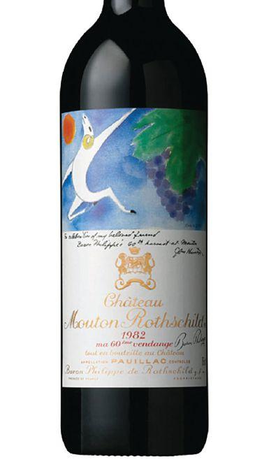
Chateau Mouton Rothchild
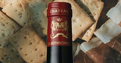
In 1945, Baron Philippe de Rothschild began the tradition that would become the visual hallmark of Mouton Rothschild when he brought together some of the most celebrated artists of the time, including Picasso, Miro, Chagall, Dali and film director, art love, writer, actor and painter John Huston, whose watercolor for Mouton Rothschild’s 1982 label is one of the last pictures he ever painted. His symbolic theme of the ram, leaping in dionysiac joy, accompanied by the sun and the vine, was dedicated to his “beloved friend Baron Philippe’s sixtieth harvest at Mouton.”
Imagery Estate Winery 2019 Sangiovese

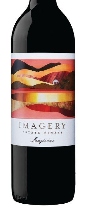
Contemporary landscape artist Sarah Winkler is responsible for this bright Sonoma County label, inspired by the “Upper Ridge” location in Imagery’s vineyard. “I imagined the volcanic history of the landscape that creates such good minerals in the soil for growing grapes in the region,” she says. It’s certainly a vibrant piece reminiscent of warm California summers.
Matsu
The portraits on the labels of Matsu wines were shot by renowned photographers Bèla Adler and Salvador Fresneda. Representing different wines from Matsu, “El Pícaro,” “El Recio” and “El Viejo, the labels each have their own personality, with the resembling some of the key strengths of the Toro, Spain winery, namely family values and three generations of experience.
Juliet Ros
The evolution of labeling isn’t limited to a sticker on glass. Boxed wine is being elevated through beautiful designs, such as this option from California’s Central Coast. Los Angeles designers Kinley Danger Winnaman & Noelle Roth collaborated on this effort, taking cues from prior work in various CPG and culturefocused branding exercises. Above all, the design speaks to the elegance and sophistication of this particular varietal.
Johan Vineyards

2020 ZWEIGELT
Many of Johan Vineyards’ labels are designed by Yong Hong Zhong, an accomplished watercolor artist who has also done animation work for Disney and MTV. However, these light, playful watercolor labels seem a far cry from that more commercial work. Zhong’s watercolors are deep, yet simplistic and reflect the wines in a way that only a soft touch such as watercolor can.
BROOKS WINE 2021 ‘KISS THE GROUND’ WHITE BLEND

Brooks Wine has long been a steward of pushing the regenerative agriculture movement forward, and this newer blend highlights an ongoing partnership with Kiss The Ground, a non-profit dedicated to a more regenerative future. The art comes from designer Erica Wagner, who has extensive experience bridging the gap between design, farms and food. This label, like other design work she’s done, aims to tell the stories of healthy soil and the people who help create it.