ARCHITECTURE PORTFOLIO
Application for The Bartlett Faculty of the Built Environment

Masters of Architecture
EMILY Z CHEN
Application number: 23166472
+1 202-304-9525
zhixiao.chen@uwaterloo.ca
I’m Emily, a forth-year architecture student at the University of Waterloo with a fascination towards the way architecture interacts with its surroundings - landscape and people alike, and how these elements formulate the spirit of a city.

Having been lucky enough to be exposed to a variety of different cultures and landscapes travelling as a child has allowed me to be attuned to the little things that make a space feel the way it does, and a city the way it does. These are things that I hope can be communicated through all the work I producecomplex and meticulous in execution but with the simple intent of connecting architecture to people and the existing world we live in, to evoke the same happiness on every occupant walking through it that I experience while creating it.
EDUCATI ON
2018-2023
University of Waterloo
• Candidate for Bachelor of Architectural Studies Honours Co-op program
PUBLICATIONS + CONFERENCES
eCAADe 2022 Conference // Published Paper
RAIC Conference 2022 - CASA-ACÉA Student Showcase // Top Project 3rd/4th Year
Dezeen Magazine // University of Waterloo Selected Feature
Uni E-Yearbook Series 4B // Editor’s choice
A CHIEVEMEN TS
University of Waterloo 3B Outstanding Design Award
University of Waterloo Project Exhibit Showcase
Norm Li Visualization Award
Pella Sustainable Design Award // 3rd Place
OAA Sustainability Prize // Honourable mention
University of Waterloo Dean’s Honours List
University of Waterloo 3A Outstanding Design Award
Terra X Terra Architecture Competition // Editor’s Choice
CISC Architecture Student Design Competition Finalist // Top 10
Excellent Academic Standing // Placed in top 15 percentile
University of Waterloo President’s Scholarship
CONTENTS
2 // Academic Projects > Variance > Intersection > Embed > Uncovered // Professional Projects > Hafencity Campus > Hannemanns Allé 2.0 03 08 13 18 22 24
HELLO !
2022 2022 2022 2022 2022 2022 2021 2021 2019 2019 2018 2022 2022 2022 2021
VARIANCE
How can we improve upon passive adaptive strategies in architecture to optimize user experience and limit energy expenditure in building systems?
Project Type: Biomimetic Architecture, Research Pavilions

Completed: Fall 2021, 3rd Year Design Studio
Location: Shaga Forest, Japan
Programs: Rhino 6, Grasshopper, 3DS MAX, Adobe Suite
Supervised by: David Correa, david.correa@uwaterloo.ca IncollaborationwithLyricBarnikandGlennLu
CASA 2022 Student Showcase Top Project
Dezeen University of Waterloo Spotlight Project
OAA Sustainability Prize
Norm Li Visualization Award
3B Studio Outstanding Design Award
Pella Sustainability Design Award
UWSA Project Exhibition Showcase
Variance is a pathway of nodes placed in the ever-changing character of the Shaga Forest, creating an apparatus for viewing the forest in a new set of perspectives through both elevation and aperture. These nodes play in and out and in between a vertical grid of cedar trees, transporting the user from a preexisting path to one that minimally invades the natural setting.
The aperture forms truncated passive lighting mechanisms, derived from the biomimetic principles stemming from our research into the nastic movement of the Maranta leuconeura, the Oxalis triangularis, and the Mimosa pudica. Their activation combines principles of elastic instability, or “snap-buckling”, and hygroscopic movement, which allows for an acceleration of the hygroscopic movement itself. The presented mechanisms make it possible to significantly increase the speed of response of the hygroscopically driven mechanism while maintaining the ability to operate over several reversible cycles.
The formulation of cassettes allows for the extension of the hygroscopic snap mechanisms to be self-sustaining structures - not only acting as an addition to a facade, but act as modular building blocks that create an atmospheric space as it passively responds to the humidity and fluctuations of their environments and microclimates. As recent trends in architecture open the possibility to move away from the electromechanical and towards the use of smarter materials, these material-driven intrinsic actuators offer a more durable and sustainable solution to failure prone electronic sensors controllers and actuators.
3 01 VARIANCE 1
*All line drawings, graphics, diagrams, physical models were produced individually unless otherwise stated. 3D model produced with Glenn Lu; visualizations produced with Lyric Barnik.
Analysis: What plant structure and movement strategies can we observe and adapt from nature?


Prototyping: How can we utilize material-based actuation strategies in architectural applications?

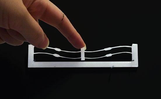


bistable mechanism hygroscopic amplification snapping mechanism hygroscopic counterweight
HYGROSCOPIC PROTOTYPES


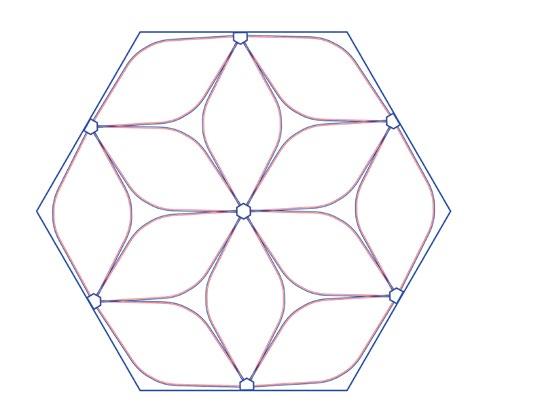
Taking inspiration from the arrangement of leaf clusters from the maranta and its centroid, the single unit is aggregated to form a hexagonal opening with an outer and an inner ring. By manipulating the hygroscopic to flexible material ratio, we can control the RH at which the snapping occurs in the leaflets in the outer ring versus the inner, creating an aperture effect. There are three main states for the aperture: an open, semi-open, and a closed module that allow for the filtration of light.


4 01 VARIANCE
1:2 SCALE FINAL PROTOTYPE MODULE
HYGROSCOPIC SNAPPING MECHANISM
BISTABLE-ELASTIC PROTOTYPES
*Render
*Initial
by Lyric Barnik.
prototypes produced collaboratively with all team members.
There is an abundance of cedar trees, notable for their durability and fragrant aroma which permeates this site.


The paperbushes bloom once a year and are very fragile so one would want to protect them: a nice balance between shade and sunlight.

A delicate flower growing on the ground: one would raise the ground plane to avoid disturbance.

Adaptive strategies can play a key role in adaptive façades. As the threshold between interior and exterior conditions, the skin of a structure plays an important role in not only regulating but establishing the ambiance and atmosphere of inhabited spaces. The negotiation of this relationship for the comfort of inhabitants continues to be developed and motivated by desires to limit energy expenditure in these control systems.


Applying the cassettes to a wall provides light modulation and spatial depth. The aperture serves as a climateresponsive shading device and as a portal framing the exterior view. Each shelter tests a different level of enclosure while negotiating the user‘s experience with relation to their surroundings.


5 01 VARIANCE
ENVIRONMENTAL ANALYSIS OPEN (DRY WEATHER) SEMI-OPEN (SEMI-HUMID WEATHER) CLOSED (HUMID WEATHER) GROUND ELEVATED CIRCULATION 1. USER EXPERIENCE 2. SHELL 3. PLANARIZATION 4. CONSTRUCT
FORMFINDING DIAGRAM EXPERIENTIAL ELEMENTS CLIMATE/
INTERSECT PATHWAY LOOKOUT CIRCULATION
Shaga Forest, Kyoto, Japan
Daylight, wind, humidity analysis
Cedar Trees Paperbush
The terrain is predominantly hilly with colourful vegetation.
Wild Iris
*Formfinding grasshopper script developed in collaboration with Glenn Lu.
Nine variations of the modulated unit are developed in this façade scheme, with openings of 0.5m, 1.0m, and 1.5m in diameter, each with varying options in terms of cassette depth, ranging from 0.5m, 0.7m, and 1.0m.


These subtle changes create significant impacts on the amount of light in the space, how shadows are cast, and what can be seen beyond in the user’s line of sight. Taking into consideration each variation of the cassette module, larger openings are placed at eye level, while smaller apertures are positioned higher in the structure. Working with the cassette geometry, the apertures act as light funnels, casting sharp shadows in the space while accentuating the cassette geometry. The humidity calibration of the aperture openings would be designed to produce a dynamic choreography throughout the day.


6 01 VARIANCE SITE ELEVATIONS
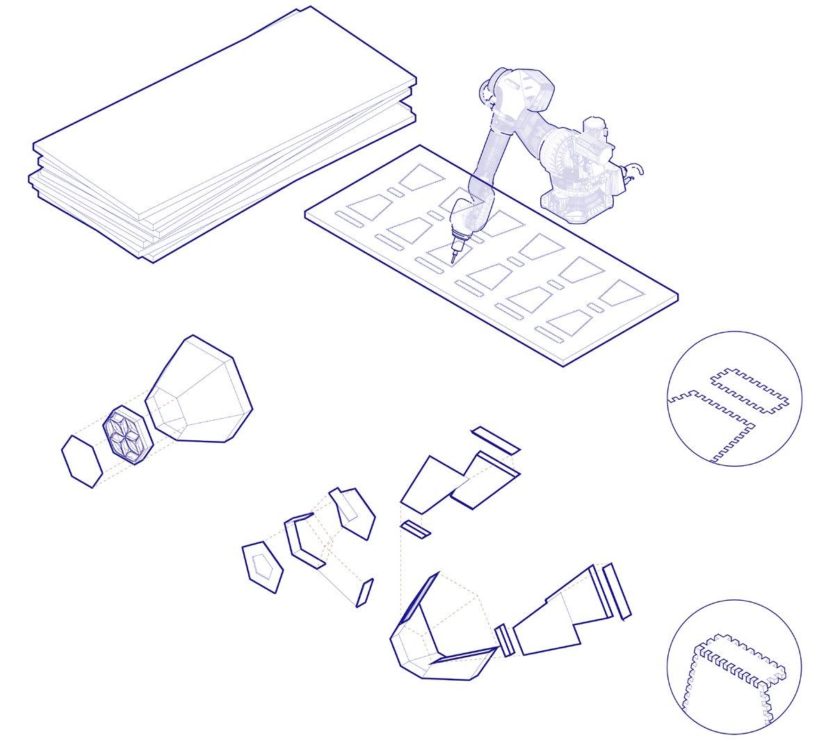
FABRICATION DIAGRAMS
SITE SECTIONS
ASSEMBLY AXONOMETRIC


7 01 VARIANCE
2INTERSECTION & Oakwood-Vaughan
Masterplan
How can we challenge typical housing typologies in response to an increasing housing crisis amidst rapid development and gentrification of urban neighbourhoods?

Project Type: Residential Mixed-use, Masterplan
Completed: Winter 2021, 3rd Year Design Studio

Location: Toronto, ON
Programs Used: Rhino 6, Lumion, Adobe Suite
Supervised by: Adrian Blackwell, a3blackw@uwaterloo.ca
In collaboration with Justina Yang and Mary Ma
3A Studio Outstanding Design Award
2021 UWSA Project Exhibition Showcase
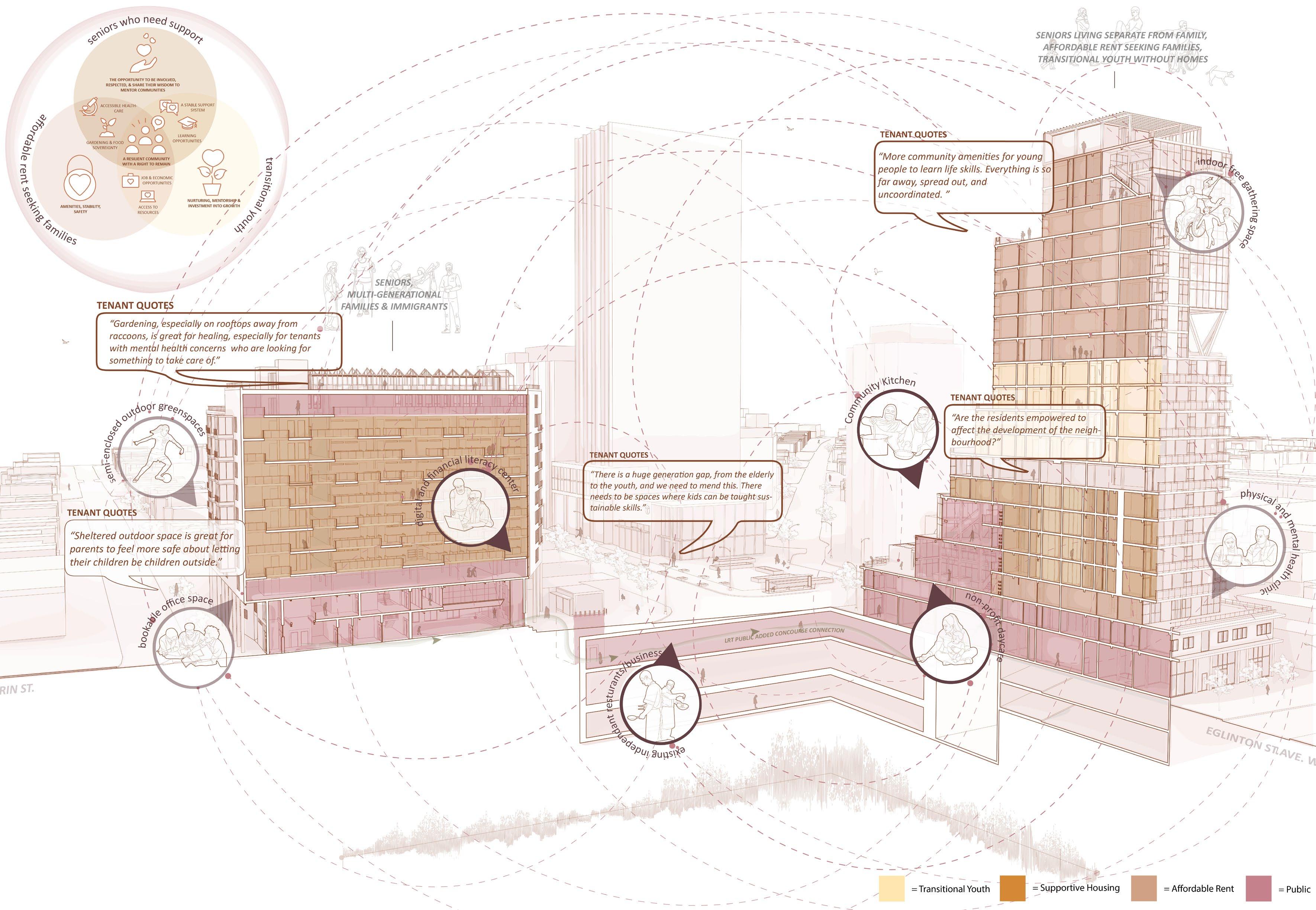
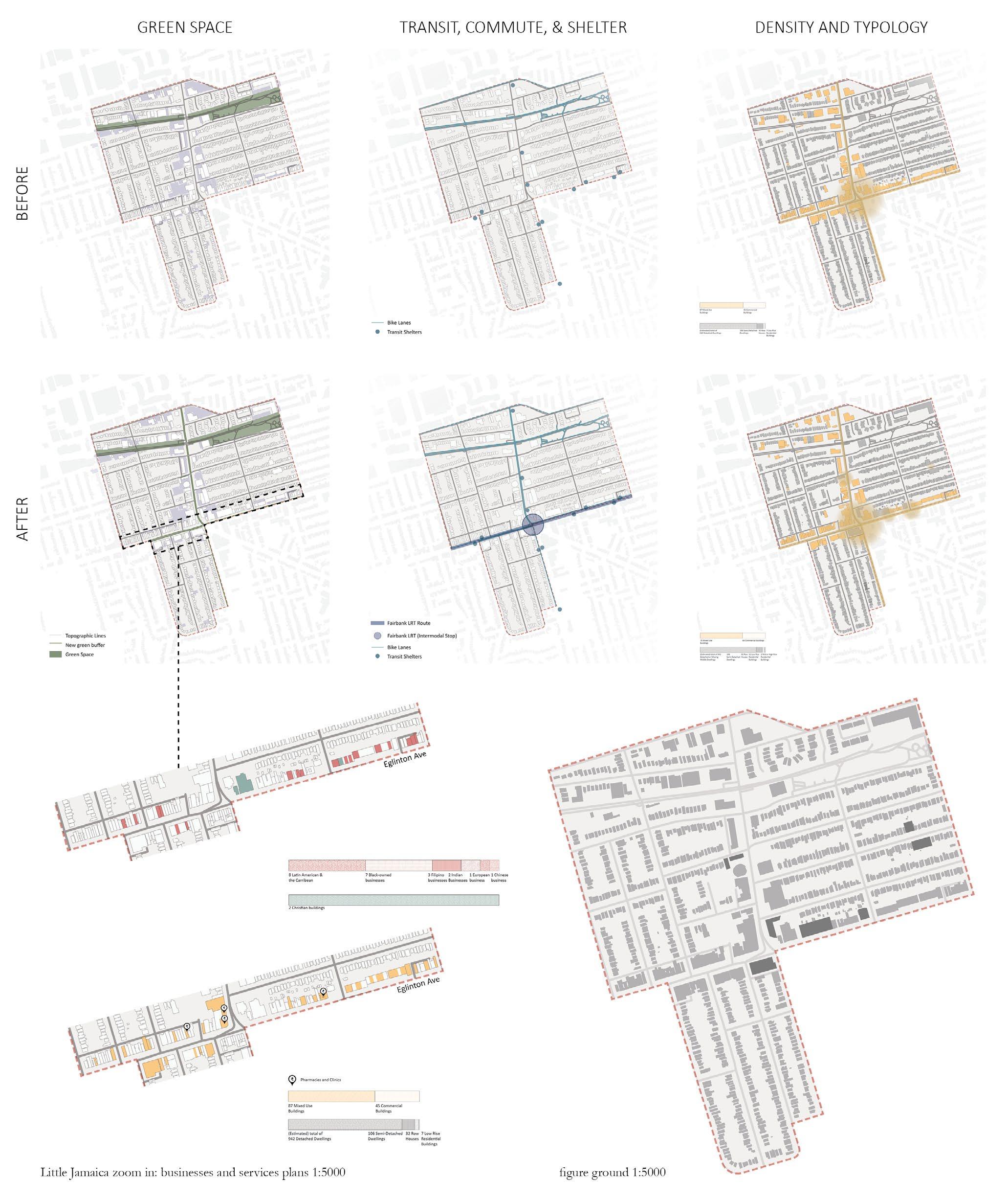
With the introduction of the Eglinton Crosstown LRT, the Eglinton and OakwoodVaughan neighborhood currently lacks the services, affordable housing, and public amenities to accommodate the expected growth in the next 2 years.
In response, Intersection aims to design spaces that encourage the intersection of tenancies that represent the diverse demographic of the area. By filling in the blanks for missing services and making them accessible to all, designing new missing amenities to help nurture and support underrepresented people groups, and creating new points of convergence, the project seeks to create a self-sustaining network made up of the community members themselves on the Eglinton-Dufferin Intersection, allowing them the right to remain, transition, and age in place.
By integrating various public and shared spaces throughout the site, as well as programs catered to the needs of the residents while simultaneously providing the opportunity to train and nurture future generations, this urban design proposal challenges current typologies of separating seniors and other tenancies from one another, demonstrating how the reintegration of these groups can invigorate the community and its culture as a whole.

*All line drawings, graphics, visualizations were produced individually unless stated otherwise. I was responsible for producing the 3D model for the site and the high-rise building. All shown progress work produced individually.
8 02 INTERSECTION
Additional quality-of-life strategies on the pedestrian level are incorporated into the overall urban site to increase walkability and pedestrian safety and to support, help preserve, and grow the vivacious blend of cultures present on the historic Eglington Street, also recognized as the cultural hub Little Jamaica. Street parking is moved underground and replaced with public spaces. Bikes and public transit are then encouraged through the implementation of bike lanes. Green buffer barriers are implemented on the street for an additional level of safety for pedestrians. Finally, residents of pre-existing residential and commercial structures are given the right to remain, while additions are proposed to improve the quality of life for these residents that will be directly impacted by the new proposed developments along Eglinton.


9 02 INTERSECTION
AVE SITE SECTION
ST SITE SECTION
Project Totals: 842 Tenants 420 Units 122 New Trees 3 Additional Crosswalks 1 New Bike Lane
MASTERPLAN SITE AXONOMETRIC EGLINGTON
DUFFERIN
SITE ANALYSIS DIAGRAMS
*Site analysis diagrams produced in collaboration with all teammates
INTERSECTION SITE AXONOMETRIC


10 02 INTERSECTION BUILDING DEVELOPMENT
SITE CONNECTIONS DEVELOPMENT
FRAGMENT SECTION OF INTERCONNECTED KITCHEN AND GARDEN

GARDEN UP
Proposal for 1855 Eglington Ave.


LONGITUDINAL SECTION PERSPECTIVE


The high-rise caters towards the mixed tenancies of supportive housing, youth transitional housing, as well as affordable housing, with the intention of promoting the reintegration of often separated groups back into the community. The network of interconnected kitchen, dining and vertical gardening spaces allow for a communal sense of living, promotes the sharing skills and experiences, while having access to a variety of support systems at close proximity, creating a micro urban village within the building.

11 02 INTERSECTION
VIEW OF 3RD-LEVEL COMMUNITY KITCHEN
TRANSITIONAL UNIT LAYOUT
UNIVERSAL LITERACY
Proposal for 1828 Eglington Ave.


This multi-generational mid-rise combines universal design for seniors with a focus on providing literacy resources to any who are struggling to adjust to the accelerating pace of society. To seniors, for whom research has shown that social isolation is the key factor that leads to mental and physical health issues, teaching and incorporating digital tools and literacy skills is essential to raising their quality of life.

*unit layout diagram + cross section produced by Mary Ma

12 02 INTERSECTION
CROSS SECTION PERSPECTIVE
UNIT LAYOUT ATRIUM FRAGMENT SECTION
How can we re-introduce and promote intuitive connections between the city and a neglected river bank?


Project Type: Cultural, Museum, Landscape

Completed: Fall 2022, 4th Year Design Studio
Location: Roma, Italy
Programs: Rhino 6, Enscape, Adobe Suite
Supervised by: Beatrice Bruscoli, b.bruscoli@archiworld.it & Eduardo Cappella, edoardo.cappella@gmail.com

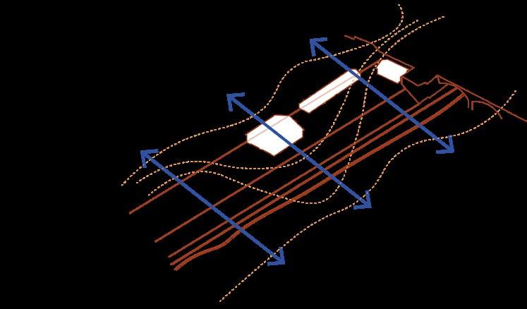
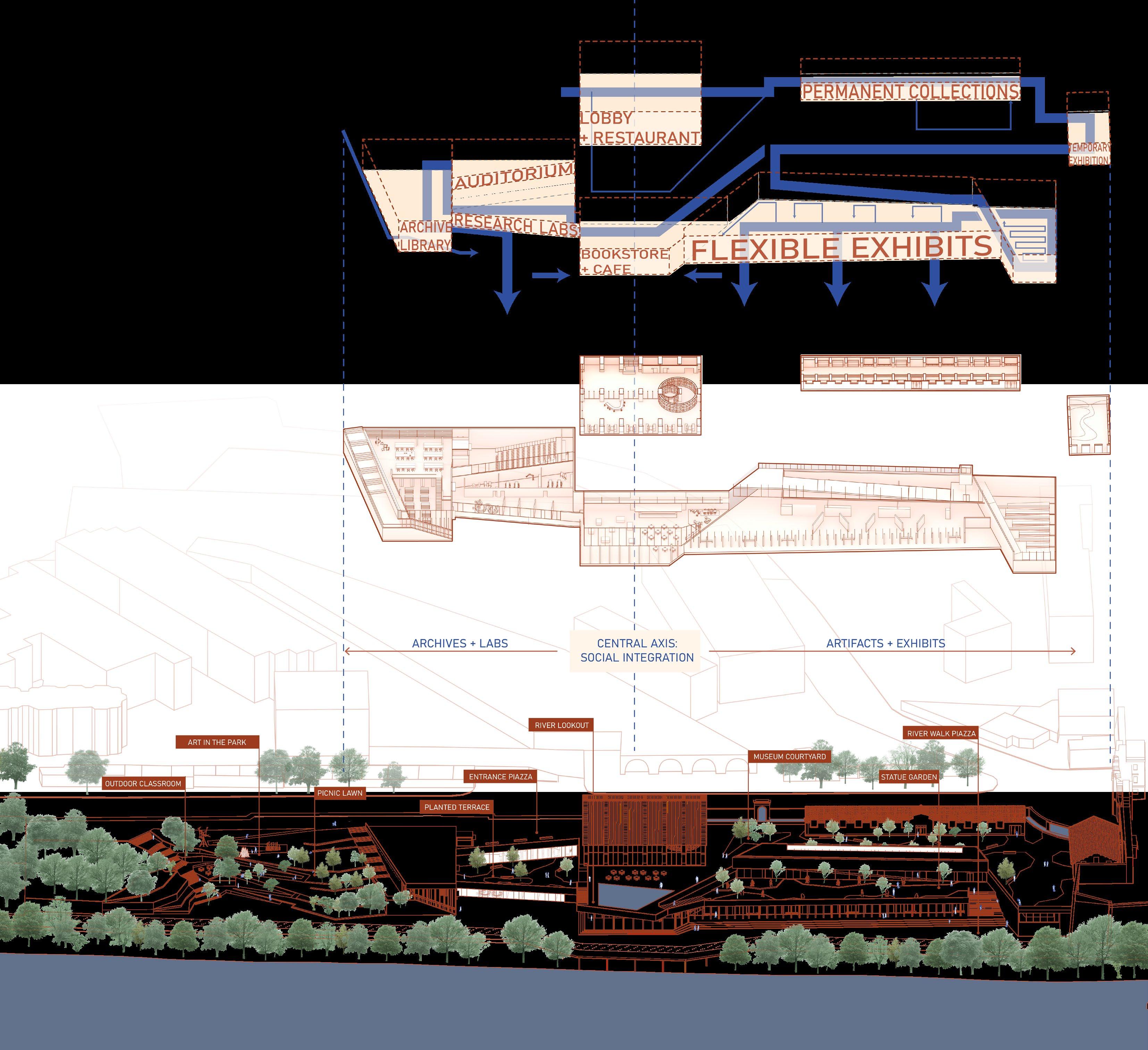
Along the banks of the Tiber, which has become a distinct separation line between the river and the city today, this project acts as an important intersection point and transitional space that aims to promote natural circulation and use by the water. The Tiber, traditionally a hinge element in the urban landscape of Rome, has become largely ignored in the neighbourhoods of the selected site, primarily due to a lack of visual connections and access. To promote intuitive circulation to the river banks below and integration with the natural landscape, the project scheme uses the existing lines formed by the embankment, pulling at them as they juxtapose the city’s built landscape with the natural overgrowth of landscape framing the river. The spaces created by these intersecting lines and circulation are then activated by the creation of public spaces, both as part of the museum and as public elements in the urban environment.
Access to the water can then be achieved through following the directed circulation through the museum, crossing spaces and directed views that break through the vegetation and frame the Tiber in different ways, or alternatively through the landscaped park just downstream of the museum. The new museum is mainly below the level of the existing Arsenale complex, accentuating historical structures and further integrating the building into the embankment, with its primary face towards the river. A central lookout point at the Arsenale building becomes the hinge of the project, and symmetry is achieved with artifacts and exhibitions in one direction, and archives in the other. However, regardless of which direction the occupant follows, the lower riverwalk plaza becomes the natural, if unintentional destination.
The park follows the same language as the museum, pulling at lines of the topography, creating spaces of program such as an outdoor classroom, sculpture garden, and flexible picnic hill between the planted landscape.
13 03 EMBED 3
EMBED


14 03 EMBED
STRATEGIES FINAL SITE DIAGRAMS SITE DIAGRAMS DEVELOPMENT
DESIGN


15 03 EMBED
SITE ELEVATION_1:500
SITE PLAN_1:500


16 03 EMBED
archives
SECTION AA_
SECTION BB_ social integration


17 03 EMBED SITE SECTION DD_ landscape SITE SECTION EE_ landscape SECTION CC_ artifacts
4UNCOVERED
How might artificial landscapes act as a way to acknowledge the contamination history on a site while pursuing its remediation?

Project Type: Landscape, Community
Completed: Spring 2020, 2nd Year Design Studio
Location: Arlington, VA
Programs: Rhino 6, AutoCAD, Lumion, Adobe Suite
Supervised by: Rick Andrighetti | reandrighetti@uwaterloo.ca
UWSA Energy + Design Award Nomination + Honourable Mention
On the site of an urban waterfront and former industrial brown-field, a recreational re-use park is established across the Potomac River from Washington DC. An addition project within the park aims to reveal the complex history of the landscape while simultaneously healing the soil below using its integrated bio-venting technology. Analysis of the site’s industrial use and contamination history reveals lingering lead and PCB remnants in the soil, and though although most of the soil in the park has been remediated through layering and treatment, an asphalt cap has been used to contain the toxic contaminants within one particular area.
A system of wind turbines and bio-venting is developed and creates a “line of action” on the boundary of the asphalt cap, connecting human programs to the remediation of the soil. This formulates the structure of the community library, and frames the expanse of the resulting playground situated above the remediation process.
Due to the recent urban developments around the area, the adjacent neighbourhoods are becoming increasingly inhabited by a more diverse demographic of people, including many young professionals and families, in addition to the more senior current residents. There is currently a lack of gathering and social spaces beyond mini parkettes and underground malls. The project aims to curate specific spaces that can be enjoyed by all, whether it be a birdwatch tower, playgrounds, or a place to study.
The man-made surface of the sculpted terrain is a reminder that a natural looking landscape may not be truly sustainable, whereas a constructed landscape specific to the needs and requirements of natural processes will maintain a healthier and more sustainable landscape over time.
DESIGN STRATEGIES

Educate and acknowledge the history of the site
Remediation of the soil on-site using non-intrusive methods

Create open public gathering spaces for the community


Establish different programs for the wide age group moving to the area
Improve access to the water and nature across the tracks

18 04 UNCOVERED
What strategies can we use to create a usable landscape while remediating the site?

The wind turbine and bioventing apparatus creates a line of action on the boundary of the asphalt cap, connecting the programs above ground to the remediation of the soil below. Vertical axis wind turbines were chosen as a clean energy source of a small scale that is less intrusive to birds and human activity. Kinetic energy is collected from the wind turbine and is converted into electric energy that powers the blower, integrated into the structure of the building, which sends 02 into the soil for bioventing, encouraging native bacteria to break down hydrocarbons from PCBs and petroleum-based contaminants.


These apparatus line the edge of the asphalt cap, and also act as the structure of the new building - a community library and research center that monitors the remediation process.

19 04 UNCOVERED ANALYSIS OF CONTAMINATION HISTORY
ENERGY + BIOVENTING SYSTEM DETAIL BIOVENTING SYSTEM AXONOMETRIC Injection well
Centrifugal fan Vertical axis wind turbine Vertical axis wind turbine optimal array 2d 4m 6m Rotor diameter d: 1.6m
cables in the structure bring electrical energy to transformers
How can we address the way contamination and the asphalt cap affects botanical design on site?


The soil mounds in the sculpted play-scape allow native trees to be brought back into the landscape without risk of their roots seeping into the contaminated soil. The height of each mound is determined by the amount of root space that is needed for each specific native species. The sides of the mounds are lined with corten metal, and acts as wayfinding and educational signage about the site and the plants.

The permeable material at the apex of the mounds allow for easy water delivery to the plants, and the sculpted design assists the drainage of water through the plaza and eventually into the nearby rain garden.
Phytoremediation is used in areas of the site outside the asphalt cap. The chosen plants are both hypperaccumulators and high biomass plants, which will take in and accumulate the heavy metals left in the soil.
20 04 UNCOVERED
PLANTING SECTION PLANTING ELEVATION EAST-WEST SECTION
INITIAL CONCEPT SKETCHES

A community library is developed in the space created by the peeling back of the artificial landscape. The structure of the building, along with the strips of landscape, follow the grid created by the turbine system. An open reading space continues the wave system of the play plaza in the interior flooring, blurring the lines as you enter the building. A line of machinery managing the turbine and bio-venting system separates two major areas of the building - public community space and quiet reading.


21 04 UNCOVERED BUILDING PLAN
INTERIOR VIEWS
C.F. Møller Architects

HafenCity Campus
Location: Hamburg, Germany

Programs: Rhino 7, Enscape, Adobe Suite
Supervised by Thue Borgen Haslrz, Architect MAA | tbh@cfmoller.com


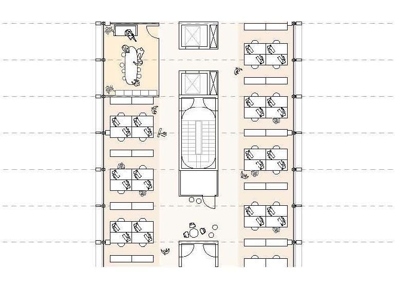
HafenCity Campus was a competition project located in Europe’s largest urban development district. The sustainability-focused design acts as a catalyst for a vibrant city life and a green landmark for Hamburg. The building concept provides a framework for future-proof learning environments and communities based on diversity and sustainability. The condensed housing of the program is volumetrically transformed into a harbor-facing cascading structure with multiple green platforms.
Responsibilities include: building and reiterating the 3D model during schematic design, rendered sections, elevations, visualizations and the physical model during the final production phase.


5
RENDERED LONGITUDINAL SECTION Mensazone Bezirksflächen Am Hannoverschen bhf 0. +0.00 8.4m -3.00 Ebene des spielplatzes 1. +6.80 ZG. +3.30 2. +10.60 3. +14.40 3000 6000 *situation plan produced with Dominika Ufnal 05 HAFENCITY CAMPUS


tuhllager Garderobe Lager age technischer Raum scher Raum technische Raum chnischer isch Ra technischer ZWISCHENGESCHOSS 1:400
MODEL LEVEL 1 FLOOR PLAN
MASSING
GROUND FLOOR PLAN 05 HAFENCITY CAMPUS
DETAILED FACADE ELEVATION + SECTION
*floor plans produced with Charlotte Yara, Lucas Pflbchr, Emmanuel Van Oost
C.F. Møller Architects
Hannemanns Allé 2.0
Ørestad’s Green Corner
Location: Copenhagen, Denmark
Programs: Rhino 7, Enscape, Adobe Suite
Supervised by Thue Borgen Haslrz, Architect MAA |tbh@cfmoller.com

This project is C.F. Møller’s submission towards the competition for a new masterplan in south Ørestad Copenhagen. The flexible design provides a good mix of an urban city scale in conjunction with intimate green spaces, creating a city gate motif - leading pedestrians and traffic into the central square on the western side of the area.


Responsibilities include: 3D modelling, progress renders, massing design, environmental studies, parametric studies, final drawings


Project design managed by Adam Busko and Emil Meyer. Drawings and designs in collaboration with Luc Guralp, Gabriele Lipskyte, Christina Moschopoulou, and Maja Galka.


6
URBAN ACTIVATION DIAGRAM SUSTAINABILITY DIAGRAM
Green Axis Passages Roof Terraces Plazas
SITE SECTION SITE PLAN 06 HANNEMANNS ALLÉ
AERIAL RENDER
*landscape diagrams produced by Luc Gurlap
ENVIRONMENTAL ANALYSIS

MODULAR FACADE STUDY


GROUND FLOOR PLAN AND FLEXIBILITY DIAGRAM


 STUDY: glazing required
STUDY: wind
STUDY: noise

Thank you for your consideration!


 STUDY: glazing required
STUDY: wind
STUDY: noise


