1 minute read
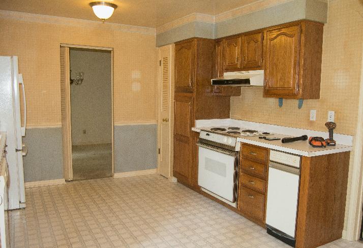
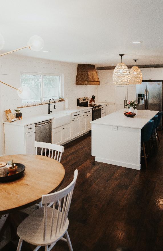
Before & After
Take a look at this amazing transformation by our photographer friend Emilee Kerner! “When we were looking for a house we knew we wanted a fixer upper, something we could personalize. The layout of this house had so much potential to make a large, open concept great room. We had to take down several walls, including one of which was load bearing and had to be replaced by a beam. But once it was all open, it was perfect. For the design, we wanted it to be really clean and bright. We also wanted a huge window over the sink, rather than upper cabinets, and an island as big as we could make it. Since we decided on no upper cabinets, we did a whole wall of cabinetry surrounding the fridge. We use one cabinet as

a coffee bar, one as a pantry, and then the last houses lots of baby supplies. For the light fixtures, I wanted something unexpected. So we went with large-scale basket pendants over the island and then a funky mid-century fixture over the table. I’m not totally sure how to classify the style of the whole thing, but we love how it turned out!” – Emilee Kerner

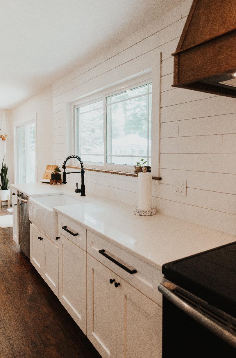
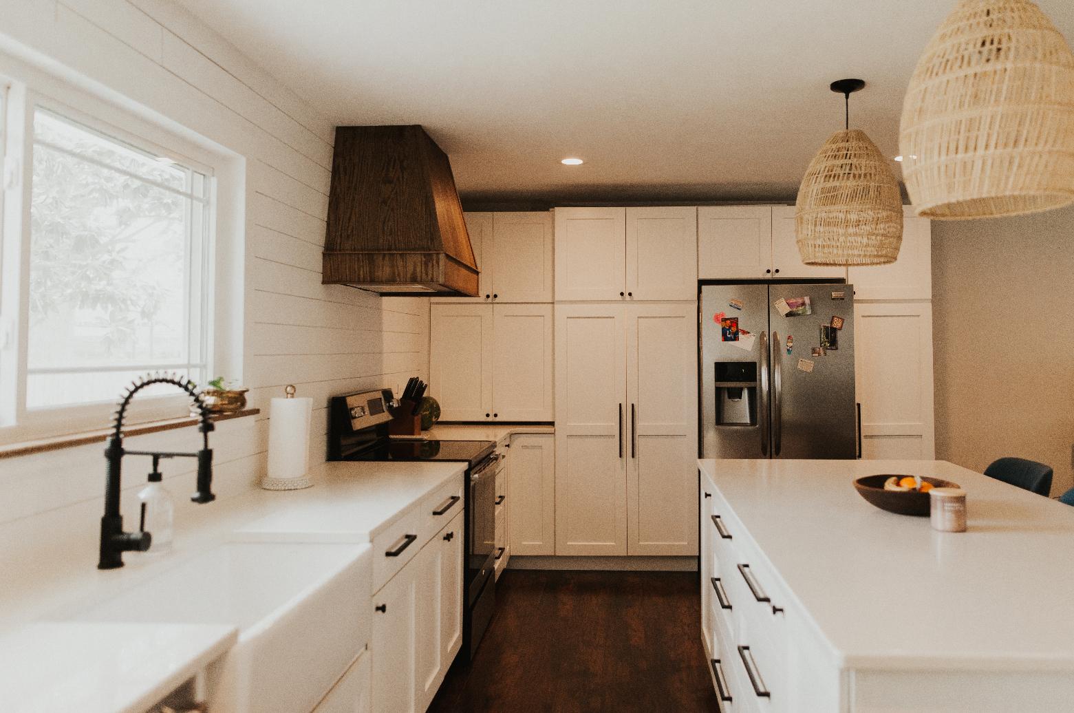
After

BEFORE
