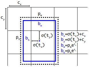
1 minute read
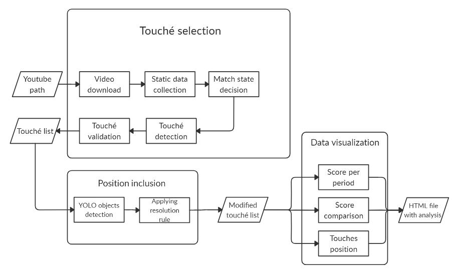
Figure 21. Data visualisation


4.3 Data visualisation
Figure 21. Data visualisation.
Advertisement
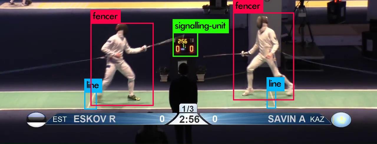
The fencing analysis software creates an HTML page with results as its output and saves this to the given directory path. The components of the page are created using Plotly data and visualisation tools. The HTML page contains the following components: a table of match scores per period, a graph of the score comparison, a pie chart of the touché positions.
4.4 Match score per period
The table that displays the points earned by the fencers after each period has the names of the fencers written at the top. The periods are listed down the left column forming a row for each period. The points earned per fencer during each period are then indicated in columns under each name (Figure 22).
27