


Hello, my name is Evelyn Rickards and I am currently a sophomore with a graphic design major and a marketing minor. Ever since I can remember, I have always had a passion for the arts, whether that be design, drawing, painting, photography, and much more. In school, I wasn’t very interested in anything other than art and it was quite obvious it was one of my strengths over any other subject. I was interested in english and writing and succeeded in science equations but neither were necessarily my passion like art was. I grew up in a very creative household with my dad being a theatre major and my mom dabbling in art as well. The reason I decided to pursue a graphic design degree and take this class is because although I’m decent at art, I am better versed on digital designing. I enjoy creating slideshows, posters and logos and through this class I have learned a great amount about the significance of visual hierarchy, fonts choices, design concepts, and composition. I also bettered my understanding and use of Adobe and the many programs that are available through the Adobe Creative Cloud. Since taking this course, I am not only better at designing and collaborating with others but I have learned a great value about how to be the best graphic designer I can be.
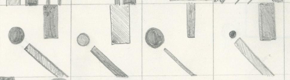
To start this project, we were asked to take a few minutes and reflect on our past semester on campus and after doing so, we were challenged with interviewing our partner to figure out how their semester was by asking questions, starting off easy before asking more detailed questions. Once we finished with the first two rounds of questions, we to create a problem that needed to be solved based on the answers we received. Then with that information we created sketches and designs of how we’d solve the problem, receive feedback from the partner, and assemble a real life prototype of what could solve this problem. The objective was to get us thinking creatively and work on our communication skills with our partners, along with getting to know them on a deeper level. We learned how to work one on one with each other and work in a limited time frame that helped pushed the boundaries of what we could make in that allotted time.
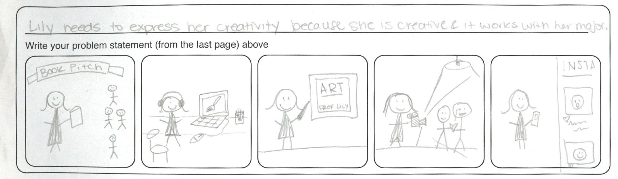

LilyisasophomoreatSNCandis
EnglishmajorwithaGraphicDesign minor.Shelovesbeingabletobe creativeanduseself-expressioninher work.Imadeherabest-sellingbook becausesheloveswritingandIcould tellshewaspassionateaboutbothher majorandminor.
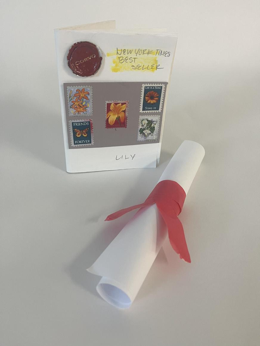
I personally really enjoyed working with Lily and getting to know her. I think it really helped open my eyes to what her life is like and helped me to experiment with new styles and techniques while showcasing what I see for her future. Although the final work wasn’t the finished final product, I still was satisfied and proud of what I came up with in the time given. I felt almost as if I was showing a client a potential product in a sense and explaining my ideas, thoughts, and concepts. Thankfully, Lily was a great partner to work with and made it really fun to work with and test the limits of creativity. I kind of enjoyed the fast pace because gave me just the right amount of time to think so that I didn’t have to overanalyzed and overthink what I was doing. Instead I could just go for it and see how it turned out. Honestly I was proud of the concepts I came up with and I liked all of them mutually. I did struggle with the needs part so if I had to do it over again I might have changed that, but overall for the most part I feel happy with what I created. I am so grateful that Lily was so easy-going and great to work with during this project and how together we both were able to use our creativity to create something similar yet different because of the unique information we learned about each other. I’m sad Lily wasn’t able to stay the rest of the semester but I hope to see more of her and her work in the next few years.
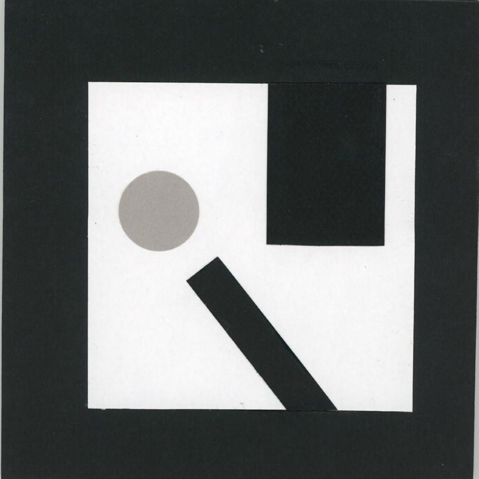
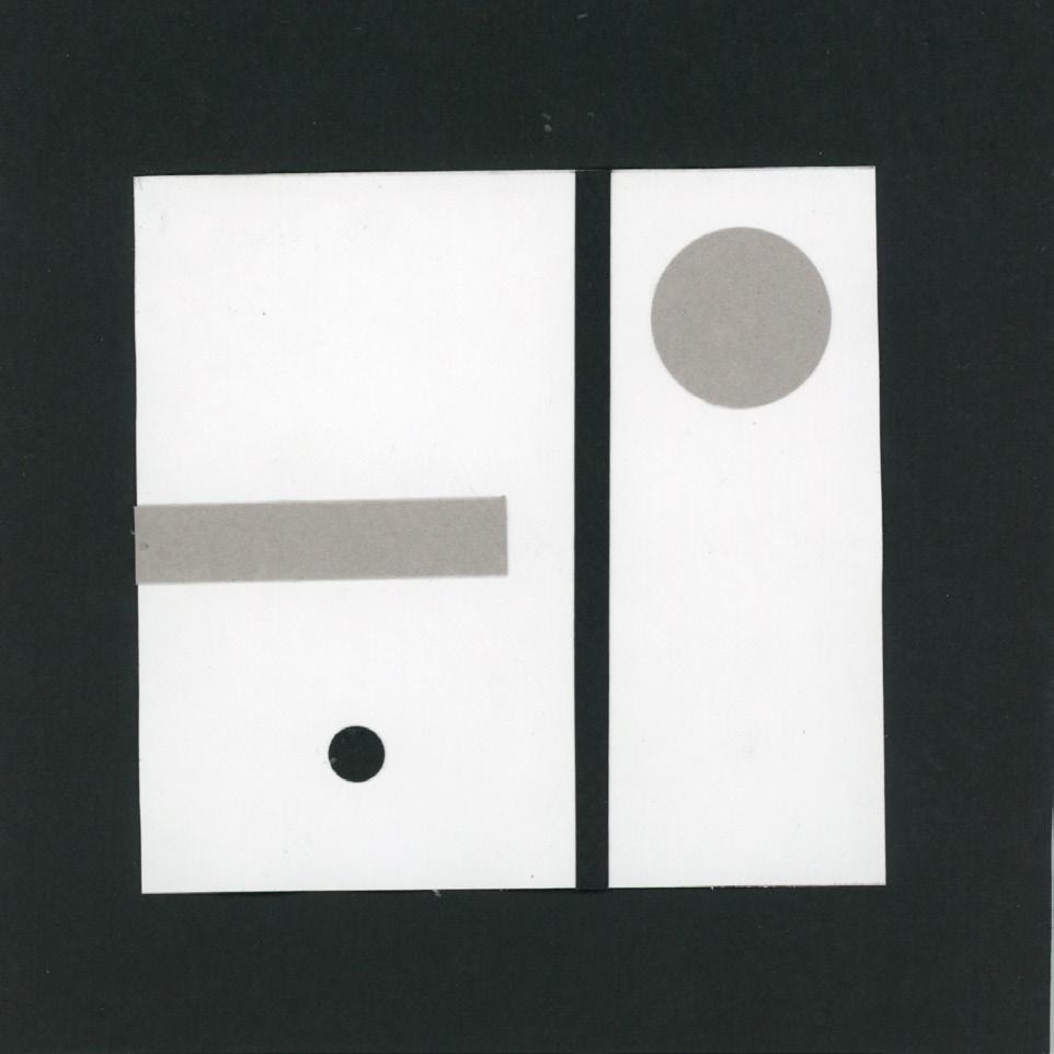
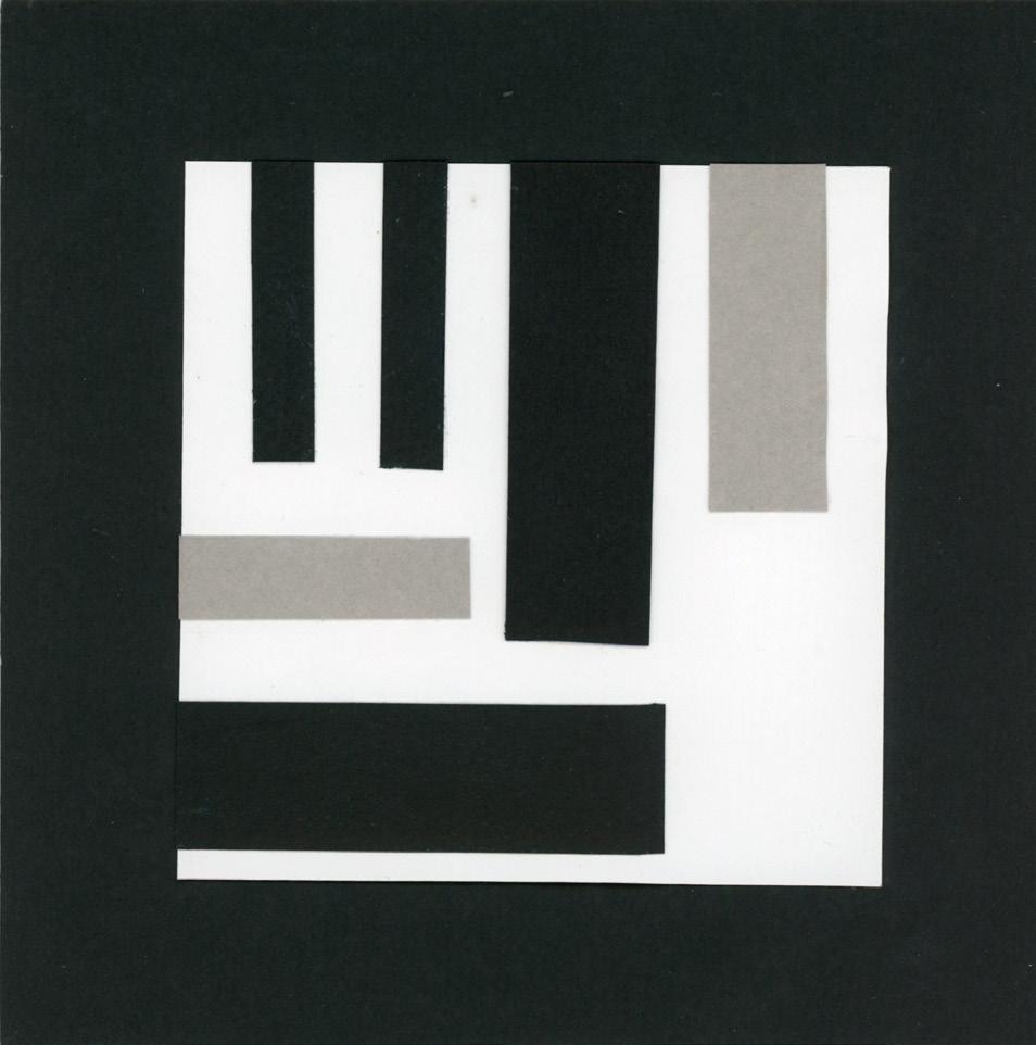
In this project, we learned how to properly use things like value, scale, line, and visual hierarchy to effectively portray emotion while having dynamic and captivating form. In addition, we learned about composition, gestalt, and how to portray emotion with limits and requirements. Gestalt is a abstract way to format and formulate a piece of work that makes are brain work a little harder. For example, when looking at logos such as the USA Network, are brain puts together the pieces that there’s an S in the middle without lines surrounding it. It relates to this project similarly because we are trying to convey emotions without strictly labeling them or drawing a specific image, with limited shapes and colors too. When designing logos, gestalt and abstraction is very important. Having the knowledge and ability to portray the message while using creativity, design, and overall composition makes it helpful. Not to mention, if a logo is needed it’s important to come up with a completely original idea that will both portray the message while having a sort of flare to it that makes it stand out from the rest.
Similarly, creating these pieces while making sure it looked wellcrafted was a challenge to say the least. I’d rather spend a little extra time to make it look well presented and best crafted than rush and it end up looking like a child’s work of art(even though I did rush some parts). In the future, I would spend more time on my pieces to make sure everything is clean, cohesive, and well made so that I not only better my skills but also be able to grade myself better. When thinking about abstraction, I don’t typically think of creating emotions with limited shapes, so it really pushed my creativity. Abstraction, to me, was creating a piece but taking it with a grain of salt and elaborating on why the piece is what it is. However, since doing this project I feel like it has a completely different meaning to it. Its the ability to portray something in a unique way that may not be seen at first glance by a unsuspecting audience until it is brought to the viewers attention. For me, creating a collection of art that represents specific emotions was extremely difficult, especially with having limited shapes, colors, and sizing. If I were to have the ability to use any color, shape, or ability to overlap it would be a walk in the park. However that’s not useful because in the real world there are guidelines and protocols to be followed when designing for others or for individual projects.
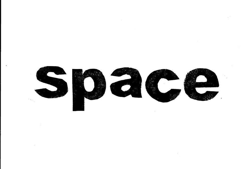
For this piece, I did a standard straight line print of my letters which was a bit more challenging that I anticipated. Making sure your letter have enough ink on the stamps along the stamps being level and even is extremely difficult even with some of the tips we learned to make it easier. I ended up trying my best to have them straight and then used the photocopier to manipulate the text to be as straight as possible.
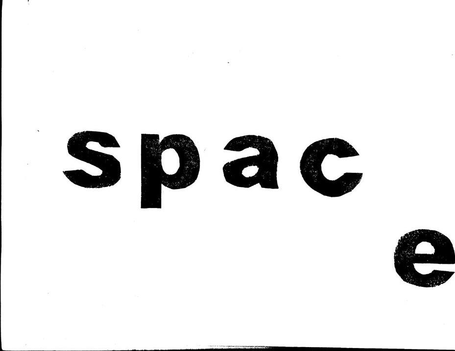
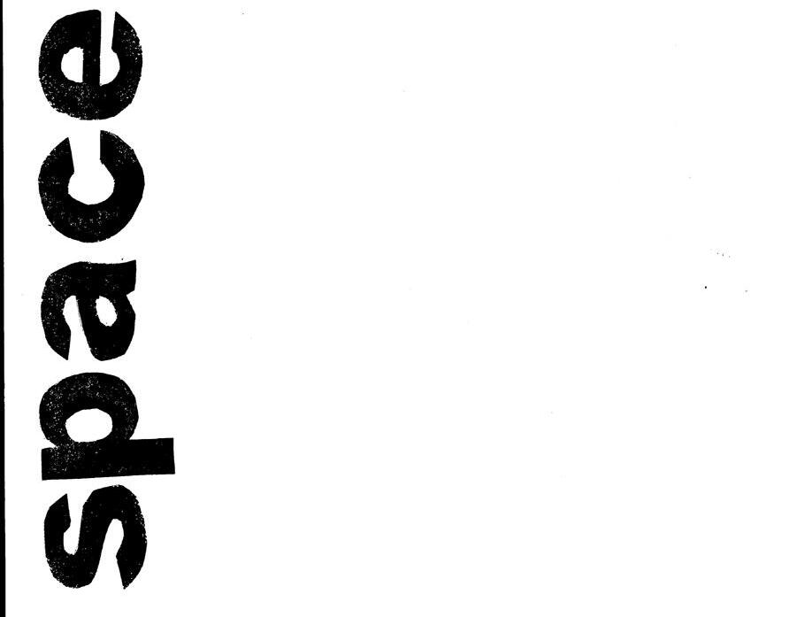
The second image, I chose was to have the “e” lower than the rest of the text because it is giving a sense of space as in the space between the letters. I chose to do a design like this to accentuate the space between as if the word is drifting from itself. As if the ‘e’ is trying to distance and isolate itself from the rest of the letters. Personally, this design is my favorite because I think it perfectly represents the SPACE between the letters.
The goal of this assignment is to think iteratively with words and images by creating a concept and design based on a specific word. In this instance, I chose the word SPACE because of the multiple meanings and creative interpretations I could do with the word. I learned that creating the stamps isn’t nearly as difficult as lining up and stamping. I learned how to show emotion or a word by how it’s positioned, composed, and its overall theme and the difference between type and integration of text. If I were to do the project again, I would work and experiment more with different styles and layouts. I would want to make one falling down the page, one with a black background, and possibly one with stars intertwined. I think I also would experiment with re-stamping the letters differently.
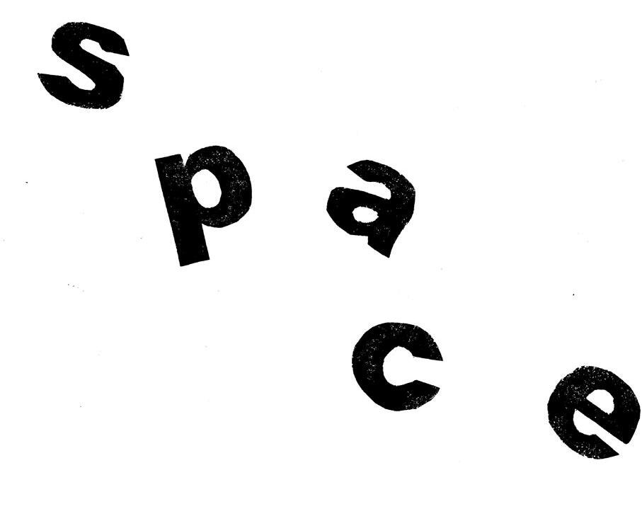
My third image has all the letters in the word “SPACE” be strategically scattered amongst the plane to look as if the letters were floating through space. I made sure the letters were sporadic but not to chaotic that you weren’t able to make out what word it was to draw too far from the many concept. I enjoy the flow of this design and I like how you can read it clearly and your eyes make the assumption that it flows on a curved line down the page.
My last and final image wasn’t originally one of my four designs I had planned but a hidden gem nonetheless. For this design, I left a decent amount of empty space on the page to show the the word “SPACE” was doing the opposite of the word, not taking up space. I really enjoy this one because I never would have thought to do it this way originally but for some reason I am drawn to it. Maybe because of the empty space or perhaps because of the alignment.
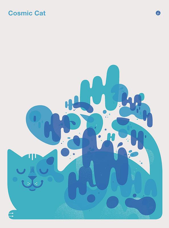
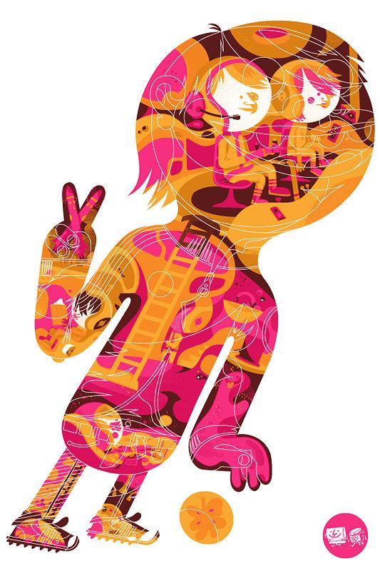
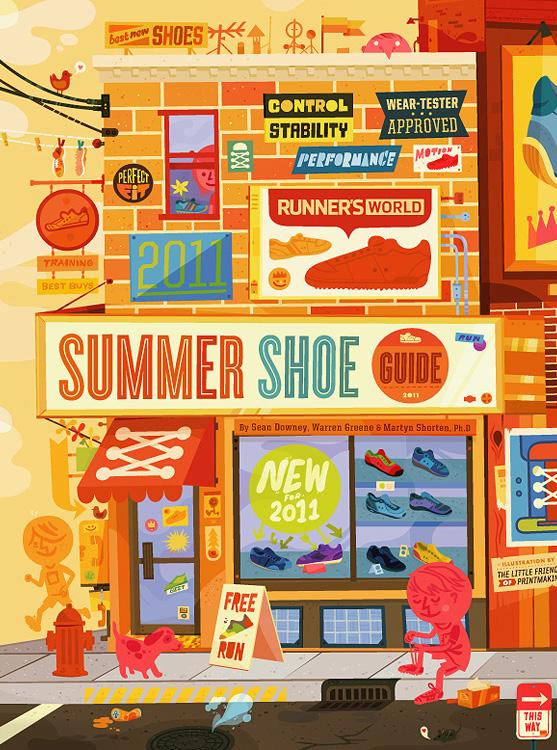
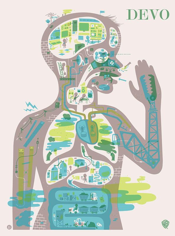
JW & Melissa Buchanan are the very talented artists behind The Little Friends of Printmaking, a husband-and-wife printmaking duo based in Los Angeles, California. They are known for their illustrative playful designs with bright colors and have partnered with many famous brands and corporations like Disney and Cartoon Network. Even know they are quite popular, they are still active in exhibitions, been featured in books and media, and give live lectures to those curious about what they do and how they go about creating a piece. They have also won numerous awards over the years, for example the Art Directors’ Club and American Illustration. They take inspiration from movies, farmers markets, hiking, and most recently older books. JW and Melissa met at the University of Wisconsin-Madison in a 2D design class and the rest was history. They have owned a business since 2006 and since then relocating to Los Angeles. They live in a tiny work studio apartment and enjoy the fun atmosphere LA has to offer, although it is very different from the traditional midwest lifestyle. When creating new pieces, they prefer to approach art with a sense of humor, making it fun for people of all ages. Their current goal for the future is to potentially take a stab at animation or possibly ceramics. They enjoy being creative and expressing their uniqueness while perfecting their craft. Their use of diverse colors and elaborate yet simplistic designs are what makes them stand out from other artists. I specifically enjoy how they play around with different sizes and shapes along with mixing fonts, which can be extreme hard to master and succeed at.
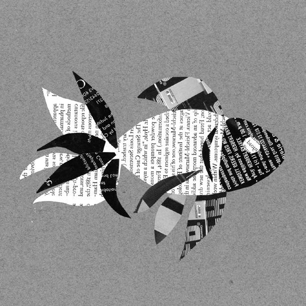
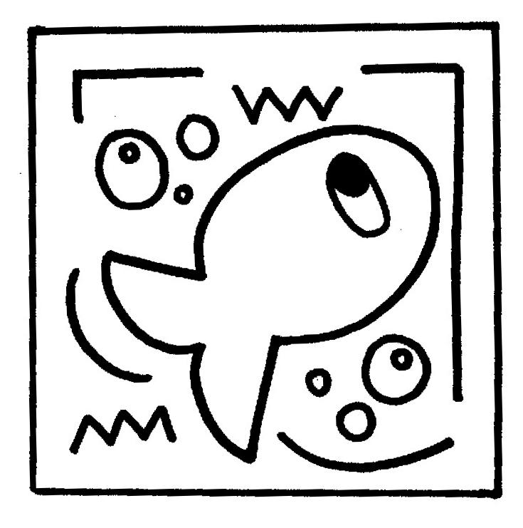
The main objective of this assignment was to create an animal or object of your choosing in multiple different styles and medias and I chose to do a goldfish. I learned that fish can be complicated to portray due to their unique size and look. It was hard coming up with different poses that didn’t look too similar nor so indifferent that you don’t recognize that it was a fish. The most of the medias were quite easy for me because I have had experience in the past with them, however the most enjoyable one for me was collage because I love scrapbooking. I enjoy playing with different texture and styles along with having the ability to make it as abstract as I’d like. I love the variety and unique look that collage work has and I love cutting out random shapes that soon turn into art. In addition, I learned that Photoshop and InDesign can be very challenging to use at first, but once you get the hang of it, it’s a walk in the park. I like being able to link images, change resolutions, and fidget with the colors and contrast but that can also be extremely challenging. It’s hard organizing all the files and saving them properly while making sure nothing is missing and remembering which file is which. I enjoy how my piece turned out and I think the only thing I’d do differently is add more renditions and designs to fill up more of the empty space while playing around more with the poses.
For my first rendition, I placed my strongest piece in the corner and made it the largest because I wanted it to stand out. When creating my first rendition, I was playing around with different layouts and forms because I didn’t want to do the traditional 2x3 layout. I surround the strongest piece with three other illustrations, and placed my second two favorite pieces larger near the bottom to once more bring attention to them. During critique, I got some helpful information from my peers and changed the layout to be more fluid and dynamic.
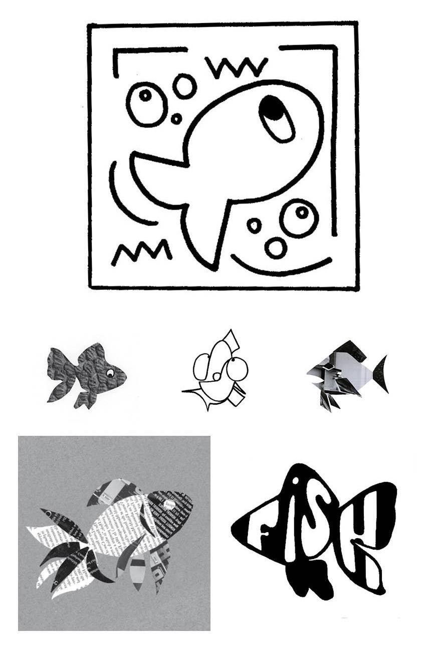
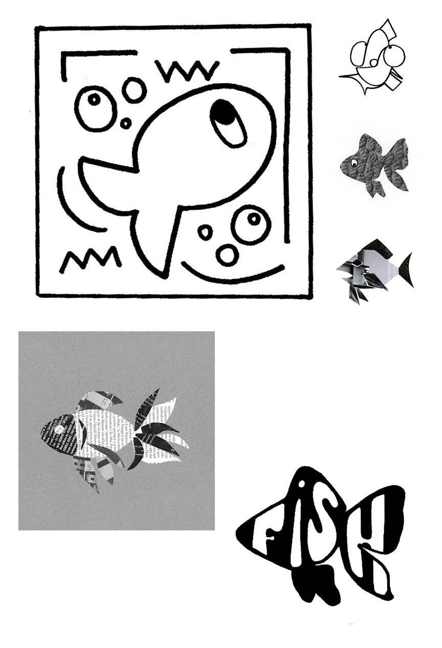
My final rendition was, in my opinion, very strong in comparison to the previous rendition because of the layout and composition. I still was able to have my strongest piece the biggest but also was able to show off my other pieces as well. I liked that they all looked different in their own way and how they stood out on the paper. I think it was a great use of space and was perfectly layouted. The only thing I’d do differently next time would be to change the positioning of the fish in my designs because more intricate and intrigues poses could make the piece stand out more. However, I did come across this issue previously because fish are commonly shot in the same position.
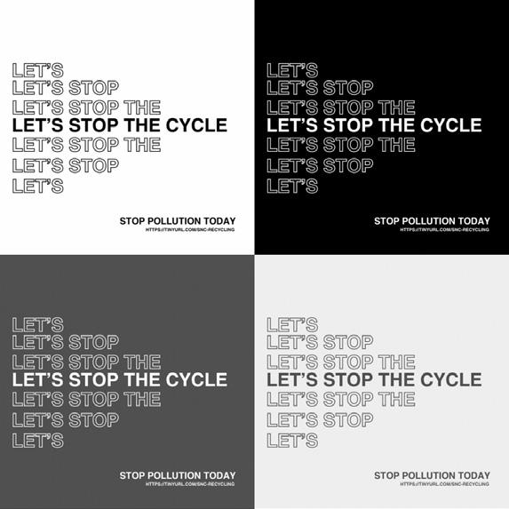
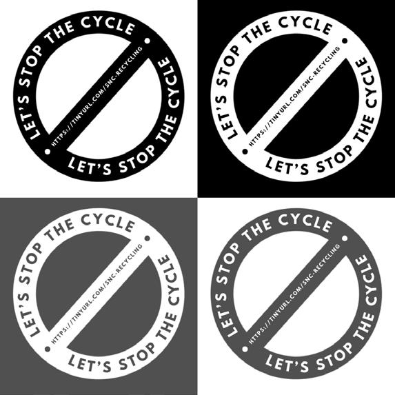
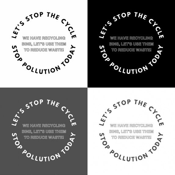
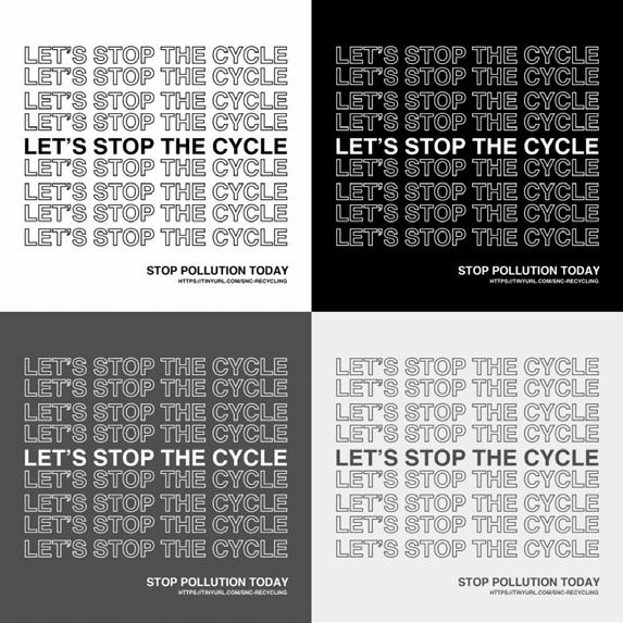
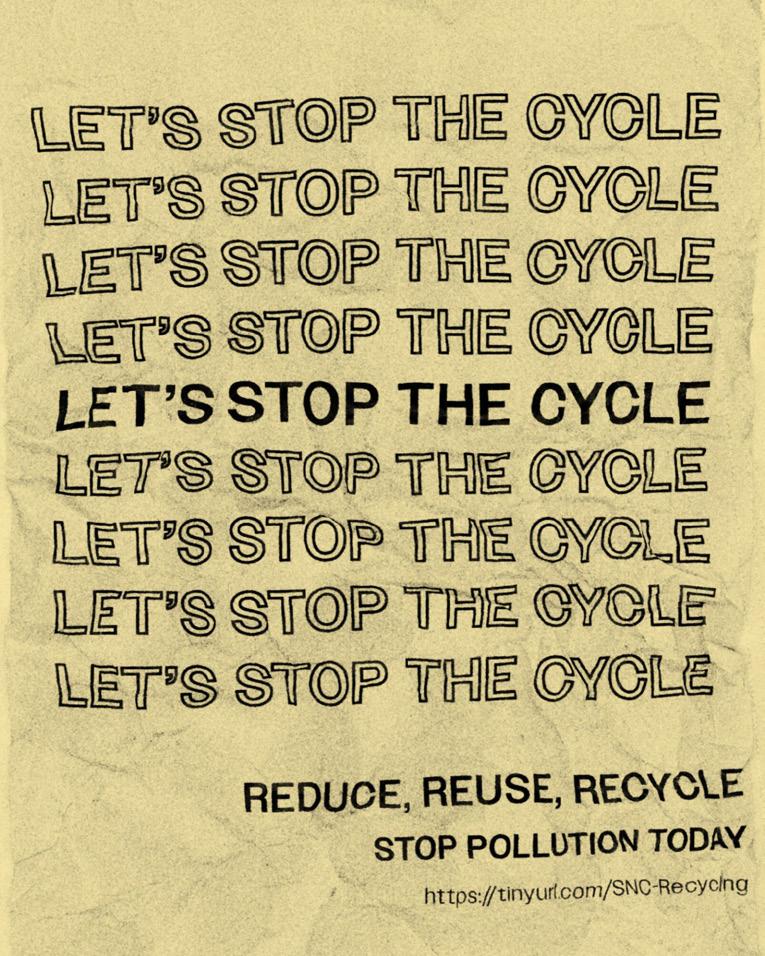
The main objective and goal of the PSA Poster project was to work with a peer in our class(or a client) and discuss and collaborate to create a poster. Every student was told to complete a brief which explained their thoughts and ideas for the project and what topic they wanted the designer to discuss. For me, it wasn’t that challenging working with limitations, especially with fonts and typography, because I like taking on challenges. I feel like using too many typefaces can lead to inconsistency and not looking as well together so I didn’t struggle with using multiple typefaces because I stuck to one. However, I did struggle within the project at times but not regarding to typography. Though I wasn’t given enough information, I feel my piece was strong in the aspect that I used what was given and was successful with my piece. The main text stands out from the rest because of the repetition and the information is clear and concise. I am very satisfied with my final piece and how it turned out, despite the link being incorrect. Rough Draft and
LET’S STOP THE CYCLE
LET’S STOP THE CYCLE
LET’S STOP THE CYCLE
LET’S STOP THE CYCLE
LET’S STOP THE CYCLE
LET’S STOP THE CYCLE
LET’S STOP THE CYCLE
LET’S STOP THE CYCLE
LET’S STOP THE CYCLE
STOP POLLUTION TODAY
https://tinyurl.com/SNC-Recycling
Within this assignment, I learned it’s hard creating designs with no images that aren’t basic and how to use InDesign to create a piece like this. I enjoyed getting to know InDesign better and learning how to use it was very beneficial to both me and my resume for future jobs.
LET’S STOP THE CYCLE
LET’S STOP THE CYCLE
LET’S STOP THE CYCLE
LET’S STOP THE CYCLE
LET’S STOP THE CYCLE
LET’S STOP THE CYCLE
LET’S STOP THE CYCLE
LET’S STOP THE CYCLE
LET’S STOP THE CYCLE
REDUCE, REUSE, RECYCLE
STOP POLLUTION TODAY
https://tinyurl.com/SNC-Recycling
Although InDesign can be extremely tricky to work with when you are a beginner adjust starting off, but once you get the hang of it, it can become quite easy to manage and work on. I started most of my designs in Canva so that I was familiar with the layout and could easily fix issues before transferring my ideas to InDesign.
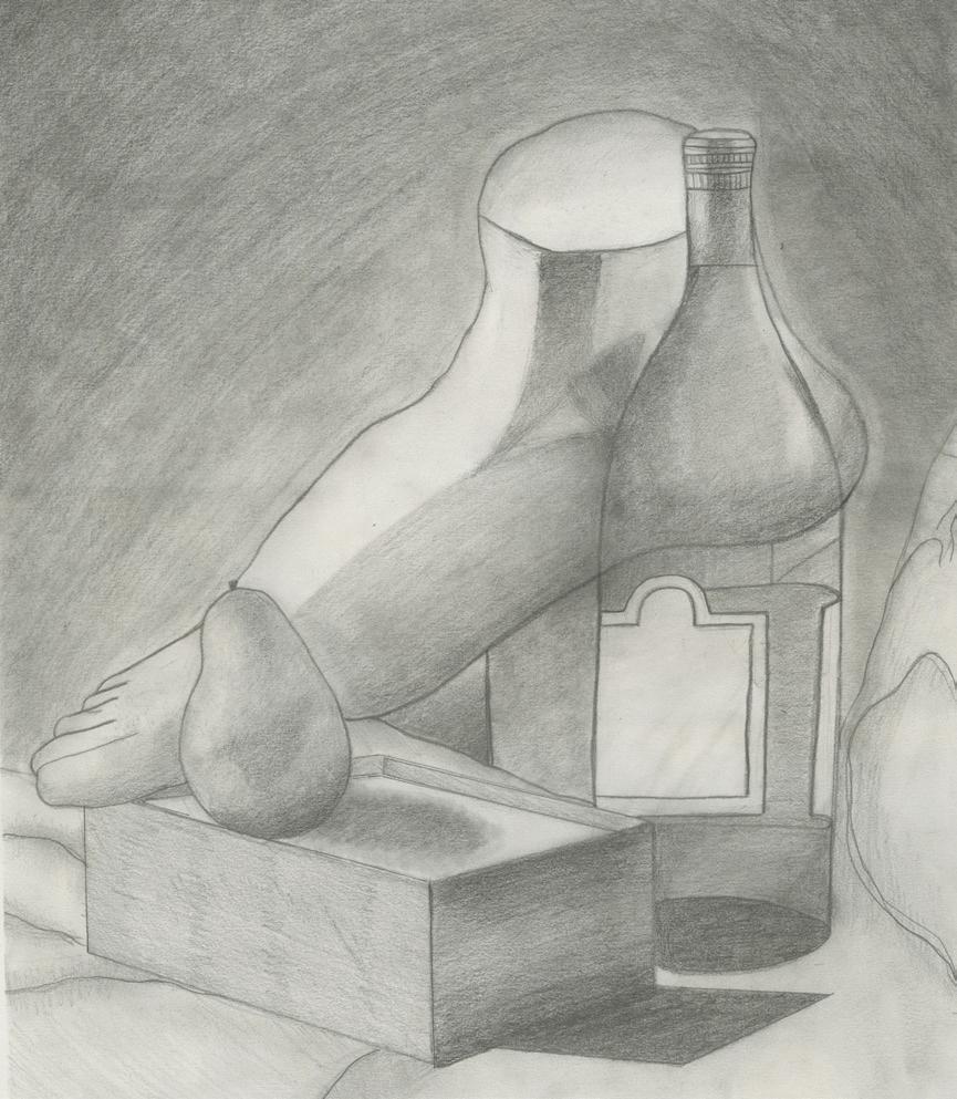
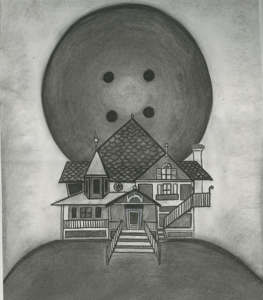
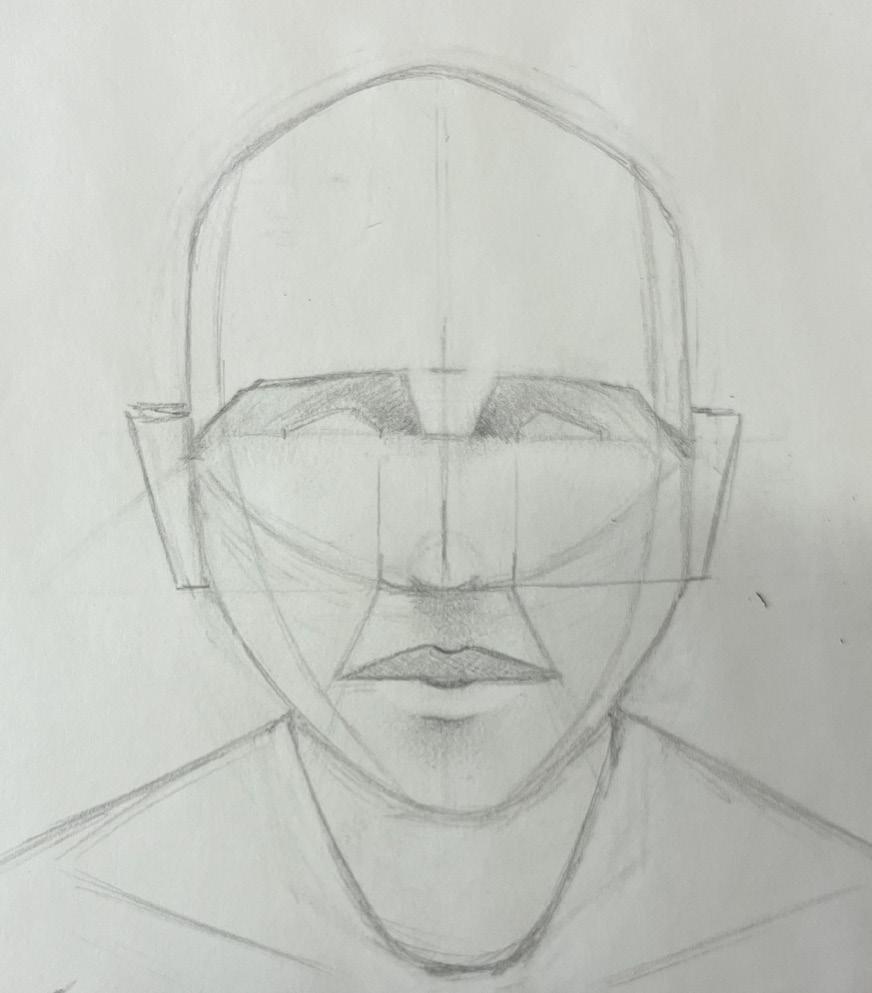
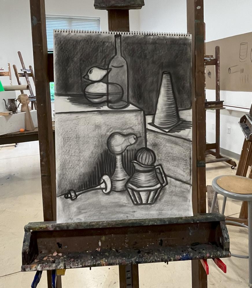
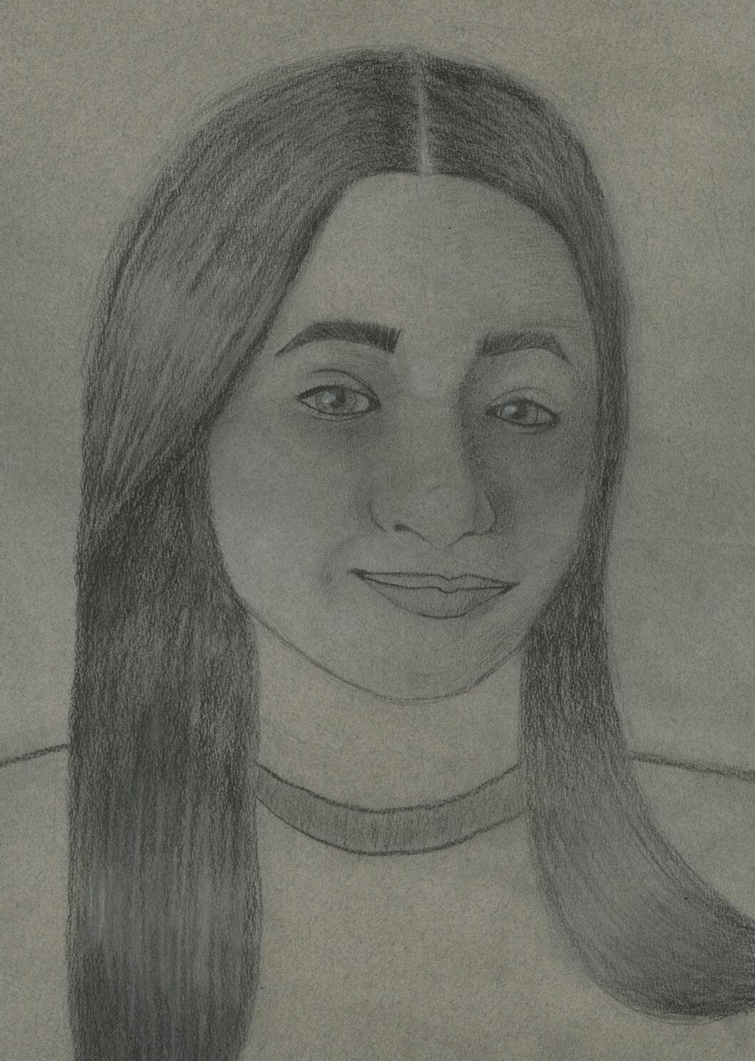
This page is dedicated to some of my favorite pieces I’ve made so far in my two years here at SNC as a art/graphic design major. My first semester last year for art was one of the best art experiences I’ve ever had. I had the chance to take a Basic Drawing class with Professor Carpenter and it truly was one of the best classes I’ve ever taken. I learned so much in that first semester alone about how to draw and how proportions and attention to detail really help elevate a piece. I learned about depth, dimension, shading, contours, and much more. My favorite piece would have to be the first charcoal drawings we did in-class because I fell in love with charcoal back a few years prior but hadn’t had a chance to pick it back up again. It was challenging to commit with charcoal because although it isn’t necessarily permanent, it does affect your piece if you mess up. I like to think that charcoal is more forgiving than other medias and that’s why I like it. Some of the other pieces I am proud of are the Coraline House, a rough sketch of how to proportionally draw a face, and my end of the semester self-portrait. This was my first time doing a full self portrait of myself and it was extremely challenging at first. Thankfully, Professor Carpenter helped me revise my work and I was way happier with the results. This portrait is the closest drawing I have of myself and I wish I committed more to the charcoal to add more dimension. If it weren’t for the help and the seminar he gave before we started the portraits, I feel my piece would look completely different and not be as successful as this one turned out to be.
Are you called to creative work? If so, how do you recognize that calling? If not, to what do you feel called?
After taking this class, I strongly believe that I am called to creative work for similar reasons I stated in my introduction. I have had a huge passion and love for all things art and I feel I would strive best in a creative environment and occupation. Some of the many career paths that interest me and are art related are digital marketing, work on film and television, interior design, graphic design, or even potentially owning my own store. I am very interested in all the pieces that go into these occupations and I feel I would thrive in these types of workspaces. I have both the creativity, experience, time management skills, and organizational assets that would further help me grow in that specific field.
If you were guaranteed it would support you financially, what would you want to design or make for a living?
Personally, I would love to work in the film industry as a producer, editor, costume or set designer if it were guaranteed and would financially support me. I love all things movie and television related and it been a long time dream of mine since I was a kid. I grew up acting and preforming and soon taught myself in middle school how to film and edit videos. I still desire to go into the film industry, however I understand the complications with doing so such as the financial issues, not guaranteed consistent work, strict hours, possibilities of strike, and many other factors that most don’t bother to think about. Even though it is a goal and dream of mine to do so, I’ve stuck to some other potential artistic careers that are more achievable and realistic for my lifestyle and budget.
This book was made as part of Introduction to Design at St. Norbert College in the fall of 2024. The fonts used were Playfair Display(italicized, bolded and standard). It was digitally printed and saddle stapled at the St. Norbert College Print Center.