3 minute read
Editors’ Letter + Table of Contents


Like Dorothy stepping out of her humdrum, black-and-white world and into the gleaming land of Oz, Eye on Design is leaving behind the gridded comforts of home and diving headfirst over the rainbow and under our brainwaves for issue #02, the Psych issue. Give your mind a good yogi stretch and join us. Psychedelia has a unique etymology; its rather noble, high-minded dictionary definition is the result of what linguists call an “irregular formation,” the rocky marriage, so to speak, of its two main roots: psyche, the human soul/mind/spirit + the Greek “delos,” meaning clear, manifest. Pulling back the curtain and shining a DayGlo-bright light on our deep, dark inner worlds seems like a chewy enough brief for a designer as well as for us editors. While the word itself didn’t come into mainstream parlance until the 1950s, we want to look well beyond its obvious trippy hippie connotations and more broadly at the intersection of design and mind-altering experiences of all kinds. —Perrin Drumm, founder + director
When the term “psychedelic” did c, ome into prevalence in the middle of the 20th-century, it was coined by psychologist Humphry Osmond in a letter to author Aldous Huxley, in reference to popular hallucinogenic drugs. Its meaning grew from there, becoming a way to describe a new kind of sound, style, and sensibility. It would be impossible for us to create a Psych issue without touching on the history of the designers of that period, with their fluorescent inks, oozing typography, and pattern-heavy optical illusions. But to us, embracing irregularity means uncovering some of the lesser-known design stories from that time. For instance, the “Summer of Love” wasn't so bright for everyone, so we tracked down some women designers to hear their versions of this moment in history. And, of course, the American version of psychedelic posters isn’t the only version, so we trotted around the globe to see how different countries interpreted the visual movement. There's never just one side to a story. In the spirit of expanded consciousness and shifting perspectives, the issue in your hands also represents a plurality of experiences. —Madeleine Morley, associate editor + art director
Advertisement
And not just a plurality of experiences, but a plurality of mindsets, too. We’ve long championed design stories that explore the mind: how design shapes and is shaped by the multitudinous ways in which we see the world, through the lenses of mental health, substance abuse, and so on. The Psych issue offers ample room to experiment with new takes on how certain external agents— everything from drugs to gong baths to perceptual psychology—can expand or contract the creative mind. Moving beyond the lysergic stereotypes and the tired “tuning in and dropping out” doctrines, we see how designers today are really tinkering with their brains; touching on the wider spiritual, legal, and sociological conditions around these trends. —Emily Gosling, senior editor
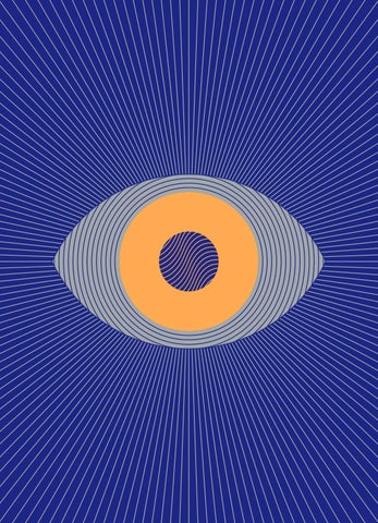
Uncovering the tensions between reality and perception has long been at the crux of what designers do. Visual tricks—or, intentionally messing around with other people’s brains— is an oft-wielded tool that we’re eager to explore. In our Sike! package we uncover the optical illusions and clever turns of shape that impact the way we perceive the world around us. From ’90s fads, to perceptual tests, to the calculated influencing of consumer behavior, exploring the theme of Sike feels appropriate and timely, well beyond its homonymous ties to its psychedelic past. —Liz Stinson, managing editor
With our new, expanded definition of what psych was, is, and could be, we began to wonder about the psychedelic design of the present moment. If the hallucinatory experiences of the ’60s were made visible through vivid, kaleidoscopic posters, and the trademark excess of the ’80s carried over into the next decade with maddening patterns and a healthy dose of optical illusion, we wanted to know: What is our equivalent now? We immediately thought of the deliriously ironic social graphics and spinning, glittering gifs that fuel our feeds— and of the group of designers who’ve honed this aesthetic and brought it to the fore while working at, of all places, a major business magazine. Hallucinatory graphics today play out online and any place with a hashtag, but they still respond to a sense of social and political turbulence with an irreverent sense of humor and savvy critique. With a little help from some psychics, we also try to peer into the future and see how our current climate might affect the design world of tomorrow. And we discover that bringing together the past, present, and future of design, all at once, is its own kind of trip. —Meg Miller, senior editor
As we do with all of our issues, we brought on a guest designer to wrangle our visions and revelations—as well as the work of our incredible contributors—into a cohesive, thoughtfully designed magazine. We chose Shira Inbar, a New York-based graphic designer, for the fluid and surreal quality of her work, her bold and striking use of color and typography, and the smart ways in which her design reveals layers of meaning. We knew she’d give us something erratic yet thoughtful, bold but clean, prismatic but still completely coherent. —Tala Safié, art director