


Welcome to the fourth edition of Adland, the magazine which explores what we can learn from the history of advertising about its present and future, taking in everything from Mascots to Mad Men, Typefaces to Television, Politics to Pandemics. It was produced by first-year students on the BA(Hons) Creative Advertising degree at Falmouth University.
Falmouth Advertising @falmouthadvertising on Instagram


Editor and Art Director Munro Black @m0b.adv on Instagram
Cover Luka Kolesnykova The Adland team Amelie Alcorn, Sissy Anderson, Amelia Belam, Munro Black, Eleri Blayney, Ellianna Braddick, Tara Brewster, Kai Brown, Koby Davies, Alice Deeks, George Denney, Issie Dexter, Gwendolen Franklin, Daisy Hawker, Abi Hinton, Hannah Hustwayte, Archie James, Courtney Jones, Luka Kolesnykova, Gracie Lawrence, Theo Martin, Ella McCa erty, Becca Mortimer, Harry Nash, Rose Perrin, Ivy Samuel, Kai Savage, Sam Shackleton, Rianna Storoszczuk, Kent Sturgis, Ed Talling, Rosie Whyte, Tilly Wilson


From ever-changing messages to three-pronged slogans, public service announcements have been hard to miss. But how should governments communicate in times of crisis? Ivy Samuel identifies some key takeaways from the UK’s response to the COVID-19 crisis


Back in the eighties, deep into the Thatcher years when rumours were spreading and panic was becoming endemic, the government of the day was facing a pandemic: HIV/AIDS, a virus that threatened death for anyone who caught it.
There are many ways to curb the spread of a virus. You’ve got the science: lockdowns, vaccines, developing treatments. And then you’ve got the communication strategy.
To tackle the rising Aids pandemic, 1987 saw the launch of one of the largest health campaigns this country has ever seen. The Don’t Die of Ignorance campaign, created by the agency TBWA, sought to raise awareness of the disease. In an article for The Guardian (2017), former designer Malcom Gaskin said: “It was like an alien plague.”
For people to protect themselves and those around them, they needed to get their facts straight. Consequently, the campaign took a deliberately dark and moody theme. The aim: scare people enough so they read the leaflets posted to every household, but so much as to cause widespread hysteria.
Prompting behaviour change is the main reason why any government bothers investing time and resources into creating a public information campaign. In the same way that commercial businesses try to persuade consumers to buy their products, governments try to persuade the public to follow their laws or advice on how to behave.
Fast forward to 2020. As the COVID-19 pandemic was beginning to take hold, we saw governments around the world using communication as a key tool in their arsenal.
Now, four years later, it’s important we look back at some of the British Government’s communication choices and reflect on those that worked and those that weren’t so effective.
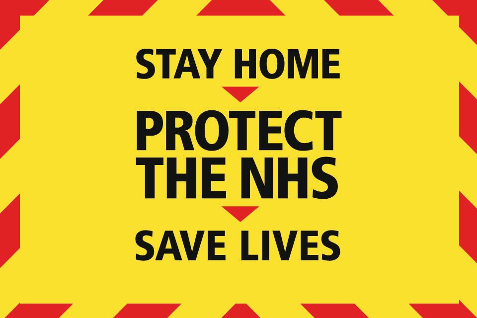
On March 23, 2020, with the country gathered around TV screens, Prime Minister Boris Johnson
gave a widely anticipated announcement. The nation was entering lockdown. Johnson ended with the line: “Stay at home, protect our NHS, and save lives.” This became the main slogan used in the early days of the pandemic.
The Stay at Home, Save Lives campaign, as it was later shortened to, took a multifaceted approach. The adverts were featured on radio, digital, print and outof-home, all centred around the same message. It was a campaign that people were responsive to, according to the Cabinet Office, achieving an awareness rate of 92%.
Weiss and Tschirhart (1994) highlight the importance of delivering a trustworthy message that people are able to grasp: “Campaigns should deliver messages that are clear, credible, and easy to understand.” Regardless of how interested the public are in the issue, if it’s not communicated correctly its essence will be lost in translation. This became evident with the change in messaging that came later on.
As restrictions were beginning to ease and people were no longer required to stay at home, the previous government line was no longer relevant. So, a fresh slogan, “Stay alert, control the virus, save lives”, was
‘By trying to communicate nuanced changes to the rules succincinctly through the use of a line very similar to its predecessor, the government soon realised ‘Stay alert’ just didn’t have the same impact as ‘Stay at home’
rolled out. And with it came a barrage of confusion. Sixty-five per cent of the public were either “not very clear” or “not clear at all” on the government’s message, according to a YouGov poll.
By trying to communicate nuanced changes to the rules succinctly through the use of a line very similar to its predecessor, the government soon realised that “Stay alert” just didn’t have the same impact as the former “Stay at home”.
Despite the shift in message, a similar level of simplicity was expected from the public. People are willing to do the right thing but it’s up to governments to communicate in a way that is both digestible and easy to understand.
After a summer of “eating out to help out” and the virus beginning to feel further away, the country unfortunately saw a new wave in the pandemic. By September, shortly after the introduction of the

“rule of six”, where the public could only gather in groups of up to six, we were greeted with the launch of the Hands Face Space campaign created for the government by agency MullenLowe London.
In the TV advert we see people telling us why they wash their hands, why they wear a face covering and why they make space. It emphasised the importance of doing what you could to protect the ones around you, using a technique known as “triggering norms”.
Weiss and Tschirhart say that triggering norms is when a campaign aims to link individual behaviour to much wider social repercussions. It’s a strategy used by numerous public information campaigns around the world and has been a successful way to instigate behaviour change.
The Hands Face Space campaign attempted to make the pandemic, a global problem, feel personal. By mentioning family, friends and even co-workers, it allowed members of the public to visualise the potential impact their choices could have on those they care about, making it more likely it was something they would adhere to. As Weiss and Tschirhart put it: “Triggering norms can work as a strategy of influence, however, only if the norm that is evoked is powerful for the target audience and successfully connected with the target beliefs or behaviour.”
However, the slogan which accompanied the campaign was less effective. Despite the hashtag receiving a large amount of traction across social media, an Independent Sage report (2020) found that generally people viewed the messaging as vague. If you didn’t see the TV ad or the print campaign, the words
‘People were uncomfortable with this campaign as it felt like the government was using blatant guilt-tripping techniques to strongarm the public into changing their ways
“hands face space” in isolation, though memorable, simply had little meaning so wouldn’t lead to the desired changes in behaviour.
When we thought the pandemic might be behind us, and as 2020 came to a close, we found ourselves in another lockdown and saw the return of the familiar “Stay at home, protect the NHS, save lives” message but this time under the guise of a new campaign.
The Look Them in the Eyes initiative, also created by MullenLowe and released in January 2021, sought to adopt a whole new tone. This far more emotionally-charged approach included a video with real footage from Basingstoke and North Hampshire Hospital, featuring staff and patients. It aimed to confront people with the reality of their choices and forced them to take personal responsibility with the line: “Look them in the eyes and tell them you are doing all you can to stop the spread of COVID-19.”
It took making the pandemic “feel personal” to a whole new level. Journalists such as Rachel Cuncliffe in The New Statesman argued that it was in fact the government who should be taking the responsibility for failures in the pandemic and not ordinary people. This argument was reinforced by the Downing Street parties exposed later in the year.
People were uncomfortable with this campaign as it felt like the government was using blatant guilttripping techniques to strongarm the public into changing their ways. Though the use of emotion can be helpful in allowing a message to cut through, too much and a government seems desperate. This risks losing the public - an outcome you don’t want in the middle of a pandemic.

Whether the enemy is Aids, the Coronavirus or another health threat, effective public information campaigns are imperative. During a crisis, such as a worldwide pandemic, where people are filled with fear and misinformation spreads faster than the virus itself, the public looks to those in charge to inform the choices they make.
Guidance needs to be clear, messaging must feel personal, and above all trust is paramount. From Dominic Cummings’ eye-test at Barnard Castle to ‘partygate’, a lot of what dented the government’s own progress during the recent pandemic were
contradictions of its own making. If people don’t believe what they are being told is important, then why would they choose to obey?
As we look to the future, with all that we faced in the throes of COVID-19 now behind us, it might seem as though we’re out of the woods. But the risk of a new large-scale crisis that future governments will have to face is very real.
So, with this comes the hope that whoever is next can learn from what has come before and put together a communication strategy capable of steering the public in a crisis.
The Second World War was a transformative event in history, and it greatly impacted how advertising is today. Prior to the war, advertising relied heavily on newspapers and magazines. However, with the war on the horizon, the entire advertising landscape changed. The world saw a new form of advertising that used propaganda to appeal to emotions rather than being fact-based. As we continue to develop modern-day advertising, we can look back to the pre-war era, the use of propaganda, and product advertising from the wars to learn how effective advertisements should appeal to audiences. This article will delve into these aspects of WWII advertising, examining how they are still relevant to modern advertising.
Before the war, print media was the primary method of advertising, and ads were typically text-heavy with little imagery. According to The Outlook newspaper from the early 20th century: “Ads should be written so that they will appear to be news items rather than advertising.” Advertisements were meant to blend in with the news rather than stand out.
Advertising was focused on presenting the unique selling proposition (USP) of a product to consumers, rather than using attention-grabbing tactics. Advertisements were not seen how they are today, as a form of entertainment or art, but principally as a way to convey information about a product or service to the consumer.
During World War II, advertising played a key role in the UK’s propaganda efforts. Adverts were used as a tool to rally support, boost morale, and promote a sense of unity and purpose among the people of Britain. Campaigns encouraged the purchase of war bonds and emphasised the importance of rationing and conservation. The Lord Kitchener Wants You campaign, for example, urged people to sign up for the war and was a notorious recruitment tactic. As the war progressed, advertising became increasingly sophisticated and targeted.
Among its many challenges, World War II required innovative solutions to keep spirits high and the economy afloat, including the development of many advertising techniques that we still use today, writes Abi Hinton
Government propaganda also involved the use of cartoons, such as Pip, Squeak and Wilfred, which featured anthropomorphic animals who served as symbols of British fortitude and unity. The characters appeared in various forms of media, including comic strips, toys, and even in advertising for products such as cigarettes and chocolate. This was the start
Some key takeaways from propaganda advertising would be the use of fear and repetition. Fear can be seen in campaigns on health or political issues
of more sophisticated targeted advertising. What’s more, for the first time in advertising history, radio and television were used extensively. In the USA, as Cynthia Meyers wrote in A Word from our Sponsor: “The advertising industry and commercial radio became closely associated with the federal war effort. Despite the war economy, both industries grew and thrived.”
Some key takeaways from propaganda advertising would be the use of fear and repetition. Fear can be seen in campaigns that are trying to raise awareness for certain diseases or political issues such as the
posters by Cancer Research UK which explain how to stop early signs of the disease.
Repetition is used a lot in modern-day advertising to help drill in the brand’s message, like when NIKE released their Just Do It campaign in 1988 which was made by the Wieden+Kennedy agency. The slogan was plastered onto every advert they created and was so successful it is still being used over 30 years later.
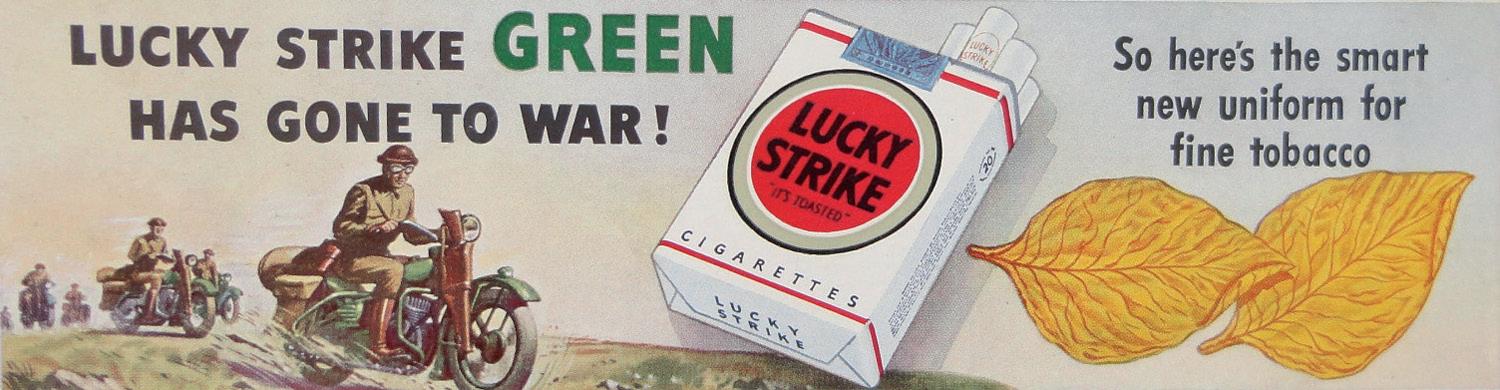
According to a report published by the American Cancer Society, during World War II the tobacco industry spent approximately $130 million on advertising. This included adverts in newspapers and magazines, as well as posters and other formats made to be sent overseas.
One of the most iconic cigarette advertising campaigns of the war was for the brand Lucky Strike. The brand was heavily marketed to soldiers, with slogans such as “Lucky Strike Green has gone to war”. These ads emphasised the idea that smoking was a way for soldiers to relax and relieve stress and that Lucky Strike was the best brand for the job. In modern times, promoting smoking is heavily restricted but the legacy of cigarette advertising during World War II has become a reminder of the power that advertising holds in influencing our attitudes and behaviours. Moreover, it can teach us how the ever-changing supply and demand of products can impact the production of campaigns and marketing as a whole.
After the war, the supply and demand changed dramatically as factories had been mass-producing military supplies and other war-related products for over four years. Now, there was a surplus of these items. Manufacturers had to think of a new way to entice domestic buyers into purchasing more products so they teamed up with psychology experts to gain some key insights.
They found that subconscious decisions were more effective than conscious ones and from Maslow’s Hierarchy of Needs, they realised that humans have a large need for feeling respected and confident. This was a key turning point in the history of advertising as these experts realised they needed to switch to more visual and emotion-based selling.
People have since researched into colour theory and further into human psychology which is why you
see so many examples of emotion-based marketing in modern-day advertising. An example of this is an advert for Apple’s iMac in 1998 with the slogan “Chic not geek”, drilling into people’s subconscious that you would be cool if you owned their product, further exploiting that innate human need to be accepted.
So the Second World War created a huge shift in the way adverts are created. From propaganda to using psychological strategies, we can still apply all of these techniques to adverts and campaigns today. The power of marketing and advertising to shape public opinion and behaviour is still as important today as it was during World War II. Just because there isn’t a world war happening right now doesn’t mean fear tactics and propaganda don’t exist. Advertising would not be the way it is today if it
wasn’t for all those companies stepping up and trying to engage the public into doing their bit for their countries.
In the years that followed the war, advertisers adopted many of these techniques and shifted their focus from promoting products to promoting brands. The rise of technology has further changed the way that advertisers reach consumers, with new tools such as social media, virtual reality, and artificial intelligence transforming the advertising landscape.
As we look to the future, it is clear that advertising will continue to evolve and adapt to new technologies and consumer behaviours. However, the lessons learned from the propaganda campaigns of WWII will continue to inform and inspire the world of advertising for years to come.
‘
Just because there isn’t a world war happening right now doesn’t mean fear tactics and propaganda don’t exist. Advertising would not be the way it is today if it wasn’t for all those companies stepping up and trying to engage the public
The tobacco advertisement industry was one of the largest sectors in the 20th century. But then governments began to put public health before private profit. Kent Sturgis reflects on the rise and fall of the cigarette giants
During the tobacco industry’s long reign, there were many concerning ways that they promoted their products to the masses. In the 1940s, it was not uncommon to find the words “Just what the doctor ordered” plastered across a packet of cigarettes. Companies would hire doctors and dentists to recommend their products to reduce the major health concerns that surrounded the use of tobacco.
“More doctors smoke Camels” was a slogan used by Camel Tobacco to mislead the population and steer them towards smoking, and to show that cigarettes were, if anything, good for them.
This radical method of promoting a product with negative side effects was built on in the late ’50s and ’60s with celebrity endorsement. Tobacco advertisements appeared regularly in television and at the cinema, with celebrities fronting their campaigns
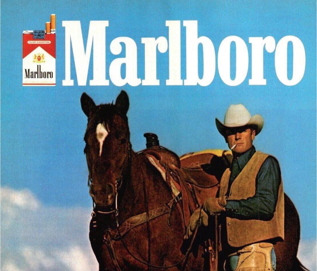
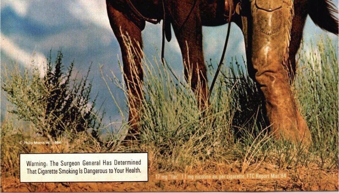
to recommend their products to fans. This period gave birth to icons like the Marlboro Man, a rugged cowboy from Texas depicted on horseback covered in dust, smoking a Marlboro cigarette. Although unconventional for the farmer lifestyle (which was in favour of chewing tobacco) he arguably became one of the most successful campaign characters in history, selling the ‘spirit of the cowboy’ to the American nation, along with many many packets of fags.
Within a year of the Marlboro Man’s debut, the company went from holding only one per cent market share to being the fourth bestselling brand of tobacco in the USA, with sales today of over $23 billion. Before the icon was created, the company’s product was seen as feminine and considered a ‘woman’s cigarette’. It wasn’t until the introduction of the macho cowboy in the 60’s that the brand underwent a “sex change”, according to Stanford studies. Part of Marlboro’s campaign was to convince the male audience that filtered tobacco was no less masculine. Part of Marlboro’s campaign was to convince the male audience that filtered tobacco was no less masculine.
Within a year of the Marlboro Man’s debut, the company went from holding only 1% market share to being the fourth bestselling brand of tobacco
This clearly demonstrates how one campaign can completely rebrand a company in the eyes of the public.
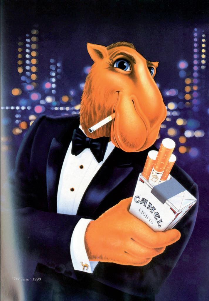
This use of celebrities in advertisements was followed by a more daring strategy, with kid-friendly characters littering the tobacco ads. In the 1990s cartoon characters were introduced such as Joe the Camel. This was a character created by R.J. Reynolds, the second-largest US cigarette manufacturer. First stepping into the world of icons in December 1991, his introduction caused the Camel brand market amongst teens to grow from 0.5 per cent to a staggering 33 per cent within three years. His cool style with leather jackets, motorbikes and attention from females was enough to dazzle the young audience and bring him to stardom.
Questions had always been raised around the ethics and legality of the advertisement and promotion of tobacco-based products, due to the health risks
and influence many advertisements had on children. Towards the end of the 20th century cigarette brands in the UK found themselves working against increasingly strict advertising restrictions.
Some of the earliest government-implemented legislation came in 1965 in the form of the Television Act which restricted the advertisement of cigarettes on television. Other laws around this period restricted people from being shown in tobacco advertisements as it could suggest enjoyment, and healthy environments couldn’t be implied.
However, this did not see the end of all cigarette advertisements. Benson & Hedges created a series of surrealist billboard adverts inspired by painter René Magritte. The campaign was utterly random; the

images individually were nonsense. They were just aesthetic pictures with a pack of Benson & Hedges cigarettes situated in the frame, meaning the ASA couldn’t reject the advert. It was in this campaign that the iconic pyramid advert was born. It was so successful that a cinema ad was commissioned, which was just as bizarre. It was known as ‘The Swimming Pool’. Again, the advert had no real story or logic,

consisting of rattlesnakes, helicopters, a swimming pool and an oversized pack of cigarettes with a canopener. The elements, although confusing, worked together and were attention-grabbing and memorable.
The visual campaign shot in the Arizona heat was wonderful and is frequently hailed as being one of the most revolutionary and inspired campaigns that have ever been produced. The creatives behind it had been forced to change their strategy and thinking, and from this adversity emerged some memorable and effective ideas.
Further limits were imposed on the advertisement of tobacco in 1990. The Broadcasting Act was passed which restricted the advertisement of loose tobacco on TV and all tobacco products on the radio. This heavily affected the advertisement markets, as in the prior year the tobacco industry had spent $4.6 billion on advertisement, or more than $12.6 million a day. It was this legislation that saw the end of icons such as Joe the Camel. However, this did not herald the end of all cigarette advertisements. Some of the
most recognisable and iconic adverts were created during this period of heavy restrictions and political arguments. Many ad agencies began to explore the surrealist style pioneered by Benson & Hedges. One of the most recognisable of these was done by Saatchi and Saatchi for Silk Cut. The campaign was as simple. It featured ‘silk’ that had been ‘cut’. The campaign not only mirrored the brand’s name but attracted the target audience using expensive and sophisticated silk material. The striking and innovative series of ads was so successful that even now the shade of purple they used for the material is still associated with the Silk Cut brand.
The advertisement of tobacco was unarguably still very effective up to the very end of the 20th century. However, by 2009 it had almost disappeared completely, after a new onslaught from lawmakers. The first was the Tobacco Advertisement and Promotion Act of 2002. This finally banned the press and billboard advertisement of all tobacco products, as well as direct marketing.
However, there were always going to be loopholes. Tobacco companies had a strong hold on the sponsorships of many televised sporting events to subconsciously associate their products with healthy and active lifestyles. Companies used sports like Formula 1 to connect with the glamour the sport thrived on and its drivers. Tobacco advertisement in Formula 1 races dates back to 1968 when Gold Leaf cigarettes became the first ever sponsor of a team in F1, sponsoring team Lotus and decorating their cars in red white and gold, the colours of the tobacco brand.
Tobacco brands were seen on almost every car racing in F1 with teams profiting from the sponsorship of a tobacco company. Marlboro proudly sponsored McLaren for over 20 yearsfrom 1980. This loophole was shut in 2005 with a second Tobacco Advertising and Promotion Act banning sponsorship in all sporting events. As expected, tobacco companies did their best to bypass the law. Marlboro logos were still used on Ferrari cars in races outside Europe, for example.
However, these attempts were short-lived. The relationship between many F1 teams and tobacco companies has surprisingly not been destroyed despite Marlboro still paying $100 million per year for the sponsorship of Ferrari cars. In countries that still allow advertisement images on tobacco packets it is not uncommon to find a Ferrari Formula 1 car situated beneath the name Marlboro.
Mass media cigarette advertising is undoubtedly a thing of the past in many countries, including the UK. However, the innovation and creativity that was put into this sector of advertising do not need to go to waste as much can be learnt about the adverts made in the face of strict legislation and implemented in other sectors. It is even possible that one day, anti-smoking ads will be created by health organisations globally that may use inspiration from adverts like the B&H Swimming Pool or Silk Cuts campaigns. In addition, other sectors may soon have to adapt their own selling strategies in the face of fresh restrictions.
Products like sugar and vapes with high health risks are likely to be affected and may have to turn to more surreal or bizarre ways of advertising. Campaigns that promote gambling will most likely be targeted by legislation to prevent the promotion of gambling to a younger audience, like that of tobacco in the 1980s.
The tobacco industry was not the first to work under large legal restrictions and most definitely won’t be the last. But currently, it is the most famous, and has created some of the most memorable adverts in creative advertising history.


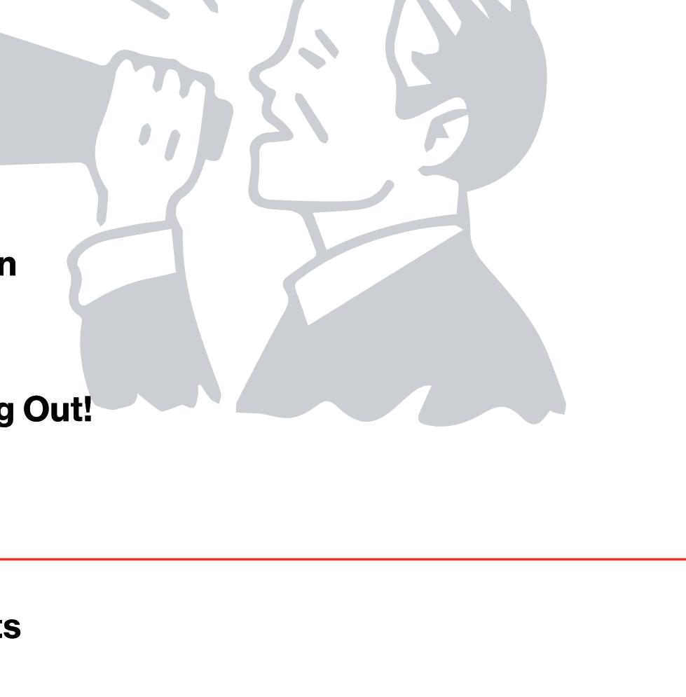
Some of the biggest and best adverts aren’t trying to sell you car insurance or promote a chilled carbonated beverage. They’re altering human behaviour and raising awareness of issues. But what do governments and advertisers have in common? Ed Talling offers some answers (overleaf...)
In the UK, HM government dominated the top ten of UK advertisers in 2020 after splurging £164m in its ad department, surpassing Unilever and Sky in the process (Glenday, 2021). But why does the government advertise at all?
The government has different aims from regular advertisers: it wants to initiate positive behaviour, reduce negative behaviour, encourage law-abiding behaviour or recruit for tough service jobs (Lannon, 2008).
At first glance you may think these targets are simple but altering human behaviour and societal beliefs is very tricky. “The public service challenge is often one of creating new behaviours rather than displacing a brand one normally buys… changing habits requires a strategy that confronts, and challenges entrenched attitudes.”
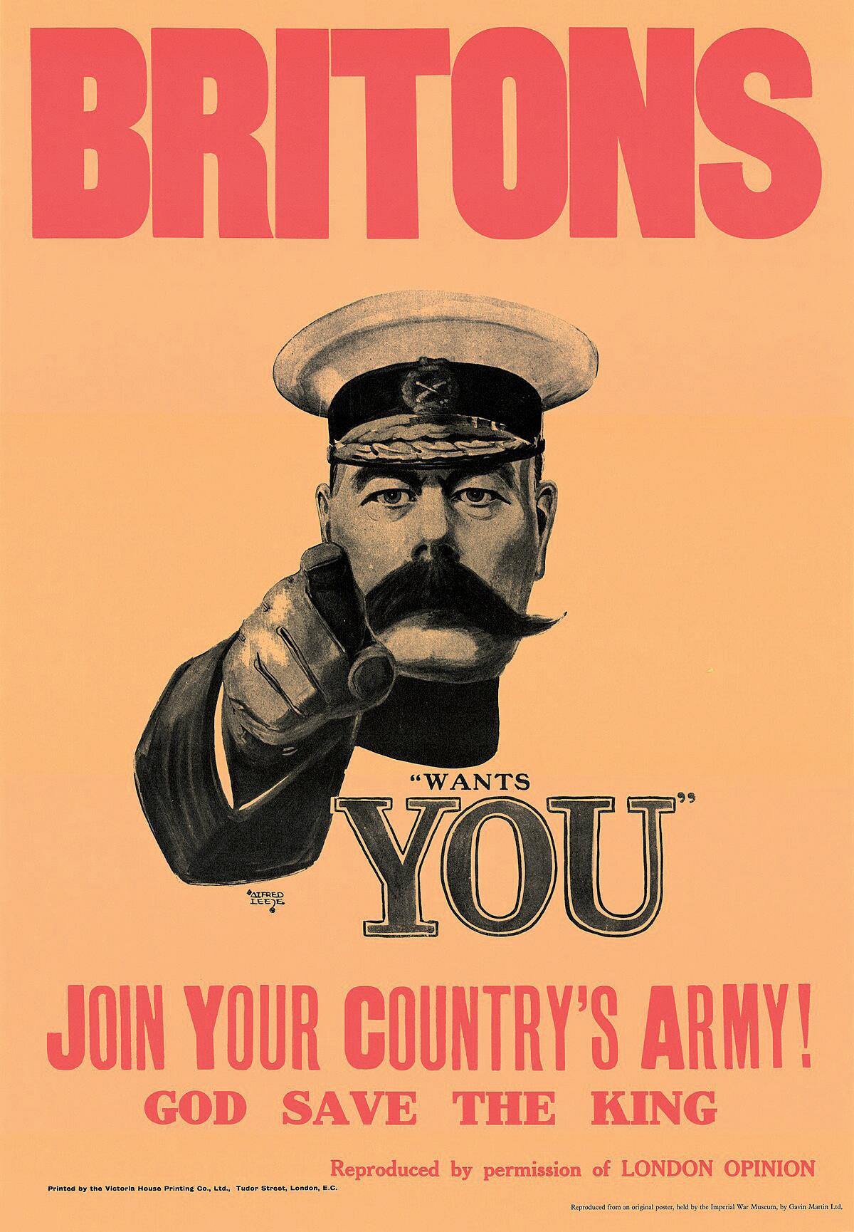
‘Their direct, plain and colloquial style made the posters easy to understand and instantly recognisable, aiding their effectiveness in recruiting men to fight for Britain
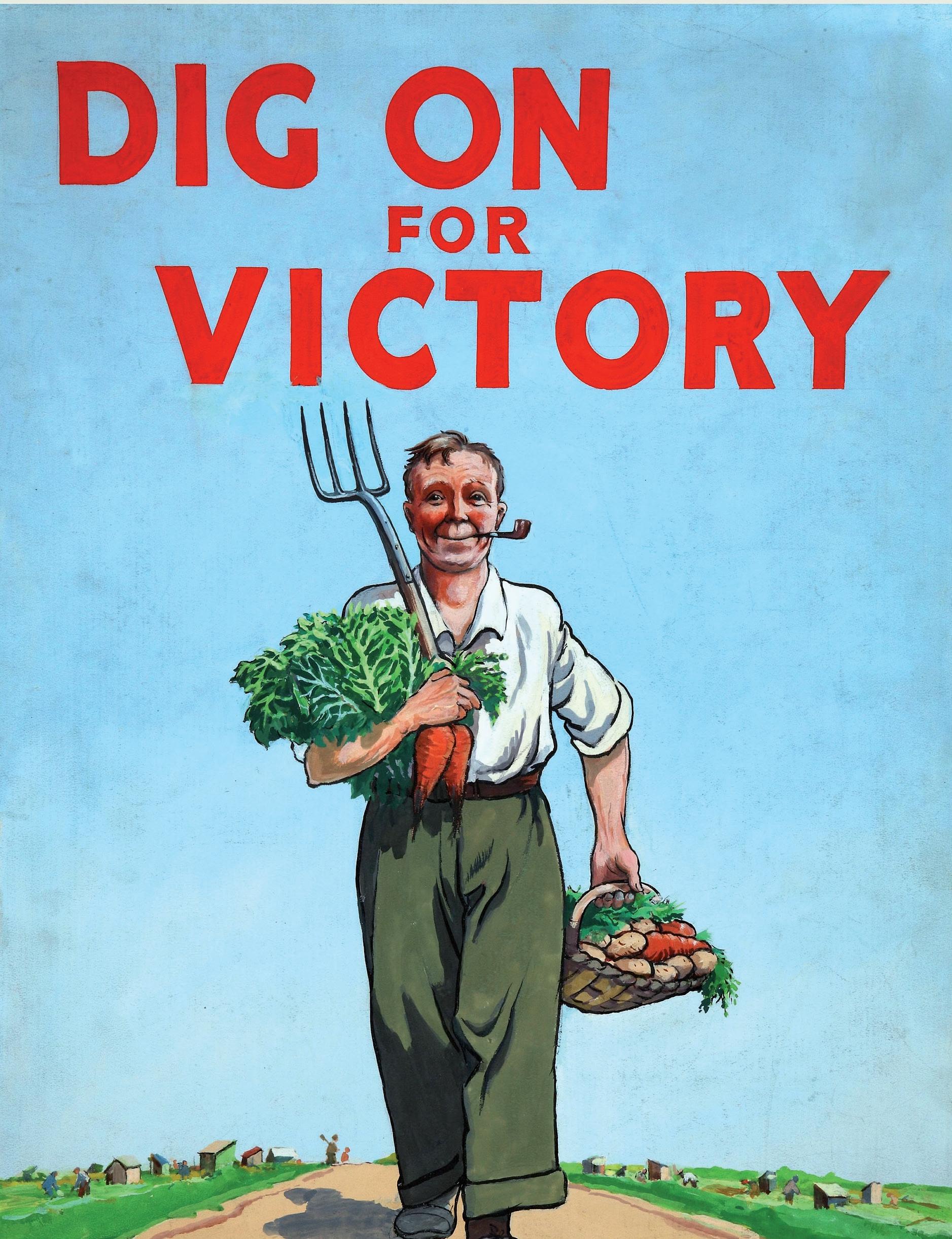
Despite the tragedy of World War One, it paved a new way for governments to speak to the public. Led by the Minister of War, Lord Kitchener, the Wants You posters were produced from 1914, and became a significant recruitment technique for the nation’s army. It depicted Lord Kitchener pointing out to the reader, calling on men to “join your country’s army” in bold, sans serif type; guilt tripping the reader into taking action for the good of the country. Other campaigns during wartime Britain included ‘Dig for Victory’ which encouraged civilians to grow their own fruit and vegetables due to food rationing and ‘Careless Talk Costs Lives’ which warned people to be mindful of not talking too freely as the enemy may be listening. Their direct, plain, and colloquial style made the posters easy to understand and instantly recognisable, aiding their effectiveness in recruiting men to fight for Britain.
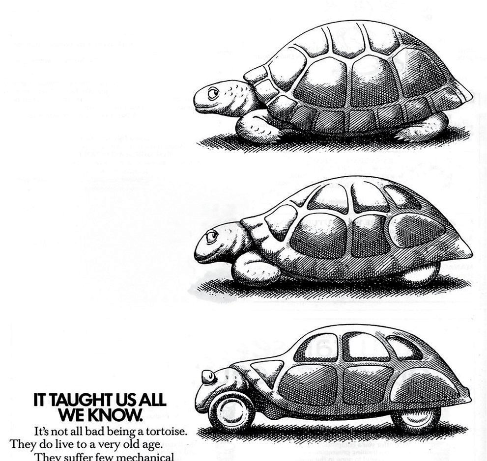
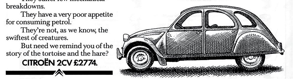
These techniques matter in advertising as sometimes simplicity is the key to a successful campaign, evident in Citroën’s posters for the 2CV. Citroën subverted typical features of car adverts, instead of selling the amazing new features and luxury touches. Its advert series admitted how the 2CV is small, slow and has very few creature comforts such as not having cruise control, remote-control door mirrors, a rev counter or cigarette lighter. But these didn’t matter to the average consumer. Instead, they focused on the points that really mattered such as easy manoeuvrability, superb reliability and all-round visibility - as well as the low price. These simple yet sophisticated adverts helped aid the production of 5,114,969 units between 1949 and 1990 (Stellantis, 2023).
Moving through the 20th century we saw a growth in the topics covered by governments, becoming more varied in their messaging and increasing the scope of target audiences. Road safety adverts are a good example. These often featured more shocking graphic images such as people flying through car windscreens covered in blood as a result of not wearing their seatbelt or hitting a child due to the effects of alcohol on people’s driving abilities.
In 2014, Northern Ireland’s Department of Environment produced an advert which showed a car losing control on the road, flying through a wall, and rolling over a group of young schoolchildren, killing them instantly. This advert was banned from
appearing pre-watershed as many complaints were raised over its gruesome and vile imagery. This and many other adverts would have stood out to the audience, as up until then, many road safety adverts were aimed towards children to be safe and caution when on or near roads, evident in the Tufty the Squirrel which was conceived by Elsie Mills MBE in 1953 to introduce road safety message you kids (ROSPA, 2024). These new but occasionally graphic ways of showing the very real impacts of unsafe driving may have been more impactful as the viewer can see what could happen to them, from injury to death of themselves or others. These somewhat emotionally-challenging campaigns show how there is sometimes a need for more intensive forms of advertising.
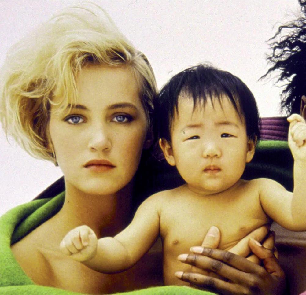
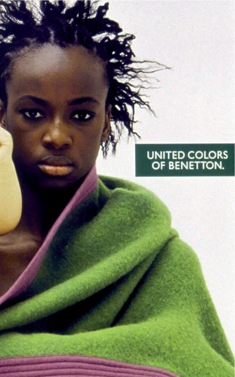
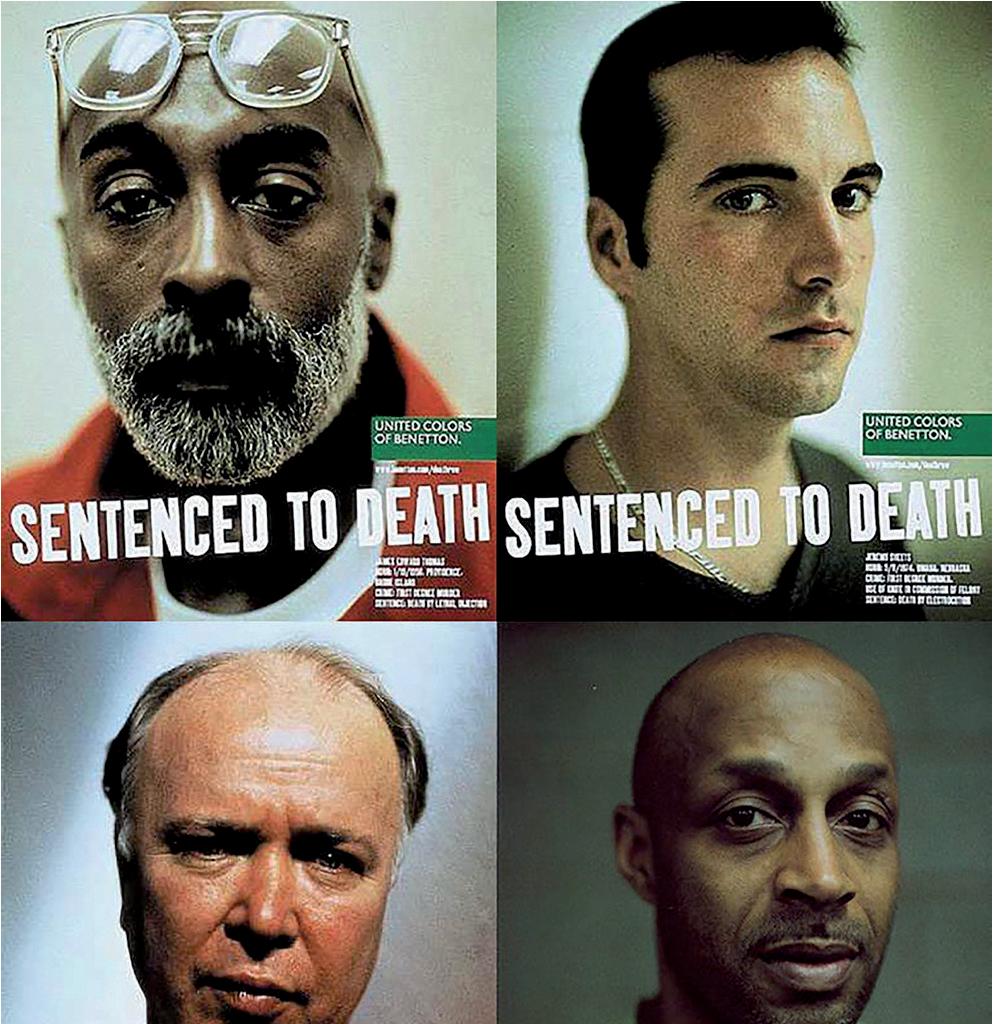
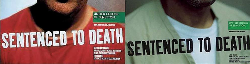
Benetton, a global fashion brand, could have picked up on this; but may not have succeeded with the
execution quite as well as the government did, evident in its ‘United by Colours’ campaign during the 1990s. These contained controversial images to essentially increase profit. Featured were an interracial, homosexual family; an AIDS patient on his death bed; multicoloured condoms; an army uniform covered in blood, world leaders kissing and death row inmates (Eilidh Nuala Duffy, 2017). All these images relate to a topical news story or societal beliefs, when emotions surrounding such subjects would be very sensitive and raw. Many of these adverts received major backlash and negative comments. Nonetheless, the campaigns were impactful, gaining traction and using shock tactics will have impacts for the audience, whether for good reasons or bad.
Governments need to be very aware of who they are targeting when developing a new campaign; if done wrong it can result in a lack of interest from the
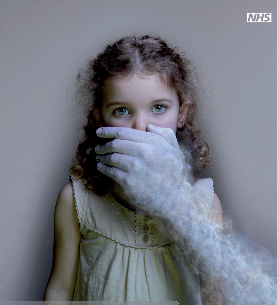
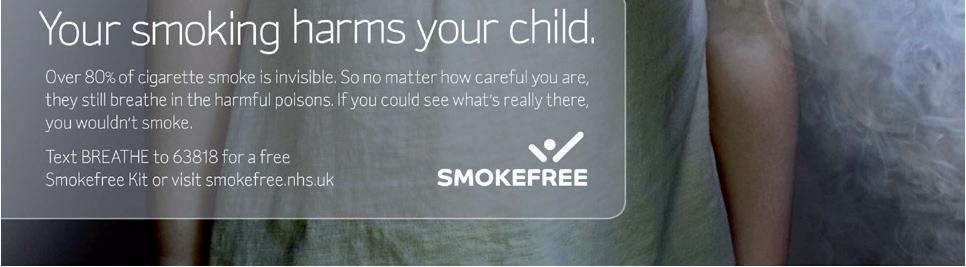
viewer and reduce the effectiveness of the message. Having a clear audience in mind is apparent in the Smokefree campaigns regarding tobacco. These adverts highlight the dangers that smoking has for your health but also others around you. The obvious target audience are smokers, which is fairly broad as many people of all demographics smoke, but often the audience is narrowed down even further, as seen in the UK Health Security Agency advert from 2013, targeting smoking parents who have young children.
This highlighted how much of the smoke from cigarettes is invisible, and no matter how safe you try to be, your children will still be impacted by your smoking. The aim was to encourage parents to be more careful when smoking near their children or give up smoking entirely as they wouldn’t want to do anything that could cause harm to their children. For context, cigarette and tobacco advertising in the UK was seriously restricted in 1965 and banned in the press, on billboards and via direct marketing in 2003. Tobacco companies were banned from sponsoring Formula 1 teams and sporting events in 2006 and the sale of cigarettes from vending machines and the adverts appearing on them was prohibited in 2011 (Ash, 2019). After decades of smoking-related adverts, the government needed to identify the exact audience to target.
Marmite also has a very distinctive audience in mind, which gave birth to their slogan: “You either loveit or hate it.” Much of their advertising targets people that fear or dislike their product. The Marmite Neglect advert plays on how some people may buy the product but never use it as they end up hating it and banishing it to the back of the cupboard. By contrasting the distinct divide between the lovers and haters of Marmite, it highlights how they are very aware of their audience, whether it be for good reasons or bad, but also has helped generate a memelike culture surrounding their product.
We can see how, over the past 100 years, the government has altered its techniques to convey different messages to various audiences. This may be due to changing trends, different demographics, or maybe people just aren’t listening to regular adverts
and creatives need to produce something new and impactful. Simplicity, new communication strategies and audience awareness are all key parts of advertising but can carry huge risk factors when used by the government; if an advert fails in its aims it can lead to an incredible disconnect to its population.
“Advertising is the art of convincing people to spend money they don’t have for something they don’t need,” according to Will Rogers, cited in Advertising and Society by Carol Pardun. Advertisers can learn a great deal from how the government uses their advertising resources and techniques to help deliver impactful and meaningful adverts with depth as seen with Citroën, Benneton, and Marmite.
‘We can see how the government has altered its techniques to convey different messages to various audiences. This may be due to changing trends, different demographics, or maybe people just aren’t listening to regular adverts
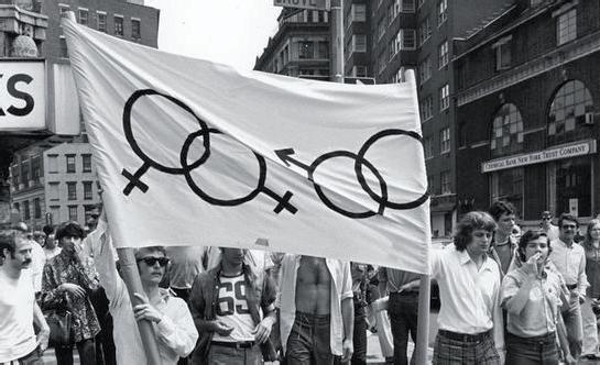
Being gay was not legalised until the 1960s (Burston, 2017). For centuries, queer people have found subtle ways of sharing their identities without catching the attention of an unaccepting society (Fanucci, 2023). Due to this, many ads showcasing queer identities were coded. Advertising has been one of the main communication tools throughout history and could be subtly used to communicate with minorities, like LGBTQ+ people. Looking back at certain ads, it’s clear that they were winking at queer people. It was a lovely form of secret activism that was not obvious to the heterosexual eye.
For example, the All-American Man (Fast Company, 2023) was an ultra-masculine man stereotyped in most early 1900s advertisements. You know him: he’s preppy, broad-chested and plays golf. He was created by gay illustrator and advertising genius J.C. Leyendecker. Leyendecker painted the figure to sell everything from cigarettes to socks to underwear to razors. He was a household name that held the standard for the modern-day man and brought homoeroticism to the masses. His works featured a lot of men glancing at each other, usually in intimate conversation or exchanging lustfully charged looks. Sometimes, the figures were holding sexually suggestive items like golf clubs or canes. One of Leyendecker’s popular works that showcases this is the And it floats! campaign for P&G (99-44/100% Pure… It Floats, 1882), mostly featuring men bathing with homoerotic connotations in its copy and imagery.
The first endeavours corporations made to attract queer consumers followed the 1969 Stonewall uprising and the first Pride march in 1970. These events shifted the visibility of LGBTQ+ people and the nascent stages of the modern gay rights movement. However, catering to queer customers still posed a risk in the early 1980s as LGBTQ+ individuals were highly discriminated against due to the AIDS epidemic. Even though there was a shortage of insights into LGBTQ+ people’s tastes and spending habits, there were a few advertising trailblazers that successfully targeted queer consumers and help catalyze the confirmation of their existence in society.
Due to LGBTQ+ individuals’ presence in bars and nightclubs, alcohol companies were one of the first to target queer consumers.
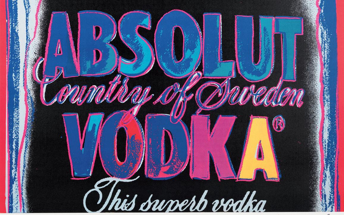
Absolut Vodka’s creative Michael Roux committed as early as 1981 to court gay and lesbian consumers, believing they were trendsetters (The New York Times, 2019). Keeping a close eye on the community has bred a lot of inspiration for Absolut; creating their famous ad with Andy Warhol, a wellknown queer artist who skyrocketed Absolut’s’ image (Absolut Warhol, 1988).
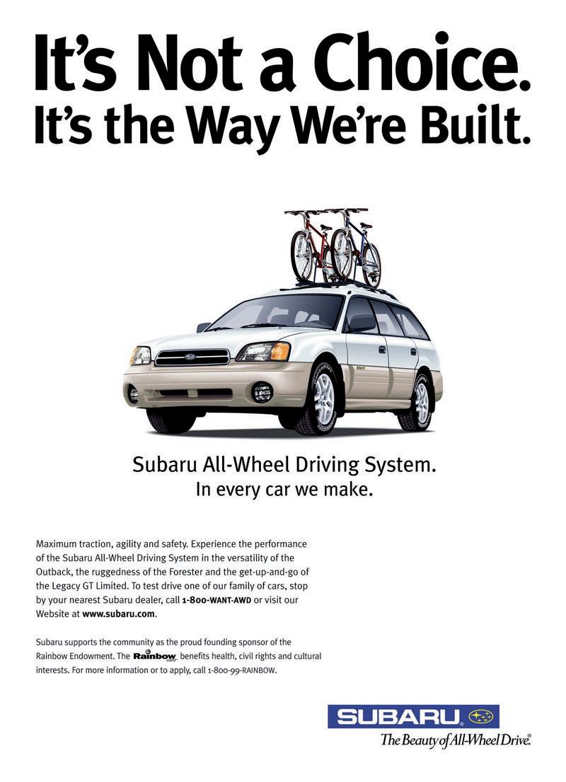
“Gay vague” is a term that describes the desire to target queer consumers while avoiding public blowback. A series of print ads by the Japanese car company Subaru illustrates this well. It leaned into its queer customer base after research showed that
The first ad to showcase a queer couple resulted in a bomb threat. Today, inclusive ads have gone from revolutionary to middle-of-the-road and back to controversial again.
Amelia Belam dives into the history of LGBTQ+ ads
lesbians were their ideal target audience. Lesbians liked Subaru’s dependability and size, and were four times more likely than the average consumer to buy a Subaru (Priceonomics, 2016). Their mid-90s vaguely gay ads consisted of taglines with double meanings such as “Get Out. And Stay Out” which could refer to
either exploring the outdoors in a Subaru - or coming out as gay.
Another typical “gay vague” commercial was from Volkswagen. It aired around the same time as the coming-out episode of the TV show Ellen in 1997, a pivotal gay moment. The ad featured two men
driving in a neighbourhood and salvaging a discarded armchair. Volkswagen didn’t intend the ad to depict a gay couple but Michael Wilke, founder of AdRespect, said that “they didn’t mind if people read it that way”, adding: “That was a real switch for advertisers.”
The first openly gay ad was IKEA’s 1994 Dining Room Table, a TV commercial made by the Deutsch Inc. advertising agency. It aired on local television stations in NYC, Philadelphia and Washington DC at night. The ad centres around Steve and Mitch, a gay couple in search of a dining room table. It cuts between the couple searching the IKEA store, joking about each other’s taste and sharing some anecdotal moments of their relationship. It’s sweet and comical, and they feel like an authentic couple.
Companies began to go after the market as research on queer populations and their spending grew
The ad was subject to a significant backlash. It caused protests by conservative and Catholic groups expressing their outrage. Some IKEA stores on the west coast of the USA had their phone lines inundated by protesters expressing their anger at the announcement. The most intense reaction was a bomb threat which caused an IKEA store in Hicksville, NY, to have to evacuate its staff and customers.
Fast forward to the late 1990s and LGBTQ+ individuals were gaining more rights. Companies began to go after the market as research on queer populations and their spending grew. Political events such as President Bill Clinton declaring June as “Gay and Lesbian Pride Month” in 1999, the corporate Equality Index (policies to create a safer workplace for LGBTQ+) in 2002 and Massachusetts becoming the first to legalise same-sex marriage in 2003, aided a new era of queer marketing.
Corporations such as Nike, Boeing and Microsoft expressed their approval for same-sex marriage and Pride celebrations began attracting sponsorships. Due to this, LGBTQ+ representation began showing up; for example, an ad in 2013 for Amazon’s
Kindle Paperwhite, was among the first to use the word“husband” rather than “boyfriend” about a gay couple.
In recent years Pride sponsorships and queer representation have risen significantly. Through a combination of the changing political climate, a rise of social media and a new generation responding well to diverse and inclusive marketing, it’s no surprise corporations loudly signal their support of queer communities during Pride month.
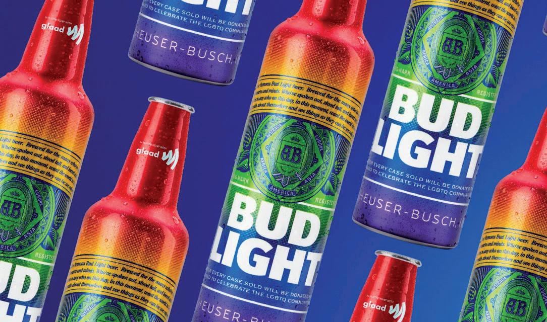
However, not all marketing moves for LGBTQ+ people have gone smoothly. A recent partnership between Bud Light and trans influencer Dylan Mulvaney catapulted the trans community towards a lot of hate. The sponsored Instagram video involved Mulvaney showing off the beer cans to commemorate a year of her transition to womanhood. Conservative consumers were outraged and reacted by dumping cans of Bud Light, calling for a boycott.
This sparked controversy but nonetheless, great PR and attention for Bud Light. It left Mulvaney in immense danger. She said: “The Bud Light ad had opened her up to more bullying and transphobia than she’d ever experienced” (The Washington Post, 2023). Bud Light made no effort to protect the influencer and has yet to reach out to her, despite all the abuse that has been caused as a result of the sponsorship.
Looking at the past, we can see advertising’s impact on our culture and power of belief.
For many years, the queer community was ignored by society and therefore by ads. Nowadays, companies use queer identities to promote themselves.
Advertising should and has been used to give voices to those who are misunderstood and underrepresented. When representing the queer community, quality representation, good intention and collaboration with the queer community is necessary. The queer identity being represented should be just as important as the corperation or product being promoted.
We should learn from queer advertising history and understand how advertising can be used as a form of activism. But when done poorly, it can perpetuate negative public views of minority groups, in this case, LGBTQ+ people.


The pursuit of profit can lead to a disregard for ethics, honesty and safety. From false claims to bad campaigns, scandals have eroded public trust. Amelie Alcorn uncovers....

First on my list, one of the earlier scandals in advertising dating back to the late 1920s, when Lucky Strike cigarettes were marketed as a means to achieve thinness for women. Its highly successful campaign featured the catchy slogan “Reach for a Lucky instead of a Sweet,”positioning cigarettes as a healthier alternative to sweets. The irony, right?
This promotion of unhealthy behaviour not only dealt a blow to the sweet industry but also, as highlighted by Stanford research on Tobacco Advertising, “preyed on female insecurities about weight and diet”. This led to a wave of marketing campaigns specifically targeted at women. These used mainstream beauty and fashion standards to entice women to present smoking as a feminine activity.
The impact of this campaign was significant, with sales of Lucky Strikes soaring by over 300 per cent in the first year, establishing it as the top cigarette brand nationwide.
However, the campaign later faced deserved scrutiny from health advocates and government officials and was eventually derailed by the threat of litigation from the sweet industry. Ultimately, Lucky Strike dropped it, but not before it attracted both loyal customers and fervent critics.
But the exploitation of women and their insecurities ceretainly doesn’t end at cigarette campaigns. Take Wonderbra’s famous Hello Boys advert, the 1994 billboard that reportedly stopped traffic. The ad features a Czech model, Eva Herzigova, dressed only in Wonderbra underwear, gazing down at her assets and remarking “Hello Boys!” Is she addressing her bust or any male onlookers? Of course, the copy was intended to be equivocal, but if the rumour is to be believed then the billboards proved to be so distracting to male motorists that the ad caused many traffic accidents. However, this wasn’t the only controversy attached to the brand. Wonderbra has been dogging accusations of sexism for years with the creative
Bodies as
...or how women have been objectified by adverts for everything from cigarettes to bras 1
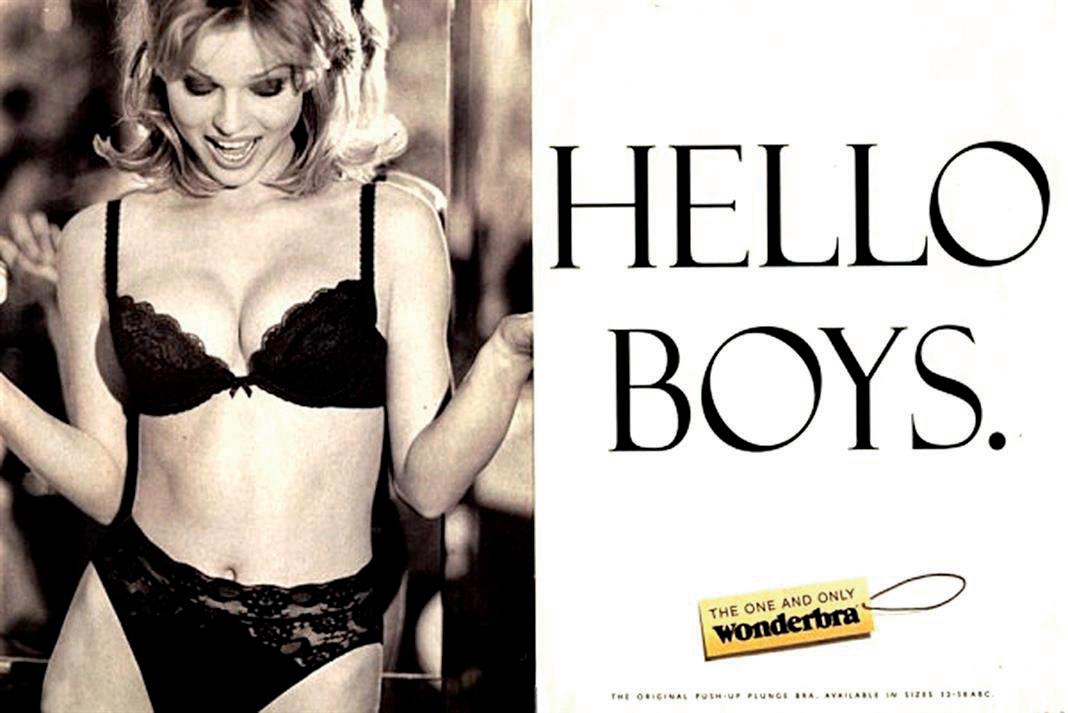
teams behind the campaigns being predominantly male. But why should women’s underwear be advertised so that it appeals to men?
As of today, Wonderbra continues to generate controversy. The previous slogan has been replaced with “Hello me!”, a caption aimed at promoting female self-empowerment. However, feminists argue that the campaign is simply a case of “same nonsense, different era”. Julie Bindel, co-founder of the legal reform group Justice for Women, strongly criticized the company, stating that women in this era will not be deceived into considering the posters as empowering.
She remarked, “We are being fed the guff that the new slogan is less about appealing to sleazy men and more about targeting ‘empowered, liberated women’. If you ask me, [this] is the same nonsense, different era”. Despite ongoing efforts to address these issues, the advertising industry continues to grapple with deep-rooted problems of sexism and objectification. Carl’s Jr.’s highly sexualized burger advertisements, promoting their “all-natural” beef burgers, serve as a prominent example. Linsey Davis, a vocal advocate for Diversity and Inclusion, has rightly highlighted the fact that in one of their commercials, featuring a model dressed in revealing attire, it takes a significant 28 seconds out of a 42-second video to realize that it is, in fact, an advertisement for a fast-food company. Adweek editor Lisa Granatstein openly acknowledged in an interview with ABC News’ Good Morning America that these ads intentionally target men, disregarding potential controversies and emphasizing that more controversy ends up benefitting them.
Consistently reducing women to mere objects of desire or eye candy perpetuates harmful gender stereotypes, which ultimately contribute to gender inequality and discrimination. It is disheartening that even in 2023, we must still call out these offensive and outdated tactics. One can only hope that these brands will learn from their past mistakes and genuinely embrace a more inclusive and respectful approach in the future.
...or how Pepsi proved we still don’t learn from the past
...or when advertising goes seriously wrong
Issues of diversity and representation have plagued the industry for decades. While these scandals have gained more attention in recent years, the presence of stereotypical and discriminatory ads has a long history.
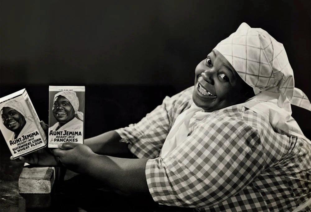
Take Aunt Jemima, an American breakfast brand for pancake mix in the late 1800s that depicted a Black woman in a subservient “mammy figure” role. Similarly, Uncle Ben’s Rice, owned by Mars Inc, featured a racist “happy black cook” figurehead. Even toothpaste ads in the 1950s portrayed a Black man who, after using the product, magically lightened his skin and gained acceptance from white people. This was uncannily similar to the more recent Dove advert which depicted a black woman turning into a white woman after supposedly using its body lotion. Dove’s marketing team should have known better and apologised swiftly. Nevertheless, these few examples highlight the persistence of harmful stereotypes and discriminatory practices in advertising.
As Kristen Rogers, an Associate Writer for CNN Health pointed out, there is a subtle and insidious form of racist stereotyping that can be challenging to identify. Even celebrities with significant social influence have, without supposedly realising, taken part in this discrimination. The 2017 Pepsi ad featuring Kendall Jenner exemplifies this. It depicted Jenner leaving a photoshoot to join a protest where activists from
Lesson No1
The cornerstone of effective advertising lies in understanding your audience. Countless brands have faced failures due to a fundamental lack of comprehension regarding the individuals they sought to captivate. To leave a lasting impression, marketers must immerse themselves in the complexity of their target market, peering into the depths of their interests, values and needs.
diverse ethnic backgrounds carried signs of peace and love. As Rogers observed, the scene reminded viewers of past instances of excessive force and violence against activists during protests. However, the ad took a problematic turn when Jenner handed a can of Pepsi to a police officer as a peace offering, seemingly resolving the tension.
Critics took to social media to express their disapproval. Entertainment Weekly labelled the ad “tone-deaf,” accusing the company of attempting to exploit a political movement for commercial gain. On platforms like Twitter, numerous users voiced their concern and disgust, highlighting how the ad trivialized real-life protests in which lives were lost while fighting for genuine causes, one user commented “the worst thing about that Pepsi ad, beyond the blatant disrespect and disregard, is the amount of people who greenlit that advertisement”. Many individuals expressed their disdain for Pepsi positioning itself as a solution to deep-rooted social problems, finding such a portrayal distasteful and inappropriate. Kendall Jenner publicly apologised, expressing regret for her involvement.
Despite the lessons learned from the past century, it is disheartening to witness the repetition of these mistakes in the 21st. The harm caused by such ads cannot be overlooked, and it is crucial to acknowledge and rectify the negative impact they have on marginalized communities.
Lesson No2
Adherence to the ever-evolving tapestry of cultural and societal norms is paramount. The consequences of offending or alienating consumers are dire, spelling swift relegation to the archives of irrelevance. Staying attuned to current trends and remaining with the zeitgeist is essential for maintaining a firm foothold in the limelight.
Lesson No3
Honesty serves as the bedrock of an enduring advertising campaign. The perils of disseminating misleading or deceptive ads cannot be overstated. Such practices can erode credibility and tarnish the hard-earned reputation of brands. Embracing transparency and integrity safeguards the coveted position within the advertising realm.
One of the highest-profile scandals in recent years revolved around Facebook and Cambridge Analytica. In 2018, it came to light that the political consulting firm had surreptitiously obtained raw data from million Facebook users worldwide, without their consent.
The data had been collected through a quiz app developed by Cambridge researcher Aleksandr Kogan who then sold it to Cambridge Analytica. This data included users’ personal information, such as names, locations, likes, and even the data of users’ friends.
The repercussions were far-reaching, as the harvested info was exploited to influence major political events such as the 2016 US presidential elections and the Brexit referendum. Facebook CEO Mark Zuckerberg vowed to make sure it would never happen again.
The failure to safeguard users’ information resulted in a $5 billion fine imposed by the US Federal Trade Commission. It sparked widespread calls for stringent regulation of the tech industry and ignited a broader debate on the ethical use of personal data in advertising and marketing.
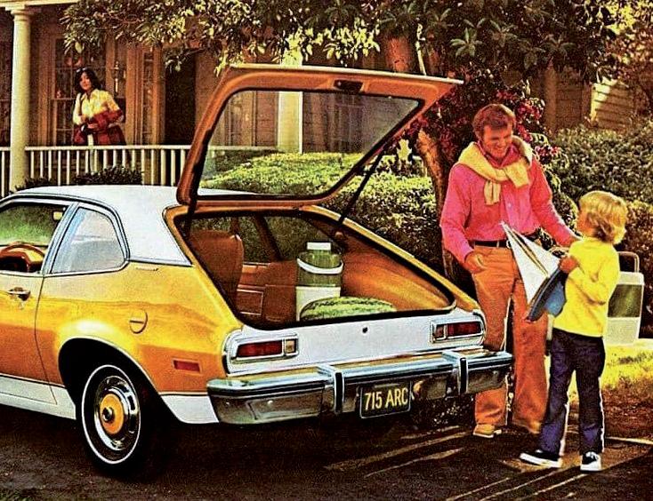
In the realm of corporate wrongdoing, one particular incident stands as a stark reminder of the dire consequences when ethics take a backseat. The Ford Motor Company disaster unfolded in the 1970s, with the introduction of the Pinto (pictured) , a cheap and compact car that was marketed as “The Little Carefree Car”. However, behind the enticing advertisements lay some grim facts. Rushed into production, the car was a ‘death trap’ and Ford knew it, but deliberate decisions not to modify the design were made to protect corporate profits.
Tragically, the defective design resulted in the loss of 27 lives including a 13-year-old. However, when the case reached the courtroom, a not-guilty verdict was delivered due to a lack of concrete evidence—a glaring miscarriage of justice.
Ford’s actions were not only cynical but also complicit in the perpetuation of an advertising campaign that concealed the grim reality. A multimillion-dollar ad spend extolled the virtues of the Pinto while disregarding the potential harm it could inflict on unsuspecting consumers. This was a
While referencing other media texts, such as movies or books, in an ad can be considered clever and creative, it might just be a lazy way of appealing to a large, unrelated market. Theo Martin dissects two high-profile examples of intertextuality in advertising
American snack brand ‘PopCorners’ aired an advert relying heavily on intertextuality at Super Bowl LVII, February 2023. The advert, Breaking Good, is a parody, based on the extremely successful AMC television show Breaking Bad (BB), featuring characters Walter White (Bryan Cranston), Jesse Pinkman (Aaron Paul) and Tuco Salamanca (Raymond Cruz). The advert spoofs BB, replacing the manufacture of methamphetamine with the creation of PopCorners snacks.
Several references to the show are made, including the iconic recreational vehicle meth lab and lines such as“Yo, these are the bomb!” and “Say their name!”, amongst others.
According to Illumin, Breaking Good was the 10th most watched ad of the 2023 Super Bowl, racking up 37,434,115 views. The 30-second slot was likely to have cost around $7 million.
It is hard to argue with the impact of such a high-profile advert from the commercial point of view, but creatively I would argue this advert uses intertextuality in a lazy way. The relationship between a meth-based drama and the snack is tenuous and irrelevant. In this advert, PopCorners is obviously trying to promote its product to the masses by aligning itself with IMDb’s third highest-rated TV show of all time
The context of the advert only emphasises the laziness of the creative strategy. Cranston and Paul’s last appearances as White and Pinkman were in one episode of the BB spin-off series Better Call Saul in August 2022, and it had been a full ten years since the final season of BB ended. So any sort of reference to the show, in any media would highly likely generate a wild amount of publicity across social media.
This shows how heavy-handed intertextuality is often a sign of a risk-averse marketing strategy. It is much safer to use a popular show with a pre-engaged audience than earn your own fans.
Instead of trying something new and original, the creative team have decided to simply spoof an already iconic programme.
However, according to Benjamin Hiorns, writing on Creativepool: “Parody ads may seem lazy on the
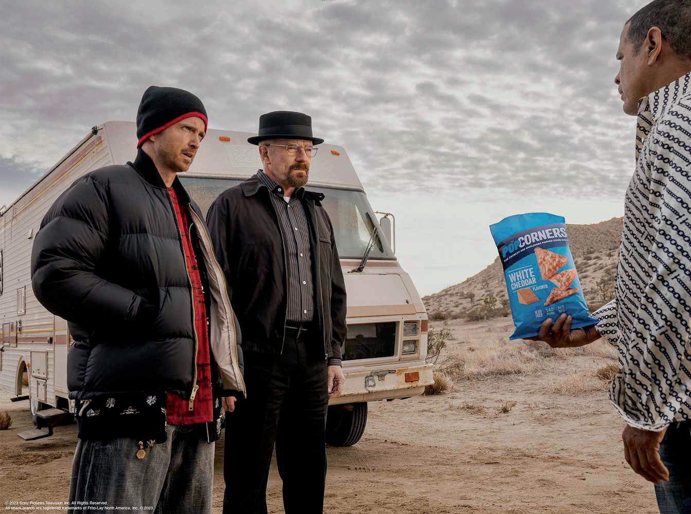
ABOVE: A still from the advert spoof of AMC drama Breaking Bad for PopCorners, 2023
surface but dig deeper and you’ll find they require a certain degree of creativity, wit, and technical proficiency.” This is a relevant point as the jokes and references in the advert do show a level of cleverness.
But the fact that BB has very little to do with crisp-like snacks far outweighs the wit of the script. Hiorns does concede in the same article: “The key to a good parody is in the depth of appreciation for the source material.”
In the PopCorners ad, the source material, BB, is being appreciated but not applied in any relevant context and, therefore, the effectiveness of the comedic writing is undermined by the mostly irrelevant product placement.
‘Heavy-handed intertextuality s often a sign of a risk-averse marketing strategy. It is much safer to use a popular show with a preengaged audience than earn your own fans
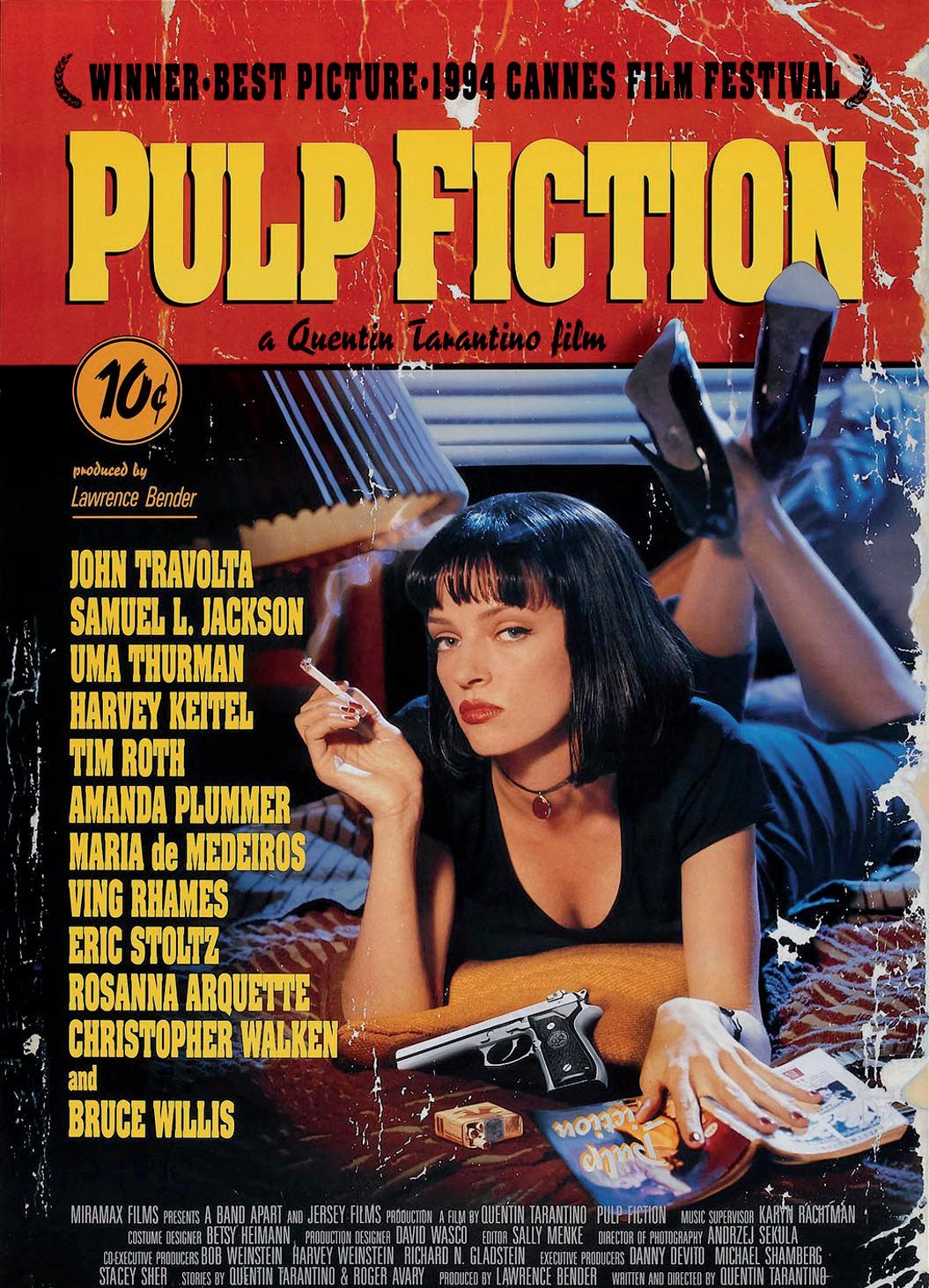
In 2015, UK-based insurance company Direct Line released a series of adverts featuring Harvey Keitel as the infamous Winston ‘the Wolf’ Wolfe, from Quentin Tarantino’s Pulp Fiction. In the film, Winston Wolfe is a gangster and ‘fixer’ who aids hitmen in cleaning up their victims’ remains after a killing. Saatchi & Saatchi, the agency behind the Direct Line adverts, took the idea of Wolfe’s role as an efficient and competent problem-solver, and compared this to Direct Line’s quick and simple service. The adverts depict the average Direct Line customer facing a stressful insurance-related problem, such as a crashed car or an electrical fire at home, with Wolfe explaining how Direct Line can help them in this situation.
The tone of these adverts differs greatly to PopCorners: Breaking Good. It is a much more creative use of intertextuality as the character of Wolfe is comparable to the benefits of investing in insurance. While PopCorners are only using the BB brand to attract new consumers, Direct Line are familiarising themselves with potential customers and offering stronger justification for the appearance of such an iconic character.
The intertextuality fits - it is an essential part of the original idea. If you were to change the name of Winston Wolfe in the Direct Line adverts, you would still have a narrative, call to action, and benefits of the service. If the recognisable characters, dialogue, settings, and narrative were removed from the PopCorners advert the only content left would be a pack shot. The Direct Line adverts are clearly more creative as the narrative and themes of the adverts are all original compared to the PopCorners’ narrative taken wholesale from BB.
Equally, the film that the characteromes from is itself an incredibly intertextual film. Pulp Fiction is rife with references to celebrities, products, music, TV shows and other films, and even Tarantino’s own films. Multitudes of fans and movie critics alike have dedicated themselves to finding each individual reference and at the time of writing they have counted a whopping 182 instances. The fact that Winston Wolfe is being used intertextually could be an (albeit rather farfetched) intertextual reference in itself.
RIGHT: Poster of Quentin Tarantino’s Pulp Fiction, 1994, which features Havey Keitel as Winston Wolfe who was adopted by Direct Line in 2015, inset
Is using intertextuality in advertising creative or lazy? In most cases, I would argue that intertextuality is still a valuable creative tool that can be employed to create meaning and single out new markets.
But deciding on appropriate media texts to refer to requires thought and skill. A weak reference can lead to audiences feeling alienated, but a strong reference can create persuasive, precisely targeted advertising. An intertextual reference becomes lazy when the referred to text has nothing to do with the product or service, and is there simply to bait fans via association with their favourite media product.

Another lazy use of intertextuality is where an advert relies too heavily on the narratives, characters, settings, and dialogue of the referenced text. Every aspect of the advert is borrowed - there is nothing original, as seen in the PopCorners advert.
There is a fine line between lazy and creative when incorporating existing work into new adverts. It is a risky strategy insfar as the reference might not ‘land’ with the intended market.
But it is also risk-averse: there is a guaranteed market for the advert, should the reference be properly executed.
Most importantly, an advert that uses intertextuality, if it aspires to be creative rather than lazy, must be able to stand without the referenced text.
The intertextuality fits - it is an essential part of the original idea. If you were to change the name of Winston Wolfe in the Direct Line adverts, you would still have a narrative, call to action, and benefits of the service
On the 20th of May, 1873, blue jeans were born. On this day, Levi Strauss and Jacob Davis obtained a US patent for putting rivets in men’s work pants for the first time. Blue jeans, as we know them today, were not produced until the 1920s. At that time, they were mainly used as work pants in the American West. It wasn’t until the 1950s that blue jeans became popular among young Americans for their style, comfort and durability. Their jeans were cool, but not sexy.
Calvin Klein changed that. It’s brand identity has been built by provocative ad campaigns that have captured audiences and sparked conversations over the years.
Klein seems to thrive on controversy. In 1980, two campaigns caused an uproar. One was The Feminist with the seemingly suggestive tagline “Nothing Comes Between Me, and My Calvins” featuring 15-year-old Brooke Shields. The other was The Teenager with Klein yet again choosing seductive wordplay: “If My Jeans Could Talk, I’d Be Ruined.”
Some TV stations banned these commercials after viewers’ complaints. Klein was not discouraged. He believed that “jeans are about sex” and continued to sell his products using this approach. “I didn’t set out thinking how to be controversial,” Klein told WWD in 1994. “With Brooke Shields years ago, I thought it was a hoot, but all these people went crazy. We need newness and excitement in fashion. That’s what it’s about - that’s what puts the fun in fashion... We’re always questioning people’s values. How much can you provoke? How much are they willing to show? Is it decent? Is it exciting? Is it valid? Is it over the top? It’s a whole process, but it’s not about trying to be controversial or trendy.”
These advertisements pushed the limits of societal norms, creating controversy and intrigue around the brand. Despite Klein’s controversial tactics, his 1995 campaign, featuring childlike models such as 17-yearold Kate Moss, sparked significant outrage and was
We’re always questioning people’s values. How much can you provoke? How much are they willing to show? Is it decent? Is it exciting? Is it valid? It’s a whole process but it’s not about trying to be controversial
By daring to be different, Calvin Klein has made jeans sexy. Issie Dexter explores Klein’s marketing journey, questioning its ethics and examining its controversial path to success
considered one of the most controversial campaigns in American history. The CK 1995 ad angered parents and child welfare authorities, as they believed it resembled child pornography. These objections led to an FBI investigation into Klein and his in-house agency, CRK, for violating child pornography laws.
Although no evidence of wrongdoing was found, Klein pulled the campaign. This started Klein’s career of generating free publicity through shock tactics. He understood that creating a small amount of the right noise could result in millions of dollars worth of free media coverage.
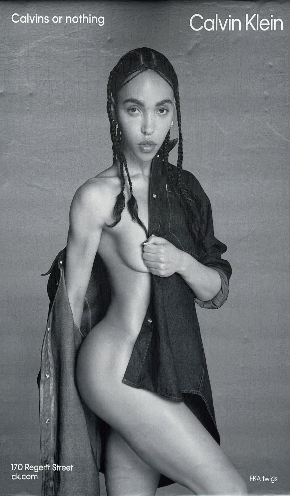
The use of celebrity sex appeal is still in CK marketing. On January 4th 2024, Calvin Klein released My Calvins or Nothing, featuring heartthrob actor Jeremy Allen White. It initially caused an online frenzy among fans. After the actor’s half-naked photos appeared on Calvin Klein’s famous billboard in the centre of New York’s SoHo area, the frenzy only became stronger. And when a video featuring a dozen doves shooting into the sky and a ripped Jeremy AllenWhite sprawled out on a couch wearing nothing but his underwear and trainers was released, the campaign became a full-blown media sensation.
It was a classic Calvin Klein move to stick the heartthrob in a pair of jeans and strip them down until little is left for the imagination. What else would we expect from a brand that built itself with alluring conversation-starting campaigns since the 80s?
Calvin Klein’s advertising campaign began with Whites ad, but it didn’t end there—of course, there was going to be something to provoke backlash…
Singer and actress FKA Twigs joined the campaign, appearing on billboards with a portion of her breast and the side of her buttocks exposed while wearing a shirt bearing the “Calvins or nothing” slogan. On January 10th, the UK’s Advertising Standards Authority (ASA) banned the advert, based on the notion that the images focused on her “physical features rather than the clothing, to the extent that it presented her as a stereotypical sexual object.”
In the original ruling, the authority deemed the ads were unlikely to offend based on objectification. However, ASA has now reversed its decision, stating that the image is “overtly sexual” and that the billboards should be banned so that those under 16
The ASA is right to be cautious about overly sexualised messaging, but we should apply the same scrutiny to ads featuring men. Banning her campaign while not taking action against his smacks of gender bias
could not see them in an “untargeted medium”.
FKA Twigs highlighted the double standards in the industry. Alongside a copy of the banned image, she wrote on social media: “I do not see the ‘stereotypical sexual object’ that they have labelled me. I see a beautiful, strong woman of colour whose incredible body has overcome more pain than you can imagine.”
You would think that in 2024 we would be more careful not to place women in awkward circumstances or treat them differently than men. Of course, we shouldn’t return to the days of advertising when women’s bodies were objectified without question. The ASA is right to be cautious about overly sexualised messaging, but we should apply the same scrutiny to ads featuring men. Banning her campaign while not taking action against White’s campaign smacks of gender bias.
Klein has still managed to ruffle the ASA’s feathers with its audacious imagery, capturing the public’s attention and raising serious conversations about the use of female bodies in advertising.
Calvin Klein effectively positioned itself as a brand that challenged conventions and captured consumers’ attention. By stoking controversy and pushing the boundaries of societal norms, it became a go-to choice for those who looked for an edgier and more provocative fashion choice, cementing the brand’s image as daring and fashion-forward.
How did the company achieve this? Klein saw an opportunity in the market. Jeans were functional, casual and youthful, but not sexy. He took this and ran with it, advertising with a seductive tone to change the narrative of what jeans could be.
However, Klein’s seductive voice wasn’t the only element contributing to his success. He used celebrity endorsements, strategically choosing popular figures in the public eye, such as Brooke Shields, Kate Moss, and Mark Wahlberg. By doing so, it could reach its target audience effectively. As most young people wanted to be these celebrities, this strategy worked well.
But the history of their campaigns should also remind us to take care when using provocative imagery and always to question the ethics of our creative choices. Are the models too young? Are you objectifying certain groups in society? Is the use of this imagery necessary to sell your product?
In conclusion, Calvin Klein’s controversial strategy has taught us that celebrity endorsement is everything, that we should be a part of cultural conversations, and that we should not be afraid to push the boundaries of social norms and take risks. There will always be an audience that wants to rebel against society’s rules. Last but not least, advertise with the tone of voice you want your product to be perceived as. For example, are you bored of jeans being sold as functional and casual? Change the narrative, make them sexy, and seduce your audience.


Becca Mortimer explores the weird and wonderful animals of insurance: geckos, ducks, bulldogs and meerkats. Why are these fun characters paired with such a dull industry and how have they left their lasting paw print in wider pop culture?
Insurance policies: tedious, complicated and boring It’s just another tick in the box you have to complete for a supposed peace of mind. Time seems to drain away as you scroll through the endless options: fees, premiums and compensations – all big words no one really understands. In the end you sign your life away to a company which apparently has the best ‘financial protection’ (whatever that means).
For a long time, the marketing was similarly dull. Corporate logos and droning voiceovers, with an undertone of fearmongering. But then this bland, and let’s be honest, somewhat intimidating subject transformed into a haven of laughs, catchy jingles and most bizarrely... a breeding ground for talking animals.
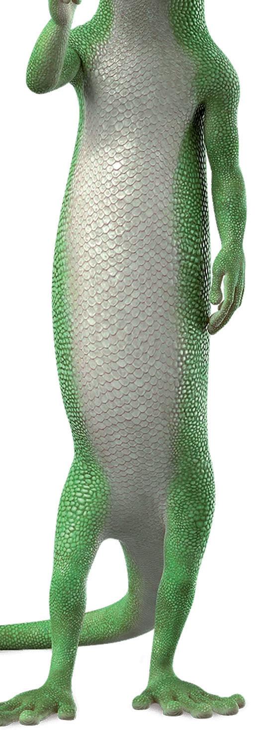
Advertisers at the Martin Agency recognised the negative relationship consumers had developed with insurance and saw a gecko-shaped gap in the market. American insurance company, GEICO, first introduced their cockney-speaking gecko mascot over 20 years ago.
The green reptile, despite his slim stature, had a huge impact, raising the business’s ranking to second in the US industry.
With GEICO’S wild success, another American insurance company, Aflac, felt added pressure to come up with an innovative campaign to win over the reptilian-loving public. Many people, including Aflac employees, struggled to remember the generic name.

The Martin Agency recognised the negative relationship consumers had developed with insurance and saw a gecko-shaped gap in the market


Repeating it again and again in the office was the only way to get it to stick in their heads. “It’s Aflac – Aflac – Aflac – Aflac – Aflac”. Someone said it sounded like a duck, and long story short, a duck mascot has been quacking the company’s name ever since.


However, the duck idea was not accepted with open wings straight away. When agency Kaplan Thaler was initially pitching the duck idea, the CEO of Aflac said: “The response was always the same: a silent stare.” But creatives knew that Aflac’s biggest issue was the easily forgettable name – and a duck seemed the obvious solution. After a lot of persuading and many studies on the duck’s memorability, they managed to convince the company management to embrace it. It proved to be worth the risk, with Aflac’s name recognition up to 67 per cent after just two years of running commercials featuring the duck.


The duck quickly became a beloved household character, and requests came flooding in for a cuddly toy version of the bird. Insurance had never seemed even remotely interesting to children, but Aflac had quacked the code. Just like insurance ads, children are pushy, repetitive and annoying; they became a constant reminder of the brand as parents across the States were being begged for the “Aflac duck plush”.
The insurance company decided early on that all proceeds from the branded stuffed animals would be donated to Aflac Cancer Centre. Within a few months, $75k had been given to the charity. My Special Aflac Duck ™ is a special robot version, which is given to children with cancer and blood disorders, free of
charge. It even includes an interactive mobile app with calming visuals and sounds.
These charitable intentions created a positive reputation and an emotional connection with its consumers. The President of Aflac commented: “Our purpose is deeply rooted in being there for our policyholders. My Special Aflac Duck stands as a tangible symbol of that dedication.”
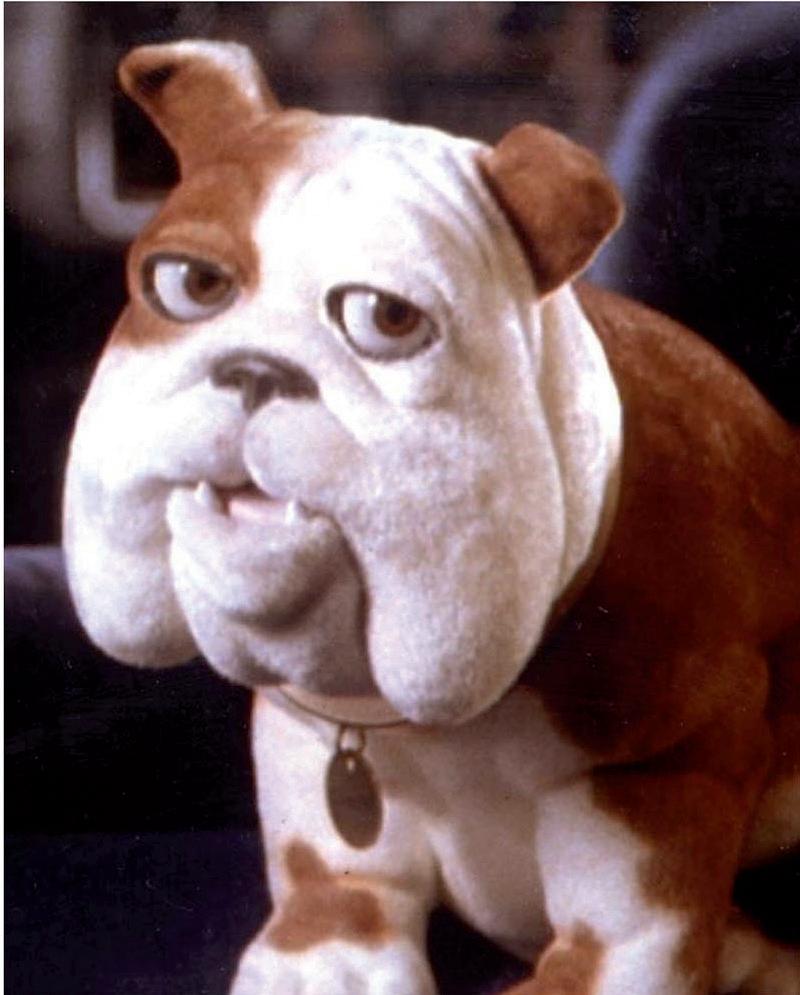
Across the pond in the UK, Churchill Insurance decided they wanted to join the animal mascot bandwagon. They adopted a bulldog, a traditional symbol of British identity. It developed into a nodding
dog called Churchie, and within a year of his ‘birth’ they began selling models of him. Voiced by famous Yorkshire comedian, Bob Mortimer, the dog’s slogan “Oh yes” became synonymous with the brand.
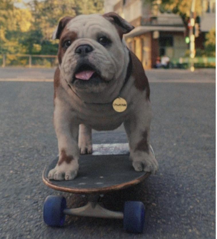
Churchill recently underwent a rebrand, by the agency Engine Creative. Creative Director Paul Jordan commented: “Brand love can slip into overfamiliarity if you’re not careful.” They decided to remove the anthropomorphic aspect of their mascot, and replaced the original with a CGI equivalent, in the hopes that they could reach a younger, contemporary audience. Despite the new campaign urging busy consumers to “Church… Chill”, people were certainly not chill about this change. Many did not approve of the modernisation of the classic branding.
The insurance company received further backlash when animal rights group PETA claimed that Churchie was boosting the popularity of flat-faced breeds. British bulldogs are more perceptible to health
issues, including breathing problems and ulcers in their skin folds. This is an example of an unintended controversy. Businesses should think carefully about what they’re representing before producing any form of advertising, especially longterm brand mascots.
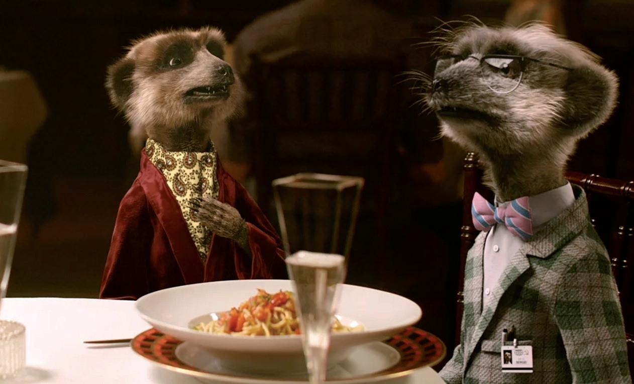
Another British insurance company with mascots is Compare the Market, who introduced their iconic meerkats in 2009. The idea was derived from the similarity in the words “Market” and “Meerkat”. Somebody presumably had to present this to the client with a straight face at some point, praying that they wouldn’t get fired for being completely ridiculous.
Their main mascot, Aleksandr Orlov, has become something of a national ad break celebrity. His aristocratic attire and Russian accent are now part of the tapestry of British pop culture. Orlov’s catchphrase “Simples” became so widespread it was added to the Oxford Dictionary, and there is now a whole family of meerkats.
Compare the Market is known for the wide range of rewards and extras included in its service, such as
‘
This is a prime example of silly excellence in advertising. What started as a very ‘simples’ concept had space to grow and develop over time, becoming a long-lasting brand identity
Meerkat Meals and Meerkat Movies offers. Much alike Aflac, it also also offers toy versions of its mascots. They have become collectables, with some fans investing in the insurance purely to get the dolls. The most ‘desirable’, special edition meerkats are now going for over £100 on eBay.
This is a prime example of silly excellence in advertising. What started as a very ‘simples’ concept had space to grow and develop over time, becoming a long-lasting brand identity. We can learn from Compare the Market’s bold and creative move that risky ideas sometimes pay off bigtime.
To conclude, the silliness of talking animal insurance mascots has taught us valuable lessons for creating memorable, long-term advertising campaigns. Stripping it back to the plain and obvious – like saying the company name again and again until something forms. A basic concept can blossom into something truly wonderful, and from there everything else falls into place.
That’s not to say it doesn’t take time to develop; becoming a national sensation does not happen overnight. You can ask Mr Aflac Duck himself. It took at least a couple of months for our feathered friend to establish himself in the audience’s hearts and minds.
What’s more, it is not easy to be an animal mascot in today’s society. Being at the forefront of a serious business comes with a lot of responsibility. Companies must be cautious to avoid scandals and being cancelled.
Insurance companies deliberately target children and younger audiences with their anthropomorphic counterparts. Their fun and playful characters stick in kids’ brains. When paired with benefits of free toys, it becomes the children who pester and remind the adult consumers to look into these services.
Oh yes! Maybe it does seem ridiculous at first but there is method behind the madness of these strange creatures of insurance advertising, and it’s all thanks to a lime green gecko from East London.
Advertisers have been using art for centuries to flog everything from schizophrenia medication to chewing gum. But is it lazy? Is it ethical? Daisy Hawker explores...
Artvertising is a term referring to the use of art as advertising to persuade potential consumers to engage with a brand. The origin of the term is unknown - it’s likely that it was a naming convention used casually and then spread by people in the marketing industry. Ranging from iconic historical fine art pieces used in ads, to art commissioned for use in adverts, to adverts from the past now seen as art, “artvertising” can be seen everywhere.
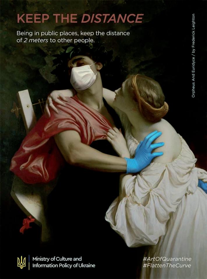
Fine art featured in print ads can make even the most monotonous work eye-catching and memorable. For example, the Ministry of Culture and Information in Ukraine created a COVID-19 informational ad featuring Frederic Leighton’s iconic painting Orpheus and Eurydice (shown right). The aim was to reinforce the concept of social distancing and the painting fits in perfectly with this as Orpheus (the person on the left) pushes away Eurydice and there is a COVID-19 mask covering his face, protecting him. The ad stands out from typical pandemic informational ads and grabs your attention.
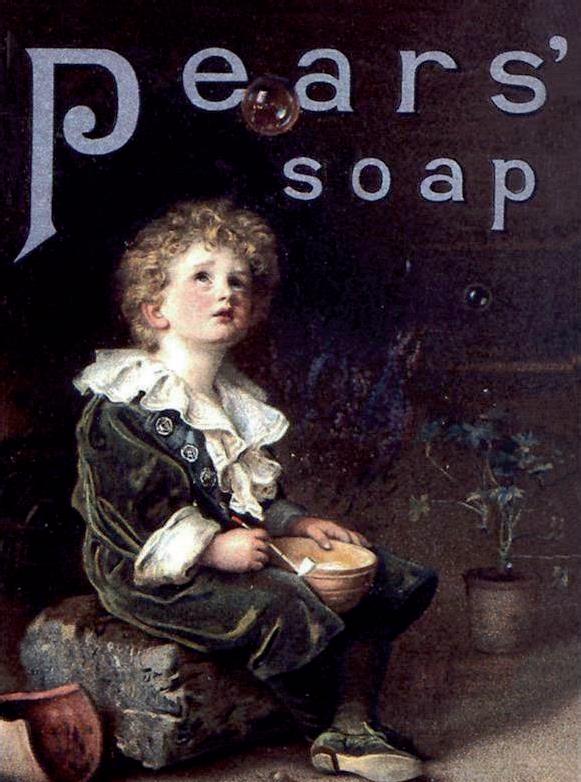
Some would argue that Pears was the pioneer of the artvertising movement. In a time when advertising wasn’t really a thing, Thomas J Barrett, the chairman of Pears, decided to use art to get the word out about Pears soap, creating an advert known as Bubbles. In his book Adland, Mark Tungate explains: “Barrett convinced the popular artist Sir John Everett Millais to sell him a painting of a young boy gazing at rising soap bubbles. Not only that, but he persuaded Millais to add a bar of Pears’ soap to the scene. Queasily sentimental, Bubbles became one of the earliest advertising icons, and set the tone for a highly successful campaign.”
The public were able to purchase prints of the ad, and they were displayed on walls in homes around the world. Bubbles has become a widely recognised, famous advertising symbol and was undoubtedly a success.
Andy Warhol, the American artist, producer and director, famously painted Campbell’s Black Bean soup cans in 1962, however this was not initially in collaboration with the food giant. In fact, the brand
considered suing Warhol until they recognised the amazing brand awareness the artwork generated. In 1964 Campbell’s sent Warhol a letter of gratitude and crates of soup, then later that year commissioned him to do a painting of their tomato soup can as a gift for its retiring board chairman.
In 1985, Campbell’s commissioned him again to create a series of paintings of their dry-mix soups, creating the iconic Chicken Noodle soup painting. As Ed Carolan, the Vice President of Campbell North America explained, Warhol’s art did more than shift cans of soup: “Campbell’s Condensed soup is [seen
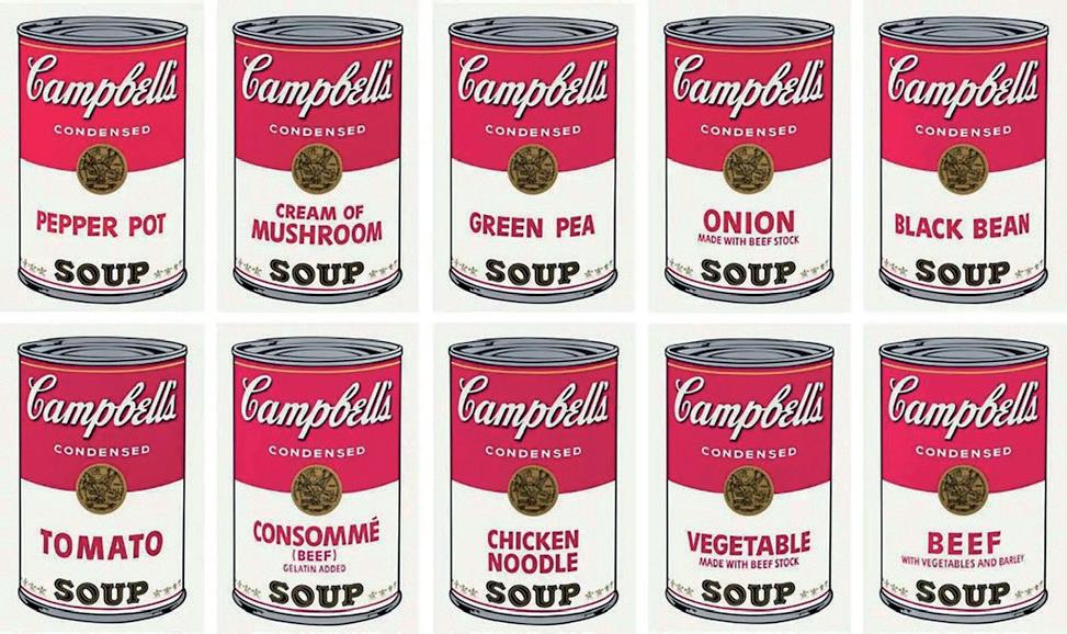
Thanks to Andy Warhhol’s inspired paintings, Campbell’s Soup will always be linked to the Pop Art movement ‘
as] an iconic brand. And thanks to Andy Warhol’s inspired paintings, Campbell’s soup will always be linked to the Pop Art movement.” Campbell’s still has a soup can painting displayed in its headquarters in New Jersey.
Another striking example of artvertising was an advert for Zeldox schizophrenia medication. It features Van Gogh’s painting Self-Portrait with Bandaged Ear displayed on a wall, with another version of the painting to the right of it, showing the artist with his ear undamaged and a smile on his face. The tagline is simply “For Schizophrenia” and there is an image of the Zeldox pill box.
The art in the ad creates dark humour, making people laugh but also getting the message across: if Zeldox had been available, Van Gogh’s art (and life) would have been significantly different. The ad was ahead of its time - it was published in 2007 yet if it was published now it would have been just as successful. The use of art in this ad is carefully considered and strategic If Van Gogh’s portrait had been replaced with any other piece of art, the ad wouldn’t have been as effective as most people know the story of Van Gogh’s schizophrenia.
However, not every example of artvertising feels as well thought-through and the use of historical pieces of fine art in advertising could have a negative impact on the piece of art itself. Henrik Hagtvedt, a marketing professor at Boston College, observed: “Art
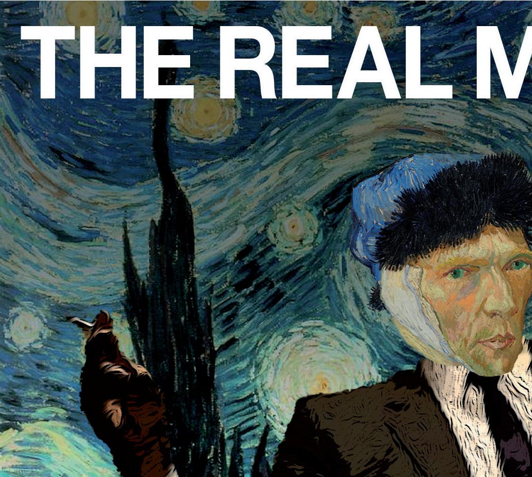

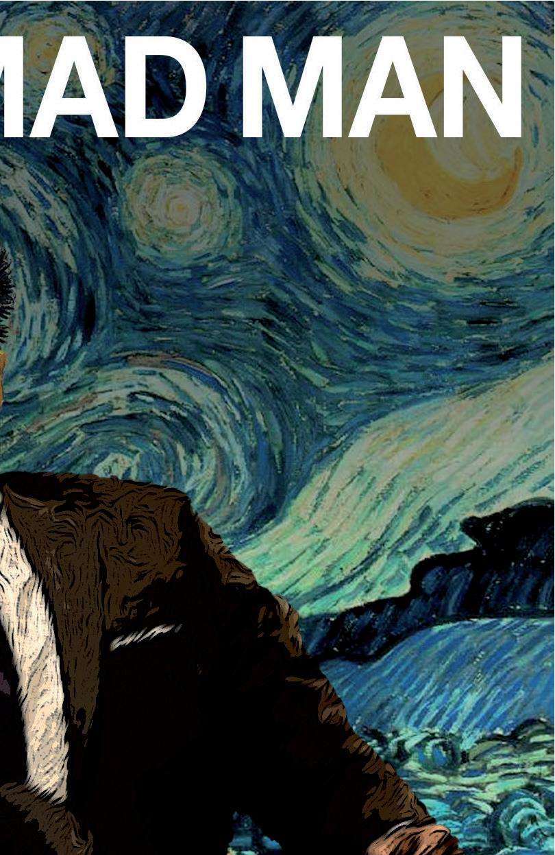

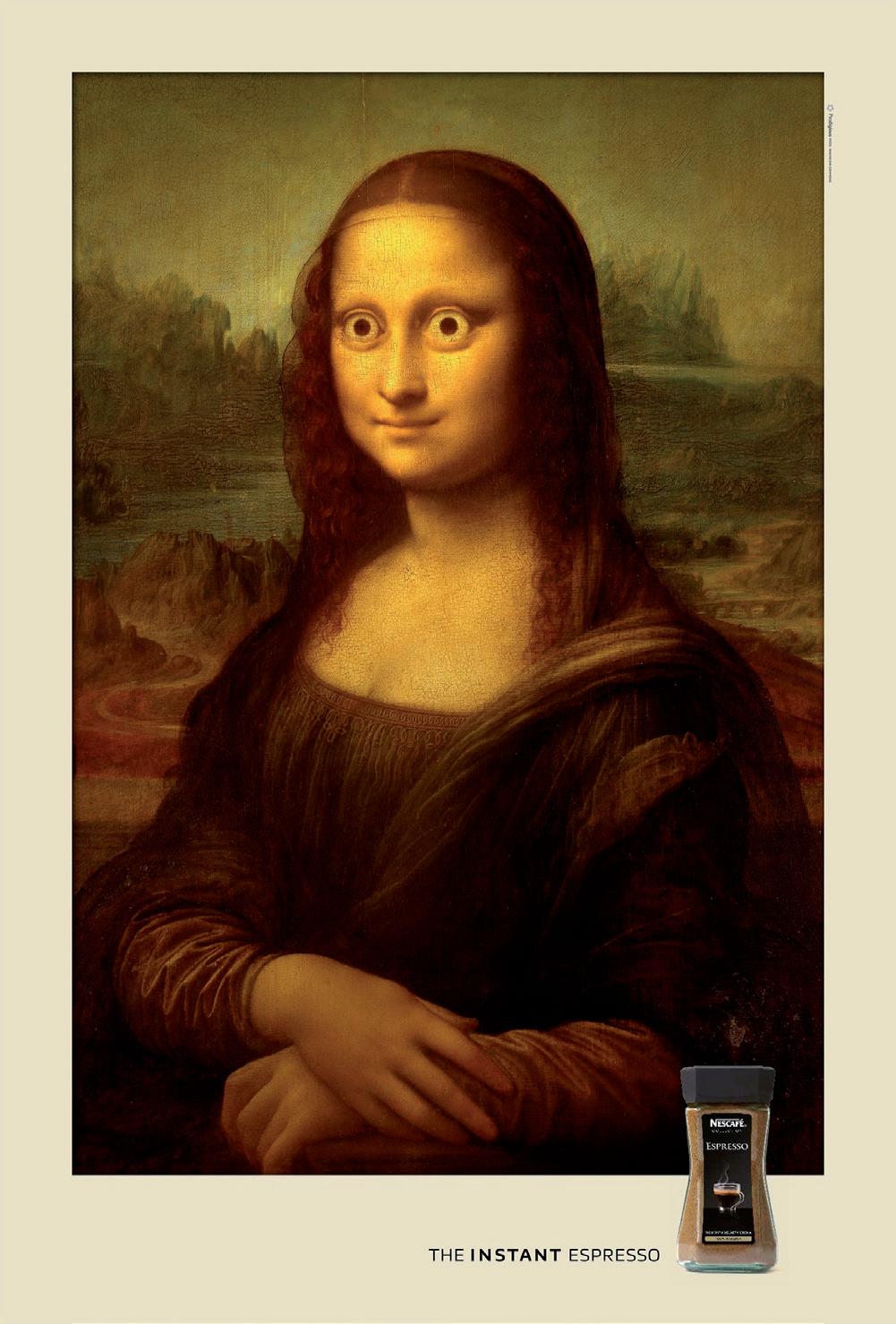
is valued for its own sake. If brands are associated with art in a tasteful way, consumers will accept and even appreciate it. But as soon as the artwork is viewed as a mere product-relevant illustration, they can take a critical view of its message and it is demoted to the status of any other ordinary image.”
What’s more, if the artist has died, they are unable to consent to the use of their art in the ad which brings up a further ethical issue. An example of this is Tiffany and Co’s About Love campaign which features a never-before-seen piece of art by Jean-Michel Basquiat, purchased by Tiffany after hisdeath in 1988. Opinions of the ad were divided, with some people praising it, but others feeling that it distorts the artist’s anti-capitalist and anti-colonial views, especially considering the abuse of human rights within the diamond mining industry. Basquiat’s former flatmate said: “I was horrified. The commercialisation and commodification of Jean and his art… it’s really not what Jean was about.” Such use of could be considered appropriation.
Artvertising brings some serious benefits: it can take an ad from boring to brilliant. Some ads that include fine art are the most memorable ads of all time. But from is using art in advertising lazy? Does using someone else’s artwork in your ad make you an unoriginal or unambitious advertiser?
This makes us reflect on what makes a good ad. If more effort makes a good ad, then the best ads would be long form copy ads, the most intricately designed ads or short film ads, such as Apple’s The Greatest. If simple ideas make good ads, then the best ads would be the ads with little to no copy, minimal visuals or negative space, such as McDonald’s 2021 Happy Father’s Day ad. In reality, there is no formula for an effective advert. It may take more or less effort, an intricate or a simplistic idea. From this perspective, artvertising is not an inherently lazy approach.
The use of ‘real’ art in advertising raises another
question of interest to creatives everywhere: is advertising itself art? The debate has been going on for years. If advertising is a form of art, then artvertising is not really a concept.
Mark Tungate argues: “If the history of advertising has one overriding theme, it is this constant tug of war between two schools: the creatives believe art inspires consumers to buy, the pragmatists sell based on facts and come armed with reams of research.”
Faris Yakob from The Marketing Society adds: “Advertising is neither [art or science]. It draws from both but must also factor in the messy unpredictability of humanity.”
Some believe that art and advertising are separate entities that feed each other.
There is no clear answer, but I’ve reached the conclusion that advertising in itself is not art, but a practice that the creative skills used in art are essential
for, as well as other skills such as human psychology, analytical skills and problem-solving.What can we learn from artvertising moving forward?
It is an excellent tool for a creative advert. A picture is worth a thousand words and referencing an iconic piece of art can bring depth and context to an ad. However, for ethical reasons advertisers should be commissioning current artists for their ads, or using art from artists that are able to consent to its use. If their creative inspiration comes from an existing piece of art and the artist has passed away, they should consult people close to the artist to discuss the ethics of the ad, preventing any loss to the art’s value or changing its meaning.
But if done well, as well as creating memorable and effective ads, artvertising can keep people talking about a piece of art that may have existed for decades, putting it in a different context and reviving its

From ancient Roman gladiators to the Kardashians, influencers have been around a lot longer than you think. Shaping the advertising industry with more than just their bodies, influencer marketing has changed the game, argues Rosie Whyte
Kim Kardashian, Molly-Mae Hague and James Charles are just a few that come to mind when we think of influencers but the concept of influencer marketing is nothing new. An influencer is someone who can affect the decisions of potential buyers and brands can benefit from influencers promoting their products or services. Throughout history this definition has evolved due to the expansion of social media. Today, anyone who has a good number of followers is considered to be one.
However, the very first influencers date back thousands of years and it’s worth revisiting where it all began.
Influencer marketing can be traced back to ancient Rome, where gladiators were some of the first influencers. The most popular gladiators gained celebrity status and promoted products such as oil or wine – some of the first examples of celebrity endorsement. In the 18th century, celebrity sponsorship became a popular marketing tool, with brands like Wedgwood leveraging their royal connections to attract more customers. English potter Josiah Wedgewood convinced the royal family to allow him to bill himself as the “Potter to her Majesty”, in collaboration with Queen Charlotte. This type of social proof helped to build trust and credibility with consumers.
As time went on, influencer marketing became more sophisticated with companies using celebrities and other notable figures to promote their products. The use of fictional brand ambassadors encouraged people to buy, such as Santa Claus in Coca Cola’s advertising from the 1930s and Homepride Fred, starting in the 60s. The 20th century saw a rise in celebrity sponsorships, with everyone from Marilyn Monroe to Coco Chanel lending their star power to various brands. These collaborations created a strong link between consumerism and celebrity culture.
Looking back at these early examples of influencer marketing, it could be suggested that while the tactics and platforms may have changed, the core principles remain the same – leveraging the influence of someone popular to drive brand awareness and sales.
The 1980s marked the beginning of celebrity sponsorship and endorsement, becoming increasingly common during the next few decades, particularly with sports stars, supermodels and other famous faces promoting products, a tactic that has grown in popularity since. One of the most famous collaborations was between Michael Jordan and Nike in 1985. By wearing Air Jordan sneakers on the court the year before, Michael Jordan brought Nike to new heights of popularity when they signed him as the face
of the brand. Nike’s partnership with Michael Jordan was so successful that it still generates billions in annual revenue to this day. Analysts like Goldman and Papson observed that the power, indeed the value, of Nike’s swoosh depends on the athletes it signs up.
Other famous endorsements of the time included Michael Jackson for Pepsi, and Mike Tyson for Nintendo. Celebrities were seen as crucial ingredients in advertising campaigns to grab consumers’ attention and boost sales. According to Kantar, 16 per cent of ads globally feature celebrities because celebrities increase the reach of advertising.
But what can we learn from the rise of celebrity sponsorship in advertising? The main lesson is the importance of finding the right fit. Not all celebrities will be a good match for every brand, and it is important to choose someone whose values and image align with the brand.
‘Unlike mainstream celebrities, influencers are intimate and easy to relate to as they share everyday aspects of their life with their followers.
The 1990’s brought the advent of the internet and with it came a new age of influencers who had a new platform to market brands. At just the click of a button, influencers could now use blogs, social media and online advertising to promote products. This allowed influencers to reach audiences worldwide and share reviews on products they loved with dedicated blogs, videos and posts. Quickly brands saw the potential of web influencers and began putting partnerships in place to get products visibility. The internet revolutionised the way brands could market their products and gave birth to influencers as we know them today.
Then, in 2010, Instagram launched and changed the game again. The social media platform became associated with the age of influencers and featured many posts explicitly dedicated to promoting brands and products. Unlike pre-internet endorsements, brands no longer needed an established celebrity to sell their products but instead anyone who could attract lots of followers. Such influencers must also prioritise authenticity and provide genuine recommendations to their followers. This way, they
can build lasting relationships with their audiences and maintain trust over time.
With the digital age changing the game for influencers and brands it was only a matter of time before the word influencer iself would become commonly known and used in everyday life.
This marked the start of a new era in marketing, with the increased use of social media, influencer marketing gained popularity, coinciding with the advent of reality TV and vlogging. This led to the likes of reality TV stars and other small-time celebrities beginning to emerge as relatable and authentic influencers.
Unlike mainstream celebrities, influencers are intimate and easy to relate to as they share everyday aspects of their life with their followers. “This may generate para-social interaction…described as the illusion of a face-to-face relationship with a media performer and makes consumers more susceptible to their opinions and behaviour” (Levine et al, 2009).
However, this newfound influence also came with increased restrictions and scrutiny. There seemed to be no distinction between whether an influencer was recommending a product because they had tried and liked it or because they were obliged to by their contract. People were spending money on products that were promoted by their idols only to find that the product wasn’t quite as good as stated. In response to this, in 2018 the Advertising Standards Authority implemented regulations stating that all posts promoting products or services must disclose that it is an ad. Failing to do so results in the risk of breaking the law and also being ordered to remove the posts for breaches of standard, emphasising the importance of authenticity in today’s modern landscape.
Today, influencer content forms a big part of marketing spend. With the definition continuing to evolve it’s important to remember what remains the core principles of influencer marketing. Authenticity and reliability has remained a constant factor throughout history from fictional characters such as Santa Claus, to Tik Tok creators, influencers have always influenced perceptions and purchasing decisions through their authentic and reliable image that they have created for themselves.
As ever, relevance is crucial to a successful advertising campaign. Not only should brands be aware of current trends but also choosing someone whose audience aligns with the target audience. In the age of cancel culture, choosing the right person has never been more important: one wrong move and both influencer and brand will fall from grace.
Typefaces have become synonymous with brands and advertising, but how far really are the two industries connected? asks Munro Black (overleaf...)
In our modern commercial world, typefaces have become synonymous with brands and a brand cannot exist without using them. Typography and typefaces have evolved hand in hand with advertising; if there is something to be written, it must be dressed appropriately so that it accurately conveys the information you want it to. As prominent graphic designer Neville Brody eloquently puts it in documentary Helvetica (Hustwit, 2007): “If it says ‘buy these jeans’ and it’s in a grunge font, you would expect it to be some kind of ripped jeans”, and if it were in Helvetica or Times New Roman the expectations of the jeans would match the typeface. A typeface is something that is able to visually communicate personality and tone in words that otherwise don’t, so of course a brand would have to use one to communicate their own personality and tone. Typefaces are a prime weapon for brands and advertising since the decoration of the type and text is going to define our emotional reaction to that message – something of utmost importance in the world of advertising. As typographic designer Tobias Frere-Jones (‘Helvetica’, 2007) puts it, using a wrong typeface isn’t too dissimilar to wrong film casting: the message and plot is still there but something will be wrong and the audience will be less convinced or affected by the words and events on the screen. So let’s start from the very top to find out how closely typography and advertising are connected.
Prior to the invention of the printing press by Johannes Gutenberg in the 15th century, books were written by hand and typically reserved for the elite of society, but increased literacy rates among the middle and lower classes resulted in higher demand. And so, the first non-handwritten typeface was invented for printing: Blackletter, intended to mimic the common style of calligraphy at the time and to bring books to the masses. These letters, durably carved for use over and over again, weren’t the most spatially efficient and in 1470, Nicolas Jensen created the first Roman typeface based on typographic principles. From this, typographic principles evolved and expanded, changing in all kinds of ways to optimise legibility, readability, space, emphasis, and now personality.
It would be impossible to talk about type, especially in relation to advertising, without bringing up Helvetica. Developed by Max Miedinger and Eduard Hoffman in 1957, Helvetica has become ubiquitous as one of the best-known typefaces of all time; whether you’ve heard of it or not you will have seen it. Its introduction to the world transformed advertising and it quickly became one of the most influential and most used typefaces.
Its use dramatically and instantly changed the advertising style at the start of the 1960s and throughout the 1970s. Michael Beirut (‘ Helvetica’, 2007), prominent designer and critic, noted its revolution in advertising flicking through a 1953 issue of Life Magazine: “One ad after another that just shows every single visual bad habit that was endemic in those days [...] zany hand lettering everywhere, swash typography to signify elegance, exclamation point after exclamation point,”. Helvetica brought dramatic change to this, changing the personalities
of several brands, going from faux-elegant to slick, stylish and authentic. Beirut continues and shows the change in Coca-Cola’s advertising, “No people, no smiling fakery, just a beautiful big glass of ice-cold coke [...] Helvetica Any questions? Of course not. Drink Coke, period.”
After its mass usage Helvetica has become more than just a typeface. It was used by governments who saw it as the everyman; conventional, neutral and efficient. Leslie Savan (‘Helvetica’, 2007) observed “The smoothness of the letters made them seem almost human. That is a quality they all want to convey, because of course they have the image they are all fighting that they’re authoritarian, they’re bureaucratic, you lose yourself in them, they’re oppressive”. Many noted its use in this way – Paula Scher, respected graphic designer, was morally opposed to it and its use saying this neutral, everyman typeface played a significant role in the Vietnam War and the Iraq War being used for desensitisation.
‘‘ The smoothness of the letters made them seem almost human. That is a quality they all want to convey, because of course they have the image they are all fighting that they’re authoritarian, they’re bureaucratic, you lose yourself in them, they’re oppressive
Of course, this story cannot avoid Comic Sans, a case when a typeface was so heavily used in the least appropriate of contexts, immortalising itself as the naughty child who stepped out of line, and brandishing its name for all eternity. Created by Vincent Connare in 1994, Comic Sans was made for sole use in Microsoft’s user-friendly software package: Microsoft Bob. Originally its instructions, designed in accessible language with appealing illustrations, were set in Times New Roman and heavily conflicted with the personality that they wanted to convey with the contents, with Times New Roman’s cold and traditional lettering. Inspired by comics and graphic novels, Connare created a typeface with an appreciation of craftsmanship and hand-rendering of comic onomatopoeia (i.e. WHAM! BAM!! ) and body text, that looked as if it had been drawn by a friendly hand to guide them through the process; the letters would be able to look human in
any context. Despite all his efforts, Comic Sans was not used in the final release of Microsoft Bob due to all the elements of the software being already set in Times, and couldn’t simply be slotted in. However, its inappropriate usage was no fault of his own. Despite all his efforts, Comic Sans was not used and after going global with Windows 95 it started seeing use at the heading of a student essay, then birthday invitations, greeting cards and restaurant menus, and even then in more professional and reputable circumstances: on gravestones and ambulances. ‘It was viral advertising before such a thing existed, and like a good joke it was funny at first,’ (Garfield, 2010). It even had several websites dedicated to hating it and advocating for its removal. Thankfully, no self-respecting brand has claimed Comic Sans for its personality, but it is a classic example that shows just how absolutely detrimental a badly-selected font can be; choosing the wrong one
‘
Typefaces themselves are a brand. You’re telling an audience ‘this is for you’ by using a certain typographic voice [...] You can recognise a Marlboro ad two miles away because they use a typeface that only they use. [...] Anyone can buy it, but they have made the typeface theirs. [...] If they used Helvetica, it wouldn’t quite work.’
can be damaging to the perception of your brand. When designing a stop sign, using Comic Sans would be akin to heresy, but when designing a cutesy invite to your toddler’s birthday party? Perhaps it’s only appropriate usage...
So, we’ve established that typography has personality and people who connect with it: the same word can be written in a different typeface and mean completely different things. In the same context, you can remove a brand’s personality by switching up their typeface. If you remove the typeface from a brand you are removing an essential part of their personality - who they are talking to, who they are, what they want, what they want you to want and be. Erik Spiekermann (2007) comments “Typefaces themselves are a brand. You’re telling an audience ‘this is for you’ by using a certain typographic voice [...] You can recognise a Marlboro ad two miles away because they use a typeface only they use. [...] Anyone can buy it, but they have made the typeface theirs. [...] If they used Helvetica, it wouldn’t quite work”. Commissioning a custom typeface is becoming increasingly more common, as more brands realise how persuasive their own personalised voice through type can be.
A lot of this knowledge and relation to personalities comes mostly through observation and intuition rather than actual data and statistics, as agreed upon by graphic designer Sarah Hyndman (2015) and typographic designers J. Hoefler and T. FrereJones (2007). But these typefaces are designed to be looked at by people for whom this kind of knowledge or processing of information will be completely subconscious, so a font’s personality being defined with ‘vibes’ alone may be more beneficial, since they are what will be conveyed to the audience.
The only way you could check if a certain typeface is effective is whether the people are thinking in the way you intended them to think by using it. A typeface’s creation and use parallels the creative side of advertising in that it relies solely on the people it is targeted towards, using elements that will be intuitive to both the designer and the audience, should they be conveyed effectively. Each typeface is created with a certain intended way to read a piece of its text, which is absolutely detrimental to the very core of what advertising is: getting you to think how they want.
LEFT: Coca-Cola print advert from Maclean’s Magazine, August 6, 1955, with “zany hand lettering everywhere, swash typoghraphy to signify elegance”
Adverts have always been the gateway of communication between a business and the public. But advertisers must be efficient, making sure that everything that needs to be said gets across in a small amount of space and time, while still being aesthetically pleasing. This is where colours come in, writes Sissy Anderson
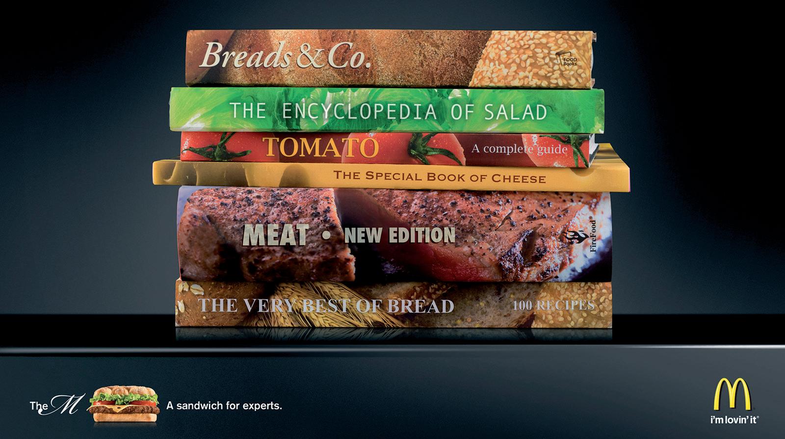
So, let’s try a game. I’ll say a colour and we’ll see what company or brand is the first to spring to mind: Red you might have thought Coca Cola. Blue is tricky but after some thought leads to Facebook. Purple isn’t used by many companies, so Cadbury’s comes to mind. Pink is iconically Barbie and Yellow, surprisingly, it makes me think of McDonalds, not red, because through all their adverts and packaging changes the one consistency is their yellow “M”. This happens when we are exposed to things so often that we start to link them together instinctively.
Equally this is what happens with the meanings behind the colours themselves. Your mind learns colour associations. These can come from personal experiences or cultural significances. For example, in China red symbolises luck, whereas, in western countries red is commonly used as a warning. Stuart Hall’s reception theory helps explain this. He suggests: “A text can have different meanings to different audiences, the reader understands a text by interpreting it to what they think it says.” Everybody has different experiences, cultural identities, context, and personal preference and this all affects how we view, take in and understand colours.
But over time colours have been used repetitively so that there are base meanings behind each colour that everybody understands, often subconsciously and immediately upon seeing the colour. We relate colours to emotions and other abstract nouns that allow for us to relate to them on a different level.
The idea of colour psychology has been applied to advertising for years, with advertisers linking colours with products and industries, and utilising the connotations behind a colour to influence us subconsciously. “The study Impact of Colour on Marketing by Satyendra Singh found that up to 90% of snap judgements made when buying products are based on colour alone, and success depends partly on the traits associated with each colour, as discussed above, as well as the perceived appropriateness for each brand.” (Centre Colour, 2018)
Colour psychology can be dated back to the Ancient Egyptians, who studied the effect of colours on people’s moods and used their findings for health benefits. The Egyptian word ‘iwn’ meaning colour, also translates as ‘disposition’, ‘character’, ‘complexion’ and ‘nature’, showing that they valued colour and saw it as especially linked to a person’s personality. To the Egyptians the beauty and symbolic meaning behind a colour meant more than the value of the material/s it came from. And so rather than using colours randomly, they used them with care and purpose to make pictures that held more meaning and greater power.
One of colour psychology’s earliest known case
was in a book called “Theory of Colours”, published by the German poet, artist and politician Johann Wolfgang von Goethe. While this essay was at first dismissed by the scientific community, it has later been found to be ground-breaking and of great interest, especially where he explores colour psychology. He goes on to talk about each colour and how they can make a person feel. He speaks of each colour not as a scientist but describes them as only an artist could. It was very interesting to read this as his words from so long ago, this website has the key parts of the colour psychology that he spoke about all compiled together and so I would recommend giving it a read and seeing if you agree with what Goethe says for each colour. Studies have found that colours trigger different levels of dopamine to be released in the brain. Dopamine is a chemical in your brain that is released when we have a positive experience. Louise Mead wrote: “Bright, bold colours such as red, yellow, and orange are known to be particularly effective at stimulating dopamine release. These colours are associated with positive emotions such as joy, excitement, and happiness, and they can help to boost our mood and motivation. In contrast, muted, subdued colours such as grey, brown, and beige are less likely to trigger dopamine release. These colours are associated with more neutral emotions, such as calmness and relaxation, and they are less likely to impact our mood and behaviour significantly.”
When deciding whether to buy or do something we are often influenced by our emotions. This is why colour psychology is used in advertising and why it is so effective. If we are looking for something relaxing, we won’t buy something that has bright colours since they are too loud. This same principle that is used in marketing: if the colours don’t reflect what you want people to feel, then people are less likely to be swayed to your cause. The best way to ensure you get your colour right is to start with the emotion. Once you have defined what emotion you want your audience to feel, you can figure out what to colours to use to invoke this response. A study cited by the University of Southern California in 2023 which supported the theory that color is critical for conveying information. The study states people make decisions within 90 seconds of their first impression of a product, and colour alone contributes up to 90 percent of the information that forms the decision. This is why colours are so useful to advertisers; they can communicate so much so quickly.
A good example of colour psychology being used in an ad is the iconic WW2 morale poster, right. By using yellow as the background colour, it not only makes the poster eye-catching and everything else on the poster
If the colours don’t reflect what you want people to feel, then people are less likely to be swayed to your cause. The best way to ensure you get your colour right is to start with the emotion
pop, but it also fills you with a sense of optimism, energy and cheer. Equally, by making the speech bubble for the text blue, the ad conveys wisdom, stability, and trustworthiness. We are convinced not only by her words and stance but also subconsciously by the colours in the ad that “We Can Do It!”.
A more modern example of a company successfully using colour psychology in their ad is Carlsberg’s “Probably the best beer for the world” ad. The only colour, aside from the text, is green. This meant that all they had to say was their tagline, and we automatically knew exactly what they were trying to say. Green is almost always used for health and the environment, therefore when reading that it is the best for the world, we subconsciously understand that they are implying this new product is good for the environment. The white of the base text doesn’t just show up well against the green backdrop, but also suggests innocence and honesty.
Colour psychology allows for colours to be utilised not just for aesthetics but as a tool that holds a deeper power. Colours communicate to us on a deeper level, speaking directly to our subconscious through our own ideas and experiences. From starting with the Ancient Egyptians and their paintings, to helping a beer company become more green, colour psychology will continue to be one of the most useful tools in a marketer’s arsenal.
You might know Tony the Tiger or the names of every Compare the Market meerkat. But how about Melon Kuma, part bear, part melon? Or Blåhaj, the ‘real estate shark’? If you dare, step now into the weird and wonderful world of Japanese mascots with your guide Luka Kolesnykova ...
From Tony the Tiger to the Monopoly Man, iconic characters have been a staple in advertising. Providing both brand recognition and emotional connection to audiences, there is no disputing the power characters can have.
Research states that audiences prefer fictional characters 73 per cent more than celebrities and musicians within advertising (Born Licensing, 2021). There is clearly a high demand for them in the West. Characters are also more versatile and cost-effective compared to hiring celebrities so surely characters should be everywhere in advertising?
Despite this, their use in advertisements has seen a drastic decline in recent times. Adverts are over 13 times more likely to feature a celebrity, musician or sports figure than a fictional character.
In contrast, Japan is fully embracing characters within their advertising culture. There are characters

for seemingly everything, from real estate agencies to cities, even prisons. You’d be hard-pressed to find a business in Japan that doesn’t have a character to go along it.
Japan showcases its love of characters through the art of “yuru-chara”, the term used to describe mascot characters and oughly translates to “loose, laid-back characters”. This phenomenon is very common, with almost all companies, locations and events getting their own mascots to represent them. In2012, this industry was worth around $16 billion and has only grown since.
These wacky characters all have distinct, usually cute, looks and personalities, often having backstories to go alongside them. From the horrifying realistic grizzly bear-melon hybrid Melon Kuma to the stoically adorable cat samurai Hikonyan - no two yuru-chara are the same.
Within the city of Osaka alone, there was a mascot for every 6,000 residents (Sabukaru, 2023). This caused governmental concern, to the point where their governor “could not recognize most of his prefecture’s 92 mascots” (Bloomberg, 2018). This highlights how prevalent mascots are within Japan’s culture, to the
Characters should...
1. Convey a strong image of love for one’s hometown/region
2. Have awkward, unstable or unique motions and behaviour
3. Be unsophisticated, laid-back and loveable
‘Modern Japanese society is a place where every generation cannot escape from stress. In such a osciety, the existence of characters has been accepted by many as an object of ‘healing’
point where some may complain about there being too many.
Their popularity has even spawned several unofficial mascots that have reached the same level of popularity as their official counterparts. Funassyi is an unofficial pear mascot for the city of Chiba, with a fondness of heavy metal and rock music, and has released four full length albums. Chiitan is a self-described “0-year-old baby otter” unofficially representing the city of Susaki. Its controversial and chaotic slapstick stunts online led to it being rejected by Susaki officials and banned from Twitter, despite Chiitan being one of the most popular characters in the country.
The Japanese public of all ages is very receptive to these “charas”. They leave an impression without using words and are able to convey information at a fast pace and in an appealing way. In such a workaholic country, people find solace in the cute simplicity of these characters, and many connect them emotionally to a brand they would have felt nothing for otherwise.
IKEA Japan decided to embrace a yuru-chara of their own in 2021, turning its widely-beloved “Blåhaj” shark plush into an actual mascot, complete with a TV show spoof. In collaboration with the Wieden+Kennedy ad agency, the campaign promoted IKEA’s new 99 yen homes by showing that any house can be a happy home, no matter the size.
Blåhaj, marketed as “the first Real Estate Shark”, originally launched in 2014 as a plush, and later in 2017 in Japan. This plush already had a cult following
online, with people sharing images and memes with the shark on social media. IKEA built upon this popularity with a series of shorts, showing Blåhaj renovating small 99 yen homes using IKEA furniture. This campaign was overwhelmingly positive in Japan, with IKEA getting tens of thousands of applications for the 99 yen houses. The campaign trended on Japanese Twitter for a week and made global news. Blåhaj even appeared in person at IKEA stores and in his own real estate offices, handing out business cards and even being able to apply for an apartment with him.
The most prominent type of “yuru-chara” is known as “gotōchi-chara”, meaning local characters, in which different prefectures, cities and districts in Japan have their own mascot. These advertise each region through the use of physical mascot suits and merchandising, engaging tourists from other parts of Japan and the rest of the world. They are often designed around farm produce or wildlife found in the area, or puns based on the place they are from. These are so successful that they have their own expo known as the Yuruchara Grand Prix, where the characters participate in events and a vote is held to find the most popular.
The most famous gotōchi-chara is Kumamon, a black bear from Kumamoto. His name comes from a combination of “kuma”, meaning bear, and “Kumamoto”, the place he is from. In 2012-2013
alone, he generated over 123 billion yen in revenue (Brand Knew Mag, 2018) and appeared on everything from notebooks to aeroplane packages, complete with a unique Kumamon-themed aeroplane lunch.
In 2016, a major earthquake struck Kumamoto, and social media was flooded with posts saying “Pray for Kumamoto”, accompanied by Kumamon’s likeness (Bloomberg, 2018). He started touring Japan, raising funds for the reconstruction of Kumamoto, establishing his status as a national icon.
Japan’s yuru-chara offer some valuable lessons to the West about effective advertising characters. Having approachable and simple designs would make characters here more visually appealing to a wider audience. This simplicity makes it easy for yuru-chara to be able to stand alone, apart from their associated brand, with their own fans and merchandise.
Yuru-chara often have very cute, “kawaii” designs, which the Japanese public is very receptive to. The
‘west may be put off by these design choices though, as typically cute characters are associated with children. These characters could be adapted easily, however, by for example removing oversized features such as the head and eyes which is read here as typically childlike.
Yuru-chara’s personalities are often clumsy and laidback. Agencies here could better emulate the relatability of such characters, which would make them resonate with audiences more.
Of course, we have do have many familiar and successful mascot characters of our own. Beloved icons such as Colonel Sanders, the Duracell bunny and Tony the Tiger prove that characters can work in advertising and resonate with audiences of all ages.
In 2009, Compare the Market launched a peculiar campaign featuring its now iconic meerkat characters. These captured the hearts and attention of many,
Gotochi-chara is now a part of life. Children have grown up seeing the faces of their local gotochi-chara grin from the pencil cases and bento boxes they take to school each day. [...] These weird, lovable characters are now an indelible part of the identities of a generation
helping it become the “most recognised brand in the insurance price sector” (Marketing Week, 2010).
In a sector where consumer engagement is low, it really hit the jackpot, building a huge social media following and creating highly marketable plushes. The main character, Aleksandr, was granted his own social media profile to interact with fans, and has amassed over 32,000 followers on Twitter and 700,000 fans on Facebook
The West has a long wey to go before its characters have the same kind of presence in advertising and society as their Japanese counterpart. These mascots have resonated with audiences worldwide, becoming more than just stars of commercials, and gaining their own followings.
Given there also appears to be a public appetite for such characters, it is surely time for agencies to look more closely at the Japanese experience and the benefits of character-driven advertising.