4 minute read
Exclusive Q&A with Sara Bederman
Exclusive Q&A with Sara Bederman
Interior Design by Sara Bederman Design
Q: What were the needs of your clients, and how did you consider them when designing this space?
A: Our client needed a comfortable urban home that was uncomplicated in design. The furniture needed to be luxurious but not fancy, comfortable but still neat and tidy. Everything we designed and specified was chosen based on these criteria.

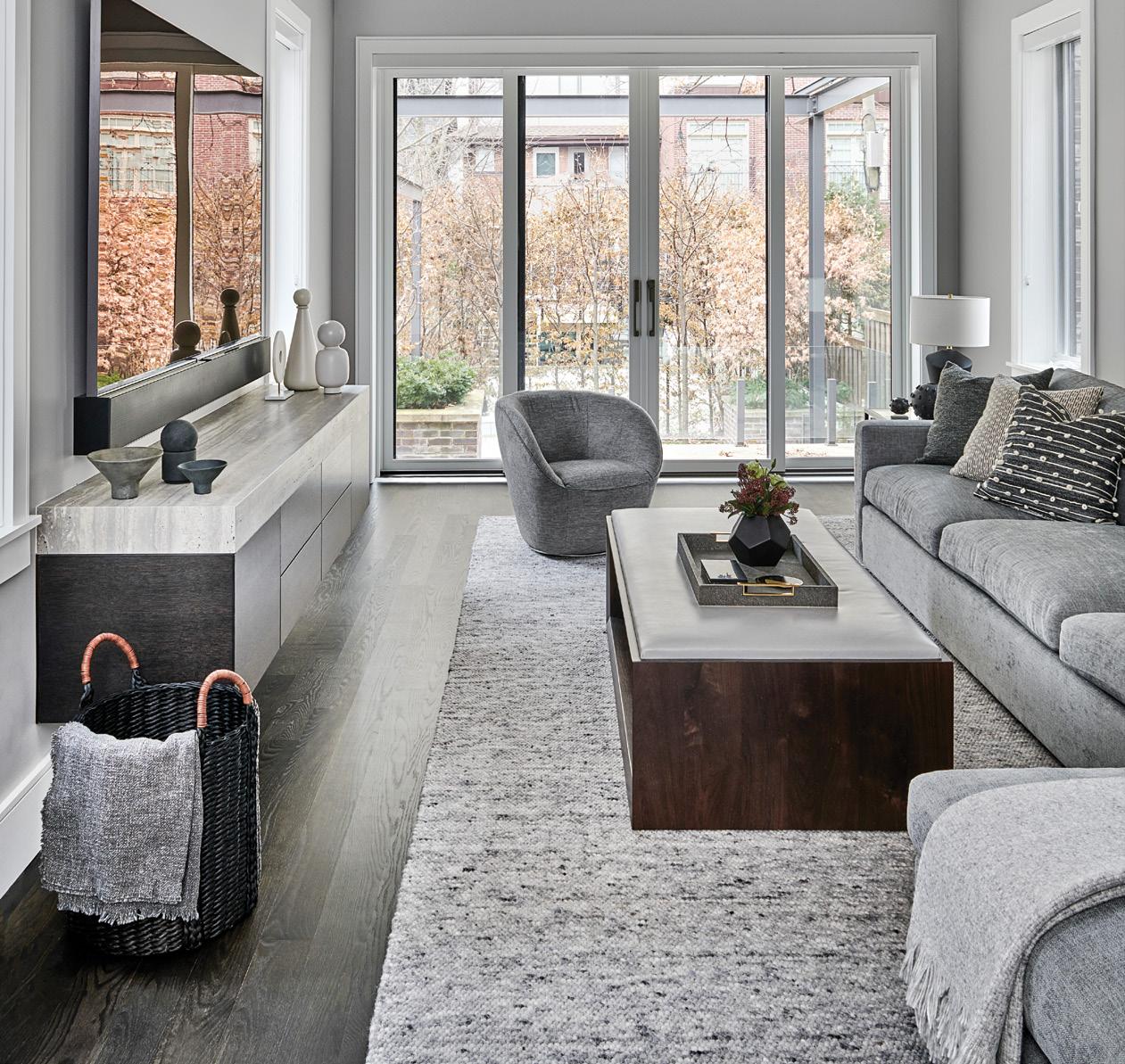
Q: The family room has a lot of clean, contemporary lines mixed with comfortable furniture. Talk to us a little bit about how you chose these softer textures, low-slung couches and mixed cool gray tones to tie together the space.
A: Our client wanted a large sofa to fill the awkward shape of the family room. Both the homeowner and his children are quite tall, so a deep, large sofa was what made sense for their lifestyle. We created warmth and welcome in the space through different textures in shades of gray. This palette creates a calming environment perfect for relaxing in after a long busy day.

Q: The dark hardwood floors installed throughout the home are gorgeous—how did you choose this style of wood flooring? Do you feel it inspired any other elements in the house?
A: Wood is one of my favorite materials to use on floors, cabinetry, and furniture. We try to throw it in whenever we can. The stain of the hardwood was custom mixed to give a deep brown, almost gray, tone to complement the gray upholstered pieces in the home.

Q: The living room is stunning from the minimalist gray stone fireplace down to the unique floor lamps. How did you decide what elements to draw from when it came to decoration?
A: The fireplace was definitely the feature and the anchor of the space. It acts as a beautiful sight line in the home, and we used the upholstered furniture in the living room to soften the contemporary simplicity of the fireplace design. We kept fabrics quite monochromatic, working mostly with texture rather than pattern and contrast or color pops.

Q: We love how personalized and yet elevated the boy’s bedroom turned out. How did you go about designing the kid’s room to find a balance of playful aspects and materials that can function as they grow older?
A: Designing for the future is key in children’s bedrooms. Finding furniture that can grow with a child is so important. We added decor items that reflect some of the kids’ passions and kept the furniture age-appropriate with a little extra sophistication to last through the years ahead.

Q: There’s a lot of baseball paraphernalia scattered throughout the house. What was the inspiration behind the client’s baseball-themed home office?
A: The client is very passionate about baseball and wanted to highlight his favorite baseball memorabilia.
Q: What are some things to keep in mind when designing entryways to create a functional family mudroom?
A: Storage and surfaces are essential elements in a mudroom. Somewhere to put things away as well as a surface to put stuff down are always elements we include in a mudroom. A quick coat hook is also a very useful feature. We like to keep all the practical needs of a mudroom in the design and then elevate the space with great decor and fabrics when possible. We love a sophisticated mudroom.

Q: How do you approach designing a home gym when you’re working with limited space?
A: We really work within the available footprint and plan a reasonable amount of equipment based on the size of the space. It does not make sense to include more equipment than can fit without ample space to circulate in the gym. A hard-surface flooring solution and lots of mirror panels are key elements in every gym we design. Space to move around is something we pay close attention to as well. A gym should not feel cramped, if at all possible.
Q: We love the use of incorporating storage into the wall space in the bedroom. How did you work with the slanted ceiling in here to create more space?
A: This bedroom did not have a pretty or functional closet solution, so we decided to demo the closet and replace it with a beautiful millwork concept full of storage space. The angled ceiling was very challenging to work with when planning the concept, but working through complex space planning is one of our favorite design challenges. We get excited to problem solve!

Q: This walk-in closet has beautiful built-in cabinets and is the ideal accompaniment to any master suite. Was there originally a closet here, or was this on the client’s must-have list?
A: This was an existing walk-in closet that we redesigned and refinished. The cabinetry has a beautiful wood grain finish that adds texture and masculinity to the principal suite.


