P O R T F O L I O


twu380@gatech.edu
Tianrun Wu
Undergraduate Architecture Portfolio 2020 - 2022






3 -21 22 -35 36-55 FALL 2022 SPRING 2022 FALL 2021 TABLE OF CONTENTS 01 02 03
OTHER PROJECTS

56-65 66-86 SPRING 2021 FALL 2020 - FALL 2022

3 2
04
Main Material: Heavy Timber
PROJECT


Architecture Studio 4 Instructor: W. Jude Leblanc Software: Rhino, Grasshopper, Vray, Enscape, Adobe Photoshop, Adobe Illustrator, Adobe Indesign
TIANRUN WU FALL 2022
4 5
ASIAN CULTURE CENTER I
Asian Culture Center for Asia Society Atlanta
The project proposes applied research into new (and old) ways that art ideas and architecture might intersect. The method will be experimentation regarding ways that structure/material, use/space, and FORM might create positive environments for the broadest public. The program for Asia Society Atlanta (ASA) will include a theater for performing arts and galleries for the visual arts. A portion of the art gallery will be dedicated to the work of one artist Ai Weiwei. This will be a permanent installation similar in scale and purpose to the Cy Twombly Gallery in Houston. The larger portion of the gallery will be used for rotating contemporary art exhibitions. Considerations will also include an arts and culture program, consisting of symposia, a lecture series, and a film series. A garden is included for educational and social events. The starting off point for the larger agenda is excerpted from the self-defining statements of the Asia Society itself.

POSSIBILITY & SECLUDED & MOVEMENT & PERSPECTIVE
Georgia Tech
Midtown ATL
Downtown ATL
From narrow to spaciousness:
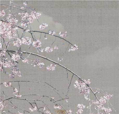
The idea generates from the ancient Chinese story, the Peach Blossom Visionary Land.
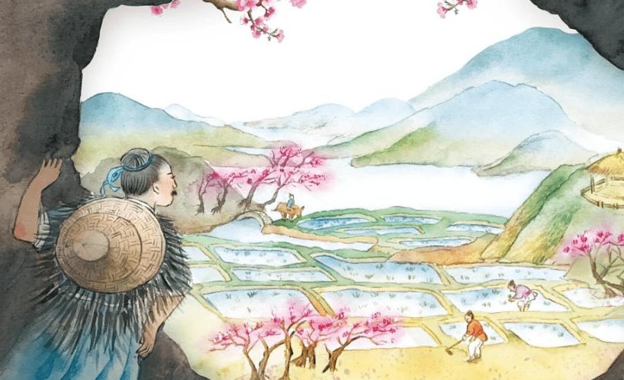
During the Tai-yuan years of the dynasty Jin, a fisherman from the county of Wuling strolled on the bank of a stream, forgetting the distance of his track, into a grove of blossoming peach trees all at once. For several hundred steps along the bank side, there were no other trees; the sward was freshly green and fallen petals of the peach blooms were scattered on the grass verdure. The fisherman, surprised by the sight, walked on to see where the grove would end. It ended at the source of the stream, where there was a mountain. An aperture opened on the mount, from which light seemed to be emitted.
The man abandoned his boat and entered the opening. It was narrow at first, just enough to pass through. After several tens of steps, the way led to vast spaciousness. The land was level and expanded, houses were spread out in good order; goodly farms, fair ponds and mulberry and bamboo thickets were to be seen everywhere.
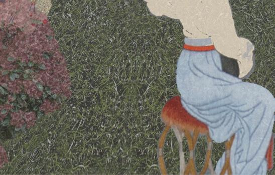
For this project, the most important idea is to create a “otherworldly”, “secluded” garden in the urban world for the visitors to relax and meditate.
The land was level and expanded, houses were spread out in good order
From narrow to spaciousness
6 7
BOBBY�DODD�STADIUM
ALUMNI�CENTER INSPIRE�APARTMENTS
SMITH�RESIDENCE�HALL


NORTH�AVENUE� APARTMENTS
North�Avenue�NW
TECH�TOWER
Centennial�Olympic�Park�Dr�NW
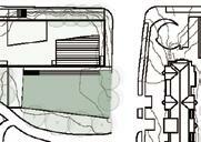
The first step is to put the mass on the side of North Avenue NW because of the large traffic volume, compared with Centennial Olympic Park DR NW, in order to hide the secret garden behind the mass, from the urban world.










The second step is to create a garden behind the mass. The wall of the garden follows the interior space order of the building and the boundary of the site.






















































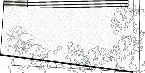
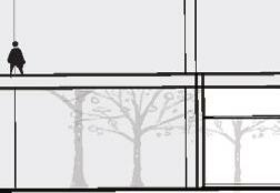
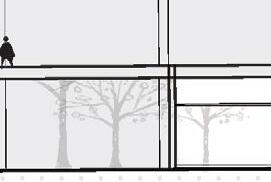
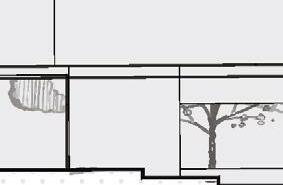
The last step is lifting the mass, to make the first floor of the building more transparent and create a corridor connecting the garden with the entrance. The process generates two gardens. One of them is the secret garden behind and another one is the garden on the roof. One of them is inward and another one is outward with the view of the city around the architecture, the “real world”

8 9 Garden 2 Garden 1
Garden 1
Stair Theater Gallery
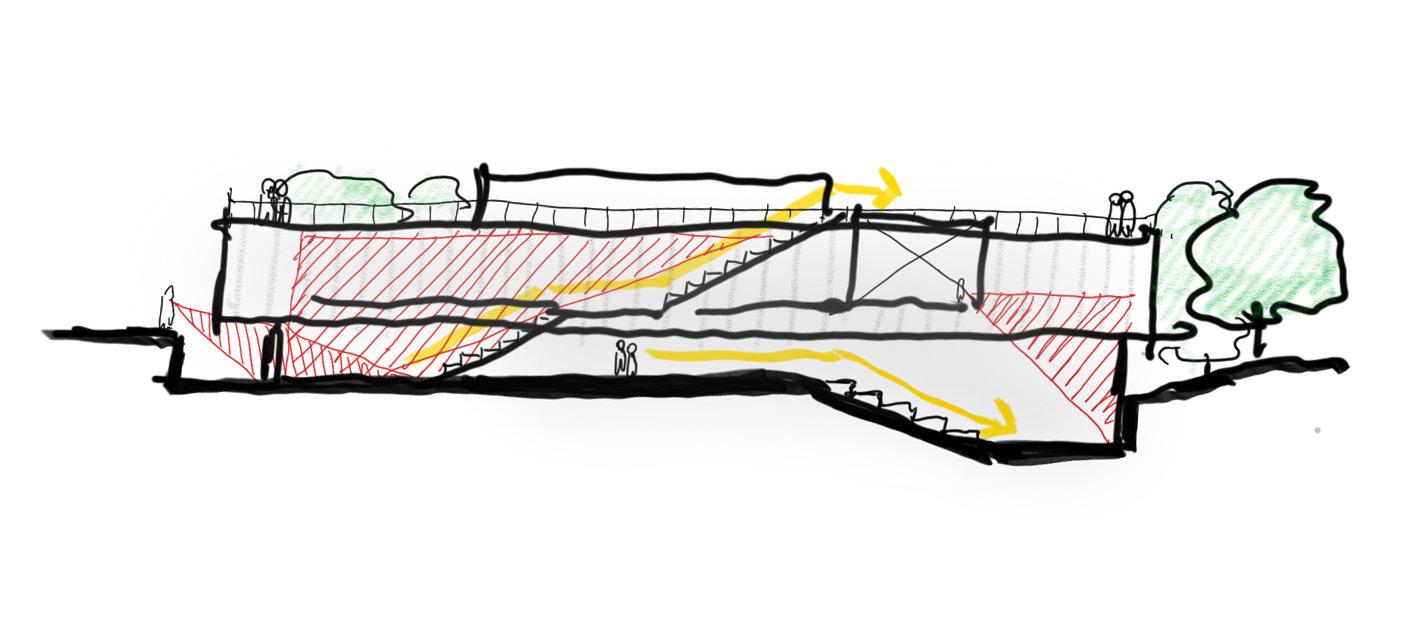
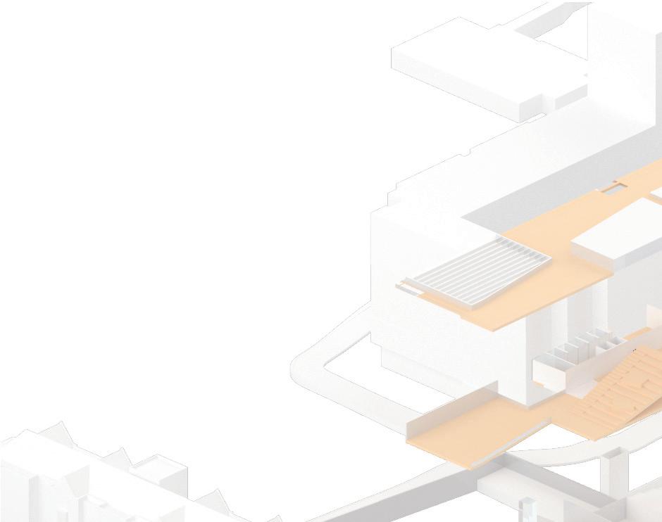
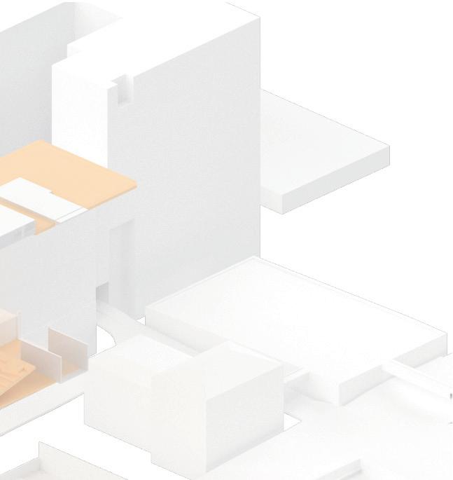
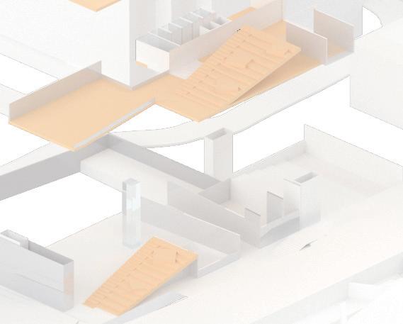
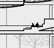
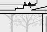
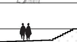
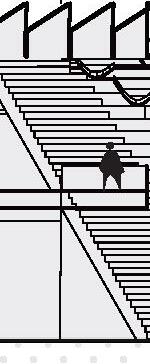
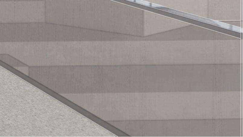
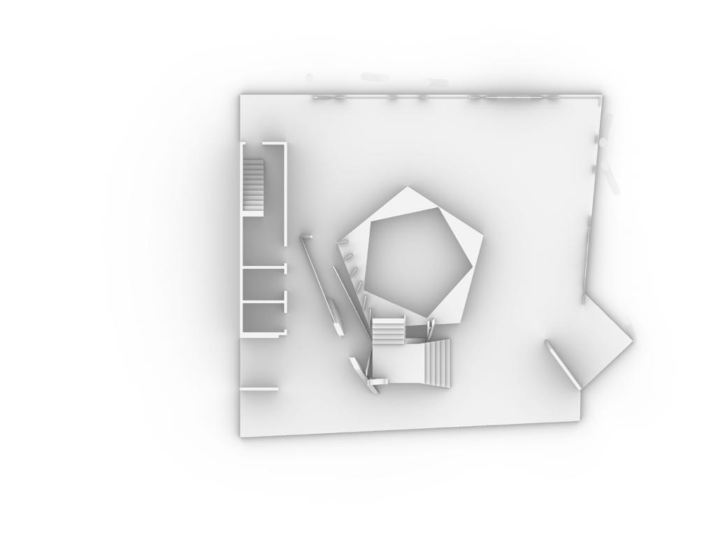
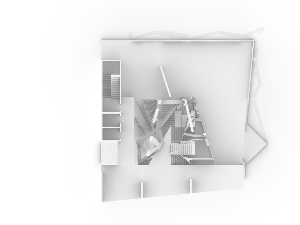
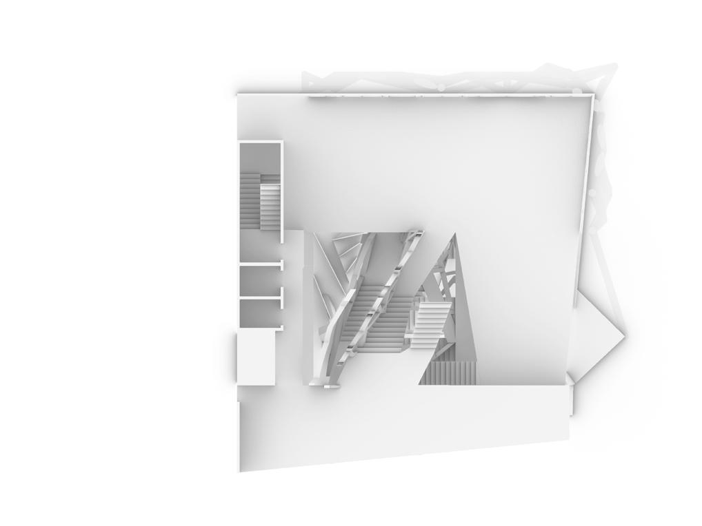
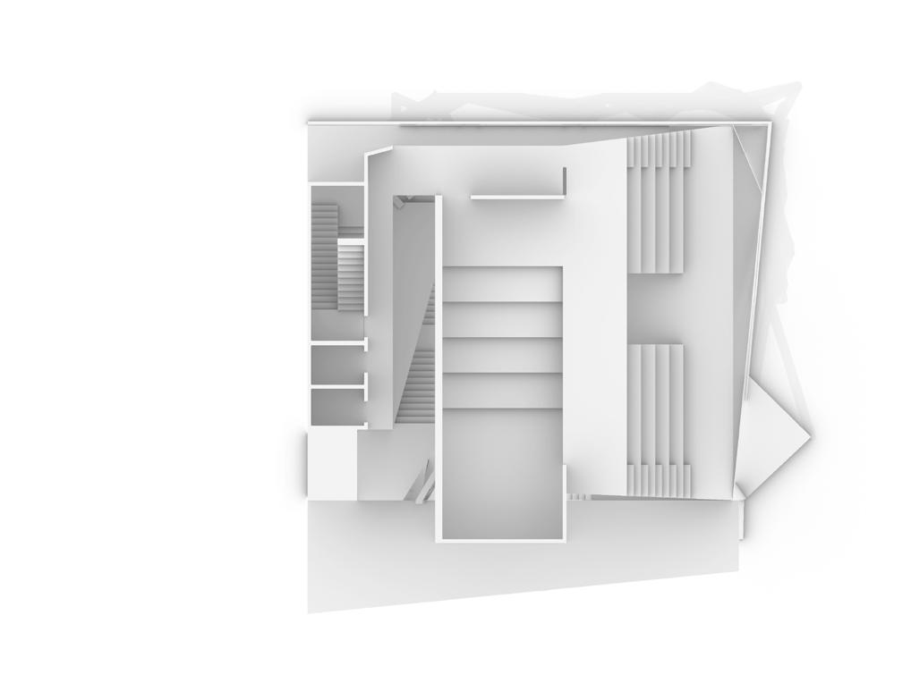
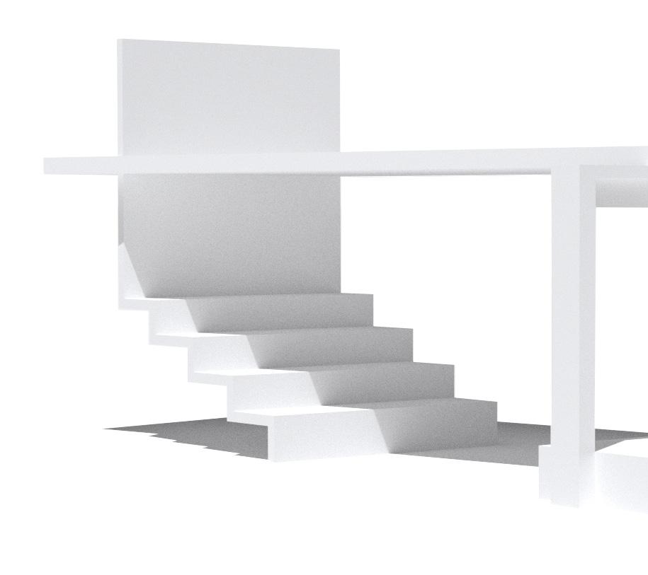
The monumental stair connects first floor, second floor and the roof garden, making a linear circulation of the project.
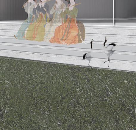
However, this is not only a stair. It is also a theater. With the acoustic structure above, the stair becomes auditorium and the landing becomes the stages.
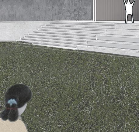
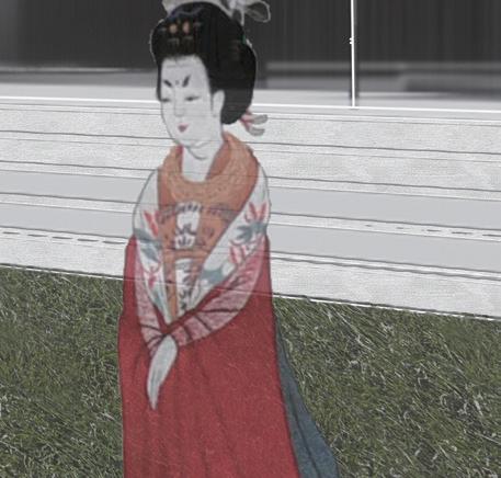
The stair is also a gallery. With the platforms generating out of the stair, the artworks can be displayed on them. When people move on the stairs, they can view the artworks from different perspectives.
Floor
Floor
1
2 Roof Garden


10 11





















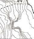


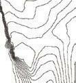


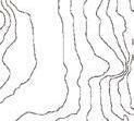


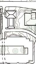
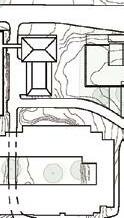




SITE
PLAN
Central Hallway
Permanent Gallery
Rotating Gallery
Reception Area for Theater
Reception Area for Gallery
FLOOR 1
FLOOR 1


ROOF






12 13
1 2 3 4 5 6 6 7 8 9 10 1.
2.
3.
4.
5.
6.
7.
8.
9.
10.
1.
2.
3.
4.
5.
1.
2.
3.
3 1 2 3 4 5 5 1 2 3
Theater
Cafe
Bathroom
Mechanical Room
Garden
Permanent Gallery
Administration
Library
Mechanical Room
Bathroom
Sculpture Garden 1
Sculpture Garden 2
Sculpture Garden







14 15


16 17































































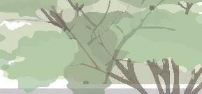
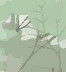
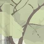
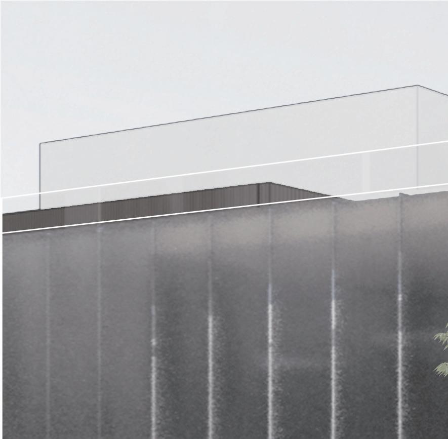
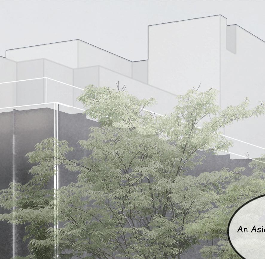
The skin is composed by two layers. Inside is the glass and outside is the polycarbonate panel. The half transparency of the polycarbonate material shows the movement of the people inside and the interior space to the outside in an implicit way, as a advertisement of the project to the public.

The main material of the object is CLT, which is environmental friendly and has connections with traditional Asian architecture.




















18 19
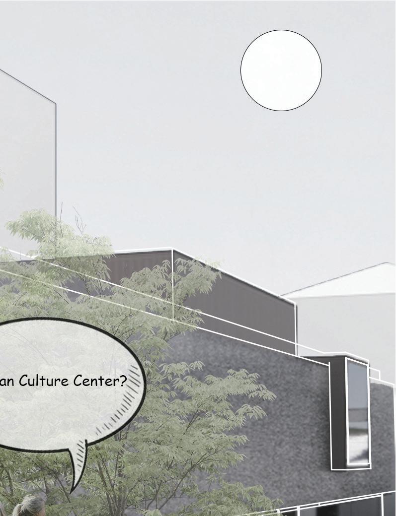
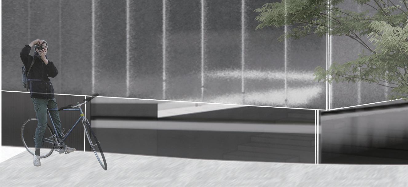
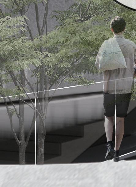
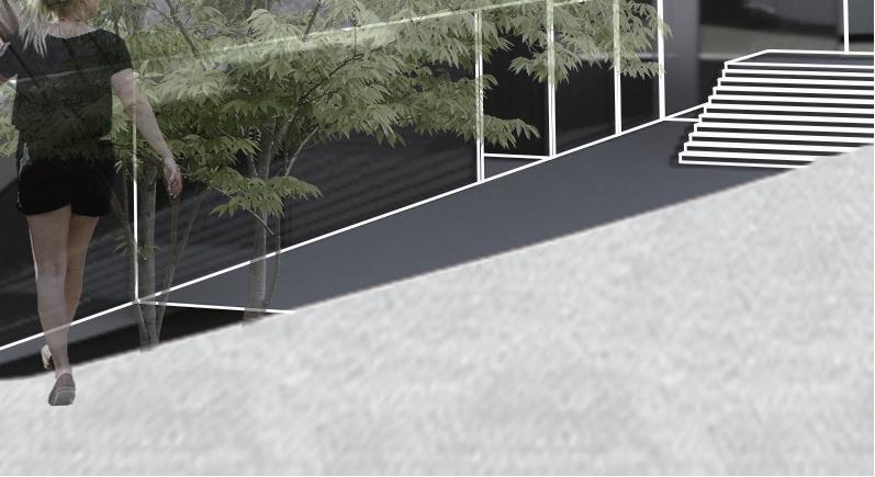


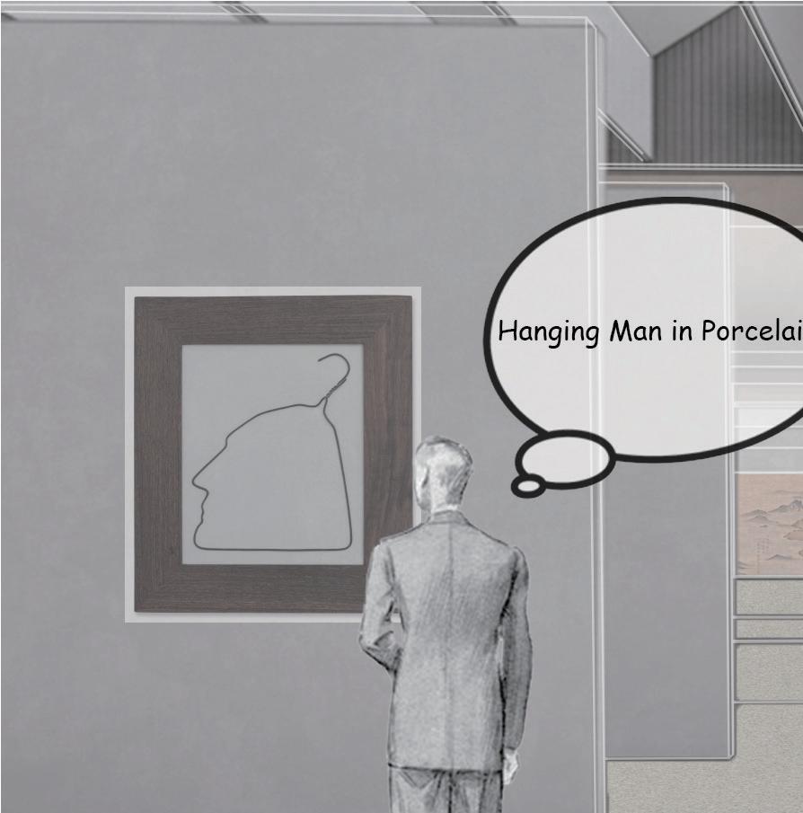
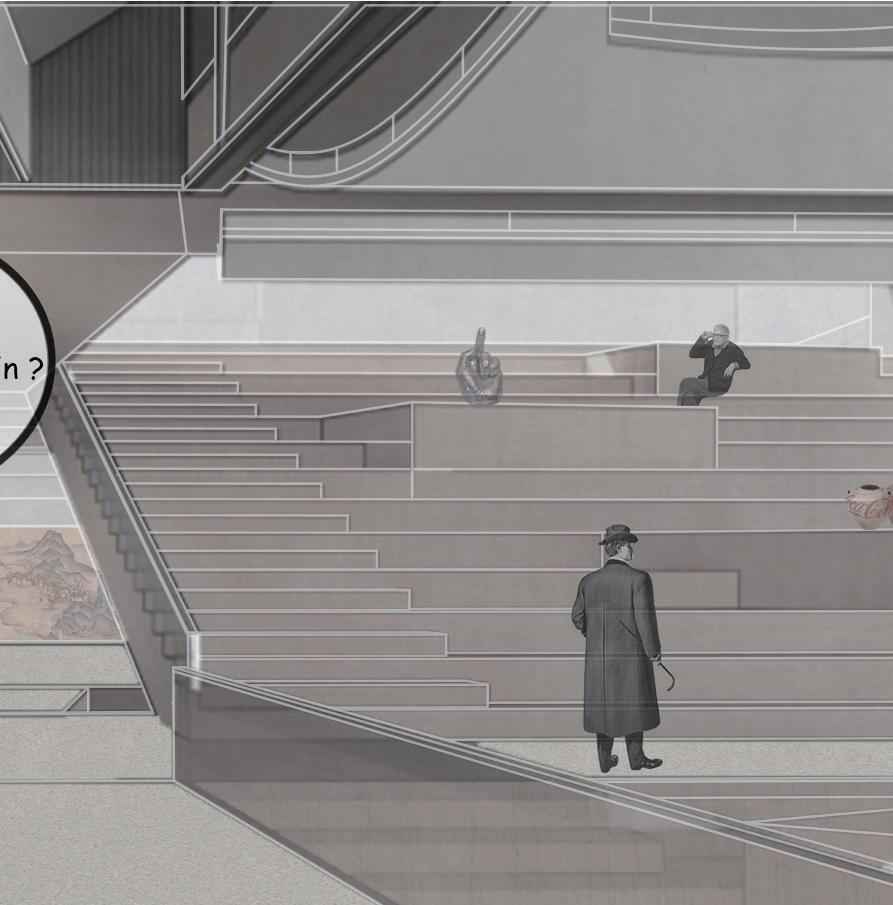
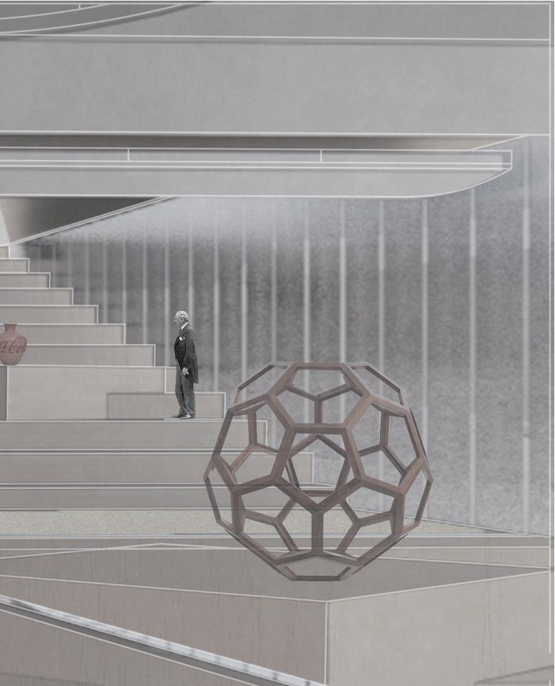
Gallery View Corner
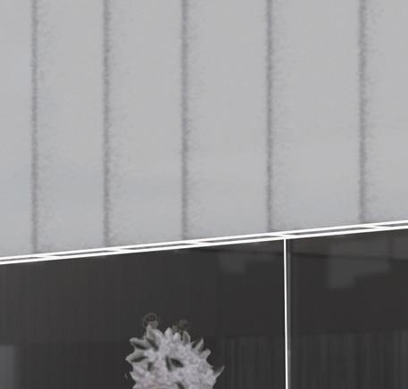
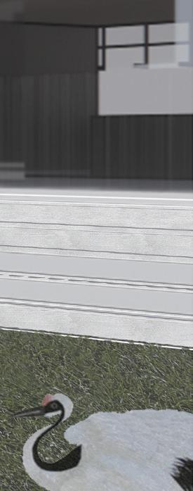
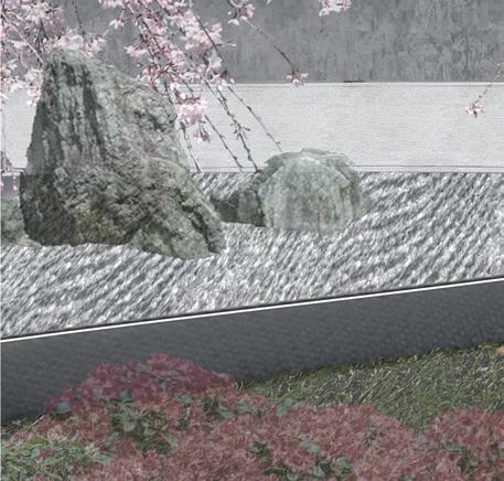
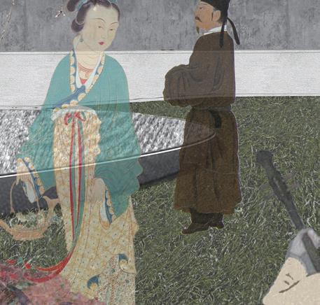


20 21
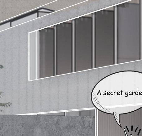
Secret garden behind the building
Main Material: Concrete
SWEETWATER MEDITATION CENTER
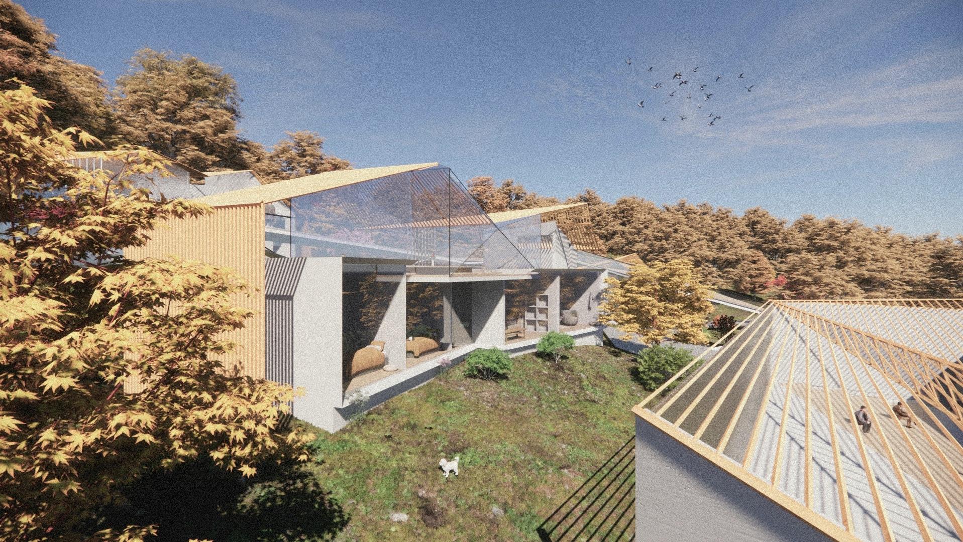
Architecture Studio 3 Instructor: Logman Arja Software: Rhino, Grasshopper, Enscape, Adobe Photoshop, Adobe Illustrator, Adobe Indesign
TIANRUN WU SPRING 2022
22 23
PROJECT II
Sweetwater Meditation Center
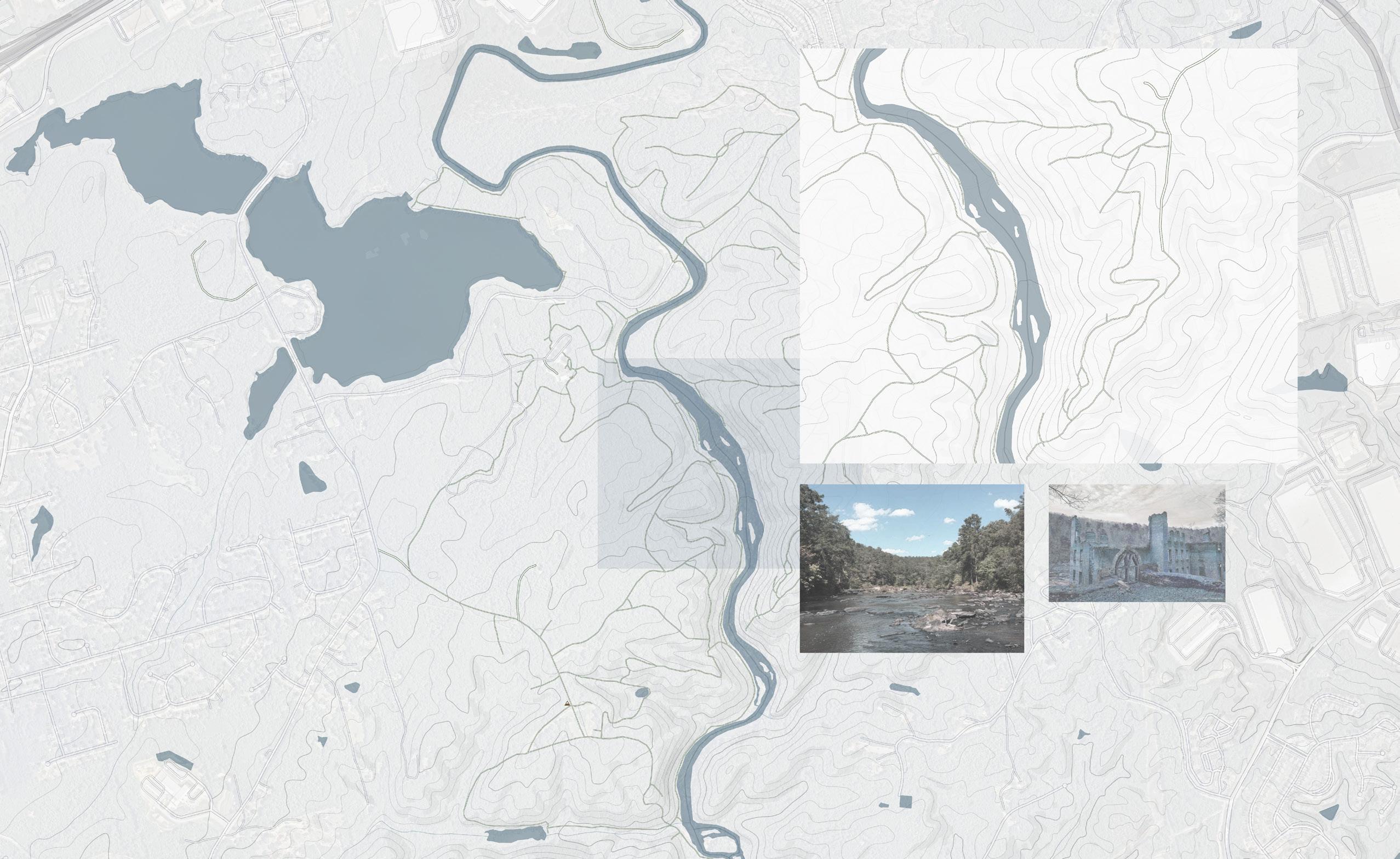
Sweetwater Creek State Park is a 2,549 acre (10.32 km2) Georgia state park in east Douglas County, 15 miles (24 km) from downtown Atlanta. The park is named after Sweetwater Creek which runs through it. Cherokee people were forcibly removed from the area and it eventually became home to the New Manchester Manufacturing Company and mill town of New Manchester. During the American Civil War the textile mill and general store were burned down by the Union Army and the women and children taken away and eventually sent to Louisville, Kentucky and Indiana as refugees.
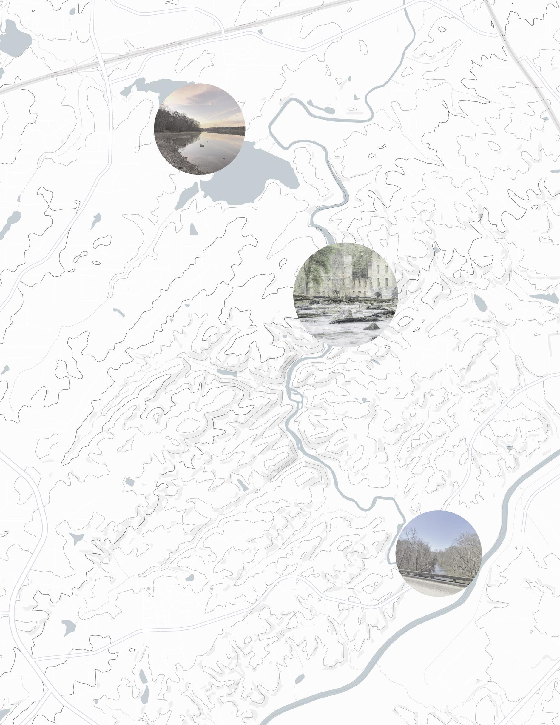
MOVEMENT & SPACE & NATURE & LIGHT
SITE ANALYSIS
20
Sweetwater became an official state park in 1972, driven in great part by the work of the Georgia Conservancy, an environmental organization that was formed during a meeting at Sweetwater Creek in 1967. The park features wooded walking and hiking trails, the George Sparks Reservoir, a visitor center, a bait shop, and a gift shop, as well as the ruins of the New Manchester Manufacturing Company.
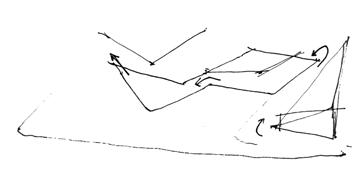
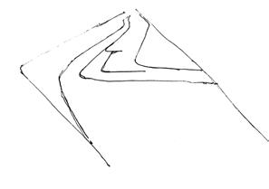
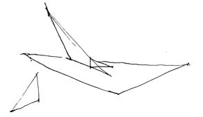
TRIALS OF FORMS
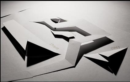
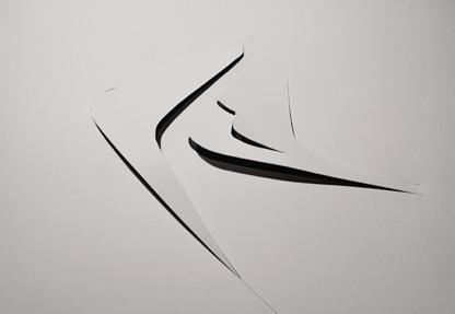
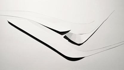
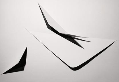

21
1. Using the parallel lines to create the geometries
2. Creating a “flow” crossing each program
3. Providing each program with a three-dimensional geometric form
1 2 3
FORM & PROGRAM
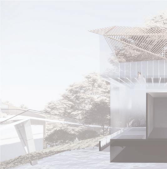
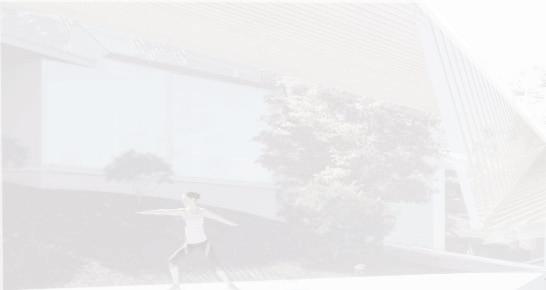
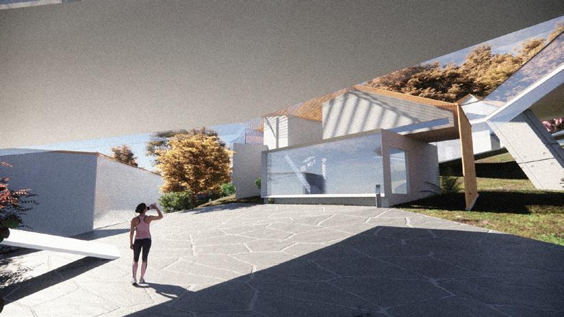
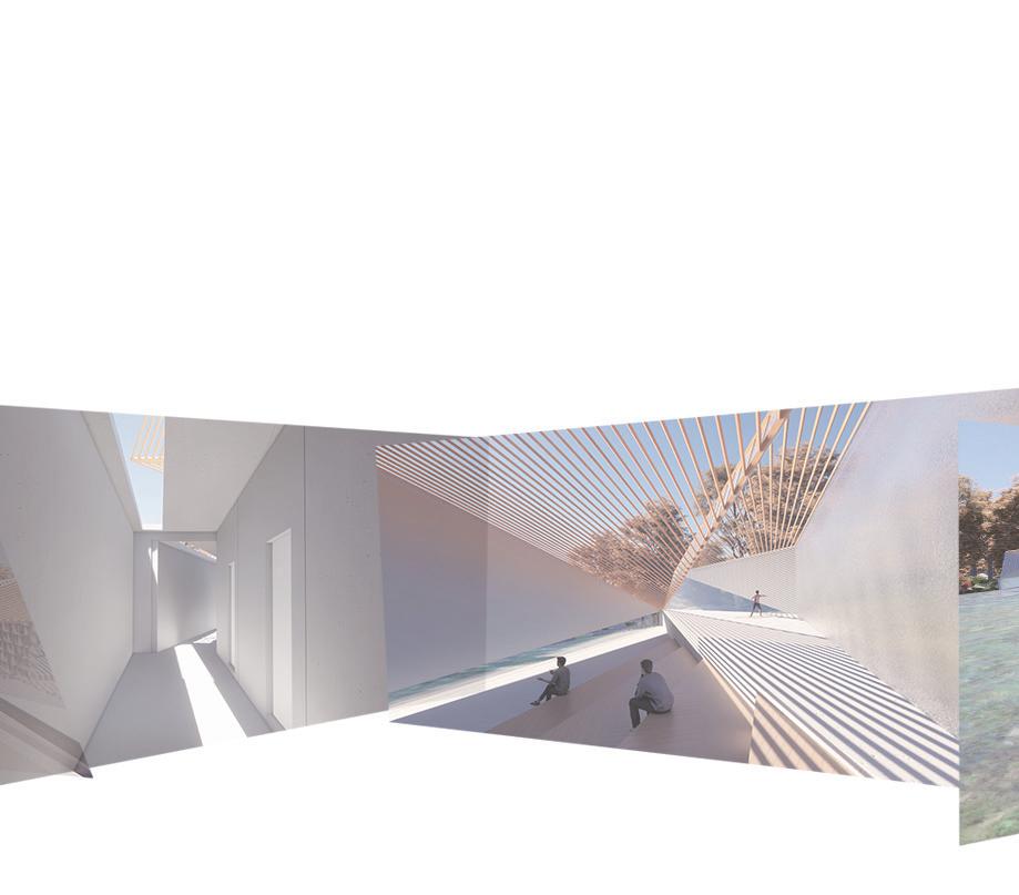
The project aims to use the variation between light and shadows to help visitor to meditate, bringing with the dynamic of the nature and sensory perception through movement and feeling. The beautiful nature around the site includes the water, the animals and plants and the undulating terrain. How to follow the landscape, how to connect the interior and exterior and how to prompt the movement of the visitors become the important topics of the project. Meditation center has five programs, including Yoga space, living area, auditorium and arrival area, which provides the visitors with various choices and experiences.
26 27
LIVING AUDITORIUM YOGA
ARRIVAL
OFFICE
MEDITATION
SPACE
&
PLANS IN THREE DIFFERENT SCALES
























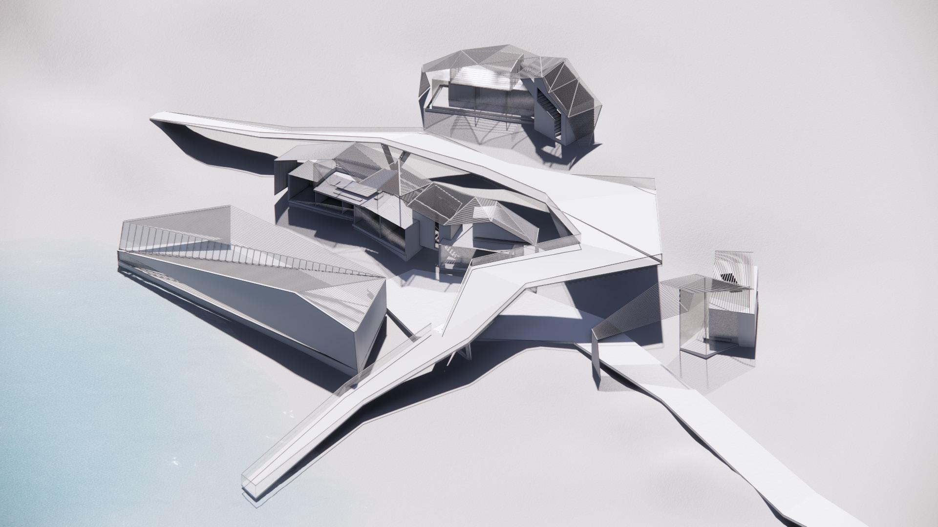
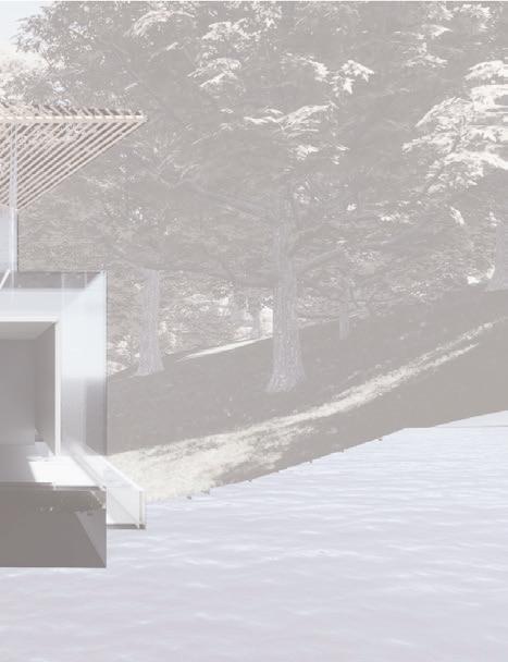
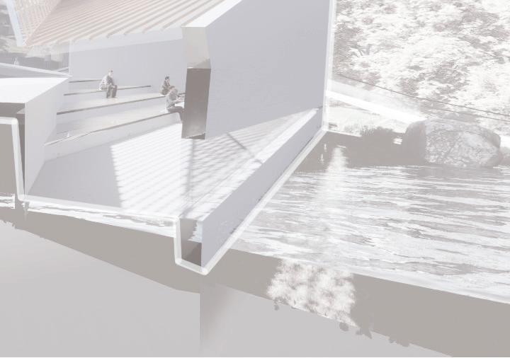
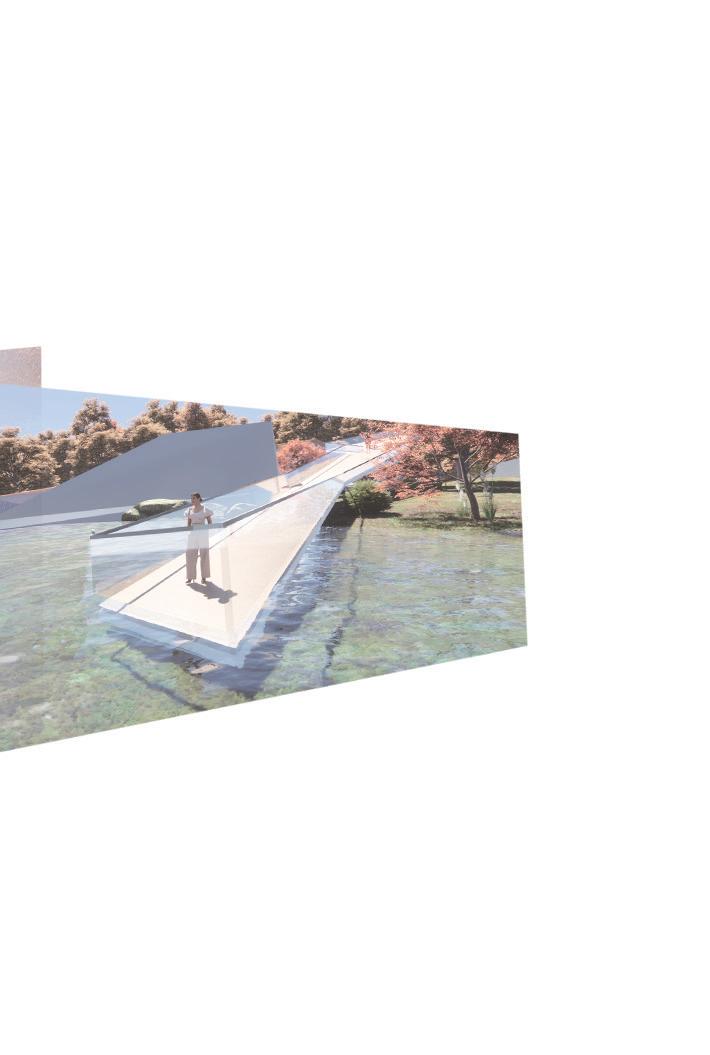
The great platform shuttling between the different parts of the project emphasizes the movement characteristic. The platform starts from the trail and ends in the center of the water, connecting different programs. When people walk on the platform, they can be easier to enjoy the beautiful landscape and integrate themselves into the nature. Twists and turns in the form let people have a new perspective and experience every time they move. The changing sight ends in the water, the most exciting part of the project, where people can relax completely and be completely

TRAIL NEW MACHESTER MILL RUINS SWEETWATER CREEK
TRAIL


























 MILL RUINS
28 29
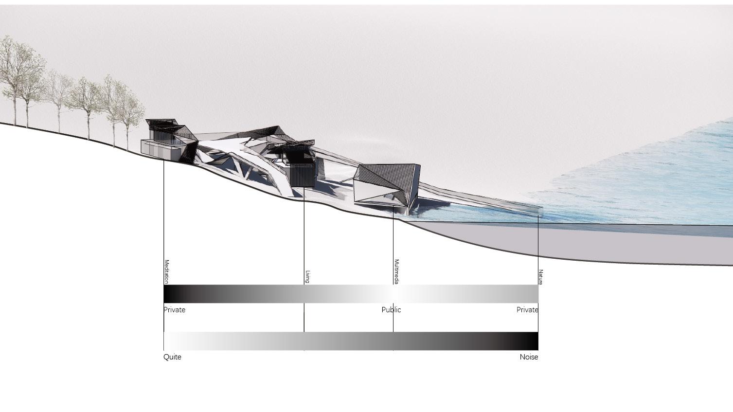
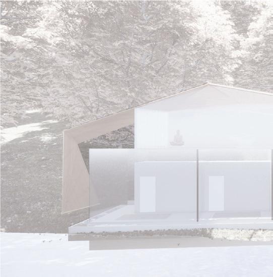
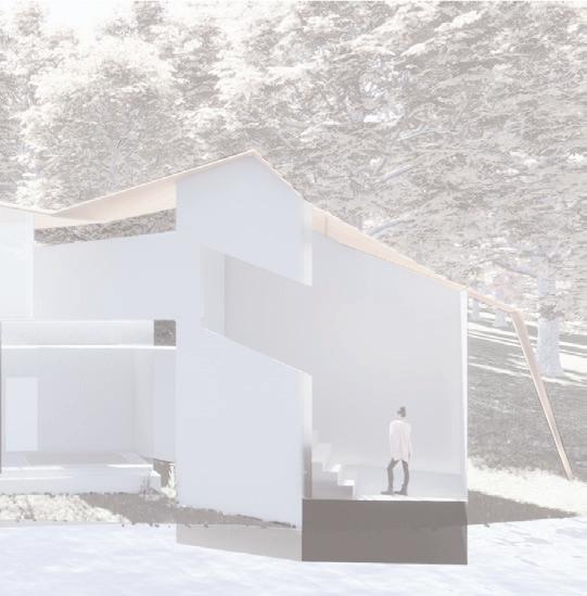
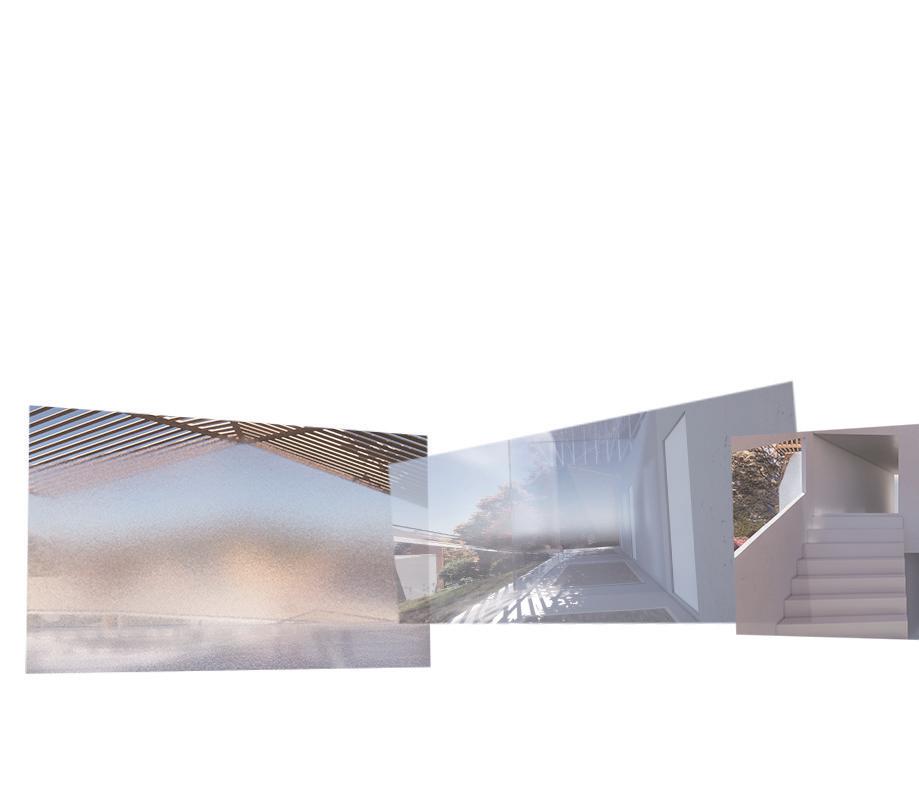
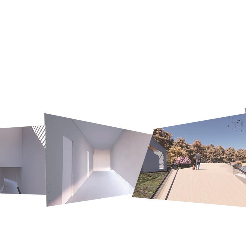
The sequence of the layout from left to right (west to east) is from private to public to private. Meditation area, the most private and quite space, is set away from the river and noisy space. Surrounded by the nature, the meditation area has two topics, transparency and blurry. The first floor is surrounded by the transparent windows, which help to bring the outside nature into the interior space. The next floor is surrounded by frosted glass, presenting the surrounding scenery to visitors with a hazy feeling, like an oil painting, like a dream.








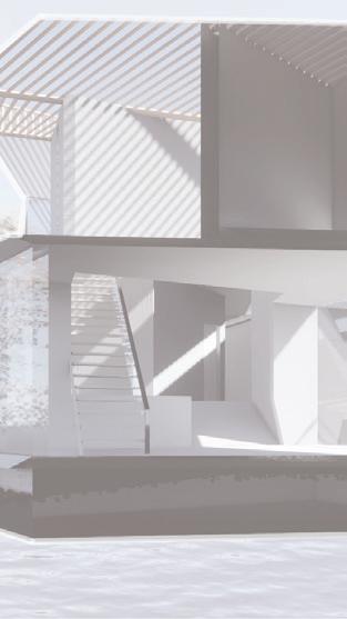
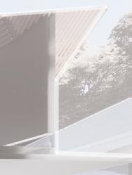


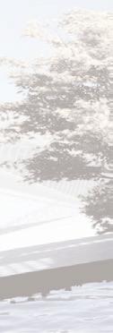
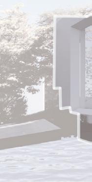





30 31
MEDITATION AUDITORIUM & YOGA SPACE
AREA
MEDITATION
LIVING
Living Yoga Space Auditorium
Meditation
Arrival
32 33


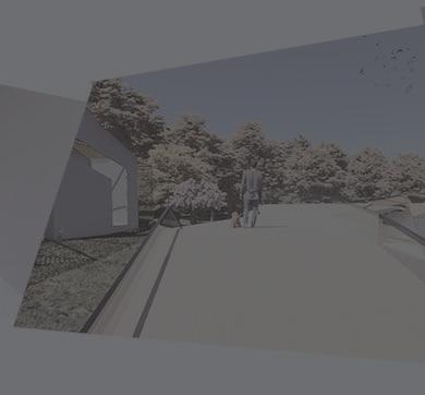
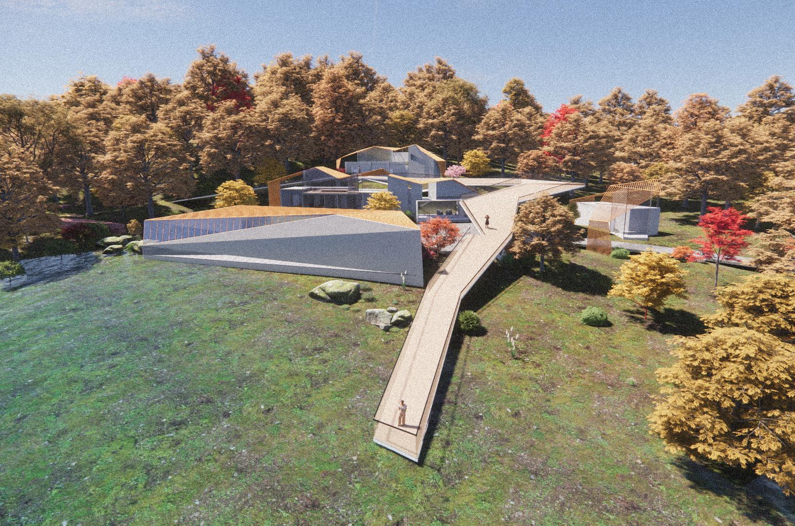
PRIVTE PUBLIC MEDITATION Room 2 MEDITATION Room 1 MEDITATION Hall MEDITATION Corrider RENDERS & LASER CUTS
PLATFORM
LIVING AUDITORIUM
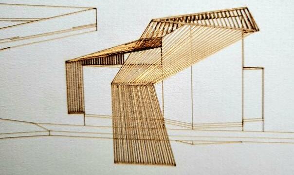
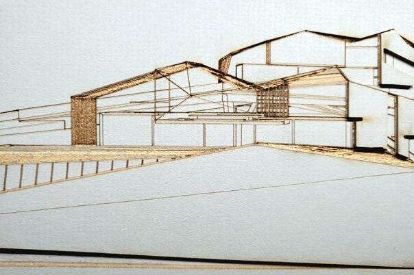
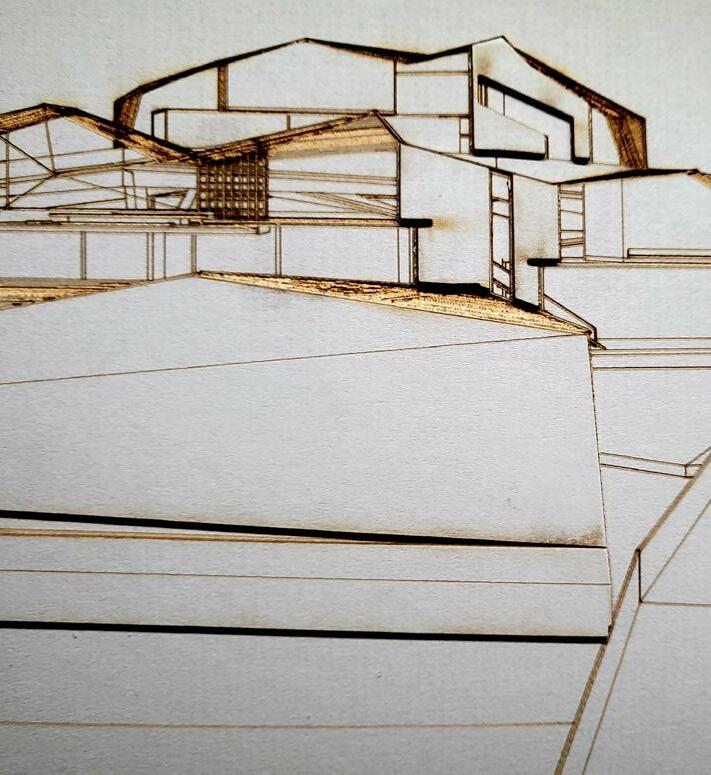
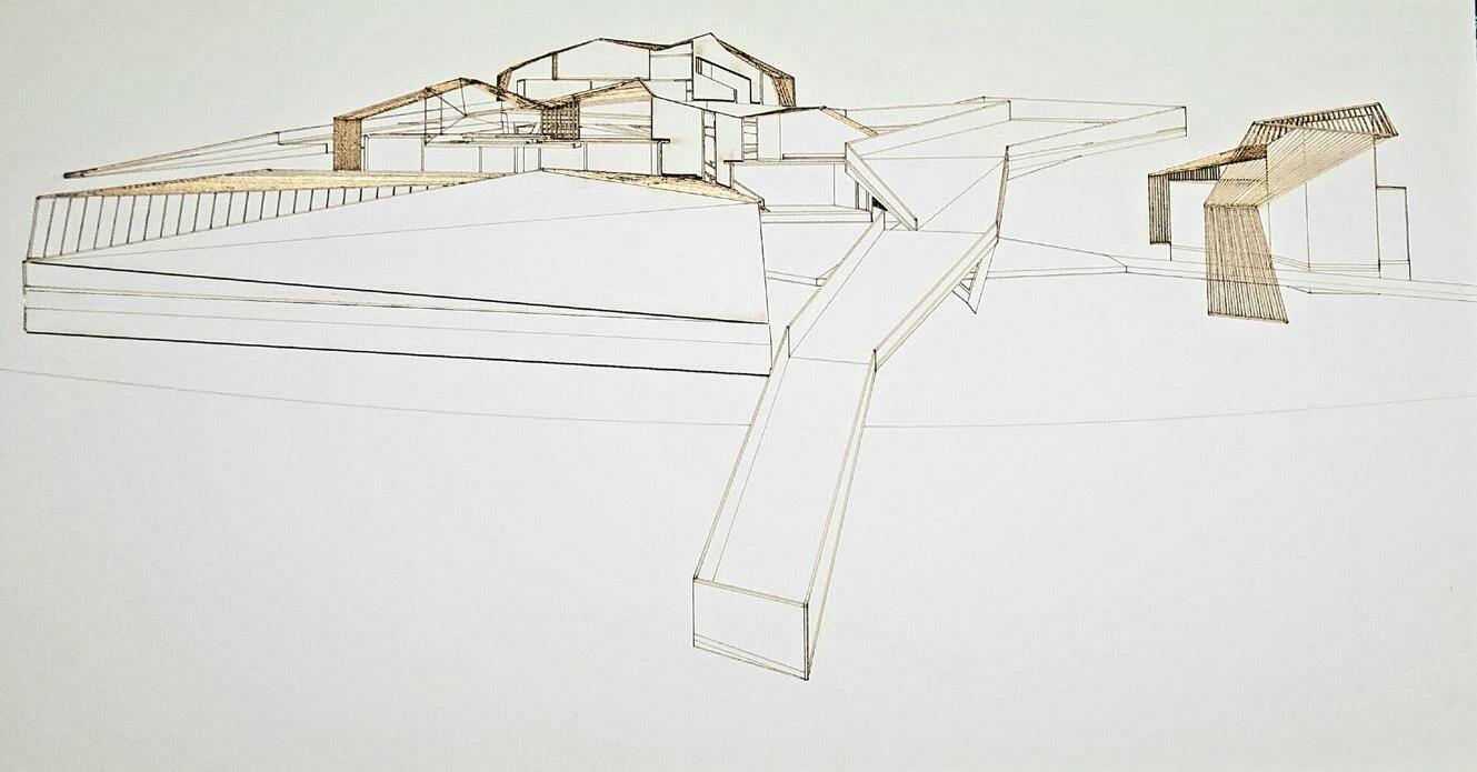
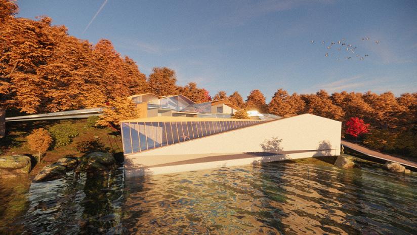
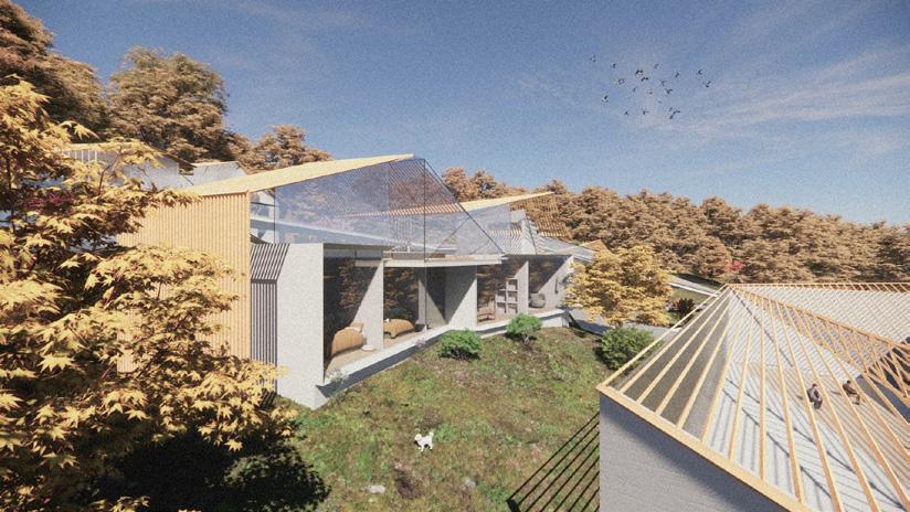
END


34 35
Main Material: Concrete
PROJECT
DESIGN RESEARCH ACADEMY FOR SAN FRANCISCO
Architecture Studio 2 Instructor: Stuart Romm Software: Rhino,Vray, Adobe Photoshop, Adobe Illustrator, Adobe Indesign
 TIANRUN WU & XINYAN LI FALL 2021
36 37
III
APPLICATION OF THE ISLAMIC TESSELLATION
FIGURATION AND DEEP DECORATION
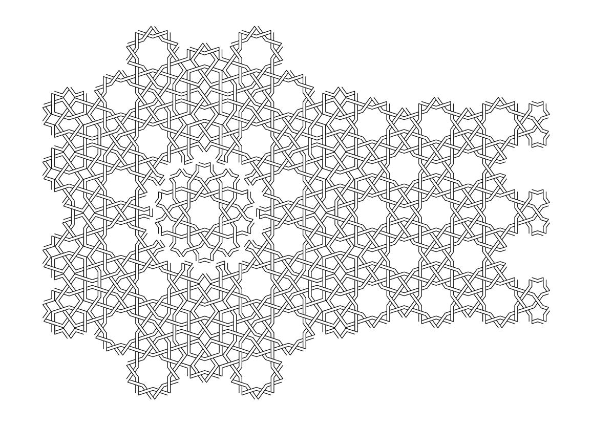
Our investigation of the Islamic Tessellation began with the study of various historical patterns, including decorative art patterns from India, Turkey and Transoxiana. Our main research is Islamic geometric patterns, which is always divided into 4-fold, 5-fold, or 6-fold patterns, and these patterns are abstract, flexible, coherent and dense. Not only that, these patterns are usually symmetrical or centrally symmetrical, forming a complex texture while also having a sense of beauty.

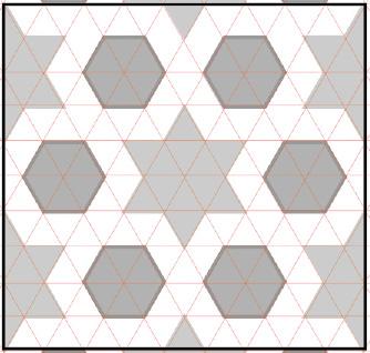
The sources are taken from the buildings where certain walls , floors and decorative piece, covered with colored tiles with grout lines in between the shapes. The grid under the patterns is also very interesting. The isometric grid is mainly for the 3-fold and 6-fold patterns.
The grid of 4-fold and 8-fold is mainly square grid. These grids help to construct the patterns and compose an order throughout the whole pattern.
The Girih tiles, like the grid of other fold, serves for the mathematical function for the construction of the 5-fold patterns. They have been used since about the year 1200 and their arrangements found significant improvement starting with the Darb-i Imam shrine in Isfahan in Iran built in 1453. Because of the specialty of the 5-fold patterns, the pattern can not be easily divided into small dispersed shapes, like triangles and rectangles, or squares.
All sides of the figures in the 5-fold patterns have the same length, and all their angles are multiples of 36° (π/5 radians). All of them except the pentagon have bilateral (reflection) symmetry through two perpendicular lines. Some have additional symmetries. Specifically, the decagon has tenfold rotational symmetry (rotation by 36°); and the pentagon has fivefold rotational symmetry (rotation by 72°).
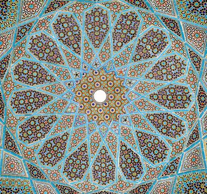 Isometric Grid Tomb of Itimud ad-Daula, Agra, India
in Shiraz A M J D F B K H L E G O R Q N P C
Girih Karatay Medrese, Konya, Turkey
Tomb of Hafez
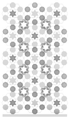
This is a combination of 4-fold and 6-fold patterns. The 4-fold is from Agra Fort, Agra, India and the 6-fold pattern is from Tomb of Itimud ad-Daula, Agra, India. The first combination is letting the 6-fold patterns to be the grid and put the 4-fold ones in the gaps of the grid.
The next combination is based on the creation of new pattern. I create a new pattern to connect the 6-fold pattern and the octagon. Then I translate the basic pattern into a larger one. The last step is put the 6-fold pattern into the gaps to make the gaps more regular.
The last one is using the 4-fold patterns from the Agra Fort has the basic grid. However, instead of using the rhombus as the center shape of the basic pattern, I use the 6 point star from the 8-fold pattern as the center shape.
This pattern illustrates the transitions of the 4-fold patterns. The transitions experience four different procedures, including radial, scaled, free-form and transitional. I create a new pattern to connect 8 octagons, which forms a great transition. The 4-fold is quite easy to be reformed and connected because the underline of the pattern is the square grid.
38 39 CONFIGURATION SHOWING COMBINATIONS (4-FOLD+6-FOLD)
SHOWING TRANSITIONS (4-FOLD)
CONFIGIRATION
CONFIGURATION SHOWING TRANSITIONS (6-FOLD)
The next pattern is the transitions of the 6-fold patterns. Like the last one, the procedure includes four procedures. The difference is that the under gird of the pattern is the triangle gird but the function of the grid is the same, which helps to create different combination of the patterns.
CONFIGURATION SHOWING TRANSITIONS (5-FOLD)

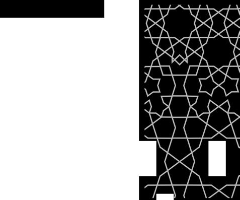
The pattern here illustrates how 5 fold shapes could combine together through radial, translational, free-form, and scaled ways that all follow the underlying rule of Girih Tile. The first pattern in this panel creates the configuration by having some overlaps with shapes of decagons and also forms some regular gaps between the scaled decagons. The second pattern tries to connect scaled shaped with some freeform shapes; however, there are some irregular gaps between different geometries. The third gray configuration is more promising as it creates regular shapes to connect with
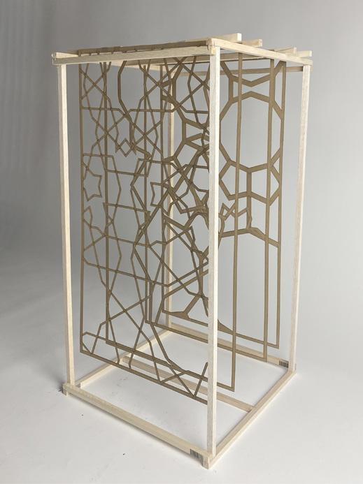
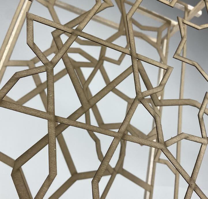
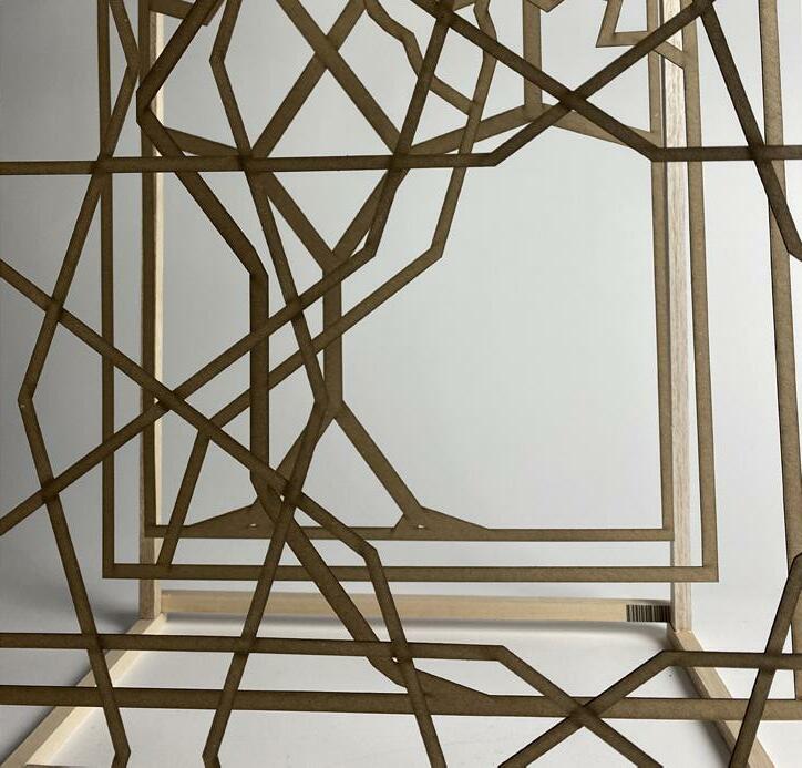
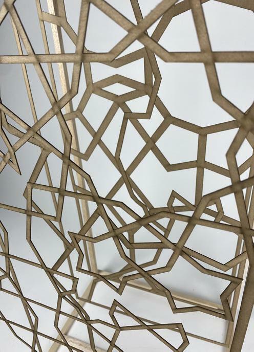
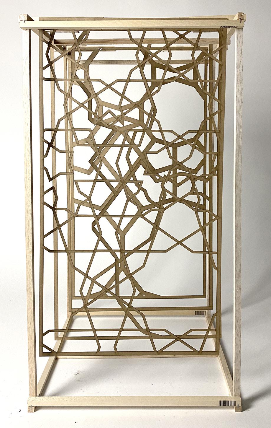
The first and the sixth picture shows the entire view of the model and the other show the detail feature. The light comes through the gaps of the Islamic patterns, making the space between the panels viable and dramatic.
40 41 LASER CUT
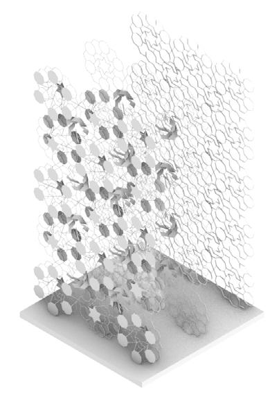
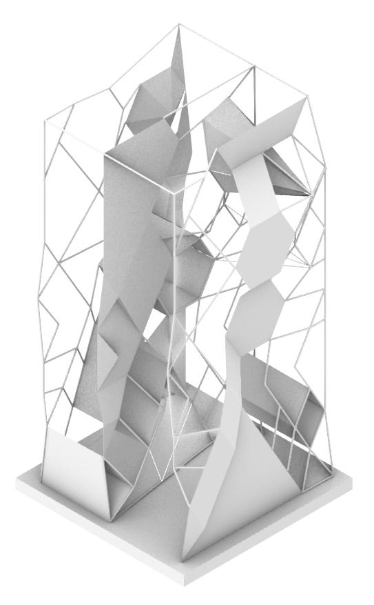
The first variation is from the 6-fold’s transitions from the previous slides. The overall idea of the transformation is folding and projecting. On each surface, I fold the pattern to create a dynamic surface of the plain. Moreover, the three different planes also project each other by using appropriate subtracting. When seeing from the front, the whole structure is just like the pattern before. However, when rotating the sight, the ups and downs of the surface gradually appear, just like the wave of the sea.
PROJECTING
FOLDING EXTRUDING
EXTRUDING PROJECTING
PROJECTING & SUBTRACTING (6-FOLD)
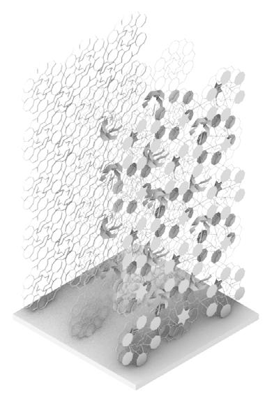
The next variation is from the combination of the 4-fold and 6-fold patterns. Two main ways used here is the projecting and subtracting. From the front to the back, each layer is become lesser and lesser by subtracting from elements from the previous one. The first layer is constructed by changing the order of the patterns, applying a new spatial order.
SUBTRACTING PROJECTING
of the interesting point is the directions of the shape. The first figure in each line is clockwise and the second figure is counterclockwise. When the viewing angle changes, such simple graphics become dynamic patterns.
FOLDING & PROJECTING (6-FOLD)
RENDERED ISOMETRIC RENDERED ISOMETRIC
RENDERED ISOMETRIC
GEOMETRIC COMPOSITION
TOP VIEW SECTION VIEW FRONT VIEW
EXPLODED ISOMETRIC
EXPLODED ISOMETRIC
+45° +22.5°
SECTION
FRONT VIEW
TOP VIEW
VIEW
One
EXTRUDING & PERFORATING (5 fold)
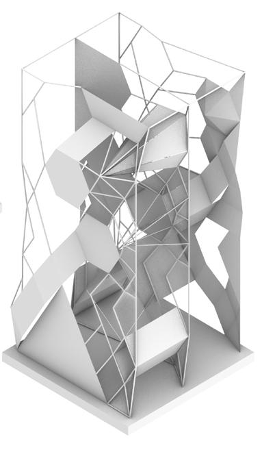
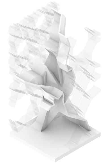
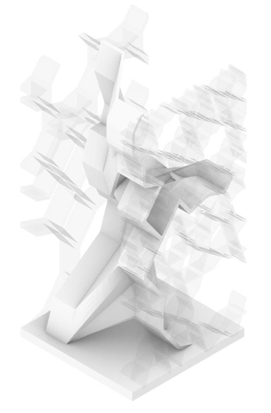
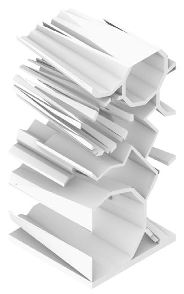
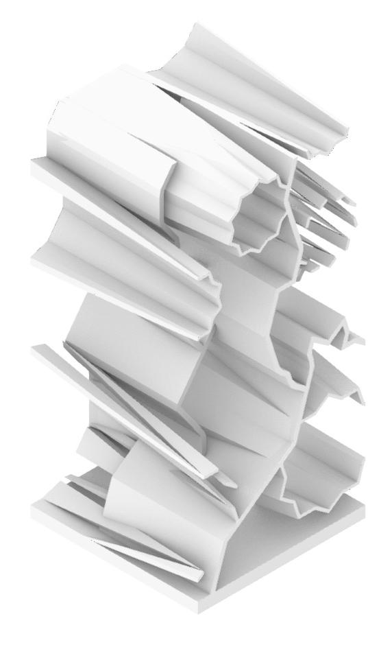
This variation utilizes the method of extruding between the ten points stars on the first layer and the decagon on the fourth layer so that the two patterns create connection. It forms tubelike geometry. Also, the way of perforating is applied in some “tubes” so that forms variety and makes the entirety less dense. Moreover, the second layer is extruded and extended to the fourth layer; the third layer is extruded and extended to the first layer.

This variation uses the loft command between the second layer and the third layer that creates interesting and complicated volume, which looks like a sculpture standing on the middle. Moreover, the first layer and the fourth layer are extruded with relatively thin thickness and applies with glass material. The patterns in second and third layers also be extruded to make connection between the “sculpture” and the glass facade.
42 43
VIEW SECTION VIEW FRONT VIEW
GEOMETRIC COMPOSITION & VARIATION
TOP
RENDERED ISOMETRIC
RENDERED ISOMETRIC RENDERED ISOMETRIC TOP VIEW FRONT VIEW SECTION VIEW
EXPLODED ISOMETRIC + = PERFORATING
EXTRUDING
EXTRUDING & LOFTING (5 fold)
1 2 3 4 LOFTING EXTRUDING
APPLYING GLASS MATERIAL
DESIGN RESEARCH ACADEMY FOR SAN FRANCISCO
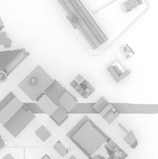
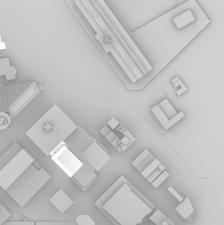
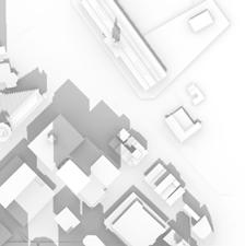
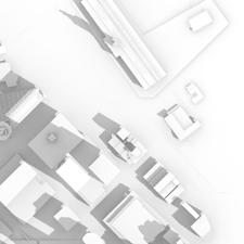



wind ow water ow Sun's path on the 21st December
Sun's path on the 21st June
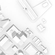
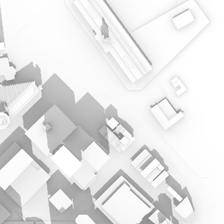
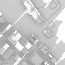
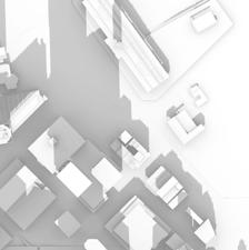
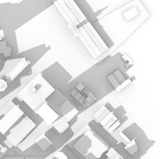
The site is located at the corner of the Embarcadero and Con Chee Way in Downtown San Francisco. The site is currently used as a tramway station; however, the station will be removed, and its structure will be demolished. There is a seven-story building adjacent to the southeast side of the site and a four-story building adjacent to the southwest side of the site. The site provides impressive vista points looking at the San Francisco Bay and Several historical landmarks. The site looks at the financial district in the northwest direction and the San Francisco Bay in the northeast direction. One of our important design objectives is to capture the great view of the San Francisco Bay. Several historical landmarks around the site include Ferry Building, Ferry Station Post office, Ferry plazas, Embarcadero Plaza, Hyatt Regency by John Portman, Treasure Island, and San Francisco-Oakland Bay Bridge. The port area and the Ferry Building, restored and redeveloped as a gourmet marketplace, attract locals and tourists to the site.
The basic geometry of the surrounding buildings is also one of the important considerations. The seven-story building next to our site is an extrusion-like building. The windows extrude out from the main body of the building. In response the surrounding context, we use “mass” as our major design form, with the “Islamic Pattern” as texture style.
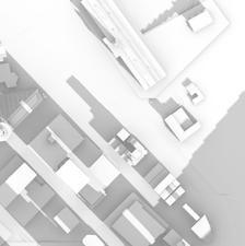
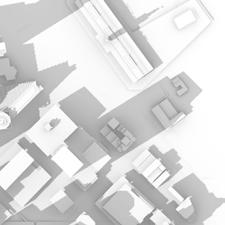
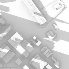
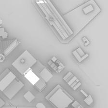
03.21 09:00 am 12:00 pm 15:00 pm 18:00 pm
natural ow (wind/sunlight/water) vegetation
06.21 09.21 12.21
APPLICATION OF THE ISLAMIC TESELLATION
Downtown O ce Community Business Public
natural ow (wind/sunlight/water) vehicular ow vegetation land use Unobstructed General Congested Sun's path on the 21st June wind ow water ow Sun's path on the 21st December
Volume after lofting Simplifying & Hollowing Projecting pattern
Front structure: thinner strap pattern Back structure: thinner strap pattern as mullions with glass
44 45
Final Atrium Geometry
SUPPORT AREA STUDIO AREA 2

Main entrance
Elevator
circulation with open
Solar panel over the roof
Warm air convection Cross ventilation
Fire stair Open stair
Main
stair
Vegetation
FACULTY AREA RECEPTION AREA / LOBBY
PUBLIC SPACE STUDIO AREA 1
MULTIMEDIA SPACE Storage Mechanical/Electrical Room Tel/Data/ Custodial Locker Rooms Guestrooms Public Restrooms Fabrication lab 1&2 Paint box Black box Material Printing/ Imaging Administration Zone Faculty/Student Fishbowl Faculty Touch-Down Library Cafe Gallery Studio areas Classrooms Materials Sampling Auditorium Interactive
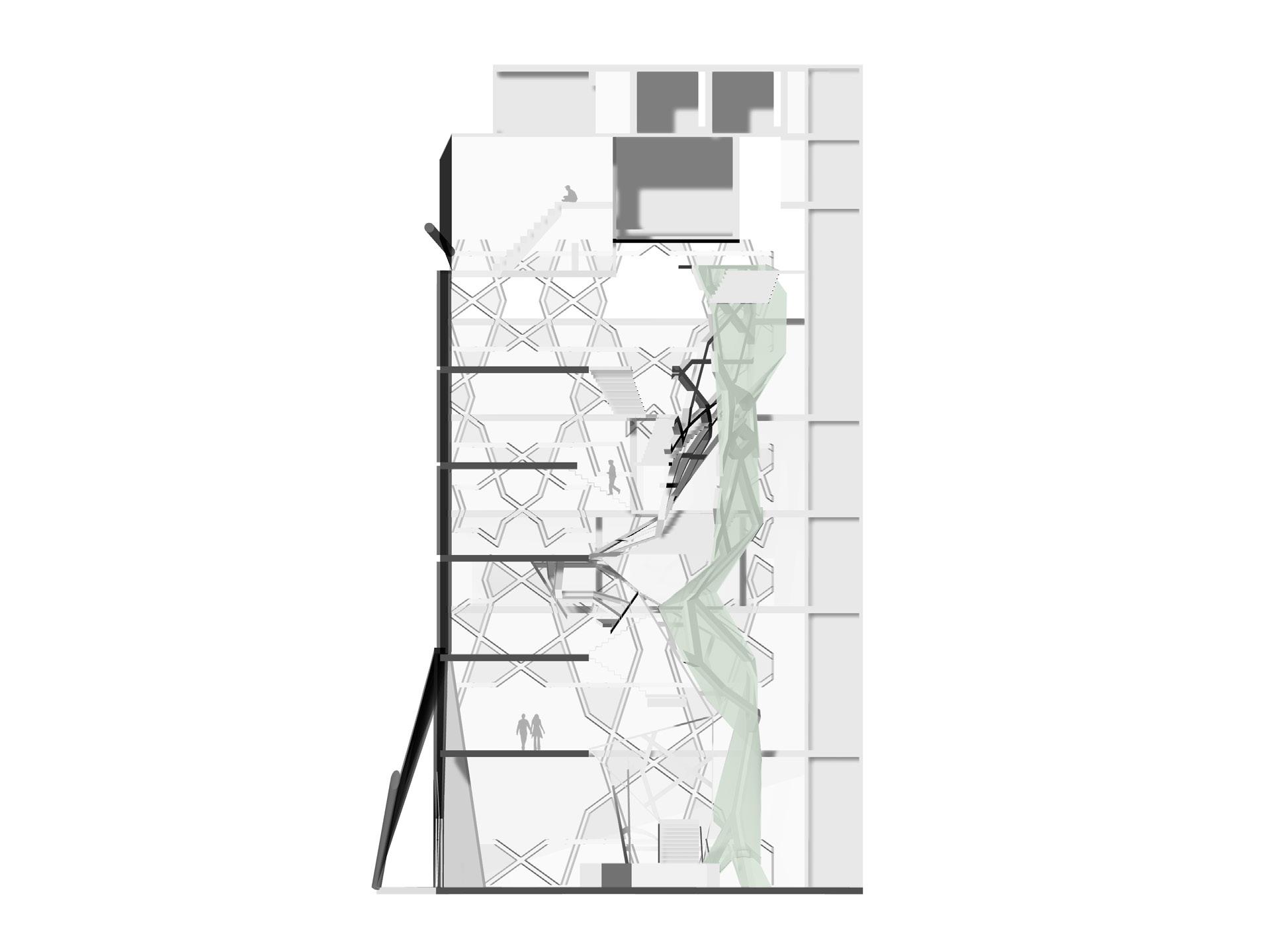

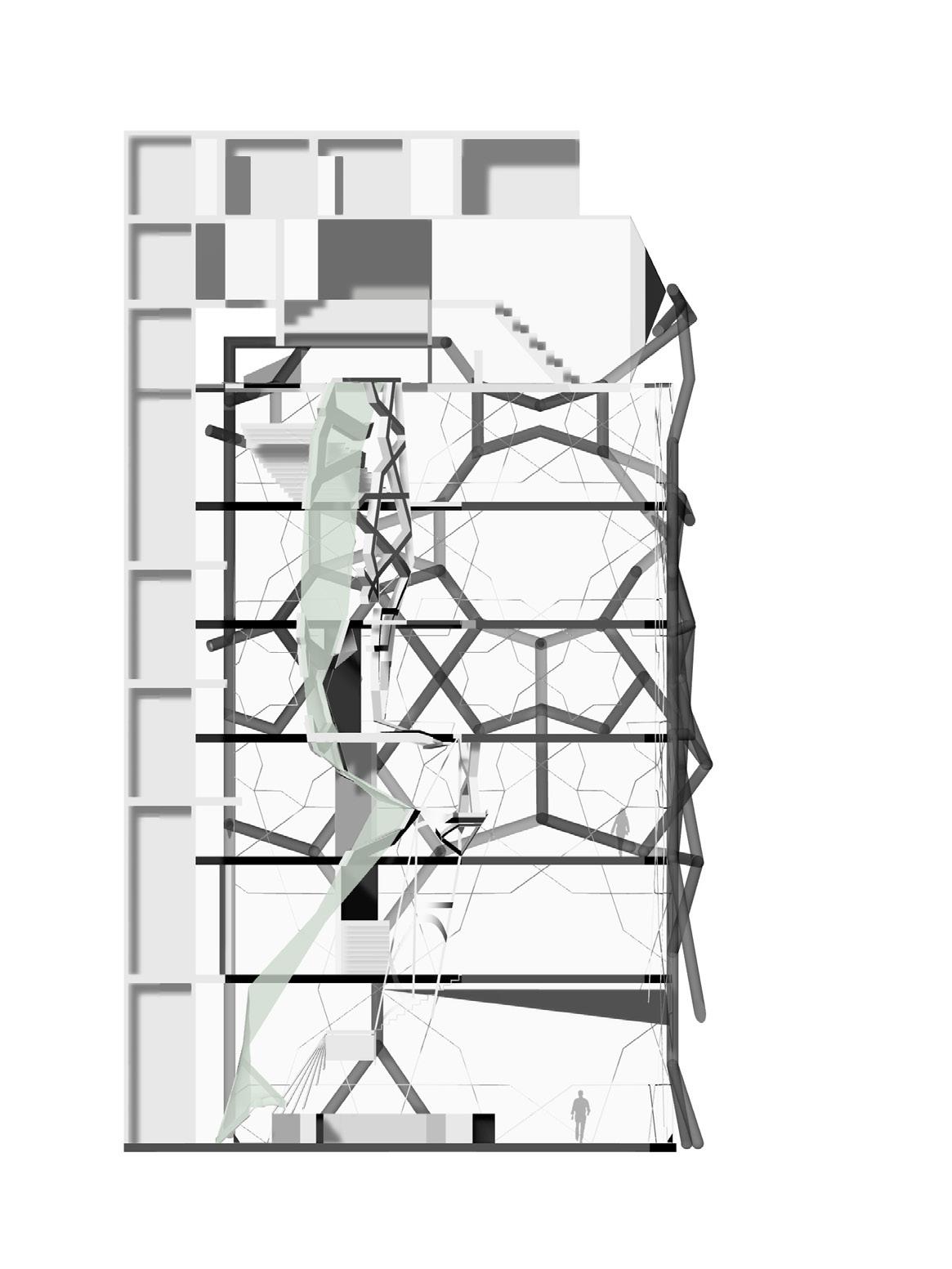
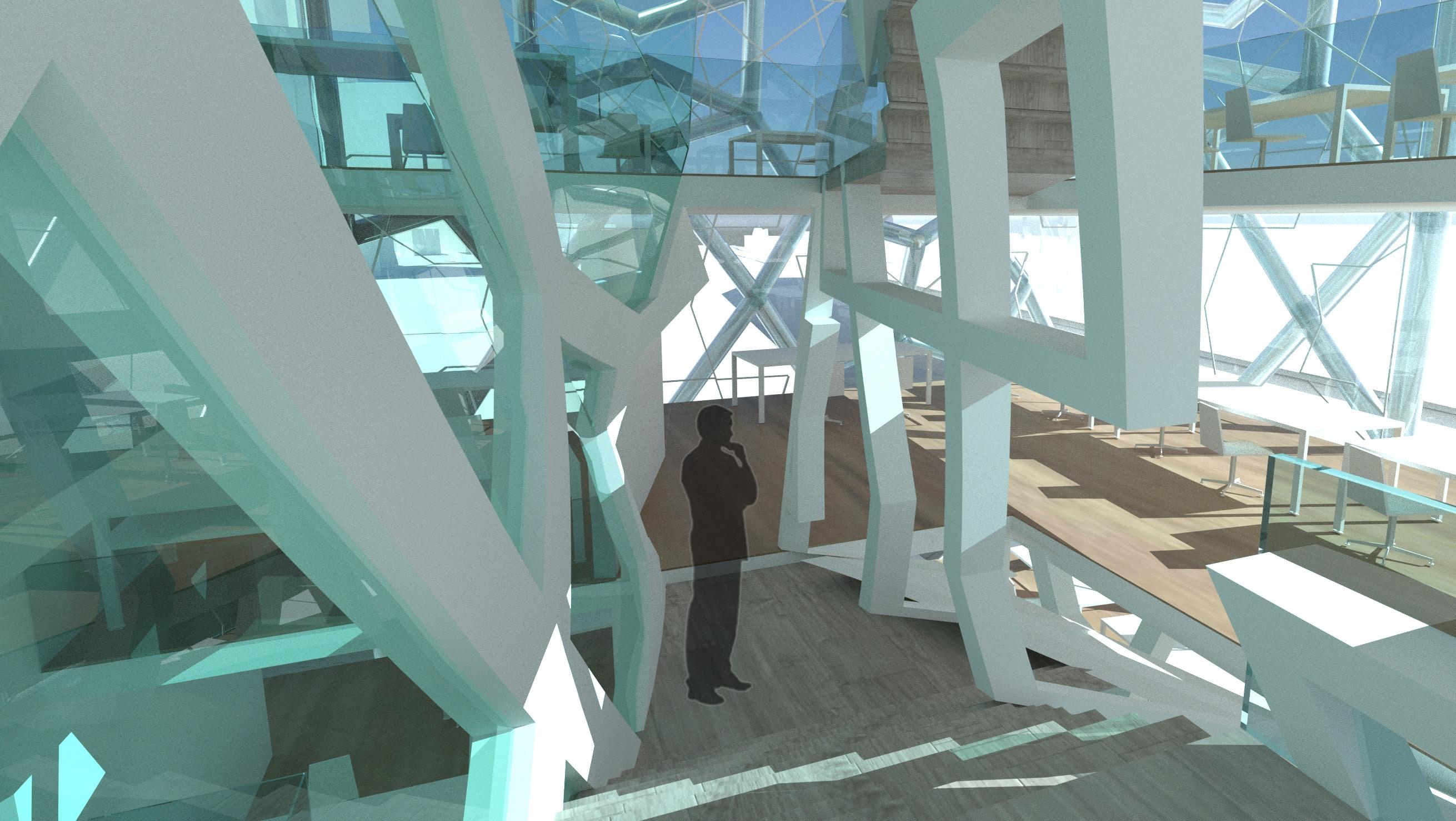
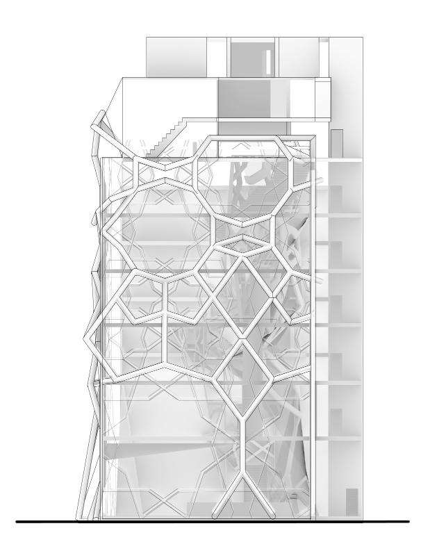
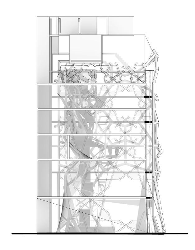
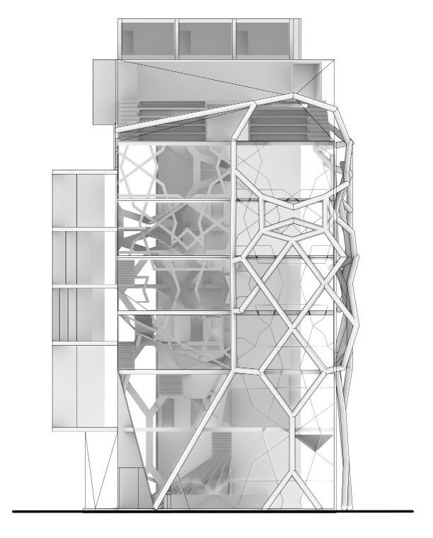
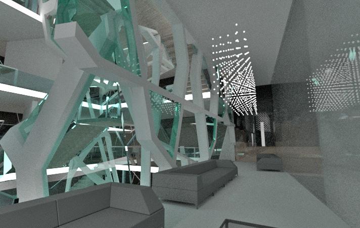
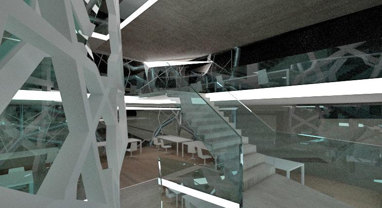
The exterior Islamic patterns and the interior patterns not only help to decorate but also serves as structural framework of the building, making the interior floor without columns possible. The design of the library utilizes the beautiful view outside. The stairs serve as the bookshelves, making the books more accessible and students can sit on the stairs to enjoy the great view. The multimedia room create a “Zen” space. Through the window between the library and the multimedia room, the view of the San Francisco Bay is carried into the interior. The design is a practice of the Islamic Pattern into the modern architecture, making the two-dimensional pattern into three-dimensional, creating space inside and designing a sustainable building, which is also important for this era.
STRUCTURAL FRAME ATRIUM
HISTORY MODERN &
48 49
STRUCTURAL FRAME GLASS GLASS MULLIONS MULLIONS
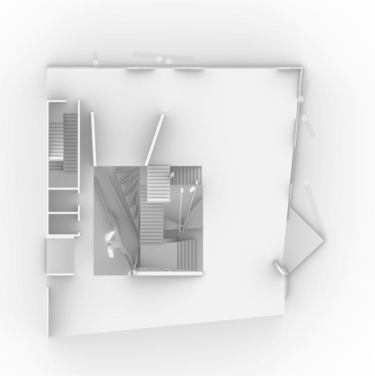
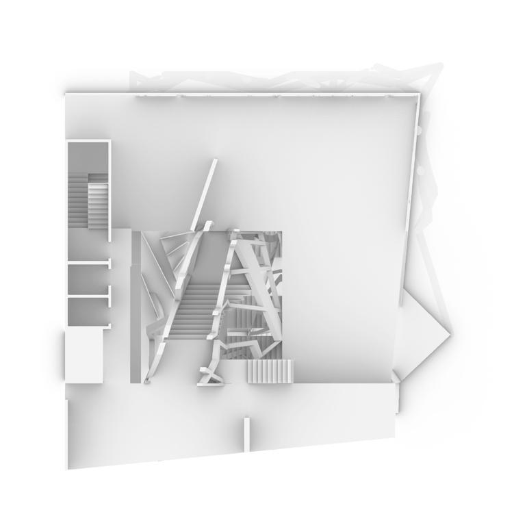
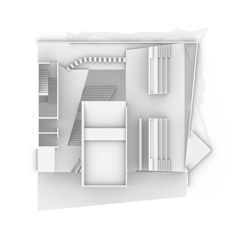
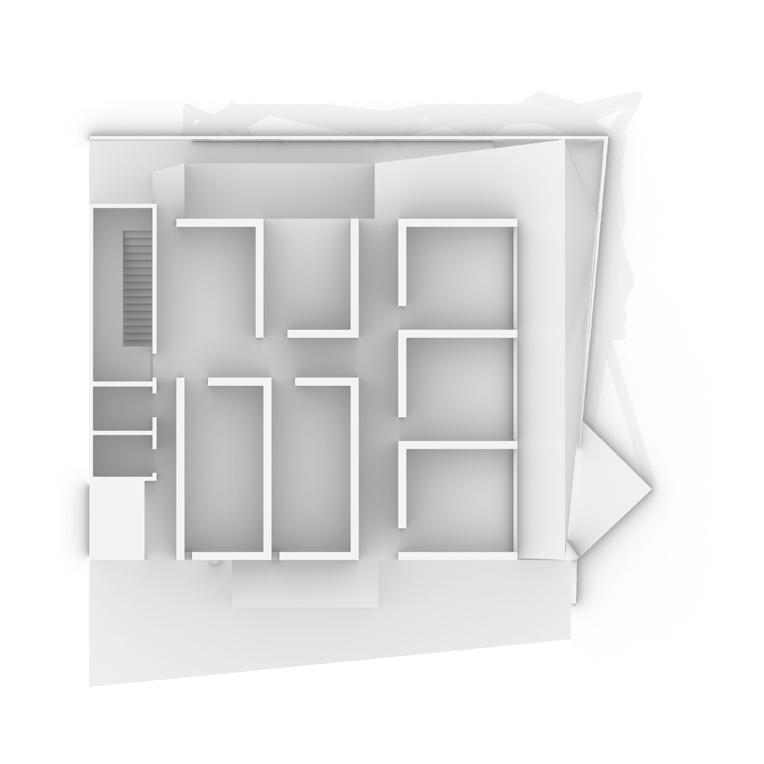


5th floor 3rd floor 7th floor 1 LOBBY 1 STUDIO I AREA 2 STUDIO II AREA 3 ENCLOSED OFFICES 1 STUDIO I AREA 2 SEMINAL/ CLASSROOM 1 AUDITORIUM MULTI-MEDIA SPACE 2 LIBRARY 3 GALLERY 1 STUDIO I AREA 2 STUDIO II AREA 3 STUDENT/FACULTY MEETUP AREA 1 STUDIO I AREA 2 STUDIO II AREA 3 CLERICAL AREA 1 AUDITORIUM MULTI-MEDIA SPACE 2 LIBRARY 3 CAFE AREA 1 STUDENT/STAFF LOCKER
2 GUESTRROOMS 6th floor 4th floor 8th floor 1 1 1 1 1 1 1 1 1 3 2 2 2 2 2 2 2 3 3 3 3 3 3 2 2 2 N
ROOMS
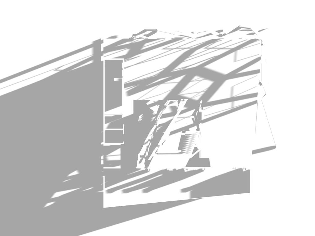
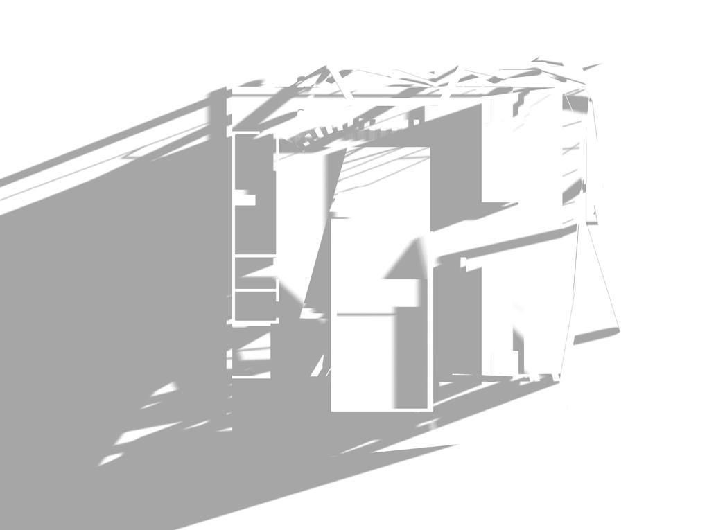
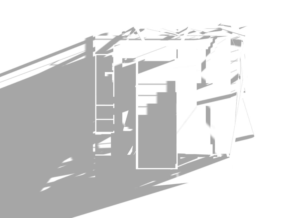
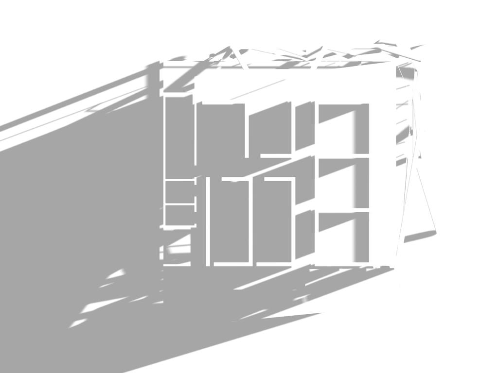
Considering the fantastic bay view and minimizing the use of artificial light, we do not add too much cover on the surface of the building. Introducing the natural light and using Islamic patterns at the surface, we make variable and beautiful light and shadows in the interior of the architecture. The mullion of the outside window also comes from the Islamic Pattern, which is the Girih tiles of the exterior patterns, the structural framework of the building.
50 51
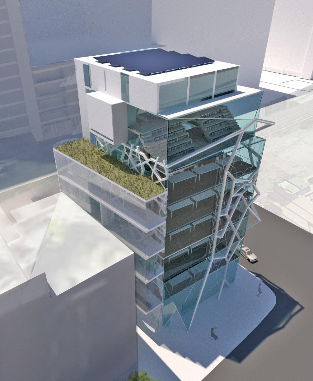
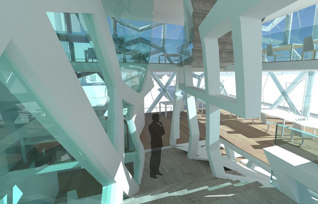
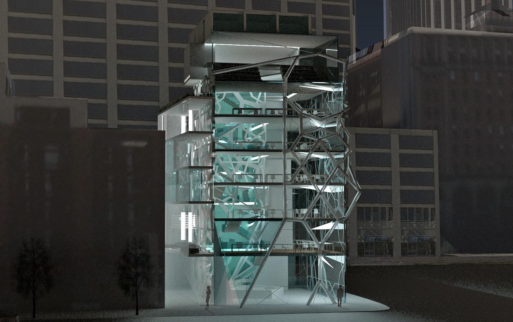
1 2 1. BIRD VIEW 2. ATRIUM INSIDE
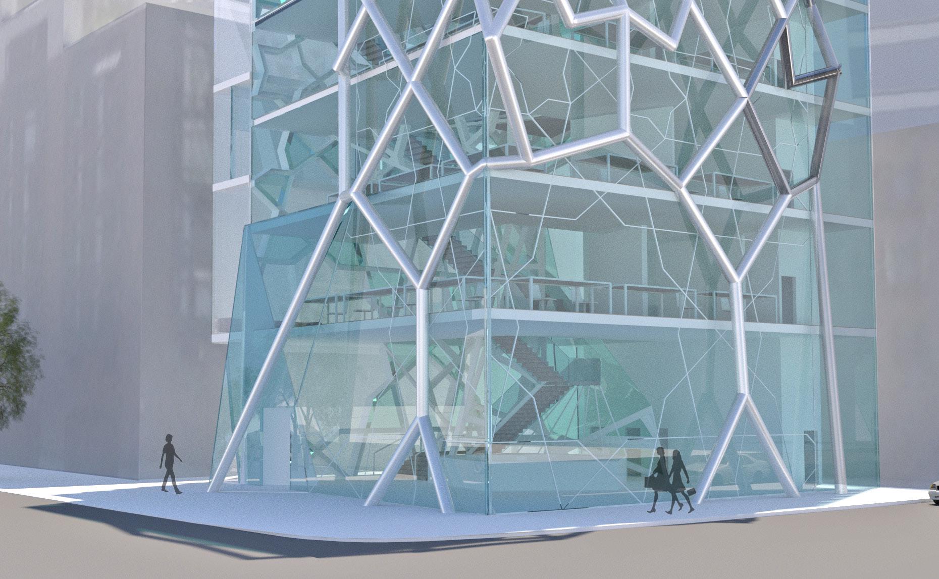
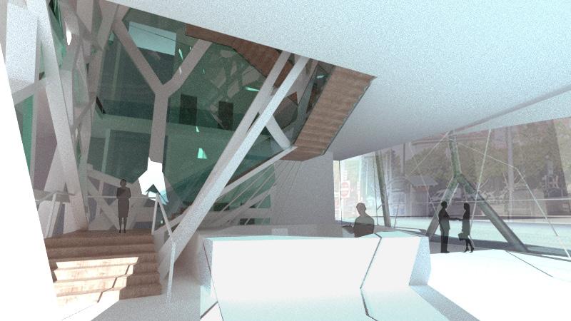
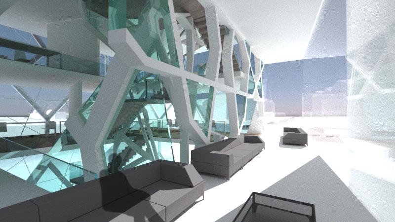
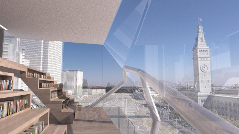
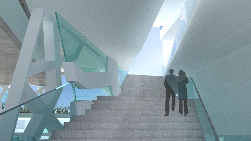
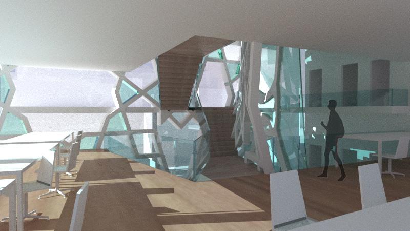
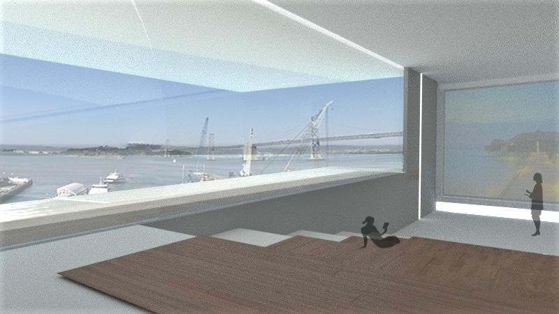
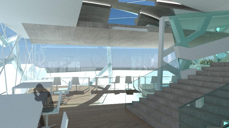
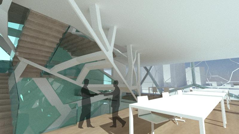
52 53 1 4 7 8 5 2 3 6 1. LOBBY AREA 2. STUDIO AREA 3. MUTIMEDIA SPACE 4. STUDIO AREA 5. STUDIO AREA 6. LIBRARY 7. STUDENT & FACULTY MEET UP AREA 8. STAIR TO SKY
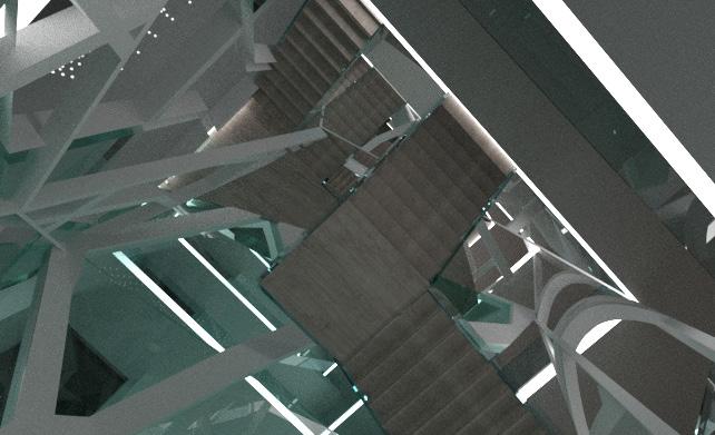 ATRIUM from Inside
54 55
Student and Faculty Meetup Area
Open Stair
Main Material: Concrete
Urban Interaction
Architecture Studio 1 Instructor: Frederick Pearsall Software: Rhino, Adobe Photoshop, Adobe Illustrator, Adobe Indesign
 TIANRUN WU FALL 2021
IV
PROJECT
Urban Interaction
Housing for Artists
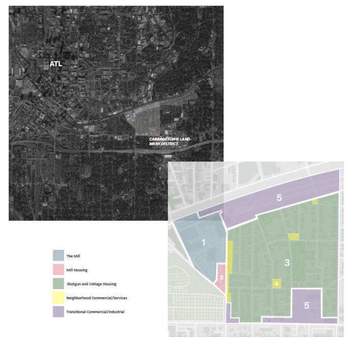
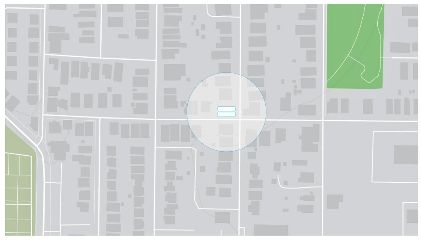
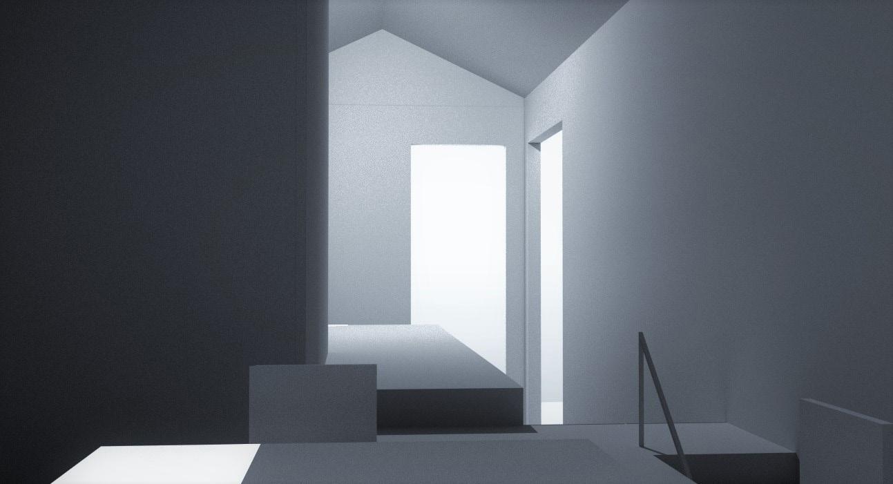
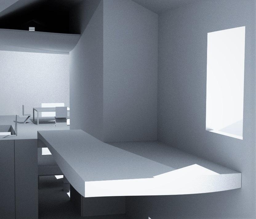
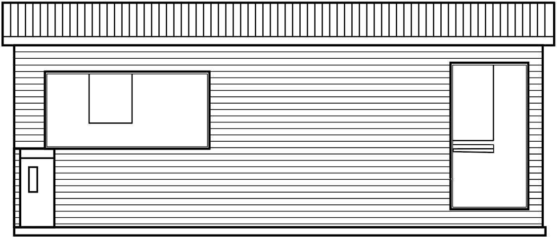
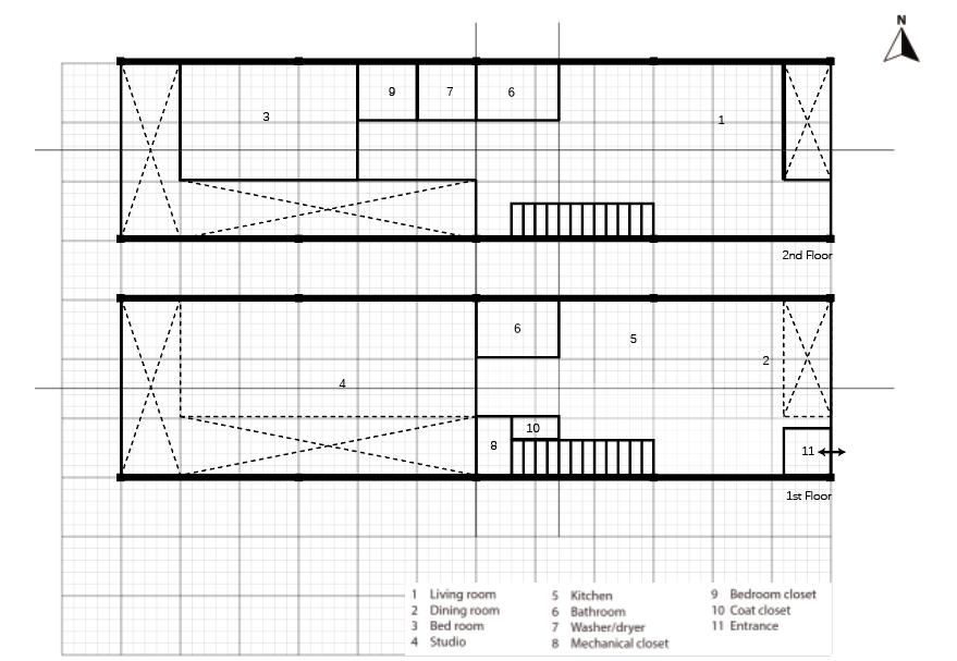
The physical location of Cabbagetown is a complex one, and it is a microcosm of Atlanta settlement and development patterns. Situated to the east is the historic Oakland Cemetery (the oldest graveyard in the city), to the north is the National Historic Landmark District of Sweet Auburn (historically African-American community and business district), and Cabbagetown also borders the historically white and affluent neighborhoods of Grant and Inman Park. For the project, we need to design two houses. Each live/work unit needed a dedicated studio for an artist. One of them is weaver and another one is lithographer. The figures span the historical transition and character of the Cabbagetown, both connected to art and culture of the area.
 Landmark District guidelines

Proposals needed to adhere to the Cabbagetown Landmark District guidelines.
The regulations are mainly about two parts: regulations that apply to more than one subarea and regulations that are unique to each area.
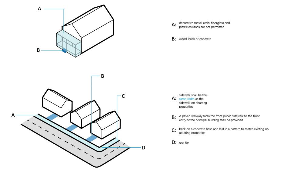
From the beginning is the general regulations, certificates of appropriateness required above shall be obtained from the commission or the director, as applicable, in accordance with the regulations. About the design standards, all new construction shall be one of the house styles of a contributing building that appears on the block face of the street on which the new construction shall occur. The design principles include specific standards of the different parts of the buildings, including facades, roofs, dormers, porches, site development, sidewalks and curbs. Moreover, there are other regulations about the accessory structures and uses, grading and landscaping, fences, walls, etc.
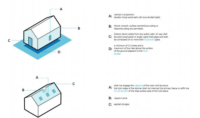
The next part is the following regulations apply to any new development or the conversion of any existing structures to permitted uses within the Mill Subarea. The most important regulations I think are that new construction shall be of red brick exterior in keeping with the scale and the character of 19th-century mill construction and the height of any new construction shall be limited to the highest point of the existing complex, excluding chimneys.
The next section is the regulations apply to any new development in Mill housing (Subarea 2), including the requirement of the maximum building height and width, the facades, the roofs, the porches, walls, minimum parking requirement etc.
The subarea3 is the Shotgun and Cottage Housing. The subarea 4 and subar-
58 59
Cabbagetown
Weaving
Step 1. A selection of color compatible new fabrics is washed to eliminate shrinkage and then steam pressed.
Step 2. Fabric is cut is into one-inch strips.
Step 3. After designing the color way and color order of the warp the cotton yarn is measured onto a warping board.
Step 4. The next process is to thread the loom and wind the yardage onto the loom.
Step 5. The fabric strips are like a palette. Colorway selections are finalized before starting to weave.
Step 6. A hem is hand sewn across the warp and creates a finished edge when removed from the loom.
Step 7. Each cotton fabric strip has to be rolled to make sure the backside of the fabric and cut edges are enclosed.
Step 8. Each strip of fabric is rolled and beaten in. When adding a new strip, the end is cut into a point and rolled into the previous strip. It takes approximately one hour to weave 12” of fabric!
Step 9. After the woven fabric comes off the loom it has to be wet finished for complete shrinkage, dried and steamed.
Step 10. When creating decorative pillows the fabric is serged, machine stitched and hand hemmed onto a commercial pillow form.
Step 11. Rag accent rugs have one extra step before completion. The fringe is hand braided for a long lasting neat finish.
Stone Lithography
Step 1. Graining the stone Step 2. Drawing on the stone Step 3. Processing the stone Step 4: Washing out and rolling up
Step 5: Printing the stone
Weaver Schedule:
7 am - Wake up
8 am - Eat breakfast
9 am – Make a new design
10 am - Set up yarn/string and prepare it to be weaved/knitted together
11 am - Begin weaving
12 pm - Stop weaving for lunch
1 pm - Continue weaving after lunch
5 pm - Stop weaving
6 pm – Go out for relaxing
7 pm – Have Dinner
8 pm - Leisure time
9 pm – Sleep
Stone Lithographer Schedule: 7 am - Wake up
8 am - Have breakfast
9 am – Deal with the stone and get them prepared for curving 10 am – Make design
11 am – Do the lithography
12 pm - Continue 1 pm - Take a break
2 pm – Have lunch
5 pm - Stop printing
6 pm – Have Dinner
8 pm – Relax to get new ideas
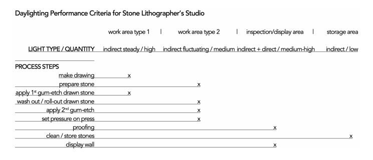
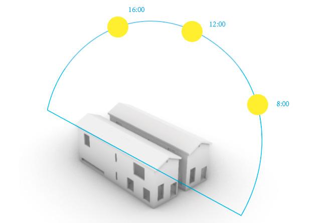
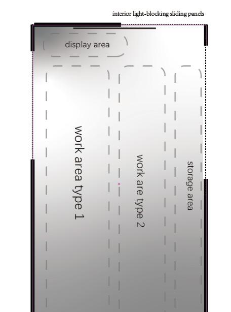
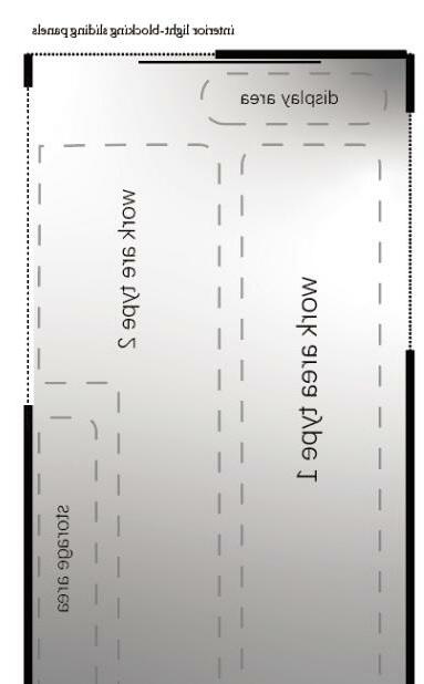
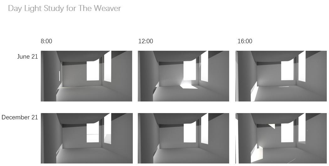
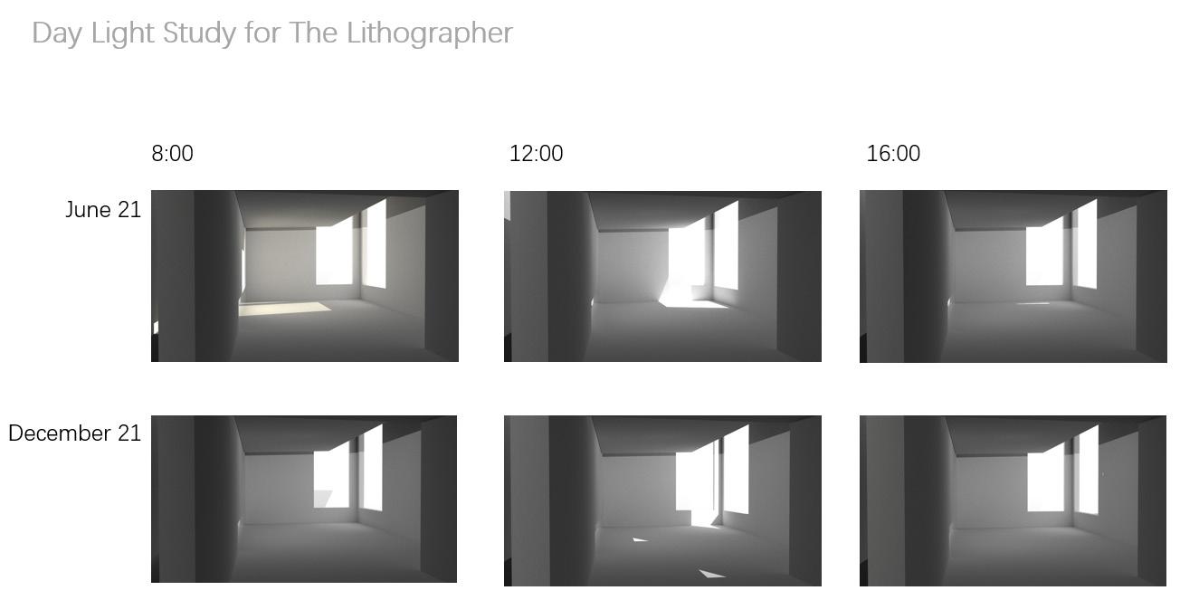
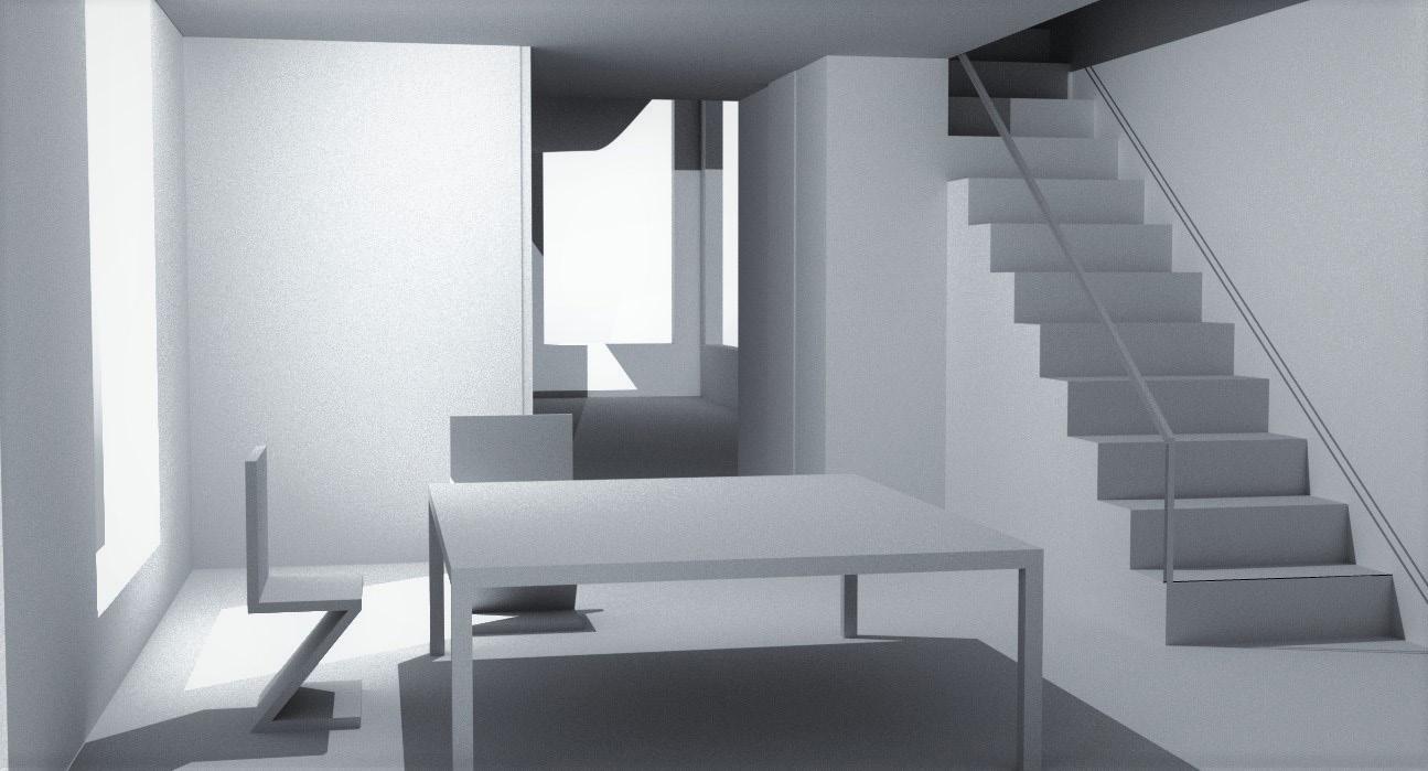
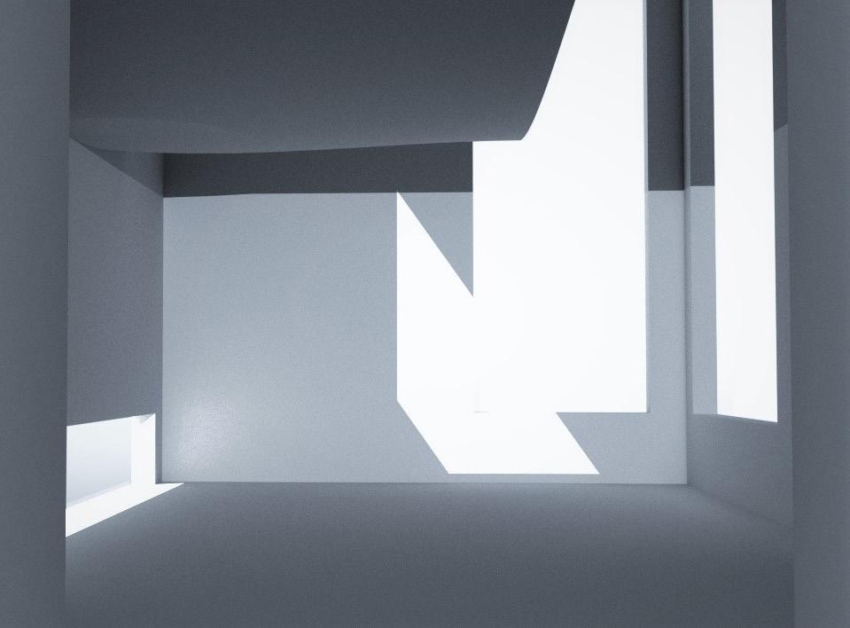
LIGHTNING ANALYSIS
60 61
62 63
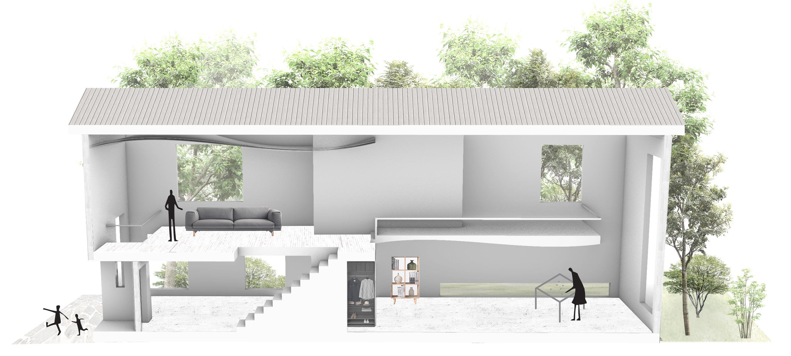
Living room
Studio for Weaver
Dining room
Bedroom
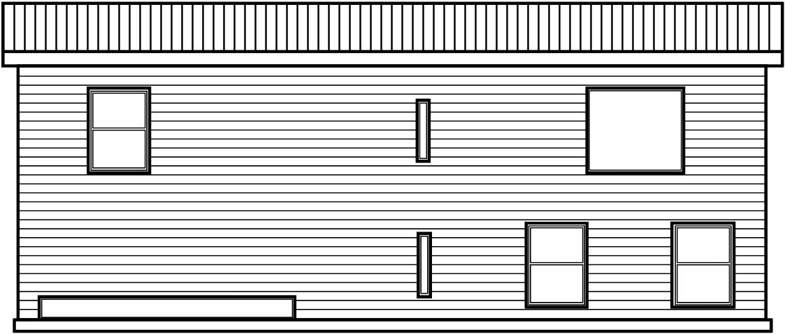
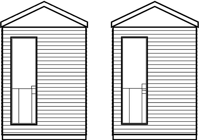
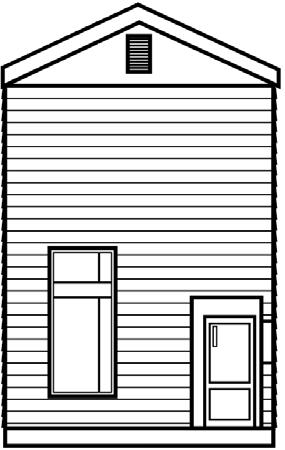
ARCHITECTURE DRAWINGS

64 65
Bus Stop Design















Parametric Structure System Interaction AR (Augmented Reality) Design System Mass & Geometry Light & Shadow


TIANRUN WU
Fall 2020 - Fall 2022









66 67
OTHER PROJECTS
Bus Stop Design
For this project, I am asked to design a bus stop. There are two sites. One of them is near Georgia Tech Campus, a urban site, and another one is in a suburban area.
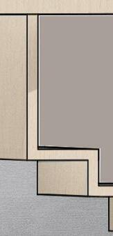
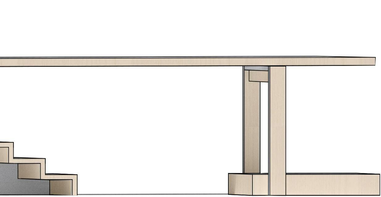
My design idea is an equation: Theater = Auditorium + Stage = Seat + Bench = Bus stop. It is not only a bus stop, but also an unfinished theater, a shared space with full of possibilities.
The material is heavy timber, which helps to make the more sculptural, more geometrical and more environmental friendly.
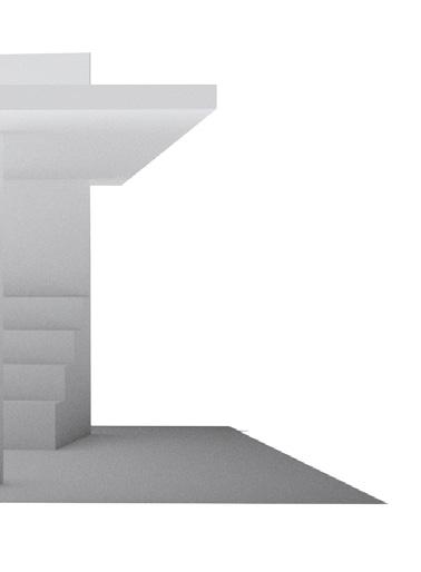
The bus stop is composed by two main space, theater space and shelter space. The theater space is rotated a little bit for the waiting people to have a better view of the coming bus and the vanishing point of the end of the road, a great city view.
For more people in the suburban area
ARCH 3016 Architecture Studio 4 FALL 2022
Stage Auditorium Theater Bench Seats Bus Stop Platform Stair Sculpture
Or Or Or Or Or Or
Theater + Shelter
68 69 Urban Site
Suburban Site
70 71




Interaction AR (Augmented Reality) Design System
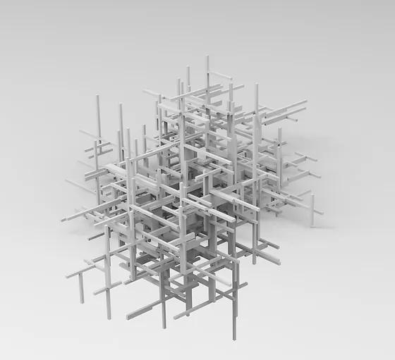
Aggregate Architectures challenge the common notion of architectural structures as being immutable, permanent and controllable. Aggregate Architectures are understood as material systems consisting of large masses of granules—designed or natural—interacting with each other only through loose, frictional contact. As a consequence, they take the realm of structural stability and architectural planning into entire re-configurability and into merely probable predictions of their prospective behavior.
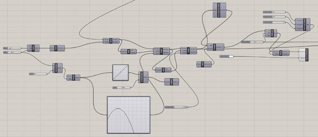
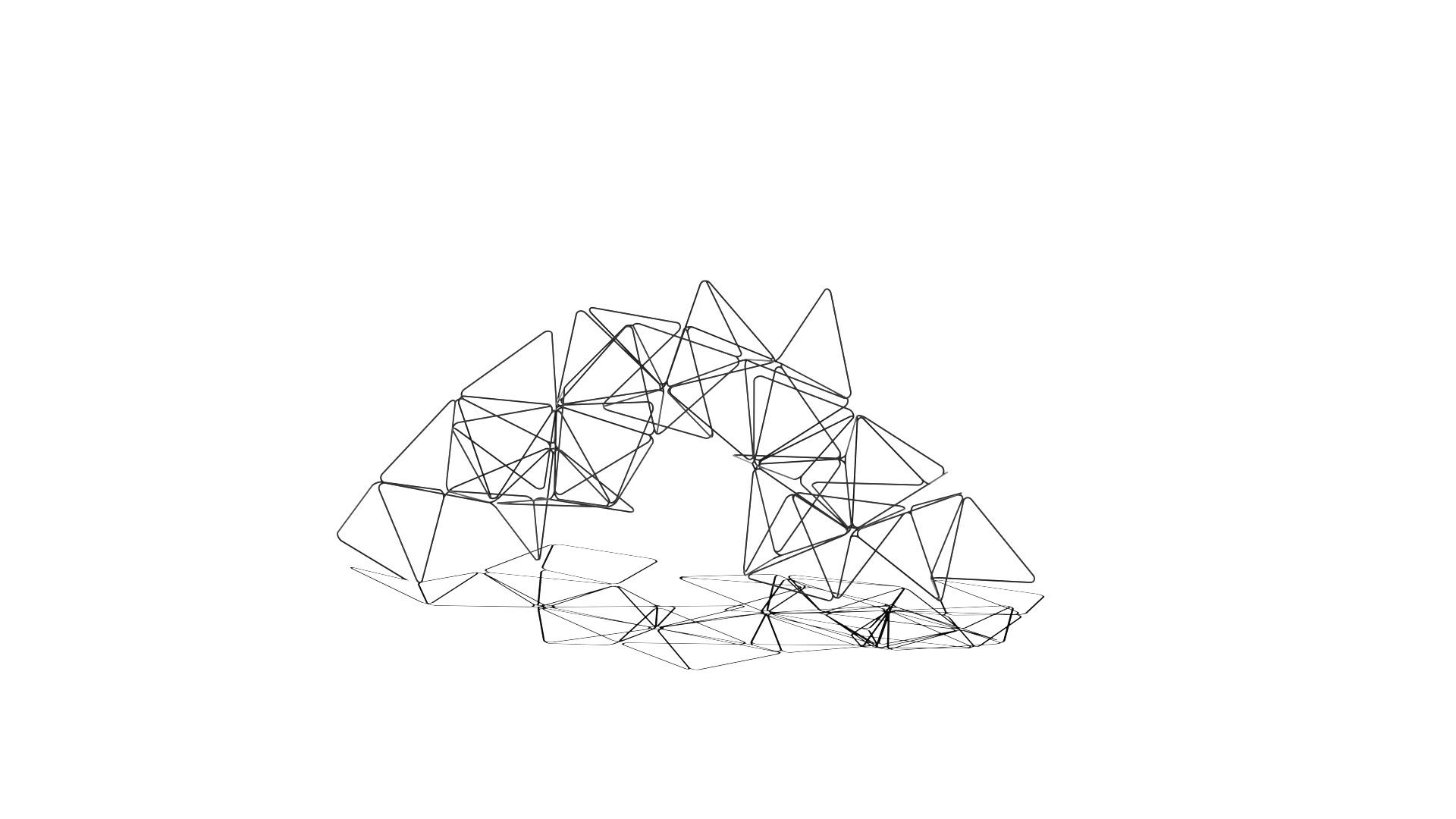
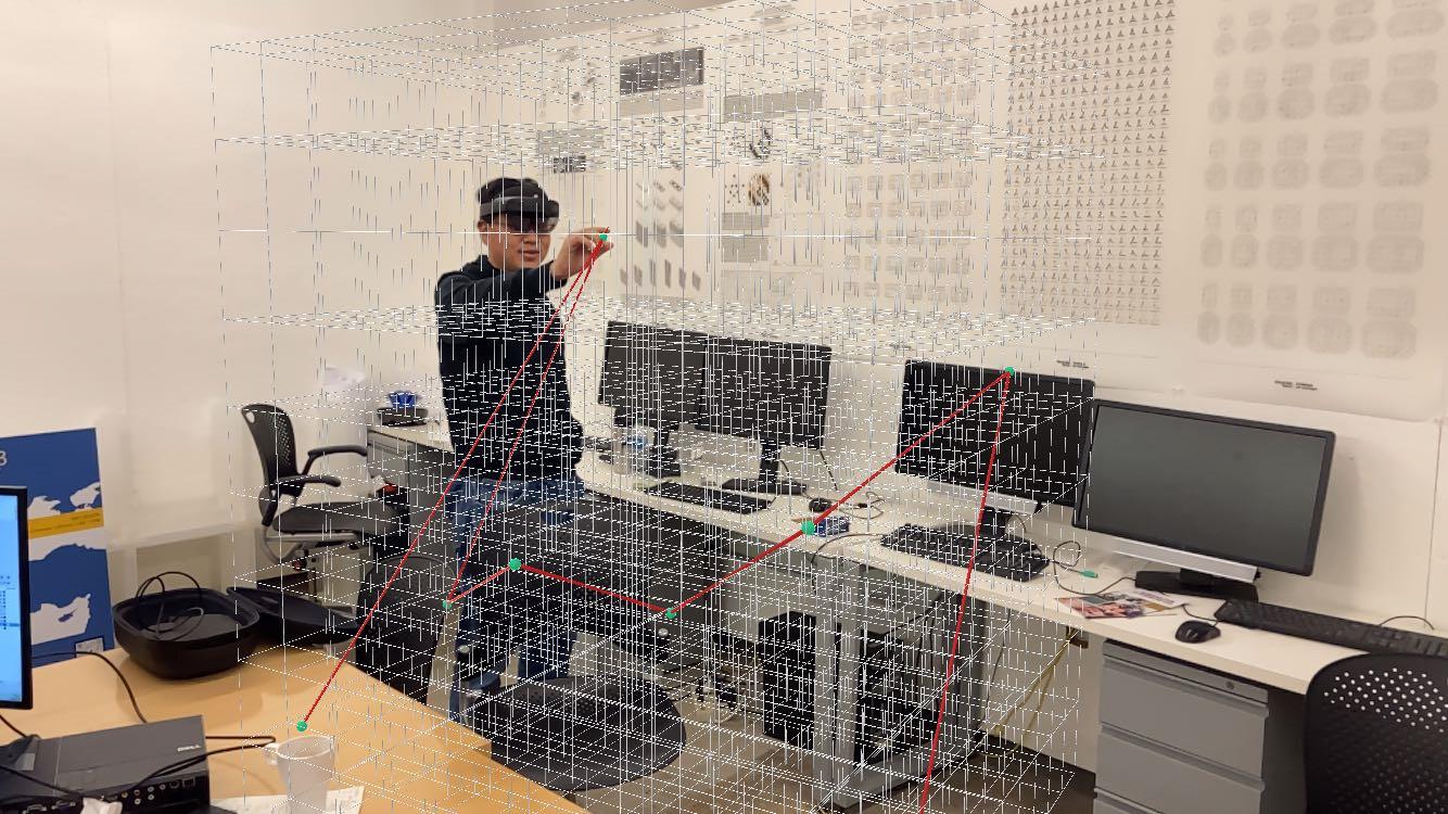
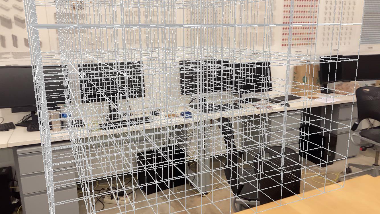
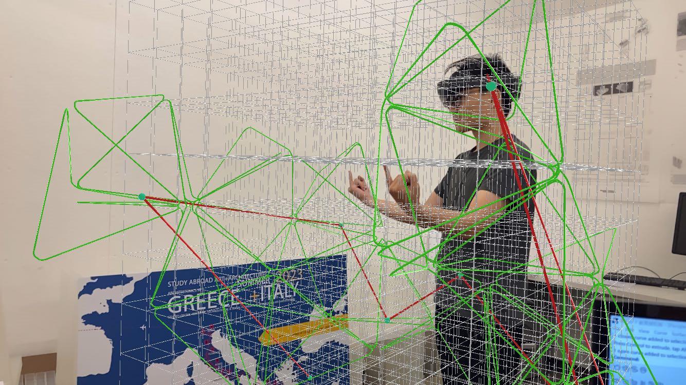
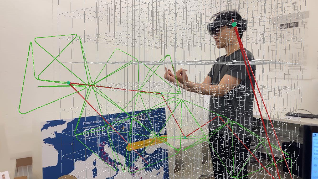
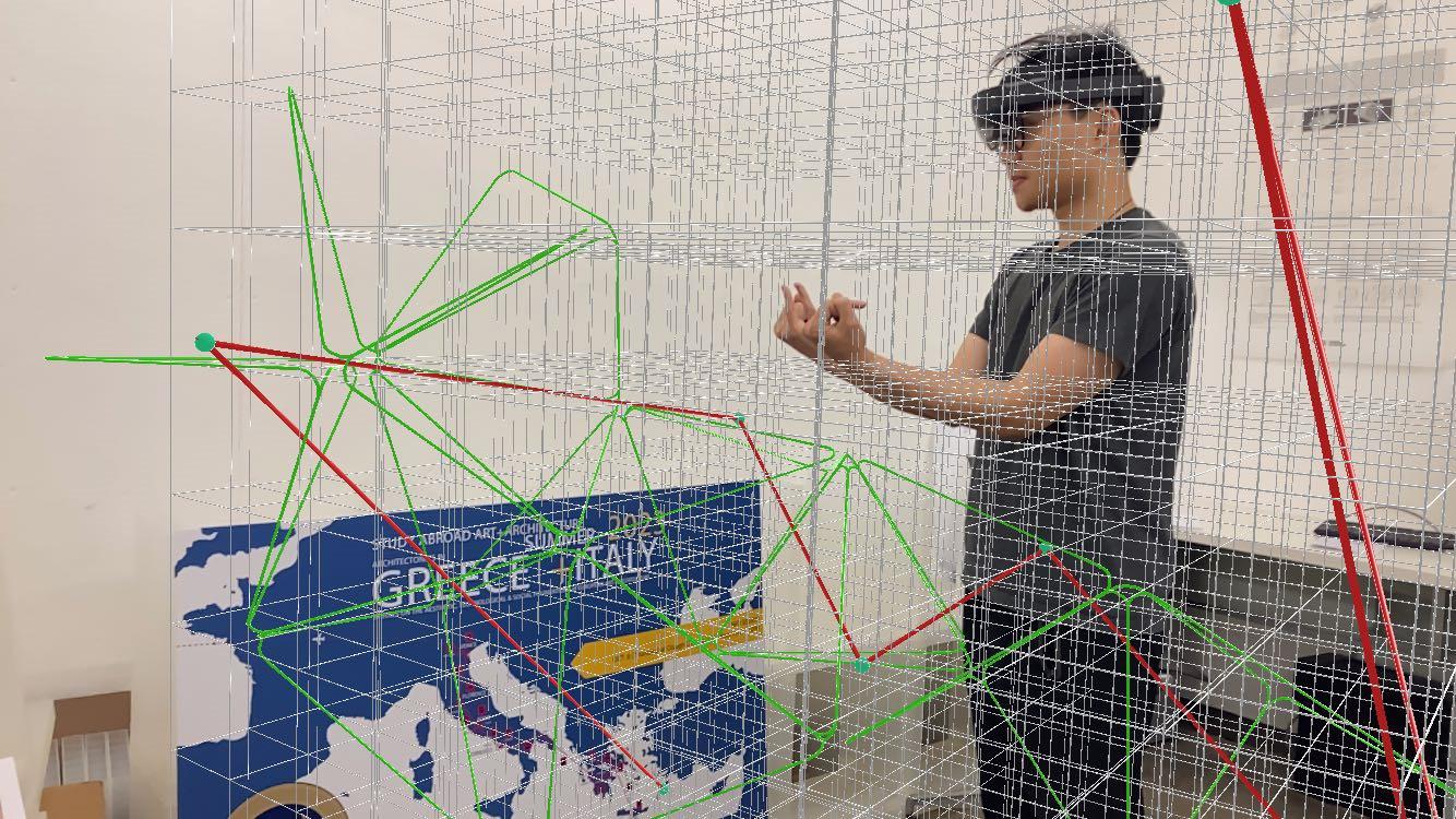
For this project, we developed a user-friendly mixed reality design system by using grasshopper and c#. By using a system, the user first need to adjust a 3D grid in the space. Then, the user need to pick a basic geometry by using the different gestures. Then the user needs to define a curve or a polyline on the grid by using the Draw Definition. The basic geometry will start to “grow” following the polyline drawn by the user, by using the aggregation process based on the discrete design logic. The process will generate a sculpture-like project around the user. The last step is for the user to adjust the amount of the basic geometries generated by the process, the density of the geometries. The generation logic is based on the WASP toolkit, a Grasshopper plug-in. The description of each part includes all information necessary for the aggregation process (part geometry, connections location and orientation).

The connections define the topologi cal graph of the part, which is used to define the possibilities of aggregation with other parts. Wasp offers a series of aggregation procedures, allowing geometry- and data-driven generation of structures. Additionally, it provides tools for constraining the resulting aggregation, both at the local and global level, as well as utilities to visualize and process it.
The design system can help to generate a user-centered, interactive sculpture, which make the process of making sculpture like playing with building blocks. Everyone can use the system to create something interesting and logical with their own brilliant ideas.
72 73
Special Topic: Advanced Productions FALL 2022
Picking up a basic geometry
Draw Definition
Adjust the amount
Based on the grid
GESTURES
Step 1
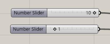
Adjust the 3D grid by using the slider in the Fologram.
X
Step 2
Use the three gestures to decide the one basic geometry from three options.
Step 3
Draw a polyline according to the grid in the space.
Step 4
Use the gesture to adjust the amount of the basic geometries.
74 75 STEPS
Y Z or or
Basic Geometry: exahedron-like
Basic Geometry: tetrahedroid-like
Basic Geometry: stick
RESULTS
76 77
STEP 1: Adjust the 3D grid in space
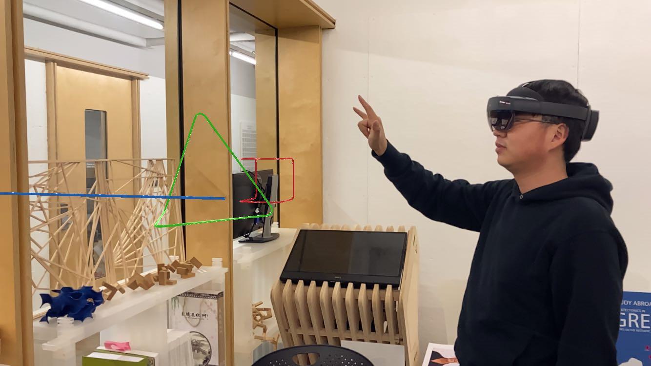
STEP 2: Pick a basic geometry
STEP 3: Draw a polyline based on the grid
STEP 4: Adjust the amount of the basic geometries
78 79
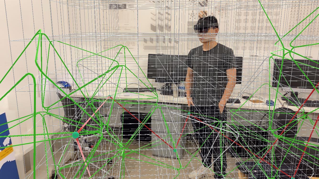
Final
Parametric Structure System



 ARCH 2020 Architecture Media & Modeling II FALL 2021
SYSTEM I: STRUCTURE
VARIATION OF THE SYSTEM
80 81
SYSTEM II: FLOORS


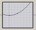
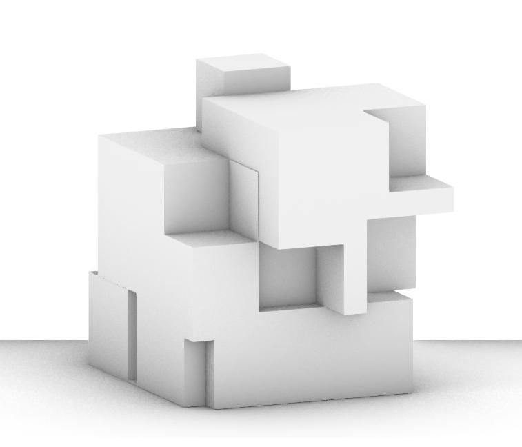
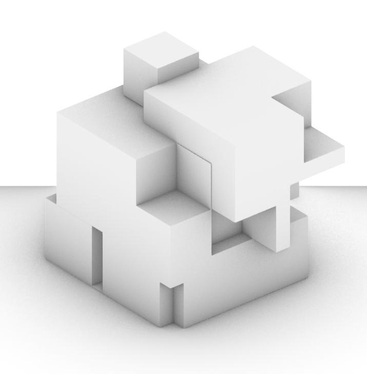
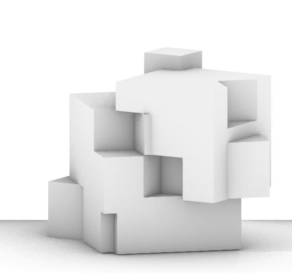
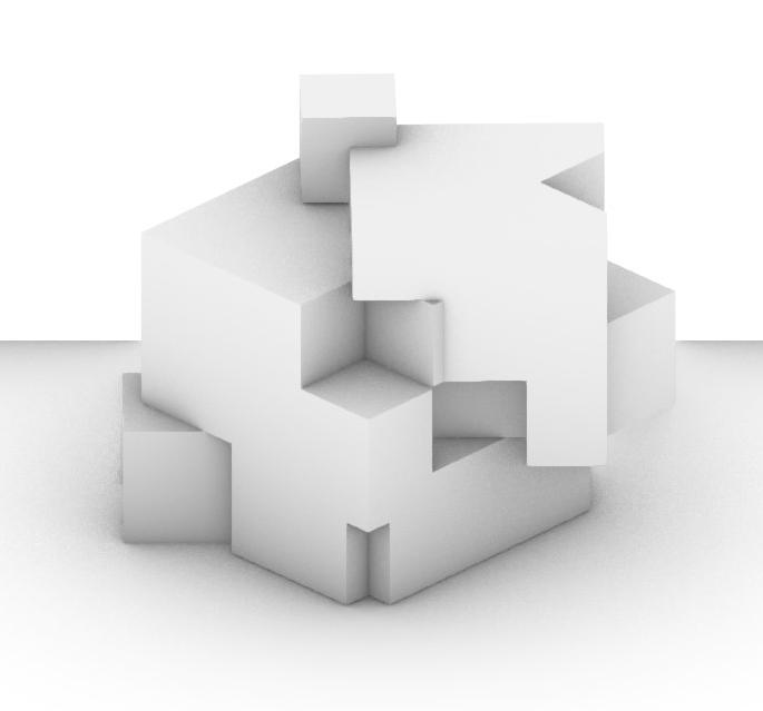
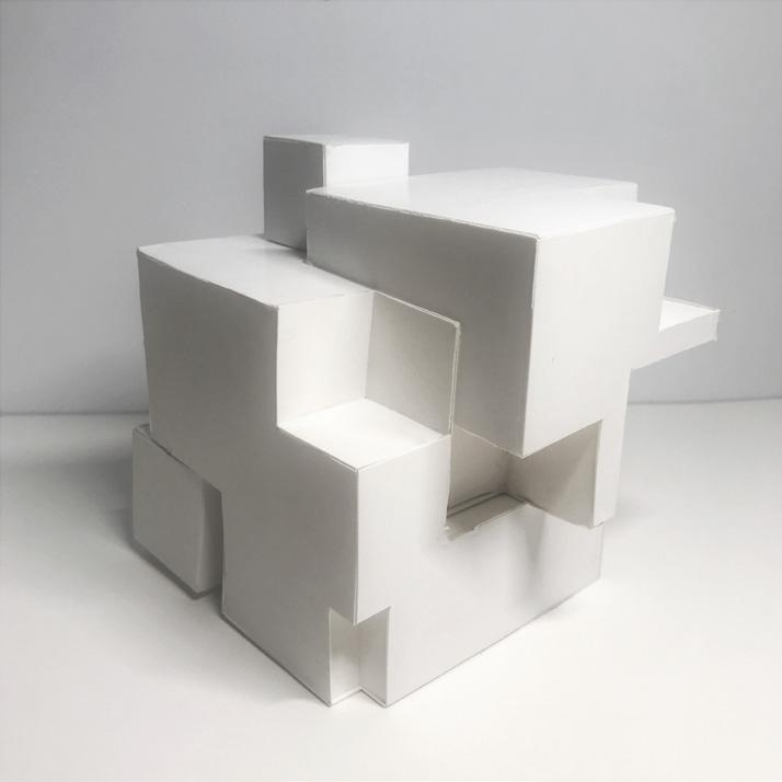
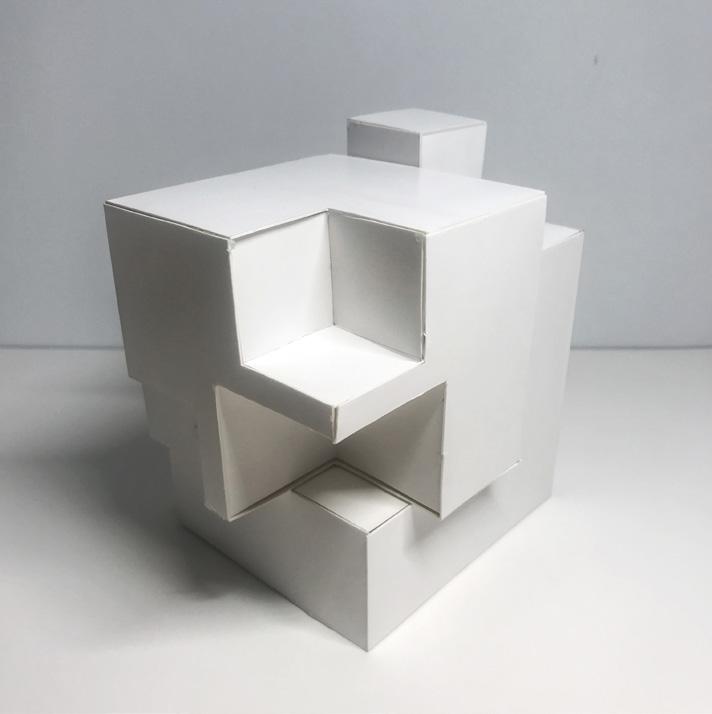
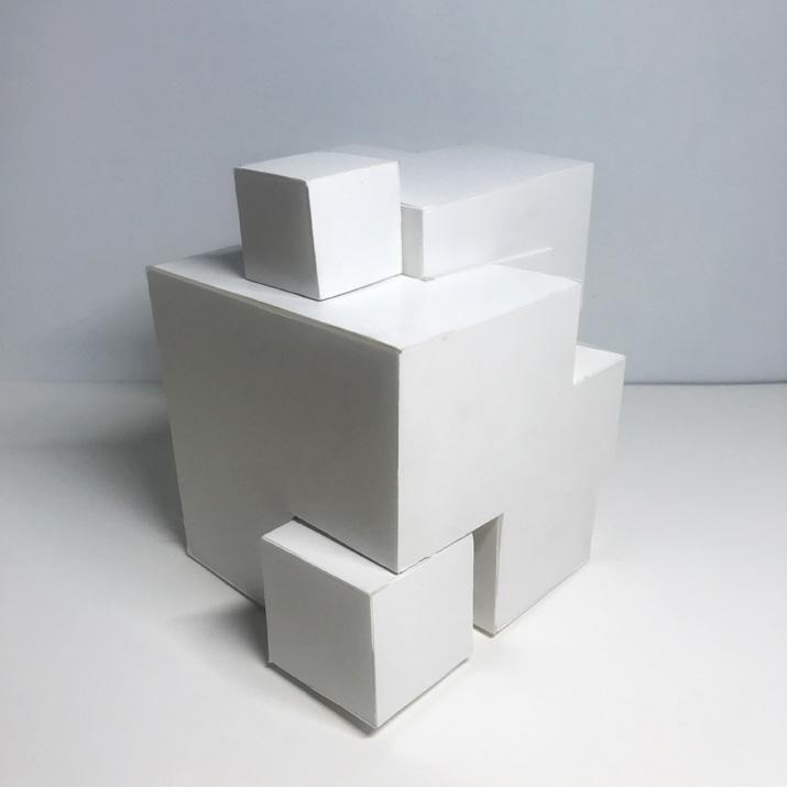
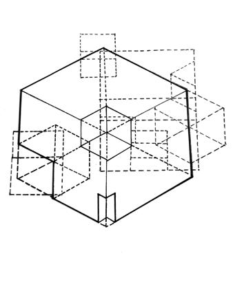
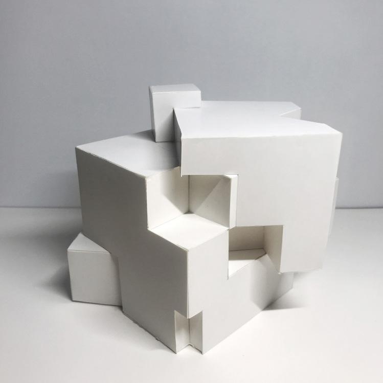
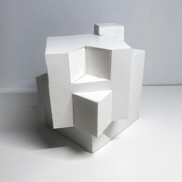
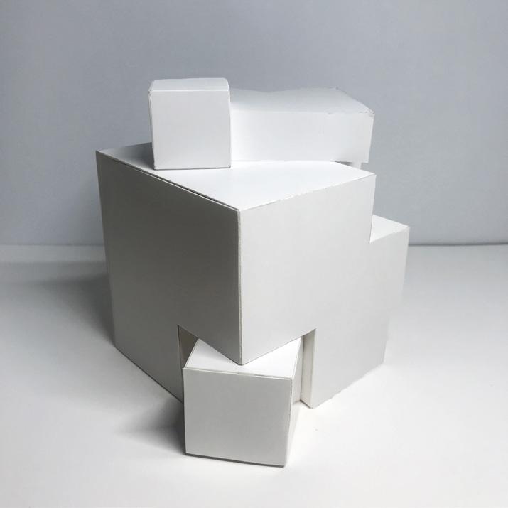
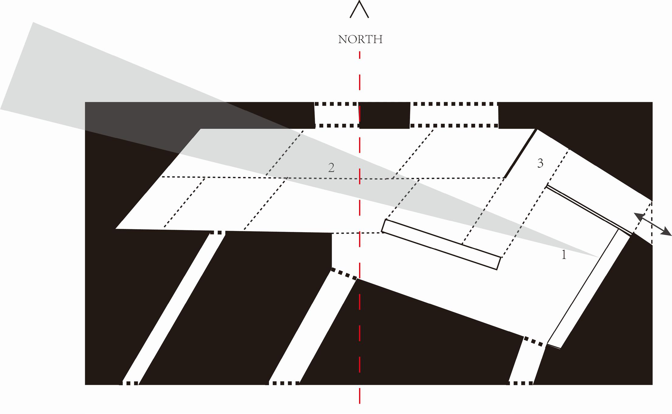
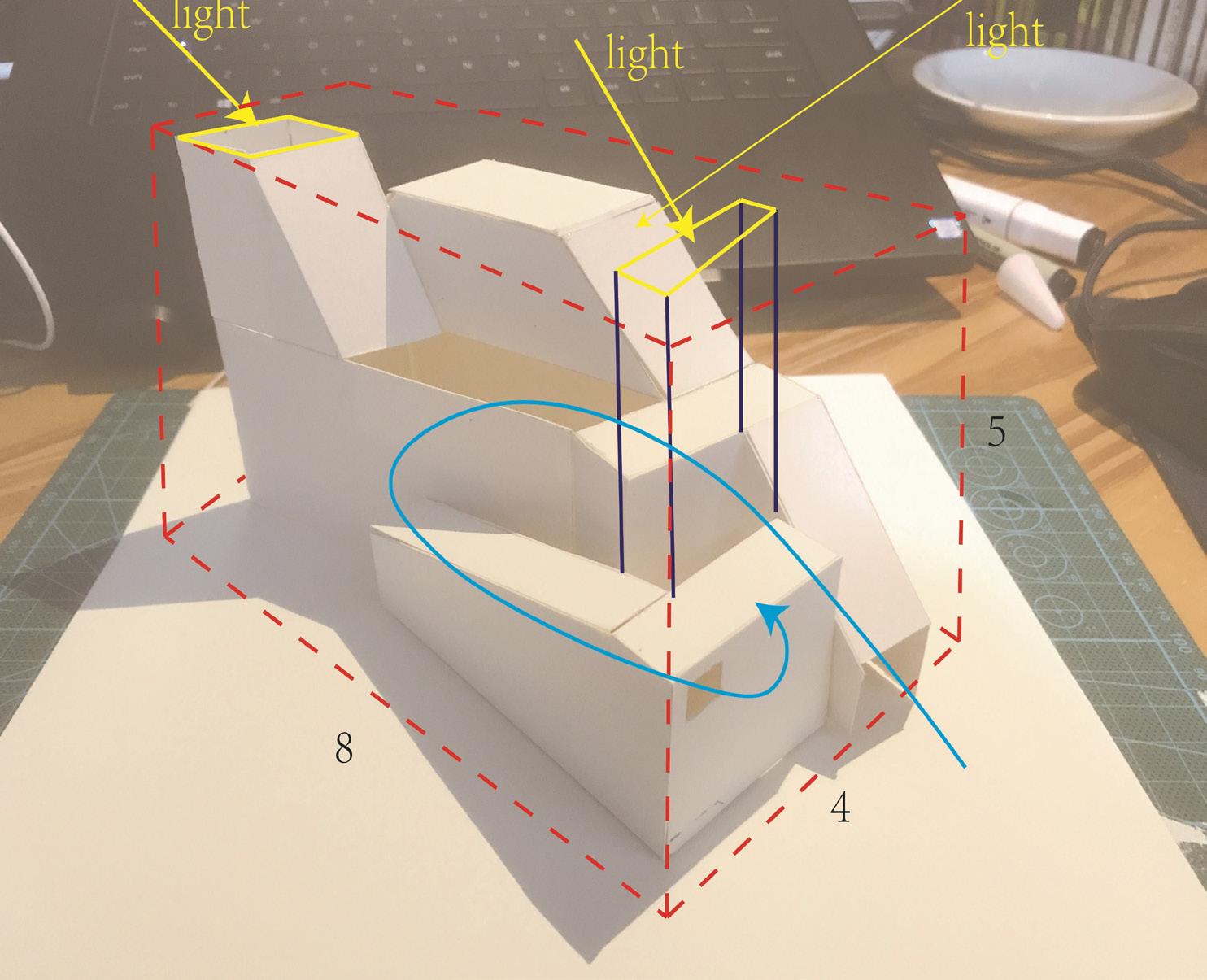
In the exercise A, I tried to build the concept of a roof garden and used a 3 * 3 square as the entrance and exit of the garden. The deletion on both sides of the model was imagined as balconies. Two deletions on the lower side of the second main block create a shady space at the bottom of the building. The diversity of building facade also increases the vividness and structural sense of the building. In the exercise B, I rotated parts of the model. In order to make the model after rotation still have unity and order. I changed the position of a few of the squares a little in order to make the


ORIGINAL ROTATION

82 83 Mass & Geometry
ARCH1016
FALL 2020
FOUNDATION STUDIO


84 85 Light & Shadow


 MILL RUINS


 TIANRUN WU & XINYAN LI FALL 2021


 Isometric Grid Tomb of Itimud ad-Daula, Agra, India


 ATRIUM from Inside


 TIANRUN WU FALL 2021
 Landmark District guidelines


 ARCH 2020 Architecture Media & Modeling II FALL 2021


