
The 1860 Boston brownstone was converted back to a single-family home. FACING

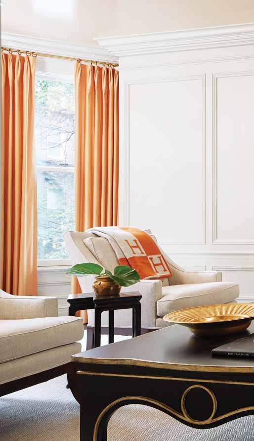
PAGE: Neutral surroundings offset the bright pops of color in the reception area. A skeletal chandelier subverts period expectations.

The 1860 Boston brownstone was converted back to a single-family home. FACING
PAGE: Neutral surroundings offset the bright pops of color in the reception area. A skeletal chandelier subverts period expectations.
From three-story duplex unit to five-story family home, a down-to-the-studs renovation returns an old Boston brownstone to its singular splendor.
TEXT BY FRED ALBERT PHOTOGRAPHY BY LAURA MOSS PRODUCED BY KYLE HOEPNER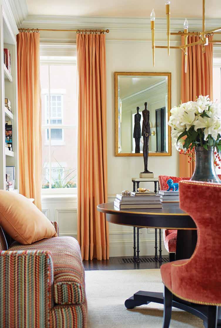
couples often flee the city once their children are born. But that was never an option for a pair living in Boston’s South End. They relished the fine dining, fashionable shopping, and peaceful park that beckoned just beyond their duplex door.
Following the birth of their second daughter, however, they found themselves at a crossroads. The brownstone they shared with another couple was starting to feel snug, with little room for all the paraphernalia a family of four attracts. Then, out of the clear blue sky, the neighbors upstairs announced they were moving. Would the family be interested in acquiring their unit before it went on the market?
Architecture: Ruth Bennett, RBA Architecture
Interior design: Gerald Pomeroy, Gerald Pomeroy Interiors
Builder: Preston Lemanski,
In the parlor, the owners’ existing furnishings were reupholstered and paired with a generous coffee table. The new fireplace surround was fashioned from arabescato grigio orobico marble, which picks up the coral in the curtains; doors to the right conceal storage. The seagrass carpet provides an organic counterpoint to the formal furnishings.

“It was something I’d wanted to do for a long time,” admits the wife. “The hard part was convincing my husband to take it on.”
Eventually, he acquiesced, and their world suddenly expanded from three floors to five, filling the entire 1860 Greek Revival structure. And just as quickly, those five floors evaporated, as renovations revealed an interior so structurally and aesthetically
compromised, it made more sense to gut the place and start from scratch.
Rebuilding the interior gave the owners and their design team, architect Ruth Bennett and interior designer Gerald Pomeroy, a chance to right some of the injustices that had been perpetrated against the structure over the past 150 years. “It gave us a much clearer runway and a much more structurally sound
“I think ceilings are an opportunity that a lot of designers don’t embrace,” says Gerald Pomeroy.
“I knew the glossy blush-colored lacquer would be unexpected, but it would be subtle enough that you would start to see the coral throughout the room.”
building,” says contractor Preston Lemanski, who was able to update the home’s electrical and HVAC systems while exorcising 1970s aluminum windows and intrusive staircases that were added when the building became a duplex. Period-appropriate sash windows now illuminate the interior, and a single stairwell hugs the wall just inside the front door. “We put it back where it would have been,” says Bennett.
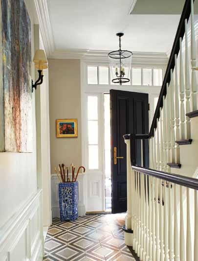
The entry hall’s geometric floor tiles pack a powerful punch, offsetting the gracious lines of the staircase, whose sinuous spindles frame dusky oak treads cloaked in a cheetah-print runner. “It’s very old-guard and classic,” says Pomeroy of the pattern, which he ordered in taupe to diminish any jungle connotations.
New woodwork faithfully mimics Greek Revival
profiles and proportions, with picture-frame moldings adorning the wainscoting and built-ins populating the public spaces. “We focused on bringing integrity back to the building,” says Pomeroy. “But we also wanted to make sure it was working for the way a young family lives today. So it was kind of a balancing act.”
The design team pulled it off by keeping all the architectural details true to the period, but making the floor plan more contemporary and open. In the public areas, spaces flow freely from front to back, enhancing the transmission of light and instilling a sense of cohesiveness the old house lacked.
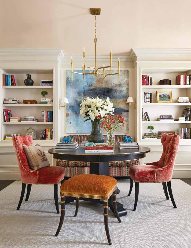
With only 600 square feet per floor, the home’s footprint seemed too small to squander on a dining room that would only get used a few times a year. So the design team turned the front room into a recep-
tion area, with a center table that serves as a repository for keys or kids’ homework, but can expand to seat eight on holidays.
Here, and in the neighboring parlor, linen-white walls and neutral carpets are offset by jolts of color: a pair of fuchsia chairs skirting the dining table, crisp coral curtains framing the windows. While the colors are powerful, they’re doled out judiciously, softening their impact. “They wanted color used as accents, as opposed to a great deal of it everywhere,” says Pomeroy, who’d worked with the clients previously, establishing a sense of trust that allowed him to push things in unexpected directions.
The parlor ceiling, for instance, sports a glossy, blush-colored lacquer that reflects the light and imparts a rosy glow to the room. “I think ceilings
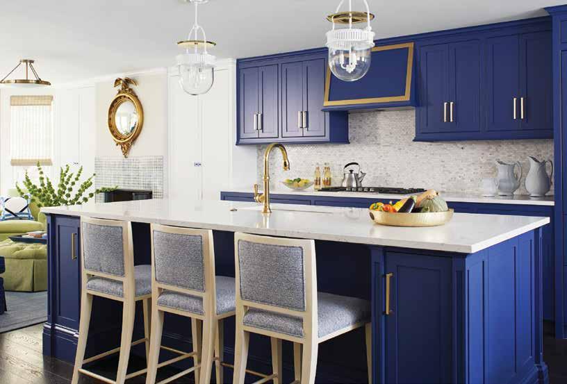
“I love white kitchens,” says the wife. “But it would have been a very white room if we hadn’t done the color on the cabinets. It adds richness and is very soothing.”
are an opportunity that a lot of designers don’t embrace,” Pomeroy says. “I knew it would be unexpected, but it would be subtle enough that you would start to see the coral throughout the room.”
Skeletal brass chandeliers from Arteriors add a modern touch to the mix. “I wanted to do some-
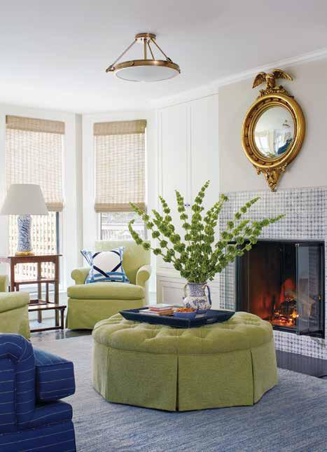
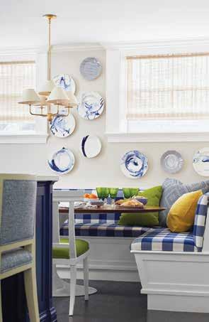
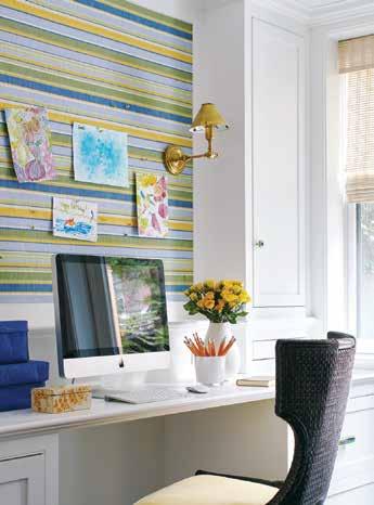
CLOCKWISE FROM LEFT: An office area echoes the blue and green shades of the neighboring kitchen and family room. The family room’s kiwi-colored furnishings bask in light from newly expanded rear windows. Christopher Spitzmiller plates adorn the wall above the breakfast banquette, which is covered in an indoor/outdoor fabric. FACING PAGE: The kitchen’s cheery cerulean cabinets make you forget you’re in the basement.
CLOCKWISE
thing that would be slightly more provocative,” adds the designer.
The same word could apply to the kitchen, which is located in the daylight basement but feels anything but subterranean, thanks to ample windows and the sizzling cerulean cabinets dominating the space. Initially, Pomeroy was just going to paint the island blue. But as the project progressed, he decided to take the notion further, figuring the neutral surroundings would temper the Technicolor display, and the color would bring warmth and cheer to the room.
Although his clients were hesitant at first, they grew to embrace the decision. “I love white kitchens,” acknowledges the wife. “But it would have been a very white room if we hadn’t done the color on the cabinets. It adds richness and is very soothing.”
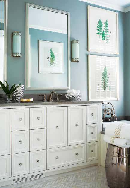
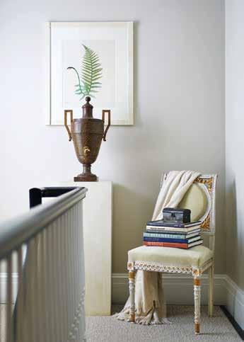
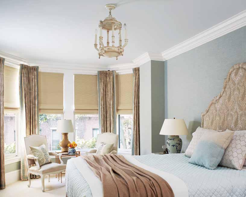
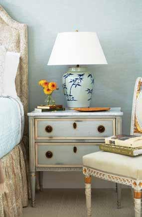 FROM LEFT: A 200-yearold urn is paired with a Louis XVI chair on the landing outside the master suite, which occupies the entire second floor. A marble-topped nightstand flanks a bed upholstered in a Schumacher paisley. The master bath’s vanity was modeled after an apothecary chest. FACING PAGE: Seafoam-hued grasscloth wraps the bedroom in a soothing embrace.
The hue is echoed in the neighboring family room, where it’s paired with kiwi-colored chairs and a matching oversized ottoman—magnets for the daughters, now five and nine, and the family’s Portuguese water dog. “I used a lot of indoor/outdoor fabrics on this level,” explains Pomeroy. “When people spend a great deal of money, they want to feel assured that it will hold up.”
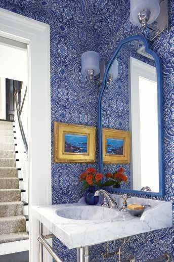
An explosive blue paisley paper covers the walls and ceiling in the neighboring powder room, erasing any boundaries in the compact space. “I think powder rooms should be glamorous and romantic and unexpected,” says the designer. “By wrapping the room in wallpaper, we achieved that.”
A more subdued seafoam grasscloth lends the master suite a hushed serenity that makes the home-
owners feel like they’re floating on a cloud. Pomeroy paired the wallcovering with toast-colored toile curtains that once adorned the couple’s living room, and repeated the fabric on the custom bed and in the wife’s dressing room, whose ample proportions would elicit envy from a supermodel. The adjoining master bath boasts a vanity modeled after an old apothecary chest, with a multitude of drawers for every possible purpose.
So many well-meaning renovations end up erasing the character that attracted the buyers in the first place. But in this instance, the changes only enhanced the old building, melding the best qualities of past and present. “The result,” says the wife, “is exactly what I wanted.”
RESOURCES : For more information about this home, see page 180.