Designer Product · Service · UX / UI


I am an Industrial Design and Product Development Engineer currently working as UX/UI & Product Designer.



As a designer, I believe it is important to have both a personal artistic vision and the ability to respond to social developments, especially living in a time of constant and accelerated change.
I understand design as a way to turn problems into solutions that optimize both the experience and users' lives. For this it is necessary to work side by side with users, in order to reach the solution that best suits them.
Creativity and innovation are two realities that go hand in hand. So I consider myself a methodical and hard-working person, who appreciates the value of managing each project creatively, always with great attention to detail.
I am passionate about artistic activities and bringing them into the design process. I also love everything related to visual arts in general and storytelling, I consider them fundamental pieces for the gestation of any product or service.
In this portfolio you will see part of my work, from products and services to mobile applications, digital design and others.
Do not hesitate to contact me for further information!
I am Gorka Martin,
UX/UI Designer
Sopra Steria · 2021 - Present
I have worked in several transversal projects with different clients, creating interfaces as UX/UI Designer at Enagás for the redesign of a complex digital data reading tool. Also carrying out Heuristic Analysis, Benchmarks, Visual Design and conducting Workshops, some of them together with Randstad to devise an App to help in the labor insertion of people with intellectual functional diversity. Currently I work as an external Global Product Designer at Allianz.
UX/UI Designer
Mondragon Unibertsitatea · 2018 - 2020
I worked in the Industrial Organization Department developing the Usability and User Experience of the digital data collection tool Estandard, which is part of the online platform Bateratzen, a multidisciplinary initiative to help companies of the region to create more competitive and sustainable business projects through the involvement of the people in the organization. I was part of the development team together with programmers and industrial organization engineers, carrying the UX design as well as User Interfaces and Visual Design. I also collaborated in report layout and creating graphic design material.
ULMA Architectural Solutions · 2017
Design of prescription drawings working together with the engineering team in the Piping and Drainage Department, using both 3D Modeling tools (Solid Edge) and 2D Drawing tools for the creation of the drawings (AutoCad).
Usability, UX and CRO UNED · 2020 - 2021
Master’s Programme, Virtual Ergonomics and Design Högskolan i Skövde (Erasmus+) · 2019 - 2020

Master in Strategic Design of Products and Services
Mondragon Unibertsitatea · 2018 - 2020
The aim of this Master’s degree is to train professionals to be specialists in promoting and generating new products and services by way of strategic design, using the discipline of design as an innovation tool to improve the user experience. Emphasis is also placed on the design of digital products through the development of usability and UX/UI, taking into account other disciplines such as Motion design. Master’s Degree Final Project on UX/UI and usability development of an online platform (Estandard).
Industrial Design and Product Development Engineering Degree
Universitat Politècnica de València (Sicue) · 2017 - 2018
Completion of the last year of the degree and the Degree Final Project based on urban furniture design and Smart City principles.
Mondragon Unibertsitatea · 2013 - 2018
The degree is focused on training professionals capable of creating new products that add value to the company and the marketplace. Industrial designers develop their professional activity very much in a multidisciplinary environment where creativity and innovation acquire special relevance.
English Spanish Basque
Illustrator
Photoshop
InDesign
After Effects
Adobe XD Sketch
Figma
InVision
Zeplin Miro
FCE (B2)
OLS Erasmus+ (C1)
Native Native
Ps
Ai Id Ae Xd
2019 · 8th BID Meeting: Service Design Category Award
Participation: 2019 · Shenzen Design Award
2018 · Braunprize
2017 · MAIER Automotive Design
2017 · Vidrala Masterglass
2016 · The 24h of Innovation (ESTIA)















“
The best kind of design isn’t necessarily an object, a space, or a structure: it’s a process- dynamic and adaptable ”
Donald A. Norman





DBZ-MU Design Methodology
6 months
Master's degree final project
Project carried out working as UX/UI Designer in the Industrial Organization department of Mondragon University.





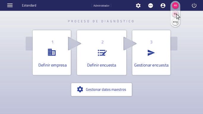

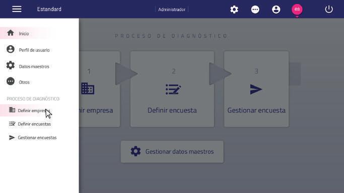

This project arises from the need to develop and improve the usability of the Estandard data collection tool, which is part of the online platform Bateratzen, a multidisciplinary initiative that integrates companies from Gipuzkoa, universities and administrations, which aims to help companies in the region to create more competitive and sustainable business projects, through the involvement of people in the organization. Thus, taking into account the importance of data collection for the growth of this initiative, this project has focused on adapting the Estandard tool to the needs of the user, in order to optimize the user experience and achieve a tool that offers a much more effective and simple functionality for the user.


The users of the platform will be human resources managers and company executives.


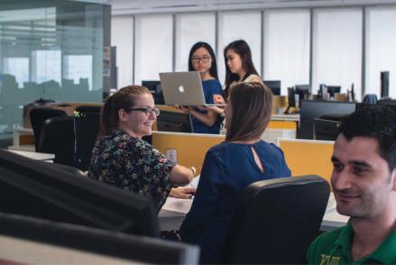

Their problems and needs have been defined through a target definition template.

· Agile navigation
· Minimum usage time
· Simple data imput
· Customization
· Profile differentiation
· Defined use process
The overall objective of this project is the redesign for the adequacy of Estandard, the data collection tool, so that interfaces can be developed to clarify and improve the usability and user experience, as well as the operation of the tool itself.
The HCD (Human Centered Design) methodology has been used as a basis, organizing the content according to the steps of user interface (UI) design.
A functional analysis has been carried out. This is a web tool made to be used by accessing through a laptop or a PC, since that is the resolution in which the user prefers to use it due to the use context. It allows the access of three different types of profiles, for which different options are displayed, according to the requirement:
The structure of the platform has been specified according to the actions to be performed the user, who carries out these steps by filling out different forms, since the objective is to send surveys to people in the company
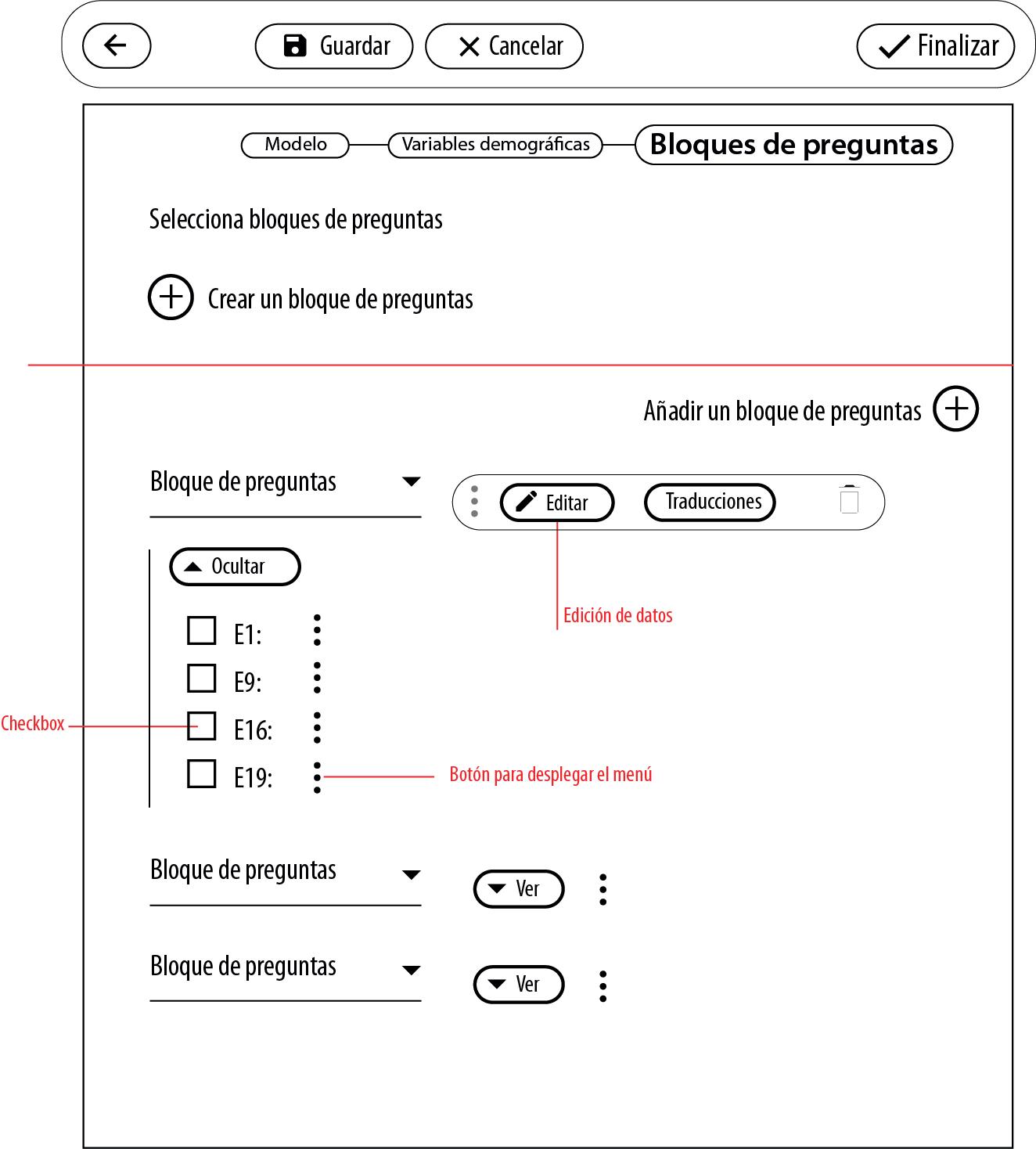
The first step is to specify the company's data, so that information can be obtained as a starting point. The next step is to define and select blocks of questions, according to the type of diagnosis you want to propose to the company. After this, it is necessary to specify model that serves as a template to specify how the questions will be asked. The last step to define the survey to be carried out and send it, so that the process can be completed.
The operation of this tool is always the same and has the same objective: to show companies where they stand in the business universe and allow them to compare their situation with that of other companies. To do this, users must carry out a series of actions that will allow them to make a diagnosis of their situation, collecting information through surveys that are customized, sent and their data is collected through this platform.
1 UX/UI > 1.1 Estandard_Design of a digital platform
The architecture of the platform has been defined taking into account the ease of navigation for the user, simplifying the structure as much as possible, so that it is intuitive and without too many levels in its flat hierarchical style.
Special emphasis has been placed on accessibility and navigation to the screens from which the main process of use is performed, making it possible to enter and exit and move from one screen to another directly.
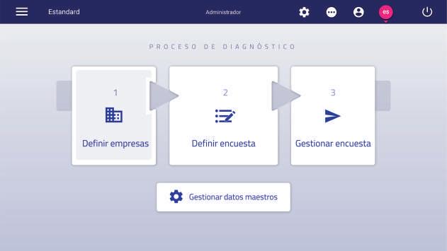
Access buttons to the main process of use

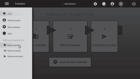
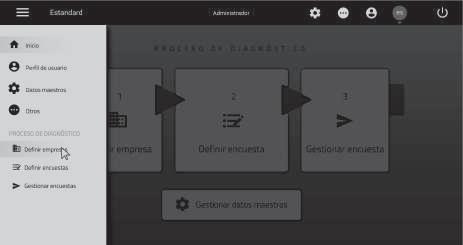
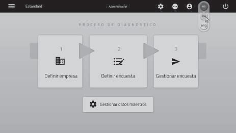
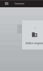
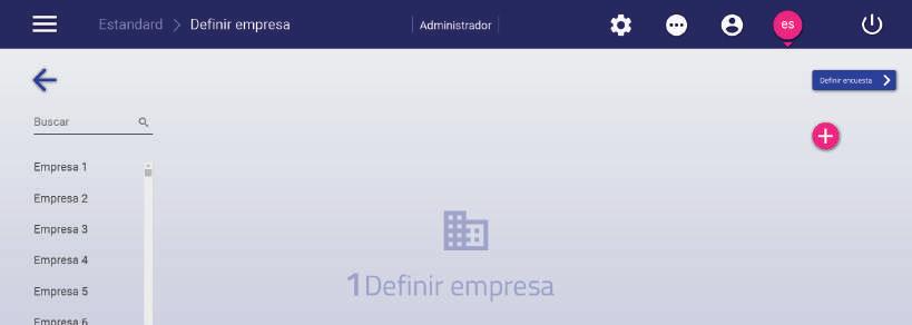
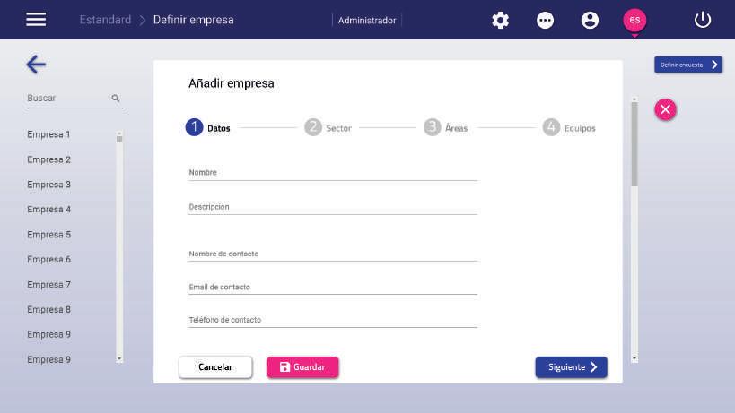
For the Home screen, a simple interface with just enough options for the user to understand the process of use has been established, using a top option bar with buttons and a hamburger-type dropdown menu. It has been given a great visual importance as main interaction elements to the access buttons to the main process of use.
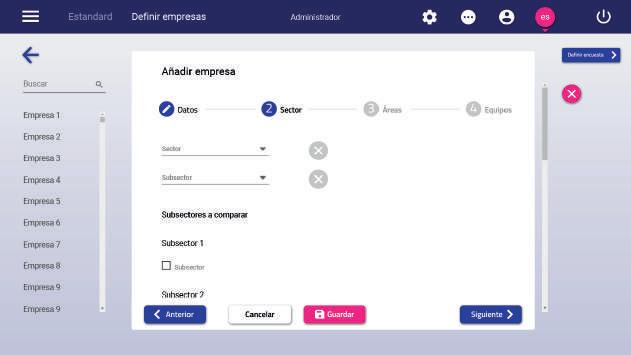
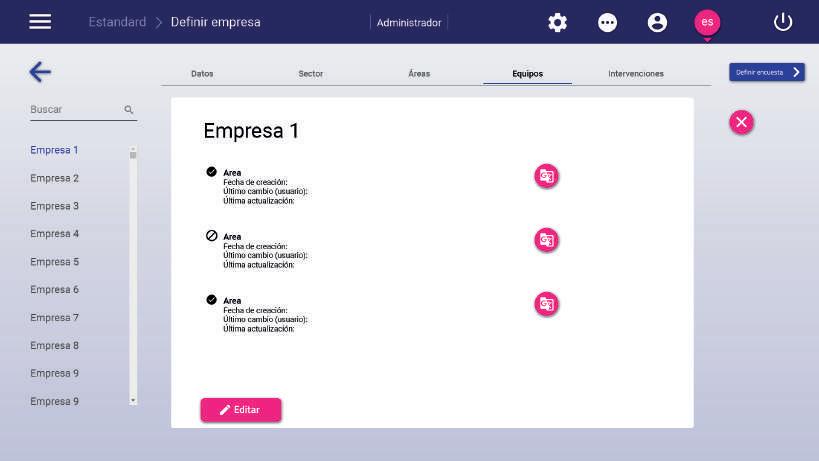
A large area of the screen has been dedicated as an area where the user will view and interact with the forms.
Navigation buttons to interconnect and facilitate the usage process between the three main steps of the usage process
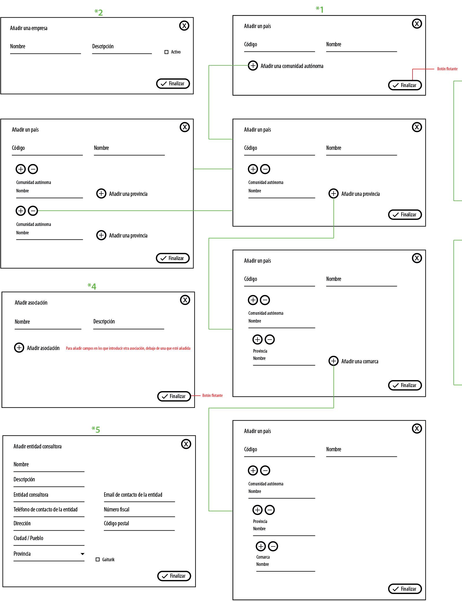
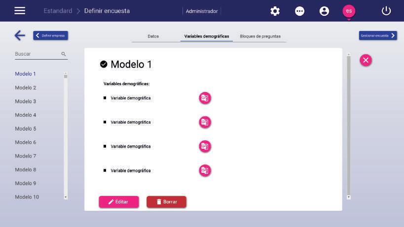
The information architecture and the skeleton of all the forms and their order within the process of use, as well as the necessary modal screens, have been detailed at a conceptual level.
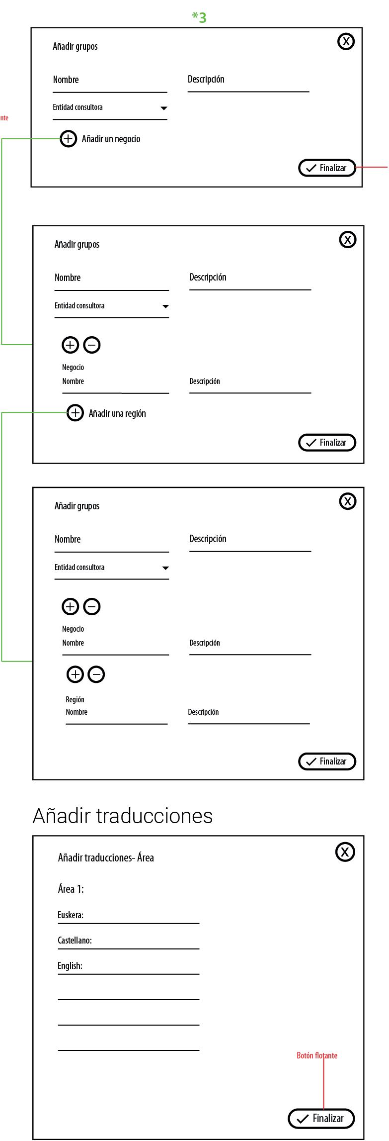

Top
Top option bar / Forms / Lists
Main drop-down menu / Buttons Interaction elements not linked
1 UX/UI > 1.1 Estandard_Design of a digital platform




















Administrador Estandard Gestionar encuesta es
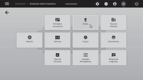
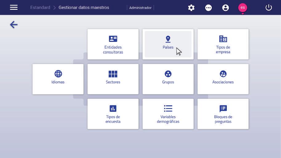
Secondary display buttons
Entidades consultoras Países Tipos de empresa
Sectores Grupos Asociaciones Idiomas
Definir empresas Definir encuesta Gestionar encuesta
Tipos de encuesta Variables demográficas Bloques de preguntas
Hover effect


Administrar usuarios
Intervenciones Servicios
Editar Conseguir datos en fichero CSV
Cancelar Guardar
“select” button










Euskera Castellano Inglés

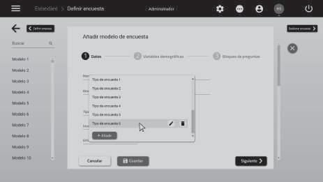
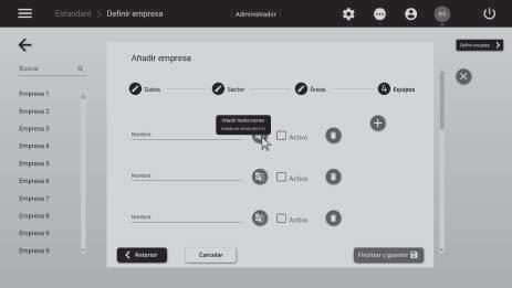
Form components
Form elements - data input and selection
Usuario Usuario*
Usuario
Obligatory field
Form components


Obligatory field
Tipo de empresa*
Tamaño de area*
Buttons to add a digit
Entidad consultora Activo
Activo
Usuario
Es necesario introducir un usuario
Usuario
Usuario@gmail.com



1 UX/UI > 1.1 Estandard_Design of a digital platform
Alignment of the elements components
Preguntas
Pregunta 1
Pregunta 2
Pregunta 3
Pregunta 4
Form components + Ver preguntas
Cancelar encuesta
Terminar recogida de datos
Abrir encuesta online Editar
Borrar Reabrir encuesta
Log in display buttons (Font: Titillium Web)










Iniciar sesión
¿Olvidaste tu contraseña?
The user and out. has through the just Even added, interesting orientation the








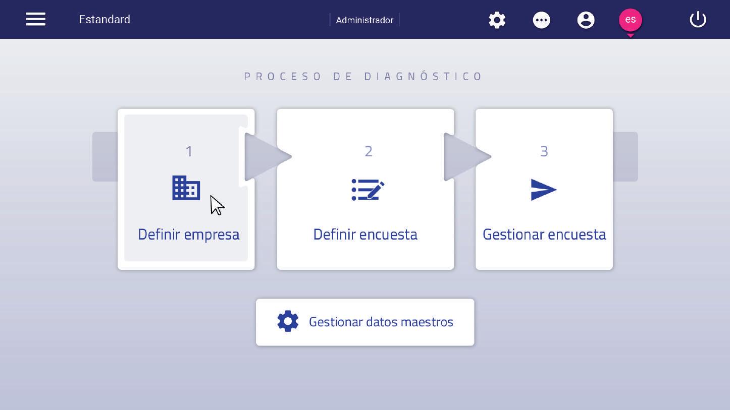



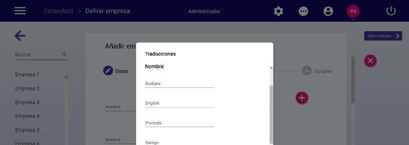
The objective of this screen is to present the user with the main steps of the use process and the order in which they should be carried out. We have also tried to ensure that the user has all the options and accesses to navigate through the different screens at hand from the beginning, so that all the main options are just a click away.
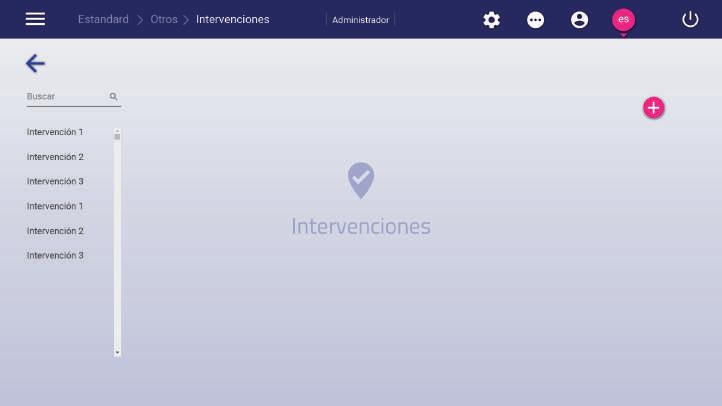

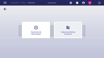

Even so, a "hamburger" type menu has been added, since it has been considered interesting to use this element as an orientation element for the user to visualize the main structure of the platform.


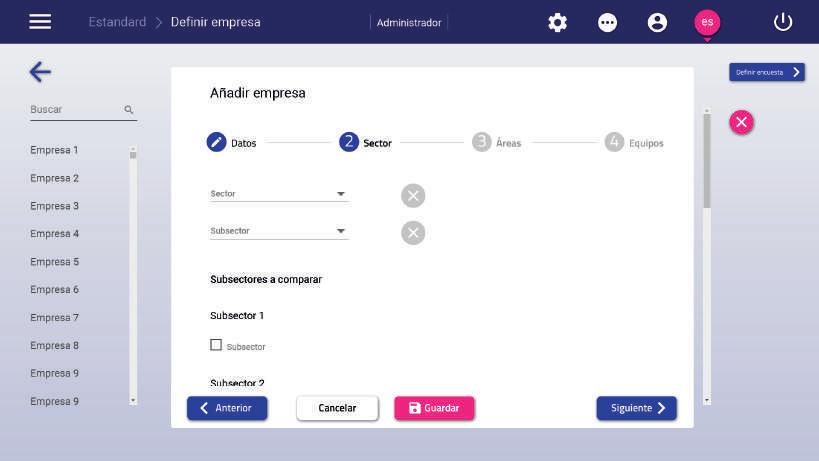
An element such as "breadcrumbs" has been used in the top options bar, to reinforce user guidance and enhance the user experience.


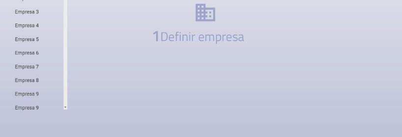
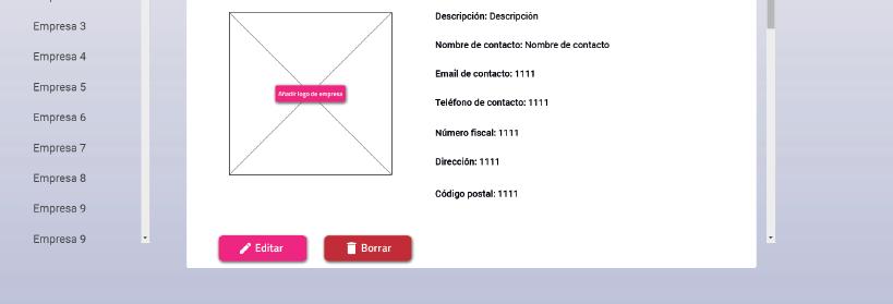
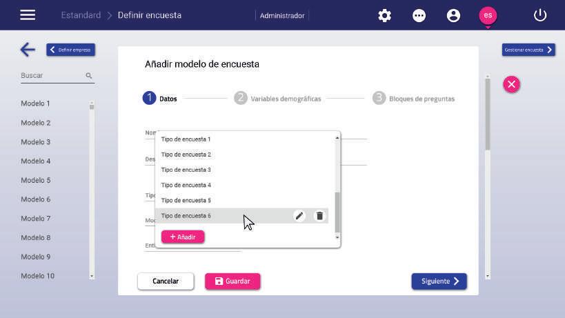
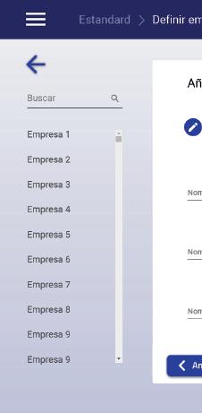
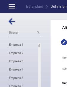
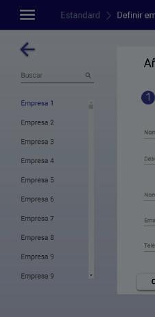
Due to the importance of the forms, a large part of the visual space within adding progress bars so that the user where he/she is in the process, as well alignment and aesthetics of the fields the select type lists, among other elements.

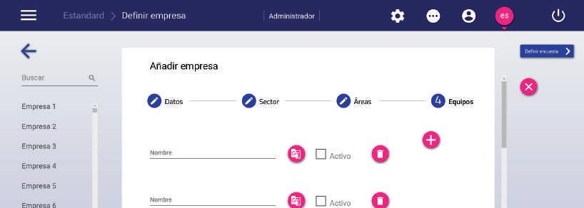

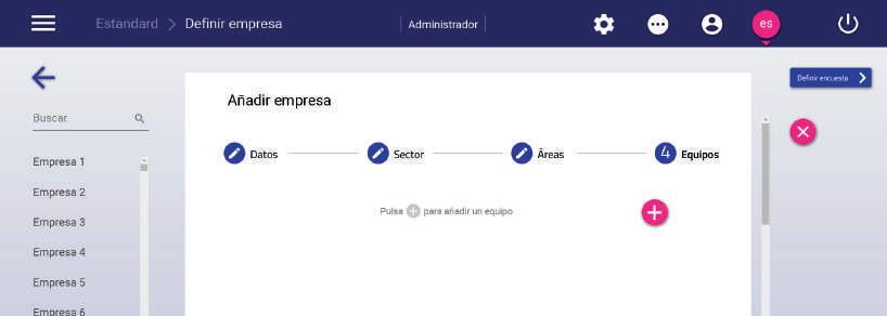

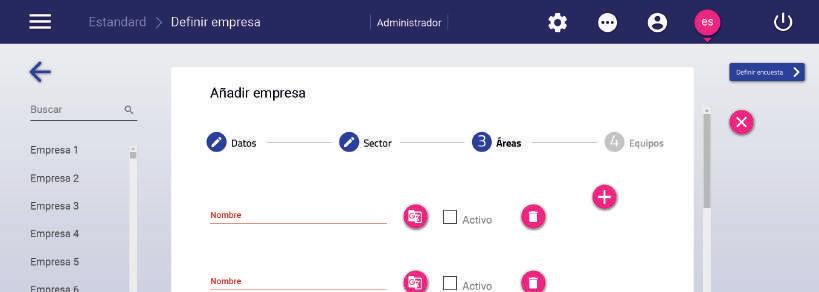

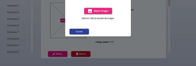


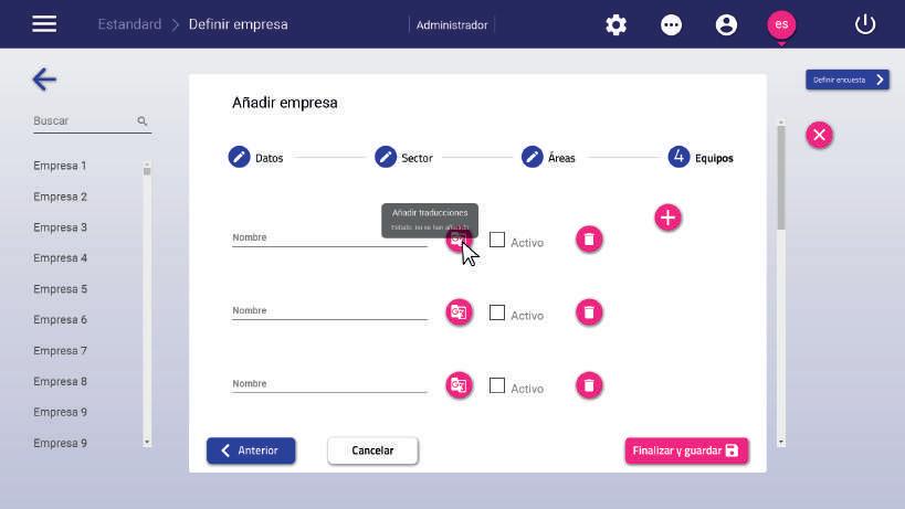


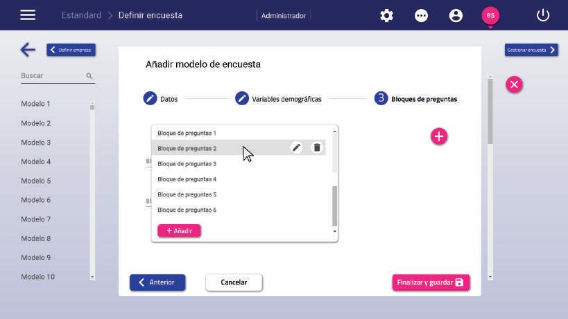



it has been given them within their interfaces, user can know at all times well as taking care of the fields to be filled in and elements.


















Workshop in collaboration with Orona.


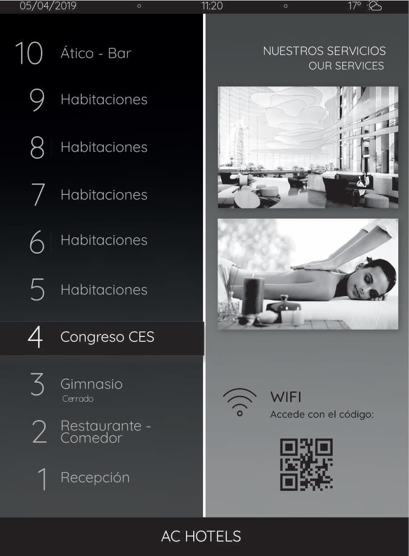
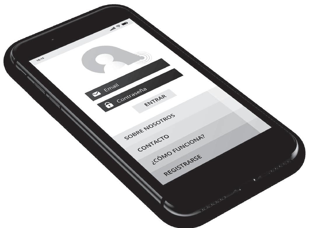
Interface design for elevator TFT screens.




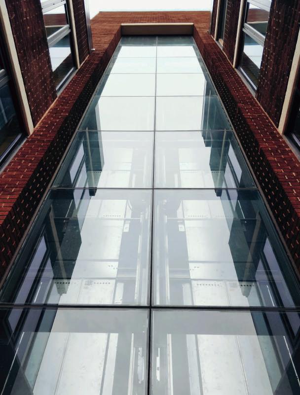
Design the interfaces for two integrated screens of the flush type with TFT technology, being coherent with the high range and aesthetic line of Orona.
Define the functions of the screen, the information to be displayed and its interactions with the user.

TFT, which stands for "thin-film transistor", is a type of flat-panel display that offers high image quality from any angle. These screens allow the display of images, videos and additional information, from the basic elevator information.
Sometimes in elevators we can find an additional screen that normally shows information not related to the elevator (advertising, weather, news, etc.). The type of information displayed requires certain image quality, so the technology to be used will be TFT.
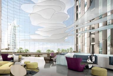
This project is framed in a context of high standing hotels. The elevator is always an identifying element of the quality of a hotel. Aesthetically it is one of the main sources of impression, since the traffic of people who use them daily is very high.
flat-panel screens information, apart (advertising, requires a TFT.

It has been decided to establish this context taking into account that high-end hotels are the type of establishment in which it is feasible to identify value with respect to the implementation of this type of technology, in addition to being able to find situations to generate utility for the user.

A definition has been made of the user profile that would fit the context established for the use of the elevator and of the type of interfaces to be designed. Moreover, by means of the personas tool, the characteristics of this user have been established, with the aim of detecting insights and opportunities in order to define ways to implement value.
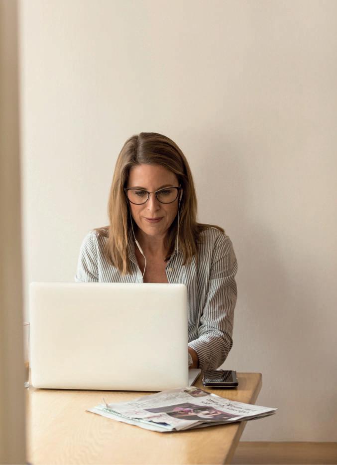
Nekane works as a manager of a multinational company, her job requires her to travel regularly, so she usually stays several days in hotels that t a business pro le, which makes it easier for her to do her job comfortably and without having to waste time moving around or making a great e ort to nd the areas she wants to access. During her stay, she likes to be informed at all times about the services and leisure options o ered by the hotel, and appreciates being noti ed of any situation or change in the organization of the establishment.
· Moving easily around the hotel.
· Be constantly informed about her ight.
· Perform work-related activities during her stay at the hotel.
Getting lost in the hotel.
Not knowing on which oor the area you need to go to is located. Not nding out about last minute changes in the hotel's organization. Waiting time that cannot be spent doing something useful.
· That her stay at the hotel does not interfere with her duties.
· Perform her work smoothly and e ciently.
· To have information about the hotel services, to be able to organize her agenda and know what to do in the free time.
"What oor had they put the conference on?"
"What can I have for dinner today?"
"What can I do this afternoon?"
Need for easy movement
Busy Lifestyle
Urgency to be constantly informed
Several trends related to hotels have been identified, in order to understand the different possibilities that will be standardized for the user experience to be offered in a generalized way, and to see how the type of screens and interfaces to be implemented can be positioned.
The dimensions and content of the screens have been defined, as well as their position within the elevator walls.




Several icons and graphic elements have been designed to develop them as motion elements and design their animation for different situations that may occur in the use of the elevator and that should be notified on screen.
Animations created using Adobe After Effects.



“ No product is an island. A product is more than the product. It is a cohesive, integrated set of experiences ”
Donald A. Norman


DBZ-MU Design Methodology
2 months
Best Service Design award at the 8th Iberoamerican Design Biennial meeting
8ºencuentro bid_ enseñanza y diseño
100 años después de la Bauhaus
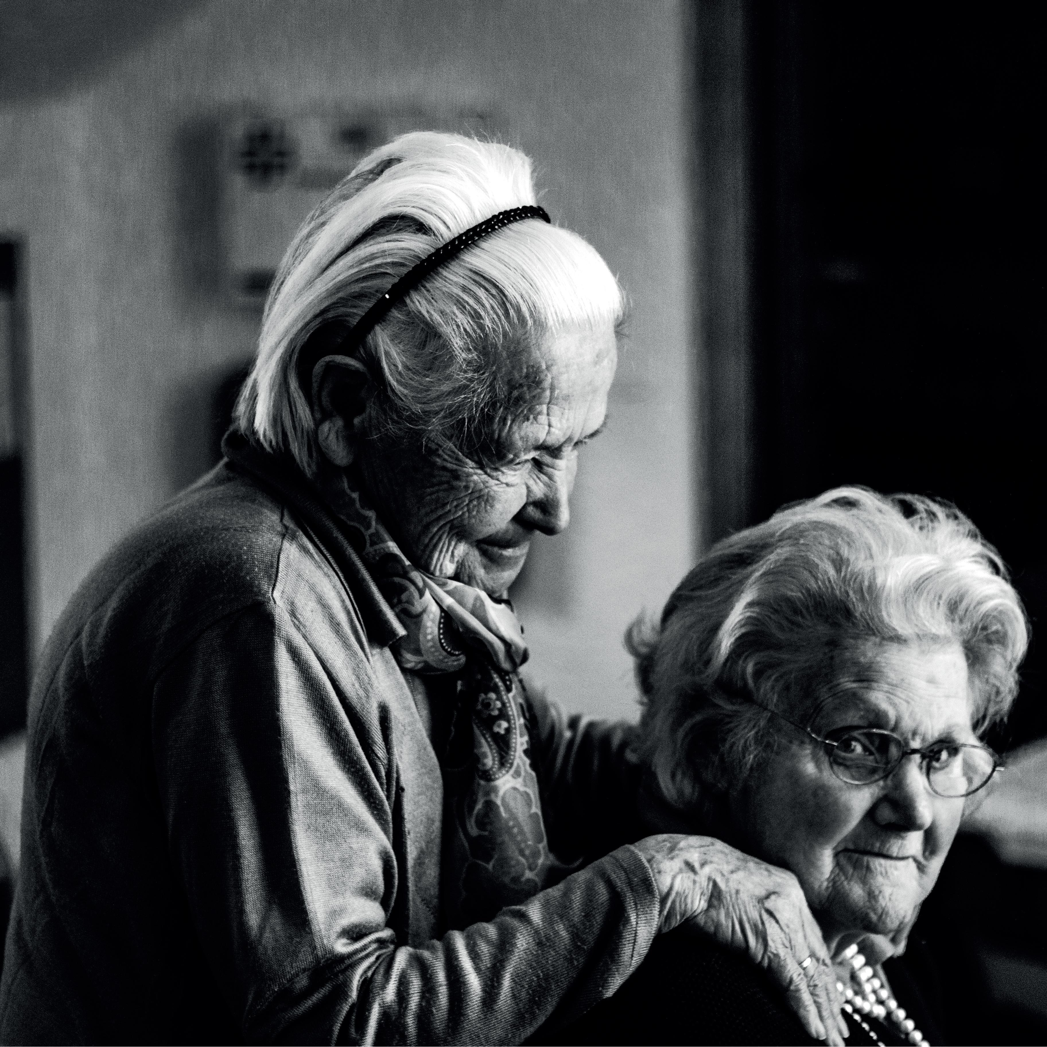
A home delivery service with a person-centred caring approach.

Help elderly people
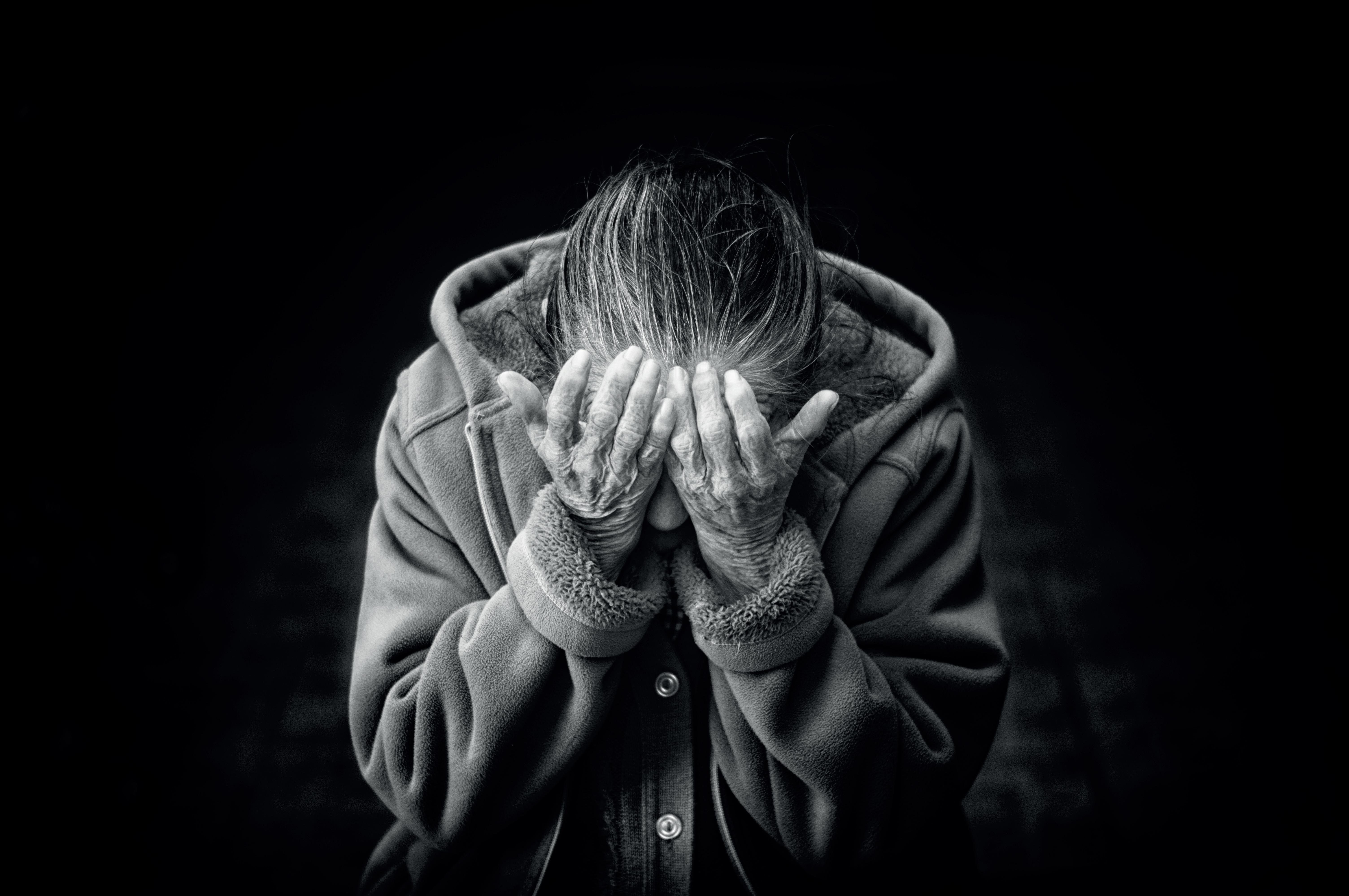
Social-health solution
Slow down dementia
Holistic experience
This project launched by the University of Mondragon, in collaboration with the technological development center of Uggasa, is a part of the Zaintzeko methodology test they created.
The objective of this challenge is to design a service that helps to slow down or improve the early stages of the dementia.
“Globally, the population aged 65 and over is growing faster than all other groups”
“The aging of the population will be the most significant social change of the 21st century, with implications for the financial market, family structure and demand for good services”
This challenge is born as a response to the upcoming ageing of the population and the need to propose small-scale solutions to face this problem in a holistic level.
A person with dementia can need help and vigilance in both at home and in an institution. Many organizations are also available to help taking care of these people by protection services for adults, community resources, geriatric departments in local or statal level, visiting nurses or assistants and volunteering services.
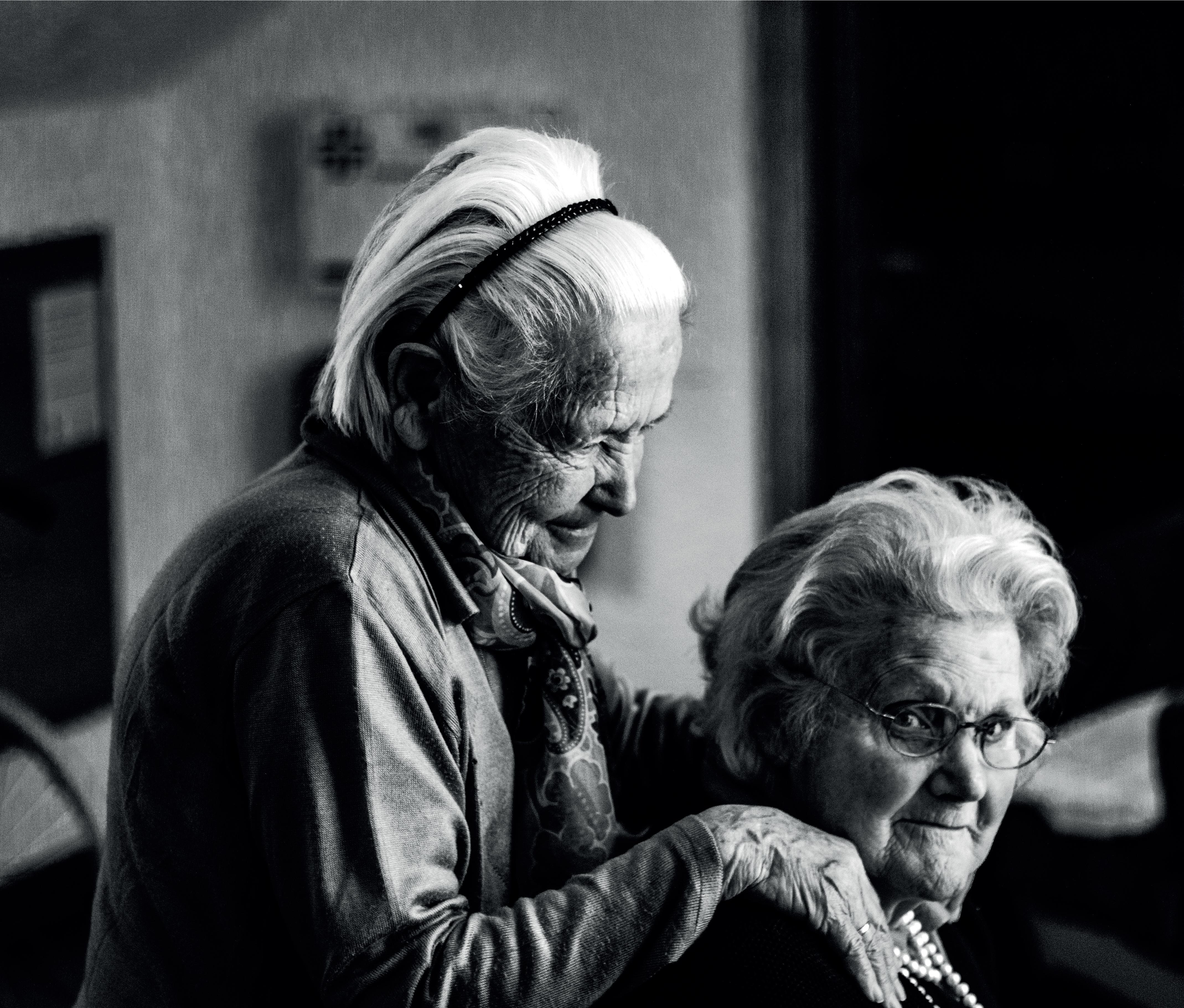
The carers’life revolve around the satisfaction of their relatives’needs and many of them leave their own life in a secondary place.
Almost all the entities that have been contacted during this project, have remarked the importance of the preventive action in dementia cases. It exists the habit of applying solutions when it is already too late or the dementia has reached a severe stage.
Therefore, this project deals with the first four phases of the dementia, which are those in which the patient is still at home and is not completely dependent.
In this case, several tools have been used in order to analyze correctly the user. On the other hand, some interviews have been carried out with patients, carers and public health field professionals. On the other hand, there have been different co-creation sessions with different profiles. To finish, taking into account all the insights detected with the previous tools, they have been summarized using the Personas tool and conducting a Customer Journey Map with them.
STAGES OF DEMENTIA · According to the Reisberg scale
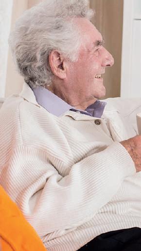
“Designing a product or service that will help slowing down the first phases of the dementia where the patient is still at home and is not completely dependent, although the person is aware of the beginning of the deterioration
 Trained person Supervision Company
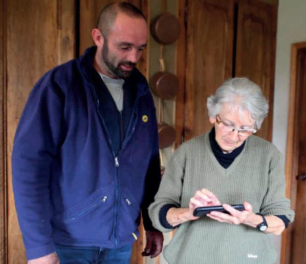
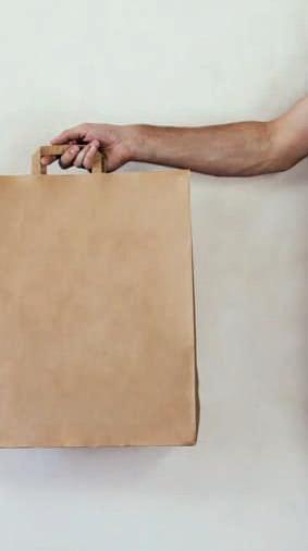
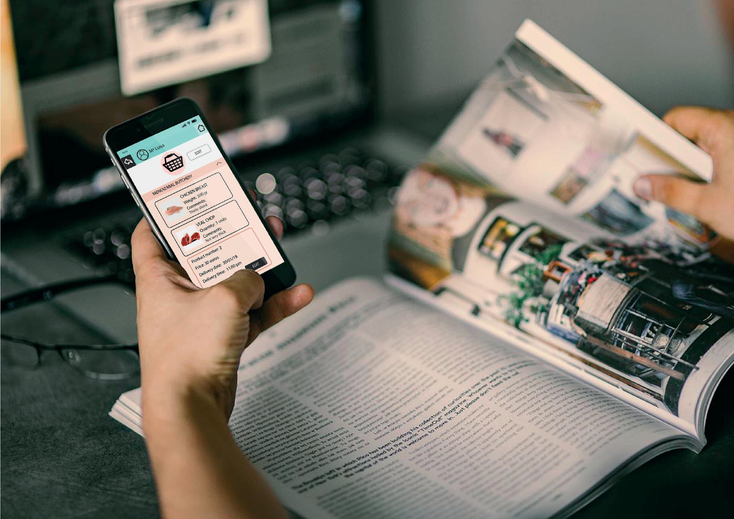
The proposed solution is a home delivery service with a caring approach. It is a local initiative, in which people with difficulties in making purchases during the week in their usual establishments, have another way of obtaining these products and services. In addition, the delivery service is reliable, allowing older people to choose the most suitable delivery service.
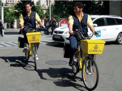

In the nearest circle are the distributor, the trade association and the development agency. In the background would training center. The local trade association would also hall and the professional carers. Finally, on an external Basque Government and the employment department
·
association, the establishments, the elderly would be the family caregivers and the be here. Then there would be the town plane would be the Deputation, the department

·
· Information
· Community

· Assistance
·
·
A home delivery service with a person-centred caring approach.
A service that receiving products while, at the same ensure that they
The service members (caregivers) and some distribute the on the state that they used
allows elderly people to continue products from their usual local shops same time, they are checked to they are well.


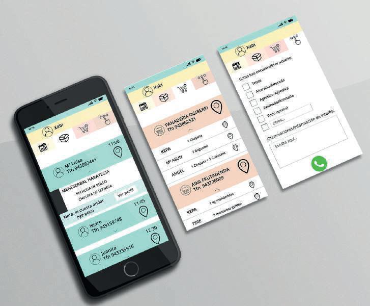
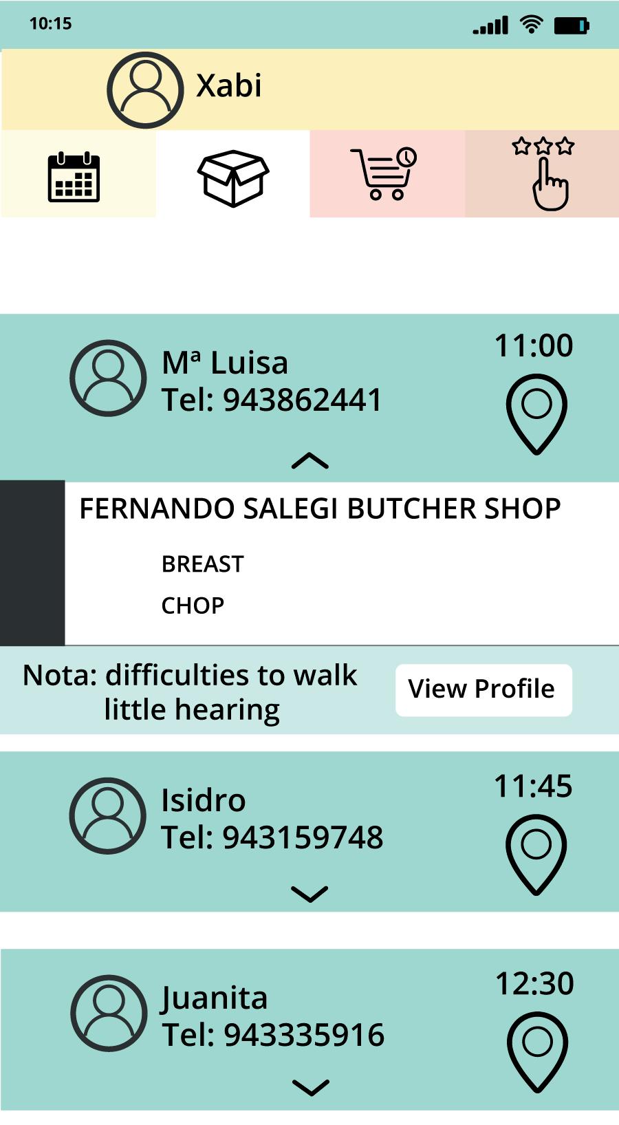
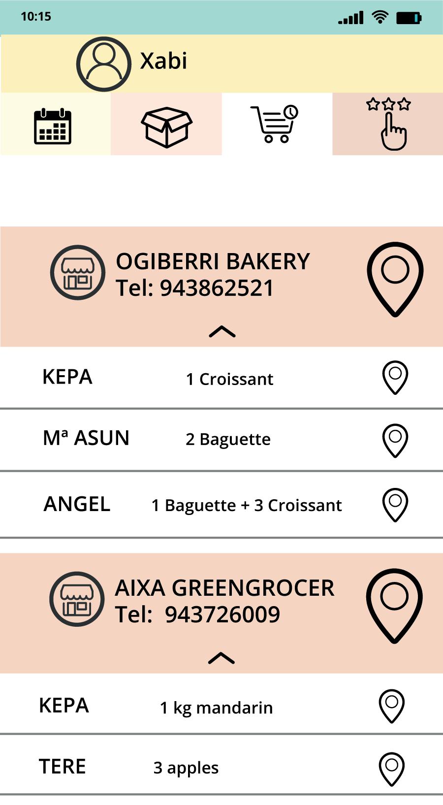
service works through an app that gets family (caregivers) in contact with the establishments delivery people (external to the establishment) the products and give feedback to the family state of the elder, so that they can have situations used to have before the illness.
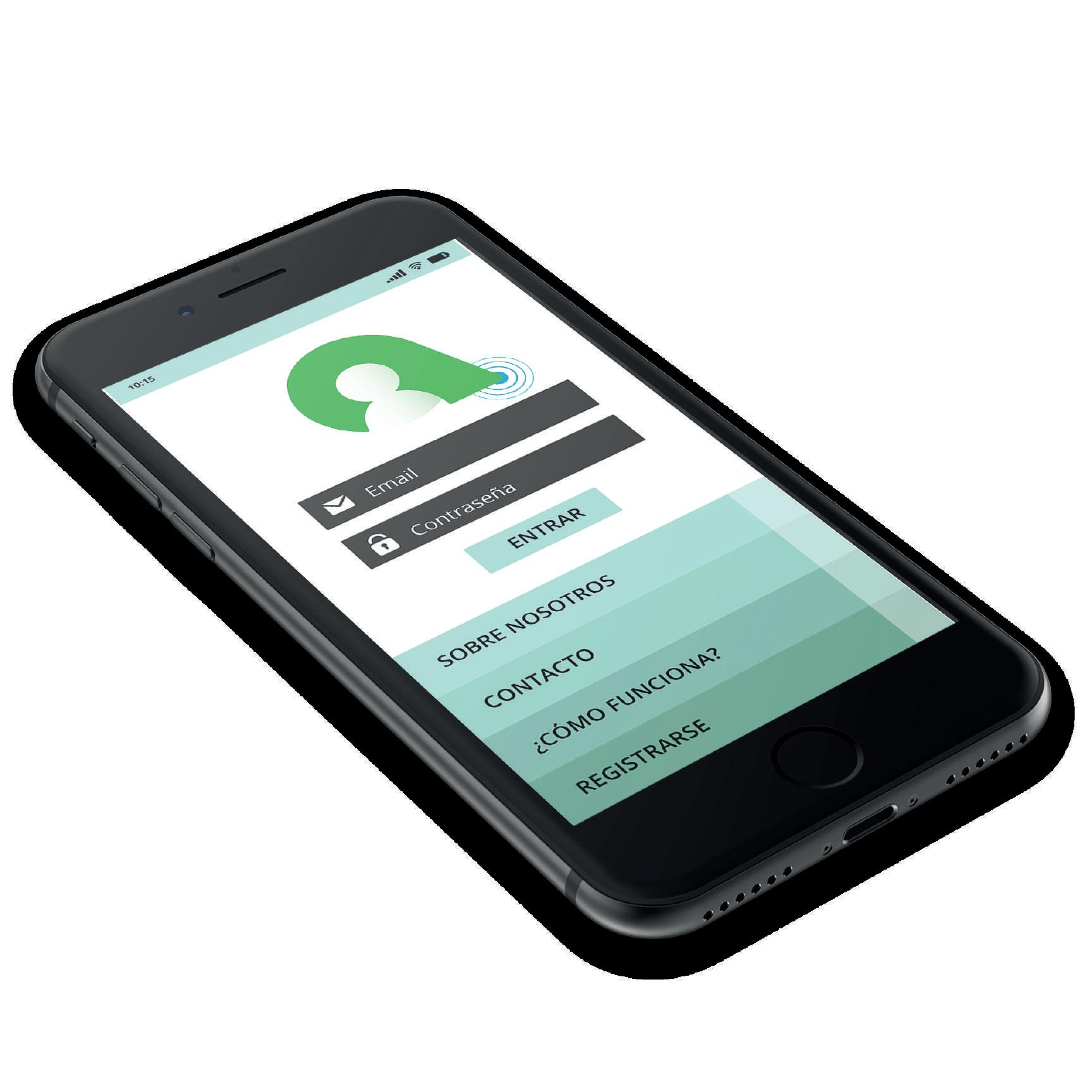
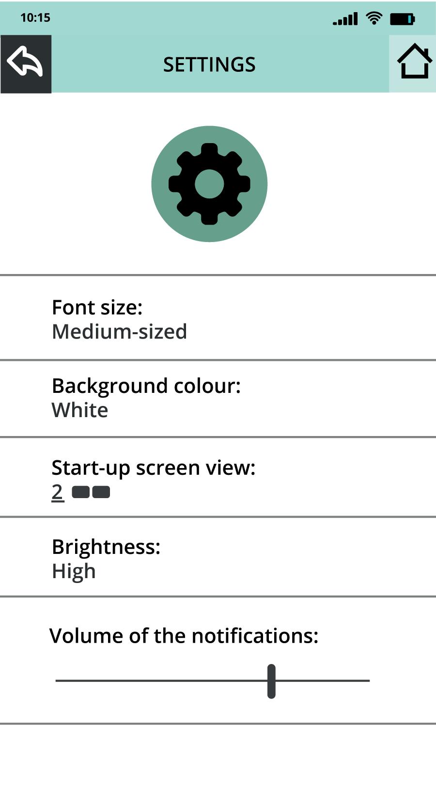
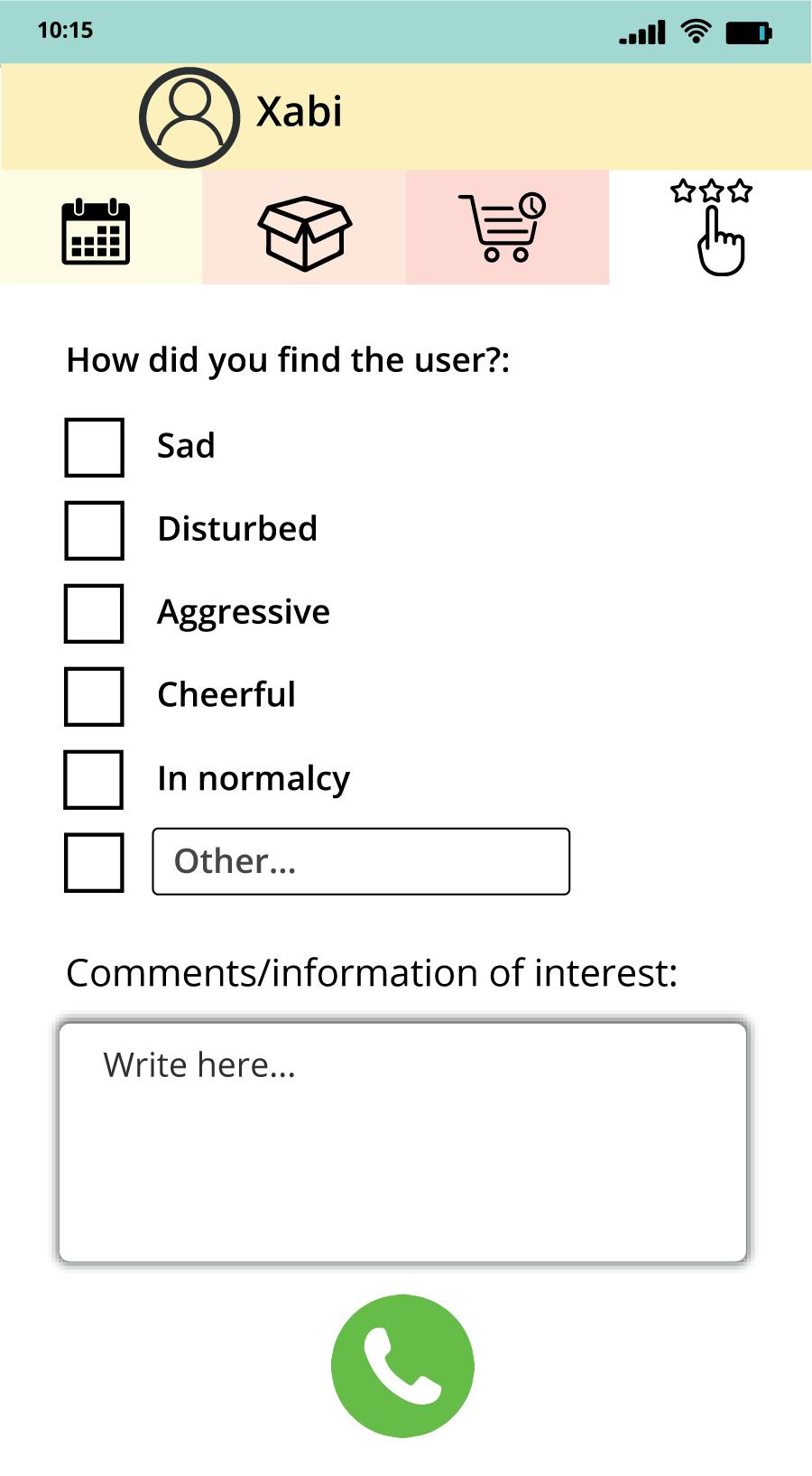
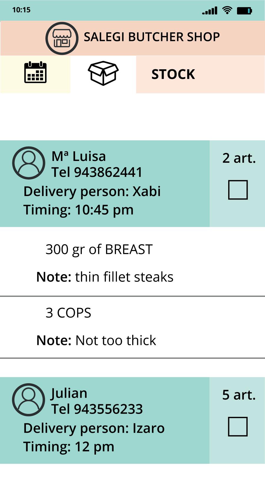
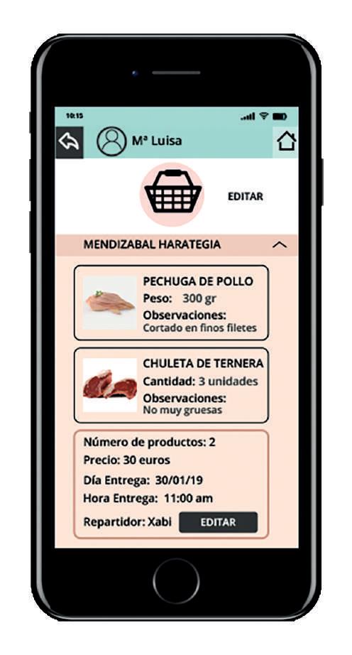
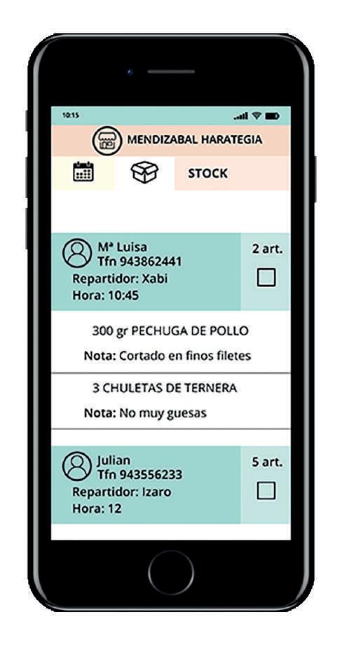
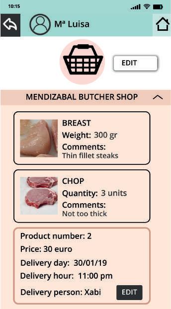
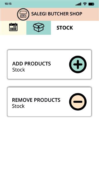
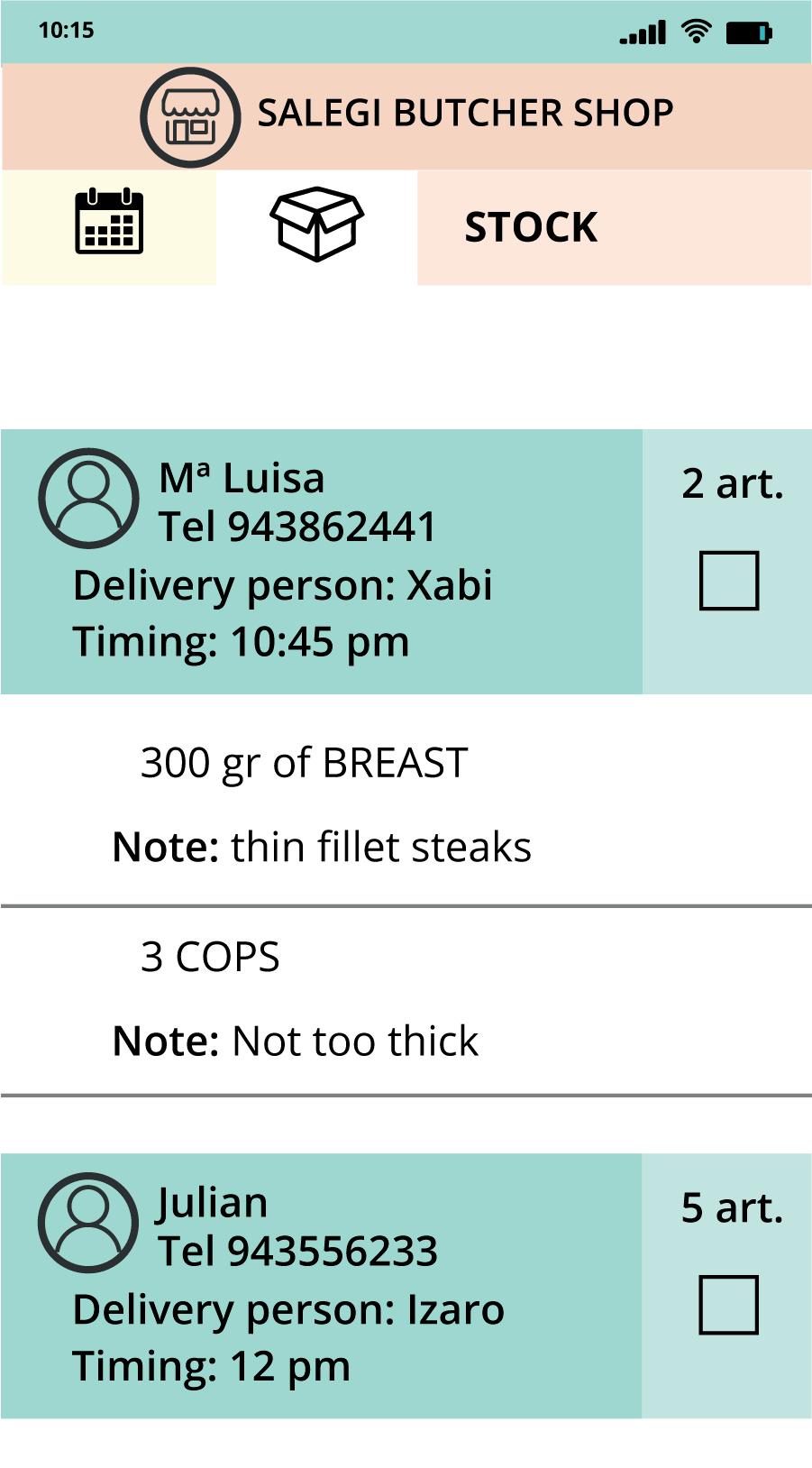
The auzotu app is aimed at 4 different profiles: the elderly person, their caretaker, the establishments and the deliverers. All these profiles have been adapted to each type of user, making them as intuitive and accesible as possible.
This service will be carried out through a main channel: the mobile application. Therefore, in order to design this application, it has been thought about the functions it should have, along with its structure.






After that, the wireframes of the different screens have been defined, from the three different user profiles. Finally, using the Adobe XD tool, the visual design and the prototyping of the app has been carried out.
In addition, as it is a service that unites people with dementia with local commerce, it has been seen convenient to visualize the service itself in the physical stores.
To this end, they have been designed some stickers that will be stuck in the windows of the stores, and the brochures will be distributed by the dealers to their customers when they do the buy.


















WE TRANSFER THE ROUTINE THAT THE PERSON HAD BEFORE THE ILLNESS, I.E., VISITS TO LOCAL STORES, TO THEIR HOME. NOW THEY MAKE THE VISITS.
WE IMPROVE THE CUSTOMER'S LIFE AND HELP STRENGTHEN THE LOCAL ECONOMY.
ASSISTANCE + YOUR USUAL PRODUCTS AND SERVICES, IN YOUR HOME.


Auzotu is a local
Company during the delivery Feedback to the family member after the distribution
DBZ-MU Design Methodology
Strategic research Explore Ideate Develop Implementate Launch


Hypothesis 1 3
Scenarios 2
Drivers 3
Distillation 4
Future Scenarios 5
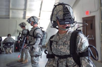
VR is generally used for two purposes:
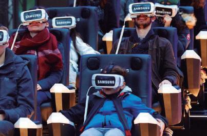
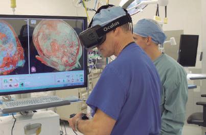
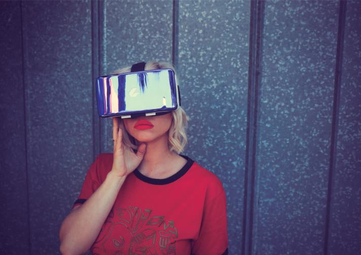

Simulation
The objective of this project is the analysis and identification of consumer trends based on Virtual Reality, proposing future scenarios and services derived from the possible applications of this technology.
VR
Virtual reality is an artificial environment that is created by software so that the user somehow believes and accepts that it is a real environment.
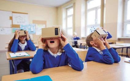
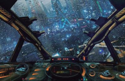
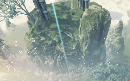
Imaginary environments
2 Services > 2.2 VR Trends_Future VR scenarios

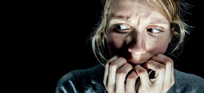
3 scenarios related to current trends within psychological treatment have been proposed, in which VR could be applied as a technological support.

What would happen if virtual reality was applied in psychological treatments?


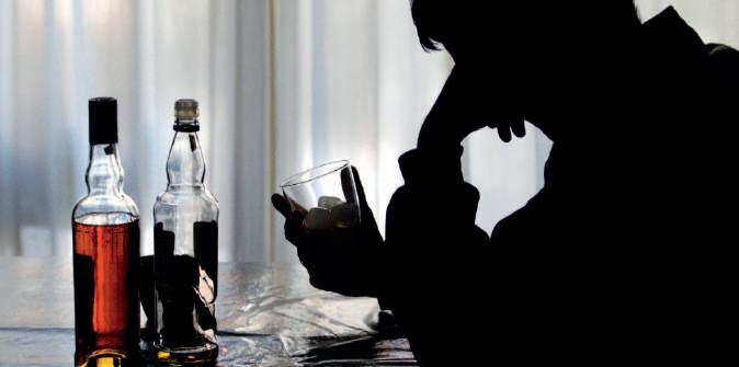


It has been decided to focus the research on the use of VR for psychological treatment, so a hypothetical service that performs this technique has been proposed as a starting point from which to analyze this trend.
Phobias
Imaginary environments

We are PSYCHOLAB. A center dedicated to rehabilitation sessions focused on psychological traumas such as phobias, addictions and anxiety episodes.

Anxiety
Macrotrends related to the scenarios have been identified in which the use of VR may be involved. After that, they have been filtered by means of a graph, measuring the impact and uncertainty of each one.
Duality of presence 51
2 Services > 2.2 VR Trends_Future VR scenarios
Distillation
Personalization of education

Conversational interfaces

A distillation exercise has been carried out, in which connections have been made between the three scenarios proposed, the macrotrends and the consumer trends identified, resulting in two future scenarios. presence

Popularity of the fictional dystopia

Scenario + Macrotrend + Consumer Trend = Future Scenario
Addictions + Social anxiety + Increased desire to disconnect =
Virtual spaces for disconnection
with the the one have
Increased desire to disconnect
Phobias + Virtualization + Duality of presence =
Simultaneous non face-to-face follow-up

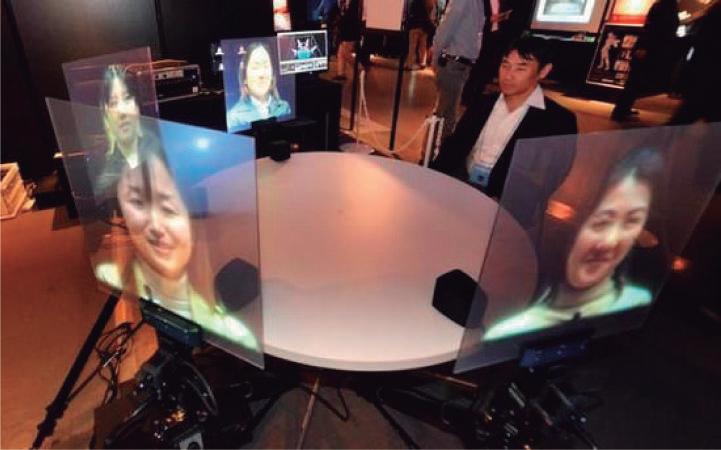
Phobias are a psychological trauma that affect society in a generalized way, to a lesser or greater extent, something that may increase as society advances to a state of isolation in which it is more difficult for people to confront their fears directly. Therefore, a scenario is presented in which virtualization can help people to accept this aspect in their lives, and to be more openly willing to receive therapies through virtual reality that can be carried out by therapists working with several patients simultaneously through videoconference methods, that is, using as a channel the duality of presence that is so integrated in society.
 The psychologist simultaneously attends phobia therapies of several patients at a distance.
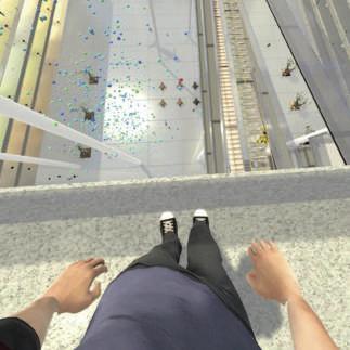
VR scenarios are used as reinforcement of the therapy, adapted to each person.

Due to the social anxiety that is becoming widespread due to various political and socio-cultural aspects, it is becoming increasingly common for people to need to rely on substances to overcome their problems and isolate themselves from reality, i.e. to overcome possible anxiety disorders generated by the circumstances of the environment. Consequently, a scenario is proposed in which virtual reality could be used to get people to disconnect from their problems and social anxiety, but by creating virtual scenarios in which the patient can feel calm and in a state of security, removing from his mind the need to resort to other methods to carry out this action.
Virtual scenario with therapeutic and calming effect. Capacity to contact the psychologist to have a conversation during therapy.Good design is also an act of communication between the designer and the user ...

...
except that all the communication has to come about by the appearance of the device itself.
The device must explain itself ”
Donald A. Norman
DBZ-MU Design Methodology
Strategic research Explore Ideate Develop Implementate Launch
2 months

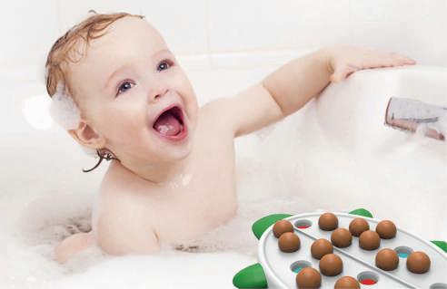
Designing a bath toy for children between 2 and 5 years old, putting the user in the middle of the innovation process.
Ideate a toy that could be used for when they are having bath alone or in company.
Create a product related to water motion or floatability.
To obtain an ecodesign product by reducing the environmental impact of the product throughout all its life cycle.
To understand user needs, both a quantitative and qualitative analysis has been carried out by conducting user surveys and interviews. As a consequence, it has been possible to identify the keys to adapt the product to the user's lifestyle.
The user is an active family with enough time to share with their children, at least during bath time. They are people who understand the need for their children to learn through play, so there is a need to include renovating concepts like making the child learn new concepts and boosting his/her creativity too. In addition, there is a strong awareness about the much-needed respect for the environment.
In the case of the children users, who will play with the product, it has been observed that they are the ones in charge of transmitting happiness in their home. Therefore, the fact that their active parents dedicate bath time as a moment of family dynamics will help their children to feel loved and the use of the toy will lead to a moment of calm and fun.
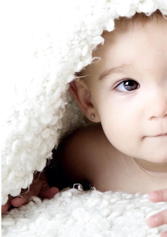
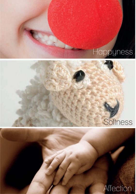
Based on the conclusions obtained during the exploration phase, it has been possible to establish the formal lines that have helped to define the character and aesthetics of the product.
It is essential to understand the use environment and what it entails, since being a product for the bath, should convey hygiene and cleanliness On the other hand, these two concepts are essential, since the main user will be a child between 2 and 5 years old, who may tend to put objects into the mouth.
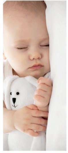

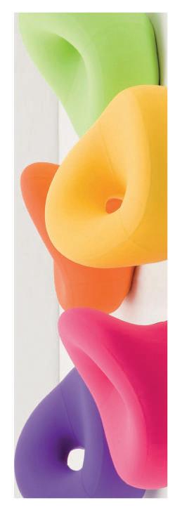
Moreover, through the user analysis it has been concluded that the toy should be coloured in a way that attracts the attention of the child, but without leaving aside the above-mentioned concepts. On the other side, and based on the capabilities of the user, the shapes of the product will be suitable to the size of him/her hand for a more ergonomic grip, these ones being clean, simple, rounded and, ultimately, organic.
3 Products > 3.1 Dordoy_Water toy design
A toy that presents a simple use with a versatile dynamic for the user, which adapts to the growing process between 2 and 5 years of age. It also allows the user to develop their psychomotor levels while it interacts with the family too, without forgetting about the ecological aspect.
The specifications have been divided based on the level of importance. 1
After completing the brainstorming and the sketching activities, three sketches have been selected which have been developed as drafts or pre-projects, which have been developed in a more detailed way.
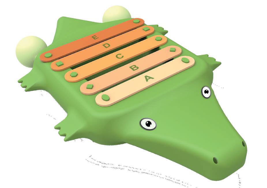
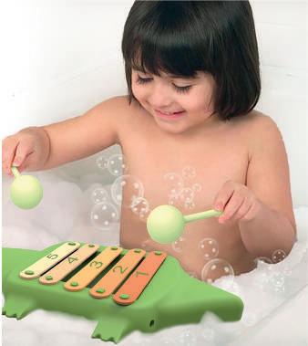
Based on the shape of a crocodile, while floating. The game dynamic is based on a six note silo. This toy includes two small drumsticks.
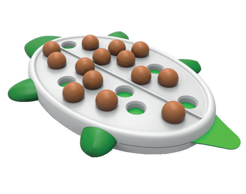
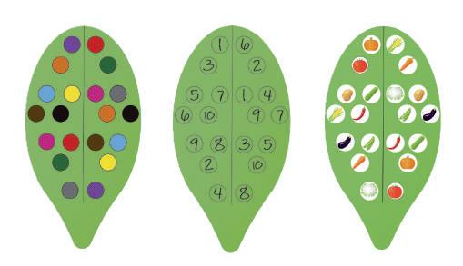



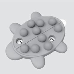
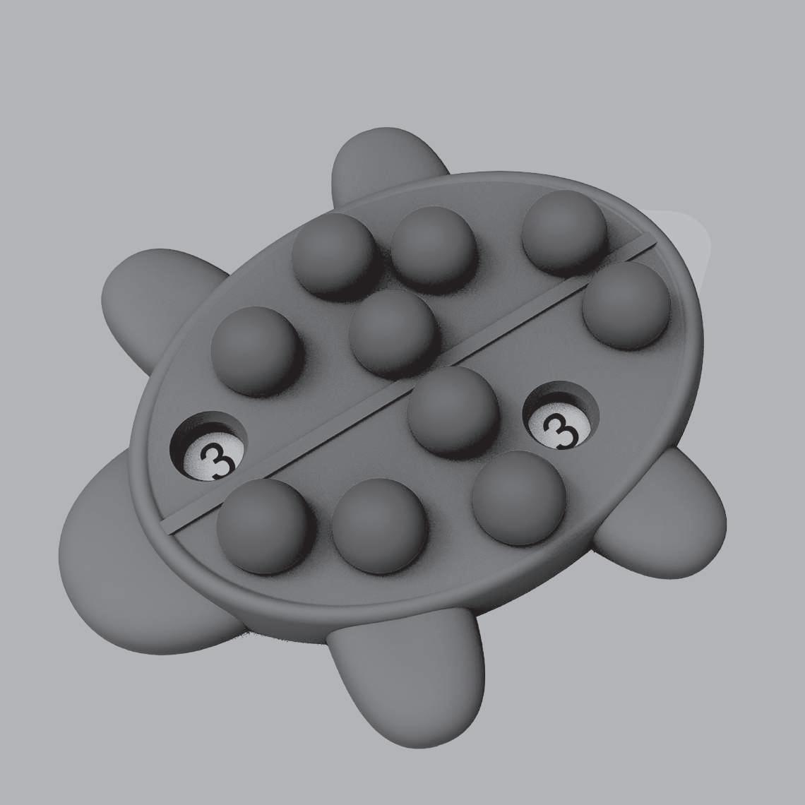
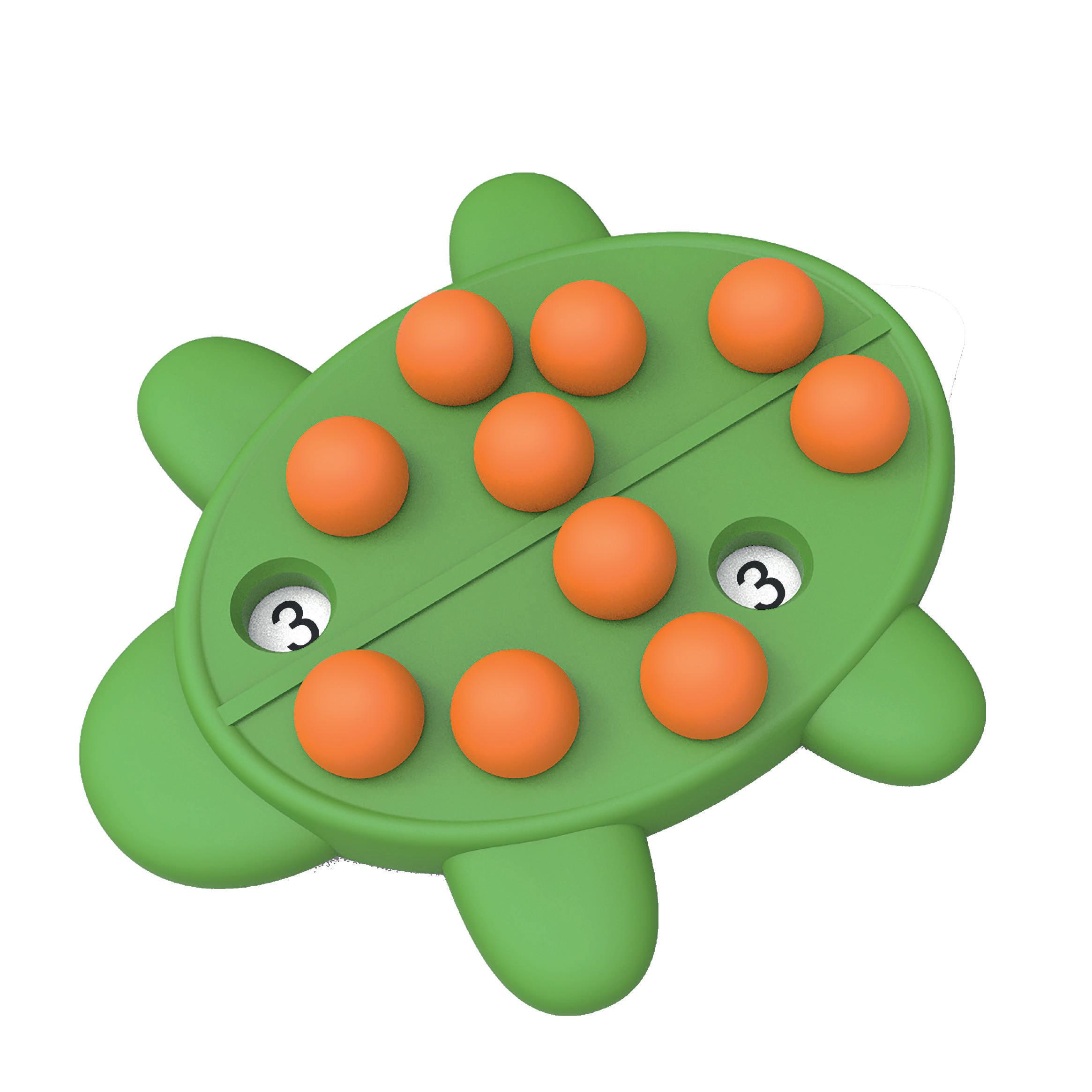
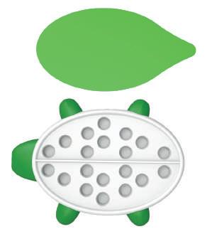
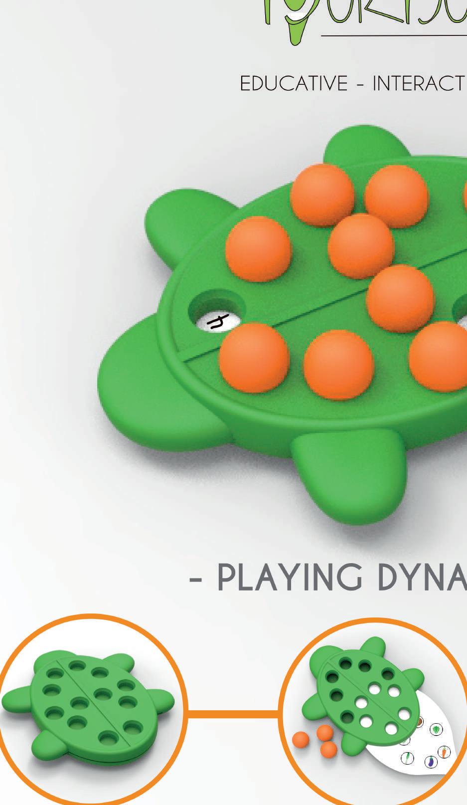
Based on the shape of a turtle, this floatable toy has a cavity at one of the ends, through which different flat insoles can be introduced, based on which the games will vary. The main goal of the game dynamic will be to make pairs.


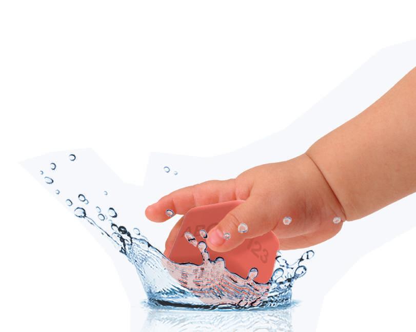
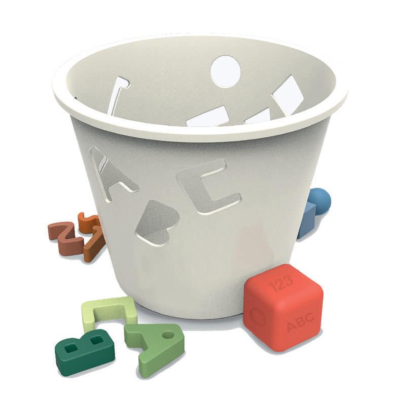
The user enters the dice in the water, and this one, after being introduced, will leave the water facing up one of its faces. Depending on the geometrical figure on the face, the child will have to throw that same form inside the cube, acquiring a dynamic similar to basketball.
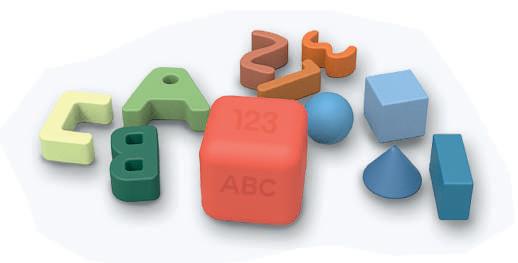

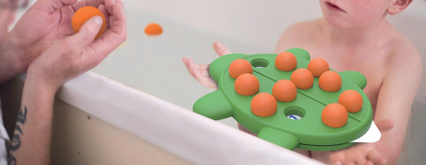
In order to analyze the environmental impact of product’s whole lifecycle a qualitative method has been carried out, called MET matrix. This method shows the used materials (M), the consumed energy (E) and the toxic emissions (T) generated during the different stages of the product lifecycle. This has made it possible to obtain data with which to optimize the product's environmental performance.
M E T -

Dordoy is the name of the developed water toy. It has a turtle shape, which is why it has been named as Dordoy, bearing in mind that “dordoka” means turtle in Euskera.

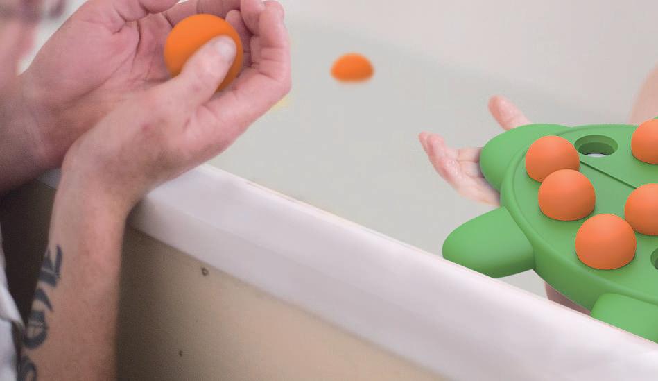
This singular product has a main large user range of between 2 and 5 years of age. The game dynamic is adaptable to each stage of learning and development of all the psychomotor levels of a child, as it has different functionalities or ways for using it.

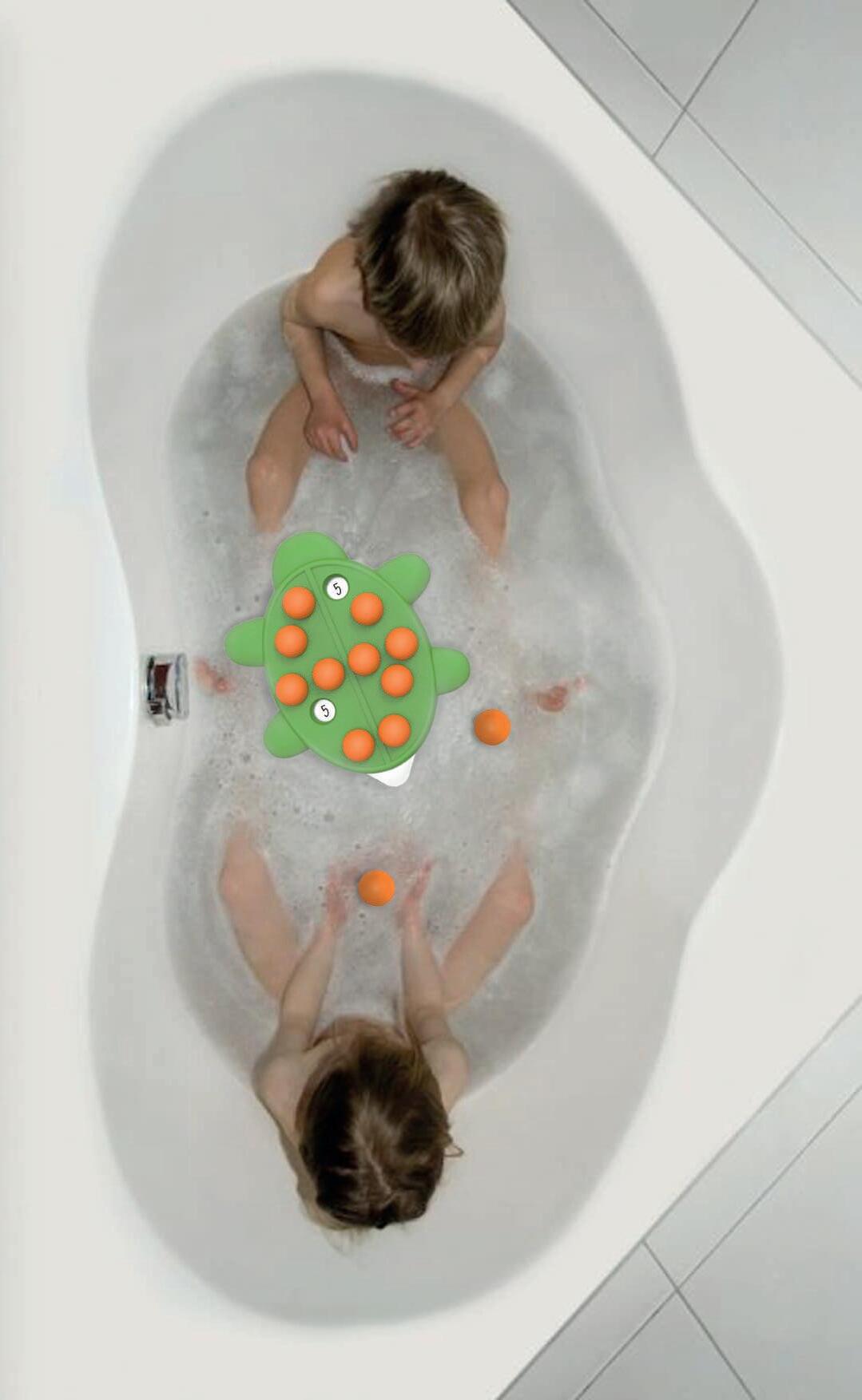
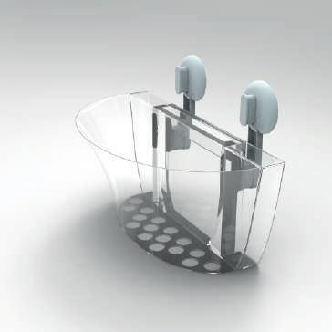
The game consists in inserting the insole into the slot once all the balls are placed in the holes. The user, either alone or with the parents or siblings, will have to catch a ball on each side of the turtle, this way uncovering the color, figure or number below and trying to form pairs. If the user is not able to form the pair, the balls will have to be put back in their place. However, if the user is able to made a pair, the balls can be scored in the basket that this product has. This basket can be placed on any wall of the bathroom, as it has two suction cups and could be placed without the need of applying a big force for doing so.

Only using the turtle, with the curiosity and the fun that transmits when floating on water, leading to the development of motor skills.


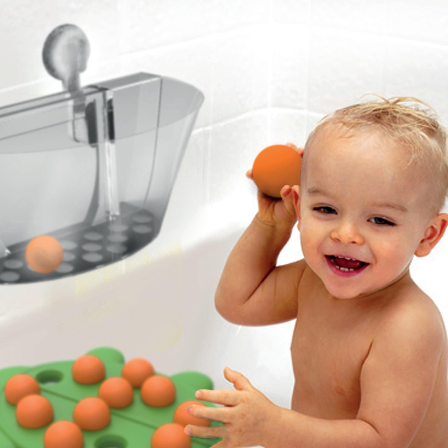


Adding an insole, the memory is developed by remembering the figures that appear on it, such as colors, numbers, etc. Therefore, it is possible to swap difficulties based on child’s age.
With the balls and the basket case, fun is added to the game. The balls can be used alone or in accompaniment of the memory game. As when the child gets a pair, he/she can shoot the balls to the case.
DBZ-MU Design Methodology
Strategic research Explore Ideate Develop Implementate Launch


Brand identity

Aesthetics
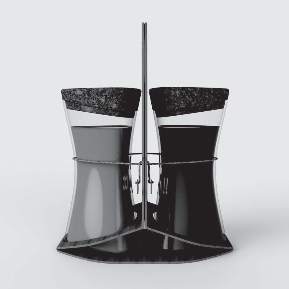
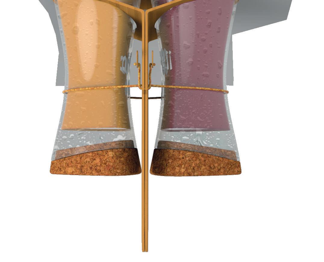
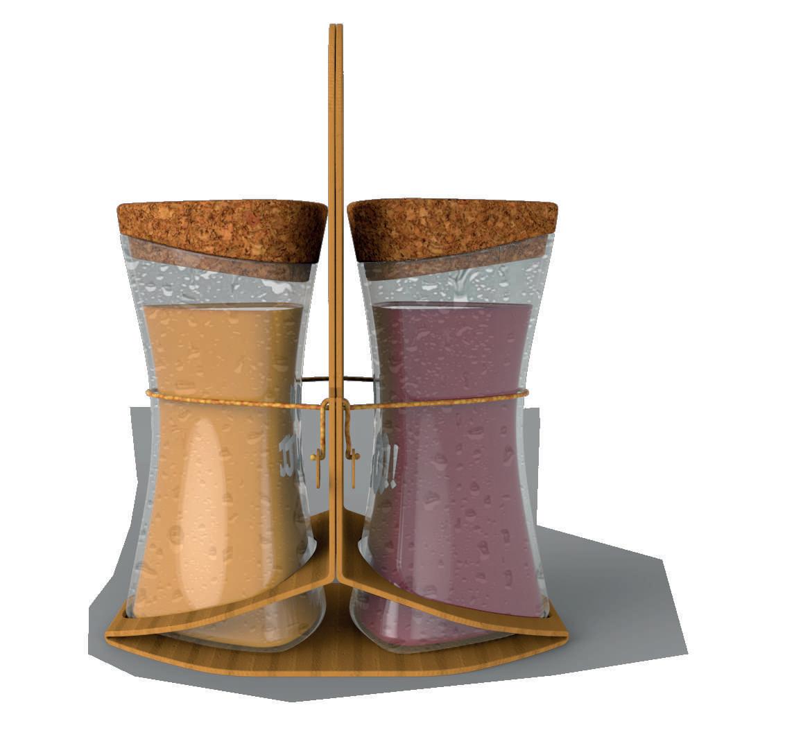
Create and design a brand and its respective glass bottle for Vidrala's annual contest for designers.
Define features that meet the user's needs both functionally and aesthetically.
Design an innovative packaging that fits both the bottle and the brand design.
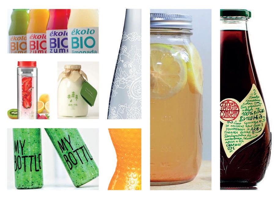
All ecological, natural and healthy products are the trend. The consecuence of that trend results in a significant decrease in artificial and preservative ingredients. Furthermore, each year increases the amount of vegetarian and vegan prople as well as the consumption of the products that are oriented to them.
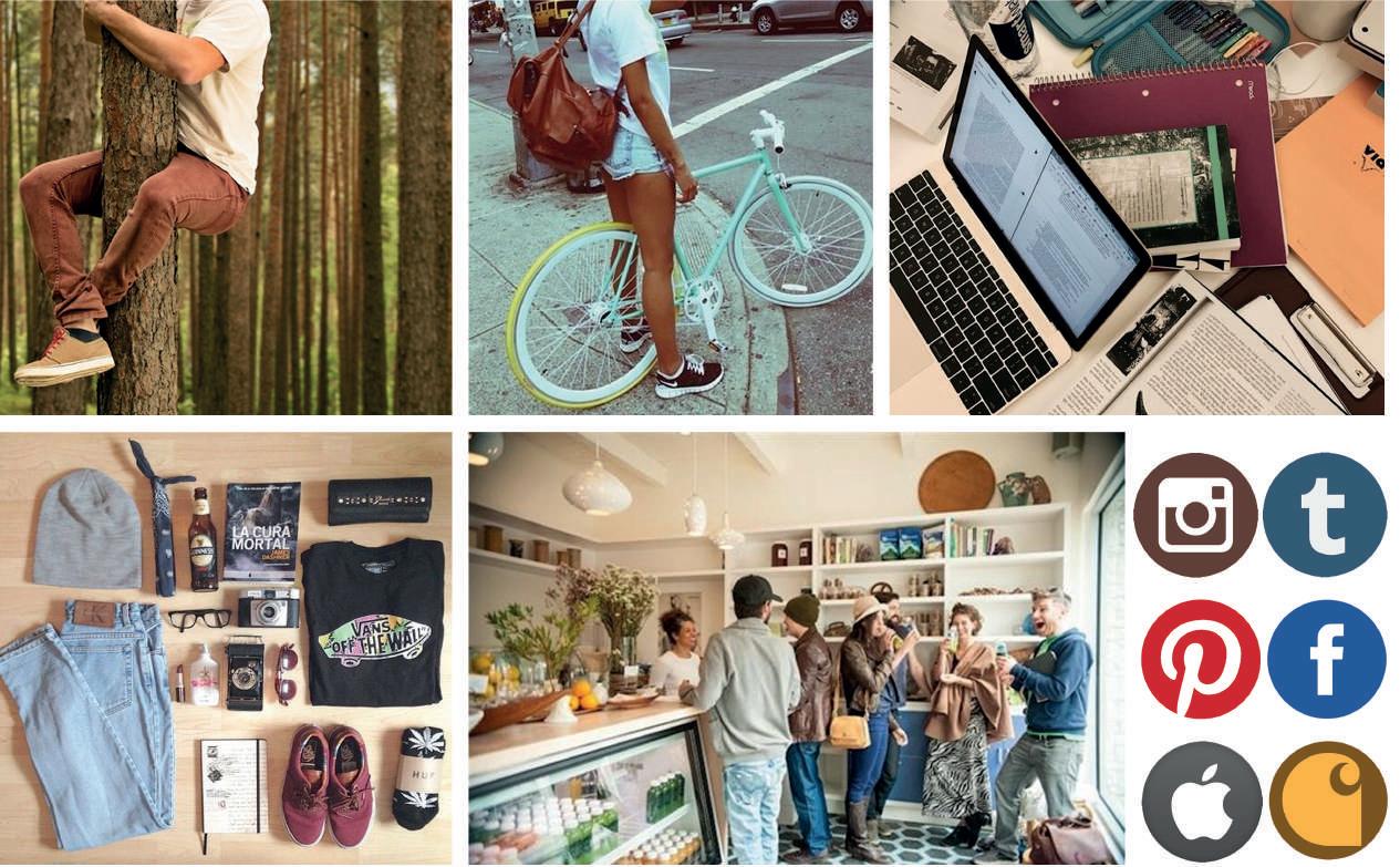
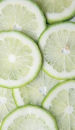
Therefore, considering this eco consciousness that is expanding nowadays, natural products are constantly on the rise. In addition to that, in order to take the most advantage of the vegetables and fruits, those who have peelings have become the most common ones. Moreover, the fruits that have peelings are usually the healthiest ones.
On the other hand, it is necessary to take into account that the society has more interest in reading the labels and specifications of what they eat and drink to obtain as much information as possible.


Eco-consciousness
Natural food Green labels
Young people
Busy lifestyle
The product is oriented to the 18-25 years old young generations. People in this age gap tend to be very occupied with the university or their jobs, so they do not have time to prectise sport and sometimes even to focus on having a healthy diet. To deal with those problems and feel healthier, they look for alternative choices to feed. At the same time, these people are used to take care of the environment and they live constantly connected by the technology.
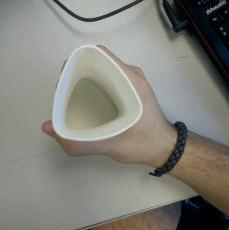
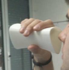
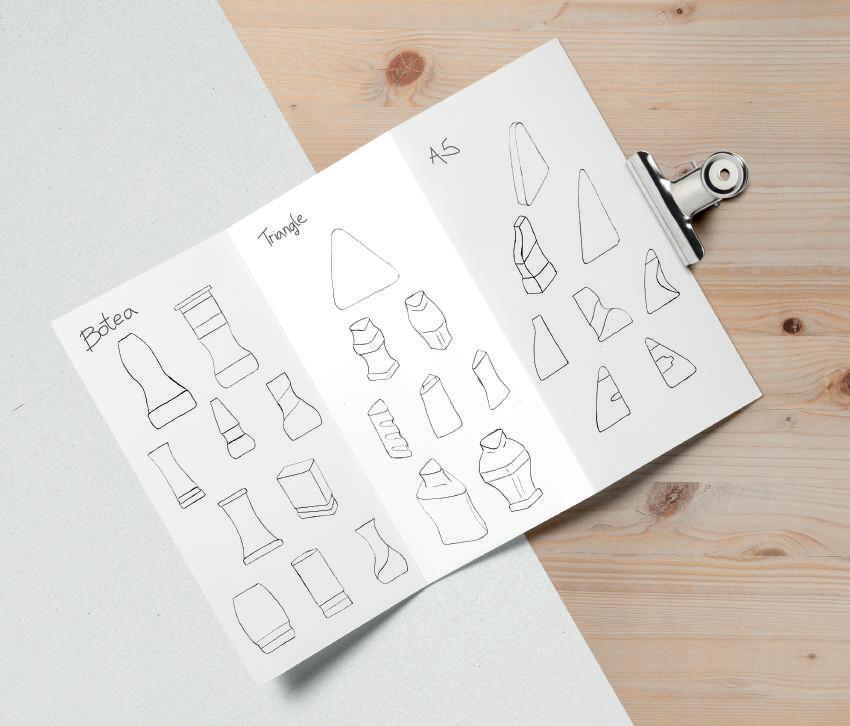
In the ideation phase, after representing some ideas and concepts as fast sketches, three final drafts have been reached using different creative methods to select the best option. After that, an early prototyping process has been carried out to help define the formal characteristics and check their ergonomic value and dimensionality. The creation of a prototype has allowed doing some user testing prior to the development of the final product.
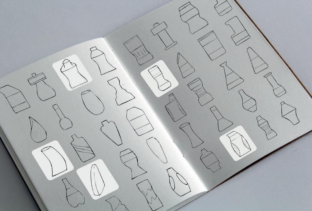
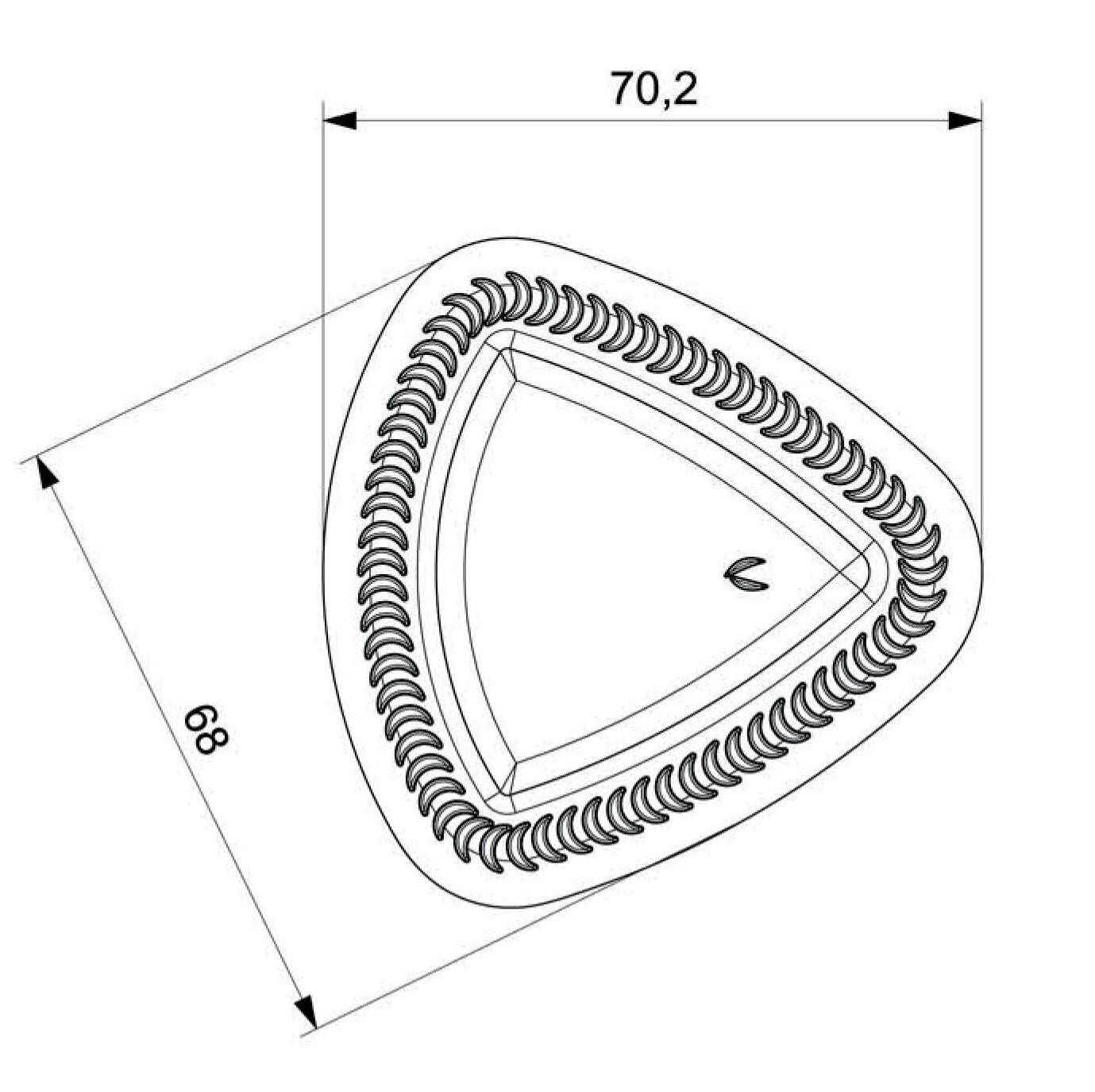
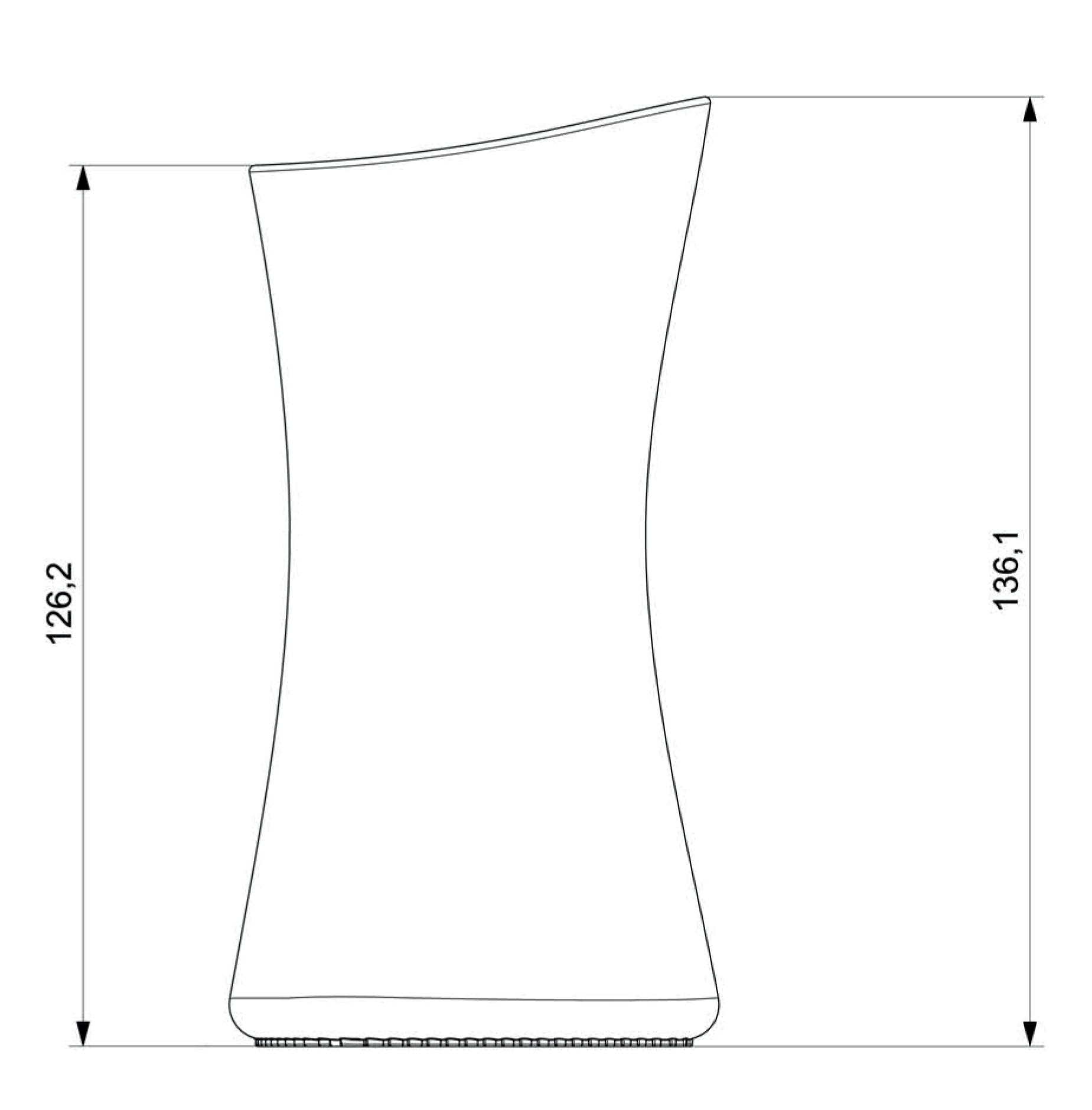
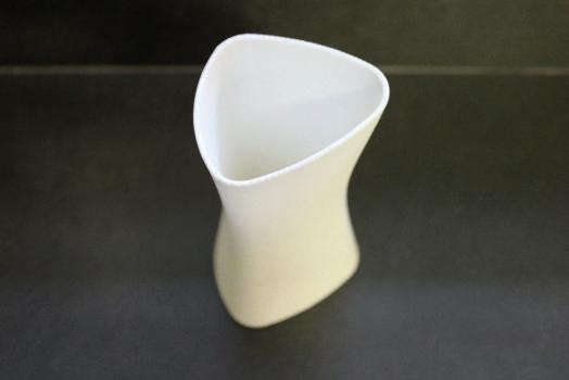
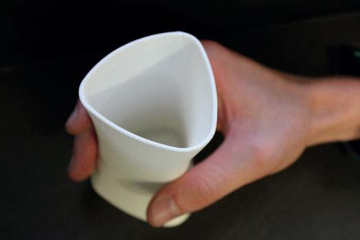
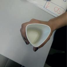

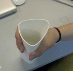
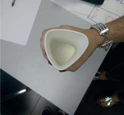
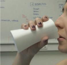

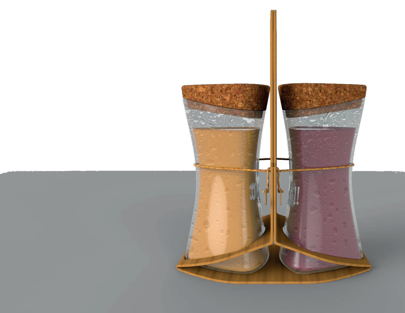
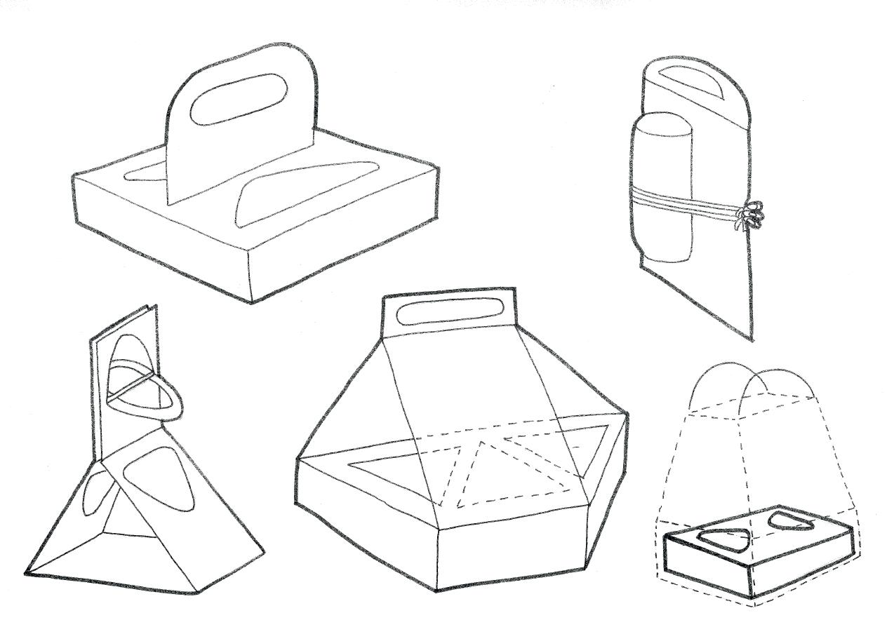
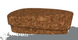
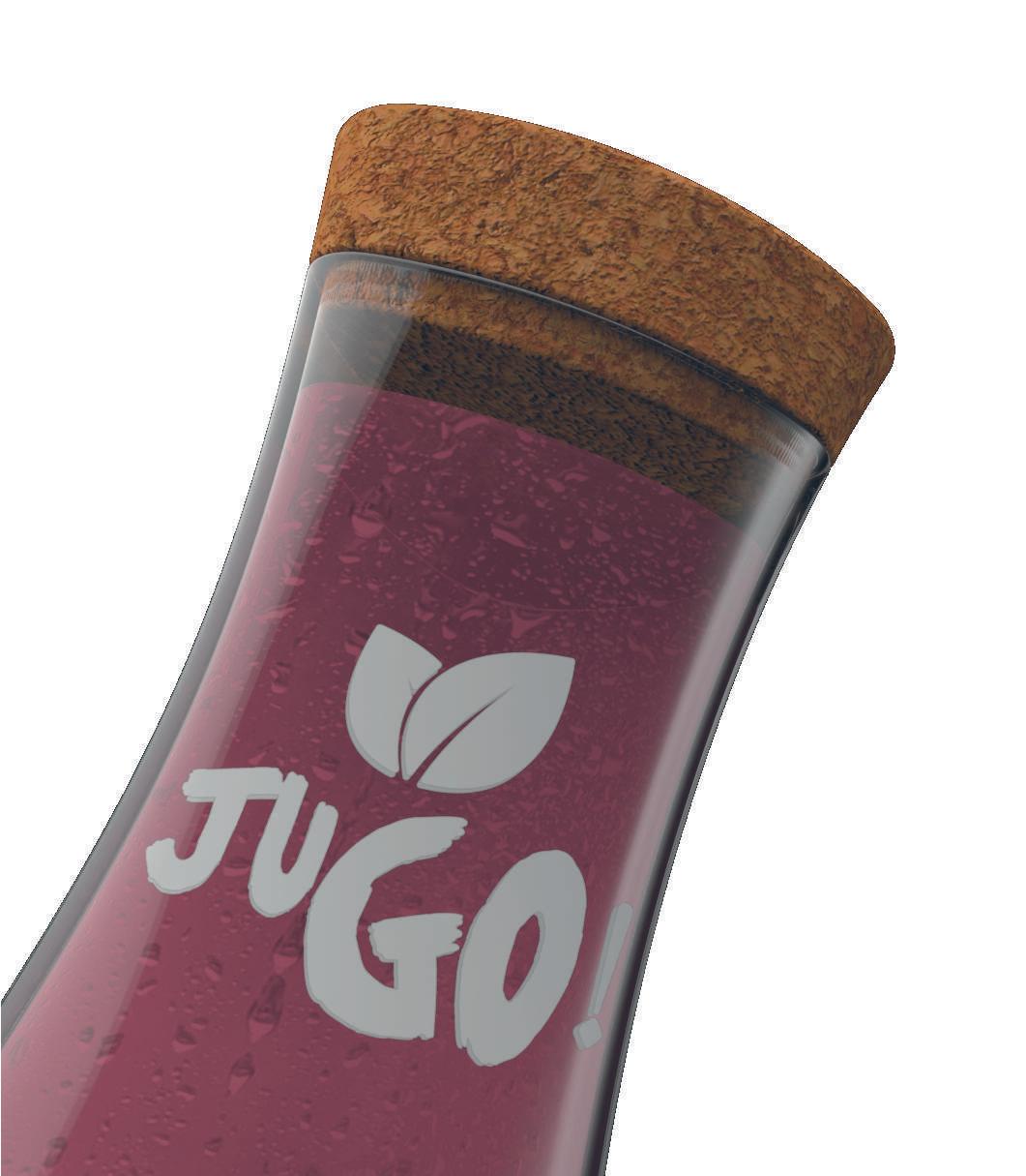
After establishing the formal characteristics, a development process have been carried out in which both the glass bottle and the cap were defined. In addition, it has been developed a packaging that adapts to both the product and the brand bases, taking care of its functionality and its ecological character.

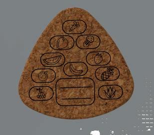
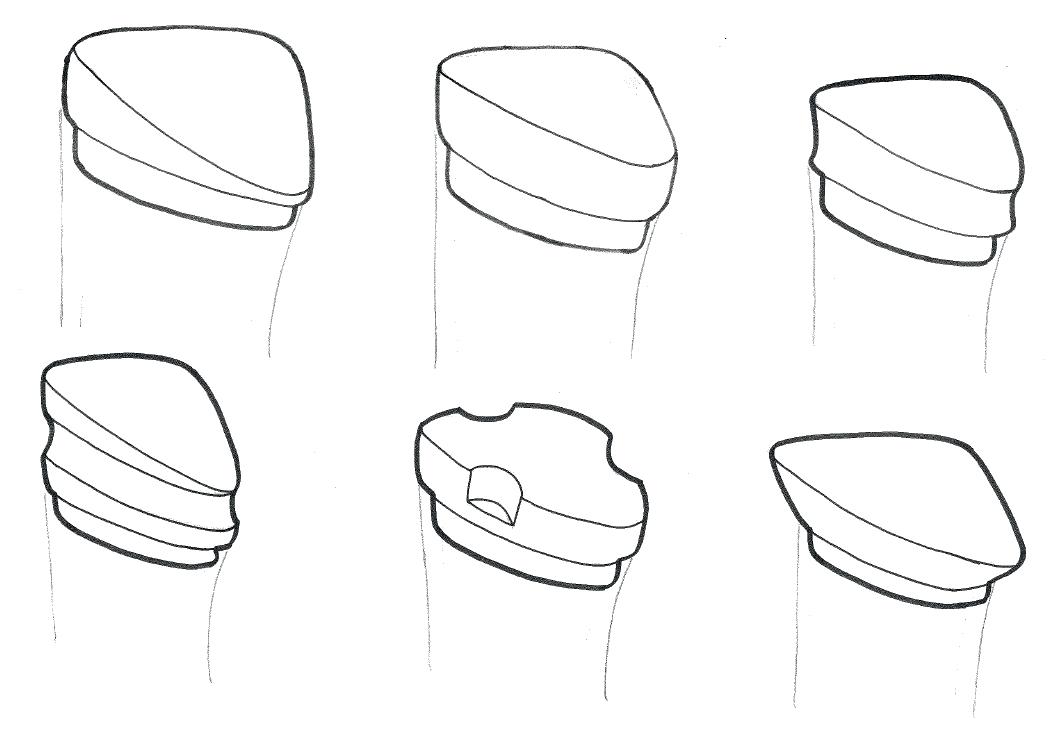
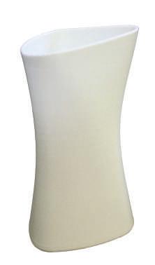
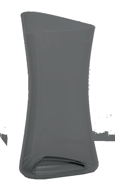
The brand has also been defined by means of an experiencie flow based on the user's needs, being able to design the operation of the physical stores where the product will be sold, as well as the distribution and promotion of the product (touchpoints).


Distribution
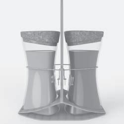
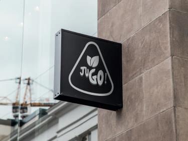
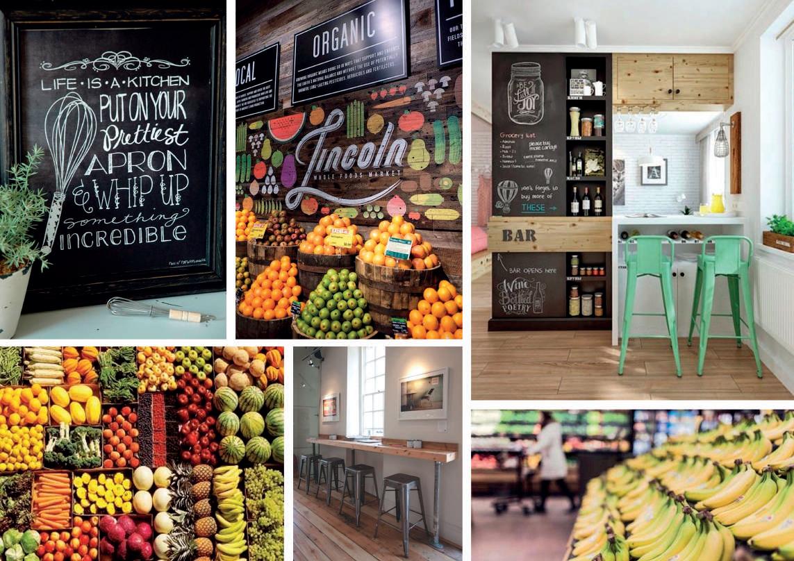
The product will be sold exclusively in the stores of this franchise. The establishment will give the consumer a natural feel. The place will have a section similar to that of a fruit shop, so that customers can choose the ingredients of the juice. Another section of the store will be focused on squeezing the fruit, in full view of the consumer. The stores will be located near universities around Vidrala's factories in Spain. In this way, it will be possible to reduce the cost of transportation and reduce the environmental impact
Product


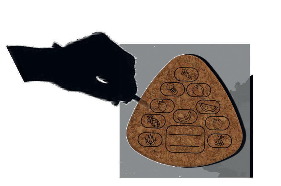
The product offered is a range of 100% natural and healthy juices inspired by the detox diet. Consumers will have the freedom to customize their own juice, as an alternative to the standard beverages offered in the store. Four types of standard drinks will be offered, antioxidant, relaxing, activating and to aid digestion.
Promotion
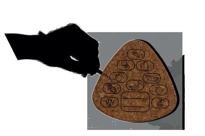
Considering that this is a new brand, it will be necessary to promote the stores from the beginning, making special use of the Internet and social networks. In addition, several offers will be offered to motivate consumption. It should be mentioned that to promote the brand itself, use will be made of the internet, exploiting the added value of the product, i.e., always offering a 100% natural, healthy and fully customized juice. Moreover, the bottle will be sold as an iconic product, as it will also serve as an identifier of the brand itself, encouraging the user to consume juice outside the home.





3 months
Bachelor's degree final project

Urban furniture + Smart City

Regulating the flow of pedestrians and cyclists
Contribute to the aesthetics of the environment
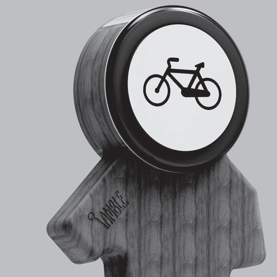
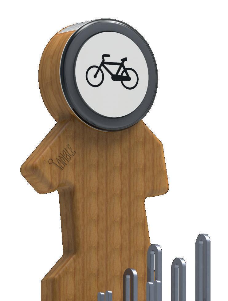
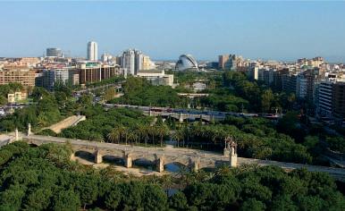
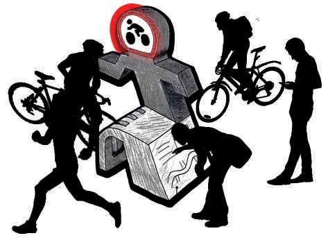
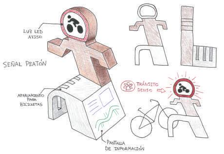
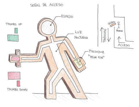
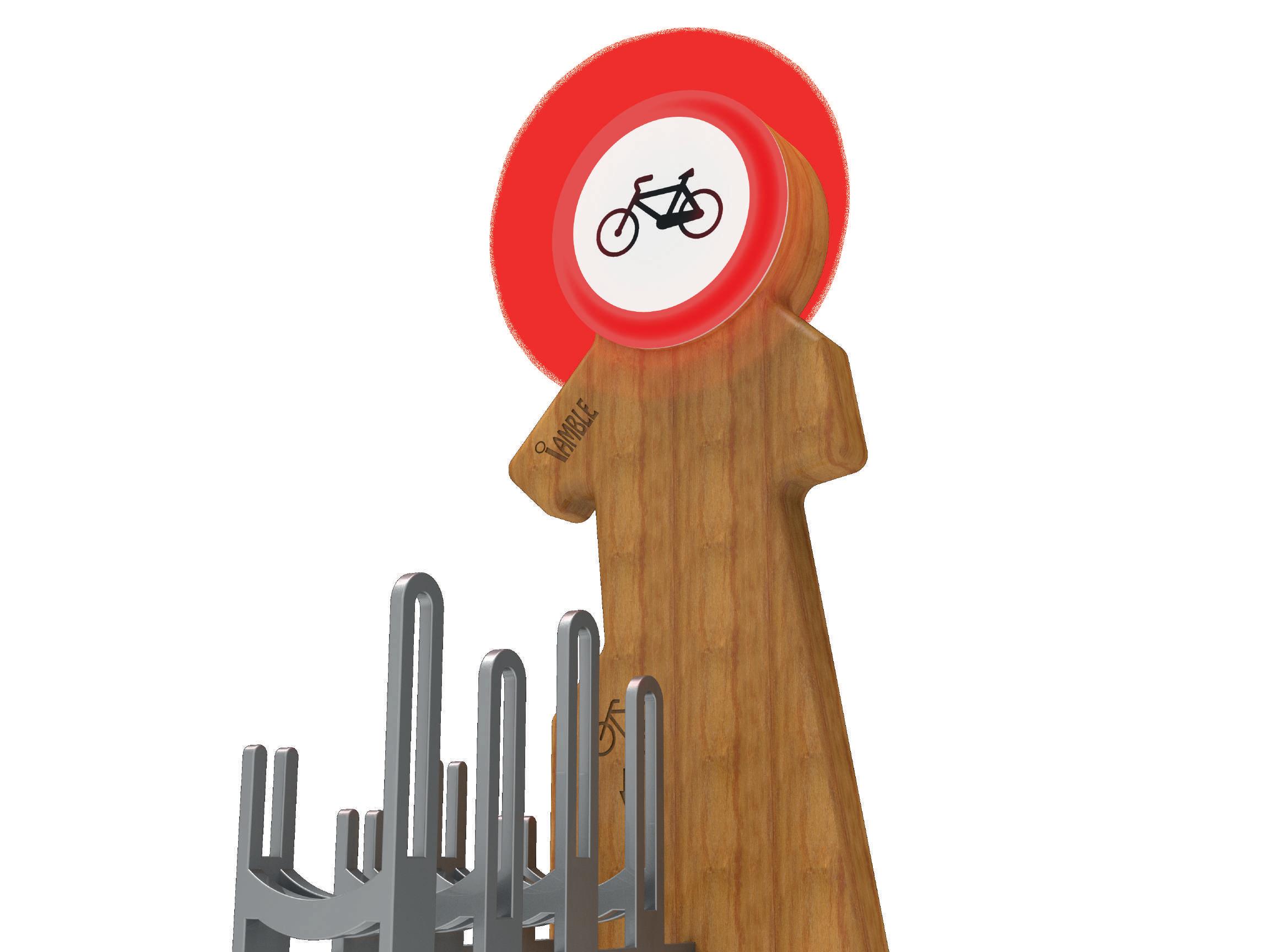
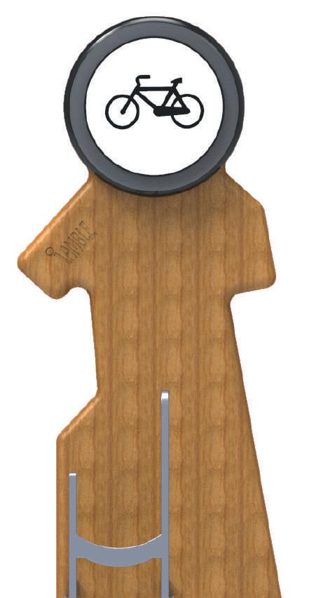
Design of signaling element with the aim of regulating the flow of pedestrians and cyclists on the paths of El Jardín del Turia (Valencia), since the need to increase safety on pedestrian paths was identified, due to their intensive use and the risk generated when cyclists invade these paths.
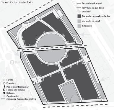
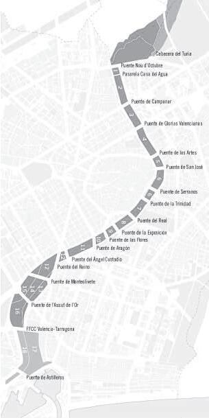
Both field and quantitative of the environment and its to this it has been possible for the design.
The aim is to give relevance to the Smart City concept by designing a product that meets the necessary characteristics to provide improvements that help to integrate this term in the urban environment, so that the element in question can increase in the quality of life of the citizens and users of this area.
It is a city that applies information and communication technologies with the objective of building an infrastructure that guarantees sustainable development, an increase in the quality of life of citizens, greater efficiency of available resources and active citizen participation.
Environment analysis - Jardín
analyses have been carried out in order to know the characteristics roads, as well as the needs and observations of the users. Thanks possible to capture in a moodboard the formal and aesthetic lines required

3 Products > 3.3 IAmble_Urban furniture design

Smart City Trends Transparency & participation Walkability Bikes First New Urban Icons

Brief
Smart City Product
Good visibility
Intuitive
Participative
Application of technology
Multifunctional
Reference and integration in the environment

 Jardín
Once the characteristics of the product to be designed had been defined, a conceptualization phase was carried out to generate ideas in order to choose a concept to be developed as the final design. For this purpose, creative ideation tools have been used both for the generation of ideas and for selecting the most valid one.
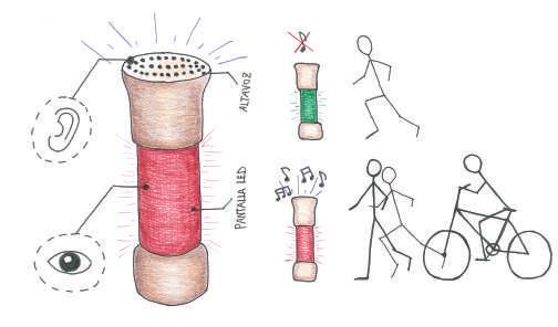
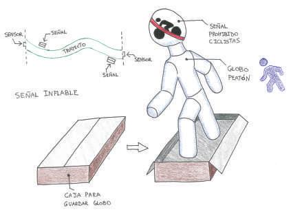
One of the goals has been to achieve concepts with a very visual essence, so that it is possible to develop a street furniture that connects with the user at a very elementary level and that can be iconic.
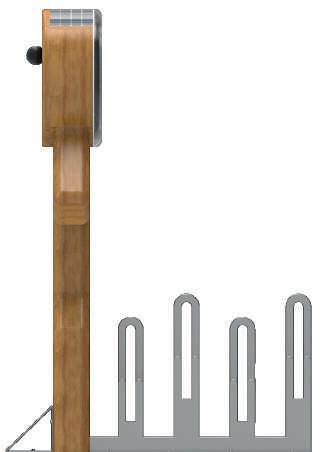
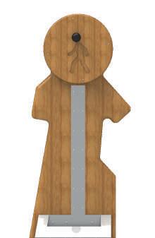
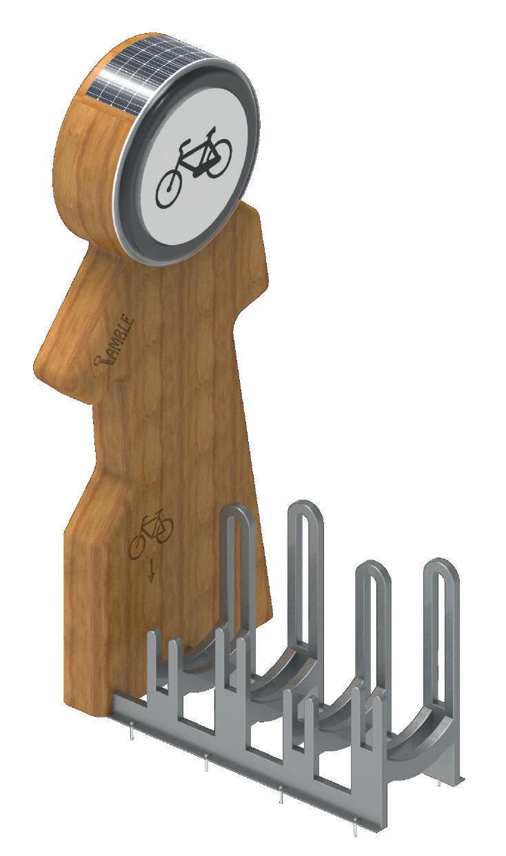
The dimensions, materials and characteristics of each non-commercial part of the final product have been defined, as well as its assembly.
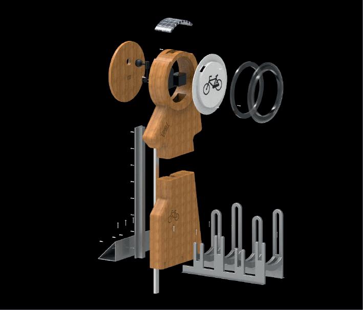
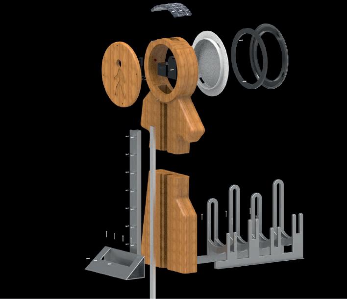
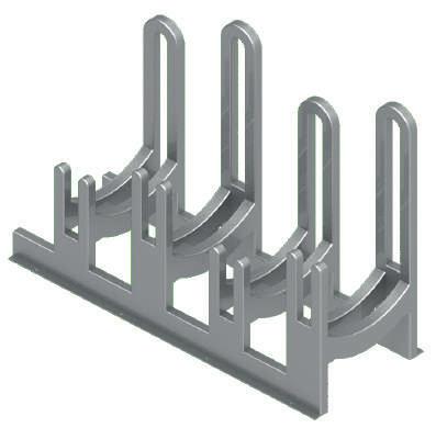
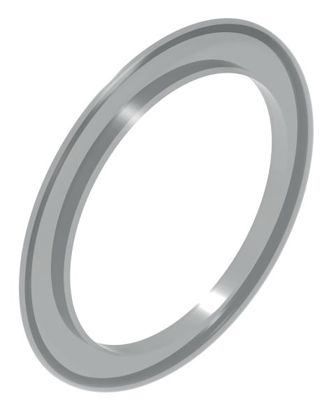
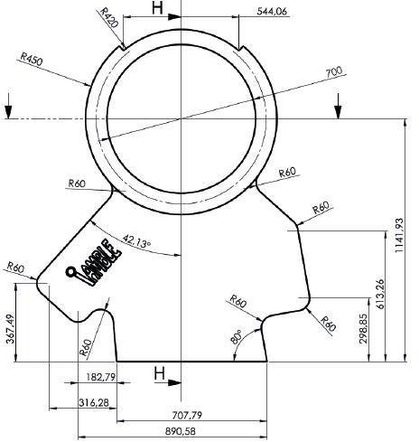
Solar panel
Commercial part
C-Walk motion sensor

Commercial part
Lower body
Pine wood
Upper body

Pine wood
LED panel cover
Polycarbonate
Signal part
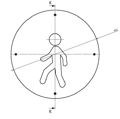
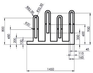
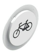
Austenitic stainless steel
Rear support cover
Austenitic stainless steel
Upper part cover
Pine wood
Lower anchor
Austenitic stainless steel
Bicycle parking
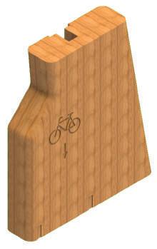
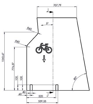
Austenitic stainless steel
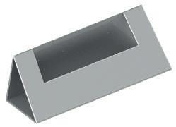
3 Products > 3.3 IAmble_Urban furniture design
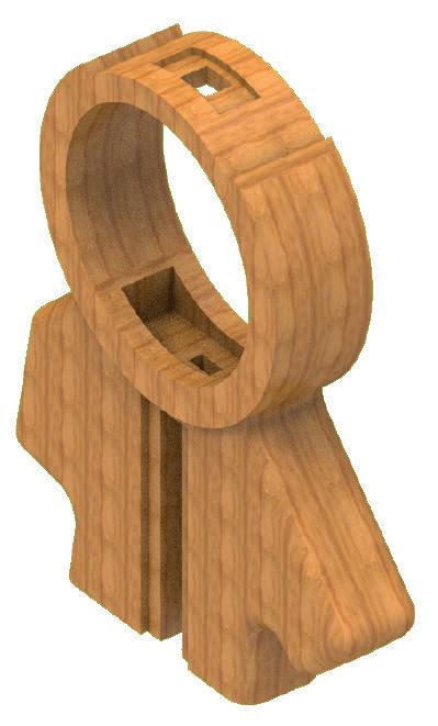
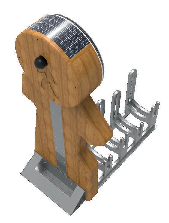
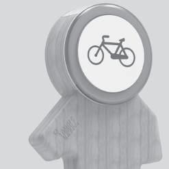
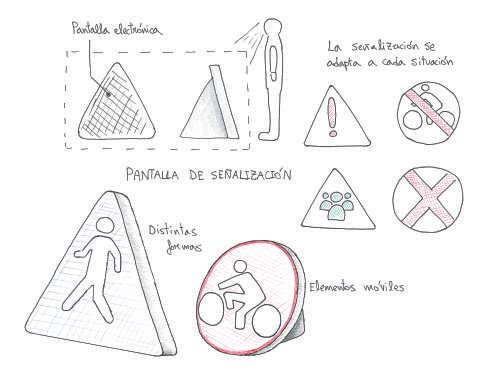
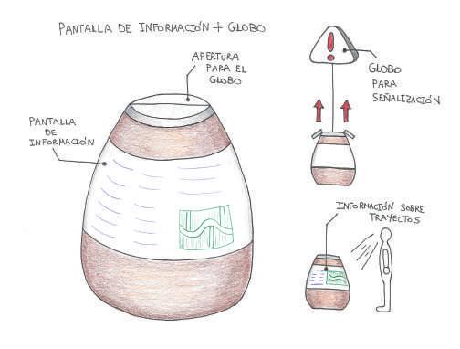
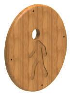
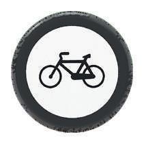
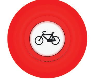
The final design is based on a signaling element composed of a wooden body on which a sign with the ability to light up is installed to prohibit cyclists from entering when pedestrian traffic becomes very dense, preventing the conflict that can be caused between pedestrians and cyclists.


Thematic: Nature, Orientation
Logo design and brand image for music band · 2021
Thematic: Three members, Simplicity, Unity, Difficulties
Logo design and brand image for music band · 2021
Isotype + logotype final concepts
Selected isotype
Logo design and brand image for music band · 2021
As a young musical group that makes music of all kinds (mostly pop-rock) they want to show both their passion and energy, as well as their introspective feelings and their true identity, without being categorized.
Fonts: Maven Pro / Cairo
D






Passion / Energy
Peace / Introspection
Logo design and brand image for music band · 2021

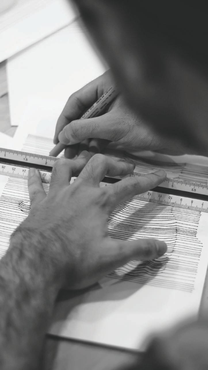
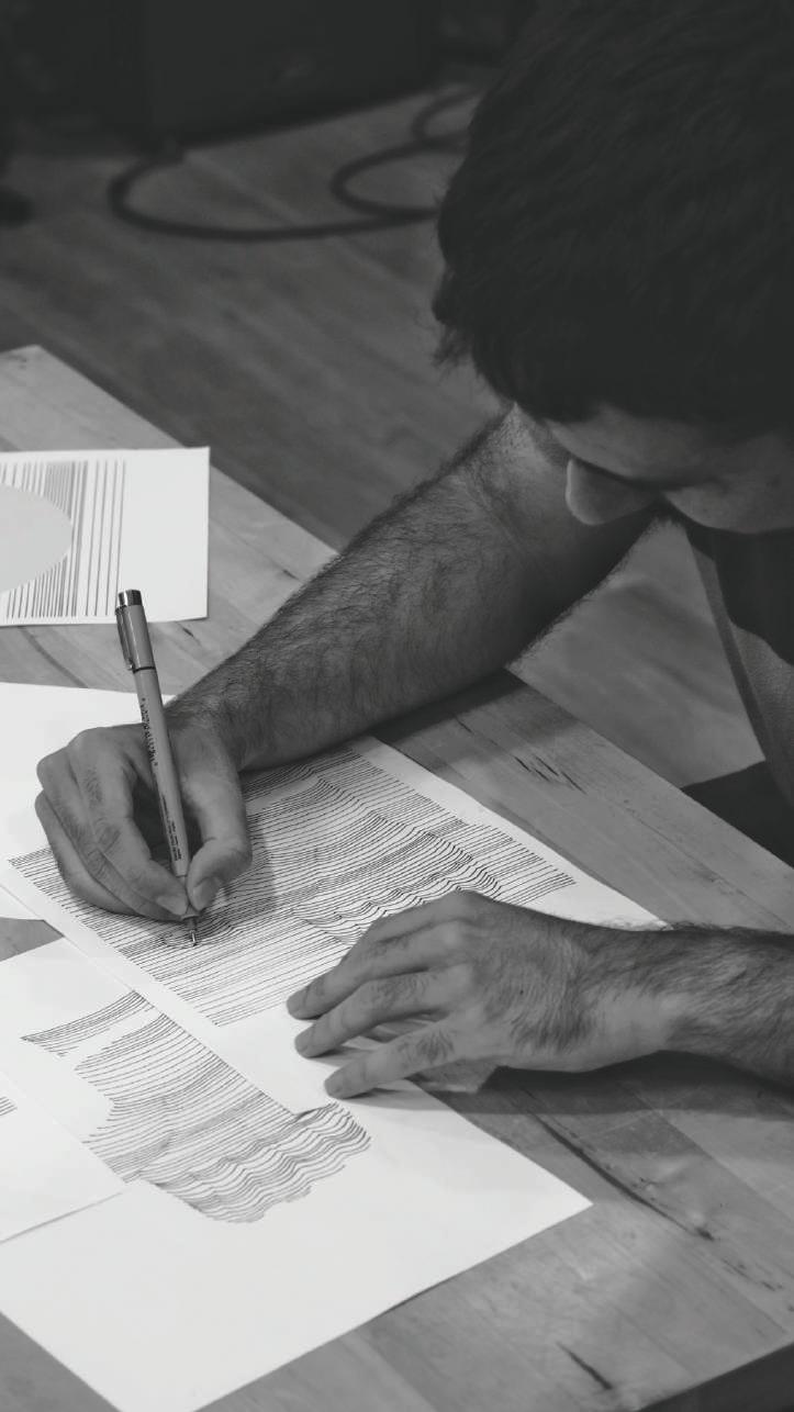
Mix of hand-drawn and digitally drawn illustrations, along with digital layout.
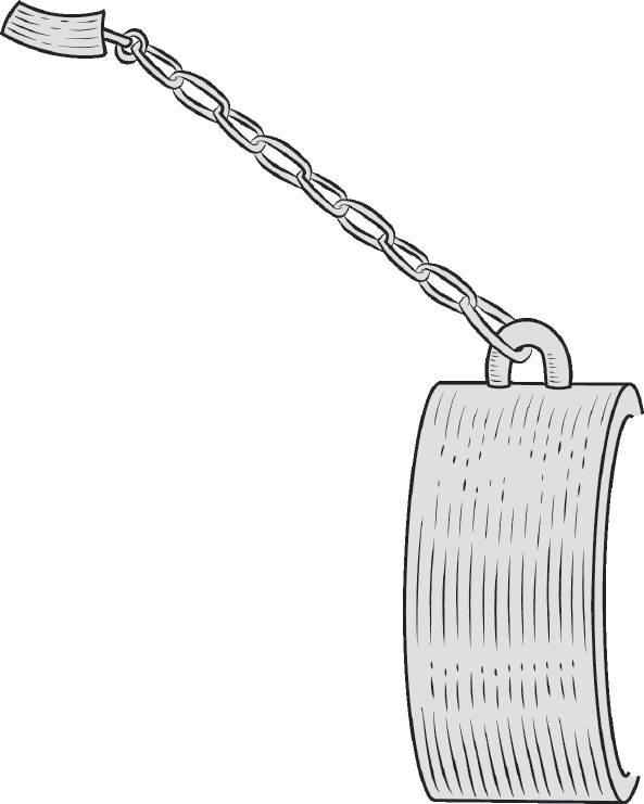
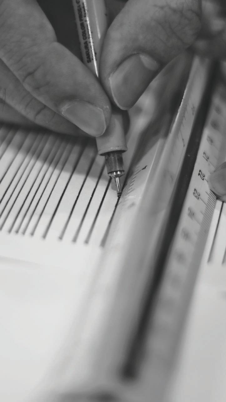

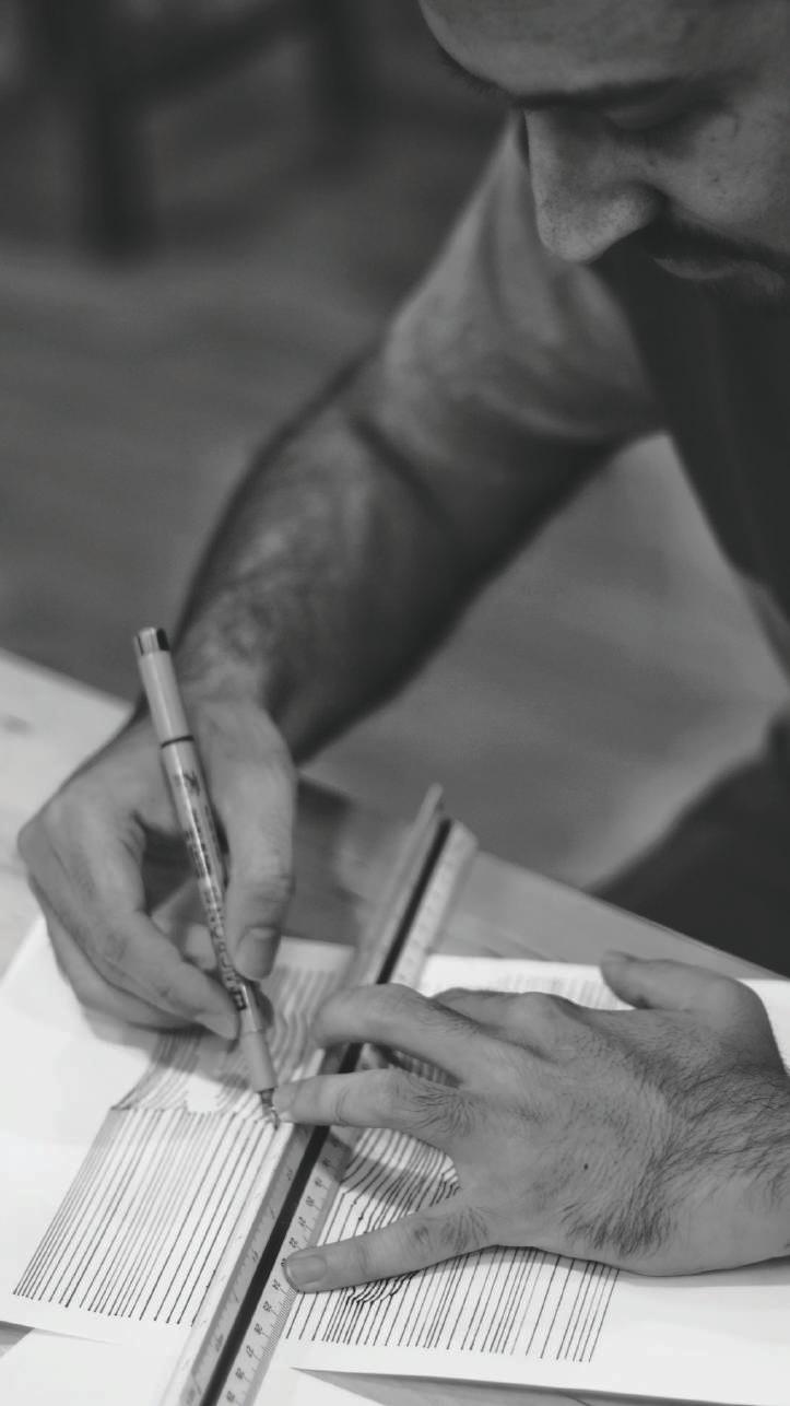

Hemen


Mix of hand-drawn and digitally drawn illustrations, along with digital layout.

Logo design and brand image for music band · 2021
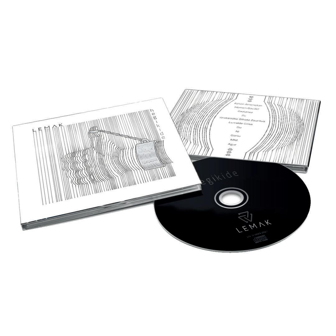
Azken Amenetan


Hemen Gaude!
Gezurrez
Kristalezko Bihotz Zauritua
Lurralde Grisa

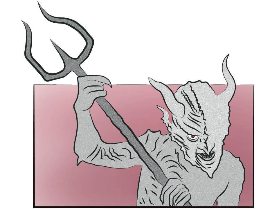

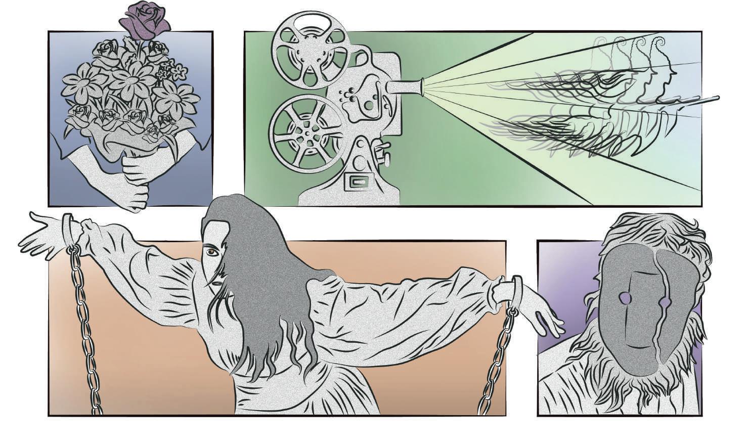
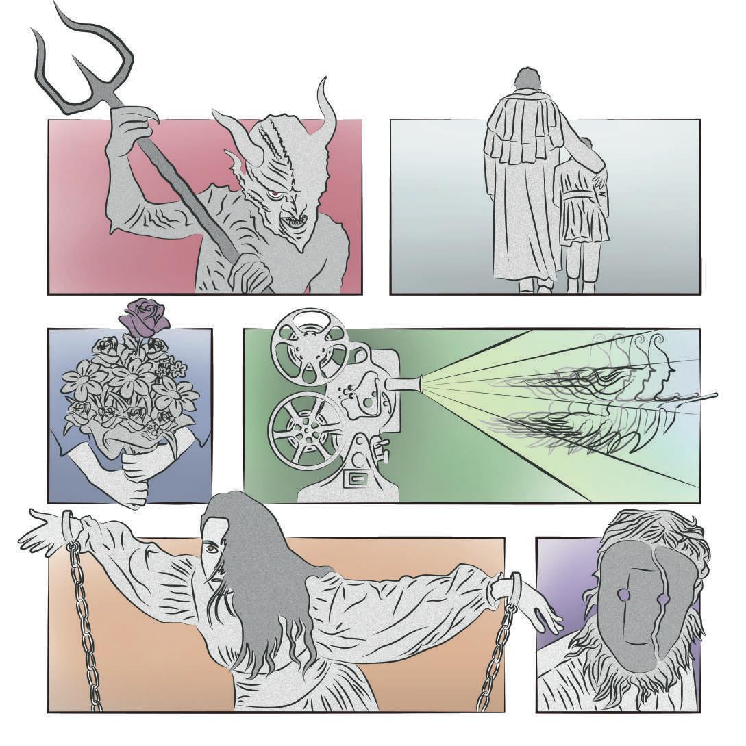
Design for the poster contest of Huhezinema 2021 short film festival



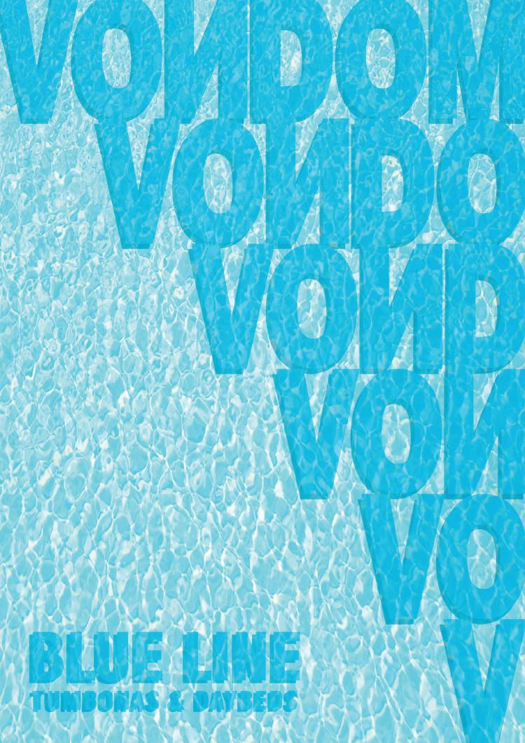


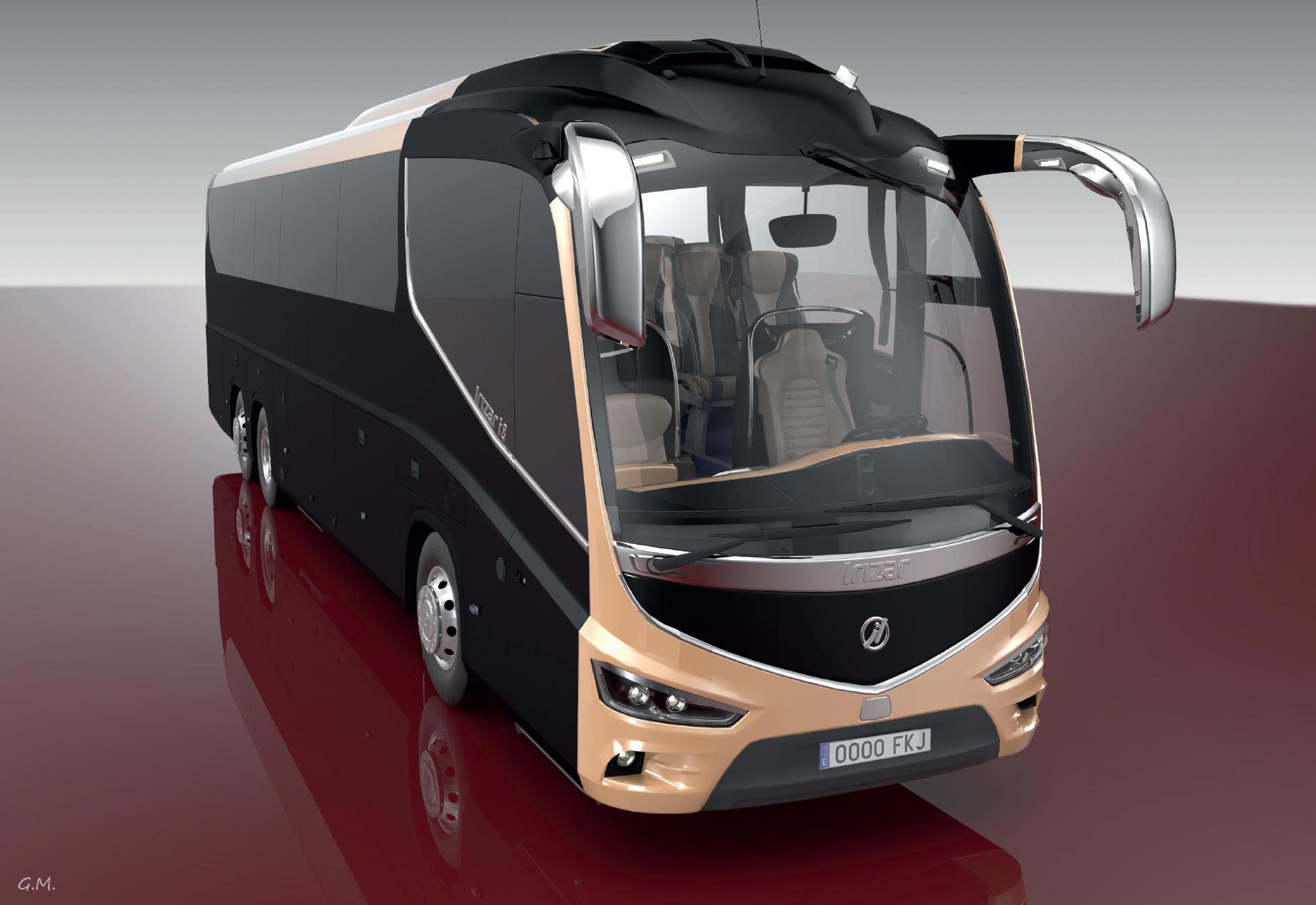
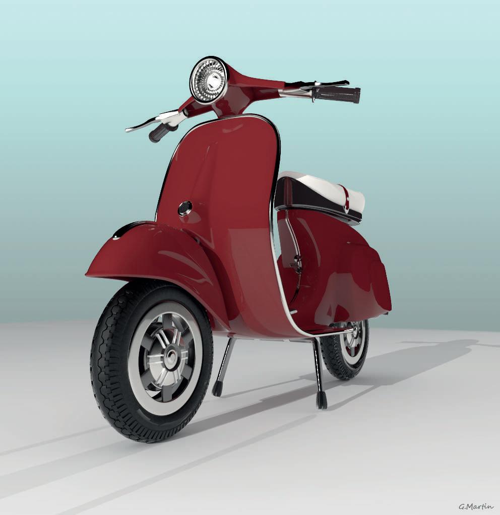
V-Ray


Participation as an external UX/UI Designer redesigning a complex digital data tool.
Tasks ranged from workshops and user interviews, to heuristic analysis, UX design, interfaces and component libraries.
External Global Product Designer at Allianz.
I have performed user experience and interface design and collaborated with the design system team in creating new components and improving usability from research data, with close collaboration with the developers.
2021-2022 2022-2023With a multidisciplinary approach, Sopra Steria is present in reference clients from all sectors and is the largest strategic design and user experience (UX) team in Spain.
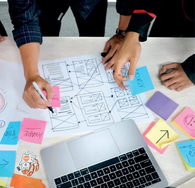
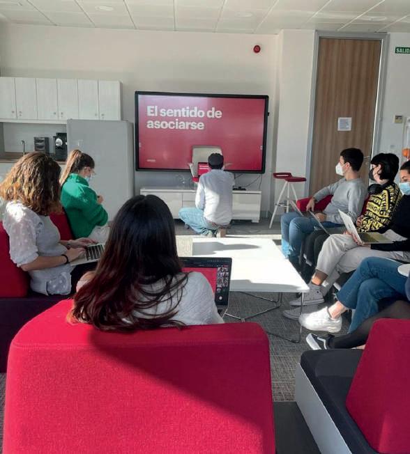

With a global approach to the experience, we unite the business and user vision and design digital products such as Apps and Webs with simple and intuitive interfaces that generate first class experiences.
