PROCESS BOOK
created by Grace PetersonIntroduction to Design, ART 130, Fall 2022, St. Norbert College

This course of Intro to design has been quite a learning and growing experience from start to finish. As the fall of 2022 ART 130 class, we took on these projects individually and as a team. Personally, I learned so many new skills and tools from Professor Ries when it came to executing design projects and how to approach them. This class worked as a team to truly help one another and critique our work throughout the course. Also, this course has taught me so much about the fundamentals of design that I know I will take with me in the future. This final project Process Book showcases my work throughout the semester and personal reflections on the process.


The project had us working with a partner to create a prototype for them in a concise amount of time. We interviewed our partners and got to know them on a deeper level. We used this information to identify a problem and create a
Engaging with a real person changed the direction of my prototype as I took it in a direction I thought would relate to them. I kept in mind what she told me about herself and wanted to ensure I conveyed the solution to her. I wanted to create something that she understood. Engaging with a person also put more pressure when creating the prototype. Presenting my partner with this unfinished work was new for me. It was intimidating, nervewracking, and almost a little embarrassing. I felt like my idea wasn’t fully displayed since it was so unfinished. It was an uncomfortable feeling because it was incomplete, and I never have really done that before. At the same time, it was
solution. At first, we were to come up with five ideas.
I am not the best under a time crunch which is evident with my only four ideas written down. We then shared our ideas with our partner and reflected to design our final solution.
This solution was used to create a physical prototype in 10 minutes with materials provided by Professor Ries. Finally, we explained and shared our prototype with our partner.
comforting to know my partner was in the same position as me.
The pace for this project felt very quick and spur of the moment. You had to be decisive and improvise on the spot. This pace is something a lot quicker compared to how I normally work. I can be indecisive and dwell on how to either start a project or how to continue it. I usually spend a lot of time when working on something, so this was very different for me.
Based on where I left off and what I learned from the process, I would
This is the final prototype made out of cardboard coverd in blue tape and stickers.

go back and refine my solution to then create a better prototype. I would do over my solution. Once we had to create a prototype on the spot, I felt my original solution drawing could not be produced into a prototype.
I had to come up with a new idea. So, I would go back and think of a better solution that could be created into a prototype right away. I also hesitated at the solution step and didn’t have as much time to draw once I thought of my idea. So, I would do over how I spent my time originally.

We were assigned to choose three words from a list we were provided and convey our words of choice using dots and lines. We created abstract work using the gestalt principles we learned about in class. The parameters were very specific regarding the amount of dots and lines we could use as well as them being well-crafted. This project was designed to have us work quickly while creating numerous iterations to lead to our final three compositions. The process began in my sketchbook.


These are images from when I was testing different arrangements for each word with my cut out lines and dots

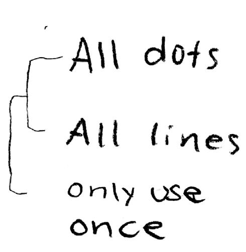


Gestalt is about how we perceive things. It’s how we perceive based on how things are arranged and how our brain interprets that. We all seem to interpret things for a similar reason. Different gestalt principles explain this, such as proximity or continuation. We interpreted each others’ abstract projects using these principles.
I am a detailed-oriented person. When it comes to projects, I tend to take a lot of time on them and make sure small details are precise and right. It is more difficult for me to do something very rushed.


So, I would say it isn’t super difficult for me to make something “well-crafted.” I enjoy spending my time and making sure the details are right which was needed for this project.
After doing the first in-process critique, I had a shift in my idea of abstraction. We all were looking at the same piece of art, knowing what word the student was trying to portray, yet we all viewed it in different ways. They were simple objects yet could convey deep feelings. This project changed my previous assumption about abstraction, which was that it is usually done in an imperfect and complex way. Our project was very minimal and precise but was still an example of abstraction.

It was but also was not difficult to represent ideas without illustrating. Yes, it was difficult because they, for the most part, had to be very minimal, using only: one dot and a line, two dots and two lines, two dots and one line, etc. At the same time, it wasn’t difficult because gestalt principles help convey the ideas. While doing the critique process, it was reaffirming to hear people look at the same image and interpret it similarly.
In the future, I will be more conscious of considering using gestalt principles to get an idea across. Also, after doing the in-process critique, I realize how much more meaning people can take from an image, even when it’s very simple. For example, when someone was critiquing my own image, they spoke deeper about it compared to how I originally thought about it. It reminded me to be more intentional and open-minded to abstraction.

We were to choose any four-letter word to work with for this project to explore how the form of a word can impact its meaning. We began this project by carving 2-3 letters by hand out of linoleum. We then practiced printing our word with black ink using our carved letters. This project allowed us to try different variations through printmaking by hand, utilizing a copier machine, or capturing a photo.
These are my first iterations I printed by hand.
These two are some of my first iterations using the photo copier. I did not like how these looked.


This is the mind map for my chosen word: grow


We learned more about working with letters by hand and how word formation can change interpretation. The final is composed of four different typographic variations of our word. My process began with creating mind maps.

I learned a lot throughout this project about the basics and complexities behind letterforms. I learned what goes into forming a single letter when cutting the linoleum. I also learned how letters should work as a whole to create a word. For example, working with the letterforms taught me about leading, baselines, and kerning, which I did not have much previous knowledge about.
This was completed with letters printed by hand and the photo copier to achieve correct spacing.

This was completed by printing by hand.

This was completed by printing by hand.
This was completed through letters printed by hand and a photo copier.
This project brought me a greater understanding of how simple differences in letterforms can create a big difference in the meaning of a word. There are so many possibilities when it comes to letterforms to create different, creative, or deeper meanings to a word. You can showcase more meaning behind a word by simply changing how the individual letters are formatted.
If I were to continue working with these letters, I would try different modifications. I had ideas of using elements outside to create a new modification, but I never ended up doing it. So, I would try using things outside and taking photos as a new modification. Also, I had different conceptual ideas for the word grow. So, another thing I would try doing with the letters would be executing a totally different conceptual meaning behind the word “grow.”


This project entailed choosing a subject to create six final different iterations of. These iterations included: 2 “master” artists, geometric, continuous-line, collage, and typographic collage iterations. The numerous iterations and different use of mediums led to a deeper understanding and time with our subject compared to previous projects. We started this project by hand, scanned our created iterations, used photoshop to edit and refine, and finally used InDesign to create the final poster.
These are iterations created throughout the process.
This is my master artist iteration: Wendy MacNaughton.


These are two of my geometric iterations.
This is one of my continous line drawing iterations.


Here are two of my typographic collage iterations.


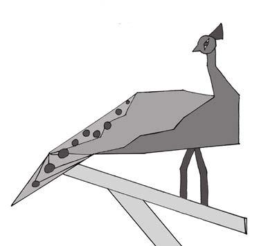


From the beginning of this project, when choosing my animal, I already began to learn more about it. One of my master artists was Wendy McNaughton, and she has writing on her works about the drawing. So, I was researching facts about my animal to write around my drawing. For example, I learned there are more than one species of peacocks and that they are actually called peafowls. I learned a lot of random facts through that iteration. Overall throughout working on the iterations, I was taking a deeper look at how the peacock is built. So, through that, I was looking closer and learned more about the structure of my animal.


The collage and continuous line iterations were the most challenging for me. With the collage, it was hard for me to pick out textures or images that could represent the feathers or body of the peacock. I also wasn’t sure what the best way to cut shapes was to represent the feathers. The continuous line iteration was also challenging for me because I had never really done a continuous line drawing before. It was hard for me to do it all at once and not be able to erase or plan it better. The most enjoyable for me was my Master Artist #1. I had Wendy McNaughton, and I really enjoyed using the ink to represent my animal. It reminded me of using watercolor, which I love.
There were multiple tools I didn’t know how to use previously in photoshop.
This project allowed me to learn new things about Photoshop that I will use moving forward. For example, I didn’t understand how to use the clone stamp tool, and it became very helpful throughout this project. That is a tool I can see being very useful for a lot of different purposes in the future. It was very helpful for cleaning up lines. Another tool I didn’t know about previously was the magic wand tool, which I can see will be very useful for selecting in the future. To represent the peacock in new ways, I would research more pictures to create images with new perspectives of it. I would also try using different mediums or different types of iterations to represent it in new ways.

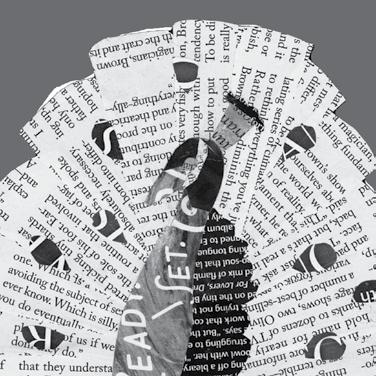
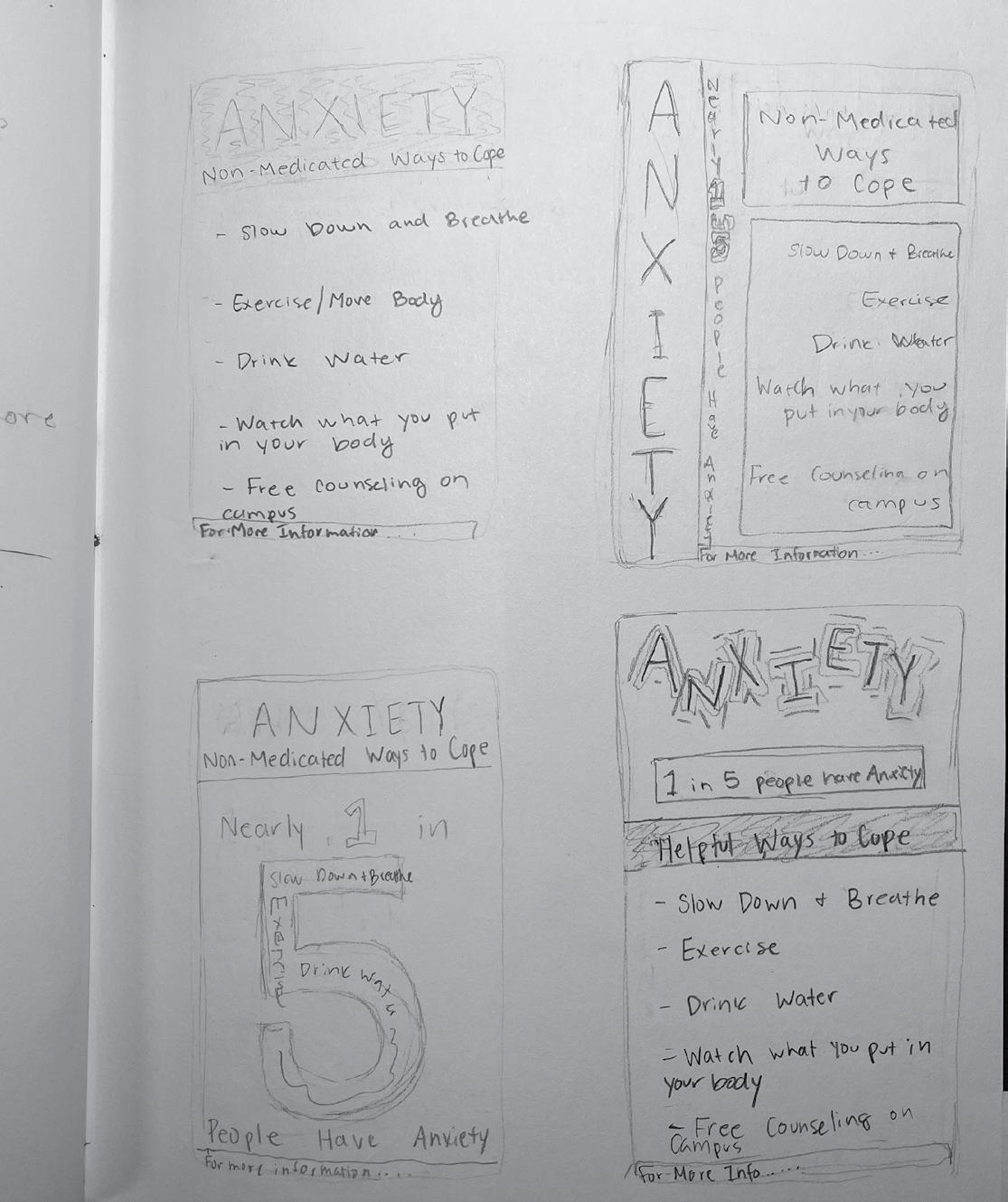
We were to decide on a topic for a Public Service Announcement poster. Once we chose a topic, we researched it and typed a brief for our partner (classmate/client). We exchanged briefs with our partner and were now to create a poster based on our partner’s brief. They became a “client” we were working with. Our poster had to be created with only the use of type. No illustrations were allowed. This project allowed us to learn about working with a client and how to effectively only use type while grabbing the audience’s attention.
This is the sketch my final is based on.
I researched the topic of phone usage and how it affects us as humans.
The brief I received, which is what
I created my poster on, was about ways to cope with anxiety. I began the process by asking my client any questions I had before beginning. I then proceeded by going to my

This was my first attempt in Indesign.
As you will see, it is very different from my final.
This is my first page of ideas in my sketchbook.
This is my second page of ideas.

Being limited to only type was challenging for a few reasons. It was challenging to be limited to type because I felt as though I might not be able to convey my message properly without illustrations. I felt at first it was challenging to only use text while trying to have the poster stand out and grab the audience’s attention. My first thought would be to add some sort of illustration to the poster. So, that was challenging, along with finding a font and composition to have the poster stand out.
I used scale as a way to create a visual hierarchy on my poster. I had the header of my poster at a larger font size than the body so the audience knows what the poster is all about. I also used a different funky font for the header as a way to grab the audience’s attention. I bolded the statistic in my subheading to have that stand out as well. I put a filled box behind the additional text/body of the poster to separate it from the rest of the poster. This section was a simple and smaller-sized font.
There were numerous skills I learned throughout this project I will carry with me to other work. I have never worked with InDesign prior to this class. So, I will for sure take with me the many new skills and tools I learned when using this program. For example, I learned how to properly set up a document, create, and then print a bleed print. This project also taught me about working with a client. I will carry with me in other work how to effectively communicate and work with someone else when it comes to design work. This is something I don’t have experience with. So, it was great to begin to learn what it could be to work with a client. This project allowed me to learn what you should and should not do when doing so.
This was my original final for critique.
What, if anything, distinguishes art and design?
If you have to pick a side, which do you choose? Why?
While art and design have similar components, an aspect distinguishes them to me. Art is a way to express thoughts and feelings in any way you choose. Design is able to express emotions as well, but I would say the distinction is the purpose. Design is used as a way to identify a problem and then solve it by providing a solution.
If I had to choose a side, I would choose design. I like to problem-solve and come up with the best possible solution. Design is a way to problem-solve in your own creative way.
Are you called to creative work? If so, how do you recognize that calling? If not, to what do you feel called?
I would say I am called to creative work. Reflecting on my life, I can recognize an interest in art all throughout it. I have always chosen to take art classes and like to experiment and practice in my free time. Although, I do not know if I feel called to pursue it as a future career. I feel as though I would be better skilled in doing something else. At this time in my life, I am not exactly sure what that might be, and that is okay.
“This book was made as part of Introduction to Design at St. Norbert College in the fall of 2022. The fonts used include Futura and Carrotflower. It was digitally printed and saddle stapled at the college’s print center.”