7 minute read
Brief Encounters
For too long, this work was trapped in the spaces designated for occupational therapy, but when they are a whole school effort, all students can reap the benefits. Textures on the walls allow students to self-soothe, calm, and reset. Some schools are placing objects for interaction along the walls that encourage students to interact in a physical way with the wall spaces. In other schools, we see the walls retro-fitted with curves or a variety of materials that give students a tactile experience. Be strategic with this work as it isn’t about creating a fun house of distractions. However, you can provide a series of stations that meet the needs of both students with special learning needs and those suffering from stress and anxiety.
The healthy hallway movement In many parks, you will find fitness equipment that allows visitors to take part in circuit training. This model is being brought into many schools who see their corridors as a great opportunity to push their healthy movement mission. Depending on the size of the school, 8-12 stations throughout the building can create hallway spaces that increase movement and physical well-being. These stations can be used with individual students that need to reset, classes of students looking for a ‘brain break’, indoor break activities and for small groups. It is essential that each of these stations describe the activity and scaffolded options, a description about why the activity supports physical and mental wellness, and images of students doing it correctly.
Images of learning In too many schools, visitors, students and parents travel a long way into the school building without seeing images of the modern learning experience. By placing images of students learning throughout the hallway spaces, there is a clear message that this is what excellent behaviour looks like in the school. Along with this visual reminder, it can create excitement about active learning for students. Images, strategically placed, can create an energy and joy in the space as well. A comprehensive hallway strategy threads together the work being done in the classrooms that are attached to the hallways. These efforts enrich the mission, reinforce learning, and provide students with social, emotional and academic learning opportunities throughout the school day.
Dr. Robert Dillon, is the co-author of ‘The Space: A Guide for Educators’ along with Rebecca Hare.
Three Rivers Academy’s striking building has received numerous plaudits since it opened its doors last year. Consultant Gareth Long explains how the school arrived at a design that meets all its needs.
It all started with a phone call.
The caller, the business manager of what was then Rydens Enterprise School in Hersham, Surrey, said that they were selling some land to fund a replacement school building.The value of the land, close to London, enabled them to be ambitious and innovative, they explained. The school had heard that our consultancy — the-learning-crowd — provided education support to new school design projects and wanted to know how we could help.
But their second question was: “Can’t we just leave all aspects of the school design to the architects?” A series of meetings followed between the headteacher and myself.
There, they started to appreciate the real importance of having a detailed document that explained their carefully thought out vision for the new school.

This included their pedagogical approaches, operational considerations, the types of spaces that were needed, their approaches to cross-curricular working and how the community was to be involved. We also explored other places they had visited, design ideas they liked as well as those they did not.
The school soon started to understand that the huge amount of work put into planning before the project started would make the design stages so much more efficient. Architects would have access to all the key facts and not waste valuable time in design sessions by asking about operational factors such as storage, lockers, staff spaces, student toilets and so on.
Their ambitious plans were a very big move away from the existing situation. The school did not have the best reputation, and it was surrounded by several prestigious private schools. The bleak buildings were really not fit for purpose: they included a large, sprawling collection of traditional brick blocks with numerous quadrangles of post-war prefabricated (CLASP-style) buildings usually joined by extensive walkways.

Inside were narrow corridors with numerous staircases, corners and alcoves. The size and nature of the site made supervision during lesson changeover and at break times extremely difficult and demanding. The head’s office was so far from the rest of the school that anything could happen without them knowing about it. Their vision and aspiration however was exciting. This was to be no standard replacement building. The head was determined to create a first class learning environment in a statement building that looked modern and innovative. The vision was to move from one large sprawling school environment to a model of ‘four schools within a school’, each with their own identity and housed within a single efficient building. Movement was to be minimised with students largely staying within one section of the school, moving only to access specialist subject rooms and for break and lunch times.
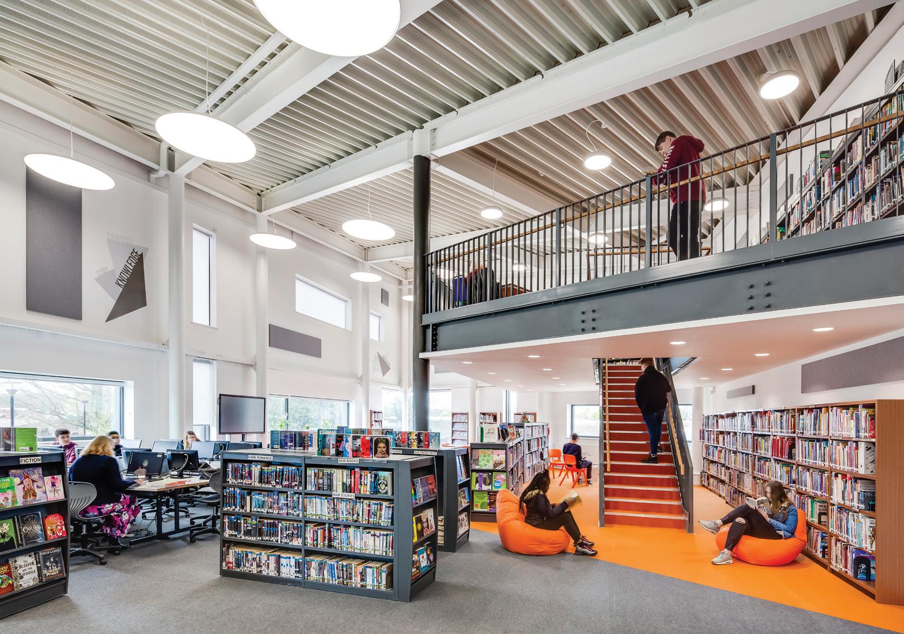
The sixth form was to have its own separate but connected learning zone that supported teaching; independent and small group learning activities, but with easy access to specialist subject spaces. And so, as we worked, a really detailed education design brief was created, outlining all the ideas, vision and aspirations for the new school.
We tried to ensure that it was also pragmatic and realistic.
Spending this time planning made us confident that we could understand how this new approach would work operationally and how staffing could be organised. We analysed the curriculum and thought about how it would be accommodated.


We also looked at ways that design elements could be flexible so that different leadership styles, pedagogical and organizational approaches could be catered for in the future. The key priorities were to provide an inspirational modern learning environment with each of the four ‘schools’ having its own identity. It was to be a design that minimised travel time, and improved cross-curricula and cross-phase learning. We also wanted to maximise passive supervision by staff and increase opportunities for community partnerships. Above all, we wanted to develop a building that created an environment that students and staff genuinely wanted to come to. It was immediately obvious, when interviewing architectural practices, which team had really read the education design brief carefully and considered the many operational aspects of the design.

The successful team from Scott Brownrigg architects had clearly totally absorbed the brief and done a great deal of work prior to the interview. In fact, their initial innovative interview concept design pretty much matched the end result. There were numerous obstacles as always. The land sale took time to complete, and the ESFA was concerned that our aspirational school building was ‘too big’, and had spaces not included on Building Bulletin 103. Whilst DfE officials made many positive comments about the design concept, hours were spent in offices in London as they assessed every square metre of space instructing us to reduce areas, remove the odd space and so on. However, eventually the final design was agreed. The result is that Scott Brownrigg have designed a fantastic school building that addresses all the priorities identified by the school.
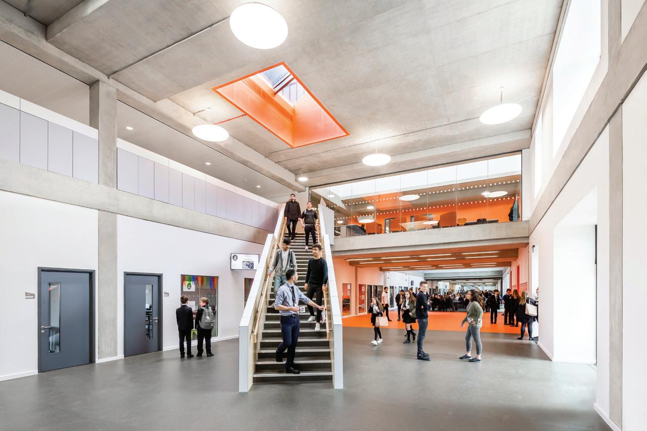
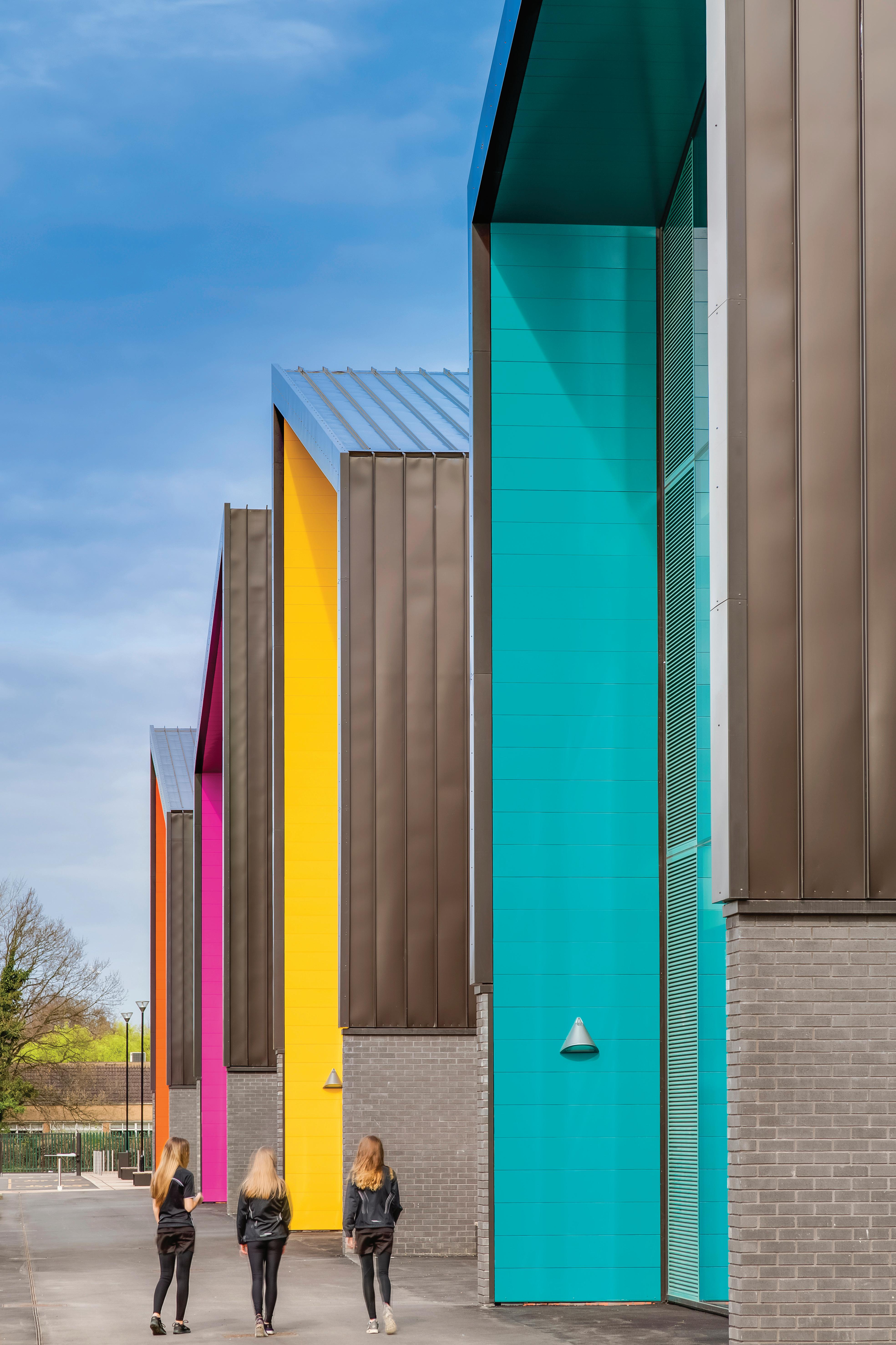
Importantly, design considerations made were based on solid education and operational thinking as opposed to what would look good. We hope we have achieved both. The building, built by contractors BAM, is certainly eye-catching, extremely colourful, innovative and prominent (even to those passing on the train). Arriving visitors pass through a generous landscaped plaza before entering the building through its soaring entranceway. The only major change was during the build process when the Rydens School was taken over by The Howard Partnership Trust — a multi-academy trust — and the school was renamed Three Rivers Academy. The design is based on a ‘street’ model featuring all specialist subject spaces on the ground floor, all with ‘shop front’ windows into the learning spaces. Four distinct ‘blocks’ in different colours sit over the


street containing multiple learning spaces. These were originally designed to be separate ‘schools’ but The Howard Partnership Trust chose to make these into faculty bases, but still differentiated by colour. Each block has its own collection of classrooms, breakout spaces, staff accommodation, cloakrooms and storage facilities. Teaching spaces have large windows into them to encourage a shop front approach to displaying and celebrating learning. This also allows passive supervision into teaching spaces as well as staff being able to monitor those passing. The adjacencies and use of breakout spaces have ensured space for easy cross-curricular and cross-phase learning activities. Finding your way around is easy. There are no hidden corners or ‘hidey holes’ where students could possibly misbehave: even the main stairs are located on the ‘street’ overlooked from all parts of the school.


