5 minute read
CONTRACT HIGH
Exceptional spaces to eat, play, work, and stay.
By Rachel Gallaher
Portland’s Central Eastside welcomed the 57-room Hotel Grand Stark, a property operated by boutique hotel group Palisociety, this spring.
COURTESY PALISOCIETY HOTEL GRAND STARK

Portland’s latest boutique hotel embraces the historic eclecticism of the city’s Eastside.

Los Angeles–based hospitality group Palisociety has opened its second Pacific Northwest property, the Hotel Grand Stark, in Portland’s Central Eastside neighborhood. The four-story, 57-room historic property—which was built in 1908 and served as a hotel until the 1970s, when it became a local furniture warehouse—has been restored to its original purpose, with interiors that reflect the patchwork nature of Portland’s diverse neighborhoods.
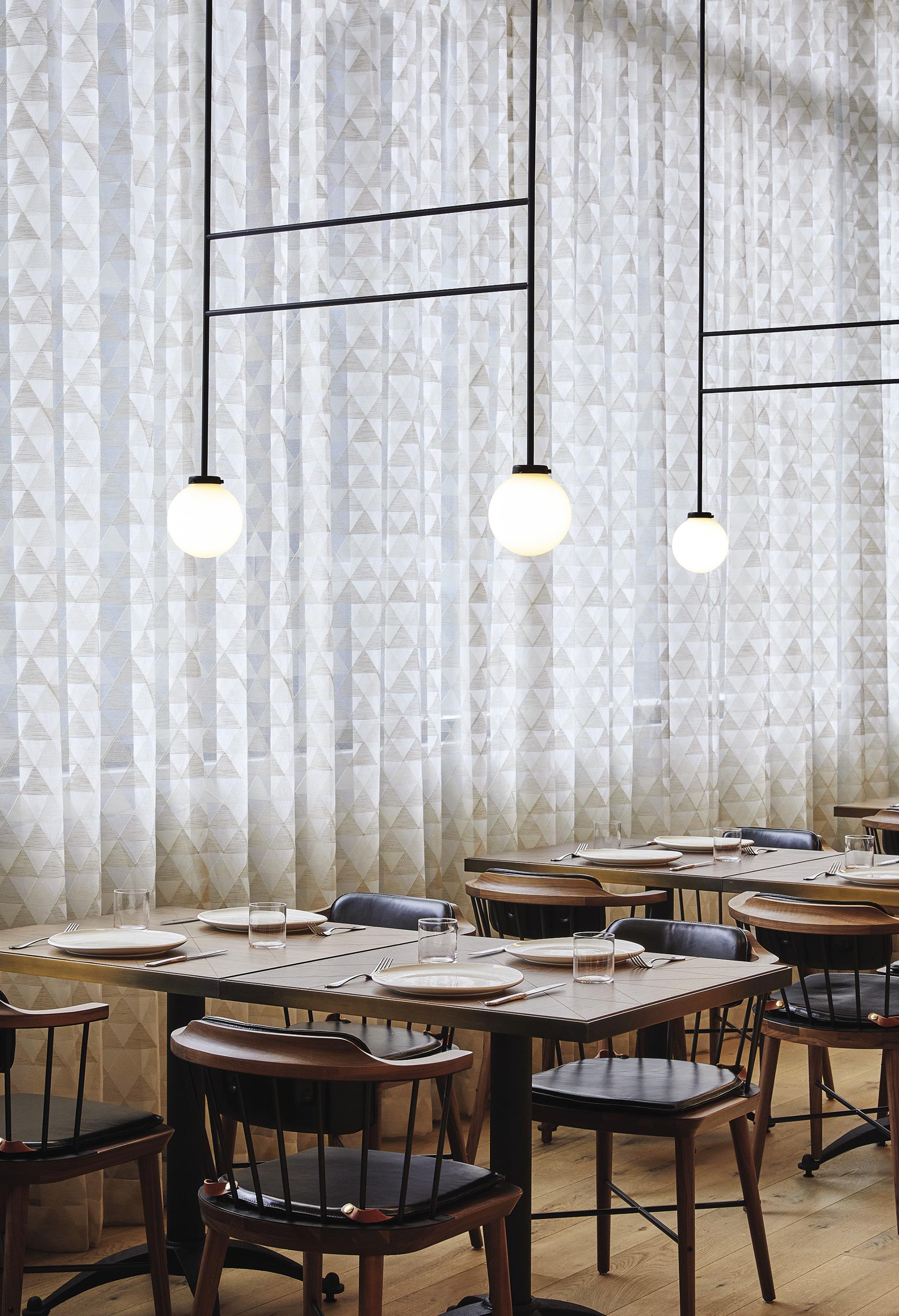
A local team—Works Progress Architecture, Urban Development + Partners, and Eric Cheong of North 45 Projects—came together with Palisociety to implement a full seismic retrofit, refinish historic windows and the brick exterior, construct a new roof, and build out the guest rooms. The on-property eatery, the Grand Stark Deli, is a refined and playful homage to the old-school delicatessen (think: checkered tile floor and glossy white counters), while Bar Chamberlain embraces the classic cocktail bar—made moody with a Northwest-inspired palette of dark-green and warm-gray paint colors. Public spaces also feature commissioned art from the local Nationale gallery, as well as vintage furniture and décor by local designers. “We wanted the spaces to feel as though you’re visiting an affable Portland friend’s loft— eclectic and approachable yet refined,” Cheong says. “The art and décor serve as a local guide to the vibrant and varied people, places, and things of the city.” »
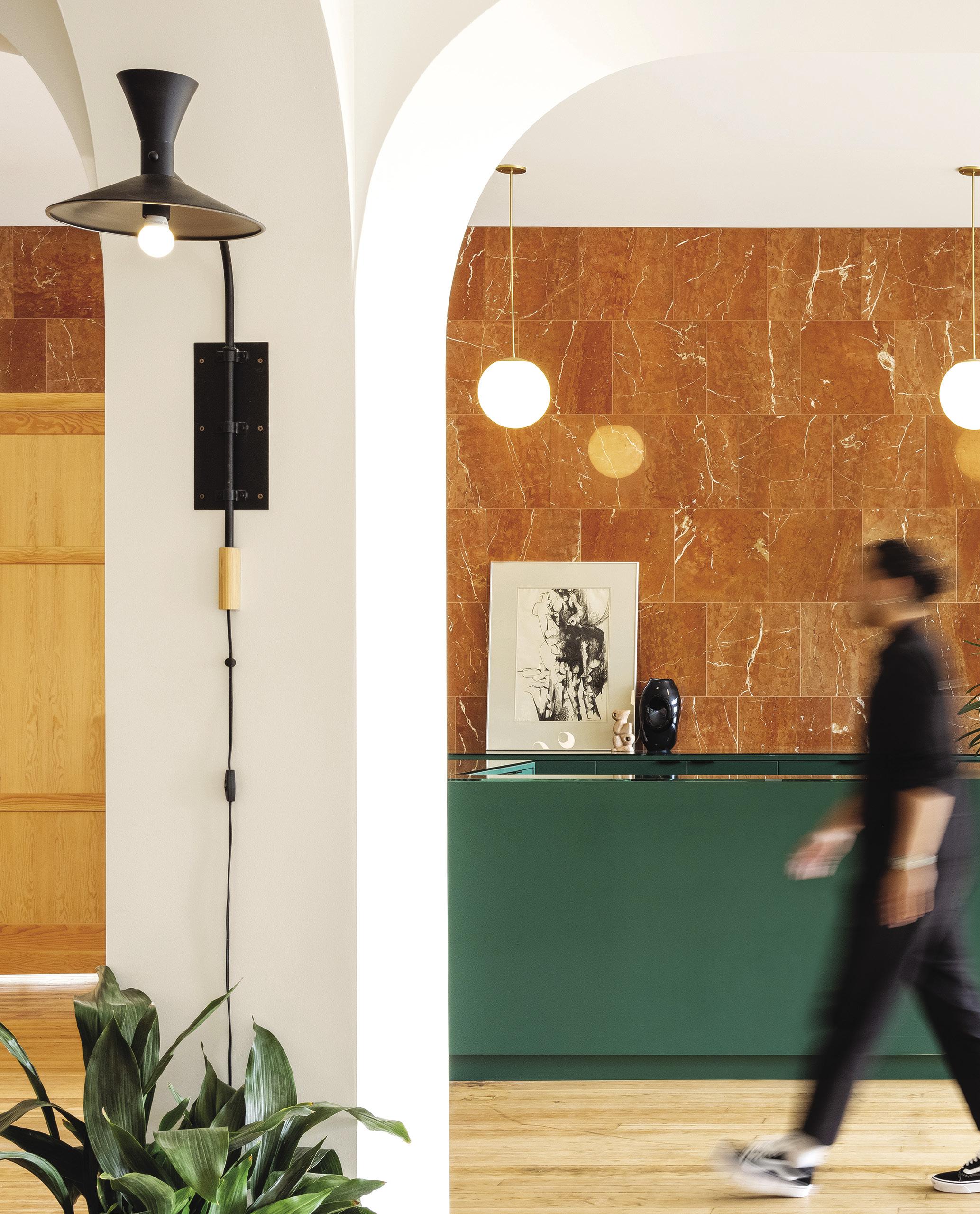
FROM TOP: In the lobby, banquette seating with white melamine tables edged in solid wood offers a place to enjoy fare from the Grand Stark Deli. The hotel embraces the understated sophistication of the Northwest with Douglas fir floors, a color palette featuring shades of green, and décor and art sourced from local designers.

—AVI BROSH, PALISOCIETY
The regionally inspired palette continues in the guest rooms. “I chose colors that are not meant to go together to reflect the irreverence and wabi-sabi nature of Portland,” says Palisociety founder Avi Brosh. “Hunter green mixed with mint blue and black accents—on paper that is not supposed to work, but in Portland, it flies.”
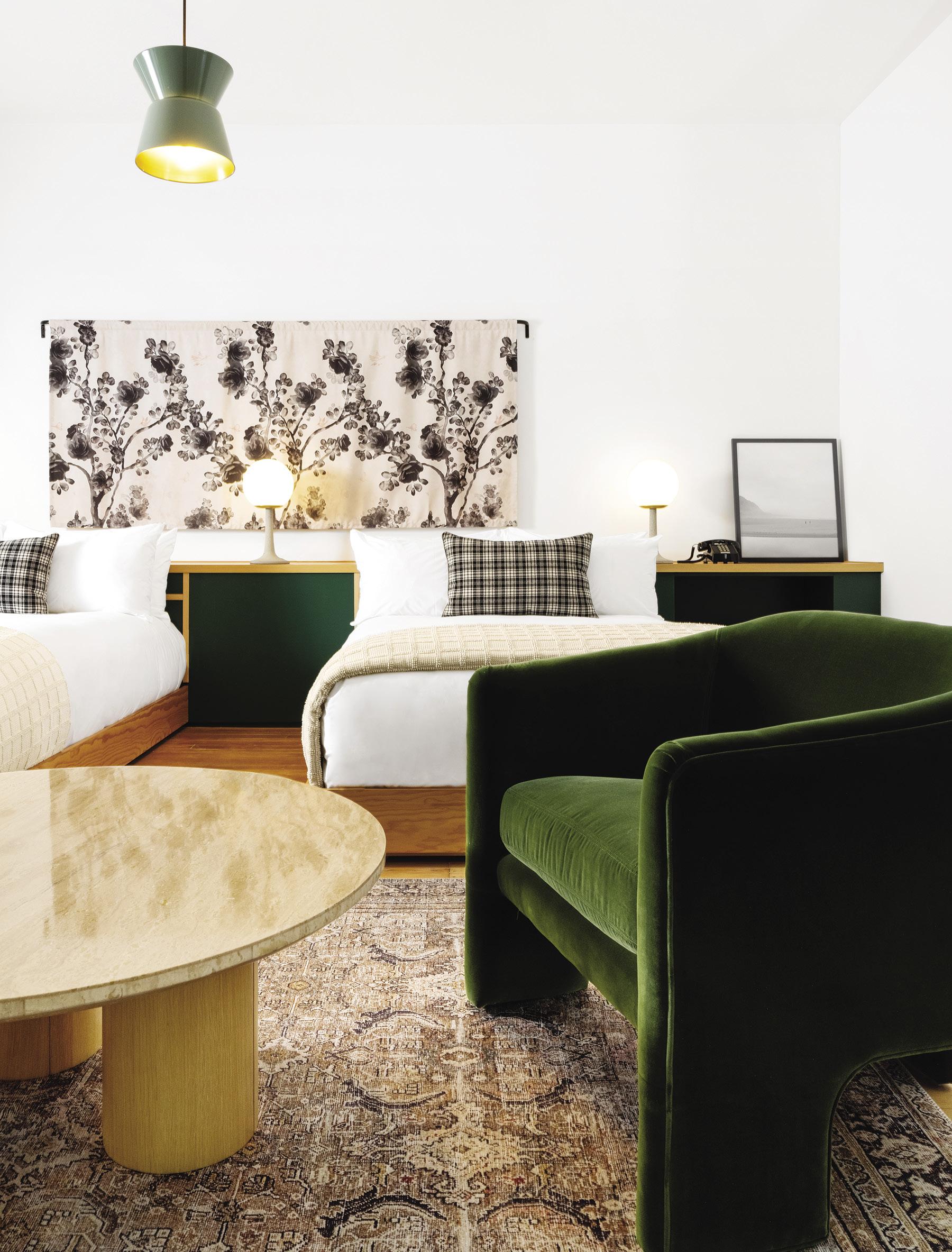
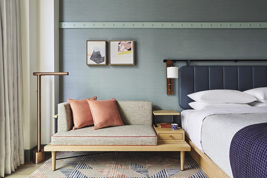
FROM TOP: In the lobby at the Hyatt Centric City Center, with interiors designed by Crème Architecture and Design, a built-in wood display case holds a mix of art and objects that creates a loose narrative about the natural world and the cultivation of land, as an ode to Pennsylvania’s farming history. Guest rooms are kitted out in a palette of blues with custom white-oak millwork and blackened-steel details.

HYATT CENTRIC CITY CENTER
For its first full hotel project—the Hyatt Centric City Center in Philadelphia—Brooklyn-based Crème Architecture and Design looked to the city’s industrial roots and regional design traditions to inspire their sophisticated, materials-forward interiors. Conceived by architect Jun Aizaki, whose Japanese heritage— specifically an attention to meticulous craftsmanship— served as a lens for the interior design project, the 332-room hotel, located in the city’s Rittenhouse Square district, draws inspiration from craft mainstays such as woodworking, metalsmithing, and leatherworking—nods to which appear in exposed concrete pillars, blackenedsteel trim, and stitched-leather furniture.
“Our goal was to create that feeling of warmth and tradition through impression, not imitation,” Aizaki says, “so we pulled organic and industrial textures that subtly reference key cultural points into the design, layering them to create depth and make the space feel airy, but lived in.”
The wood-paneled lobby draws from design work seen in the regional Shaker, Amish, and Quaker communities. Distressed, textile-based works (made from recycled garments) by artist Fanny Allié adorn the elevator vestibules. Custom carpets in the corridors embrace a similar patchwork pattern, and also have a shibori (a Japanese dyeing technique) influence. Vintage and found objects adorn in public spaces and guest rooms; the latter have a neutral color scheme featuring soft blues, which, Aizaki notes, “is aimed at creating a relaxing space for guests to enjoy their surroundings and the views of the city offered by large picture windows. New builds can easily feel a bit sterile; we wanted to avoid that by layering in textures and elements that tell a story and transport guests to a place that feels unique yet familiar.” »

At this creative hub in Brussels, Belgium, which houses architect Noro Khachatryan’s studio, as well as a gallery space for Harlan Levey Projects, a welded switchback staircase connects the two levels.
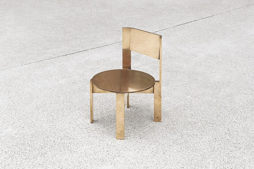
LEFT: A chair by Khachatryan, who designs furniture and objects in addition to interior architecture. BELOW: THE JACKET, an installation at Harlan Levey Projects by Polish artist Marcin Dudek.
STUDIOKHACHATRYAN
For the past 18 months, designer and architect Noro Khachatryan has been meticulously renovating an empty warehouse in the Molenbeek neighborhood of Brussels, Belgium. The result—a creative hub that encompasses Khachatryan’s studio along with a new double-height exhibition and gallery space for Harlan Levey Projects— is a pared-back space that serves as a neutral backdrop for Khachatryan’s work (in addition to interior architecture, he also designs furniture and décor objects). The building, which dates to 1890, had undergone a series of structural and interior interventions over the years, giving it, as Khachatryan says, “a sort of layering of history and techniques. At the same time, since it has always been in the same family, all the interventions were very harmonious. The goal was to preserve the building’s industrial character as much as possible, and to make it as livable, functional, and ecological as possible.” Using materials that complement this vision—steel, concrete, aluminum—the designer updated the warehouse, but was careful not to stray from its utilitarian origins (some parts were left completely untouched). The two levels are connected by a striking welded switchback staircase, and 32,000 rectangular tiles comprise the floor of Khachatryan’s studio, the open courtyard, and the gallery’s office. “I hope that the purified visual language allows viewers to bring their own specific interpretations to the work,” he says. “It is thanks to this approach that the spaces radiate a sense of peace and tranquility.” h


