1 minute read
INSPIRATION
MOODY HUES
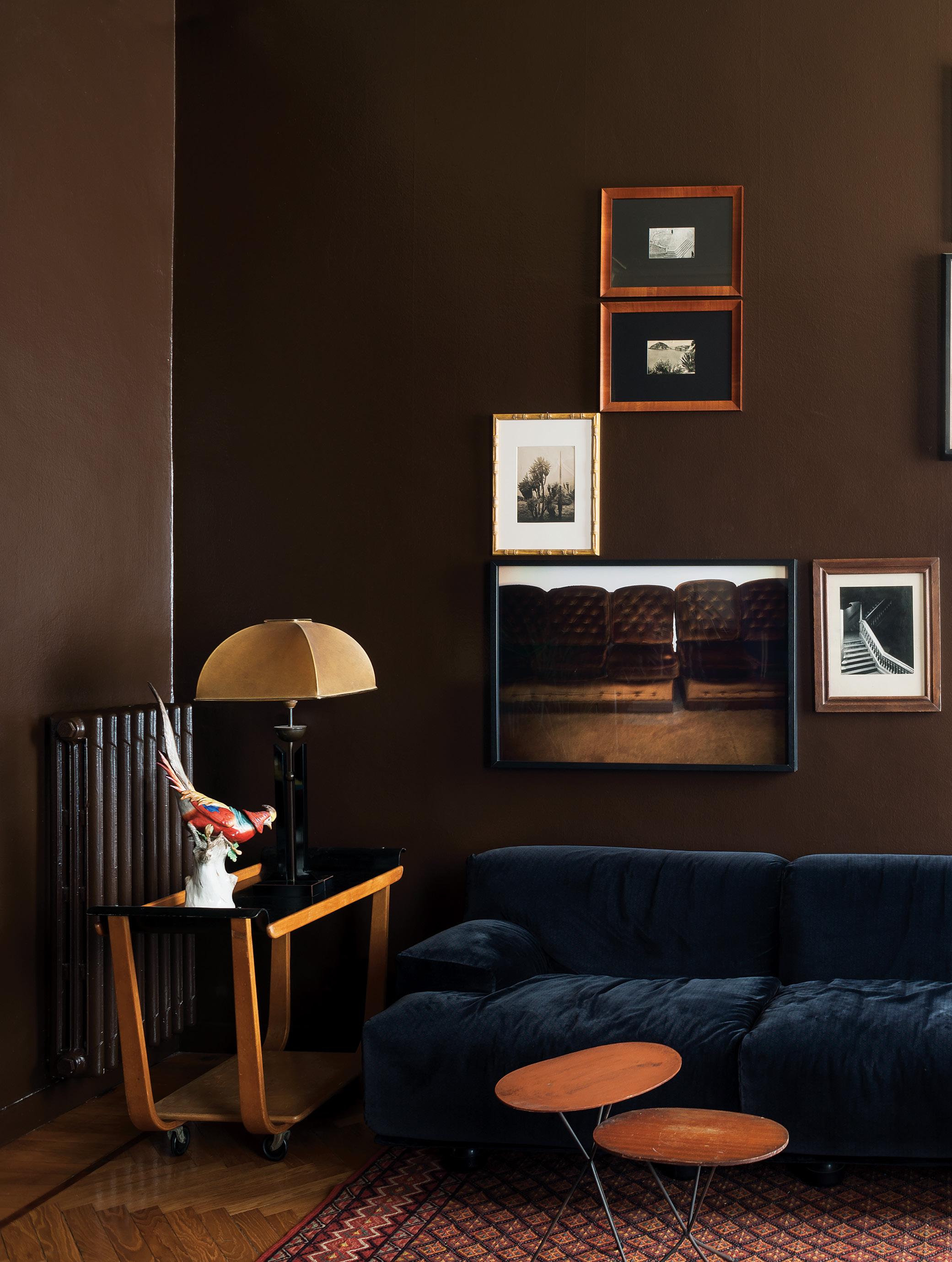
Tapping into a palette that features dark wood and deep jewel tones—balanced with just the right amount of lighter-hued elements, from finishes to furniture—these designers demonstrate that embracing the dark side can work in any room.
By Rachel Gallaher
LIVINGROOM INSPIRATION
Designer: Dimorestudio

Andrea Ferrai
Casa Serafino is the latest residential project from Milan-based Dimorestudio, and the apartment of the design firm’s cofounder Emiliano Salci. The intense, floor-to-ceiling brown paint was a potentially risky move, but the careful balance of the décor—including a vintage Fiandra sofa by Vico Magistretti and two Ignazio Gardella sconces—and the lighter-toned herringbone flooring make the space feel spacious and luxurious. »
KITCHEN INSPIRATION
Designer: Brio Interior Design Contractor: Ty McNeill

Haris Kenjar
Layered dark tones create a sophisticated area for cooking and gathering at the heart of this home. The natural walnut upper cabinets and flooring bring warmth, while the lower cabinets, painted in Sherwin-Williams’ Peppercorn (a dark slate-gray color) anchor the room. Navy-blue backsplash tiles and plum-colored chair upholstery add chic touches, and a large steel beam (added so that the designer could remove a wall and open the kitchen to the adjacent living room) brings symmetry to the space. »
BATHROOM INSPIRATION
Designer: Lisa Staton Interior

Jordyn Pruitt
Design During the renovation of this home’s two bathrooms, this powder room was taken down to the studs, but two original elements—white hexagonal floor tiles and radiator—were saved. New oak paneling with Tudor-style arch detailing continues the classic aesthetic, and a custom-designed Arabesco marble trough sink adds a modern centerpiece to the room. In the water closet, hand-painted silk de Gournay wallpaper is the ultimate touch of luxury, completing the classic-meets-contemporary design. h


