22 minute read
day turnaround. 6 Benefits
How Infinity Drain’s solutions can improve bathroom design
BY LAURA ROTE
Advertisement
6 Benefits of Linear Drains

SSince 2007 Infinity Drain has been designing decorative shower drains for barrier-free bathrooms. “The barrier-free shower—also referred to as the walk-in shower, zero-threshold shower, or curbless shower—is a growing trend in bathroom design,” says Barbara Kratus-Stark, sales and marketing director for Infinity Drain. What distinguishes this type of shower from another is it has no obstacle at the threshold to step or roll over. Kratus-Stark says barrier-free bathroom design is often achieved with a linear drain system and single-slope floor pitch. A linear drain is a channel or trench built into the floor of the shower. It collects the water and delivers it to the drain outlet, which can be anywhere along the channel length. “With the floor sloped in one direction, the water is aided by gravity and rushes to the far edge of the space, where it is then easily processed,” she says. We talked to the Infinity Drain team about some of the reasons why designers should consider linear drains for their next projects.
1. TRULY BARRIER-FREE
With no curb or barrier obstructing the entrance to the shower, you make for a more accessible bathroom for people of all ages and capabilities while removing the trip hazard. Solutions like the Site Sizable Low Profile Linear Drain have a lower profile that helps minimize the floor height needed to achieve a curbless entry.
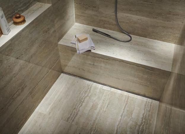
“When the shower flooring material must accommodate a drain and four-way pitch, architects will often specify smaller tile or cut large-format tile on a diagonal and then pie-piece it together around the drain,” Kratus-Stark says. “When the shower floor slopes uniformly in one direction, as it does in a barrier-free application, the limitations on tile size and slab material are eliminated. Large-format tiles, stone slabs, or any solid-surface material can be used without being compromised or broken down into smaller pieces.”
2. MORE MATERIAL OPTIONS
Kratus-Stark says barrier-free bathrooms enable architects to use materials that didn’t fit into a conventional center drain shower enclosure. The removal of physical boundaries at the shower eliminates the compartmentalization that before made the bathroom space feel smaller and broken up. “The move from a shower compartment with a standard center drain to a barrier-free shower with a linear drain affects the type of flooring that can be specified in the bathroom. The barrier-free solution offers architects the opportunity to use higher-end materials often found in ultra-modern interiors and five-star spas,” she says.
3. MAKE THE BATHROOM LOOK BIGGER
And instead of having a bathroom broken up into distinct areas, the barrier-free shower creates a seamless transition between the shower space and the rest of the bathroom. This makes the entire bathroom feel larger, even though the total square footage of the space has not changed.
[1] The Slot Linear Drain from
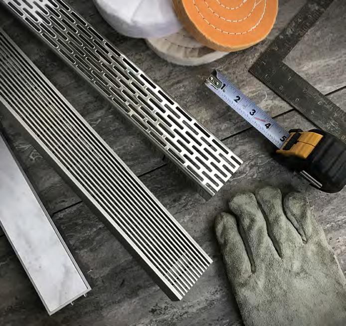
Infinity Drain was designed to disappear. The new drain has a narrow 3/8-inch drainage gap and comes in a range of finishes from stainless steel to matte Bback, with an easily accessible clean-out tray.
[2] Barrier-free bathroom
installation is simplified with the new Site Sizable Low Profile linear drain, seen here in satin bronze. The drain’s lower profile helps minimize the floor height needed to achieve a curbless entry.
[3] Infinity Drain also offers
Next Day Custom for a perfectly aligned solution for wall-to-wall linear drain installation without the wait. Next Day Custom Linear Drains are available in lengths up to 72 inches in two finishes, three grate styles, and for all installation waterproofing methods.
3
1

2
4. PROLONG YOUR BATHROOM’S LIFE
Linear drains are a long-term solution because you can make the entire bathroom waterproof and more durable. Plus, the barrier-free aspect means owners can age in place. Kratus-Stark says it’s a no-brainer when you compare it to using cheaper materials that aren’t waterproof, aren’t long-lasting, and may require more maintenance later on.
5. MADE SUSTAINABLY
Infinity Drain uses locally sourced and manufactured products with 91.2% recycled content and emphasizes energy-efficient improvements to their New York-based factory, including a new PVC roof and LED lighting. Their CLEARCLAD e-coating process creates a closed loop, which reclaims nearly 100% of the water used in its low-VOC finishes.
“Infinity Drain’s priority is to be a sustainable provider of decorative drains,” says Infinity Drain President Jonathan Brill. “We have committed to reduce our impact on the environment as well as to enhance the overall wellness of our clients, employees, and trade professionals.”
6. EASY TO CLEAN AND MAINTAIN Linear drains are as easy to maintain, Kratus-Stark says. The drains come with a hair basket and tool to pull out the grate for easy access, and water drains more efficiently— leading to less mishaps in the bath and less mildew to clean, she says. You can also switch out the linear drain decorative grate to a different style or a tile insert frame to update the look of your shower. g
projects
STUDIO GANG TURNS A DECOMMISSIONED POWER PLANT INTO A REMARKABLE CENTER FOR HEALTH AND WELLNESS.
Powering Up
Beloit College transforms Blackhawk Power Plant for new student and community programs.
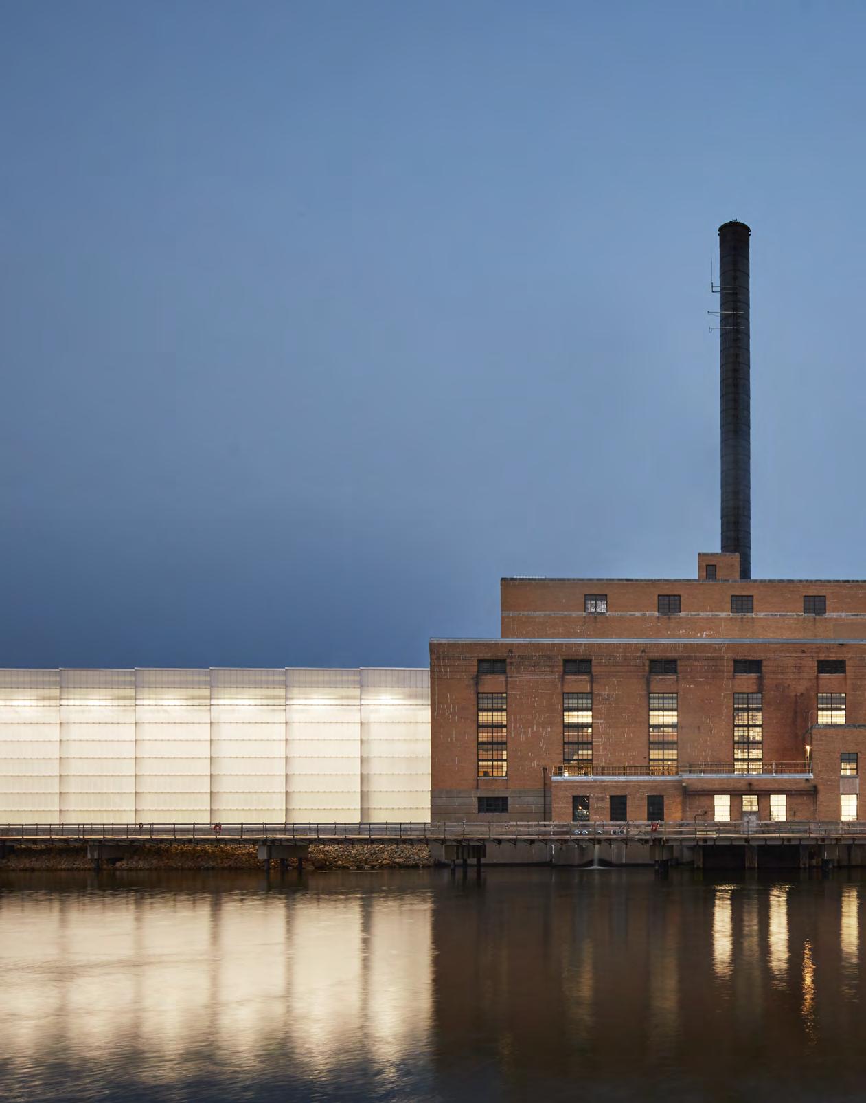

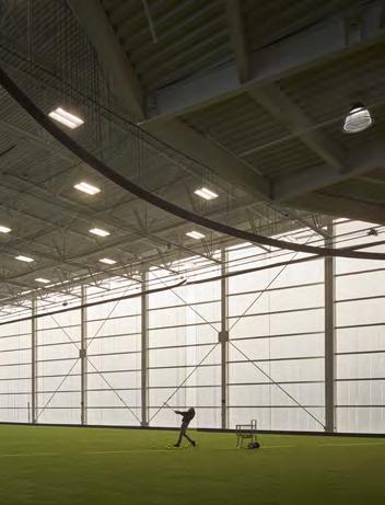
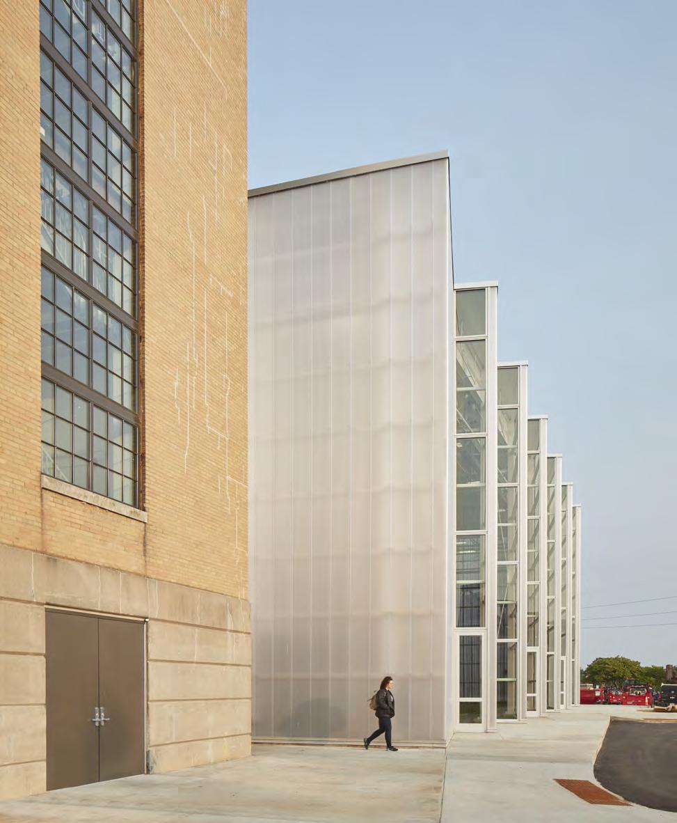
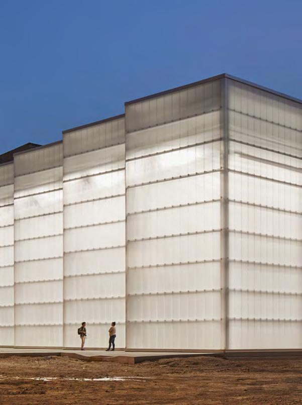
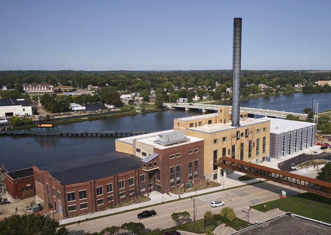
When a college president passed a newly decommissioned power plant, he got an idea: Wouldn’t that space make for a great, much needed new campus fieldhouse? The new facility now has a running track, conference facility, batting cages, café, and more. The transformation of Powerhouse, a student union and recreational center at Beloit College, was a unique reuse design opportunity that embodied the core philosophy at Studio Gang—start a design with what’s already there. For the Powerhouse project, that meant a 120,000-square-foot decommissioned powerplant.
The impetus for the powerplant transformation came from Beloit President Scott Bierman on one of his routine runs around campus. “I had just gone past the existing Quonset Hut that was the campus fieldhouse, and I remember having the thought that it had long lived past its usable life,” Bierman says. “Then I jogged down Pleasant Street past the recently decommissioned Blackhawk Power Station, and I thought, ‘My gosh. I wonder if this could be used for a rec center.’”
Juliane Wolf, partner and design principal at Studio Gang, worked with Bierman and Beloit’s vision to transform the historical power plant into a human-use building for Beloit students and the surrounding community. While the large floor plan allows for impressive amenities like a running track, fitness level, conference facility, café, lecture hall, and batting cages, the immense layout needed to be reimagined in order to create welcoming spaces.
“Sometimes with these industrial buildings there’s a scale and logic to the structure and envelope that doesn’t necessarily lend itself to the health and well-being of human occupation,” Wolf says. By breaking down the scale and taking a playful approach to the robust and serious structure, Wolf was able to give the power plant a human quality that meets the needs of the college and community.
Wolf explains it was the “robust flexibility that was really unique for Powerhouse.” Once the polluted, heavier equipment was removed from the building, the existing steel structure harnessed impressive load carrying capacity. Studio Gang used the building’s inherent strength to create unexpected design elements—like suspending a running track from the ceiling and adding an additional level to hold fitness equipment. “It’s using architecture to create that transformation on a spatial level in order to make it this environment you actually want to be in that doesn’t feel too overwhelming or too cold,” she says.
Studio Gang worked to highlight the origin of the historic building by keeping existing power plant elements in the design. The original smokestack, for example, now serves as a skylight, and a truss that was discovered by the contractor mid-project now has a glass facade to serve as a sightline between the
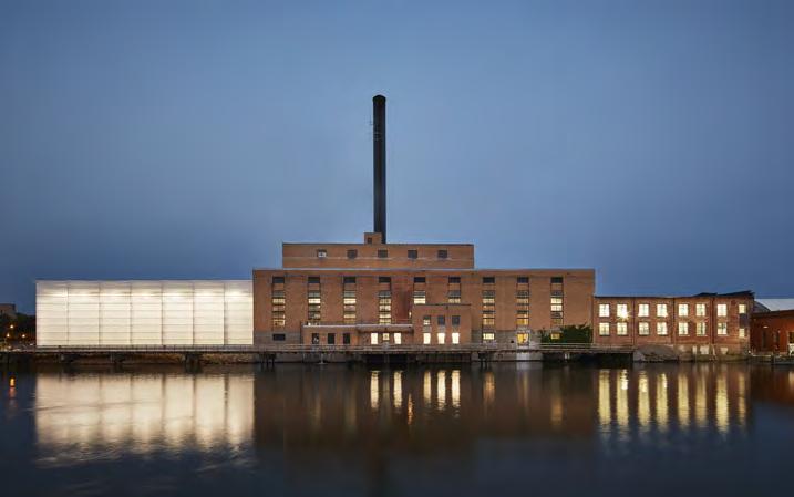
A pedestrian bridge connects Powerhouse to Beloit’s campus and helps students avoid Pleasant Street below. Powerhouse, with its original smokestack, sits along Rock River.
SITE DIAGRAM

PROJECT: Beloit Powerhouse ARCHITECT: Studio Gang LOCATION: Beloit
Completion: 2020 Size: 120,000 square feet Cost: ~$40 million Associate Architect: Angus Young Associates Electrical, Plumbing, and Structural Engineer: Angus Young Associates General Contractor: Corporate Contractors, Inc. Interior Design: Studio Gang Landscape Architect: Applied Ecological Services LEED Consultant: Angus Young Associates
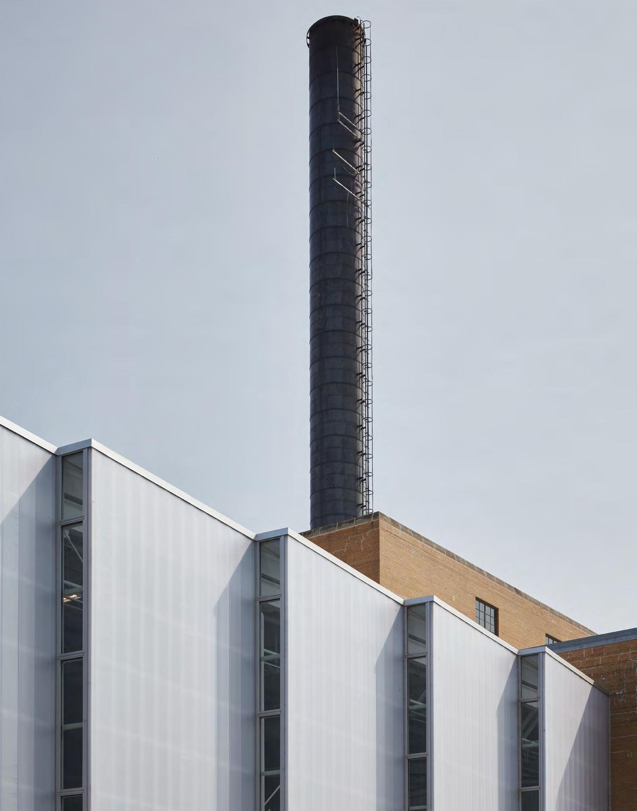

running track and pool. “That’s symptomatic of a reuse project,” Wolf says. “Especially buildings with a totally different use.”
Beloit College worked with Alliant Energy to ensure the historic building was not torn down, which ended up being a huge benefit in the building’s carbon emission performance. Dan Schooff, chief of staff at Beloit College, says one of Powerhouse’s impressive sustainable resources is the nearby Rock River. “The building is cooled and heated with a river-source geothermal system. The Rock River helps power the electric heat pumps, which reduces our use of fossil fuels. We use this system to cool and heat the building, mostly through radiant panels and radiant floor slabs.”
In the fieldhouse, fan-assisted natural ventilation keeps the area comfortable for active use. There are low-energy fans on the roof, and large hangar-like doors open at night to draw cool air into the space.
The structure itself also underwent a substantial, and somewhat invisible, sustainable upgrade with an improved envelope, new windows, and wall insulations that met the historic preservation standard. “Now we’re in the process of really testing the performance,” Wolf says. Alongside Beloit staff, Studio Gang is conducting a post-occupancy evaluation to see if the sustainable features keep the building at their target goal—up-to 50% below code requirements.
Beloit partnered with city, state, and federal governments to install a three-million-dollar river walk behind Powerhouse. g
Studio Gang transformed the building’s original smokestack into a skylight. A truss that was discovered by the contractor mid-project now has a glass facade to serve as a sightline between the running track and pool.
Stitched Together
How renovation at the Johns Hopkins School of Nursing became the connective tissue of the community
WORDS BY SOPHIA CONFORTI
A double skin curtain wall system was used in the facade to not only control heat gain and glare but also allow a high level of transparency. It was an environmental choice, Lasky says, one that also ties back to the building’s theme of connectivity.


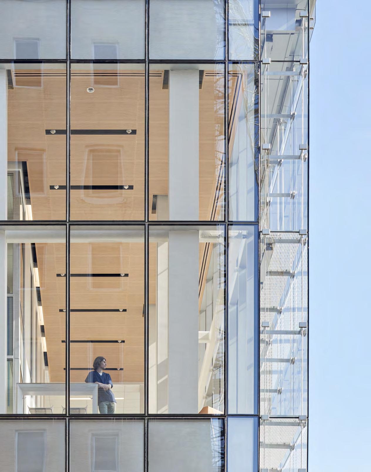
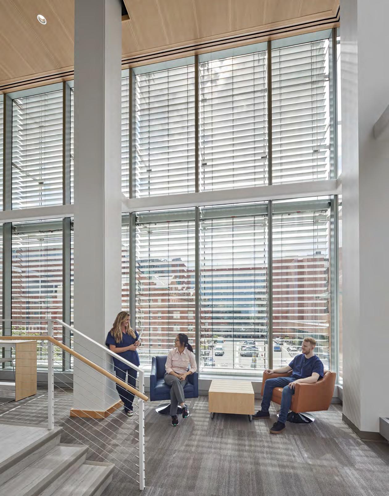
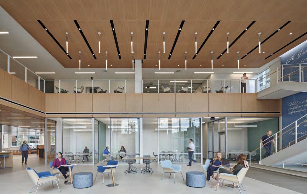
The design team considered low VOCs, natural daylight, acoustics, and energy efficiency when renovating the Johns Hopkins School of Nursing. Connection. In an age of separation, the 2020 renovation to the Johns Hopkins University School of Nursing aimed to bring people together.
Codesigned by Hord Coplan Macht and William Rawn Associates, the building upgrade was meant to open up the school not only to students but also the Johns Hopkins and Baltimore community at large. As it was, “The school was inward-focused, in a long, skinny building,” says Paul Lund, principal at Hord Coplan Macht. “It was hard for the school to play a reciprocal role within the broader campus context and within the city itself. A lot of the school’s research projects involve working with different agencies and groups within Baltimore, so there are lots of nurses going out but no way to invite people from the community in.”
Even if someone was invited, it was easy to get lost: Standing on the street looking at the original building, you could barely see the front door.
One of the first design decisions was to make a grand entrance worthy of the best master’s program for nursing in the country, of which it is. Big letters announce the school now, with a clearly defined welcome area both inside and out. “It seems like a small thing, but making the building accessible and open—telling people that it’s okay to come visit—was important,” Lund says.
To figure out how else they could improve the student experience, the design team conducted a lengthy feasibility study before any building took place. “We met with students, faculty, and staff,” says Sam Lasky, principal at William Rawn Associates. “We spent time just listening to people.”
After months of listening, what they learned was students thought the building felt dark. They wanted access to researchers and faculty but felt there was a barrier between them. The team also discovered the School of Nursing operated on an active, group-based learning model, where students often had to meet up to work outside of class, but because of the long, thin shape of the building, there was no large central gathering space that enabled them to do so.
“Students were having to have their study groups on the fire stairs,” Lasky says. As such, the main focus of the renovation became creating a variety of spaces both inside and outside the classroom where students and staff could learn together, collaborate loudly, or study quietly.
One of the main features of the project is

SITE PLAN
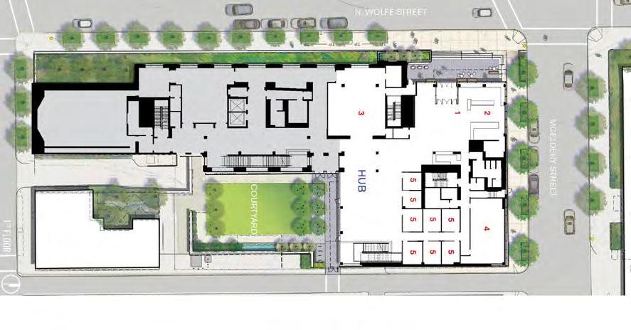
PROJECT: Johns Hopkins School of Nursing ARCHITECT: William Rawn Associates & Hord Coplan Macht LOCATION: Baltimore, MD
Completion: 2020 Size: 42,000 square feet Structural Engineer: Hope Furrer Associates Civil Engineer: RKK Contractor: Gilbane AV/IT: Spexsys Interior Designer: Hord Coplan Macht Lighting Consultant: Mag-Lighting Design Landscape Architect: Hord Coplan Macht
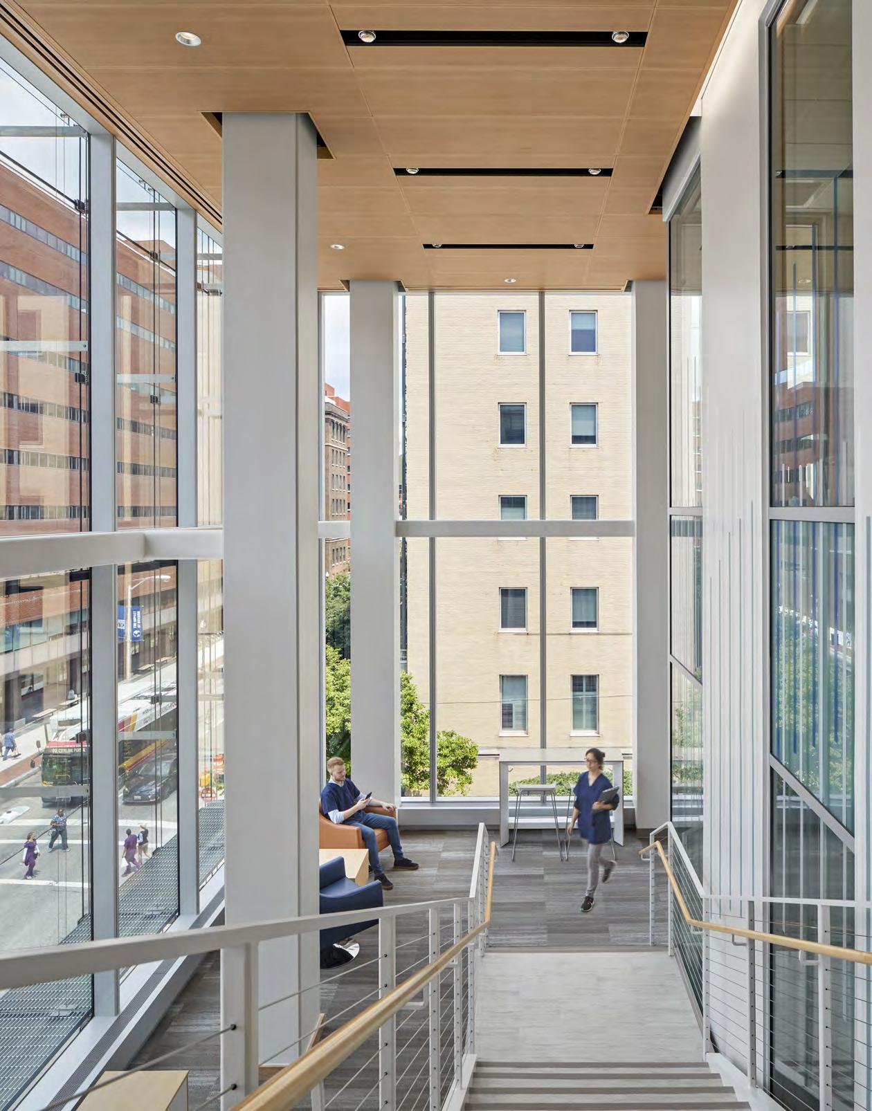
what Lund and Lasky refer to as “the hub,” a light-filled atrium of dedicated student space. “One of the things we uncovered in our research is that it’s so important for students to get a sense of belonging and learn from each other,” Lund says. The hub has levels of privacy with huddle rooms and open seating and also overlooks the coveted courtyard—one of very few open, natural spaces in the area. For that reason, the transparent facade was intentional: Even if students had their noses buried in textbooks, the design team wanted students to be able to look up, soak in the daylight, and see the greenery outdoors. “A lot of elements of what we did were based on a research project we were involved with on biophilia, which showed that biophilia reduced student stress and increased student cognition,” Lund says.
But mental health wasn’t the only type of wellness the team paid attention to. Students’ cardiovascular health was also taken into account—a fitting concept for a health-minded building. Instead of adding another elevator, the team put in a large stair system that snakes its way throughout the school—a design element that encourages walking and also directly inserts you into the flurry of the student experience.
Health care, even outside of a hospital setting, is an intense experience after all. In a time when there has been an eagle-eye focus on frontline medical workers, the updated School of Nursing serves as an educational safe haven nurturing the next generation of nurses. “The students here were so incredible, with so much energy, vitality, and enthusiasm,” Lasky says. “It was a privilege to build a building that would help them maintain that incredible generosity of spirit.” g
“A lot of students don’t necessarily live nearby, so if you come, you’re there for a long period of time,” Lasky says. During the design phase, the team thought, “How can this feel like a home away from home?”
Outside the Box
How architects in South America are using biophilia in design for education and child care
WORDS BY JESSICA ZUNIGA
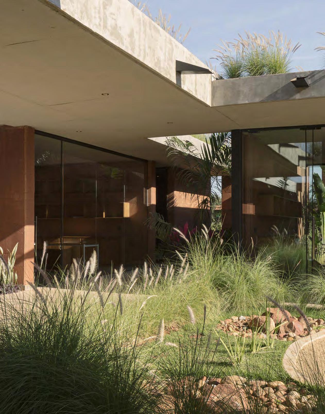
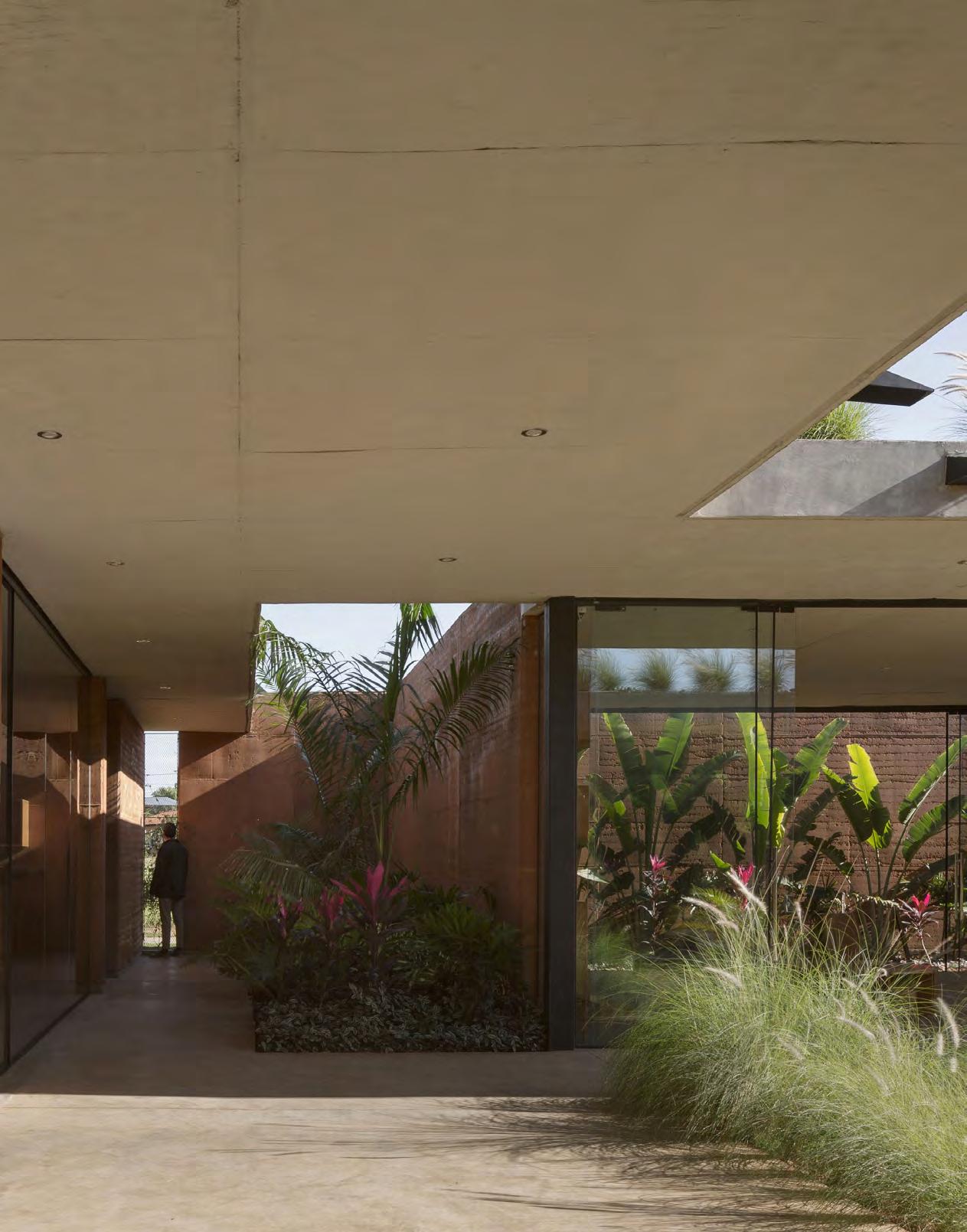
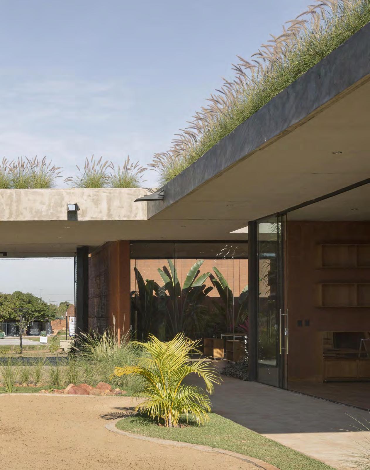
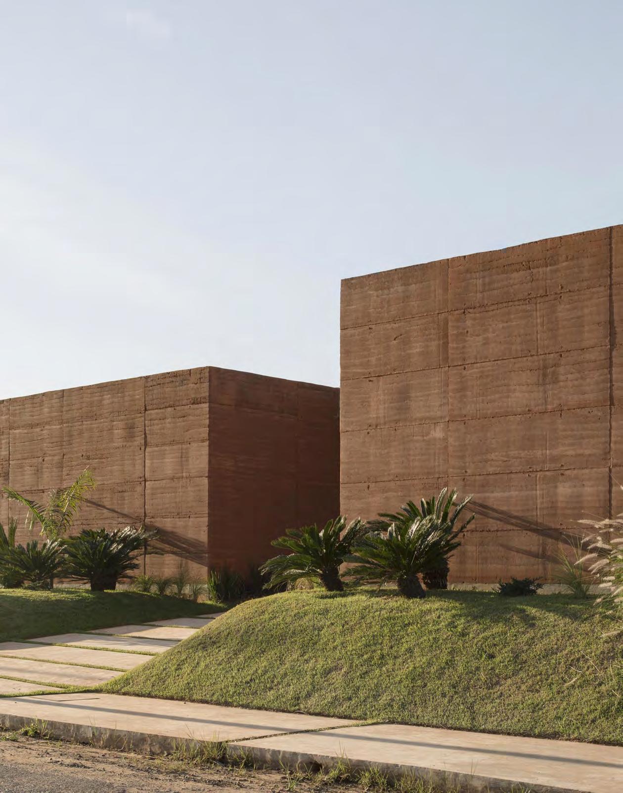
Equipo de Arquitectura’s rammed earth Child Care Center gives children the opportunity to learn using their senses— from the proximity to open courtyards to the natural earth walls.
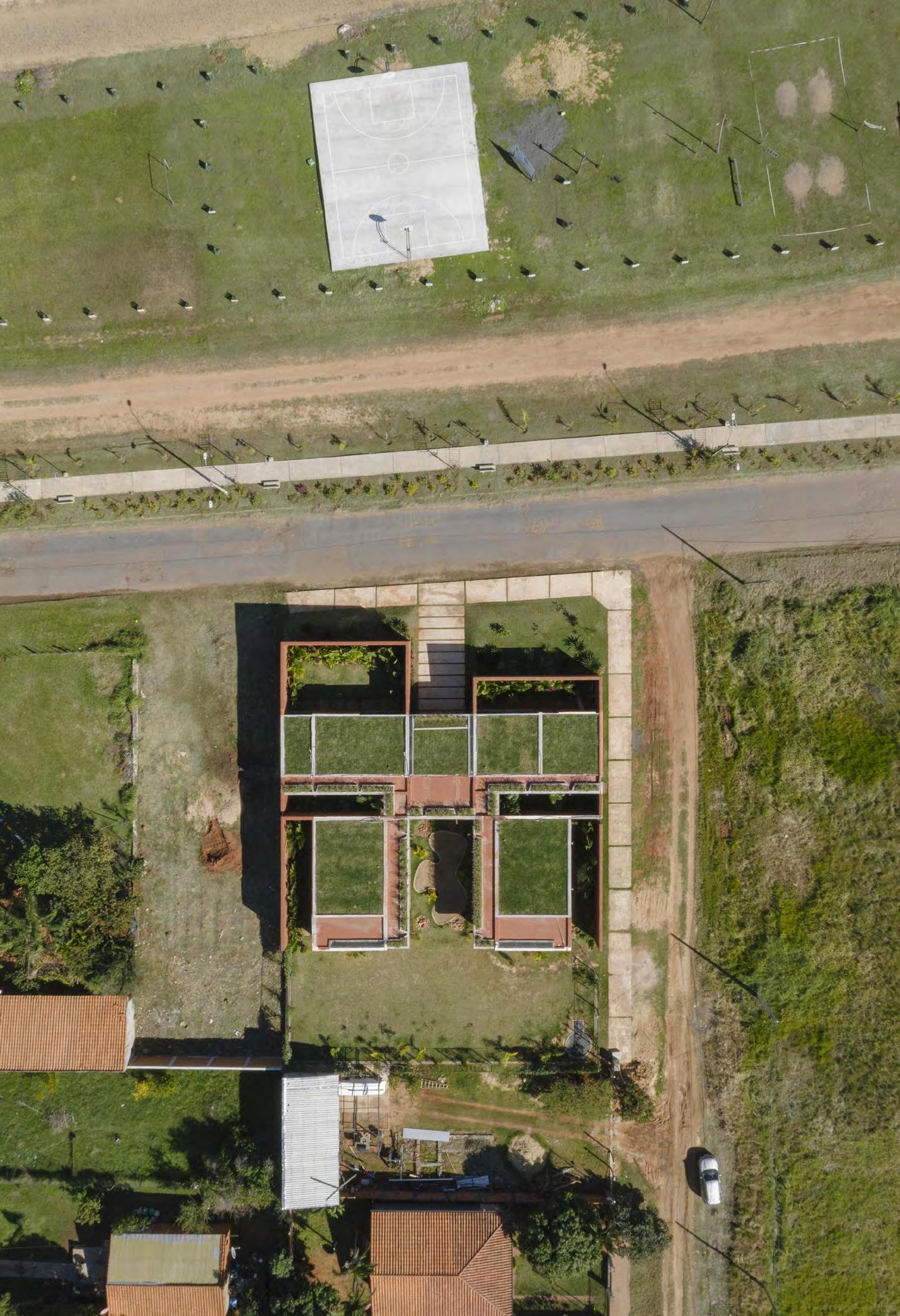
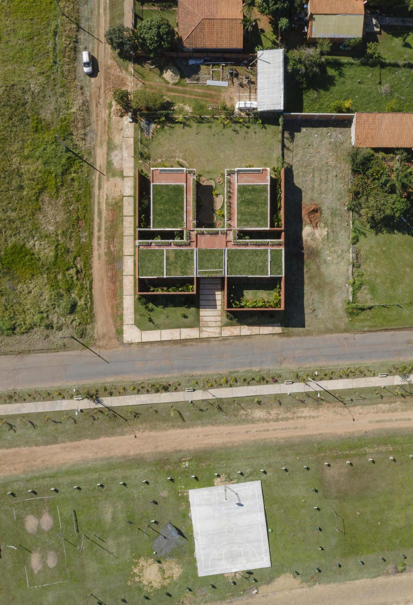
Green roofs are one way the building lowers daily electricity use and keeps the space comfortable and cool.
The Child Care Center in the city of Ville-
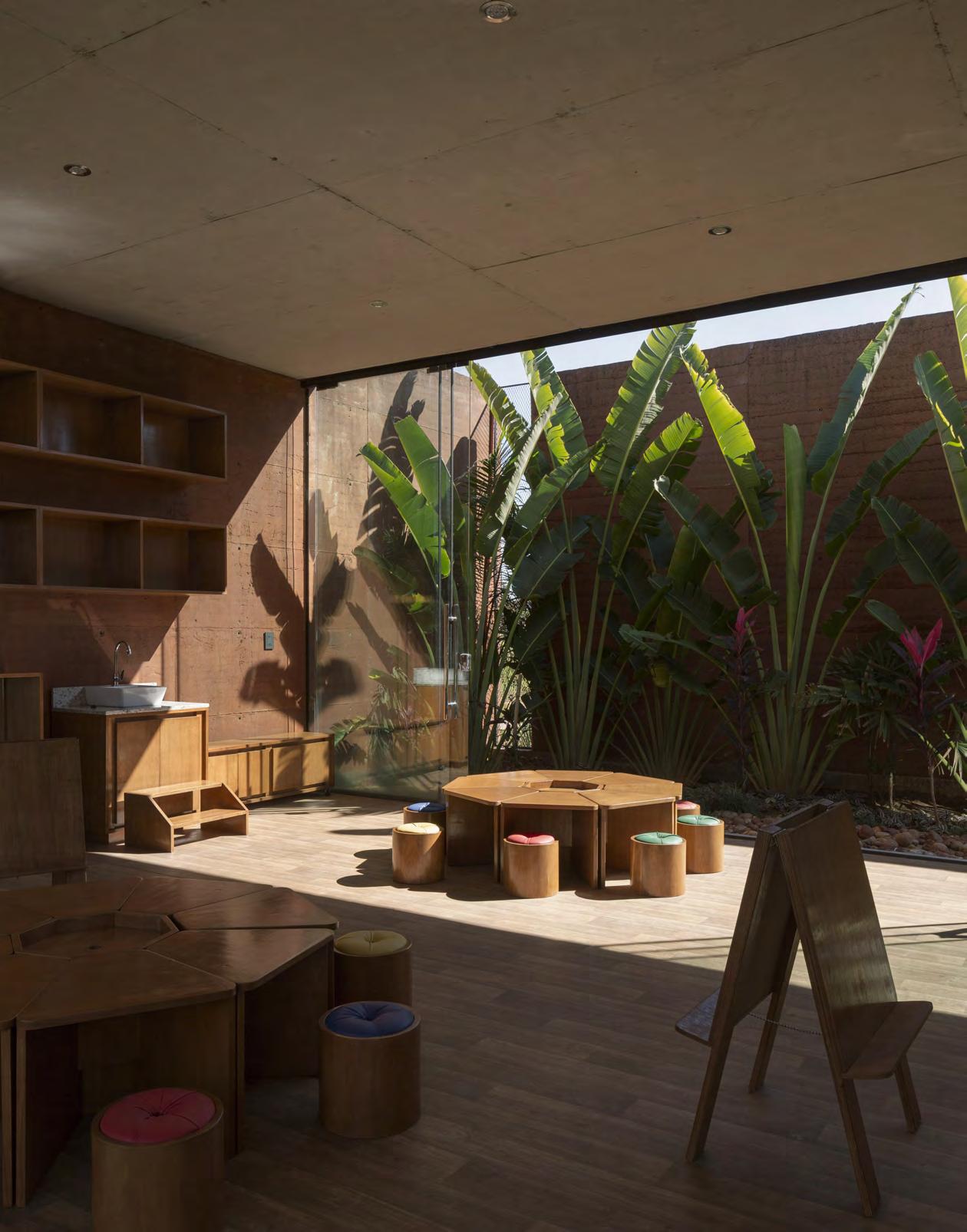
ta in Paraguay is designed as an alternative to the traditional closed classroom setting. The center is made of four large spaces—two classrooms, a dining room, and an administrative area. Each is open to the outside on both sides so patio spaces full of vegetation are never out of reach. The rooms can become fully enclosed with glass walls during bad weather, but children and staff alike never lose touch with the outdoors.
The Child Care Center fills a need in the industrial driven city, where there are few care opportunities for working parents with children under the age of 4. Partnering with a local manufacturer, the Equipo de Arquitectura team designed a space where young children in the community will not only be taken care of but thrive, learn, and grow along the way.
Horacio Cherniavsky, a founding member of Equipo de Arquitectura, says the design pulls inspiration from alternative methodologies of learning like Montessori and Reggio Emilia—both of which value independent sensory learning in children. The Equipo de Arquitectura team put an emphasis on access to the natural surroundings in order to create a rich environment to learn in. “We wanted children to be in contact with nature and natural materials at all times,” Cherniavsky says. “We did not want to create the typical classroom where you feel you are inside a closed space.”
The walls you do find in the center are made using a rammed earth technique, using primarily raw earth mixed with 5% cement to avoid erosion from rainwater. This way, the load bearing walls can be exposed to the natural climate for years to come. “It’s a structural element within the project but also an element that builds the space,” Cherniavsky says. “Raw earth provides information. The walls have a special texture, special moisture, and build a special atmosphere.”
The rammed earth structure helps create a diversity in textures, colors, and smells, too, all aligning with the building’s methodolo-

gies. While the center’s layout is simple, this is one example of how the architects value enrichment of the child’s experience in the design process.
“It’s a sensory type of learning,” Cherniavsky says. “The experience of the space is what helps the child learn from his or her senses.”
Cherniavsky says rammed earth structures are growing in popularity in Paraguay, where brick has long been the favorable building material. While bricks are also made of earth, they are baked in wood burning ovens for long periods of time. Since rammed earth doesn’t require time to bake, and the raw earth is often abundant and nearby, builders save financially and lower their ecological impact during construction.
On most days in the center, fresh air and sunlight moves through the classrooms. Beyond the courtyard gardens and use of a low environmental impact building material, the center also utilizes cross ventilation, natural lighting, and green rooftops to incorporate the outdoors, cut costs, and preserve energy.
By discouraging the use of artificial lighting, the space is designed to be a more comfortable environment you can easily spend a whole day in and needing less electricity to function. In a similar way, cross ventilation keeps the building cool naturally and give you the benefit of fresh air. The green roofs help achieve this as well by absorbing sunlight to maintain stable temperatures inside. On cloudy days, they absorb rainwater and keep it in their soil, reducing the amount of runoff onto the building itself. g
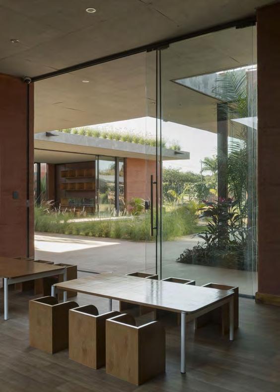
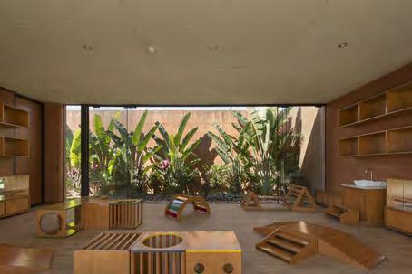
On each side of the classrooms inside the building, the walls open to green courtyard spaces, maintaining a connection to the outdoors. Even during the rainy season, glass panels maintain that feeling of openness. “You are connected to the outside and to the patio, which is full of vegetation,” says Horacio Cherniavsky, a founding member of Equipo de Arquitectura. “We intended to make the experience of the place feel very comfortable and connected to nature.”
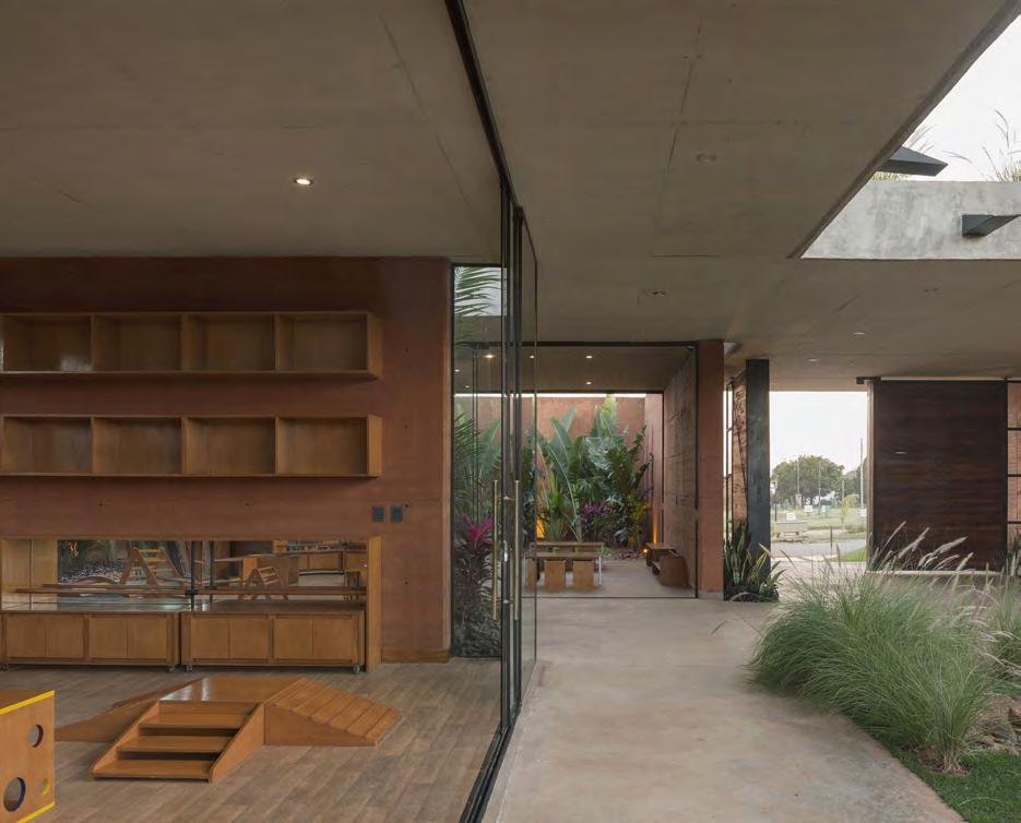
By discouraging the use of artificial lighting, the space is designed to be a comfortable environment you can easily spend a whole day in, needing less electricity.
FLOORPLAN

PROJECT: Child Care Center ARCHITECT: Equipo de Arquitectura LOCATION: Villeta, Paraguay
Completion: 2021 Size: 1,475 feet Client: Las Tacuaras SA Landscape: Lucila Garay
This Bali School has led by example with sustainable education since 2008.
The Green School
WORDS BY JESSICA ZUNIGA
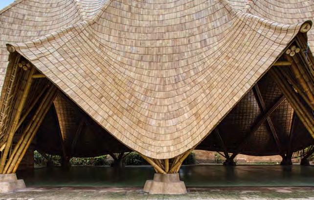
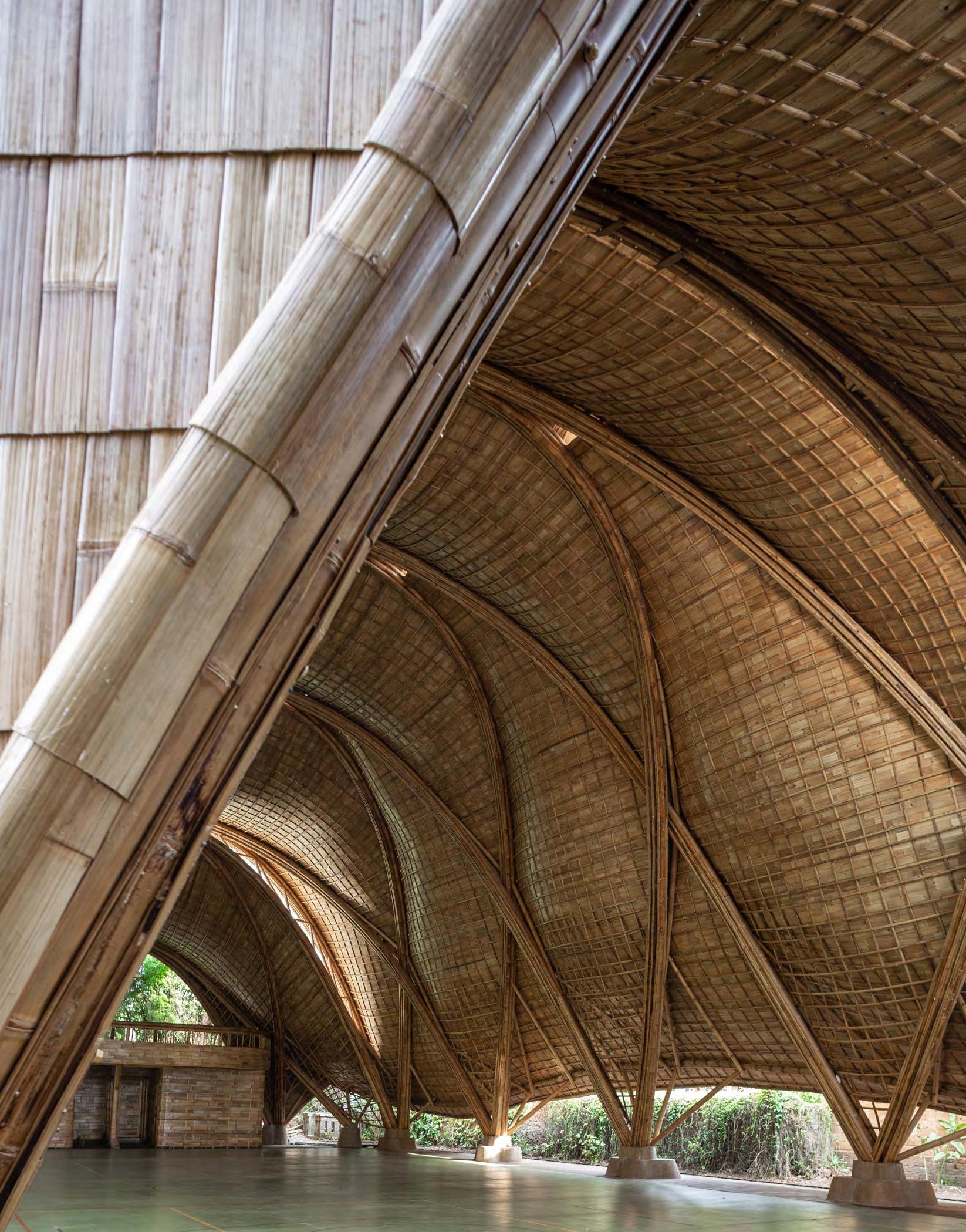
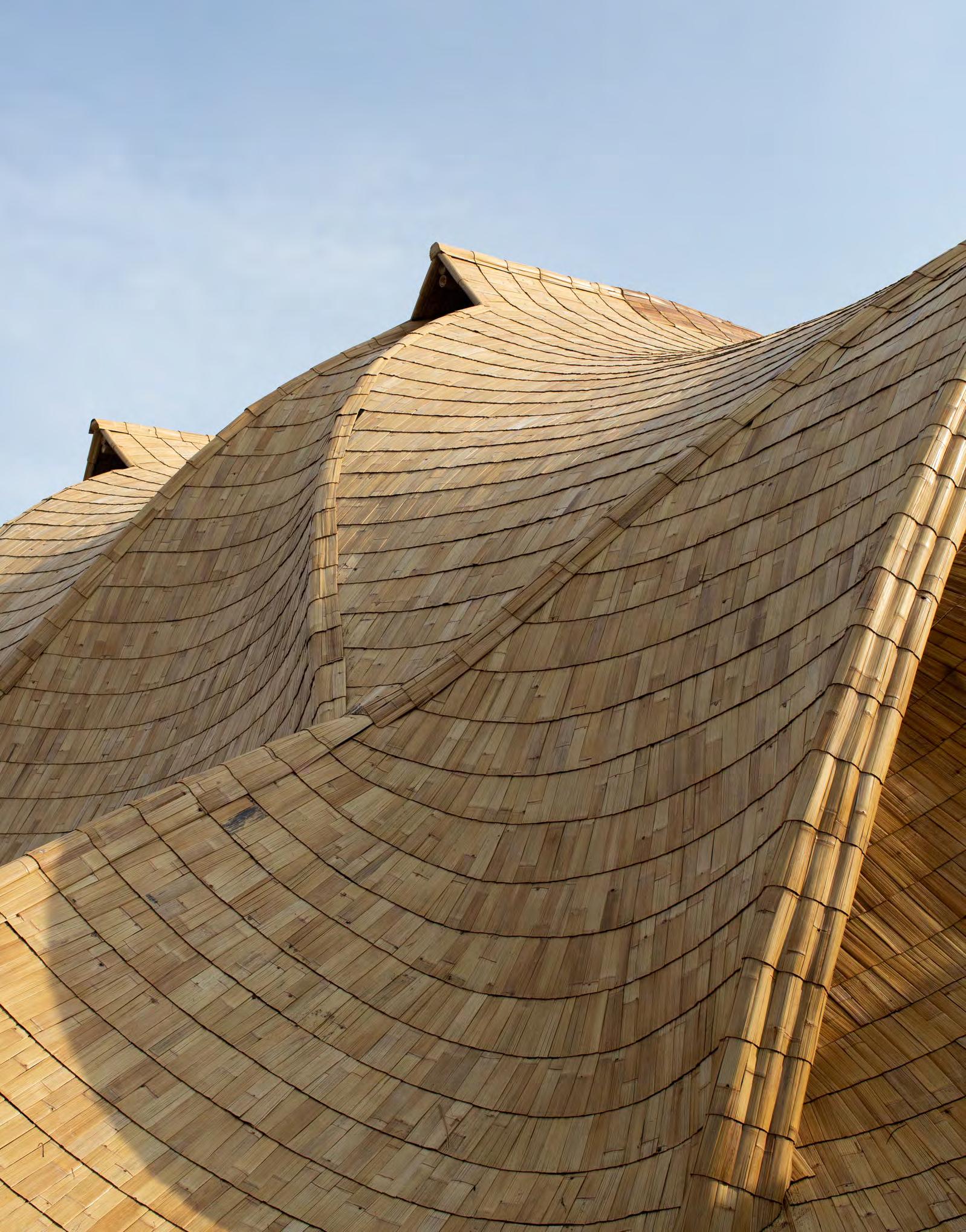
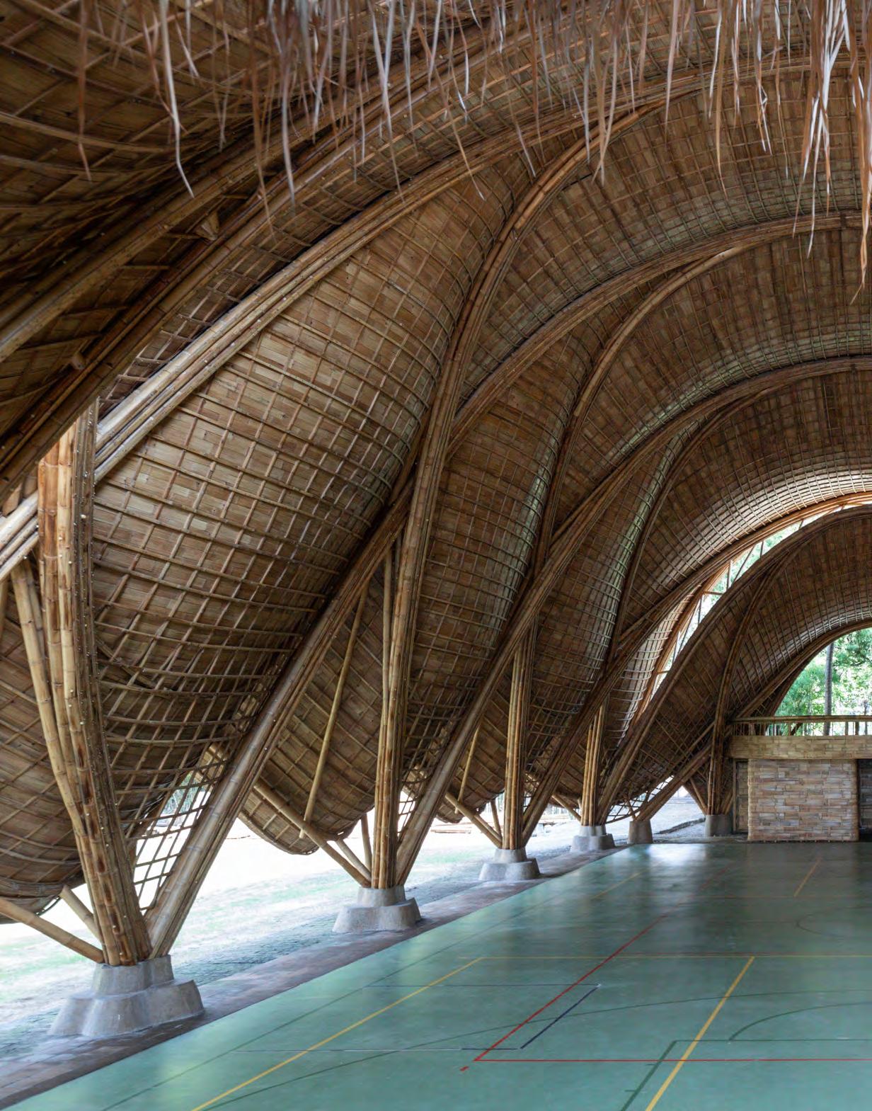
The Arc’s design was inspired by a mammal’s ribcage. While our own ribs are stabilized by a layer of muscle and skin, the structure’s long arches are held in place by tensioned anticlastic gridshells. Looking up from inside it’s hard to imagine this layer is supporting the arches draping overhead. “Biologically, these highly tensile microscopic tendons transfer forces from bone to bone. In the Arc, bamboo splits transfer forces from arch to arch,” says Jorg Stamm, the design conceptor.

The campus of the Green School in Bali
is dense and green, with structures made from natural materials using both ancient techniques and modern technology. At the center of an open field, bordered by palm trees, stands the school’s largest and newest structure—The Arc.
Standing underneath the Arc’s gracefully sloped roof you feel like you’re in the belly of a whale, staring up at detailed weavings and large arches. The Arc spans more than 60 feet across and reaches 45 feet tall. The structure is built entirely with bamboo; its weaving arches are not only aesthetically beautiful but an impressive feat of engineering.
Architecture firm IBUKU has designed the Green School’s buildings since the school opened in 2008, and they’ve built a world-renowned reputation for their innovative ways of working with natural materials. The Arc itself mimics shapes found in nature since the beginning of time, while also being a new type of building entirely.
When Green School founders Cynthia and John Hardy first conceived of the project, they too dreamt of building something new—a campus made from bamboo. More than a decade later, as the school prospered, the founders set out to build the largest assembly space on-campus.
The design concept stems first from its purpose as not just a place to meet, but as a school gymnasium. The vertical height clearance was non-negotiable as it was vital to meet local code requirements and to play sports unobstructed. The architects needed to have adequate natural light and airflow while also providing a sense of enclosure to the space. The arch of the bamboo inside reflects the path of a ball when being thrown through the air.
In its earliest stages, the simple solution was to use a roof over curved trusses. But the design team refused to settle for something so straightforward. Trusses were more likely to challenge height requirements and disrupt the feeling of unity they set out to achieve. Instead, the final design is made using a series of anticlastic gridshells to bind intersecting arches and create the carefully calculated shape.
“The gridshells use shape stiffness to form the roof enclosure and provide buckling resistance to the parabolic arches,” says Neil Thomas, the project’s structural engineer. “The two systems together create a unique and highly efficient structure, able to flex under load and allow the structure to redistribute weight, easing localized forces on the arches.
As a material, bamboo creates infinite variability when high precision engineering is applied. IBUKU and the Green School invested a lot of time and research answering every question they could think of before moving on to the engineering stage. The structural engineer, Atelier One, was in constant collaboration throughout multiple rounds of structural testing.
“The concepted structure for The Arc is totally unprecedented. Embarking on a design never before executed required some bravery and optimism,” says Rowland Sauls, the project’s architect. “The IBUKU architects started with modeling all the possibilities of what the building could be before exacting the shape and feeling.”
The Arc is a great example of how broadly natural materials can be used when combined with modern design and construction. This structure shows us how organic materials can be reimagined for their strengths to fit today’s architecture needs. As many across the globe are pushing for sustainable alternatives, the IBUKU team hopes this project can be a reference point for design teams in the future. g
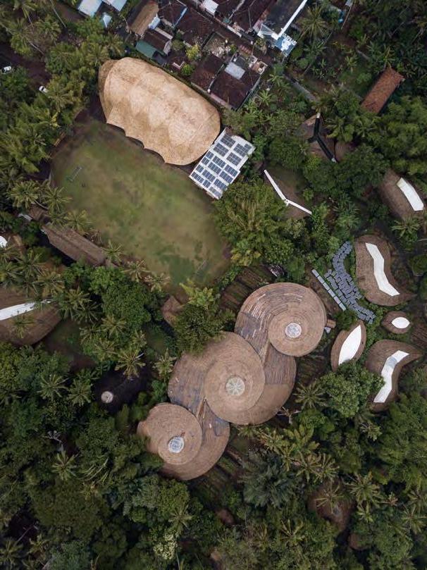
The Green School in Bali, sometimes referred to as the bamboo school, is a private, international school that teaches pre-K through high school. The campus highlights the natural environment and teaches sustainable practices.
DRONE PHOTO BY SASHA DE LAAGE ; DRAWING COURTESY OF IBUKU ELEVATION
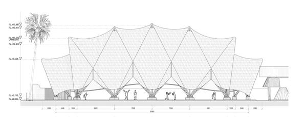
PROJECT: The Arc at Green School ARCHITECT: IBUKU LOCATION: Bali, Indonesia
Completion: 2021 Size: 8,180 square feet Structural Engineer: Atelier One Concept: Jörg Stamm

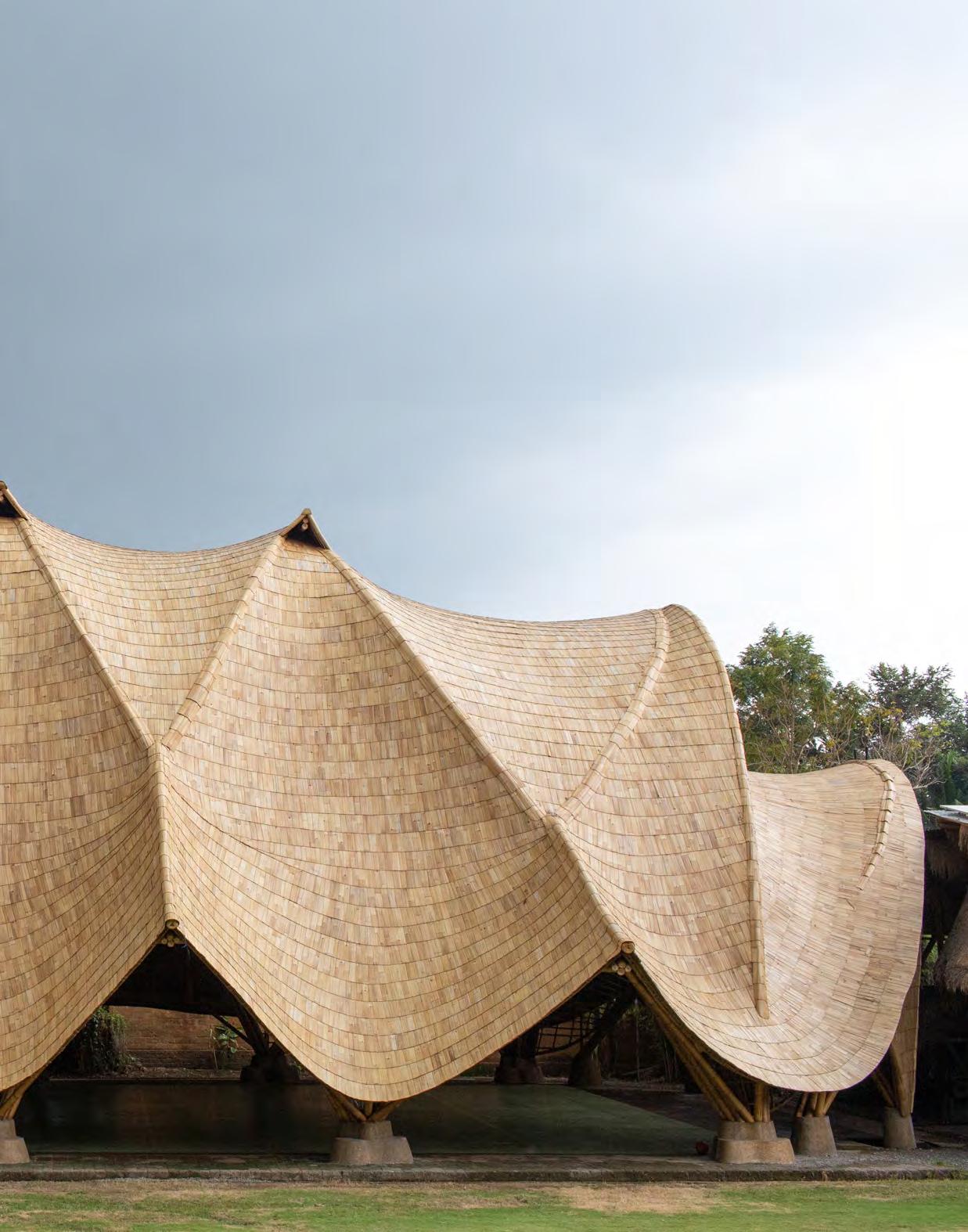

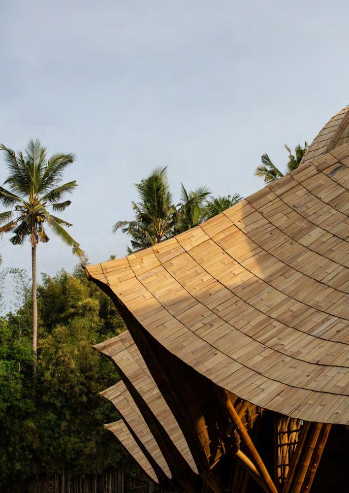
The multipurpose building was engineered to survive catastrophic events like storms and earthquakes.
The Arc was not only designed as a gym for children to use but also as an event space. The design team wanted to make a building that the entire community would enjoy being in together.
