I Didn’t Blow It


Going into college I had my mind set on being a biology major and following my dreams of becoming a physical therapist because I wanted to help out injured athletes and get them back on the right path. However, three weeks in I knew it was not the major for me, so I dropped it. Afterwards I was confused and scared because I did not have a back up plan. I sat down with my parents and talked about what I could do. They have always said I have such a creative soul and I would be great at designing things. I was trying to think of things I would be good at and after thinking long and hard, I decided it would be a great idea to try graphic design. My first class as a graphic design student was basic drawing. I was super nervous because I didn’t know if my drawing skills would be good enough for this class. Although I was not the best at drawing, I thought for my first time in that class I did pretty well. I got to explore and learn different skills I had no clue I was capable of. I had a blast in that class and knew this was the right major for me. My main goal for my future is to get a job as an interior designer.
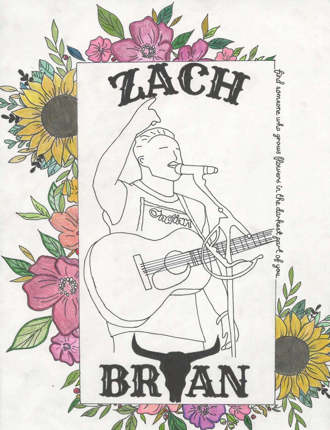
This was a piece I made in my Basic Drawing class. I have always loved doing drawings based off of celebrities I love such as Zach Bryan. My boyfriend and I were going to see a Zach Bryan concert in Nashville Tennessee that June which inspired me to create this drawing.
Bis estium reperna turion num am sentur? Quia dunt aut ent fugia doluptur resequias quiam si quamus dellest, a nonsequam ut quiaeriberro quam coriatur, volorio necepta tiosaerero qui doluptat.
Senem fugiani musandita nis int. Harchil licilit accuptata core, ulpa que niam
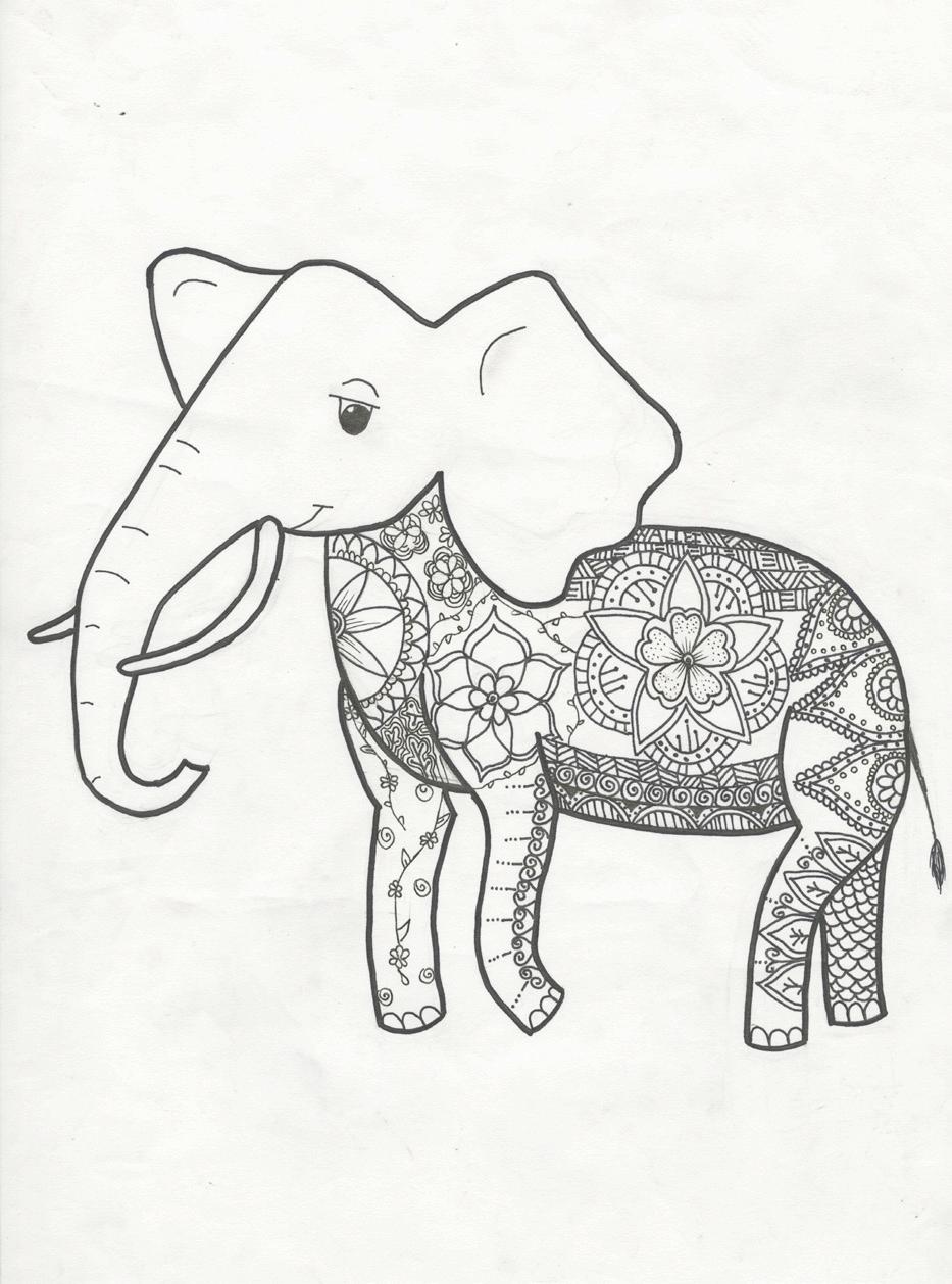
This was another drawing from my basic Drawings class and the main purpose of this drawing was to designa tattoo, so I chose to make an elephant tattoo with a henna style design on the inside.
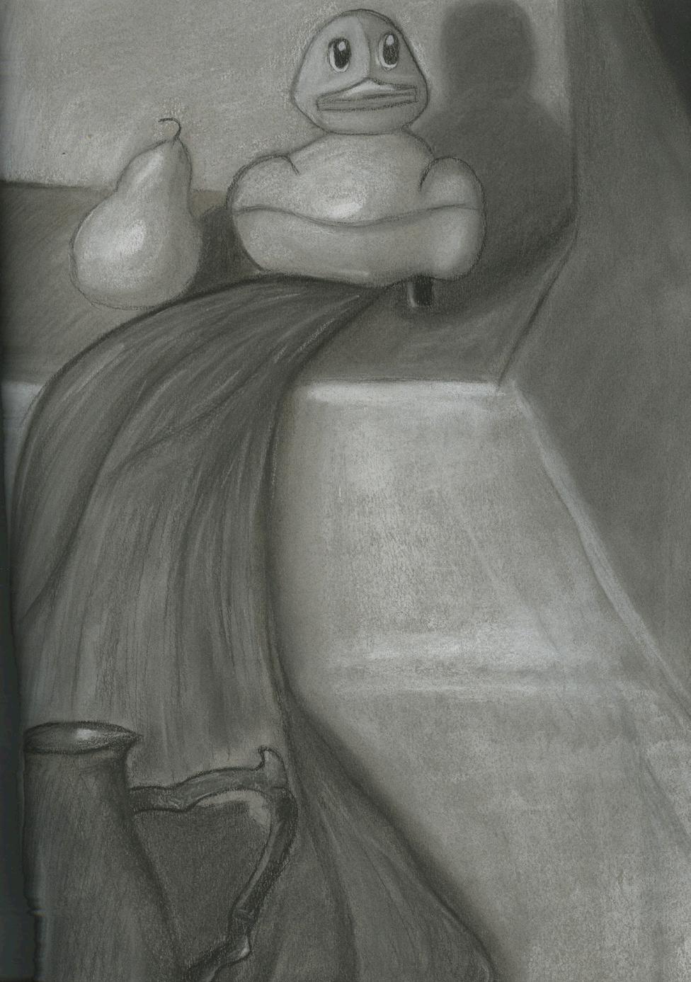
This was my first drawing in my basic drawing class at SNC and I was super proud of how it turned out for the first project in my first art class.
This project encourages you to work quickly and iteratively with both words and images. While it may feel fast-paced, that’s purposeful—it’s meant to help you focus on generating ideas freely and without overthinking, prioritizing quantity over perfection. As with all projects in this class, you can always refine and improve your work later. For now, dive in and start creating.
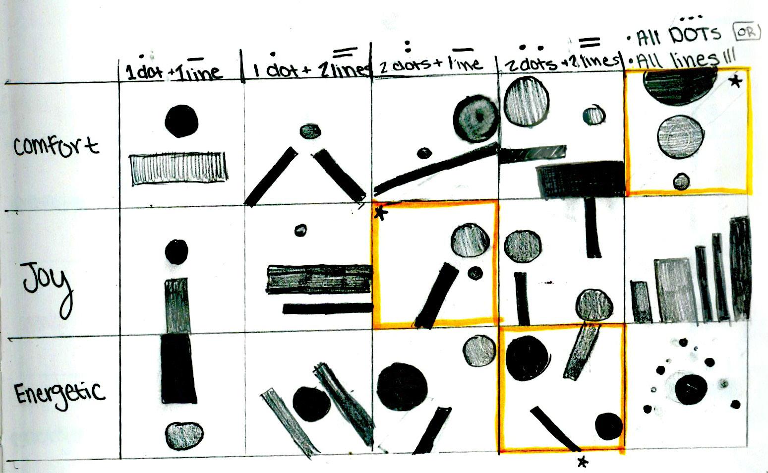
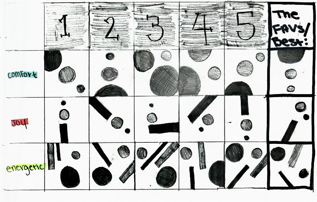
This project was not too difficult for me to make a well-crafted project; however, this project did test my patience. It seems like such a simple project because all you have to do is cut some lines and circles out and place them on a piece of paper, although that was not the difficult part. The difficult part was placing the dot and the lines so they would express the emotions. My three words/ energetic for this piece were Joy, comfort, and excitement. After taking a step back and looking at my three dots and lines I didn’t notice how much meaning you could get from a couple of dots and lines. This project was eye-opening and now I have a different kind of respect for abstract art. Overall, I really enjoyed this project. I think this project was very eye opening, and challenged me to think outside of the box to portray different feelings using only dots and lines.
In this project, you’ll explore designers and what counts as design. You’ll share what you find interesting, exciting, or even off-putting. Pick a designer, research their work, and create a short post about them with example images. Your classmates will be your audience.
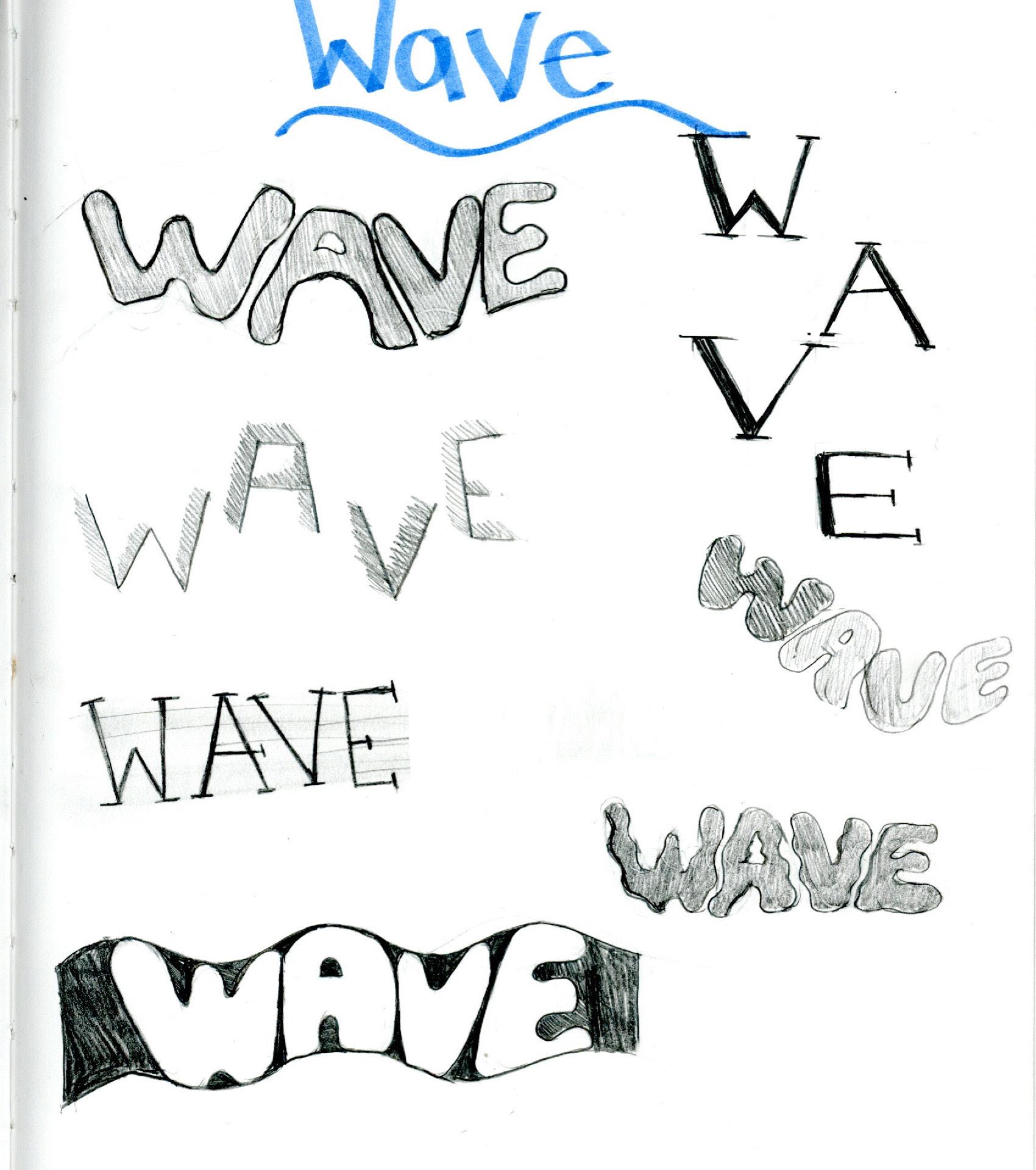
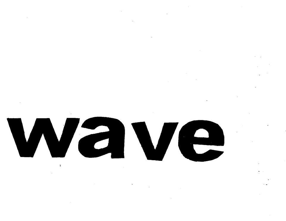
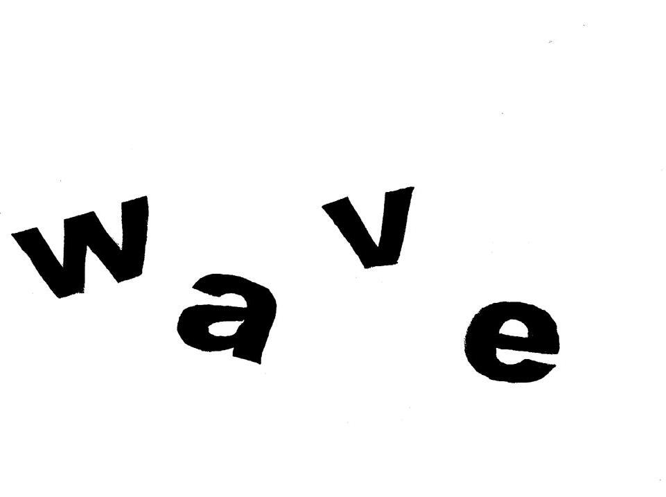
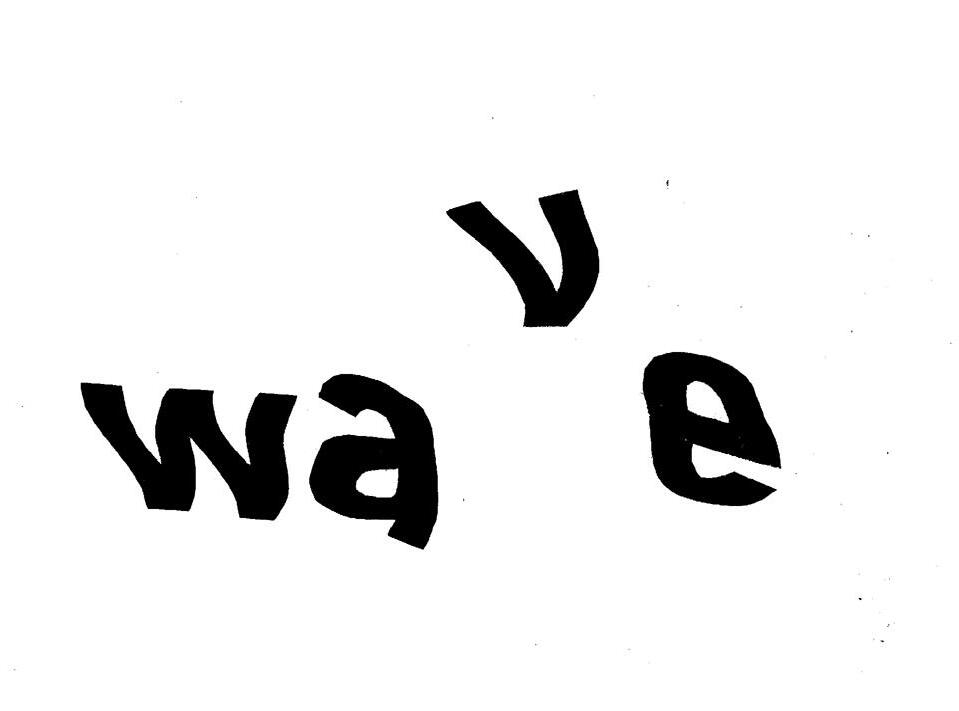
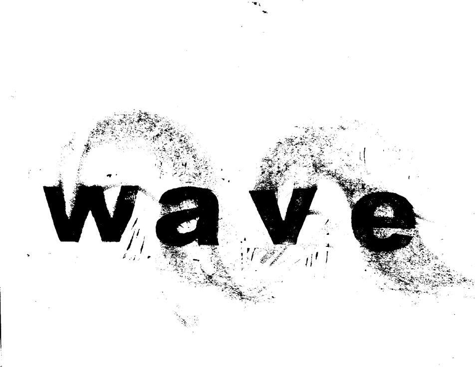
In this project I learned that printing can be very fun but also very frustrating at the same time. It was fun because I could be creative with words and how to give the words motion. I enjoyed trying new, different ways to make my word, wave, and symbolize waves in different ways. However, it was very frustrating when printing with the actual ink because some of the stamps left noise around the letters which was annoying. To get rid of the noise, I went to the printer with my letter cutouts and messed around on that to create different designs. Next time, I would choose a different word that involves a different action. I would also make a better mind map of what things revolve around that word. All in all, I thought this was a fun project that pushed me to think outside of the box along with being creative with it.
Luba Lukova
This project gives you the opportunity to explore designers and push the boundaries of what can be considered design. You’ll research a designer (or design group) and create a brief post showcasing their work, complete with example images. Your classmates will be your audience, so feel free to share what you find intriguing, inspiring, or even off-putting.
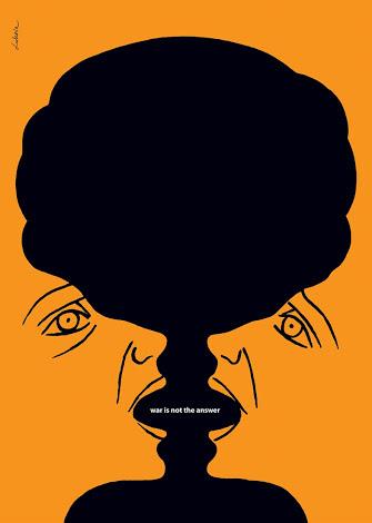
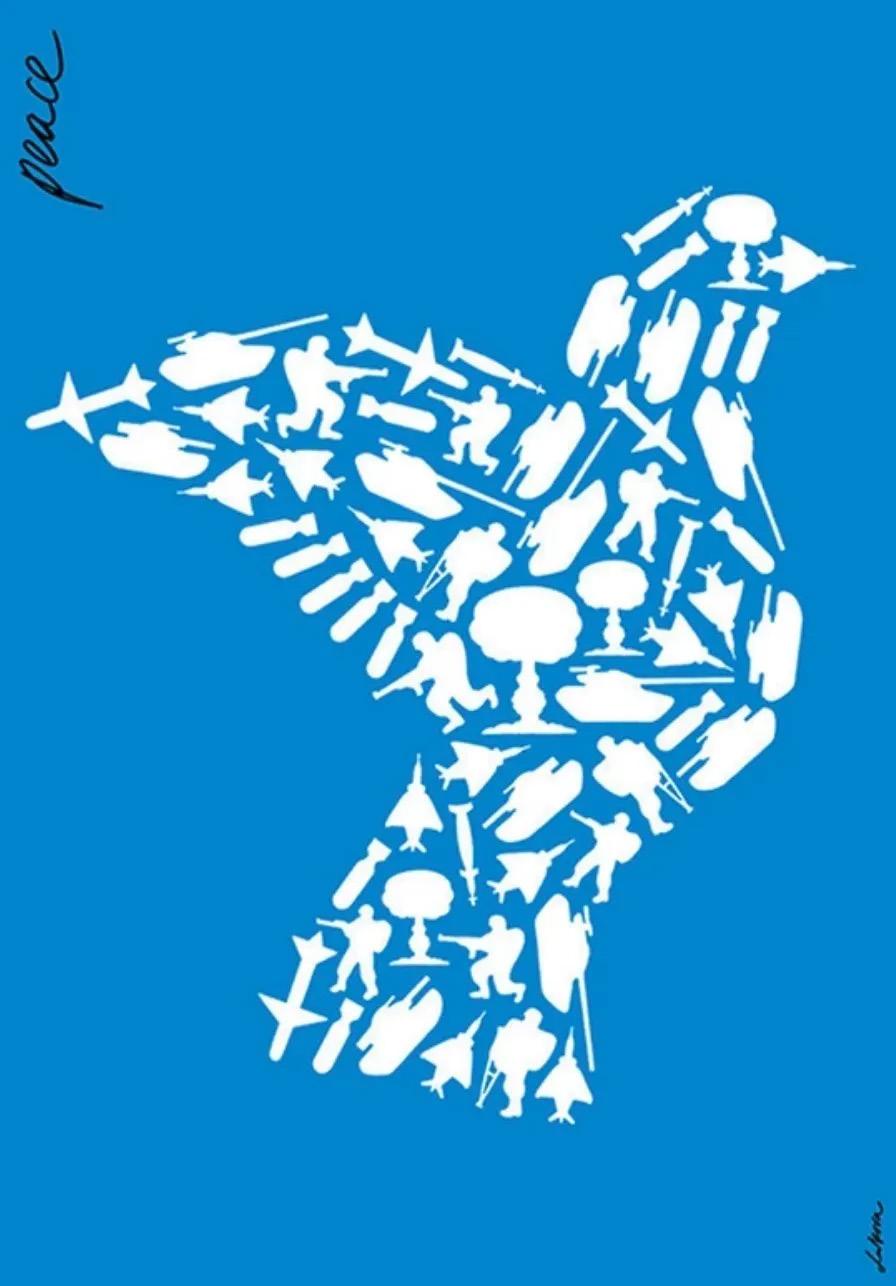
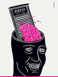
Born in 1960 in Plovdiv, Bulgaria was the amazing graphic designer named Luba Lukova. She is most well known for her very impactful poster which revolves around common issues happening in today’s society, including human rights, environmental issues, and social justice. Lukova created many minimalist design posters which portray complex issues through her use of bright, bold colors and vigorous shapes. Essentially, these posters act as a call to action, to change the world and make it a better and safer place for everyone. Luba Lukova is the best graphic designer because she creates impactful posters that address serious issues around the world.
In 2003, Luba Lukova’s most popular piece was called ‘Peace’. Luba Lukova designed this piece with a specific question in mind, “Do we protect peace by creating war?” In the image, there is a dove which represents peace; but, inside the dove is made up of soldiers, bombs, and other common military equipment. Luba created this metaphor of a dove and war to create an overall meaning of peace. However, this makes people reflect on the consequences that come with peace, because of the amount of violence that occurs to gain peace. Overall, this poster is promoting how the world needs to work together to create peace, not war.
You must invest time in thoroughly researching the object for this assignment. You are going to analyze its essential components and use several illustration styles to rethink it in various ways. It pushes you to think imaginatively, experiment with different resources, and attempt something different.
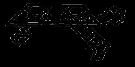
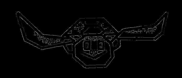
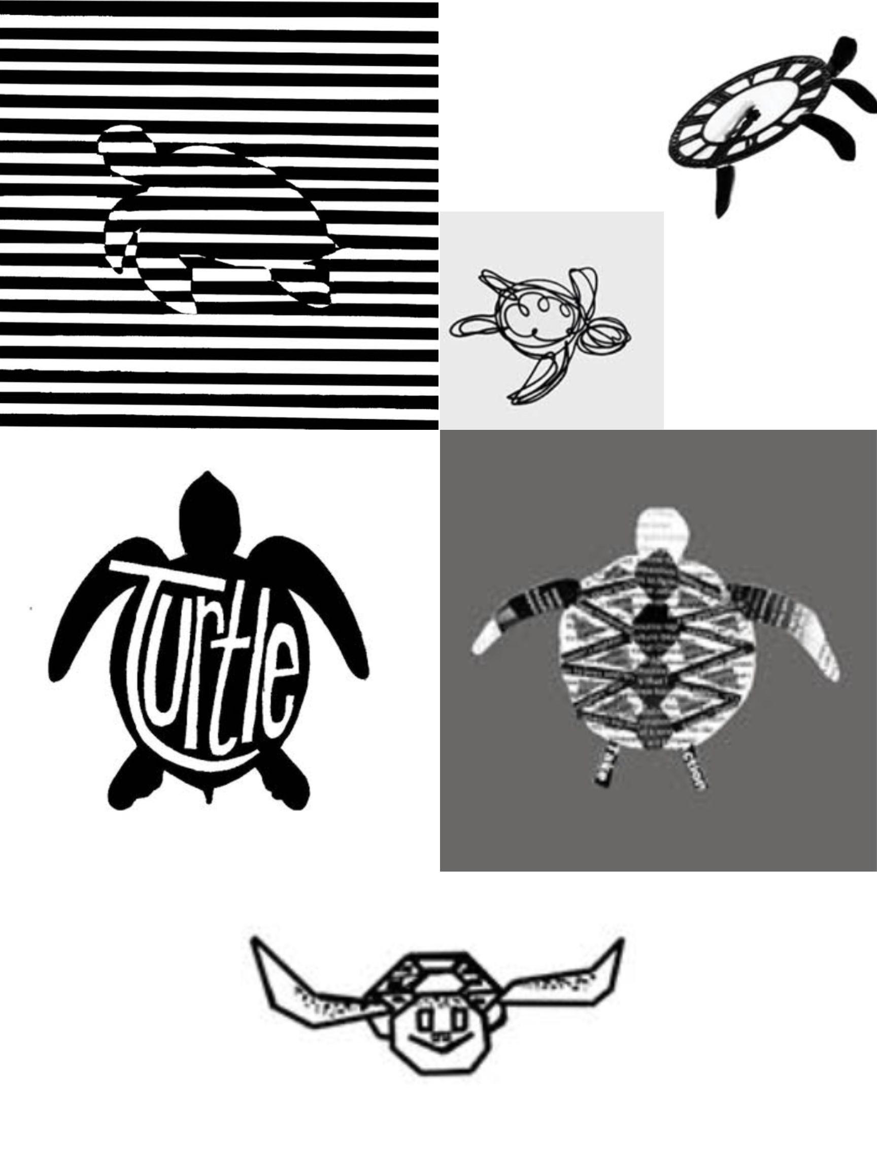
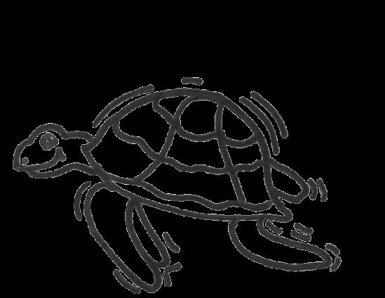
Sea turtles, what an amazing animal, not only are they absolutely beautiful, but they are graceful and intelligent animals that live in the ocean. I chose this animal because I thought it would be easy to design for this project. The most challenging part for this project was definitely type-collage. After a while, I was getting so sick of gluing little pieces of paper. I also thought it was a challenge because I was trying to get the turtle shell design and with type-collage, it was very difficult. The most enjoyable part for me was artist Malika Favre because I got to paint all the lines and make it fun and unique, however editing it was extremely annoying because all the lines were so close together and there were paint bleeds, which made it not as clean. All in all, I would say this one is my favorite because the design was so fun to do. This project introduced a new technology to me called Adobe InDesign and Adobe Photoshop, and because it was new to me it was very difficult to figure out. However, I learned how to remove backgrounds from my images. I also learned how to play around with the format/ layout of all my images. I think the most important things to use going forward are removing backgrounds and figuring out the layering. Overall, I really enjoyed this project. It was very fun to create because I could design freely and be creative with the positions of my sea turtle.
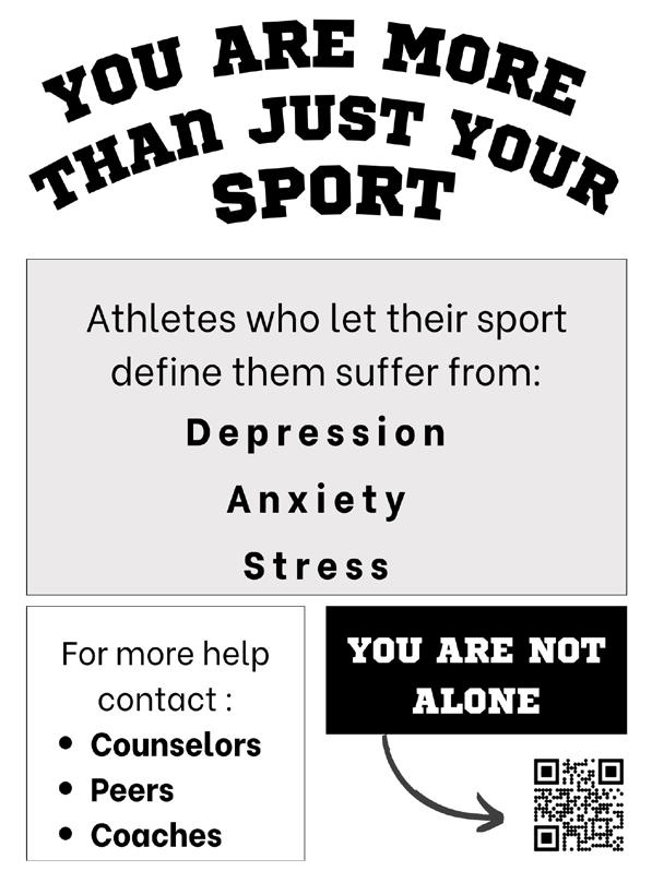
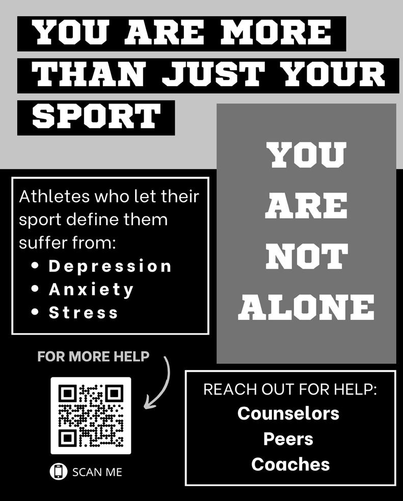
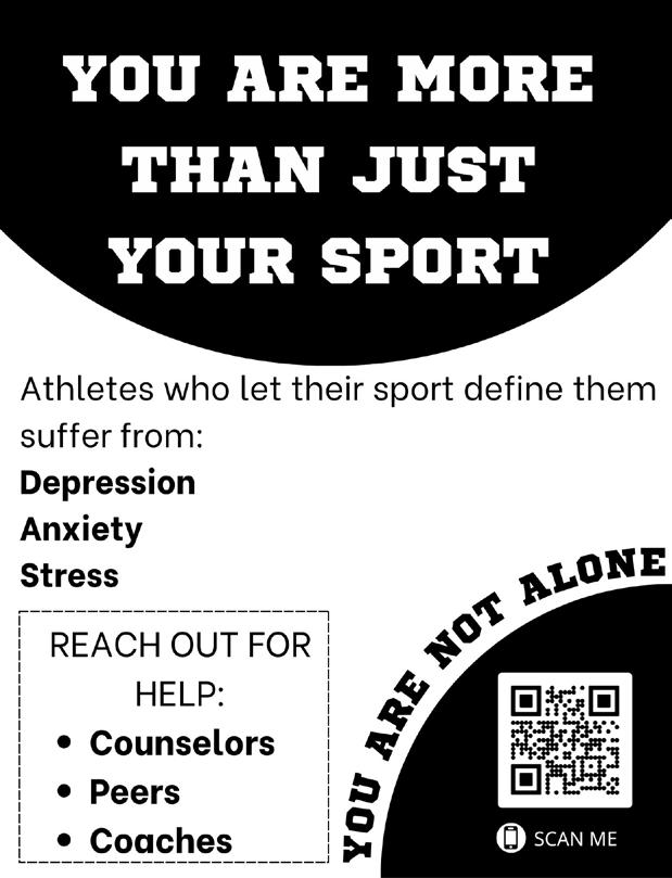
Public Service Announcements (PSAs) are free messages shared through media channels to inform the public about important issues, typically related to health and safety. They are usually issued by governments and can aim to warn, educate, motivate, or even criticize in order to inspire people to take action. For this assignment, you’ll choose an issue that matters to you, research it, write the text for a poster, and create a creative brief that outlines your vision for the design. You’ll then share this brief with another design student, acting as their art director and collaborator to help guide the development of the piece.
The main goal of this project was to engage with our assigned partner and get to know our partner better. I did not know my partner before this project so I tried to ask appropriate and respectful questions because it was our first time meeting. Therefore I didn’t want to ask any personal or deep questions. If I asked more questions about their personal experiences and life I could have created a better prototype. I felt pressured and rushed throughout some points when making this prototype because we had a limited amount of time. Although we did not have a lot of materials or time to work with to show our prototypes at their full potential, my partner and I were understanding and we explained what we had envisioned. Overall, I really enjoyed this project because we got to know our classmates better. It felt like a social experiment.
In this project the main goal was to ask your partner a series of questions to get to know them and learn about them. Then after getting to know them, we found a problem that we experienced while being here on campus. After acknowledging the problem, our task was to create a prototype of our invention to solve their problem.
The main goal of this project was to engage with our assigned partner and get to know our partner better. I did not know my partner before this project so I tried to ask appropriate and respectful questions because it was our first time meeting. Therefore I didn’t want to ask any personal or deep questions. If I asked more questions about their personal experiences and life I could have created a better prototype. I felt pressured and rushed throughout some points when making this prototype because we had a limited amount of time. Although we did not have a lot of materials or time to work with to show our prototypes at their full potential, my partner and I were understanding and we explained what we had envisioned. Overall, I really enjoyed this project because we got to know our classmates better. It felt like a social experiment.
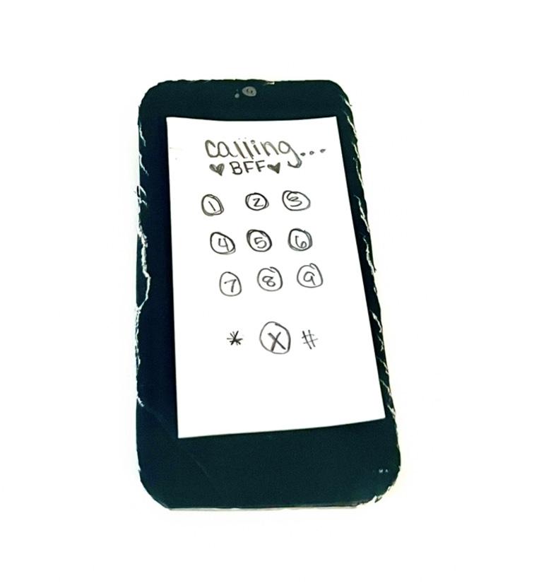
What is something that you've made in the past two years that you are proud of?
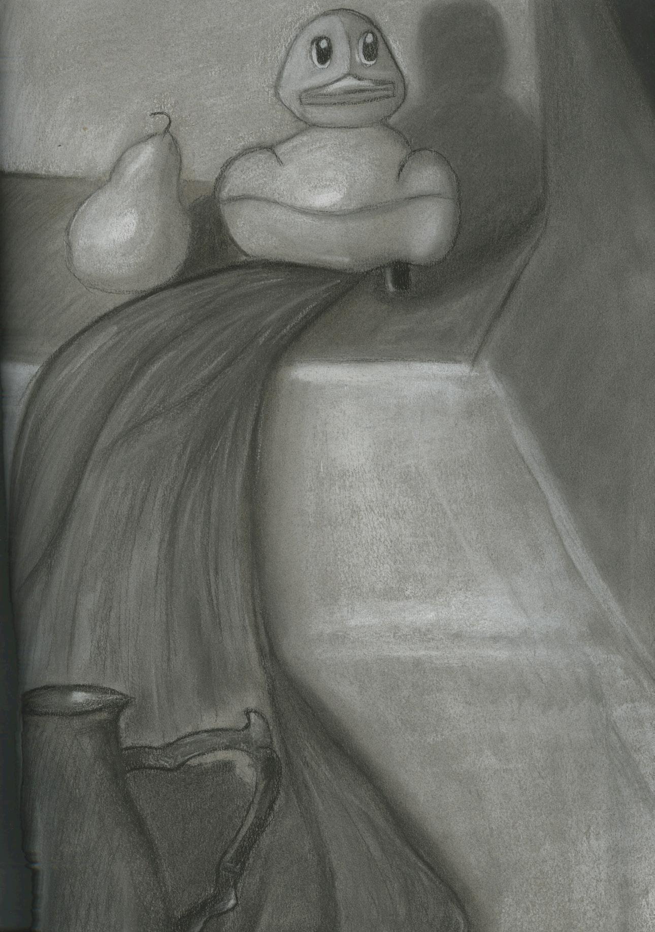
A piece that I am most proud of would be my still life because it was my first time drawing with charcoal and my first time shading. I was super proud of how it turned out. It’s not perfect, but I am very proud of it and for my first time doing this it wasn’t terrible.
What would you want to design or make for a living?
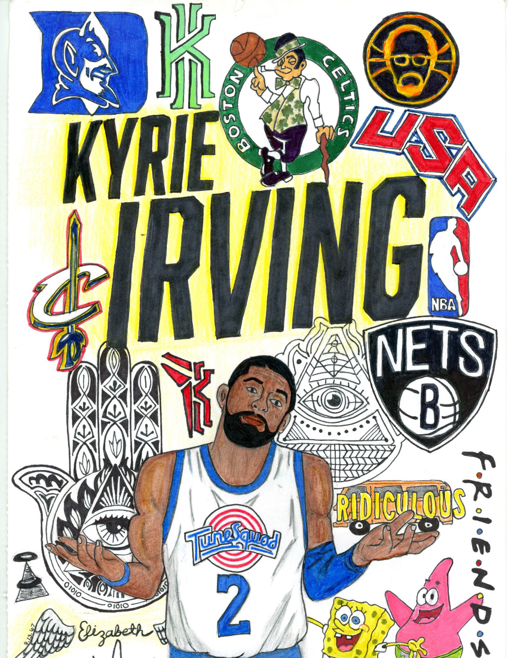
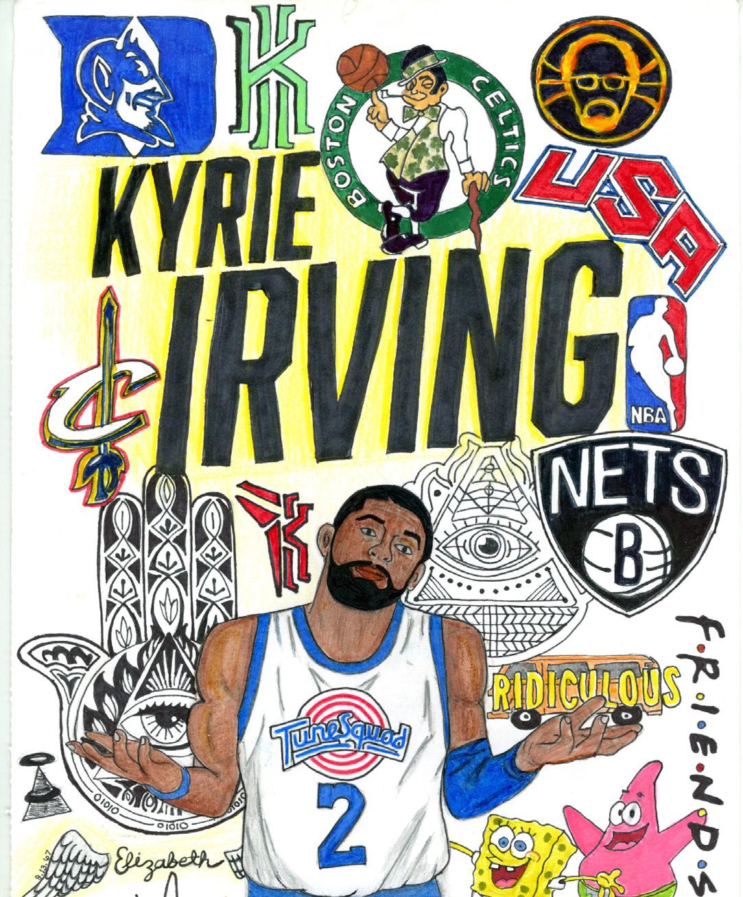
I would love to make fan art and sell it. I am a huge fan of music and follow so many different artists that I love and love their music. I could never pick a favorite. I am also a huge fan of sports. When I was younger I was obsessed with Kyrie Irving, a famous NBA player, and I made a picture when I was 13 with all of the teams he’s played on along with some personal things to him. It was always a dream of mine to have someone famous notice my work, so I did what every 13 year old would do and send it to all of the kyrie fan pages and himself so I could get noticed. As a matter of fact one of the fan accounts posted my drawing and got 8k likes, and the best part is Kyrie Irving follows that account. Who knows if he saw my work but maybe he did. I can always hope!