
18 minute read
The Role of Typography in Visual Design


Ewa Grabska, Iwona Grabska-Gradzińska & Teresa Frodyma
Introduction
The intention of our study is to investigate the relationship between three key domains: craft, technology and design. The study itself is based on the concept of visual design and illustrated by examples of selected aspects of typography. The key domains, on the other hand, are driven by visual perception – from a creative perspective. However, in order to understand the interaction between the user and the designed object, we need to look into the process, which consists of numerous ‘acts of attention’ often referred to as visual queries. It leads to the concept of dynamic perception, which is the resultant of external graphic information and a constructive mental process (Ware, 2008). Such dynamic perception is often associated with the concept of favourable circumstances which influence perception of particular objects considerably. Needless to say – the way they are perceived depends on the perceptive abilities of the individual, his/her experience and other skills.
An interesting example of the combination of the craft and design process is evolution of the font shape stemming from the craftsman’s creativity to the algorithms of the UTF encoding. The evolution relates to a variety of tools used to create text (from chisel to computer) and the need to consolidate a different set of signs (e.g. alphabets in different languages) into one, visually coherent whole. Coexistence of craft and design in the evolution of the font design is visible also in terminology – the term font, which is used nowadays, is seldom related to a metal typesetting, but it is mainly understood as a general lettering design, i.e. typeface. Although the font comes from the word fount, which referred to the foundry where metal fonts were cast, any conceivable association between letters and their functionality or legibility have been effaced over time (Austin & Doust, 2007). Designing patterns with literal motifs represented by interesting fonts is very popular nowadays.
It is known that our reality has been represented by images across millennia. First images appeared on cave walls while nowadays we watch pictures mostly on computer screens. In the age of Internet, designers often use visual design as a cognitive tool to amplify their mental abilities. While searching for a relationship between craft, technology and design
illustrated by typography, we will inevitably come across basic concepts of typography such as a letter, word or block of text, which, in modern times, have been restored to a form or image-like element by our gifted designers.
Technology and Typography
Handwriting tools
The shape of every single sign of writing is closely connected with the handwriting tools and later on, technology of replication and digitalisation. History of writing distinguishes a few stages of writing systems: mnemonic, pictographic, ideographic, logographic (word or phrase), syllabic and alphabetic (elementary sound). Different systems mean different number of signs, sign complexity, sign sets (open or close), etc.
Let us consider two variants of these systems to show the differences and their consequences.
The Chinese writing system was developed about 4000 years ago (Diringer, 1968, 98) and is based on a sign as an equivalent of the word or phrase (logographic). Currently, there are over 50 000 signs in the Chinese system (Majerowa, 1987, 294). The enormous number of different signs makes each sign very complex. Elements of each sign are characteristic due to the use of a soft brush (Frutiger, 2015, 160; Majerowa, 1987, 294). Brush motion and circles and arcs are converted to straight lines. It is not possible to hit the brush, you have to make brush strokes, which is clearly visible in the picture. It is difficult to change the direction of movement without interrupting it. Lines enlarge while going down. These shapes can be compared to the older shapes of Chinese signs when they were drawn on silk with a bamboo stylus (Diringer, 1968, 540).
The idea of basing the writing system not on its physical properties, but on the sound of speech (alphabetic system) started in Phoenicia, where the previous ideograms were replaced by the symbolic signs related to sound. The example of such a process is shown in the Figure 1. This idea reduced the number of different characters, which allowed their shapes to be simplified. The Latin alphabet is derived from Phoenician, Greek and Etruscan alphabets. Since the number of sounds used by Romans was not very large, only 19 characters (later increased to 26 signs) were used, which represented the entire language system. While diffusing through the Europe, the other “barbaric” sounds were added in several ways: by redefining original letters (e.g. “c” in Polish, Czech), combining two or more of them to express one sound or adding a diacritic symbols as a dots, dashes and hooks to their Latin base (as in the word “church”, which is “č” in Czech,“cz” in Polish and “tsch” in German) (Diringer, 1968, 553).
Figure 1. The idea for the letter “a” starts from the pictogram of an ox head, then Phoenician letter aleph, derived from the meaning “ox”, Greek and Latin intermediate shapes, to finally show the letter “a” from Caroline tradition (in the lats picture). Graphic designed by Teresa Frodyma (Frodyma, 2010) on a base (Frutiger, 2015).
The character’s shape refers to the tool. The tool for forming the shapes of Latin letters is a chisel either for monumental writing (with recognizable angular shapes) or for everyday texts: a stylus on wax tablet, a brush on the walls, a cane pen and quill. The chisel causes the line cross-section to be formed into V-shape grooves which end in thin, perpendicular segments called serifs to flatten the line. The width of the line is based on two sizes: thick or thin.
Initially, the text’s direction was vertical in China and horizontal in the Roman Empire. The direction was not specified: there are inscriptions written down from left to right, inversely and boustrophedonically, i.e. imitating the movement of an ox during ploughing (name comes from “ox” + “turn”). Nowadays, the direction is most often unified horizontally from left to right, both in Europe and in China – where there is contemporary
European influence (Majerowa, 1987, 302). The rectangular shapes of text blocks, their proportions, the idea of a margin as a text protection against touching, the margin size, etc. – were standardized in the Great Library of Alexandria (Bieńkowska, 2015, 34).
The print invention
The most important idea behind Gutenberg’s invention was not that his fonts were movable – since he was not the first visionary who did something similar, but the adjustable hand mould which allows an easy and precise replication of the shape of any font in heavy duty metal casting. They were identical, easy to recreate and relatively cheap. The necessary elements of the invention were a modified wine press and a printer ink.
As far as visual design was concerned, Gutenberg was not innovative – he reproduced the appearance of handwriting and page layout of the manuscript. For that purpose, he went as far as preparing many more different metal types than the number of alphabet letters to simulate the diversity of handwriting.
The time for visual design in prints came later on, when the similarity with handwriting lost its meaning. The shapes of letters started to be composed on a base of geometrical dependencies, following the rules of readability. While the founder’s vision and effort were important, craft soon became technology, thus rendering technical aspects such as alloys and quality of paper paramount. Growing capabilities were also echoed in the fashion. For example, didone typeface designed by Giambattista Bodoni about 1780 A.D., drew attention to an extreme contrast between thick and thin lines, especially hairline serifs, which was technologically possible, and thus very popular (Tomaszewski, 1996).
Unification and Automatization
First period of the history of printing, letterpress printing, not only accelerated the craftsmen’s work but also rendered them replicable. That, however, did not constrain the individuality of each design both on the level of font shape (founds of unusual characters were possible) and layer design (leading as a distance modifier among page elements thin strips of lead that were inserted between lines of type in the composing stick to increase the distance between them). The act of printing was very quick, but preparing the page for the print – quite the opposite. The advantage of the technique was possibility of adjusting any element manually. Disadvantages – there was no other possibility than adjusting the page manually, and the typeset was limited to the specific language, actually, the specific set of metal fonts distinguished only visually. The next phase of the technology development was to automatically prepare whole lines of text (e.g. linotype) but this system was not as adjustable as manual one. Later the identification base on binary encoding was introduced and the signs start to be digitally resolvable, but in limited range of Latin alphabet.
Full solvation of this problems is contemporary digital encoding and digital printing. First of all, the Unicode standard provides consistent encoding, representation, and handling of text expressed in most of the world’s writing systems. Digital desktop publishing and typesetting software applications allow to use algorithms to automatize the typesetting with taking into consideration context and conditional rules, what largely cover the human decision, but final adjustment can be still made by expert. Last, but not least the tag systems description, especially Text Encoding Initiative (TEI) gives the possibility to append semantic information to the typesetting, especially manuscripts and old prints specific features.
The new technology can also extend the perception of the text, for example while using QR-codes to create augmented reality using cell phones (Argasiński & Woynarowski, 2019).
Visual Design and Typography
Our research of the relationships between craft, technology and design often refers to the world of art, typically in a visual form, as one of the important sources for explaining the role of this coexistence. Typography defined often as design to facilitate reading and reception can also be considered in the visual art world that expresses human creative skill and imagination.
Shape of the sign
Let us consider the following example based on Chinese language. Written Chinese contains characters which do not constitute an alphabet. In Chinese writing system, a character can represent one syllable of spoken Chinese and may be a word or a part of a word. The characters are often composed of parts that may represent physical objects, abstract notions, or pronunciation. The formalized Chinese writing system based on the concepts of strokes and radicals. Strokes present the basic gestures used to write Chinese characters, while radicals are the building blocks of all Chinese characters.

Figure 2. Stages of transformations of the concept of music in ideographic writing. Graphics drawn by Wojciech Grabski on a base (Donnini, 1988).
In Chinese language the symbol 乐 means music. The prototype for this symbol was the instrument consisting of five drums as the five tones of the musical scale on a stand of wood.
In other words, the abstract concept of music from the symbolic level is transformed into the practical levels that includes musical instruments. Figure 2 presents the main transformations of the concept music into the word “music” in Chinese language. In this figure the most right is presented simplified character, preceded by traditional ideograph. It turns out that the symbol for music pronounced differently also means joy or pleasure, because music is a source of gladness (Donnini, 1988).
Textblock as a visual design tool
In European alphabetical systems there is no such a direct connection between shapes and signs. In the past there were alphabets based on picture identification, e.g. the picture-based Phoenician alphabet, but later Greek and Latin systems, despite derived from the mentioned one, are based on phonemes so each letter responses to sound, not visual idea of the object. On the other hand, there is another field of design exploration: shapes of textblocks. Each word consists of letters, succeeding to create a line and then block of text. Their size and shapes are often used for visual organization and hierarchy of the text, but sometimes the shape of the text block is one of the forms of artistic expression.
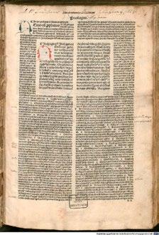
Figure 3. Separate rectangular block of main text and two columns of comments in the system called modus modernus (Nicolaus <de Lyra>, 1488).
Figure 4. Block of text in the modern book used in artistic manner. (Danielewski, 2000)

The blocks shown in figures 3 and 4 show the way of structure organization using textblocks, with no reference to real world shapes or any others symbolic representation. The other, graphical forms of text are more often used in the poetry. One of the famous collection of poems based on the idea of essentiality of the poem’s visual shapes is Calligrams written by Guillaume Apollinaire and published in 1918 (Apollinaire, 1925/1973). The lyrics are the interesting form of ekphrasis, were the same peace of art is a drawing and ekphrasis describing itself (see figure 5).
Figure 5. Examples of Guillame Apollinaire calligrames published in Calligrammes: Poems of Peace and War 1913-1916 (Apollinaire, 1925/1973, 64, 70, 74).
The similar idea was used in the book by A.A. Milne, Winnie-the-Pooh. (Milne, 1926/1993) The thought of the Piglet, one of the characters, while being carried away by Kanga is shaped in the way of jumping element (see figure 6).
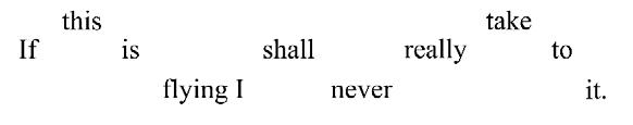
Figure 6. A.A. Milne’s character way of thinking formed in the way of jumping.
Another example of this way of visualization within the text is shown in the Lewis Carroll’s novel Alice’s Adventures in Wonderland (Carroll, 1916/2006). Example is presented in the figure 7.
Figure 7. The Mouse’s Tale from Alice’s Adventures in Wonderland (Carroll, 1916/2006).
In the 20th century, architecture and visual arts began to have an impact on lettering and typographic design. Typography has been placed in the context of “pure” art. Then, as the first field of design, typography was revolutionized by the computer, thanks to which it took a central place in design. Modern designers freely combine typography, lettering and image (McDermott, 1999). For example, the shape of the letter can be used as an item of real world representation because of the visual similarity. Figure 8 presents a poster of the play “Mary Stuart”, where the author, Polish artist Władysław Pluta, used letter “r” as an executioner’s ax and letter “a” as a trunk, which is an allusion to the Mary Stuart death (Pluta, 1996).
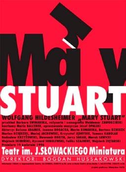
Figure 8. Poster “Mary Stuart” designed by Władysław Pluta.
For designers with experience in typography and looking for similarities, the alphabet can be a playground where letters transform into things and vice versa (McAlhone & Stuart, 2010). Figure 9 shows a visualization of the word fire composed of the letters of the word. The use of letters of a word to express its meaning represents a limited language for solving the complex issue. But, the conditions of the problem suggest design decisions, which make it easy to find a solutions (Wilde & Wilde, 1991).

Figure 9. Visualization of the word fire designed by Wojciech Grabski.
Designing patterns with letter motifs is another example of breaking the association of letters with functionality and readability. When choosing an appropriate typeface that best expresses the style of the design, practical knowledge of typography can be useful (see figure 10).

Figure 10. The pattern with the use of Tango BT font designed by Wojciech Grabski.
Translation of Plastic Arts into the Visual Shape of Poem
Let us consider a typical ekphrasis, e.g. poem inspired by painting. The contemporary artist, Bronisław Linke (1906–1962), presented in 1951 an oil on canvas titled Cannibalism. It depicts an extremely close-up scene of a huge human mouth ready to eat a sandwich with a small frightened man as a piece of meat among onion rings. In 1980 the poetic ekphrasis (entitled Sandwich with the Human) was written by Jacek Kaczmarski (1957–2004) and presented with the music of Przemysław Gintrowski (1951–2012) in a form of a song (Kaczmarski, 2010; Kaczmarski et al., 2014). Its lyrics consists in broken rhymes, which is an extremely rare example of a visual text organisation in the field of poetry. They correspond with the story of the sandwich preparation: using a sharp knife for cutting the bread, vegetables, as well as adding butter and herbs. The main cannibalistic activity is cutting – thus the main visual typographic character is a hyphen, which strikes the word and divides it into two pieces. The hyphenation of the text emphasises the jagged phrases (Grabska-Gradzińska & Wasilewska, 2011). Additionally, this unusual division avoids traditional longer lines of text by forming crescent-shaped verses. These sets of 9-line strophes with short first and last lines give us a repetition of rounded shapes.
Let us translate the first two strophes of the poem:
A sharp knife goes through the bread with breadcrumbs sprinkling I sink deep into the fat and tears
That’s the onion yellow ring pins me down from the head up to the nerve root spices, salt they are put into nose pepper too I don’t want to Be gobBled down
These are typographical means of expression – it can be noticed that hyphenations are the only visual elements which disappeared during reading out loud, and in the song they are replaced with a peculiar rhythm
and syllables accentuated in an unusual amphimacer metrical foot (Gajda, 2009). When we appose it with the painting, we can notice that this is a typographical equivalent to the graphical cuts and roundings in the composition: extreme close-up with body part cuts, cross section of a slice of bread and the rounded shape of open mouths, onion rings and nails. The visualization is presented in Figure 11a and the corresponding text shape in Figure 11b.

Figure 11 a, b. Cuts and rounds represented by oval shapes and dashed lines, designed by Iwona Grabska-Gradzińska on a base (GrabskaGradzińska & Wasilewska, 2011, p. 228).
Since all the typographic tricks disappeared while listening to the poem, how does it work as a song? In the music there is a lot of dramatical pauses after the vocalised stress on the last syllable (in polish poetry it is rather a rare situation, introduced here by the hyphenation) and repetition of the one characteristic motive: triton and halftone (e – ais – h) expanding and growing in intensity during the song (Gozdecka, 2017).
Conclusion
The purpose of our considerations has been to draw attention to the inspirational role of typography in discussing the most important design problems, such as the essence of creativity, the vitality of craft skills or the role of computer technology in design. Typographic design reflects the most important technical innovations. The typography itself, firmly rooted both in the traditional approach and oriented towards new challenges of both pure art, and new practical applications, can be treated as a significant tool for any graphic designer.
References
Apollinaire, G. (1973). Calligrammes: poèmes de la paix et de la guerre (1913-1916) [Calligrammes: Poems of Peace and War 1913-1916]. Gallimard. (Original work published 1925)
Argasiński, J., & Woynarowski, J. (2019). Augmented reality book as a narrative medium. In Blashki, K. & Yingcai, X. (Eds.), Proceedings of the International Conferences : Interfaces and Human Computer Interaction 2019, Game and Entertainment Technologies 2019 and Computer Graphics, Visualization, Computer Vision and Image Processing 2019 : Porto, Portugal, July 16-18, 2019 (327–332). Lizbona: IADIS Press.
Austin, T. & Doust, R. (2007). New Media design. Laurence King Publishing Ltd.
Bieńkowska, B. (2015). Książka na przestrzeni dziejów [A book throughout history]. Warszawa: CBIiD.
Carroll, L. (2006). Alice’s Adventures in Wonderland. Gabriel Sons & Company. Retrieved from Project Gutenberg: https://www.gutenberg.org/ files/19033/19033-h/19033-h.htm. (Original work published 1916)
Danielewski M. (2005). House of Leaves. New York : Pantheon Books.
Diringer, D. (1968). The alphabet: A key to the history of mankind. New York: Funk & Wagnalls.
Donnini, R. (1986). The Visualization of Music Symmetry and Assymetry. In Hargittai, I. (Ed.), Symmetry, Unifying Human Understanding. Pergamon Press.
Frodyma, T. (2010). Around the letter “A”. In Michalska-Suchanek, M. (Ed.), Gliwice School of Entrepreneurship Jubilee Book. Gliwice: GWSP.
Frutiger, A. (2015) Człowiek i jego znaki [Man and his signs] (trans. Tomaszewska C.). Kraków: D2D.
Gajda, K. (2009). To moja droga. Biografia Jacka Kaczmarskiego [My road. Jacek Kaczmarski Biography]. Wydawnictwo Dolnośląskie.
Gozdecka, R. (2017). Trzy wiersze Jacka Kaczmarskiego inspirowane malarstwem polskim. Z muzyką Zbigniewa Łapińskiego i Przemysława Gintrowskiego [Three Poems by Jacek Kaczmarski, Inspired by Polish Painting. With Music by Zbigniew Łapiński and Przemysław Gintrowski]. Annales Artes, 15(1).
Grabska, I. & Wasilewska, D. (2011). Lekcja historii Jacka Kaczmarskiego [History lesson of Jacek Kaczmarski]. Demart.
Kaczmarski J. (2012). Kanapka z człowiekiem [Sandwich with a Human]. In Kaczmarski, J., Antologia poezji [Poetry Anthology]. Demart.
Kaczmarski, J., Gintrowski, P. & Łapiński, Z. (2014). Muzeum [CD]. Pomaton EMI.
Majerowa, J. (Ed.). (1987). O książce [About the book]. Wrocław: Ossolineum.
McAlhone, B. & Stuart, D. (2010). A Smile in the Mind – Witty thinking in graphic design. Phaidon Press.
McDermott, C. (1999). Design. Carlton Books Limited.
Milne, A. (1993). Winnie-the-Pooh. London: Mammoth. (Original work published 1926)
Nicolaus <de Lyra>. (1489). Biblia : mit Postilla litteralis von Nicolaus de Lyra. Deutsche Digitale Bibliothek, München, Bayerische Staatsbibliothek – 2 Inc.c.a. 2288-3. https://www.europeana.eu/pl/item/358/ item_DBD2ER7CB45KLIKWSVEKEGU6JJLGI34
Pluta, W. (1996). Mary Stuart [poster]. In Lenk, K. Myślące plakaty [Thinking posters]. 2 + 3D, 9 (IV/2003).
Tomaszewski, A. (1996). Leksykon pism drukarskich [Lexicon of printing letters]. Warszawa: Wydawnictwo Krupski i S-ka.
Ware, C. (2008). Visual Thinking for Design. Elselvier Inc.
Wilde, J. & Wilde, R. (1991). Visual Literacy – A Conceptual Approach to Graphic Problem Solving. Watson-Guptil Publication.


