HISTORY
HISTORY
1893: Hampden-Sidney faces Randolph-Macon for the first time; losing their second game 12-6.
1894: The Garnet and Grey football team gained their first-ever victory, defeating the College of William and Mary 28-0.
1901: H-SC defeats Richmond 70-0 in a game that still stands as the largest margin of victory in school history.
1907: The first visual reference to the interlocking HS is seen on sporting uniforms.
1912: Charles “Yank” Bernier, class of 1912, becomes H-SC’s first fulltime head coach, and the College’s athletics teams begin referring to themselves as the Tigers.

With a long-standing tradition of fierce competition and diehard fans, HampdenSydney College Athletics is a force to be reckoned with. Its branding should reflect this tradition of excellence.
Baseball was the first sport which received the attention of the students. In the spring of 1891, two brothers by the names Horace J. and A.D. McFarland entered the College and challenged the strongest college aggregation in the South; the University of Virginia. The College’s first intercollegiate game resulted in a 9-7 loss.
In the football line the old Rugby kicking game was played every fall among the students, with a match game or two with the Union Theological Seminary students across the way. In 1892, William Bull of Norfolk entered the College, bringing with him the knowledge of and enthusiasm for the game of football played by the great American universities. He set to work and trained a team, which played but one game that season on Thanksgiving day, with Richmond College, and was defeated by a score of 24-0 (1992 Kaleidoscope & Football Magazine) 34-0 (1906 Kaleidoscope).


BRANDING
A collection of visual elements and intentional aesthetics used to communicate our institution’s purpose, goals, and tone.
What is BRAND IDENTITY?
LOGO MONOGRAM
PRIMARY MARK
Interlocking HS
The Hampden-Sydney Athletics logo is the representative symbol for sports and athletics. It is used exclusively for athletics programs and on spirit wear. It is not to be used for institutional or academicrelated programs and should never be locked up with the H-SC wordmark or other H-SC branded logos. The minimum size for the interlocking HS is .5 inches wide with a clear space of .25 inches.
LOGO
Athletics Wordmark (New)
The new Hampden-Sydney Athletics wordmark is set in the typeface Pragmatica Extra Bold. It was created in 2024 to pay homage to the slab serif font highly used and sought after in the campus store. It should be used exclusively for athletics. It is not to be used for institutional or academic-related programs, should never be locked up with the H-SC College wordmark or other H-SC College-branded logos, but may be combined with other athleticsbranded marks. The minimum size for the 3-Line Athletics Wordmark is .75 inches with a clear space of .25 inches. The minimum size for the 2-Line Athletics Wordmark is .5 inches with a clear space of .25 inches.
ATHLETICS WORDMARK AND
TAGLINE
LOGO TIGER HEAD SUPPORTING MARK
Tiger Head
Based off an illustration from Hampden-Sydney’s 1948 Kaleidescope, this tiger head was first introduced in the spring of 2024. The Hampden-Sydney tiger head is the representative symbol for sports and athletics. It is used mostly for athletics programs and on spirit wear. It is not to be used for institutional or academic-related programs, and should never be locked up with H-SC Collegebranded logos. The minimum size for the tiger head is 1 inch with a clear space of .25 inches; unless used as a watermarked background.

LOGO TIGER HEAD
Tiger Head
When displayed on a dark background, the tiger head should be displayed as shown with its combined outline and background in white. It should never be displayed without the background, which would cause it to look like a negative image.
When used as a background watermark, the tiger head may be cropped, but not altered.
AS WHITE ON DARK BACKGROUND
TIGER PAW
LOGO
Tiger Paw
The smooth tiger paw is a supporting mark for athletics. This is an updated 2024 version where the paw is accompanied by a double outline (like the interlocking HS). In this update, the paw is rotated at a 21° angle. It should never be locked up with H-SC College-branded logos. The minimum size for the paw is .5 inches and with a clear space of .25 inches.
LOGO TIGERS WORDMARK
SUPPORTING MARK
Tigers Wordmark
The new tigers wordmark, made for Hampden-Sydney Athletics in 2024, is set in the typeface Pragmatica Slabserif Extra Bold with an outline similar to the interlocking HS. It can also be typed without the outline for text purposes. Both uses should be used exclusively for athletics. It is not to be used for institutional or academic-related programs and should never be locked up with H-SC College-branded logos. The minimum size for the tigers wordmark is .5 inches tall with a clear space of .25 inches unless part of an approved lockup.
**RESTRICTED USE**
LOGO TIGERS SCRIPT
Tigers Script Wordmark
New in 2024, the Hampden-Sydney Athletics’ tigers script wordmark is set in the typeface Fenway Park
JF. It should be used exclusively for athletics and with special permission given by the Athletic Director and the Vice President of Communications and Marketing. It is not to be used for institutional or academic-related programs and should never be locked up with H-SC College-branded logos. The minimum size for the tigers wordmark is .5 inches tall with a clear space of .25 inches unless part of an approved lockup.
LOGO
H-SC Acronym
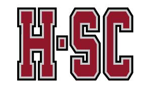
The updated H-SC Acronym was designed for Hampden-Sydney Athletics in 2024 and is set in the typeface Pragmatica Slabserif Extra Bold with an outline similar to the interlocking HS. It can also be typed without the outline for text purposes. Both uses should be used exclusively for athletics. It is not to be used for institutional or academic-related programs and should never be locked up with H-SC College-branded logos. The minimum size for the H-SC Acronym is .5 inches tall with a clear space of .25 inches.
H-SC ACRONYM
SUPPORTING MARK
LOGO
Sport Specific
Sport-specific logos are only intended to be used by HampdenSydney’s sports programs and athletics office. The particular sport is a sub category of the overall H-SC Athletics brand and therefore should be displayed less prominently, in order to not dilute the brand. The sport’s name will be typed in Pragmatica Bold with kerning set to 150 points. Any current use of sport-specific logos not shown here should be discontinued.
SPORT SPECIFIC COMBINATIONS
OF SPORT]
LOGO LOCKUPS EXAMPLES
Lockups
A lockup is a combination of a logo or mark and another element such as the College’s name, tagline, or sports team. Any lockup not shown here should be approved by the Office of Communications and Marketing before use.
[NAME OF SPORT]
ATHLETICS


LOGO SPECIAL USE TIGERS
Yank
Yank the Tiger first appeared in 1913 and is most likely named after Charles “Yank” Bernier, football coach of H-SC from 1912 to 1938. The illustration was drawn specifically for the College by a former Disney illustrator and made its debut in the Kaleidoscope in 1981.
Chuck the Tiger first appeared in 2019 and is named after the bronze tiger statue given to the College in 2003 by Richard F. Cralle ’65. The illustration was drawn specifically for the College by Nike.
To use either Yank or Chuck, contact the Office of Communications and Marketing before use.


HAMPDEN-SYDNEY ATHLETICS
DISCONTINUE
LOGO
The following logos should neither be used nor produced, unless special permission is given by the Office of Communications and Marketing. Such instances may include Hall of Fame and other historic callbacks.


LOGO COMMON MISUSES
Do not use unapproved colors
Do not alter the proportions
Do not add graphic components like drop-shadows
Do not rotate logos (even making the paw straight up and down)
ORIENTATION STAFF
Do not use in reference to non-athletics entities
Do not alter sport name placement in sport specific logos
Do not use logos as outlines
Do not invert tiger
Do not add athletics marks with College logos
Do not skew the logos
Do not alter the typeface or kerning of the specific sport name
Do not combine logos in close proximity unless its an approved lockup
LOGO COMMON MISUSES
INTERNAL EXAMPLES CONT.
Common Misuses
The Office of Communications and Marketing, alongside the Campus Store, are working diligently with vendors to correct inconsistencies with logos and colors. By creating a clear and easy-to-maneuver style guide, these issues should be resolved.

Not an approved two-color logo. Alumni is okay as we have athletics alumni.


Not an approved two-color logo. Not an approved two-color logo.


Slightly off style guide but acceptable for legibility. YES! Exactly on brand. Special case. Ideally we never veer from the color palette, but camo and blaze orange can be an exception.
LOGO FLEXIBILITY
UPON SPECIAL APPROVAL
Many campus bookstores take creative liberty in producing merchandise that is new, exciting, and up-to-date with current market trends.
So what are we trying to say? When information is coming from the College, whether the Department of Athletics or the Office of Communications ans Marketing, the design should be fully on-brand. The Campus Store (and some local vendors) will have the flexibility to use the logos in a tasteful way, but must be approved before production.
COLORS GARNET
Pantone 202C
Shortly after the College’s founding, students committed themselves to the Revolutionary War effort. They organized a militia-company, drilled regularly, and went off to the defense of Williamsburg in 1777 and Petersburg in 1778. Their uniform was a hunting shirt, dyed purple with the juice of pokeberries, and grey trousers. Garnet and Grey were adopted as the College’s colors when sports teams were introduced in the 19th century.
C:29 M:95 Y:75 K:29
R:138 G:36 B:50
HEX: #8A2432
GREY
Pantone 427 C
C: 18 M:12 Y:12 K:0
R: 208 G:211 B:212
HEX: #D0D3D4
BLACK
Pantone Black 6
C:82 M:71 Y:59 K:75
R:16 G:24 B:32
HEX: #101820
WHITE
C: 0 M:0 Y:0 K:0
R: 255 G:255 B:255
HEX: #ffffff
FONTS PRAGMATICA SLABSERIF
FONTS PRAGMATICA
light (oblique) book (oblique) bold (oblique) black (oblique)
VISUALS


VISUALS
BASKETBALL SIGNAGE

VISUALS
SCHEDULE POSTERS


hampdensydneygolftenniscamp.com


VISUALS
Athletics Stationery (digital and print) can be requested through the Office of Communications and Marketing.
1. Use official stationery— not a photocopy.
2. Use an official font— Pragmatica Book.
3. Use 1 inch margins on the top, left and right sides and a .5 inch bottom margin.
4. Indent all paragraphs except for the first or leave a space between paragraphs with no indents.
5. Keep consistent alignment between date and signature.
6. Leave four returns for a signature.
7. Always sign letters. Digital signatures can be ordered through the Office of Communications and Marketing.
STATIONERY
LETTERHEAD, ENVELOPE & BUSINESS CARD

November 21, 2019
Hilibus dolut quis exeres dolupti aessit, unt magnamus dipit ipideliqui ommodip sandae nobitia tectur acessim qui quam ea vel molo te pore, con cus sitibus, omni sinti autem aspe por ateceperume aut aute coratur ehentio nsedipi taspicima qui coriae pliquiam aliquia sedi bea vollam, ulluptaecto dolorestiae comnis corerch illaccusame dolent, offic tem archilicium resedis expe parum eum et a nusaes dolum sit omnihil litemporro et laborepta num sed qui ne simenihitat moluptae expla dendem si te eossitiis nis restium que netur aut qui am et ipsunte voloria venis aut eseriat iassum ant et eatibus aperchic tes esci am quae evel imintiam dipicabo.
Eliquia tecusdame molupta simus dis expliquunt debis vendel eleniet odignihiti omnistem ersperf erchictur aut quibust otataspidis velescima eos niste omniandaerro occabor sunti nempersperum facit officia dent alit lat.
Henim volorec tionem fuga. At mos inci omni dunt quibusant faciae nimaioreped untio od et aliam expla senimol uptatestrum et eture od utas vitempo ssitia sita dolupid ucilit venduciendae quissimus quid maximet magnihi cienietur adi dolendelenis restrum es de dia consed quatest assuscient et et eosam ex estiandiam fugiasped mint od qui odignatur, entem venisciis.

ceisele@hsc.edu hscathletics.com PO Box 698 Hampden-Sydney, VA 23943
VISUALS EMAIL
HEADERS AND SIGNATURES
FORMATTING
Emails should reflect the same design principles as any printed publication from the College.
1. Use approved email signatures generated by contacting the Office of Communications and Marketing—do not use a screenshot or pixel graphic.
2. Do not add your own logo.
3. Do not add personally flavored quotations or links.
4. Email backgrounds should remain white.
5. Use an official font for body copy—Pragmatica or Adobe Garamond Pro.

