BRAND GUIDELINE


We are five Digital Design students at PXL University College of Applied Sciences in Hasselt.
As part of our course we were invited to create a fully branded and functional, ready-to-launch digital product for PXL Esports, a pro-level student gaming league with which two team members are themselves involved. This project work took place in a simulated professional work environment at Corda Campus iSpace in Kiewit, Hasselt. We worked in sprints according to the agile methodology and presented the work in progress during sprint reviews.
To close the project, we pitched our results and presented a demo of both our design prototypes and the functional website on Tuesday 28 May 2024 during an industry event. www.pxl-esports.be
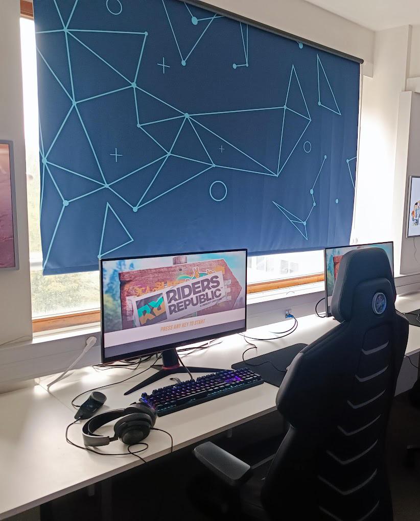
PXL Esports raises the bar for collegiate gaming on a professional level by focussing on three C’s: coaching, community and content.
Active participation in several grassroots and professional competitions, on both a national and international scale, providing coaching and support. 1
A thriving community with a tight-knit fanbase and college-wide support to inspire and infuse the professional Esports teams with budding talent. 2
A leading role on the Esports stage, aiming for continuous growth and innovation, through meaningful involvement in streaming and content creation.

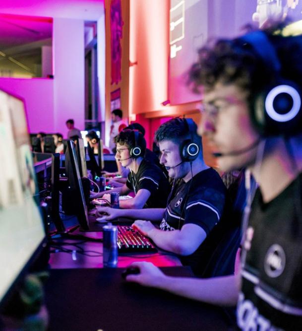
As a leading Belgian collegiate Esports team our goal is to continue to grow until we reach our rightful place on the international Esports stage.
PXL Esports aims to become a household name among students at PXL university college. To achieve this, we are committed to a strategically executed online presence that reflects our accessible and inclusive character, aided by a quirky tone of voice. Our primary focus is to enhance the quality of our teams and establish a professional reputation.
Mike Vandebriel

We want to prove our worth, inspire others and motivate team mates to push harder and aim higher. Our ‘top dog vibes’ we know will bring us far, and when we get there, we’ll make an impact!
We’re strict, yet fair. Our teams are dead serious about gaming - it’s never ‘just a game’ to us. We count on each other, and hold each other accountable too. So be on time, practice, and play! 1 1 2 3 2 3
 © Mario Kart
We inspire others through guidance and coaching. We organise open-to-all events with an emphasis on fun and community to attract new players from all backgrounds and skill levels.
A healthy, cheeky cockiness characterises our tone of voice. We’ll throw playful insults towards competing teams with an undertone of mutual respect and team spirit, but we won’t punch down.
It’s not all about screens and consoles: like any student organisation we host all kinds of fun events to celebrate our community.
When needed, we offer advice about maintaining a healthy gamestudy balance for our players as well as our Gaming Hub visitors.
DescriptionPXL Esports currently borrows the standard PXL university college wordmark and circular logo with house colours (rich) black and white. Like all departments, the capitalised wordmark has a heavy sans serif font. The letters P, X and L are each adapted from the original font to give the impression of cut-off corners, matching the web-like background pattern. The heart shape inside the letter P comes in two different variations, either rounded or square (with slightly rounded corners).
To distinguish themselves from regular college departments, PXL Esports added a second, brightly coloured circle at the bottom right of the larger PXL circle, displaying a black gaming console icon inside of it.
In order to remain faithful to PXL’s own house style, as per the design brief, we rearranged, flipped and rotated several existing shapes that make up the current PXL Esports logo. The result, with a playful nod to the college mascot Pandix (a panda bear), is a quirky and unique logo that nevertheless pairs perfectly with the original.
Our logo uses the gaming console icon as the panda’s body with the controller buttons for eyes, and repeats the rotated P-shape from the PXL logo in its glasses and ears with the flipped heart as the mouth.
For very small sizes, such as the website favicon, we recommend the following variation of the full logo which excludes the body shape.
We matched the original wordmark from the PXL house style as closely as possible. Our chosen font is Archivo Black, also used for the slogan.
The logo fits perfectly inside a square and its shapes are simple enough to allow for resizing. We do not use strokes, instead the outside ‘border’ is in face an adapted expansion of the inner outline of body and head.
1
The circular panda head has a thick black outline and a white ‘face, mirrorring the PXL logo circle, only with the colours reversed.
2
3
The PXL ‘P’ turns up in two pairs, firstly for the ears (which explains the cut-off top parts) and secondly for the glasses.
The console shape is clearly visible in the body, where it mimics two front paws poised for battle. Meanwhile, the controllers have moved up inside the head to form the eyes.
4
While the mouth is shaped by an upside-down heart originally found inside the PXL-P, the nose is an adaptation from a shape found in the PXL Esports jersey pattern, also flipped.
5
The light-coloured contour, invisible on the identical light background (see below), should always have a straight top border.
Our logo is primarily designed for digital media use. In our responsive web design, we most frequently used the indicated sizes shown on the right. For print media and merchandise, it might be advisable to review these sizes depending on the carrier.
Logos should never be provided in sizes less than the criteria indicated on the following page to guarantee visibility and legibility.
The favicon, both the full version as the adaptation without ‘body’, has a minimum size of 32 pixels.
The margin around the logo can be quite narrow depending on the usage. For the monogram, we are using the width of the ‘nose’ placed next to the ears to determine the minimal gap between logo and wordmark.
However, the gap between the monogram logo and any other content should be larger. We’ll advise at least twice the ‘nose width.
In combination with the wordmark and PXL logo circle, we will suggest a gap measuring about a third of the width of this circle.
For improved legibility and depending on the carrier in the case of printed media, a wider gap between the circular monograms and the wordmark may be better suited.
1/3
The logo has a ‘black & white’ duotone, containing the lightest and darkest colours from our brand color palette. On the right, the logo is displayed on background colours taken from our colour palette: dark, light and gold.
On a dark background, the light-coloured border around the logo shape is essential for a correct display.
On a light background this border will not be visible and can be discarded.
On the lighter gold background, the light-coloured rim isn’t necessary but can be included if desired.
On the darker gold background, the light-coloured rim should remain visible to achieve a high enough contrast.
Outside of our own colour palette, the logo can appear on different coloured backgrounds and still display clearly thanks to the versatility of the optional border shape. A similar layout variation is found in the PXL brand guide.
On the bright and fluorescent backgrounds, the wordmark should be dark. The monogram can best be displayed without its light-coloured border for better contrast.
On gradient backgrounds or against a multi-coloured backdrop, the display choice should be made case by case. 1 2 3
On darker hues such as blue or purple, the wordmark should be light and the monogram should appear with its border included for better contrast.
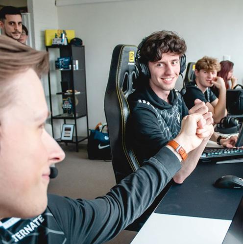
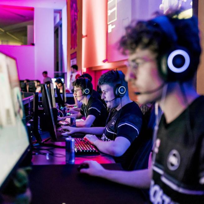
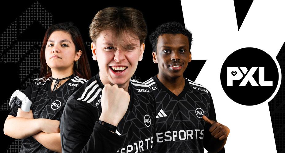
The logo can easily be added to all kinds of images and photography. As an example, the photos of various Esports team members and staff on the right show both the monogram and the full logo with wordmark.
On images with little exposure, or with a darkened overlay added to them, the logo can be added with a ‘lighten’ or ‘screen’ blend mode applied, to add transparency while keeping the overall logo shape intact and legible.
On very bright parts of an image, the black parts of the logo can be enhanced by using a ‘multiply’ or ‘darken’ blend mode, which will create the reverse effect.
In its original version, the logo can be added in various sizes (see size guide for recommended minimal size).
While our logo is very versatile, certain usages will negatively affect the legibility and integrity of the shape and should be avoided.
Do not reverse the colours.
Do not use a single-colour outline of the logo.
Do not warp the logo.
However, depending on the context, it is possible to:
Add a throw shadow or extra strokes
Use a colour change as a hover effect
For any changes in colour, the brand colour palette should still be used (see below).
The client brief made clear that we should align our brand colours with the existing PXL University College colour palette, which is a rich black and pure white. The current PXL Esports logo contains a bright yellow colour as the background for the gaming console icon. We were encouraged to choose an alternative accent colour to complement our grayscale palette.
Our decision fell on the colour gold to symbolise victory and value, befitting of our core brand archetype The Hero. Gold is a tricky - especially in print - yet versatile colour which lends itself perfectly to the use of gradients that mimic a metallic sheen.
We felt that a carefully sought out range of gold-like hues would make the sleek and professional look of a ‘black and white’ main palette truly come alive.
#0F0F0F
R15 G15 B15
C0 M0 Y0 K94
#F5F5F5
R245 G245 B245
C0 M0 Y0 K4
#DFB23F
R223 G178 B63
C0 M20 Y72 K13
For large sections, elements, titles and background colours, we use a nearly-black and a nearly-white pure greyscale shade. The high contrast conveys the kind of boldness we associate with the brand voice. Meanwhile, black and white are often associated with a no-nonsense style of professionalism, which likewise fits the mission and vision of this brand. The gold colour base has a medium visual brightness that contrasts sufficiently with both the black and white.
On the next page, we’ll show a few tints and gradients to add more variation, brightness and elegance to this basic, high-contrast colour palette.
Our choice of font needed to closely match the existing fonts in the PXL University College house style, in particular the font Museo Sans which is already used in graphics such as video lower thirds. Although many websites we researched as part of our benchmarking study, most fonts commonly associated with Esports or gaming labels appear too ‘space-y’ which makes them appear too quirky or frivolous. Moreover, exaggerated decorative shapes such as these are intended as display fonts and aren’t designed for legibility, which would become an issue for the small font sizes needed for mobile screensize viewing.
The fonts we picked are all highly versatile and legible sans serifs with clean straight lines in their capital letters and subtle elegant curls and twists in lowercase. Besides two main text fonts, we’re using the logo wordmark font Archivo Black as an alternative display font for the slogan in the hero banners.
The Gaming Hub is conveniently located on campus Elfde-Linie (block F, 4th floor), where students walk past on their way to class or a lunch break. At only a stone’s throw away from the city centre, we’re delighted to extend our invite to any gaming and Esports enthusiast.
DM Sans is a low-contrast geometric sans serif design, intended for use at smaller text sizes. The capital letters M, S, K, R, Y and G in particular compared favourably with similar fonts thanks to their straight lines and symmetrical curves. This font is used for paragraphs and headings.
Work Sans is a typeface family based loosely on early Grotesque fonts. Early on in the branding process we workshopped several Grotesques for the heavyweight type we needed for the website. This font should only be used in capitalised lettering, such as section titles and button text.
Patterns are important to break the monotony of large, even-coloured background surfaces, especially when working with a high-contrast greyscale palette. Luckily, we could look to existing patterns in both digital and physical products. In our moodboard, assembled early on in the research process, we included a selection of graphics from social media posts by PXL Esports, among which a brand new X/Twitter banner.
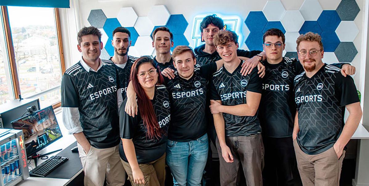
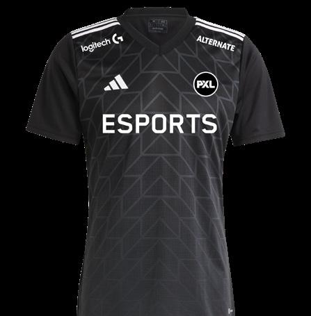
Next, we took a very close look at the PXL Esports team jersey, which has a background pattern in duotone dots decreasing in size along the vertical axis, creating a kind of pixellated gradient effect. This pattern is broken up by angled lines and mirrored steps converging into upwards pointing arrow shapes in the centre of the shirt.
You’ll have already spotted the outlines of our reimagined arrow shape at the centre of each chapter page spread.
We made use of open source font libraries to create and develop our design prototype (see download links). For specific uses we adapted elements from our logo as well as existing branding, to aid recognition.
Our custom icons are showcased on the right. Profile icons come in different versions depending on user activity and administrator status (indicated with a gold gradient rim). In addition, the upwards arrow shape derived from the PXL Esports Jersey pattern, can be rotated in four directions to replace default arrow icons from any of the chosen libraries.


https://fonts.google.com/icons https://fontawesome.com/icons Download Links
Existing branding already contains interesting patterns which we borrowed and adapted. Our main inspiration was the PXL Esports team jersey, which shows a dotted background pattern and various repeating linear shapes.
Our dotted pattern comes in two variations. The vertically symmetrical pattern shouldn’t contrast too much with the background for a subtle decorative touch. The uneven corner dots however can have a bright gold colour or gradient.
We adapted the lines into a wave pattern, to break the rigidity. These can be used as a background for smaller shapes.
The slanted lines are angled to match the PXL logo lettering, which also returns in the proposed slogan.

Our primary goal for this project was to create digital products for PXL Esports, specifically a responsive website design which our team has also developed into a fully functional website, and a mobile app prototype with specific features.
To achieve this, we created a detailed and versatile component library in Figma, following the principles of atomic design. This means that we started our building process by carefully designing the smallest elements first, such as buttons, making sure our colour palette and icon libraries were used consistently and always with a smooth user experience in mind.
For a detailed look at our component library and collection of digital assets used in our designs, one of our team will gladly walk you through our Figma project.
The TEAMS page presents an overview of the PXL Esports players from each team, their coaches and subs.
The website’s homepage presents a sneak peek with redirects to several separate pages which are also easily accessible via the navigation bar at the top. In the footer, users can discover additional information including a redirect to the PXL University College homepage. All designs are made responsive for 3 different screen sizes.
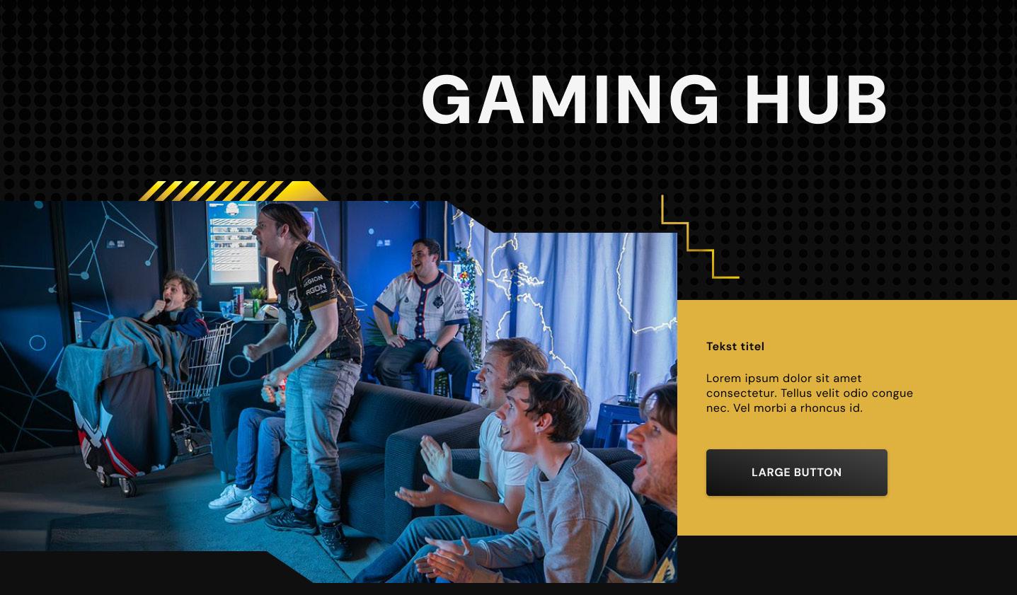
The HUB page contains all necessary information about the RedBull Gaming Hub, with opening hours subject to change.
The SHOP page lists all merchandise items currently available for sale and redirects to a flyout shopping cart.
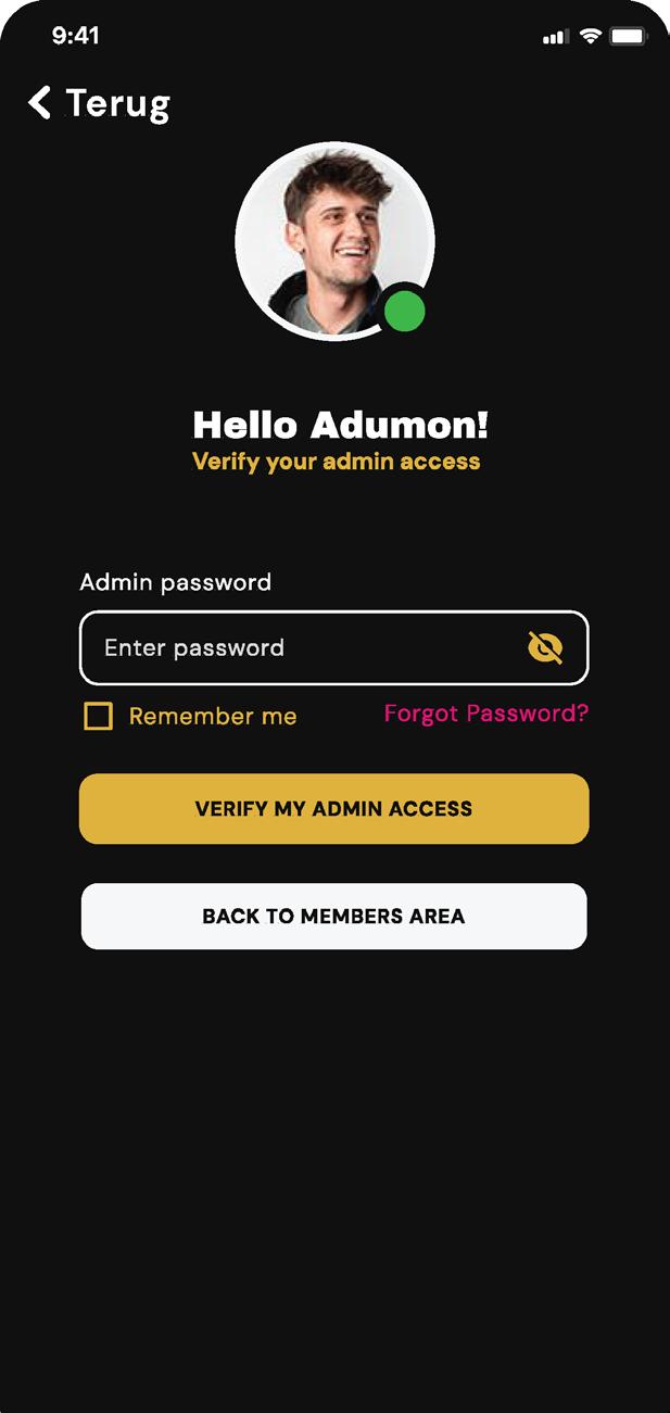
Users may choose to use the app as a guest for browsing, but a member account is necessary for interactions.
Designed with PXL Esports fans who need quick access to the latest news and events calendar in mind, the app also offers an Admin Area which grants access to detailed information about gaming gear stock, and allows users to add, edit and delete information such as Gaming Hub opening hours and staff scheduling.
Next steps would be to develop a member user flow which makes it possible to comment on posts and add content.
The admin area currently redirects to an overview of staff members, including volunteers, and the gaming gear stock.
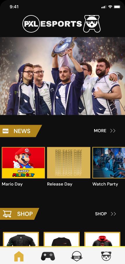

Esports brands commonly showcase their brand on merchandise and advertising, which means that besides an online representation via digital products we would provide, attention should be given to a social media campaign as well as design suggestions for physical products that can be offered for sale or given out to team members.
On the following spread, we showcase some of our design suggestions in the form of templates and mockups.

We prepared templates for social media posts and stories that fit the current posting style, to showcase the adaptability of the brand fonts, patterns and colour scheme.
In the Google ad banner above, we integrated one of our buttons.
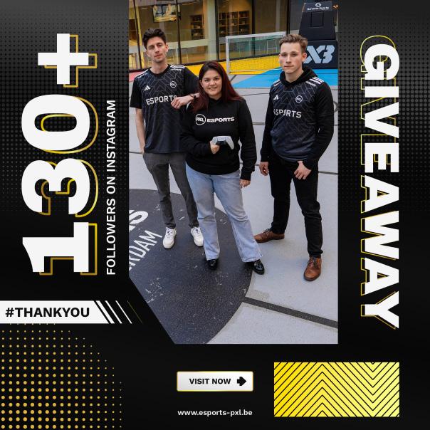
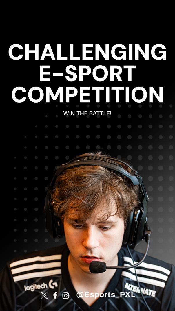
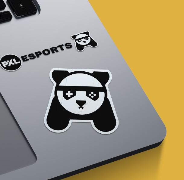
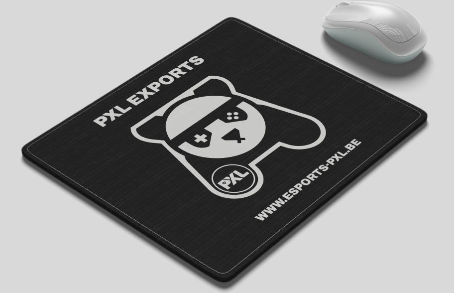
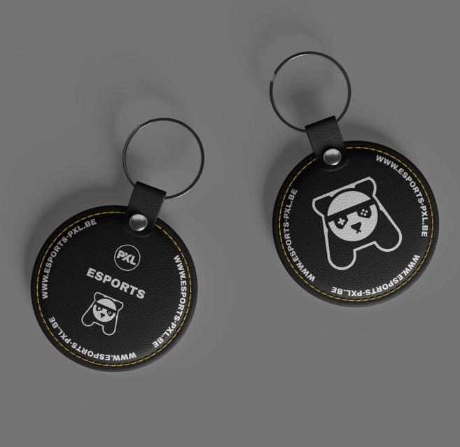
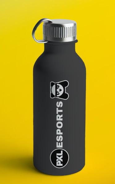
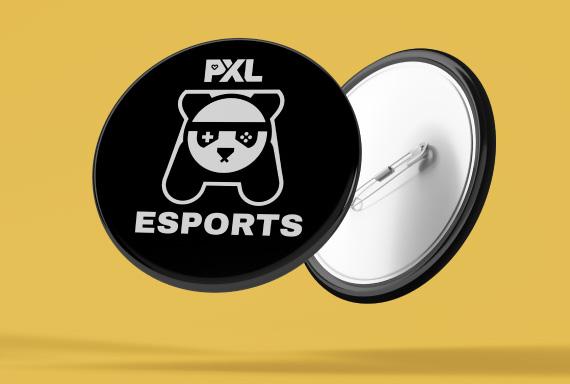
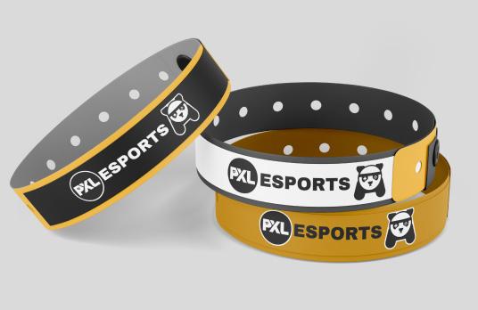
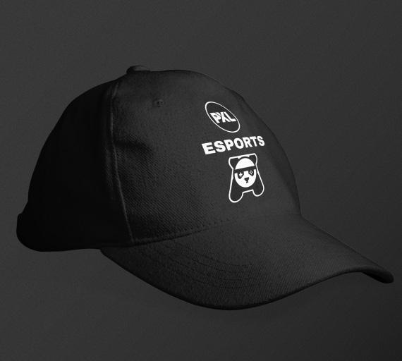
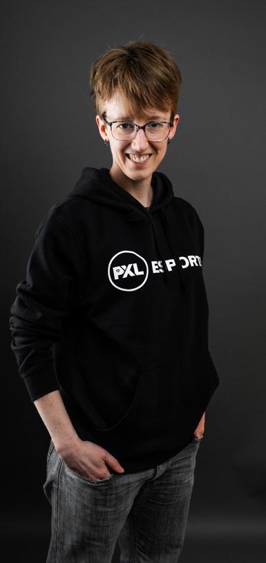
Various physical products, all affordable and relatable to the brand and its target audience, would be worth offering as merchandise in the future.
These mockups show how the proposed logo and brand colours could be displayed on these items.
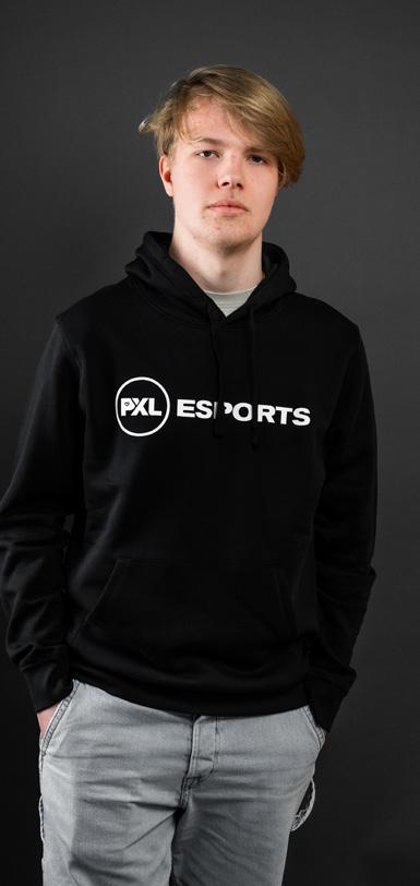

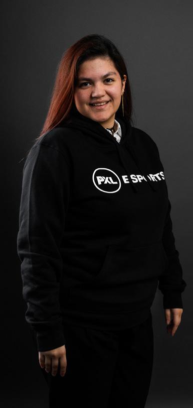
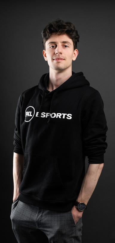 Heleen Evers Designer
Sander Kuyken Designer
Conor van Bemmelen Designer
Marigold Speelmans Developer