
20 minute read
Feature: Illustrate with Photoshop

from _Issue_03
by Hiba Dweib


Illustrate with Photoshop
Advertisement
There’s more to Photoshop than removing red-eye and cropping photos. Alan Campbell presents three exciting artists who are using the software to make a big splash in the illustration world

onventional thought C would have you believe that image creation is split into two distinct fi elds: vector and raster graphics. The same conventional thinkers will probably tell you that Adobe’s Illustrator software is there purely for vector illustrations and that Photoshop will never offer anything more than raster work, end of story. Because vector has always been thought of as the format of illustrators (another thing to blame conventional thinkers for) Photoshop has by consequence been belittled when it comes to illustration prowess. But conventional thinking has also been responsible for declarations such as the world being fl at and countless other urban myths that have all been debunked.
While there’s no getting away from the fact that Illustrator will always be a vector package simply because it works in the vector format, the truth is that Photoshop is now as much a part of the digital illustrator’s armoury as trendy specs. Gone are the days


Image copyright of Derek Bacon

when the only time an illustrator would open Photoshop would be to convert an image or to manipulate a photograph before bringing it back into familiar fold of their beloved vector software. Through a mixture of users’ ingenuity and some signifi cant software updates over the years, Photoshop now contains virtually everything you need to create stunning digital art. Sure, Illustrator is still better for vector art and if you need the scalability it wins hands-down, but don’t think for a minute that you can’t achieve equally impressive results using Photoshop’s built-in Path tools. And if you do fi nd Photoshop inadequate for any particular task, all you have to do is pop back into your other software – but, like increasing numbers of illustrators, you’ll fi nd yourself heading right back into Photoshop to continue. And this is the crux. We could talk endlessly about the many and varied talents of Photoshop, but you’ve no doubt heard it all before. Instead, this time we’ve decided to call in the professionals – people whose design opinions matter, because they’re setting the agenda for the next generation of digital design.
After much consideration, we’ve found what we consider to be three of the brightest, biggest and best illustrators around, and have persuaded each of them to divulge their deepest Photoshop secrets. Despite their completely different styles, you’ll fi nd that each of them relies on Photoshop to achieve results, even when you might think they’ve moved far beyond the boundaries of a mere photoediting package.
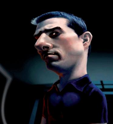
TOP LEFT: Derek Bacon’s distinctive colours shows there’s more to Photoshop than photo editing
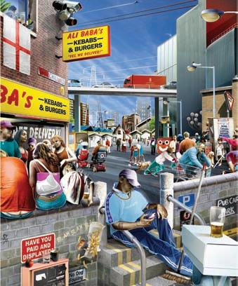
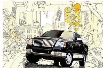
TOP: iLovedust’s work proves Photoshop deserves a place at the illustration table
BOTTOM: Blake Loosli’s painted eff ects show another side to Photoshop
Blake Loosli
Since graduating from Brigham Young University in Utah, Blake has been rocking the illustration industry with his traditional-style paintings, and his work has been recognised in competitions by CMYK magazine and the Society of Illustrators.
Although his work has all the hallmarks of an old-fashioned painting, Blake reliably informs us that “at least 95%” of his image work is done entirely in Photoshop. He used to base his images on pencil drawings, but recently he has even begun using Photoshop to draw his rough sketches. Blake demonstrates Photoshop’s multi-faceted talents perfectly – virtually no one would predict that he uses Adobe’s killer package to fashion stunning paintings. However, he builds every image from scratch using Photoshop’s painting tools, showing that, if you put your mind to it, you can achieve anything in Photoshop.
Blake manipulates the Photoshop software to achieve highly-realistic painted eff ects
Q+A
When did you fi rst use Photoshop? What was your fi rst project? I started using it in version 5.5. My fi rst illustration projects were coloring in line drawings, more ‘cartoony’ than my current work. Usually done just for fun, not even as school projects.
How do you start a new image? With many of my digital paintings I start out the same as any artist – thumbnail sketches and then full drawings on paper. As I have become more and more skilled with the Wacom tablets, I am now able to do the initial drawings completely digitally, bypassing pencil and paper. Once I have the pencil or digital sketch in Photoshop, I then create a separate layer underneath my drawing and fi ll it with a middle grey. This middle grey allows me to proceed to create a more full toned drawing. This process allows me to save time by not having to create a full tone drawing on paper, but rather taking a more painterly approach of adding lights and darks to a middle tone.
How do you ‘paint’ your image? I usually have a pre-determined colour scheme for the image, so I choose a few key colour combinations. The colours for a portrait usually consist of black, white, an average fl esh tone, a more reddish fl esh tone, a shade of the fl esh that will be the shadow, and colours of any clothing or colours from the environment that may introduce refl ected light into the subject. These selected colours are then drawn as small spots on the image. They are drawn with the paintbrush tool set to 100% opacity.
With the colours laid out, I then create a new layer to put my coloured strokes on. With the paintbrush set to a higher opacity (70%) I proceed to lay in the general colour planes on top of the middle grey. Once I have the large planes separated (light, mid, shadow) I can then lower the brush opacity to 20% and overlap the areas, sampling the different colours and creating the different edge transitions. With the colours starting to solidify I often zoom out (much like stepping away from a painting) to make sure that the colour relationships are working.
To allow for more fl exibility and errorproofi ng, I keep the separate elements on different layers and often group them together under a ‘layer set’ for better organization.
BLAKE’S Tip 1 1 Hardware I use a PC that I built myself. The main tips I would give about hardware are to have plenty of RAM. I have 2GB currently. At least two hard drives is a must. This is for the Photoshop scratch disk, and for backing up your fi les. For Which tools do you use most often in people wanting to do any drawing or painting you need Photoshop? Why do you think this is? Obviously the Brush tool, for painting. But to have a graphics I really take full advantage of layers and the tablet. I mainly use a Wacom 9x12. History palette. With layers and the History palette you are able to add or subtract
Blake’s images are built up layer upon layer, giving the rich, textured qualities you see here

BLAKE’S Tip 2 2 Know your history
The History palette is often overlooked but can be a image making tool, not just a form of backup. Layers are probably the most important aspect of Photoshop, so learn them well… and use them. Make sure you know how to create masks, clipping groups, and layer sets.
things from your work, and then see how your image was affected by switching on or off a layer or going back in the History. This before/after view, for me, makes working digitally much more powerful than traditional media.
How do you achieve realistic hair and brush strokes in Photoshop? With hair, it’s good to set your brush to change thickness depending on the pressure applied. Sometimes I will select brushes that are made up of dots, so that when you make a stroke, it looks like an actual bristle brush. Generally though, I just use the basic brush, work from general to specifi c and from dark to light, and then go over some parts with the healing brush to remove harsh lines.
How do you combine your workfl ow in Photoshop with other software? Often towards the end of a painting I will reach a limit to how well Photoshop can blend the colours and edges. Then I take it into Corel Painter. In Painter I simply blend out a lot of the edges and details for a more uniform look, and to eliminate any areas that look ‘splotchy’ which can be a result from painting in Photoshop. I also occasionally create vector objects in Illustrator, but usually the Path tool in Photoshop is good enough.
What would you say to people who claim that Photoshop’s main use for illustrators is as a touch-up tool? There are plenty of examples of artwork out there that show Photoshop’s incredible diversity. The power of Photoshop is that the tools people think have one purpose can actually be used in different ways. For example people use the Healing Brush to ‘touch-up’ a photograph, but if you sample a smooth pattern, it can be a great blending tool for painting. Photoshop will only seem limited to someone with limited creativity.
When do know an image is fi nished? Working digitally can be a curse in the sense that you can always do more, or you can always try something different. This is why it is important to have a clear idea ahead of time how you want the fi nal image to look.
What advice would you give to someone learning to use Photoshop? It’s good to play around with the program to see what it can do. But at a certain point you have to decide what you want to create and then plan out the steps it will take to reach that point. There are a lot of things in Photoshop that can be used as a crutch; you have to learn to be creative without relying on cheap tricks.
BLAKE’S Tip 3 3 Learn the quick keys
This saves a ton of time when you are doing basic tasks, but is crucial when you are painting. It is also worthwhile to modify the keys. I use a program called Keymapper to change my keys. Then, inside of Photoshop, I’ve changed the shortcuts to modify the brush size from the bracket keys to the front slash keys.
Derek Bacon

Derek Bacon’s images are based on photomontage, and can see him incorporating a range of wildly different photographs into one canvas. It is probably his use of colour above everything else that has seen Derek become a name to watch in the illustration world, however – his subtle tweaking of hues often leads to surreal and otherworldly effects. Combine this with the often everyday subjects he bases his images on, and you have the perfect recipe for success.
Based on the south coast of England, Derek’s unique style has seen him create stunning art for The Times, The New York Times and The Economist, not to mention the work he has contributed to countless design magazines and Web sites. Photoshop is his tool of choice, not only for the photo-editing and colouring that he calls upon extensively, but also for the many image elements he creates himself.
Derek is a master of taking ordinary photos and turning them into a colourful alternate reality
Q+A

DEREK’S Tip When did you start using Photoshop? I did an introductory course to Photoshop about six years ago, but didn’t start using it daily at work until a year later.1 Be subtle
When you are airbrushing, cloning, or erasing, keep the opacity right down (to no more than 30%), and vary your brush sizes. The big trick in Photoshop is to hide all signs of the technique that you’ve used to achieve the end result. You can’t aff ord to be heavyhanded in Photoshop. What was the fi rst piece of artwork you created in Photoshop? The fi rst picture I made was quite similar to the stuff I do now: it was a photomontage of the urban landscape with various people walking past – only back then I knew nothing about how to do this particularly neatly… The spirit was defi nitley there, I just had no technique.
How do you start working on a project? Usually I spend time sketching something very rough, just to get my head around the composition, then I go through my photo library to fi nd suitable elements to use. I’ll also usually have to make a list of any new things to shoot specifi cally for that illustration.

How do you build your images? The way I work is to re-create the sketch in Photoshop, basically sticking little bits of photos together to slowly build up the scene. I don’t really worry about the colours or anything at this stage – only when the composition is rock solid will I start colouring it all in.
Which Photoshop tools do you fi nd yourself using most often? I guess because of all the cutting out I have to do, it would have to be the Pen tool. Probably not far behind that is the Eraser.
How long does it take to create one of your images from start to fi nish? I probably take two to three days per picture. Sometimes longer.
On average, how many photos are used in each of your fi nished images? It’s really hard to say. I’ve got about 12,000 digital photos, divided into 22 categories, so I might use elements from any of them.
On any image, how much comes from photography, and how much is generated by you? I would say half and half. Half of my time is spent gluing together bits of photos to build the composition, and the other half is spent ‘painting’ over the top of them.
Technically, do you always use the same techniques? I am not especially adventurous with my
DEREK’S Tip 2 2 Don’t be overwhelmed
There is such a lot to this program – you are never going to learn it all. There are also many ways of doing the same thing, and you are always going to get people telling you the best way of doing it. Find a method for you that works, and practice it till it’s second nature. It’s just a tool for making pictures after all… you need to make it do what you want, rather than it dictating you, or limiting you.
techniques, and use the same tools over and over. I always have a particular look and feel in mind that I’m trying to achieve, and I know how to get Photoshop to do this. Largely it involves a lot of cutting out, and re-colouring using Colour Balance, or Hue/Saturation.
How can you tell when one of your images is fi nished? Do you keep fi ddling, or do you have specifi c aims right from the start? Deadlines are great for keeping you from fi ddling too long. But I know it’s fi nished usually when everything has been overpainted and coloured in. You just sort of know when it’s done really... it just looks right.
Which is your favourite image? One of my favourite images is the one called ‘Ing-ger-lund’ which was done for a promotional poster for the Illustration agency I’m with. It’s based on a famous picture by William Hogarth from the 1700s called ‘Gin Lane’, which shows an England fallen prey to the evils of gin. I thought it would be a laugh to do a modern version based on the original composition.
DEREK’S Tip3 3 What’s that noise?
When you are bringing together elements of photos, you can give them a much more homogenous look by adding a little noise (I always use Gaussian and Monochromatic at 2 or 3%). This mimics fi lm grain, and takes away that ‘too clean’ look that digital art can often have. What does Photoshop not do that you’d like it to? I have this fantasy that instead of controlling Photoshop on a computer, it can somehow be done via a large mixing console, sort of like the ones you see in a sound recording studio. The sliding faders could be your layers, and all effects could be added by turning a certain knob or two… I don’t know how possible this would be, but it would certainly make the picture-making process more hands-on and active, instead of having to sit at a table moving only your hands for days on end.
Do you think there is anything that Photoshop can’t convincingly create or alter? I think as long as you start with a good quality, high-res image, you can pretty much get away with mimicking anything that real photography can do. However, if you only have poor quality material to begin with, you are going to be more reliant on retouching and overpainting, and so there’s the risk it’s going to look too worked-on and artifi cial. But if you move away from the limits of a photographic look and into the world of illustration, then there is no real limit to what you can get from Photoshop. It’s really just down to you and your imagination, and this great big digital paintbox…
iLovedust
Web site: www.ilovedust.com Style: Vectors and rasters in perfect harmony
Portsmouth-based design crew iLovedust has quickly gained a reputation as one of the UK’s most exciting graphics innovators, despite only being formed in 2003. Since then, the team has fashioned artwork for a host of UK magazines and companies, not to mention being responsible for major Web sites for Oasis and stylish books for Marks and Spencer.
Fusing a mixture of clean vector with photo-collage and downright messy, iLovedust’s work is as varied as it is stunning. Working on a 50/50 ratio between Illustrator and Photoshop, the team can boast equal expertise in each program, resulting in their wide range of designs. And as if all of that wasn’t enough, iLovedust has just received the offi cial rubber-stamp of success, with the launch of ultra-cool t-shirts bearing the design combo’s best efforts.
We spoke to the team (they work as a collective, so prefer to be known collectively) to fi nd out what Photoshop means to them.
iLovedust covers the whole gamut of illustration, from clean drawings to gloriously dirty designs
Q+A


How much of your creative work is done in Photoshop? This is all dependent on client’s requirements, but I would say around the 50% mark. When did you fi rst use Photoshop? 1ILOVEDUST’S The power Tip 1 of photos Can you describe what the experience If you’re stuck was like? for inspiration, It seems so long ago for all of us that no one open up a photo can decide what version it was! On average, in Photoshop. It’s really easy to it seems we started on Photoshop 3. The adjust photos: experience… like going to a sweet shop and their contrast, not knowing what to try fi rst! hues; shapes, backgrounds and environments make for very What are the advantages of Photoshop over other packages? diff erent visual Photoshop lets us manipulate imagery such looks that you as photography and scanned textures really can tinker with very easily. quickly and allows us to work with colours and contrasts very easily.
Obviously, vector graphics and raster graphics have their pros and cons. How do you feel about the tradeoff and how do you decide which elements of your illustrations should be created in which packages? We like to use both. Mixing up vectors and raster graphics is a way we can create new ideas and looks for our work. This is also very dependent on who starts the project and/or what feeling we are trying to get across with the image.
How do you go about starting work on a new image? What are your fi rst steps? We usually have a brainstorm then have a look on Google for a reference point. We then have a cup of coffee and a chat then start working the image up either in Photoshop or on paper so we can get what’s in our huge skulls out and into some kind of visual idea.
How long does it take to create an average iLovedust image? How do you know when it is fi nished? It would usually take us around a week. We rarely get to do a project straight through from its beginning to its conclusion without client feedback and changes etc. But we usually know when the projects are fi nished when our eyes start to bleed and our heads spin around!
Which of your images do you feel most proud of? We love them all and hate them all equally – we have no golden child that we could all ever agree on.
Tip ILOVEDUST’S 2 2 Don’t be constrained

Don’t feel that you should always start every image with a blank canvas in Photoshop. The program can easily deal with your hand drawings and any other materials you have that can be scanned in or photographed. In fact, Photoshop can expand on the sources of your creative elements.
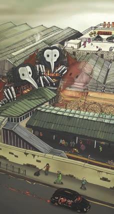
This image can be bought as a limited edition print and shows yet another side to the Dustie’s Photoshop portfolio All images on this page copyright of iLovedust
As a team, do you fi nd that you have different techniques for doing things in Photoshop? That’s hard to say. We don’t really look over each other’s shoulders when we work. Everyone in the team has little tips and tricks of their own and I think we all learn from each other on certain things – someone might be far more knowledgeable in colour or masking for example.
What Photoshop feature could you not live without? Layers!!! Layers make creating really nice effects and compositions incredibly easy. They also let you shift them about to create different looks and feels in a matter of seconds.
What does Photoshop not do that you’d like it to? Well it would be nice if it could handle vectors better but then the same could be said in reverse for Illustrator and its handling of raster images. Photoshop can now do so many things that I don’t think any of us have really taken it as far as it can go yet.
What advice would you give to someone trying to learn Photoshop today? Mess about and have some fun. You can’t really do anything that’s going to make Photoshop blow up! Just get some elements together and have a good root around in all the tool palettes and functions. Tutorials in design magazines are also really good ways of getting to grips with certain functions and shortcuts and getting ideas for the kind of look you’d like to aspire to.
3ILOVEDUST’S Tip 3 Combine and conquer
Photoshop off ers loads of functions (fi lters, channels, adjustments, layer features etc). Every one of these is useful and can achieve an eff ect, but combining them together will let you create your own eff ects, generating your own unique style in the process.
iLovedust proves that even simple illustration designs can have lots of impact

