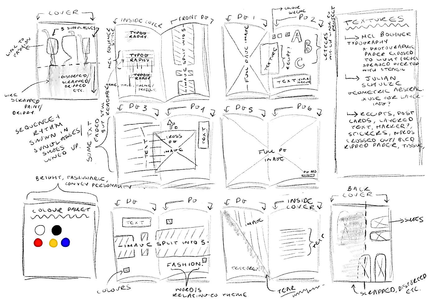
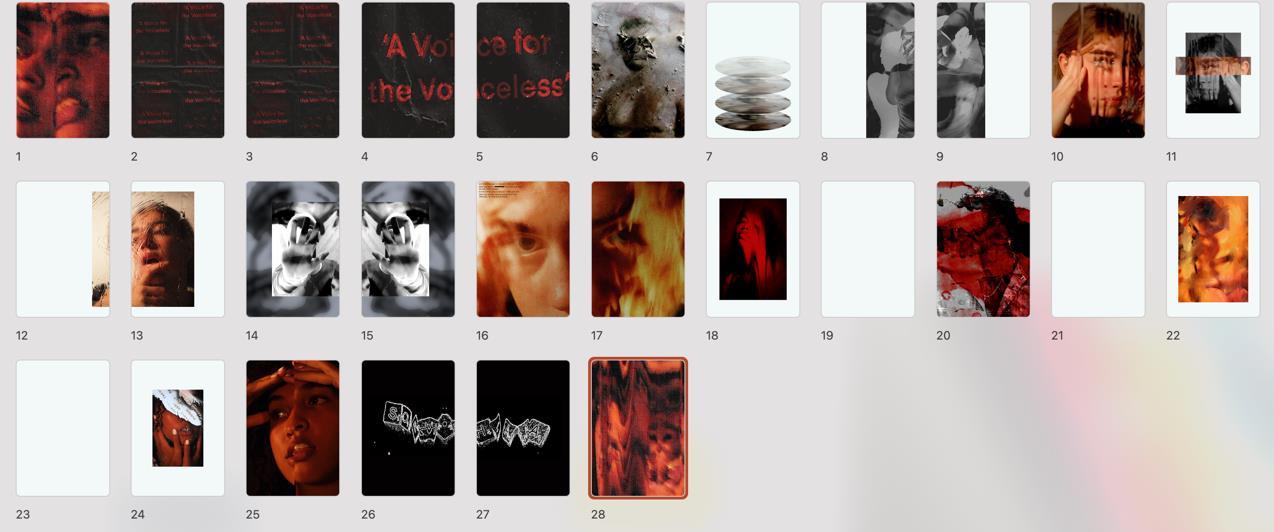
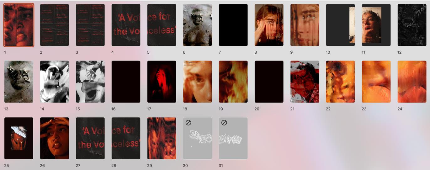
Candidate number: 6545
unit one personal investigation


exploring human figure within environments

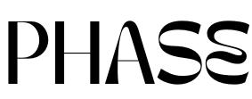
sophia ellul

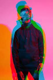
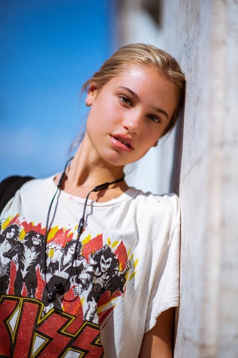
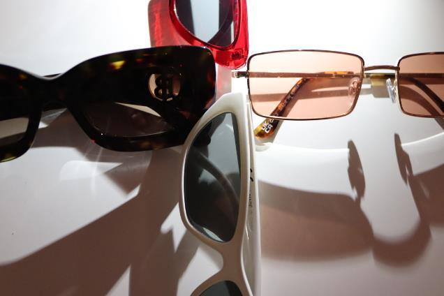
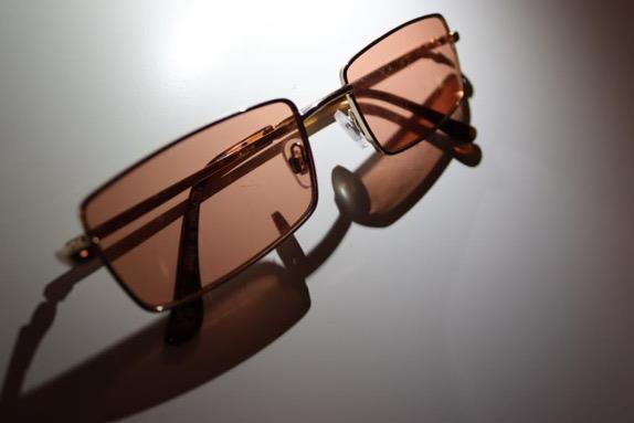
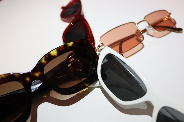
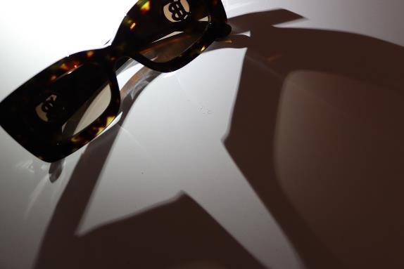
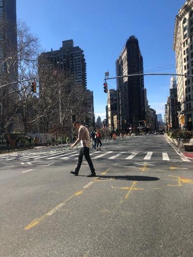
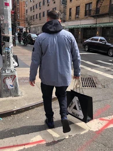
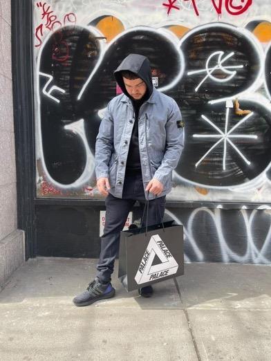
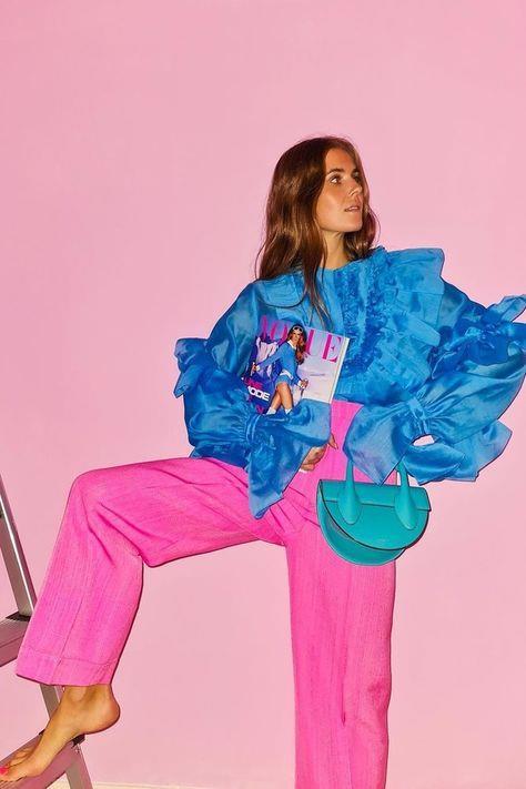
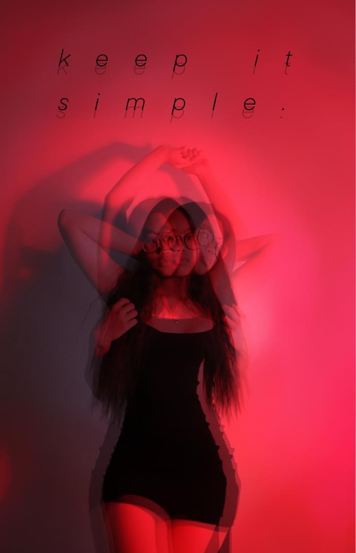
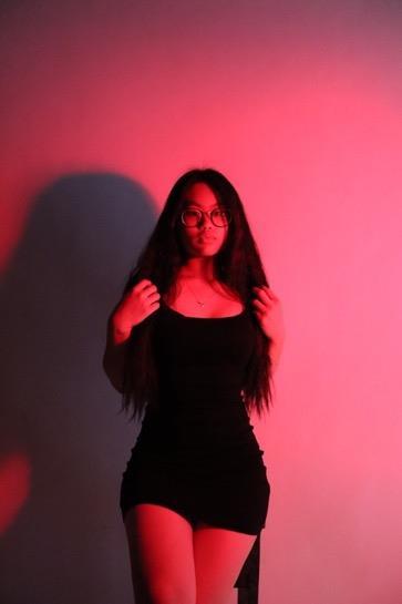
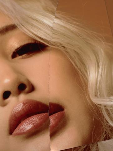
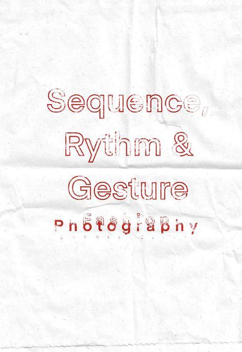
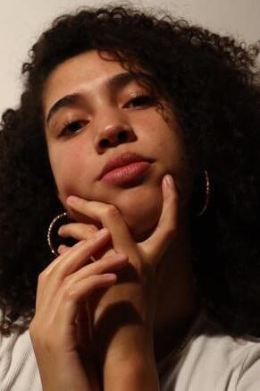
Anexplorationoffigure,sequenceandgestureconformingfromfashionphotography.
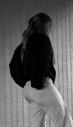
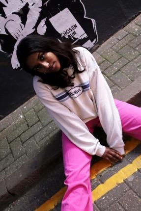
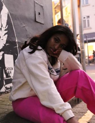
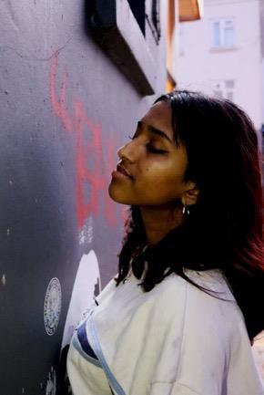
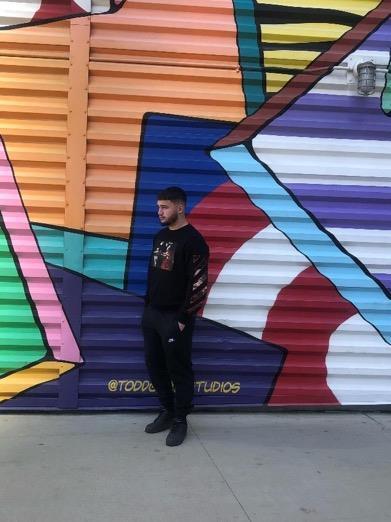
The theme I have chosen for photography is 'sequence, rhythm and gesture' within showing movement through human figure and/or editing styles. This is because I love the graphical style mixed within photography and how I express a sense of personality through my work. I want there to also be a representation of movement either through the poses of the model/person or the way I have edited/composed the final images. I explored fashion photography as this succeeds the goal of personal style and showing movement through silhouettes of clothing. This evolved into the idea of mixed media and montage. This is something different and exciting to broaden as I want to practice my skills regarding art photography. The fashion art movement I have been influenced by is pop art. I think this movement relates to my project through the usage of bright and impactful colours, expressive patterns that portray unique personality and style. Furthermore, the ideas allocated towards self image, presentation/representation of diversity and gender stereotypes are key elements I want to explore. This will relate to my project through sequence, rhythm and gesture as it enables me to create a passage through fashion photography and self expression, elevating the theme through styles and characteristics. Now, further exploring stereotypes, the media’simpactandbeautystandardshasbecome the main string for my evolving project.
After reviewing my theme and intentions I think my next steps moving forward would be taking more photographs of people which allow me to create a in sync outcome and unified setofimages which succeed aportrayalof sequence,rhythm and gesture. Iwant everythingto linktogether whether that’s through the style or the composition of pages. My last project really helped me to explore my graphical style so I would like to enhance it moving forward in a different approach. Techniques I would like to enhance or explore further would be video photography, trying to capture a composition in new angles possibly within the range of viewpoint and perspective, varying the location I am shooting in and attempting new styles of graphical/artistic photography. Regarding the camera, I would love to try experimental angles within shooting from above and below to create surreal-looking proportions which demonstrate movement. Colour and monochromatic photography is something I have explored. I also would like to practice threading a set of scenes together to create a successful video relating to fashion and movement. This enables me to gather knowledge on different styles, gaining my opinion of which one I prefer. Due to fashion being a key element of my project I think colour is now a huge role in portraying personality and fluidity within the form and structure/overall look of an outfit.
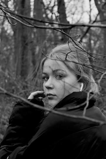
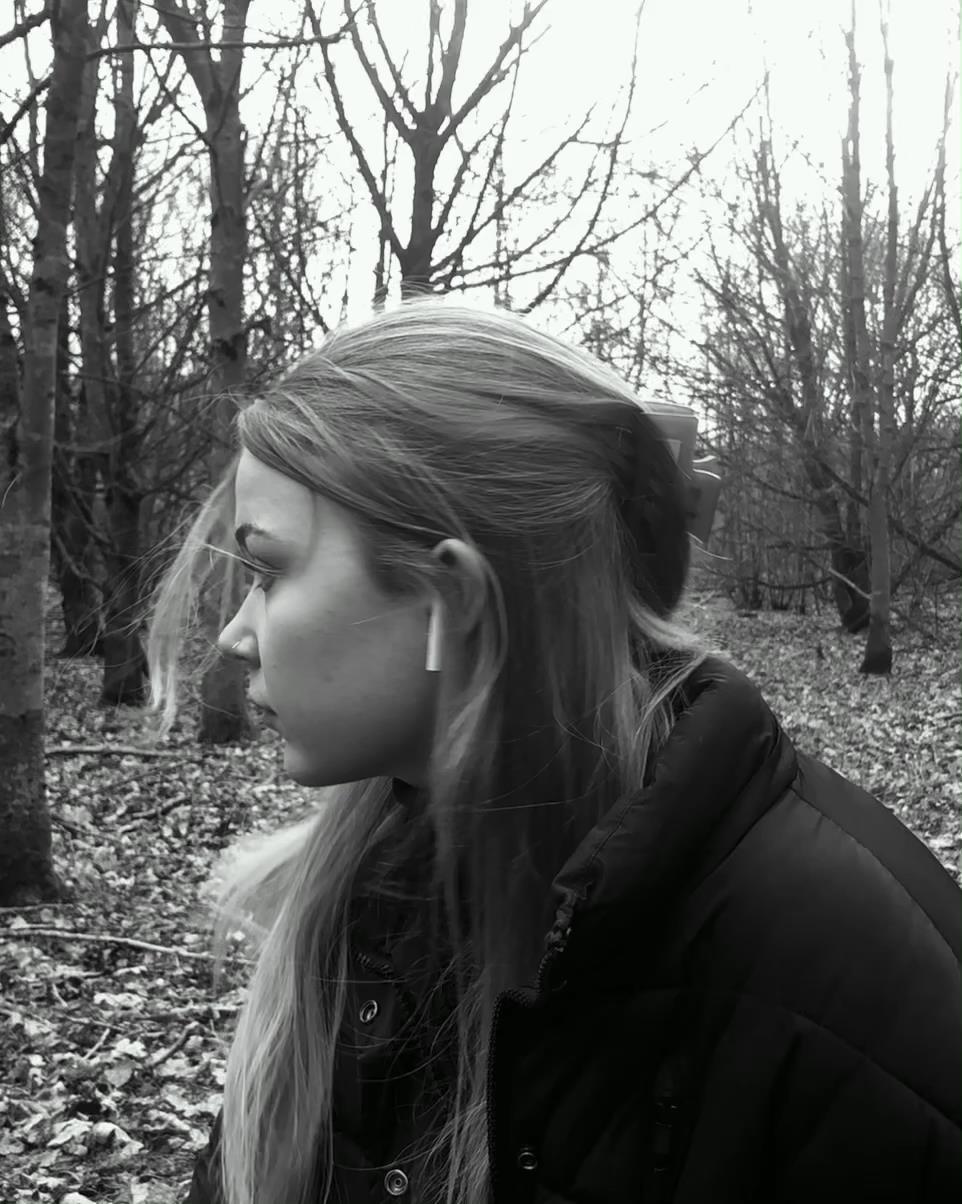
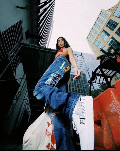
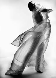
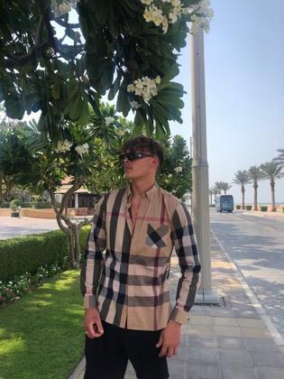
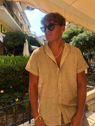
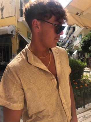
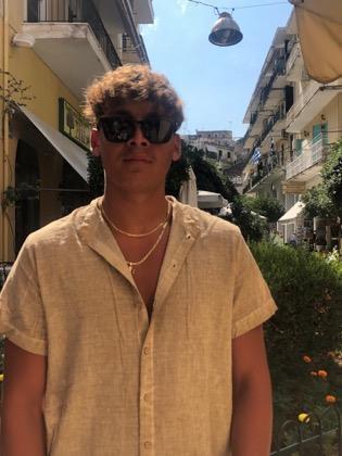
The artists I have studied/researched that have informed my initial ideas are Agata Serge and Daniel Bruno Grandl. They have a sense for portraiture photography, enhancing fashion and expression with their photographs. I love the way they can make a simple composition look intriguing to the viewer's eye. There is also a complete difference between the two regarding their photography styles however they both are skilled when it comes to correct placing of the body and centre view-point (where they want to lead your eye). The artists I have studied relate to my project theme due to presenting movement in the expression, fashion silhouettes, poses and compositional aspects of the photographs. I inspire to take photographs that are successful in illustrating this. Furthermore, Nick Knight, Rossana Jones and Hannah Nöch relate to my adapted ideas of self image and representation in the media. The three artists all have a message to society and this is something I want to elevate within my project.
an exploration into mixed media, fashion photography and how the figure can create a sense of sequence, rhythm and gesture.
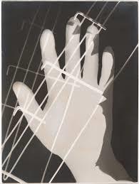
sequence, rhythm and gesture.
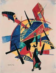

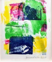
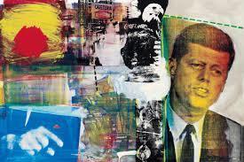
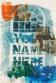
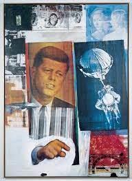
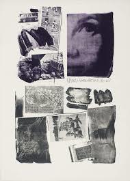
- Rauschenberg’s ‘Street Sounds’ presents the idea of collageusing a screen printon paper.
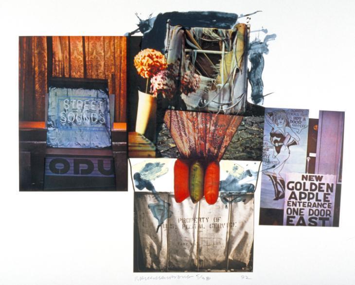
- The colours used in the overall piececontrastand complement each other, some are brightand impactful (red, blueand orange), and some aredark and dull looking. (black, grey and muted purple)
- The composition allocated to the design, includes overlapping of images/paintings which gives the artwork a ’scrapbook’ sense, which compliments Rauschenberg’s style.
- He has incorporated scaffolding into one of the images of ’Street Sounds’. This could present the noiseof construction or builders on a busy street/or in a city.
- There is a sense of city noises fromthe ‘Golden Apple’ entrance section of the collage. New York’s Time Square is known as the ‘Golden Apple’.
- The lightand tone in the artwork suggests a nighttime feel. Its dark hues and overcast lightillustrateharsh dimensions of fabric and material. Also, thelighting makes the objects pop againstthe gloomier surroundings, making them striking and contrasted. It draws the eye to the desired areas made by the artist.
- There are brushstrokes made with a blue medium at the top of the image. They are ‘messy’ and look splattered. This could suggest the rough sounds he hears in a street, portraying them in his brush strokes.
- The constructed design fits into Robert Rauschenberg’s signaturePop artstyle. It is graphic and looks as if hehas thought about each individual section carefully as each piece works well together.
- Textures and patterns used in the art piece give ita vintage sense, likethe images are old this could represent how long he has been living in New York and the sounds he hears daily.
- ‘Popartemergedinthe1950sandflourishedinthe1960sinAmericaandBritain’.
- ‘Itbeganarevoltagainstthedominantapproachestoartandcultureandtraditional viewsonwhatartshouldbe.’
- Youngartistsbelievedthatmuseumsandartschooldidn’trelatetotheirlivesso‘they turnedtosourcessuchasHollywoodmovies,advertising,productpackagingandcomic booksfortheirimagery.’
- ThecharacteristicsdecideduponbyRichardHamiltonin1957werethatitmustbe
-termsolution),Expendable(easilyforgotten),lowcost,Mass produced,Young(aimedatyouth),Witty,Sexy,Gimmicky,Glamourous[and]Big businesses.
- Popart‘canbeseenasoneofthefirstmanifestationsofpostmodernism.’
- ‘IntheUnitedStates,popstylewasareturntorepresentationalart(artthatdepictedthe visualworldinarecognizableway)’.
- ‘EarlypopartinBritain[however]wasfueledbyAmericanpopularcultureviewedfroma distance’.
- ’InBritain,themovementwasmoreacademic’.Itemployed ‘ironyand parody,Itfocused moreonwhatAmericanpopularimageryrepresented,anditspowerinmanipulating people’slifestyles.’
- ‘The1950’sartgroup TheIndependentGroup(IG),isregarded astheprecursortothe BritishPopMovement.’
- ’TheIndependentGroup(IG)werearadicalgroupofyoungartists,writersandcriticswho metattheinstituteofContemporaryArts(ICA)inLondoninthe1950s’.They‘challenged thedominantmodernist’and‘culturedominant[…]inordertomakeitmoreinclusiveof popularculture’.
https://www.tate.org.uk/art/art-terms/p/pop-art
https://www.tate.org.uk/art/art-terms/i/independent-group
https://www.tate.org.uk/art/art-terms/a/abstractexpressionism
- ‘The abstract expressionists were mostly based in New York City’ they became known as the ‘New York school.’
- Their aim was to make art was was ‘abstract’ but ‘also expressive or emotional in its effect.’
- ‘They were inspired by the surrealist idea that art should come from the unconscious mind’.
- The usage of ‘expressive brush strokes’ belonged to the ‘action painters’, one of the ‘two broad’ groups.
- This altered to the ‘colour field painters who filled their canvases with large areas of a single colour.’
- ‘The action painters were led by Jackson Pollock and Willem de Kooning, who worked in a spontaneous improvisatory manner often using large brushes to make sweeping gestural marks.’
- ‘Action painters directly placed their inner impulses onto the canvas.’
- The second group ‘included Mark Rothko, Barnett Newman and Clyfford Still. They were deeply interested in religion and myth’. They created ‘simple compositions with large areas of colour intended to produce a contemplative or meditational response’.
- Colour field painting was ‘characterized by artists using large areas of more or less a single flat colour.’
‘Popular’,‘Transient(short
https://www.artsy.net/marcel-katz-art/article/marcel-katz-artunique-perspectives-matthieu-venot
- ‘34-year-old photographer from Brest, France that views architecture around his hometown and the places he visits in an astonishing way.’
- He has an ‘eye for finding pastel-colored landmarks in seemingly grey cityscapes.
- ‘His signature photos are abstract yet particular, exemplifying simple geometry and nostalgic colors, often backed by a cloudless blue sky.’
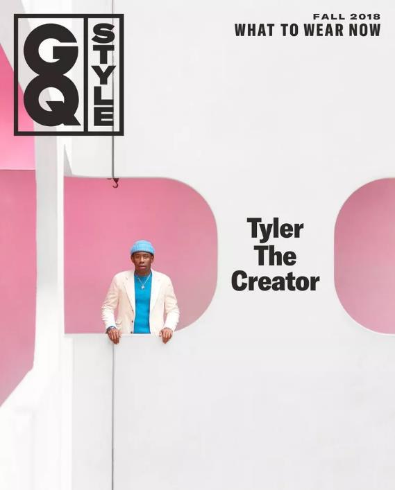
- ‘In four years Venot has managed to create a signature style that is instantly noticeable on social media, or on the cover of GQ Style.’
- ‘Matthieu Venot’s creative process is both unique and modern, often using Google Maps as a tool to scout locations.’
- He ‘walks around the city for a while’ after ‘a lot of location scouting’. ’Exploration is a huge component of Venot’s creative process.’
- ’Finding the perfect location is crucial’ to achieve his style of photography.
- All he does, after the extensive lighting and location process, is edits the photograph’s ‘contrast and exposure’.
Referencesused(Quotes):
https://www.youtube.com/watch?v= Pb1jsFRcqJo
- Photography started in the fashion world, ‘like Christian Dior, Alexander McQueen and Vivian Westwood’
- He is drawn to the ‘mineral gallery’ which made him more aware of ‘3 dimensions’ – and ‘a different way of looking’ at something and ‘3D scanning’.
- Looking a sculpture, he wanted to see ‘how different artists approach sculpture and representation of the human form’ – working fromtheir mind insteadof a photograph
- He tried to create ‘fashion sculpture’ in a computer software in his website Show Studio.
- He looked at the art of plant power (‘mans relationship with plants’) and ‘affected the rest of [his] career’ –he wanted to ‘make fashion socially relevant’.
-
‘The most interesting thing we can do’ is to look at ‘life through other people’s eyes’.
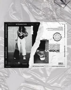
I chose these artists and photographers because I am drawn to the graphic design element of photography but also the unique prints and editing used. I like their styles of work; some use bright colors some use textures to enhance their photography.
The artists researched might influence my work in a way of experimenting with color, texture and the subject matter for my photographs but also the presentation of my overall project. I want to get into more pictorial and illustrative styles which will correspond with my photographs. Also, I want to have a meaning behind this way of selecting these aspects –possibly responding to global issues through my work.
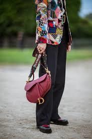
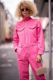
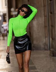
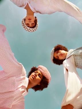
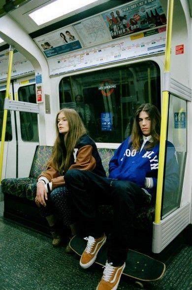
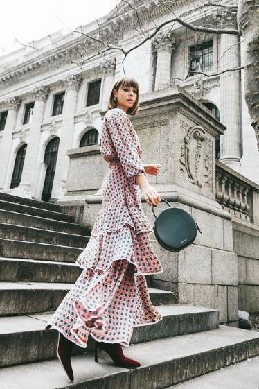
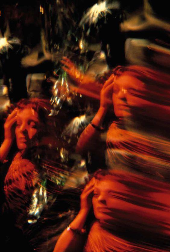
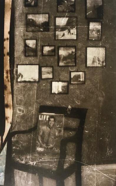
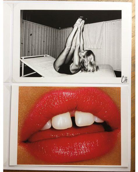
Inspiration from Sequence, Rhythm and gesture mood board (Pinterest)
- Exploring mixed media and montage techniques to enhance my skills to use them for later work
- Exploring rhythm and gesture through colour, repetition of form and composition
How does this relate to my project?
- Exploring mixed media and montage techniques to enhance my skills to use them for later work
- Exploring rhythm and gesture through colour, fractured digital manipulationand composition
inspiration picture from Pinterest
Locations/backdrops
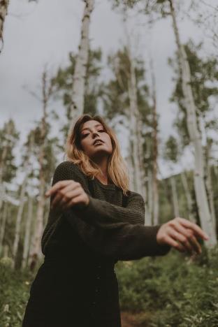
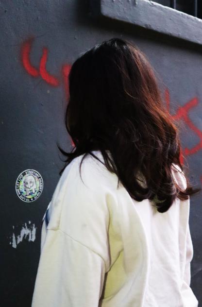
- graffiti walls
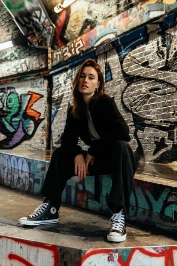
- basketball court

- Brick walls
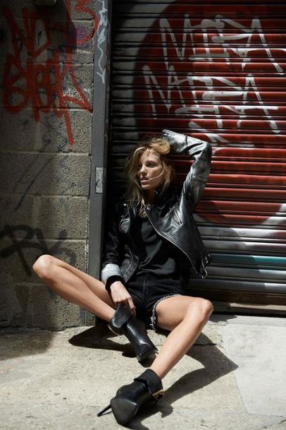
- Forest scenery
Inspiration Pictures from Pinterest
Referencesused(Quotes):
https://www.lensculture.com/agata-serge-2
https://www.outdoorphoto.co.za/blog/agata-serge-interview/
- ‘Portrait and fashion photographer’
- ’Agata Serge had many publications in various magazines online and in print worldwide.’
- Uses monochromatic filters/editing over top of images
- She thinks black and white photography can be hard to create.
- Works with a Canon 5D mk IV, Canon 40 mm f/2.8 lens, Canon 35mm f/1.4 lens, Broncolour studio lights, ONA 7 and Vinta camera bags and Tether Tools TetherPro USB 2.0 Cable.
I think I could inspire my moving image around this photographer as I want to experiment with portraiture/black and white photography. The rhythm and gesture could be represented through the movement in the video and the facial expressions.
I could look at the facial expressions and poses Serge uses in order to practice successful compositions.
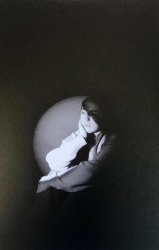
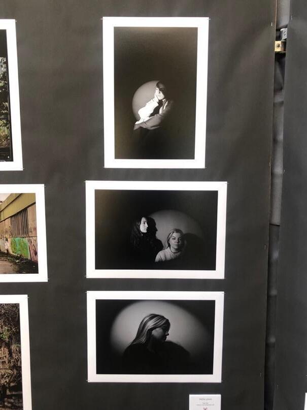
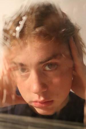
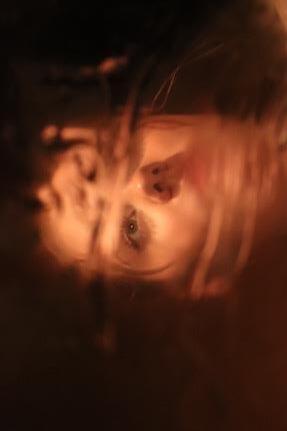
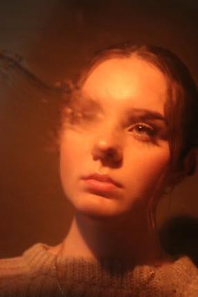
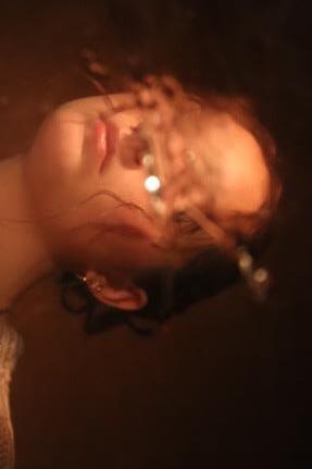
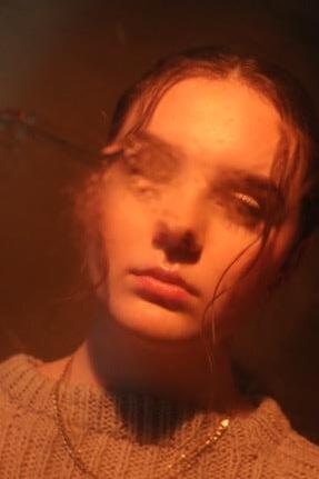
Photoshoot 4Edited
What theme am I drawn to most?
- I am drawn to the ‘Sequence, Rhythm and Gesture’ project theme the most due to the most creative variation I could achieve fr om it. I like the number of approaches I could take with the theme. It also allows me to generate my creative,graphic style which is personal to me. I wanted a theme that would grant this as it would keep me interested in the project.
What was your focus in my recordings so far?
- My focus through the recordings was the ability to present my style in a way that linked with the theme. I wanted to be inspired by artists but not copy their work.To add, I wanted to explore my subject matter,this is shown in the portraiture(never done before in Photography), the editing styles, lighting and composition. This starting point of my project was to practice my camera abilities and spark my project in new directions.
What qualities in the objects/places/people have I observed,do I wish to explore further and translate into still/moving image?
- I have observed the placement of a photograph,how to translate a sense of movement through posing,art (overtop of the image –collage and montage),lighting,the way the photograph draws the viewer to a specific place.How the viewer would look through the image, this shows movement within looking through.
- I would like to explore moving image further.This could be explored through a set of images of a moving figure or a video.I want the feel for movement and rhythm shown in the images, this could be due to the editing styles or positional elements.My artist research will help me to explore this.
What materials and techniques will help me do this?
- I want to explore my camera setting into video format as this is something I have never done before.
- Materials such as Procreate,and Photoshop will help me to edit the photos in this style. Techniques such as a variation in lighting, posing and composition exploration will filter down my selection and abilities.
Locations/backdrops
- graffiti walls
- Brick walls
- Cambridge City Centre
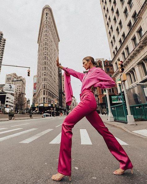
Inspiration Pictures from Pinterest
Graphical
https://danielbrunograndl.com/about/
Referencesused(Quotes): https://theurbanspotter.com/about/
- ‘Daniel Bruno Grandl is a Fashion Photographer currently based in Berlin, Germany’.
- ‘Started his photography career in London’.
- ‘Founded his brainchild @theurbanSpotter, documenting global fashion trends.’
- ’traveling to capture unique style & beauty’.
- ‘especially drawn to portrait & street style photography’
- ‘Daniel began TheUrbanSpotter with the idea of capturing peoples’ sense of fashion and how fashion is visible in our daily lives. However, it is not all about clothes it is about people who wear them and their personality that make clothes stand out.’
I think I could be inspired by this artist for my next photoshoot. I want the photos to convey a sense of personality through the clothes, poses and facial expressions. I want to have fun with bright pops of colour and selecting street surroundings emulating the graphical style.


- Blue skies (possibly a park)
- Fields to portray a neutral background (balanceout the colorful fashion pieces worn)

- Boldly colored walls to enhance colours worn,could be complementary colours such as orange clothes,blue wall
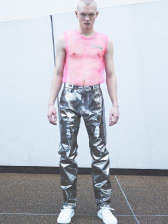
https://www.showstudio.com/contributors/nick_knight
- ‘Nick Knight is a fashion photographer, filmmaker and director of SHOWstudio.’
- ‘knight has consistently challenged conventional notions of beauty and is fêted for his groundbreaking creative collaborations with leading designers’.
- Editorial style portrayed through the bold colours and abstracted fabrics, structures and placement of the body.
- Sense of movement through the fluidity of fabric and how it lays over the body too.
- Unification of colours. They all work together whether that’s through a specific colour palette or monochromatic styles.
Nick Knights work links to my theme of Sequence, Rhythm and Gesture through the dressed-up, enhanced body with silhouettes creating dimension.
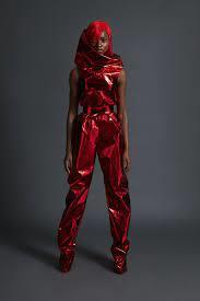
- Contrasted background compared to fashion (bright red)
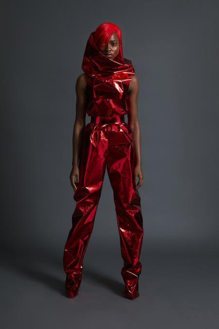
- Bold, confident pose
- Sense of movement through the folds and curves of the fabric
- Large, tight belt to draw attention to waist, making the shoulders and legs angular to create an hourglass effect
- Lighting is vignetted to draw the viewer’s eye towards model and center of image.
- Also, the lighting is dimmed but harsh on the model, this makes the reflective fabric stand out/ more dynamic.
- One single bold colour used compared to multiple within the outfit, this makes the piece unified as the black/dark grey background connects with the monochromatic look.
- There is also a sense of movement illustrated within how the fabric travels along their body, covering half of the face and feet.
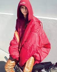
Inspiration Pictures from Pinterest
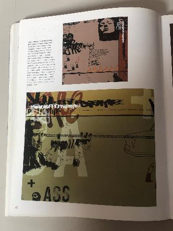
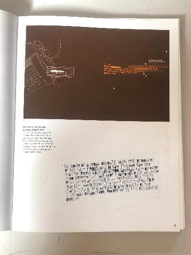
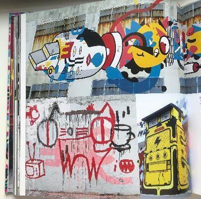
Typography
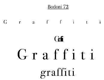
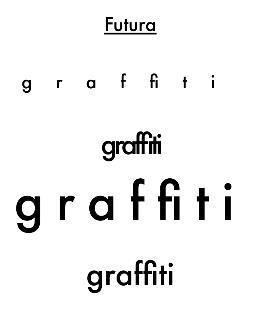
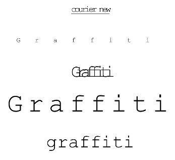
- Graffiti
Bold Colours from Photographs:
Tones from Photographs:
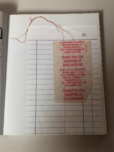
Typographyfrom machines/receipts.
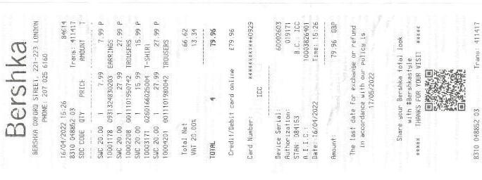
- Printedtypography(fromcomputerssuchasreceiptsetc.)
- Paintedletters/words
- Letters/wordscutoutfromtextures
Somefontsthatare simpleforbulktext onoutcome.
Iwanttousegraffitiasa partofmy outcomeasitistypicallyseenas‘ugly’ and‘irregular’bymost.Ithinkthis linkstothewayweperceivepeople andourselvesasmanyseebeauty withinusthatsometimeswedon’t alwaysseeinourselves.

https://www.lucaszarebinski.com/info
- He loves ‘creating conceptual images, pushing boundaries of still life photography and resolving client’s problems with an inspiring imagery.’
- He was ’raised in Poland and came to Michigan when [he] was twenty.’
- ‘After getting a degree in photography, [he] moved to California’.
- Vey well known for his food photography, however I am interested in his product photography.
- I love the use of bright colours, minimalism and symmetry.
- I see a trend of using a similar colour to the subject matter within the background. – this makes the pictures look unified.
Lucas Zarebinski’s work links to my theme of Sequence, Rhythm and Gesture through the simple compositions showcasing a sequence of product placement.
 Lucas Zarebinski.
Lucas Zarebinski’s Work
Lucas Zarebinski.
Lucas Zarebinski’s Work
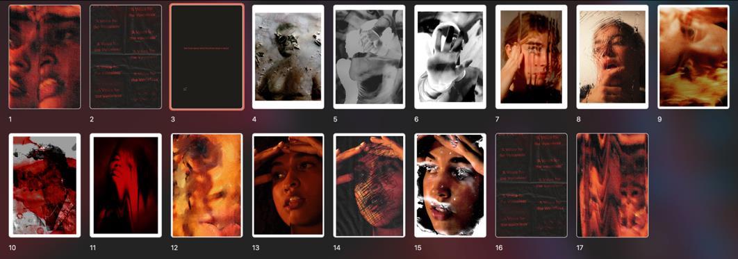
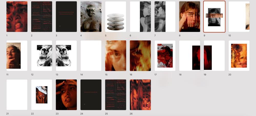
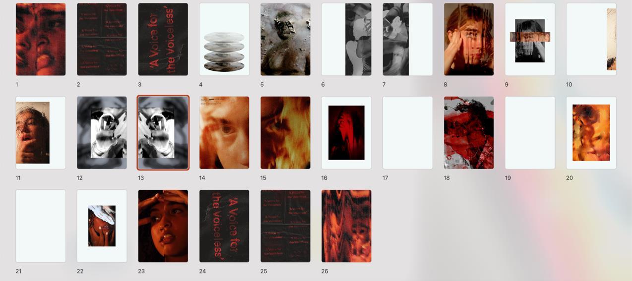
Possible photos for front/back cover of mock photobook. (Raw)
Locations/backdrops
- graffiti walls
- Brick walls
- Murals - New York City
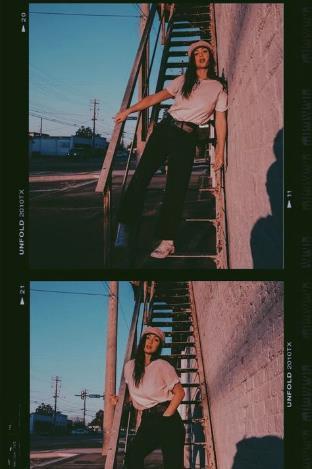
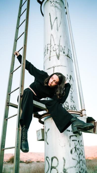
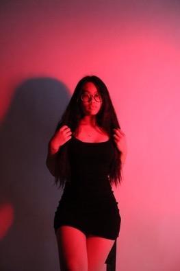
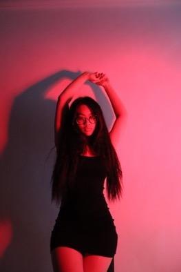
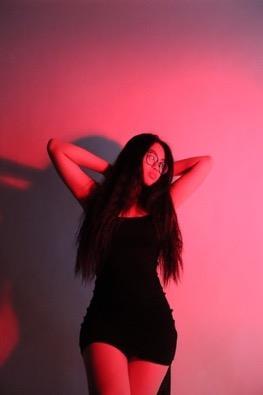
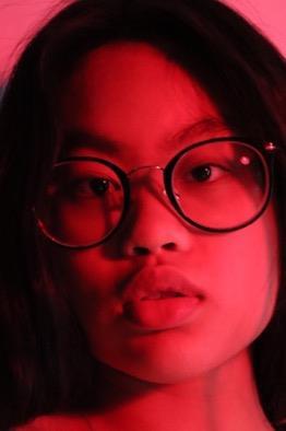
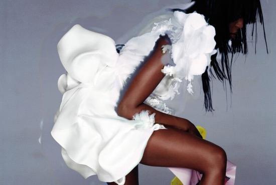
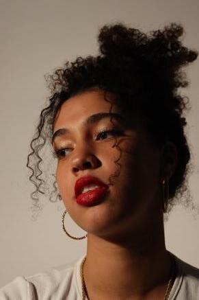
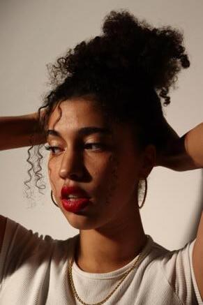
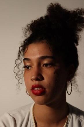
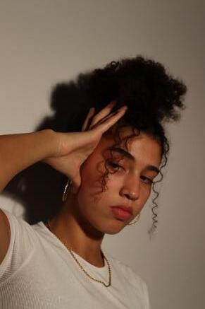
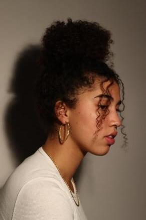
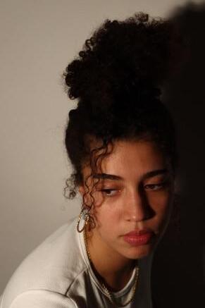
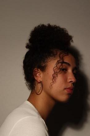
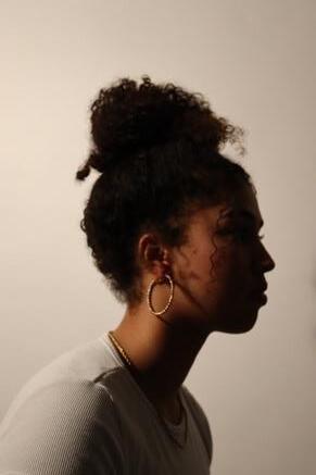
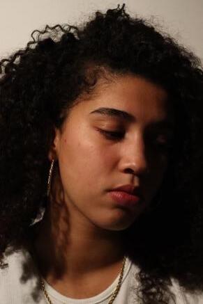
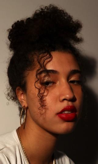
Fashion Photography – expressing identity Photoshoot9
Referencesused(Quotes):
https://academy.wedio.com/famous-fashion-photographers/
- Twoartists,MertAlasandMarcusPiggot ‘arebothfashionphotographerswho workunderthenameMert andMarcus.’
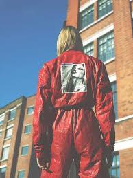
- ‘had theirworkfeaturedinDazedandConfused.’
- ‘pioneeredtheuseofdigitalmanipulation’andare‘alsoresponsibleforhaving shapedtheglobalimageofrenownedbrands,suchasGiorgioArmani,Yves SaintLaurent,Givenchy,andLancôme.’
- Photographedmanycelebrities‘suchasMadonna,LadyGaga,JenniferLopez etc.’
- ThesimpleyeteffectiveplacementofthefigureissomethingIwouldliketotry inmynextphotoshoot,experimentingwithcolourswithintheoutfitand surroundings.
- Onefigureinmostphotographs.Thisdrawsattentiontothegarmentstheyare wearing,makingthemspeakforthemselvesandshowingpersonality.
Mert and Marcus’ work links to my theme of Sequence, Rhythm and Gesture through the usage of sequence regarding similarity between shots. You can see a sense of pattern in the three images of their work to the right.


- Adjustedthe brightness to createa moodier and more defined atmosphere
- Contrastincreasedto add depth to my image
- Saturationincreasedto balance out the films lack of tone and shadow
- Vibrance decreasedto then balance out the saturation,so it doesn’t look artificial and like a filter
- Gramma correctionwas to tone down the noise within the photo
brightness:-54
contrast:51
vibrance:-18
saturation:+13
exposure:-0.11
gramma correction:0.84
levels:rgb
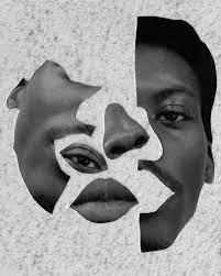
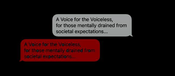
an investigation into expression and diversity; encapsulating the celebration of difference and how this has evolved and is evolving within the media/society today.
the use of graphical elements help to portray my own sense of personality as well as promoting diversified societies within portraiture photography.
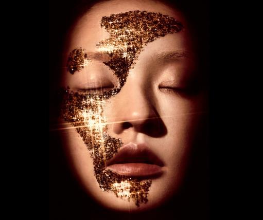
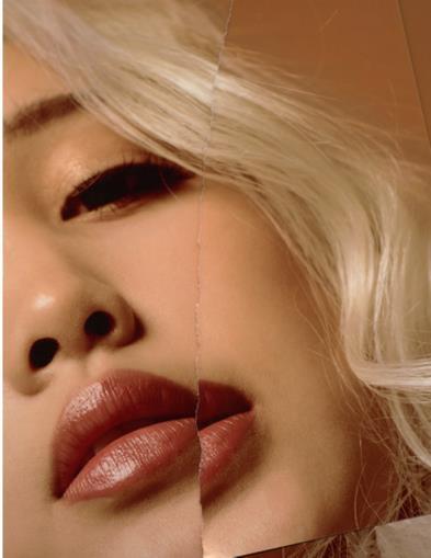
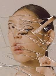
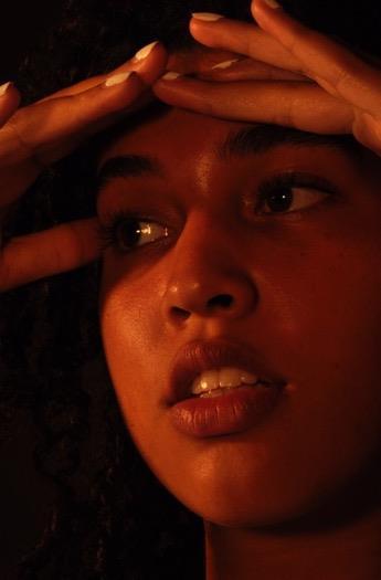
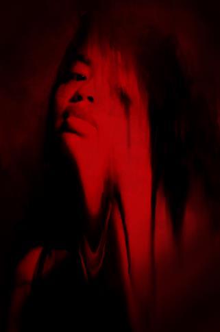
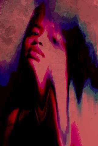
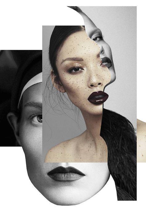
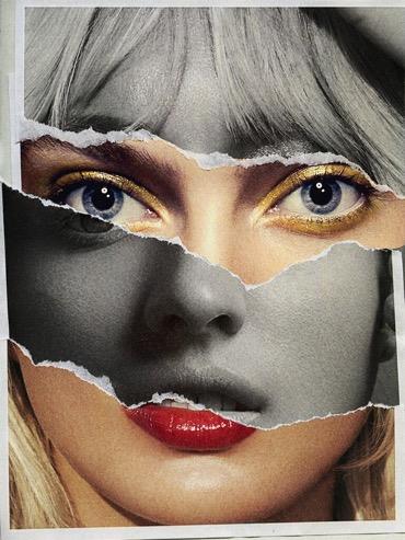
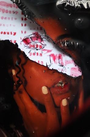
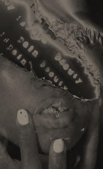
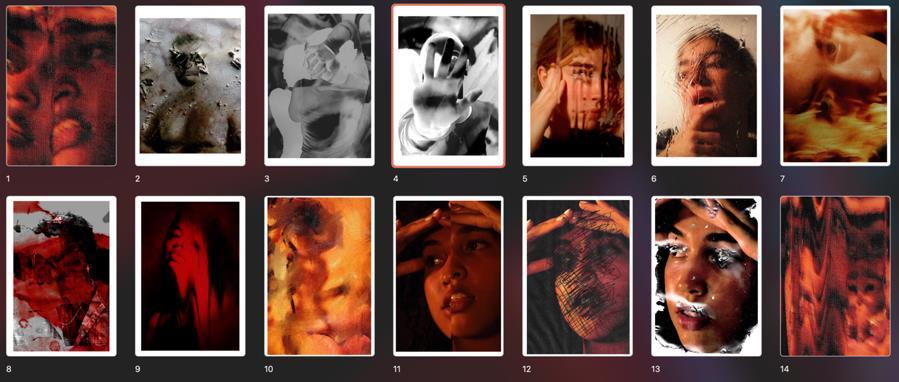
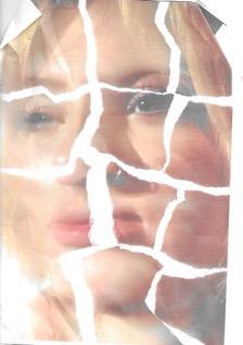
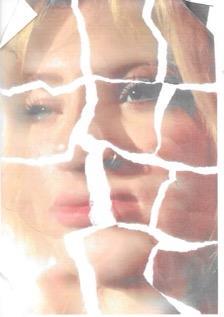
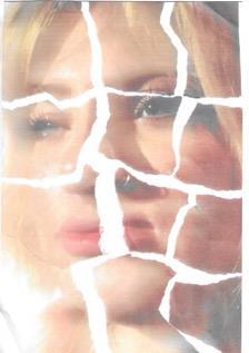
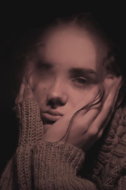
Anexplorationoffigure,sequenceandgesturelookingatthepressureofthemedia.
Within the exploration, which evolved from fashion photography to portraiture photography, I developed my understanding of my artists such as Nick Knight and Rosanna Jones which allowed me to convey deeper meaning in my work. I now understand how inequality of representation, beauty standards and stereotypes and how they fuel these artists work. This interested me as a young photographer. I wanted to convey my own struggles with self-expression and the lack representation I saw within the media from a young child. To do so, Jones was my main interest as mixed media was always deep routed within my photography. Narrowing down my objective and the reasonings behind my work created a clear curiosity with how I and many others are constantly being manipulated my the media to question ourselves rather than the screen we are told is reality.
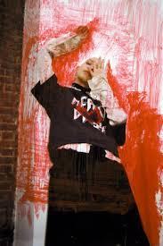
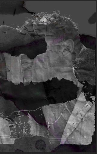
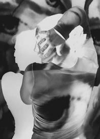
Using more gestural features such as mixed media and fine art photography allows me to create pieces that showcase this awareness, using subtlety as a tool for questioning our stereotypical mindsets. Furthermore, I wanted to acknowledge the damage social media and curation of the media can impact onto people, but especially women such as myself. Constantly, we are being told how to act, dress, behave and live our lives within the judgement of heavily routed media expression. Using methods such as burning, bleaching, distorting, tearing and layering my images helped to portray the mask many of us wear to conceal from the impact, as well as showcasing the anger in which many of us feel due to the issues as well as present the lack of identity.
Nick Knight, the artist researched when looking at fashion photography, diverted my interest into his reasonings behind his work. Wanting to create a more diverse representation within his platform, he photographs people less heard within the media. In addition, Rosanna Jones uses her techniques to critique what beauty can be, allowing for normal bodies to be celebrated without the need of photoshop manipulation. Hannah Höch creates an interrogation towards society about gender stereotypes and uses her imagery to express equality for women.
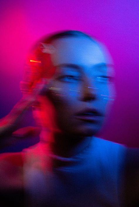
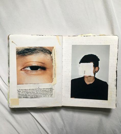
Inspiration pictures from Pinterest
photoshoot planning
Fashion Photography – expressing identity
- Adler, when photographing people,keeps the composition clean within one subject matter in majority of her work
- She allows her work to be fun and creative through the elements she introduces.For example,lighting,experimenting with colour, reflectiveaccessories and hues and tones.
- She also plays with contrasts making them dramatic,enhancing her subject matter and drawing your attention to the focal point.
How does this artist relate to my project and how will they affect me moving forward?
- The artist relates to my project due to the enhancing of portraiturephotography within the fashion world.
- Also, the element of identity is shown within the singular figure,showing that they are powerful enough to be on their own, telling a story.
- Inspiration taken from the artist would be the singular subject, colour experimentation within lighting and gels and reflective features.
Photoshoot 11

Contact sheet.
- brightness -25
- contrast 42 - levels, increase contrast 2
- saturation -2
- vignette, gradient fill 1 (bottom image)
How does this relate to Lindsey Adler / what did I learn from this artist?
- tried out close, portraiture compositions
- experimented with colour gels and overlays


- experimented with harsh contrasts
- simplistic composition
H ow does this relate to my theme: sequence, rhythm and gesture: human figure within environments (fashion photography)?
- photographing a range of diverse models
- element of sequence through the captured moments in time as they are different through each pose but make up a set
- experimenting with posing the human figure to create rhythm and fluidity


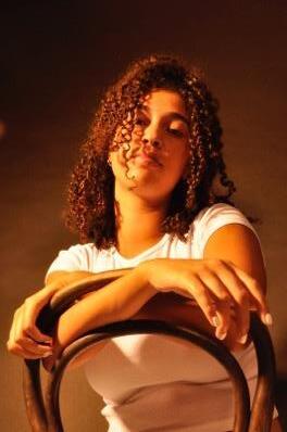
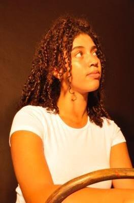
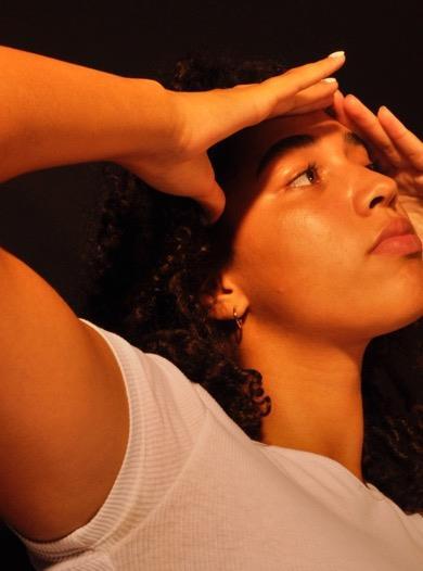
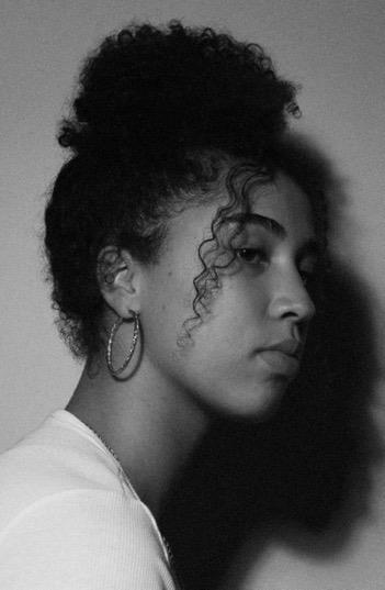
Fashion Photography – expressing identity
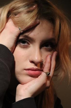
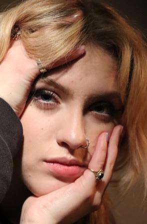
Looking at closer portrait compositions
Experimenting with the studio – lighting, poses, exposure…
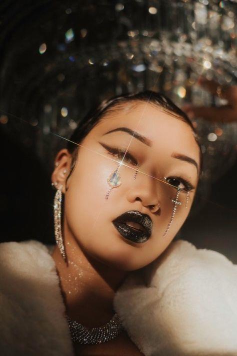
Inspiration pictures from Pinterest- Rosanna Jones focusses on dissolving beauty standards within her graphical elements
- “I was taught to heavily retouch […], but these days I like to do as little as possible, ideally not at all. […] I’ve not worked with anyone who was after something totally unrealistic.” https://metalmagazine.eu/en/post/interview/rosanna-jones
- uncanny elements that distract the viewer, could be seen as making the images
‘imperfect’ but are still seen as beautiful. How does this artist relate to my project and how will they affect me moving forward?
- Jones relates to my project through the experimentation of graphical elements such as burning, distorting and editing. She also relates by the idea behind her work, disregarding this idea of unattainable standards of beauty and celebrating one's own difference.
- Moving forward, I am going to take her portraiture style of a simplistic portraiture shot and converting it into my own distortion of identity. I love the neutral crossed with the strange as it depicts this new idea of what beauty is.
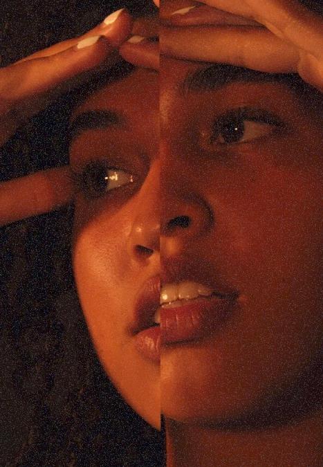
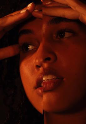
I am trying to achieve a sense of identity within my work through the close - up compositional elements, singular model and simple style. I am doing this to elevate my skills of fashion/portraiture photography and my postproduction skills including graphical elements.
I have looked at Lindsey Adler and Rosanna Jones so far to inform my photoshoots, they enable me to take key elements that I find successful (lighting, angle and composition) and put it into my own work.
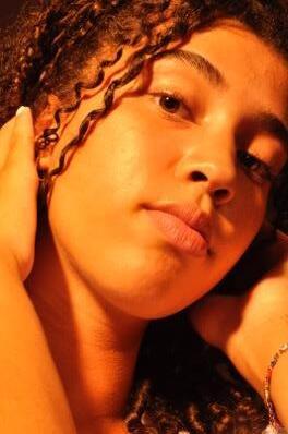
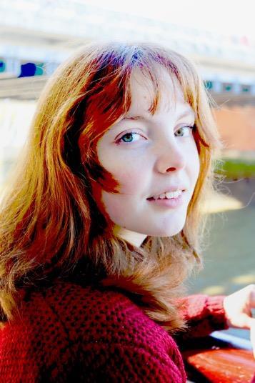
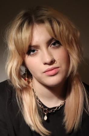
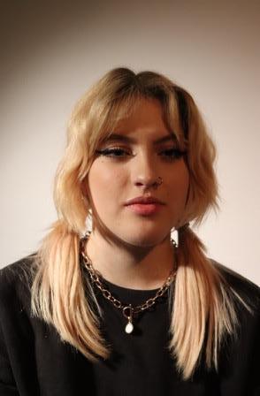
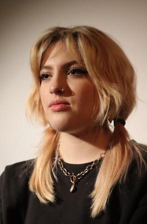
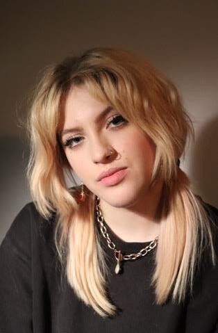
I am going to photograph my friend, Ruby within a classical style, focusing on her features and personality.
Outside in my garden, using a blank wall and laying a white sheet over it. Or within the studio with a black backdrop and orange lighting.
Natural lighting would be great on a sunny day. If it doesn’t portray the harsh shadows that I desire, I will find some lights in order to create this instead (artificial lighting with natural lighting)
Possibly suggest using a fan to create an ambiance and sense of movement. Also, I will possibly need another light to create the shadows that may not be created with the natural light.
Simplistic, loose dresses, blazers, sparkles and reflective clothing. Gems on the face. Neutral makeup such as greens, golds, silvers and white clothing.
Photoshoot 12
Contact sheet.
-
edits (using photoshop)
- exposure:+0.17
- offset:-0.0042
gammacorrection:1.00
- brightness:25
- contrast:9
- contentaware fill
- crop


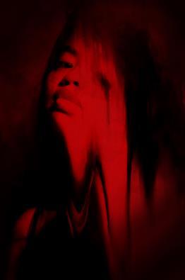
How do these images relate to my project?
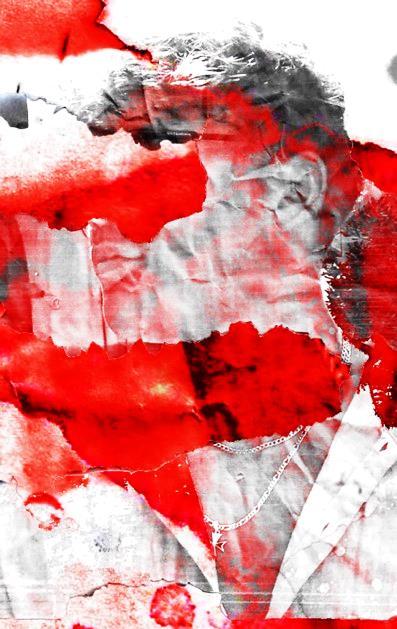
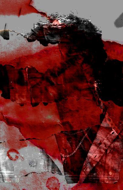
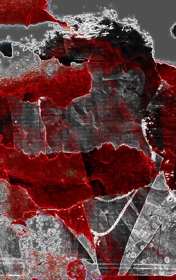
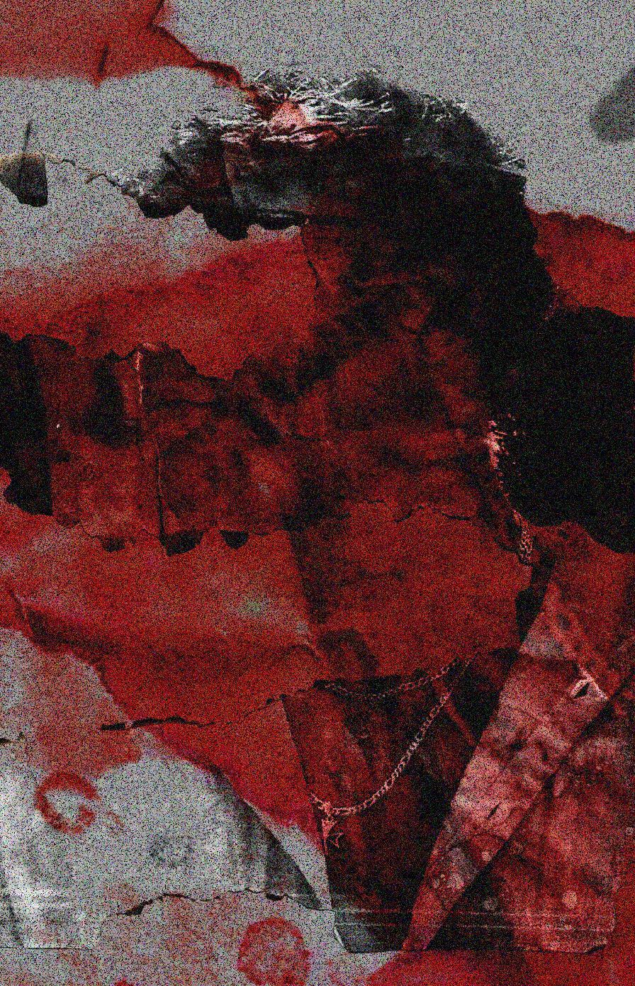
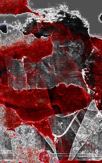
- Lack of identity shown through teared and burnt face
- Blood red symbolises the permeance of the pressure and the effect of the media
Photoshoot 13
Contact sheet.


I tried using this technique which is conveyed in Rosanna Jones’ work. I think this links to my idea of how the media affects society/societal misconceptions through the imperfect alignment. Almost translating that imperfect is also seen as beautiful.

In the style of Rosanna Jones, I created this piece from the right image, which invites the idea of distortion. I wanted it to portray how the media impacts people emotionally and I feel as this is shown through the manipulated facial expression. There is a sense of discomfort and trying to mould into the idealised portrayal of the female beauty standards.
 Rosanna Jones
theme: sequence, rhythm and gesture: exploring human figures in environments subject matter: human figure concept: expressing and celebrating difference
Artists: Nick Knight, Rossana Jones, Hannah Nöch
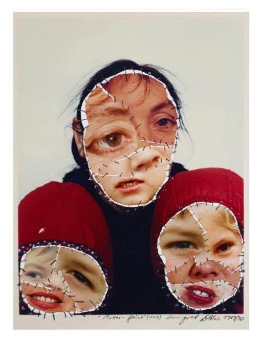
2007
- Senseof montage
- Subject matterof people
- Bright colour pallets
-
Abstract
- Some are morerealisticthan others
-
-
-
-
More than one media
Layout
Composition
Two are headshots and one is a full body shot
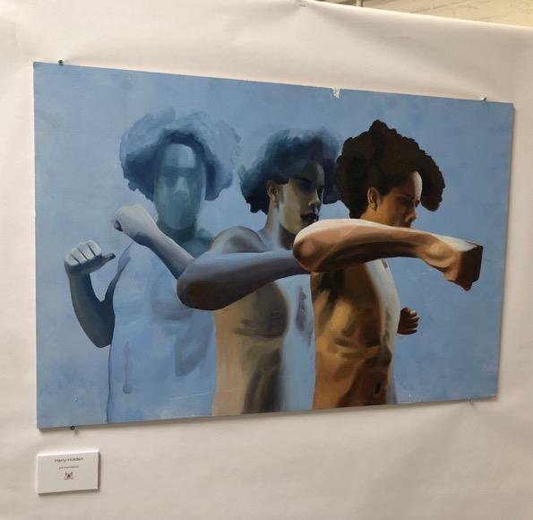
the element the drew me to this selection of work was the projectedelements about how you are depicted within society. this also relates to my work through the idea of self image.
this video was about dementia and how it effects your life. I loved the graphics and editing style of the video. this would inform my work further by looking into moving image and the programs used to complete this standard of video.
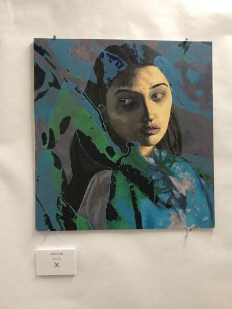
the idea of identity drew me to this selection of work. you get a sense of body image, comfortability and exposure through the art. this will inform my work further through the idea of body language and posing.
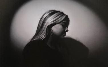
 Hills Road Exhibition
the sense of sequence drew me to this selection of work.I can catch a glimpse into the future through the snapshots and outlines. Hills
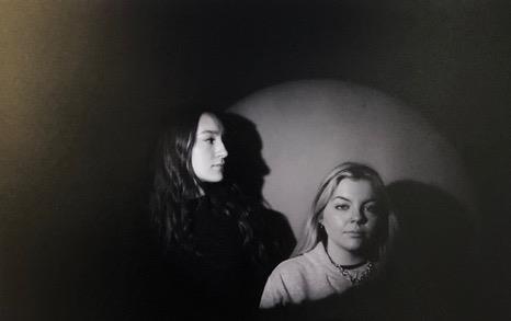
There is sense of correlation between the graphical elements and the portraiture photography. The harsh lighting, red components and sense of layers.


Regarding research, I could revisit the burning and bleaching with some of my new images. Trying it out on some higher quality paper that might convey new results. This will move my project further as I am able to test out some new ways of portraying my sense of style and overall message.
There is a sense of not knowing how the images will turn out which I like, spontaneous aspect. I think this makes my images more authentic and real looking rather than them looking very digital and flat. I love exploring with textural surfaces to make my images look 3 dimensional. This links to my artists as some of them also play around with physical and digital techniques combined.
Using graphical elements such as bleaching, burning, overlays and postproduction manipulation in order to capture a sense of emotion towards societal standards.
Future ideas could be using physical elements on top of my printed photographs in order to portray a sense of tactility and allow for features that are not possible within photoshop and procreate. There is also the idea of the unknown (not knowing how the piece will turn out compared to my ability to manipulate the piece to my liking.) – this idea links to my studied artists Rossana Jones and Hannah Höch
Where is my project going?
The idea of abstraction and colours help to encourage a more artistic approach to my photography which I feel is staring to move forward to finding my style.
The idea of distortion of the human figure: allows me to convey a message questioning the viewer towards beauty standards. Allowing the viewer to understand that being unique from everyone else is what is supposed to be but social misconceptions is what makes this a key element to the modern world (social media).
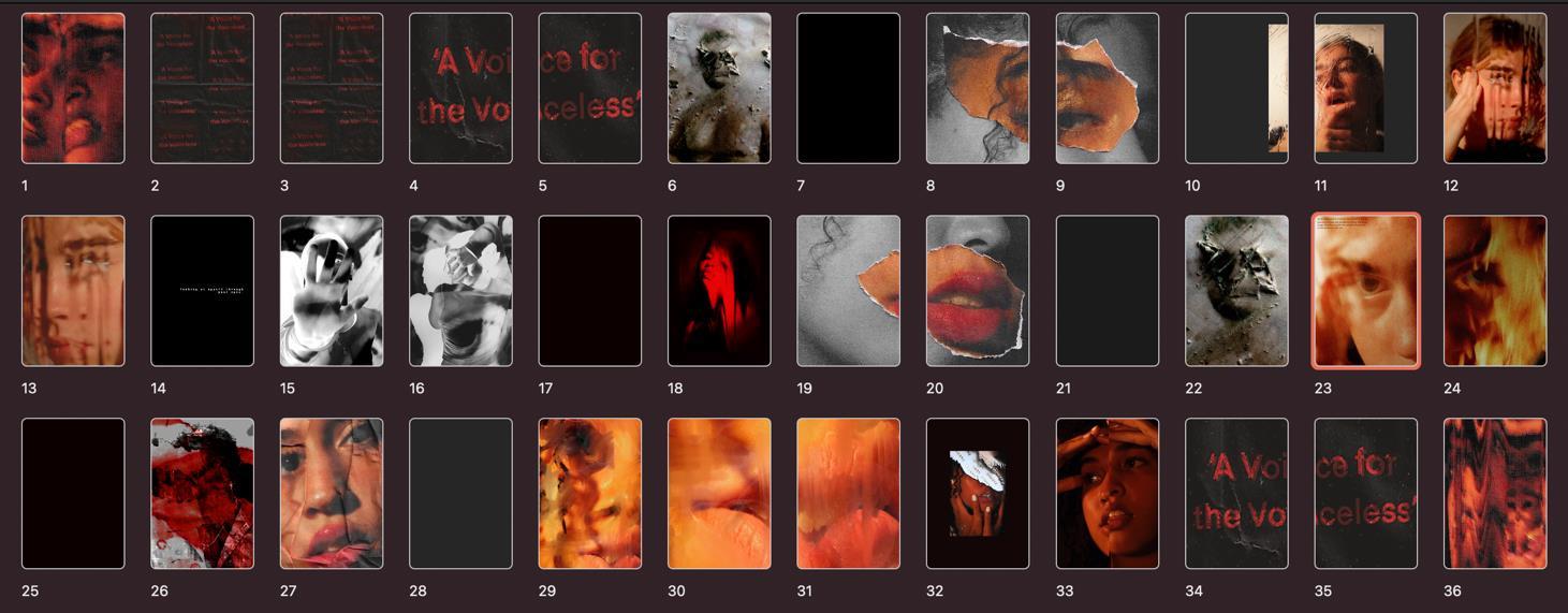
The full bleed images were my favourite and were successful in my last outcome.
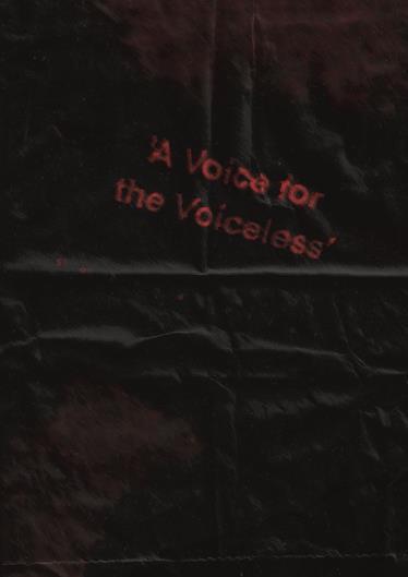
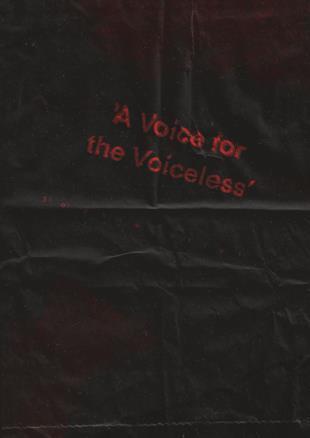
The use of the crumped paper bag texture and dissolving text was successful at simply conveying graphical elements for a backing page. This also linked to my style, and still does.
In my next outcome I will think about doing pages in a simpler way to not distract the viewer's eye. This was an unsuccessful part to my outcome in which I will abandon in the next one.
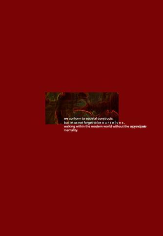
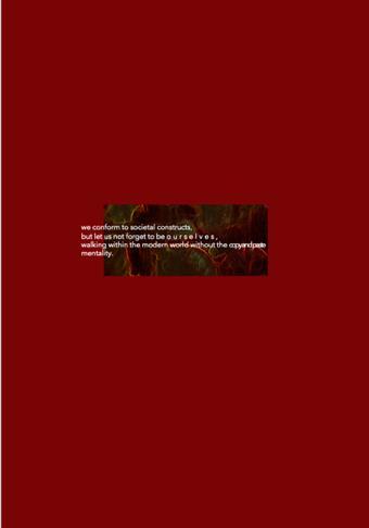
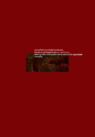
we conform to societal constructs, but let us not forget to be ourselves , walking within the modern world without the copyandpaste mentality.


an investigation into how the media effects society within the pressure we face using mixed media and montage techniques as well as focusing on portraiture photography. This will encapsulate the emotions and oppression in which we wrestle with.
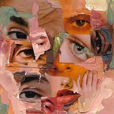
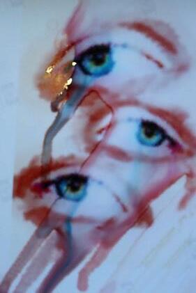
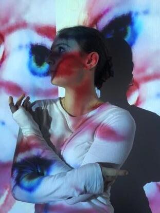
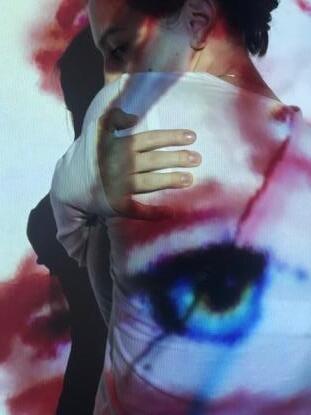
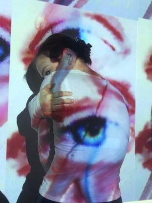
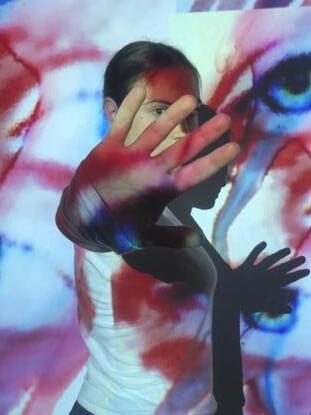
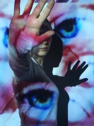
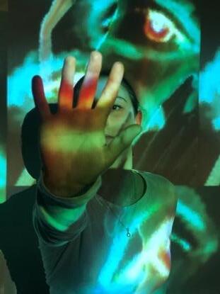
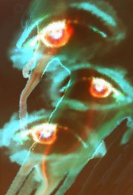
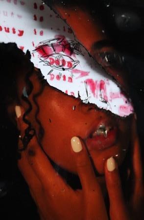
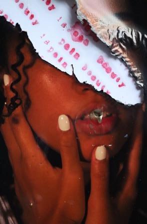
Reasoning and explanation regarding chosen images:
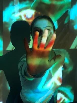
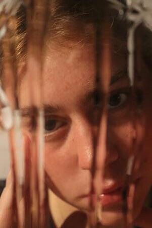
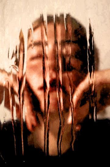
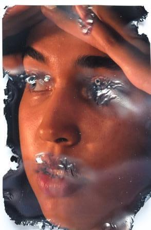
- distortion shown through the ’melting’ forms which go against idealism

- trying new techniques such as projection in which I wish to show as it could convey a powerful message (masking yourself for public view)
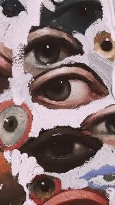
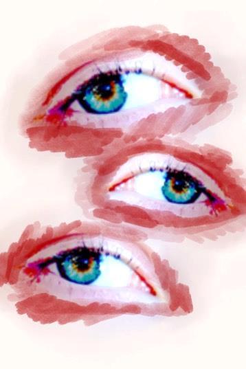
- eyes have impactful meaning towards showing emotion
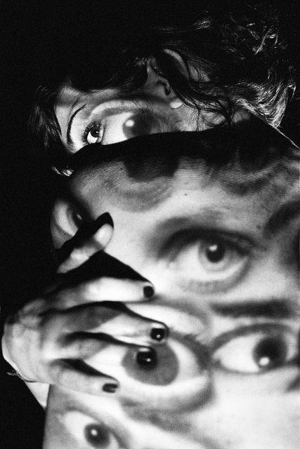
- composition is successful and shows a sense of unity within the images, the tonal range as well as their simplicity
- Eyes could also portray the want and satisfaction of approval by others in order to feel valid and ‘pretty’
- Also, within the eyes there’s connotations of being constantly looked at and critiqued by others to look and behave in the most ‘trendy’ way.
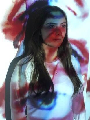
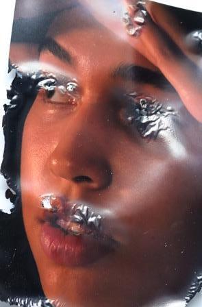
Decided to merge the two images together to create a successful composition, I thought the acetone would work within the eye image as it almost suggests emotion through the appearance of tears as it bleeds. This could evoke the pressure of the media and how it affects us mentally as well as physically.
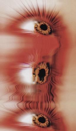
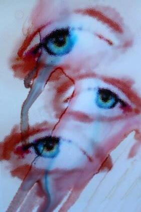
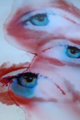
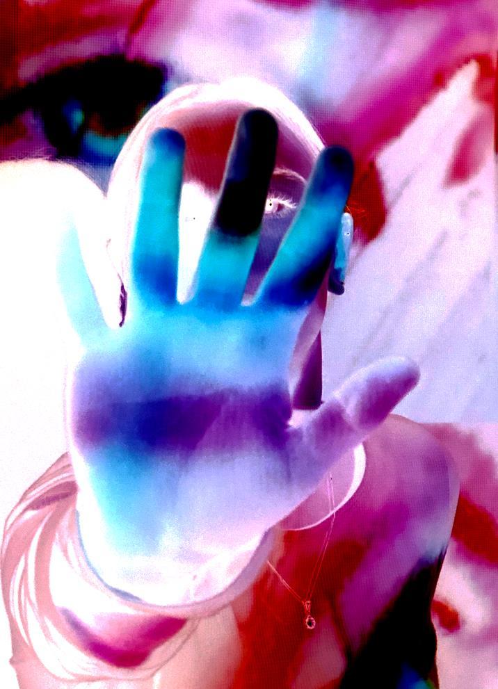
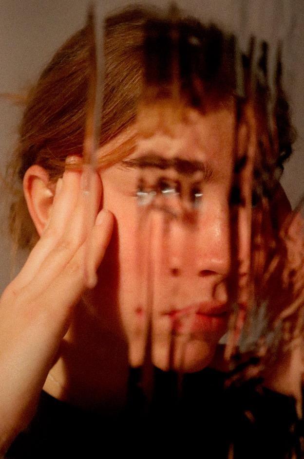
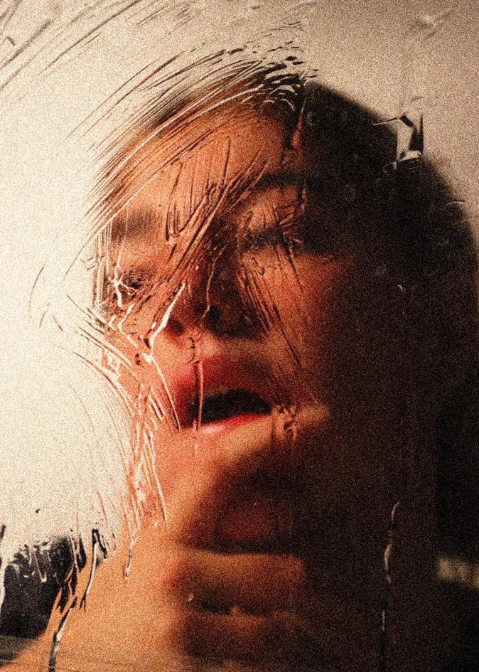
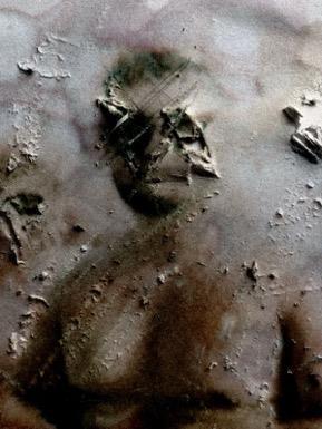
Tried out this technique using ink jet paper, printed on the wrong side, with spilled acetone (nail-polish remover) onto the image. This initially was a practice image to understand the medium, however I believe the outcome turned out successfully.
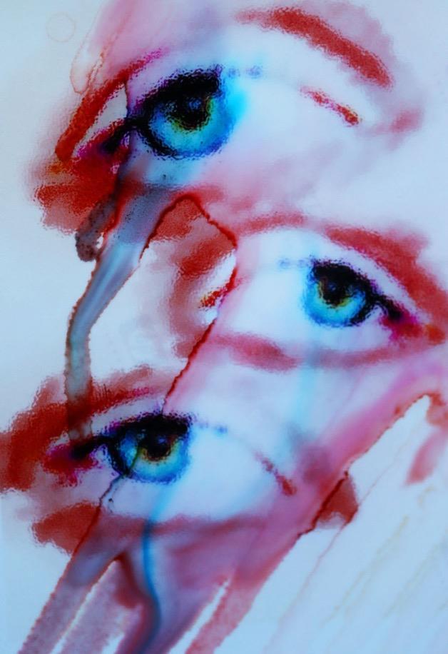

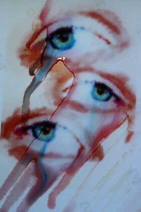
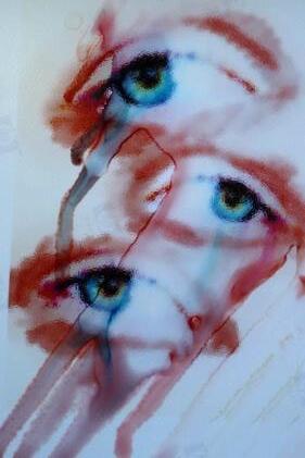
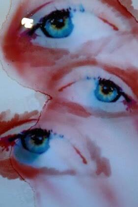
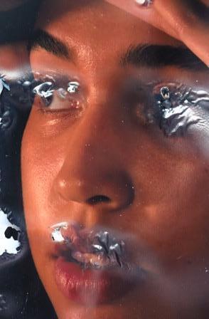
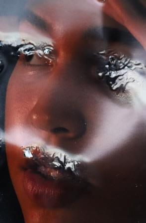
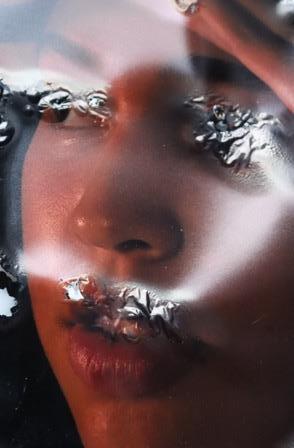
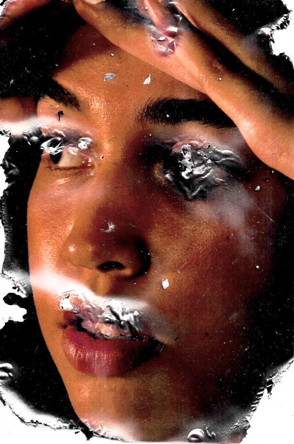
I have expanded within the technique of acetone bleeding, using scratching motions and rubbing the surface in specific areas of the piece. This piece was intended to be a practice to understand the materials and processes however, I feel as if this image turned out successfully. Potentially, I could use it in my next outcome.
I feel as if this image portrays a sense of losing your identity due to the media’s pressure within the unrecognisable face, conveying emotion through the aggressive motions used to create the image. Furthermore, the piece allows for experimentation and adapt my desire of distortion.
references and quotes:
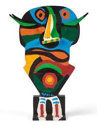
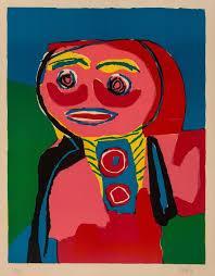
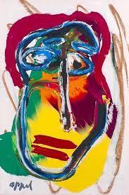
https://www.tate.org.uk/art/artists/karel-appel-654
https://www.moma.org/collection/terms/avant-garde
- ‘a Dutch painter, sculptor and poet’
- ‘one of the founders of the avant-garde movement CoBrA in 1948’
- Avant Garde means ‘any artist, movement, or artwork that breaks with precedent and is regarded as innovative and boundariespushing.
- ‘often met with resistance and controversy.’
How does this artist relate to my project and how will they affect me moving forward?
- I am going to use Appel’s use of colour blocking and colour pallet to create a new graphical element to my photography.
- I want to create a message of disregarding societal pressures with these new elements.They could portray the emotions caused by it, essentially producing awareness for the issue.
My aim for this photoshoot is to convey a sense of emotion through the treatment behind societal pressures and misconceptions.
Looking at Karel Appel, I will take his sense of controversiality to create my own societal bend on art and portraiture photography. I love his colour pallets so this would be inflicted on my images in the postproduction element.
I am going to shoot a person within a simplistic style. This will then be elevated with the graphical features later. I do not want to add too much to the subject matter as this will be more effective if kept simple.
In the studio as I can manipulate the lighting and angles very easily. This will enable me to receive the best base image for the next stages.
I would like to experiment with soft and harsh lighting, working out what is best for the image. I feel as though the more emotional looking images the harsh lighting will enhance this further.
Lights within the studio, transmitter for the light and the camera. Digital software such as Procreate and Photoshop for the postproduction.
Simplistic wear will be best for this type of photoshoot. Possibly neutrals. I will need tape and drawing equipment for the postproduction.
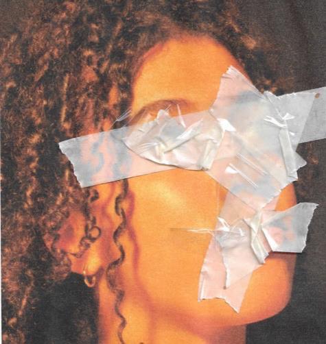
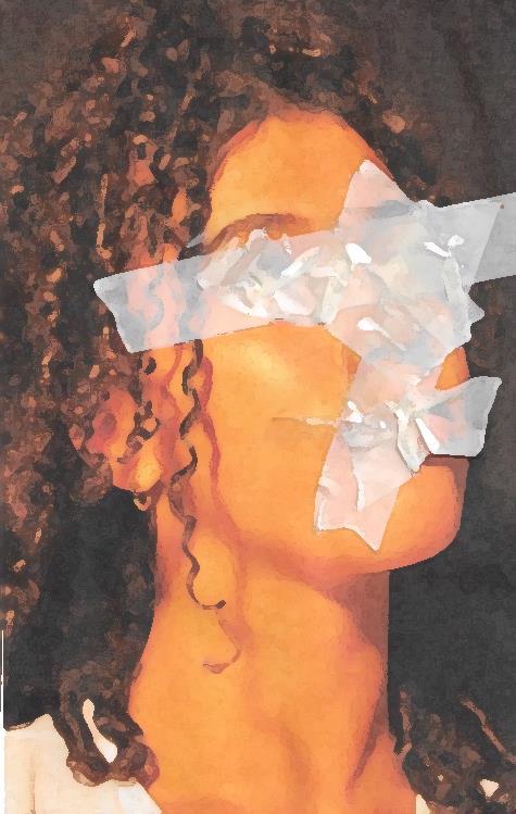
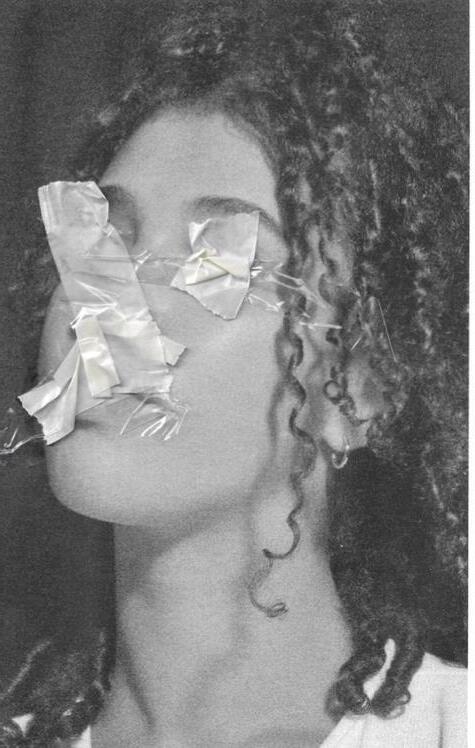
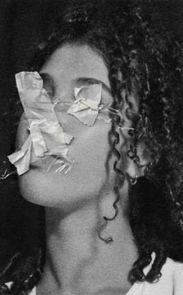
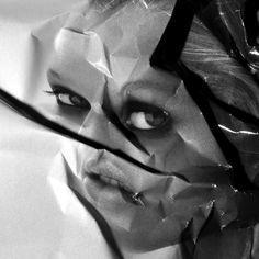
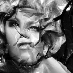
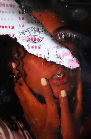
I have explored a new technique within the inspiration of Jones. I employed the technique using tape to cover certain features on the face to convey a sense of loosing your identity, being stripped of your own persona.I am fond of using physical manipulation as well as digital manipulation as it creates a more authentic,realistic appeal to the images.
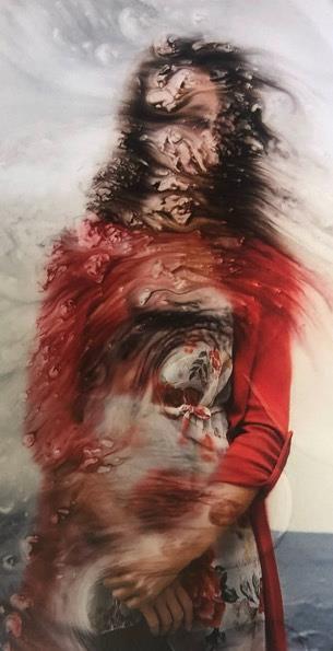
Photoshoot 14
Contact sheet.
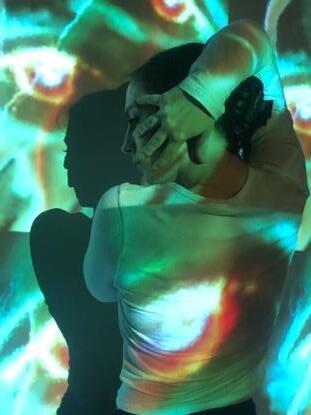
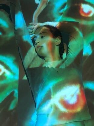
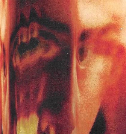
These images respond to the artist studied, Karel Appel, as they employ the same colourism in which they use. These images respond to the media’s pressure through the lack of identity due to the model’s poses (not showing her full face/hiding it) as well as the eyes projected onto her. These projections imply the emotions we may feel because of the weight brought on by beauty standards.
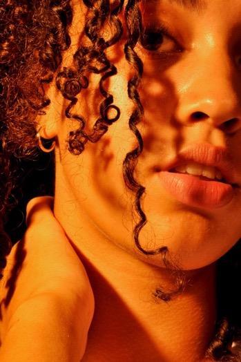
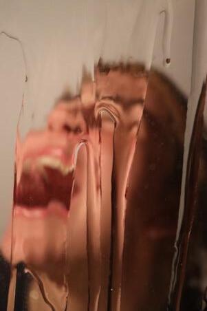
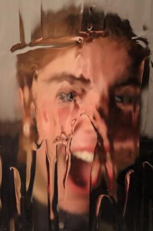
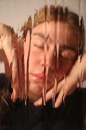
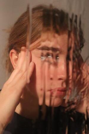
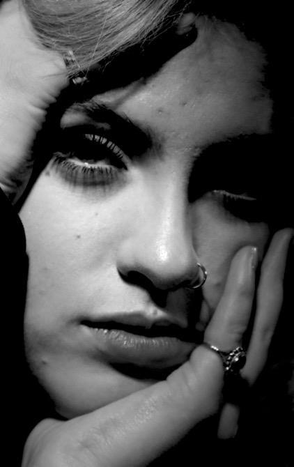
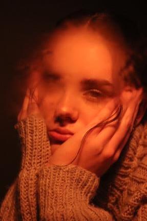
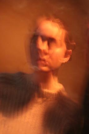
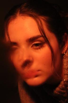
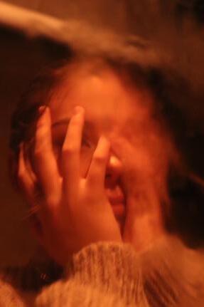
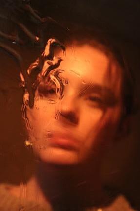
Portraiture photography – the effect of the media's pressures.
references and quotes:
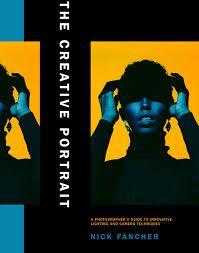
https://www.nickfancher.com/bio
- ‘Nick Fancher is a photographer, author, and educator who specializes in dramatic lighting,often employingthe use of bold colors and experimental camera techniques.
- ‘known for his efficient method of working, which is with the use of minimal gear, often unconventional locations.’
How does this artist relate to my project and how will they affect me moving forward?
- I want to investigate more techniques regarding distortion and loss of identity which also focusses on the portrayal of social pressures.
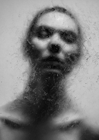
- this artist allows me to learn new skills such as creating harsh and dramatic lighting, overlays and physical elements.
- the style of Fancher's work will allow me to portray the media's pressures in a way where the figure no longer has an identity.
- In addition, it could show the figure’s ‘mask’ essentially melting away to reveal their true self, disregarding social pressures.
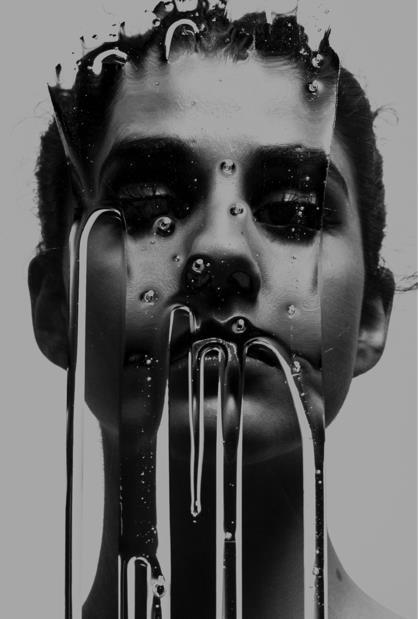
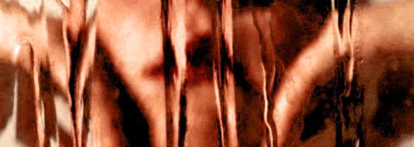
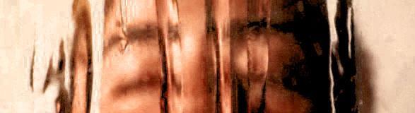
- use of a monochromatic editing style, conveys simplicity and allows the focus to be on the subject matter
- subject matter is centred in the image to create a direct focus
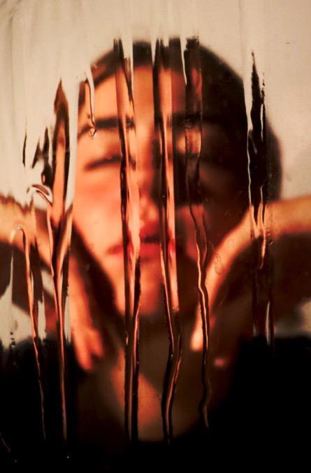
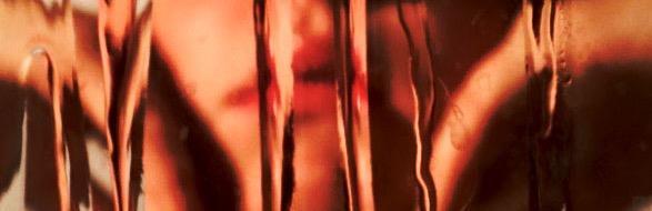
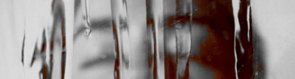
- harsh lighting which illuminates parts of the dripping substance, creates a sense of disjointment and distortion to the face
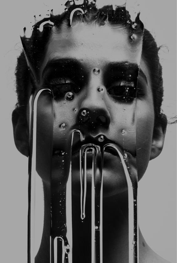
- the lighting also creates shadows to the piece, making parts of the figures face look hollow, this also makes some features unrecognisable
- the facial expression is remained stern, emotionless and distant from the viewer, the subject matter looks lifeless and unresponsive. This elevates the potential hidden messages the artist wants to convey.
- Fancher wishes to 'create moments of surprise' as you cannot control the medium to a full extent.
https://www.nickfancher.com/blog/2022/1/17/using-a-fungus-filled-lens-with-long-exposure-and-prisms-tocreate-psychedelic-in-camera-effects
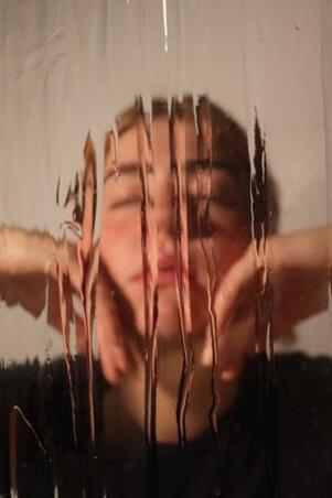
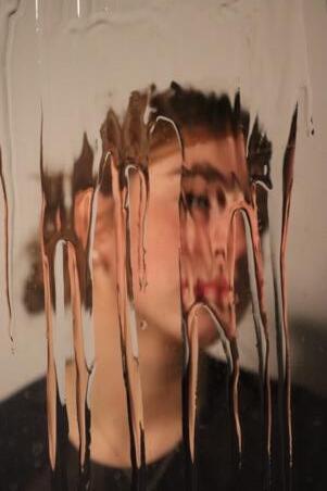
Photoshoot 15
Contact sheet.
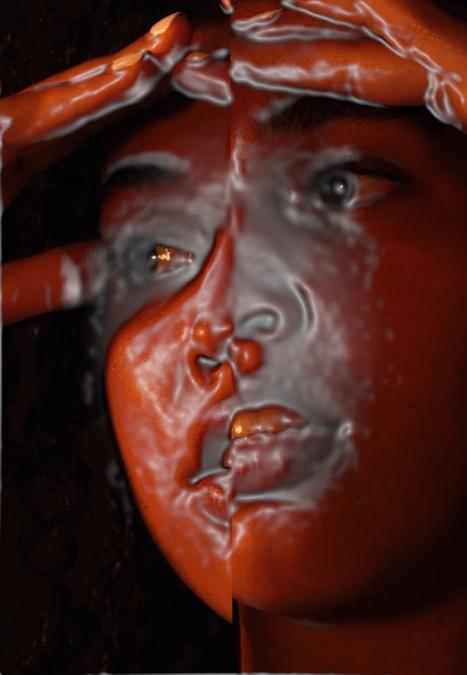
Theseimagesshowcasethetechnique ofdistortion.Thisdripeffectallowsme tosendamessagetotheviewer;the maskinwhichweweartoappealto othersmeltingaway.Theseimagesalso goagainsttheidealistviewsregarding beautystandardsduetotheirimperfect tendency.

Page colour experimentation, This will help me to understand how to not distract the viewer from my image but also make my outcome coherent.
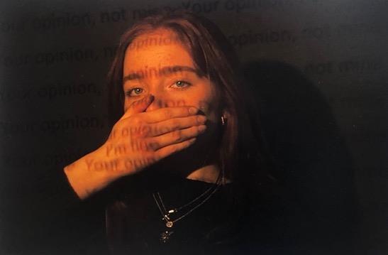
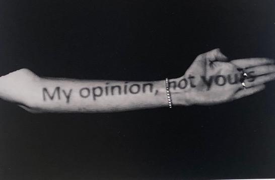
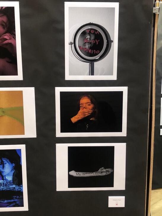
'Ineededyoutopleasegive myreflectionabreak'

Consideration(feat.SZA)
Rihanna
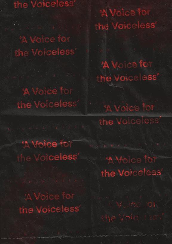
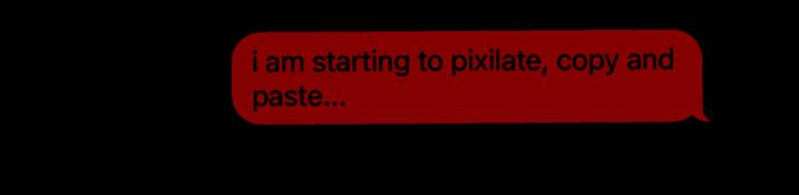
i need you to give my reflection a break.
Inclusion and practice of typography, this will enable me to understand and try out placement of conveying a successful message to the viewer without interference.
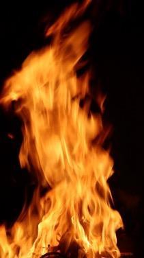
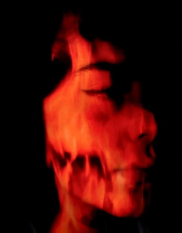
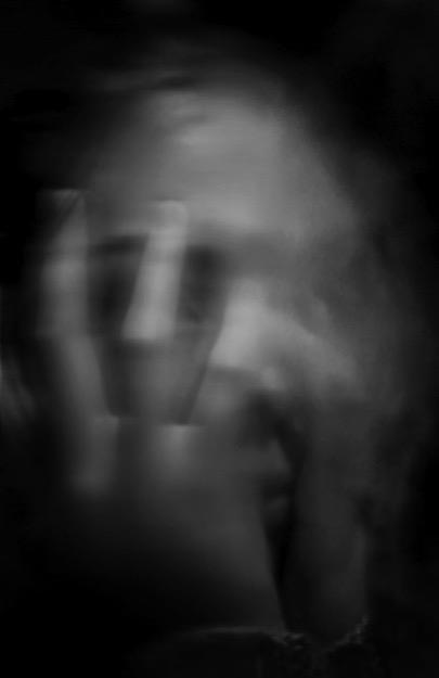
Portraiture Photography and moving image – expressing inner emotion
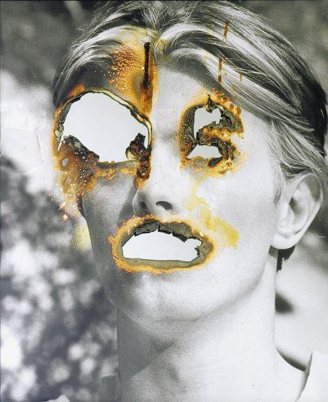
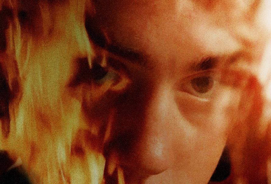
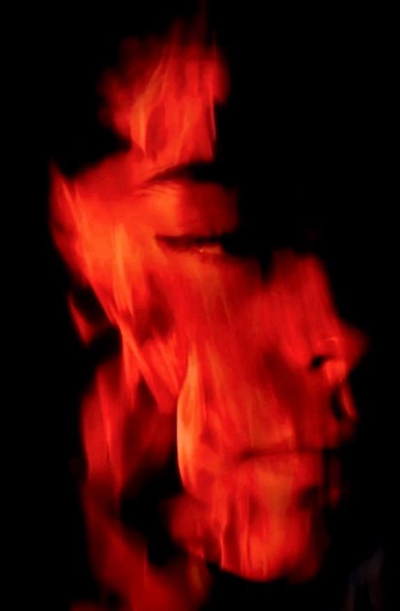
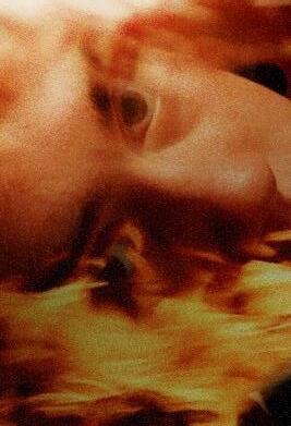
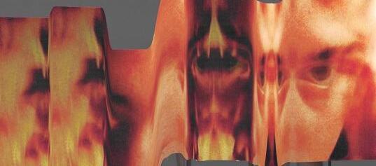
WhyhaveIchosentheseimages?
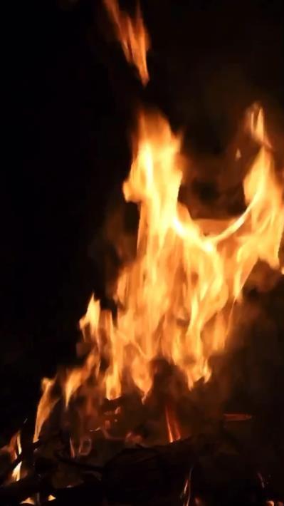
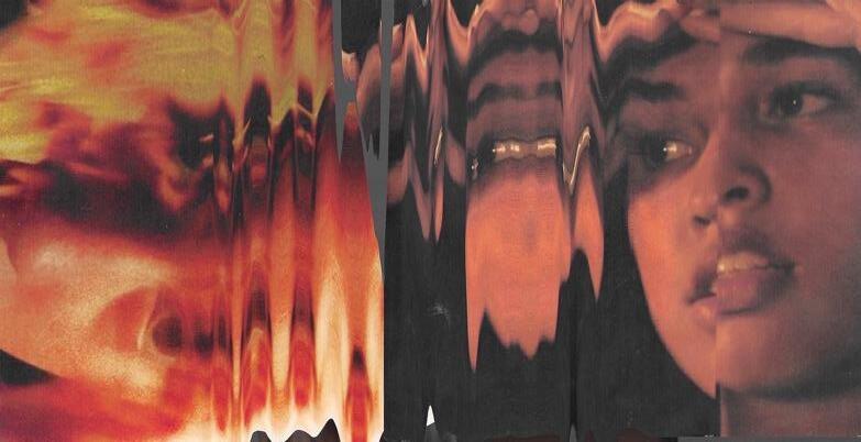
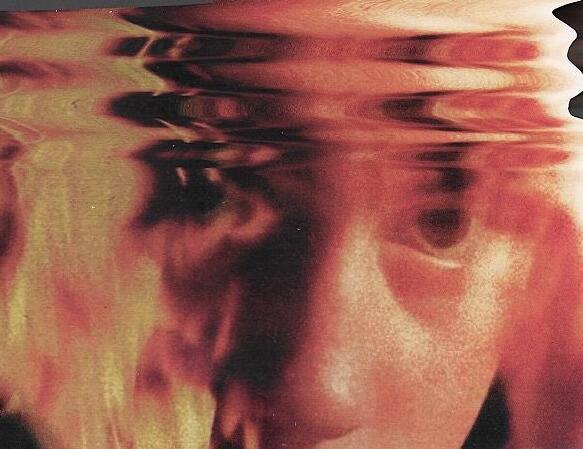
- Theycreateasenseofemotionthroughtheharshsubjectmatter(fire)
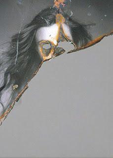
- Innerstruggleshownthroughtheburningandsmokecomingfromtheeyesandpartsoftheface
- Darkcontraststofocusattention
- Couldportraytheimpactofthemedia’spressuresthroughthispermanentdamageofourmentalandphysicalhealth
- Uses dramatic light and tonal techniques to draw the viewers eye to the central axis
- Limited use of colour, allows for the focus to be on the fire as this is the main source of vibrancy
- Half of the face is highlighted and the other is extremely dark, as if it has been burnt, this allows for a more authentic feel to the image. As if the fire is truly there.
- Subject matter is centred within the piece, this allows for a less distracting mixed media and montage style and technique
- The face is cut off from the rest of the body, leaving his head to be the main subject within the dark background
- The fire accent is fluid around the figure’s face making it more believable to the viewer
- Parts of the model’s face have become ambiguous making the viewer question and assemble the rest of the face mentally
- Goes against traditional ideas of what art is
- Ties to beauty standards and the pressure of the media through this emotive conduction of the fire burning the features of the face, becoming less and less of yourself – destroying your self esteem and individuality
- Portraiture rather than landscape which allows for a more unified piece
- Red/orange and black ties to my overall colour scheme for outcome
My aim for this photoshoot is to convey a sense of emotion through the treatment behind societal pressures and misconceptions.
Looking at the Pinterest imagery chosen, I will take their sense of mixed media and montage techniques to create my own societal bend on art and portraiture photography. I love the physical elements and inner emotion conveyed so this would be inflicted on my images in the postproduction element.
I am going to shoot a person within a simplistic style. This will then be elevated with the moving image and fire features later.
In the studio as I can manipulate the lighting and angles very easily for the portraiture portion of this exploration. I will also do a separate photoshoot of my fire pit at home to capture the moving flames.
I would like to experiment with soft and harsh lighting, working out what is best for the image. I feel as though the more emotional looking images the harsh lighting will enhance this further, however I want to convey a sense of realistic highlights and tones from the flames onto the face, this might have to be done with gels on the lighting. This will manipulate the colour of the light to be red and orange.
Lights within the studio, transmitter for the light and the camera. Digital software such as Procreate and Photoshop for the postproduction. Colour gel also.
Simplistic wear will be best for this type of photoshoot.
Photoshoot 16
Contact sheet.
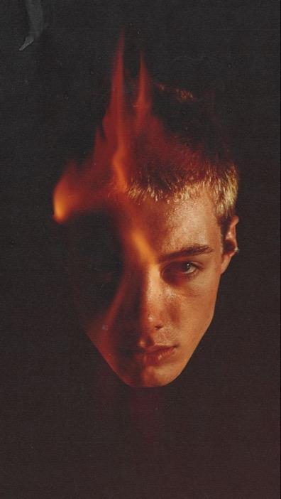
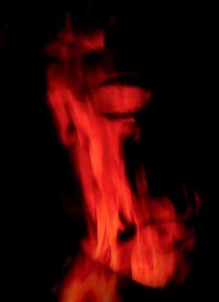
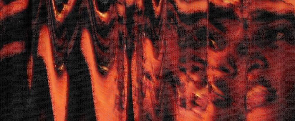
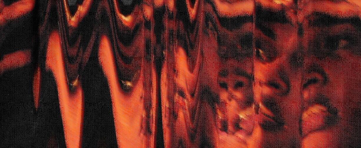
videos
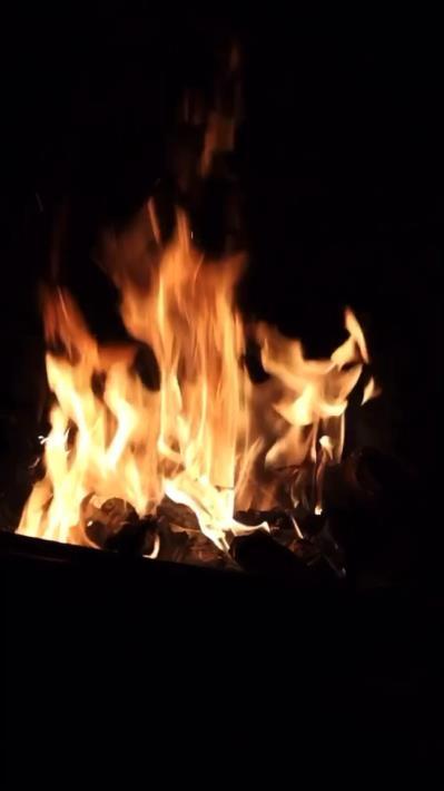

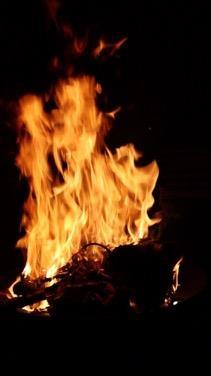
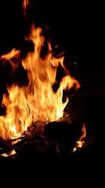
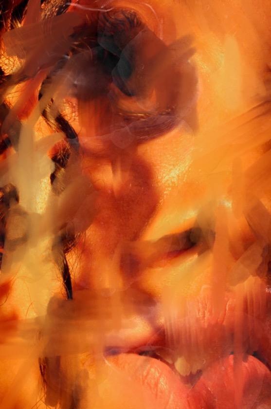
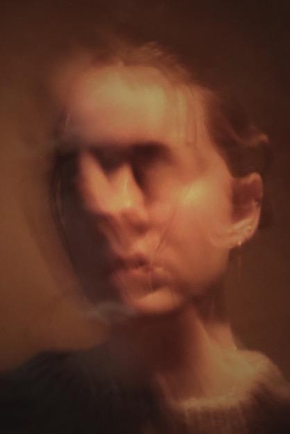
Using the inspiration found on Pinterest, I wanted to merge two photoshoots. One being the moving fire layered over a portraiture photograph. This will convey an emotive sense to my imagery, explore another mixed media and montage technique as well as respond to the pressures of the media. This technique conveys a message of anger due to the oppression we face, being told to look, feel and act a certain way. This eventually makes us want to reject these views, however it may leave an impact from the mental strain from following this to begin with.
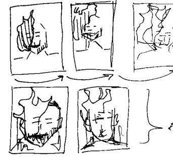
sketched idea
 Quickpracticeimagefrom previousphotoshoot.
Fire moving within image of face
Quickpracticeimagefrom previousphotoshoot.
Fire moving within image of face
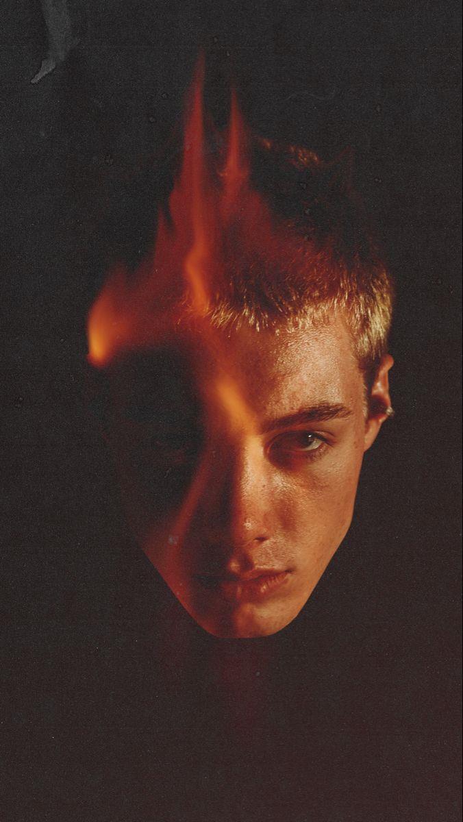
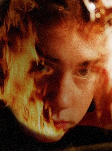
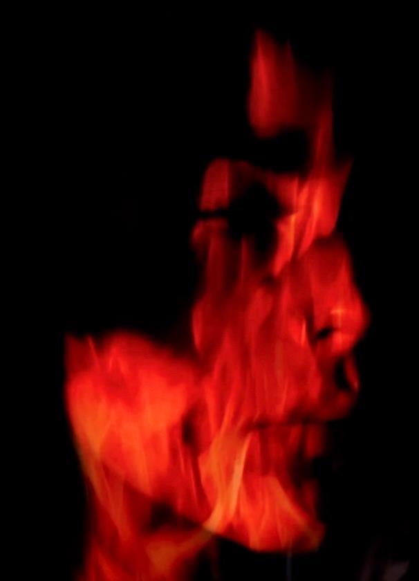
Photoshoot 16
Contact sheet.
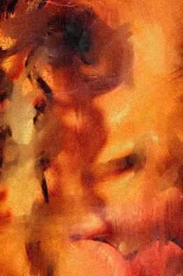
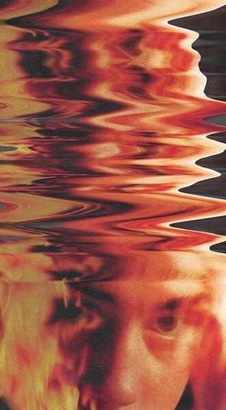
This mixed media photography initially was a practice image for my moving image. In doing this, it enabled me to understand the placement of the flames and how I could make it look realistic and synchronise the curves found within the head. I feel as if this image has come out successful as could feature in my next outcome.
- also I wanted to try out adding noise to the image to see if it would create a more textual approach to the flame images, this is something I have added to most of my images and gives them an old, pixelated feel.
- The colours and tones within this image helps to unite the flames as I have given it a warmer filter over top, this made certain aspects of the picture orange and red
- I cropped the image slightly from the top and bottom, this helped to disconnect any distracting elements of the image. I wanted the focus to be on the eyes as they have an emotional connotation to them
- The flames symbolise the permanent destruction cast upon our mental and physical health trying to achieve the unattainable beauty standards set by the media.
Looking at a new medium, moving image, I was able to create an impactful message. I wanted to portray a sense of permeant damage due to the pressures of the media onto a person’s physical and mental health as this mentality has been engrained into us from early stages. This is shown within the fire of the image as when something is burnt it cannot be reversed. I also believe fire has connotations of anger and disturbance which further emulates this idea.
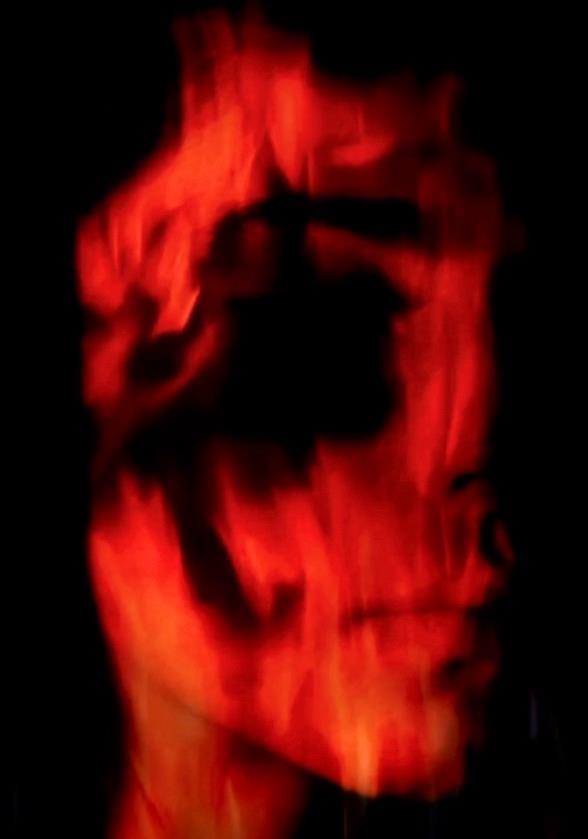


Here I wanted to see how my final images would look all together. This will help me to understand how to move on as well as what images look good next to each other.

Using this method of creating texture to my images as well as making them ‘imperfect’ has adapting my style of rejecting idealistic standards. It also showcases the damage of mental health through the irreversible process (setting fire to parts of the image, especially the face/eyes). It also allows me to accept the unexpected and try out new mixed media and montage methods, getting out of my comfort zone.
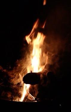
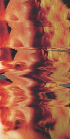
I chose to try out two editing styles. One where the pixels are very apparent in the image identifying the link between social media and the mentality of comparing through a screen. Furthermore, choosing black and white for this image allowed me to see if the image would be more successful monochromatic. I believe it was not more successful than the colour image as I feel as it was less in sync with my other images. This relates to my outcome decision making as I want to be selective with that in mind.
The colour image showcases a vibrant red tone, this links to my images prior as most involves a red and black theme. The colour is seen as dangerous, aggressive and negative. This has been done purposefully to enhance my message of media pressures.
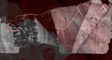
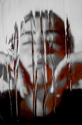
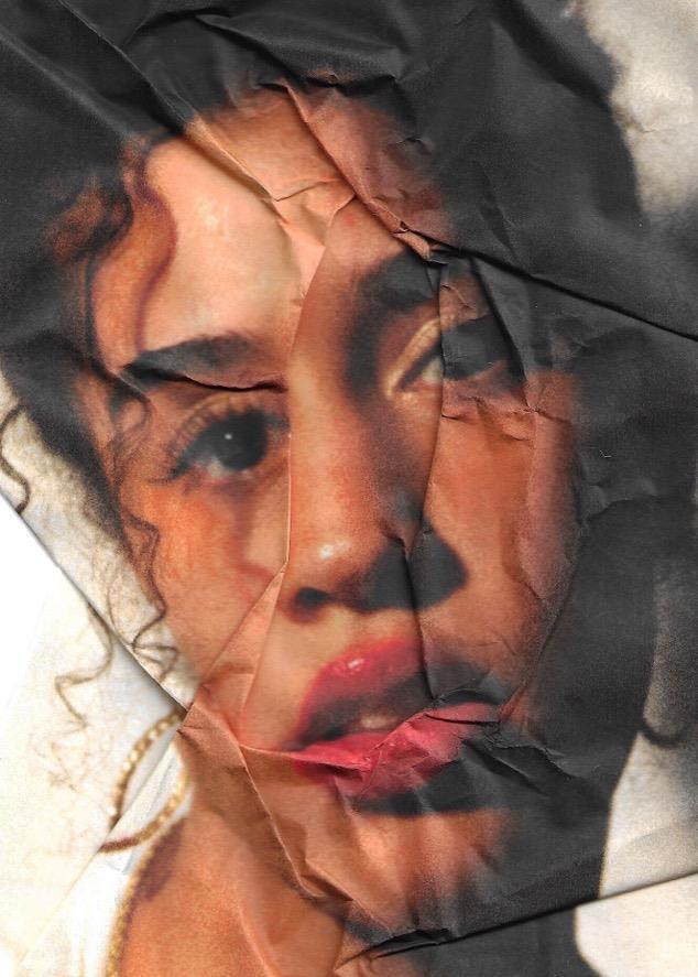
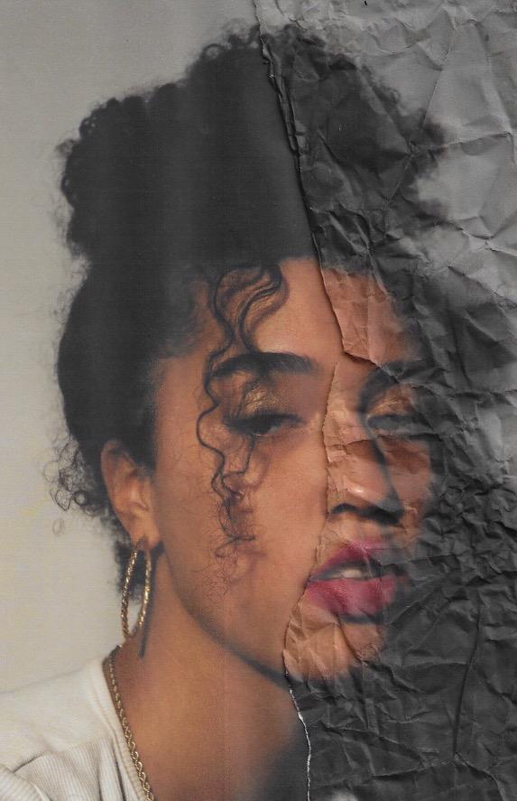
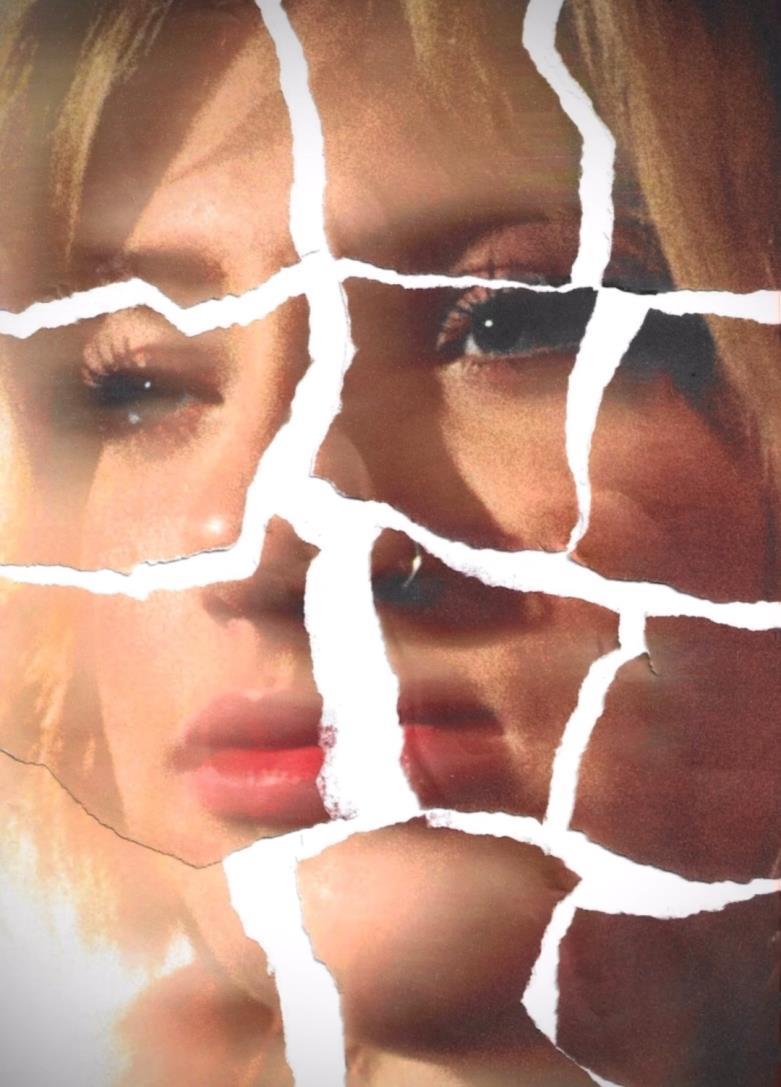
Printer distortion
- placing my images within the scanner and moving them whilst scanning
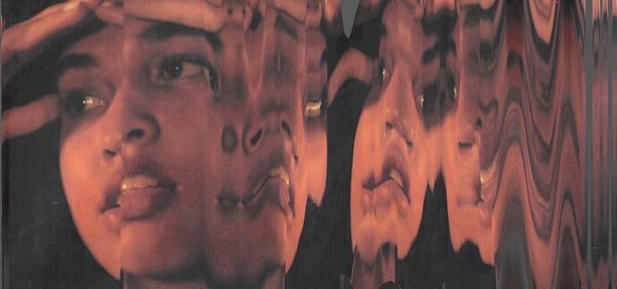
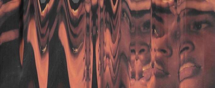
This selected image, made using one of my images printed placed on the printer and moved whilst scanning, connotates to my theme of impactful media’s pressures. This is shown in the melting face which slowly gets more distorted as it goes from right to left. I wanted it to suggest the slow process of losing your own sense of identity when you conform to these pressures as well as body dysmorphia within reflections.
The tones in which I have edited within this image corollate to my previous images and portray a moredamaged, pixelated texture.This unites the whole image.
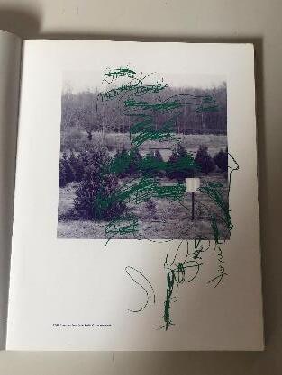
I have taken inspiration from this image in the left hand corner as it sparks a new technique for me to try within mixed media and montage (drawing over my images to make them ambiguous). I also love that the person’s identity is hidden through the pen strokes and thought this would work nicely within my own work, showcasing this within the media’s pressure and the loss of self you experience when conforming to beauty standards. Out of the three experimentations, I believe the middle to be the most successful as the colour and pen stokes are more noticeable as well as the chosen placement of the ink being more concentrated in certain areas.
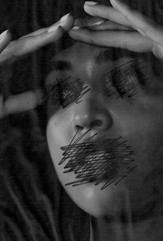
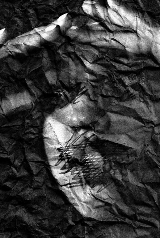
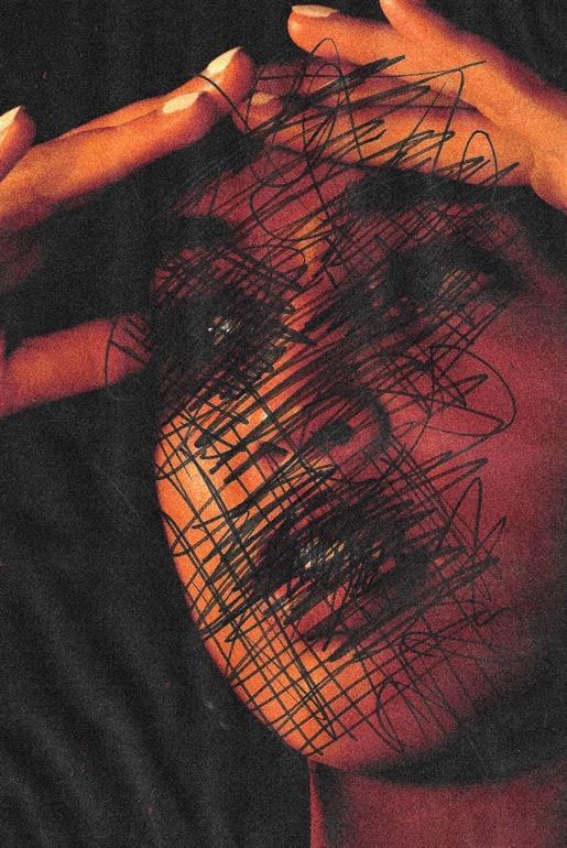
Expanding my techniques and ideas in mixed media and montage,I have tried drawing over my image. I wanted to present the pressure of the media through the identity loss when covered by the ink.The messy pen strokes are focussed in differentareas of the face such as the mouth and eyes. This was to signify my message of the voice of the voiceless and the impact of society. As I cannot reverse the image after ‘ruining the face’ it almost suggests this irreversible damage many experience on a daily within physical and mental health issues.
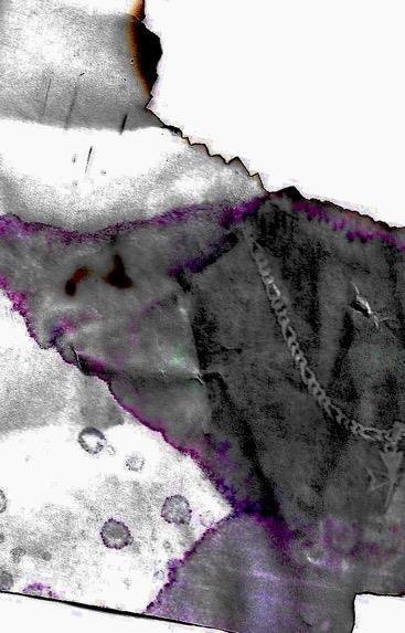
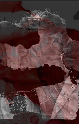
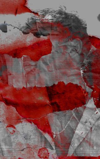
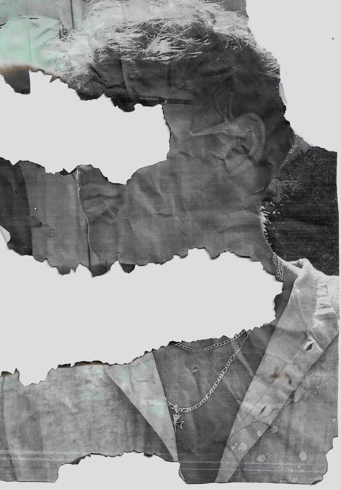
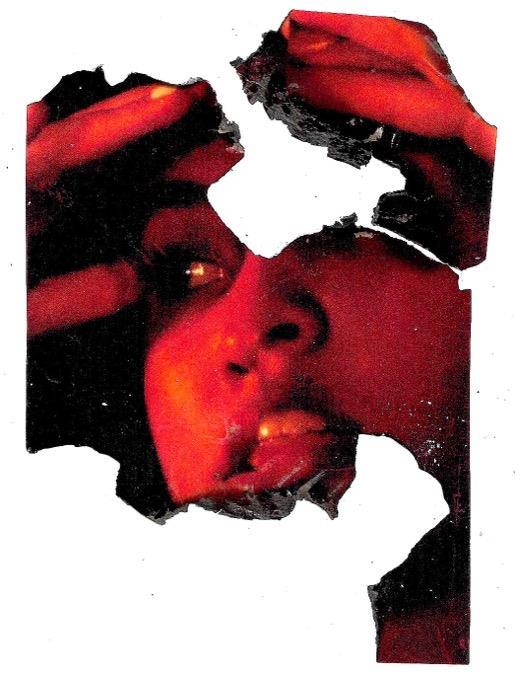
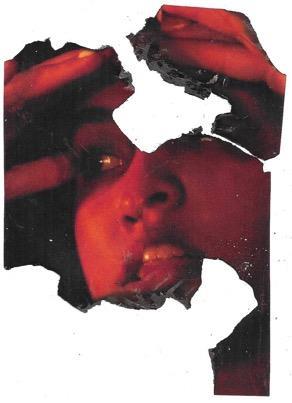
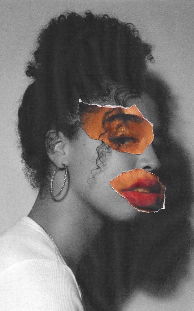
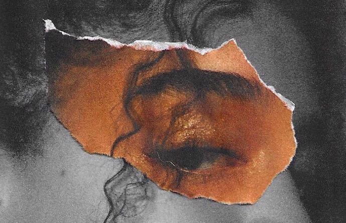
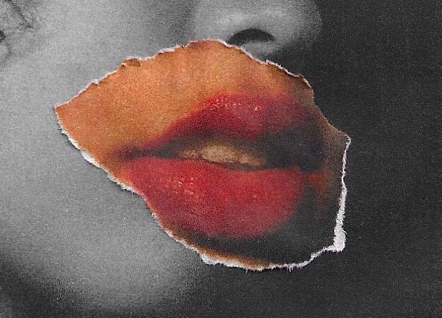
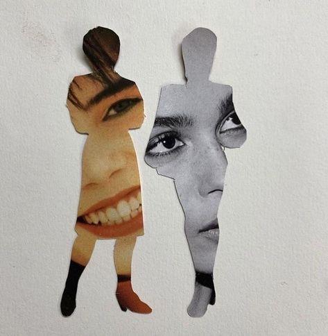
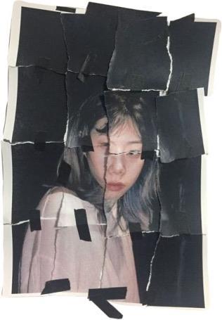
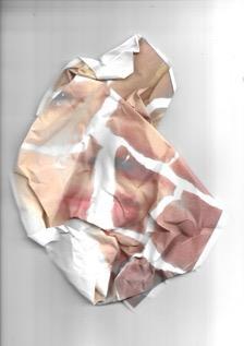
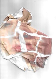
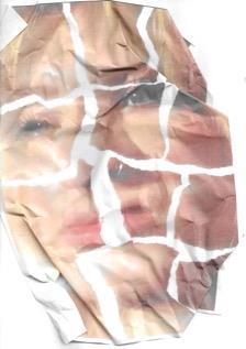
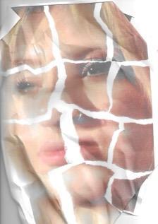
Why have I chosen these images?
- Thereisasenseofdistortionthoughthecrumpledpaper
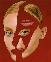
- Senseofbeautystandardsthroughthemaskedfigures
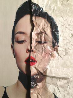
- Feelingofmaskingtrueidentityduetothemedia'spressure
http://www.fgpi x.com/facetearsart/ogtqdqwu4f dj31s4sdoi182wi
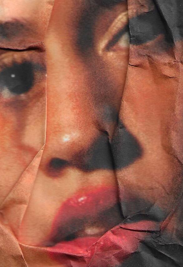
8kuz2
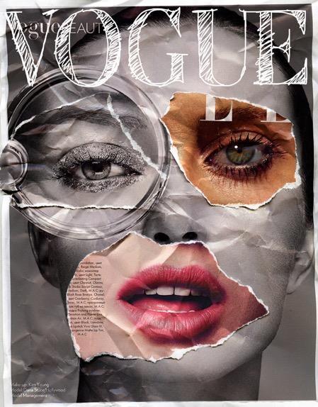
- Plain backdrop,for my photoshoot I am going to use a white back drop in comparison to the usual black one.This helps to create a cold, magazine-like feel to the image.
- Use of monochrome for the back image, this creates separation from the realistic body image from the composed, idealist beauty standards that are in colour
- Crumpled paper effect on the image, this helps to add texture and corresponds with some of my prior work, gives a sense of imperfection/anger/fractured emotions to the image.
- Type is sketchy and looks to be drawn on, this makes the image looked rushed, playing on the idea of everything having to be ‘proper’.
- Lighting is soft and creates a lack of shadows
- The pose is simple and allows for the overlay images to speak for themselves, making them the subject matter
- There is a soft vignette around the image, this draws your eyes to the centre.
Photoshoot 17
Contact sheet.
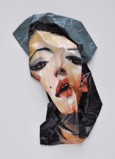
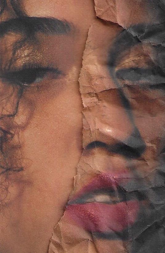
Elements I want to improve on for my next experimentation, looking at collage:
- Crumple the paper on the college
- Crumple the image to make a surreal face like the artwork looked at prior
- enlarge the lips/eyes to become abstracted
- Burn holes to show image underneath
- Burn parts of the image to become more rough/textured
How does this link to my project (looking at beauty standards and the pressure of the media)?
- Showcases the mask in which we employ to become certified towards the pressure of the media
- Distorts the face, this is not her true self, she has lost her identity
- Monochrome allows for a dramatic image when compared to the colour sections of the image, this shows the viewer that something is off, it presents a cold emotion.
- Her facial expression is cold, this further emulates this idea of showing the viewer that this is off and creates awareness for issues regarding the loss of ones’ sense of self.
Inspiration pictures from Pinterest


“Pain is Beauty”
Pinterest inspiration
potential outcome images
Transitioning to graphical elements

Lyrics used –
Ghost in the Machine, SZA Ft. Phoebe Bridgers
In The Fire, Dave Special, SZA
Quote from myself included –
‘I felt masked by your pressure and for years you made me silent, as if it was normal, infecting my mentality. Now I am conscious to your manipulation, rejecting you daily.’
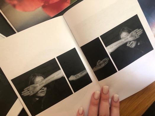
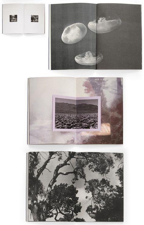
https://issuu.com/sophiaellul/docs/outcome_3_
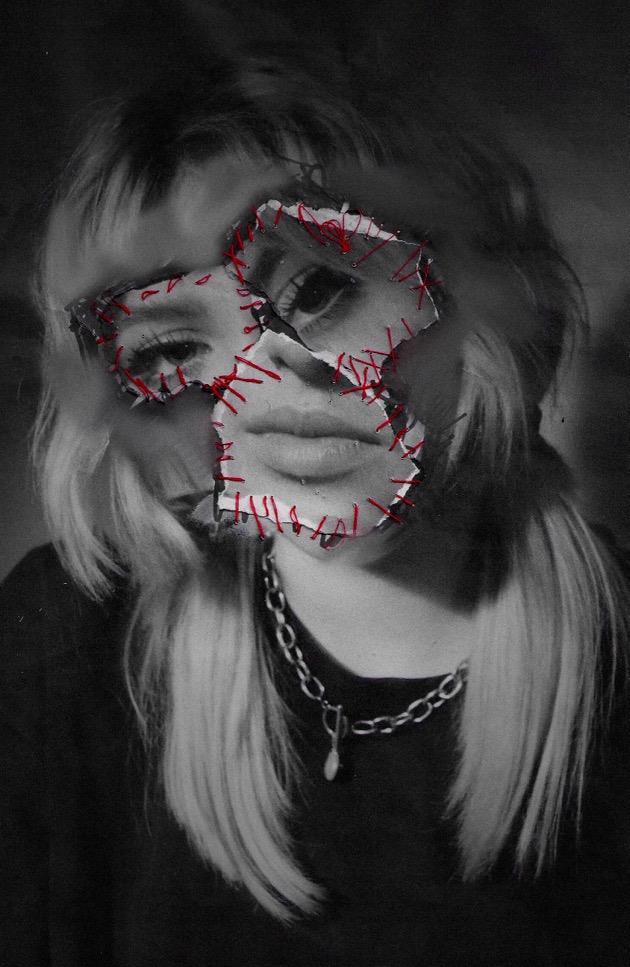
Why have I chosen these images?
- Youstarttolooseyourselfwhenyouemploythepressuresofothers
- whenyoupieceyourselfbacktogetherrepetitively(showninthe images),itstartstoaffecthowyouseeyourself
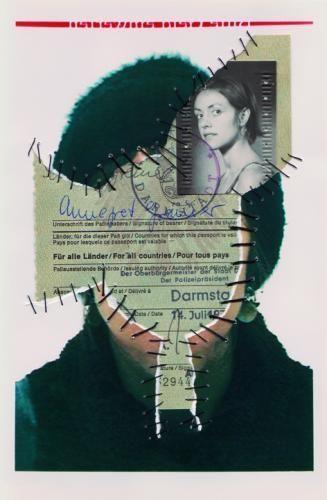

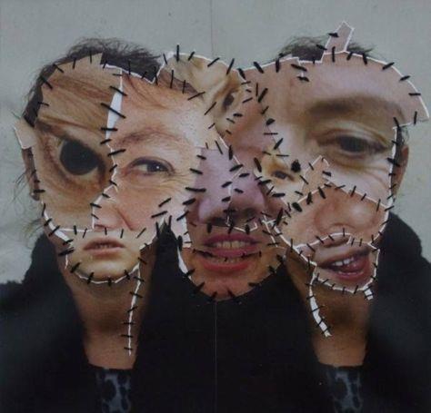
- Ialsoseetheactofgettingsurgeryinordertosucceedbeautystandards hencethestitches.
references and quotes https://www.richardsaltoun.com/artists/233 -
annegret - soltau/biography/
- Challenges‘theconventionalnotionsofrepresentationthroughperformance, photographyand collage’.
- Focussesonthefemalebodyanditsbodilyprocesses
- Oftenincorporatesherselfintoimagesandis‘attheheartofherpractice[which]isan inexhaustiblesearchforidentityandmeaning.’
- Herworkwasincludedin‘Wack!ArtandtheFeministRevolution’‘thefirst comprehensiveexhibitiontoexaminetheinternationalfoundationsandlegacyof Feministart’. How does this artist relate to my project and how will they affect me moving forward?
- This artist relates to my theme of rejecting beauty standards and stereotypical views of society through the emotions evoked in her work.
- I was drawn to this artist’s work as I believe it could symbolize the need to change yourself for societies’ validation, whether that’s through surgery, adapting ones’ personality or even wearing a mask. Not showing your true identity.
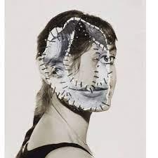
- use of a monochromatic editing style, conveys simplicity and allows the focus to be on the subject matter
- Also, the monochrome colour pallet conveys a cold, detached feeling to the viewer, conveying a depressing atmosphere
- subject matter is centred in the image to create a direct focus
- the Stitched ‘mask’ is off centre to the face, this makes the piece look obscure, strange and intriguing to the viewer
- Fragmented look due to sections of stitched face are different tones, conveys that there are two faces being used to create the overall face, could present the façade of ideal beauty standards in comparison to reality
- Lack of identity shown in the piece, we don’t know which one is her true face/identity
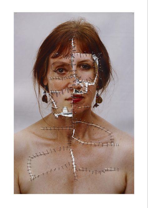
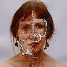
Photoshoot 18
Contact sheet.
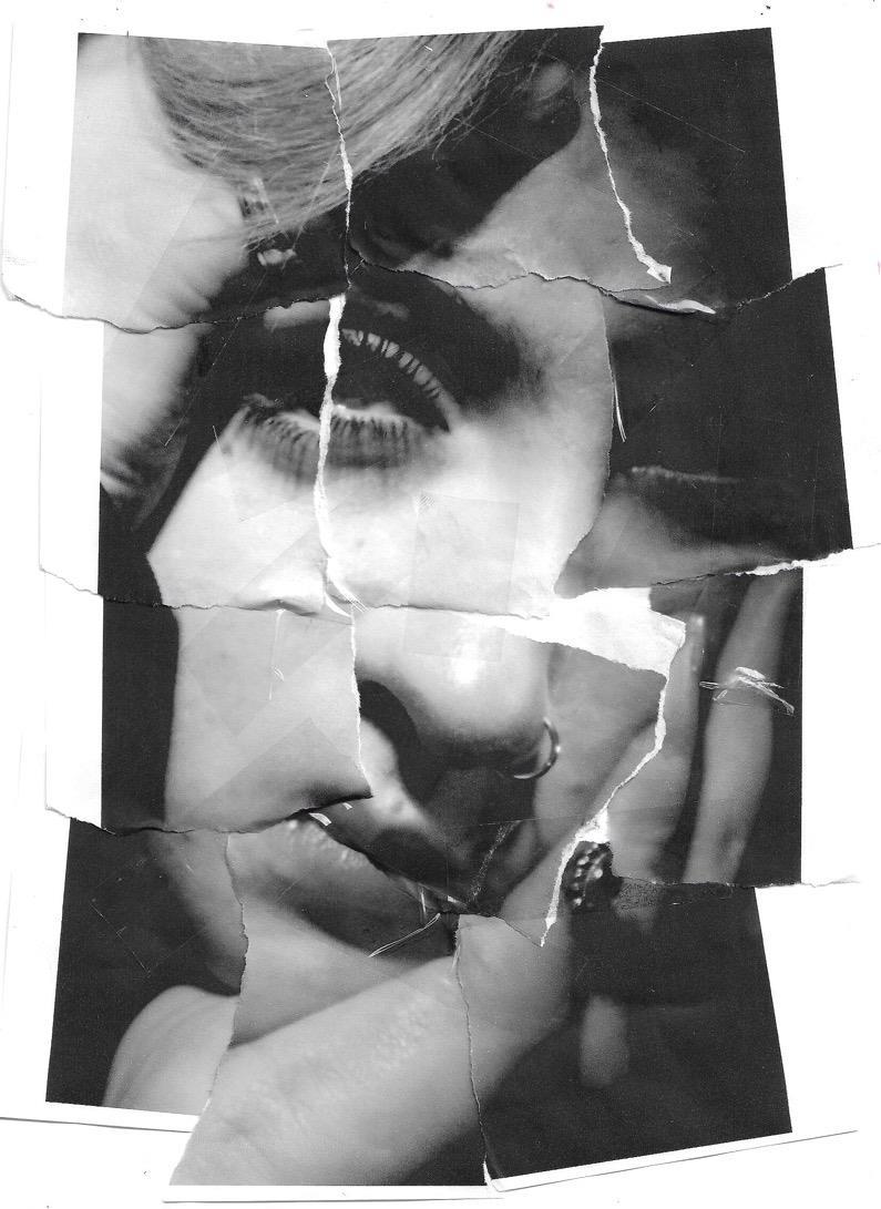
How does thisrelate to my project?
- I want to show the viewer distortion, irregularity and lack of identity
- Also wanted to infer to plastic surgery and changing yourself in order to please the media/others (not for yourself)
- Sense of regret and permeance due to the actions taken place in a result of the pressure of the media
- Black and white composition in order to add drama and add contrast to the stitches that are red
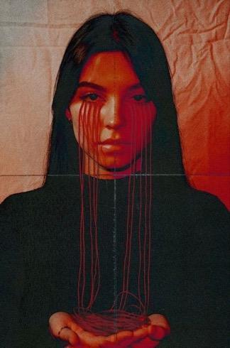
How was this piece made?
- Using prints of my photograph, some more zoomed in than others, I ripped parts of one and laid them over top of the other
- Then using red thread, a colour of anger, blood and danger, I threaded the pieces of ripped photograph onto the piece in obscure ways
- This was to translate the irreversible damage due to the pressure of the media, whether that’s to our physical of mental health

How does this relate to my project?
Looking at this inspiration image from Pinterest, I explored the lack of identity involved due to the pressure of the media.
I decided to make this image monochromatic to add a sense of drama, contrast and high shadow towards the overall composition.
Also, I wanted to convey the fragmented tendencies of the inspired piece in order to show the irreversible damage sue to the pressure of the media (whether that’s to our physical or mental health), piecing ourselves together but never feeling the same.
Stills using my scanner, gradually crumpling the image more and more each time, threading them together to make the moving image on iMovie.
After reviewing this moving image, I believed it wasn’t finished.I added in the crumpling paper moving image within it to add a sense of distortion. I want the viewer to see the gradual process of loosing one’s identity due to the media.

Why have I chosen these images?
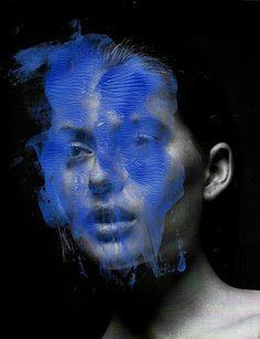
- Toshowcaseinfluenceoflighting,compositionand connectiontotheviewerthroughexpressedemotion
- Harshlighting,asenseofmeltinganddistortionwill elevatemyideasforpresentingthepressureofthemedia
- Ispecificallyliketheredandbrowntonesemulated throughsomeoftheimagessoIwanttoplaywiththisin myexploration – thesecolourshavebeenemulated throughoutmyproject
‘These portraits show all kinds of distortions, unsettling mutilations that deny any trace of socially accepted beauty or fragmented facial features that reveal human limitations and speak of vulnerability.’
- ‘The hair and sometimes the eyes, mostly remaining part of the composition to increase the work’s expressiveness and visual impact through confronting or connecting with the viewer in striking ways’
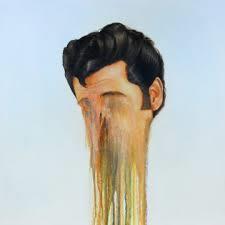
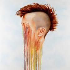
How does this artist relate to my project and how will they affect me moving forward?
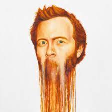
- ‘dripping’ effect in which I want to employ onto my own work to showcase the gradual loss of identity when conforming to society and the media
- desire to connect to the viewer ‘in striking ways’ through the influence of Donnelly
- Relates to the pressure, physical and mental health issues many of us face in result of the media
references and quotes: http://thereart.ro/brian-donnelly/
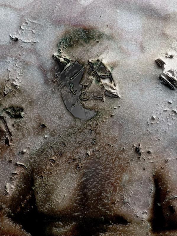
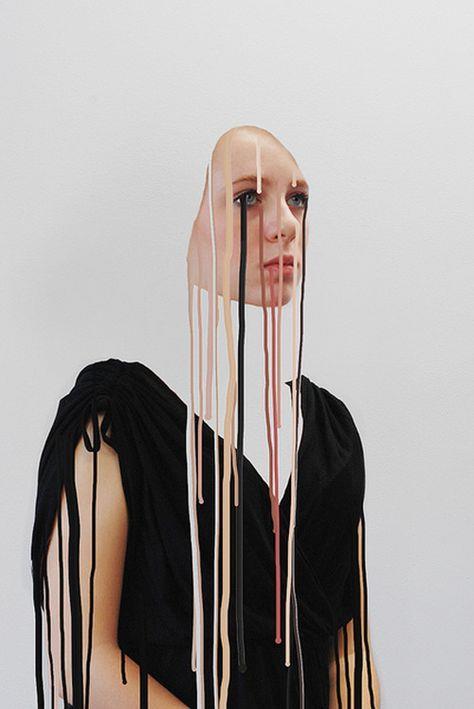
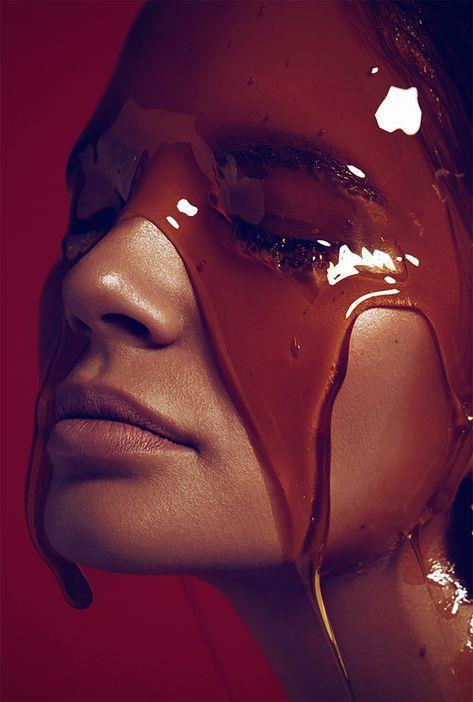
- In this painting, I was drawn to the slow dissolvement of the face and how this could symbolise a lack of identity due to the media’s pressure
- The drip effect is just on the lower section of the piece, we are drawn to look downward due to the vertical emphasis
- The figure is centred however we cannot see their neck/rest of the body, I feel as if in my work I will continue to include these sections of the body
- Placed onto a white background, allows for simplicity and draws eye to centre, I will keep the background of my images simple to as this is effective
- Lack of shadows, this makes the piece very vibrant and eye catching, the tones are all similar, makes the piece united
Photoshoot 19

Contact sheet.
-
How does this link to my project (looking at beauty standards and the pressure of the media)?
- Showcases the slow dissolving of identity due to the pressures media
- Evokes negative emotion and presents how the media makes us feel, also as a result of the pressure and manipulation
- Colour scheme kept muted, further emulates the coldness, depressive state
All the faces are distorted is some ways, makes the viewer look and compare to how this might have effected them, they are seen and heard