UNIT 1 Personal Investigation
Maddy WilkinsonTheme 2 – The Human Figure In
Environments
5898
January 2023

Theme 2 – The Human Figure In
Environments

5898
January 2023




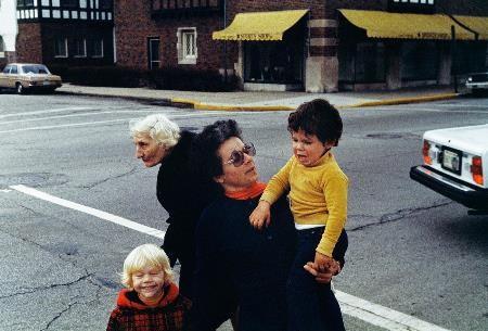
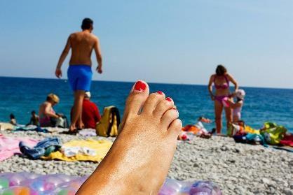
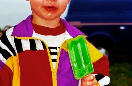
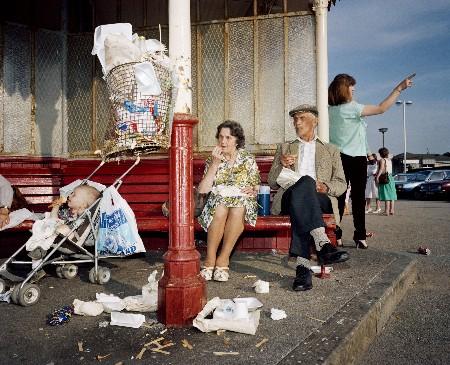
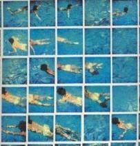
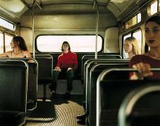
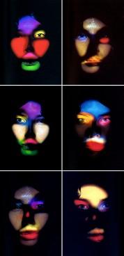
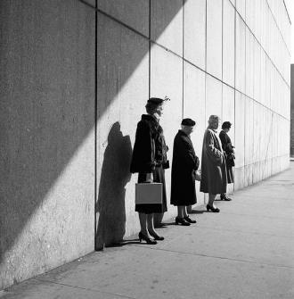
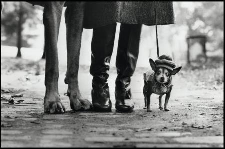




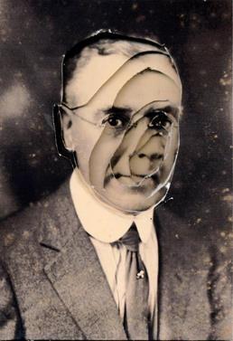
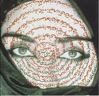
• Postmodernism is essentially the antithesis of modernism – that is, the reaction against the utopian, forward-thinking Western artistic outlook from the 1860s to the mid 1950s.
• Postmodernism came about after the arrival of Pop art and Neo-Dada in America, and brought about many new submovements, including Conceptual Art, Minimalism, and Institutional Critique, which are all widely varied but connected through a set of shared characteristics.
• This comprises of a satirical and ironic view of their subjects, the consideration of the consumer/viewer (or the viewer as a consumer) within their art, a challenge to societal norms and perceptions through an emphasis on shock or grandeur, and the undermining of the concept of originality, which was once thought of as a prized (yet possibly pretentious) attribute in art.
• (In doing so, the postmodern pieces themselves would arguably become more unique and authentic, despite being caricatures of corporate advertising or comprised solely of everyday, readymade objects.)
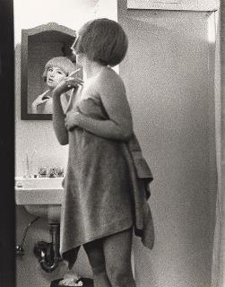
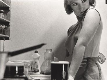
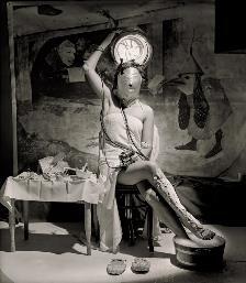
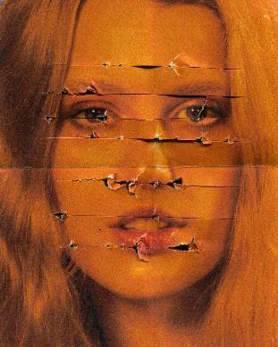
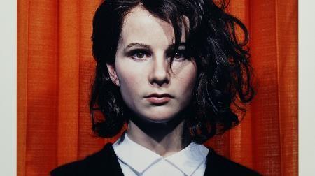
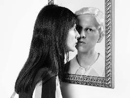
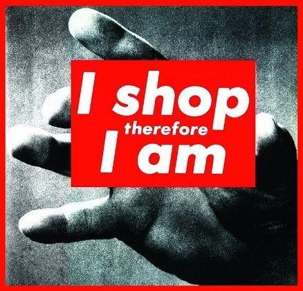
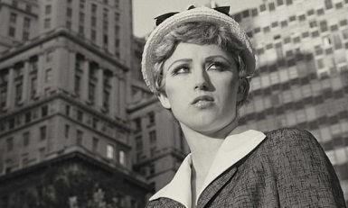
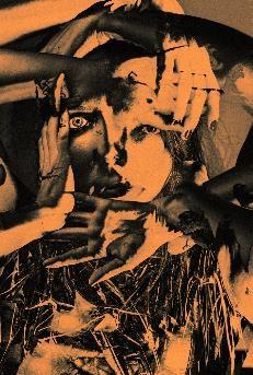
• Other important ideas included the view that the art world should not be male-dominated, leading to Feminist Art and minority representation falling under the term of postmodernism, as you can see with Barbara Kruger (top right) and Cindy Sherman (middle right), who were key figures in the movement.
• They also recognised the value of immediate, accessible culture and the meaning it gave their work to their audiences. The rejection of the notion that art had one sole meaning set out by the creator when it was made meant that their art endures and have multiple interpretations as the years go by.
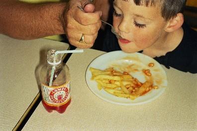
• On a wider scale, the outlook of the Postmodernists recognised the importance of the everyday and menial, the temporary and local in making up our understanding of the world. They rejected ideas that huge concepts like history and knowledge could be explained away with general theories, and incorporated this belief into their art.
• Postmodern art ranged a great deal, but I particularly like the work of Barbara Kruger's mock-advertising, turning Descartes' well-known philosophical assumption into something trivialised and satirical in a highly consumerist society.
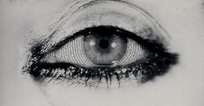
• Cindy Sherman's mock-film stills also aim to subvert expectations, especially of the representation of women, by placing her both inside (as the model) and outside (as the photographer) the media's critiquing eye. It's reminiscent of a film still we just can't place, but the fact that it is entirely staged plays with the notion of a hyperreal, simulated society - where the images are reproduced so many times, the original meaning (if it had one) is completely lost – a distinct lack of authenticity.
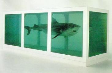
• The Young British Artists, a sub-movement of postmodernism, which commenced in the 1980s and 90s in Britain, aimed to do much of the same things as the Postmodernists, but with an emphasis on shock tactics through an apparent lack of artistic skill (due to a use of non-artistic materials), accompanied by an excess, rock 'n' roll lifestyle. This led to them becoming infamous within the British tabloids, a key factor in their success.
• The Physical Impossibility of Death In The Mind of Someone Living, also known simply as 'The Shark' by Damien Hirst epitomises this movement: the body of a tiger shark is preserved in formaldehyde in a glass case, and the directness of the by-turns alive and dead beast forces us to confront our own fears about mortality. Unashamedly shocking and deeply conceptual, it raises unequivocable controversy as to whether the intention behind it counts for more than the
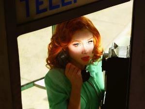
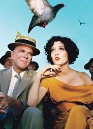
• Alex Prager's work merges reality and fiction – all her work is staged on film sets, but has an element of cinematic realness about it which both confuses and attracts the viewer. Is this real? Is this fantasy? It looks believable, but at the same time, surreal, like nothing you've ever seen in real life before.
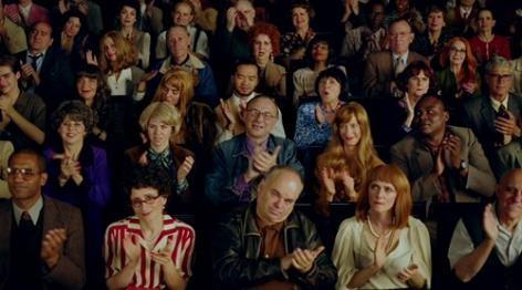
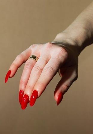
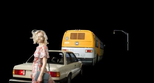
• She controls all aspects of the shot, that is, placement, hair & makeup, clothing and surroundings, and plans out exactly what she want to achieve beforehand, but what excites her most is the inherent unpredictability that occurs when gathering together a group of friends, family and professional actors to pose.
• In much the same way as a street photographer, whom she finds many similarities to, looks for interesting characters with no staging, she looks for the unpredictable moments in her staged everyday, which adds that little something extra to her images and stops them from being just ordinary film stills.
• She also makes diligent use of cropping and scale in her images to distort the viewer's perceptions, and the assumed storylines that go alongside her photos - by zooming in on or emphasising a particular detail, we are forced to reconsider our views on her theatrical, surreal photography.
• (I feel they have an element of satire to them as well, especially that of the beauty & fashion industry, the overblown emotion and dramatic figures posed not-quite-naturally in vibrant colours, and this could link to the surreal, conceptual Postmodernist element of a lot of the photographers I've chosen to focus on.)
• All of her work is influenced by her personal experience – from working on catalogues in a publishing background to immersing herself in movie culture in Los Angeles.
• She never seeks to please an audience when she creates her photographs - they are for her own gratification and what interest her alone – but she does feel that her work is universal, and able to be interpreted by everyone in their own personal way, to link the characters within them to their own lives, regardless of their meaning to anyone else.
• I really like the saturated use of colour within her work - she rarely works in black & white - and I think this is greatly to her credit as it builds the cinematic, surreal quality of her work by making everything just slightly brighter, slightly more fake-looking than it does in real life. As if the characters in her work are trying too hard to fit in compared to their surroundings, and capturing their moments of weakness is where she finds interest. I think this can be applied to real life as well, hence the satirical aspect.
• Her photography has led her to film as well – at first, she felt film was a continuation of her
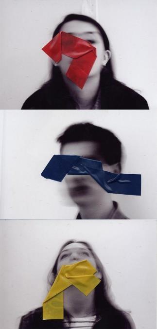
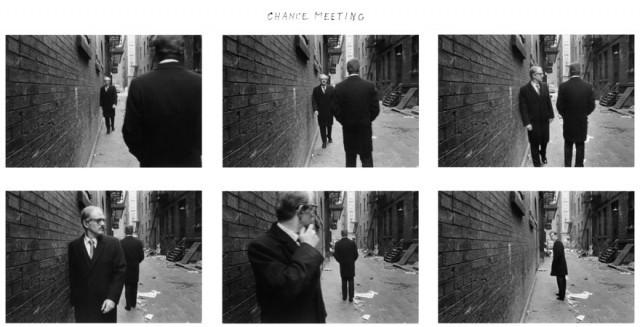
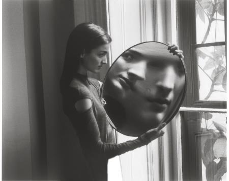
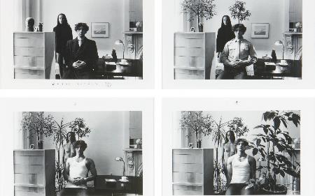
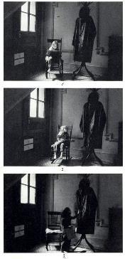
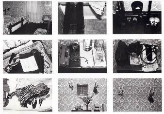
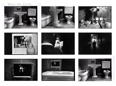
• Duane Michals is most famous for his cleverly woven sequences of staged photographs, many suggesting a narrative of philosophical proportions – topics of life, death, spirituality, sexuality, desire and the passage of time are all explored within his work.
 Blart By Dr. Marcus Bunyan, 30th Jan 2015.
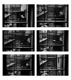
• The vast majority of his work is small, gritty black & white prints, set in short but thought-provoking sequences of events, often with a mind-bending, circular effect. For example, his 1973 work Things Are Queer (pictured middle right) has the same starting and ending image, forcing us to reconsider our perceptions and expectations of the images seen before us. We no longer know how to read the sequence, as it just seems to keep going round and round forever, as if in a dream.
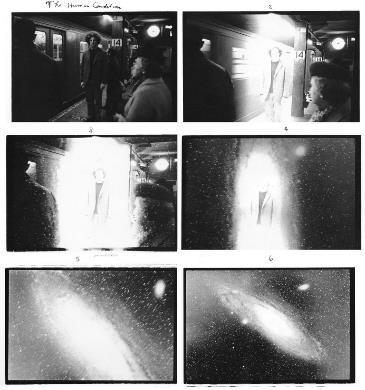
• This is what I like about Michals' work, the fact that it's wittily deceptive and makes you question the reality you see before you, as we think we know what the subject is, but we are often proved wrong by the object or reality morphing into something otherworldly later on.
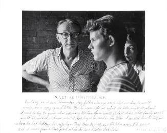
• All of his works are titled, often hand-written, for a poignant, personal touch. His singular images are annotated in Michals' distinctive handwriting to add an extra dimension of understanding through this background information.
• In A Letter From My Father (1960/75), a seemingly ordinary photo of a young boy and his presumed father takes on a whole other meaning when paired with the unreciprocated plea for affection expressed underneath, from an all-forgiving son to a once estranged and abusive, now deceased father.
• He reveals a subject by exploring every aspect of it, and often by forming unanswered, philosophical questions through this experimentation. Those that can be answered are filled in through our own personal take on the deeper meaning of the work, such as in A Letter from My Father.
• He works on exposing the subconscious, conveying an intimate, dream-like sense of the self inaccessible in everyday life, and believes the best photographs are only ones depicting what cannot be seen in the real world – thoughts, feelings, ideas, and emotions. This is what excites him as a photographer.
• In a world of rapidly growing demand for documentation and commercialisation in photography at the time, Michals did the opposite and peered inwards, at his own thoughts and feelings, finding
I chose Alex Prager and Duane Michals to focus on because I admire their ethos and reasons for creating photographs as much as the actual artworks. Alex Prager's glamorous, saturated cinematic style inspires me as much as her street photographer excitement about the unpredictable does, and Duane Michals' exploration of the subconscious and the intimate, unashamedly personal attracts me as well as the witty, surreal creativity of his sequences.
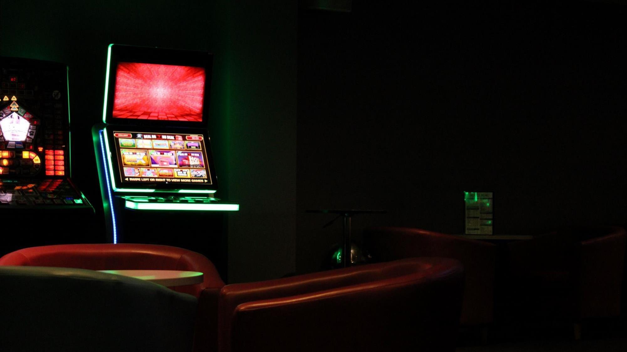
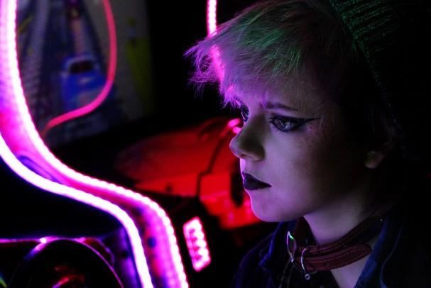
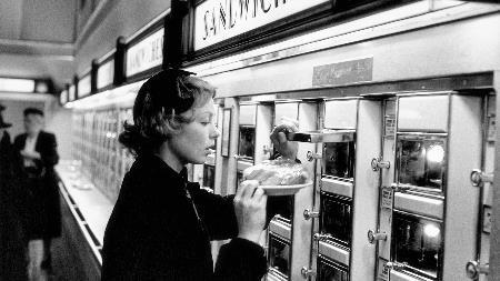
I hope to create photos with strong narratives, sequences or not, which evoke a sense of cinematic surreality (that I have started to explore through my previous arcade-based project), of the notquite-real that intrigues and entices people. I'd like to twist the documentary realist style to fit my own attitudes towards life and to express the personal messages I feel are relevant at this period in my life, and therefore highlighting and emphasising the things I see around me in a certain way through my photography to reflect this.
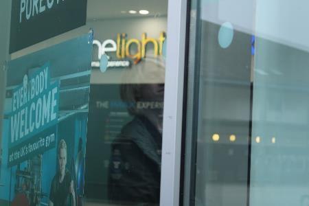

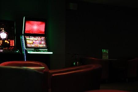
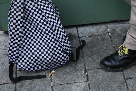
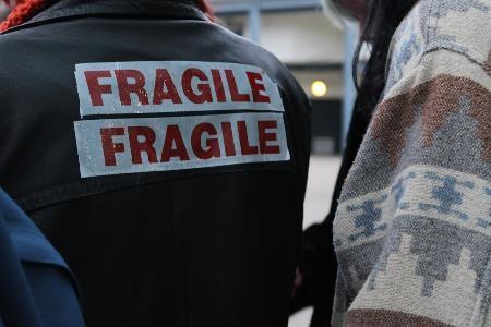


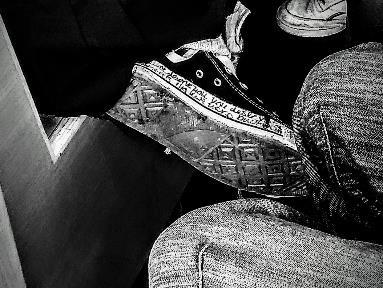
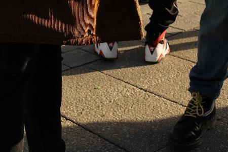
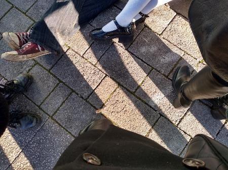
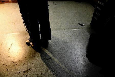
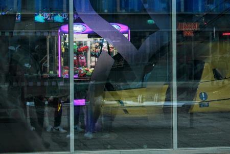
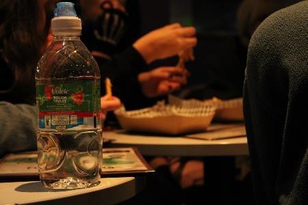
I'm going to be exploring Theme 2 within my project, as I'm interested in photographing people (and their immediate surroundings) more than anything else. I'd like to explore the teenage façade - the way that my peers and myself form their identities and showcase themselves for the unique people they are, and how this differs when around others of the same mind. I also wish to explore, through Theme 4, the concept of real and surreal, posed and candid, and what these contrasts in setting and style will reveal about us.
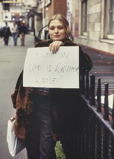
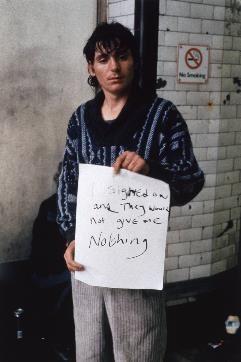
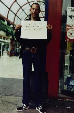
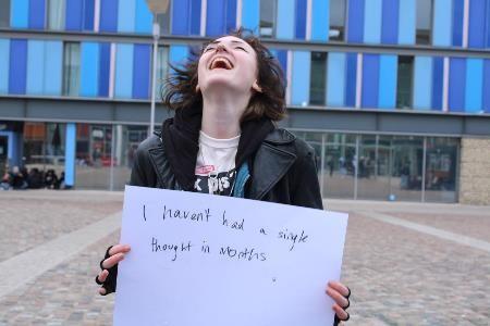
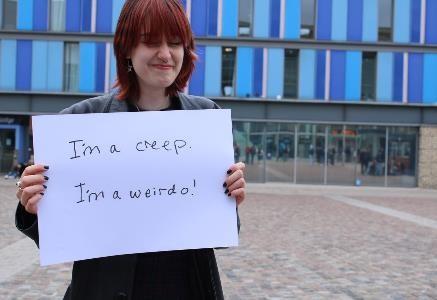
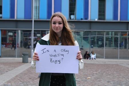
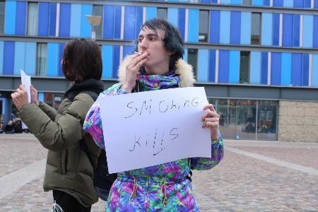
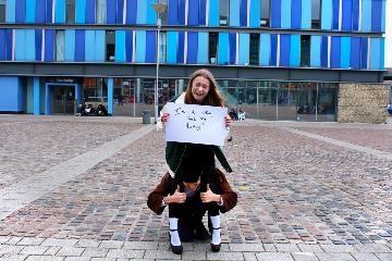
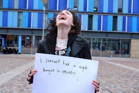
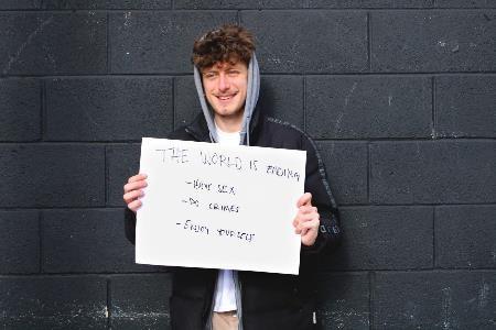
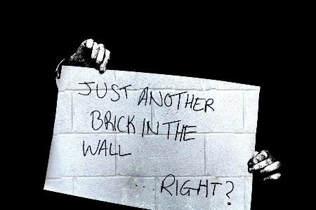
I've taken inspiration from Gillian Wearing mostly, as I loved the idea of her 1993 collection "Signs That Say What You Want Them to Say and Not Signs That Say What Someone Else Wants You to Say" so much that I tried it out on my own peer group, with mostly successful results. I'd like this to represent the façade that we put on around others (and maybe when done again, I'd find a way to photograph people's reactions to other's messages, to show the power of the group) whether it be overly childish or overly mature, or anything in between. I want them to be their true, fake selves, without seeming like they're faking anything.
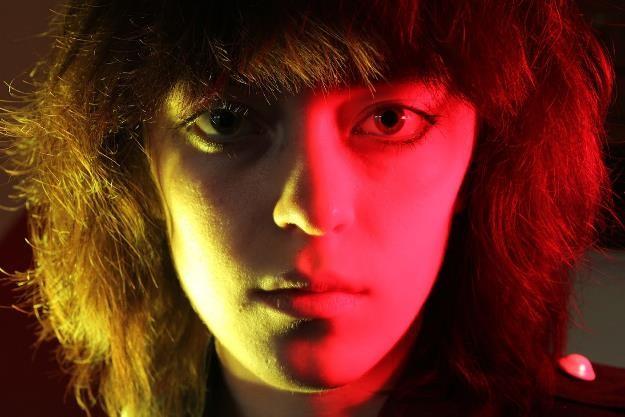
This contrasts with my second idea, and this is to do a series of intimate, studio-based portraits, likely still with the boards, but this time offering a chance to write something truer, a bit more personal, as they may feel encouraged to do so now the pressure's off. For this, I have taken inspiration from photographers like Nick Fancher, as his bold use of colour really adds to/reflects the mood and character of the person he's photographing, and I'd like to experiment with stark, high-contrast black & white photography too, in the style of David Bailey and Richard Avedon, as this is equally as revealing when grey areas are stripped away and the subjects are depicted in pure black & white. They also all take an interest in fashion photography, and people's identity expressed through their appearance, which is the basis of my project.
I really like the idea of atmosphere, and shooting in places with a specific atmosphere – the studio is one, outside on the street is another, but I also want to investigate other places/shooting at other times of the day to create the atmosphere that matches the clothes/attitude - however, I don't want this to become too predictable or cliched, or change the project's focus too much be on environments over people.
I'm leaning towards a photobook or magazine over an exhibition book because there is more room for adding text or graphics to complement my images, especially when trying to convey the personalities of my subjects. I also love experimenting with
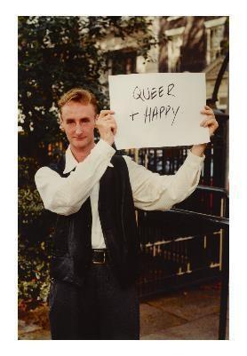
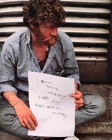

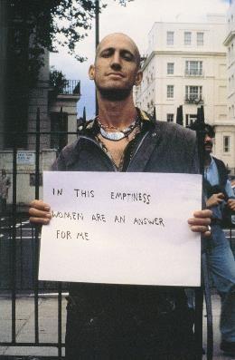
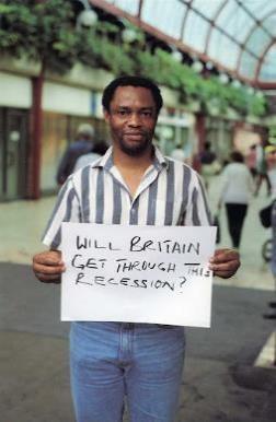
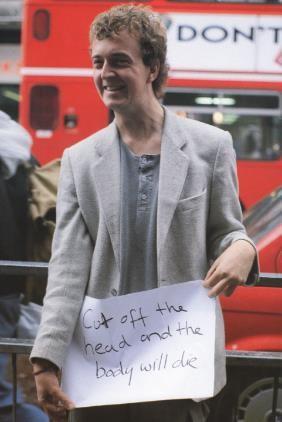

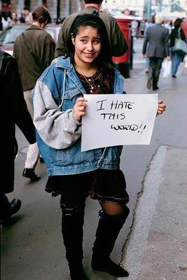

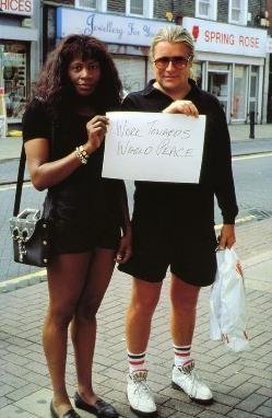
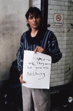
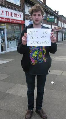
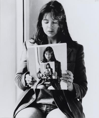
Wearing - Signs That Say What You Want Them to Say and Not Signs That Say What Someone Else Wants You to Say
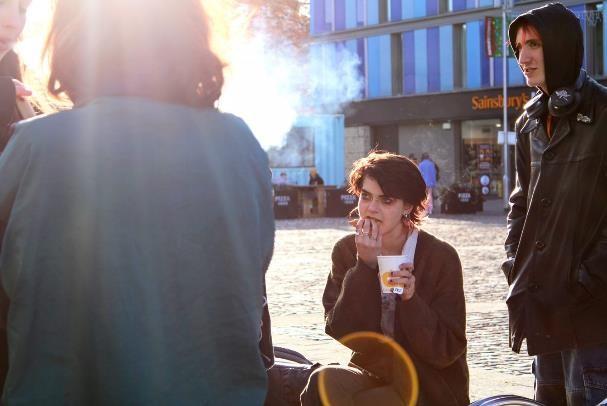
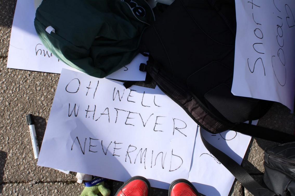
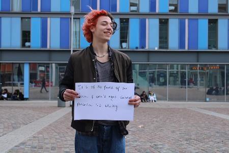
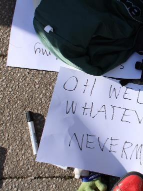
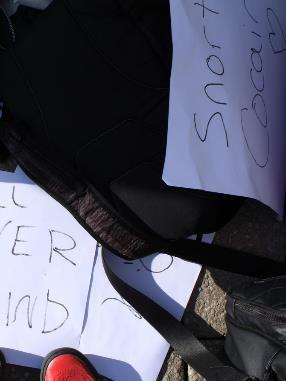
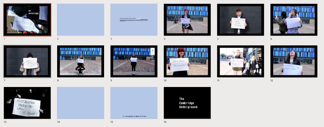
I took lots of photos of my friends and other people my age after asking them to write something that they were thinking about down on a piece of paper and hold it up. I staged the shoots over two lunchtimes at the leisure park nearby (making sure not to get any private building names in the background...) and found it was quite successful. (I find it fascinating that so many people, when faced with the task of writing something down on the paper, were unsure about what to put down, or said simply that they couldn't think of anything – I suppose this is the difference between asking adults or people clearly with things to say, as GW did, and asking random teenagers...)
Nevertheless, I wanted this exercise to be a true representation of the alternative Cambridge youth, and so gave them no guidance as to what to write, how to pose, etc. I'm pleased with the results – the only thing I would have changed is obviously to get continually different people to pose, as some of my friends did have more than one go in front of the camera. I'd also change the position of the camera/close the aperture on the camera on the second day (black wall portraits) as the sun came out intermittently and made some of the signs unreadable. I'm hoping postproduction will sort this.
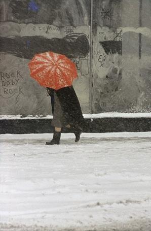
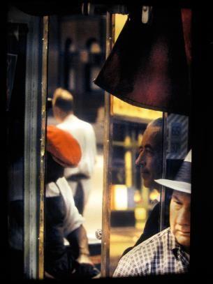
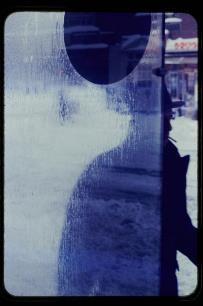
I took around 200 photos, and hope to narrow them down to about 20 and edit them accordingly to create my first collective. In terms of editing, I want them to be more realistic than many of my previous photos, as I'm interested in untouched, candid street photography, in the style of Saul Leiter.
https://hrsfc-my.sharepoint.com/:v:/g/personal/mw137090_hrsfc_ac_uk/EVAvZuVgBONFkAc-13sJuR8Bp q6qeb30R3WjtyMCx9M5RA?e=gO53JB
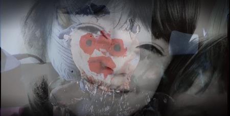
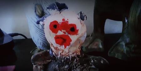
For this short film, I shot some footage of my everyday life on a day I was home alone, and then used some editing software and stock sounds to edit the shots together. I really enjoyed working with the software – learning to colourise and edit all my frames to create certain moods or for continuity, adding complementary or contrapuntal sound (there is no dialogue) and transitions to add to the themes of isolation, surrealism, mundanity, teenage angst and existentialist pondering. Of course, it's done highly tongue-in-cheek, and was all shot on my phone and under natural light, and edited together on software meant for social media videos over a number of hours.
I wanted to prove to myself that I could actually make a film, as it's the first time I've ever tried it. It has narrative elements, but no preconceived script ideas – I saw interesting things around my house, or remembered interesting techniques I'd seen in films, filmed them, and juxtaposed the shots with other shots to create a film best interpreted as a series of mostly unrelated vignettes (albeit very short ones).
I intend to make more films, as I really enjoyed the process, and these would be made with a definite structure and narrative in mind, in order to push a real message or meaning, which this one is slightly lacking in. I'd like to film other people – but as this was done over progress review/half term, access to other subject matter was limited.


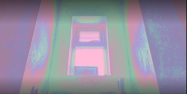
Experimenting with colour casts, framing and overlay for narrative effect.
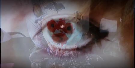
I'm most drawn to Themes 2 and 4 – with an emphasis on 2, as this incorporates the human figure and environments, with an abstract, surrealist, symbolic twist.
My focus in my recordings was mainly people; the Cambridge Youth, with a few on objects with symbolic/narrative significance (featured in the film and extra photos).
I wish to explore the façade of young people – what they choose to hide (behind) and reveal to others – as this is very interesting to me. I also wish to explore the contrast between posed and unposed, edited and unedited, surreal and real – and explore this between locations with different associations, such as the cinema (escapist), studio (posed, fake, surreal), and the street/cityscape (real, candid, where youth feel comfortable). I'd like to shoot the façade in an outside setting, with other people around them, and then just people on their own, hopefully in the studio/more intimate setting, where they can start to be themselves a bit more. I think Gillian Wearing's boards will help with this.
Black and white film to capture the 'real' element in stills or sequences – or Helmut Newton, David Bailey inspired sleek high-contrast images. Digital editing for vividness, backgrounds – candid sequences, different editing. Moving image is fun but needs to be relevant.
My favourite style of his –bold, block colours, clean, graphic lines and only a little ambiguity of shadow/tonal areas. I'd really like to get this effect with my own photos.
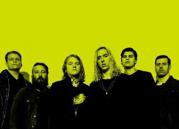
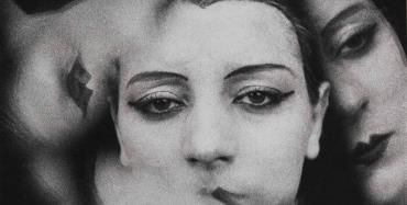
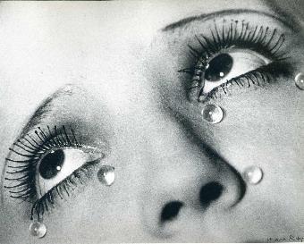
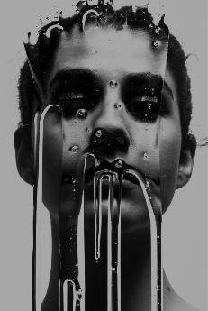
Clear surrealist influences here, with a semisolarisation effect and striking black & white close-up compositions.
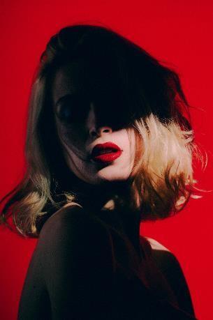
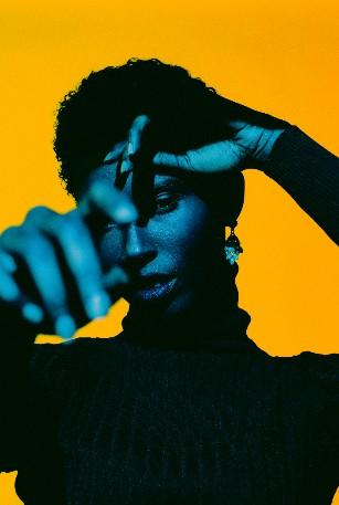
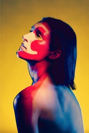
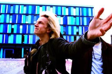
I like the different elements Nick Fancher includes in his work: he has an interesting mix of old and new techniques - clear classic fashion and surrealism photography influences coupled with new technology and image editing creates a modern yet timeless visual style.

Classic fashion photographyinspired: clean black& white, powerful compositions, highlighting faces and bodies in a narrativefocused way.
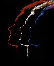
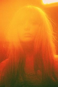
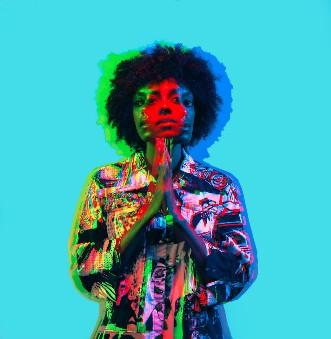
I liked these two other examples for techniques only – I want to experiment with the one-colour light source seen below right, and the burst of light above is reminiscent of highkey portraits which I'm interested in
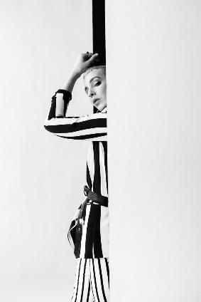
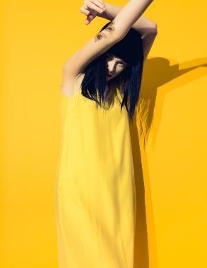
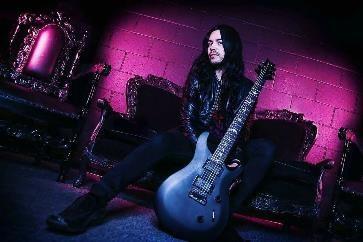
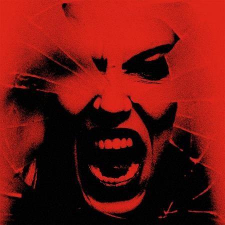
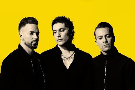
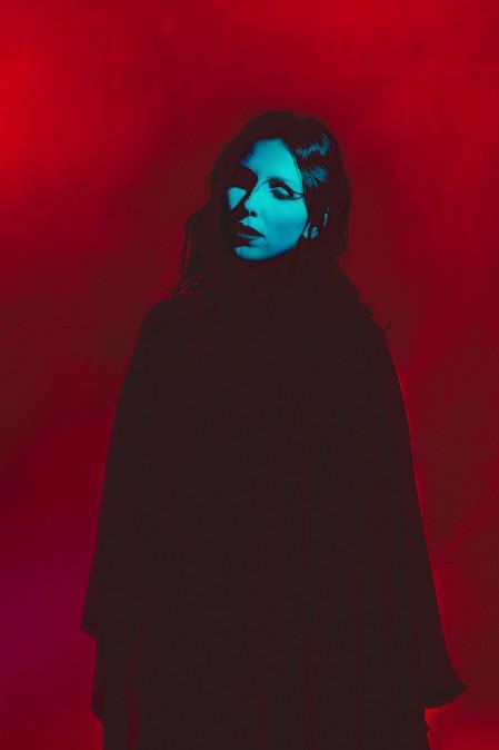

Nick Fancher is an American portrait and commercial photographer, known for his eccentric and innovative use of coloured lighting, often using portable lights and set ups in ordinary locations, i.e. not a studio. He is based in Columbus, Ohio, where he graduated with a BFA in Fine Art Photography in 2005, but takes commissions from around the world. He's worked with companies such as Apple Music, The NY Times, Adobe and IBM to name but a few. He's also written several books on his technical processes, including how to create a studio effect anywhere and how to effectively use colour to light your photographs.
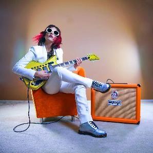
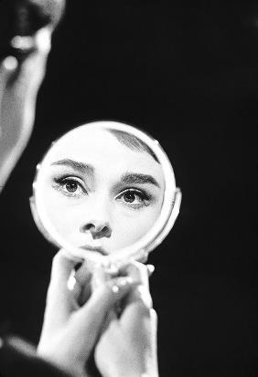
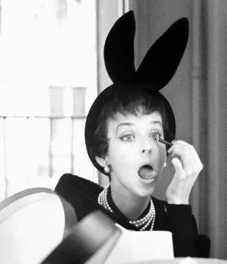
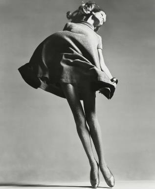
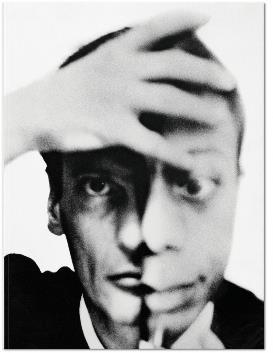
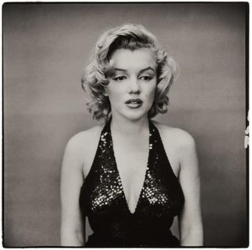
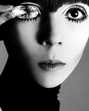
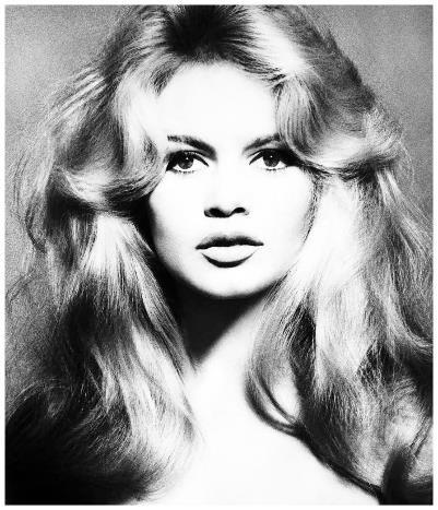
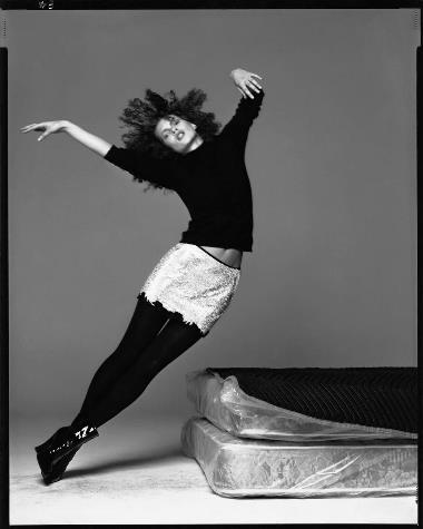
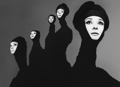
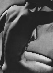
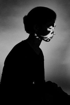
I really like the simplicity of these photos – the contrast between white, black and grey is really effective in bringing out the details of the subject and making you focus on shape and form over colour. Positive and negative space is used very well.
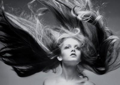
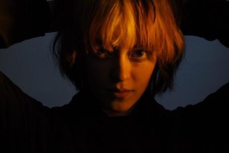
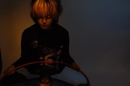
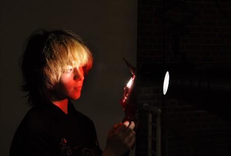
Experimenting with coloured lights, backlighting and different backgrounds in the studio.

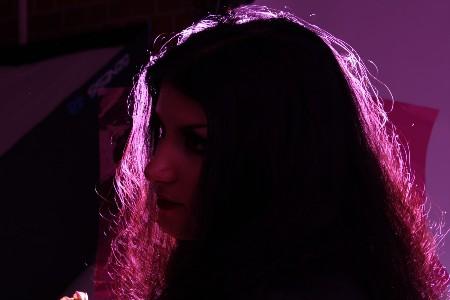
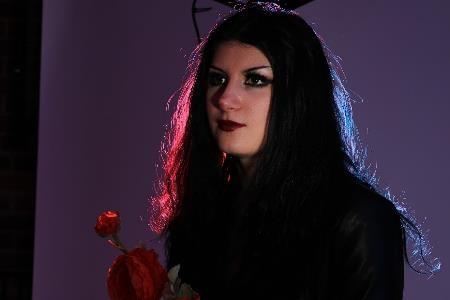
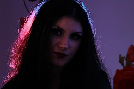
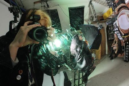
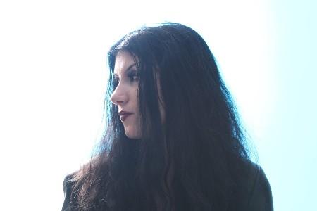

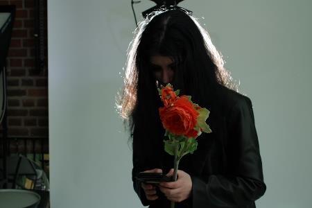
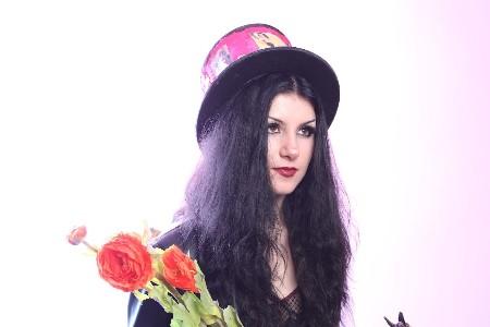
Experimenting with coloured lights, backlighting and different backgrounds in the studio.
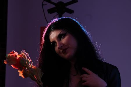
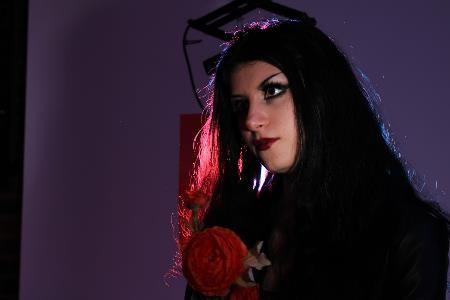
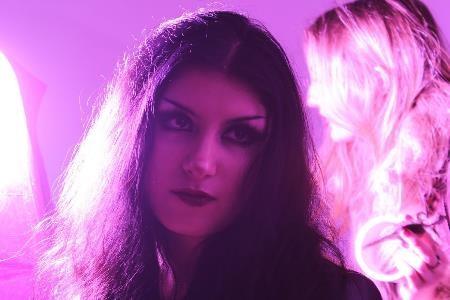
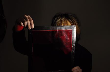
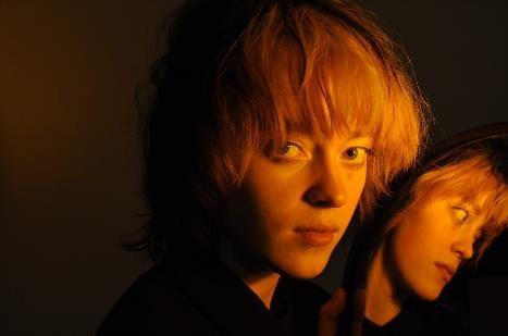
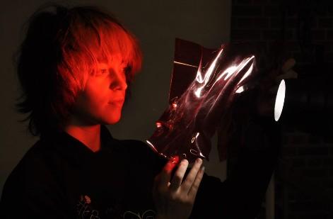
Further explorations with colour, light and props from the studio environment.
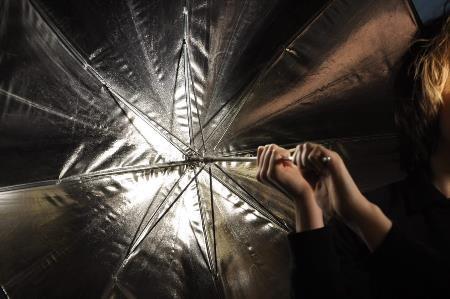
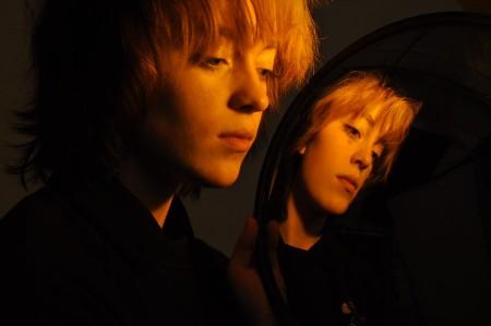
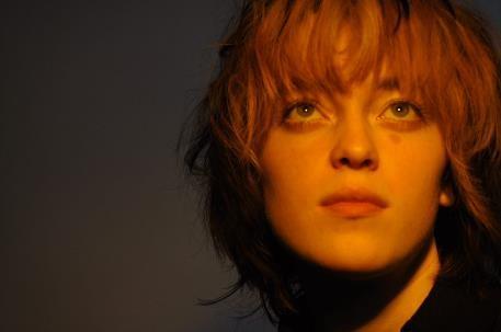
Further explorations with colour, light and props from the studio environment. Surreal mirrors.
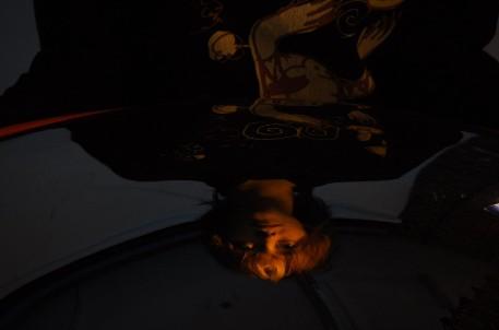
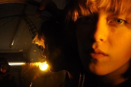
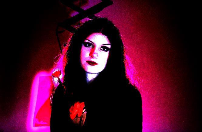
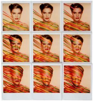
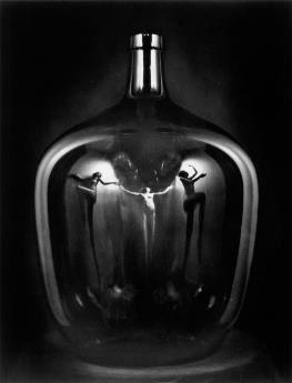
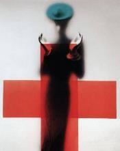
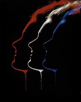
My homage to Erwin Blumenfeld's futuristic outline photography (above right). Alsoanother photo of his which fit well with my explorations of light and shadow in this photoshoot.
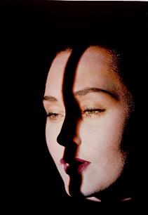
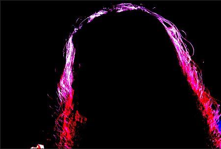
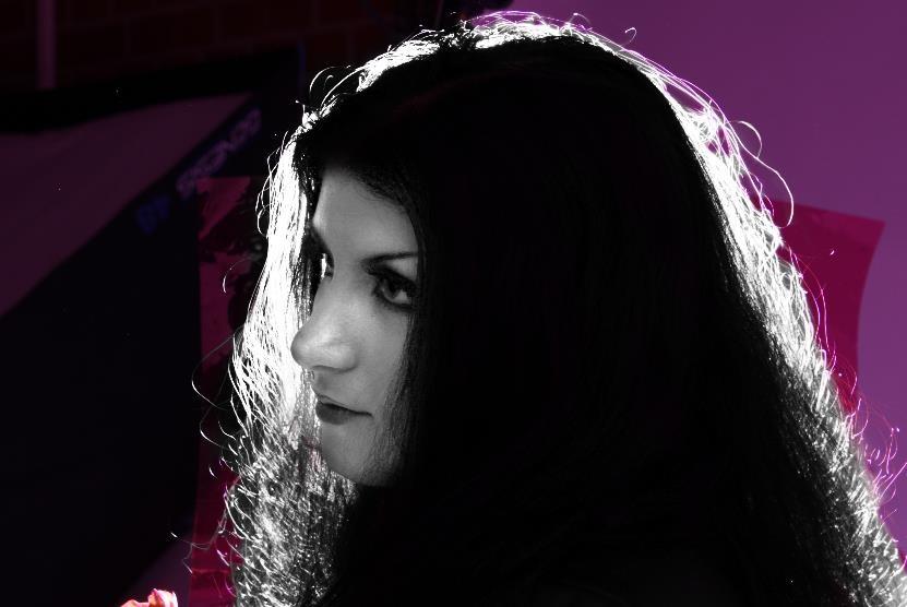
Here, I've used layer masks and levels on Photoshop to brighten the face of my model, before using a black and white filter to create a strange scrapbook-style effect. I think the contrast between colour and black and white works well in this instance due to the features of the model being brought out by the filter, whereas before the focal point of the image
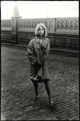

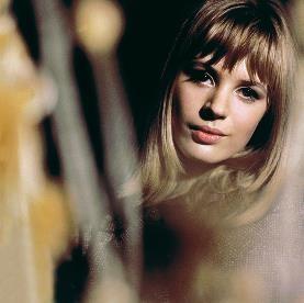

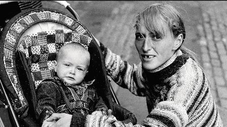

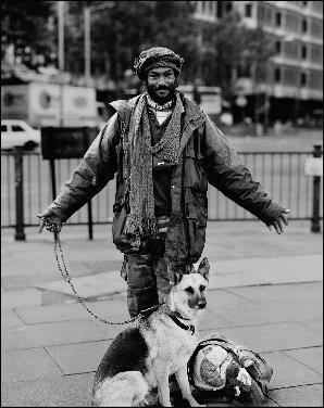

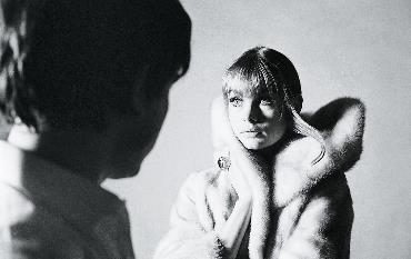

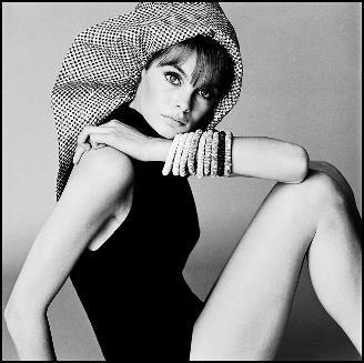

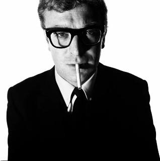

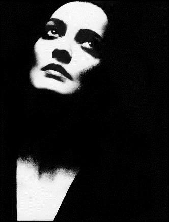


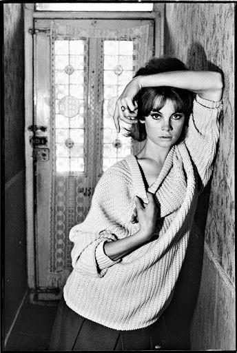

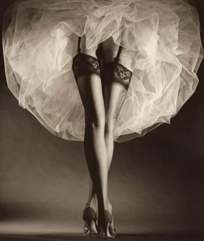
Stark black and white images, tight framing, subjects obscured by darkness or shown plainly in their environments. Rare colour photographs show Helmut Newton-style glamour and contrast.
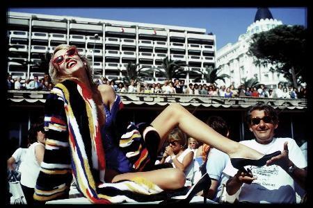
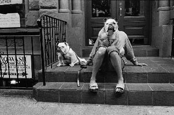
Exploring urban spaces outside, using natural light, with the aim of creating more simple, David Bailey style images.
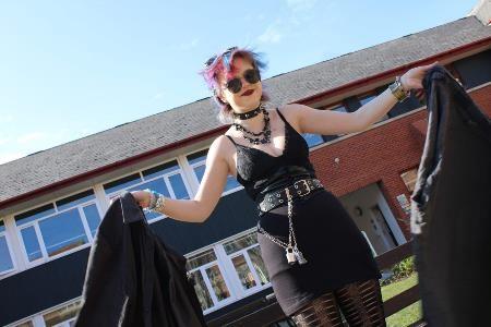
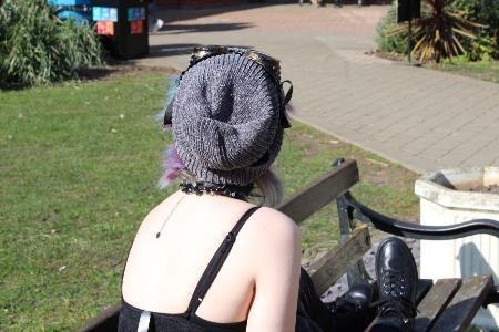
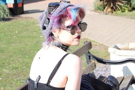
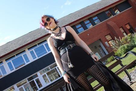
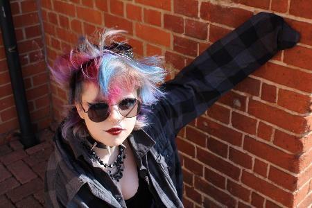

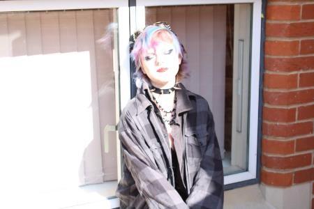
Exploring urban spaces outside, using natural light, with the aim of creating more simple, David Bailey style images.
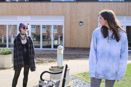
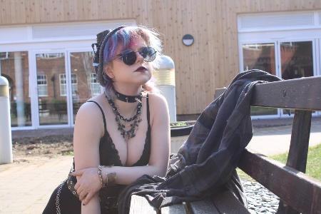
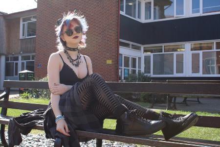
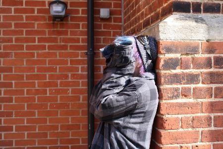
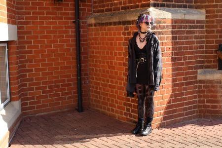
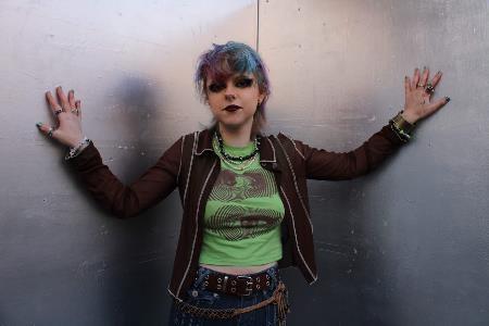
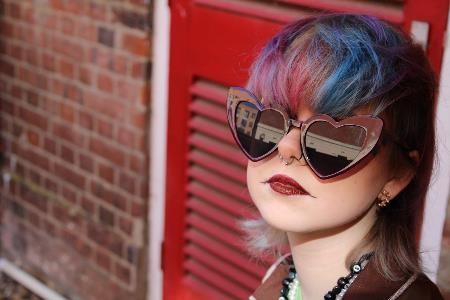
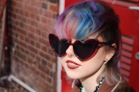
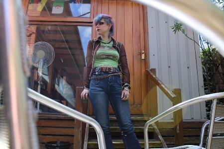
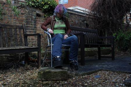
With the same intention as the last photoshoot, but a more mythical fashion shoot, aiming to create a mood different to the one we had while shooting – more otherworldly.
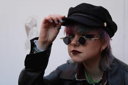
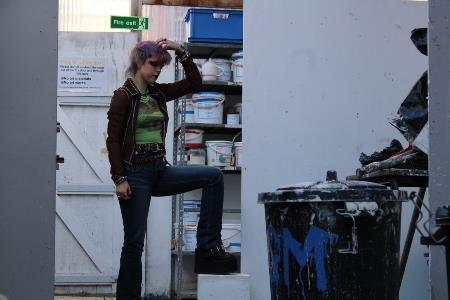
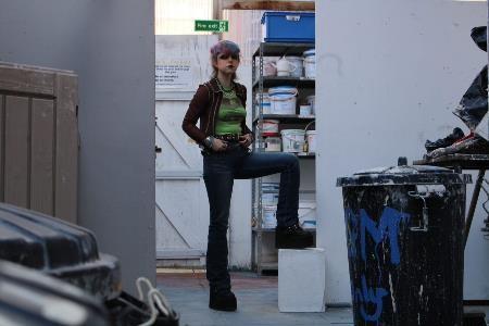
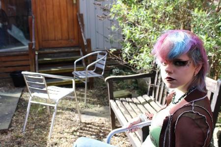
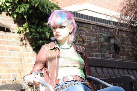
With the same intention as the last photoshoot, but a more mythical fashion shoot, aiming to create a mood different to the one we had while shooting – more otherworldly.
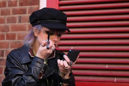
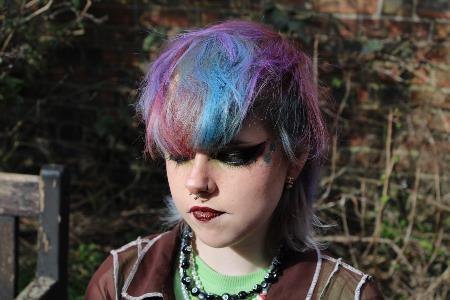


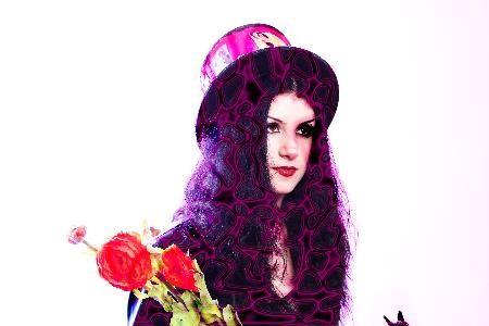
I really like this selection of studio and location images as I enjoy controlling light and colour in the studio but I also like playing with composition, which is easier outside where there are more dynamic lines and angles to experiment with.

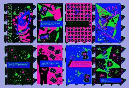
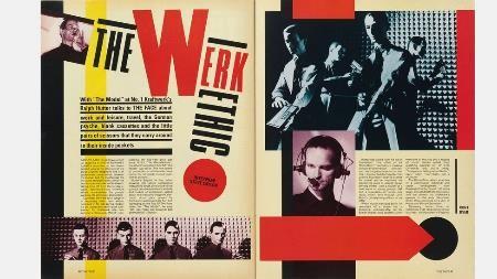
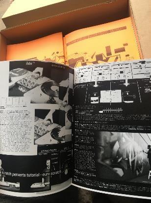
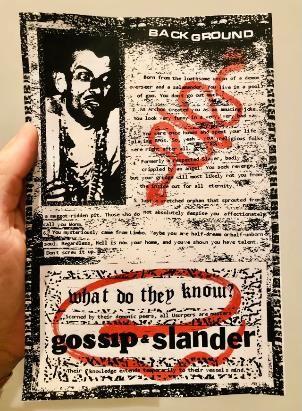
Striking black & white typography or images mixed with pops of block colour, geometric patterns, bold slogans, gritty handmade punk zine style.
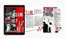
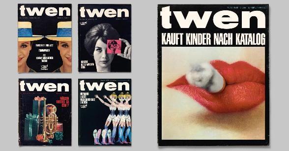
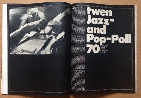
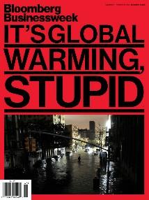
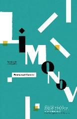
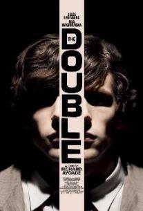
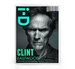
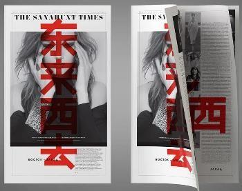

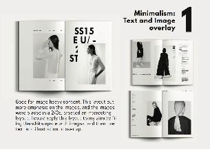
I’ve refined my aims from ‘Theme 2’ into ‘exploring the façade of the youth of today – teenagers’ appearances and how they reflect their environment’. I know I want to explore the mix between fashion and street photography, as I’m inspired by both studio and location photography in equal measures. The slides that show this are mainly my review slides in dark blue (currently 19, 20, 34, 44, 46), as they sum up what my intentions are following research and photoshoots.
I think there is definitely a link, as I’ve been heavily inspired by Gillian Wearing’s work and have consequently created my own series of images in the style of hers. I’ve also experimented with studio lighting in the style of Nick Fancher and photographed outside in the style of David Bailey.
I’ve explored techniques such as studio lighting with coloured gels, new ways of composing photos handheld and on a tripod, working with/directing a model, the use of props and post-production editing skills on photoshop to create the intended atmosphere. These are showcased in slides 51-5. I’ve also learnt how to organise my PowerPoint in a new way, having been introduced to the Slide Master, and am now organising everything according to theme colours and phases.
I’ve really improved at all types of studio work, as I’d never used it very creatively before. I’m also improving at innovating in my editing techniques on photoshop.
I’ve made sure my PowerPoint work is all of a high quality and that I’m explaining my intentions/gathering together and reviewing what I’ve done on a regular basis. I’ve been very disciplined with photoshoots and have completed 11 so far, 7 of which have been targeted specifically to respond to research. I’ve also used the Learning Log each week to organise my tasks and check my progress.
I plan to do a fair few more photoshoots, hopefully one in the studio imitating David Bailey’s clean style exactly, and one incorporating the boards from a few weeks ago with intimate lighting, and a few more outside in different environments, to imitate the fashion/posed street photography of photographers like Saul Leiter, Helmut Newton and Alex Prager. Over the next two weeks/Easter Holidays, I’m aiming to be out in town for a few days anyway, but will hopefully organise some meetups in urban areas to get the outside photos I’m aiming for.
TARGETS: I need to think about a direct link between my outside/environment photos and my stripped-back, coloured-light studio ones – how will I link these together? Want to try new flash techniques – sync flash, projection – studio. Gloomy/grainy black & white outside or with plain b&w backgrounds – with boards? Film camera? Juxtapose, imitate DB and Cindy Sherman, filmic? Show degradation of old boards, get people to write new ones.
I think my images are consistent in quality as I’ve greatly improved in creative thinking on poses, directing models and lighting, and composing my images. I now feel confident in choosing exciting-looking images – my target now is to create a strong message between them by planning shoots to contrast and juxtapose the human figure with their surroundings, so they flow well and make an impact when added to my outcome.
My PowerPoint currently has two phases, and I will put a third in when I do my next set of photos/act on the targets set above.
I’m yet to complete much outcome research but I’m looking at making a magazine as I’ll get an opportunity to interrogate lots of subjects and add their thoughts in writing alongside the images to drive home my message. It’s also a good opportunity to experiment with lots of graphic design ideas - I can sustain a theme and explore it further in a magazine than is possible in another type of outcome. A target following this is to learn to design pages using Adobe InDesign or Photoshop to give my zine a professional edge, although I’d like to have it in a punky, contrasting urban style such as the ones I’ve collected as research – and these have a handmade feel.
My supporting PowerPoint reflects my design principle research and sensibilities as although it is fairly basic in design, everything is consistent; it’s organised and colour co-ordinated; it reads well and is easy to follow. My choices of font and colour reflect my themes, and it will get revised and hopefully redesigned when my PowerPoint is streamlined/compressed at the end of the project (i.e. include a set slide for each type, proper picture background).
I get other people’s feedback on the photos I take and will consider showing my PowerPoint to family members at a later stage to check the journey makes sense, although I think I need to decide on the journey myself properly first! In terms of help in general, however, I believe I am progressing well with my project and don’t currently need any help outside the
Outcome Design Template 2 - Maddy Wilkinson.pptx
Magazine-Style Outcome.pptx (sharepoint.c om)
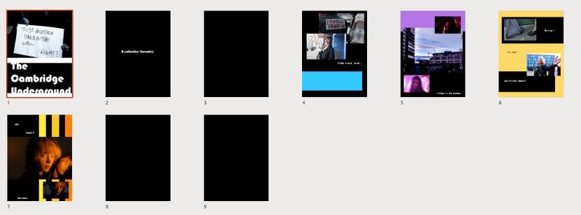
Outcome Design Template 1 - Maddy Wilkinson.pptx (sharepoin t.com)
<-- More just a collection of potential images and how they'd fit on a PowerPoint than a proper outcome.
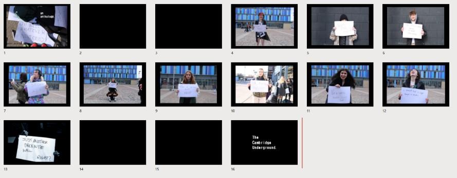
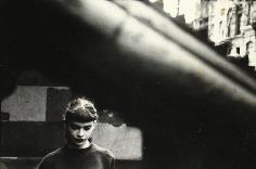
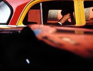
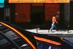
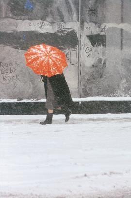
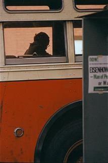
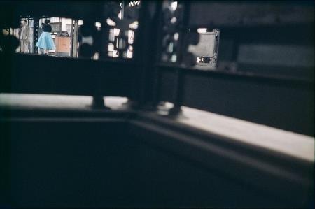
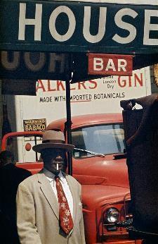
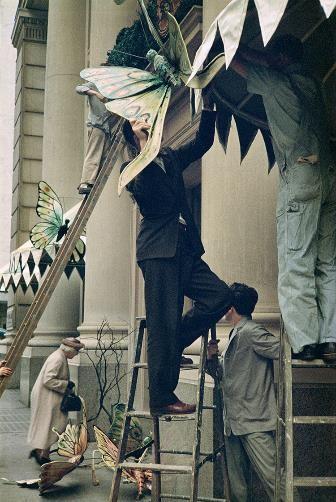
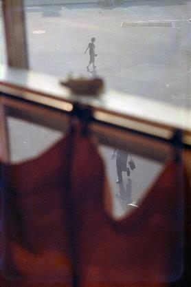
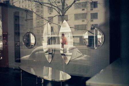
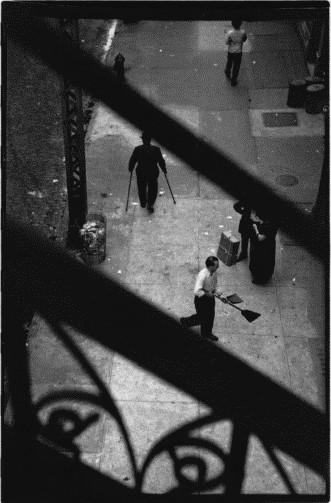
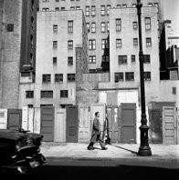
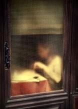
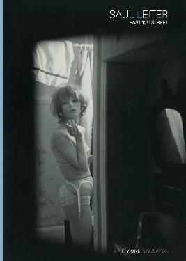
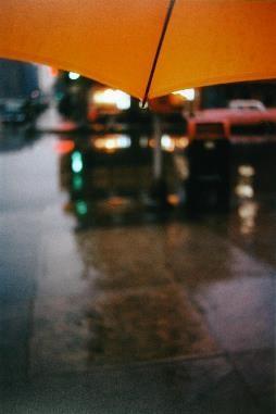
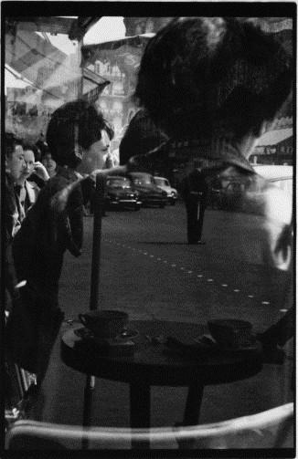
Saul Leiter was an American street photographer hailing from Pittsburgh, Pennsylvania. He had a keen interest in painting from a young age and pursued a career in it from the age of 17. His photographs have a distinct painterly quality in their composition and often concern themes of obscurity and voyeurism. I love his style of working as he creates an experience of 1950/60s America for us to immerse ourselves into. He finds interest in the smallest things and gives them artistic
Date 11/4/22
1. Intent
What are you trying to achieve? What are you doing and why?
Time 3-4 pm
I want to continue to explore the relationship between the alt youth and their environment, through a mix of fashion and street photography.
2. Research
Which artists have you looked at to support you with this?
David Bailey, Saul Leiter.
3. Subject matter
Who/what/where are you going to photograph?
I will photograph a variety of models outside around Cambridge.
4. Location
Have you visited the location already? Is there anything you need to consider when you go back?
No, but I know the general architecture of Cambridge and the area in which we'll be, and will think about which locations in particular I'll use for different shots. Doorways and railings are good for framing a model.
5. Lighting
Natural/Ambient/Artificial?
Natural light, possibly with my camera flash, but I think I'll rely on post-production or offset the white balance if I want a different look in my images rather than use any other equipment, simply for ease.
6. Equipment
Do you need any extra equipment? Tripod, flashgun etc.
No, just my camera as I feel that's the best way for me to be flexible as a photographer. I like shooting handheld and it gives me freedom to move around, change angles, switch orientation, etc.
7. Costume and Props
8. Risk Assessment & Plan B?
Will you need to bring anything with you?
My camera, everyone will be wearing their own alt outfits which will be suitably filmic.
What do you need to consider – safety, weather, cancellations etc?
There won't be any cancellations as everyone has agreed far in advance to meet for purposes other than a photoshoot, and we can easily move to an indoor location if the weather gets bad.
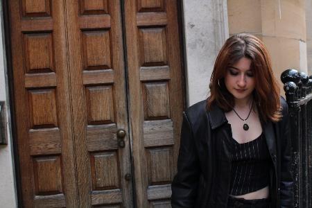
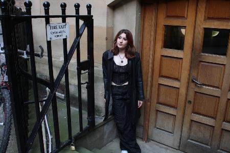
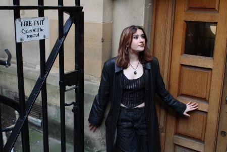
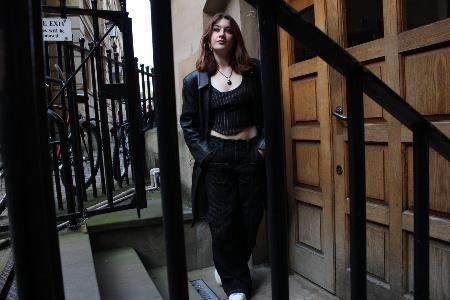
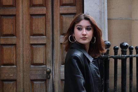
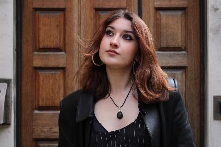
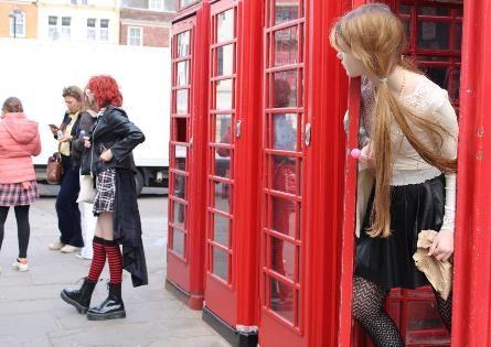
I enjoyed framing my suitably styled model against the brown and black tones of this doorway.
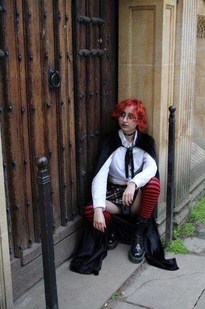
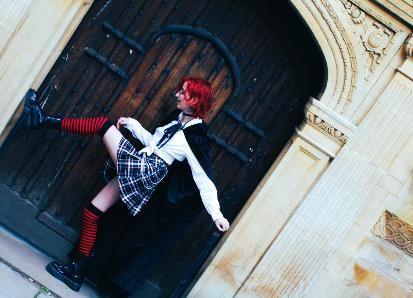
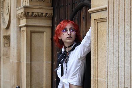
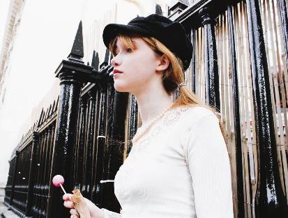

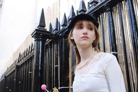
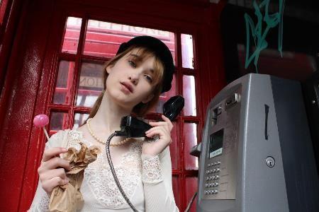
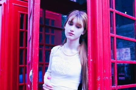
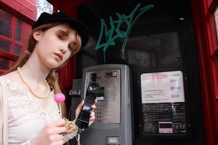
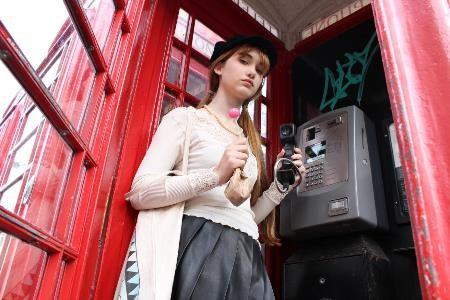
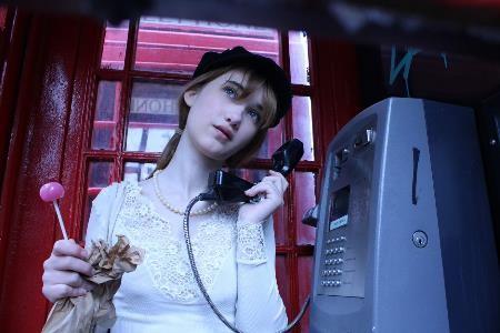
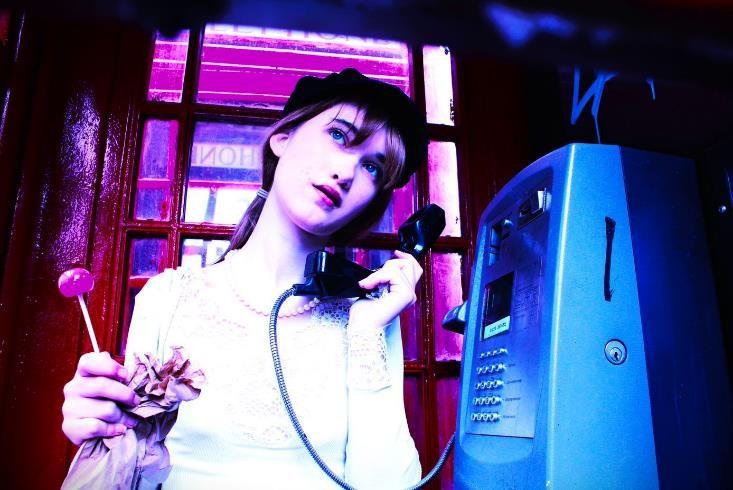
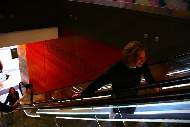
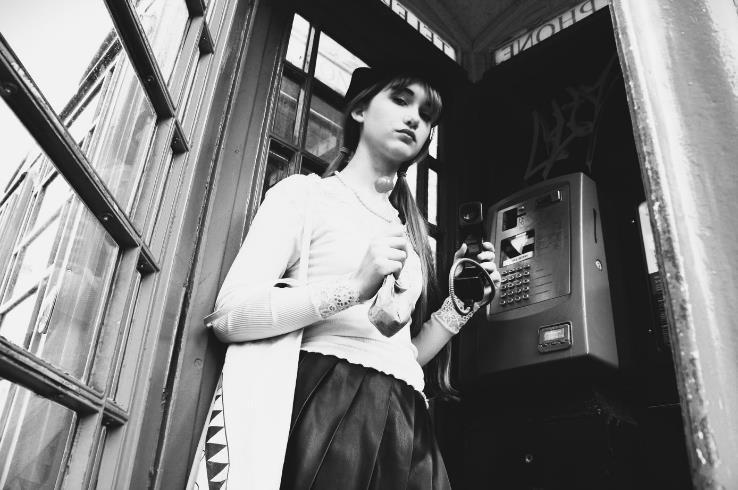
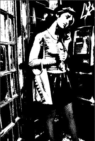
I was captivated by the rich tones of this graffitied phone box, and the retro styling of my model. I feel I've reached a stage where my photography is beginning to become more cinematic, and less about documenting the truth but more about manipulating it for artistic effect.
Edits
editor, photoshop. Cross-processing, black and white David Baileystyle.
I feel my project has evolved slightly from my original idea – instead of making one outcome that showed both sides of our teenage facades - real and unreal, posed and candid – I'm going to have one outcome for each, in differing formats/styles. The first, the unposed side, will be simple and restrained in terms of excess writing or typography in order to show the images as candidly as possible. The second will be more akin to a fashion/editorial outcome as I hope to use post-production editing, colour and placement more creatively, as well as typography, to present a more fantastical world.
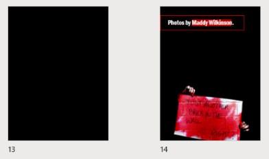
In future, I hope to produce a portrait, magazine-style outcome, as I think this looks really effective and I could use quotes from my subjects to add to my work.
Splitting up images on photoshop using the slice tool. This is helpful in creating double page spreads with only one image.
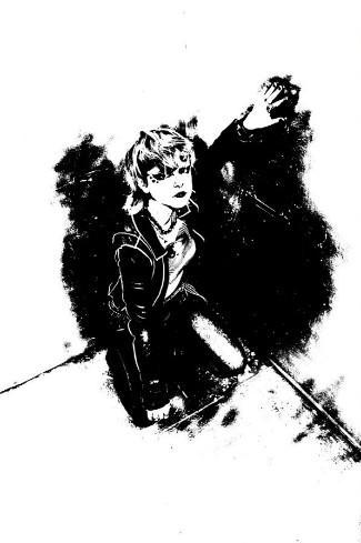
Threshold adjustments on Photoshop – I really like this effect and will likely use it in my outcome.
Outcome 1 – A social documentary exhibition book-style outcome showcasing my Gillian Wearing images, and Outcome 2 – a more creative magazine-style outcome with pictures from throughout my project that I felt better expressed the cinematic side of my photography.

I like to photograph people, both in the studio/a controlled environment and on location/on the street.
Exploring the line between social documentary and staged photography?
Fantasy vs. real life e.g. how far can you stage a photo before the original documentary becomes completely distorted?
The concept of facades among young people – what they mask and what they reveal.
The Quasi-Cinematic World of Everyday Adolescents –An exploration into how modern teenagers present themselves and interact with their urban environments in order to escape and fantasise, through both studio and street photography.
Youth identity, bold, dramatic, contrast, shadow, cinematic.
What facades hide and reveal about the fantastical nature of young people.
Philip-Lorca diCorcia
Cinematic view of everyday, social documentary, candid.

Saul Leiter
Cinematic view of everyday, looks like unposed street photography, bright, engaging colours. Social documentary.

Favourite Artist Images.
David Bailey
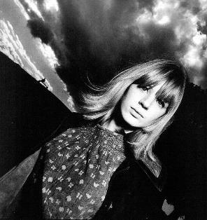
Cinematic view of everyday, posing in normal locations, true black and white, atmosphere created.
Philip-Lorca diCorcia
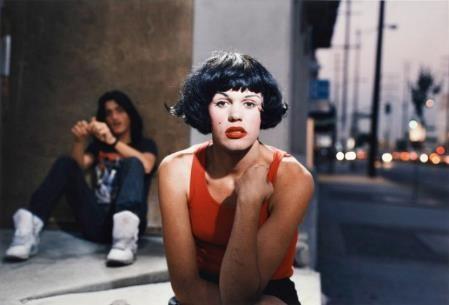
Cinematic view of everyday, strong message behind his images while still retaining fantastical glamour.
Nick Fancher
High contrast, graphic, colourful, light and shadow, glamour and homage to earlier fashion photography.


Unknown – Sophie Calle?
Cinematic view of everyday, glamour in true black and white.
 Erwin Blumenfeld
Processes creating artistic effects, high contrast, still recognisably a human figure.
Gillian Wearing

True social documentary, literal representation, gritty realness in processes and well as subject matter.

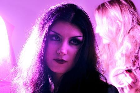
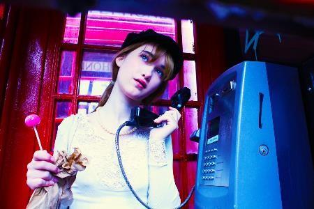
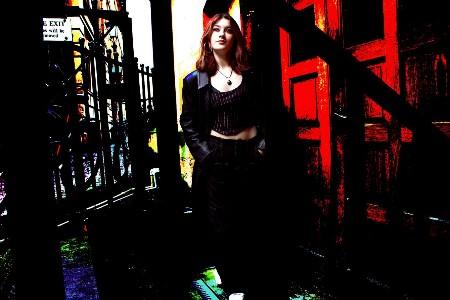
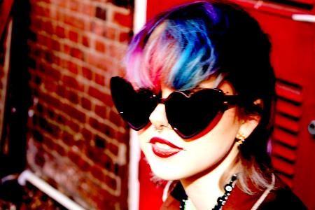
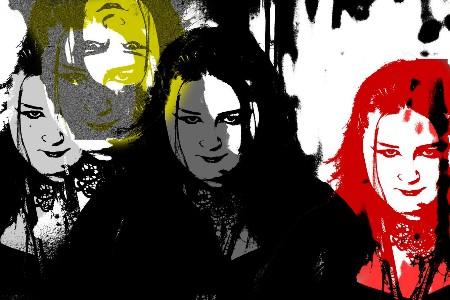
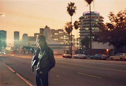
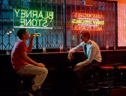

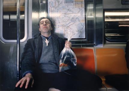
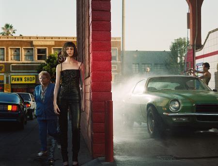
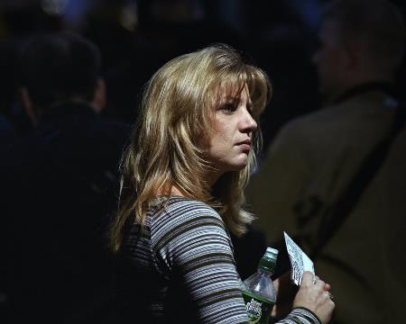

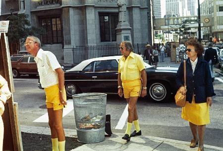
I love Philip-Lorca diCorcia’s use of colour and props to create “natural” scenes, where the elements all seem realistic but the use of lighting, framing and character styling all show that these scenes are staged. I admire this ability to create cinematic out of the mundane, and have explored this artist in my Personal Study to unpack this more.
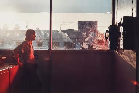
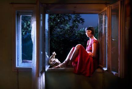
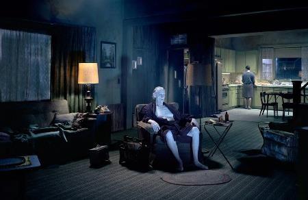
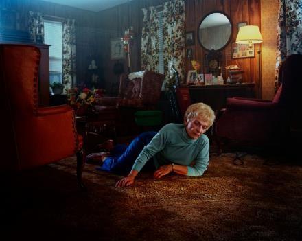
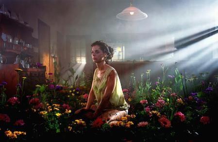
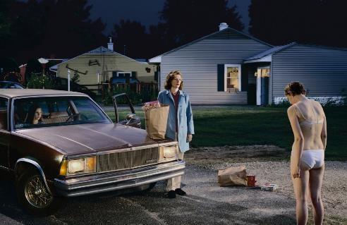
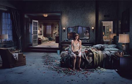
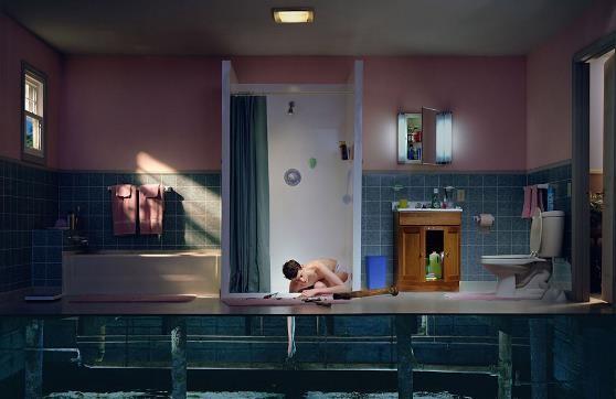
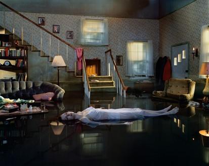
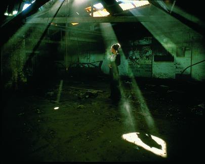
I love the use of light in Crewdson's work, as this serves to create the suburban-yet-dramatic feel that I aim to imitate. His use of colour, placement of figure and location – mostly in a quasi-domestic film set – mean his images look normal at first glance, but when you look closer, you start to notice the image and the characters within it are slightly 'off', mismatched with time, place or props, suggesting that whatever you're seeing isn't reality.
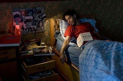
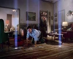

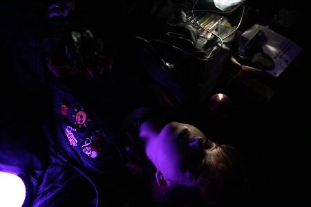
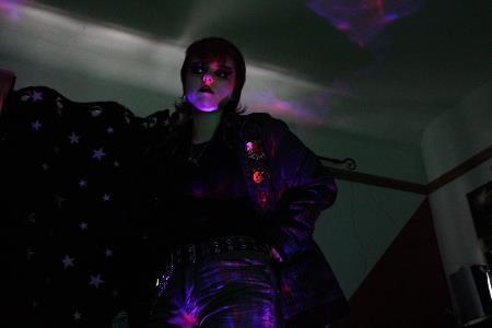
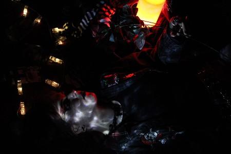
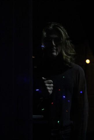
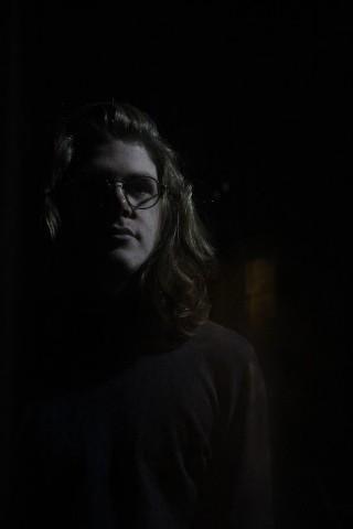
Experimenting with minimal light sources and arranging settings. All images turned out a bit dark but will be improved in post-production.

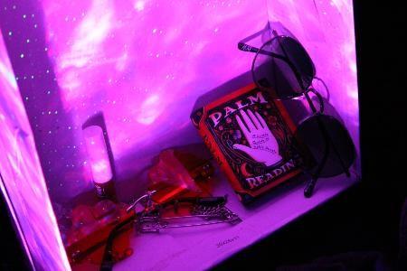
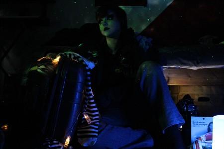
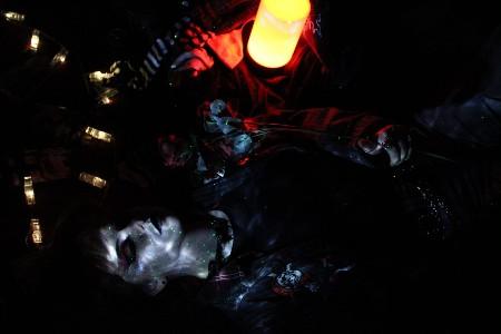
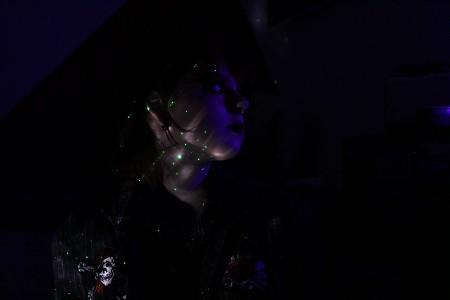
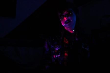
Experimenting with minimal light sources and arranging settings. I really liked the effect of a sprawling personality in a space, and feel that the photos have a still-life element to them.
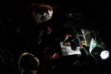
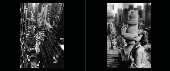
Yuka Fujii is a long-time artistic collaborator with musician David Sylvian – these black and white photos of him capture intimate moments that have an almost cinematic quality to them. I think the use of the double page spread to create a narrative, even an abstract one, is incredibly effective. like the image at the bottom right. The movement of your eyes across the page is almost like that of a panning camera shot, making insinuations in the mind that single images wouldn't. The two images in the top right were used on DS' album covers in the 80s and I like the mood they create; it perfectly reflects the refined, elegant yet atmospheric style of music he was creating.
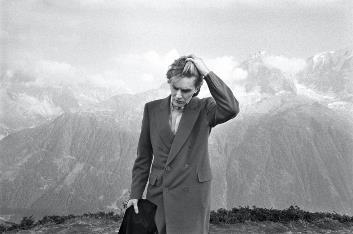
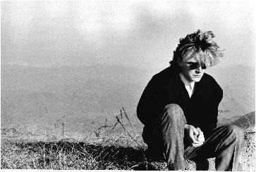
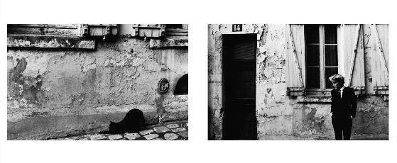
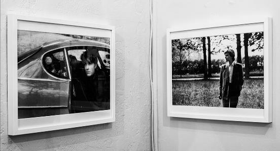
A lot of Yuka's work is in striking black-and-white, meaning the eye is sharply focused on the details of the photo. She juxtaposes massive, breathtaking landscapes with a focus on one young man, often looking oddly out-of-place in the environment. This contrast is what drew me to her work, and I feel it links to mine in a continuing development that links the black-and-white sequences of Duane Michals, the portraits of David Bailey, and the expansive settings of Philip Lorca-diCorcia and Gregory Crewdson. Therefore, I would like to move forward with my recording work now exploring black-and-white photography, recording environments while always having focus on a figure infiltrating this.
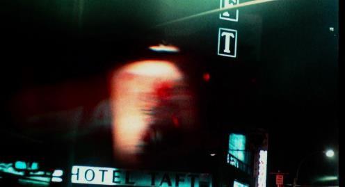

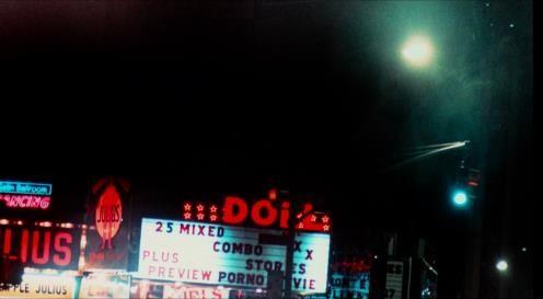
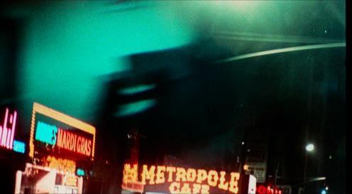
• Cross Processing – digital version
• Camera shake in situation
• Details enhanced by psychedelic colour
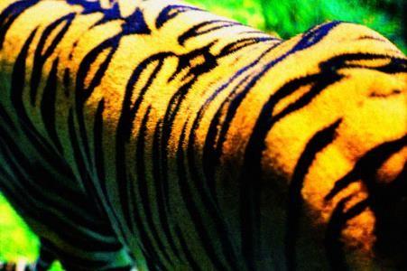
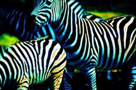
• Retro, film-style blur
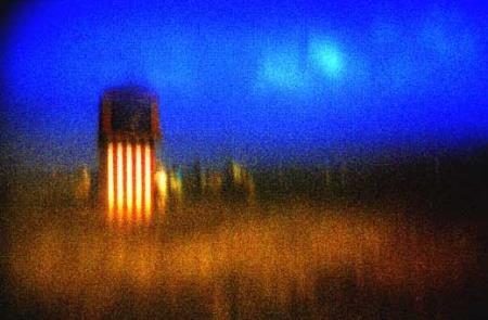
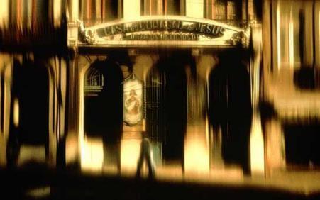
• Areas of judicious focus and out-of-focus
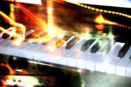
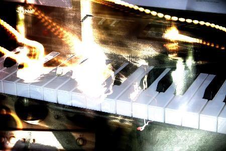
Further experimenting with filmic processing, heightened colours on long exposure images, playing with light.
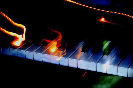
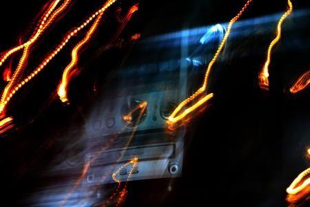
Editing to bring out colours – I was pleasantly surprised how vibrant they turned out to be.
Almost burned effect, like some of my first inspiration photos (board 3) <---
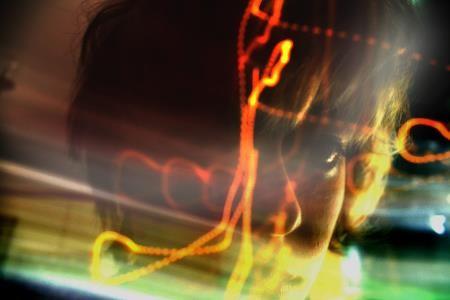
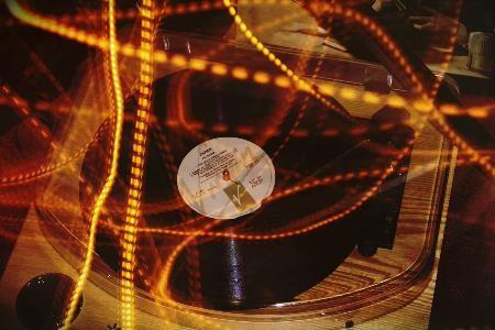
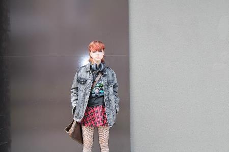
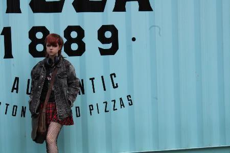
Exploring various locations – I liked the large spaces and walls for my subject to contrast against.

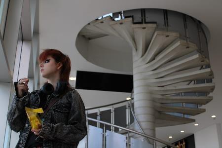

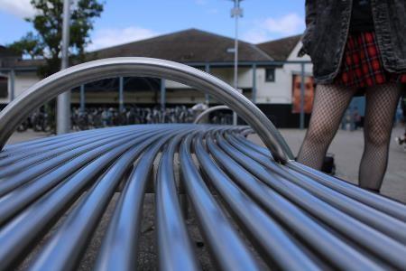
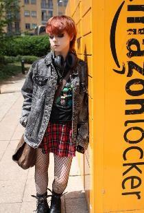
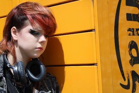

Exploring various locations – I liked the large spaces and walls for my subject to contrast against.
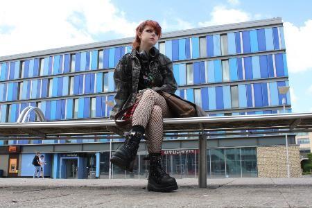
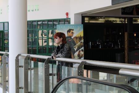
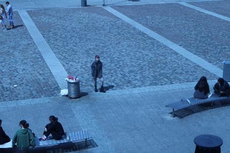
Plans:
Images that don't have any time signifiers
Narrative
Nostalgia
Moving image – aha, take on me -->
Glitching from reality to fantasy
Cropping imgs for effect –architectural
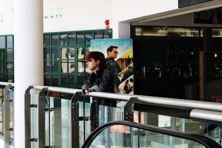
Video with sound, capture the moving as well as still img. Person turns and looks at the camera, we are left to wonder why...
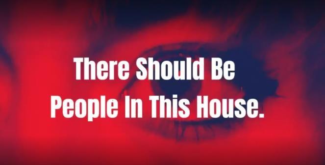
Revisiting my film: There
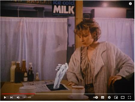
Should Be People In This House
– Surreal visuals and sound

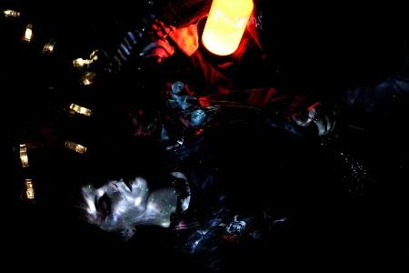
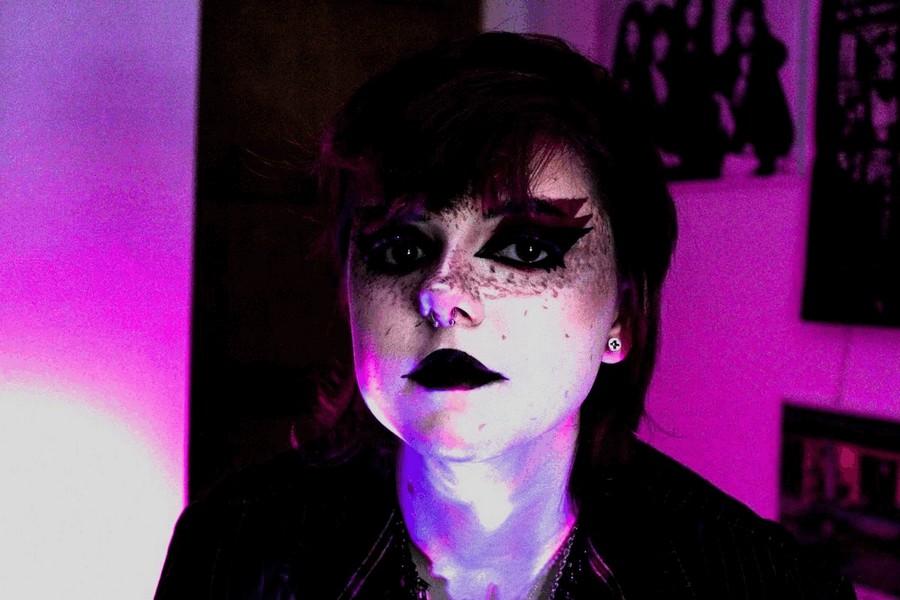
Capturing the urban alt youth world I see around me in a cinematic style, in line with Theme 2 and elements of Theme 4 through post-production. My work may cross into social documentary at times but the intention (and what makes my most successful photographs) is always to create narrative, or at least the illusion of narrative within my images. I like to put a cinematic spin on the mundane, as this is most aligned with my outlook on life.

Both cinematic and social documentary photography at the party of a lifetime...

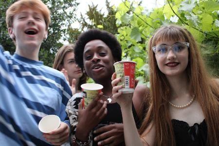
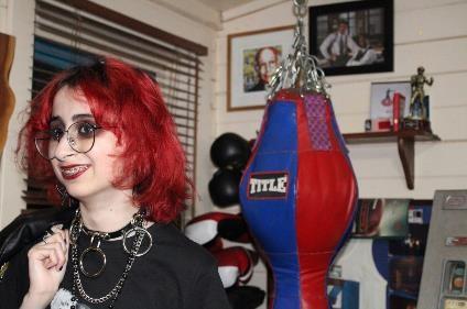
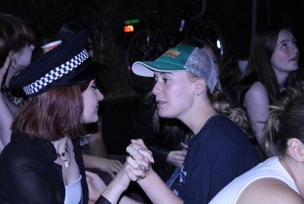
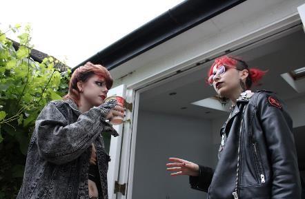
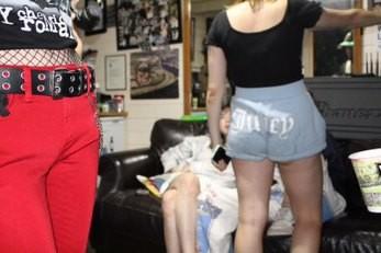
Both cinematic and social documentary photography at the party of a lifetime...
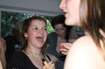
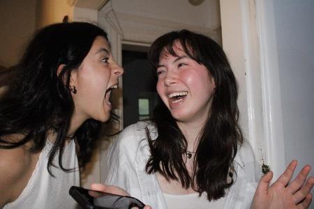
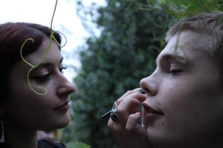
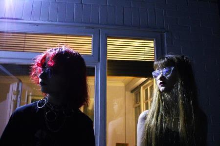
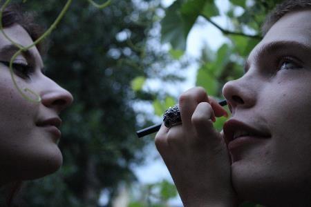
Revisiting old photos – (mostly) subtle yet creative edits.
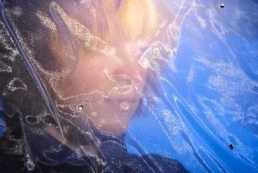
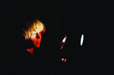
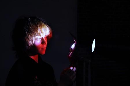
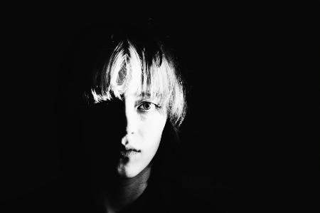
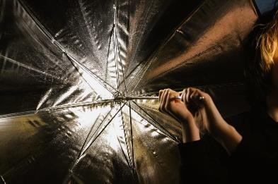
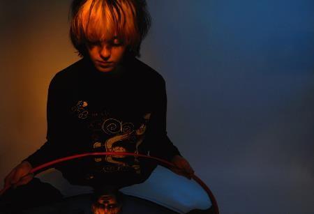

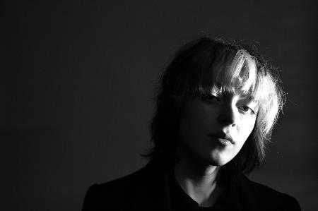
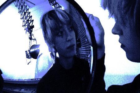
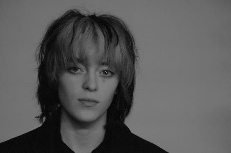
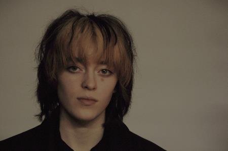
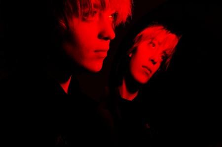
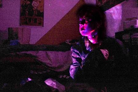


I feel these images are the most advanced in terms of lighting setups, narrative or compositional qualities, and would like to take them forward in my project. I also think I’m improving in the depth and organisation of my images.
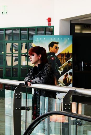
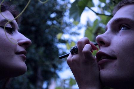


1. Intent
What are you trying to achieve? What are you doing and why?
Date 28/7/22 Time 7-9pm
I'm looking to photograph models in an unnatural costume in a very expansive natural environment, in order to emphasize the alt – youth and the isolation they feel. I want to build on my organisational skills and plan bigger-scale photoshoots with more models and more lights, as well as a radically new environment.
2. Research
Which artists have you looked at to support you with this?
Gregory Crewdson, Philip Lorca-diCorcia?
3. Subject matter
Who/what/where are you going to photograph?
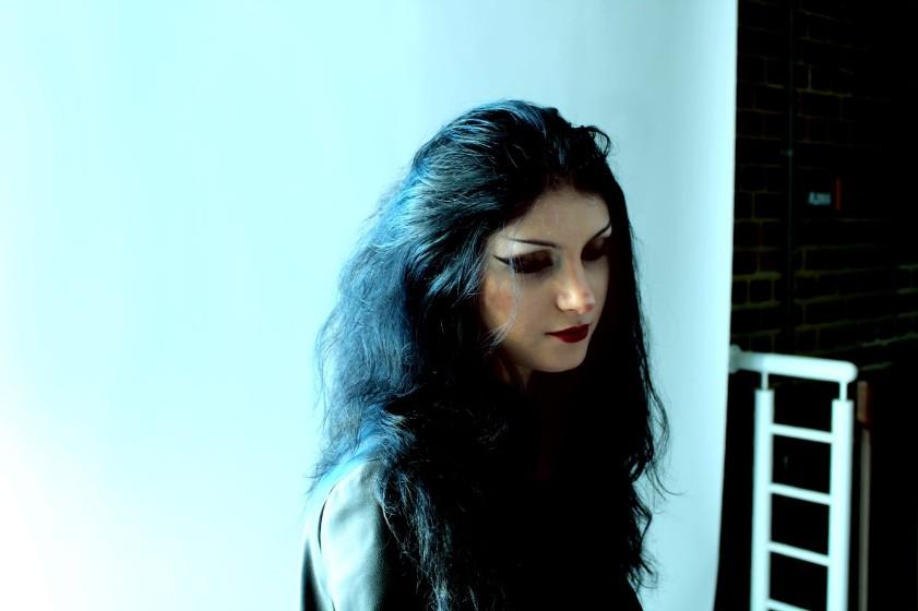
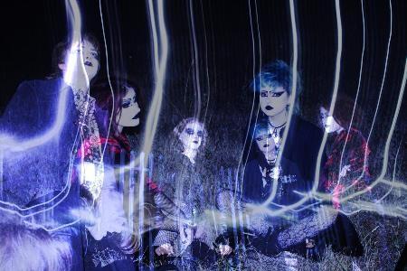
I will photograph my friends in gothic makeup around the fields and factory near where I live. This is to create a stark contrast between natural surroundings and the unnatural people placed in that environment. It's also just an interesting situation that could provide good photoshoot opportunities.
4. Location
Have you visited the location already? Is there anything you need to consider when you go back?
Yes, the location won't change too much, just camera and light placement that needs considering.
5. Lighting
Natural/Ambient/Artificial?
I'm hoping to shoot at golden hour, but I'm also bringing artificial studio lights which I can hopefully set up and use as fills when the light fades.
6. Equipment
Do you need any extra equipment? Tripod, flashgun etc.
I'm bringing a tripod and flash guns.
7. Costume and Props
8. Risk Assessment & Plan B?
Will you need to bring anything with you?
My models have been styled beforehand in suitable clothes and makeup.
What do you need to consider – safety, weather, cancellations etc?
The weather is fine, dry and partially cloudy. All my models are present and I just need to remember to handle the kit safely outside.
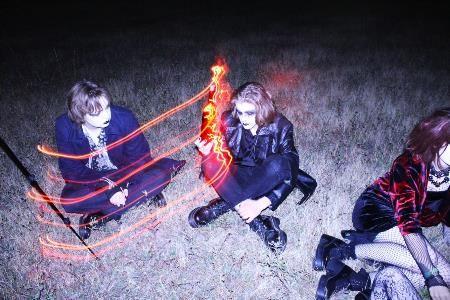
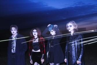
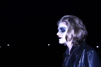
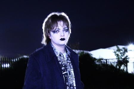
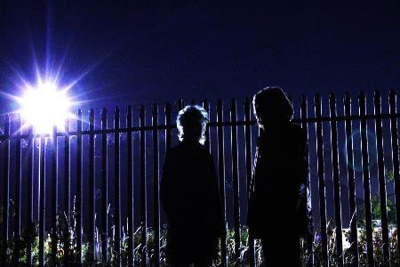
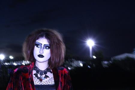
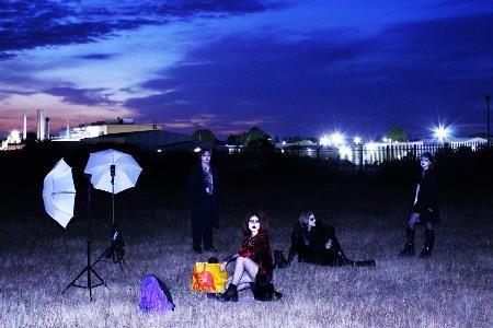
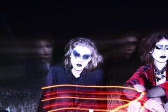
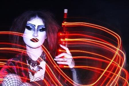


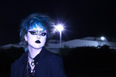
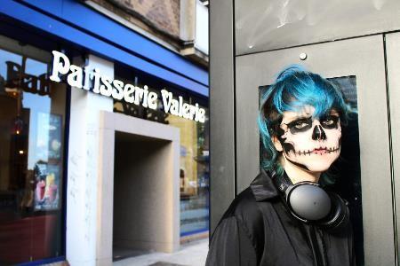
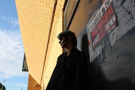
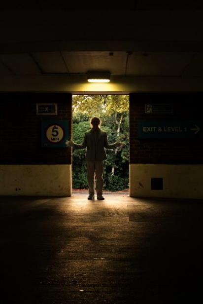
I had originally planned to do this shoot on Polaroid, but my friend's camera broke before we could take any pictures. Fortunately, I had my DSLR with me and we explored different spaces and both their hard natural light and interesting artificial light, such as in an underground car park.
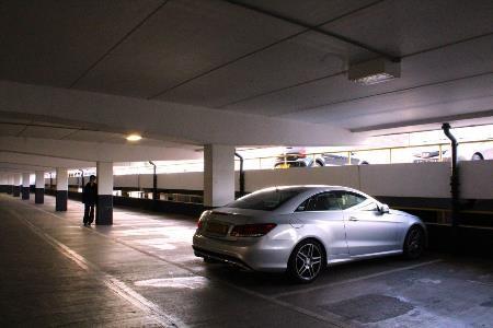
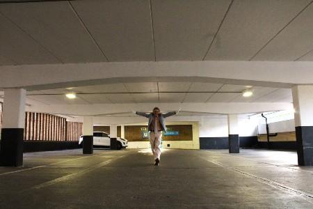

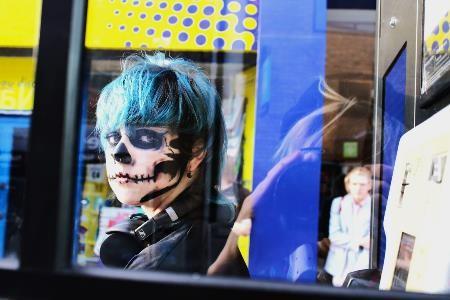
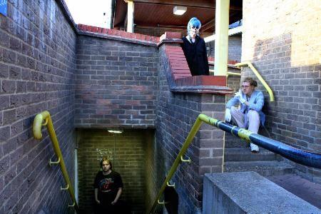
I had originally planned to do this shoot on Polaroid, but my friend's camera broke before we could take any pictures. Fortunately, I had my DSLR with me and we explored different spaces and both their hard natural light and interesting artificial light, such as in an underground car park.
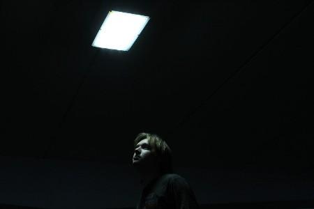
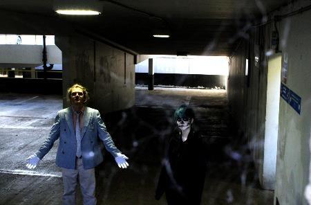
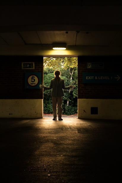

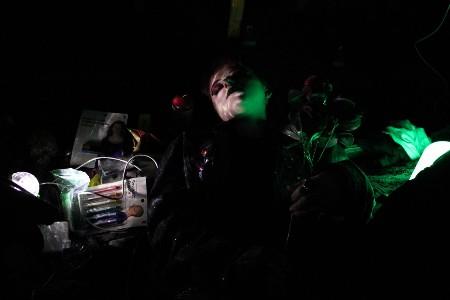
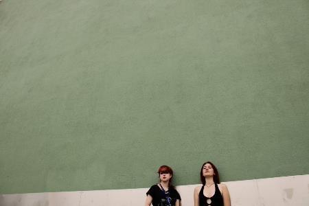


I'm happy with my summer work as I feel it's forced me to progress through thinking more deeply about settings/locations, composition, techniques and the message behind my photos. My cinematic view of the world I inhibit and the young people I come across means I'm always looking to elevate my photos by creating some intrigue and mystery within them through interacting elements like lighting, shadow and colour. My outcome in April showed my developing skills in selecting photos where I had seen an element of the dramatic in them, but that my poor editing and design choices overshadowed.
Past images that I want to continue with:


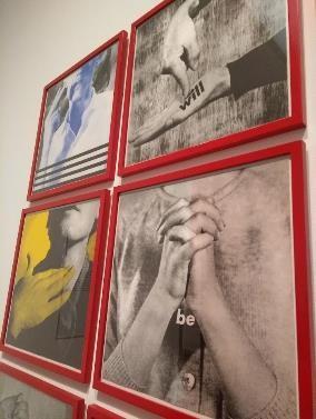
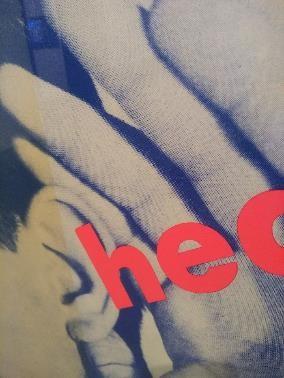
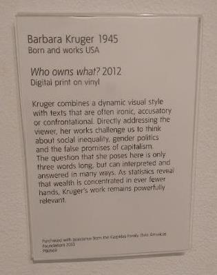
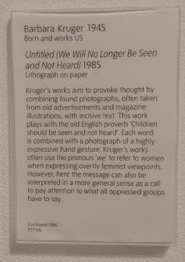

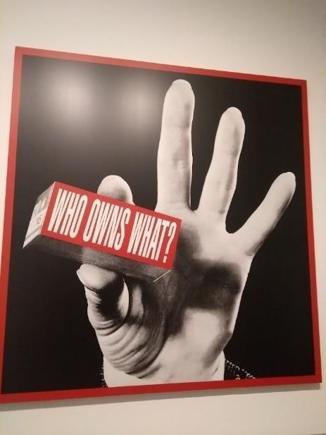
This style of art inspires me through infiltrating into the messages I want to create within my work – it displays the power of colour, a particular angle, a gesture, or an unflinching stare into the camera, which I aim to use to great effect.
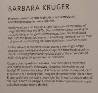
Barbara Kruger – I really enjoy the boldness of her work – this, combined with the often-monumental scale and eye-catching, unmissable text means her works are impossible to ignore. The neon letters spell out memorable, confrontational questions that are as timelessly relevant as her screen-prints: whether from the 1980s or the 2010s, each almost glows, bathed in their vivid colour casts reminiscent of the early days of pop art.
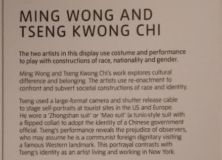
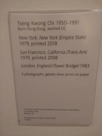
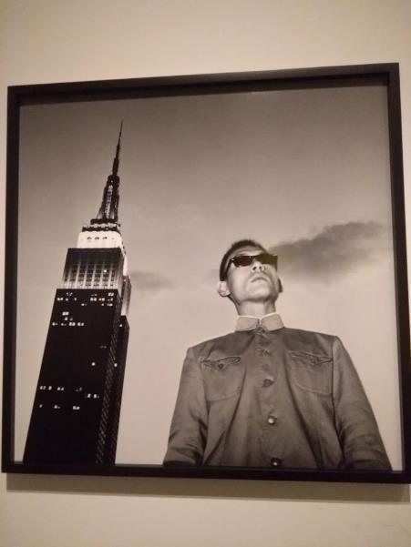
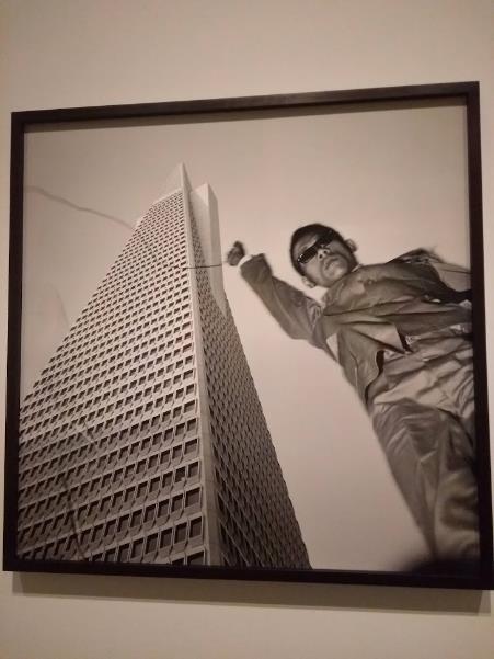
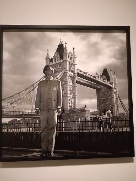
This triptych is the artwork I feel relates most closely to my project, or certainly where I'd like my project to go. The images all depict a figure juxtaposed with a huge urban building, at three locations across the UK and America. I really like the immense scale of the photo and the detail captured in each frame, and the starkness of black and white just accentuates this more. These images remind me of Yuka Fujii's work, made at around the same time, and fit well with my desires to juxtapose the open space or tall, urban landscape with a figure who too, doesn't seem to belong. The irony in these pictures is that the artist is not a "foreign dignitary", he is merely posing as one in order to subvert the expectations of his audience when they find out he is based in New York – in short, he belongs in the western world.
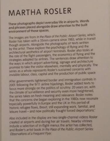

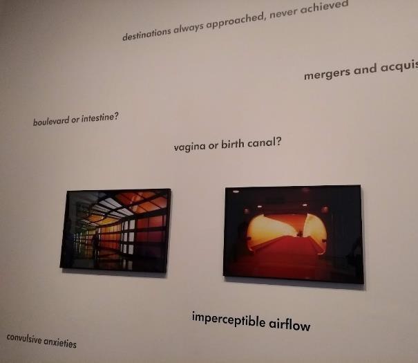
These brightly saturated photos explore the liminal spaces of airports in much the same way as Gregory Crewdson explores his fabricated domestic settings – and therefore inspire my visions of placing figures in landscapes where figures don't belong, or where the individual figure doesn't belong. I love the way these images were presented, among a sea of evocative words and phrases, in perfectly clear glass frames that look like TV screens. The images themselves have a lush, cinematic quality only found in film cameras, and the artist's use of bright, block colour and contrast are aesthetic values I constantly revisit in my own work. The messages within and around the images also resonate with some of the subversions I feel the images are trying to portray, and make for an interesting, immersive experience rather than just the images themselves.
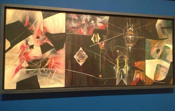
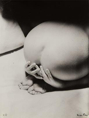
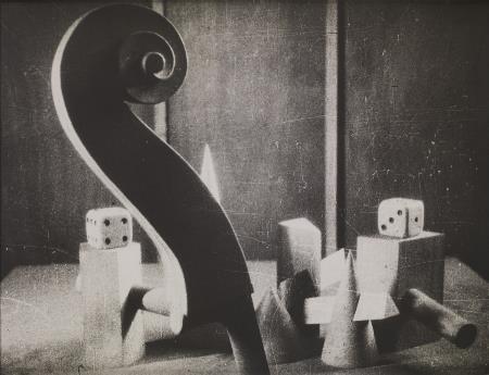
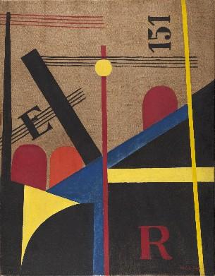
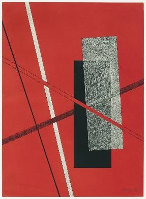
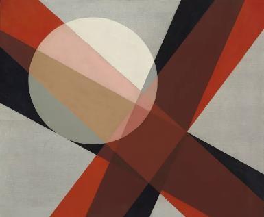
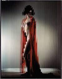
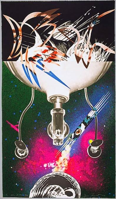
These two abstract images, made over 40 years apart, interest me greatly. The left, part of the Tate's specialist Surrealism exhibition, reminded me at first glance of the unconscious "mistakes" created in images when a long exposure is used while shooting handheld. The images inevitably come out full of smears of light that are impossible to remove, and obscure parts of your subject. This links in well with my most recent photoshoot in which I used this for purely creative effect after stumbling across it beforehand while experimenting. In this artwork, as with lots in the exhibition, things are never what they appear to be, and by nature of the movement, invite you to have your own interpretation of what's depicted. I enjoy this challenge within the work and will aim to apply this abstraction to my own work.

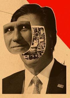
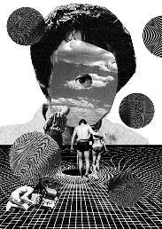
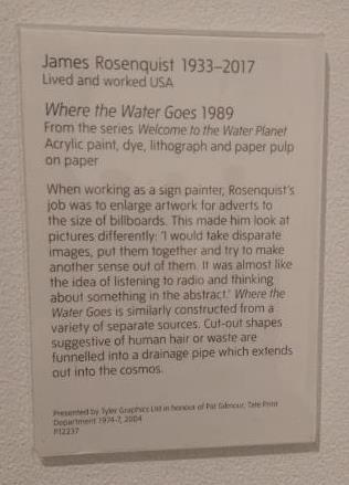
The image on the right is again, at first glance, one of pure abstraction, involving Marcel Duchamp-inspired household appliances and pop-art colours – however, despite the very Surrealist photomontage technique, this is part of the artist's lightly satirical series exploring how Earth (deemed 'The Water Planet') could be viewed by other beings from space. The title suggests a reason for the kitchen sink – where all our waste is washed away – the waste in this instance being snippets of advertising images, seemingly cutout from magazines and billboards, creating a modern-retro effect not unlike Barbara Kruger's work, although much more abstract. I really like the effect created here and the messages carried with it about disposable society,
Plans -
• Edit summer images
• Photoshoot in day in goth makeup around fields? - contrast
• Second night-time photoshoot with studio lights that work & refinement of techniques, inc. moving image.
• Photoshoot exploring locations in urban Cambridge – wide angle lens

• Long exposure as technique to add fantasy to imgs
• Make mock-outcome designs
• Reinstate ideas of alt-group, Cambridge Underground, revisit the message behind work.
• Band imagery/film coursework, links into this

Exploring black and white edits through OneDrive editor, as well as Photoshop using warming filters.
• More night photography, long exposures around Cambridge/with flash, building on goth photos.
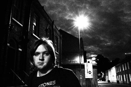
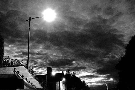
• Message of cinematic worlds through idiosyncrasies like suits, makeup, cinematic framing, night vs day?
https://issuu.com/maddy.wlknsn/docs/suburban_outrage_outcome_1_3_ https://issuu.com/maddy.wlknsn/docs/suburban_outrage_outcome _1_5_
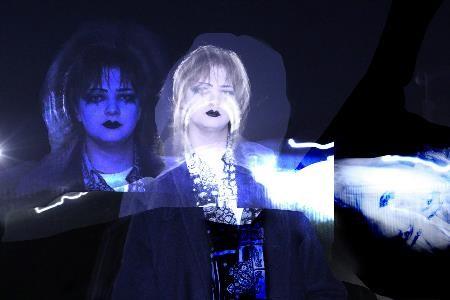
Exploring the use of double exposure to create montages through combining and cutting out images. Though these are fun to make, I don’t feel they make the impact single exposure images do and so likely won’t be used in my outcomes.
https://issuu.com/maddy.wlknsn/docs/compilation_outcome_1 _

Plans For Specific Photos:
• Aim for 7, 8 images total plus imgs already taken on the left
• Blue winter themed image with Jules in long coat.
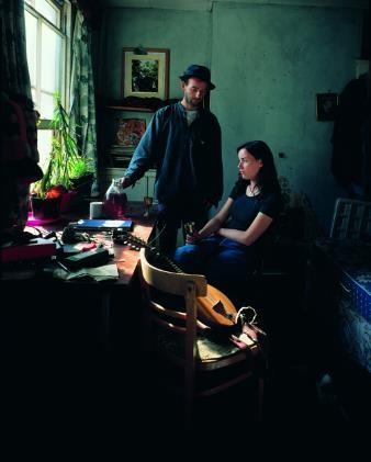
• One in my room – red, domestic, Alex Prager, with instruments – Shoot 18 but better lit.

• Field ones of Ed – long exposure revisited – Shoot 24/6. Ideas using wide/telephoto lens, night, flash guns.

SHOOTS:
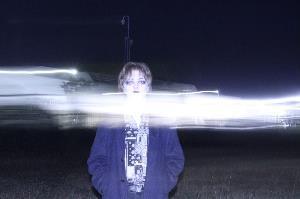
• Long exposure with galaxy light
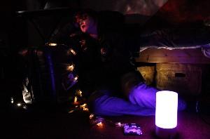
• Instruments with fairy lights/my room, Ed’s house – elements of shoot 18
• diCorcia style lights throughout –phone torches, coloured.
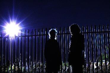
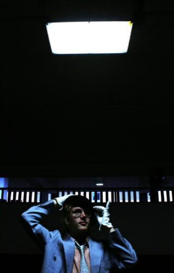

• Text/images or naming images, exhibition book style.
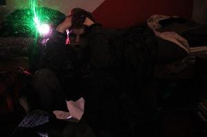
Shoot 18 – fairy lights/small sources, but this time with instruments and better composition. Also long exposure experiments with the galaxy light/laser (green).
Shoot 24 Outtakes – I liked this 'cutting across' effect that the long exposure gave, as if it was painted or drawn on. Could potentially incorporate a group photo into this.
• Reshoot of shoot 24 – go back to field at night with flash guns, coloured gels.
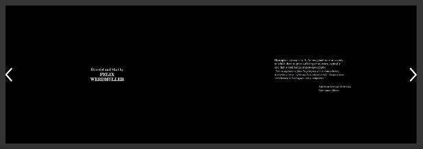
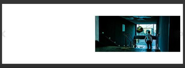
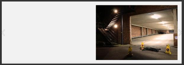
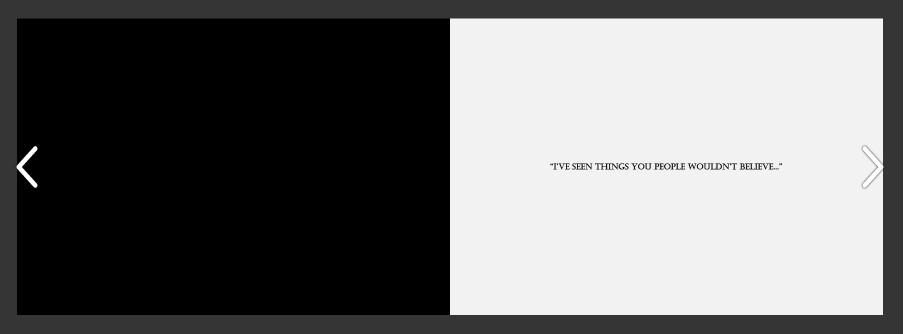
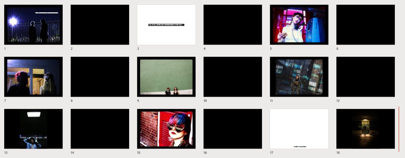
What drew me to these outcomes were their simplicity juxtaposed with the drama of the images. By having just one image per page, you can better appreciate the small details carefully placed within each, and by having every picture in the same place, with the same format, you can see how they all fit into a bigger series of work – you can compare their similarities and differences. Throughout these outcomes, the quality of the pictures and their effectiveness vary slightly, but the main idea is well-conveyed and has inspired me to create an exhibitionstyle outcome like this.
The use of monochrome backgrounds really make the saturated pictures stand out from the page, and the serif fonts used, as well as the wide landscape format, look like film credits or titles. This really suits the theatrical type of image created, and means the whole book reads like film vignettes.

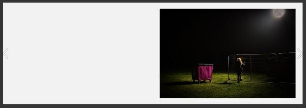
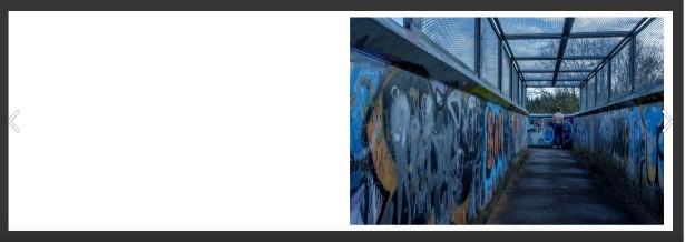 Fight Club – Felix Werdmuller Von Elgg
I am continuing with theme 2, exploring the human figure in environments. My most successful images are the ones in which I am able to create a fantasy world – where time, location and situation becomes ambiguous and the viewer is immersed in imagination and cinematic narrative. Within my images, I play with light arrangements, often subverting the usual purpose of that source, and enjoy finding ways to manipulate locations into things you'd never expect them to look like (such as an underground car park becoming a studio background and softbox).
I'd like to continue with my explorations in subverting the norms of fashion/portrait photography and elevating the mundane, but through incorporating more experimental techniques such as controlled long exposure and flash work into my "normal" images to develop their surreal and subconscious undertones. I'm looking to use more ambitious locations than I have previously, and am interested in photographing at different times of day, as I feel really inspired by the photos I've taken in the evening/at night.
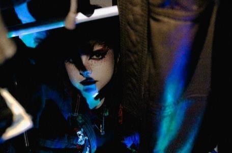
In terms of artists, I've gone back to revisit Nick Fancher, as I feel his exploration with light is more fitting with what my project is moving towards; I really like his long exposure work. I'm also continuing to be inspired by surreal, carefully structured photography such as that of Nadia Lee Cohen, who mixes high-glamour with mind-bendingly absurd images. In my desires to explore the surreal and externalise the subconscious within my creative journey, I'll aim to create more organised, luridly fantastical images as well as those whose messages are blurred or obscured by long exposure and the symbolic meanings linked to it.
In all, I've been inspired by new and old artists, my previous work and my personal study topic of fantasy and reality to create images which explore the subliminal messages behind simple documentations, and look much grander than they actually are, which is part of the challenge I love to set for myself. My images going forward will be atmospheric, surreal, glamorous yet tangible, and above all, cinematic.
These images by Nick Fancher, as well as the three on the right by Renzy Atibagos (Pexels) are similar to my recent long exposure work – I really enjoy the juxtaposition of neon and natural colour, and the sharpness of a flash portrait while overlayed with random and unpredictable swathes of light. I will take inspiration from this going forward to explore colour in long exposures in greater detail.
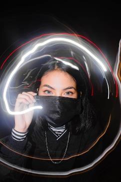
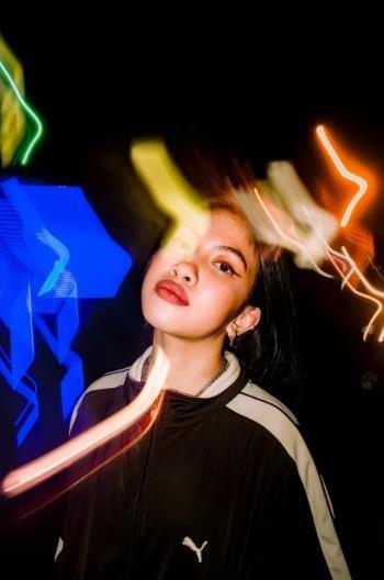
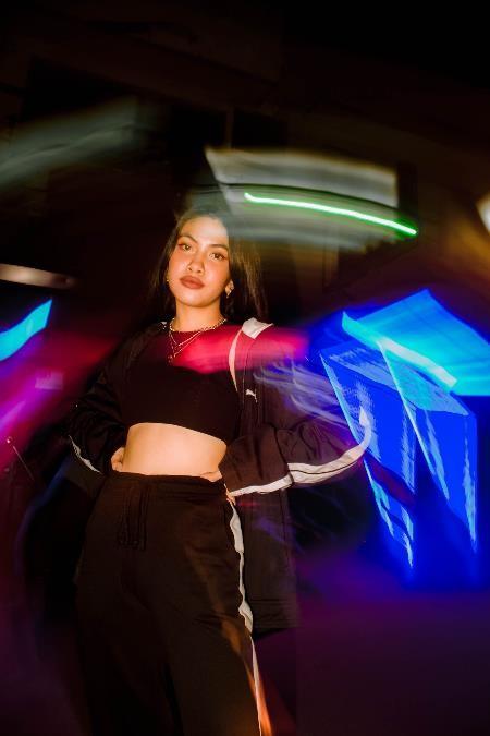
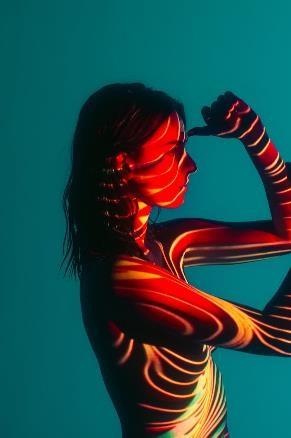
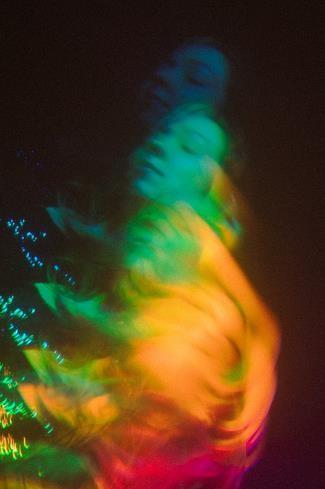
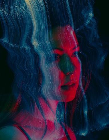 Renzy Atibagos
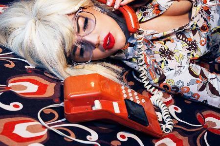
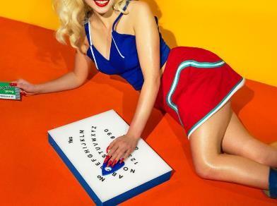
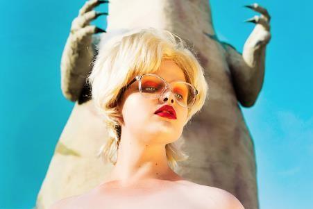
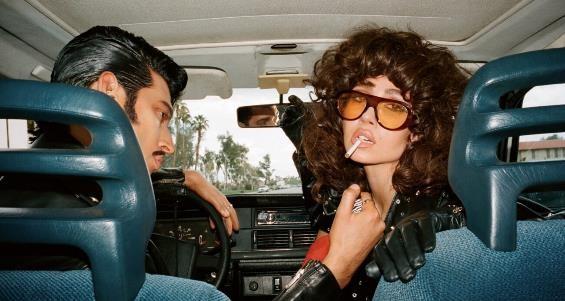
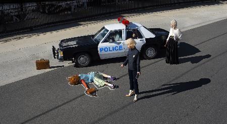
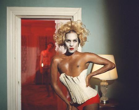
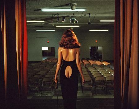
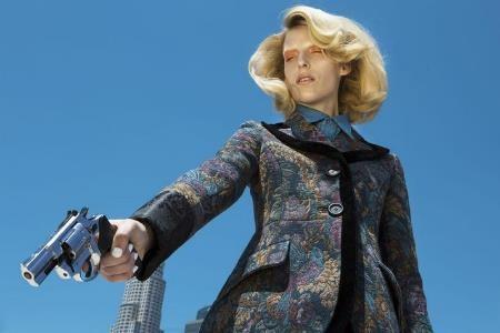
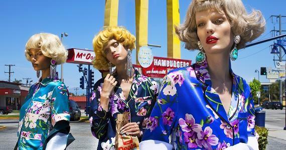
I really like the bold colours and surreal staging of these photos, especially the cinematic lighting and arresting angles. The use of props is also highly advanced, and I love the timeless feel created by all the elements of the photo coming together. I feel they’re a perfect mix of Alex Prager’s and Philip-Lorca diCorcia’s images. They create an atmosphere of not-quite reality which I am, as ever, keen to imitate in my work.
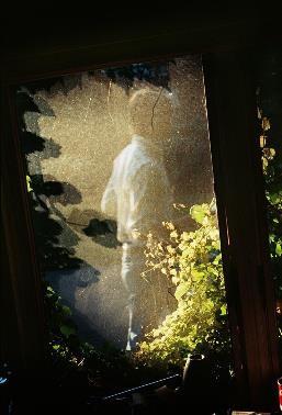
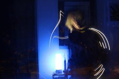
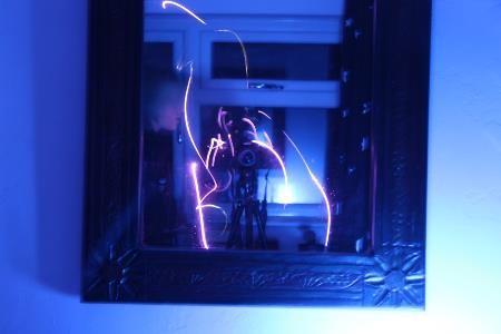
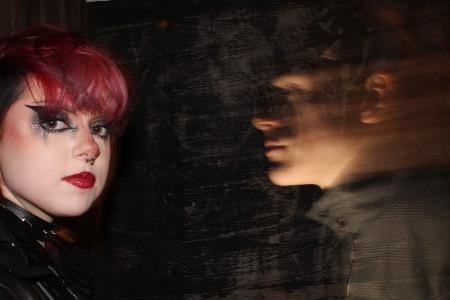
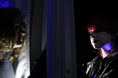
I've managed to create the effect I desired in photographing the reflections seen in my window and mirror – the fact that it’s in my bedroom is irrelevant. Exploring the surreal and ghostly – I now want to incorporate this into my other, more conventional images.

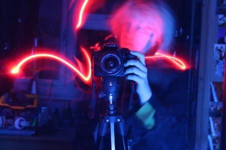
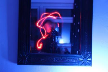
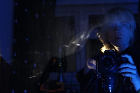
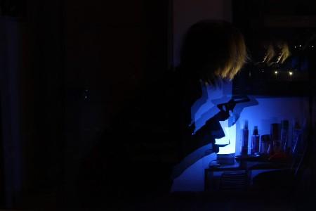
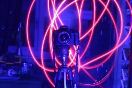
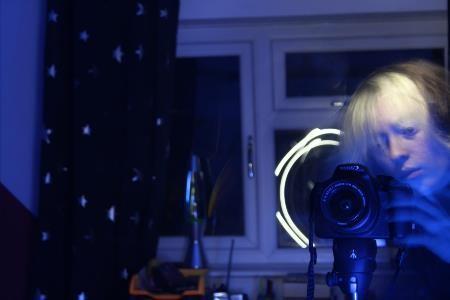
I've managed to create the effect I desired in photographing the reflections seen in my window and mirror – the fact that it’s in my bedroom is irrelevant. Exploring the surreal and ghostly – I now want to incorporate this into my other, more conventional images.
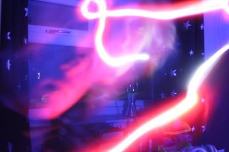
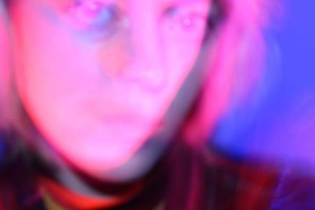
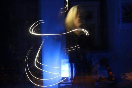
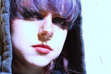
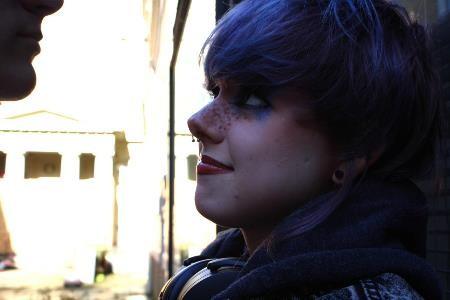
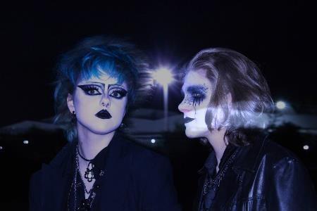
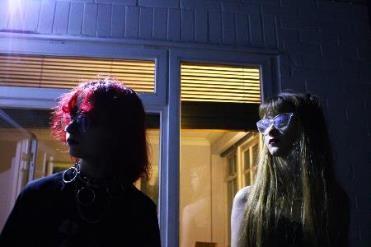
Exploring new locations, opposite aesthetics and opposite lighting conditions – dynamics between two of my differently styled friends...
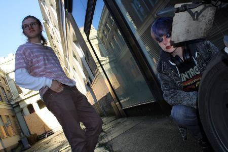
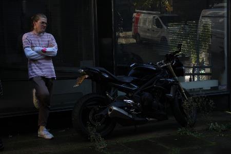
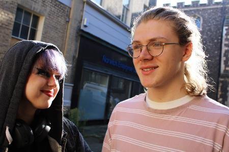
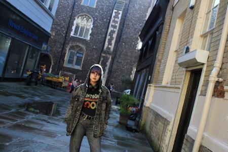
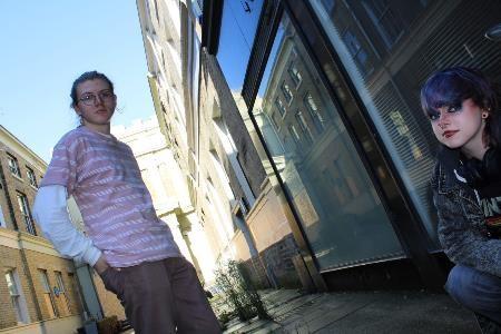
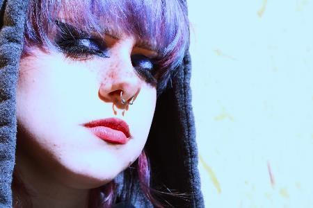
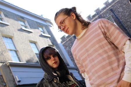
Exploring new locations, opposite aesthetics and opposite lighting conditions – dynamics between two of my differently styled friends...
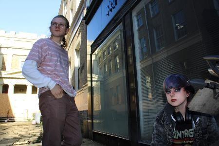
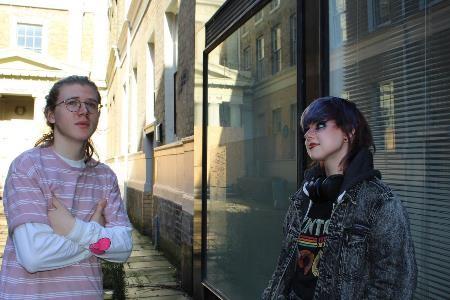

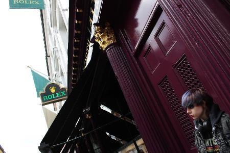
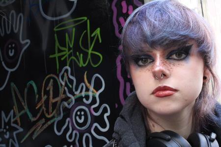
Further, more dramatic spaces, Nadia Lee Cohen style faces, almost mannequin-like, interaction of colour.
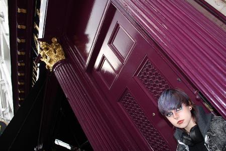
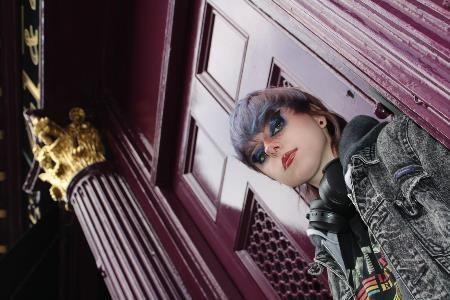
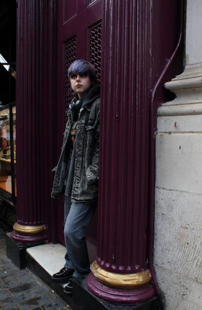
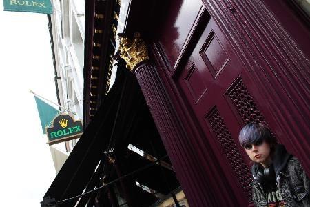

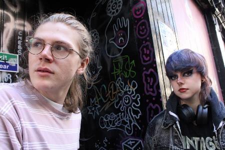
Further, more dramatic spaces, Nadia Lee Cohen style faces, almost mannequin-like, interaction of colour.
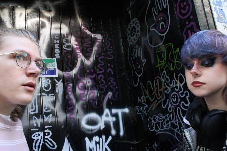
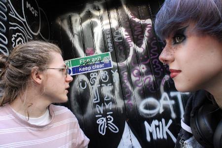
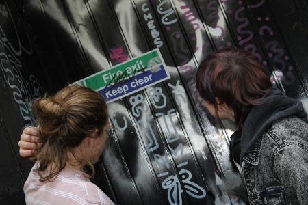
Plans:
- Quotes from friends in outcome
- Change brick image/re-edit
- Experiment with other photos in place of that one
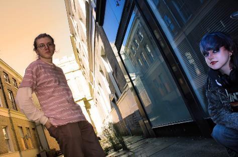
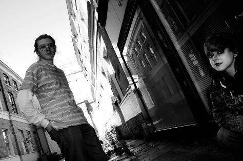
- Remake ppt + colour slides appropriately
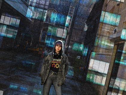
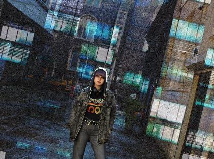
Refining images exploring a light/dark dynamic, cinematic faux-cityscapes using overlays, vibrant colours. Nadia Lee Cohen style faces in close-up.
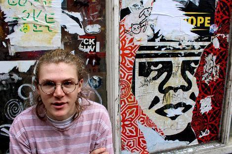
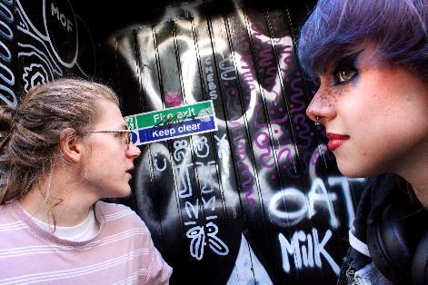
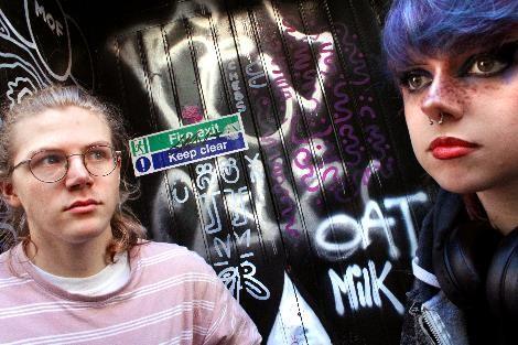
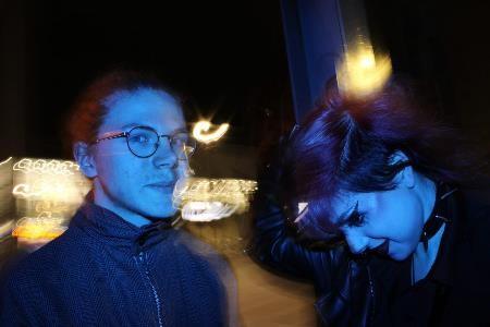
Long exposure meets portraiture – how does the light emphasise the dynamic between the two characters?

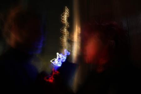
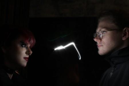
Surreality/dreams.
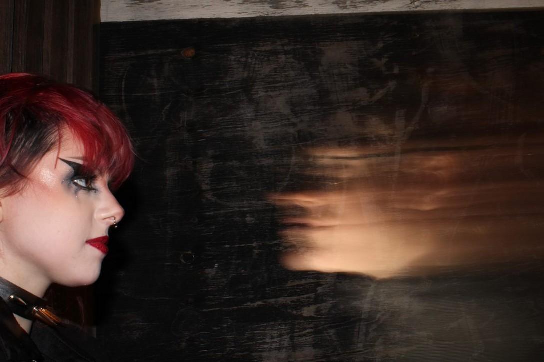
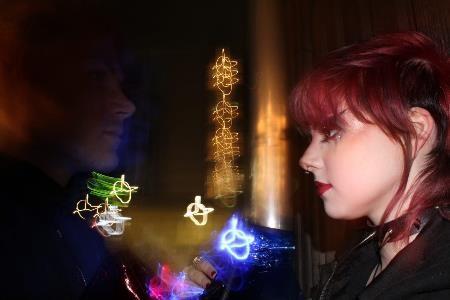
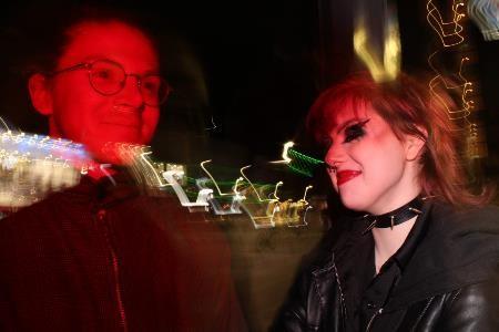
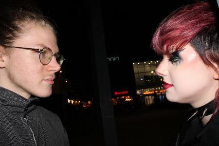
More playful images, exploring coloured flash, divides and urban landscapes. Portraits in long exposure for a softened effect.
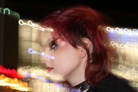
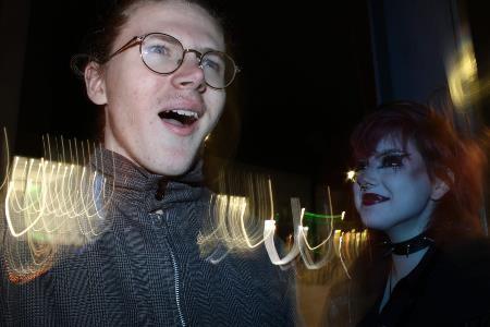
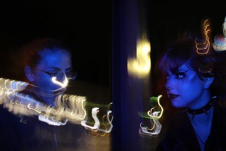
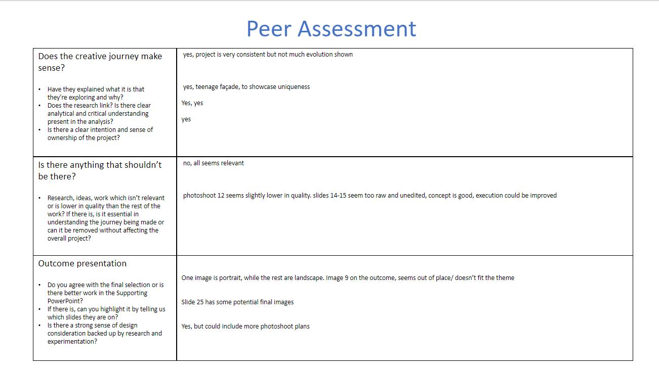
In response to this feedback, I've hidden the slide for photoshoot 12 but left in the rest of my photos such as the ones on slides 14-15 as they were important in showing the evolution of my project. There was no image 9 in my outcome but I'm aware of making them all fit the theme, and I think having one or two in a portrait orientation isn't a major issue as long as they do fit. I disagree with their comments about slide 25 as the edits I did there were stylistically effective but the photos essentially had no meaning within them as I hadn't developed my ideas enough at that stage. I will endeavour to add in more photoshoot plans but I felt I only needed to add the ones that foreshadowed a large shift in my work, as the rest was fairly self-explanatory. I also am conscious of the length of my PowerPoint and didn't want to add more slides than were necessary.

Exploring a window being used outside of my bedroom, reflections and long exposure.
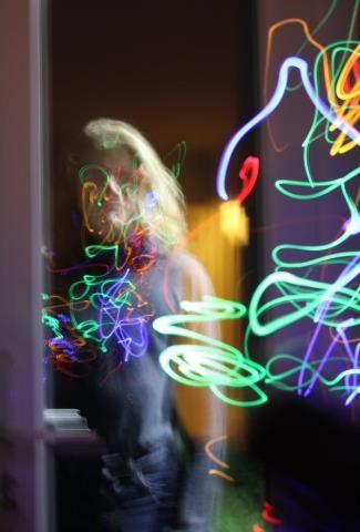
Exploring a window being used outside of my bedroom, reflections and long exposure.
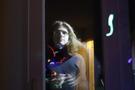
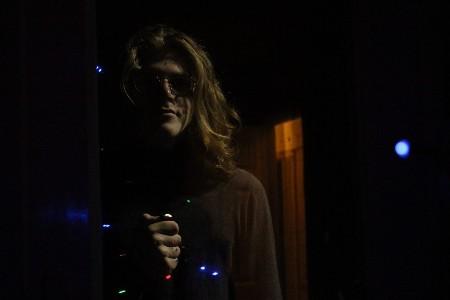
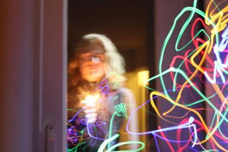
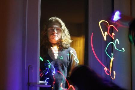
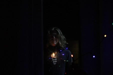
Exploring the window in greater depth, including juxtaposition of my two characters in different lighting setups. I liked the reflections as they provide a long exposure reduced opacity effect without being too difficult to create.
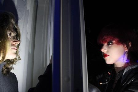
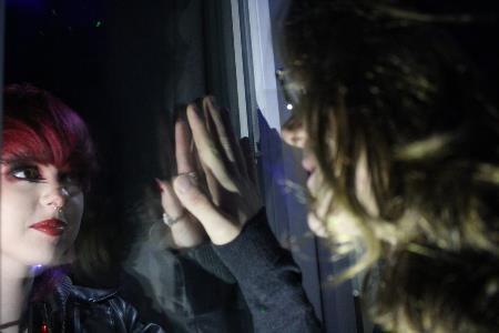

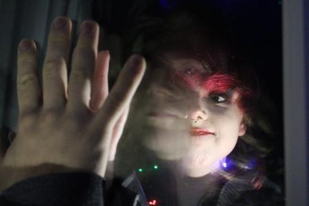
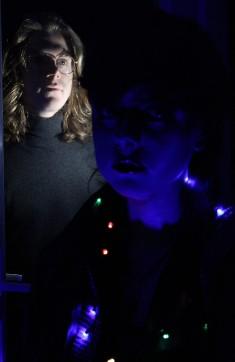
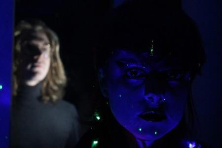
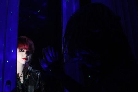
Exploring the window in greater depth, including juxtaposition of my two characters in different lighting setups. I liked the reflections as they provide a long exposure reduced opacity effect without being too difficult to create.
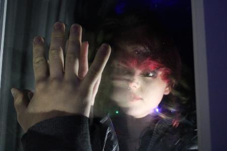
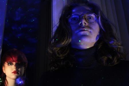
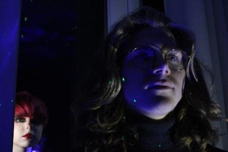
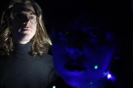
Otherworldly long exposure and more conventional portraits.
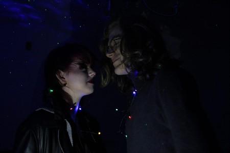
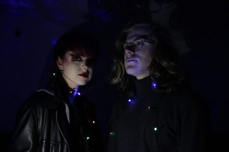
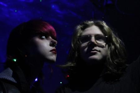
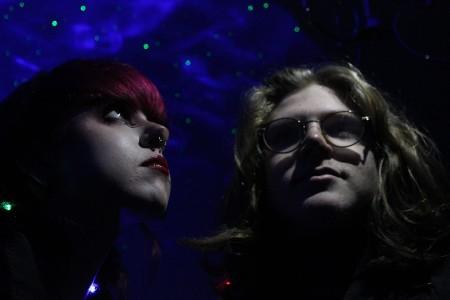
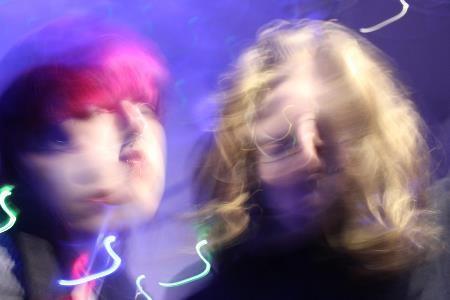
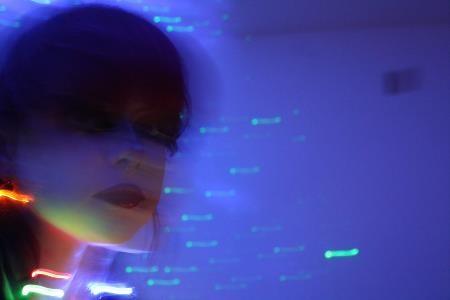
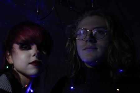
Otherworldly long exposure and more conventional portraits.

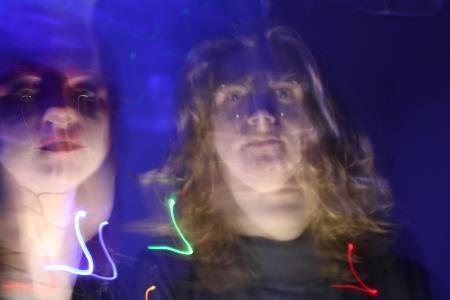


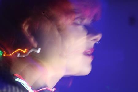
Blending two pictures together, fixing images such as removing the phone in the right-hand picture. Subtle contrast, brightness and saturation adjustments. Creating ghostly figures using layer masks and overlays.
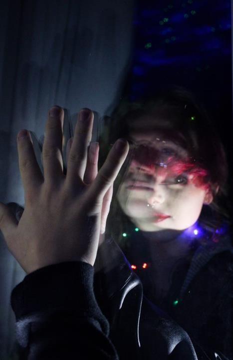
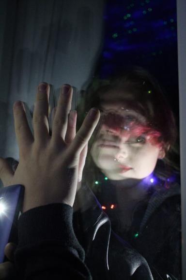
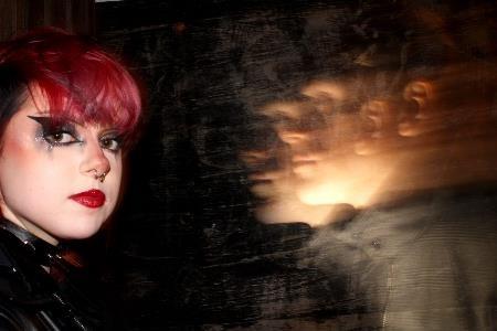
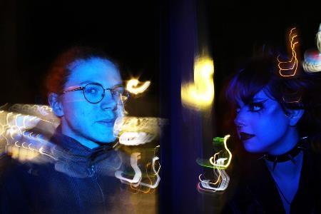
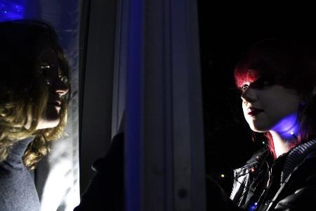
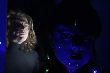
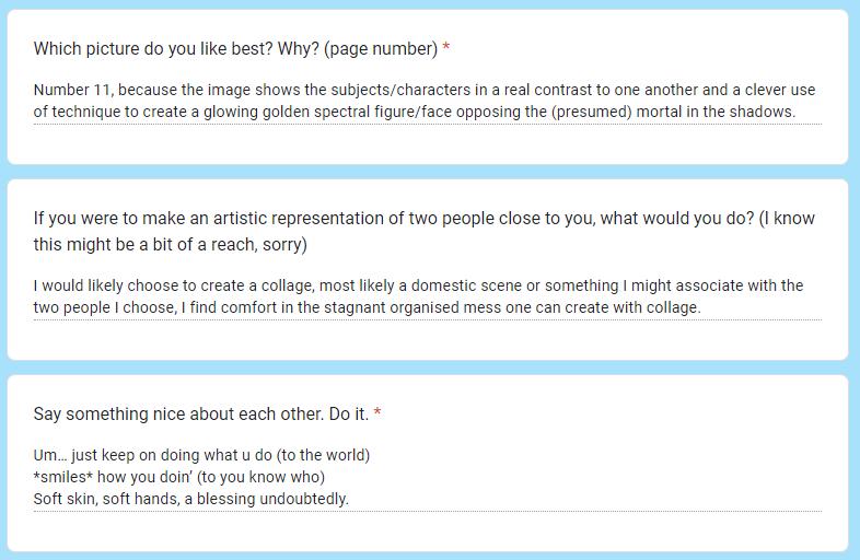
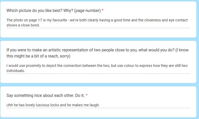
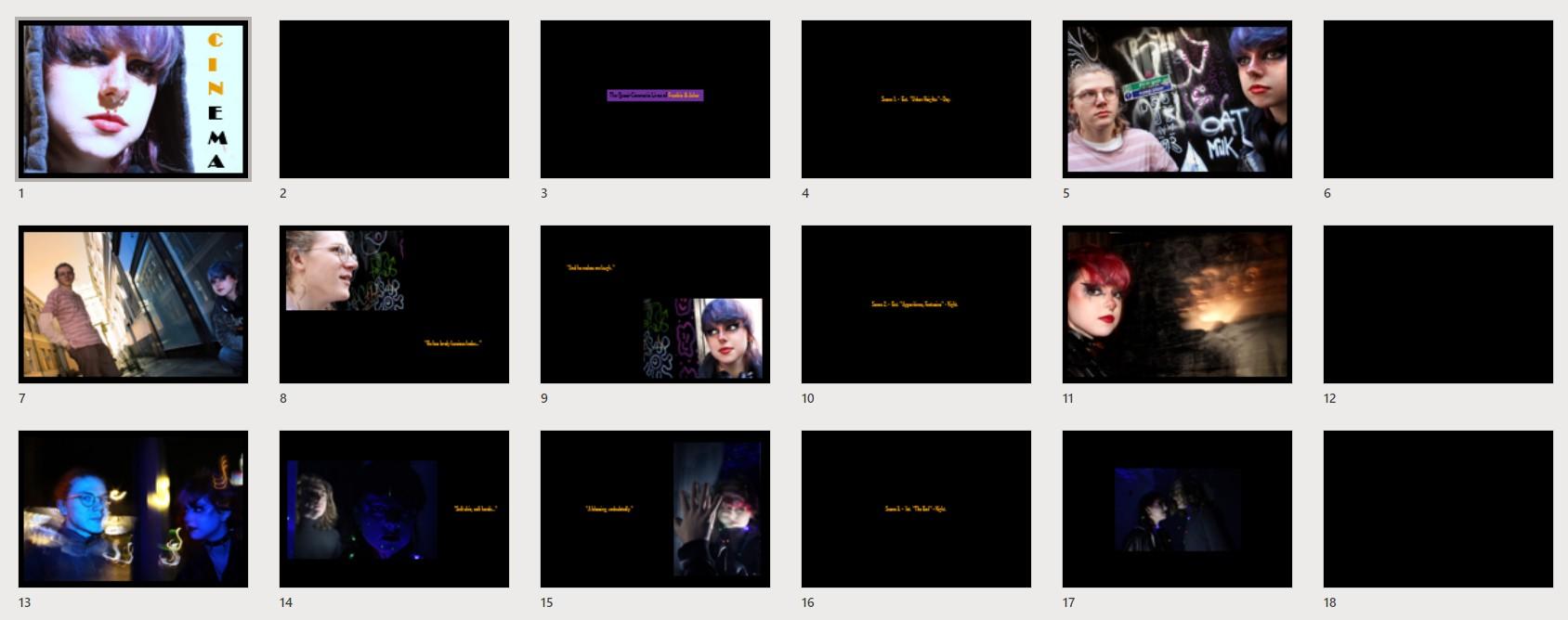
I decided to make a form to gather some thoughts from my two subjects that I could use in their outcome. At the moment, I've called it 'Cinema' and put in mockscript lines saying the scene number, whether it's interior or exterior, etc, in order to play with this idea of film stills, but I felt it needed a more personal touch so I asked my subjects to fill in this form commenting on my photos.
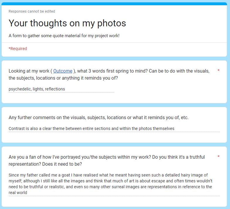
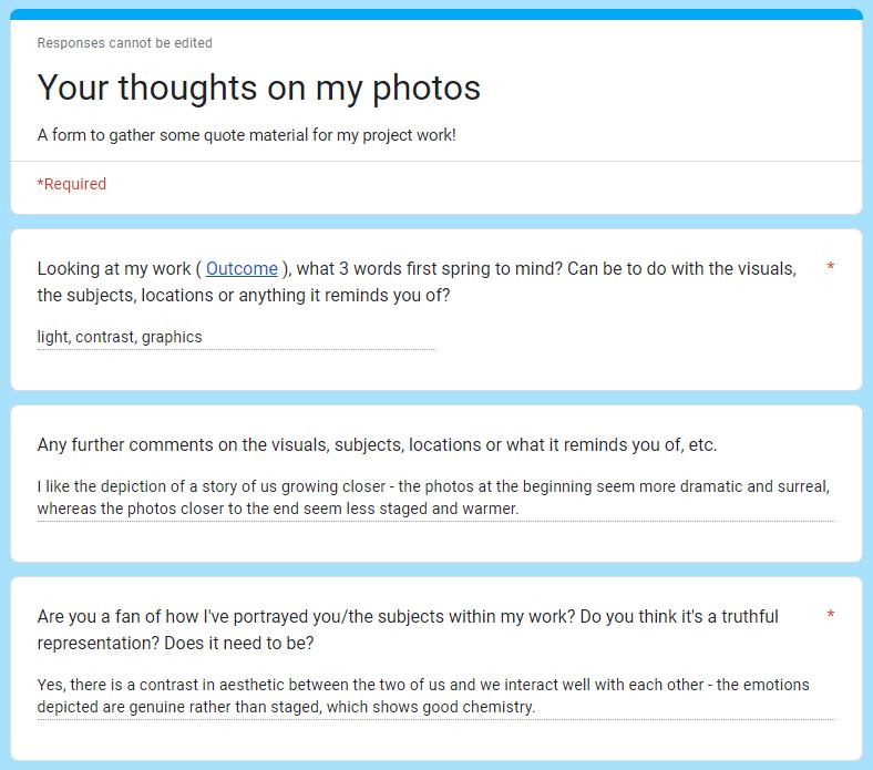
- Talk about next steps
- Moving image – staging, costumes, locations, props, lighting

My feedback consisted of simply keeping up what I'm currently doing: improving my photoshoots by making them even more staged and dramatic, considering how I can add depth to my images through the use of location, props, costumes, characterisation, and lighting, which is feedback I'll take on in my next photoshoots. Moving image was also mentioned – this is something I'd like to explore further, especially with the Externally Set Task next year.
I'm happy with my outcomes as they are and won't be changing them ahead of the deadline, but I will be hopefully exploring new things as per my feedback, and potentially creating new outcomes to showcase this work.
My most relevant artists continue to be Philip-Lorca diCorcia, Alex Prager, Nick Fancher and Nadia Lee Cohen. I really love their use of colour and composition: bold juxtapositions, surreal scenes and tropes of film noir and retro Americana. My project is driven by my desire to imitate them through creating my own cinematic instances in ordinary life.
My theme has evolved to become a solely cinematic-focused human figure in an environment; an interrogation of my two friends as they go through their lives, and the different ways I can represent them, and perhaps subvert their expectations of themselves. I've become fascinated by the apparent binary in their visual aesthetic – one being quite a dark, gothic, punky style, and the other full of pastel colours and a gentler demeanour – and have strived to explore and celebrate this within my work. My most successful images seem to be following a narrative of loss or separation by something: a wall, a window, a plane of existence... In achieving this, I've played with the idea of fantasies and spectres – not-quite-real ghostly figures that for me, embody oft-taboo, surrealist desires. I've really enjoyed using long-exposure techniques to realise this idea, and in doing so, have gone above imitating my artists and am beginning to bring together new elements to create my own style.
I use ambient and portable lighting, often relying on phone torches and nightlights to give the desired spotlight effect. This is convenient and produces great results, but I'd like to be more ambitious with flash guns going forward, as I aim to organise more expansive scenes.
Moving forward, I wish to create images that better transform these burgeoning narratives into a full idea. I'm going to take inspiration from film noir and the aura of ominous mystery in Alex Prager's images, as well as more ambitious staging and lighting setups, and get my models to play with characters in order to make the narrative of the image more explicit, but no less intriguing. To do this, I'll find new locations and think of some movie scenes or narrative moments I'd like to reinterpret in

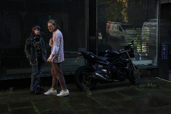
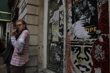
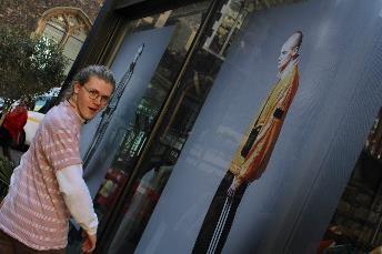
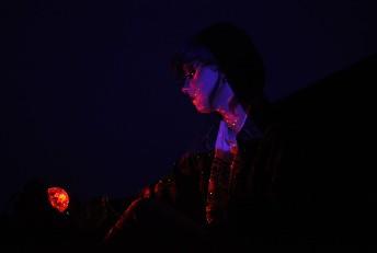

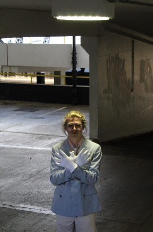
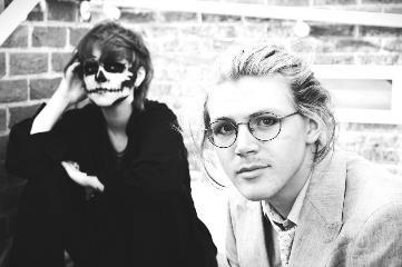


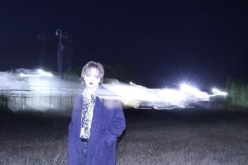
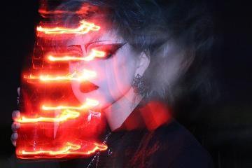
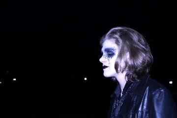
Images which tell some sort of story or that I imagine to be part of a narrative. I really like the atmosphere created; it seems to me that in every photoshoot I do, a specific narrative appears or is at least hinted at through my choice of lighting, location, and character costume. I've made this collection to help form my images going forward.
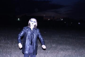
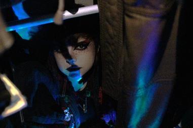
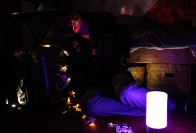

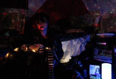
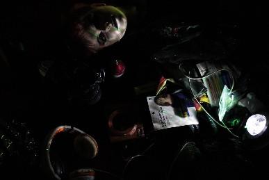

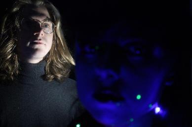
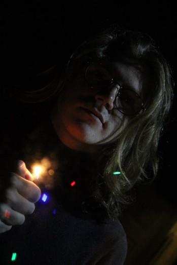
Cont. from last slide.
An edit inspired by 80s horror posters – this image immediately made me think of a film still, with a canted angle and minimal lighting.
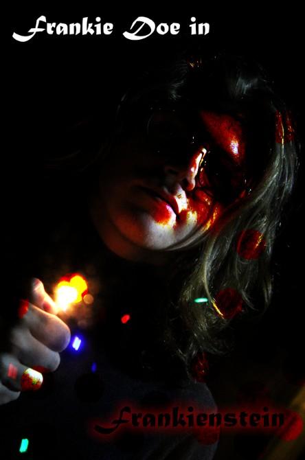

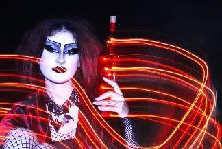
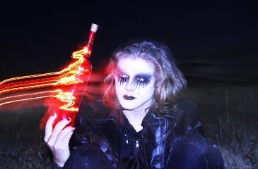
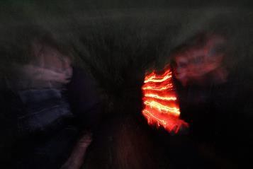
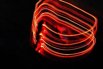
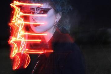
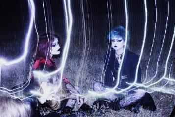



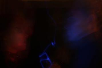


Following feedback from my teacher, I've selected some experimental images that I feel could be exhibited in a third outcome.

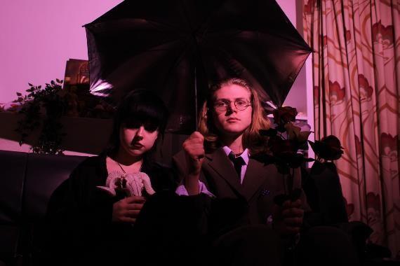

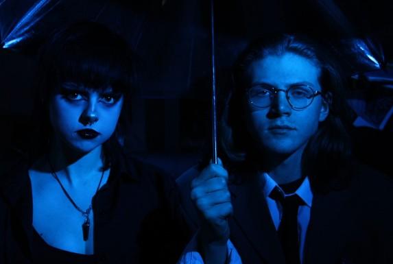
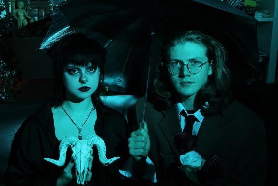
In this shoot, I tried to be more ambitious with characterisation and props, as well as using artificial lighting. I really liked the effect and my two models look more cinematic than ever. We were originally going to go to a local cemetery to make the shoot even more gothic, but due to extreme weather and traffic problems, we had to stay in my friend's bedroom instead, which was suitably full of interesting props.
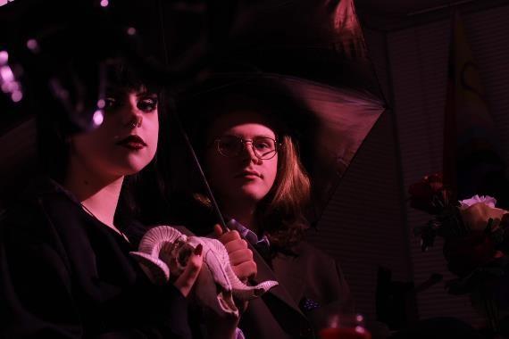
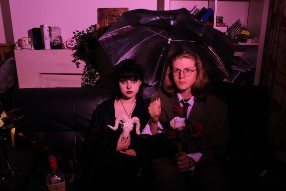
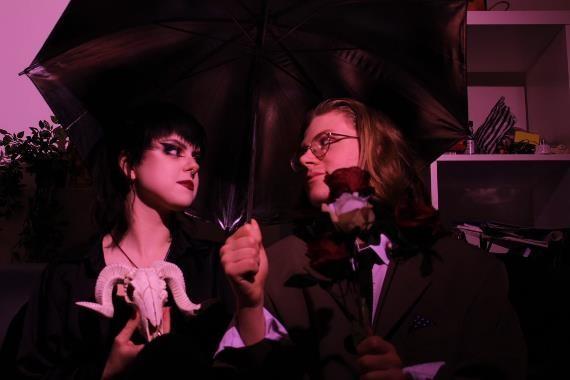
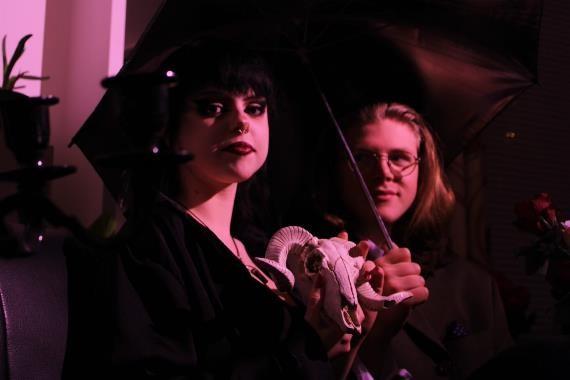
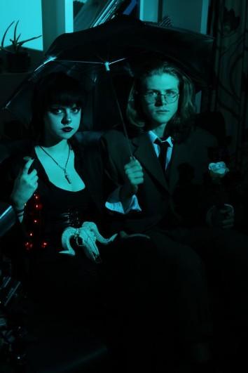
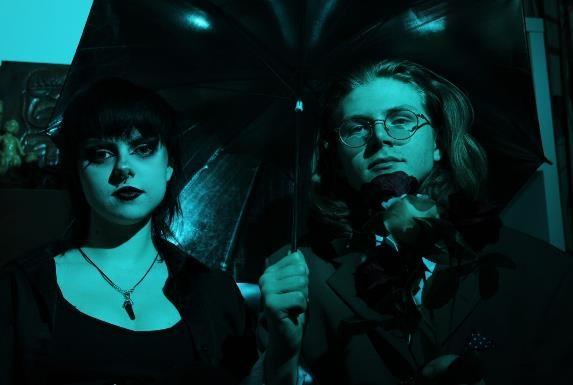
When the frame is bathed in one colour, the effect is almost that of a black and white image, as everything we see within the image is on a scale of blue/purple to black.
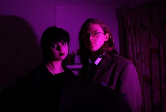
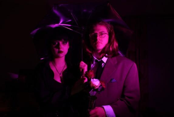

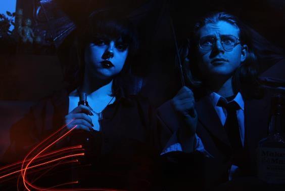
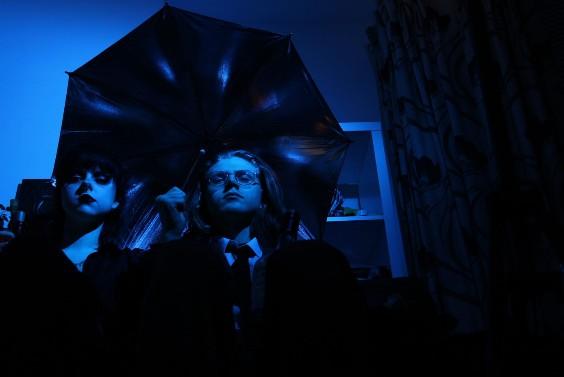
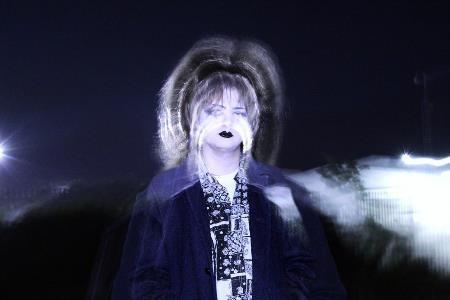
Experimenting with my signature long exposure techniques, which produced some great fantastical results.
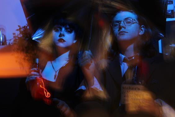
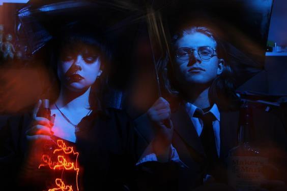
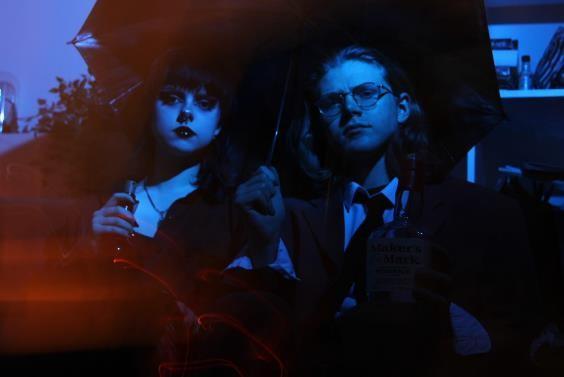
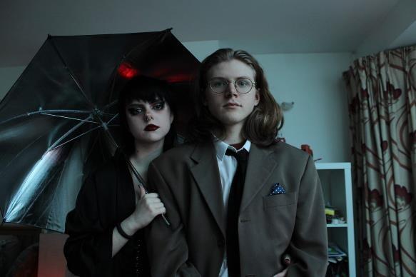
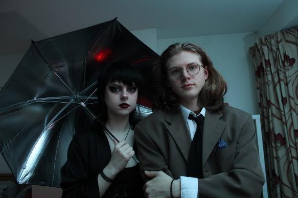
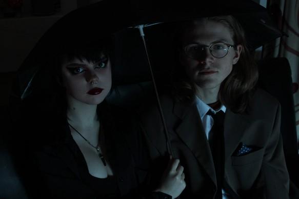
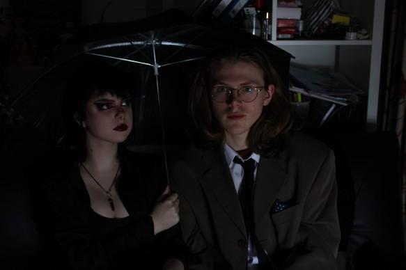
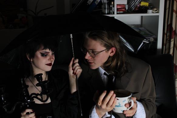
More naturalistic lighting gives a different ambience, but the figures still look out-ofplace.
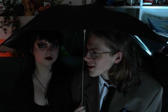
My project is focused on my desire to depict my peers in the fantastical, cinematic way they appear to me –celebrating the ways that they make themselves a little different to the norm, where moments of creative genius and originality shine through the mire of mundanity, homework and relationship struggles. These are meant to be the happiest days of our lives – but often end up being the most turbulent, just like a soap opera, but better dressed...
The progression through my project has been fascinating: I've now created three outcomes that span a more or less chronological record of my best work at the time. My first outcome, 'The Cambridge Underground', are my first forays into really constructing a cinematic image, through the manipulation of ordinary spaces and people I found around me. I think these really speak for themselves and the outcome design of the exhibition book reflects this. It's also carrying my original expository idea of rebellion against what Cambridge is always portrayed as, through its title and the Pink Floyd quote embedded throughout.
My second outcome, 'Cinema: Jules & Frankie', is focused on my two friends and their relationship, aesthetic and filmic nature. In this outcome, I played with the idea of a book of film stills of the two of them, using a glitzy yet classic font and including captions in the style of a film script. This was a more organised and creative outcome where I feel my strengths were really showcased, and the images were naturally more cohesive due to keeping the same subjects as a constant. I submitted a version of this after Phase 2 but subsequently edited the outcome to include some of the images taken in photoshoots 23 and 24. This is also the longest outcome.
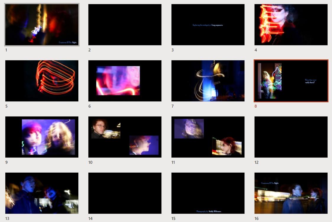
My final outcome was created after feedback from my teacher, to explore presenting more abstract long exposure images, as my experiments were quite successful and it felt like an opportunity to show a wider range of skills. I've called this outcome 'Creatures of the Night' because long exposure images with artificial light are more effective in dim conditions. It still centres around my two friends but the wider theme here is technique, not narrative. It's also more playful in terms of arrangement, as I chose a photobook format to fit with the movement conveyed in the images.
Exhibition Outcome - 1
https://issuu.com/maddy.wlknsn/docs/exhibition_outcome_ 6_
Jules & Frankie Outcome - 2
https://issuu.com/maddy.wlknsn/docs/jules_frankie_outco
me_7_
Experimental Outcome – 3
https://issuu.com/maddy.wlknsn/docs/experimental_outcom
e_11_
Print Version of Outcome 1
https://issuu.com/maddy.wlknsn/docs/exhibition_outcom
e_7_
Exhibition O
utcome.pptx
Jules & Franki e Outcome.p
Experimenta l Outcome.p ptx
This is a portrait version of my second outcome, to play with splitting images in two and having them as a full bleed double page spread. It's not been submitted as a final outcome.
PowerPoints reflect the print versions.
Magazine-Styl e Outcome.ppt x