
4 minute read
5. Ranking Analysis
from Basic Needs Index
The above developed Basic Needs indicators are used to rank the SA3 regions through various methods:
Decile Ranking of Basic Needs Index: The SA3 regions of the Greater Sydney are ranked by using the Basic Needs Index in scale of 1-10; the lowest 10% areas are given value 1 and highest 10% areas are given value 10. The choropleth map clearly shows a higher Basic Needs Index in the inner suburbs around Sydney CBD and Northern Beaches, while the Basic Needs Index decreases towards the outer regions, which indicates the lack of overall facilities for the target group in the outer regions of Greater Sydney.
Advertisement
In order to observe the global autocorrelations, we have used Moran’s I statistic (Levine, N. 1999) It is a cross-product statistic between a variable and its spatial lag. The variable is expressed in deviations from its mean. For an observation at location i, this is expressed as zi = xi - x ̅ where x ̅ = mean of the variable. Moran’s I statistic = I is described as:
where, S0=∑_i▒∑_j▒▒wij ▒ = sum of all weights n = number of observations
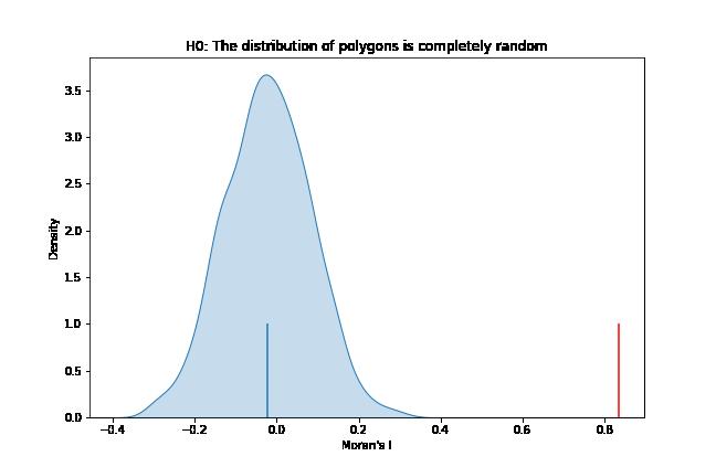
The null hypothesis in Moran’s I test infers spatial randomness. The test can be based on normality assumption; however, such an assumption may produce erroneous results as discussed by Griffith (2005) and hence rather than employing normality, we have used a randomization technique. Under this technique, a reference distribution is created by randomly assigning the variable values over different locations. Then, reference distribution is used to calculate pseudo-p-value given as: p = (R+1)/(M+1) Where, R = Number of time the computed Moran’s I is equal to or more than the observed values, and M = the number of permutations. We have calculated Moran’s I with 999 permutations and got the pseudo-p-value as 0.001, inferring that we can reject the null hypothesis and that Sydney is highly structured.
Figure 5: Basic Needs Index Ranking.

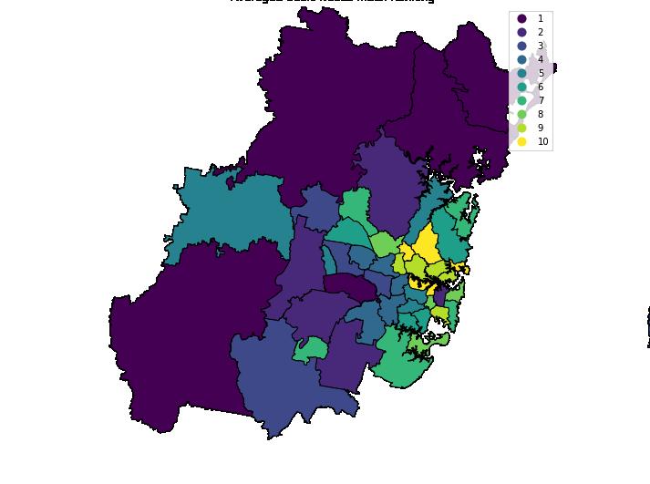
Figure 6: Moran’s I statistical analysis: The distribution of values based on spatial randomness vs actual value (red)
Figure 7: Global Auto-correlations: Moran’s I Scatter Plot
The Morans scatter plot is used to observe the global auto-correlations. We observe that all the SA3 regions fall into quadrant 1 and 3, inferring positive spatial auto-correlation. Additionally, we do not have regions with significant pseudo-p-values that fall into the 2nd and the 4th quadrant, indicating negative spatial auto-correlation.
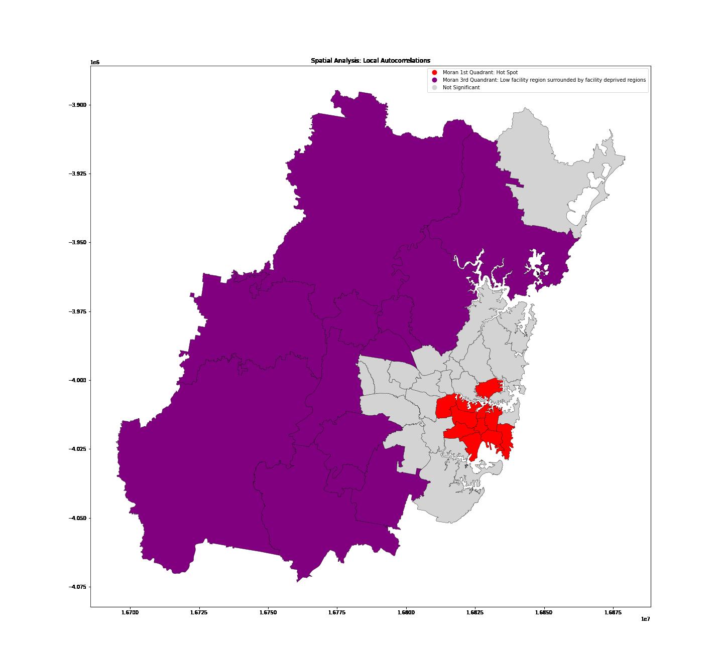
Then, we have looked at the local autocorrelations which develop a relationship between the sum of the local statistics with global statistics. It helps to identify the so-called hot spots bustling with amenities and cold spots deprived of facilities. As per the local Moran’s I plot we observe the Sydney;s hotspots agglomerated at CBD and as we move outwards we find cold spots with less number of facilities. Rest of the regions were statistically insignificant.
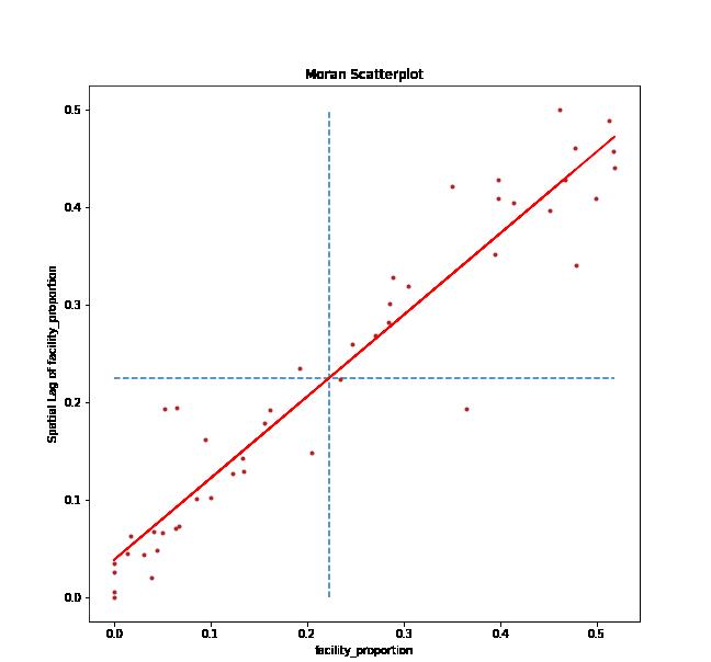
Figure 8: Local Autocorrelations: Identification of hot spots (red) and cold spots (purple).
The spatial lag is a variable that averages the values of the neighbouring locations using a so called weight matrix and accounts for autocorrelations in a given model Murack (n,d.) Spatial lag is comparable to autoregression wherein we have a lagged dependent variable. Spatial weight matrix expresses a notion of geographical relationships between locations Smith (n,d.) and “Spatial weights in PySAL”. Weight matrix can be created based on many criteria such as contiguity, distance, combination of distance-boundary etc. We have used a contiguity based algorithm called Queens wherein it checks whether a polygonal shape in a graph shares an edge or vertex with another polygon. In comparison with Queen weights, Rook weights only consider if polygons share an edge. Hence, in further analysis we have employed Queens weights as we wanted to pull in information from adjacent polygons if they shared an edge as well as vertex or vertices.
Decile Ranking (Spatial AutoCorrelation): Spatial AutoCorrelation algorithm (Griffith, 2005) is applied to Basic needs index across Greater Sydney to understand the systematic variation in the ranks.The observance of systematic variation with Spatial AutoCorrelation shows the positive correlation of one SA3 with its neighbours, indicating the ranking order of various SA3 regions are not spatially dispersed, but rather related to its neighbouring SA3 regions.
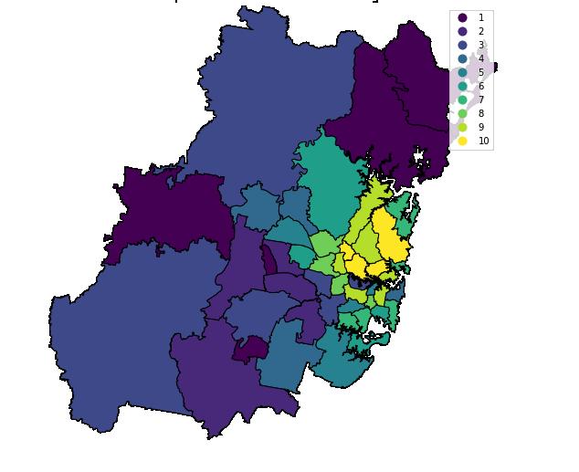
Figure 9: Basic Needs Index Ranking (Spatial Correlation)
Decile Ranking of Basic Needs Index: The SA3 regions of the Greater Sydney are ranked by using the Basic Needs Index in scale of 1-10; the lowest 10% areas are given value 1 and highest 10% areas are given value 10. The choropleth map clearly shows a higher Basic Needs Index in the inner suburbs around Sydney CBD and Northern Beaches, while the Basic Needs Index decreases towards the outer regions, which indicates the lack of overall facilities for the target group in the outer regions of Greater Sydney.
Conclusion:
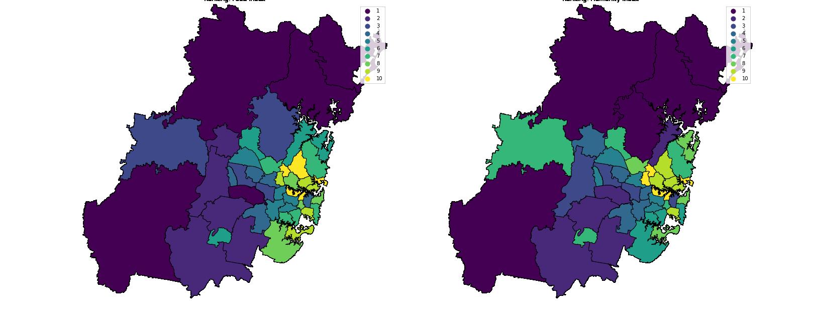
In general, the spatial ranking of Basic Needs Index reveals the spatial disparity in the amenities for homelessness across Greater Sydney. It reveals that the accessibility of facilities as a phenomenon of inner suburbs only, have provided greater opportunities for the population in the inner suburbs to break out of their economic conditions. The analysis of sub-indicators shows food, accommodation & safety possessing similar trend to the parent indicator, but the variation in humanity index shows the spatial distribution of help homelessness groups across Greater Sydney.
Ranking: Food Index Ranking: Humanity Index
Ranking: Accommodation Index Ranking: Safety Index
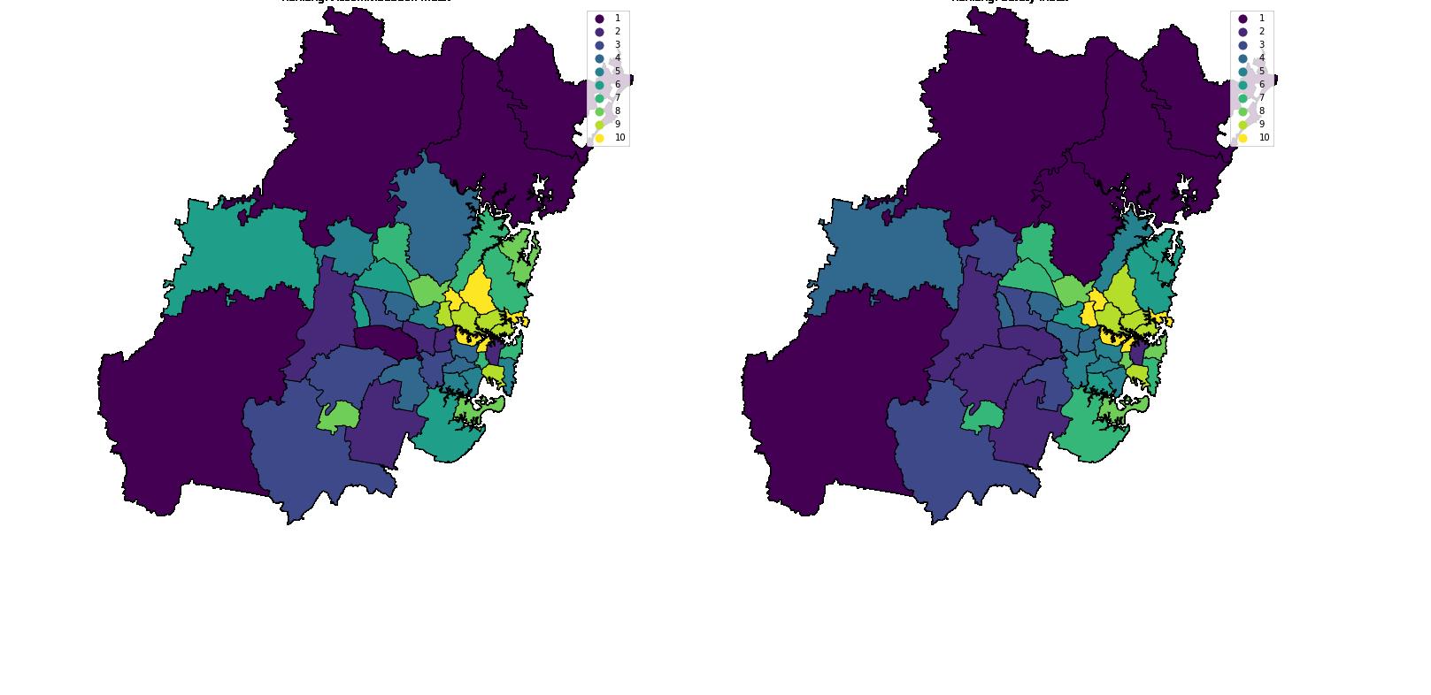
Figure 10: Ranking Map of Sub-indicators


