3 minute read
GRANVILLE
from For The Love Of Type
by ianmyersart
Granville Description
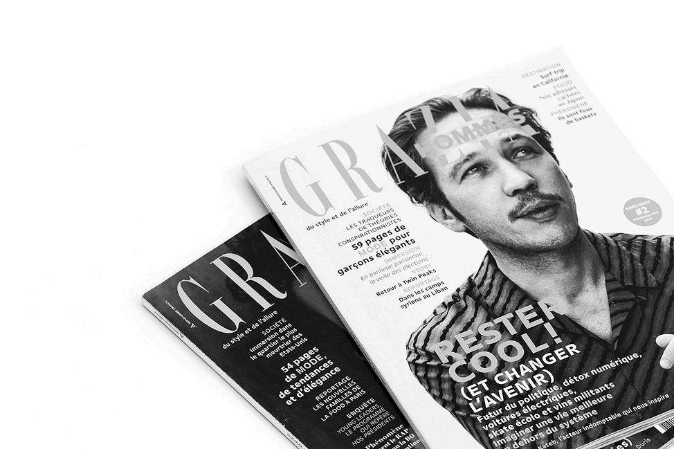
Granville is a modern sans-serif typeface. It was designed by a graphic designer named JeanBaptiste Levée of French Production Type, founded by Levée. Granville’s design has a strong contrast in its strokes. However, unlike other thick-thin sans-serifs, the letters remain sturdy enough at small sizes to allow Granville to work as a text face. Granville has six styles: Light, Light Italic, Regular, Regular Italic, Bold, and Bold Italic. Granville is very prominent in editorial designs, signs, and posters.
Advertisement
The Story Behind Granville
Granville was created in 2015 for French Production Type. Production Type is based in Paris, France and is an online distribution of type for designers and active font users for industrial or luxury applications. Production Type was developed in 2014 and is currently a very important and influential digital type design agency.
Granville is a well harmonized sans serif typeface. This typeface is known for having a very visible contrast between thick and thin strokes. The high thick to thin contrast fonts started to be outdated and replaced by the more modern san serifs in the 20th century, until Jean-Baptiste Levée designed Granville, a stylish, contemporary typeface. This typeface family was created for versatility purposes. Granville is built on hairline cross bars and thick stems. Granville’s italic similar to a script font. There is still a high contrast in the letters, but it is more flowing and graceful.
JeanBaptiste Levée

Bibliography
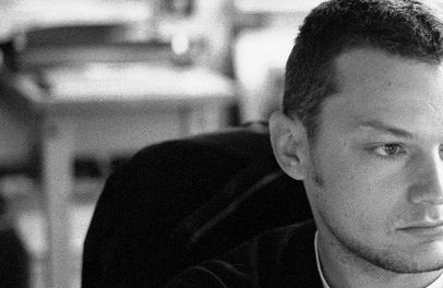
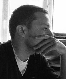
Jean-Baptiste Levée was born in MontSaint-Aignan, France in 1981. Levée first went to Estienne School and studied visual communications. At the school he joined the DSAA typographic creation which sparked his love for typography. Levée graduated from Estienne in 2004. Levée later took lessons and learned design from Franck Jalleau, Michel Derre, Margaret Gray and Sébastien Morlighem.
When Levée finished schooling completely, he started working as an assistant for a famous French graphic designer, Christophe Badani. In 2004 to 2006 he started worked as art director of the music label, Ambroisie. In 2006, he took a role as a French representative in the International Typographic Association, and later became Vice President of the International Typographic Association a year later. In 2010 Levée and other artists like Bruno Bernard, Stéphane Buellet and Patrick Paleta developed the Bureau des Affaires Typographiques which was the first French collaborative digital foundry.

A couple years later Levée left the Office of Typographic Affairs to focus on his personal work. While focusing on himself Levée launched his own digital foundry. Production Type, which became a place for Levée to explore and show off his talent of design and typography. Levée is the creator of numerous typefaces as well as works for several magazines and newspapers like Liberation, Vanity Fair, Sciences & Avenir, and Trax. Levée has designed over a hundred typefaces for industry, films, fashion and media and is currently creating and teaching other young artists.
Visual Analysis
Granville is known for extreme contrast with strokes and changes of weight within just one character. Granville’s strokes gently turn and swell throughout each letter. Granville’s italic has a distinct personality of its own, but does not stray too far from the original font. In Granville’s uppercase “H’’ there is a much higher emphasis on the stems than the crossbars in the letter. Also in Granville’s “H” it has a relatively wide proportion to its body. Granville’s “C” has an equal weight for the top stroke and the bottom stroke. Granville has terminals that are cut at a 90 degree angle. Granville’s “C” has a very tight curve to it. Granville’s lowercase “s” balances its space for the curve of the spine of the “s”. The terminals yet again are cut off and curved in and the small tails curl upward. The “s” has a thick spine. Granville’s lower case “f” is very unique. There is a hooking effect in the curve of the “f”. This arch is created to give it more room to breathe. In Granville’s lower case “e” it is thick on the cruse and get thin right at the terminals. Granville has a certain old yet modern feel to it. It gives a harsh contrast between the characters with each letter having a unique characteristic to it.
H


