About The Brand
Mood Board & Brand Direction
Primary Logo
Secondary Logo

About The Brand
Mood Board & Brand Direction
Primary Logo
Secondary Logo
Business Name: Coded Card Company
Submark Logo
Logo Mark
Fonts
Colour Palette
Assets
Media
Welcome to Coded Card Company, where we believe in challenging societal taboos and initiating meaningful conversations.
by creating fun and thought provoking cards that encourage humour, curiosity and open dialogue to promote understanding.
Our unique brand focuses on three crucial areas: death, menstruation, and social class. We understand these topics are often shrouded in silence, which leads to stigmas and misunderstandings. We aim to break down these barriers
We hope to foster a more inclusive and empathetic society by addressing these taboos head-on. Join us in our mission to reduce stigma and transform these taboo subjects into catalysts for change. With Coded Card Company, we want to ignite conversations that matter’.
‘Igniting conversations that matter’
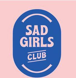
This carefully compiled mood board was selected to direct the company’s visual direction throughout the creative conception stage. The mood board acts as a visual compass, providing a clear and unambiguous path for the brand identity to follow. It comprises of an
aesthetically pleasing selection of images, concepts, colours, and styles. This guarantees an exact and consistent design approach that resonates and aligns with the brand’s essence by capturing the intended visual appeal and ambiance.
Direction:
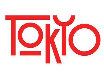
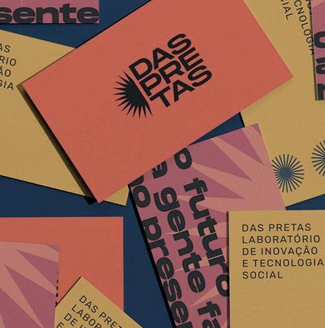
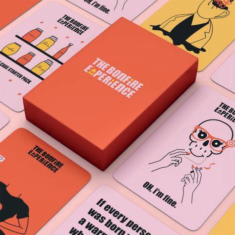
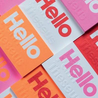
With a focus on fun, Gen-Z, and millennial preferences, the mood board’s design was specifically chosen to appeal to the target group.
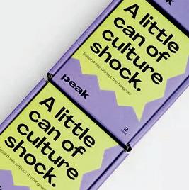
Striking a mix between dynamic and sophisticated, vibrant yet subdued tones are carefully selected. The
bold sans-serif typography enhances the overall appeal by incorporating a playful yet modern atmosphere. The mood board successfully conveys an alluring visual language that addresses the target audience by skillfully fusing these components.
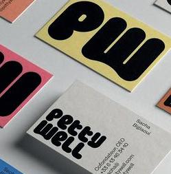
A brand logo is a symbol, emblem, typographic representation, or a combination of these things businesses use to identify their brands. Customers can better recognise and remember a product and the brand’s quality when it has a distinctive logo.
The logo must be adaptable and work in a range of settings. Because of this, secondary versions of the primary logo have been created.
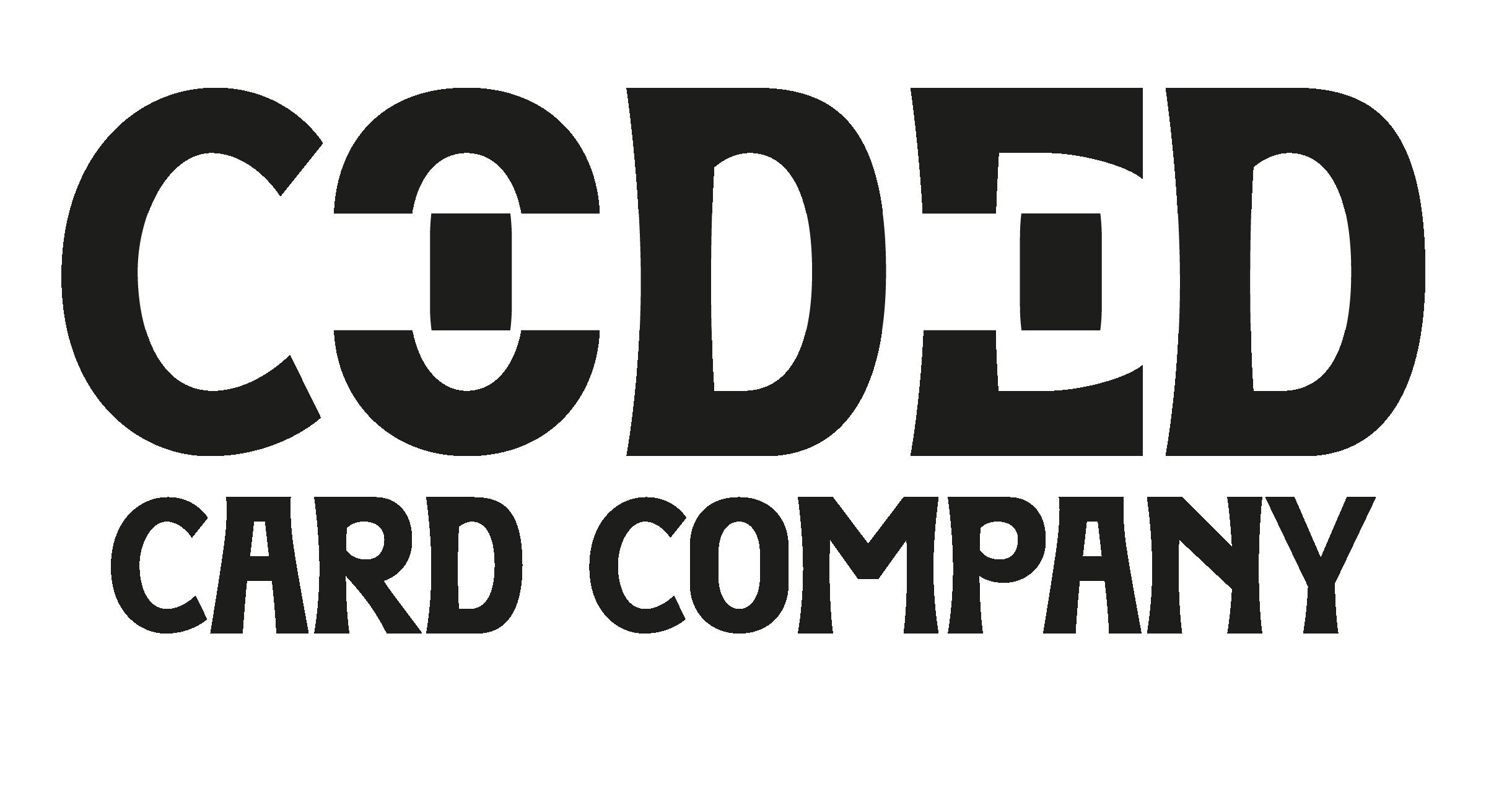
The primary logo serves as the central representation of the brand. It holds the utmost significance and should be used predominantly when space permits. By leveraging the primary logo consistently,
the brand establishes a solid and recognizable visual identity, fostering brand recognition and reinforcing its presence in various contexts.
Notes:
The logo’s bar can be changed to any of the brand colours. This allows for adaptability in multiple contexts, such as when pink denotes menstruation. The logo’s significance and connection to particular circumstances are improved by this thoughtful approach.
The logo successfully combines a playful and youthful look with refinement, catering to the target market of 17–35-year-olds. By making this deliberate design choice, the logo will ring true with the target audience, captivating their attention and building a strong brand relationship.
Black rectangles represent playing cards.
Bar represents redaction to nod to the hidden nature of taboos and the name ‘coded’.
‘Coded’ is larger than ‘card company’ to place emphasis on this.
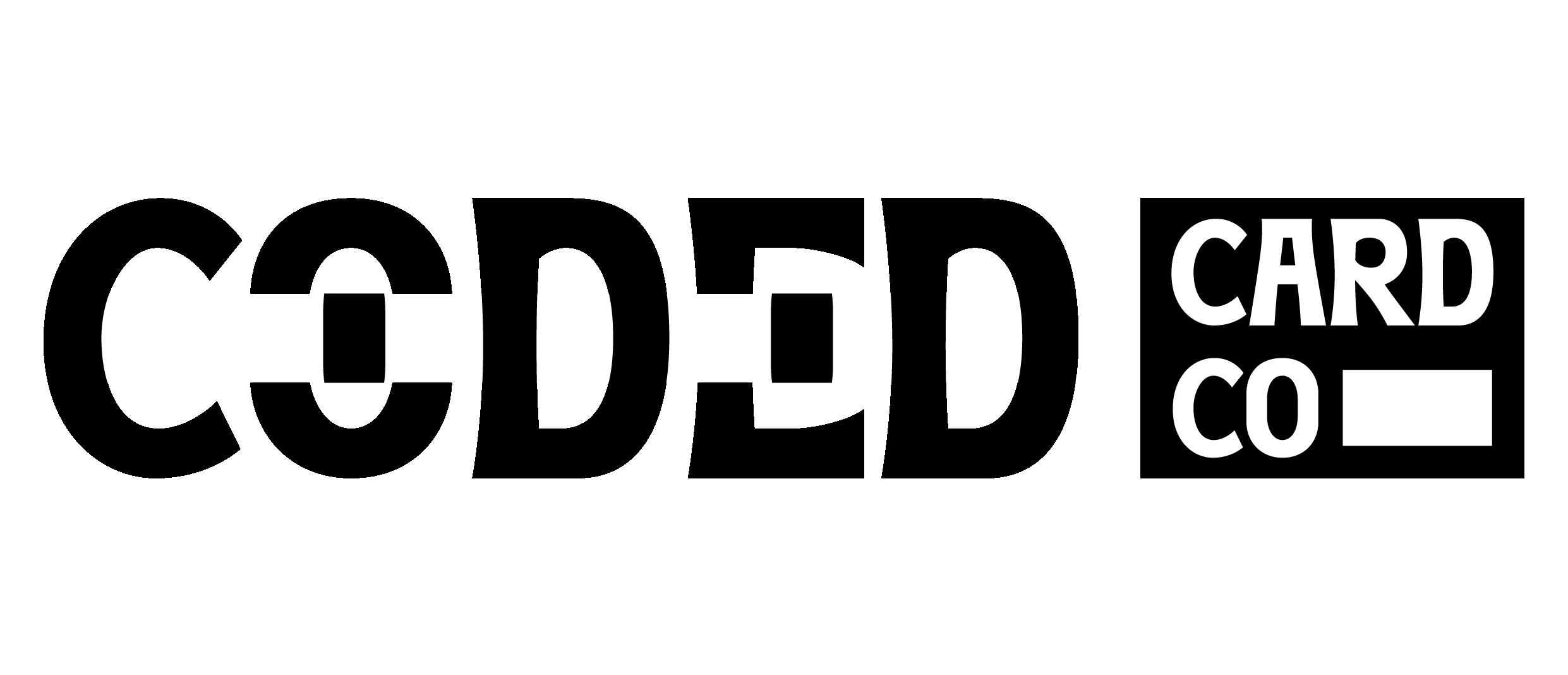
The secondary logo, also called the “alternative logo,” incorporates elements from the primary logo but in a different arrangement. Having this logo gives the brand additional freedom. For instance, one can utilise the secondary logo if the primary one doesn’t fit in the space.
Notes:
The bar can be made any of the brand colours for different situations. It can also be simply in black and white for documents and so on.
The use of a black box is clever as it reminds one of a card.
Logo’s width is wider than height to fit in spaces that the primary would not.
Bar carried on to tie in ‘card co’ to coded as well as fill the space.
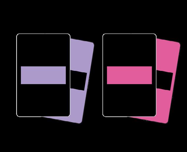
Another variant of the logo with a distinct layout that increases branding flexibility is the Submark Logo. This should be used if the other options do not fit the available space.
The icon is a simple depiction of two playing cards. This links well to the brand’s name and product.

Notes: The typography is simplified in order to improve readability for small spaces. ‘Coded’ is still larger than ‘card company’, however.
The bar can be made any of the brand colours for different situations. It can also be simply in black and white for documents and so on.
The redaction bar (which helps to form the circle) ties into the other logo variations.
Compared to the primary logo, logo marks are more condensed. This is often composed of a symbol or two letters. Something straightforward works nicely if one needs to fill a smaller space, like the top of an internet browser.
Notes:
An icon (opposed to a couple of letters) was chosen as this will stand out and is much more memorable than ‘CCC’, for example.
The icon is the same as featured in the submark logo.
The icon is compact to fit into small spaces.
The redaction bar is featured to link the logo mark to the other logo variants.

Setting the tone for the company by using a collection of standardised fonts is essential.
The fonts were picked to go flawlessly with the brand identity and each other.
The brand will become recognised and memorable if the font is constant throughout.
Greycliff Bold. Sans serif. Readable.
subheading goes here
Body copy goes here. Body copy goes here. Body copy goes here. Body copy goes here. Body copy goes here. Body copy goes here.
Gantari Extra Bold. Bold enough to be eye catching but not too overpowering.
Gantari Extra Bold. Sans serif. Relative comparative thickness to logo. Simple but modern.
Greycliff regular. Simple yet contemporary.
The decision to use Gantari as the primary typeface was motivated by the font’s capacity to strengthen the brand’s visual identity, its similar thickness to the logo, and its straightforward yet contemporary style. By choosing a typeface that is in line with these factors, the brand is given a strong, unified presence that appeals to the target market.
Due to its bold and distinctive appearance, readability, visual contrast, and contemporary adaptability, Greycliff Bold is a superb choice for subheadings. It promotes readability, aids in content navigation, and enhances visual appeal in the overall design
Due to its readability, adaptability, contemporary style, and ideal letter spacing, Greycliff Regular makes an excellent choice for body text. These elements make it a compelling and practical option for clearly and aesthetically pleasingly delivering information.
Building brand recognition will require developing a distinctive and complementary colour scheme. The colour scheme will be utilised on the website, business cards, social media, and more. The suggested colour scheme and the rationale behind its selection for the business are on the next page.
A representation of social class, this colour is bright and vibrant, bringing a playful feel.
A representation of social class, this colour is cool and contemporary, complimenting the orange nicely.
This colour contrasts against all of the others, making it a perfect highlight. It also is great as provides the brand with a black and white option if necessary.
A representation of menstruation, this colour is vibrant and fun, fitting in perfectly with the target audience’s aesthetics.
A representation of death, this colour is bold and perfect for any body text or areas of design that need to stand out.
An intriguing aspect of the brand is the brand’s assets. One can incorporate the brand identity and forge an unforgettable brand experience here.
It’s also a powerful approach to establishing brand identification that permeates every aspect of the company’s physical presence and contributes to consistent branding.
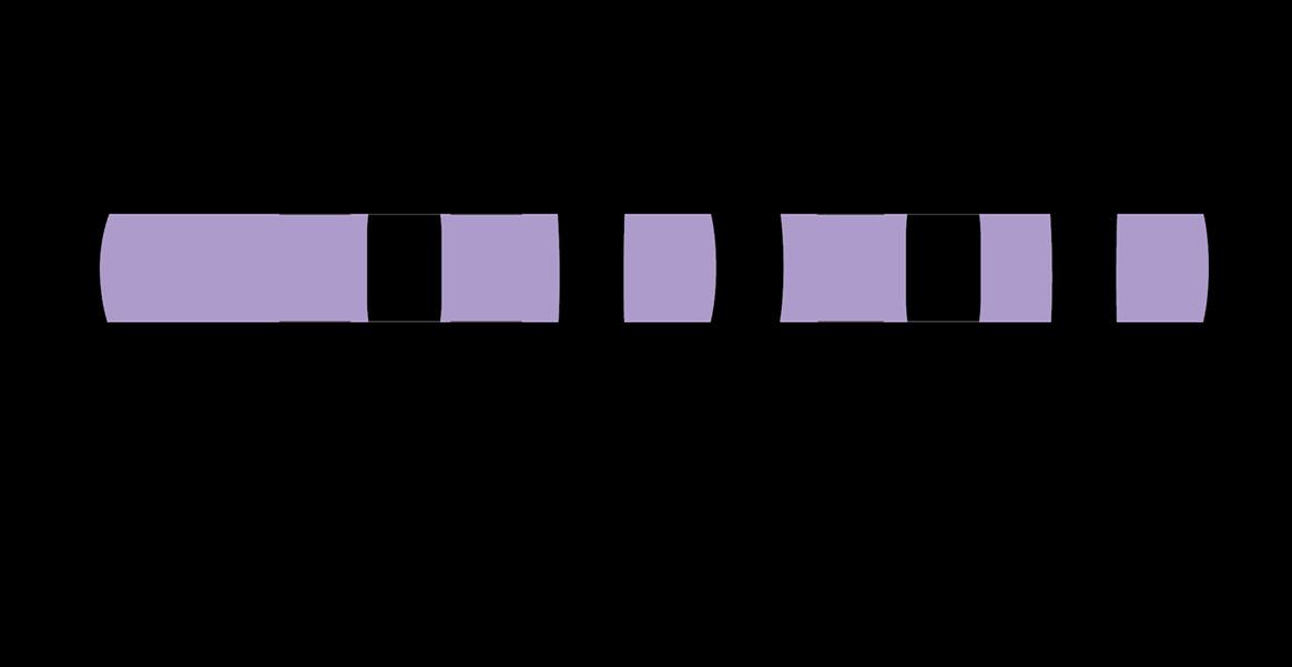
This symbol represents menstruation. The concept is that menstruation is a cycle, the symbol is cyclical to represent this. The cycle is not whole/is broken/tainted however by the bars which represent the coded and taboo nature of the subject. Moreover, these also appear as cards, tying in with the product of the brand.

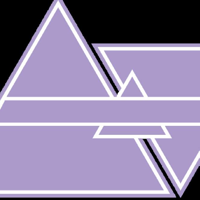
This represents the taboo of social class. The three triangles represent the three classes, with lower class the largest, middle class the middle size and upper class the smallestas reflecting the actual size of the classes. The bar through the center represents the taboo/coded nature and is a nod to the logo.
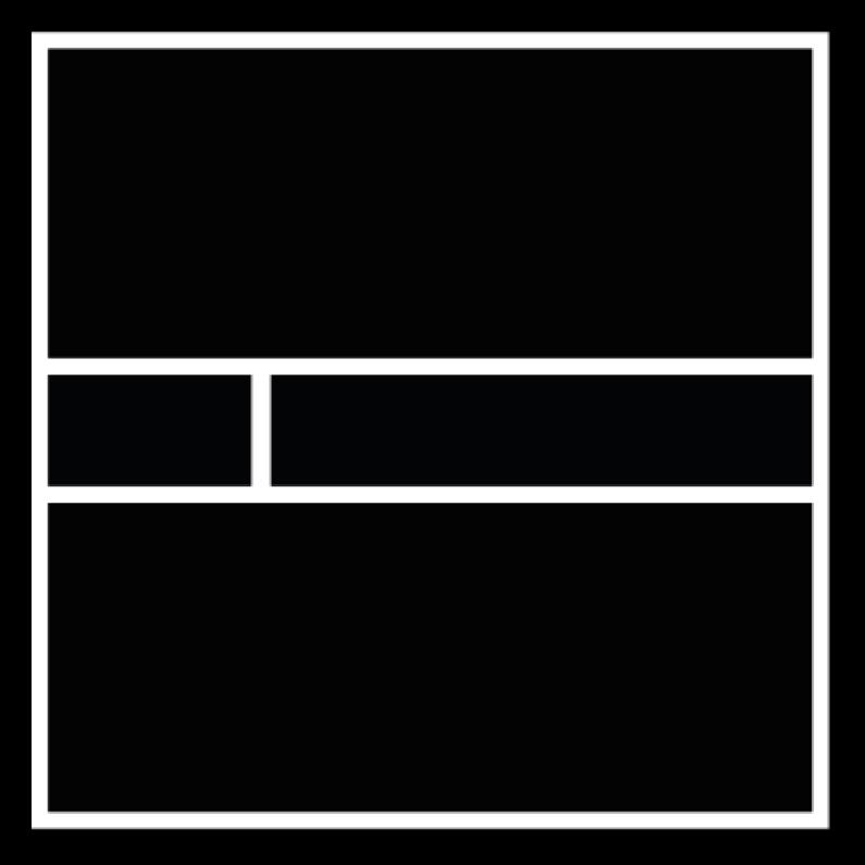
This symbol represents death. The concept is that the square is a window into a void. It is dark and empty-nothing. This represents the concept of death. Once again, the middle bar represents redaction, nodding to the taboo nature of the topic in conversation. The smaller bar is representative of a playing card to nod to the brand’s product.

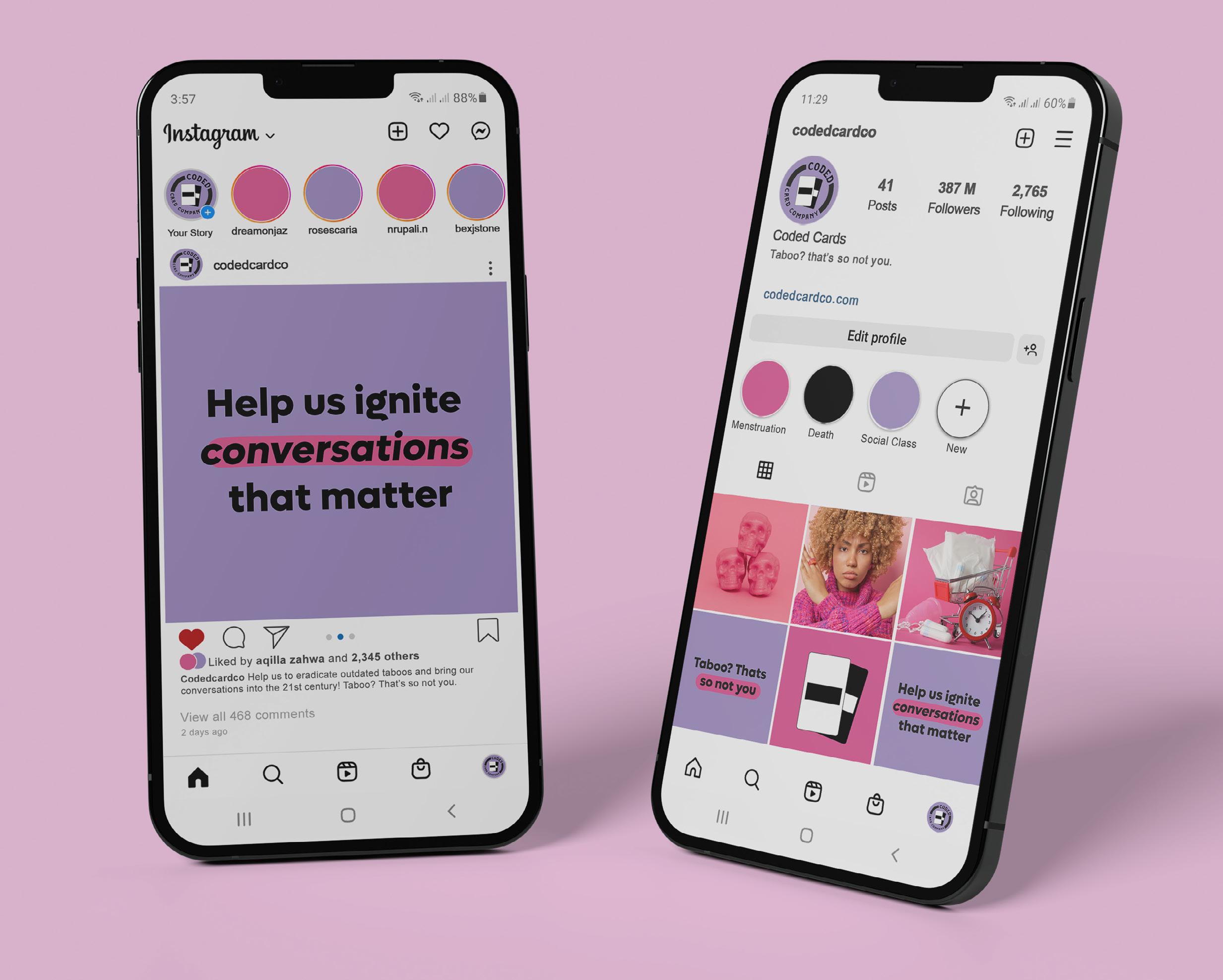
Viewing the Instagram feed with the suggested branding might help one picture the brand’s potential uses. Additionally, it clarifies how various branding components, such as colour schemes, typography, and photographs, should be used together.
Knowing the correct photographic route to go can help maintain brand consistency.
I wanted to explore a possible photography direction for the brand as maintaining consistency and exhibiting the brand voice will be made easier by sticking to a particular photography aesthetic inside the brand.

This could be used on social media and a website, for example.
The photography direction is colourful, bold, modern and fun. This will really appeal to the target audience of the game. Additionally, it feels creative and exciting, something that the game aims to create.
Despite the ‘heavy’ nature of the taboos, the game is supposed to be fun and enjoyed, in this way the players will naturally talk about the cards and thus the taboos.
The vibe of this photo really sets the mood for the brand tone and look: young, fun, nonconventional, bright and bold. The shielding of the eyes also suggest hiding, like the coded language is hiding the taboo topics.



Photographs that represent the taboos and coded language. For example, this shows menstruation but also the clock could represent ‘that time of the month’ which is a coded language phrase for menstruation.

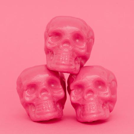
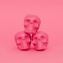
The purpose of the game is to start conversations around the taboos, as is suggested in this photo, which conveys the idea of death through the skull.




Thepeopleintheimages arearoundtheageofthe targetaudience,which wouldincreaserelatability. Also,thetypography utilisesasomewhat provocativeapproachto makecallstoaction.



This can be read as a challenge to decipher and comprehend the underlying hidden meanings within cultural norms and expressions. The term has a metaphorical sense that calls into question and challenges coded language.




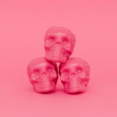




The overall social media direction is a fun and contemporary feel which will appeal to the target audience. The colours used stick to the brand’s three main colours (as featured on the cards). There is a mixture of illustration, typography and photography to ensure engagement and interest.

The mockup utilities the social media template from the previous slide. Additionally, fun and witty captions have been added to show the brand’s tone of voice. This is specifically curated for the brand’s target audience, which will thus appeal to them, helping to build an audience online.
