Inside this book illustrates what it’s like to read with a wandering mind, from a personal experience. The internal thoughts channeled throughout are inspired by real-time thinking when reading Abbott Miller’s book Design and Content
This is purely subjective, and whilst the author didn’t intend to “cause” the mind to wander, this is a challenge that myself and others are often exposed to—and often without realising.
This books depicts the journey of my mind; and the way the reader perceives the content inside this book will leave room for their own mind to wander whilst establishing a different and unique experience. You’ll notice the continuous line that runs throughout each page—this acts as a “path” for the reader to follow as well as a distraction.
foreword
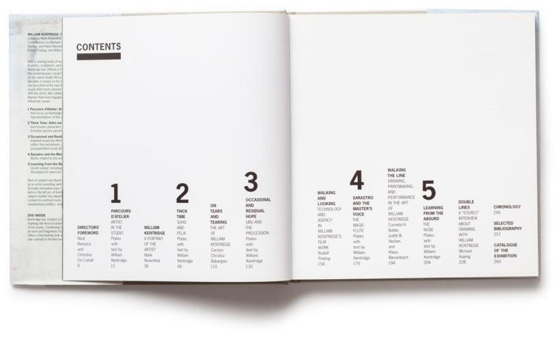
rick poyner 6 design and content abbott miller 8 the archaeology of college ellen lupton 18 design is a mode of inquiry 30 the only way to do it is to do it 62 design is a measure of energy 78 a white cube is a black box 90 patterns create patterns from patterns 122 a book is a movie you hold in your hands 136 an exhibition is a room with a plot 156 the story is the engine
identity links pixels and bricks
the idea is the machine 240 from object to observer 246 through thick and thin: fashion and type 254 the elephant in the room
michael bierut, abbott miller, eddie opara, and paula scher 260 biography and bibliography 268 acknowledgements and credits 270
design and content
ABBOTT MILLER
George Bernard Shaw reportedly once said that the United States and Great Britain are “two countries divided by common language”. The aphorism captures a fault line in the discussion of design and content. How can we talk about design and content as if they were separate “places” or things when our experience continually affirms their inseperability? To pull apart the message of a poster (its verbal content and its funcitional purpose) from its visualization (its embodiment in form, colour, and image) completely misses the drama of design, which arises from the way the two parts come together as a unified whole. If we separate design and content for the sake of discussion, we cannot avoid the binarisms that either devalue or overestimate the importance of form— design as a mode of content in its own right—or of content—the primacy of message, function, and communication.
Within my own practice, the push and pull of design and content has made me shift, at different points, between prerogratives of an author and the instincts of a dyed-in-the-wool formalist. Many designers experience the split between the hedonism of the eye and the obligations of function, message, and content. Our profession is, in a sense, founded on that gap: we offer ourselves up as people who have the ability to effectively connect form and content. How that connection is made may vary wildly in the hands of different designers, but being a graphic designer depends on one’s ability to separate form and content, and then put them back together again. This magic can be performed as a service for others, and you can earn money by doing it well.
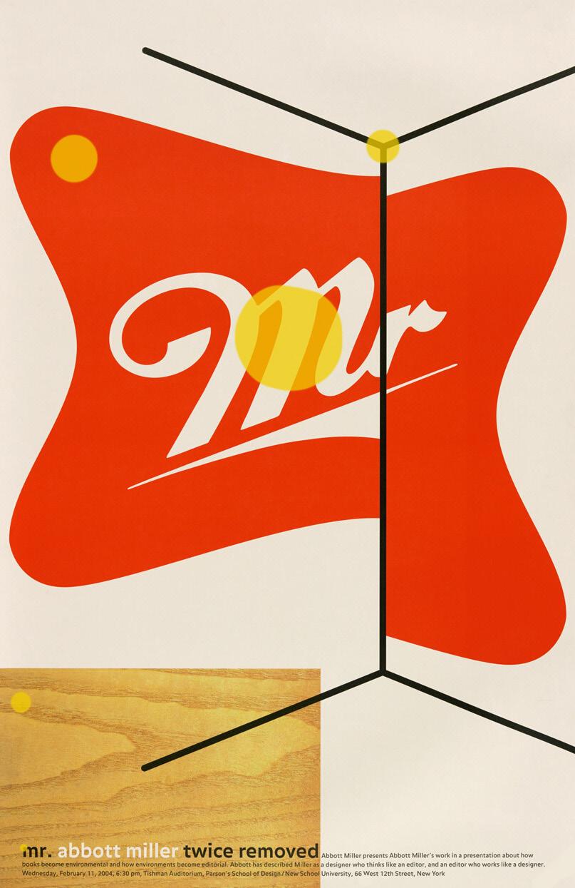
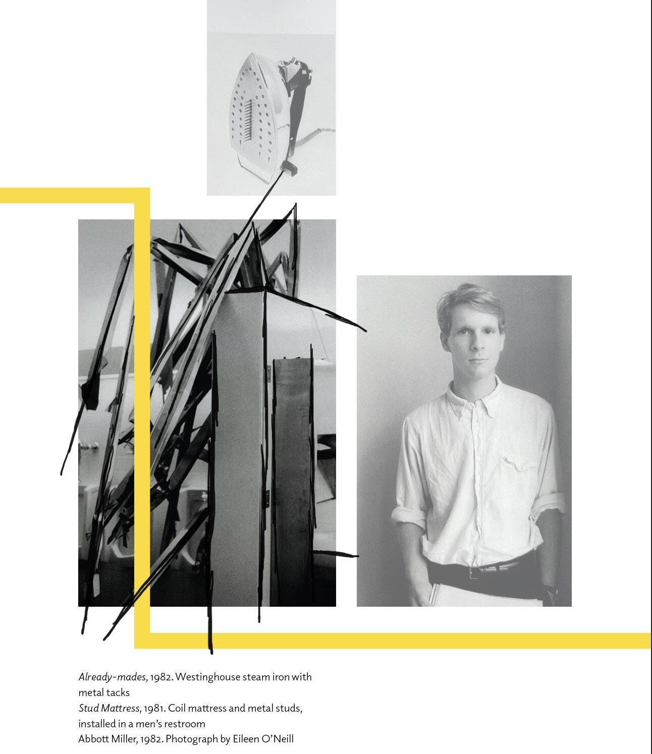
Mr. Abbott Miller: Twice Removed, 2004
As a student at Cooper Union in the early eighties, I was ambivalent about this “service” orientation design: designers seemed to miss out on the self-determination of artists. Yet I did not believe that my identity was clearly that of an artist either. At Cooper during that period, there was a strong divide between the expressionistic painters and sculpturs and conceptually and politically inclined students who worked across different media. Immersed in critical theory and left politics, I recall being upended by a passage in an essay by Walter Benjamin: “There is no document of culture that is not at the same time a document of barbarism”. The phrase haunted me in its suggestion that (as I read it then) the “indulgent” pursuit of art could never be separated from the inequity at the heart of capitalism. This became an uncomfortable soundtrack for my own politicized years at Cooper: with his pronouncement, Benjamin destabalized my attachment to form by imbuing it with an ugly subtext or privilege and hyprocrisy.
Yet Benjamin’s statement resonated with me because the schizophrenic juxtaposition of poverty and wealth in New York City provided such vivid eveidence of the dichotomy he described. During my years in college, I witnessed the extremes of the city, which were especially pronounced at that time (see Tom Wolfe’s The Bonfire of the Vanities, 1987). During the week I was immersed in classes and lectures at an elite art school and going to art galleries in the boom years of Soho, but on the weekends I rode my bike through the bleakest parts of the city and worked with a program teaching art to disadvantaged New York City high school students.
Although it seems surprising in retrospect, these experiences led me back to the clarity of design andthe role of the designer. I liked how the context-driven culture of design immediately placed you at the intersection of form and content. I liked design because it seemed to remove the gauzy filter of the artist’s identity. My teacher Hans Haacke provided a model for someone whose work was situated in the art world but but whose strategies and techniques drew upon design,
advertising, and techniques of display. Haacke waged a long battle within the art world: a characteristic early piece traced the provenance of a small painting by Manet of a bundle of asparagus, documenting its complex history of ownership and escalating value, and its intersection with the Nazi Regime. This was the kind of art I admired, and it was close to the “aboutness” of graphic design.
If the prospect of entering a career in design had a shortcoming, it was that designers seemed less likely to generate the content of their work. “Normal
“I found myself feeling more confident making “art” that was closer to design in its use of narrative and in its engagement with messages and ideas.”
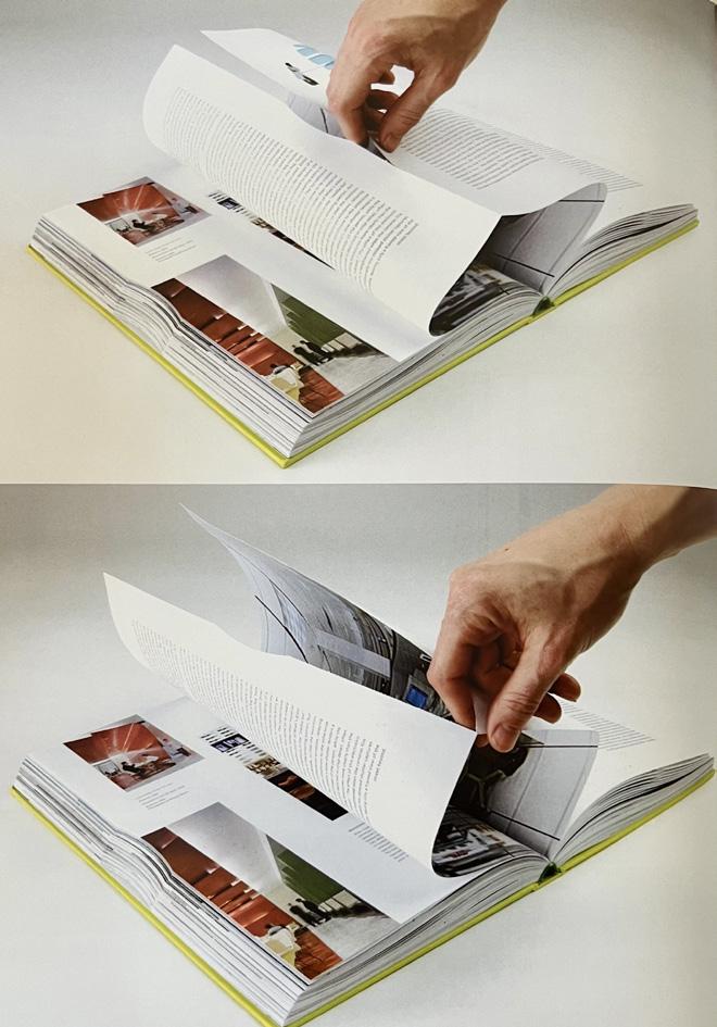
Reading to the end of the line, at the end of the page and quickly turning the page so I don’t lost my place in the sentence. Text doesn’t appear, instead it’s a piece of design.It’s this that throws me off path—again. The red text catches my attention amongst a grid-inspired piece.With the first part of the sentence just about staying in my mind, I must turn the page again.
If the prospect of entering a career in design had a shortcoming, it was that designers seemed less likely to generate the content of their work. “Normal science” for designers was to use their visual skills to express other people’s content, whether that content was narrative, commercial, political, or scientific. I wanted to practice design in a way that preserved determination of the artist as the generating force of content. Surely there was a way to be a designer that maintained the engagement and authorship that that characterized being an artist.
The historical artists I was most interested in— Marcel Duchamp and Marcel Broodthaers—were conceptualists, unaligned with a specific medium. A number of visiting artists who taught and lectured at Cooper Union—Victor Burgin, Barbara Kruger, Sherrie Levine, Tim Rollins and K.O.S., Joseph Kosuth, Martha Rosler, Michael Asher, Jenny Holzer, Daniel Buren, Barbara Bloom, Louise Lawler, Group Material—incorporated text, photography, and media in their work, providing provocative models of how to negotiate the art/design terrain. If these artists could bend paradigms of art production toward design, I reasoned that I could bend design towards art, or at least to the notion of the practice that follows one’s interests and passions as well as meets the needs of clients.
As a student and then as a young designer entering the profession, I was hell-bent on avoiding working for a “typical” design firm, choosing to work with the architect-entrepreneur Richard Saut Wurman, who was relocating his publishing company to New York. This was my way of avoiding the overly defined outcomes of the design studios I knew about. I reasoned that it was better to be in a place focused on publishing its own content. I learned a lot from working with Richard, but I didn’t really grow much as a designer because the publications were so heavily templated. Design with a capital D was not a priority: instead it was a medium on the way to publishing, and ultimately led to establishing the now well-known TED conferences.
While working for Richard I had opportunities to do freelance projects for a number of art galleries and museums, creating publications, invitations, and advertisements. When I secured a retainer with the
Through the process of turning two pages and being ever so slightly distracted my a design. I turn back in time to the previous page. I start the paragraph again, skip the page with imagery, and proceed through the sentence. I’ll reach the end of the sentence eventually...
A list of inspiring people - but I’ve never heard of them...I read one line with a list of names and my mind drifts, so I repeat my steps along the line.
Miller is discussing his path but ideas are jumping around. I’m disengaged.What happened to design and content? TED conferences? With the big red letters.
New Museum for a year’s worth of work, I was able to quit my job and be on my own. I had never worked in a “real” design studio and found myself struggling to define my practice. The available models were vividly staked out in the New York design industry: there was the cool, conservative Swiss-derived modernism of Rudy de Harak & Associates as well as Chermayeff and Geismar, the Italian rationalism of the Vignellis, the postmodernism of a now less-remembered but influential firm called Doublespace, and the vernacular pastiche and deadpan humor of M&Co, led by Tibor Kalman. I was aware of Pentagram but it registered more dimly as the New York outpost of a British Phenomenon.
was the cool, conservative Swiss-derived modernism of
was the cool, conservative Swiss-derived modernism of
My stronger reference points were the art galleries that I worked for, the critical theory I read, and my increasing interest in design history. In all of this work I was influenced by Ellen Lupton, who was my friend and classmate and who, after graduating, become curator of a newly established gallery for design, the Herb Lubalin Study Center at Cooper Union. Her base of operation there allowed us to undertake a variety of projects and formulate a practice that we called Design Writing Research.
The DWR studio began as a purely conceptual entity, fueled by intense breakfast meetings in a diner on Astor Place. We progressed to presenting a more legitimate face to clients by borrowing a conference table at Princeton Architectural Press, a small publishing house operating out of a funky townhouse across the street from my even funkier apartment building. From occasionally squatting at their table, we graduated to renting studio space in their back office storage room.
During this time, DWR moved from its basis in small print-based projects to exhibitions and publications. We elaborated our position as a hybrid of think tank, publisher, and design studio. The goal was to fuse our work as designers and writers, creating a studio that could generate content and use the unique skill set of designers to focus on projects about art, design, architecture, and ideas. In this notion of the content-based studio there was a number of inspirational precedents, from Charles and Ray Eames to Quentin Fiore and Bernard Rudofsky.
Our original emphasis on language and theory merged with work for clients who came to us not somuch for the manifesto-like pronouncements of
Whilst I’m carefully following along each word and each line in a repetitive pattern, my eyes begin to wander out of place and my mind follow.I look at each word but their place and meaning amongst other words quickly becomes lost. As I reach the end of the line, I subconsciously go back to the start of the line and retrace not just my steps but each word too.
Rudy de Harak & Associ
Rudy de Harak & Assoc
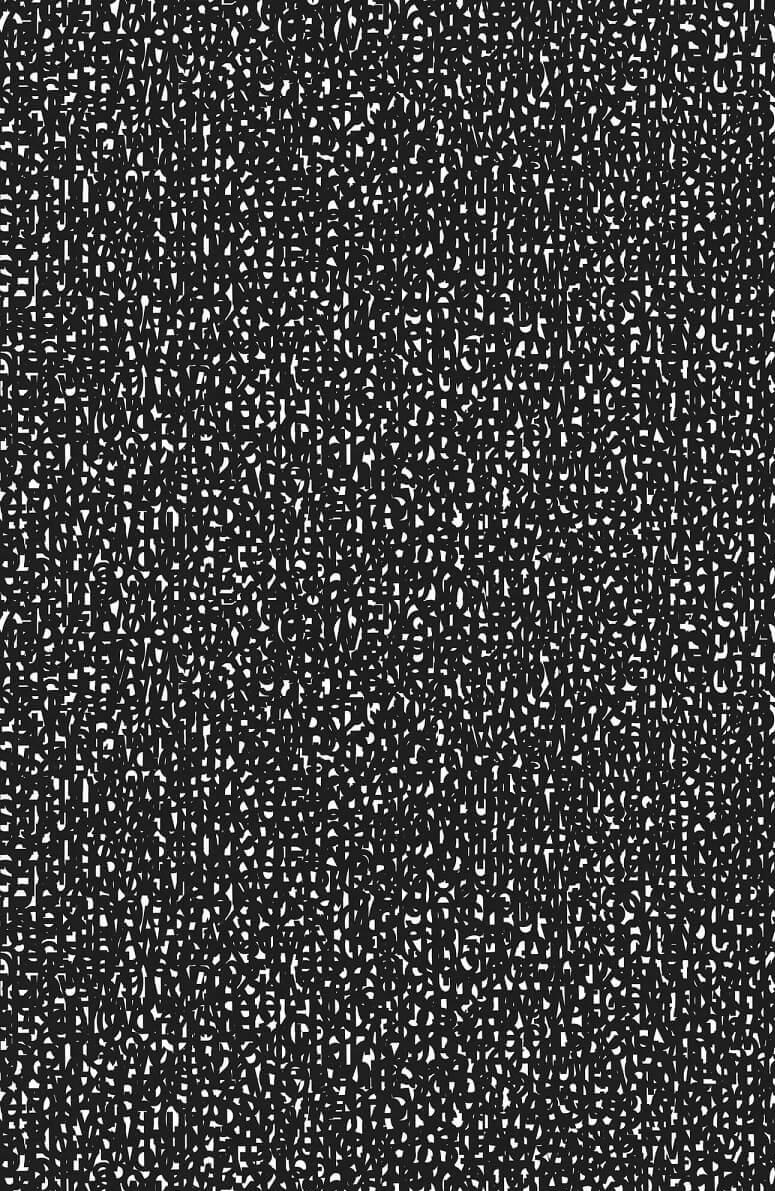
our mission, but for the thoughtful interplay of design and content in our projects. DWR was a self-consciously literary and conceptual hothouse version of a design studio, undertaking projects that experimented with literary theory and psychoanalysis, leaning heavily on what we saw as the vastly underdeveloped relationship between writing and graphic design. We borrowed from Jacques Derrida an expanded notion of “writing” (ecriture), which included all elements of graphic communication, from symbols to spacing. Hence our predilection for mazes of glyphs, out attentiveness to the minutiae of punctuation, and our maniacal focus on typography and textual systems.
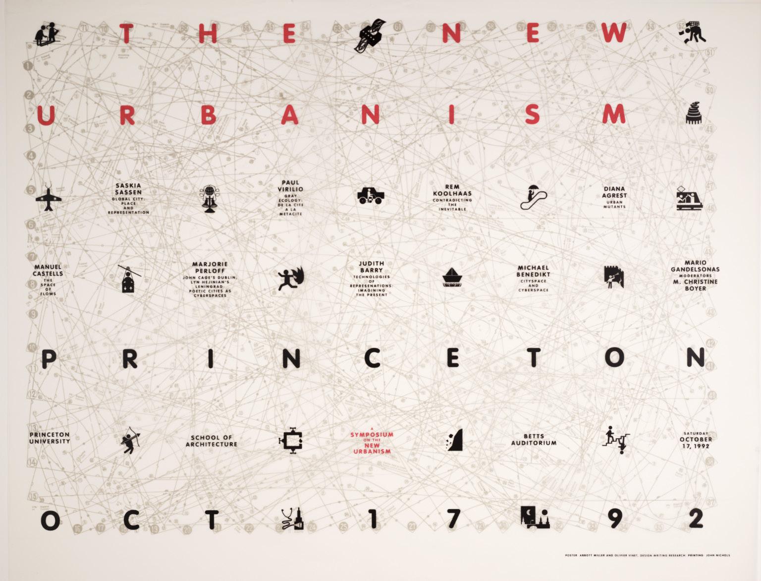
A characteristic project of the moment was a poster Ellen and I designed for a conference at Princeton University’s School of Architecture. “The Discourse of the Studio” conference explored the role of language in the development of architectural education. With characteristic glee we burrowed into the language at the heart of it, creating a typographic mise-en-scène. For another Princeton poster on New Urbanism, I created comical International Style symbols overlaid on an old sewing pattern. During those already-bleak years of professional opportunities for architects, I designed a poster representing luminaries of the architecture lecture circuit in the style of classified ads, with a background composed of a pair of Le Corbusier glasses lying on the surface of the help wanted pages of the New York Times (in which there were only three jobs posted for architects).
My education at Cooper Union placed me in a very particular position along the design-content axis and gave me a heavily typographic basis. Most of my projects were defined by type and idea, with the occasional use of imagery. After founding my studio I was working on projects that depended purely upon Design with a capital D, particularly upon photography and art direction, which were entirely new vocabularies for me. The biggest opportunity in this regard was a magazine called Dance Ink, a quarterly publication on dance and performance. The topic was inherently visual, and my role was not as a writer or conceptual agent, but purely as a designer. Presided over by an enlightened publisher, Patricia Tarr; a tolerant editor, Lise Friedman; and a resourceful and well-connected photo editor, Kate Schlesinger, the project became my calling
card. Among the magazine’s followers were photographers, artists, and performers—an audience that led to related commissions, including a long and formative collaboration with the legendary fashion designer Geoffrey Beene.
Parallel to this emerging design practice was a burgeoning interest in a more academic and research-oriented way of investigating design. In my late twenties I entered a graduate PhD program at the City University of New York. I was able to study with an amazing faculty, deepening my connection to theory and history. During this period there were many opportunities to write, publish, and curate, making this period a fertile combination of practical and theoretical exploration. The academic writing and the work of the studio complemented and reinforced one another. But maintaining a busy studio and graduate studies also collided with adversities in my family: my father became gravely ill and I lost both of my parents in quick succession. It was a difficult period on all fronts.
In time I refocused on maintaining my studio, and Ellen and I worked to reestablish our goals. We took two teaching positions at MICA, the Maryland Institute College of Art. I maintained my studio in New York and set up a parallel studio in Baltimore, beginning a new life as a fluid resident of the eastern corridor. During our first semester in Baltimore, Paula Scher came to MICA as a visiting designer. Paula had joined the New York office of Pentagram in 1991 and, with Michael Bierut and Woody Pirtle, had made it the city’s leading design studio, erasing the sense of Pentagram as the stepchild of the London office. I had previously had limited interactions with the Pentagram partners: a couple of years before Paula’s visit to MICA, I had written a small piece about her and she had called to tell me that she didn’t like it; and although I had previously met Michael Bierutyou can’t work in New York without at some point meeting him—I didn’t really know him or the other partners at Pentagram.
At MICA, I invited Paula to critique my students’ work. As I explained the assignments, she surveyed the posters pinned to the wall. She was a quick study and she charmed the students, even as she ripped them to shreds. And she had literally ripped one of the posters to shreds: never one to wait for scissors, she tore a three-by-five fragment from the center of one student’s poster and declared,
“There is a great poster. Try that!”
A month later, Paula invited me to lunch with Michael, and they asked whether I had ever thought of joining Pentagram. In my mind Pentagram was the competition—why would I have thought of joining them when I was busy figuring out how I was different from them? I had never joined anything in my life: no teams, no clubs, no anything. Suddenly a group of talented people were asking me if I wanted to join their practice. It took me a year to figure it out, but I found myself drawn to the idea of having partners, or having three-dimensional disciplines within the culture of the studio and learning how a “real” studio worked. I was convinced that I could bring something specific to Pentagram and that I could benefit—intellectually, financially, and emotionally—from Pentagram’s unique work paradigm. Certain projects I’ve taken on since joining Pentagram are classic DWR projects combining curating, writing, and designing, while others bear the influence—whether through their environmental scale or their populist character—of a Pentagram ethos.
Across the changes of geography, studio spaces, and clients, my goal has always been to capture a reciprocity between design and content. Design is not a passive presentation of already cooked and digested ideas, but a critical tool, capable of creating its own insights. This notion of design rests on an active and less hierarchical conception of practice—a model closer to a collective search between author, curator, and designer.
Design is a conceptual tool, a kind of metalanguage operating alongside and somewhat “above” writing, and a bit outside of rational thinking. Designing thinking offers an alternative to sequential, expository, and reasoned thought processes. The perogatives of design—visual correspondance; visual impact, contrast of scale, materiality, form, and colour— bring you into communication problems from a different perspective. The duality of design—its status as a discourse in its own right, as well as being a medium for discovery—positions designers as interpreters and performers of content.
Design animates and enables: a powerful design concept is something that is “owned” and “used” by everyone working on a project. I love the moment—if it happens—when everyone involved in a project gets behind a design because it has the force of inevitability. Once you’ve alighted on a premise, it starts to make its own arguments and shows you how to move forward. A powerful design concept has an almost palpable current that pushes a project along.
Because so many design decisions are formal and arbitrary—which doesn’t make them trivial—it is deeply satisfying when you hit
“Design thinking dissolves the lines between form and content, and between two and three dimensions.”
upon a visual, spatial, or narrative rationale for a design endeavour. Establishing this governing concept helps ground the work, rooting it in a logic that unfolds on its own. This phase of any project is the period of greatest invention. I’ve learned that you’d better have your fun in those exploratory moments, because those flases of insight require months and years of meetings, flights, emails, and approvals to see the light of day.
Negotiating the relationship between design and content is the defining dynamic of my work. The material presented in the cultural arena—identity, exhibition, environmental, and publication design. Seen in proximity, the individual projects communicate with each other across time and disciplines. To find it, the designer must listen and look, read and write, teasing out the messages that reverberate against the surfaces of what we know.
The words that you see on the page, they do have meaning. This is what it feels like to focus, as I read along each line. The ideas and concepts keep on flowing.
As soon as ‘design’ and ‘content’ content popped up, my mind was bought back to the page.
“With its emphasis on meaning and context, my work makes content legible through form. Style is not the place where design begins, but something that happens along the way, as an echo of content.”
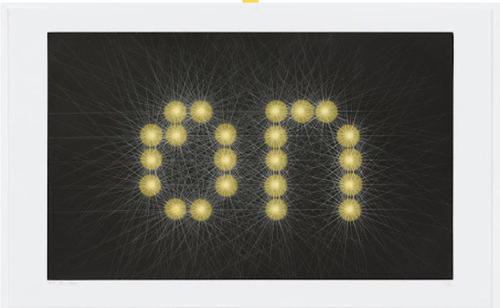
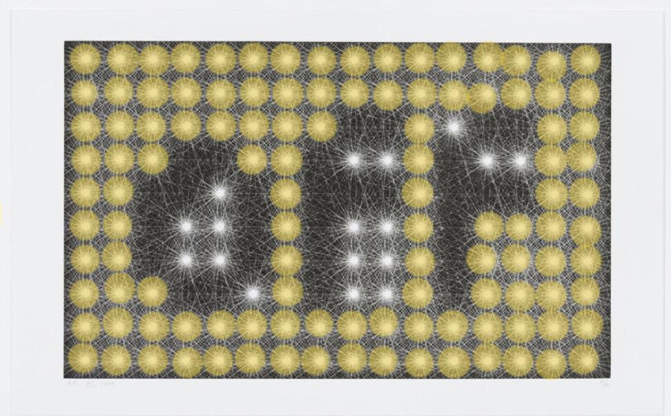
A fascinating image of what appears to be light or lasers forming the word “on” in a geometric pattern.What is this type of image? In the description, it’s a “Photogravure”—must search what this means later.If it says “on”, there might be a similar one that says “off”? I’ll search this now and see.
the archaeology of college
ELLEN LUPTON
The archaeology of college.Did I read that right? archaeology.college. Is it meant to read “collage”? That would make sense.But “the college of archaeology” would make more sense. Is this a metaphor? Who knows.The chapter heading alone confuses me more than reading the chapter and trying to make sense of it all.The pages will be quickly turned to start the following the chapter...
And there it is. In the same style, but a different format.
design is a mode of inquiry
I think every designer entertains fantasies of life without editors or clients standing between you and the project as you see it. The work shown on the following pages represents some of my most rewarding projects because I was able to function as a designer, writer, and curator, using design as a mode of inquiry into a particular subject. My first studio Design Writing Research named an intention to weave these three activities together, seeking a model of design practicethat enabled the studio to function like a laboratory that would advance writing and research on design-related topics, extending the boundaries of traditional design practice. By its very nature the model implied a loop of activity where research feeds into writing, which leads to its realization in the form of exhibitions and publications. Museums and galleries have provided a form for this practice, offering opportunities to explore connections between curating, designing, and publishing.
Design
Design is
Design is a
Design is a mode
Design is a mode of
Design is a mode of inquiry
What else is design?
Design is a mode of collating information
Design is a way of searching
Design is logic
Design is a plan
Design is a drawing
Design is a pattern
Design is art
Design is a reason
But what is the design inquiring?
Dimensional
dimensional typography
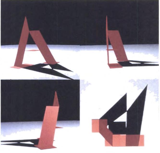
In 1996, Claudia Gould, then director of Artist’s Space, invited me to create an exhibition. I developed a specific body of workabout the impact of digital technology on type. The exhibition, called Exhibit A: Design Writing Research, displayed visualizations of type conceived in three dimensions. The project explored the sculptural properties of letters, inspired by the experiential qualities of virtual environments.
Our case studies included historic and experimental letterforms, building on the implied physicality of classic fonts like Bodoni, as well as contemporary typefaces such as JesusLovesYouAll by Lucas de Groot and Modula Ribbed by Zuzana Licko.
We developed ideas in the studio through drawings and paper models that provided the basis for digital renderings that we commissioned from a range of people working in the relatively new arena of 3-D software. We exhibited the wireframes and renderings as transparencies on mdeical x-ray light boxes, presenting the work in the context of a luminous screen and implying a microscopic universe of typographic organisms capable of growing and propagating like cells or root systems. I created a small book, Dimensional Typography: Words in Space, that documented the project and has served as a point of departure for a number of related investigations and exhibitions.
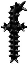
A dimensional lowercase f was based on the knobby silhouette of Zuzana Licko’s 1995 font Modula Ribbed
At first these looked liked photographs—but they are actually renderings.These look like they appear in space with the dark background and light surface with shadow. The way light is used in the composition to reflect the letter ‘a’ on the surface—not just in the red.
A rendering of a Bodoni A interprets its thick-and-thin characteristics as an effect of intersecting planes, 1996
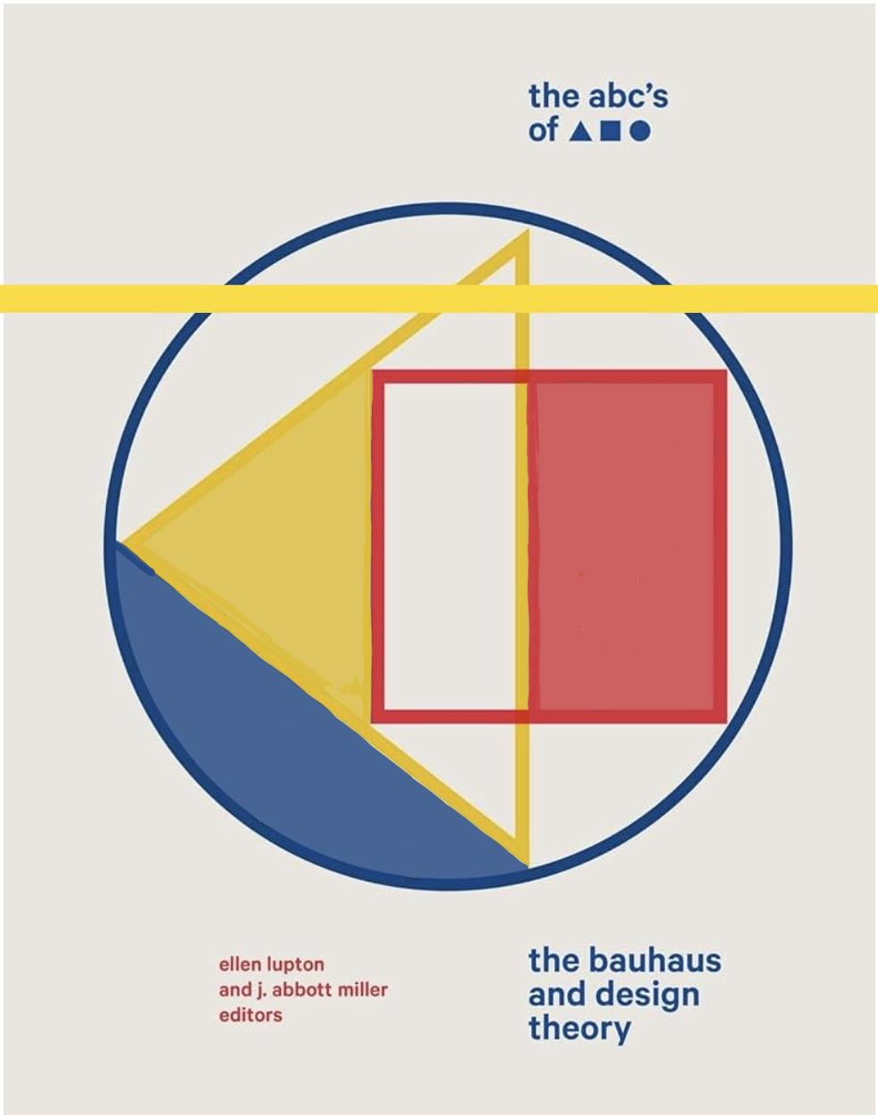
the abc’s of
Developed with Ellen Lupton, The ABC’s of : The Bauhaus and Design Theory (1991) explored the origins and impact of the Bauhaus. The exhibition and publication, produced at the Cooper Union, analyzed the Bauhaus’s preoccupation with the circle, square, and triangle, and primary colours as a foundational grammar of modern design. The project examined the prehistory of the Bauhaus through educational reforms in art education, particularly the radical pedagogy of Friedrich Froebel’s kindergarten, which used elementary shapes and colours as building blocks in a progressive education process. The notion that one could breakdown the visual world into its basic parts and elaborate a “language of vision” was integral to Bauhaus theory. The project considered this concept critically and looked at its influence on succeeding generations of designers, educators, and schools in the United States.
In the original edition of the book Herbert Bayer’s geometrically derived font universal was featured on the cover and produced in letterpress. The pages of the book were stitched in alternating yellow, red, and blue thread.
I’m still thinking about dimensional typography.And now, the shapes distract from the text. It’s a clever way of laying out a title of a book.
But amongst all these thoughts, the history of Bahaus theory does grab my attention.
I’ve always wandered why the primary colours were so significant with Bauhaus.
A cover from the ABC’s of : The Bauhaus and Design Theory, 2019
printed letters
Printed letters. This could be interesting.Is this connected with the process of letterpress printing? We’ll wait and see...
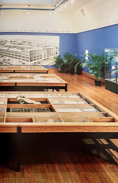
Jersey City, New Jersey, was once the center of the typesetting industry thanks to American Type Founders, a company that wsa the Standard Oil of metal type production. The sprawling factory supplied metal type for the pressrooms of the world but succumbed to the photographic—then digital— revolutions that transformed type into increasingly immaterial “information”. Printed letters: The Natural History of Typography(1992), exhibited at the Jersey City Museum, presented the aesthetic and technological issues surrounding type production, explaining the rapid rise and fall of this local industry. Inspired by the work of Michel Foucault— particularly his analysis of classification systems—I used the metaphor of natural history to explain how typography preserves words on a page, similar to the way specimens are preserved in a natural history museum.
As soon as the text starts my mind feels lost. Trapped amongst a page of words that first appeared to be straight forward. Where do I go from here? The only path to follow is down the page, and encountering more frequent, longer, and complicated words along the way within a short space of time.
My mind is quite simply boggled.If I read to the end of the page, there might be a sentence that sumps out from the page to sum up what I’ve just ‘read’, but otherwise the page is being turned.
The exhibition reveled in the heterogeneous mixture of natural history displays and “cabinets of curiosity”. The “cabinet” was based on the gridded trays (“job case”) used to sort metal type. The exhibition juxtaposed natural and typographic “specimens”, making analogies between lead type and mineral artifacts. The inscription that forms a frieze around the room stated that “typography is a museum of the word” and that “the word is a form of fossilized speech”. A historic rendering of the ATF factory looms in the background, an image of the distant past of Jersey City. The antiquarian aesthetic, complete with potted palms (a la Marcel Broodthaers), was intended to conjure a funereal aura, appropriate to the loss of industry, as well as a paean to the passing of type as a corporeal thing.
The resurface of names. Again, who are these people? Would the text make sense if I search these famous names? I’d lose my attention even more if I pick up my phone.I’d lose many minutes by just scrolling.
As for the photograph on the opposite page, I gloss over this to turn the page. The photo may support the text but it doesn’t give away any further information to break down the meaning behind the text.
To finish off the page, there are words I haven’t heard of before. This adds to the dilemma of distinguishing the meaning and purpose behind the text.
The photograph to support this piece of text wasn’t what I was expecting.I was picturing bold, abstract prints that explore and experiment with typography and shapes and other visual elemens— but perhaps not.Rather it’s an exhibition that appears to focus on the history of old artifacts. Am I missing something? Maybe I should have tried to stay focused along each line.
Installation view of Printed Letters: The Natural History of Typography, 1992
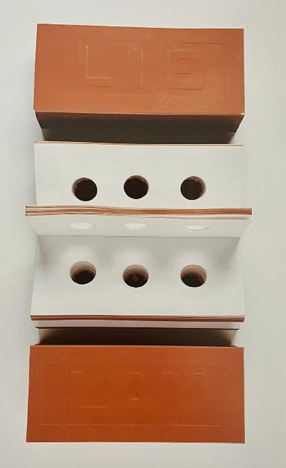
brick book brick book brick book brick book brick book book brick book brick book
book
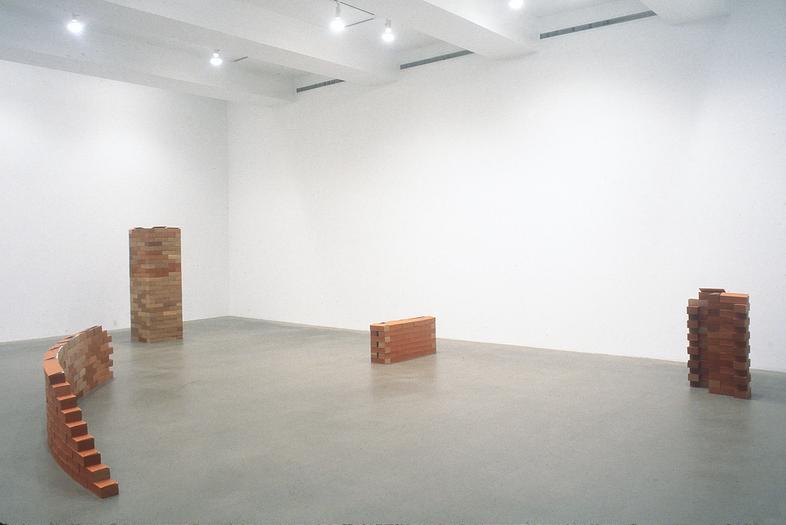
As I turn the page, my eyes are immediately drawn to these photographs—before I even read the text. Quite simply it’s a book that has been designed to represent a brick, whilst at the same time working to carry the function of a brick.This is realised whilst observing the photographs which showcase such ‘books’ stacked together in the formation of laying bricks, whilst the cover or top pages neatly fall upon the body of each brick.
The inside of the book intrigues me more than the outside. The concept is clever, but it’s the form that lets me question—in a positive way.It appears to be a book with no words (or few words); whilst each page features 3 circles that have been evenly cit into to mimic a brick.
How does such an idea start?How was this produced and executed? What is the form behind the book? Do they vary? Look at the circles.Is there content, or is it purely to create an effect through form? My mind is off and away— I’m mid-turning the page before I’ve remembered to read the text.
Installation and detail of Brick Book, Andrew Rosen Gallery, New York, 1997
Once inside, elevator music (Muzak) accompanied a short film that analyzed elevator behaviour. A second set of doors opened onto a bright yellow gallery dominated by life-size symbols of “people movers”. These icons anchored the exhibition’s thematic zones of the elevator, escalator, and moving sidewalk. The emphatic visual character of the exhibition, held at the Nataional Building Museum, was a response to the heterogeneous content; architectural models, fragments, photographs, film clips, and many other artifacts required an environment that united these items as facets of one overarching theme of conveyance.
“Upon entering the exhibition Up, Down, Across: Elevators, Escalators, and Moving Sidewalks (2003), visitors were confronted by a large elevator with motion sensors that activated sliding doors.”
up, down, across
The second half of the exhibition presented a survey of architectural projects that foreground circulation as an integral part of a building’s form and identity. Drawings, photographs, and models showed how architects have incorporated people movers, tracing a shift toward “expressive conveyance” initiated in the 1970s with the famous Centre Georges Pompidou in Paris. The exhibition followed this trajectory into the present with projects that embrace the technology of conveyance as central, even formative, to the design of a building. Architect Rem Koolhaas’s statement that “architecture can finally be unmasked for what it is: flow” is indicative of how the issue of conveyance has moved from the margins to the center of the built environment.
Installation views of Up, Down, Across, National Building Museum, Washington, D.C., 2003
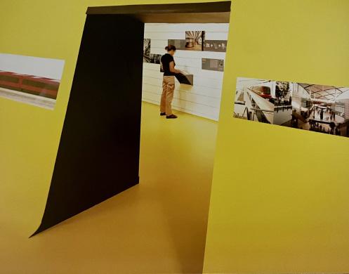
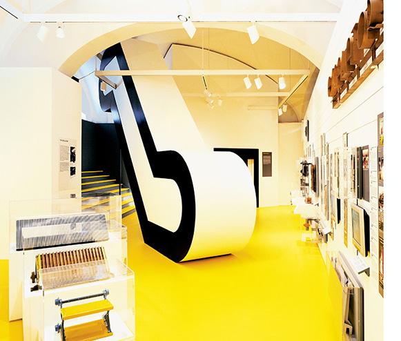
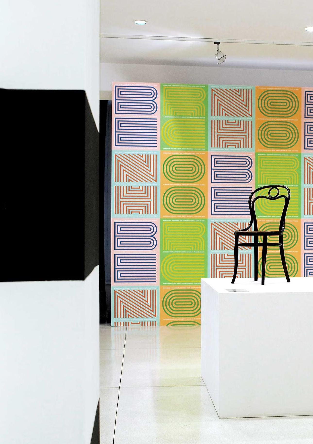
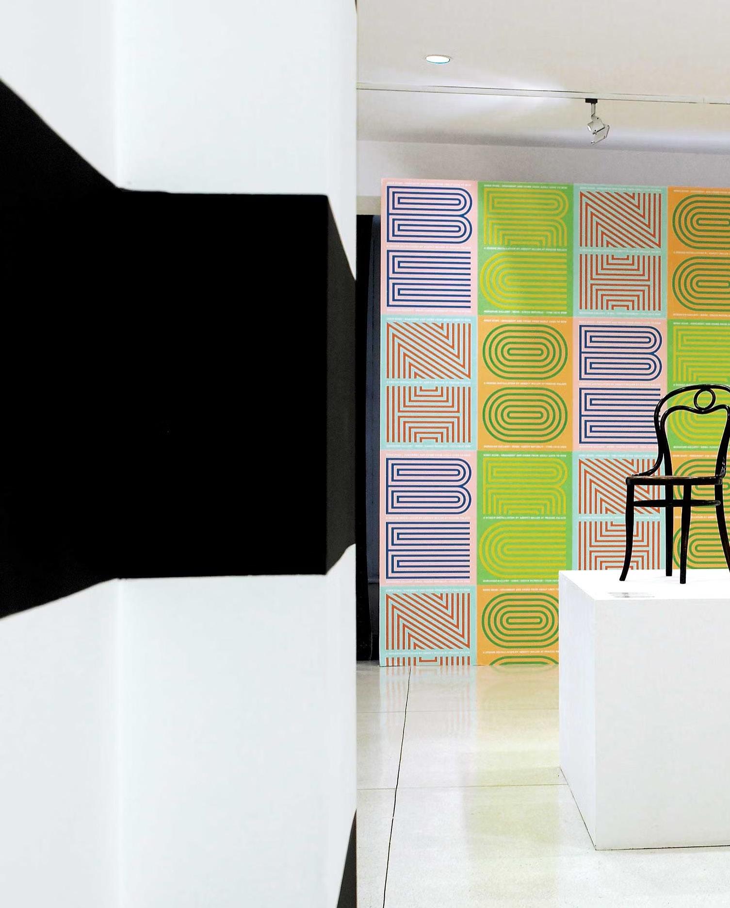
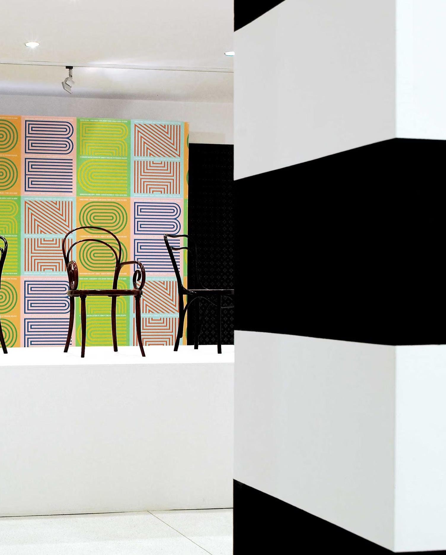
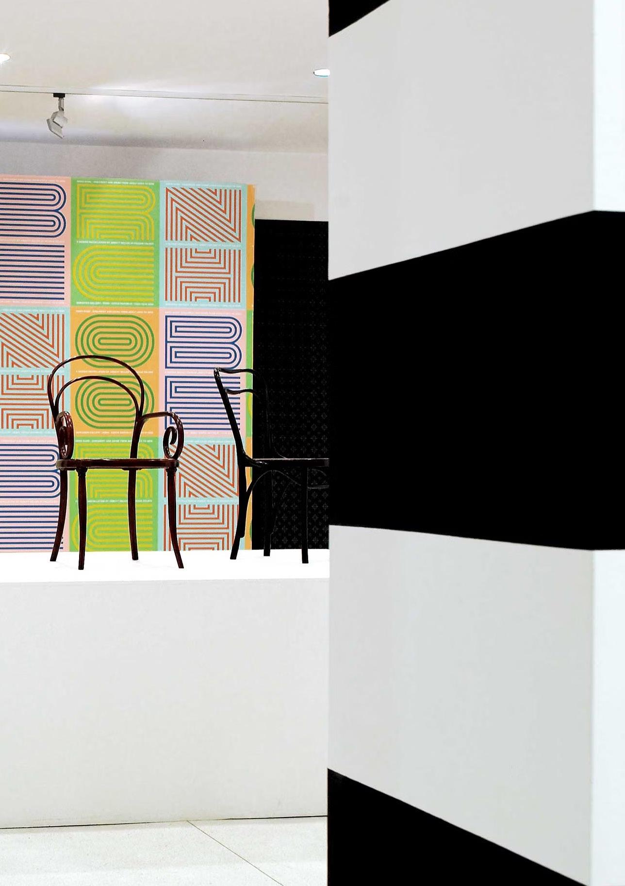
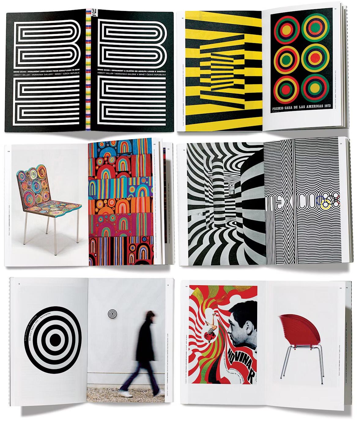
brno echo
Brno Echo: Ornament and Crime from Adolf Loos to Now (2008) was an installation I curated and designed at the Moravian Gallery, a museum in Brno, Czech Republic. The exhibition coincided with the 23rd International Biennial of Graphic Design Brno. The project staged a dialogue between historical and contemporary design on the topic of “modern ornament”.
Beginning with the original 1963 bienniel logo by designer Jiri Hadlac, I traced the history of concentric stripes in modern design. Adolf Loos, who was born in Brno, wrote Ornament and Crime, a 1908 manifesto that served as the contextual foundation for the exhibition. Looking at stripes as a recurrent grammar of modern ornament, the exhibition connected everything from the Wiener Werkstatte to Pop Art to retro-futurism.
The exhibition and book created a graphic echo chamber in which typefaces, posters, textiles, and furniture revealed a cosmopolitan dialogue that crossed time and place. Drawinguponinternational sourcesandthecollectionsoftheMoravianGallery, theinstallationfeaturedadozengalleriesandover150 works,includingalargemodelofLoos’sfamousunbuilt JosephineBakerHousefrom1928.Eachgalleryfeatured alargewallofhistoricorcontemporarywallpaper.The posterIdesignedfortheexhibitiontookHadlac’sBand extendeditintothetitleoftheshow. Wall texts featured statements from artists, designers, and writers commenting on the nature of repetition in contemporary life and the constant recirculation of forms and images.
Installation view of poster wall and Thonet chairs from Brno Echo, Moravian Gallery, Brno, Czech Republic, 2008
The publication for Brno Echo used facing pages to juxtapose historic and contemporary design.
“The publication for Brno Echo used facing pages to juxtapose historic and contemporary design.”
In the middle row, left, a 2002 chair by the Campagna Brothers is shown opposite a 1910 drawing for a textile by Otto Czeschka. The wall texts throughout the show revealed a frustration with the “humiliated repetition” (Roland Barthes) of contemporary life, set against the joyful profusion of forms and colours in the galleries.
swarm
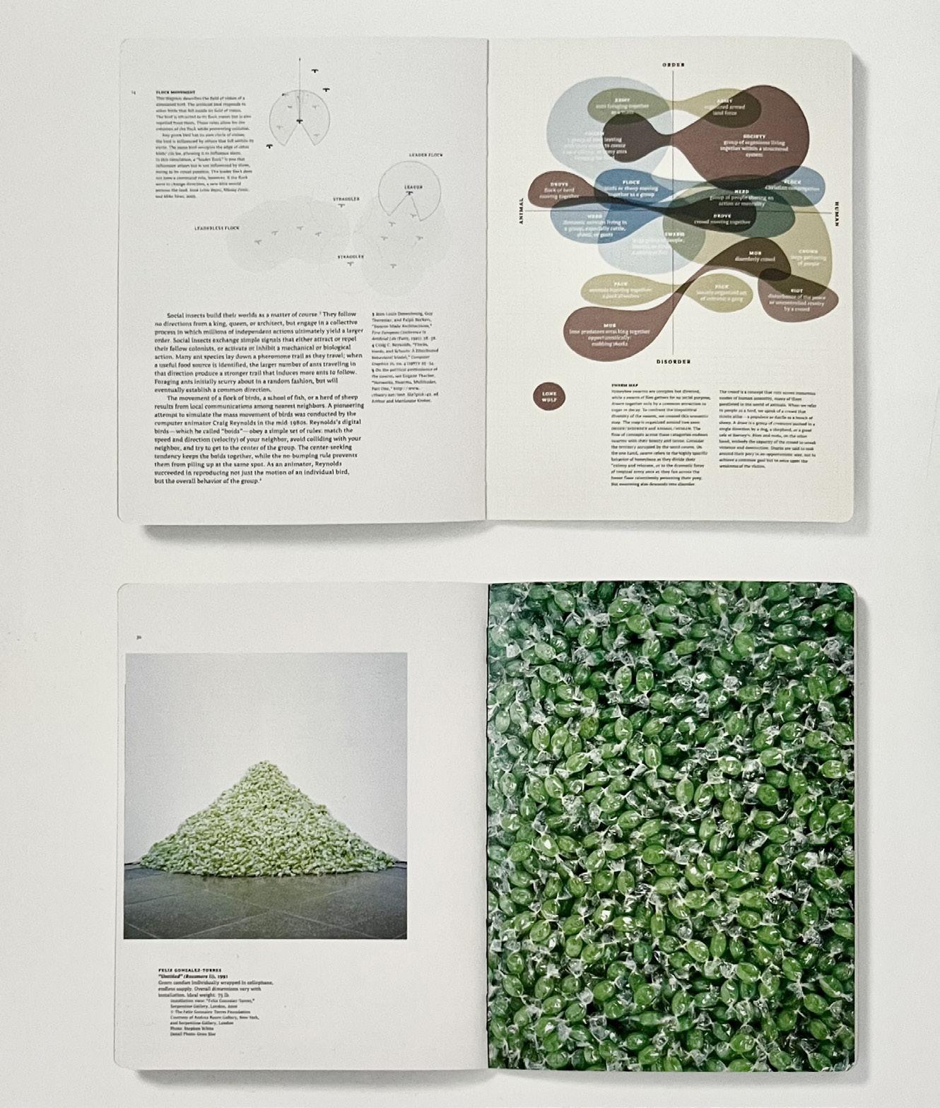
Contemporary art, science, design, digital media, and social theory have analyzed decentralized and unplanned modes of organization under the rubric of swarm theory. Swarm (2005) was an exhibition and publication I curated and designed with Ellen Lupton for the Fabric Workshopand Museum in Philadelphia. The project presented works by artists and designers influenced by the theoretical and visual effects of swarming, linking practices that aggregate masses of objects, images, data, and organisms.
A few artists—Paul Pfeiffer, Yanagi Yukinori, and Peter Kogler—incorporate the images and behaviour of insects. Swarm connected the social life of bees, birds, crowds, and cities to contemporary aesthetics, as seen in the fascination with how simple, discrete units accumulate into complex systems.
The catalog is modeled on a naturalist field guide and features information graphics of swarms occurring in the human and animal worlds—from army ants and honeybees to traffic and suburban sprawl.
Spreads from Swarm, featuring information graphics that analyze swarming in animal and human communities, and a sculpture by Felix Gonzalez-Torres. A view of the installation shows chairs by the Campana Brothers and paintings by Trenton Doyle Hancock.
design for a living world
The photographs grabbed my mind, and reading the text had to follow to piece together the story.Only a few photographs were featured in the original book, so I had to search for more to further explore this project and the “Design for a Living World” book.
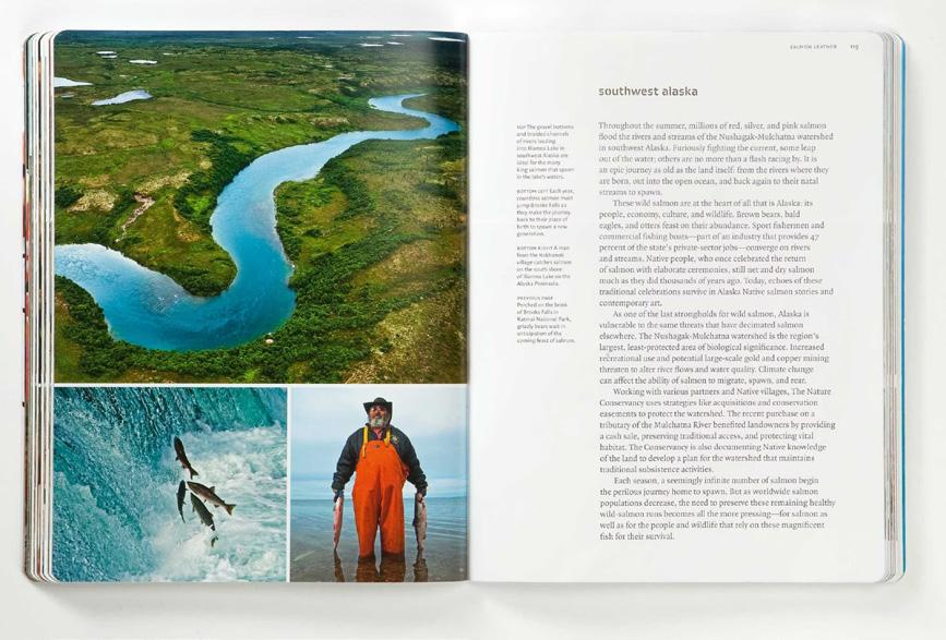
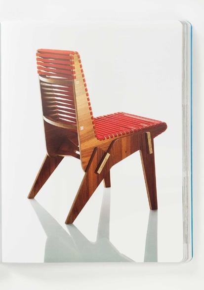
The Nature Conservancy commissioned us to create a project about design and conservation. The goal was to expand awareness of its mission by highlighting the conservancy’s work in communities around the globe. Our concept was to commission ten designers from the fields of fashion, product, and industrial design to work with sustainably grown and harvested materials from endangered ecosystems. Scientists at the conservancy identified provocative regions and materials, and we selected designers with natural affinities for the different materials.
Design for a Living World (2009) highlighted conservation and land management, as well as effectively showed how designers are inspired by materials. A critical part of the project was the documentary photography of Ami Vitale, who spent nearly a year travelling to each region, providing a powerful visual thread connecting our design of the exhibition, book, and website.
the only way to do it is to do it
The The only
The only way
The only way to
The only way to do
The only way to do it
The only way to do it is
The only way to do it is to
The only way to do it is to do
The only way to do it is to do it
What is this referring to? The only way to do it is to design? Or does this connect with the content behind each magazine? Its story? I’d read on but the designs that support this chapter appear to be old-fashioned magazines that don’t quite hold my mind.
I’m not sure how long this chapter is but my mind isn’t guided through by the imagery. I go back to the contents page, find the title of the next chapter along with its page number and I fast forward to “design is a measure of energy”...
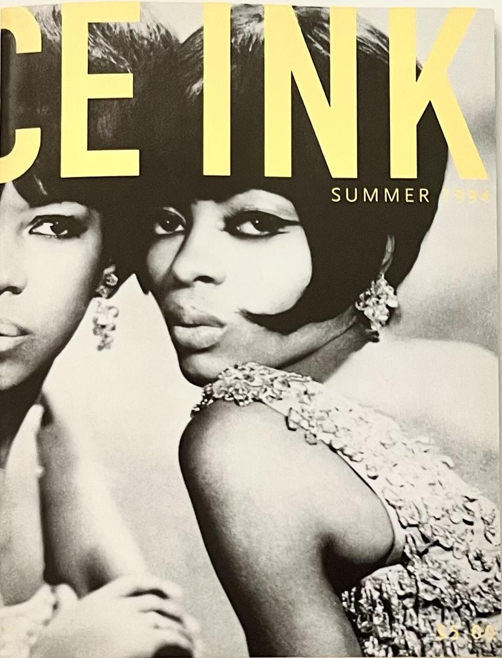
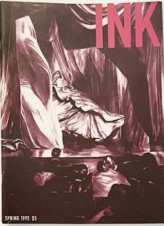
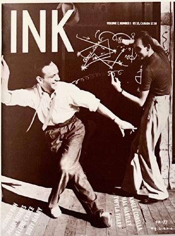
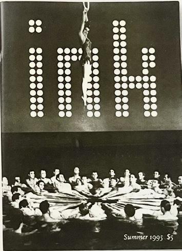
A range of covers reveal a playful approach to the magazine’s identity, ranging from the wrap-around treeatment for Diana Ross and the Supremes (1994), to a mysterious cover featuring a painting by Mark Tansey (1995). Esther Williams is lowered into water against a dotted version of Ink (1995) , and Fred Astaire adn Hermes Pan dance under a simple sans serif iteration (1996).
design is a measure of energy
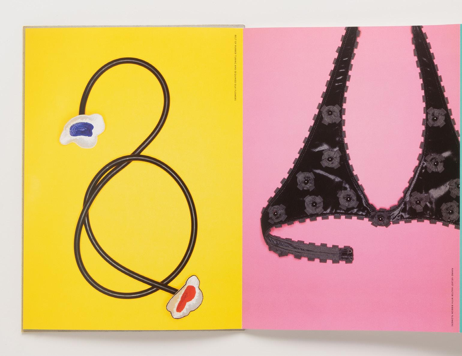
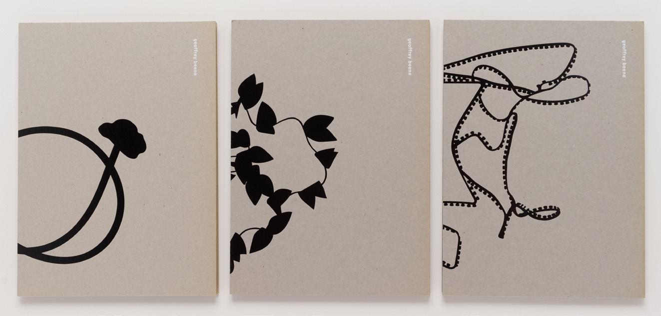
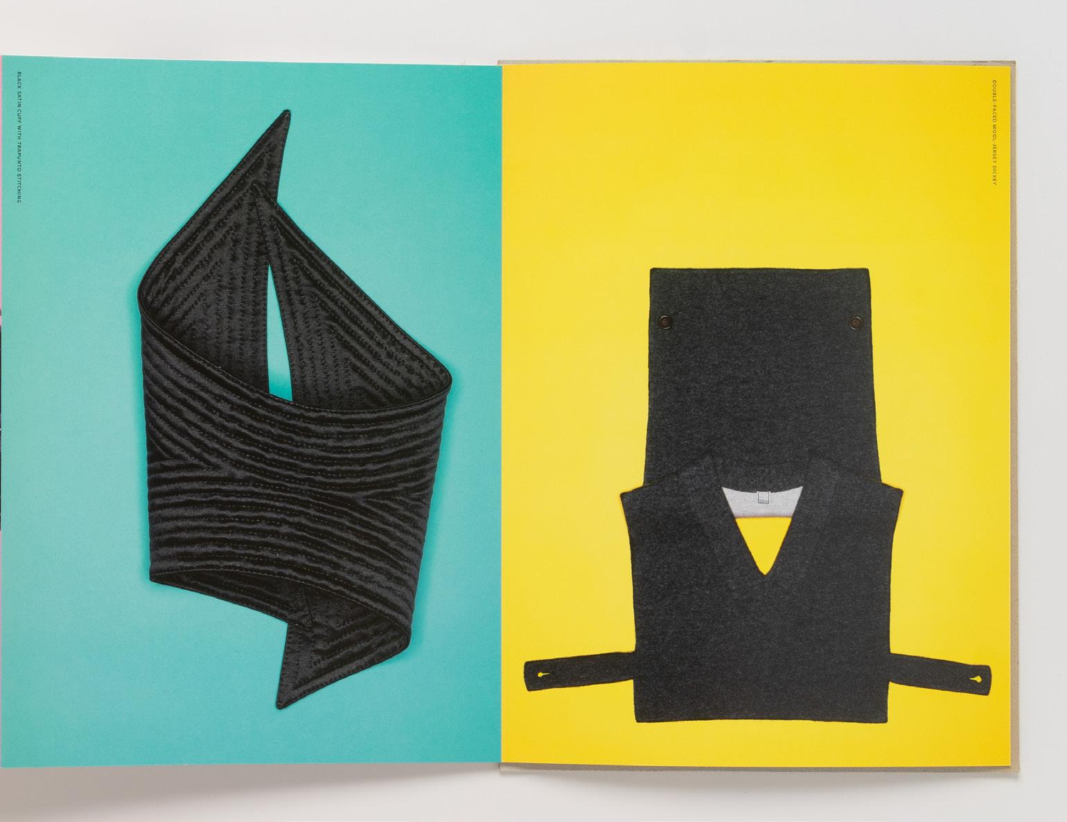
Formal and deliberate, his voice had a southern Truman Capote drawl. His hair was snowy white and his eyes were framed with large black glasses. The studio was hushed and reverential: I had already been warned to call him “Mr. Beene”, but still I was not prepared for the rarified atmosphere I encountered. Geoffrey Beene was —like his favourite flower, a house orchid—sustained by an elaborate support mechanism, yeilding bursts of beauty as long as the hushed down decorum of the studio was maintained.
I was mystified by the nature of our first meeting, but about a month later he asked if I would design one of his shows. He was frustrated by typical runway presentations, because he thought they failed to accurately show the clothing. Instead, he wanted to create a daylong exhibition with clothing shown on dress forms, allowing people to see the craft and detail. His refusal to play by the rules defined his career: he derived clarity and focus in his work by defining himself as an outsider to the preoccupations of the fashion industry. He could get swept up in pronouncements about the cynicism and ignorance of fashion, but then just as quickly start to rhapsodize about a button or a seam or a fabric that had caught his eye. One of his many sayings was “design is a measure of energy”, which conveys the sense of design as a distillation of complex forces, insight, and sustained attention.
He evolved his own lexicon, captured in shorthand phrases: “saints and sinners” (dresses that present a chaste image in the front with an unexpectedly revealing back), “new erogenous zones” (his emphasis on areas like the small of the back, or the collarbone or shoulder blades); and “geometry” (by which he meant triangles, a primary shape recurring in his work). His attitude about design was cosmopolitan, synthesizing influences from Japanese design, the Wiener Werkstatte, the Bauhaus, African textiles, and in a series of
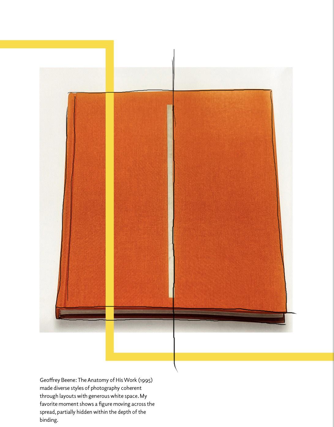
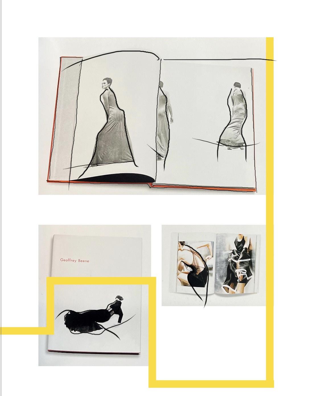
Geoffrey Beene: The Anatomy of His Work, 1995
appropriations, Pop Art and the vernacular of cartoons, football jerseys, and traffic signs. His work offered a rare combination of being both very cerebral and totally sensual.
I was privileged to have had a total immersion in his work: over the course of a decade I designed many of his shows on runways and in galleries, a retrospective, books, and graphics. Our friendship was close but formal, more like a student and teacher. Over the years I worked with him, his work and passion for independent design thinking made him a hero to those around him.
Geoffrey Beene: The Anatomy of His Work (1995) made diverse styles of photography coherent through layouts with generous white space. My favorite moment shows a figure moving across the spread, partially hidden within the depth of the binding.
Geoffrey Beene: The Anatomy of His Work, 1995
From editorial designs, to the style and striking colours incorporated by Miller, this is a work of art. As photographs take over a series of pages from Beene’s career, with pieces of written copy weaved throughout these pages also, my mind is constantly engaged.
1994
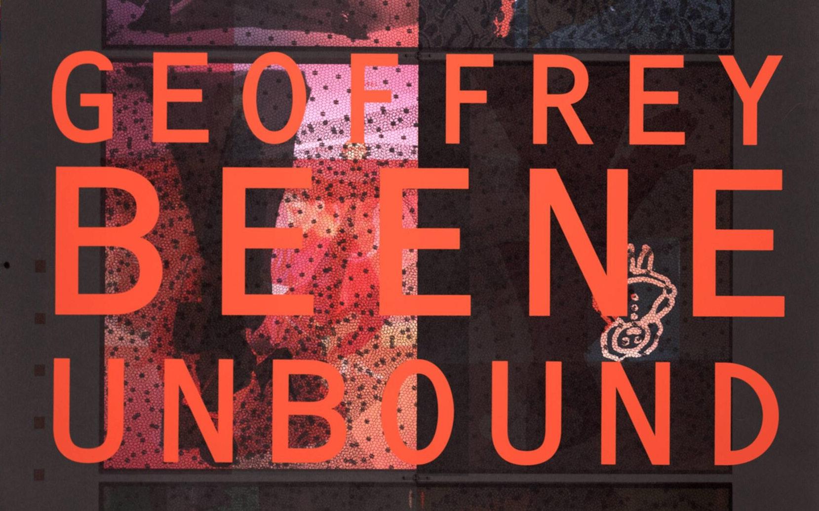
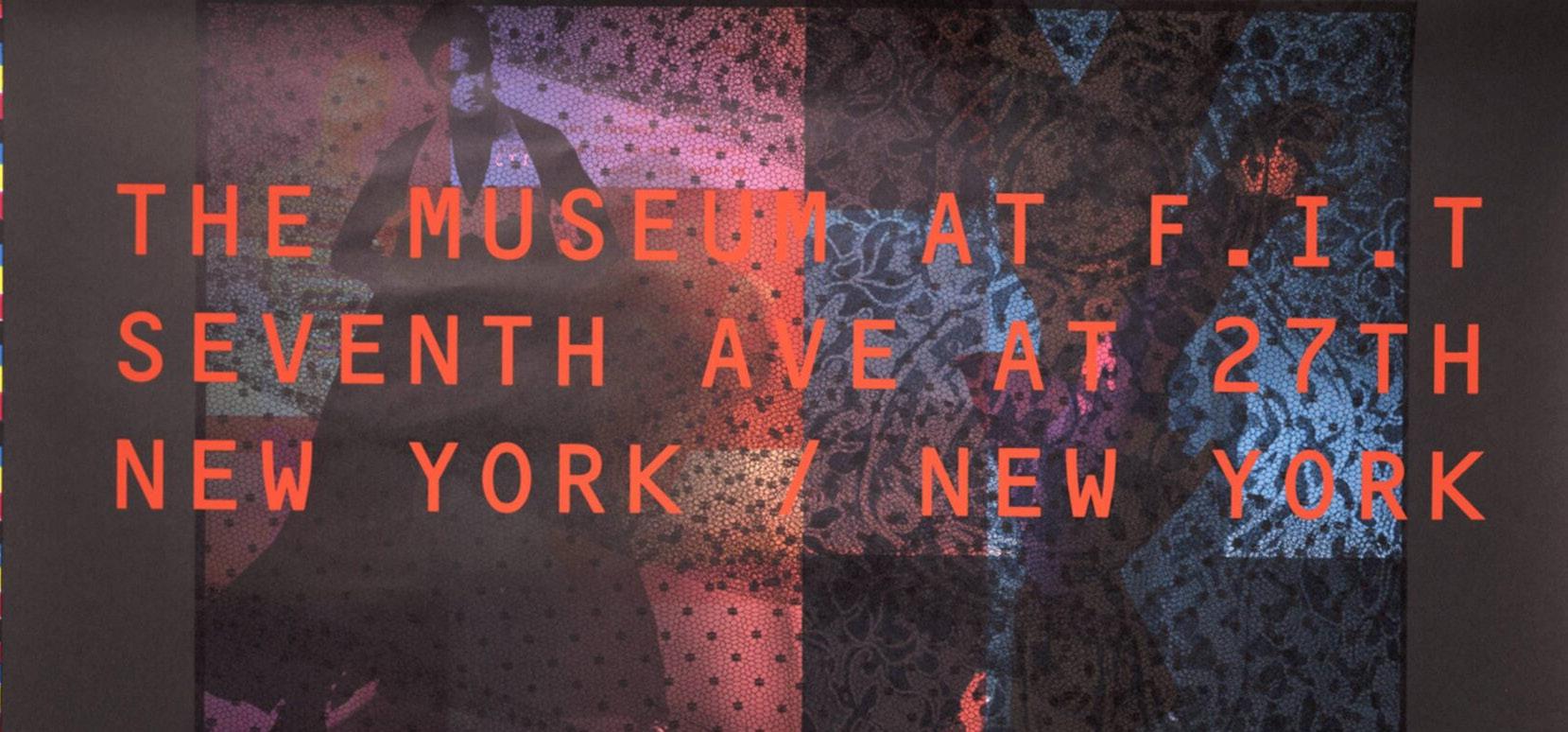
I designed and produced a book to accompany Unbound (1994), a Geoffrey Beene retrospective at the Museum of the Fashion Institute of Technology. Photographs by Josef Astor were shot with saturated coloured backgrounds. A pinking-sheared edge on the pages creates an immediate association between fabric and paper. A series of enigmatic short stories by Franz Kafka, in which clothing plays a central role, act as a counterpoint to the photographs.
The posters use the make-ready sheets for the book, unified by a silkscreened layer of orange text. The posters were wheatpasted on the street and within the tall entrance, accompanied by a figure atop a ladder completing the installation.
Unbound,
Geoffrey Beene,Unbound (1994)
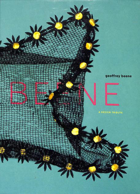
Geoffrey Beene: A Design Tribute (2005) celebrates the designer’s legacy, focusing on his inspiration from dance and inventive use of materials. The book was fabricated as a trio of accordion-bound documents within a slipcase. One side features details of accessories photographed by Jay Zukerkorn. The reverse side shows dancer Holley Farmer in photographs by Shoji van Kazumi. The publication includes essays by Patricia Tarr, Nancy Dalva, and myself.
a white cube is a black box
What is the meaning behind this title? What direction will this chapter take? Maybe it’ll be filled with lots of text, or the opposite and lots of photographs.The first photograph is a piece of editorial design for a magazine—in black and white. That’s something a bit different.Usually it’s colour that grabs and holds my mind, but this captures it in a different way. A way that reflects the title of the chapter.
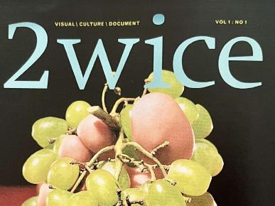
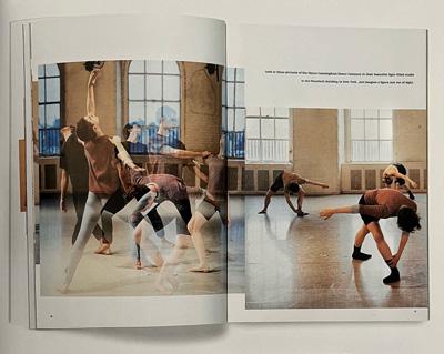
2wice was conceived as a biannual publication poised at the intersection of the visual and performing arts: a white cube in which to display art and a black box performance space for collaborations with performers and photographers. The editorial perspective is united by idiosyncratic themes that provide a starting point for essays and art direction. As editor and designer, I have been able to develop both its editorial content and its visual expression. When we published the first issue in 1997, 2wice was an exotic entry in the world of magazines, hearkening back to art- and design-driven publications of the past such as Flair, FMR, and Portfolio. The selection of photographers, writers, and performers is tied to the thematic direction, resulting in an eclectic array of contributors. Our strongest issues present a deft mix of original research, writing, and inventive imagery. Several issues are devoted exclusively to a collaboration with a single choreographer. Our latest 2wice projects move our black box collaborations into the realm of film and digital media.
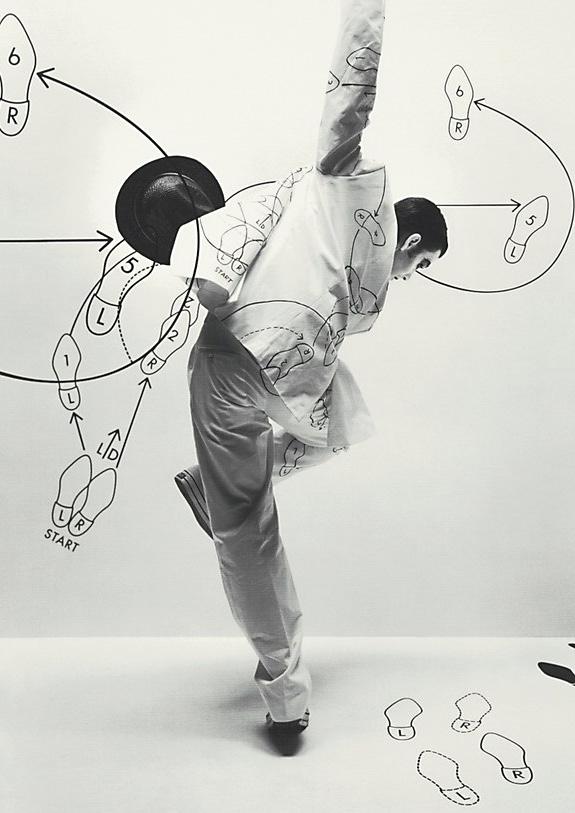
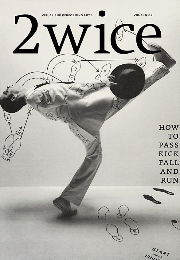
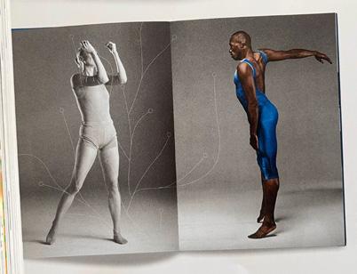
How to Pass, Kick, Fall, and Run (2007) borrows its title from a 1965 dance by Merce Cunningham. The issue explores the theme of “how-to”, ranging from conceptual art to 1950s etiquette. In a series of photographs shot by Jens Umbach, dancer Tom Gold performs amid dance notation, shown as a 1920s constructivist in a proletariat jumpsuit and in a white suit covered in graphics from a 1950s “how to dance” book.
2wice: How to Pass, Kick, Fall, and Run, 2007
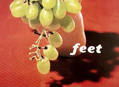
2wice Feet edition, 1997
2wice Feet edition, 1997
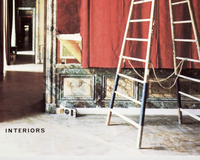
2wice Interiors edition, 1997
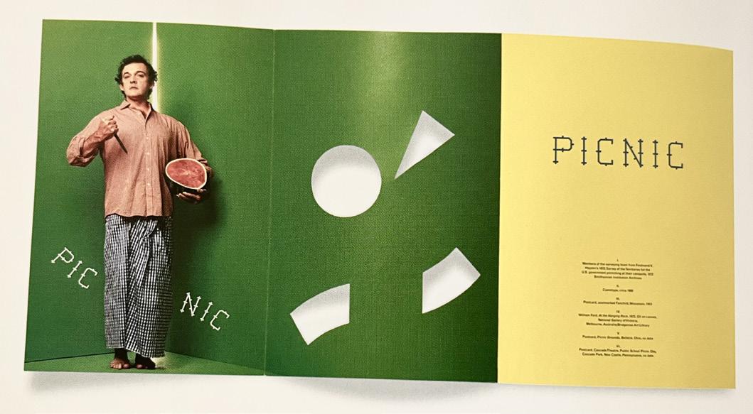
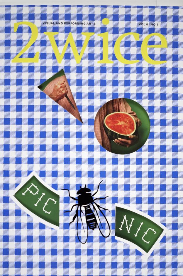
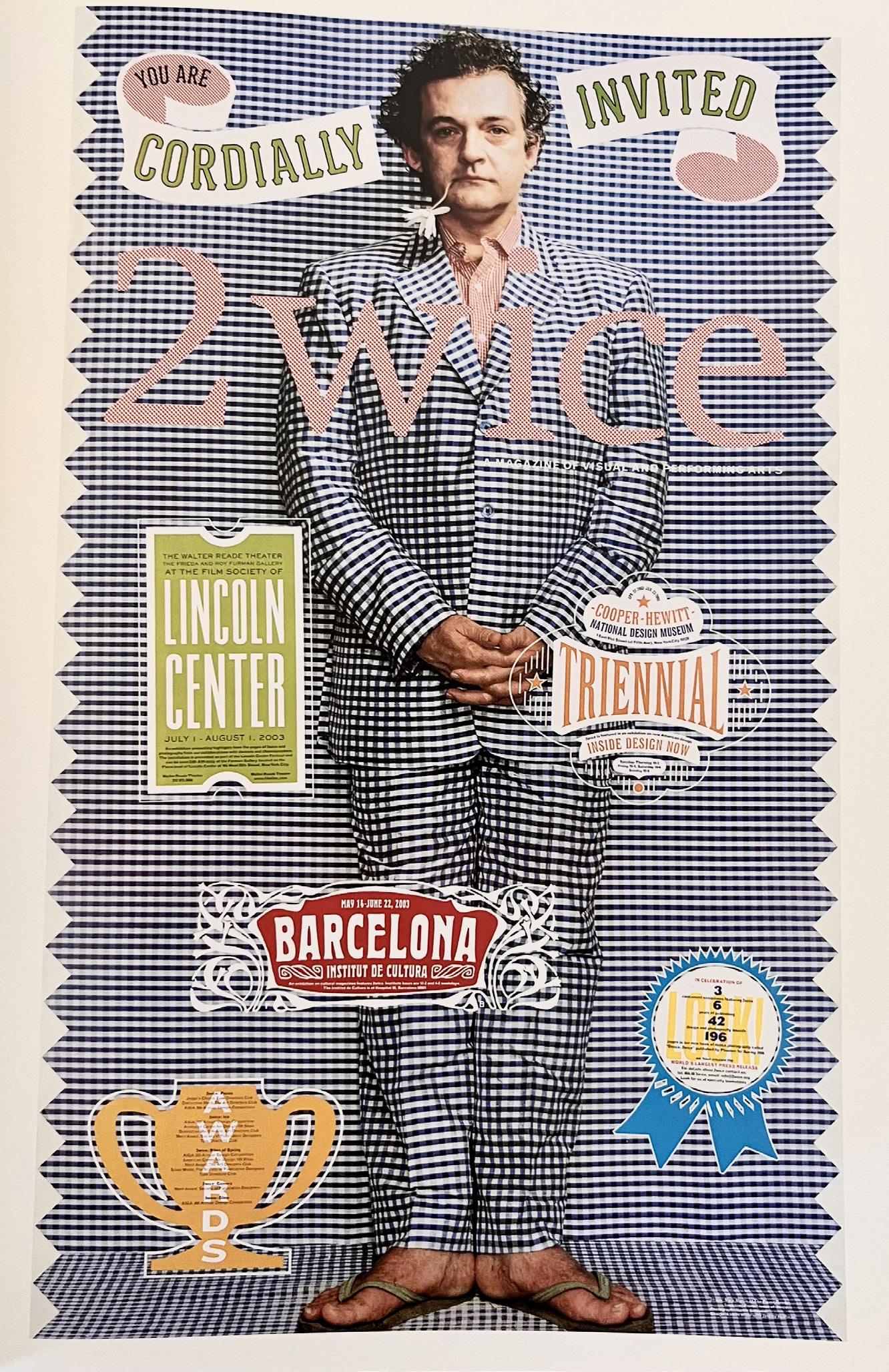
A page that features one magazine cover and inside pages. This makes so much more sense than different issues flying around.I get to really understand about this issue—Picnic from 2003. The longer I look at these photographs, it suddenly clicked in my mind. The areas where part of the cover have been cut into to reveal layers beneath what we the eye can initially see.
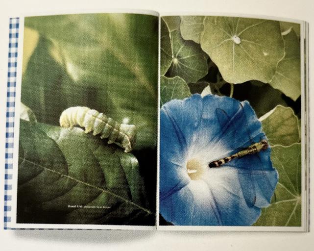
Picnic (2003) explores rustic and rarefield social rituals of dining en plein air. I commissioned a Honk Kong tailor to create a gingham suit for choreographer Mark Morris. His friendly picnic persona is featured on a life-size poster celebrating awards and exhibitions for 2wice, but his vengeful knife-wielding picnic warrior is hidden under the flaps of the cover. Sarah Blodgett’s close-up photographs of insects are a reminder of the natural world.
2wice Picnic edition, 2003
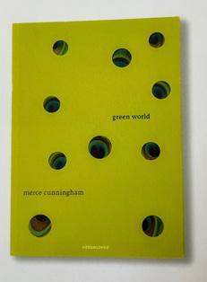
Green World (2007) is an ambitious restaging of Merce Cunningham’s 1994 dance Ocean in the gardens of Vizcaya, a historic estate in Miami. The issue unfolds slowly, meandering through the gardens at dawn, glimpsing statuary amid the lush vegetation. Cunningham carefully arranged every movement during our daylong shoot. In Katherine Wolkoff’s photographs, the dancers emerge like peacocks with an eruption of iridescent blue within the dense green of Vizcaya. Once the dance is completed, the pages capture details of the vegetation, the surface of the water, and the creatures that inhabit the garden.
Photography figures prominently in the thematic evolution of 2wice Camera (2001) looks at the role of the apparatus, including different types of cameras, lenses, and brands of film. Everybody Dance Now (2009) is devoted to Martin Parr’s photographs of social dancing, taken over the course of thirty years.
How to be a Guru (2007) captures practice sessions at the Merce Cunningham studio. Photographed by Katherine Wolkoff, the images are arranged as a panorama across sixteen pages, using the windows to define scale adn ryhthm. In the same issue, images from a rehearsal at Mark Morris’ studio are knit together to describe a full rotation through the studio. The bars of the Mozart score of the dance provide a graphic baseline to the layout.
Armitage Alphabet (2006) is a collaboration with choreographer Karole Armitage. The issue creates a narrative arc through the transformation of the sets, color, and graphic reproduction techniques. The ensemble of dancers were placed in a landscape we created with a system of internconnecting branches designed by Ronan and Erwan Bouroullec. The images, photographed by Patrick Giardino, were manipulated through alternations of color and resolution.
A chapternever-endingshowcasing a series of magazines.The“2wice”front covers jump out from each page as they are all so different, but the reasoning behind them is left behind in the text as pages are quickly turned.But why do these pages stand out? It’s the colours, the title—how it isn’t always bold, but observing the cover careufully it becomes clear.The closer you look, more elements are revealed—from the backdrop, to the title, to perhaps the meaning.There
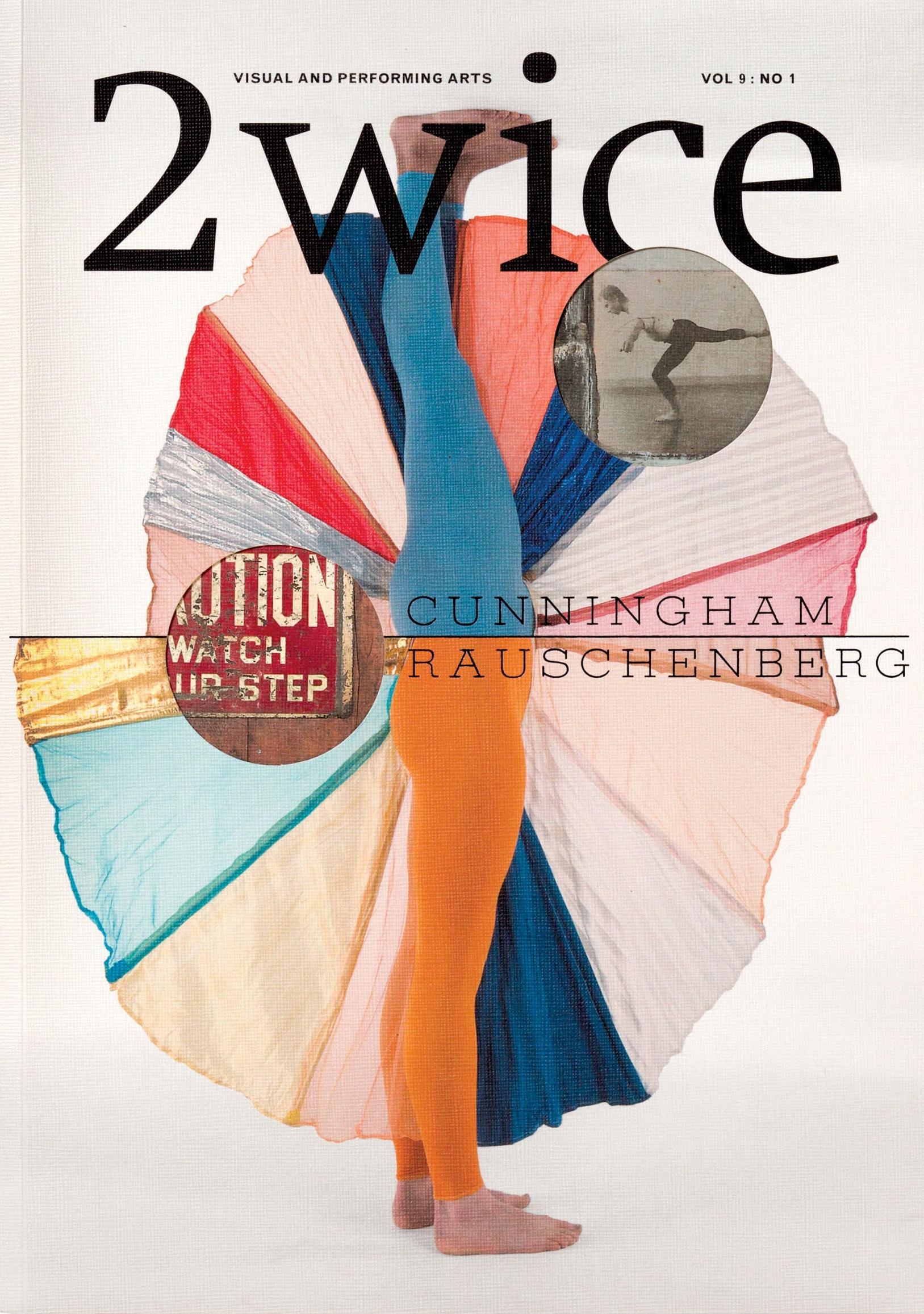
Cunningham/Rouschenburg (2006) features costumes created by Robert Rauschenburg for dances choreographed by Merce Cunningham. Many of these groundbreaking works—produced from the 1950s until 2007—were never properly documented. We restaged the dances with Cunningham directing every movement on the set for photographer Joachim Ladefoged.
The images were over the edges of the Japanese binding, suggesting a continuous performance space. Titles of the dances punctuate the space, rendered in metallic foil stamped letters, set in a custom typeface called 2wice Egyptienne by Chester Jenkins.
At a party to celebrate the launch of the issue there was a memorable moment when I was having a conversation with Cunningham. Rauschenburg, and Jasper Johns, three icons of modernism gathered around 2wice
My mind is immediately caputured by a new direction in the chapter and this is revealed through photographs.This reminds me of the title—’a white cube is a black box’.This is perhaps the first time that this chapter *actually* makes sense to me.I think back to the photographs I’ve been observing, and they make even less sense now.
Fifth Wall (2012) is an app that conceives the digital tablet as a new performance space. My concept for Fifth Wall was to construct a box based on the exact proportions of an iPad, collaborating with choreographer Jonah Bokaer to create a dance that responds to the slippery orientation and gravitational dynamics of the device. Bokaer’s performance took place within a shallow box that confounds a fixed sense of gravity, highlighting the way the user’s movement and interactions constantly impact the representation of the dance. The accelerometer— the mechanism that reorients the screen by shifting between landscape or portrait view in response to the user’s orientation—provided a foil to the movement of the dancer.
To the “ natural” disorientation of the medium, we added several in-camera pivots from landscape to portrait, as well as full rotations of the box itself (pushed by me), revealing the constructed nature of the box. The user can move and rescale individual boxes as they display full motion video, and also select frame-within-frame views. The footage was shot by Ben Nicholas and the app was programmed by Eddie Opara and his team at Pentagram. The original score is by So Percussion.
Dot Dot Dot (2013) creates a playful parallel between the touch-screen interface of the digital tablet and the performance stage.
Dots
Dots and more dots...
One of the most memorable pages in the book. Such simple visual work but one that jumps from the page. The concept behind the shapes are hazy in my mind but I begin to visualize... What happens when this is taken into the world of a digital tablet? Is it interactive? Or is it a video? Or is it static? The large “blob” in the middle from the paint bucket is a distraction in itself. Eventhough the whole page communicates visually, this is one point that caputures my attention but quickly the mind wanders from this point.As each circle follows the same pattern, size and structure, it’s easy to focus on these areas and for reading to go off track.What if each circle was a differentsize? You can tell that my mind wandered here...
The Ink Collection, 2011
patterns create patterns from patterns
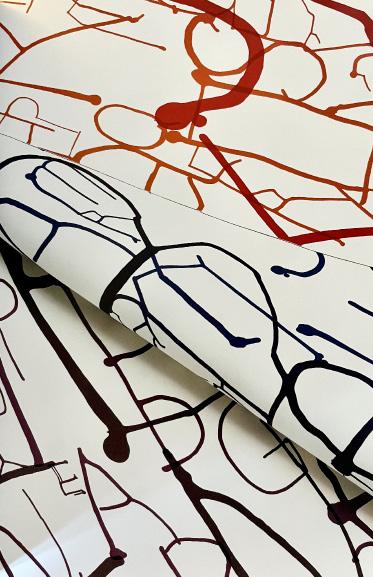
The degradation of avant-garde artistic practices into the kitsch of mass culture is often illustrated by Jackson Pollock’s drip paintings, which “inspired” wallpaper, Formica, and other surfaces. The Pollockto-Formica story has been portrayed as a cautionary tale of how serious fine art becomes banal when pressed into the service of daily life. Designers don’t face these anxieties and are, instead, inspired by the opportunity to bring their work into everyday life.
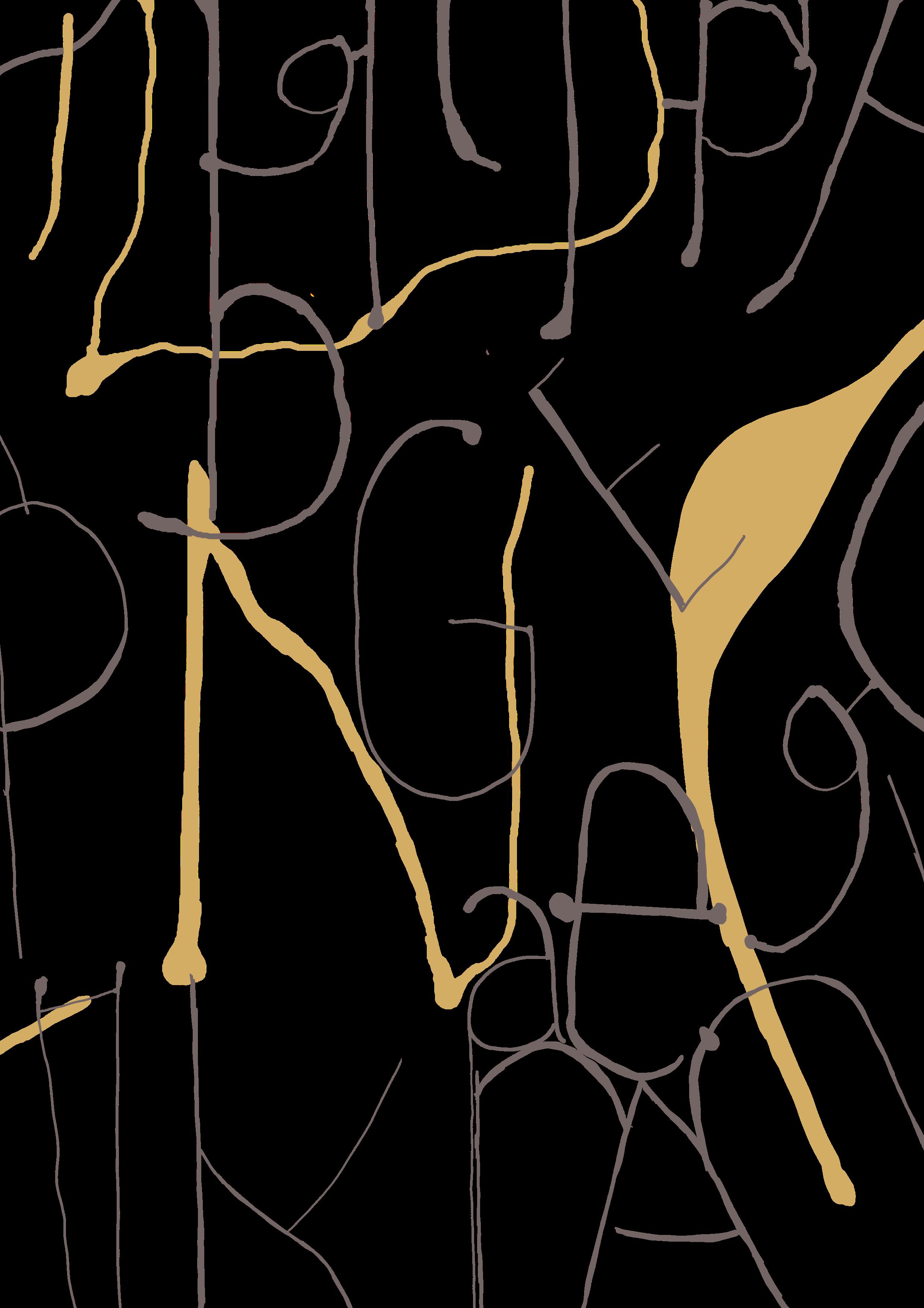
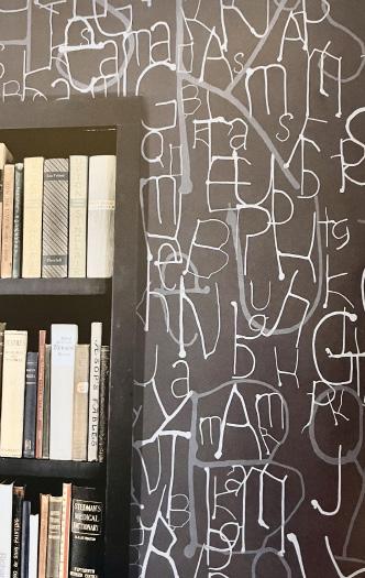
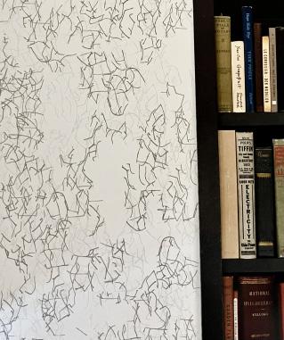
When I was invited to design wallpaper for Knoll, I decided to derive patterns from the raw materials of my work by using typographic forms. While “normal” uses of type involve optimizing scale, spacing, and margins for legibility, creating patterns from type meant setting it for purely optical effects. I called the first series of patterns the Grammar Collection, referring to the idea that typography forms a visual grammar, as well as alluding to the literary dimensions of type. A second collection called Ink investigated the behaviour of ink on paper, reflecting on the status of wallpaper as ink on vertical spaces.
In designing a series of patterns for Formica I was drawn to the idea of creating something inspired by the medium of print. Because Formica begins life as a sheet of printed paper, I developed patterns that refer to offset printing: the transparency of ink, the minute scale of dotscreen, and the different values created through benday dots.
I was so captured by this wallpaper that was created using ink, I tried to replicate the original using a digital drawing software— alongside reading this chapter... maybe not the best idea for someone who wanted to concentrate on the pages.Without even reaching the text to support this project, my mind was focused on recreating lines—considering the placement of letters, angles, colour, and style of line too.This looked managable at first but the power the ink had in the original artwork was hard to reiterate in a digital format. Although a challenge, it was therapeutic in the way I could step away from the book whilst understanding the design at the same time.
After attempting to recreate one of the designs, I was determined to read the piece of text that supporteed this project.As someone who has studied surface patterns previously, this part of the chapter was gripping.
The Ink Collection (2011) was generated through drawings that explored the behaviour of ink on paper. The patterns were derived from: dots formed by plopping ink from a dropper, branching clusters formed by tilting the surface of the paper and letting ink run, and letterforms that resulted from deliberately “steering” the ink to form them.
The Grammar Collection (2006) was based on the repetition of typographic characters to create a densely woven texture. The patterns carry the spirit of the fonts they are based on but suppress the recognition of individual marks. The spaces between characters provide hints of the forms—brief cracks in a wall of signs.
a book is a movie you hold in your hands
Books collapse space and time into volumes that, like an accordion, expand and contract with the action of reading. They are physical objects of a certain size and weight, and they are also akind of “score” for the reader’s experience. Designers affect both aspects, determining a book’s appearance—how it feels in a material sense—as well as how a reader navigates its terrain. Throughout history, books have “learned” from other media. In the 1920s, El Lissitzky and Laslo Moholy-Nagy reexamined the book in relation to avant-garde experiments in photography and cinema. These relatively new media reinvigorated the tradition-bound medium of book design. Photography allowed designers to conceptualize the book as having an experiential dimension analogous to film, thereby opening up new ways of thinking about the structure, rhythm, and content of books.
The simple and instinctual act of turning the pages of a book is as elegantan interface as any imaginable. A new lexicon of interaction is evolving in digital media that will steadily influence the physical form and conceptual organization of printed books as well as their status and distribution. But as new media defines new models for authors, designers, publishers, it simultaneously refines our
Turning the page and seeing a new chapter—it’s refreshing.I can put the book down.Take some time to breath and reset my flying mind.The chapter title seems grabbing, but this can be a thought for when I pick up the book next...
notion of what is specific to the medium of the printed book. Design in books is especially interesting now because digital media is forcing us to claim, defend, and define the their physicality. Inventive uses of materials and techniques can bring a tactile and sensual dimension to books that deepens the reader’s experience. Books are a temporal and spatial arena—an immersive space whose wholeness is characterized by cuts and folds and the “thickness” of the user’s interactions. Books may aspire to be filmic, but they want to seduce the hand as well as the eye.
The role of the book designer is to deepen the connection between form and content, to make books a vivid and irreplaceable medium for authors, readers, and designers. This is especially important as texts migrate into other media, proliferate into myriad formats and excerpts, and become increasingly “placeless”. Just as certain businesses depend upon brick-and-mortar environments to establish their identity and authenticity, certain types of content demand a compelling physical realization. The fundamental pleasure we take in books—their their combination of stability and tactility—sets a high bar for the evolution of electronic interfaces. Books remind us of a statement by Charles Eames: “Take your pleasures seriously”.
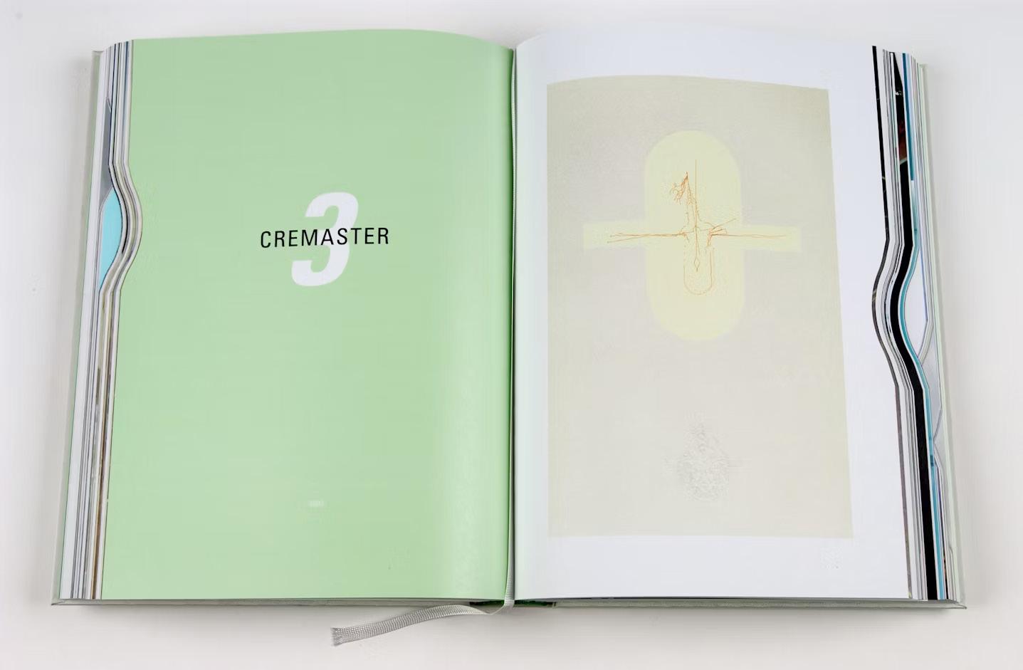
After making my way through the chapter introduction, the first project is the “Cremaster Cycle” from 2003. Before I reach the text, my eyes are instantly drawn to the pages that are cutaway at the side to indicate the chapter’s within the book.What a clever way of playing into the book’s form.It’s an easy way to go straight to the chapter you’re looking for— as opposed to flicking through numerous pages—and searching for the big “3”.How much simpler would this make the process of picking up a book, to then feeling where your next page starts? It interacts the reader with not just the content, but the form too. Just this page alone supports the title of this book—”Design and Content”.The text to support this should be interesting to read...
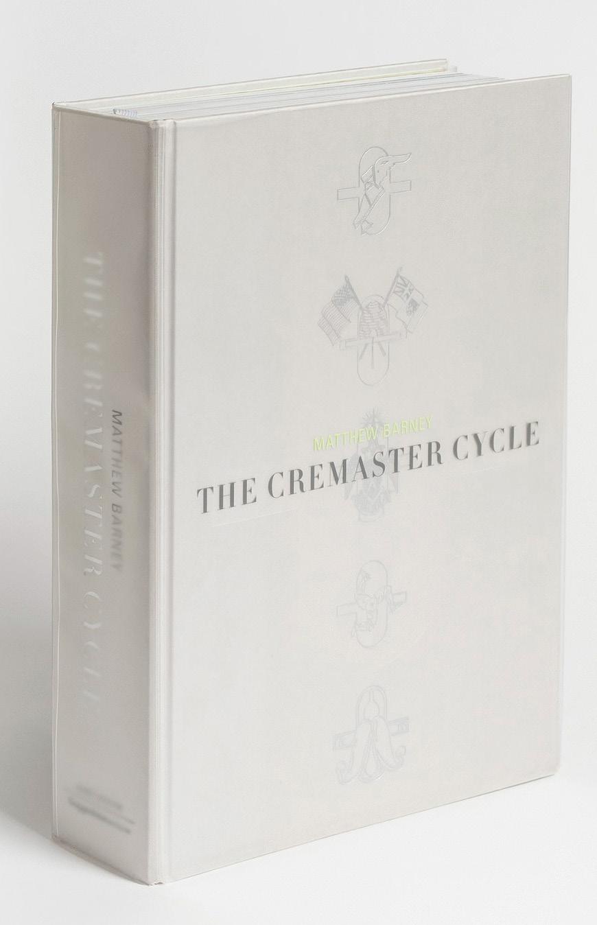
The Cremaster Cycle (2003) documents Matthew Barney’s epic five-part film and the drawing, photography, and sculpture he produced as part of that oeuvre. Curated by Nancy Spector, the exhibition occupied most of the Guggenheim Museum. The book functioned as a catalog to the exhibition and a guide to the sensibilities and themes of the project. The greatest challenge was how to organize so much material. During our meetings in Barney’s studio a large wall was covered with the storyboard for Cremaster Five, then in development. Location shots, drawings on notecards, images of sculptures in progree, and photographs torn from magazines were pinned in a sequence that roughly tracked the narrative arc of the film. We seized on the storyboard’s mix of sources as a way to structure the book, avoiding a more straightforward organization by medium.
With its large format, self-consciously elegant typography (Didot), and wide margins, the book design references the refined and analytical character of an encyclopedia. Exaggerated thumb tabs mark the beginning of each film in The Cremaster Cycle. Through precision, detail, and depth, the book parallels the obsessive nature of Barney’s practice. It uses the language of rational exposition to present work whose coordinates are sexual, psychological, and irrational.
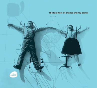
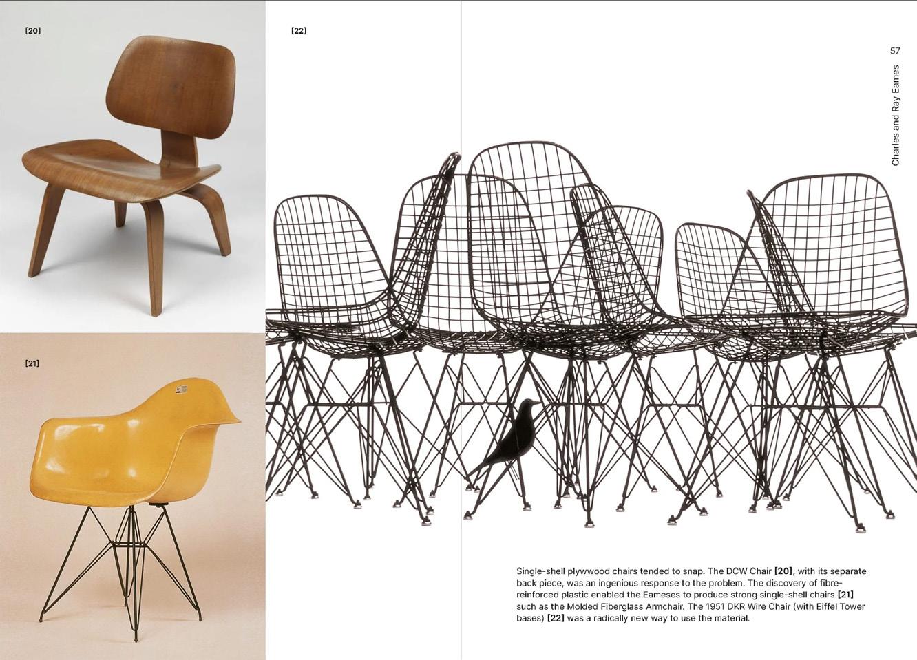
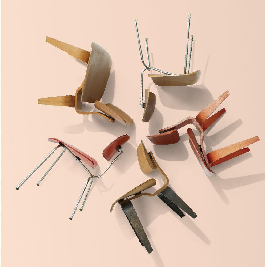
The Furniture of Charles and Ray Eames (2007) was designed for Vitra, the Swiss Company that has manufactured Eames designs foro the European market since the 1950s. The book shows the larger context of the Eameses’ practice and the way in which the designers pioneered different constructive techniques in furniture. The mixture of historic and contemporary images required a specific strategy for staging their relationship. I developed a kind of “shelf” that runs through the book: archival images are seen as a backdrop to the contemporary productions. The horizontal flow of content is divided into sections by a yellow “speed bump” that announces a new zone of content. The ovoid “vitra eames” logo was a collaboration with Tibor Kalman, who first introduced me to Rolf Fehlbaum, the visionary CEO of Vitra.
The Furniture of Charles and Ray Eames, 2007
The furniture of Charles and Roy Eames.I recognise the designs, the chairs, the final products. I had to search more examples of inside pages just to see more sketches and the history throughout the designs.When searching inside pages online, I was looking purely at photographs, and admittedly not reading the text that runs parallel to these.I sometimes think the images speak louder than words in this instance.With a journey illustrated through drawings and photographs, this book clearly captures the essence of this furniture.
The cover of a book that I found from searching online that follows the same path as the one included in the book. It wasn’t designed in this order, but this is the way it jumped out for me.The image first, followed by the title and author, and finally the publishing company. By looking at the cover image first I could absorb all aspects of the photograph and the contents it holds.
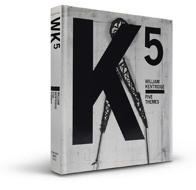
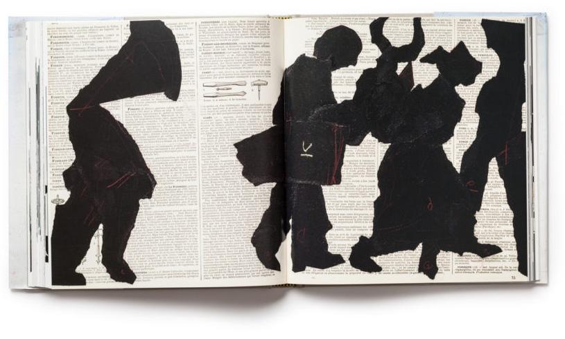
William Kentridge: Five Themes (2009) was produced for a retrospective of the artist’s films, drawings, and sculpture. Telescoping across the page, individual frames convey the nature of the Kentridge’s approach: each frame is a discrete drawing in itself but also part of a sequence that builds into a filmic whole. Smaller frames emphasize growth and progression over time by gradually stepping up in size until the fill the entire space of the page. The compositional strategy has a gravitational pull toward the bottom of the page, creating a ragged skyline.
William Kentridge: Five Themes, 2009
Positive and negative space.
The style against the columns of text and sketches.
Thr rough edges of the paper figures against the carefully curated text in the backdrop.
Just this alone grabs my attention—over the meaning...
This was not what I was expecting
The front cover catches my mind before it turns the page so my eyes hover over the page.What is the image of? What is the effect? A sophisticated photogaph with no title—the content lies purely inside the pages that follow.Maybe if I read the text it’ll reveal more about the content.
As for the form, it’s similar to “The Cremaster Cycle” with each page cut into—but this time in the same place as it runs from the start to the end of the book.
Scanning: The Aberrant Architectures of Diller + Scofidio (2003), a catalog for a retrospective at the Whitney Museum of American Art, features the architects’ designs for sets and installations, objects, furniture, and buildings. Sly and subversive, the work in the show dealt with the social and psychological aspects of architecture, technology, surveillance, and global media. The book reflects their fondness for complexity: images wrap around the outer folds of the Japanese binding: perforations at the edge of each page invite readers to tear the book open, revealing images printed on the undersides of pages; elliptical cuts create openings that reveal strange scenes played out in the hotel rooms and offices cubicles. The cover features an eight-stage lenticular photograph that animates the hydraulics of a “syringe cocktail”.
At first glance, the pictures may not reveal the purpose behind the book, but the text does.The intent and meaning behind cutting into pages—how images wrap around pages Whilst I’m reading along the lines, with a clear mind (and whilst remembering that I’m absorbing such information—this is a positive view of mind wandering and one that doesn’t distract from the text or make words printed on the page feel invisible with a loss of meaning).
Suddenly out of nowhere—where a sentence or sequence of words quickly loses my attention, the next words I read are “hotel rooms” and “cubicles”. What does this have to do with the show and installations? I notice there are only a few more lines so I forget about this and read on. One question I had when I first saw the front cover was how the image on the front cover was achieved. The last lines answer this—”a lenticular photograph”.This makes sense as the photograph looks to be in stages and edited together, but what actually is meant by “lenticular”? This is a question for another time so I turn the page...
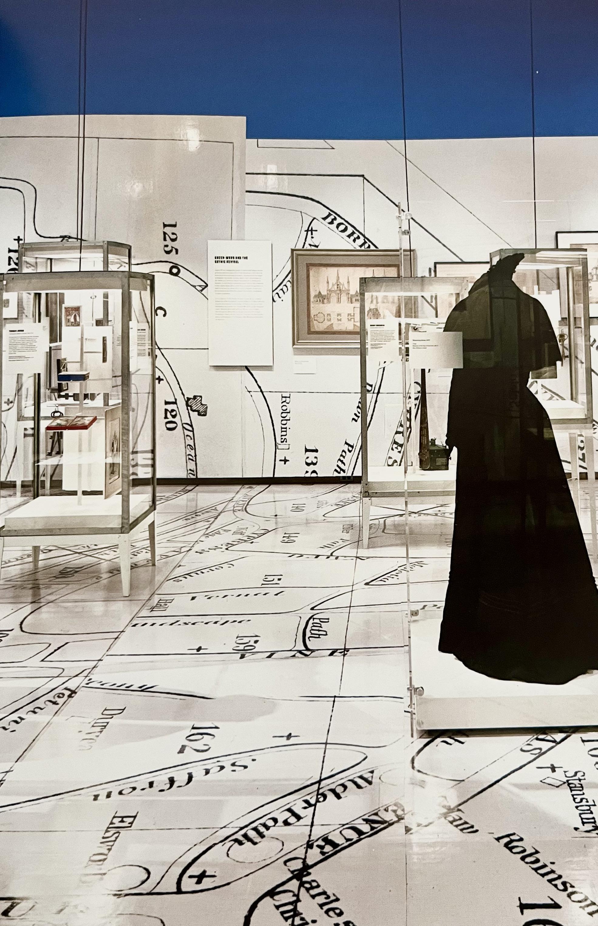
A Beautiful Way to Go: New York’s Green-Wood Cemetery, 2013
an exhibition is a room with a plot
Exhibition design creates a physical and interpretive context for objects and images. Unlike the pages of a book, an exhibition presents things in real space and time, delivering a visceral experience that cannot be communicated through reproduction. The environmental dimension of exhibitions connects them to architecture, interior design, and stage design, but their basis in storytelling and interpretation brings them back to editorial design. Exhibition design is a choreography of objects, images, texts, and people: the design shapes how things look and helps audiences construct meaning. Exhibitions simultaneously “stage the object” and “stage the observer”. In making decisions about how an object is displayed or a story is told, designers and curators position not only the objects but also the viewers, anticipating their needs and provoking their interest. Exhibition design constructs a stage for both the objects and observers.
The roots of exhibition design are in the fundamentally modern activity of collecting and displaying objects, from the scientific presentation of specimens to the arrangement of goods for sale. From early cabinets of curiosity to the modern museum, techniques for presenting objects and images—frames, pedestals, vitrines, and dioramas— have developed into a repertoire of display strategies. In the 1920s modernist designers and artists reinvigorated (perhaps invented) exhibition design by shifting the emphasis from object to observer. Pioneering exhibition designers such as Frederick Kiesler, Herbert Bayer, El Lissitzky, and Lilly Reich delineated the viewer as a social and dynamic agent whose perceptions are shaped by his or her position in space and time.
In contemporary exhibition design,
Our design for an exhibition about a famous nineteenth-century cemetery creates an environment tableau from historic maps. Visitors navigate the exhibition encountering objects and stories that are positioned according to their location within the landscape.
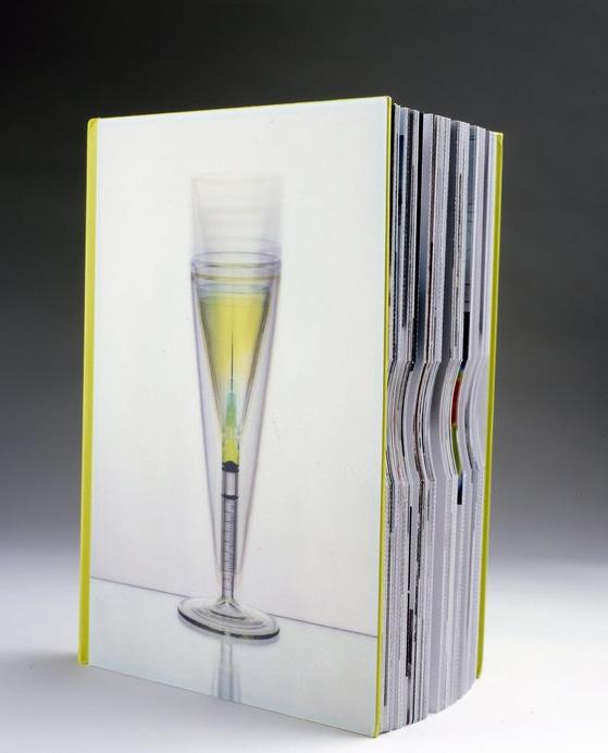
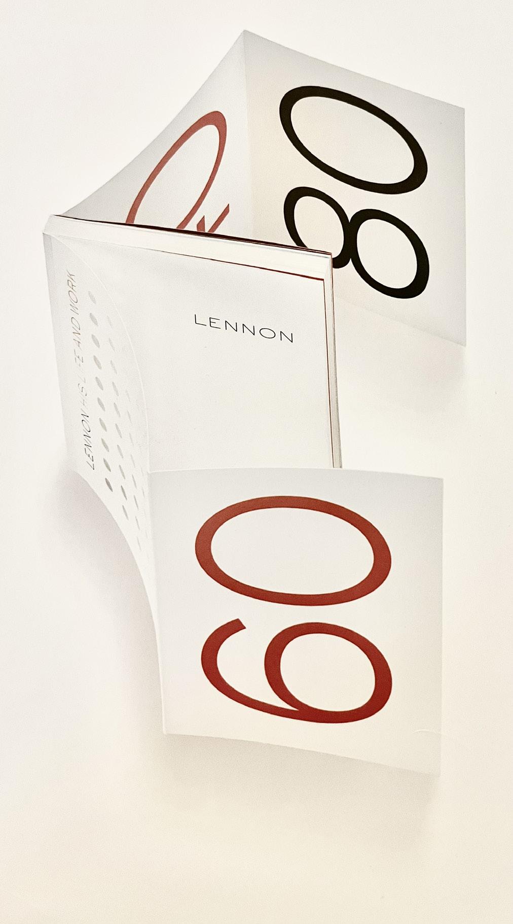
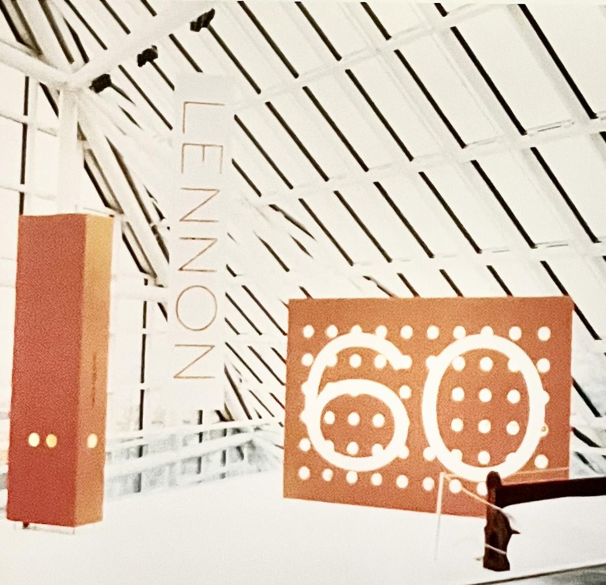
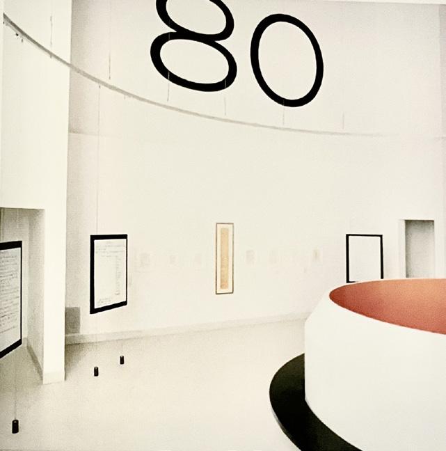
John Lennon: His Life and Work (2000) was both a celebration and a memorial, since it was produced on the sixtieth anniversary of his birth and the twentieth anniversary of his death. Curated by Jim Henke at the Rock and Roll Hall of Fame and Museum, the exhibition was done in close collaboration with Yoko Ono. In our first meeting in the Dakota building, she took us into her bedroom and showed us the plastic-wrapped evidence bag that was returned to her after Lennon was killed, and his glasses, which sat on her dresser covered with dried blood from twenty years earlier. She wanted to feature both items in the exhibition to advocate for gun control.
The evidence bag and the glasses were visible through small portholes in a vertical cenotaph marked with the date August 7, 1980. Adjacent to this was a large vitrine with sixty lenses holding snapcshots and personal effects from Lennon’s life. The sixty holes were also featured on the cover of the book.
In contrast to the predominantly dark and theatrical exhibitions at the Rock and Roll Hall of Fame, the Lennon installation followed the spare white-on-white and Fluxus-inspired sensibility of Yoko Ono’s work. Many of the photographs in the book and exhibition featured John and Yoko in white clothing in their all-white apartment, playing their white grand piano.
The main exhibition space presented Lennon’s guitars, piano, and artifacts from his career with the Beatles and his later collaborations with Yoko. Visitors ascended a spiral stair to a square, high-ceilinged gallery, where we displayed original manuscripts of his lyrics. Eight panels placed around the gallery featured enlarged lyrics; in a random sequence the sound of each sone emerged from the graphic, using the membrane of the panel as a speaker.
A circular light fixture illuminated the space, highlighting a sequence of large numbers high on each wall: 40 for the year he was born, 60 for what would have been his sixtieth birthday, 80 for the year he died, and 00 for 2000, the year in which the show was held.
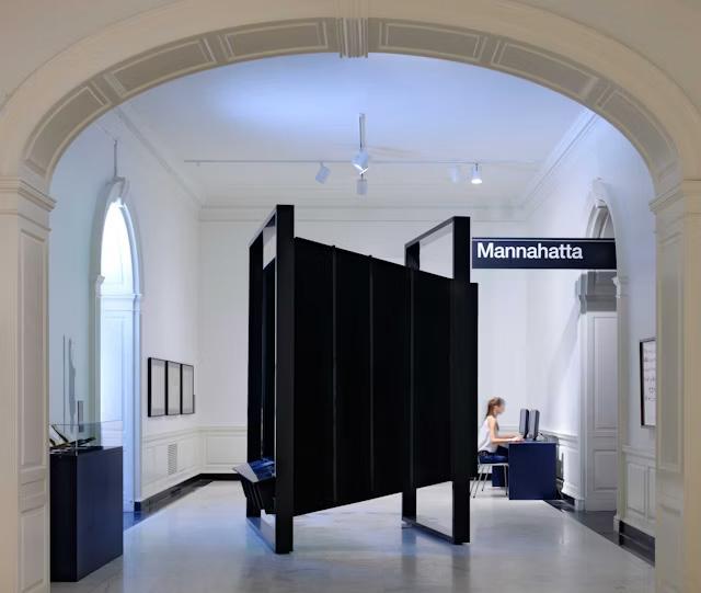
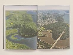
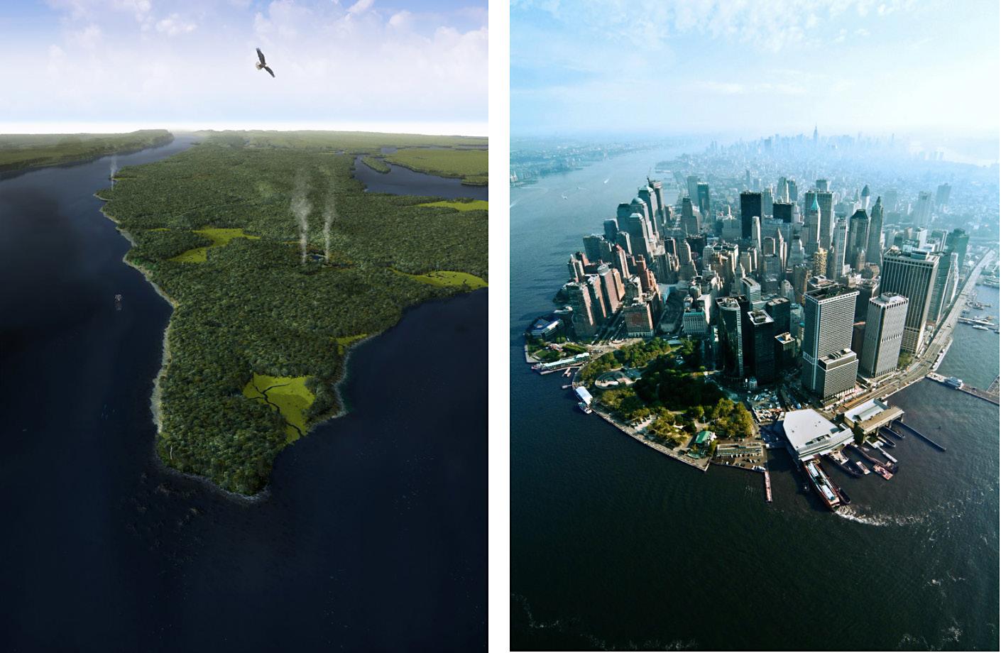
Mannahatta (2009) represented a ten-year research project on the ecology and wildlife of Manhattan four hundred years ago, when it was sparsely populated by Lenape Indians. Conducted by landscape ecologist Eric Sanderson, the study used sophisticated sampling and mapping techniques to provide an amazingly detailed picture of the geography, plant life, and wildlife of Manhattan. Markley Boyer used this data to visualize these “lost” landscapes, creating a series of compelling images that became
the focal point of the Mannahatta book and an exhibition at the Museum of the City of New York. Structures that recall large-format cameras were situated within the gallery, placed in relation to a topographic model of Manhattan, presenting layers of information through digital projection. Different regions and geological features were identified through their historic names but in the style of the New York City subway graphics.
Mannahatta exhibition and photographs, 2009
This purpose behind this exhibition is one that we don’t think about enough.It’s an idea I think about but have never looked into.Without reading the text, I have one idea that this could be about. But I go onto read it anyway to first make sure it’s what I’m thinking—and also to have a better insight into the project, photographs, and exhibition.
“New York City, a Concrete Jungle”
Three-dimensional glyphs
Broken glyphs
Lost glyphs
Glyphs that are still identifiable eventhough they’ve been disrupted... Why is this?
Have they been combined with photographs? How have they been made?
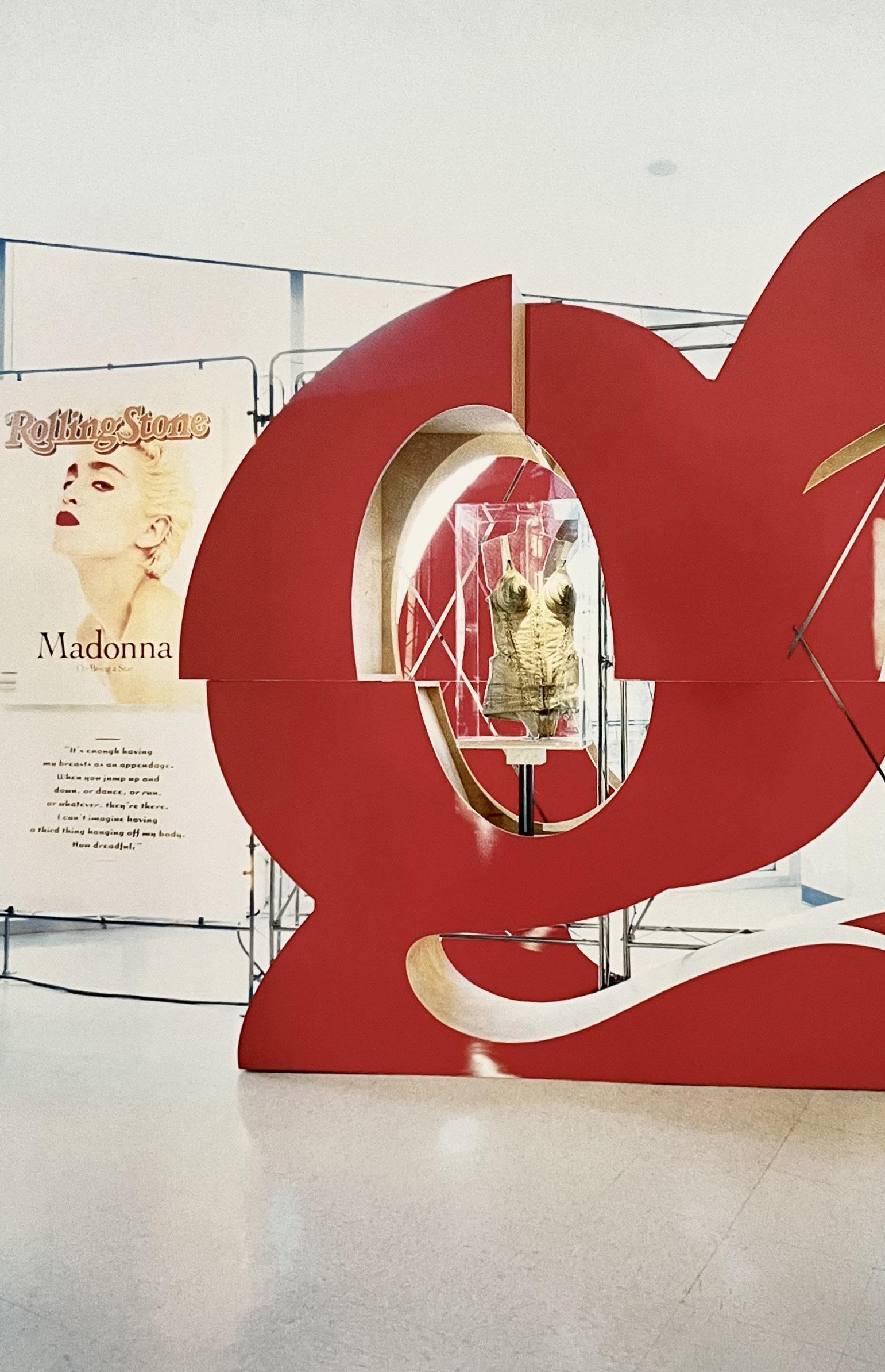
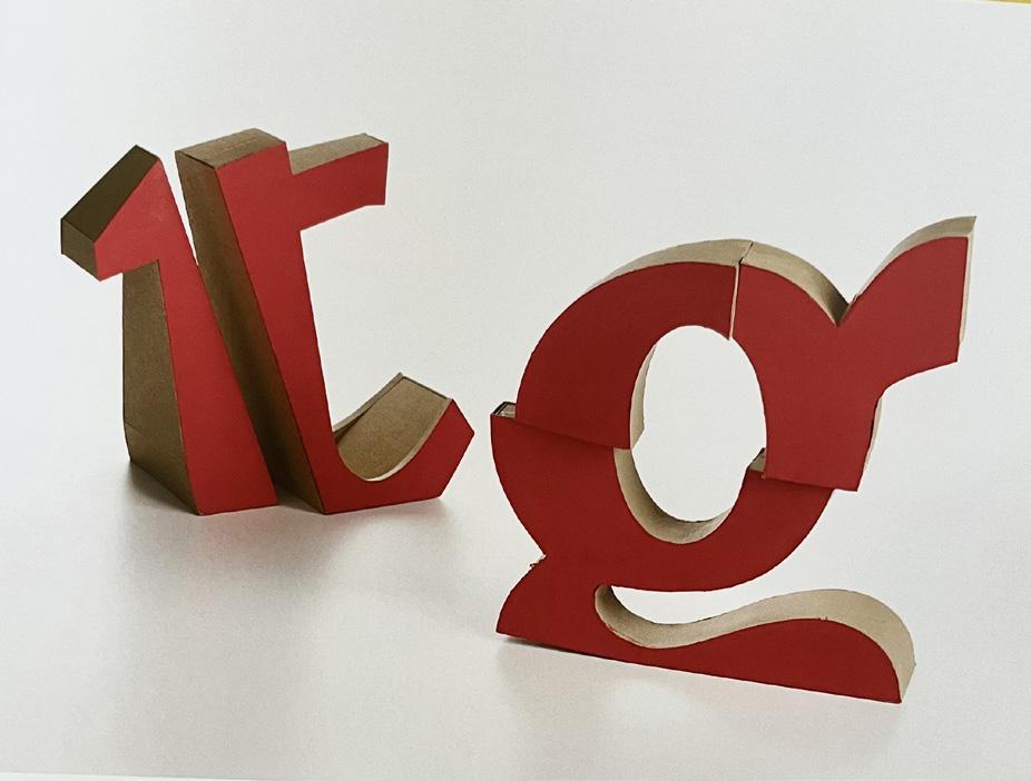
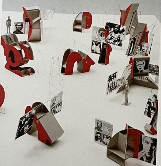
The Rolling Stone Covers Tour (1998) exhibition celebrated thirty years of the magazine’s iconic covers. We designed a landscape of sculptural letter fragments derived from the distinctive forms of the magazine’s logo. In a series of models we experimented with different ways of rendering the letterforms, using photographic collages to visualize their effect as built forms. It was first exhibited in New York City and traveled to over fifty different locations; the fractured forms of the letters and light boxes were designed for fast breakdown and installation. Because of their sculptural character, the composition of elements could dramatically expand and contract in response to different spaces.
The Rolling Stone Covers Tour exhibition, 1998
exhibition—curated by Judith Hoos Fox at the Davis Museum—showed that the traffic between “high” and”low” culture moves up and down, but also sideways. We created a “domestic” context by installing a structure in the middle of the gallery that recalled a modernist house of the 1950s. Visitors approached the gallery from above, where concentric rings on the roof of the house—similar to the diagrams that plotted the scope of radiation fallout in the event of nuclear attack—alluded to the pervasive paranoia of the era. The radiating rings also signalled the role of sound in the exhibition, which featured music that emanated from within the house. Visible from all points within the space, the word MODERN was set in eighteen-foot-tall Monotype Grotesque, overlaid with different definitions of what modern means in the context of art, politics, and literature. On both ends of the gallery we vastly enlarged a collage of furniture shapes that Irving Harper had developed for an exhibition at the Museum of Modern Art. I was struck by how they distilled the powerful dialogue between art and design that characterized the period. We contacted Harper and he graciously granted us permission.
Cold War Modern: The Domesticated Avant-Grande (2000) examined how elite and pupular culture influenced one another in the post-World War II period. Including art, design, and music, the exhibition—curated by Judith Hoos Fox at the Davis Museum—showed that the traffic between “high” and”low” culture moves up and down, but also sideways. We created a “domestic” context by installing a structure in the middle of the gallery that recalled a modernist house of the 1950s. Visitors approached the gallery from above, where concentric rings on the roof of the house—similar to the diagrams that plotted the scope of radiation fallout in the event of nuclear attack—alluded to the pervasive paranoia of the era. The radiating rings also signalled the role of sound in the exhibition, which featured music that emanated from within the house. Visible from all points within the space, the word MODERN was set in eighteen-foot-tall Monotype Grotesque, overlaid with different definitions of what modern means in the context of art, politics, and literature. On both ends of the gallery we vastly enlarged a collage of furniture shapes that Irving Harper had developed for an exhibition at the Museum of Modern Art. I was struck by how they distilled the powerful dialogue between art and design that characterized the period. We contacted Harper and he graciously granted us permission.
Cold War Modern: The Domesticated Avant-Grande (2000) examined how elite and pupular culture influenced one another in the post-World War II period. Including art, design, and music, the exhibition—curated by Judith Hoos Fox at the Davis Museum—showed that the traffic between
permission.
Cold War Modern: The Domesticated Avant-Grande (2000) examined how elite and pupular culture influenced one another in the post-World War II period. Including art, design, and music, the exhibition—curated by Judith Hoos Fox at the Davis Museum—showed that the traffic between “high” and”low” culture moves up and down, but also sideways. We created a “domestic” context by installing a structure in the middle of the gallery that recalled a modernist house of the 1950s. Visitors approached the gallery from above, where concentric rings on the roof of the house—similar to the diagrams that plotted the scope of radiation fallout in the event of nuclear attack—alluded to the pervasive paranoia of the era. The radiating rings also signalled the role of sound in the exhibition, which featured music that emanated from within the house. Visible from all points within the space, the word MODERN was set in eighteen-foot-tall Monotype Grotesque, overlaid with different definitions of what modern means in the context of art, politics, and literature. On both ends of the gallery we vastly enlarged a collage of furniture shapes that Irving Harper had developed for an exhibition at the Museum of Modern Art. I was struck by how they distilled the powerful dialogue between art and design that characterized the period. We contacted Harper and he graciously granted us permission.
Cold War Modern: The Domesticated Avant-Grande (2000) examined how elite and pupular culture influenced one another in the post-World War II period. Including art, design, and music, the exhibition—curated by Judith Hoos Fox at the Davis Museum—showed that the traffic between “high” and”low” culture moves up and down, but also sideways. We created a “domestic” context by installing a structure in the middle of the gallery
My mind is instantly drawn to the exhibition photographs. The abstract shapes, and the contrast between black and white as they take over the wall. Wanting to know more, I’m subconsciously directed to the text. As I start reading, the correlation between words and their meaning, is long and they no longer support photographs. What have I missed? Did I wander before I set eyes on the very first word? Were the shapes on the wall a distraction? Their boldness surrounding a simple space with few colours.We’ll never know.
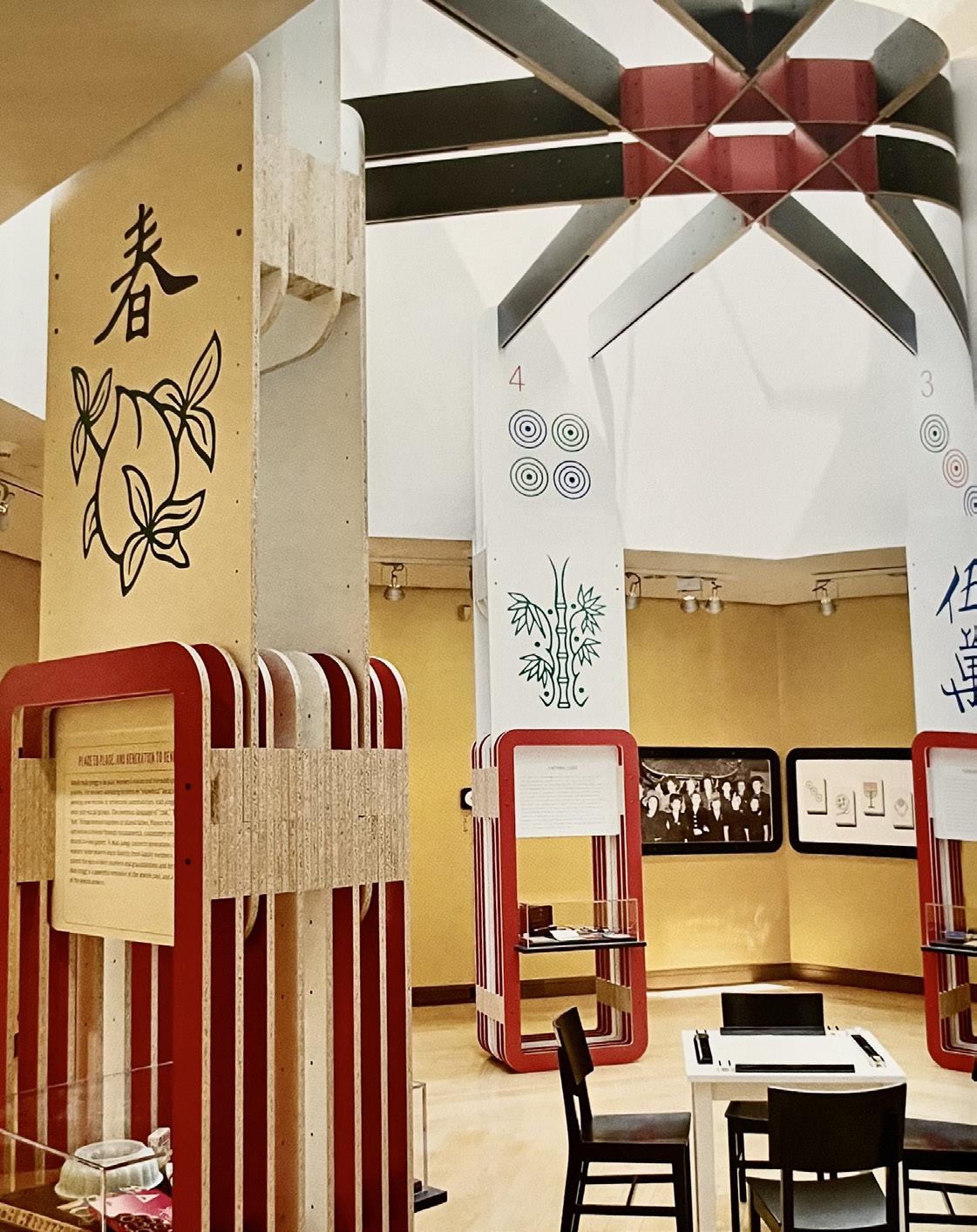
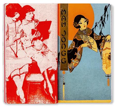
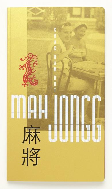
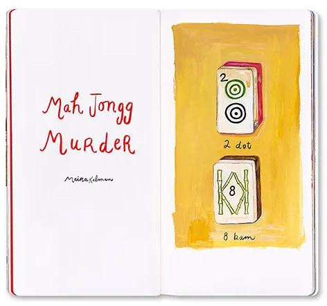
Mah Jongg: Crack, Bam, Dot (2010) was developed as a traveling exhibition and book documenting the biocultural heritage of the game. Curator Melissa Martens, from the Museum of Jewish Heritage, proposed the concept for the show and together we developed content for the book that explored the intersection of Asian and Jewish cultures in the history of mah jongg. Highlights of the book include: Bruce McCall’s image of Chinese elders tutoring ladiesin Miama; Maira Kalman’s mah jongg murder mystery; and Christoph Niemann’s revised mah
jongg tiles featuring bagels and dreidels. Our mah jongg pavilion was designed as a modular kit of parts. It took advantage if the height of the museum’s high-ceilinged gallery but could be adjusted to lower ceilings in subsequent venues. The proportions of the tiles and their rounded corners provided a language for the display framework, connecting in a lattice structure at the top to form a Jewish star. The typography is adapted from lettering that, like the game, is assembled by arranging tiles.
Mah Jongg: Crack, Bam, Dot exhibition and book, 2010
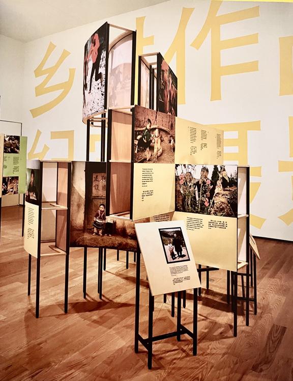
Village Works (1999) presented photographs created by women living in mountain villages in Yunnan, China. The project resulted from an experimental initiative funded by the Ford Foundation that teaches illiterate women how to document their daily lives through photography.
the story is the engine
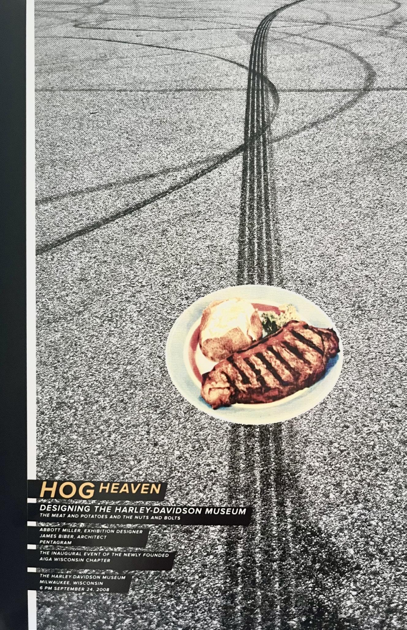
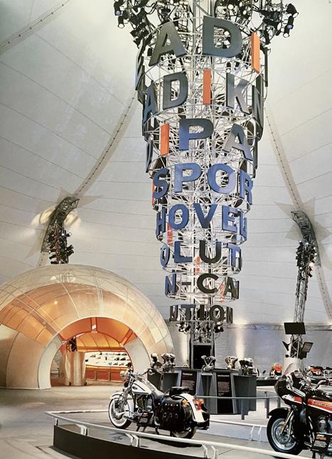
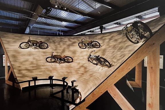
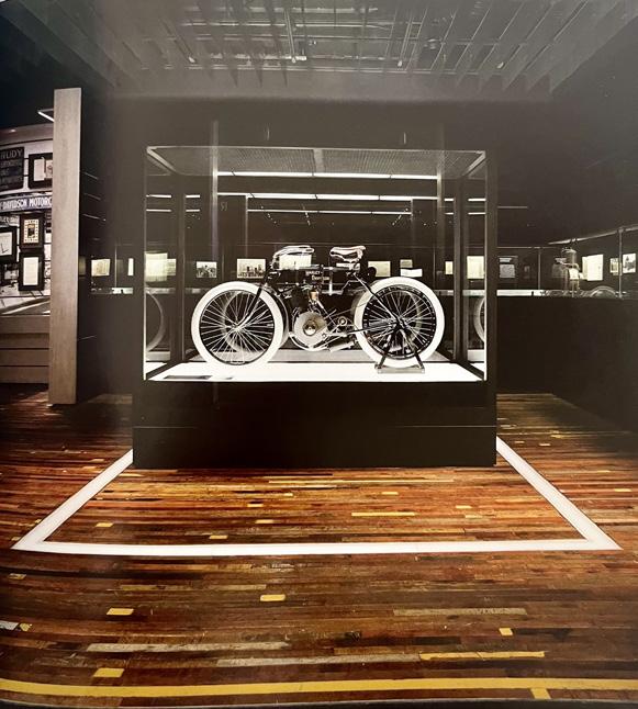
A series of projects designed for Harley-Davidson provided the opportunity to do large and complex exhibitions with a populist and celebratory attitude. As a group, these environments show how an iconic brand provides a strong language that can respond to diverse contexts, from the spare white walls of an art museum to the vast scale of a racetrack. Each project built on insights from the other, allowing me to understand the culture of the company, the characteristics of its international audiences, and the visual and material expressions of Harley-Davidson as a brand. Conveying the personality of the brand and capturing the spirit of Harley-Davidson required an immersion in the company culture, its archives, and its history. Over the course of these projects I also came to realize that my separation from motorcycle culture provided a valuable perspective. A purely “tribal” approach can run the risk of presuming too much about audiences. As a designer you have to be both “inside” the material and also “outside”, in that you benefit from a certain amount of distance so you can observe what might be interesting to a hardcore fan but still understand the need to reach uninitiated audiences.
Now this makes sense. The story behind the idea, the concept, the designs.This chapter sounds intriguing. Is this going to be a metaphor for building a story, or is it going to be taken literally. I’m a literal person. Will I take ideas as they are said or interpret them in the way the author means for it to be? The image doesn’t fill me with confidence. What appears to be tracks—from a vehicle... A plate of food that goes over my head—I don’t even question this at this point.
A 2008 poster for a Milwaukee AIGA lecture on the design of the Harley-Davidson Museum suggested that the journey of a motorcyclist is punctuated by plate-sized destinations along the way.
road show
Harley-Davidson celebrated its centennial with a yearlong Open Road Tour (2002) that traveled ten cities across the globe.
The Open Road Tour embraced the temporary nature of the event, using skeletal frameworks, industrial stagecraft, and fabric skins.
Portraits of riders and video testimonials provided a sense of the passionate connection motorcyclists have with Harley-Davidson.
Rolling Sculpture: The Art of Harley-Davidson (2003) occupied a Santiago Calatrava-designed pavilion at the Milwaukee Art Museum. The exhibition focused on the design language of HarleyDavidson’s styling department.
making a museum
Harley-Davidson had been planning to build a museum for several years when a site in downtown Milwaukee became available.
An ever-ending chapter that’s filled with photographs and photographs.Short glimpses of text weaves throughout these but only the first sentence or two captures my mind. Vehicles aren’t something I’m interested in.And this supports the title of the chapter—literally. One or two photographs pause my mind amongst the pages but not for very long.
As visitors enter the museum, alternate paths are visible: a “road” runs the length of the museum with bridges that cross back and forth.
The exhibition design creates different zones within the larger volume of the museum. The “road” from the upper level continues on the lower level with a display of the most important pieces in the collection.
A gallery focused on the styling department features prototypes and drawings.
Photographic imagery is handled in a variety of ways, including printing directly on aluminium wall surfaces and large light boxes.
identity links pixels and bricks
I hate logos. Why?
Because everyone gets obsessed with the logo when they should really be more concerned with how it’s used.
I have designed many logos, but I approach them not as the most important component of a graphic expression of that
A logo is what can be deployed, consistently, in the absence of all other signifiers.
A logo is an inherently reductive proposition, which is why I like them to have the simplicity of a word— something not much more complicated than a typographic construction. Perhaps this is why so many marks I’ve designed bear the traces of an architectural or figurative reference,
back to its origin in the physical specificity of a place. Graphic identity is the adhesive that connects physical and digital experience. To be effective across multiple contexts, a graphic
elements that can be rendered in different scales, materials, and media.
Unlike the design of a book, which is complete once it is published, depends on the energy and talent that goes into its future success.
Some elements are designed at the outset of the project, as part of the initial wave of establishing a new identity:
signage, and merchandise. Institutions and businesses invest in the “tool kit” of , but they need to stay vigilent and engaged to keep it running, re-evaluate its performance and maintain it, just as a physical when it keeps its vitality and consistency in the face
Beyond the core elements of a logo, typefaces, needs enough development to translate it into a sensibility about materiality, its literary “voice”, and its overall personality.
I’m seeing pixels, pixels, and more pixels.These little circular shapes making up the foreground and texture of the composition—it adds a lightness. Is it a photograph beneath the surface? I’m not sure—but it’s effective.
MICA, officially known as the Maryland Institure College of Art, straddles a major boulevard in Baltimore. This historic Main Building of 1907, which looks as if it were carved from a giant chunk of white marble, is situated directly across from the 2003 Brown Center, a taut glass iceberg of a building that projects over the streets as if nodding to its older colleague. In creating a graphic identity for the school I wanted to caputure its juxtaposition of historical and modern sensibilities, and to specifically reference the dialogue between the two buildings.
Founded in 1826, the school is one of the oldest art schools in the nation, evident in its turn-of-thecentury buildings and campus. The wordmark we
developed in 2007 is a typographic portrait of this relationship: the monumental capitals are seen in counterpoint to the rhythm of fine verticals, last of which carries the angled “prow” of the Brown Center facade. A pattern within the indentity program recalls the ornamental motifs and mosaics of the Main
Building, as well as the fritted pattern of dots on all of the panels in the Brown Center. A book we designed to to recognize the school’s 175th anniversary used dots silkscreened on vellum to simulate the pointillist rendering that occurs when looking from the Brown Center to the Main Building.
Cooper Union. Like MICA, this was discussed in the introduction chapter—with no imagery to support this part of the text. Having this visual alone sets the scene for me.With no knowledge of Cooper Union, this provides meaning for my mind.I notice the architecture and signs and typography, and I actually read the text that I thought I would skip.
Cooper Union commissioned a building by Morphosis in 2008, adjacent to the historic 1858 Foundation Building on Cooper Square. As a student at Cooper I was intrigued by the block lettering above the entrance to the Foundation Building that identifies the school and heroically declares “To Science and Art”. Like letters on technical drawings, diagrams, and blueprints, their t-square and triangle forms suggest the school’s nineteenth-century origins.In our environmental graphics we use Wim Crouwel’s 1974 font Gridnik, which follows the spirit of the historic block letters but in a more modern voice.
Because of its geometric clarity, Gridnik retains a consistency of expression across varying scales, materials, and techniques: on the previous pages it is twisted and punched through the facade’s canopy and etched on steel fins above a stairwell. At right, it forms stripes like a bar code as it turns a corner. Below, it’s engraved in concrete pavers that stretch across a roof terrace.
“One of my favourite fonts, Balance by Evert Bloemsma, features gently concave edges that recall the carved and cast surfaces and silhouettes of Noguchi’s work.”
A square with sides that ever so slightly bend inward. making the corners more pointy. increased font size for the name
abstract shapes with no clear intended shape
positive and negative space leaves the identity standing out
is this included in this chapter because pixels make up these abstract shapes?
The Noguchi Museum is a perfectly distilled expression of artist Noguchi’s work. He created the museum in his Long Island City studio as a permanent record of his work, which included sculpture, furniture, and gardens. In designing a graphic identity and environmental graphics in 2004, I wanted to reference his use of organically inflected geometries. The identity and signage use this subtle concave language with a simple black-and-white palette.
t he letters at the back
What is the Frank Lloyd Wright lettering? There’s no picture on the page of such typography. A quick search online gave me a good idea of the style... What does “lingua franca” mean? It is French? I can understand the gist of the text without this word—luckily.
“vertiginous space inside the rotunda”—too many words within a short space of time—and line that I have never heard before.I was following up until this point, but my mind has been caught out by these words that I lose my place along the line.
The Guggenheim Museum invited me to design a new magazine for its members in 1996. I proposed that we develop the Frank Lloyd Wright lettering on their famous facade into a typeface that could become the basis for the magazine, and eventually, the signature of the museum. Working with type designer Jonathan Hoefler, the font now known as Verlag has become the lingua franca of the global Guggenheim network, used prominently in our design of the website and on all communications. A book we designed on the history of the building used the font in a a circular composition that recalls the vertiginous space inside the rotunda.
The paragraph surprisingly resets and I think Miller’s mind wandered whilst writing this paragraph. No exmplanation or connection to the previous sequence of sentences—rather revealing a dream to the readers.This makes me feel better about my own mind wandering throughout his book...
I’ve worked with the museum, one of my earliest clients, on many projects over the last two decades. A dream project of mine is to design an exhibition in the rotunda—I just thought I’d put that out there and see if anyone at the Guggenheim wants to make my dreams come true.
I turn the page and the first thing I notice is the logo against a red backdrop.But as I read it, I misread “INSTITVTE”. I think there’s a spelling mistake but then I come to realise that the “V” is in place of the letter “U”.What is the meaning behind this? Is it to connect with the straight lines and angles of the architecture? I look along the rest of the words in the logo and see predominantly straight lines— but then I meet the letter “S”. This is one curved continuous line with one stroke.What originally caputured my attention and mind, has now disengaged my mind...
The Miho Institute of Aesthetics is a newly founded school in Japan, located an hour north of Kyoto. Nestled in forested landscape, it is part of a campus of buildings that includes the Miho Museum— an extraordinary art collection displayed in a series of pavilions designed by I.M. Pei. The school buildings and landscape were designed by io Architects and completed in 2012.
The identity I developed for the school features a symbol based on the distinctive shape of a wall relief in the Miho collection.
The form alludes to the image of an open book and the top of a pen or brush. Its steeply tapered forms also recall the silhouette of a bell tower on the campus, designed by Pei.
The symbol was integrated into a number of architectural features, including door handles, metal screens, and shoji screens in a teahouse. The stage curtain we designed was handwoven in silk by a team of artisans working on an enormous loom for five months— the most lovingly and expensively produced object I’ve ever designed.
A channel of skylights floods the hallways with natural light that washes down the walls leading into classrooms.
A halo of colored light is created by brilliant colors applied to the back of the signs.
Exterior directional signs are connected to columns.
At night the letters glow from within the lanterns.
This is a never-ending chapter, but it’s one that I’m interested in. The pages and text catch my attention as it’s focused on identity (and pixels).So far, my mind has only drifted a few times.The text is manageable to read, and I’m not searching for the end of the chapter—I want it to carry on.
“A dramatic ceiling in the lobby.”
The National Academy was America’s first art museum and art school. It was founded in 1826 by a group of artists who wanted to echo European academies, which taught and displayed art for the general public. The selected members form an incredible list of artists and architects central to American art. The academy has occupied a historic mansion on Fifth Avenue since 1942 that was renovated in 2011. I revised the “NA” mark developed a system based on the typeface Plan by Peter Bil’ak. A dramatic ceiling in the lobby features the names of over two thousand academy members and the years they were elected. Architects Bade Stageberg Cox created a jewel-like space in which the white-onwhite “cloud” of names hovers above. This ongoing roll call of members is routed in Corian with an academy-red infill on dates.
This full page of text reminds me of the introduction chapter at the start of this book.I start off following, and then words begin to lose their meaning as they become meaningless. Words just become shapes on a page, lines on a page that are carefully arranged into a unique sequence—unique to this page.I stare at them for long enough that I don’t even recognise the word—it looks incorrect—the spelling I mean.And before I know it, this is what I’m thinking as I move along each line. Looking at the words but not absorbing their meaning.
“Point, line, plane”—I remember reading a few pages from Wassily Kandinsky’s book “Point and Line to Plane”.It was more confusing than this book...
grip of chronology, affording a glimpse of relationships between historically divergent practices. For instance, the device of framing a text to look like a book-within-a-book recurs across the history of design. This structure dates back to manuscript and incunabula traditions in which a central text is framed by a commentary. While the structure has been recycled at different points in history, the book-within-a-book is an “idea” and a structure that remains independent of particular instances of its use. Artist Barbara Bloom’s book The Reign of Narcissism consists of a sequence of facsimile-style spreads resting within an otherwise traditional book. The shift in scale and the photographic depth of the pages force the viewer to see the page as an image.
“A book-within-a-book”
The concept behind my project started off as a branch of this.With the frequent integration of longer, challenging words, I save my mind and turn the page...
Other examples use the book-within-a-book structure for both its pictorial and conceptual value. The French philosopher Jacques Derrida exploited the spatial and typographic resources of the page to find ways of writing that are not reducible to verbal form. For his 1974 Glas, he drew on the intricate textual “glosses” in medieval books and the framed commentary of the Talmud as models of nonlinear, polyphonic texts. Traditionally, the Hebrew-Aramaic text of the Talmud is surrounded by interpretations, translations, and notes. In Glas, Derrida places two texts next to one another on the same page: in the left column is an analysis of Hegel, while on the right he makes a series of observations on Genet through a web of puns and alliteration.
These citations of the book-within-a-book structure are not “timeless” or “universal”, for each bears the aesthetic marks of its time. They refer to a design convention but are not stylistic quotations. Instead, a visual form is employed more for its structure than for its style.
The “vernacular” has become a familiar breeding ground of ideas for graphic designers, but here the closed loop of imitation and appropriation has become hackneyed and condescending, positioning the designer as a cultural tourist.
A different relationship to historical sources involves apprehending such forms as conceptual models rather than as stock imagery. Such an approach borrows the principle behind an artifact rather than its surface manifestation. Principles are
I agree—”structure comes from within the medium”. This content inside this book shines a light on the original book written by Abbott Miller, with the addition of alluding to the mind wandering (from a personal experience). From pages and pages of text, to photographs and descriptions, this book carries plenty of obstacles for the mind to go off track—like it has now...
It’s the last sentence in this that catches my mind. Why is this? It sums up the page—and in short.
typology and pattern
Approaching design through the filter of structure has affinities with the artistic practices of Sol LeWitt and other conceptual and process artists of the 1960s and 1970s. LeWitt’s wall drawings were executed from a series of verbal descriptions. His famous statement *I jump to the big text* holds true for design that lets form unfold from structure.
The fascinations of the Dadaists and Surrealists with “readymade” objects—the ordinary form placed in a different context and pressed into the service of an alternative function—is another important source for design. A 1992 catalogue for a Dutch exhibition about Duchamp performed a reflexive use of the readymade within graphic design. The first half of Al(l)ready Made includes essays and color photographs of works of art featured in the exhibition, while the second half is a commercially produced diary for 1993. The book as a whole embraces the format and productiontechniques of the diary, including its faux leather grain cover and gold embossed lettering.
By the first few words or lines in a paragraph I can usually tell if I’ll stay focused or whether my mind will wander off lines, off words, off letters, off shapes, and off lines... This is what happens in this instance—the first line puts me off and I skip to the next paragraph break. One thing I have noticed in the original book is the number of names. I’m terrible with names.Here, I stayed on track and as soon as a name is thrown into the mix my mind is off and away.
“The idea is the machine that makes art.”
... going back to the title of the chapter...
I automatically pick up on this, but I retrace my steps to read the title of the chapter again and them I’m back here again and read the text.
design as public language
Gender Advertisements presents the repeated structures of photographic language, bu there are also a vast range of recurrent typographic and compositional structures.
Investigating structure divests design of its focus on the “signature” of the designer and looks instead at design as a public language. Apart from specialized audiences who have an awareness of how designers shape communication, design is a largely anonymous activity. “Design without designers” surrounds us in all forms of institutional, educational, governmental, and commercial media. Post-structuralist writers such as Michel Foucault and Roland Barthes critiqued the humanist ideal of the “individual” as a unified, self-knowing subject. For instance, Foucault examined the way privacy, sexuality, hygiene, and mental health are shaped by the controlling structure of schools, hospitals, and factories. Foucault, like the others, moved from the humanist subject as the authorial source of individuality to the social contexts that make up modern individuality.
Looking at structure offers a way to loosen design from the grip of individuality and chronology
Context to round off the paragraph. No names, just information.It’s a lighter way to close a paragraph. It’s not as intense.A clearer mind to turn the page and continue.
“exhibition design”... again...
Amongst an array of glyphs and symbols throughout a continuous piece of writing, I may not entirely understand what I’m reading, or the words that lead the way along the line, but numbers stick out to me. They might not correlate to surrounding words but visually they are noticeable.
I really tried to keep my focus but it was hard.Similarly to before, only a few words met my eyes and mind to establish meaning.
museum director Alexander Dorner invited Lissitzky to create a contemporary art room at the Landesmuseum in Hanover, Germany. Lissitzky covered the walls with colored wooden strips, creating different effects as visitors moved through the gallery. Lissitzky’s 1928 Pressa exhibition brought photomontage techniques to exhibition design, dissolving the boundaries between the physical space and the more abstract space of photography and mass media.
of the viewer/reader, and a broader context of interpretation. These strategies can engage the audience and dramatize their encounter with original artifacts to make visitors see them in a different way, or they can create a context for ideas in the absence of compelling artifacts.
Frederick Kiesler’s landmark 1924 Exhibition of New Theater Techniques in Vienna allowed visitors to adjust the height and viewing angle of works on display. Kiesler named the system “L and T” based on its modular, typographic construction; it helped inaugurate the skeletal and modular approach that underlies much exhibition design to this day. What made it both radical and influential was the way it treated the exhibition system as an entity independent of its architectural setting— an abstract sculptural event in space. The project, with its responsiveness to the observer’s manipulation, marked an early, radical rethinking of the relationship between object and observer, making that relationship reciprocal and malleable.
In today’s context, the heritage of both “conven-tional techniques and modernist strategies coexist. Designers must stay attuned to the importance of staging the object, but the ambition to stage the observer demands a wider frame of reference, one concerned with the total experience
A powerful example of how design can recontext-ualize and deepen the viewers’ experience is Textile Field, a 2011 installation by Ronan and Erwan Bouroullec for the Victoria and Albert Museum (V&A) in London. The designers were invited to create a project that would engage the V&A’s existing galleries. They chose the famous Raphael Gallery, which features massive cartoons created as studies for tapestries in the Sistine Chapel. Whereas the tilting planes of avant-garde exhibition design created dynamic angles on which to display objects and graphics, the Bouroullec installation used tilted planes to stage the viewer in relation to the artwork. The installation’s vast field with sloping sides invited visitors to sit and lie down to view the artwork, fundamentally changing the character of the space from the more narrow conventions of museum display. In an interview the designers commented on their intention to change the way people interact with art. “The challenge was to invent or define something that could put people in a different situation, that is, to think about it as though it were an interiors project: if it’s successful from an ergonomic point of view, if it’s comfortable, and if it makes users feel at ease, even psychologically. We began to imagine a swimming pool in this great hall and then a sandy beach where you can lie down and admire a landscape.”1
1. Silvia Monaco, “Ronan and Erwan Bouroullec: Textile Field”, Domus blog, October 21, 2011
Textile Field altered the spatial, physical relationship of the viewer to the work of art, establishing different possibilities that affected their viewing perspective, their behavior, and the duration of their experience. If Textile Field represents an openended platform of contemplation —free of specific goals and educational agendas— an exhibition at the Maritime Museum in Stockholm represented the other extreme of a highly choreographed experience. Designers Per Bornstein and Mattias Lind of the Swedish firm White Architects created an installation of maritime paintings so that the horizon lines of the paintings formed a consistent datum through the installation.
Visitors standing at the center of the gallery were enveloped by a 360-degree expanse of sea and ships. As they stray from that central point, the composition splinters into an array of facets. The paintings floated in a sea of blackness, hung on freestanding supports that paradoxically foregrounded their materiality as objects while heightening the illusion of a panoramic vista. The installation dramatized the continuity of sea and sky, rendering individual works as part of an ongoing dialogue with the ocean. As observers moved in closer to the paintings and strayed from the center point (marked by a red light projected on the floor) the singular impression of the collection gave way to the impact of individual paintings. The installation modulated between object and observer, providing moments when individual objects moved to the foreground and other times when the “story” narrowed down to the observer’s perspective within the gallery.
with the full three-dimensional experience available only after walking behind the scrim. It is a powerful example of how design can foreground aspects of a collection and create a narrative sequence through the act of disclosure. The shadow view heightened the experience, making the observer focus on its most salient properties by withholding information.
Exhibition designers and curators often describe their work as storytelling, but some stories can be told through objects and images more easily than others. The British design firm Casson Mann has created several ambitious narrative exhibitions that have set a new standard for the way artifacts, texts, and interactivity can be woven into a complex whole. Because exhibitions are such a hybrid form — involving architecture, industrial design, graphics, and interaction design —it is easy to lose the physical and editorial continuity of a story, as visitors encounter so much information delivered through many different media.
All these pages of text look the same—2 equal columns, their paragraph style, typography, and leading.The lines aren’t the only thing to merge in my mind—also the visual elements that make up the page.I think it’s easy to get lost and caught up amongst the pages.
A similar transformation is evident in an exhibition by the artist Barbara Bloom at the Museum of Applied Arts (MAK) in Vienna. The museum invited a group of artists to work with curators at MAK to create a series of permanent installations. Bloom’s subject consisted of an array of fin de siècle bentwood furniture from the Thonet company. Her installation lined a long gallery with a parade of Thonet pieces a visual essay on the profusion of stylistic effects of the bentwood technique. The beauty of the installation consists in the way Bloom positioned the furniture behind two long scrims, showing the cast shadows of the objects. The installation gave us diagram and silhouette first,
One aspect that sets Casson Mann’s work apart is a synthetic integration of these elements— all the more noteworthy because the firm collaborates with different disciplinary specialists. Graphic designer Nick Bell worked with Casson Mann on the Winston Churchill Museum at the Cabinet War Rooms in London, as well as on the Sellafield Visitors Centre. Bell’s typography and media work, which is itself remarkable in the context of exhibitions, but in Casson Mann’s work there is a deeper acknowledgment of graphic design in the density of information presented, often employing the compositional strategies of books and magazines. Objects and images are tightly edited and then given space to breathe.
Interactive elements are also skillfully woven into the fabric of Casson Mann’s exhibitions. In the Churchill Museum, various tablet-like screens were dispersed throughout, featuring simple, short exercises that attracted children and adults. The centerpiece was an enormous touch-screen table, developed in collaboration with Bell and designer David Small. The table is given a commanding central space within the museum, cutting a dramatic diagonal through the exhibitions. It presented a series of virtual files that, when touched, opened to reveal texts and photographs that moved deeper into the history of World War II. Several visitors could work independently at the table, but occasionally the entire surface was affected by the opening of one of the “files.” In these moments the individual activities of visitors were disrupted by a communal experience, such as a rocket that blasted from one end of the table to the other. The table became a kind of bedrock of detail, effectively hinting at the depth
Because there were very few artifacts in Sparking Reaction, the design focused upon staging a large amount of textual information in ways that would maintain the interest of visitors. The designers created a central arena called the Core that contained projection screens on the walls and floor with typographic transformations that sequenced arguments for and against nuclear energy. The observer/reader was staged as a figure immersed in words and images with the scale of the projections blurring the relationship between screen and viewer.
Just as Lissitzky and other avant-garde designers appropriated photomontage for the purposes of exhibition design, Casson Mann employed the saturated colors, motion graphics, and luminous imagery of contemporary media and advertising.
The status of exhibition design as a form of representation comes to the foreground with particular focus when the topic is architecture. Strategies of display in architecture exhibitions take on a metonymic relationship to the subject: the space of the exhibition presents an opportunity to evoke the spatial and environmental character of the architecture under consideration. Exhibition design can provide a powerful framework for the more conventional-and sometimes less vivid-use of scale models, photogra-phs, and drawings. Two exhibitions about the work of architects — presentations that were also designed by the architects in question — show how exhibition design strategies can represent and embody the spatial and conceptual character of architectural practices.
Barefoot on White-Hot Walls, a 2004 retrospective of Peter Eisenman at Vienna’s Museum of Applied Arts (MAK), featured models, drawings, photographs, video, and partial reconstructions of projects. Staged in an immense double-height space, the exhibition was both a representation and an example of Eisenman’s theory-driven work. Visitors entered a dark space populated by a series of boxyvolumes— all the same size—set on a regular grid. The space between the boxes was ample, suggesting a pedestrian boulevard through an enigmatic, featureless city. Light seeped into the exhibition hall from reveals at the bases of the boxes and the various slices, doorways, and peep-holes. Visitors were drawn to these light-filled spaces, sometimes filled entirely by a model that one could only peer into, other times offering a bench and a video monitor, and sometimes featuring architectural fragments from Eisenman projects. A false ceiling compressed the space of the gallery, but within these smaller volumes the space reached up to the original ceiling, illuminated by skylights. The effect was of a series of austere, modernist “chapels,”
My mind skipped this chapter.I was looking at the page to bring myself to read it, but letters, words, and lines were merging together. They had quickly lost their meaning and just appeared as lost abstrast shapes.
each devoted to a particular project, a conference proceeding, or an interview. Eisenman’s work has always been preoccupied with the grid, and this exhibition heightened this diagrammatic approach by introducing the contrast between the lateral spread of the exhibition space, and the fantastic double-height voids of the chapels. Without hierarchical cues or predetermined proces-sion, visitors make their own path through the exhibi-tion. The various boxes were sometimes featureless on three sides with a small opening on the last surface.
The “fuck you” effect was heightened by the unpredictability of these openings: visitors frequently walked around the box, searching for its opening. Text panels were located near the boxes, but frequently their orientation was at odds with the openings, frustrating viewers who wished to read about the project in proximity to their view of the project. It was a “difficult” exhibition in a way that paralleled the abstruse, aggressively formal character of Eisenman’s architecture.
Yet with this lack of hierarchy also came a kind of freedom for the visitor. The grid dispelled the burden of a linear story: all routes through the space
of how the projects were contextualized. Extremely short text panels frustrated attempts to understand the significance of projects within Eisenman’s oeuvre. For an architect who places such importance on textual sources, it was a remarkably strippeddown presentation, as if the models and photographs were self-sufficient.
Where observers of the MAK exhibition entered a cerebral and hermetic space— almost liturgical in its tone— a 2006 survey of the work of the Los Angeles-based architecture studio Morphosis at the Centre Pompidou in Paris felt more like a chic nightclub. Visitors to Continuities of the Incomplete were obliged to slip protective booties over their shoes before striding onto a glass ramp. Arrayed under the glass surface were models, photographs, drawings, monitors, and text panels. Skeptical or uninterested visitors were drawn into its space by the seductive glow of white-blue light.
The exhibition’s “Big Idea” was the transformation of the angle of vision - the shift from wall to floorand it succeeded in transforming the often prosaic and abstract elements of architectural exhibitions into an engaging, full-body experience.
All architectural exhibitions confront the problem of scale: the Morphosis survey met this dilemma with humor by making the visitor feel like Godzilla in Tokyo. Striding across Los Angeles, peering into little models, visitors were given an omniscient overview of the space, free to wander in and out of projects. Visitors walked over the face of Morphosis founder Thom Mayne as talking-head interviews played from beneath the glass, with his voice projected from above. The bird’s-eye view was particularly effective for the work of Morphosis because its spectacular forms— as dense and attenuated as muscles and tendons— are best observed from above. Morphosis’s attention to the urban context was well served by the perspective of this exhibition.
Walter Benjamin’s classic 1936 text The Work of Art in the Age of Mechanical Reproduction discussed the erosion of the “auratic character of the original art object (which was seen to have an aura) in the modern age. Benjamin saw this process as an inevitable result of the rise of photography and film, expressions of a modern age in which “exhibition value” supersedes the
At this point in the chapter, letters just become random abstract shapes without meaning.Here they’re reflected to show the transition between the form in the original book against what my mind...The text across the previous pages has lost lines here and there as text “falls off the page” as it avoids my mind.
Benjamin’s term exhibition value is a useful notion in the context of exhibition design:
encounter-with a painting, an object, a physical site —will provide something that cannot be captured otherwise in photographs or reproductions.
First published in Eye Vol. 16, No. 61 (Autumn 2006)
1. Silvia Monaco, “Ronan and Erwan Bouroullec: Textile Field,” Domus blog, October 21, 2011.
through thick and thin: fashion and type
Typefaces are abstract. Barring letters that have an overt figurative origin (characters made of branches or rope), the domain of typography and lettering is refreshingly content-free, a matter of style, history and functionality. Yet, as typefaces and lettering are employed in related contexts, the associations of these contexts bleed into our understanding of the typeface itself. Type designer Tobias Free-Jones once recounted his experience developing a logo for a company that produced hair products, false nails, and perfume. After working to produce an appropriately “feminine” logotype he arrived at a high-contrast sans serif that intuitively felt right. He checked his work against the competition by making a trip to the drug. store and discovered that Almay, L’Oréal, Revlon, CoverGirl, and Maybelline follow an almost uniform typographic code, most sharing the stylistic root of the typeface Optima: he knew the “right” typeface before he realized he knew it. “What is so feminine about Optima?” he asked, as he wondered whether these gendered associations are inherent in the forms of the typeface, or evolve from patterns of use. Such patterns of use can become so pronounced that they shape our understanding of typography.1
This phenomenon is observable in the arena of fashion, where serif and sans serif tyefaces have articulated a certain landscape among fashion magazines and fashion brands. Over the twentieth century, carrying into the present, one can observe competing aesthetics of modernity, traceable through different uses of the modern typefaces of Didot and Bodoni and the avant-garde aesthetic of sans serif grotesques.
A new chapter, heading, text, and style.A fresh page and a clean slate. I hope this helps. I hope my mind has reset and my attention is back on this book. I wander what the connection will be between fashion and type—as the title implies.Is it to do with trends? —”through thick and thin”. Before my mind thinks too much about the chapter I must start reading.
The late eighteenth- and early nineteenth-century typefaces of the Frenchman Firmin Didot and the Italian Giambattista Bodoni are classified as modern because they introduced an extreme contrast between thick and thin elements, achieving a radical consistency among letter shapes by subjecting the variety of the alphabet to a thick/thin autocracy.2
The result is a abstraction and precision, echoing their Enlightenment origins. Bodoni and Didot exaggerated the height and verticality of the ascenders and descenders of the letterforms, lending the characters an architectural grandeur. Bodoni described the “beauties of type” as “conformity without ambiguity, variety without dissonance, and equality and symmetry without confusion. A second and not minor value is to be gained from sharpness and definition, neatness, and finish.”3 Bodoni’s prescription would be equally at home in a classical treatise on type, or in a 1950s book on proper grooming for debutantes.
Didot and Bodoni dominated printing until the late nineteenth century, when the Arts and Crafts movement returned to the solidity of humanist letterforms and the texture of Renaissance printing (William Morris called Bodoni’s letterforms “shatteringly hideous”).4 After fading from view, Bodoni and Didot made a comeback in the early twentieth century, partly because their geometric clarity seemed modern again. An Italian foundry, Nebiolo, issued a new cut of Bodoni in 1901, and ten years later the largest American foundry, American Type Founders, issued its own very popular cut of Bodoni.
In 1912, Deberny & Peignot bought the original punches of Didot, making the font newly accessible to designers. In a classic portrait, Charles Peignot, the head of the French foundry, was photographed with a beautiful poster-scaled Didot a hovering in the back-ground. It is from this fashionable context of European modernism in the 1920s and 1930s that America borrowed two of its most influential art directors, Dr. Mehemed Fehmy Agha, who would
art direct Vogue from 1929 to 1942, and Alexey Brodovitch, who served as art director at Harper’s Bazaar from 1934 to 1958. Both are credited with having imported a modern approach to layout and photography, as well as a modernist sensibility about type.
Brodovitch had used Didot while working in Paris on Cahiers d’Art in the 1920s. In his reign as art director of Harper’s Bazaar, Didot was the black blade that cut the white space of his layouts. The font became the signature of Harper’s Bazaar as well as Brodovitch’s own signature: he used the font for the identity of his influential Design Laboratory at the New School. In the 1950s, Bodoni (and its clownishly bloated progeny Bodoni Poster) was used in many other design contexts.
The cover of a 1950 Museum of Modern Art book, designed by Jack Dunbar, prominently displays its title, What Is Modern Design? in Bodoni, as if the question it asks is answered by the typeface, rendered in stark white letters on a black background.
Typography—it’s visual. I can imagine it. I’ve seen it before and I’ve used it in the past.It’s distinct as a Serif typeface.
fashionizing fonts
The canonization of the “fashionization” of the Didone style can be observed in the evolution of Vogue magazine. In Vogue’s early prephotographic covers, illustrators created lettering that worked with the style and spirit of their illustrations. This ethic was carried over as Vogue made the transition into the photographic era: photographers and designers created ambitiously varied and inventive approaches that integrated letterforms as part of a total approach to design. But even in those covers that did not integrate the lettering as part of the overall concept, type choices were extremely varied.
Didot
As late as 1955, Vogue covers vacillated between serif and sans serif typefaces, as well as script faces and illustrative, photographic letters. It was after 1955 that the magazine appears to have legislated a consistent use of the all-capitals banner headline set in Didone lettering. Apart from minor details, it has remained absolutely fixed since then, the trade dress of a powerful international franchise.
A visual piece of type to demonstrate the typeface. A break from columns and columns of text. As it sits at the top of the page (to break up the paragraph as it carried over to the following page), it instantly draws in my mind—more than I thought it would.
bazaar aesthetic
Flass ahead to 1992 and the Didone aesthetic is powerfully resuscitated in Fabien Baron’s re-design of Harper’s Bazaar. Baron commissioned Jonathon Hoefler to creatre a new digital Didot, a kind of super-Didot, drawn in extremely large sizes that allowed the type to be set in enormous display sizes while still retaining its razor-thin lines. When I interviewed Baron in 1995 for Eye, he seemed irritated when I asked if his choice of Didot was self-consciously referring to the Brodovitch era: “No...We used Didot because it’s very feminine, not because of the magazine’s history”. When we started at Bazaar things were very elegant and the direction of the magazine was about elegance”.5 He applied the same spirit to his advertising and brand work with Valentino and Calvin Klein, and, more recently, his art direction for a book on Balenciaga.
A casual glance through the lexicon of fashion brands confirms that this Didone aesthetic is shorthand for luxury, refinement and a certain posh attitude. To paraphrase Jack Parr’s line “Whenever I hear the word culture, I take out my checkbook”—consumers are now trained to take out their checkbooks whenever they see Didot. So why are
Bodoni and Didot used so often in relation to fashion, apart from their stylishness and pedigree? Can it be that within the very forms of these typefaces they evoke the precision of tailoring, the flatness of fabric, the dynamics of gathering, draping, and folding? In Dreaming by the Book, Elaine Scarry discusses how writers create and manipulate imagery, showing how mental images are subject to bending, folding, and stretching. Typefaces perform similar manipulations, conjuring visual associations, rather than purely mental ones. In my mind, the attenuated forms of Didone letters are not unlike the flattened geometries of dress patterns: accelerated curves and tapered rectangles meeting at precise junctures. One can imagine the fine lines of the Didone serifs as the seams and stitches that connect into an ensemble of parts.
While we can speak of this “imaginary” and associative dimension to Didone fonts, we can also point to one of its most salient, pragmatic aspects: it has an almost see-through quality. Because of its radical thick-thin structure, the mass of the letterforms are greatly diminished: words typeset in Didone fonts act as a typographic veil over photography, making them particularly useful for magazine covers. Like Tom Wolfe’s “social x-ray,” Didone fonts create an x-ray of the word. Their anorexic, skeletal forms create an ideal overlay for photography. The connection between Didot, Bodoni, and the topic of fashion is so embedded that not only do Vogue and Harper’s Bazaar continue to dress themselves in its sparkling linearity, but so do countless other magazines and brands.
Covers of Vogue October 15, 1951 and December 1950
Cover of Harper’s Bazaar, July 1958, Art Directors; Alexey Brodovitch, Jack Dunbar, and Adrian Condon
Cover of Harper’s Bazaaar, March 1993, Art Director: Fabien Baron
Chanel’s simple blackand-white sans serif label—which has remained largely unchanged since its debut—adorns a perfume bottle. Yves Saint Laurent preparing for his 1962 debut. Photograph by Pierre Boulat.
Jil Sander logo, designed by Peter Schmidt, ca. 1975; Marc Jacobs logo; Armani logo.
The hybrid logotype of Yves Saint Laurent, designed by A.M. Cassandre, 1963.
sans serif and chanel
Again—a visual I can understand, along with the words to support this. To see and understand typography in context.
I feel the lightness of the pages left, and this feels like a good ending to the book.
If Didot and Bodoni acquired the unmistakeable scent of fashion at this midcentury juncture, the use of sans serif typography in fashion can be connected to a single, powerful instance of design: the brand identity for Chanel. Set in black sans serif capitals against a white field and applied to the cubic apothecary-like bottle of Chanel No. 5 perfume, it aligned itself with the avant-gardism of Le Corbusier and the industrial vernacular. The visual approach (and the mystique of a perfume that was numbered rather than named) was a refutation of the romanticism that dominated women’s fashion and perfumes.6
The label’s little black capitals — like Chanel’s “little black dress” — captured the power inherent in under-statement. Because it has been part of the commercial landscape for so long, it is hard to see the packaging for Chanel as radical, yet one can retrospectively appreciate its alluring combination of modesty and auth-ority, an effective analogue for Chanel’s urbane style. Chanel’s sans serif set itself against the cultivated and super-refined aesthetic of Bodoni and Didot, as well as against the loopy and voluptuous scripts used for other perfumes, clothing, and “fancy” goods. We see the same attitude expressed in the sans serif logos for Rei Kawakubo’s label, Comme des Garçons, and bold sans serif wordmarks for Jil Sander, Helmut Lang, and Fendi. But the Chanel lettering also carries a vaguely moderne quality that has a related but distinct progeny in Givenchy and the contemporary-retro spirit of Marc Jacobs.
It’s nice to end the book on something I understan— something I can process. No more counting pages, or skipping them.
the “third position” and yves saint laurent In 1962, as Yves Saint Laurent was preparing his first collection under his own label, Pierre Boulat photographed the anxious young designer holding two cards: both feature his name set in Didot, one with white type against a black field, the other with black type against white. He must not have been satisfied because the following year he unveiled a new logo commissioned from the poster designer A.M. Cassandre.
The Yves Saint Laurent signature became one of the most distinctive graphic signatures in the world of fashion, and was one of the last pieces Cassandre would produce before his death. If we can think of the sans serif grotesques of Chanel as staking out one aesthetic pole, and the Didone world as another, Cassandre and Yves Saint Laurent claimed a third position -letters that are neither serif nor sans serif, not strictly roman or italic or even a proper script, but a complex hybrid of all of these forms. The YSL logo expresses the ambivalent modernity of Cassandre’s last typographic style, reflecting his disappointments with what he saw as the coarseness of advertising and the declamatory style of poster art that he had pioneered.
With the YSL mark he wanted to create modern letters that also reflected the gestural and rhythmical forms of handwriting. Yet one could argue that with this “third position” between serif and sans serif idioms, Cassandre was also playing with the subtle codes of gender and sexuality in the YSL logo, just as Saint Laurent himself played with the intermingling of masculine and feminine languages in his designs for clothing. Saint Laurent’s mystique as a gay man surrounded by beautiful people of both sexes was part of the YSL brand promise, as was made clear in a perfume ad featuring a Jeanloup Sieff portrait of the designer, naked with his legs crossed to obscure his crotch; he was not carnal as much as pansexual, a figure of both male and female sensibilities.
If Chanel’s identity exploited the traditionally male (industrial, abstract, mechanical) characteristics of sans serif for a decidedly “butch” logo, and if the forms of Didot and Bodoni were
so intricately wed to notians of fashion and femininity (the ultimate “femme” type-faces), then Cassandre’s YSL logo could reasonably be considered a “queer” typeface.
1. Tobias Frere-Jones, “Drugstore Travelogue”, in Sex Appeal: The Art of Allure in Graphic and Advertising Design, ed. Steven Heller (New York: Allworth Press, 2000)
2. My interest in the broad stylistic characteristics of Bodoni and Didot; there are now more than five hundred versions of Bodoni. See Cees de Jong, Alston, W. Purvis, and Freidrich Friedl, Creative Type (London: Thames & Hudson, 2005)
3. Alexander Lawson, Anatomy of a Typeface (Boston: Godline, 1990), 200.
6. Kenneth E. Silver, “Flacon and fragrance”, Chanel, ed. Harold Koda, Andrew Bolton, and Rhonda K. Garelick (New York: Metropolitan Museum of Art, 2005)
the
elephant in the room
The international design firm Pentagram was founded in London in 1972. Over the past forty years different graphic designers, industrial designers, and architects have worked within the unique, multidisciplinary practice. The studio is based on a partnership model, with each designer-partner leading his or her own team of designers. There are frequent opportunities for collaboration, shared knowledge, and shared resources, instilling a unique dynamic of responsibility to the larger group. The following discussion with four partners—Michael Bierut, Eddie Opara, Paula Scher, and Abbott Miller— was held in the New York office on March 20, 2013.
The “elephant in the room” implies that something is thought amongst others. After reading this short paragraph, should I have been wandering about the world of Pentagram?
Abbott
Eddie
Paula
Eddie
Abbott
Paula
Michael
Abbott
Paula
Eddie
Paula
Abbott
Michael
Paula
Abbott
Eddie
Michael
Abbott
Paula
Michael
Eddie
Abbott
Paula
Abbott
Paula
Abbott
Paula
Eddie
Michael
Paula
Michael
Paula
Michael
Abbott
Paula
Michael
Abbott
Admittedly I did’t read the interview. It was more and more pages of paragraphs that jump through each person—the only part that caught my eye were the names... and it goes on.
Paula
Abbott
Paula
Abbott
Michael
Paula
Eddie
Michael
Abbott
Paula
Abbott
biography
Abbott Miller is a designer and writer. His studio Design Writing Research was founded in 1989 and pioneered a practice that merged writing, curating, and designing. In 1999, he became a partner in the New York office of the international design consultancy Pentagram, where he creates identities, exhibitions, publications, digital projects, and environmental graphics, with a focus on art, performance, architecture, and design. He is the author of several books and numerous essays on design, as well as having curated and designed exhibitions on design-related topics. Abbott’s work is represented in the collections of the San Francisco Museum of Modern Art; the Cooper-Hewitt, National Design Museum; the Bibliotheque nationale de France; the Corning Museum of Glass; KlingsporMuseum Offenbach; the Denver Art Museum; and the Art Institute of Chicago. His work has been acknowledged with numerous awards, including the International Center of Photography Infinity Award, the Chrysler Award for Innovation in Design, and the Augustus Saint-Gaudens Award from his alma mater, Cooper Union. He is a member of the Alliance Graphique Internationale, and has taught and lectured widely. In 2014 he was awarded the AlGA Medal from the American Institute of Graphic Arts, in recognition of his contribution to design.
bibliography
BOOKS
Lupton, Ellen, and Abbott Miller, eds. The ABC’s of A 0: The Bauhaus and Design Theory. New York: Princeton Architectural Press, 1991.
The Bathroom, the Kitchen, and the Aesthetics of Waste: The Process of Elimination. New York: Princeton Architectural Press, 1992.
eds. Design for a Living World. New York: CooperHewitt Publications, 2009.
Design Writing Research: Writing on Graphic Design. New York: Kiosk/Princeton Architectural Press, 1996.
Miller, Abbott. Dimensional Typography: Case Studies on the Shape of Letters in Virtual Environments. New York: Princeton Architectural Press, 1996.
ed. Brno Echo: Ornament and Crime from Adolf Loos to Now. Brno, Czech Republic: Moravian Gallery, 2008.
Miller, Abbott, Ellen Lupton, Julia Reinhard Lupton, and Ellen Paul Denker. Printed Letters: The Natural History of Typography. Jersey City, New Jersey: Jersey City Museum, 1992.
Miller, Abbott, Ellen Lupton, and Marion Boulton Stroud, eds.Swarm. Philadelphia: Fabric Workshop and Museum, 2005.
Miller, Abbott, Patsy Tarr, and Nancy Dalva. Dance 2wice. New York: Phaidon, 2004.
Miller, Abbott, Patsy Tarr, Nancy Dalva, and K.C. Bailey. Dance Ink. San Francisco: Chronicle Books, 1997.
Lupton, Ellen, and Abbott Miller. “American Graphic Design, 1829-1989.” In Graphic Design in America: A Visual Language History, edited by Mildred Friedman (Minneapolis, Minnesota: Walker Arts Center, 1989), 24-65.
“Deconstruction and Graphic Design: History Meets Theory.” Visible Language 28, no. 4 (October 1994): 346-66.
“Hygiene, Cuisine, and the Product World of Early Twenti-eth-Century America.” In Incorporations: Zone 6, edited by Jonathan Crary and Sanford Kwinter (New York: Urzone, 1992), 496-513.
“Line Art: Andy Warhol and the Commercial Art World of the 1950s.” In Success is a Job in New York: The Early Art and Business of Andy Warhol, edited by Donna de Salvo (New York: Grey Art Gallery and Study Center, New York University, 1989), 29-43.
Miller, Abbott. “The 1980s: Postmodern, PostMerger, Post-Script.” Print 43, no. 6 (November/ December 1989): 162-85, 202-6.
“Pictures for Rent.” Eye vol. 4, no. 14 (Autumn 1994).
“Through Thick and Thin: Fashion and Type.” Eye vol. 17, no. 65 (Autumn 2007): 16-23.
“Toddler Modern: The Bauhaus as Elementary School.” Journal of Graphic Design 6, no. 2 (1988).
“Tracking the Elusive Timeline.” Journal of Graphic Design 6, no. 2 (1988): 7.
“USA Today: Learning from Las Vegas.” Print 44, no. 6 (November/December 1990).
“What did you do in the Design Studio today, daddy?” Eye no. 22 (Autumn 1996).
“Word Art.” Eye vol. 3, no. 11 (Winter 1993).
CURATED EXHIBITIONS
The ABC’s of A0: The Bauhaus and Design Theory. The Herb Lubalin Study Center for Design and Typography, The Cooper Union, New York, April-June 1991.
The Bathroom, the Kitchen, and the Aesthetics of Waste: The Process of Elimination. M.I.T. List Center for Visual Arts, Cambridge, Massachusetts, May-June 1992.
Brno Echo: Ornament and Crime from Adolf Loos to Now. Moravian Gallery, Brno, Czech Republic, JuneOctober 2008.
Design for a Living World. Cooper-Hewitt, National Design Museum, New York, May 2009-January 2010; The Field Museum, Chicago, May-November 2011; Desert Botanical Garden, Phoenix, January-April 2012; and Coral Gables Museum, Miami, JulyOctober 2012.
Printed Letters: The Natural History of Typography. Jersey City Museum, Jersey City, New Jersey, October 1992-March 1993.
Swarm. The Fabric Workshop and Museum, Philadelphia, December 2005-March 2006.
Up Down Across: Elevators, Escalators, and Moving Sidewalks. National Building Museum, Washington D.C., September 2003-April 2004.
FEATURED EXHIBITIONS
Everybody Dance Now: 20 Years of Dancing in Print. AIGA National Design Center, New York, 2009.
Codrington, Andrea. “Invasion of the Copy Snatchers.” Eye, no. 23 (Winter 1996).
Drucker, Johanna. “Graphic Design in America.” Review of Graphic Design in America: A Visual Language History, by Mildred Friedman. Artforum (March 1990).
Ewen, Stuart. “Living by Design.” Review of Graphic Design in America, Walker Art Center, Minneapolis, Minnesota. Art in America (June 1990).
Fischer, Adam Christopher. “(De)signs of the Times.” Metropolis (May 1993): 111-12.
Friedman, Alice. “Pipe Dreams: The Kitchen, the Bathroom and the Aesthetics of Waste: A Process of Elimination.” Design Book Review (Winter/Spring 1995): 29-31.
Hall, Peter. “Poetry in Motion: J. Abbott Miller and Design Writing Research.” I.D. (January-February 1994): 56.
Kinross, Robin. “Theories of the Material World.” Review of Design Writing Research: Writing on Graphic Design by Ellen Lupton and Abbott Miller. Eye no. 21 (Summer 1996): 81-82.
Lange, Alexandra. “Logo Motives.” New York, August
28, 2000.
Lippy, Tod. Review of Design Writing Research: Writing on Graphic Design, by Ellen Lupton and Abbott Miller. Print (June/July 1996): 108-10.
Lupton, Ellen, and Abbott Miller. “J. Abbott Miller and Ellen Lupton.” Interview by Shonquis Moreno. Dwell (April 2006).
McKee, Elysabeth Yates Burns. Review of The ABC’s of A0: The Bauhaus and Design Theory, by Ellen Lupton and Abbott Miller. Design Book Review (Summer 1992): 61-63.
Miller, Abbott. “The Design of Conversation: Abbott Miller.” Interview by Isaac Gertman. Design Bureau, no. 1 (July 2010).
“Reputations: J. Abbott Miller.” Interview by John Walters. Eye vol. 12, no. 45 (Autumn 2002): 54-64.
Perlman, Chee. “Cut to Fit: J. Abbott Miller and Geoffrey Beene.” I.D. (March/April 1995): 64-67.
Raynor, Vivien. “A Centennial in Typography, Celebrated Amid Potted Palms.” Review of Printed Letters: The Natural History of Typography, Jersey City Museum, New Jersey. New York Times, January 10, 1993.
Rock, Michael. “The Designer as Author.” Eye no. 20 (Spring 1996): 44-53.
”Thinking Design.” I.D. (June 1997): 88-89.
Sierman, Gijs. Review of The ABC’s of 40: The Bauhaus and Design Theory. Archis: Architectur, Stedebouw, Beeldende Kunst (April 1992): 55. Spiekermann, Erik. “Living for Design: Design Writing Research: Writing on Graphic Design” Blueprint (June 1996): 44.
Taylor, Rachel. “The Dancer’s Image as a Memento Mori.” Review of Dance 2wice by Abbott Miller, Patsy Tarr, and Nancy Dalva.
Eye no. 52 (Summer 2004).
Temin, Christine. “All the Modern Conveniences.” Review of The Bathroom, the Kitchen, and the Aesthetics of Waste: The Process of Elimination, List Visual Arts Center, Cambridge, Massachusetts. Boston Globe, May 15, 1992.
Temple, Will. Review of The Couch, The Freud Museum, Vienna. Eye no. 61 (Autumn 2006).
Twemlow, Alice. “Material Matters.” Review of Design for a Living World, Cooper-Hewitt National Design Museum, New York. The Architect’s Newspaper, June 3, 2009, 23.
OTHER PHOTOGRAPHS
Miller, A. (2004) On/Off [photogravure print] Available from: https://www.artspace.com/ellenlupton-j-abbott-miller/onoff [Date accessed 5 August 2024]
Miller, A. (n.d) The Maryland Institute College of Art logo in colour [digital] Available from: https://www. underconsideration.com/brandnew_v1/archives/ mica_finds_itself.php [Date accessed 5 August 2024]
Acknowledgments
I would like to acknowledge the support of my family, friends, teachers, colleagues, clients, collaborators, and current and former members of my team at Design Writing Research and Pentagram. My wife, Ellen Lupton, and my children, Jay and Ruby, are each, in their own ways, a source of inspiration. They surround me with their love, intelligence, talent, humor, and music. My sisters, Roxanne, Julie, Michelle, and Laura, connect me to my parents and our Midwestern origins, as does my friend John Swanson and his family. Jane Rosch has been a source of friendship and support since we first met in 1985. My father-in-law, William Lupton, contractorphilosopher, has enabled renovations to our living spaces that are as much part of my learning as my professional endeavors. Mary Jane Lupton and Ken Baldwin, and Julia Reinhard Lupton and Ken Reinhard bring theory and literature to the family table. Kippy Stroud has been generous every summer for fifteen years in hosting an amazing gathering of friends in Maine. Patsy and Jeff Tarr have given me opportunities to do the most fulfilling projects of my career. Patsy’s vision, energy, and commitment have sustained our collaboration for over twenty years.
My current and former partners in the New York office of Pentagram-Michael Bierut, Michael Gericke, Luke Hayman, Natasha Jen, Emily Oberman, Eddie Opara, Paula Scher, Lisa Strausfeld -offer advice, humor, and talent any day of the week you happen to need it. I’d also like to thank partners in other Pentagram offices, including Lorenzo Apicella, Angus Hyland, Domenic Lippa, Justus Oehler, Harry Pearce, John Rushworth, Naresh Ramchandani, William Russell, D. J. Stout, Daniel Weil, and Marina Willer. Colleagues whose work I admire and who have provided counsel and friendship include David Albertson, Jonathan Barnbrook, Matteo Bologna, Paul Carlos, Arthur Cohen, Scott Devendorf, Stephen Doyle, John Fulbrook, Michael Maharam, Charles Nix, Rick Poynor, Patrick Seymour, and John Walters.
Over the years I’ve had a talented group of people on my team: some stayed for a long time and helped define our work and the character of the studio in significant ways. The early and formative “Sullivan Street” studio included the triumvirate of Paul Carlos, Luke Hayman, and Scott Devendorf; fellow Cooper Union alum James Hicks helped advance the sculptural aspect of many early projects,
as did Robert de Saint Phalle and Brian Raby in later years. One of my MICA students, Jeremy Hoffman, started as an intern and worked with me for over ten years, becoming an associate and providing a level of craft and care to everything he was involved with; Kristen Spilman, one of MICA’s first graduate students in graphic design, worked with dedication and insight for eight years on exhibitions, identities, and web projects, eventually becoming an associate. Kim Walker is the newest associate on my team and, following in the tradition of Jeremy and Kristen, brings an incredible level of talent and wisdom to our work. This book represents their work and that of the whole team: underneath the resolved and carefully composed spaces, images, and typographic ensembles, there are the hands and minds, hours and passions, of many people.
Good teachers shape their students lives, and I owe a great deal to Rosemarie Haag Bletter for making modernism so alive to me, to Hans Haacke for the bravery of his example, to Rosalind Krauss for her contribution to theory and narrative, to Niki Logis for giving me a vocabulary to think and speak in three-dimensions, to George Sadek for being scary as hell, and to P. Adams Sitney for introducing me to philosophy, Hitchcock, Gertrude Stein, and experimental film.
I’ve had the pleasure of working with a number of museum directors on great projects, including Tracy Adler, Max Anderson, Richard Armstrong, Graham Beal, Carmine Branagan, James Cuno, Jenny Dixon, Derek Gillman, Mimi Gates, Claudia Gould, Susan Henshaw-Jones, Katy Kline, Tom Krens, John Lane, Bonnie Pittman, Marek Pokorny, Joe Rosa, Michael Rush, Inge Scholz-Strasser, James Steward, Marion Boulton Stroud, Connie Sullivan, Susan Taylor, James Steward, Adam Weinberg, and Connie Wolf.
Curators are inherently collaborative, and I’ve had the opportunity to create exhibitions and books with especially gifted collaborators. Donald Albrecht and Ileen Gallagher have been curatorial cohorts of mine over the course of many projects and many years. Other valued curatorial relationships have included Carlos Basualdo, lan Berry, Andrew Bolton, Lisa Corrin, Judith Dolkart, Matthew Drutt, Lucy Flint-Gohlke, Judith Hoos Fox, Jim Fricke, Mildred Friedman, Corinne Fryhle, Ileen Gallagher, John Hanrahan, K. Michael Hays, Jim Henke, Kristen
Jones, Harold Koda, Phyllis Magidson, Lydia Marinelli, Melissa Martens, Tom Mellins, Carol Ockman, Sandra S. Phillips, Mark Rosenthal, Margit Rowell, Dennita Sewell, Kenneth Silver, Nancy Spector, Marta Sylvestrova, and Kohle Yohannan.
A number of friends, clients, and colleagues have influenced my work and career, including Ray Allen, Kurt Andersen, Pam Asselbergs, Meredith Baber, Joanne Bischmann, Gigi Boam, Robert and Dianne Butters, Anthony Calnek, Steve Cantrell, Dorothy Cosonas, Alice Cunningham, Shannon Delage, Mary Delmonico, Renee Hytry Derrington, Miriam Hinojosa Dieck, Deborah Dietsch, Anne Doran, Sara Elliot, Rolf Fehlbaum, Russel Flinchum, Lise Friedman, Tom Gallagher, Marco Garrido, Anna Cecillia Cantone Guzman, Johanna HalfordMacLeod, Carrie Heinonen, Hank Hines, Hella Jongerius, Hiroko Koyama, Emily King, Ned Kramer, Fred Lazarus, Ralph Lerner, Beth Levy, Jennifer Lippert, Kevin Lippert, Bill McDowell, Amy Todd Middleton, Susan Morris, Ravi Naidoo, Walter Pamminger, Jennifer Cole Philips, Alice Rawsthorne, Aileen Roberts, Gwen Roginsky, Andrea Rosen, Bill Roush, Bill Ruprecht, Eric Sanderson, Kate Schlesinger, Andrea Schwan, Laura Shore, Jean Stein, Ben Watson, Jed Wheeler, Richard Saul Wurman, Richard Yancey, and Peg Zminda.
I owe a special debt of gratitude to a number of photographers whose work forms such an important part of many of our projects, including Josef Astor, Andrew Eccles, Tim Hursley, Joachim Ladefoged, Ben Nicholas, Martin Parr, Joanne Savio, Shoji van Kazumi, Ami Vitale, Paul Warchol, Christian Witkin, Katherine Wolkoff, and finally Jay Zukerkorn, with whom I have collaborated more than any other photographer and from whom I learned the meaning of patience and the sense that there is always another angle.
Architecture has been a passion of mine for many years: creating environmental graphics and other projects has brought me into dialogue with an amazing group of architects, including Liz Diller, Michael Gabellini, Simon Hsu, Ron Krueck, Hitoshi Maehara, Michael Manfredi, Thom Mayne, David Piscuskas, Charles Renfro, Jurgen Riehm, Ric Scofidio, Mark Sexton, Jamie Snead, Billie Tsien, Marion Weiss, Tod Williams and Steve Ziger.
I have valued the opportunity to work with a number of artists in creating projects, including
Allora and Calzadilla, Matthew Barney, Barbara Bloom, John Currin, John Kelly, Yoko Ono, Nam June Paik, and Doris Salcedo. And in my work with Dance Ink and 2wice, I’ve been privileged to work with an array of amazing choreographers and performers, including Karole Armitage, Jonah Bokaer, Merce Cunningham, Molissa Fenley, Tom Gold, Susan Marshall, Mark Morris, Stephen Petronio, Paul Taylor, and Twyla Tharp.
Studio members at Design Writing Research and Pentagram, 1990-2013