2 minute read
Good vs. evil


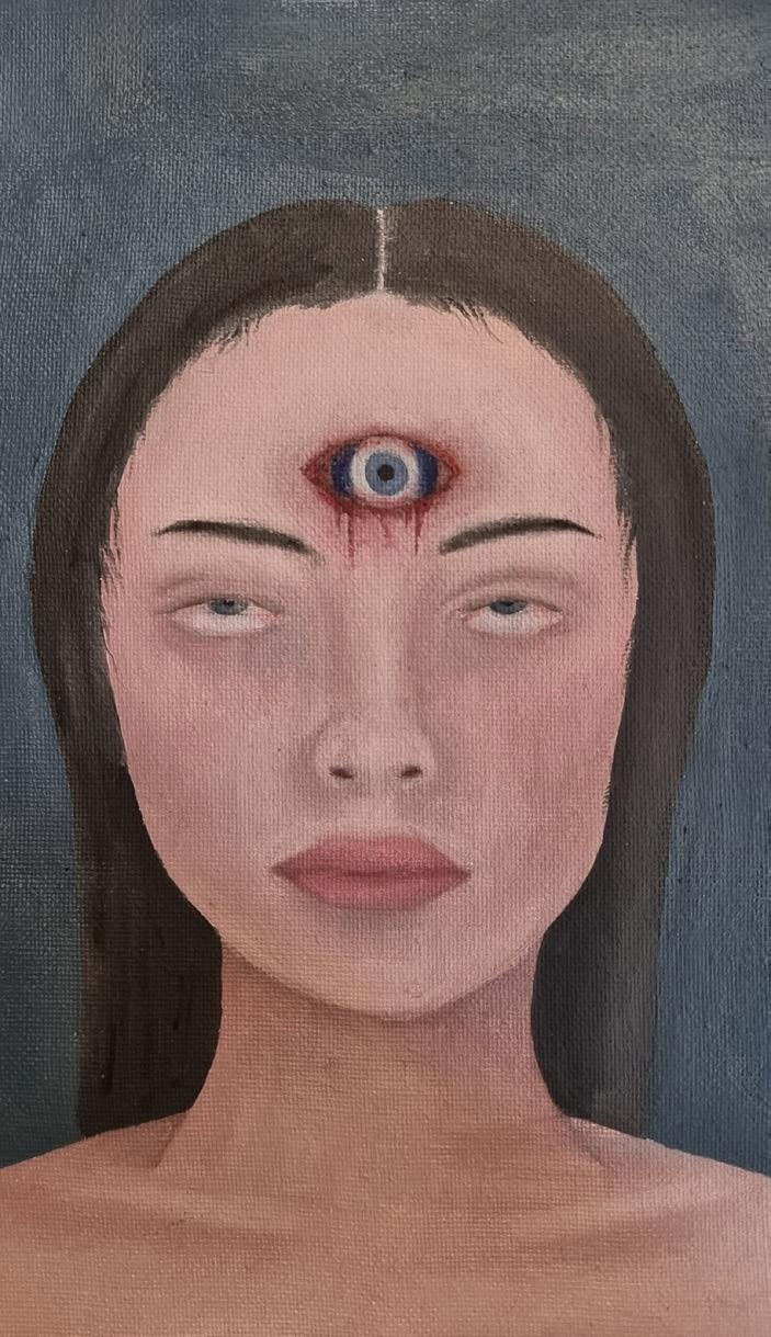
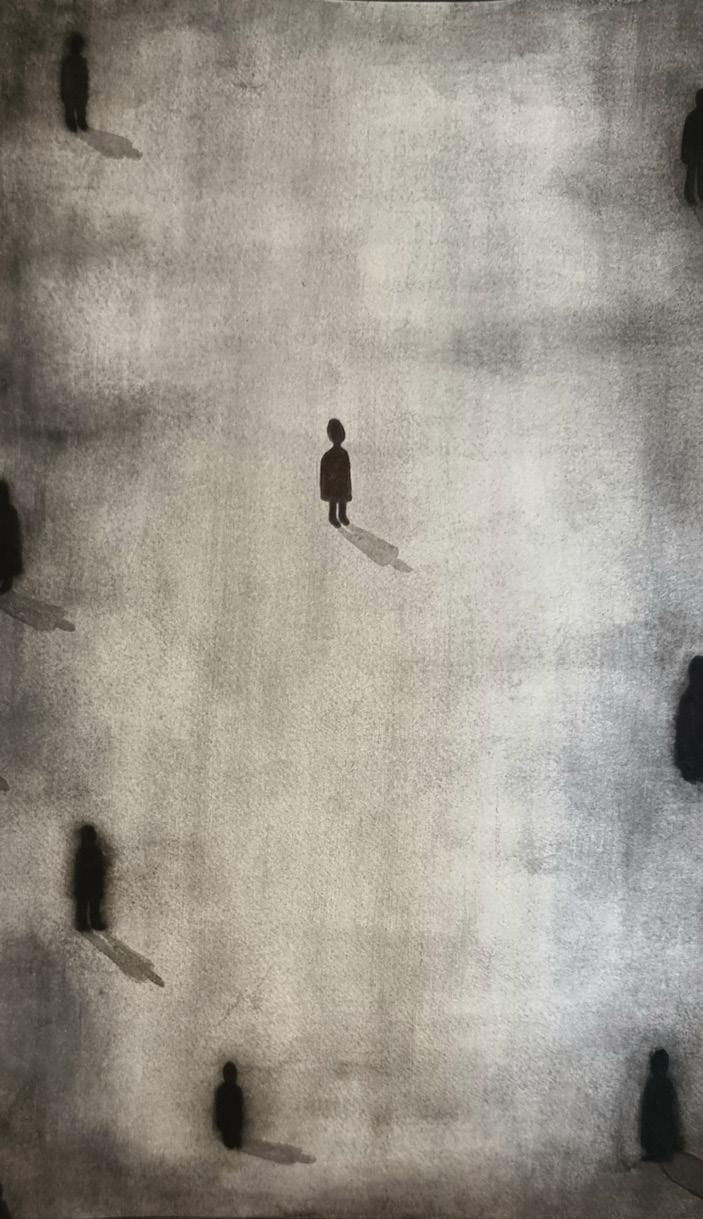
My exhibition relates to the popular notion of good and evil, and the emotions and feelings within those ideas. Good and evil are common themes in art, used to evoke emotions, create drama, and explore the complexities of human nature. In literature, visual art, and cinema, the duality of good and evil is often represented through characters and their actions. The portrayal of good and evil can range from simple black-and-white caricatures to more nuanced, multi-dimensional characters. Good and evil can also be used to explore broader social and political issues, such as power, justice, and morality. In the end, the use of good and evil in art is a way to reflect on the human experience and challenge our understanding of the world around us. Within my work I tried to present the multi dimensional aspects of good in evil in three major aspects. Loneliness, enlightenment and the loss of sense of self. Outside those boundaries I wanted to also be a little more literal, using traditional symbols of good and evil, for example angels, devils and the evil eye. In art, the idea of good and evil is often portrayed through the use of angelic and demonic characters. Angels are typically depicted as celestial beings with wings and halos, symbolizing purity, goodness, and divine guidance. On the other hand, devils are depicted as sinister creatures with horns and a tail, representing temptation, wickedness, and evil. These characters are often used to explore the duality of human nature and the struggle between right and wrong. Art can also be used to comment on societal and cultural attitudes towards good and evil, and to challenge these perspectives. This is something I hopefully have eliminated throughout my exhibition.
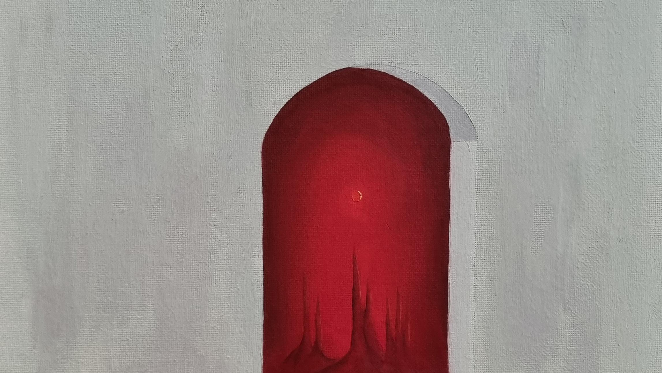
I am using a mix of mediums within my exhibition. The majority of these pieces are oil paintings as I find that fitting to the genre I chose. There are many reasons I have chosen to favor oil paint, some of which being the longevity, versatility, slow drying time and rich colours. The colours in oil point tend to be very rich and luminous, this creates a dramatic effect and impactful images that i think work well in the majority of my pieces. I also chose to experiment with sculpture for one of my main pieces. All of my pieces add something to my overall exhibition, however, this piece brings a physical representation of the mind and personally I think it adds a sense of physicality to my overall exhibition . The final medium I chose to use is water colour. I found it somewhat untraditional for my personal art style, as I rarely use it because of personal preference. However I found that it was a great way to balance my pieces and add range to my exhibition.
As for the arrangement of my exhibition I will place my sculpture in the centre on some kind of pedestal. I think this will help ground my exhibition if there is a centre object. Furthermore as this is one of my more important pieces there is a sense of it ‘taking centre stage’ I would like it to have. As for the rest of my pieces I will be placing them by theme. As in, a piece that is more biblical will be placed next to a piece centred around loss of sense of self so as not to overwhelm the viewer with one them at one. I think the main objective when placing my pieces is to not place too much emphasis on any of the aspects of my theme, whilst also bringing a sense of direction with my sculpture.
Saska Towler