1 minute read
CRETE


3rd Semester Academic Project
Location: Manipal, India
Advertisement
November 2016
The CRETE Material Museum lies in the outer end of the Manipal University campus. Situated on a contoured site, it views down to a meadow filled with peacocks. I was initially interested with manipulating bricks to create a building form. The design evolved as the cantilevers and courtyard started to emerge. I took advantage of the cantilevers to immerse the user with the dramatic view of the meadow. By orienting and placing the museum on the apex of the site, it achieved a monumental entry towards the museum
The contoured site was ideal for beautiful views, large windows that span across the building allows for full immersion with the site. The workshops and museums are connected with ramps and do not affect the natural topography. The concept initiated with the manipulation of bricks. Bricks have an even proportion that promotes building bonds with mortar. The concept was driven by this bond of brick. The modularity of the material can be seen throughout the design. The cantilevered front and back gives the design a better connectivity with the context.

Construction
In part with academics, we were constrained to use reinforeced concrete as our primary building material. I was able to maximize openings and open floors. Due to the harsh monsoons that south India experiences, my goal was to create a structure that will age with time, as most materials do.


The form is tailored around the manipulation of modular bricks. It has an intricately shifted building profile that creates natural courtyards and terraces. From this unique shape, the terraces can be used for outdoor work areas for the workshops. The courtyards is created in the building’s center allowing for a visual experience for people within and outside the struture.

Shared Balcony
Shared Balcony
Logo Redesign
Professional Project
Office: Angelo Architects, PLLC Team: Ishan Dsa
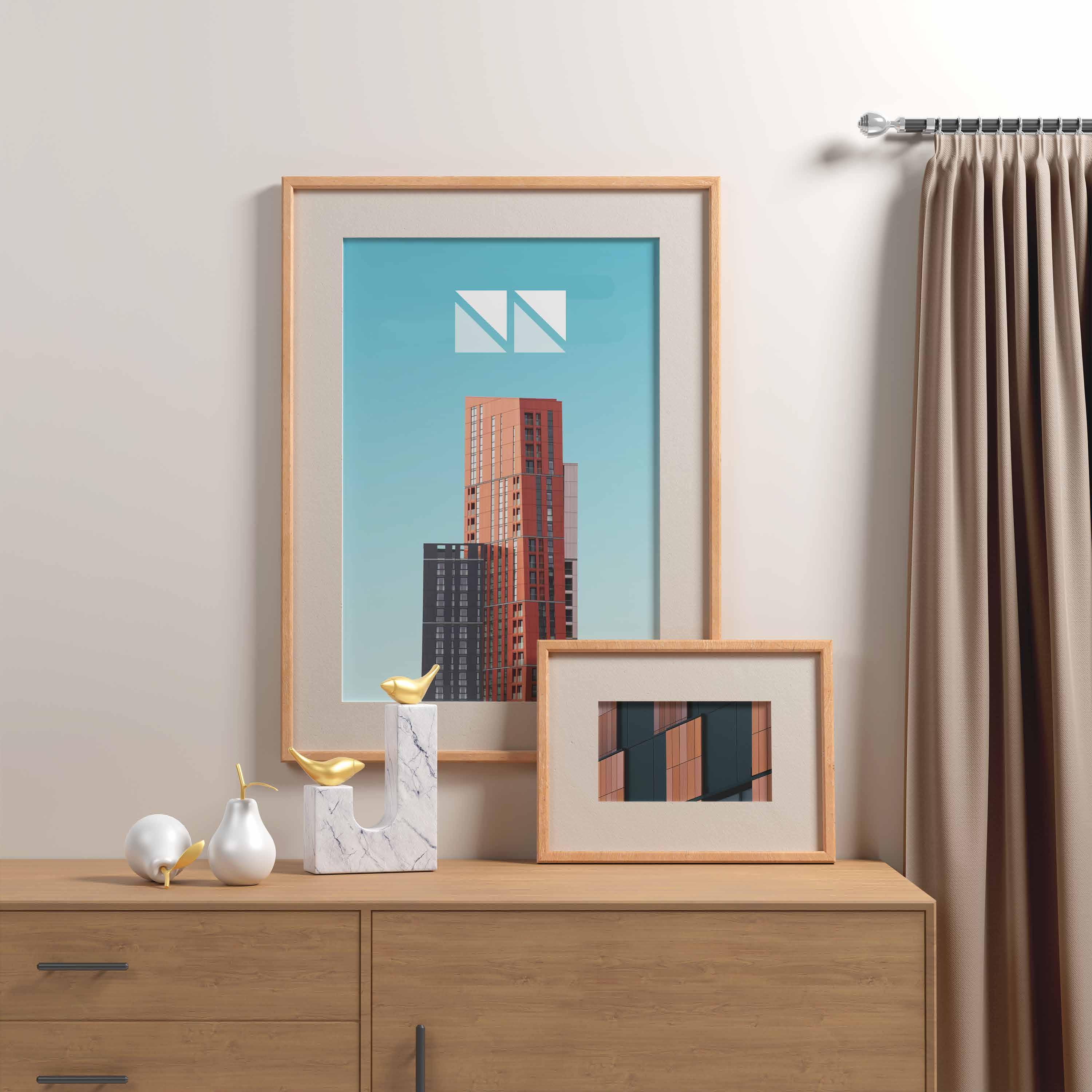
My goal for this project was to redesign the brand identity for a small architecture firm where I was employed. The brief was to redesign the logo that was introduced in the year 2000. The logo had to be fresh, and also have a subliminal message. The main key visual for the redesign, is the concealed message for Angelo Architects. The logo was then crafted to be versatile which answers the need to be used in many different forms. The color mainly used is a darker green which is a favored color of my employer.

While exploring concepts around the brand name and old logo, I was drawn towards the repeating triangle which ultimately spelled out the initials. This subliminal message which was created from the negative space was what I wanted to achieve. Rather than using a generic typeface, I wanted to spell the initials using shapes.