I V A N M O I S E E N K O P O R T F O L I O
Ivan Moiseenko. Development storyboard.
Arch. practice
Politecnico di Milano MSc Arch


New
ConTech Modular construction &




Modular hotels & playscapes


Modular housing, Project Management & Tutoring


Modular housing & health care


Click on icon to go to the project 2014 2013 2012 2015 2016 2017 2018 2019 2020 2021 2022 2023 TU Delft MSc MBE
General Hospital design Economic feasibility of modular construction in hospitals Health care center in Moscow Healthcare village in Como lake Residential district in Moscow
Modular
Institute
Modular Hospital in Russia Modular Hotel in Milan Use phase Refurbishment phase Costs Time Costs Costs Costs Time Time comparing to conventional design 52.900 Euro module 1800 Euro m2 1,5 year from construction budget 25 50 % from conventional Highly depends on case % year from construction budget 2500 Euro m2 Up to 80 m2 day 80 % 180 300 m2 day 0,5 % year 25 50 % 80 % 50 % Depend on the case 50 % from conventional design (3 4% of total budget) % from total budget Modular construction Conventional construction Savings, % Highly depends on the case Highly depends on case - including VAT (21 %) depends on unification of the design Highly depends on the case Traditional construction Modular construction Danilovsky Market re-development Public center in Moscow Zaryadie park competition in Moscow Quanke Central Axis park, China
standard of mass housing competition Moscow Arch.
development department Modular prototyping Modular House Design Factory business trips to Europe Modular Built Environment book Senior Tutor. Bachelor University course
Modular Hotels Feldsher-obstetric station 1 Modular outdoor constructor CLT modular housing Project Management Multi-story modular housing Feldsher-obstetric station 2
Hotel _ design studio, Politecnico di Milano
Task: Hotel design studio
Authors: Ivan Moiseenko, Alexandra Krivolapova
Design: 2014
Location: Milan, Villa Della Zechia Vecchia
Supervisor: Cino Zucchi, Politecnico di Milano


4
FINAL ASSEMBLY. Author of all drawings Ivan Moiseenko
TWIN / DOUBLE ROOMS
LOGIA
TWIN / DOUBLE ROOMS
SCHEMES OF THE HOTEL’S DESIGN. Author of all drawings Ivan Moiseenko
1. SCHEME OF STRUCTURAL SYSTEM
2. SCHEME OF HEATED AND NON-HETED PARTS
3. SCHEME OF ROOMS’ TYPOLOGY
RECEPTION
EMERGENCY STAIR
GLAZED ATRIUMS
MULTI-FUNCTIONAL AREA
4. STRUCTURAL DIAGRAM
OVERLAPPINGS COLUMNS
HEATED VOLUMES
NON-HEATED VOLUMES
DOUBLE ROOM / 24
TWIN ROOM 20
6 BEDS/ 10
6 BEDS/ 8
5. 3D SCHEME OF THE LOGGIA
4 BEDS 10
4 BEDS 3
12 BEDS 1
COLUMNS PILLARS
6. SCHEME OF PUBLIC SPACE
MODULAR LANDSCAPE ELEMENTS
BENCH
This project was my design studio in Politecnico di Milano under the leadership of Cino Zucchi, Milanese architect and professor of Politecnico. The design task was to deliver a hotel in the center of Milan, with public space next to it. It was two of us, Alexandra and me, who was working on this project. Alexandra focused on design of the public space, and I concentrated on building design. This choice was done based on our preregatives. I am interested in residential design since my studies in Moscow Architectural institue, where living typology was my specialization. Alexandra has big experience in landscape design, and it was here responsibility in this collaboration.
PARK PAVILION
PARK PAVILION


MORPHOLOGY SCHEME
4 / 6 / 8 / 10 / 12 rooms
/ 6 / 8 10 / 12 rooms
WATER
2 PEOPLE, SHARED TOILET
4 PEOPLE, SHARED TOILET
6 PEOPLE, SHARED TOILET
8 PEOPLE, SHARED TOILET
10 PEOPLE, TOILET INSIDE
2 PEOPLE, TOILET INSIDE
4 PEOPLE SHARED TOILET
EMPTY UNIT
DIVISION OF MODULES BY MOBILE PARTITIONS
 DETAIL «A»
DETAIL «B»

Modular General Hospital (MSc Architecture, Politecnico di Milano)
Task: General hospital for 350 beds, design stage
Authors: Ivan Moiseenko
Design: 2015 - 2016
Location: Pensa city, Russia
Supervisors: Stefano Capolongo, Marco Gola, Politecnico di Milano
Link to full thesis: https://issuu.com/ivanmoiseenko/docs/2016_07_moiseenko


Current hospital site. (author Ivan Moiseenko)

New hospital within urban tissue. (author Ivan Moiseenko)
Burdenko hospital territory
Public access greenery
Internal private court yards for hospital patients
Index Current situation After renovation Size of the plot 10,2 Ha 12.000 m2 61.180 m2 0.6 0.12 5.0 Footprint GFA (Gross Floor Area) FAR (GFA / size of the plot) COV (Footprint/size of the plot) HEI (FAR / COV) 10,2 Ha 10,2 Ha 30.600 m2 18.600 m2 Extension 70.000 m2 131.180 m2 0.69 1.29 0.18 0.3 3.83 350 300 650 4.3 Number of beds


1 4 7 2 5 8 3 6 9 Healthcare related facilities Policlinic Wards Administration Research facilities Surgery block Nutrition unit Technical facilities Green
Visitors’ hotel
yards
Office
Step-by-step renovation scheme of Burdenko General Hospital (author Ivan Moiseenko)

This is final overview of renovated hospital complex. New structure is connected with existing hospital tower and unifies the majority of hospital buildings on the plot. Hospital street connects all buildinga and departments of the hospital not only on the ground floor, but on the upper levels as well by bridges and elevators. Some of the internal yards are covered on 2d level to organize sport and special medicare activities, such as surgery block. Internal courtyards on ground level are reserved for out-patients, who come to the hospital for an appointment, while roof gardens are for in-patients of the wards. This design strategy allows to separate patient flows, which is quite important in hospital.

This scheme shows organisational spatial structure of the ground floor. Two main categories of users - doctors and patients are separated and have their own entrances and areas. At the same time, there are a lot of interaction and public spaces on the ground floor. Hospital street, the main artery of the hospital contains meeting places, shopping pavilions, and information desks. From the hospital street it is possible to get internal court yards, both covered and open ones. Upper left court yard contains surgery block with tis own entrances and ambulance parking garage. Such location of surgery block in one level provides higher level of daily operational flows.


 Intensive care unit Practitioner office with movable wall Practitioner office
2 double-patient wards
Modules’ production in factory
Modules’ transportation on site Mounting main frame on site
Fill-in main frame with modules
Opportunity to add segment of the building
5-storey building block
5-storey building block with hang cantilevered modules
Assembly principles Individual room Building level Functional floor
7-storey building block with hang cantilevered modules
Ward floor
Surgery floor
Healthcare related facilities floor
Surgery room
Bottom-up flexibility design principles used in Burdenko general hospital renovation project
The purpose of this model is to test the designed modular system of the standard hospital building. Model schows up main skeleton and insterted modules.
Primary and secondary stabilized systems are also represented here. External segments of main skeleton have diagonal connections in order to stabilize structural system. They repeat in every two sections, and provide flexible internal layout together with structural stability.
Main skeleton consists of primary columns and beams with the crossection of 300 mm. Secondary horizontal beams have crossection of 120 mm and perceive the load from the modules.
Facades of the modules represent different functions of the hospital departments. This concept came to me from the complicated nature of hospital complex. Different healthcare facilities require different amount of sun light, as well as can represent themselves by various facade topics. Visitor can see different materials, and rythm of windows, which make the perception of the hospital more diverse and nonmonotoneous. Some of the modules have cantilever parts, which allows to organize terraces for in-patient wards.


Hospital facades highlight different departments represented in the complex and correlated with amount of light required for one or another function. Office and research facilities along hospital street require high amount of daylight and have wide widnowframes. Last floors of standard hospital buildings are technical ones, and do not require sunlight, in general. Colorful facade panels on this level make building more playful. levels of hospital departments has their own facade themes, and deliver human scale for internal court yards.
This number of different facade solutions makes an entire complex diverse and non-monotoneous. By being inside, visitors can see different themes and scales, which, again, makes hospital perception diversified. Hospital street has identical facade solution, which corresponds with connectivity function of this place, while different hospial buildings have different facade topics. All together they create an interesting solution with different layers and themes.

Economic feasibility of prefab solutions in hospital construction
Graduation project, TU Delft (MSc Management in the built environment)
Task: Financial assessment of modular construction in hospitals
Authors: Ivan Moiseenko
Design: 2016 - 2017
Supervisors: Ruben Vrijhoef, Peter de Jong


This master thesis project is a continuation of the work done by me in Politecnico di Milano, where my graduation project was design proposal of modular general hospital. Hospital typology is in my focus for several years already, based on its complicated nature and demand to combine technological issues with spatial and architectural quality.
Milan project examined most relevant trends in modern hospital development and focused on flexibility in hospital building. Hospital flexibility is one of the main strategies in hospital design and construction today, since obsolescence of medical facilities is such a quick that hospital requires a renovation after 10 years of use (Capolongo et al, 2012). In order to test all aspects of hospital flexibility, the real general hospital in Pensa, one of the Russian cities, was taken for the analysis and renovation flexible project was designed. Renovation proposal was done in a modular way to test this flexible scenario. (see previous pages of this part).
In order to research feasibility aspects of modular hospital development, the standard module from Milan project was analyzed and compared with conventional construction process. The purpose was to understand whether any savings in time and cost in modular hospital construction comparing to traditional one. The outcome of the research is represented on the next pages.
Technical feasibility
Feasibility study research concept
Economic feasibility Legal feasibility
Operational feasibility Schedule feasibility
Main research question:
To which extent are prefab solutions in healthcare design and construction are more economically feasible than traditional methods?
Materials required
Labor required
Resources required
Transport required
Materials costs
Labor costs
Resources costs
Transport costs
Benefits > Costs
Legal requirements
Legal obligations
Legal codes
Process structure
Company’s structure
Schedule phases
Schedule deadlines
Feasibility is a degree to which the economic advantages of something to be made, done, or achieved are greater than the economic costs
2 fields are selected for feasibility analysis:
Economic feasibility
Operational feasibility


Time savings in modular construction Cost savings in modular construction
Feasibility study theoretical explanation (author Ivan Moiseenko)
Based on the analysis of different parameters in design, construction and use phases, savings in modular construction were identified and summarized by me in this final table. Savings in design phase are highly depend on client request and amount of predesigned elements. The higher this amount is and the lower the client’s demand for changing of the standard layout, the higher time and costs savings in this phase of modular construction.
Savings in construction phase come from the nature of module’s production process with fixed number of operations, strict regulations of resources flow and indoor assembly environment. These factors allow to save up to 30% in costs and up to 80% in time, based on quick assembly of completed modules on construction site.
Use phase results in 0,5% reductions in annual maintenance costs, as well as up to 50% in refurbishment phase, mostly based on fixed number of components inside the module and responsibility of one general manufacturer for their change. Finally, relocation of the modular building is an exclusive preregative of modular construction, which allows to use building several times in different locations.
Final assessment of savings in modular hospital construction comparing to conventional one
Parameter
Design phase
Construction phase
Use phase
Modular construction Conventional construction Savings, %
50 %
80 - 100 % faster comparing to conventional design **
52.900 Euro / module 1800 Euro / m2 *
Depend
on the case
80 %
% / year from construction budget
- 50 % from conventional construction
Highly depends on the case
2 % / year from construction budget 28 % 0,5 % / year 25 - 50 %
Highly depends on the case Highly depends on case
* - including VAT (21 %) ** - depends on unification of the design


Modular construction
Traditional construction

Time Time
Refurbishment phase Costs Time Costs Costs Costs
1,5
25
2500 Euro / m2 Up to 80 m2 / day 80 % 180
Highly depends on case 300 m2 / day
50 % from conventional design (3 - 4% of total budget)
6 - 8 % from total budget
Danilovsky _ food market renovation, international competition
Task: Re-development of Danilovsky food market (existing building)
Authors: Ivan Moiseenko, Pavel Panov, Tamara Varlamova, Anna Chistopolova, Ksenia Bisti
Design: 2015
Location: Moscow, South administrative area
Status: Competition, short-list, partially completed


This project was a competition for redevelopment of Danilovsky market, one of the oldest markets in the city center.
Oganizators asked architects to design the multy-purpose space which is going to accomodate diiferent activities beside the food market itself.
The new project, therefore, should become a place, where citizens can spend the whole day by not only buying products, but rather having social, cultural and multy-disciplinnary activities.
We named our concept “Big gastronomic journey”.
The internal and external area of the market work together and subdivided into 4 zones, acording to 4 seasons in nature.
Selling products, as well as all activities are spread through the space by this division.
Interinal space can work not only as market but rather as stage for concerts, lectures, open gastronomic schools, etc by using module counter which was elaborated for us according to technical request.
open cafe terrace
food court start-ups
food court start-ups
farm / playgrounds
multi-functional space
food court start-ups
culture start-ups
family charity neighbors farm

Since the building structure of the market is a heritage object, we decided not to change it, but to concentrate on organization of internal space. We designed radial masterplan of the market’s interior, which helps visitors ot find special area they are looking for.
Central zone is reserved for multi-purpose stage required by the brief. This place can be used as standard trading are during the day, while being transformed to performance stage during special events.
Some of the encounters have have second floors united by round walking gallery. These open terraces are used for cafes, co-workings and observaition places during the events.
Floor pattern highlights seasonal zonning areas, according to four times of the year. Ceiling pattern, presented on the next page, is matched with the floor one.
TRADE GALLERY
FARM
ANTRESOL CAFE
WALKING GALLERY
MULTI-PURPOSE STAGE
TRADING
TECHNICAL ZONE
FOOD-COURT PAVILIONS

Ceiling and floor patterns mark 4 different zones of the market, which are corresponded with seasonal products. Lower external parts of the shell are used for grasses and crops, which make transition from surrounding area. Basement floor contains shopping center.
Ground floor plan with pattern (author Tamara Varlamova)
Ceiling pattern (author Tamara Varlamova)

Telescopic counters have 8 different positions. They might have 3 different levels, or the only one, depending on the product being sold. Weels on the bottom part allow to move counters wihin the market and organize any combinations of them.
 «Island» counters (Author Ivan Moiseenko, Ksenia Bisti) «Island» counters with roof terrace (Author Ivan Moiseenko, Ksenia Bisti)
Balloon above the market’s dome serves as an attraction point and landmark, which is visible from faraway. My initial idea was to make the balloon usable for the visitors, who could go up in the basket and observe the city from the top. This idea was not realized in the final design, but it is possible to make it.


 Roof garden terrace (top), street view of the food court pavilions (bottom) (authors Ivan Moiseenko, Ana Chistopolova)
View of the farm (top), night view of the market (bottom) (author Ivan Moiseenko)


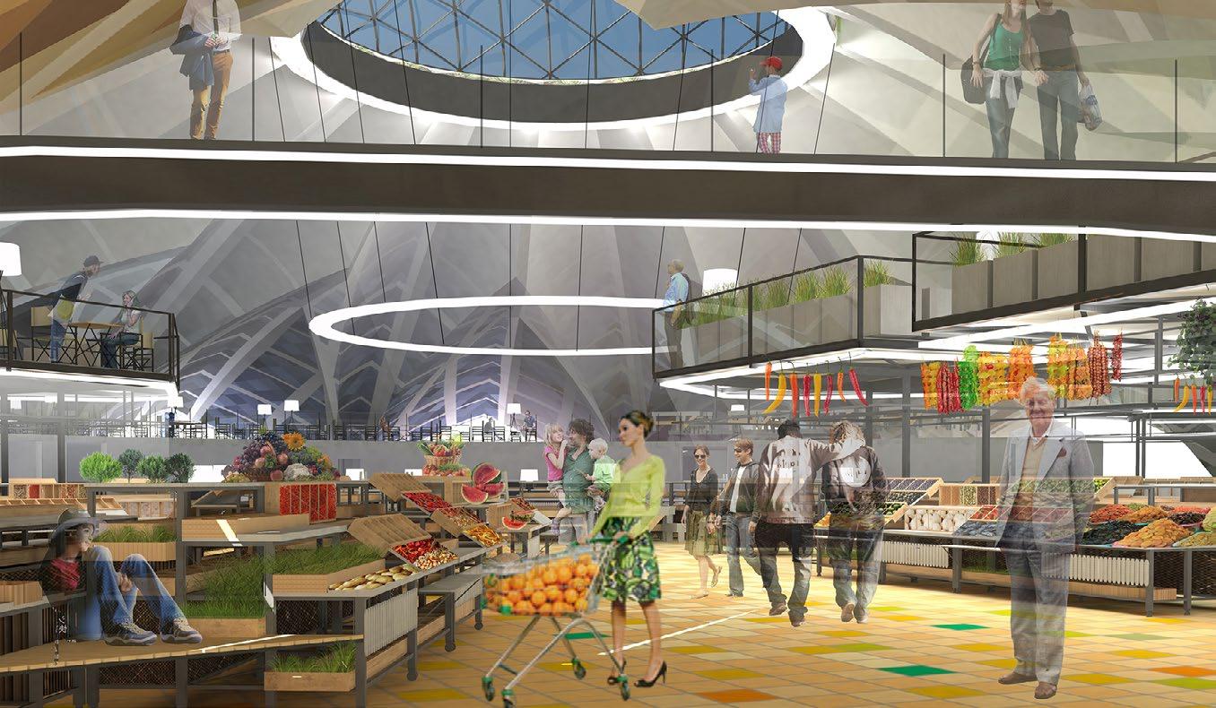 View of the farm (top), night view of the market (bottom) (author Ivan Moiseenko)
Interior 3d views of our design (author Ivan Moiseenko)
Photos of the complete building (author Ivan Moiseenko, Tamara Varlamova)
Mass housing _ international competition
Task: Development of the new dwelling model for Russian cities
Authors: Ivan Moiseenko, Tamara Varlamova, Pavel Panov, NL Urban Solutions
Design: 2017
Location: Russia
Status: Competition


Big urban block, 3 ha foot print

173,5м
173,5м
Internal courtyards are lifted on 1,3 m to define public and private spaces

Public facilities (shops, comunity centers, cafe)
Public parks
Raised courtyards, accessible only for residents
Streets and parking lots
Kindergarten with its own territory
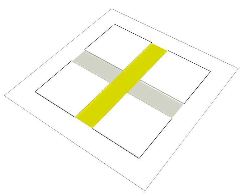
Morphology scheme of the urban block
4 blocks with internal streets

3 types of houses in the urban block

Gallery houses
Section houses
Urban villas
Internal streets can be the parks as well as roads and parking places
Internal park
Internal streets and parking lots
Final view of the urban block

Public parks
Raised courtyards, accessible only for residents
Streets and parking lots
Kindergarten
Public facilities (shops, comunity centers, cafe)
N 4
1
3 Ha N 3
S =
71м 30м 71м 173,5м 30м 2 N N 5 N N 6
Kindergarten for 50 children
Parking lots
Kindergarten’s yard on 0.00 m
Shops / cafe
Raised internal courtyard 1,3 m
Community center
Internal streets and parking lots
Stair from
internal courtyard
Stair from
Entrance
Ground


Local street
Parking lots
Local street
Детская площадка
Landscape design
Raised internal courtyard 1,3 m
Vacuum chute
Open amphitheather
Internal streets and parking lots
Playground for dogs
Raised internal courtyard 1,3 m
Sport playground
Local street

floor plan of the big urban block
Vacuum chute
underground parking
to underground parking
/ public infrastructure Section 1-1
Kindergarten Commerce
underground parking
Raised
1,3 m
street N 1 2 2 1 Section 2-2
Local

Box rectangular modules
Modules with pitched roof
Modules with sloping roof
Elevators and stair cases
Community center


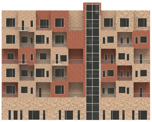


Section house facades Gallery house facades Urban villa facades


 Internal rised courtyard (top), Internal rised courtyard (bottom) (authors Ivan Moiseenko, Tamara Varlamova)
Street view of the urban block (top), Internal linear park (bottom) (authors Ivan Moiseenko, Tamara Varlamova)
Magistralnye streets _ urban re-development, Moscow
Task: Redevelopment of former industrial area
Authors: MLA+
Design: 2016
Location: Moscow, north-west administrative area
Status: Design stage


The process of redevelopment of former Moscow industrial zones takes place for several years, already. Historically, Moscow industrial zones formed along the rivers and in other attractive places just based on convenience for particular industry. Density of the city in these areas, then, is quite low.
An industrial area near Begovaya metro station was partially developed by MLA+ for residential purposes. Two plots of the area, marked by yellow on the right side schemes were developed by our bureau, while the middle zone marked by pink was designed by another team.
I was involved in urban stage of this competition as well as in detailed design of the buildings. It was very useful to be a part of such a big team and to be involved in decision making process o diferent scales.
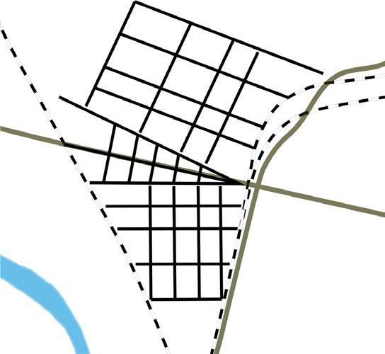

 Massing view of the new district within urban context (author Anton-Eguriev-Silva)
Zonning diagrams (authors Anton-Eguriev-Silva, Ivan Moiseenko)
Location of the project in Moscow city


[URBAN

[4 PRODUCTS]
[4 DOMINANTS]

Overall masterplan Variety of districts and their style New city streets and squares High-rise dominants
FOR LIFE]
[SPACE
STREETS AND SQUARES]
УЧАСТОК 1


[PLOT 1]
Morphological diagram of plot 1

Quanke Central Axis Park
Task: Building design & masterplan development
Authors: NL Urban Solutions
Design: 2017 - 2018
Location: China
Status: Preliminary design phase


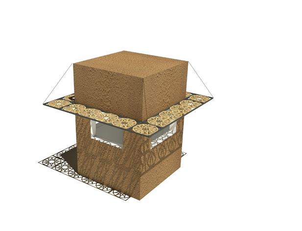
There is a number of objects in Central axis park I was responsible to design. The first one, kiosk, is a small information pavilion which stands along the routes in the park.
The structure is done as metal frame skeleton and sandwich panels with plaster as finishing layer. Wooden carving elements are used as shelter along the perimeter of the kiosk and provide a play of light and shadow on the walls of the pavilion as well as on the ground.

Climbing center is designed as a green hill with climbing, landscape and playground elements for different ages of the children. North part of the hill is concrete one with artistic pattern imprinted on it represents noodle culture which was born in this Chinese region thouthands years ago (see picture below).

Tree pavilion designed for the rest of the visitors and represented in 4 copies along the park. Metalframe structure is used as main skeleton stands on 3 arches and covered by net membrane out of sailing ropes.


Pergola’s design continues the theme of the local patterns and their play of light and shadow. Pergola structure designed as segmented curved element which can be assembled into different variations and form different structures.
Visitor center was designed instead of old mosque previously standed on this place. The client was not in favor of preserve the mosque and asked us to design a new structure.
Visitor center has an open plan and contains information desk, bar area with the kitchen and toilet block.
Wooden carved roof panels along the perimeter of the center is another representation of local islamic patterns with the play of light and shadow.
Kiosk Climbing center Tree pavilion Pergola Visitor center


Entrance pavilion located at the south part of the park and established on the place of old mosque. The client was not in favor to preserve the original building and desired to build a new structure. I decided to save the dimentions and proportions of the mosque since they were quite strong. New pavilion gets square plan with 3 entrances and open plan movable furniture and bar desk in south-west corner. Glass facades with wooden panels perforated by traditional islamic pattern make a play of light and shadowi in in- and outdoor spaces.
 Entrance pavilion bird’s eye view (top), Entrance pavilion interior (bottom) (author Ivan Moiseenko)
Facade A - C (author Ivan Moiseenko)


 Yellow River Slow Traffic, China
Masterplan Buizengat Oost, Netherlands
Anshun Xixiu District project
Modular housing_development project
Task: Launch of modular development division in Russia
Authors: Ivan Moiseenko et al
Design: 2018 - 2019
Location: Moscow
Status: Design stage


1. Business idea
6. World analogs
2. World modular producers
7. Parameters of the modules
3. Modular construction in a nutshell
4. Benefits of modular construction
8. Rental housing. Pilot project.
9. Porjects & prototypes
5. Cons of modular construction
10. Pilot modular house, Moscow
Book ‘Modular Construction. Mass-Non-Mass Housing” contents written by Ivan Moiseenko


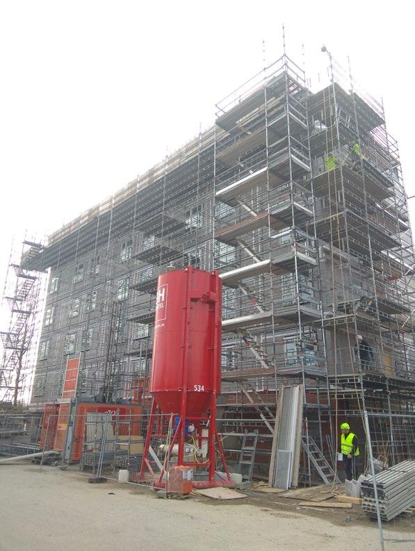
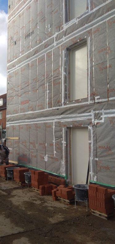

6-story modular hotel
Copenhagen, Denmark
done by Forra Pro
 Forta Pro factory tour, Latvia


This project was a full-scale start-up in one of the leading Moscow development companies to lounch modular development division in Russia. I was invited to lead this project from The Netherlands in 2018. I combined the roles of Proect Leader and Chief Architect, also working on feasibility study part and product development.
The result of this project was completed DD (Detailed Design) stage of several modular prototypes ready for construction as well as documentation for 9-storey modular house for one of the Moscow’s sites.


Detailed drawings of modules’ connection
 Interiors of the studio modules with Ikea furniture


 9-story modular house project
On-site montage
Module transportation
Equipment
Furniture
Facades (materials + job)
Feasibility studies & BoM

MEP (job)
MEP (materials)
Architecture (materials)
On-site montage
Module transportation
Furniture
Architecture (job)
Structure (materials)
Structure (job)

Architecture (materials)
1.600 Euro/m2 for prototyping stage, only modular part (feasibility studies)

Facades (materials + job)
MEP (job)
MEP (materials)
Architecture (job)
Structure (materials)
Structure (job)
1.200 Euro/m2 for production stage, only modular part (feasibility studies)

Modular Built Environment.
Mass Customization Development Book.
Task: Continuous systematization of all aspects of modular development
Authors: Ivan Moiseenko
Design: 2018 - present
Location: Worldwide
Status: Ongoing


Quadrum modular hotel & village
Task: Design & construction of modular sailing & yoga resort
Authors: Ivan Moiseenko, Ilya Kirushin
Design: 2019 - 2020
Location: Peryaslavl-Zalessky
Status: Partially completed
Link: http://quadrumtecture.com/


33 modules in total in two blocks
3 storeys height each block
6 men on-site assembly team

6 months in total
4 months off-site construction
modular block construction timeline
4 days assembly
GFA 1600 m2
two blocks
Upper block semi-modular
- 15 standard rooms (1 module)
- 3 family rooms (2 modules)
- open terraces
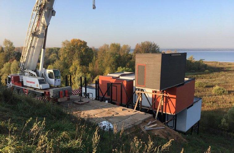
I co-founded the modular company with my partner at the end of 2019, after I left big Moscow development company I worked for. My partner got a land in Peryaslavl-Zalessky and we decided to build modular hotel overthere to test the technology, technical solutions and the concept, in general. At this moment, first block is completed, and we are ready to build the second one, which is situated at the top of the slope.
Lower block modular
- lobby area
- restaurant & bar
- 1 standard room (1 module)
- 1 lux room (3 modules)
- storage facilities
- open terraces
- sauna

Jun20 Jul 20 Aug 20 Sep 20 Oct 20 Nov 20 May 20


Exterior photos


Exterior photos

Landscape modular design. Masterplan
References and Moodboard



 Lugopark
Tetris
De Ceuvel
Modules
Amsterdam Free district
Kite Horizon
Wood Grass Sails Lake Hill
Modular hotel Wideness Water

Playground

Cafe terrace
Recreation area

 House 1.3
House 2.2
House 1.3
Sauna
House 1.3
House 3.2
House 1.3
House 1.3
House 2.2
House 1.3
Sauna
House 1.3
House 3.2
Modular Village
House 2.3


Наименование помещения №№ S, м2
S полез.: 11,5 м2
S ГНС: 14,95 м2
ИТОГО Помещения 2 этажа
S застройки: 14,95 м2

Кладовая

S полез.: 11,5 м2
S ГНС: 14,95 м2
S застройки: 41 м2
м2
S полез.: 23,0 м2
S ГНС: 28,4 м2
S застройки: 28,4 м2

S полез.: 23,0 м2
S ГНС: 28,4 м2
S застройки: 90,7 м2
House 1.3 House 2.2 House 1.1 House 1.2 House 2.3 1 7 3 4 5 8 9 3500 8100 10500 3500 3500 11 6 2 3 3500 7500 10500 3500 3500 6 1 2 4 5 7 6 8 9 14 м2 Master bedroom Кладовая Ванная комната 1,7 м2 5.5 м2 Открытая терраса 48,9 м2 ГНС 1 этажа 58.2 м2 ИТОГО Помещения 1 этажа ИТОГО ИТОГО Площадь застройки 0,0 м2 58.2 м2 3500 8100 3500 2d Floor Наименование помещения №№ S, м2 1 2 3 4 5 11,2 м2 5.7 м2 Холл 4,2 м2 Санузел Терраса Кабинет
13.6 м2 Спальня 46,3 м2 ГНС 2 этажа 58.2 м2
(спальня)
ИТОГО ИТОГО Площадь
95.2 м2 1 2 3 4 5 ИТОГО Площадь
11,6 м2 58.2 м2 3490 6 3500 3500 5
дома (полезная)
застройки
1 2 3 4 5 7 6 8 9 10 2,5
2,0 м2 Тамбур 1,9 м2 Прихожая Master-bedroom Техническое
16,5 м2 Гостинная 8 м2 6,4 м2 13 м2
комната Кухня Детская спальня 10 м2 Кабинет 6,4 м2 Открытая терраса 0,0 м2 2,7 м2 11 84,8 м2 Помещения дома 69,4 м2 Площадь застройки 3490 60008100 84,8 м2 1 7 3 4 5 8 9 3500 8100 10500 3500 3500 11 6 2
помещения S, м2 2,5 м2 2 м2 4,2 м2 5 м2 14 м2 13 м2 2,7 м2 5.5 м2 48,9 м2 58.2 м2 0,0 м2 58.2 м2 1 3 6 3500 8100 8 7 5 3500 2 4 6000 2490 2490 6000
помещение (бойлерная)
Ванная
3.2
2490 60008100 1.1 3500 8100 3490 60008100
3500 8100
1.3


Detailed design of the modules


Modular Hotel, Anapa
50 m 20 m N
Axonometric views

 Structural scheme axonometric view
Typical module explosion scheme
Single module frame structural analysis in Autodesk Inventor & NASTRAN


 Structural mesh for NASTRAN analysis
Stress Analysis diagram in NASTRAN
Safety Factor Analysis diagram in NASTRAN
Safety Factor Analysis deformed diagram in NASTRAN
Safety Factor Analysis deformed diagram in NASTRAN
DIsplacement Analysis diagram in NASTRAN
DIsplacement Analysis deformed diagram in NASTRAN
Stress Analysis deformed diagram in NASTRAN


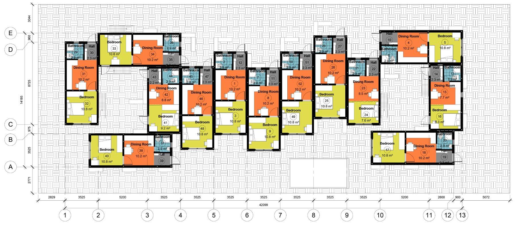


Ground Floor Plan Room schedule First Floor Plan Room schedule Room legend


 East and West Elevations
South Elevation
North Elevation
Place For Play _ Modular playground environment
Task: Design of the modular playground environment
Authors: Ivan Moiseenko, Tamara Varlamova
Design: 2017 - present
Location: Multiple locations around the globe
Status: Design, Prototyping, Under construction
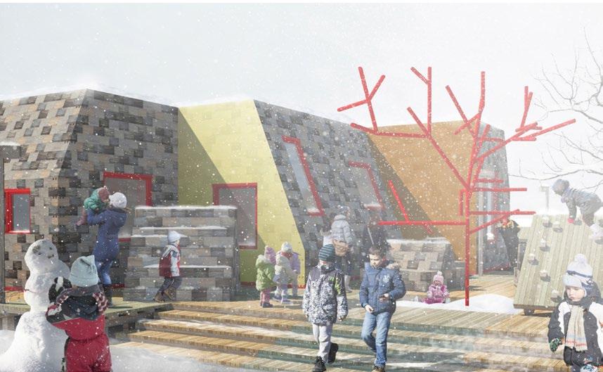


Place For Play is a modular playground environment use to be as a universal instrument which gives a human, from small children to their grandparents, an opportunity to design and built thier own play scenario, and to modify it immediatelly they would like to do so.
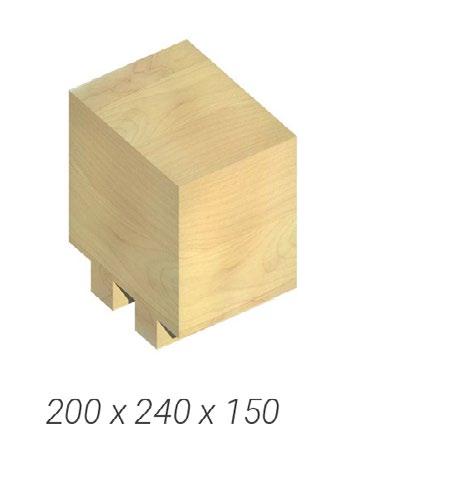
Basic unit of this environment is a block, which can be made from wood, plastic, silicone and other materials. These blocls can be assembled into indefinite number of combinations which is limited only by player’s imagine. Thanks to very easy connection method on the one hand, and sufficient number of modification, on the other hand, these blocks are useful for all types of play, equally indoor and outdoor. Players can use single bolcks as cars, bricks, benches and any other objects, as well as to build shelters, houses, walls, labyrinths and infinite number of other combinations to play.
The main principle which lays down in this idea is Free Play Principle. It allows players to make a play according to their pwn scenario and does not limit them by certain forms of elements, special details or other predefined parameters. Instead of, the blocks, these basic units, are abstrat and very common in order not to limitate children in their fantasies.
Another very important principle of Place For Play is a principle of collaborative design, which means that all members of local community are involved into its design.
What for play spaces are needed?
They are not needed.
Children play everywhere without any special “playful” places.
But the opportunities of urban environment are limited. That is why demand for DEDICATED and SAFE place for FREE PLAY is emerged.


Free Play principle
It is better to fill in play spaces by open objects which are:
TRANSFORMABLE
PROVIDE DIFFERENT SCENARIOS OF PLAY
REMAIN ATTRACTIVE FOR A LONG TIME
“Adults are often think they perfectly understand what children need, but than playgrounds lock and fix actions and imagination of children”
U. Richter


Collaborative Design
Local community does not participate in creation of play spaces. The result is:
- the necessities of the community are not taken into account
- disunity
- vandalism
The involvement of the local community in the design and further construction process gives:
- Emergence of social connections
- Satisfaction of individual needs of community
- Sense of belonging

1. How it works?

Place for Play is a language for communication and self-expression
2. How it works?
Letters
“Letter” is a basic element of constructor. These elements make “words”, but they can be self-sufficient for play, since each block can pretend car, house, rock, etc.

3. How it works? Sentences How it works?
Words
The 2d level, “words”, or blocks, is made from letters of 1st level. “Words” are small independent objects built in 1:1 scale
“Words” form “Sentences”, the 3rd level of environment, which is scaled by the players. By using “sentences” you can make something where you fit and hide yourself.
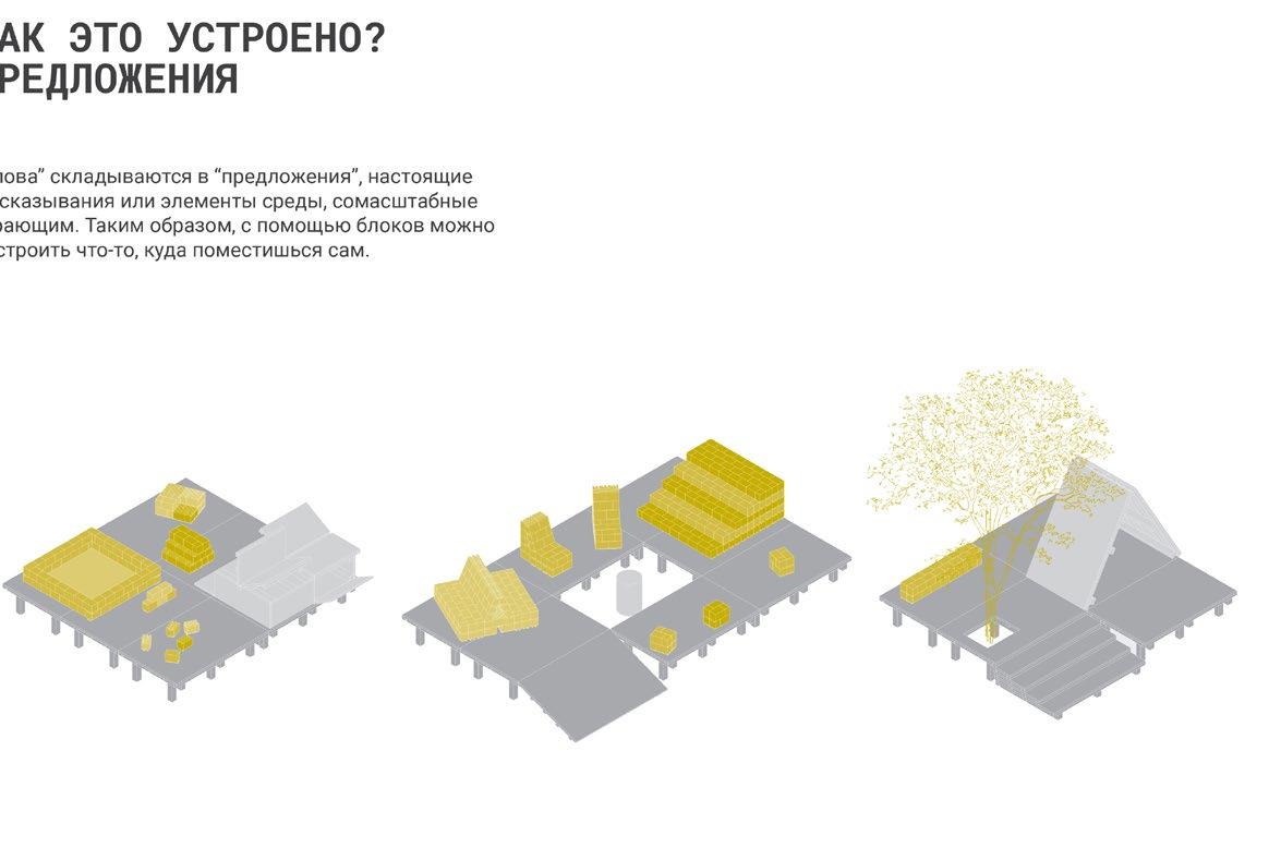
4. How it works? Text
“Sentences” make “Text” - full-scale playful environment for everyone.

letter sentence
text
word


Elevations of the assembled Place For Play Hub
Materials to be used Wooden prototypes




 Foame Wood
Bioplastic
EVA
Cork Tree
Management job_ samples of completed projects and tasks
Task: Management activities
Authors: Ivan Moiseenko
Design: 2017 - 2020
Location: Moscow
Status: Completed


1. Process Maps.
Process maps is a powerful instrument not only for visualization of existing processes in the company, but also for their adaptation and development. Process maps take the beginning in automobile industry, especially in Japanese automotive culture. By using such structured, graphically simple and visually friendly schemes for representation of the process in any company it is possible, first of all, to fixate a status quo, and, then, to improve it during collaborative meetings and brainstorm sessions. These process maps are extremely important for new employees who might

WRIKE.
get stuck at the beginning. The example of tender process map shown above help legal and tender departments to follow the exact process and do not lose any piece of information in order to close contracts on time and within the budget. Moreover, instead of preparing long text documents and company standards which are, many times, hard to read, these maps are catchy, simple and provide an overview of any process. It is also very easy to adjust processes in the company by working with such graphic schemes.
Process map of Tender, PD and WD design stages of the building (authors Ivan Moiseenko, Tatyana Markina)
Process map of Tender process (authors Ivan Moiseenko, Tatyana Markina)


Metrics is a powerful tool for collecting and visualization of data for any company. The architectural office I worked for uses such parameters as planned and actual working hours spent for the projects, number of people in working teams and other factros to manage the company. Although this data was used in the office long time ago, there was no effective and intuitive tool which represents all these charts in a user-friendly way. That is why I initiated the process of design such effective visual tool which
should be visible on the internal web-portal of the company. Together with my colleague we prepared detailed technical brief which described all the instruments we would like to use. We drew diagrams, charts, tables and formulas to give a powerful tool to all management teams in the company. Now on, when this tool is in use, it is easy for everybody to check many parameters of the company and to be aware when planning the activities.
2. Metrics.
WRIKE.
Visual infographics of the office’ projects by year, project design stage, ammount of m2, etc.

Actual vs Maximum Workload of the Design Departments (Architectural, Structural, MEP)

 Gant Chart of the standard project with its tasks. Wrike online task management tool

Standard project view with tasks, assignees, start & due dates and other metrics. Wrike online task management tool

Standard view of the Design projects with tasks and calculations of the main metrics

Main metrics of the office’ projects (teams, workloads, start & due dates, budgets) combined in one sheet
Moscow Architectural institute_Tutoring B.
Arch. group
Task: Tutoring Bachelor degree students (group of 20 people)
Authors: Ivan Moiseenko & students
Design: 2020 - 2022
Location: Moscow
Status: Completed


building
Public
project. Physical model. Student Valentina Mironova
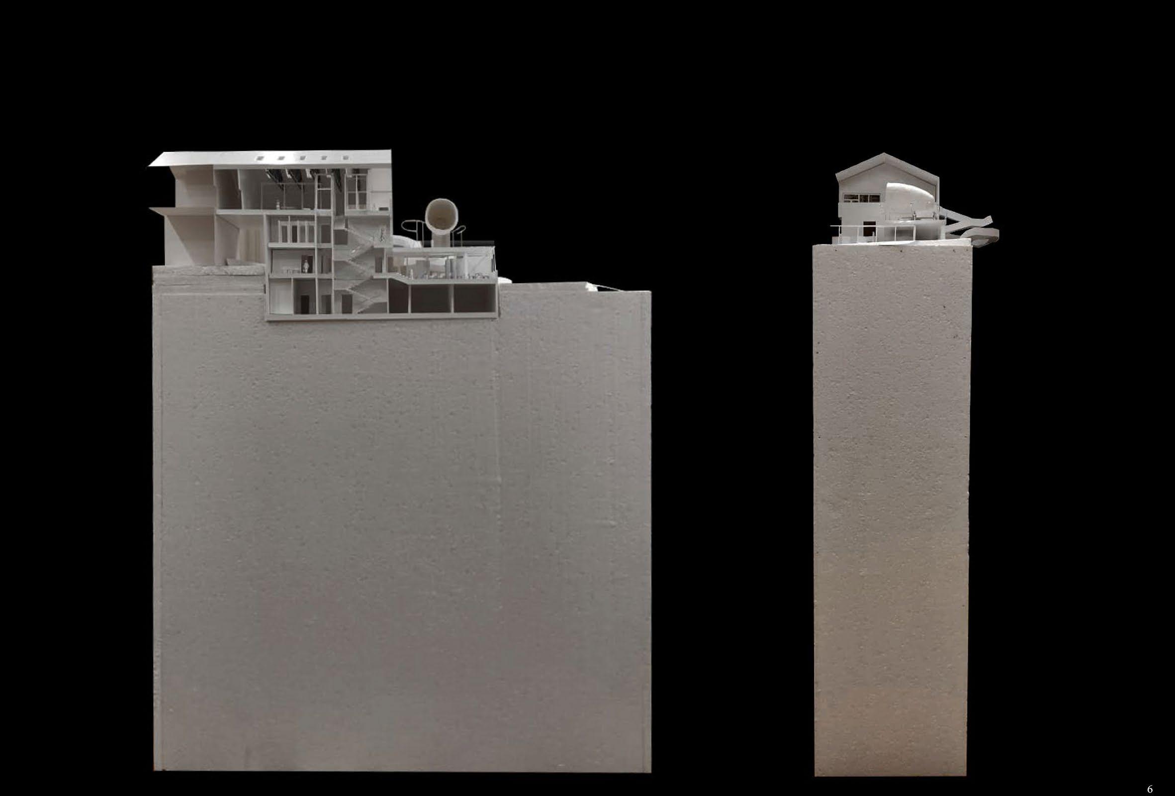
Public building project. Physical model. Student Sofia Vardanyan

 Public building project. Physical model. Student Arina Semenchenko
Public building project. Physical model. Student Faina Ledovaya


 Residential building project. Student Valentina Mironova
 Residential building project. Student Faina Ledovaya

 Residential building project. Student Faina Ledovaya


 Residential building project. Students Arina Semenchenko, Sofia Vardanyan


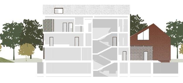

Residential building project. Students Arina Semenchenko, Sofia Vardanyan
CLT modular affordable housing
Task: Design & development wooden flexible modular housing system
Authors: Ivan Moiseenko et al
Design: 2023 - ongoing
Location: Austria, Germany
Status: Design, Prototyping


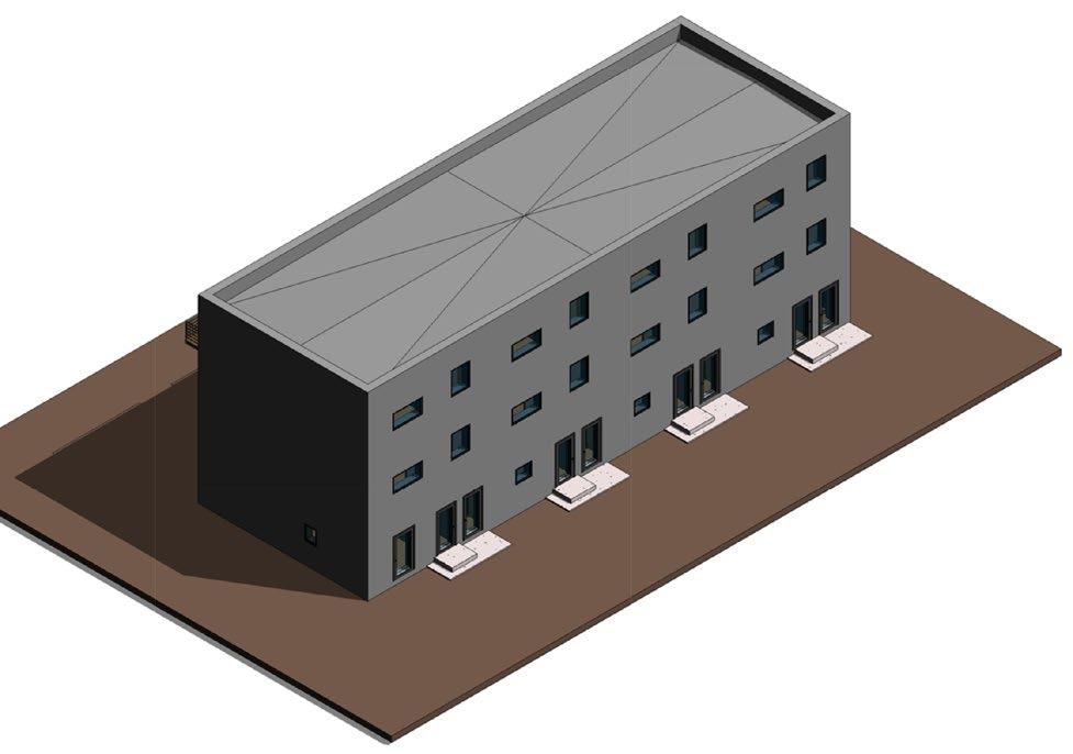


Elevations


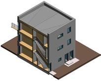
 CLT modular housing Revit model axonometry
Sections
Ground floor plan
First floor plan


 West elevation
Revit details
3D sections
East elevation
KROST_Modular design and construction
Task: Make modular construction technology widely used
Authors: Krost
Design: 2022 - ongoing
Location: Moscow, Russia
Status: Design, Construction, Use


Feldsher-obstetric station.
This project is a part of regional program for development of modular health care centers. Modular technology is extremely efficient specifically in medical facilities, and this is the reason why Moscow aglomeration is looking towards this way of design, bid and built way of completion its new medical facilities.
I was invited to the group developing the number of modular health care facilities for Moscow region. We started from the feldsher-obstetric station designed fo serve for the daily dispansarization of the local people.
I was invited to the group developing the number of modular health care facilities for Moscow region. We started from the feldsher-obstetric station designed fo serve for the daily dispansarization of the local people.
Due to technological limitations based on weight of the modules designed for reinforced cocnrete the building was subdivided into 15 modules each weight around 25 tones.
All modules were factory produced and MEP and internal finishings were installed off-site. The design scope was agreed with local authorities.
The design stage was really intensive since production process of the prototypes started almost at the same time. The photos of completed prototype are represented a few pages later.
This feldsher-obstetric station is the pilot project and going to be completed at the end of this year. There are 5 more centers are going to be built in the next year as well.
Beside feldsher-obstetric station there are ambulance stations and some other local medical facilities which are going to be completed based on modular technology in Moscow region.
Условные обозначения
Сборный Ж Б
Зашивка ГКЛ Knauf С 626 на профиле 75, с заполнением звукоизоляционным материалом из минерального волокна
Минераловатный утеплитель
Приямок
Трап
Противопожарная стена 2 типа REI 45 или противопожарная перегородка 1 типа EI 45
Легкокосбрасываемая конструкция
Окно с одинарным
остекление м 4 мм площадью остекления не
менее 1,5 кв м
Место прохождения коммуникаций газа
Противопожарное перекрытие 3 типа REI 45
Номер помещения Наименование Площадь, м ² Кат. помещения
01_Медицинские
4 Кабинет приема фельдшера 13.3
6 Прививочный кабинет для детского и взрослого населения 12.3
7 Стерилизационная 4.9
8 Кабинет процедурный 12.3
9 Смотровой кабинет с гинекологическим креслом
11 Палата временного пребывания пациентов на 2 койки
03_Служебные
19 Помещение персонала с оборудованным местом для хранения верхней и спецодежды
04_МОП
05_Технические
20 Техническое помещение (АИТ)
Г
21 Техническое помещение (электрощитовая) 3.5 В4
06_Хозяйственные
5 Материальная для хранения вакцин и медикаментов 4.2 В4
13 Помещение для хранения лекарственных препаратов и зоной обслуживания пациентов 8.3
14 Помещение хранения уборочного инвентаря и дезинфицирующих растворов
16 Материальная
07_С/У
12 С/У (палаты временного пребывания пациентов) 2.3
15 Санитарная комната, с местом для хранения грязного белья и отходов
17 С/У для персонала
18 С/У для пациентов, в том числе и для МГН
В4
В4
Г В Б 1 2 3 4 Д Е А 13.3 18.0 12.3 12.3 4.9 4.2 15.0 3.5 9.8 3.1 4.5 8.3 6.7 31.1 7.4 4240 4240 4.5 4.1 3200 3000 2290 2290 5790 3200 3000 2100 3200 3080 3200 2290 1400 1260 2290 1200 8520 2790 2390 1540 1360 3000 3200 2030 1600 2.3 3.2
900 900 900 900 900 4230 3000 1500 2030 4700 2790 2270 2270 1820 1820 1840 2300 +0.000 -0.014 -0.014 -0.014 7100 3000 -0.014 -0.014 2290 3090
500 х735 х700 мм Приямок 500 х600 х700 мм Лестница металлическая П -1
Экспликация помещений 1 этажа
18.0
15.0 75.8
6.7 6.7
1 Тамбур 7.4 2 Фойе
31.1
Фойе (служебная
6.5 10 Тамбур 3.2 48.2
(с зоной ожидания)
3
зона)
9.8
Серверная 3.1
16.4
22
В4
4.5
2.9
19.9
4.1
2.6
4.5 13.5 Общий
180.5 Feldsher-obstetric station
итог

Сборный Ж Б
Зашивка ГКЛ Knauf С626 на профиле 75, с заполнением звукоизоляционным материалом из минерального волокна
Минераловатный утеплитель
Пенополистирол
Площадка для размещения оборудования
Место выхода фанового стояка К1 отв. 200 х200)
Г В Б 1 2 3 4 Д Е А +4.365 +4.365 +4.365 +4.365 +3.825
1.9% 1.5% 3.8% 2.1% 2.6% +3.565 +3.700 +3.700 +3.700 +3.700 ВВ -1 +3.565 2.9% +2.900 2.5% 2.8% 4.9% 3.3% 3.5% +3.215 +3.215 +3.115 +3.115 +3.065 +3.115 +3.015
Декоративные экраны на металлическом каркасе с текстурными панелями из стеклофибробетона ВВ -2 Лестница металлическая П -1 1 2 3 4 785 -0.014 +3.700 кровля Декоративные экраны на металлическом каркасе с текстурными панелями из стеклофибробетона +0.000 +179,40 +5.420 +4.400
Условные обозначения
1 4 0.000 кровля +3.700 +5.420 -0.014 +2.700 4.400 0.014 179.386 -0.014 179.386 +2.640 +179.40 +3.600 +0.905 Декоративные экраны на металлическом каркасе с текстурными панелями из стеклофибробетона Место прохождения коммуникаций газа +5.420 Декоративные экраны на металлическом каркасе с текстурными панелями из стеклофибробетона Е А кровля 0.000 +179.40 ур з +3.700 -0.014 +5.420 +2.700 +2.640 +0.905 +0.405 0.014 179.386 -0.014 179.386 -0.014 +2.100 ур з +3.600 +2.700 Декоративные экраны на металлическом каркасе с текстурными панелями из стеклофибробетона Место прохождения коммуникаций газа +4.400 +5.420 Декоративные экраны на металлическом каркасе с текстурными панелями из стеклофибробетона Фасад в осях 1-4 Фасад в осях А-Е Фасад в осях 4-1 Фасад в осях Е - А
Section
Roof plan


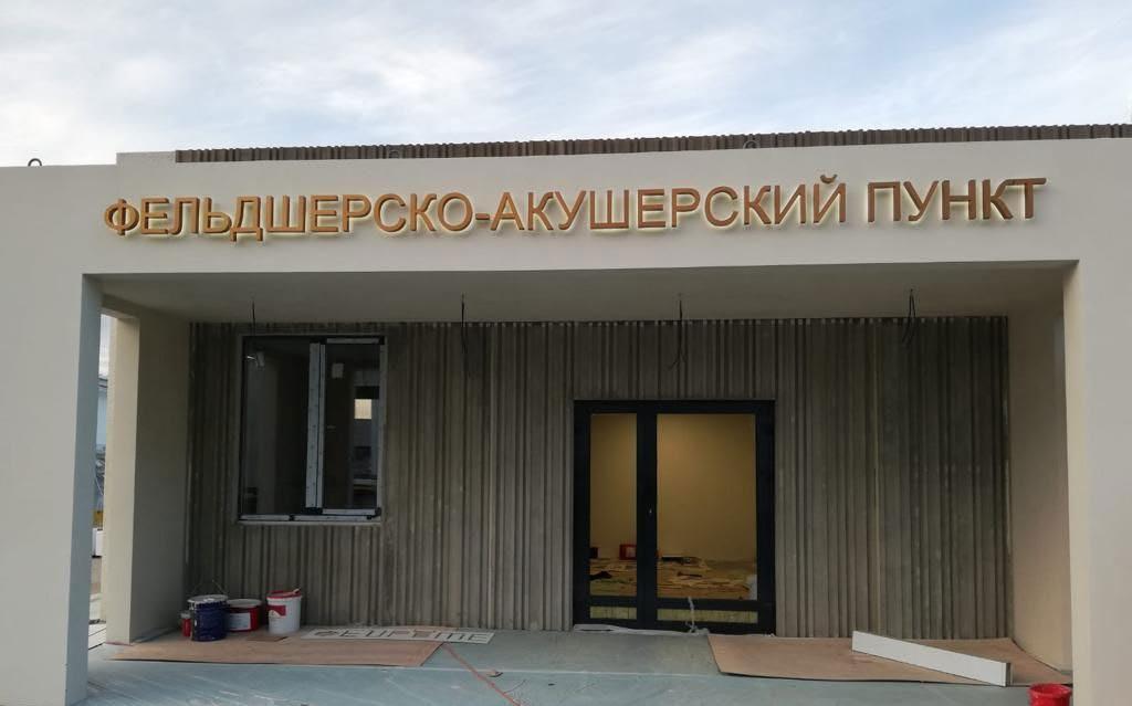
 Completed prototype


 Multi-story modular housing complex.
Node 1

 Facade 1
Facade 2

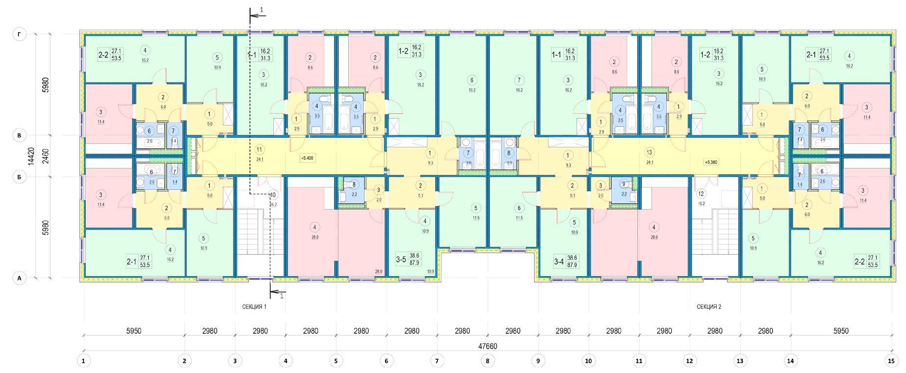
floor plan
Ground floor plan Second

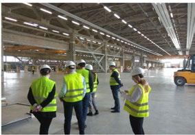
 Modular production facility. Storage of the modules in the yard.


Obligatory modules, based on minimum requirements
Additional modules, depends on requirements
 Modular feldsher-obsteric station project
S, м2
23,2 м2
5,7 м2
13 м2
10 м2
14 м2
16 м2
5 м2
4 м2
4 м2
3,3 м2
2,9 м2
5 м2
10 м2
8 м2
11 м2
25,75 м2
6 м2
10 м2
58,3 м2
240,25 м2
Возможно, нужно будет удлинить модуль на 600 мм, чтобы у кабинетов было больше места
Потолочный светильник (подвесной/встроенный) Встроенный (галогенный) светильник-подсветка Розетка на уровне столешницы (850 мм от пола) Розетка у пола (15 см от пола) Точечное наружное освещение террасы Бестеневой стоматологический потолочный светильник Внутренний блок кондиционера Линейная светодиодная подсветка

17 5 3 4 14 15 Аптечный пункт * 8 м2 Тамбур 5,7 м2 16 6 Перевязочная (экстр. роды) * 16 м2 19 ИТП с отдель. входом * 10 м2 11 9 4 м2 7 Материальн. 5 м2 21 Доп. Тех. помещение 13 Стерилизац. 18 Постироч-глад. 8 Санитарная 4 м2 5 м2 1 15600 34960,62 2 20
12
1 2 3 4 Стоматологическая установка Напольный блок Стул стоматолога Стул ассистента Светильник бестеневой потолочный Гигрометр 8 Рециркулятор Бактерицидные ультрафиолетовые лампы 10 Мойка 10 Cтолешница 11 11 Внутренний блок кондиционера Контейнер для хранения стериль. мат-в Контейнеры для дезинфекции Медицинский шкаф для стеритириль р-в Стол врача Раковина Процедцрный столик Ширма Винтовой стул Процедурная кушетка 10 Cтул 1 2 3 4 10 10 11 11 Многофункц. аппарат электро-импульс., волнового, магнитного, ультразвукового 12 12 Ингаляторная установка Световой фонарь Гинекологическое кресло Столик инструментальный Светильник бестеневой передвижной Крутящийся стул врача для осмотра Компьютер и принтер Стул врача Стол врача Смотровая кушетка Фетальный монитор 10 Раковина 1400 мм 1400мм 1400мм 1400мм Шкафы для хранения лекарств Холодильник для хранения лекарств Столешница-прилавок 1400 мм
Гинекологическое кресло Безтеневая передвижная лампа Крутящийся стул 1 2 5 5 9 10 11 11 Гистероскопическая стойка 1* 2 5 6 10 Кровать-трансформер для приема родов Кювет для новорожденного Раковина Фетальный монитор Аппарат УЗИ Контейнер для исполь. мат-в 10 Контейнер для чистых мат-в 11 11 Обогреватель излучающий для новорожденных 12 Возможнo доп. оборудование, уточнить технологом 8 7 1 4 5 10 11 12 13 1400мм 14 Cтол врача Cтул Раковина Холодильник Cтолик для инъекций Стол процедурный Стол инструментальный Стул крутящийся Смотровая кушетка 10 Медицинский шкаф для стерильных отходов 11 -Контейнер для хранения стериль. мат-в 12 -Контейнеры для дезинфекции 13 -Медицинский шкаф для стеритириль р-в 14 -Ширма 1 1 Радиаторы отопления (по расчету теплотехники) Стол Стул Кушеткa -Раковина Холодильник Шкаф 7 Ширма Room Legend:
4. 5. 6. 7. 8. 9. 11. 12. Waiting room Hall Docotr office Gynecology room Procedural room First aid room Material room Sanitary room Personnel cloakroom Visitors WC Personnel WC 13. 14. 15. 16. 17. 18. 19. 20. 21. Sterilization room Physiotherapist’s office Pharmacy office Dentist room Intensive therapy room Laundry room Technical room Feldsher’s house Technical room Modular feldsher-obsteric station. The largest variant
1. 2. 3.

 Facade and 3D views of feldcher-obsteric station

 Metal skeleton of the standard module with roof cassette


Moiseenko.
watercolor sketches
Ivan
Hand-made


Ivan Moiseenko. Hand-made linear sketches


 DETAIL «A»
DETAIL «B»


 Intensive care unit Practitioner office with movable wall Practitioner office
2 double-patient wards
Modules’ production in factory
Modules’ transportation on site Mounting main frame on site
Fill-in main frame with modules
Opportunity to add segment of the building
5-storey building block
5-storey building block with hang cantilevered modules


 «Island» counters (Author Ivan Moiseenko, Ksenia Bisti) «Island» counters with roof terrace (Author Ivan Moiseenko, Ksenia Bisti)


 Roof garden terrace (top), street view of the food court pavilions (bottom) (authors Ivan Moiseenko, Ana Chistopolova)
View of the farm (top), night view of the market (bottom) (author Ivan Moiseenko)


 View of the farm (top), night view of the market (bottom) (author Ivan Moiseenko)
Interior 3d views of our design (author Ivan Moiseenko)
Photos of the complete building (author Ivan Moiseenko, Tamara Varlamova)


 Internal rised courtyard (top), Internal rised courtyard (bottom) (authors Ivan Moiseenko, Tamara Varlamova)
Street view of the urban block (top), Internal linear park (bottom) (authors Ivan Moiseenko, Tamara Varlamova)


 Massing view of the new district within urban context (author Anton-Eguriev-Silva)
Zonning diagrams (authors Anton-Eguriev-Silva, Ivan Moiseenko)
Location of the project in Moscow city


 Entrance pavilion bird’s eye view (top), Entrance pavilion interior (bottom) (author Ivan Moiseenko)
Facade A - C (author Ivan Moiseenko)


 Yellow River Slow Traffic, China
Masterplan Buizengat Oost, Netherlands
Anshun Xixiu District project


 Forta Pro factory tour, Latvia


 Interiors of the studio modules with Ikea furniture


 9-story modular house project


 Lugopark
Tetris
De Ceuvel
Modules
Amsterdam Free district
Kite Horizon
Wood Grass Sails Lake Hill
Modular hotel Wideness Water


 House 1.3
House 2.2
House 1.3
Sauna
House 1.3
House 3.2
House 1.3
House 1.3
House 2.2
House 1.3
Sauna
House 1.3
House 3.2


 Structural scheme axonometric view
Typical module explosion scheme


 Structural mesh for NASTRAN analysis
Stress Analysis diagram in NASTRAN
Safety Factor Analysis diagram in NASTRAN
Safety Factor Analysis deformed diagram in NASTRAN
Safety Factor Analysis deformed diagram in NASTRAN
DIsplacement Analysis diagram in NASTRAN
DIsplacement Analysis deformed diagram in NASTRAN
Stress Analysis deformed diagram in NASTRAN


 East and West Elevations
South Elevation
North Elevation


 Foame Wood
Bioplastic


 Gant Chart of the standard project with its tasks. Wrike online task management tool


 Public building project. Physical model. Student Arina Semenchenko
Public building project. Physical model. Student Faina Ledovaya


 Residential building project. Student Valentina Mironova
 Residential building project. Student Faina Ledovaya

 Residential building project. Student Faina Ledovaya


 Residential building project. Students Arina Semenchenko, Sofia Vardanyan


 CLT modular housing Revit model axonometry
Sections
Ground floor plan
First floor plan


 West elevation


 Completed prototype


 Multi-story modular housing complex.
Node 1

 Facade 1
Facade 2


 Modular production facility. Storage of the modules in the yard.


 Modular feldsher-obsteric station project


 Facade and 3D views of feldcher-obsteric station

 Metal skeleton of the standard module with roof cassette

