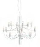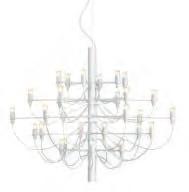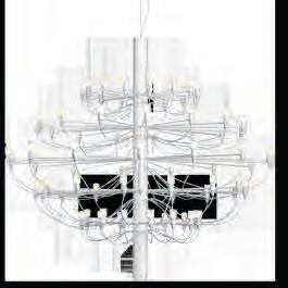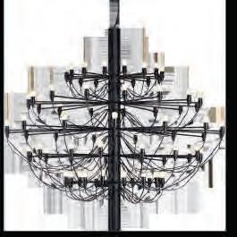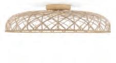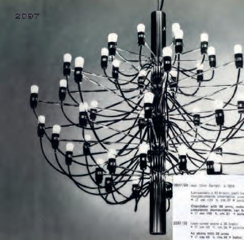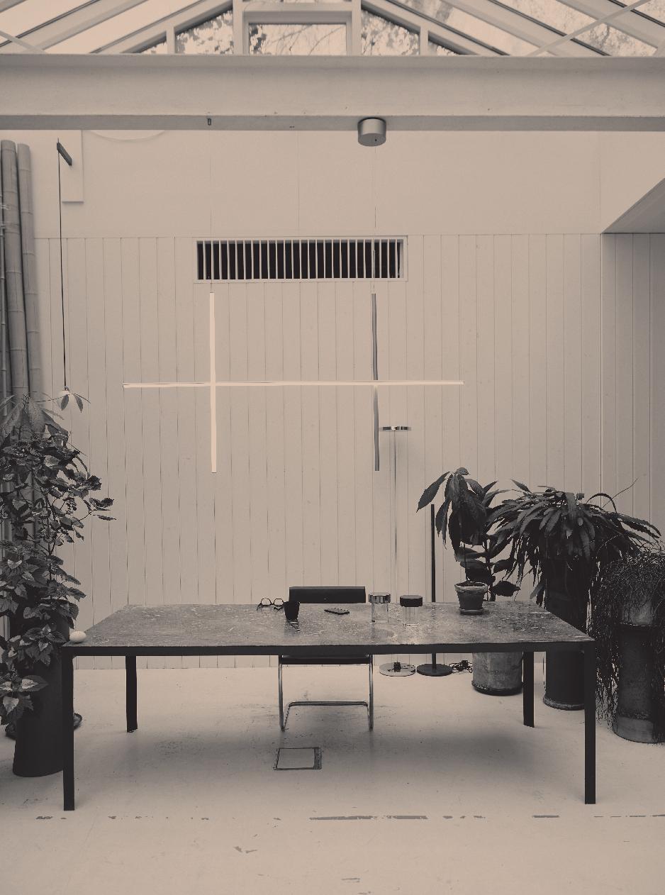


ø 670 mm / 23.37'' ø 1410 mm / 55.51'' 2800mm / 110.23'' 2800mm / 110.23'' 510 mm / 20.07'' 1300 mm / 51.18'' ø 880 mm / 34.64'' ø 1000 mm / 39.37'' 720 mm / 28.34'' 880 mm / 36.64'' 2800mm / 110.23'' 2800mm / 110.23'' 2097 Gino Sarfatti, 1958 2097/75 Gino Sarfatti, 1958 98 Decorative CollectionNew Products Material: steel Power: 18 x MAX 15W / 30 x MAX 15W / 50 x MAX 15 W Voltage: 220-250V Light Source Clear Bulbs: LED 2W E14 95lm Light Source Frosted Bulbs: LED 2,7W E14 150lm New Finishes: matte white Available in: matte black, brass, chrome Material: steel Power: 75 x MAX 15W Voltage: 220-250V Light Source Clear Bulbs: LED 2W E14 95lm Light Source Frosted Bulbs: LED 2,7W E14 150lm Available in: matte black, brass, chrome, matte white A1352009 2097/18 Clear A1351009 2097/18 Frosted A1551009 A1551059 A1551057 A1551031 2097/75 Frosted 2097/75 Frosted 2097/75 Frosted 2097/75 Frosted A1552009 A1552059 A1552057 A1552031 2097/75 Clear 2097/75 Clear 2097/75 Clear 2097/75 Clear A1402009 2097/30 Clear A1401009 2097/30 Frosted A1502009 2097/50 Clear A1501009 2097/50 Frosted
Skynest Suspension


Marcel Wanders, 2022

Materials: nylon with glass fibre, recycled polyester, LATAMID, aluminum

Power: 78W
Voltage: 100-240V
Light Source: LED 78W 2001lm* 2700K CRI90

We took 2097, now in a new white version, to the 16th century Palazzo Galli Tassi in Florence, where Martino di Napoli

*
The lumen output refers to the product with the anthracite. finish. Please consult our website for detailed information about the other finishes.

My Disc
Materials: aluminium , polycarbonate, PMMA
Power: 42.6W
Voltage: 48V
Light Source: LED 42.6W 2700K CRI90

My Lines
‘Numeroventi’s mission is to create a fertile ground for Florence’s artistic environment by bringing together local and international artists, and connecting them with local artisans,’ notes di Napoli Rampolla. ‘A contemporary renaissance residency aiming to provide an experience that activates artistic procedures, by connecting people and creating the space to discover new facets of their practice.’
Di Napoli Rampolla led a sensible restoration of the building, leaving its original character intact and discreetly renovating some of the areas with a minimalist approach to the interiors. The result is an eclectic mix of history and modernity.
F1902009
‘The simple subtractive style has been very important from the start, not only to showcase design pieces within the rooms, but also to give this impression of an unfinished space, to suggest an artisan stay,’ adds di Napoli Rampolla. ‘It feels like there's space for more, you have this feeling of contemplation.’

Material: aluminum, steel, polycarbonate, platinic silicone extruded opal
Power: 45.2W
Voltage: 48V
‘There is a contrast, like a multi-layered kaleidoscope: you can have a Renaissance painting on one side, and then on the other side there is a white wall and contemporary wooden floors. By rotating these elements we have a feeling that is very complete and complex.’
The location works closely with galleries and art institutions to craft a rich programme of residencies hosted within its lofts, intertwined with exhibitions across its spaces. The programme has benefited from an open minded approach to the arts, with a diverse roster of creatives from a range of disciplines. Among its past residents is singer and songwriter Dev Hynes, who composed a cello suite as a result of his stay, and photographer and artist Harley Weir, who as part of her residency created a series of ceramics in collaboration with a local terracotta factory and led a ceramics workshop for local kids. More designers and artists have visited the space, leaving their mark on the building and its interiors, from Formafantasma to Duccio Maria Gambi and Ana Kraš.
2022 saw the addition of a chef-in-residence programme, inviting aspiring and well-established chefs to visit Numeroventi to host workshops and events – like the artistic initiatives, this too aims at creating a connection with local networks of craftspeople and traditions.
Martino di Napoli Rampolla © Gleeson Paulino
ø 23 mm / 0.90'' 105 mm / 4.13'' 1672 mm / 65.82'' 3000 mm / 118.11'' 218mm / 8.58'' ø 600 mm / 23.62'' ø 152 mm / 5.94'' 73 mm / 2.87'' 213 mm / 8,38'' ø 904 mm / 35.59'' ø 152 mm / 5.94'' 73 mm / 2.87''
Michael Anastassiades, 2023
Michael Anastassiades, 2023
97
Light Source: LED 45.2W 2700K CRI90 F1905009 Decorative CollectionNew Products
F6392035 213 mm / 8,38'' ø 904 mm / 35.59'' 1800 mm / 70.86'' ø 900mm / 35.43'' 2500mm/ 98.42'' (1) 500mm / 19.68'' 210mm /8.26''
Motion Marcel Wanders, 2023
Ceiling Marcel Wanders, 2023 96 Decorative CollectionNew Products * The lumen output refers to the product with the anthracite. finish. Please consult our website for detailed information about the other finishes. * The lumen output refers to the product with the anthracite. finish. Please consult our website for detailed information about the other finishes. (1) Depending on ceiling's height. Materials: nylon with glass fibre, recycled polyester, LATAMID, aluminum Power: 58.5W Voltage: 100-240V Light Source: LED 58.5W 1500lm* 2700K CRI90 Available in: anthracite, blue tomaline, almond, brick red F6393031 F6394031 F6393003
Available in: anthracite, blue tomaline, almond, brick red
F6392031 F6392003 F6392017
Skynest
Skynest
F6394003
F6393017
F6394017
F6393017
100-240V
Source: LED 58W 1500lm* 2700K CRI90
in: anthracite,
5
F6394017
Materials: nylon with glass fibre, recycled polyester, LATAMID, aluminum Power: 58W Voltage:
Light
Available
blue tomaline, almond, brick red
Numeroventi is an artist residency, hotel and kitchen: ‘there is great synergy between the different concepts,’ explains di Napoli Rampolla. ‘The hotel business helps finance the artistic residencies, which in turn creatively influence the hotel.’
WHITE LINES
Rampolla created an innovative hospitality and art concept. A hybrid space suspended in time, where tradition and modernity merge a coexist, Numeroventi is a fitting backdrop to Gino Sarfatti's 2097. Photography by Adrianna Glaviano.
CREDITS
Contributors
New York-based photographer Adrianna Glaviano travelled from New York to Florence to explore the expressive potential of Gino Sarfatti's 2097 in its multiple iterations, old and new (cover)
In Puglia, Consiglio Manni @ The Freaks photographed Skynest by Studio Marcel Wanders within the charming spaces of Casa Maiora, creating a portfolio of escapism-fuelled images (p. 76)
The scenic, illusory views of Joshua Tree’s Invisible house were captured by Italian photographer Ambra Crociani, who shot a series of Flos’ icons, between raw nature and contemporary architecture (p. 58)
Stockholm-based illustrator and artist Sany , aka Samuel Nyholm, created some fun and games for this issue, inspired by Flos’ My Circuit and 2097 (p. 90)
Photographers Carlo Banfi and Luca Caizzi followed Michael Anastassiades throughout a few days in his London studio and beyond, for a reportage that took us behind the scenes of the designer’s everyday life (p. 48)
Alexandros Pissourios took on the task of demonstrating the many variants of Michael Anastassiades’ My Circuit, showing the system’s adaptability to space within a modernist villa by Vico Magistretti (p. 26)


Concept and Creative Direction
Apartamento Studios
Managing Editor
Rosa Bertoli
Graphic Design
Apartamento Studios
Flos Team
Barbara Corti
Rosaria Bernardi
Elisa Bodei
Silvia Delaini
Donatella Matteoni
Francesco Funari
Diletta Dincao
Acknowledgements
Michael Anstassiades
Paolo Brambilla
Fabio Calvi
Ángel Cánovas Celdrán
Eugenio Cirmi
Zeb Daemen
Chris Hanley
Roberta Hanley
Carlo Lanzini
Alessio Manca
Marcelo Martínez
Colleen Murphy
Gleeson Paulino
Lucy Perrett
Martino di Napoli Rampolla
Andrew Trotter
Vincent Van Duysen
Special thanks to
Alessandro Masu
Francesco Rodriquez
Adele Cassina
Translations
Team Agiliz@ tu gestion
Printing LOGO srl – Borgoricco (PD)
April 2023
....... p. 88 ....... p. 88 ....... p. 89 ....... p. 89 ....... p. 89 ....... p. 90 ....... p. 90 94
Draw your pets.

Vincent Van Duysen
TO THE FUTURE: GINO SARFATTI’S 2097 IN WHITE CONNECTS PAST AND PRESENT
Originally conceived in 1958, Gino Sarfatti’s 2097 is a masterpiece that redefines the tradi tional Venetian chandelier with a minimalist approach. Sarfatti created the 2097 concept at Arteluce, the company he founded in 1939 as a sort of creative laboratory for experimental lighting design, acquired by Flos in 1973.

Born and raised in Venice, he was well-versed in the aesthetic language of traditional Vene tian chandeliers, a classic he stripped to its es sence in a stylistic exercise that is as modern today as it was sixty-five years ago. Playing with the original, Sarfatti was able to recreate its idea in a radically original way.
2097 took cues from the ornamental elements of the chandelier; those ultra-decorative Mu rano glass follies that conceal the structure (and once electricity was introduced to the candle-holding body, technology) and that here are stripped back to the most basic interpretation of the design. Of the storied starting point, only an idea of the structure remains: a central steel tube with essential radial brass arms, each holding a lightbulb at its end.
Whether he is creating technical lighting (such as his C1 system for Flos) or a discreet portable lamp imagined for the world’s most eclectic restaurants (case in point, his Gustave lamp), Vincent Van Duysen is able to instil elegance and beauty in every design he conceives. His work balances refined silhouettes with a thoughtful approach to living - something that is well-exemplified in Oblique, a lamp that combines a technical attitude to lighting with a practical design whose minimalist aesthetic works well within every modern interior. We ask Van Duysen about his daily life, passions and approach to work and light. Portrait by Zeb Daemen.


What is your favourite scent?

What’s the last thing you ate?
Draw your favourite tool.


What is light for you?

8
9 92 QUESTIONNAIRE
The only concession to decoration is the composition of wires (one for each lightbulb) that almost accidentally outline the classic chandelier’s distinctive form - Sarfatti’s intuition revealed what old chandeliers used to hide, conceiving a decorative use of technology that softens and redesigns the lighting medium. In Sarfatti’s inspired intuition, functional technology becomes ornament.

The design was imagined for very small bulbs, for the first time available to Sarfatti, an example of how technology drove the project further and suggested new solutions: the smaller light sources created an effect as close to a chandelier’s candles as modern lighting could be.


Originally created with 18, 30 and 50 bulbs, the chandelier now expands exponentially, in a latest interpretation defined by a composition of 75 bulbs, becoming an imposing light presence that celebrates the ingenious design. Growing in size, the 2097-75 brings Sarfatti’s approach to new possibilities of interior design application.


Also for the first time, the 2097 series (in all its declinations of size) is also issued in a matte, all-white version: an interpretation that Sarfatti himself had created in his Arteluce laboratory as part of his experimental take on lighting design, and a testament to his modern approach. The white edition of the 2097 is further proof of the design’s modern minimalist potential and its application in contemporary settings.

With these new editions, Flos goes back to the heritage of 2097 and to Sarfatti’s unique approach: mastering the language of light, he was able to create poetry.


10
11
Spot the difference. 2097 by Gino Sarfatti
90 GAMES
Some Light Entertainment
Illustrations by Sany
Help Gonzales to find his way through the My Circuit
system.
My Circuit by Michael Anastassiades


13


84


A project by Studio Andrew Trotter, Casa Maiora fits into its Apulian surroundings with sophistication and ease. Made of local tufo, this modern construction blends into the landscape while maintaining a distinctive contemporary aesthetic. ‘My philosophy of design is simplicity,’ comments Trotter of his work, which includes several projects in the area, making the architect wellversed in local vernacular architecture. A particular attention to craft permeates the building, which is the ideal backdrop to Skynest, a project by Marcel Wanders that combines innovation and technology with traditional artisanal approaches.


FLOS STORIES
ISSUE SEVEN: CONNECTIONS
In this issue, we celebrate connections. The connections between past and present, with iconic lighting design objects that appear as modern as they did when they were first conceived decades ago. Connections between people and places, with ingenious intuitions that instil new life into ancient structures, invent new models of building and fuse beauty with simplicity. But also the physical connections that make light possible concealing complexity behind effortless simplicity.
For his modern interpretation of a classic Venetian chandelier, Gino Sarfatti took the iconic silhouette and revised it in contemporary terms. 2097 is a marvel of intuition, design and technology, and its concept is as impressive today as it was when it was first dreamed up in 1958. Contributing to its distinctive forms are the wires connecting each bulb, which help shape the final design. This legendary piece returns in its largest interpretation yet (2097/75, featuring 75 light bulbs for the first time) and in a new, all-white matte version, a tribute to one of Sarfatti’s original creative experiments. Each of the locations across these pages carry an enchanting history of connection. Florence’s Numeroventi is an innovative concept combining hospitality and artistic residency, while merging

baroque with minimal interiors. Joshua Tree’s Invisible House is an inspiring example of modern living in close connection with nature (and in its short history, it carries a spectacular pop culture mash up, which we try to unveil through an interview with its charming creators). Casa Maiora is a great example of building in close connection with the land. And Vico Magistretti’s House on a hill is a fitting example of elegant simplicity. Connections are also at the core of Michael Anastassiades’ My Circuit. Based on an essential track forming geometric motifs on a ceiling, the lighting system is defined by connected elements that allow light to be used flexibly across a space. For Anastassiades, who welcomes us into his studio to talk about the project, connections stem from observation. ‘I am a daydreamer, I always try to use my imagination when I enter a home,’ he told us. ‘Through objects, I try to read what the life of the individual that is occupying that house might be.’ this, he explains, is the basis of his research into the design of My Circuit. ‘When I look at the track, trying to understand its patterns not just purely as an aesthetic expression, but a practical connection from one activity to the next. And you try to imagine those activities throughout the day. So all these observations are absolutely crucial in making those connections.’


23


SKYNEST
90 Some Light Entertainment 92 Questionnaire Vincent Van Duysen 58 Invisible House ↑ 94 Contributors 95 New Products 48 Studio Visit Michael Anastassiades ↓ 26 Introducing My Circuit ↑ 76 ← Skynest at Casa Maiora 76
Photography by Consiglio Manni
at CASA MAIORA
Michael Anastassiades and Flos launch My Circuit, the latest chapter of their prolific collaboration; a culmination of twelve years combining poetry, balance and precision with light.


We test the system’s modularity within the spaces of a house on the hills outside Milan, designed by Vico Magistretti in 1964 for Cesare Cassina. Designed simply with a square layout based on symmetry, the house features a copper roof and a structure partly encased on the hill, and is accessed through a street-facing court. The house’s living area is defined by a fireplace that divides its spaces, and it opens onto the landscape, connecting the indoors with its surroundings.
Within the rational architecture of Magistretti’s interiors, the system sinuously adapts to the different interior configurations, from compact to elongated rooms and in multi-functional, asymmetrical spaces. The house gently frames the lighting compositions, allowing each element to shine in the minimalist interiors. The discreet decoration of My Circuit’s track offers a gentle approach to multifunctional lighting that sits well within the house’s rooms.
‘The house is about a continuous connection of spaces,’ says Anastassiades. ‘An architecture that perfectly aligns with the concept of My Circuit.’


27


7228 29


3171


ROSA BERTOLI What was your approach to the house’s interiors?


ROBERTA HANLEY We decided not to have too much furniture, we wanted the interior to fit in with the grey concrete floors. Flos came in and added a tremendous element of light. Chris had two 250 and 150 foot long lights, but I felt it needed a lot more than that, so that I can read a book and write a script. So it became really important to add some lights, and Flos has that minimalism that doesn't detract but yet, it allows you still to enjoy the space.
So now we have some lights outside near the firepit that are really minimal and monolithic. Before, we cooked practically in the dark, and suddenly, we had light, which was pretty cool. And playful as well: like above the bathtub, there's this symphony of lights that are just as if you're in a New York Theatre on Broadway.
CHRIS HANLEY Looks like a constellation. It's like getting close to stars.
ROSA BERTOLI Otherwise, the house is very minimally furnished.
ROBERTA HANLEY There's not a lot of knickknacks and silly things to annoy people and bring back memories. It's all about the new and the future, the house is about what you can do next, not what you are doing now. And I think that is the gift that we give to ourselves and to others who come in. People often say that while they were there, they had an amazing dream or brainstorm or a thought came to them like a lighting rod.
ROSA BERTOLI Can you tell us about your experience of the house?
ROBERTA HANLEY There aren’t many neighbours, and everybody seems like minded where they worship the desert and the rocks. We were very lucky, it's a perfect piece of land: it has just the right amount of flatness that you can take little strolls. There are really good paths that are just naturally there from forever. And it's really good for your brain. If you're a dreamer, you take the same walk every day, and you're able to experience lucid dreaming really easily. The environment matters to us, I've always been an environmentalist. And I think that a house must have something that makes it livable and also creative. We're striving towards being really modern, meaning the house gives you something back, it keeps you alive, it makes you healthy and gives you an environment that also helps your sanity and your brain functions. And Joshua Tree is perfect for that: the area is completely non polluted. It's two and a half hours from Los Angeles and the skies are absolutely blue, the clouds are puffy white bits of cotton. And the land is pure. It's just extraordinary.
ROSA BERTOLI Joshua Tree is very attractive to creatives; architects, artists. What’s been your experience of the culture in Joshua Tree?


ROBERTA HANLEY It's become quite the community. Because of us a few friends bought houses and it started to populate.
CHRIS HANLEY In the 90s we all used to go to Joshua Tree and a lot of music was taking place. Billy Gibbons, ZZ Top and PJ Harvey recorded albums right in Joshua Tree. And so became a cluster of musicians and designers, architects.
ROBERTA HANLEY You could be creative and have your art studio there. It was the beginning of this incredible independent spirit.
ROSA BERTOLI Now Invisible House has made it on the news as you’re selling it…
CHRIS HANLEY We were going to live in it, but then so many of our friends, actors and filmmakers, directors, producers came to the house and used it for long periods of time. Alicia Keys took it for a while to record music in it and then everybody was using it. And I thought, well, I guess we better just let people use it, they seem to be having a lot of fun. It's like when we make a movie; at a certain point you let it go in the world. And this house is already let go. This house has become this influencer thing.
ROBERTA HANLEY Chris's design ended up being so well loved, and it hasn't stopped. And what matters is that it stays as a historically important architectural specimen, and maintains its integrity.
66
ROSA BERTOLI How did you end up in Joshua Tree?


CHRIS HANLEY We were living in New York, working in the music business and doing music videos, we started karaoke [in America], and worked with Andy Warhol and played music with Jean Michel Basquiat. Then Roberta decided we should go into film, so we ended up in California, where we made American Psycho and Spring Breakers and Virgin Suicides, and a whole lot of other movies.
We bought the land in Joshua Tree in 2006 and then played around being off the grid with prefabricated housing. To be able to live on the land, they told us we better design something bigger that would qualify for the building code of the area. So we just decided to go for it.
ROSA BERTOLI ating the house, what inspired you?

CHRIS HANLEY
I was influenced by New York City skyscrapers, as that's where we spent a good part of our life. I was inspired by monoliths like Mies van der Rohe’s Sea gram Building on Avenue of the Americans, and 2001 Space Odyssey. I drew it in pretty good detail and then went to an architect we had been working with, Tomas Osinski. The whole thing is really simple: a cantilever monolith 225 feet, 8 inches long, 21 feet high with refractive and reflective solarcool blue vitro glazing covering its exterior surface. About 100 feet on the
west, south and north side slide open alongside the pool, so you can feel like it's indoors and outdoors. Literally sometimes animals come in.
Andy Warhol used to tell us that untouched pure land is the best art there is, and the land here has really nice shapes. So that reflective and monolithic object was supposed to be juxtaposed with the landscape, but then also blended in. We don't see it as a house per se: it's more like a sculpture, an artwork that you could live and create in.
ROSA BERTOLI It's interesting that the inspirations were very urban and connected to New York, yet the house


65
37


6238


4161
INVISIBLE HOUSE


Chris and Roberta Hanley take us behind the scenes at the Invisible House, the distinctive Joshua Tree monolith they created with architect Tomas Osinski. Known for their work in Hollywood (as producers of cult movies that include American Psycho and the Virgin Suicides), their cultural roots extend deep into the history of contemporary music and film. Passionate about architecture, together they have created a series of houses across the world. Cantilevered over the desert’s rocks, Joshua Tree’s Invisible House has a unique character that has made it a pop culture favourite over the years. We quiz Chris and Roberta about life and light in the house, and experiencing the desert through the architecture.

58
Interview by Rosa Bertoli
Photography by Ambra Crociani
My Circuit offers a functional approach to decorative lighting.
these decorations could be if they were really functional objects. And so I put these two images together, and so the track became a fully flexible solution, a system that actually expresses that sense of flexibility and the fluid plaster decorations that you experience in period homes.
ROSA BERTOLI What different elements did you design to complement the track?
MICHAEL ANASTASSIADES For me the design is about the track,it’s the circuit of lights that hangs from the ceiling. And then what I tried to do is to come up with a series of suspended luminaires that would resolve different functions. So you have this track that lives on the ceiling that expresses itself in this elaborate pattern, but all it really does is transfers power from A to B. So through the decoration, you can actually identify and define the different functions in the room, especially in open plan environments. It's more about how easy it is to attach, move or detach each piece and that sense of versatility and absence of permanence that very much reflect the way we live our homes. And I am a strong believer of permanence, of designing things for a long time and not as an ephemeral expression, but I also constantly move things around in my own home, so that sense of flexibility is very much what I was after.
A flexible ceiling system, My Circuit is inspired by electric slot cars from Anastassiades’ childhood, whose elements are used to redesign a contemporary, minimalist take on plaster motifs found on the ceiling of period homes. An ingenious intuition becomes a game of connection, offering functionality through flexibility and composition, adapting to modern living with a discreet visual approach.
Michael Anastassiades’ revolutionary flexible track offers a new approach to illuminating a space, serving as an architectural tool that offers a combination of diffused ambient lighting and sophisticated accent lighting.

44
56
45
that is not instinctively attracted to light, and I wasn’t the exception. But what drew me to light was the fact that at the beginning of my career as a designer, I found myself unable to find a job because I felt that my design education was still incredibly limited. So I was starting to question everything: not only was I questioning what I did before as an engineer, but I was even questioning my studies as a designer. So I used those early years as a form of research, trying to answer the questions I had. What is the role of objects in our life? What should design be in all these things?
I started with a series of experimental, interactive electronic objects that questioned our relationship with things in a deeper sense of the word. One of the objects was called The Antisocial light, the first light that I ever designed. It would glow only when there was absolute silence; so if you were to talk around it the lamp would dim down and then eventually it would switch off. And then only when there was silence again, then the light would start slowly lighting up again. It was very much about exploring our dependency to objects, and what they meant for us. Through this exploration, I discovered that I had a passion for the beauty of objects and felt that there was a lot inside of me that I had left unexplored, and that was industrial production, rather than just one-off experimental pieces. I realised that for me to explore that world of industrial production, and express myself, would be through creating my own brand, and decided at that point that it was going to be a lighting brand. And that was the start of Michael Anastassiades.
ROSA BERTOLI And from there, how did your collaboration with Flos start, and then how did it develop over the years?


MICHAEL ANASTASSIADES It started in 2011, it was my first year that I was exhibiting the Euroluce at Salone del Mobile. I took the smallest stand I could possibly afford and exhibited my first collection there, and was introduced to Flos. This was the start of our collaboration; from there we embarked on a really prolific journey. I embraced the opportunity to design industrial objects with slightly higher complexity than what I could produce through my brand. So these two entities worked really well in parallel, feeding from each other.
ROSA BERTOLI Your latest collaboration with Flos is My Circuit: among the inspirations for its design are electric slot cars from your childhood, but then also ceiling decorations in period homes. How did you combine these inspirations in your design?
MICHAEL ANASTASSIADES I always say that there's practical me, the engineer, and on the other side is the dreamer. And so even though one side of the inspiration was very playful, a memory from childhood, it became a way to solve a problem, transferring electricity through different individual components to form complex configurations on the ceiling through slotting the different parts together. So, that was the engineer. Then we have the dreamer, the one that observes and looks up all the time and looks at things and tries to imagine what
55
46
47
There is seemingly no end to what My Circuit can achieve, thanks to the playful approach to modularity of its track and its rich portfolio of lighting objects that can enhance its presence or leave it as a functional, discreet tool.
ROSA BERTOLI How does your studio operate?
MICHAEL ANASTASSIADES The studio for me is a laboratory. I've taken the conscious choice not to have a big studio (it’s just me and two designers), because I wanted to be involved in absolutely every part of the decision process so that I can be present creatively in what I make. We are set up like an informal workshop, it’s very much a hands-on operation. We make things, we mock things up. I'm a big believer that you know you should experience things physically rather than designing on the computer. And I think this is the process I favour the most.
ROSA BERTOLI Can you tell me a bit about the space, and how does it serve your work?
MICHAEL ANASTASSIADES For many years, I worked from a studio space in my own home. And it was an interesting testing platform for me to see what it means to live with the objects I design. But sometimes it's very hard as a creative to separate the two completely. I decided that it was time to start looking for a different space for my studio, also because we simply didn't fit anymore. So I found this very interesting car mechanic garage in Camden; it was the car mechanic where I used to take my car for service at that time. I found out that the owner was interested in selling it and I jumped on that opportunity. That created the right distance for me, a moment of reflection from when I leave home to the moment I arrive in the studio, and vice versa. And it has become a very precious time for me. We did a very basic renovation of the space, pretty much left it architecturally the way it had always been. It was originally built as a workshop in 1907 and it’s on a beautiful cobbled street off Kentish Town road, very quiet and very green. We have a big skylight which floods the space with a lot of natural light. And it's amazing, a very rare thing to have in London.
ROSA BERTOLI Before becoming a designer, you studied as a civil engineer. How has engineering informed the way you design?
MICHAEL ANASTASSIADES After studying engineering at Imperial College in London, I discovered the Royal College of Art and I applied for the Masters there. I very much enjoyed running away from engineering at the time, and starting something new, but it's only many, many years later that I realised that even though I wanted to run away as far as possible from it, what engineering taught me is still inside of me. It's a practical way of viewing the world. And many people might argue that my work is exactly the opposite of that, but I still believe that my rational way of thinking is very much from my engineering studies, and maybe probably also from before, as a character. Moving away from engineering at the time had felt like a change, but now I see it more as an evolution.
ROSA BERTOLI When did your interest in lighting design begin?
MICHAEL ANASTASSIADES I have always been fascinated with light. I mean, I don't know anybody, no human in this world
STUDIO VISIT
MICHAEL ANASTASSIADES
On the occasion of the launch of My Circuit, Anastassiades welcomes us to his North London studio.We follow him as he tells us about work and light, engineering and dreaming, from his first steps into lighting to developing the latest design for Flos.


Interview by Rosa Bertoli
Photography by Carlo Banfi and Luca Caizzi
49
52


ROSA BERTOLI How does your studio operate?
MICHAEL ANASTASSIADES The studio for me is a laboratory. I've taken the conscious choice not to have a big studio (it’s just me and two designers), because I wanted to be involved in absolutely every part of the decision process so that I can be present creatively in what I make. We are set up like an informal workshop, it’s very much a hands-on operation. We make things, we mock things up. I'm a big believer that you know you should experience things physically rather than designing on the computer. And I think this is the process I favour the most.
ROSA BERTOLI Can you tell me a bit about the space, and how does it serve your work?
MICHAEL ANASTASSIADES For many years, I worked from a studio space in my own home. And it was an interesting testing platform for me to see what it means to live with the objects I design. But sometimes it's very hard as a creative to separate the two completely. I decided that it was time to start looking for a different space for my studio, also because we simply didn't fit anymore. So I found this very interesting car mechanic garage in Camden; it was the car mechanic where I used to take my car for service at that time. I found out that the owner was interested in selling it and I jumped on that opportunity. That created the right distance for me, a moment of reflection from when I leave home to the moment I arrive in the studio, and vice versa. And it has become a very precious time for me. We did a very basic renovation of the space, pretty much left it architecturally the way it had always been. It was originally built as a workshop in 1907 and it’s on a beautiful cobbled street off Kentish Town road, very quiet and very green. We have a big skylight which floods the space with a lot of natural light. And it's amazing, a very rare thing to have in London.
ROSA BERTOLI Before becoming a designer, you studied as a civil engineer. How has engineering informed the way you design?
MICHAEL ANASTASSIADES After studying engineering at Imperial College in London, I discovered the Royal College of Art and I applied for the Masters there. I very much enjoyed running away from engineering at the time, and starting something new, but it's only many, many years later that I realised that even though I wanted to run away as far as possible from it, what engineering taught me is still inside of me. It's a practical way of viewing the world. And many people might argue that my work is exactly the opposite of that, but I still believe that my rational way of thinking is very much from my engineering studies, and maybe probably also from before, as a character. Moving away from engineering at the time had felt like a change, but now I see it more as an evolution.
ROSA BERTOLI When did your interest in lighting design begin?
MICHAEL ANASTASSIADES I have always been fascinated with light. I mean, I don't know anybody, no human in this world
MICHAEL ANASTASSIADES
On the occasion of the launch of My Circuit, Anastassiades welcomes us to his North London studio.We follow him as he tells us about work and light, engineering and dreaming, from his first steps into lighting to developing


49 STUDIO VISIT
52
that is not instinctively attracted to light, and I wasn’t the exception. But what drew me to light was the fact that at the beginning of my career as a designer, I found myself unable to find a job because I felt that my design education was still incredibly limited. So I was starting to question everything: not only was I questioning what I did before as an engineer, but I was even questioning my studies as a designer. So I used those early years as a form of research, trying to answer the questions I had. What is the role of objects in our life? What should design be in all these things?
I started with a series of experimental, interactive electronic objects that questioned our relationship with things in a deeper sense of the word. One of the objects was called The Antisocial light, the first light that I ever designed. It would glow only when there was absolute silence; so if you were to talk around it the lamp would dim down and then eventually it would switch off. And then only when there was silence again, then the light would start slowly lighting up again. It was very much about exploring our dependency to objects, and what they meant for us. Through this exploration, I discovered that I had a passion for the beauty of objects and felt that there was a lot inside of me that I had left unexplored, and that was industrial production, rather than just one-off experimental pieces. I realised that for me to explore that world of industrial production, and express myself, would be through creating my own brand, and decided at that point that it was going to be a lighting brand. And that was the start of Michael Anastassiades.
ROSA BERTOLI And from there, how did your collaboration with Flos start, and then how did it develop over the years?


MICHAEL ANASTASSIADES It started in 2011, it was my first year that I was exhibiting the Euroluce at Salone del Mobile. I took the smallest stand I could possibly afford and exhibited my first collection there, and was introduced to Flos. This was the start of our collaboration; from there we embarked on a really prolific journey. I embraced the opportunity to design industrial objects with slightly higher complexity than what I could produce through my brand. So these two entities worked really well in parallel, feeding from each other.
ROSA BERTOLI Your latest collaboration with Flos is My Circuit: among the inspirations for its design are electric slot cars from your childhood, but then also ceiling decorations in period homes. How did you combine these inspirations in your design?
MICHAEL ANASTASSIADES I always say that there's practical me, the engineer, and on the other side is the dreamer. And so even though one side of the inspiration was very playful, a memory from childhood, it became a way to solve a problem, transferring electricity through different individual components to form complex configurations on the ceiling through slotting the different parts together. So, that was the engineer. Then we have the dreamer, the one that observes and looks up all the time and looks at things and tries to imagine what
55
My Circuit offers a functional approach to decorative lighting.
these decorations could be if they were really functional objects. And so I put these two images together, and so the track became a fully flexible solution, a system that actually expresses that sense of flexibility and the fluid plaster decorations that you experience in period homes.
ROSA BERTOLI What different elements did you design to complement the track?
MICHAEL ANASTASSIADES For me the design is about the track,it’s the circuit of lights that hangs from the ceiling. And then what I tried to do is to come up with a series of suspended luminaires that would resolve different functions. So you have this track that lives on the ceiling that expresses itself in this elaborate pattern, but all it really does is transfers power from A to B. So through the decoration, you can actually identify and define the different functions in the room, especially in open plan environments. It's more about how easy it is to attach, move or detach each piece and that sense of versatility and absence of permanence that very much reflect the way we live our homes. And I am a strong believer of permanence, of designing things for a long time and not as an ephemeral expression, but I also constantly move things around in my own home, so that sense of flexibility is very much what I was after.
A flexible ceiling system, My Circuit is inspired by electric slot cars from Anastassiades’ childhood, whose elements are used to redesign a contemporary, minimalist take on plaster motifs found on the ceiling of period homes. An ingenious intuition becomes a game of connection, offering functionality through flexibility and composition, adapting to modern living with a discreet visual approach.
Michael Anastassiades’ revolutionary flexible track offers a new approach to illuminating a space, serving as an architectural tool that offers a combination of diffused ambient lighting and sophisticated accent lighting.

56
44


6141


62
ROSA BERTOLI How did you end up in Joshua Tree?

CHRIS HANLEY We were living in New York, working in the music business and doing music videos, we started karaoke [in America], and worked with Andy Warhol and played music with Jean Michel Basquiat. Then Roberta decided we should go into film, so we ended up in California, where we made American Psycho and Spring Breakers and Virgin Suicides, and a whole lot of other movies.
We bought the land in Joshua Tree in 2006 and then played around being off the grid with prefabricated housing. To be able to live on the land, they told us we better design something bigger that would qualify for the building code of the area. So we just decided to go for it.
ROSA BERTOLI Can you tell us about the process of creating the house, what inspired you?


CHRIS HANLEY When we started drawing this house, I was influenced by New York City skyscrapers, as that's where we spent a good part of our life. I was inspired by monoliths like Mies van der Rohe’s Seagram Building on Avenue of the Americans, and 2001 Space Odyssey. I drew it in pretty good detail and then went to an architect we had been working with, Tomas Osinski. The whole thing is really simple: a cantilever monolith 225 feet, 8 inches long, 21 feet high with refractive and reflective solarcool blue vitro glazing covering its exterior surface. About 100 feet on the
west, south and north side slide open alongside the pool, so you can feel like it's indoors and outdoors. Literally sometimes animals come in.
Andy Warhol used to tell us that untouched pure land is the best art there is, and the land here has really nice shapes. So that reflective and monolithic object was supposed to be juxtaposed with the landscape, but then also blended in. We don't see it as a house per se: it's more like a sculpture, an artwork that you could live and create in.
ROSA BERTOLI It's interesting that the inspirations were very urban and connected to New York, yet the house is very much in contact with nature. It feels like there's a real conversation between the house and its surroundings.
CHRIS HANLEY We are used to these big rectangles fitting into urban landscapes and going up really high. I think the rectangle is a universal form, it's always been in my head, but my idea was to flip it horizontally and cantilever it. So it's a juxtaposition.
ROBERTA HANLEY: This is a house for incredibly civilised people who want to see nature without really having to engage directly, thinkers and visual people who like to look, and yet be protected from the elements. It reminds me of the [dioramas at the] Natural History Museum in New York. But then you venture out, and you are in the National Park. I go horseback riding for four or five hours, and I think it's very special.
ROSA BERTOLI How does the house change throughout the day?
CHRIS HANLEY First thing in the morning, it's black, and then this orange corner comes up, and by noon it's almost invisible. And then at the end of the day, it picks up the sunset in the distance, reflecting the National Park mountains four or five miles away. It never looks the same, all day long. And then at night, there’s very little artificial light, so the stars and the moon give the light.
65


71


2872
Introducing MY CIRCUIT
by MICHAEL ANASTASSIADES


 Photography by Alexandros Pissourios
SKYNEST at CASA MAIORA


48 Studio Visit Michael
26 Introducing My Circuit ↑ 76
Anastassiades ↓
Photography by Consiglio Manni


A project by Studio Andrew Trotter, Casa Maiora fits into its Apulian surroundings with sophistication and ease. Made of local tufo, this modern construction blends into the landscape while maintaining a distinctive contemporary aesthetic. ‘My philosophy of design is simplicity,’ comments Trotter of his work, which includes several projects in the area, making the architect wellversed in local vernacular architecture. A particular attention to craft permeates the building, which is the ideal backdrop to Skynest, a project by Marcel Wanders that combines innovation and technology with traditional artisanal approaches.


81


84


89
The only concession to decoration is the composition of wires (one for each lightbulb) that almost accidentally outline the classic chandelier’s distinctive form - Sarfatti’s intuition revealed what old chandeliers used to hide, conceiving a decorative use of technology that softens and redesigns the lighting medium. In Sarfatti’s inspired intuition, functional tech nology becomes ornament.


The design was imagined for very small bulbs, for the first time available to Sarfatti, an exam ple of how technology drove the project further and suggested new solutions: the smaller light sources created an effect as close to a chan delier’s candles as modern lighting could be.

sign, and a testament to his modern approach.
The white edition of the 2097 is further proof of the design’s modern minimalist potential and its application in contemporary settings.
With these new editions, Flos goes back to the heritage of 2097 and to Sarfatti’s unique approach: mastering the language of light, he was able to create poetry.


11
Illustrations
Some
10 91 Spot the difference. 2097 by
GAMES
by Sany
Light Entertainment
Gino Sarfatti
What is your favourite part of the day? Draw your pets.

Vincent Van Duysen
Whether he is creating technical lighting (such as his C1 system for Flos) or a discreet portable lamp imagined for the world’s most eclectic restaurants (case in point, his Gustave lamp), Vincent Van Duysen is able to instil elegance and beauty in every design he conceives. His work balances refined silhouettes with a thoughtful approach to living - something that is well-exemplified in Oblique, a lamp that combines a technical attitude to lighting with a practical design whose minimalist aesthetic works well within every modern interior. We ask Van Duysen about his daily life, passions and approach to work and light. Portrait by Zeb Daemen.


What did you have for breakfast?

What is your favourite scent?

What do you do to relax?

What’s the last thing you ate?
Tell us something you’ve never done before. Draw your favourite tool.


What do you collect?
What is light for you?
9 92 QUESTIONNAIRE
93
CREDITS
Contributors
New York-based photographer Adrianna Glaviano travelled from New York to Florence to explore the expressive potential of Gino Sarfatti's 2097 in its multiple iterations, old and new (cover)
In Puglia, Consiglio Manni @ The Freaks photographed Skynest by Studio Marcel Wanders within the charming spaces of Casa Maiora, creating a portfolio of escapism-fuelled images (p. 76)
The scenic, illusory views of Joshua Tree’s Invisible house were captured by Italian photographer Ambra Crociani, who shot a series of Flos’ icons, between raw nature and contemporary architecture (p. 58) Stockholm-based illustrator and artist Sany , aka Samuel Nyholm, created some fun and games for this issue, inspired by Flos’ My Circuit and 2097 (p. 90)
Photographers Carlo Banfi and Luca Caizzi followed Michael Anastassiades throughout a few days in his London studio and beyond, for a reportage that took us behind the scenes of the designer’s everyday life (p. 48)
Alexandros Pissourios took on the task of demonstrating the many variants of Michael Anastassiades’ My Circuit, showing the system’s adaptability to space within a modernist villa by Vico Magistretti (p. 26)
Concept and Creative Direction Apartamento Studios
Managing Editor
Rosa Bertoli
Graphic Design Apartamento Studios
Flos Team
Barbara Corti
Rosaria Bernardi
Elisa Bodei
Silvia Delaini
Donatella Matteoni
Francesco Funari
Diletta Dincao
Acknowledgements
Michael Anstassiades
Paolo Brambilla
Fabio Calvi
Ángel Cánovas Celdrán
Eugenio Cirmi
Zeb Daemen
Chris Hanley
Roberta Hanley
Carlo Lanzini
Alessio Manca
Marcelo Martínez
Colleen Murphy
Gleeson Paulino
Lucy Perrett
Martino di Napoli Rampolla
Andrew Trotter
Vincent Van Duysen
Special thanks to Alessandro Masu
Francesco Rodriquez
Adele Cassina
Translations
Team Agiliz@ tu gestion
Printing
LOGO srl – Borgoricco (PD)
April 2023
DECORATIVE COLLECTION
NEW PRODUCTS
94
95
Skynest Ceiling ...................... Marcel Wanders ..................... 2023 ........................................... p. 88 Skynest Motion ....................... Marcel Wanders ..................... 2023 ........................................... p. 88 Skynest Suspension ................ Marcel Wanders ..................... 2022 ........................................... p. 89 My Disc .................................. Michael Anastassiades ............ 2023 ........................................... p. 89 My Lines ................................ Michael Anastassiades............ 2023 ........................................... p. 89 2097 White ........................... Gino Sarfatti........................... 1958 ........................................... p. 90 2097/75 Gino Sarfatti 1958 ....... p. 90
Skynest Suspension


Marcel Wanders, 2022
Materials: nylon with glass fibre, recycled polyester, LATAMID, aluminum
Power: 78W
Voltage: 100-240V
Light Source: LED 78W 2001lm* 2700K CRI90
Available in: anthracite, blue tomaline, almond, brick
My Disc
Michael Anastassiades, 2023
Materials: aluminium , polycarbonate, PMMA
Power: 42.6W
Voltage: 48V
Light Source: LED 42.6W 2700K CRI90
My Lines
Michael Anastassiades, 2023


Material: aluminum, steel, polycarbonate, platinic silicone extruded opal
Power: 45.2W
Voltage: 48V
Light Source: LED 45.2W 2700K CRI90
F1902009
F1905009
ø 23 mm / 0.90'' 105 mm / 4.13'' 1672 mm / 65.82'' 3000 mm / 118.11'' 218mm / 8.58'' ø 600 mm / 23.62'' ø 152 mm / 5.94'' 73 mm / 2.87'' 213 mm / 8,38'' ø 904 mm / 35.59'' ø 152 mm / 5.94'' 73 mm / 2.87''
97
Decorative CollectionNew Products
red * The lumen output refers to the product with the anthracite. finish. Please consult our website for detailed information about the other finishes.
F6392031 F6392003 F6392017 F6392035


98 Decorative CollectionNew Products
more information please visit flos.com
For


