6 minute read
Modern Life A sleek
MODERN LIFE
A SLEEK BEACHSIDE ABODE IS READY FOR ITS CLOSE UP WORDS BY EMILY BAILEY // PHOTOS BY AGNES LOPEZ
riginally from Detroit, Carolyn Klucha had relocated to Dallas and was once again considering a move—to a place where she could lay down roots. She had two job offers, one in California and one in Jacksonville. The position and pay were the same, so she looked to the destinations to help guide her decision. “The reason I came here is because my real estate agent said they have the best jazz festival in the country, and I love jazz,” says Klucha. So, she packed her bags and decided to call North Florida home. O
After a few years, a move to the beach was in order. She was given house suggestions from a few friends and more than one pointed her to a three-story duplex in Jax Beach. It had been built in 2007, but remained vacant for four years after the downturn of the market. Klucha snatched it up for a reduced price, pleased that the home wasn’t a ramshackle gut job like so many others she had looked at in the area. “When I came in it was all very beachy. It was a standard duplex, but little by little I


redid every single room,” recalls Klucha. “I work from home, I own a marketing and advertising company that we run from the first floor, and my objective was if I have to live here and work here, I’m going to make it everything that I want.” The master bathroom is currently under construction and serves as the last room to complete Klucha, and her fiancé Keith’s, modern palette. See this home, and the finished master bath, on the Beaches Tour of Homes, November 9. Tickets on 904TIX.com.
B e a c h e s T o w n C e n t e r A g e n c y
TOUR THIS HOME AND OTHERS November 9 904TIX.com

KITCHEN “I sit in the living room and I look across the house and I think I really love my kitchen,” says Klucha. The space used to be divided up into smaller compartments, breaking up the living room, dining area, and kitchen—each of which was painted a different color. Natalie Beach of Kitchen Envy came in and opened up the space, white washed the walls, and created a sleek, functional kitchen. But the function for Carolyn and Keith was different than most, as they don’t cook, have children, and aren’t the ones to host family dinner. “All we do is entertain,” she says. “With my friends, this is the hangout place. If all the girls are getting together, we come here. And we always make an attempt to go downstairs in the yard to have a glass of wine, but we seem to get stuck in the kitchen.” So a bar was extended and ample counter space provided to lay out appetizers and set up stations to make drinks.
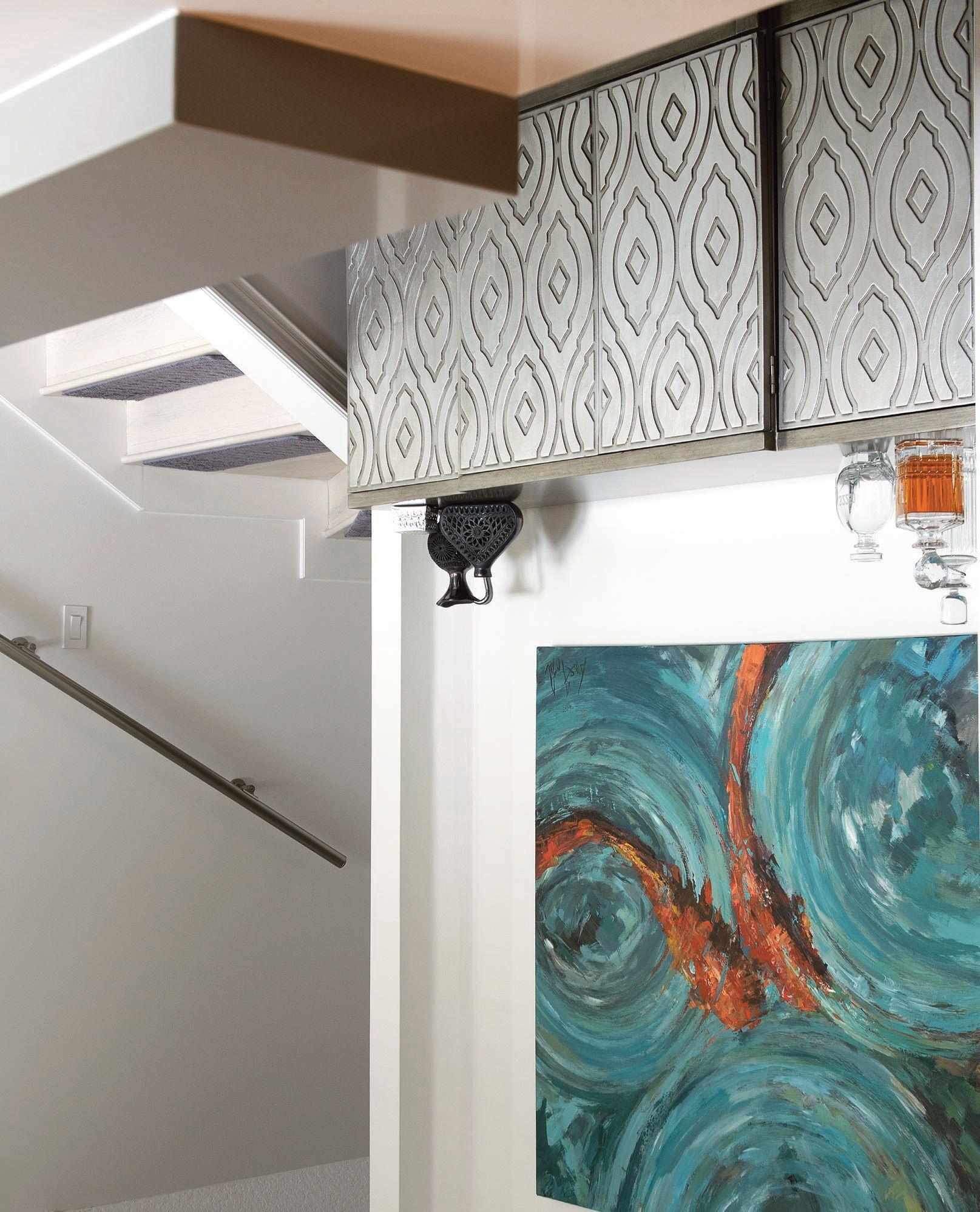
LIVING ROOM “This whole room was designed around knowing that we would have a piece of art that would add color,” says Klucha. The painting that anchors the space is a called Heartsong by local artist John Beard. Natalie Beach, the designer who worked on Klucha’s kitchen, knew Beard and suggested she check out his work when she mentioned finding a statement piece. Klucha went on the artist’s website and immediately fell in love with Heartsong. She couldn’t swing the price of the original, so she opted for the giclée reproduction. “One day I’m outside and the dogs go around the backyard, barking. I’m walking around the corner yelling ‘What the heck are you barking at?’ Well, here comes Natalie with a guy carrying this painting, and it’s John himself,” Klucha recalls. Beard not only hand-delivered the painting, but gifted Klucha the original. It was the first piece of original artwork she bought, which has stemmed into a small collection of works by Beard and other local artists.

BACKYARD The backyard was one of the first projects that Klucha tackled. Originally it had two lone palm trees surrounded by tiny pebbles, which created a walkway around the house. The space is now outfitted with faux grass, a water feature (that lights up at night), and an abundance of tropical foliage.
NATALIE BEACH’S TIPS for keeping contemporary comfortable
“Contemporary design is one that is always changing, sleek and fresh. You want to keep it simple and add sophistication in subtle ways,” she says.
Choose Texture over Color Use neutral shades in white, gray, brown or black. Texture and the use of modern elements such as concrete, glass and metals help to achieve the overall look and add depth and dimension. Details are in the lines and shapes and how they work together.
Consider Form & Function In this kitchen, custom cabinetry houses a coffee bar, pop up shelving provides an easyto-access space for a ready-touse juicer, an over-the-garbage cutting board provides quick clean up and refrigerator drawers built into the island conveniently serve guests at the wrap-around bar.
Keep it Simple Use plain fabrics on furniture, avoiding bold patterns or prints. Add primary colors with restraint. Choose artwork, pillows and minimal accessories that personalize the living space but add flair.
Go Custom If you can’t find it, commission it. Don’t be afraid of “custom.” Often, local artists and craftsmen can create exactly what your space needs for less than you can buy it retail. And you get exactly what you want to fit the space you have.


Vendor & Artist Sources: Kitchen Design • Natalie Beach, of Kitchen Envy Kitchen Backsplash • Dimensions in Tile Kitchen Countertops and Tile on Fireplace and in Guest Baths • Belmarmi Tile Work • Michael’s Custom Tile Backyard Design • Cascade Design Art • John Beard


BEDROOM The dark grey bedroom is the only room in the house that hasn’t been painted white over the years. Klucha explains her neutrals used to be browns and beiges, but found that grey with white offered a more serene palette. And the modern, Scandinavian furniture? Klucha has no shame in admitting it’s from IKEA. She was looking for a contemporary design that didn’t take up a lot of space and provided ample storage. IKEA checked all the boxes. u .

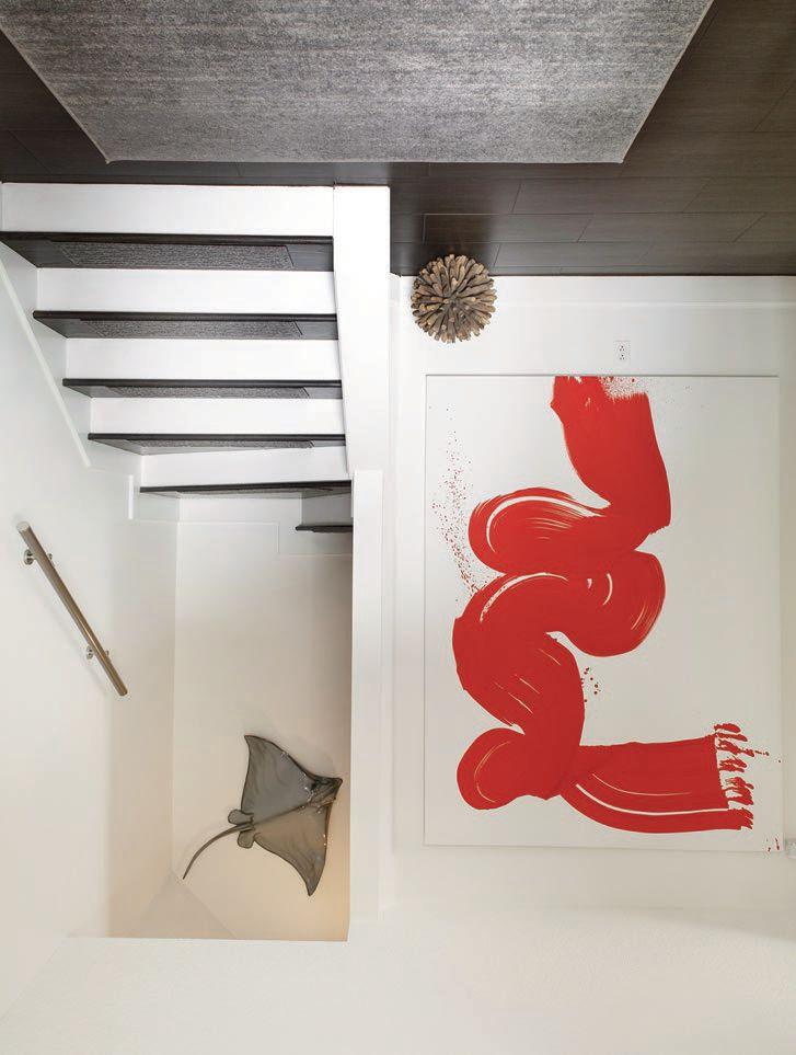
FOYER Creating a statement in the foyer is another large painting by Beard. Klucha explains that Beard made an extra large brush, set the canvas up, suspended himself from the ceiling and had his wife push him along as he created the vibrant stroke.

The stingray tucked into the stairwell underwent its own transformation as the house was made over. “I bought it at Sidney Cardel’s, so it’s local, and it was cream with blue eyes. It was stunning. We had gone to the Caymans and swam with stingrays, where they kiss you and you can pet them, so then I had an affinity with stringrays. I had to have it,” says Klucha. When the room was painted white, though, the cream stingray ended up looking a dull yellow. Luckily, a friend of Klucha’s had a son who did custom painting, and he revived the ray in a classic grey.


