6 minute read
March Animation Planner


RUBBER HOSE WONDERLAND
The team behind Netflix’s delightful new Cuphead Show offer us a special sneak peek of their eagerly anticipated retro toon. By Michael Mallory
Don’t think of Netflix Animation’s riotous new comedy series The Cuphead Show! simply as the latest TV translation of a highly successful video game (as if that were simple). Don’t even think of it as simply a throwback to the classic rubber hose animation of the 1930s (even though it is). At its heart, The Cuphead Show! is the story of two brothers who act like brothers everywhere; they fight, they get into trouble, but ultimately they look out for each other. Okay, sure, unlike other famous brother acts, they have coffee cups for heads, but there’s a reason for that. Heroes Cuphead, Mugman and their guardian Elder Kettle are the creations of real-life brothers Chad and Jared Moldenhauer. The characters first appeared in the Cuphead video game in 2017 published by their Ontario, Canada-based Studio MDHR. And yes, Chad and Jared did bring some of their familial experience to the project. “In the game there’s an older brother/younger brother dynamic,” says younger sib Jared Moldenhauer. Notes Chad Moldenhauer, “When
— Cuphead co-creator Chad Moldenhauer
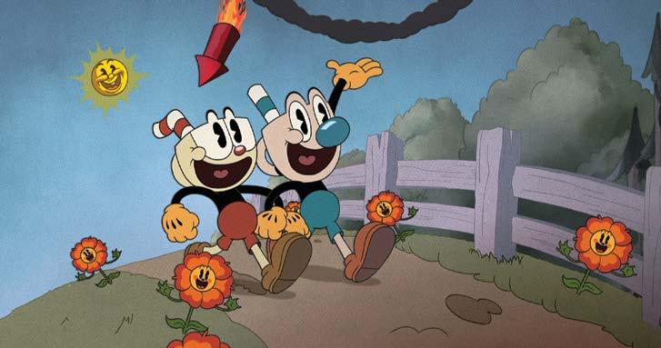
we were growing up, I was always attracted to the main hero character while Jared, for whatever reason, liked the sort of out-of-the-box, weird characters who didn’t suit the perfect hero image.” Cuphead (readily identifiable by his red nose) is impetuous and eager for excitement, despite the danger that might come with it, while Mugman (blue nose), is “a little bit more dorky,” in Jared’s words, sometimes acting as his brother’s conscience. The characters’ chief antagonist, or “boss” in game lingo, was the Devil, whom they were at times pressed into serving.
THROWBACK TO THE ’30S Both the game and the series are designed to replicate, at least visually, the style of the early Fleischer cartoons as well as Disney’s Silly Symphonies. Says Chad, “We asked ourselves, ‘How can we have a cool-looking character that feels like it was made in the 1930s, but doesn’t actually copy or look like a generic version of what already existed?’” After creating a body style they liked, the Moldenhauers then experimented with scores of potential heads. “It was a journey of ‘let’s throw anything at the wall and get crazy,’” notes Jared. “It could be a spaghetti-plate head or a cactus … anything that works.” It was flagons with faces that finally registered, with the addition of drinking straws sealing the deal. “It ties to the old Disney principle about the silhouetting of a character,” Jared says. “Once we found that we liked the Cuphead character and the straw was added, it was such a strong silhouette that the character instantly stood out.” It also achieved the purpose of looking right for the time period, when inanimate objects frequently sprung to life in cartoons. “When
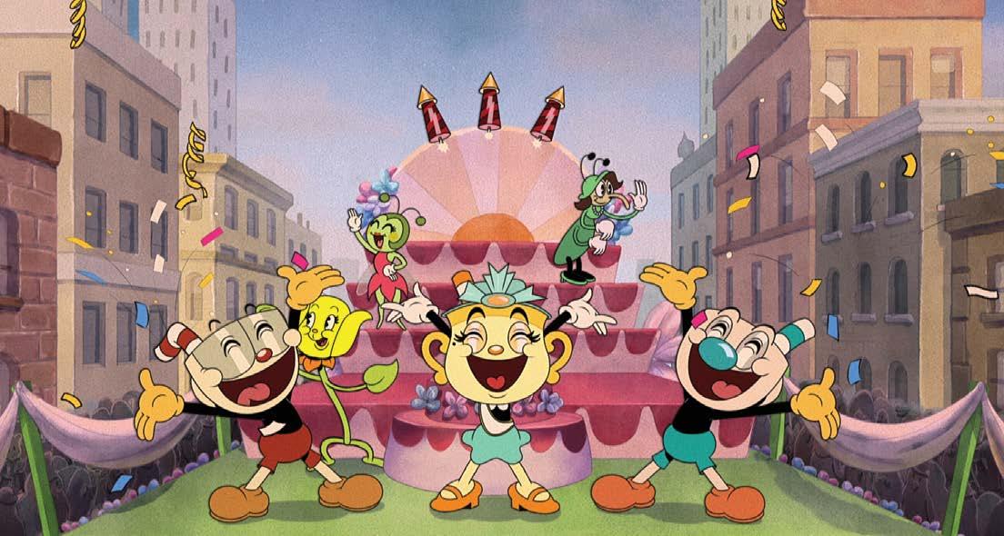
Surreal Surprises: The 10-episode first season of The Cuphead Show! follows the misadventures of the loveable Cuphead and his cautious brother Mugman on the Inkwell Isles.
— Exec producer Dave Wasson
we were showing the game at trade shows or press events, quite a few people asked which studio we had to buy the rights from,” Chad notes. (While no studio rights were purchased in the making of this show, King Features Syndicate is a production partner.) Simply developing a run-and-gun game and employing completely hand-drawn animation to produce it is one thing (though once again, hardly simple), but then came the challenge of adapting the characters for the broadcast medium. That was taken on by Emmy-nominated animation veteran Dave Wasson (Star vs. the Forces of Evil, Time Squad), who serves as an executive producer on The Cuphead Show! and is also experienced in neo-vintage tooning through writing and directing episodes of the Disney Channel’s multi-award-winning Mickey Mouse. The onus was not so much to maintain the game’s retro look, but to expand the stories beyond boss battles on increasingly complex levels. “For the game, they’re able to shoot from their fingertips at different obstacles,” Wasson says. “But for the series, it seemed like it would be more fun if they didn’t have magical powers. They live in a fanciful universe, but there are rules to it.” Residing on “Inkwell Isle” (itself a Fleischer allusion), Cuphead and Mugman still square off against the Devil, though not every time out. “In the beginning there was some talk about using or not using the Devil, because it’s sort of controversial,” he relates. “But in order to have good heroes you’ve got to have a good villain, and you’re not going to have a better antagonist than the Devil himself.” Harkening back to the early Betty Boop cartoons in which Koko the Clown channels bandleader Cab Calloway, the Devil does a jazzy “Hi-De-Ho” style musical number. So in a later episode does a new character called King Dice, voiced and scatted by the talented Wayne Brady. Unlike those early cartoons, though, the dance moves were not achieved through rotoscopy. “At one point we were considering rotoscoping someone,” Wasson says, “but the artist who boarded the King Dice episode animated the dancing straight-ahead in the storyboard, and did it so convincingly that we didn’t have to rotoscope.”
HARMONY-OUS AFFAIR To meet streaming series deadlines, the animation production from Lighthouse Studios in Kilkenny, Ireland utilizes the digital Toon Boom Harmony package, but with a lot of hand-tweaking. “Harmony builds rigs that are basically like puppets of each character, but we supplement that with lots of special poses,” Dave says. “They would have been called character layouts back in the day, but now they’re called special poses. That makes it feel more traditional.” “It has been deeply rewarding and challenging for our creative team to produce a series that lives up to the visually stunning hit video game that the series is based on,” says Claire Finn, Lighthouse Studios’ managing director. “We adapted our digital cut-out animation pipeline incorporating a lot of hand-drawn, traditionally animated elements to recreate the 1930s rubber hose style. We added highly detailed frame-by-frame, handdrawn lighting and 2D effects to the episodes and finished them off with some composited cel shadow to create that Cuphead look the show’s creators were after. We know audiences will love it.” While the look is Depression era, the animation timing adheres more to the 1940s than the slower, deliberate Depression era tooning. “As much as I love them, I’m not sure those early 1930s cartoons would work well for a modern audience as they tend to be a little slower,” Wasson states. “Because it’s all character-driven comedy, we’ve made the delivery and the timing a little snappier.” The task of recreating that look fell to art director Andrea Fernandez (Unikitty!), who immersed herself into the art of the era. “Whenever I could, instead of just looking at footage, I would go through the Disney Archives or other types of archives that people were keeping online of original artwork of the era,” she says. “When you look at something like Pinocchio or Snow White on screen it’s been


