THIS IS NOT A PORTFOLIO

JENNA STYCZYNSKI INTRO TO DESIGN ART 130 SPRING 2023 ST. NORBERT COLLEGE


My family, who is always encouraging me to explore my creative side. Thank you for believing in me and pushing me to be my best self.
Within the following pages lays my creative process for completing projects in Introduction to Design during the semester. Each project highlighted specific design principles. Taking this course directly after a drawing class was very different, and introduced new techniques and methods of the creative process. Every project required several runs of drafts and thumbnails. My sketchbook was my best friend this semester. But, even when it was busy-work, having multiple drafts helped narrow down the best composition for my final craft.


Objective: Redesign a classmate’s experience at St. Norbert, while learning the basic stages of the design process. This partner activity included interviewing each other, building and sharing solutions, and reflecting on how to refine our creations.
Engaging with a real person made me think differently about the prototype I wanted to make. Instead of only thinking about what I would like or dislike, I took their thoughts into consideration, so it would be suited to their needs.

Showing unfinished work to my partner was frustrating at first. I do not like to deliver or present an unfinished piece, because it doesn’t match or translate to the finished product I had initially pictured.
The pace through the cycles was quick and I constantly felt rushed, so I struggled to come up with quality ideas off the top of my head. My normal routine with projects is to spend a lot of time brainstorming and creating thumbnails of different compositions until I find the right one. After that, I am comfortable moving forward and working at a steady pace.
With the crash course activity, I created a logo for the face of an app for my partner, and if I could go back, I would have liked to create something more trendy or eye-catching than the generic design I went with. Ultimately, I think altering my thinking in the ideate stage would have benefited the final product more and met my partner’s wants.
Pages from Crash Course PacketThis is the contents of the app, TM (Time Management) Calculate. The user plugs in their schedule and the app calculates a recommended amount of time to study or do homework depending on the course.


This is the face of the app I created for my classmate to improve her time management with course homework and studying.
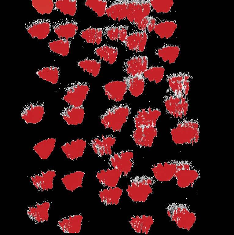
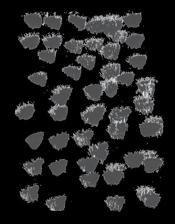
Objective: Create a strong abstract composition only using dots and lines. The design should capture and communicate a specific emotion. This project also introduced the principles of gestalt, such as figure and ground, continuation, and proximity.

The dot line project relates to gestalt because we see “the whole” before we distinguish the individual components of the composition. By manipulating components like the figure and ground, using patterns of similarity and anomaly, proximity, etc. of the dots and lines, you create a whole picture depicting a single word. You pay attention to the overall image first and then go back to the individual components that make a design fit the description.
It is not difficult for me to make a “well-crafted object” because I enjoy paying attention to detail, and it makes all the difference between a good piece and a great final project. I would rather spend the extra time getting the small details right because it pays off when you turn in the final project. I always think my work reflects my effort and creative ability, so I want to cover all the little details. Working with the small paper and glue was frustrating at times, but having clean edges and tidy work made me feel accomplished and “professional”.
This project changed my idea of abstraction and challenged me to think about what others would see in my composition more so than what I preferred for a design. There were endless ways of capturing a word, and this project showed that everyone approaches it differently. It left a lot of freedom to create a piece but was difficult to capture a feeling with just dots and lines.
It was difficult to represent ideas without illustrating them, because everyone has their own ways of interpreting words. I would say the hardest word for me to capture without illustrating it was “comfort”. Right away my mind goes to images of a home or mother and child, so I ended up using different sizes of circles to get a feel for that without being too obvious. Some people matched my thinking while others did not, playing on the abstraction part of this project.
This exercise will help me create designs and other projects that are not only appealing to me but also make sense to my “clients” or peers. Practicing and incorporating ideas of gestalt and abstraction makes a piece better and more unique compared to just flying with your first idea. It makes you go back and make your composition more interesting,


Objective: Choose a word to display letters in a way that match content and form. This project included printing letters by hand and creating compositions that matched what the word said and how the letters looked.
Working with letterforms by printing by hand was challenging, to say the least. It is a lot harder to line them up physically with ink and paper than just using a font online. There is a lot more to the process of creating a font or different typographic forms of the same word. Letterforms can take on several meanings, and how you display them could make all the difference in the audience interpreting them the way you did.
If I was working with these letters again, I would take more time to clear the noise around them using wood tools and paper. I would like to practice more with lining them up, getting even kerning, and accurately getting them on the baseline. I would also like to play around more with the variations of letters, using different drop shadows, and media with the letters.
Letters only, printed “straight”
Letters + typographic variations


Letters + modifications
One more of your choosing
Objective: Choose an animal or object, and recognize the essential elements that make it unique. Use these elements to display it in different forms of media and content. This project also introduced basic functions of Photoshop and InDesign.
The gray wolf had a lot of cliches to it, specifically the stance of howling at the moon. I found out more about my object, and that it can generate a different mood depending on the stance it is in. A side profile resembles more power or dominance which was a different take from it being a wellknown vicious animal. Also, its coat was more complex than I anticipated, with several different layers of black, gray, and white that make it the distinct species it is.

Making a quality collage from the magazine scraps was the hardest media to use because not all of the “finished products” looked realistic. It was a lot of chaos and I felt like I couldn’t match anything together in addition to telling if one color was too close to another which I found out later in Photoshop. The most enjoyable iteration for me was copying Eric Carle’s artwork process. Yes, it was still a collage piece, but I had control of everything coming together with textures, colors, and patterns to make a gray wolf. I think this one turned out very similar to Eric Carle’s illustrations and it took a lot of time, but the result was my favorite.
The basics of Photoshop are useful for future projects or just to mess around with in my free time, such as knowing how to rotate images, use the lasso tool, and curves feature on layers. Knowing how to remove the background is
helpful as well as shortcuts like using the magic wand and quick mask going forward. If I had to continue to work with this object, I would research the gray wolf further to capture more unique traits of it, like its original habitat or ancestors. Perhaps seeing how they interact with their young could generate a different outlook on the animal as well. Capturing an image of a gray wolf and its prey could be different from what I have shown so far too.


 Collage Iteration Draft
Master Artist (Eric Carle) Iteration Draft
Collage Iteration Draft
Collage Iteration Draft
Master Artist (Eric Carle) Iteration Draft


Objective: Choose a graphic designer to research their career and methodology to create successful designs. Post writing to class forum and read and reflect on others’ research too.
Nancy Skolos and Tom Wedell are an awardwinning duo for their photography and graphic design work. Their relationship stretches over 40 years when they first met each other at the Cranbrook Academy of Art. Soon after, they got married and opened their first studio together in Boston. They’ve dabbled in different mediums, but the most successful has been their poster format. Skolos and Wedell have done branding for various events over the years, such as design student competitions, commercials, and festivals.
In addition to their unique crossover between photography and graphic design, Skolos and Wedell use aesthetics to get people thinking about bigger issues in the world and to expand their perspectives. Their humanitarian designs are created through collaged, 3D images, often based on modern forms of painting, technology, and architecture. They combine reason and emotion in each of their designs and want people to discover the meaning behind a piece of artwork. In 2017, the duo was awarded the AIGA (American Institute of Graphics Arts) Medal for their innovative and impactful designs.
More popular clients of this team include the Walker Art Center, Boston Acoustics, the US Department of Health and Human Resources, and the US Postal Service. One of the more popular designs by these two is their poster named “Light of Hope”. They created it for Indonesia
after the country was hit by a tsunami in 2005. Their designs are more than just letters, symbols, and lines. They are communicating world issues through their work, hoping to make a difference and have people acknowledge others’ tragedies. Today, both Nancy Skolos and Tom Wedell work at the Rhode Island School of Design.

I was drawn to the designer team of Nancy Skolos and Tom Wedell, because of the realistic imagery that is incorporated into their posters and designs. There are a lot of different elements in their work, like color scales, technology, architecture, and collages. Every poster is interesting to look at and tells a deeper story the longer you look at it.


It was fun sharing information about the designers with my classmates. The research I gathered on these two designers was something new to share with them, and it expanded their knowledge of modern graphic design.

 A collection of posters by Nancy Skolos and Tom Wedell.

Objective: Design an appealing PSA poster only using text. The client and designer relationship was incorporated into this project. The designer had to communicate an important message to the reader, while meeting requirements found in the creative brief created by the client.
This project was challenging, limiting me to only working with type on a poster. Formatting my poster was difficult and knowing how much negative space to leave. But overall, it made me try different compositions rather than defaulting to images to fill space.
On my PSA Poster, I used around one-third of the page for the title, so it was scaled much bigger than the rest of the text on the poster. I wanted it to be eye-catching from a distance, so “Time” was bolded, italicized, and scaled larger in the title. The next heading “Great Outdoor Spots Around Campus” was bolded, gray, and had a different font family so it didn’t blend into the title. This section was more important than the next, so it was still larger scaled and had a black background with a thin border. The least important section of text on the right side of the poster was in a more subtle, black, regular font. The key parts of this section included “Mental” and “Physical Wellness” which were bolded in Bell MT font. I left enough negative space, so it was not overwhelming for the audience, but not too much where it felt unfinished.


This project tested my ability to be creative with type only. I think if I can create something visually appealing and creative by these guidelines, it’ll make me use images more purposefully in future work. From this project, I also learned how to use more features of InDesign that I could use for personal work too. Knowing how to manipulate
functions like “character” and “paragraph” in the app changes the orientation of a poster tremendously.
Lastly, this project introduced the dynamic of client and designer, and the rules that come with working for someone else, such that you cannot just change their ideas or text. Instead, as a designer, you must check with the client to see if the changes you recommend still fit their vision or not. On the other side, being the client was fun and frustrating at the same time, because I got to see unique ideas, but some of them were not what I had in mind, so it was more back and forth.
GREAT OUTDOOR SPOTS AROUND CAMPUS
TIME spent outdoors is TIME well spent TIME spent outdoors can bring
• hammock poles near Madlor and the Campus Center
• outdoor dining area outside Ruth’s
• Shakespeare Park
MENTAL and PHYSICAL WELLNESS
In the last two years, I have drawn and designed multiple compositions that I am proud of. Going back to the 2022 Fall Semester, when I took Drawing, I got to try different techniques and materials to draw the basics. I was a fan of stilllifes, specifically the all-graphite one.
Another drawing I am proud of is an illustrativeperspective project that introduced me to drawing buildings and design principles. First, I created a composition and put everything down on paper with pencil. Then, I had to go over it with varying thicknesses of micron pens to give the piece dimension and perspective. Combining graphite and pen created a unique finish to the drawing and helped certain areas stand out. After this project, I decided to alter my major to Marketing and add a minor in Graphic Design.
The project I am most proud of though, would have to be a portrait of my brother Jody. This was the first time I ever attempted a fully-rendered compostition of a person. It was the most challenging drawing I had to do in my class, but I learned a lot along the way. It was fun using vine charcoal, charcoal pencils, and highlighting parts with white charcoal.
The final for my Drawing class was more open-ended, and we had to choose a theme to follow with our composition. I chose an industrial theme, so I got to reiterate parts of the illustrative-perspective project I had done earlier in the semester. I worked with graphite and pens again for this, and I think it resembled the theme I was going for.
 Portrait of my brother Jody
Final Project
Illustrative-Perspective


 Graphite Still-Life


I believe I am called to creative work, because even when I try to stay away from it, something always leads me back to working with my hands and exploring my creative side. For the most part, drawing and design methods come naturally to me. I enjoy learning new techniques and ways of creating a design or composition that is interesting to look at. I have always been more particular when it comes to the craft of things, and I think marketing and graphic design complement my creative traits.

Once I have my undergrad, I would like to explore a career that pairs my analytical and creative brain. I grew up helping my family’s construction business and have always liked going over layouts of buildings with my dad and brothers and messing around with drawing and design. Eventually, I would like to apply my knowledge of design to construction projects in some form, whether that be creating logos for businesses, handling the marketing for my family’s construction business, or even drafting blueprints for their jobs.


Thank you for giving constructive feedback and tips whenever I had questions on my projects, and encouraging me to embrace the “weird” to create something special and better than what I had before.
Thank you for all the constructive feedback during in process critiques. This semester made me comfortable utilizing criticism to transition my drafts into appealing finals. As Professor Ries would say, “we suffered together”.


This book was made as part of Introduction to Design at St. Norbert College in the spring of 2023. The fonts used include Termina, Alternate Gothic Extra Cond ATF, and Degular Text. It was digitally printed and saddle stapled at the college’s print center.


