
6 minute read
Graphic design


Besides lighting, the single factor that underlies all artistic photographs is graphic design. Think of graphic design as the shape of things. Photographers study and strive to improve their compositions, but at its core, composition is merely a collection of shapes and the arrangement of those shapes within the frame.
Sometimes good design is simple and easily identified as in the palm frond about to unfurl, right. I chose to photograph this in Indonesia based solely on its beautiful shape. Most of the time, though, graphic design in-
volves many types of shapes that come together in a fairly complicated way. The image below shows an arrangement of vases, stone steps,
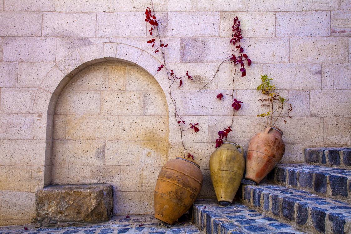
stone blocks, vines, and an arch, and these elements make an attractive composition because the shapes and colors work together so nicely.
Recognizing strong graphic design can take a long time. It’s a maturation process. The more you shoot and intelligently analyze your pictures, the closer you move to successful compositions with dynamic graphic shapes.
To improve your skills in identifying good graphic design that ultimately makes beautiful photographs, it helps to have something to look for when you shoot. The world is, basically, a compositional mess. Focusing on certain types of shapes, lines, and designs will point you in the right direction. Much of the time, these translate into great pictures.

S-curvesand Spirals
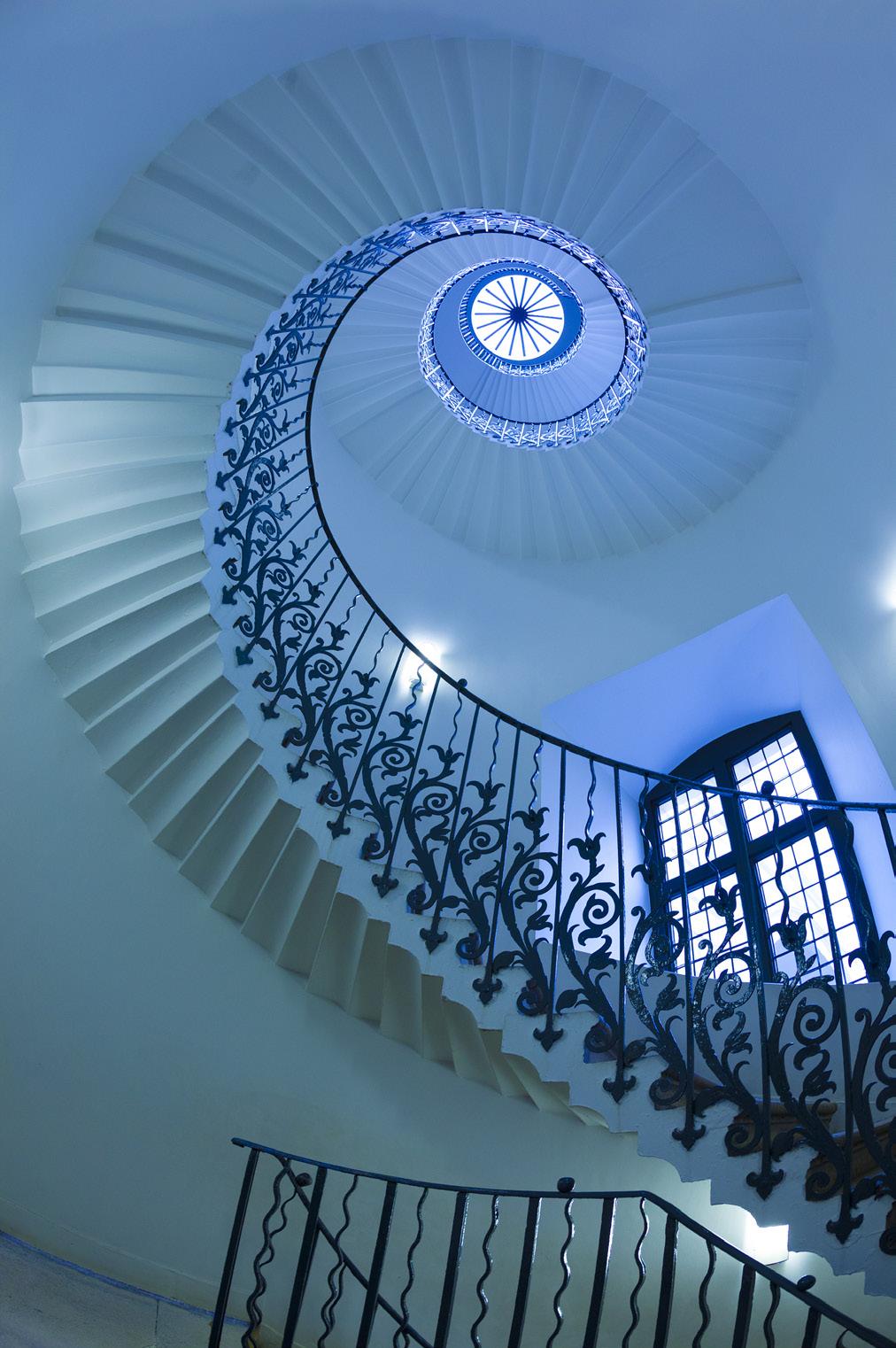
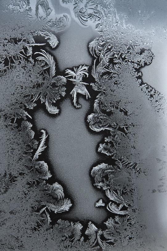
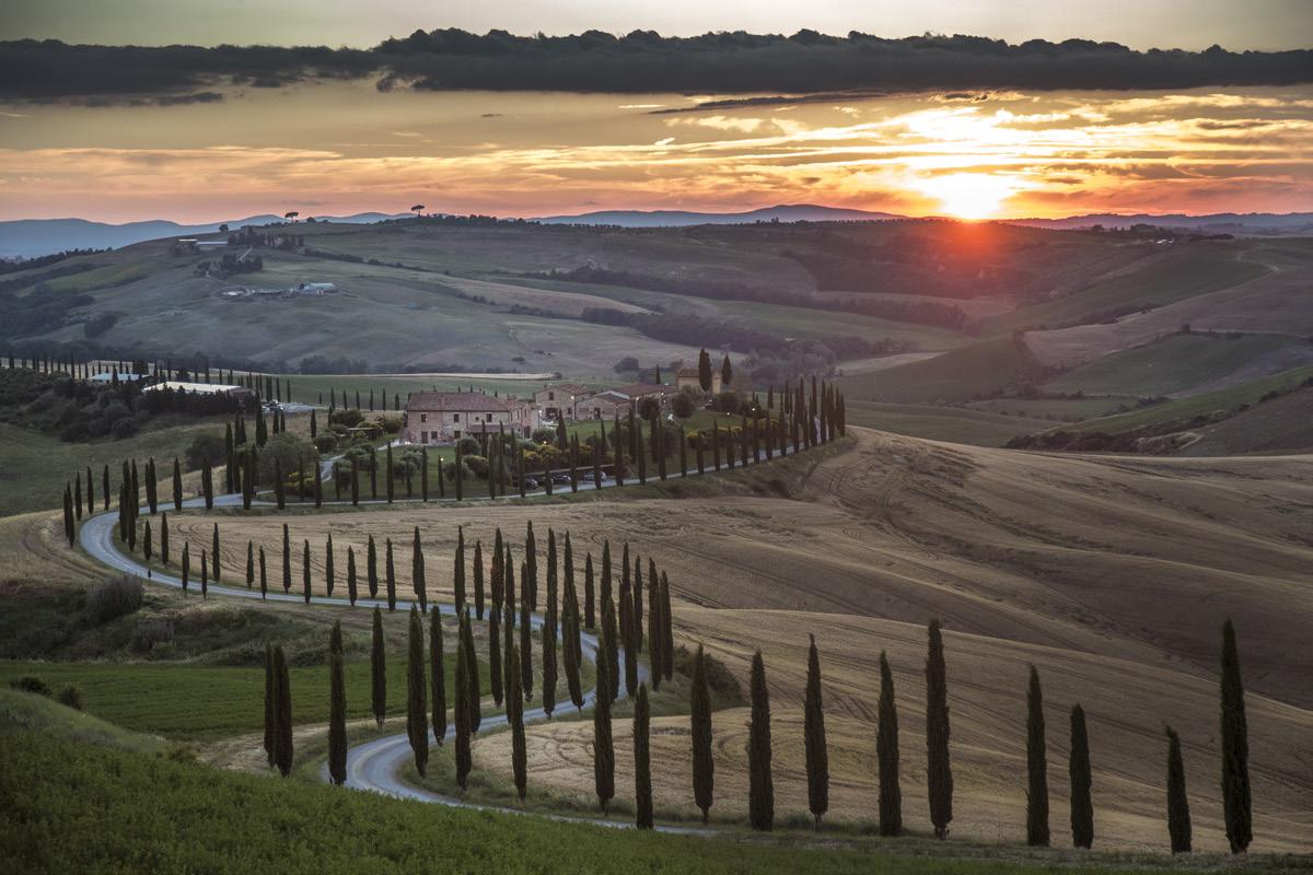
Curves of all shapes can make compelling designs in an image. The window frost, above, is an example. The most dynamic curves of all are S-curves and spirals, an example of which can be seen in the Tulip Staircase photo from the Queen’s House in Greenwich, U.K. on the previous page. At left, it’s the model’s beautiful lines and, specifically, the S-curve of her body that makes this a strong image. At the top of the next page, this farmhouse in Tuscany is a favorite shot among photographers because the driveway has a double S-curve.
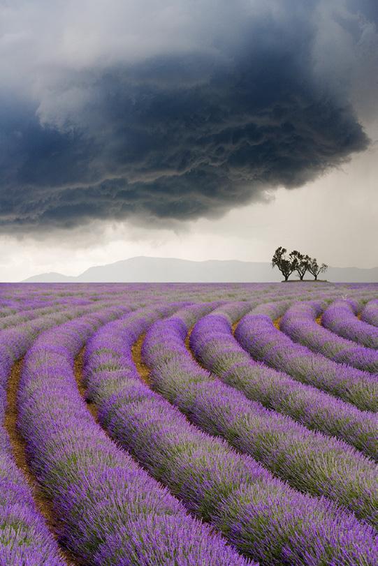
Repeating shapes
A striking type of graphic image occurs when lines or designs repeat themselves. This could
involve any type of subject -- rows of flowers like the lavender field, right, fishing boats (see the next page), ancient columns, a line of trees, a row of Victorian houses, steps, bikes stacked together, and so many more possibilities. I un- expectedly came across a line of rickshaws in India that made an interesting graphic design, shown on the next page.
In all of these scenarios, it’s important to have complete depth of field. Use the smallest lens aperture possible to make sure you’ve captured shap detail from the foreground to the back- ground.
Diagonals
A dynamic graphic element is the diagonal line. Diagonals come in all forms. Sometimes

you can create diagonal lines simply by angling the camera. That’s what I did for the shot of the feathers on the next page. I laid these out in a vertical pattern and then rotated the camera to create a stronger graphic effect.
In the photo above, the repeating design is definitely dynamic, but notice that each of the fishing boats offer a strong diagonal line in the way their bows are angled relative to the camera.
For the stunning interior of the 15th-century mausoleum of the Central Asian conqueror, Tamerlane, on the next page, I created the diamond-shaped diagonal ceiling design by standing in one corner of the building and using a 14mm wide angle lens. In reality, the ceiling shape is square, but the angle from which I photographed it created the diagonals and made this graphic design quite compelling because of the strong and prominent diagonal lines. Notice how symmetrical this image is, too.
Symmetry
A powerful type of composition is one that appears to be virtually mirrored. I’m referring to symmetrical designs that are perfectly centered and perfectly balanced. This can be eas-

ily seen in many architectural structures, from village huts to steel and glass skyscrapers. You can also set up a shot that has great symmetry as I did with the Balinese dancers on page 11. The dragon staircase was constructed with symmetry in mind, and I just placed the models in the center to echo that type of design. Perfect symmetry is also obvious in the mausoleum photo at right.

The key to making these types of pictures successful is positioning yourself dead-center on the subject. This does two things. First, it underscores the symmetry and makes the picture look perfectly balanced. Second, it prevents the horizontal lines of the subject from looking skewed relative to the top and bottom of the frame. When the back of the camera (i.e. the plane of the digital sensor) is parallel with the plane of the subject, that prevents the vertical lines of the subject from appeaering skewed,

or non-parallel, to the left and right sides of the frame. Even if the camera is slightly off-center or if it’s angled badly, the symmetry is degraded.
I’ve noticed on my photography tours that many people have difficulty finding the exact place where dead-center is. If there are symmetrical designs on a floor, such as in a cathedral, it’s not hard to identify where to stand in the center of the room. In other instances, like the tiled floor of a mosque in Bishkek, Kyrgyzstan, right, you have to look critically at the various elements in the scene to determine when you are positioned dead-center on the subject.
In the photo at right, for example, notice how the two minarets are composed such that the distance between them and the middle arch on both sides is precisely the same. This could only occur if I were standing dead-center. In addition, the spacing between the two fore- ground columns and the left and right sides of the frame are identical. Noting these details takes a few extra seconds, but it makes the results perfect.

Negative space
One of the ways to direct attention to a subject in a photograph is to compose it surrounded by a uniform -- or fairly uniform -- background that is not part of the subject. This is the idea

of negative space, and this type of composition is often very graphic and visually dynamic. The costumed model, right, taken in Venice, Italy, during carnival is an example. The background is basically monochromatic with no form at all, and this focuses our attention on the model. Our eye really has nowhere else to go.
The silhouette of a Masai tribesman from Kenya, below, also exhibits the idea of negative space. Even though the clouds have form and drama, the way I composed this (using a wide angle lens to include a large portion of the sky) means the large expanse of sky only serves to direct our attention to the subject.
In negative space compositions, the subject is usually placed off-center as you can see in both of these pictures. In the Venetian portrait, I placed the model along the left vertical third in keeping with the Rule of Thirds. With the Masai spear-thrower, I composed the image with the subject in the lower right corner. My rationale was to make the sky as large a part of the frame as possible to give the impression of the vastness of the African plains.

When you shoot outdoors, it seems like the world is compositionally messy. Using the graphic design concepts I’ve outlined here helps make sense of the mess. §