1 minute read
Short and Sweet
1. Graphic background elements that are not part of the subject are usually distracting. The balcony of the Doge’s palace in Venice, for example, see behind these costumed models during carnival pulls the eye away from the subjects because the lines and design of the railing and columns are so bold. 2. When shooting at night, combining both cool colors (bluish) and warm colors (yellowish) in a single composition is quite striking. Looking up at the Petronas Towers in Kuala Lumpur, Malaysia you can see the power of this color combination. Yellow and blue are complementary colors.

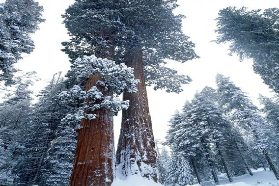
3. Photographing with overcast conditions produces blue tones in an image when using daylight white balance. Blue connotes cold, so with winter landscapes this color is appropriate. If you want to eliminate the blue, one way to accomplish this is to use the hue/ saturation dialog box in Photoshop. 4. When all the elements in a scene are far away, depth of field is no longer relevant. In this shot of the Dolomites in Italy, I could have used any lens aperture and the depth of field would have been the same even though the distance from the village in the foreground to the mountains is many miles. §


