Regular IrRegular Fall 2022
The design of the bourbon distillery begins with the investigation of the industrial typology. Transparency and uniformity in the factory facade directly reflect the inner programmatic organization and structure. Manipulating these typologies with some irreverence, one can start to imagine structural anomalies, programmatic discrepancies, and spatial misreadings of a previously ordinary space.
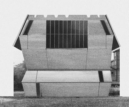


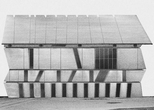


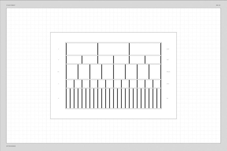
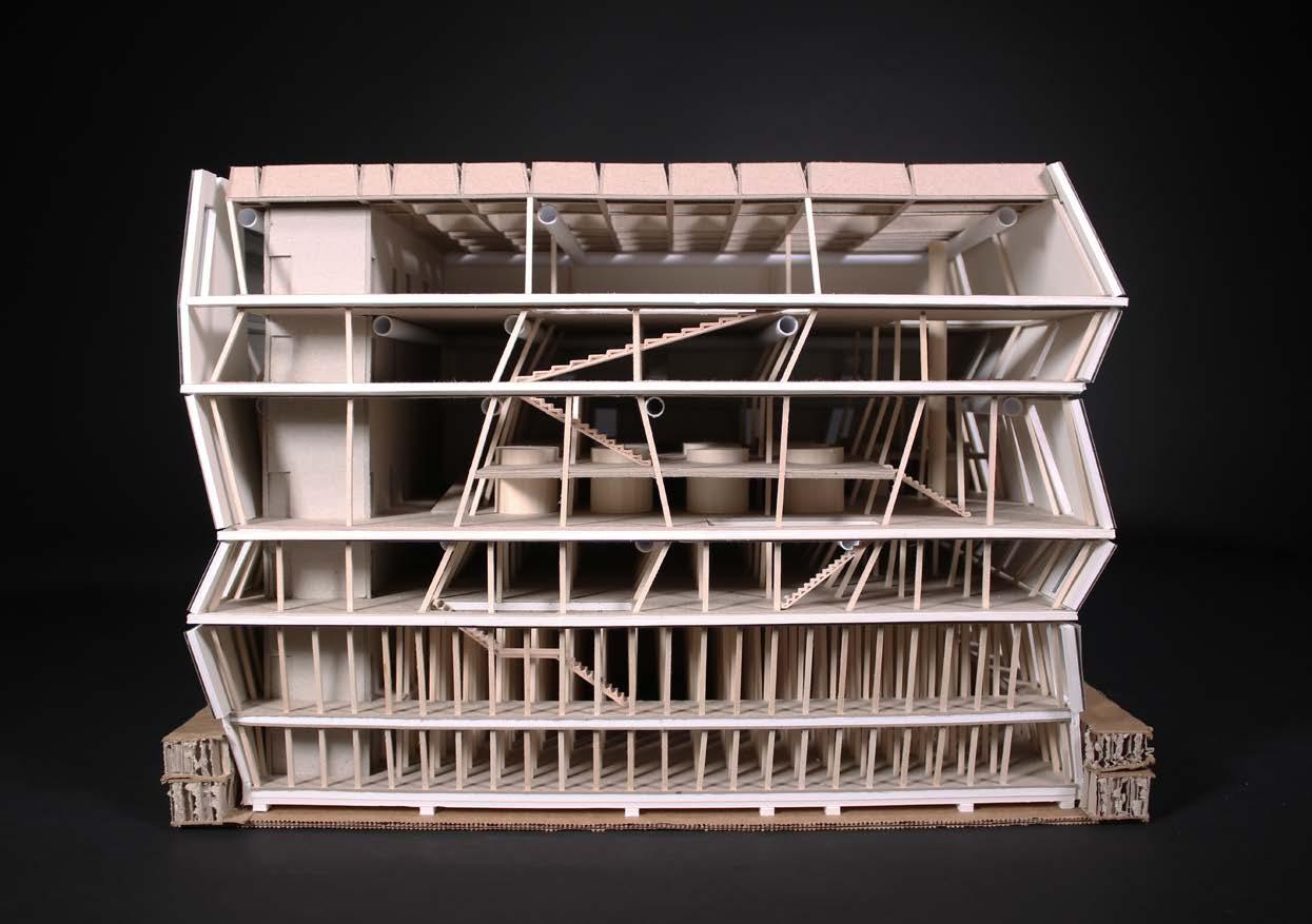
Each program is given its appropriate space determined by varying widths of column bays. Programs stack on top of one another in order of column grid density, going from the tightest of nooks in the rickhouse to the vast open spaces of the event floor. Shifting of floor plates are results of oblique columns that transfer the hefty load of industrial machinery point to point, creating branches of structure that sometimes span through the entire building.
 tumbler
tulip snifter




The angled columns, while limiting occupiable area in some places, actually provide room for mechanical systems to reside and permeate through the plan. Air ducts and water pipes inhabit these dead spaces, becoming an integral part in the expression of the wavering structure.


Operable windows let in cool outdoor air during the hotter months, pushing hot interior air out through the opened skylights of the roof. During cold seasons, these openings can be sealed and fully internalize the heat created in production to channel throughout the building.



DeFilippo Sports Center Spring 2022
The DeFilippo Park nestles between a large parking garage and a residential neighborhood of the North End, characteristic of its historic heritage and bustling tourism of Little Italy. The triangular site is a collection of programmatic zones that are distinctly separated: the basketball courts, the dog park, and the playground.
My proposal first considers the typology of the shed, its meaning, form, and construction, and begins to fragment them into parts that appear to be whole.


The building rests upon the existing geometries of the given site, using the unoccupied areas of the park as a basis for structural footprint. A pair of cantilevering roofs provide shelter and venue for large happenings. As a way to connect the building, the site, and the city, a series of ramps were introduced to provide a unique experience of meander and spectatorship.

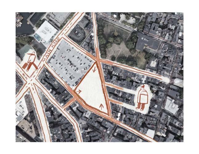


The fragmentation and the subsequent stitching of the shed structure allows for the coexistence of segmented and continuous spaces. In some aspects, the ramps function as a separator of programs and sectors of the site, clearly delineating the territories for sports, dining, and spectating, while in other ways, they also connect the differences as an elongated seam. Large open areas in the center of the site can be utilized for larger gatherings and events. Parades, flea markets, and concerts held on the indoor and outdoor courts encourage communal activities as they seamlessly engage the surrounding urban population.


Charlestown Cultural Center
Spring 2022
The People’s Palace is imagined as a catalystic insertion into Boston’s Charlestown neighborhood that serves a diverse array of constituencies. Defined by heterogeneity in program, context, and service to the community, this multistory building aims to provide amenities and collective spaces as a contemporary people’s palace. Located in the playground lot of the William H Kent School, currently a home to a pre-kindergarten program for the Boston Public Schools, the project must consider its relationship with the existing structure as well as the diverse surrounding urban contexts.
My proposal approaches the idea of the “stack” as a tight volumetric interlock rather than as a vertical repetiton of space. The interconnection of horizontal, vertical, and oblique rings allows for adjacencies that transform the spatial and programmatic relationships between one another. Dining spaces linked to the atrium, the library accessible from workshops, galleries extending out to the outdoor deck, the People’s Palace offers stimulating overlaps in juxtaposition of similar and contrasting programs in bringing the community closer together.

The unique stack of the programs at the People’s Palace present a unique experience for different demographics that may be visiting the venue for various purposes. Newcomers can grab a quick meal at the cafeteria on the ground floor, move up the staircase to visit the gallery and outdoor spaces, weave through the workshops to get a glimpse of the creative production, and finally enjoy the luscious roof garden at the top. Those participating in the community workshop programs or social events may use the elevator to directly access the floors and services that meet their needs and quickly navigate through the building without entering the enfilade.


Ordinary, Except is an artist residency situated between two triple decker houses, a vernacular building type of the Boston and Cambridge area. The project aims to characterize the relationship between the normal and the exception, the domestic and the institutional, and the existing and the new.
The designed intervention connects the pair of existing structures in a zigzag motion, creating moments of overlap and pinch that present new spatial readings. Mirroring and splicing of architectural norms resulting in such a process transform the ordinary into something extraordinary.


In this duplex, two residents live in constant presence of one another while never fully coming in contact. The house reshapes the notion of sharing space through subtle shifts in walls. Walls that defy the boundaries of floor plates function not only as separators of distinct spaces, but also as generators of social opportunities through selective visual and physical access. Here, the residents must live over, under, around, and across the partitions in order to find new, awkward, and refreshing methods of interaction.


The project began with two seemingly incompatible sections of one building. In Jump Cut - staying quite true to its reference to the technique in film editing - a series of spaces are linked at the two ends of interest, leaving the middle to form a loop. In plan, the building seems to be rather uniform. But in section, an unexpected series of shifts and undulations in the structure presents a completely different spatial experience where one can journey across the soft waves of ramps and staircases. The building is wrapped in a translucent envelope that attempts to unify the contrasting spaces as a single structure and, at the same time, reveals moments of peculiarities in intentional framing of the building that respond to the manner of the loop.


Daegu: The Future City of the Past Spring 2022


The social, political, and cultural infrastructures of South Korea are heavily centered around the capital, Seoul. As a result, the metropolitan city of Daegu, despite being the third-largest urban agglomeration in the country, has been subject to a gradual decline in population over the recent years. In an attempt to revitalize the city, the government has made an effort to promote futurization through urban developments, sustainable transportation systems, and international conferences, marketing itself as an ever-evolving metropolis. However, the reality to this movement towards innovation is not entirely promising; most estates are used for developments of residential tower complexes to maximize profit and the implementation of the monorail has proven inadequate to the urban setting of Daegu. The four images, each from the perspective of an analyst, a birdseye, a visitor, and a local, address this issue of development in Daegu that begins to greatly alter the reading of the city’s urban context at various scales.


Musical Studies Centre Fall 2022
As a material and construction analysis of the Musical Studies Centre by Ensemble Studio, the studio asks students to investigate the production of building material and its assembly more in depth. Through detail wall sections, diagrams, and physical model, the project aims to gain a deeper understanding of the idea of “massiveness” or monumentality through expressions of construction, form, and material.
The facade of the Musical Studies Centre, its most recognizable feature, is made of large granite blocks that have been extracted with a particular drilling technique that gives the material its unique texture.

GRANITE STONE FACADE
CONTINUOUS PLASTERBOARD METAL CEILING
MONDARIZ GRANITE VENEER
OAK WOOD FLOORING
POLYPROPYLENE PIPE FOR RADIANT HEATING
POLYPROPYLENE PIPE FOR RADIANT HEATING
SUPPORT PLATE
PERIMETER INSULATING PLINTH
PROTECTED POLYURETHANE THERMAL INSULATION
AIR GAP
SELF-SUPPORTING CLADDING PLASTERBOARD METAL
DOUBLE N-TYPE PLASTERBOARD THICKNESS 13+13MM
RETAINING WALL
01. axonometric diagram showing the extraction and processing of granite blocks as facades of the musical studies centre
02. detail view of the model facade made of plaster
03. detailed wall section
04. curated model photo showcasing various methods of model making to emulate the textural quality of the granite facade


05. physical model
STEEL REINFORCED BEAM
CALIBRATED STEEL PILLAR
FLAMED MONDARIZ GRANITE SLAB
FOUNDATION GROUND
The illusion of the solid exterior is shattered upon a closer look into the voids cut into the cubic diagram of the building. The thinness of the facade construction is first revealed in the expression of exterior cuts for large and small windows where the material laps the edges of the voids. The construction itself is of a typical masonry wall section behind the chunks of granite. The space behind the outward appearance of the facade consists of a light, spacious interior in contrast to the heavy, solid presenting exterior.
Digital Media Models
Fall 2022
With this project, we push the boundaries of materiality in found objects. Our understanding of material quality becomes distorted through uncharacteristic manipulations - twisting and folding rigid objects, petrifying and consolidating movement, giving volume to layers and layers to volumes - as these series of experiments begin to suggest an entirely new reading.


The process involves a constant switch between the physical and digital model space. In physical space, the model is a tangible artifact, indicative of its origin and making. In digital space, scale, material, and behavior all become parameters for change with a great degree of freedom. What is most interesting comes from the dialogue between the two: a digital transformation of an object that is translated as a physical model or a physical construction of an object that is mimicked through digital software.
Through these experiments, the models subvert expected material and physical qualities. Typically soft and malleable materials hold prescribed forms while seemingly solid materials express flexibility and softness. By repeating such operations multiple times, we can start to introduce found objects that are more and more separated from its native qualities and eventually produce artifacts with a level of abstraction and singularity that become something found anew.


Hannam University Campus Park Summer
2020
During my two-month internship at GNM Architecture Studio, located in Seoul, South Korea, the studio entered and was nominated at a national architecture competition to design a high-tech industrial park in a university. My responsibilities included site analysis, precedent research, preliminary design, model making, and interior design.


The main concept of GNM Architecture Studio’s design for the Campus Innovation Park was the creation of a “hub.” Separated into two towers, the building provides facilities and business opportunities for starting companies and research teams while also fostering an environment for social interaction and creative collaboration with the students. The concept of “separate but together” was the central idea that drove the design process.
Constructon for Hannam University Campus Innovation Park was completed in 2022.
