
15 minute read
INFLUENCES Le Corbusier Bauhaus Frank Lloyd Wright “Falling Water ” Beirut: Modernism and Brutalism
from Jordan Insurance Company - Designed by Architect Waddah Al Abidi (Steinke+Arida)
by Joanna Arida
INFLUENCES
Growing up, his favorite architect was Frank Llyod Wright. Some of his designs follow Wright’s patterns and one of his buildings was even inspired by Wright’s Falling Water. He admired his work in organic architecture. Later, when he visited Andalusia, Spain in 1978, he changed his approach completely. He felt most inspired by the Islamic Architecture and its proportions. He also fell in love with organic architecture and the “IslArab” style. IslArab is a term that he came up with as an abbreviation for the Islamic Arab styles that follow excellent proportions and is the truest style for Amman. He focused on the idea of proportions as he believes that architecture revolves around ratio and proportions. He considered it to be one of the most appealing styles in the world and this is why he committed to it. However, this direction and influence took place after design the Jordan Insurance Company. Arch. Waddah Al Abidi considers architecture to be one of the seven Arts. However, he considers architecture to be most important because architects design for the sake of life and culture. You design a masterpiece for people to live in.
Advertisement
INFLUENCES
The economic boom of the ‘70s and ‘80s introduced a form of architecture which mirrored the recently acquired wealth and aimed for harmony with the international style. Also, with the increase of wealth, travelling became easier which led clients to request the use of a certain pattern or style they had seen somewhere. Due to the urbanization and ease of travels, Jordanian architects, such as Al Abidi, began studying abroad and completed their education in foreign countries. This influenced the course of architecture and made Jordanian architects design new type of buildings using international styles. This gave a unique new feature of architectural identity in Jordan. (Ghanimeh & Pisani, 2001) Along other modern structures, these newly introduced buildings highlighted a second phase in Amman’s modernity, during its expansion into a city. The buildings of that period are testimonies to these developments. Buildings from Amman’s modern past are more than works of architectural significance. They are a living testimony to the city’s eventful evolution over the past century.
Considering that Al Abidi was assigned to design the building a year after his graduation from Alexandria, he was yet a fresh student excited to implement new thoughts and ideas to his city, such as the international building style. The modernism movements from all over the world were brought to Amman, leaving Amman with a distinct variety and flavor in is architectural characteristics. Some of the introduced movements that influenced Arch. Waddah Al Abidi will be mentioned in this research.
Figure 8: Villa Savoye. (Google Images)

Figure 9: Le Corbusier. (Google Images) A great influence of the time was Le Corbusier. The Swiss- French architect is seen as a pioneer of modern architecture. Dedicated to providing better living conditions for the residents of crowded cities. Le Corbusier believed the tower block was the solution for rehousing the masses that had been displaced during the Second World War, and that high-rise building could be used to create spacious city homes with the same amenities as a typical street. The experiments of Le Corbusier with concrete, especially in his Unite d’Habitation [1952] opened new possibilities for regional variations that were eagerly taken up around the world. In Lebanon, this new tendency found great popularity as it appeared to answer functional, climatic and cultural specificities.
5 Rules by Corbusier: i. Raise the building from the ground on pilots, to reclaim the lost space under the house; ii. Build non-weight-bearing walls to free up the designer; iii. Create an open and flexible interior floor plan, free of weight-bearing walls; iv. Include long, sliding windows to bring the garden and light inside the house; v. Create rooftop gardens to replace the green land swallowed up by the concrete block. (Choay, 2020)
BAUHAUS
The Bauhaus influence is most obviously adopted in Amman's old cinema houses, but some philosophical aspects are also shown in the Insurance Building Design. i. «Form follows function». According to this idea, simple but elegant geometric shapes were designed based on the intended function or purpose of a building or an object. Though the functionality needn’t be boring as we can see from the Bauhaus buildings. ii. Gesamtkunstwerk or the ‘complete work of art’. Gesamtkunstwerk means a synthesis of multiple arts forms such as fine and decorative arts. A building and its architecture were only one part of the concept. The other part is design. iii. True materials. Materials should reflect the true nature of objects and building. Bauhaus architects didn’t hide even brutal and rough materials. iv. Minimalism. Bauhaus artists favored linear and geometrical forms, avoiding floral or curvilinear shapes. v. Emphasizes on technology. Bauhaus workshops were used for developing prototypes of products for mass production. The artists embraced the new possibilities of modern technologies. vi. Smart use of resources. Bauhaus ideology is characterized by the economic way of design. The representatives of the Bauhaus movement wanted to achieve a controlled finance, productive time-consuming projects, precise material use, and a spare space. vii. Simplicity and Effectiveness. There is no need for additional ornamenting and making things more and more ‘beautiful’. They are just fine as they are. viii. Constant development. Bauhaus is all about new techniques, new materials, new ways of construction, new attitude – all the time.

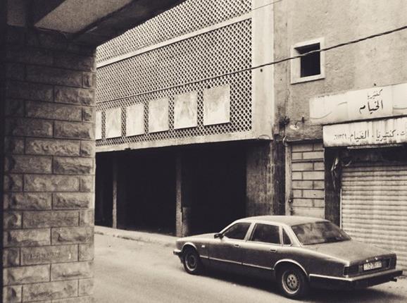
Figure 10: Cinema Khayyam. (Google Images)
Figure 11: Bauhaus building in Dresden. (Google Images)
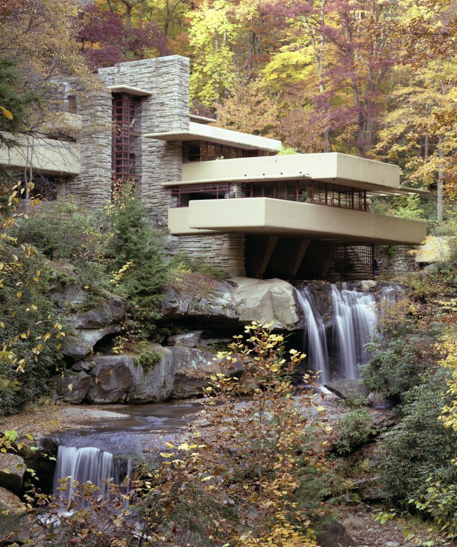
Figure 12: Falling Water. (Google Images)
FRANK LLOYD WRIGHT "FALLING WATER"
Another great source of inspiration and Al Abadi‘s childhood favorite was the project Falling Water by Frank Lloyd Wright. Frank Lloyd Wright designed Fallingwater in 1935 for his friend Edgar Kaufmann and completed it three years later. Wright spotted a rock that jutted out over a waterfall and decided to build the house there and let the water flow underneath. Taking cues from the rock edges, the American architect cantilevered floors from the house's three levels. Occupied by a series of terraces wrapped with reinforced concrete balconies, these project over the water's edge at the rear and the wooded valley on the other sides. Wright also extended the open plan living and kitchen over the torrent. As well as referencing the surrounding natural forms, Wright chose locally sourced sandstone to make up the body of the house, and a limited color palette for the exterior to ensure that the property blended into its surroundings. The structure of building was a bold choice for Wright, and one of his early experimentations with concrete. Wright presented an example of "organic architecture". His philosophy promotes the harmony between design and nature. With glass doors and direct outside access from most rooms, as well as water streams straight into the house, he continues to connect the in. And outside. (Gibson, 2017) Fallingwater is often referred to as one of Wright's masterpieces. It was one of 10 of the architect's buildings nominated for the UNESCO World Heritage List in 2015.
BEIRUT: MODERNISM AND BRUTALISM
Another influence at that time was the one of Beirut modernism. A famous architect that belonged to the Lebanese movement, was Khalil Khoury. He designed the first Insurance Company building at the First Circle and therefore brought his influence and approach straightly to Amman. Khalil Khoury (1929) graduated in 1955 from the Academie Libanaise des Beaux Arts. His production was representative of the optimism and development in Lebanon between 1950 and 1960. Also, he was one of the architects that further developed new tendencies of modernisms from Brutalism to Structuralism and Latin American versions of Modernism. He applied the rules of European functionalism and further developed the potentials of industrial and low-cost materials like steel and reinforced concrete.
The architects of the brutalism movement in Lebanon were not concerned about aesthetics, but other things in society; it was as much a social, ethical and moral movement as it was an architectural movement. The architects of the time were impugned with this moral consciousness. What remained of the hulking masses of concrete, sometimes other materials, represent an extraordinary period of incredible optimism and determination to use architecture to transform society. (Harrouk, Brutalist Beirut: Showcasing a Forgotten Modern Heritage 2019)


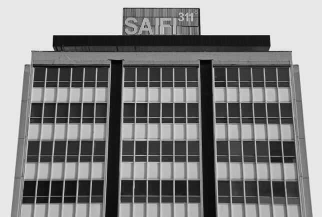

Figure 13-17: Modernism and Brutalism. (Google Images)
The building was designed in 1968 with him being a fresh graduate. He was working with the ministry of land affairs and also overtime in an architectural office. He was chosen to do the design. Back then, the initial design was done in Beirut with collaboration of the Lebanese Consulting Affairs. At first, the land’s proposed use was not commercial, it was residential. However, the influence of the office that he worked with was great, in addition to the fact that the owners of the company were quite influential in the city of Amman. Therefore, they were able to change the site from a residential area to a commercial area.
The site was a challenge, and he did not want to have one building as it would be so long and bulky. So, he broke the site into two buildings: one facing South and the other facing West. The two buildings were office buildings. When he made the first design, most of the elevations had horizontal movements, but then he found out that that was quite tedious. Consequently, he told his boss, a civil engineer, that he will change the facades. His boss warned him that the deadline was coming up in the next three days, but Al Abidi worked day and night to ensure that his new facades were ready by then. The new elevations gave building A vertical strips while building B preserved its horizontal strips. The buildings were quite different looking from one another to create contrast. He wanted to break them apart via pattern because otherwise, having continuity would create a very long tedious building. He also added a Colestra Patterned façade because they were trendy at the time. The project was a success. (Arida, Steinke, & Al Abidi, Interview with Arch. Waddah Al Abidi) Yet, years later, he said in an interview that he is not very proud of his design as he completely changed his style after several years. The JIC building follows the international building style which, in his opinion, does not carry Amman’s character. Ironically, when we interviewed the on-site civil engineer, Eng. Haydar Madi, he told us that Al Abidi was quite proud of his design and work at the time. This shows how Al Abidi’s concepts and interests shifted with time.
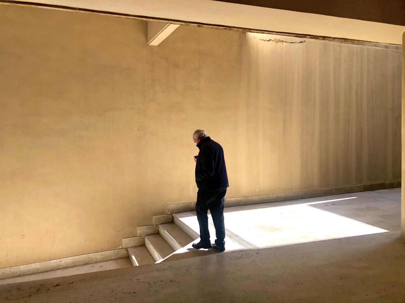
Figure 18: Eng. Haydar Madi in JIC (Joanna Arida)


Figure 19-20: Facades of the Insurance Company back in the 80s (Archive Arch. Waddah Al Abidi)
Fortunately, and unfortunately (according to Al Abidi), the project was a complete success. It represented an example of how high-rise buildings met the ground while connecting and being surrounded by an ever-flowing urban space that challenges topography and yet contributes positively to the site. In 1972, he was granted a scholarship to France to get his Post Graduate degree and so he left Amman. When he returned, he discovered that the company liked it to the extent where they added a third building in the site next to it. Building C was added by Simga Consultants. Ironically, the Director of the Company told him that he did not like the design of the third building. Nevertheless, the building was completed. After many years, Al Abidi changed his style into environmental design.
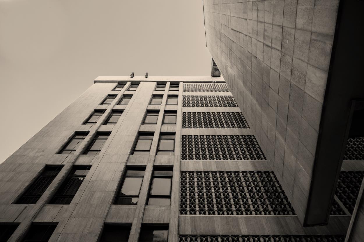
Figure 21-22: Exterior shots (Majd Hijawi)

N
Dividing the space into two buildings, later a third building was added with different angle.
Building A Building B

Figure 23: Ground Floor Plan of JIC Complex. (Joanna Arida)

Figure 24: Second Basement Floor Plan of JIC Complex. We can see that Building C does not have a basement. (Anke Steinke)
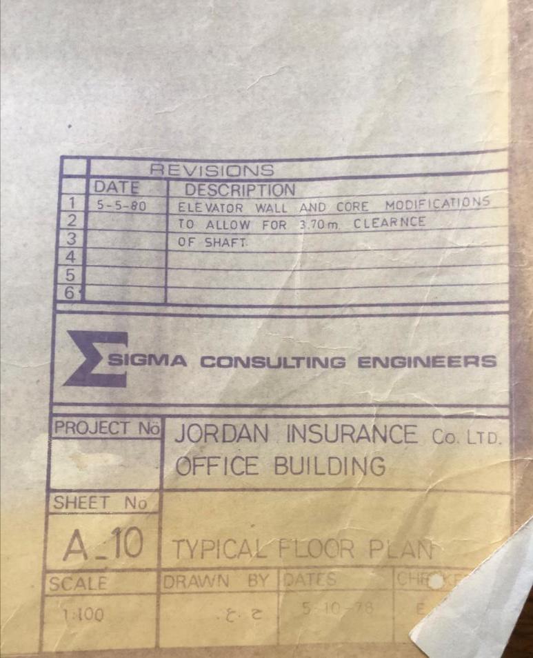
Figure 25: Plan’s legend (Joanna Arida) Figure 26: Rooms were labelled as bedrooms back when the building was supposed to be a hotel. (Anke Steinke)

Al Abidi has a fascination for the use of stone in his buildings. The type of stone used in the insurance company’s façade was local hard Jama'een Stone which was compressed and heated into marble. He enjoyed using different types of stones and years later continued to experiment with different sizes and proportions of stone courses in his architecture.
He enjoyed using local stone because it was more of a natural material rather than industrial. However, as said before, Al Abidi was not very proud of his design after returning from France. He was drawn towards the IslArab style more as he felt that he should be more committed to Amman‘s Islamic character. A style that follows excellent proportions and is the truest style for Amman, in Al Abidi‘s opinion. (Arida, Steinke, & Al Abidi, Interview with Arch. Waddah Al Abidi)
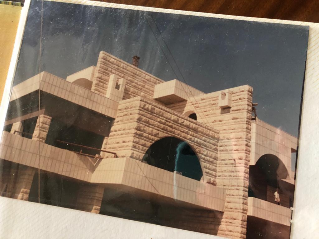

Figure 27-28: Stone Composition by Arch. Waddah Al Abidi for Residential Buildings (Archive Arch. Waddah Al Abidi)

Figure 29: Stone Composition by Arch. Waddah Al Abidi for a Villa at Fourth Circle (Archive Arch. Waddah Al Abidi)


Figure 30: Plan of the U Shape. (Anke Steinke)
THE SIGNATURE U SHAPE
Waddah Al Abidi is known for leaving the letter U on his buildings as an indication that this building is his design. The story behind this U goes back to the time he studied in France. In France, each architect would write his name and his degree on the building. He thought it was going to be a bit tedious in Amman, so he took his first name’s initial, W (two U’s), and started putting it on buildings. He tried it multiple times, but it was too much to add so he started adding one U only. (Arida, Steinke, & Al Abidi, Interview with Arch. Waddah Al Abidi) When interviewing Eng. Haydar Madi, he told us that, till this day, he remembers Al Abidi urging him to make sure that the U is included in his building, especially since he was travelling, and he did.
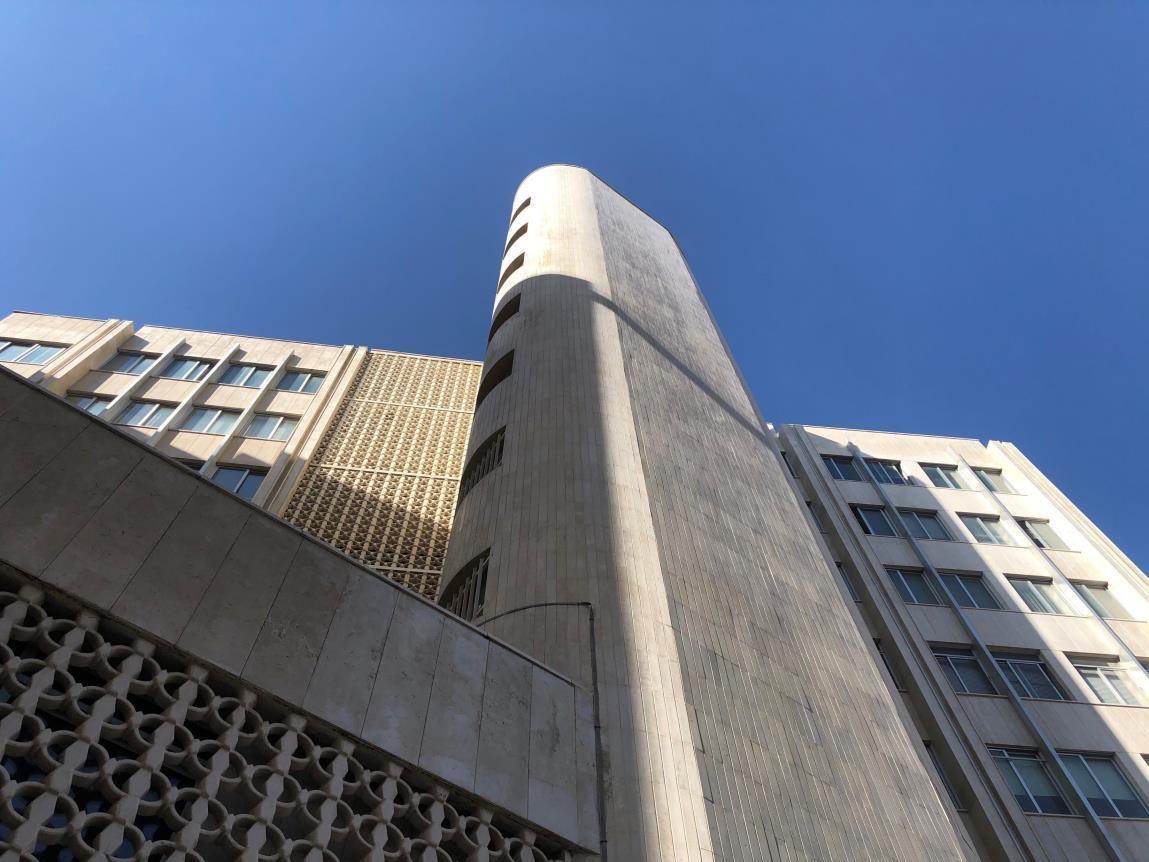
Figure 31: Exterior shot of Building A. (Joanna Arida)
"I gave great efforts in my designs, because once I marked them with the U, it means that I officially take responsibility for this building.“ -Waddah Al Abidi

Figure 32: Building C second floor plan. (Joanna Arida)

Figure 33: Typical floor plan of building B. (Anke Steinke)

Figure 34 Exterior shot. (Anke Steinke) Figure 35: Exterior shot. (Joanna Arida) Figure 36-37: Colestral patterns. (Anke Steinke)
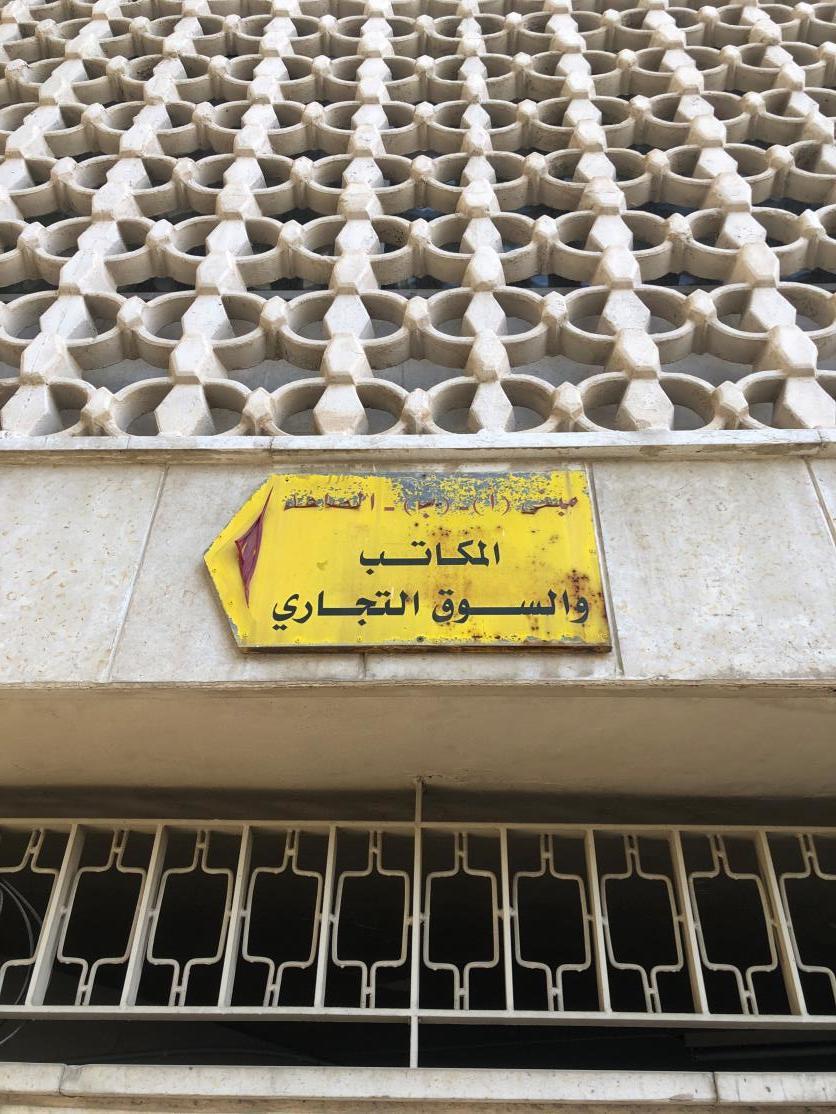


Traditional Colestra patterns from the region were added to the building and combined with the clean modern international influence.
USE OF MARBLE
In Europe, marbles are fixed onto the walls by using certain adhesive chemicals. The first circle’s insurance company was the first building to have marble on its exterior, however, the marble was fixed with cement which doesn’t take seasonal expansions and contractions into consideration. For the third circle’s insurance company, the team learned previous methods and decided to fix the marble with adhesives, grout, and screws imported from the UK. Travertine Marble was mostly used for the buildings. Buildings A & B were built by local teams, however, building C was built by Royal Boskalis. (Arida, Steinke, & Madi, Interview with Eng. Haydar Madi) All marble was fixed manually rather than mechanically. The exterior was covered with Jama’een Marble.
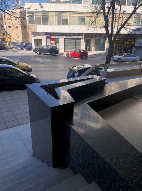

Figure 38-40: Marble used and fixed in the building (Joanna Arida)

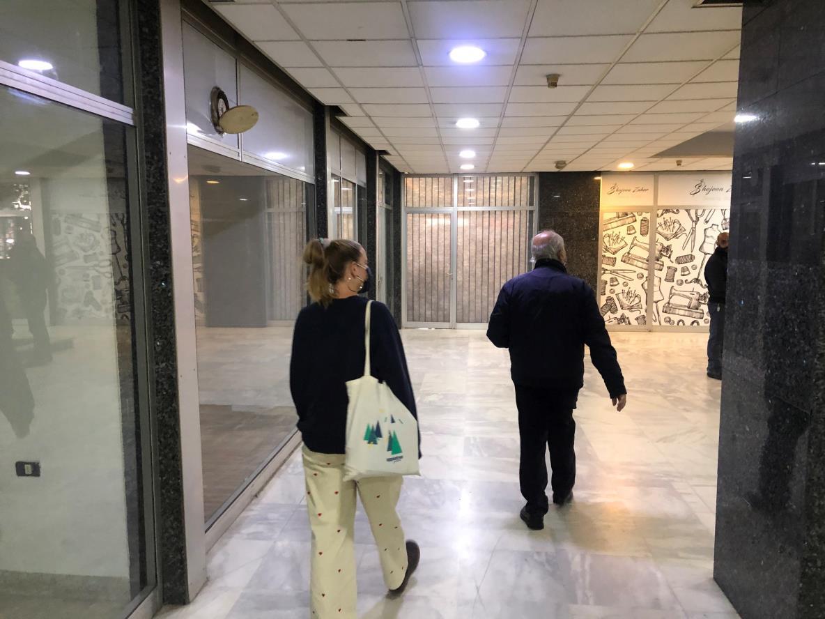
Figure 41-42: Eng. Haydar Madi showing us the mall in building A (Joanna Arida)

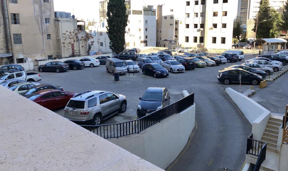

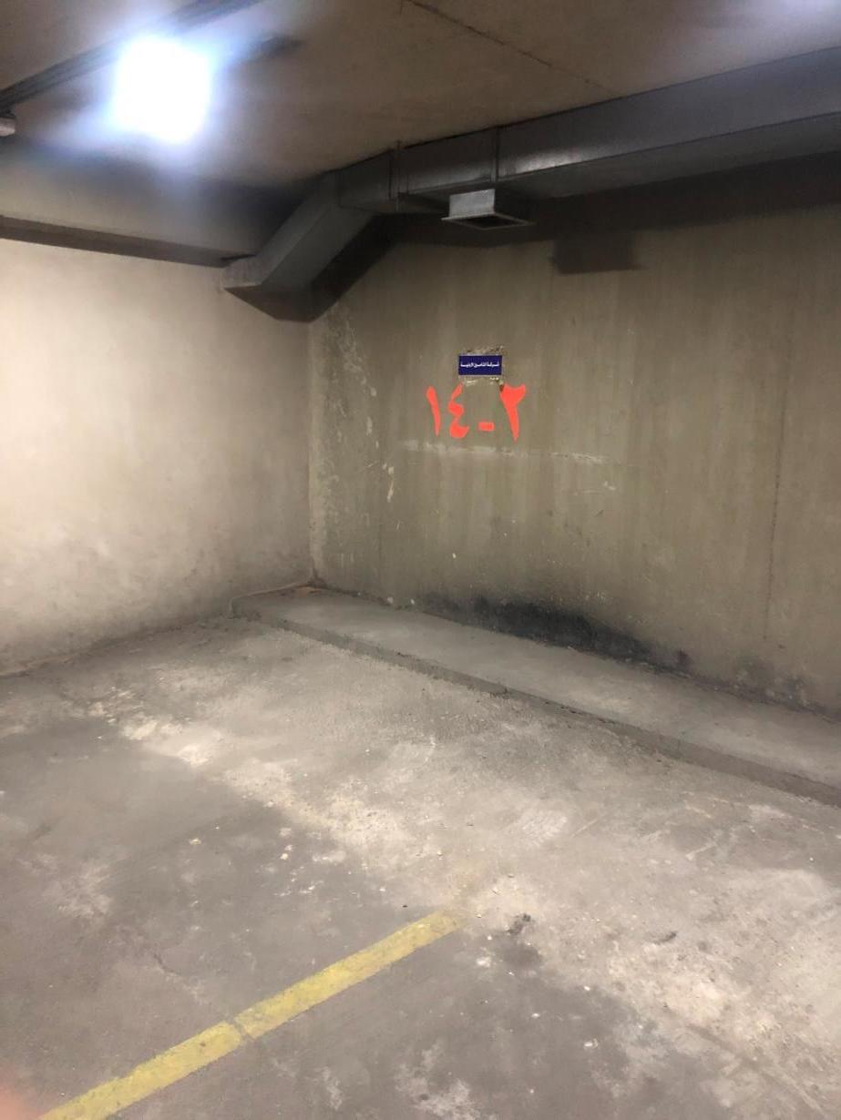
Figure 43-45: The basement garage and the outer garage next to Building A (Anke Steinke)
The walls had to be moved back 1.5m in order to have cars move properly around the garage.

Figure 46-47: The image on the right shows a room where all of the company’s archives are stored. (Anke Steinke)


Figure 48-49: Besides having a complete central system, JIC had a garbage shoot that was connected to all of the floors. This was considered a modern system. (Joanna Arida)

Figure 50-52: The stair well (Anke Steinke)


