6 minute read
Feature
5SHOW HOUSE INSPIRATIONS TAKEAWAYS FROM A SPIRE HOUSE MCLEAN By Sherry Moeller Photos by Stacy Zarin Goldberg
With several starts and stops due to the pandemic, the ASPIRE HOUSE McLean Show House at 952 Mackall Farms Lane in McLean, Virginia was held from August 22 through September 13, 2020 with all safety precautions in place including timed entries.
Presented by ASPIRE DESIGN AND HOME magazine, Artisan Builders, Harrison Design, and Design Chair Mary Douglas Drysdale, the show house provided an abundance of design tips and takeaways to apply to one’s home, as well as a chance to talk to the 28 designers and hear how they developed the look of their rooms. Most of the designers’ items in the house were also for sale. One of the show house’s most inspirational elements was the announcement of ASPIRE’s Diversity in Design Scholarship Fund awarded to Marymount University in Arlington, Virginia.
The top five takeaways from the show house include: neutral décor can set the groundwork for a home’s overall feel; color provides an expressive outlet to complement a neutral base; canopy beds are still very much in demand; small rooms can be intriguing and memorable; and art can be the personal touch a room needs.
SET THE TONE WITH NEUTRAL DÉCOR
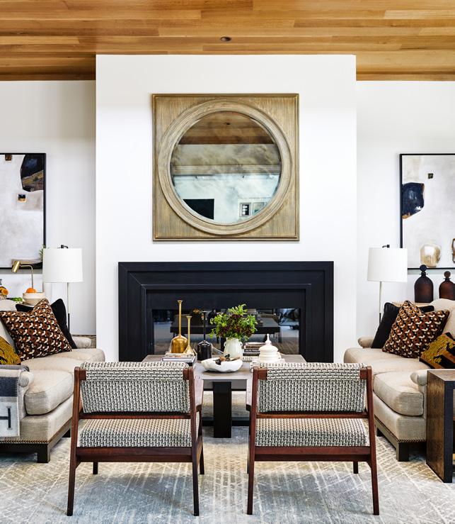
Family Room: Pamela Harvey of Pamela Harvey Interiors created a fresh family room using shades of black, beige and bourbon. “This not only keeps a room timeless and classic, but also allows the silhouette of each piece to be the main focus,” says Harvey. “I also wanted to pull the warmth of the ceiling wood into the room, so we choose graphic patterns for our pillows, chair and bench fabrics.”
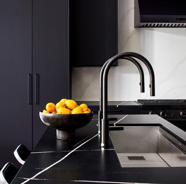
Kitchen: Jonas Carnemark of Konst Siematic concealed appliances within the matte black cabinets in his kitchen, which also features dual islands, a contrasting white backsplash, and a prep island with 75-inch LED panel for virtual learning. “Like white, black is a timeless color,” Carnemark says. “It’s also a powerhouse of the neutral palette—right alongside the paler beiges and grays that typically come to mind.”
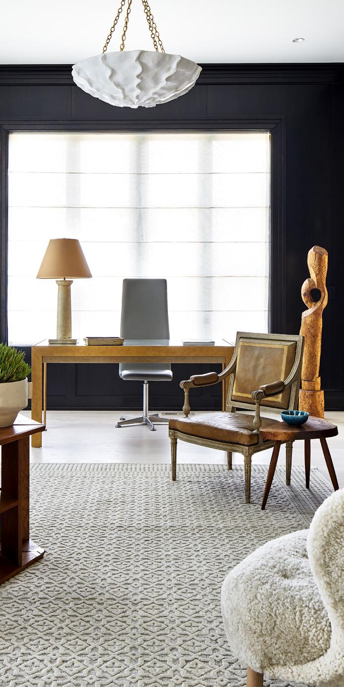
Library: Nestor Santa-Cruz of Nestor Santa-Cruz envisioned a library for the soul by incorporating art, sculptures and iconic modern furniture. “I believe that memorable rooms have a clear design philosophy that transcends individual styles,” says Santa-Cruz. “The library is thus serene and elegant while espousing a sense of whimsy.”
Wine Bar: Olvia Demetriou of Hapstak Demetriou+ conceived the wine tasting room as a destination for celebrating wine with a smoky-gray stained wood wallcovering and black marble counter. “We chose to make the room seductively dark and atmospheric with a dramatically lit wine feature wall,” says Demetriou.
BE EXPRESSIVE WITH COLOR
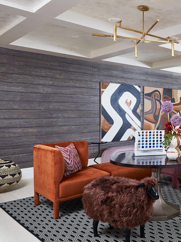
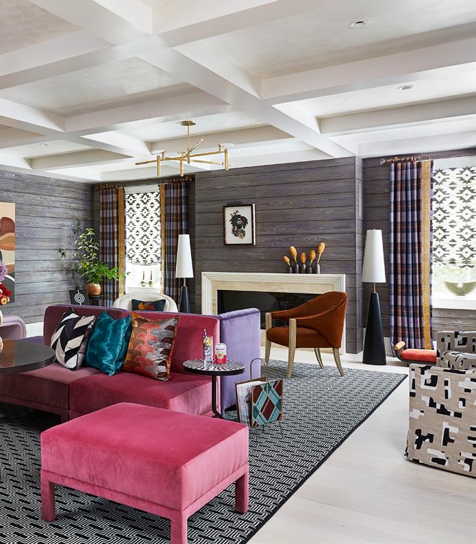
Recreation Room: Kiyonda Powell of Kiyonda Powell Design Studio designed a playful “Cabin Cool” recreation room with a decorative wall finish, eclectic art, and modular furniture in rich colors. With a focus on entertaining, Powell says, “I wanted the space to have a relaxed and casual mood, a place where people can gather and enjoy each other’s company with games and lively conversation.” Photo by Keyanna Bowen
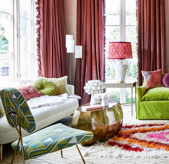
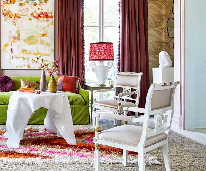
Living Room: Janie Molster of Janie Molster Designs presented a sophisticated salon filled with an adventuresome mix of rosy pinks and pops of green. “Layers of art and texture encourage visitors to linger and be transported,” states Molster.
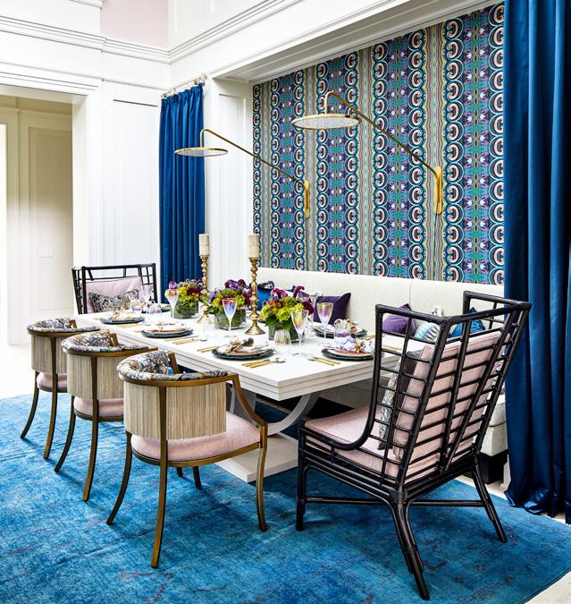
Dining Room: Jennifer Stoner of Jennifer Stoner Interiors turned the central dining room into a colorful supper club setting to take advantage of the two-story barrel ceiling. “By designing within large niches in the space, we were able to create the intimacy that can be a challenge with rooms of this scale,” Stoner says.
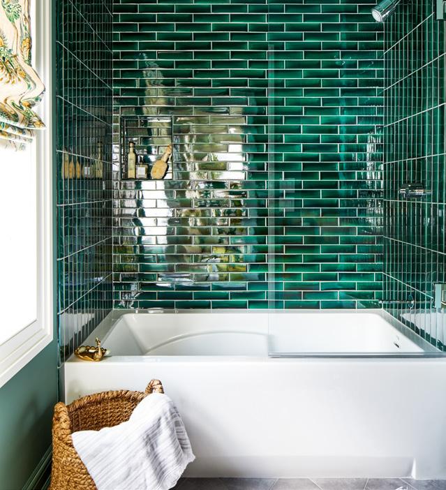
Bathroom One: Allie Mann of Case Architects & Remodelers drew inspiration from previous bathroom projects where she also used bold hues. “We celebrated color and pattern in this bathroom to create high drama in a relatively small space,” Mann says.
INCORPORATE CANOPY BEDS FOR A CLASSIC ELEMENT
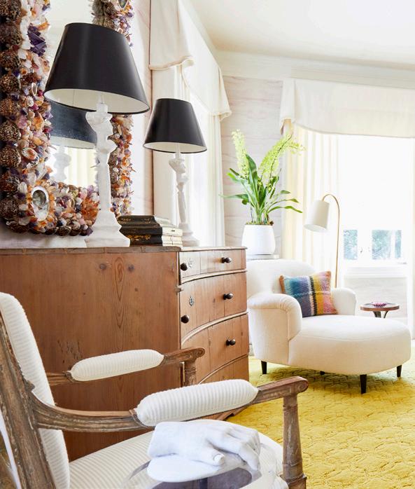
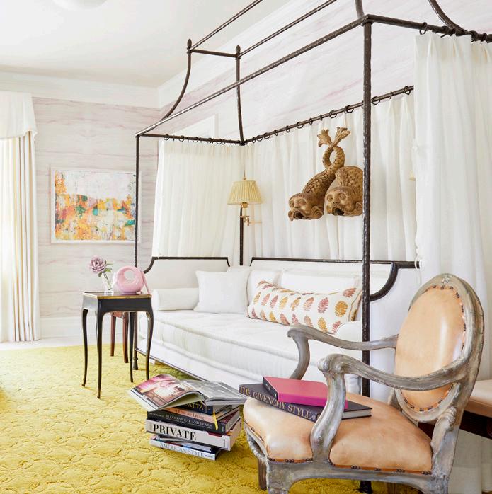
Bedroom One: Josh Hildreth of Josh Hildreth Interiors embraced the shape of the canopy bed, which is the focal point in his room, and celebrated its graceful lines in hand-forged and hammered iron by Ironware International. “We chose to keep the bed simple and dreamy with an ivory Irish linen,” Hildreth says. Photo by Kip Dawkins
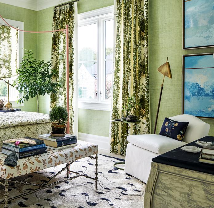
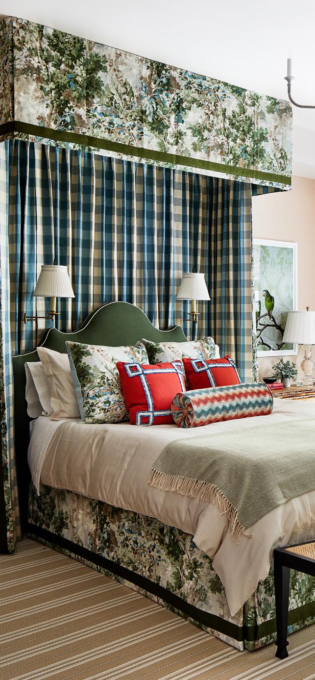
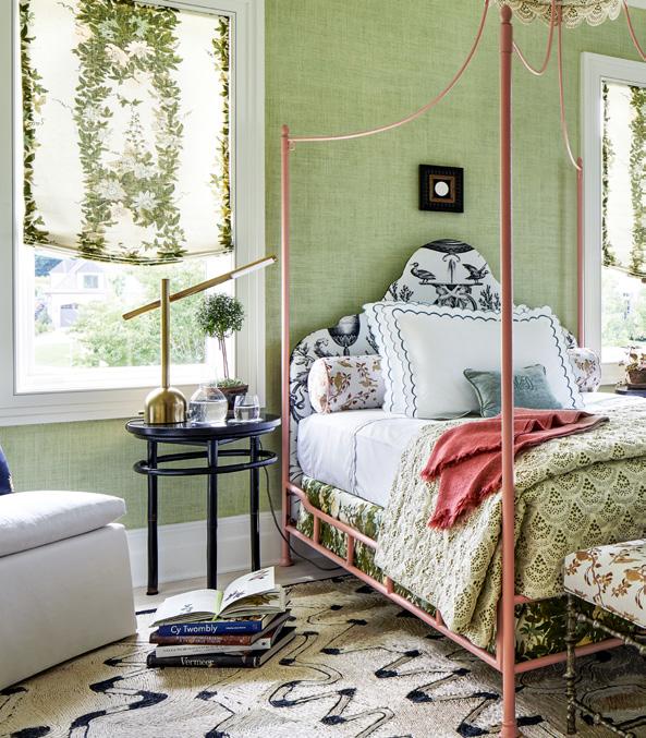
Bedroom Two: Annie Elliott of Annie Elliott Design took traditionally feminine elements, such as a canopy bed, and paired them with masculine furnishings to make the bedroom “uncle chic.” By mixing geometric and floral fabric patterns and bringing the valance to the ceiling, Elliott says, “the canopy bed feels indulgent and cozy without eating up all the space in the room.”
Bedroom Three: Melissa Colgan of Melissa Colgan Interiors was inspired by a modern day Bunny Mellon to blend classic Southern design elements including a canopy bed in a way that makes them feel young and a bit irreverent. “The canopy bed is wonderful because you can leave it unadorned, such as I did in my room except for the crown, and it can feel almost architectural like you are looking at scaffolding,” Colgan says.
MAKE SMALL SPACES MEMORABLE
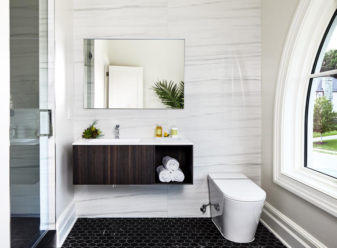
Bathroom Two: Michael Winn of Winn Design + Build started with a narrow bathroom with tall ceiling and half-circle window and blended materials to make it feel cohesive. “To complement the window’s circular shape, we used a large format tile installed in a horizontal pattern,” says Winn.
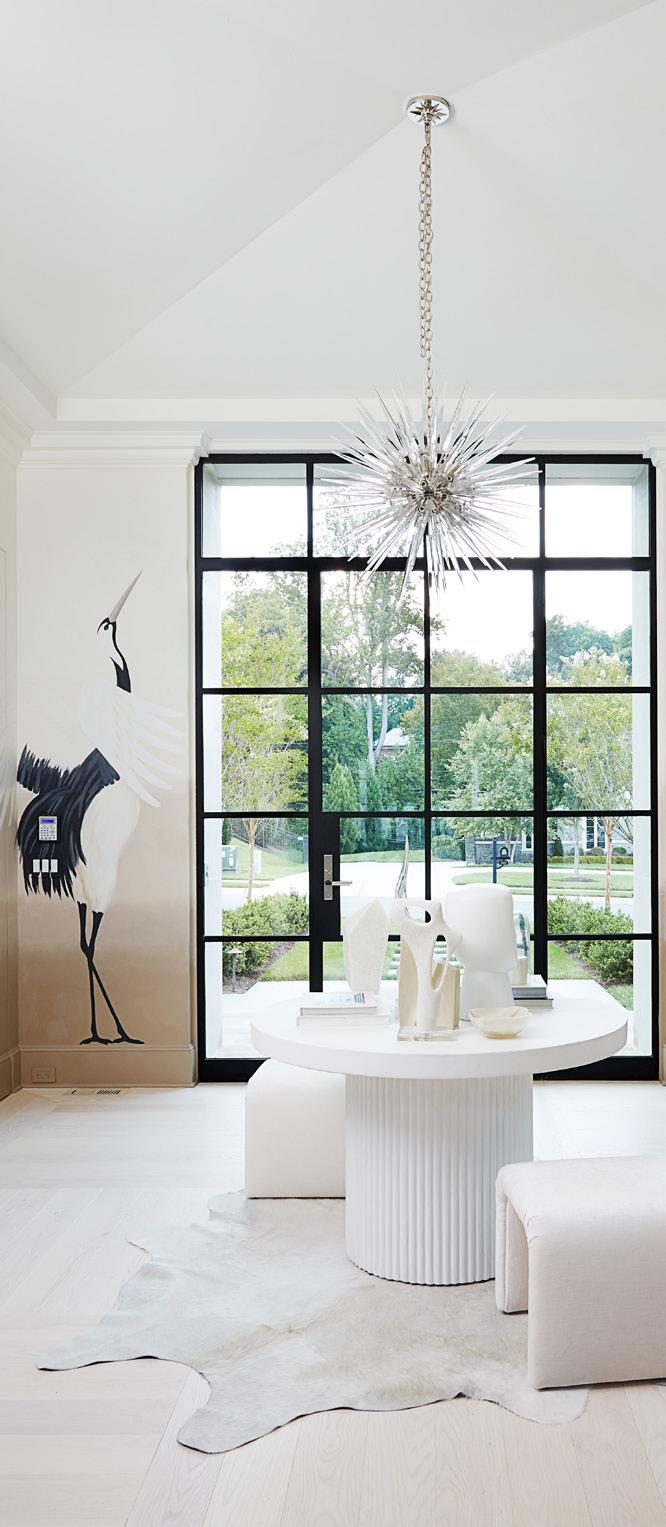
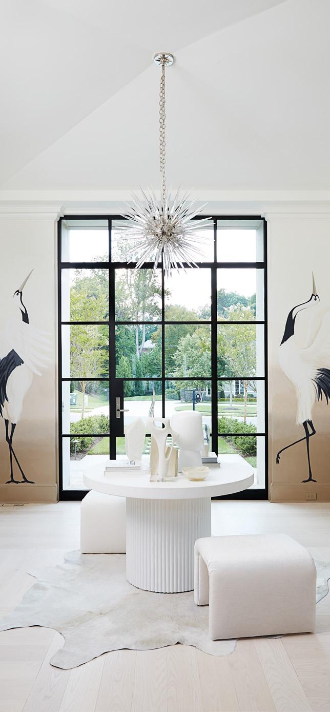
Entry Foyer: Katalin Farnady of Farnady Interiors designed an entry foyer that welcomes guests to the diverse designs in the show house. “Through an exploration of dimensions, soft colors, textures, form and materiality, I was able to add the unexpected elements and drama I like to include in my interior spaces,” Farnady says.
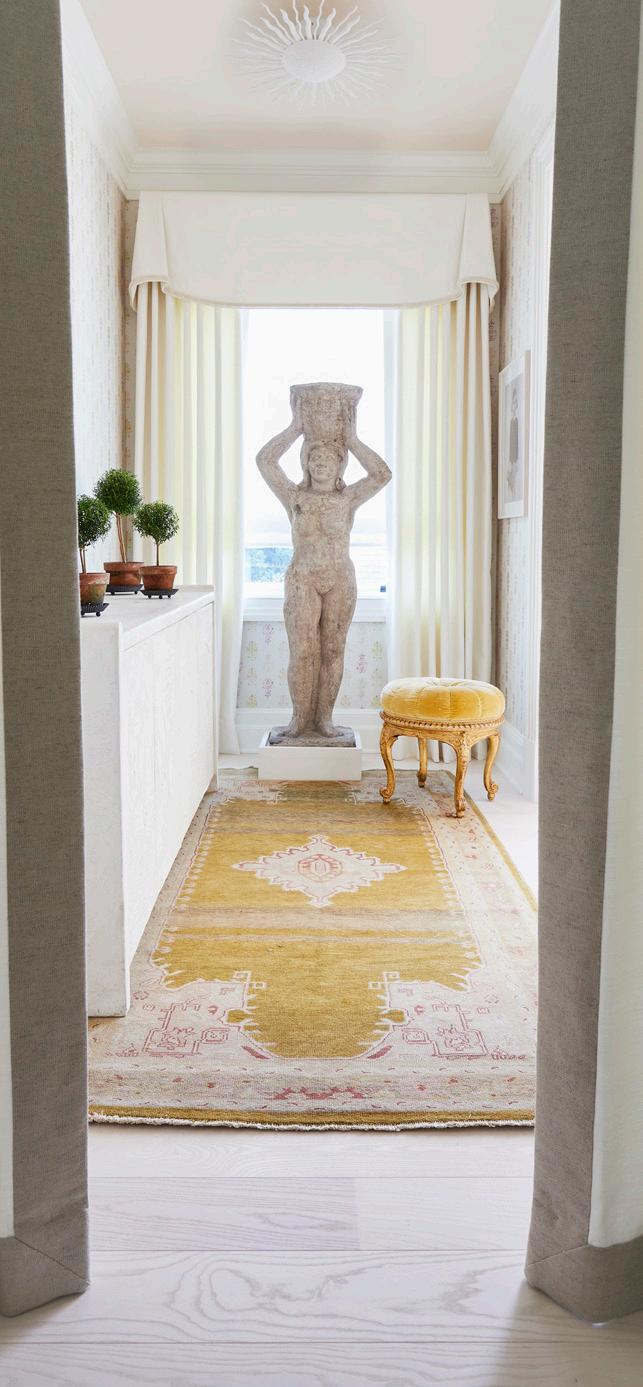
Laundry Room Entry: Elizabeth Gill of Elizabeth Gill Interiors created an entry space reminiscent of a foyer in a sophisticated NYC pied-a-terre. “It’s both elegant and contemporary,” says Gill, with its Maya Romanoff wallcoverings, Niermann Weeks mirror with lapis blue detail, and Sacco Carpet wool runner.
ADD ART FOR A PERSONAL TOUCH
Bedroom One: Josh Hildreth of Josh Hildreth Interiors was inspired by a mirror he found in Paris when designing the bedroom oasis he named Maureen’s Retreat in honor of his mother. “I like a broad mix of art in a home that includes painting, sculptures, ceramics, and of course photography,” Hildreth says. The entry to this bedroom includes a sculpture seen from the hallway. Photo by Kip Dawkins
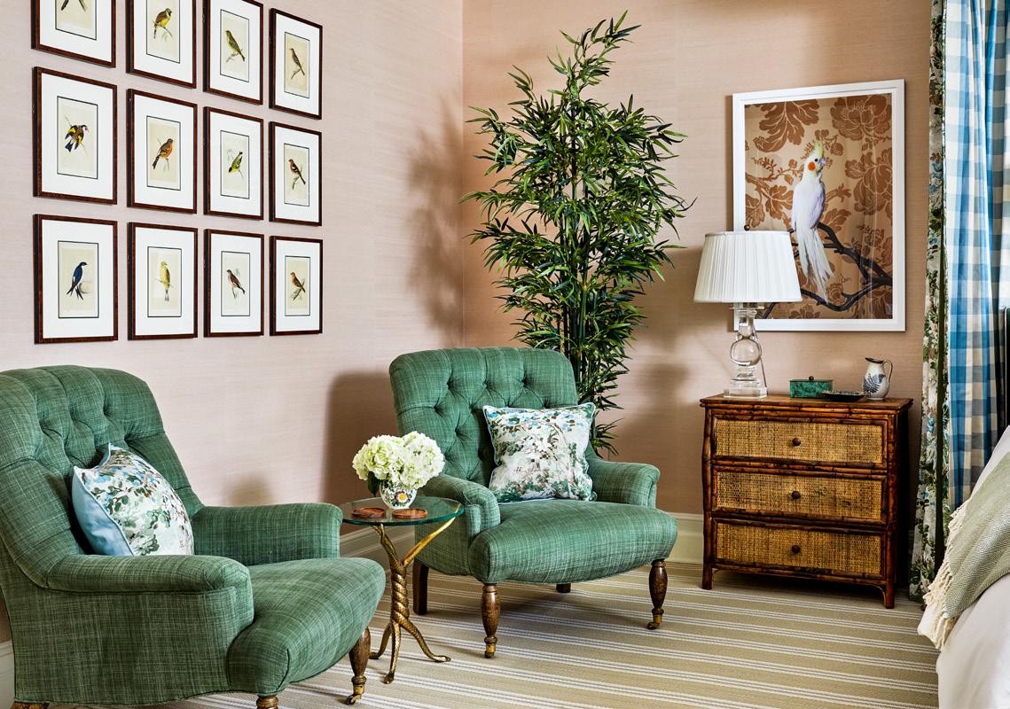
Bedroom Two: Annie Elliott of Annie Elliott Design says bedrooms deserve “real art” as much as public spaces. A bird theme is intentionally subtle in the room, from a pair of Claire Rosen portraits to 19th century engravings. “Only when you turn to the minimal watercolors by Jose Truillo might you register the repetition of subject matter,” Elliott adds.
Family Room: Pamela Harvey of Pamela Harvey Interiors commissioned Amy Allison to paint a pair of large scale abstracts to flank the honed black marble fireplace in the family room. “The artist started with black and white and then layered warm color tones that along with the Jens Risom chairs give the space a nod to midcentury modern,” Harvey says.
