6 minute read
Home Trends
WHERE STYLE & ELEGANCE MEET
Collectively Curated
Recent events have ignited a renewed focus on home life. Our homes have evolved from a place of relaxation from every day activities to the stage for all the activities and responsibilities life has given us. Our spaces have been called upon to play many different roles during the coronavirus pandemic. They have been an office, school house, video conference room, home gym and more. Our homes have now become multifunctional.
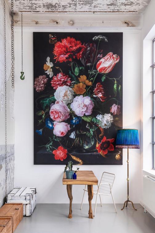
As we spend more time at home, creating uniquely curated spaces that correspond with our personal style is becoming as important as how these spaces function. Suddenly, we are noticing open concept living spaces aren’t meeting our needs and our accessories and artwork don’t truly express who we are. The new normal of zoom calls and daily visual communication with others from home is yet another reason to make certain your style is accurately being defined. Who would have ever imagined that everyone from your boss to your child’s calculus professor would be peeking into your home – everyday?
Predictable is out and things don’t need to match, they just need to go, and they can go together in a lot of different ways. Just like matching your shoes to your handbag – stop doing it! Do not stress about everything being coordinating, but instead, focus on
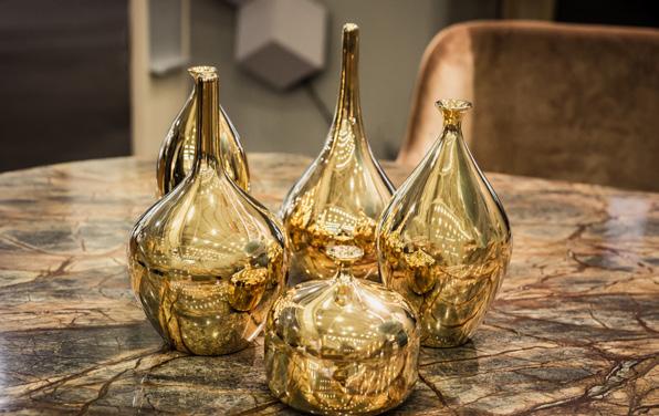
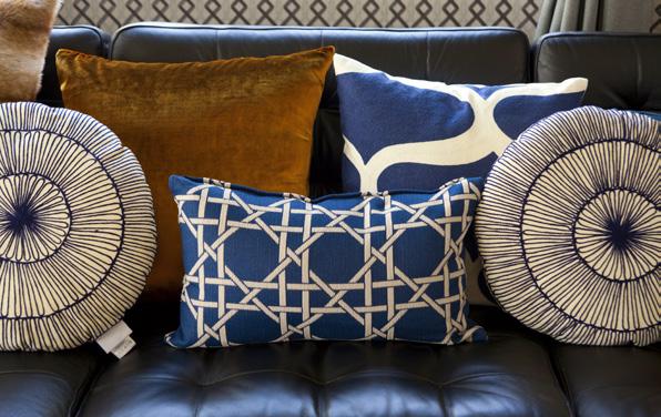
clever ways to make the things you love work well together to create a beautiful, layered and interesting home. The goal is to create a home that reflects who you are and tells your story.
Is it possible to have more than one decor style present in your home? It is extremely important to do so as it creates a ton of interest. To be successful, you will need to utilize furniture pieces from different design periods, layer in fabrics and textiles that are varied in pattern and color, hang artwork and pepper in accessories that are interesting and meaningful to you and your family. You can group things by color, size and texture, and by displaying them together you create a collection which has more impact and makes more sense than if each item were displayed on its own. Here are a few ideas to get you started:
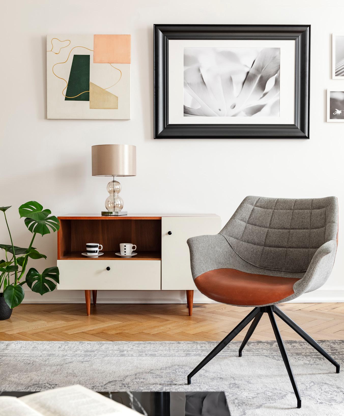
I suggest starting with simple muted colors. Use a consistent color palette to create cohesion among the various styles at play. Paint your walls and keep your large pieces of furniture a neutral color—even if they have an element of style to them—this will allow the other styles in your room to be showcased. Using a consistent color will later help your decor look more cohesive.
Think of the large pieces in your space as the canvas that is going anchor the story you are about to tell. If you have a traditional armchair, but want to add in a more modern sectional, choose a sofa in the same shade as your original chair. These large pieces will also dictate your style. For example, if your largest furniture piece has elements of modern decor (like square arms) you will want to carry that style throughout by adding other modern elements. Don’t be afraid of mixing vintage with newer pieces. Vintage pieces are what give a home a soul and I find it almost romantic to think about their history. Then, you can use modern pieces to balance the more worn-in pieces of furniture.
Keep the scale of all your decor in the same realm. You don’t want a huge overstuffed chair sitting next to a small wooden carved loveseat. If one half of the room is mid-century, and the other half is entirely Shaker, the sudden difference is overwhelming. But if multiple styles are incorporated strategically throughout the room, it’s easier for the eye to accept. Balance is achieved in a few different ways. First, your space needs to have equally distributed visual weight. This is where the 80/20 concept comes into place. The main style will be represented in 80% of the space, and 20% will be the other style. I suggest that you start by looking at the big ticket or larger items in the room (the ones that would be hard to replace) and let those be your 80%.
Accessorizing is your next layer. Sometimes finding the right mix can be tough. Remember this rule, “different but the same” and “group things together accordingly.” Mix different textures and use them many times in the same space to avoid a sense of ran-
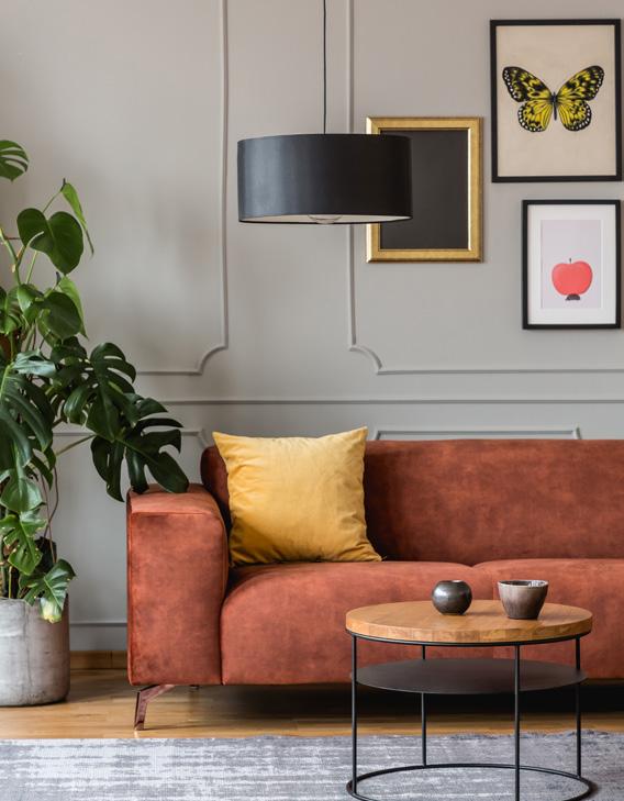
domness. Incorporate pattern by picking a few and repeating them throughout the space in different scales. Repetition of patterns, colors and texture is going to be the key to creating a space the feels cohesive. To make sense of an item that may stand out as out of place, repeat an element of that item in at least one other place in the room. For example, if you have a painting that has way more color than anything else in the space, try adding just a few minor touches of one of the main colors in other areas of the room to tie it all together and make it blend into the room. You can also take a completely different approach for that one item that does not have anything in common with anything else in the space. Make it a focal point and instead of competing with other accessories, it will stand alone. A perfect example would be a light fixture that is a different color or finish than anything else in the room, or maybe it is really big and much bigger in scale than the other elements you have going on in the room. That’s ok. Hang it up and let it be the show stopper!
I am avid art collector. I love the jarring effect of a bold painting. The colors might even clash with the furniture, but because I love the painting, it can look
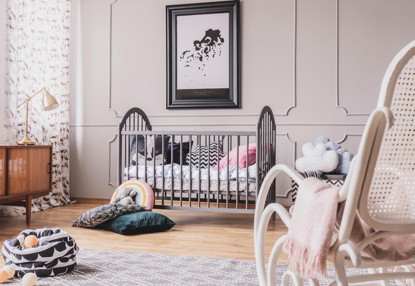
spectacular in a room décor. It always reflects my bold and eclectic taste while making me happy every time I look at it. The most important reason to hang artwork on your wall or bring it into your home is because you love it. Artwork is not “supposed” to match. By limiting yourself to pictures that match, you are denying yourself the fulfilling experience of hanging art because you find the piece satisfying or exciting to look at.
Hanging artwork is a way of showing off your personal style. It can be difficult to find artwork that uses the exact color scheme of your decor. Then, if you do find a piece or two that “match,” you may not like them or they may be out of your budget. Don’t go ahead and buy. This is not an efficient or satisfying way to express your style. Do not compromise your personal preferences in favor of an average piece that matches the colors in your home too closely. The decor will change over the years, but if you love the painting, it will always nourish you no matter where it’s installed.
When updating and redefining your personal space, you need to have a plan to keep it from looking cluttered. Take into account these ideas when executing your environment. Combining different styles, and still creating consistency, is almost an art form and can be challenging. Eclecticism embraces the combination of different design and architecture to create a look of perfectly controlled chaos. An eclectic home is much more than just a hodgepodge of stuff: it’s decidedly curated and blends together a variety of styles. Most importantly, it truly expresses the personality of the homeowner.
