
9 minute read
Joe's How-To


18
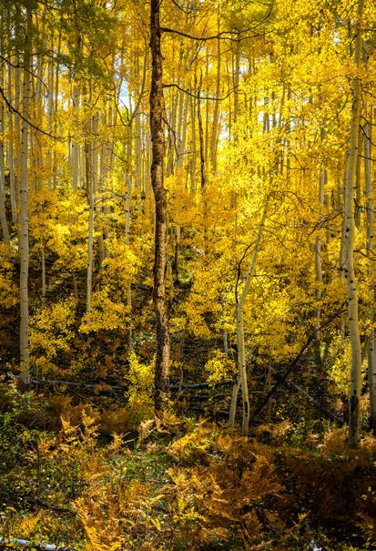
Joe's How-to Processing Fall Photos by Joe Doherty It has been 11 years since we made our first trip to the Eastern Sierra to photograph fall colors. We had no idea what we were doing. There were no guidebooks, and no hordes to work around (thankfully), we just printed off some websites and headed north. Everything was new to us, and we did our best to capture the majesty and complexity of the place.
When we got home I began to see some of technical mistakes I had made, and I developed strategies to deal with them in the future. Some of them were limitations of my equipment (dynamic range, lens flare), and others were a matter of field technique and anticipation for what I can do in post-processing. One big adjustment was to jettison an old way of thinking about photography.
The most fundamental field technique had to do with exposure. As I learned when I was a wee photographer, light meters suggest combinations of f-stop and shutter speed that result in an average exposure. That’s fine when the scene is average and is lit with average light, but many landscape scenes are not average. When the scene involves extremes of light and dark average doesn’t work. When it also includes brilliant color, the challenge is magnified.
After our first fall trip I found that many of my photographs lacked detail in the brightest areas. While the overall exposure was fine, I could not differentiate between the leaves, no matter what I tried in processing. It occurred to me that it might be an exposure issue. Now when I shoot fall color, I check my exposure using the RGB histogram in the photo review mode of my camera (Figure 1). This is not a histogram of the raw file, but of a jpg created to display on the back of camera, so it has limitations. It is nevertheless an excellent way to check whether one of the three colors is badly overexposed.
In this image, if you were to judge by the overall exposure (the gray histogram) it
Figure 1. Back of the camera RGB histogram showing clipping in the red channel, where the most vibrant fall colors are found. An otherwise well-exposed photo-graph might show clipping in the colors that most important to your image.

Figure 2. Adobe Lightroom Profiles
would appear that everything is under control, as there are no clipped values at either the low or the high end. Reviewing the RGB values, however, tells a different story. The brightest colors, especially the aspen leaves, are found in the red channel, and some of them are clipped (piling up on the right border). What we want to do is make sure that the red channel is not badly overexposed, and the other two channels contain enough information to provide useful color variation in processing. This might require slightly underexposing the rest of the image, but that’s a creative decision. An alternative is to bracket your photos and blend them in post-processing. I typically bracket about 2-stops above and below my middle image. Given the dynamic range of today’s camera sensors I rarely have to use the extra images, but when I do, I make sure that my middle image is the one that contains the best exposed fall color highlights I mention above. That way my blending is done to supplement the highlights and shadows of the image, instead of recovering key details in the aspens. Another technique I use is to experiment with camera profiles in Lightroom. A profile translates a camera raw file for your monitor/printer. While this seems like a trivial task, the billion-plus variations in the ProPhoto colorspace, combined with the vagaries of sensors and lenses, means that what you see with your eye isn’t what you will get on your screen. Adobe provides a number of camera profiles by default, and more are available for downloading. They are available in the Develop panel of Lightroom (Figure 2). If you want to, you can create your own. Using a ColorChecker Passport, I make a custom profile for each of my cameras. These work for 75% of my photography, and are as close to a literal translation of the scene as I can get.
A literal translation of the scene, though, is not always a good creative choice. The lemon-yellow reality of aspen leaves in the fall does not satisfy me. I prefer a more golden hue, and maybe a little more contrast. I could spend time adjusting the colors and light to get exactly what I want, but Adobe provides me with a shortcut via their Adobe Landscape profile. It translates the lemony color of the scene into a slightly redder, more nuanced, and more pleasing depiction of aspen leaves. It isn’t a huge shift in color, but the feeling evoked by the Landscape profile is closer to what I am looking for than those evoked by my custom D850 profile (Figure 3).
Just because I switch profiles does not mean that I am swerving away from reality. I always leave my camera white balance setting on “Daylight,” because it gives me a uniform starting point every time I open Lightroom (and raw files don’t care). From that starting point, I try to remember how the light felt at the time I was standing in the field. If the scene was lit by unfiltered daylight (i.e., a grove on a hillside) then it’s easy to remember. But if I’m shooting from inside a grove (whether
Figure 3. Using color temperature to adjust for the ambient light from the canopy The image on the left was photographed using my standard in-camera white balance (Dayllight), which translated to 5250 Kelvin in Lightroom. In the right photograph, I adjusted the color temp slider to 4000, which to me is a more pleasing color for viewing not just the leaves but also the forest floor

aspens or redwoods), I need to remember that the brain plays tricks on us.
When we enter a room lit by incandescent bulbs our minds add blue to everything. It’s an unconscious reaction. Under an aspen canopy the same thing happens. We ignore the yellow light being filtered through the leaves. The camera doesn’t know this, so I have to manually adjust Lightroom by adding blue, sliding the color temperature. (Figure 4). This brings out subtle colors in the scene like red, green, and blue that otherwise would be obscured by the dominant yellow light. I feel the need to say that auto white balance does not do the same thing, as it tries to neutralize the scene it sees through the lens, not the light source outside it. Sometimes I will include a gray card in a scene so that can measure the light source when I get home.
A final adjustment I made to my way of thinking about fall colors is to get out of the Kodachrome mindset. As a youngster I worked in a photo lab making prints from slides, dodging, burning, and adjusting the overall color as needed. I made about 100 prints on a good day (20/hr, or one 8x10 every 3 minutes), and came away with a pretty good knowledge of the strengths and weaknesses of the films, papers, and processes of the time. I carried that knowledge with me in my professional career, and it spilled over into my early digital photography work. My goal was to get everything done in camera, thinking that the lab couldn’t improve my photographs. Also, I was kind of haunted by the accusation, “did you Photoshop this?”
What I’ve learned is that the Kodachrome era is over. On our fall color trip in 2011 I shot images that I thought were complete failures; had they been slides they would have gone into the trash can. Now they are not only recoverable, but I can realize my vision of the scene in a way I never could before. I still use the old tools of dodging, burning, and overall color adjustment, but I can now do things in an hour that would have required intricate masks, filters, and days to accomplish (not to mention hundreds of dollars).
My first big “Aha!” moment on this began in a grove at the north end of Silver Lake, in the June Lake Loop. There was a lush, untrodden patch of grass between aspen trunks,
under a yellow canopy, with the sun poking through the leaves. It was a fairyland, and to capture it I needed a fairy’s point of view. So I set the camera about 8 inches off the ground, put on a very wide lens (12-24 Tokina on my DX D90), and began framing the shot.
The problems came to me immediately. If I included the sun the lens flare would be terrible and everything else would be underexposed. If I excluded the sun the scene would be less interesting, but my post-production would be less of a nightmare. I took the coward’s way out and excluded it, but I made a mistake on one frame and my hat did not block the sun. As expected, the well-exposed frames are boring, and the nightmare-to-process frame was the best.
It took me several years to learn how to process the image satisfactorily. It required a lot of selective contrast, selective sharpening, painting in colors, isolating the lens flare to extract its blue tint, and using the clarify adjustment to enhance the sun star at the top. It’s fair to say that I educated myself in the use of Lightroom and Photoshop in the process. The before and after images tell the tale (Figure 5). I was able to realize my vision of the place as a fairyland because I jettisoned the Kodachrome mindset and adopted the Digital mindset. Is it Photoshopped? Yes. I guarantee, though, that if the same scene was shot today with an iPhone 12 the result would be similar to my final image.
Due to the hours I‘ve spent refining my procerssing Technique I‘m now a more ambitious and creative photographer. I often attempt things that I once consideredimpossible. As a result, I come back from trips with more images that are personally satisfying.


Figure 4. The raw file from the camera and the processed file from Lightroom. It took me years of practice and technique to abandon my idea of a “straight shot“ and use the tools that are now available to realize the image I had in mind when I made the exposure
24
