8 minute read
Fine Tune Color


By Joe Doherty
One of the many challenges of film photography was getting the color right. The available tools included the choice of film (Kodachrome, Ektachrome, Vericolor, Kodacolor, Fujichrome, Agfachrome, 3M, etc.), warming and cooling filters (81B, 82A, etc.), and various processing techniques (push, pull, cross-process, dye transfer, internegatives, Type R prints, Cibachrome, etc.). Photographers seeking a certain look would fine-tune their images through trial and error, eventually settling on film/filter/ processing combinations that matched their vision.
Advertisement
Digital photography gives us the same flexibility, and with even greater variety and efficiency. The sensors in modern cameras have higher dynamic range and capture more color information than even the best color film from 20 years ago. Software feedback is instantaneous compared to overnight film processing. It isn’t necessary to test multiple film types as they’ve been replaced by color profiles. In short, we can do everything we used to do, better.
But better also comes with more complications, more choices, more possibilities, which means even more trialand-error. It can be overwhelming. In this article I explain four different approaches to fine-tuning color, which can be used as quick stand-alone adjustments or integrated into your workflow to create a personal statement. It isn’t necessary to use them, of course. Sometimes it’s just nice to know you have them in your toolkit.
Since I am an Adobe user this discussion is going to be about Lightroom/Adobe Camera Raw, but similar tools are available in other workflows.
Profiles
Camera sensors capture three colors: red, green, and blue (RGB). For every four pixels, there are two green pixels, one red pixel, and one blue pixel. The camera records how much light strikes each pixel in each color. For example, all pixels will record equal values of light when subjects are color neutral (a gray card). Blue pixels will record more light than red or green pixels when the subjects are blue (a blue sky).
The raw pixel data are combined and averaged by our computers to create the colors that we see on our monitors. Engineers have done their best to faithfully translate what was captured into what we see, but that’s often not what we desire. Maybe we desire landscapes that have Kodachrome blues. We desire shadow detail and sparkling highlights. We desire contrast on overcast days and high dynamic range in sharp sunlight. In short, we don’t want a faithful translation, we desire a photograph.
That’s where profiles come in. Adobe Color, Adobe Landscape, Adobe Vivid, etc., are shortcuts that produce the feeling of a photograph. They do this by taking the “faithful” translation and changing the values of different pixels to adjust color, saturation, contrast, and exposure. It’s like choosing which film to shoot after the fact. The presets that come packaged with Lightroom are the same as profiles, and new profiles and presets can be downloaded and installed on your computer to simulate other films and styles.

Adobe Neutral color profile. This can be considered a “faithful” translation of the scene according to the relative luminance of the red, green, and blue sensors on the camera. There is no added contrast, color, or saturation. If you are experimenting with color and contrast on your own, this is a good starting point.
Adobe Color color profile. This is what you might expect from a good color negative print or consumer slide film. It’s pleasing to the eye, in that it has contrast, it’s on the warm side, and there is some brilliance and saturation in the colors. If you have a lot of photos to process with similar lighting conditions, this is a good place to start.
Adobe Landscape color profile. This might be comparable to Kodachrome or Fuji Provia. The contrast and saturation are tweaked higher, and there is a definite color cast that favors warm tones. Sometimes choosing this profile and hitting the auto exposure button is all that’s needed to finish a photo.
Treat the profile as a starting point for your experiments, and don’t be anchored to one or another. Just because the profile contains the word “Landscape” does not require you to use it for landscapes. I will often choose Adobe Neutral (the “faithful translation” profile) if my scene is particularly contrasty or the colors are highly saturated. It allows me make those adjustments on my own.


White Balance
White balance (Lightroom’s temperature slider) is tricky. In the film era there were two numbers: daylight is about 5200 degrees Kelvin, and tungsten is about 3200 degrees Kelvin. If the light source was 5200K and you shot with daylight film, then you could expect the whites and grays in your image would be a neutral color. Similarly, theater lights were about 3200K, so you shot with film created for that situation if your goal was to faithfully translate your subject onto the film. It was rare to actually shoot in 5200K or 3200K light, so allowances were made.


In the digital age, white balance is both precise and malleable. We recently photographed a club ice hockey game at an indoor arena. By pointing our lenses at the ice we could measure precisely the white balance of the space. Not only would the ice appear to be neutral white, but the shadows would reflect that light as well, so there would be no need for color correction in post. With that in mind, we were comfortable shooting jpg and not raw (I learned this from sports photographers).
In a landscape, though, there is rarely a neutral value of any importance. We want the rocks red, the sky blue, and the aspens yellow. The camera doesn’t know that. If the light source is the bright sun at midday, and your camera white balance is set to Daylight, then you will probably get those colors. Shooting in shadow, or at the Blue Hour, or on a smoky day will render something different. So, how do you dial in the white balance?
For starters, most of the time I keep my camera set to the Daylight white balance, shoot raw, and expect to adjust in post. After I download and start working with my images, one of the first things I do is move the Saturation slider to +100. This gives me wildly exaggerated colors, which is what I want. I then go to the Temp slider and move it left to right, looking for a pleasing balance of blue and yellow in the image.

What is a pleasing balance? In many photographs it is the one in which no single color dominates. This might be useful if, for example, you are shooting a landscape at sunrise or during the Blue Hour after sunset. Or you might want no balance, to create a monochromatic rendering of the scene in blue or yellow. In either event, it’s easier to figure out what the global color temperature of the image should be when saturation is maximized. When I’ve figured that out, I reset the saturation to 0 and continue with processing (which may include later adjustments to saturation). The immediate effect will be subtle, but will become evident once contrast is added to the image.
Color Mixer
Complementary colors sit opposite of each other on the color wheel, and create pleasing contrast in an image. Nature does not always produce complementary colors, however, and even when it does, your camera might not capture them the way that you saw them. A scene with brilliant yellow aspen leaves, orange oak leaves, and blue sky might end up with a cyan sky. Cyan is not complementary to the other two, and the overall palette might feel unsettling.

I used the picker in color mixer to create three swatches: the sky, the red rock, and the yellow grass. I then adjusted the hue, saturation, and luminance of each until I obtained a combination that was pleasing to me.
Enter the color mixer, which supplants (but does not replace) the HSL panel. You can use it to select the color of the sky and then adjust its hue towards blue until it is complementary to the yellows and oranges of the foreground. The color mixer also allows you to adjust the saturation and the luminance of that color. This is handy if you want to change the values of just one color (e.g., yellow leaves) while leaving the rest of the image as it was.
The color mixer is also handy when you are outputting your photograph to a device or in another colorspace. If you edit on an AdobeRGB monitor and send an image out to be printed on a Noritsu printer (i.e., traditional glossy prints), you’ll notice that some colors aren’t as vibrant. The same is true when you export images to be posted on social media. This is because the colorspace is different. It’s possible to soft proof the output to sRGB in Lightroom and Photoshop, and use color mixer to adjust the colors until they look how you want them to.
The straight image (below) lacked separation between the foreground and background. The foreground was in shade and the background in sunlight, but the colors were flat. Using the color grading panel I added warmth (yelloworange) to the shadows and midtones, and blue to the highlights. The result gives the image a more intimate feeling (right).
Color Grading
Color grading is a recent feature of Lightroom. It is based on the color wheel, and it helps to know some color theory (e.g., complementary colors) to use it. Color grading allows you to separately adjust the tint and luminosity of the shadows, the midtones, and the highlights of your photograph. The adjustments can be subtle or profound, depending on your tastes and needs.


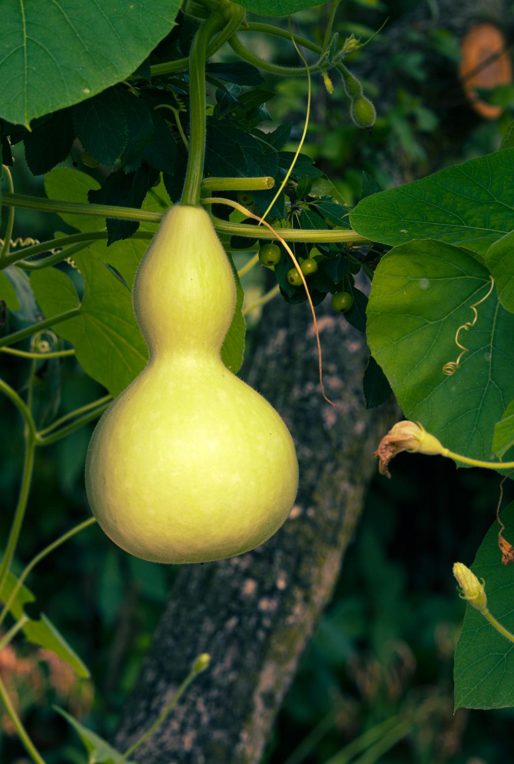
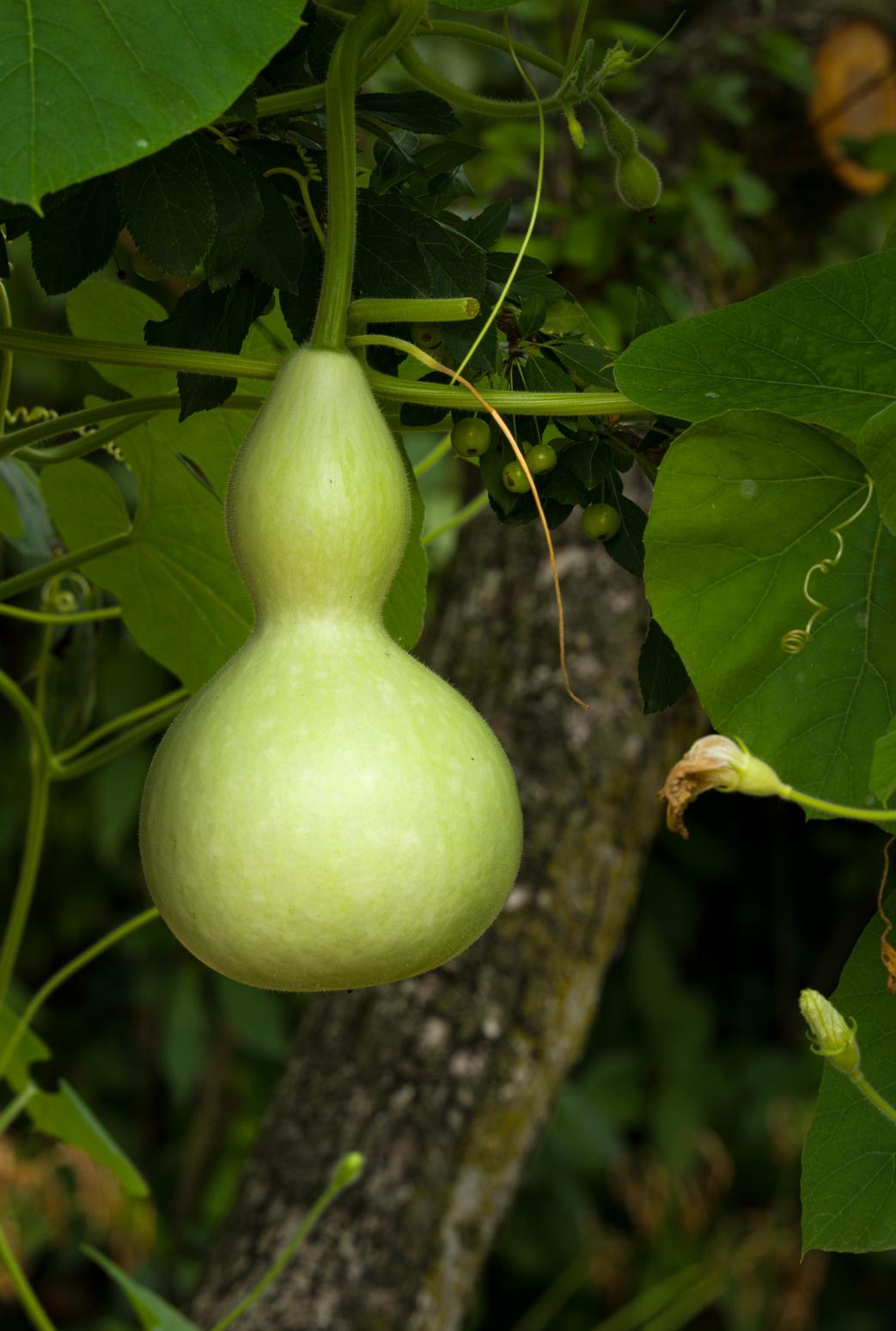
Opposite page: If I had added a global color temperature adjustment to the gourd hanging from a vine, it would have affected the shadows and highlights equally. Instead I added a lot of blue to the shadows, orange to the midtones, and yellow to the highlights, which gave me contrast across the entire image..
My experience with color grading isn’t extensive. I use it experimentally, and find it the most interesting and useful when the light is flat and I need some contrast between objects. I’ve recently found it very useful while processing fall color photographs from Maine. The yellow-orange-red leaves of the season reflect warm light into the shadows of every scene, resulting in images that are flat if not monochromatic. With color grading I can cool off the shadows and increase the warmth of the leaves without extensive masking.
I have used color grading to “rescue” otherwise forgettable photographs. In the Chicago Botanic Garden I found a scene in which a yellow gourd was hanging from a tree by its vine. The conditions were overcast, and the gourd was tucked back into the tree, with most of the light filtered through the overhead leaves. It did have luminance contrast, though, with the gourd being brighter than most of the rest of the scene. Using color grading I added blue to the shadows and yellow to the midtones, creating a color contrast that was equivalent to the luminance contrast.
There was a time when I did not have a good response to the question, “Did you Photoshop that?” Of course I did, you can’t see a raw file. But I now say, “Yes, and I used to buy Kodachrome instead of Ektachrome, shoot through a warming filter, and make Type R prints.” In both eras, film and digital, we made choices to fine-tune the color of our photographs. Today we have more flexibility.