Abigail Johnson
INTERIOR DESIGN PORTFOLIO
Interior, Architecture, and Visual Arts works from 2020-2023
CONTENTS RESUME AND INTRODUCTION THE ELEMENTAL LIVING ROOM THE ALCOVE APARTMENT THE GARDEN APARTMENT THE MEDITATION RETREAT PRACTICE SPACE HOME OFFICE FOREST MURAL HAND DRAFTING AND RENDERING MATERIAL STUDIES OTHER VISUAL ARTS 1 3 11 21 25 29 31 33 37
EDUCATION
Boston University, Boston, MA
Upcoming Graduation in May 2023, graduating Magna Cum Laude in top 10% of class
B.A. Architectural Studies
Minors in Visual Arts (College of Fine Arts) and Deaf Studies (College of Education)
GPA: 3.86/4.00
Parsons School of Design, New York, NY
Upcoming Completion in May 2023
Certificate in Interior Design
GPA: 4.00/4.00
RELEVANT COURSES
CFA AR 131: Drawing 1
CFA AR 141 Foundational Painting
CFA AR 221: Materials and Methods in Sculpture
CFA AR 224: New Genres in Sculpture
CFA AR 412: Architectural Design
CAS AH 111: Art History 1
CAS AH 201: Understanding Architecture
CAS AN 220: Urban Anthropology
CAS HI 316: American Cities
CAS AH 385: American Built Environment
CAS AH 387: Boston Architecture and Urbanism
CAS AH 398: 20th Century Architecture
CAS AH 582: Historic Houses
PCID 0101 Interior Space Planning
PCID 0102 Drafting
PCID 0106 Drawing Interiors: Perspective
PCID 0110 Residential Interior Design
PCID 0111 Commercial Interior Design
PCFA 0110 Color Theory
PCDD 0201 AutoCAD
PCDD 0203 SketchUp
PCDD 0401 Photoshop
PCDD 0403 Adobe InDesign
RECENT PROFESSIONAL EXPERIENCE
Social Media Coordinator, Andra Birkerts Design
Wellesley, MA, August 2022 - Present
Created and presented new social media approach for studio. Took over post curation and management for Instagram.
Interior Design Intern, Andra Birkerts Design
Wellesley, MA, May 2022 - August 2022
Corresponded with vendors: requested samples, quotes, lead times, CFAs, product information, etc. Ensured materials' quality and alignment with style of the project.
Researched feasibility of design concepts informing final selection of FF&E on various projects.
Sourced furniture and fixtures to add as plan, side, and front view blocks for AutoCAD library.
Maintained sample library, familiarizing myself with interior materials and finishes.
Organized and labeled fabric bins by manufacturer and type to improve findability of samples and ease of library maintenance.
Ran local errands delivering items to project sites, or to pick up samples, paint colors, furnishings, mail, and more.
Took inventory of and assessed quality and design alignment of arrived furnishings and lighting at project site.
SKILLS
AutoCAD Rhino (2D and 3D)
SketchUp
Adobe Creative Suite
Photoshop
InDesign
Illustrator
Lightroom
Premiere Pro Google Suite
Microsoft Suite
Procreate
Canva
Wix
Hand Drafting
Hand Rendering
Drawing
Painting
Basic Construction
Space Planning
Color Theory
Public Speaking
Social Media Management
1
COMPRESSED RESUME
INTRODUCTION
Hi, I’m Abbie! Born in Chicago and raised in the Bay Area, California, I grew up surrounded by art and design at home, and inspired by the diversity of the natural and constructed environments around me. I am fascinated by design’s ability to hold different meanings for each individual and understand how the details of a space, both artistic and functional, impact its use and feeling. The combination of elements that come together to create the perfect design requires a complex consideration of aesthetics, functionality, location, architecture, finances, environment, and more: entirely unique to each project. This beautiful complexity and the ability to mold the perfect space for a client, whatever that may be, is why I chose to become an interior designer.

My degree in Architectural Studies from Boston University, accompanied by my minor in Visual Arts, provided me with a strong art history background, foundational knowledge in a variety of artistic mediums, visual analysis practice, and architectural design experience. My Certificate in Interior Design from Parsons School of Design provided me with the specific knowledge and technical skills needed to successfully create interior spaces and communicate concepts to clients. Additionally, an internship at a high-end residential firm gave me valuable experience in a dynamic professional design environment.
My portfolio is a combination of works from my time at Boston University and Parsons School of Design, as well as some personal projects. It demonstrates the artistic and technical skills I have gained and learned to express over the last four years, while providing a window into my own interior style.
2
The
ELEMENTAL LIVING ROOM
D E S I G N E D 2 0 2 2
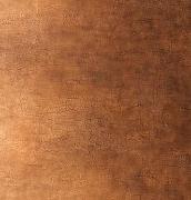
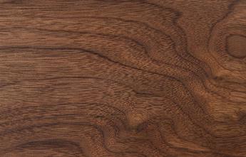
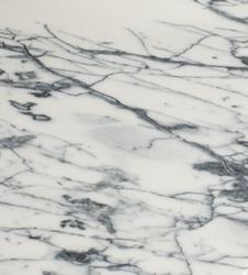
Above are materials and colors chosen for my space, and what they are based on from the precedent.
Project Brief
Photograph from Ashe Leandro
Project for: PCID 0106
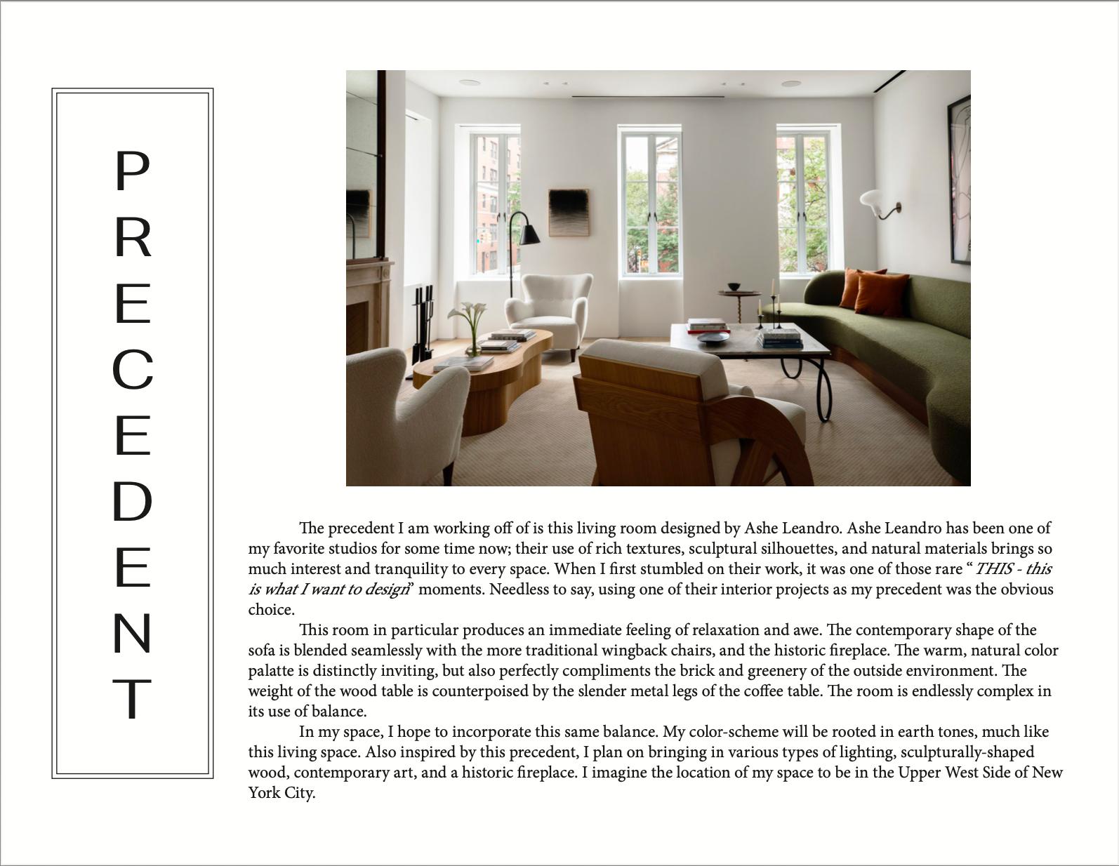
I was assigned with completely designing a 15'X22' living space, working off a precedent from a designer I admire. I chose this living space designed by Ashe Leandro. My first step was to analyze my precedent to articulate why it stood out to me, and what I wanted to replicate:
warm, earth-tone, neutral color palette


varied sources of lighting
balance of contemporary and traditional silhouettes, balance of historic/antique and modern objects
sculptural wood

rich, textural materials
4
The Elemental Living Room FF&E Selection
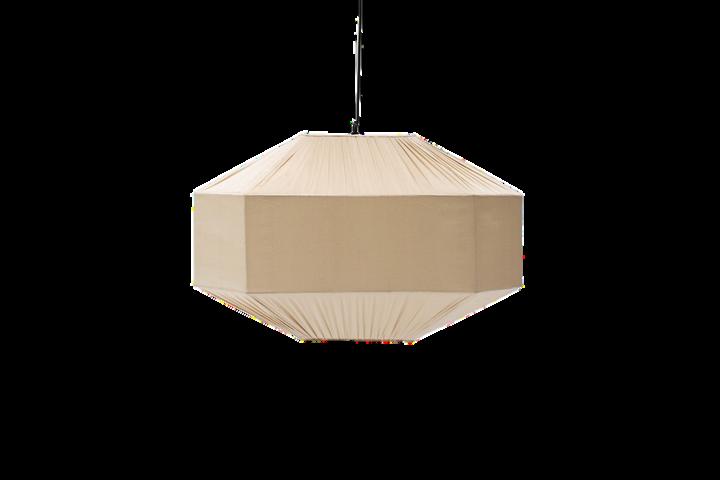
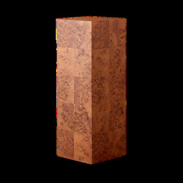
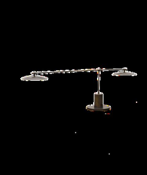
Multiple l ght ng choices illum nate the room during nighttime hours when the bright natural l ght sn't available
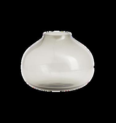

Inspired by the sculptural wood table and armchairs, I selected this organically curved console table

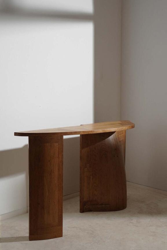
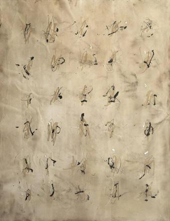
I se ected only a few pieces of art for the space I wanted the windows to sh ne: framing the exterior environment to incorporate it into the interior
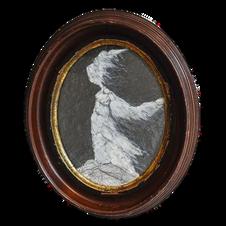
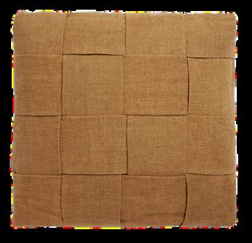
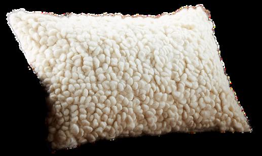
A var ety of texture, materia , and size of throw pillow he ped add depth to the neutra color palette


5
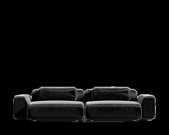
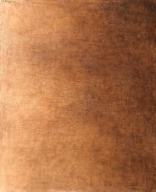
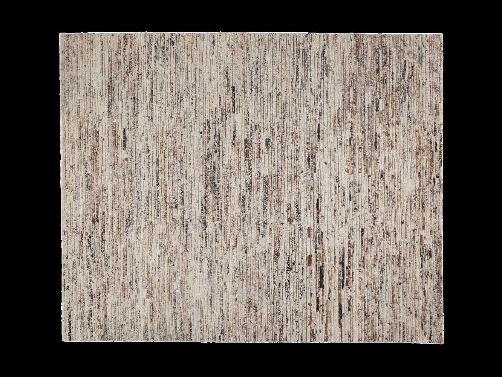
A light base for the rug was important to ground the so id, dark sofa The speckling of neutrals throughout helped to tie in the fin shes of the room, and added texture to the floor
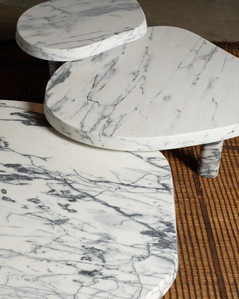


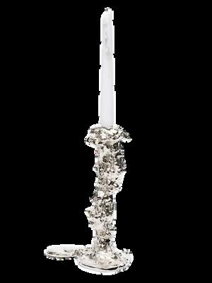
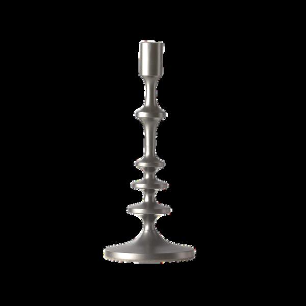
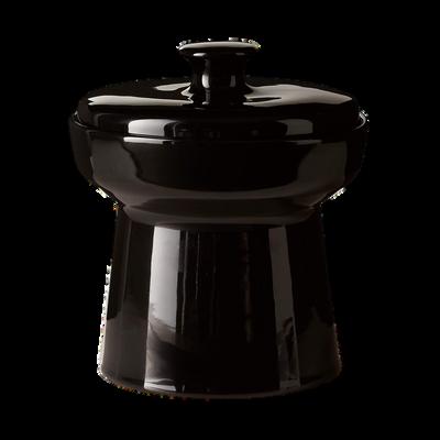
On the mante , the mixture of new and old objects helps create the ba ance that was so inspiring in the precedent


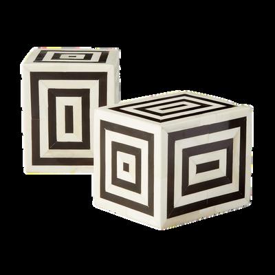

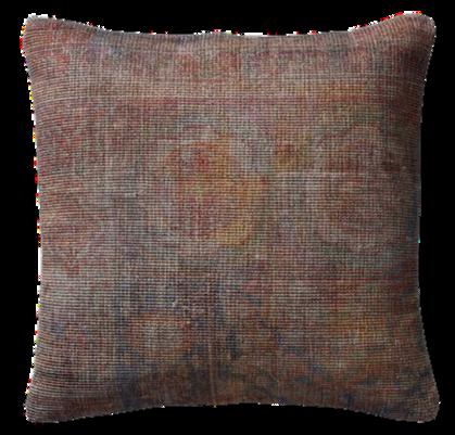
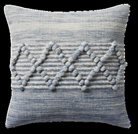
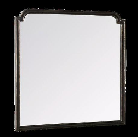
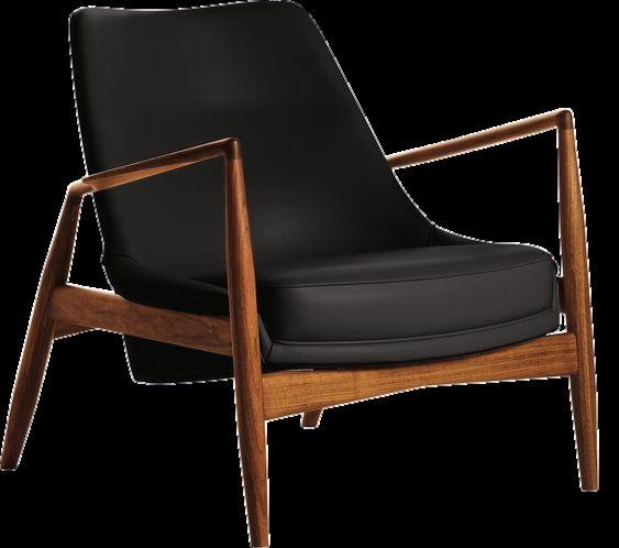
For the armchairs, I se ected a s eek, timeless design that provided a moment of visual fami iarity amongst some of the more contemporary silhouettes of the sofa and console table.

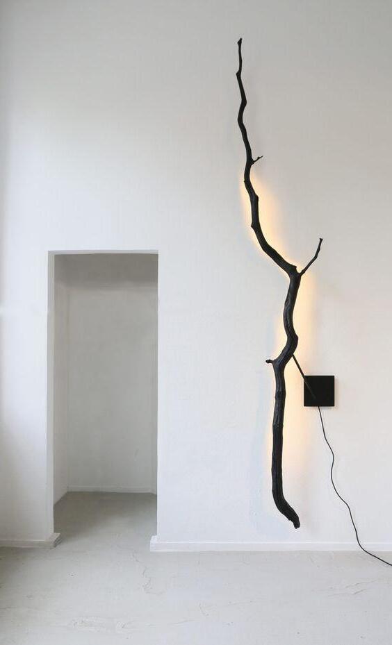
This charred-branch wall ight was one of the first pieces I selected for the space I fe t it perfectly encapsulated the ba ance of natural with unnatural
6
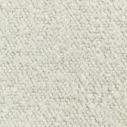
Drawing from the material of the chairs in the precedent I chose a l ght tactile fabr c
The Elemental Living Room

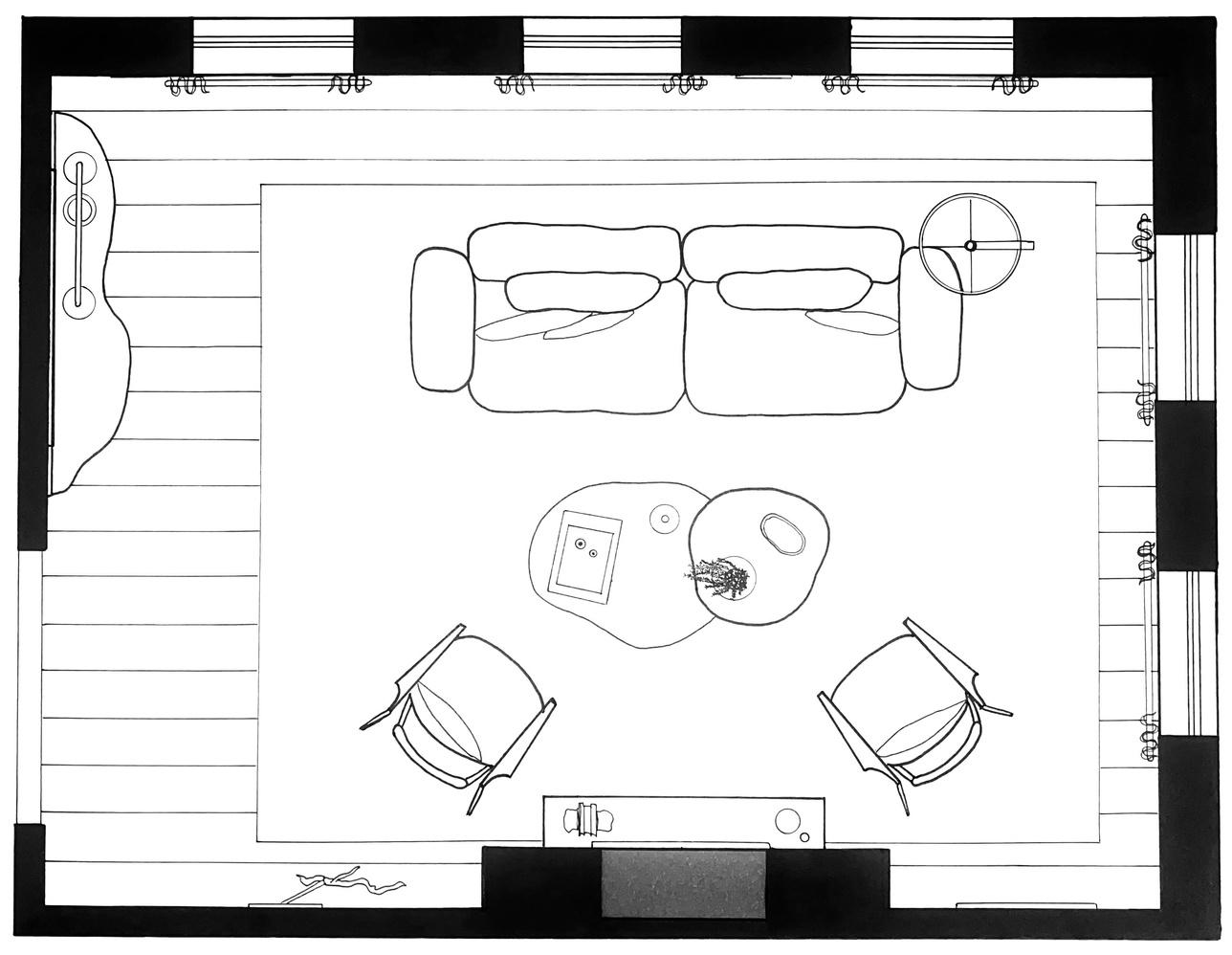
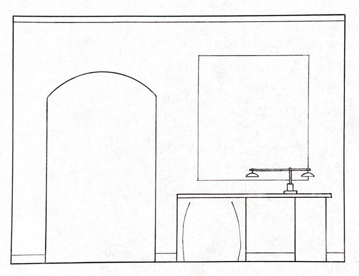
Initial Hand Drafts and Line-work
Drawn at 1/2"=1'0" with an architectural scale, drafting triangles, lead, and micron pens.
7
PLAN VIEW PERSPECTIVE VIEW
NORTHERN ELEVATION
WESTERN ELEVATION
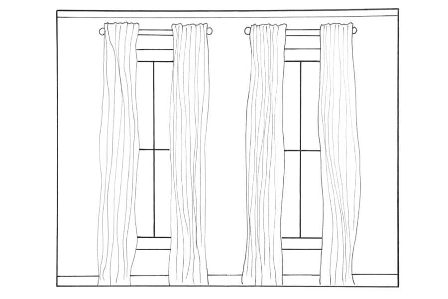

I wanted to be mindful of not crowding the walls in this space. I wanted it to be a pleasant, open living space to relax and converse in. I decided to center the seating layout around the historical fireplace, opting to not include a television in the room. On the walls, I let the view out the windows shine, selecting neutral pieces of art to scatter sparingly throughout the room.
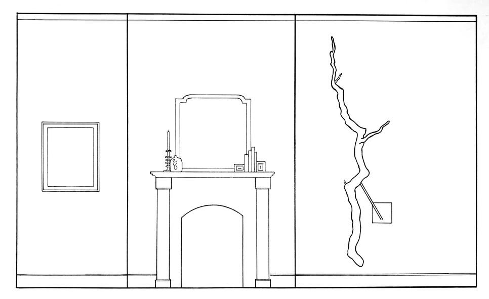
SOUTHERN ELEVATION EASTERN ELEVATION
8
The Elemental Living Room
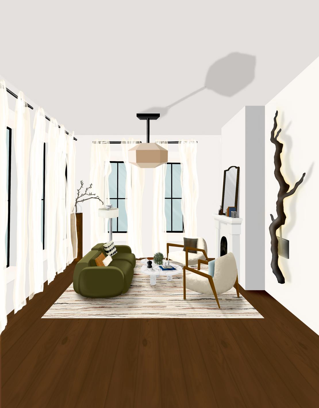
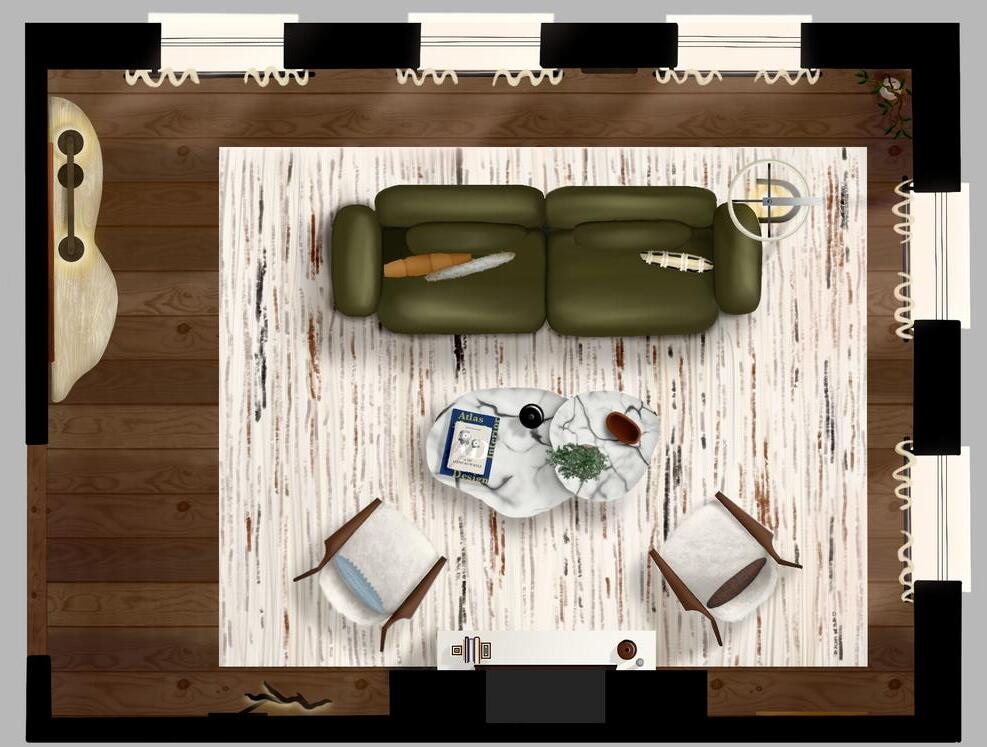
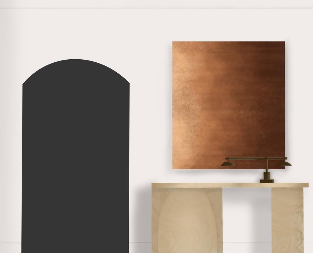
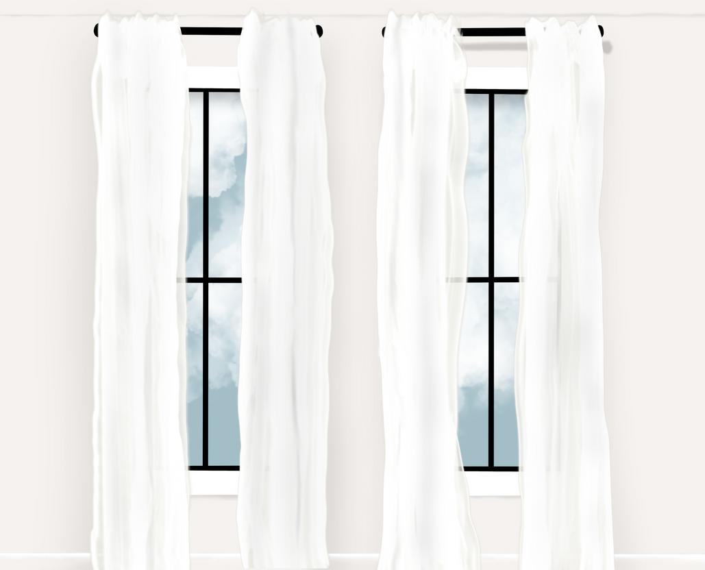
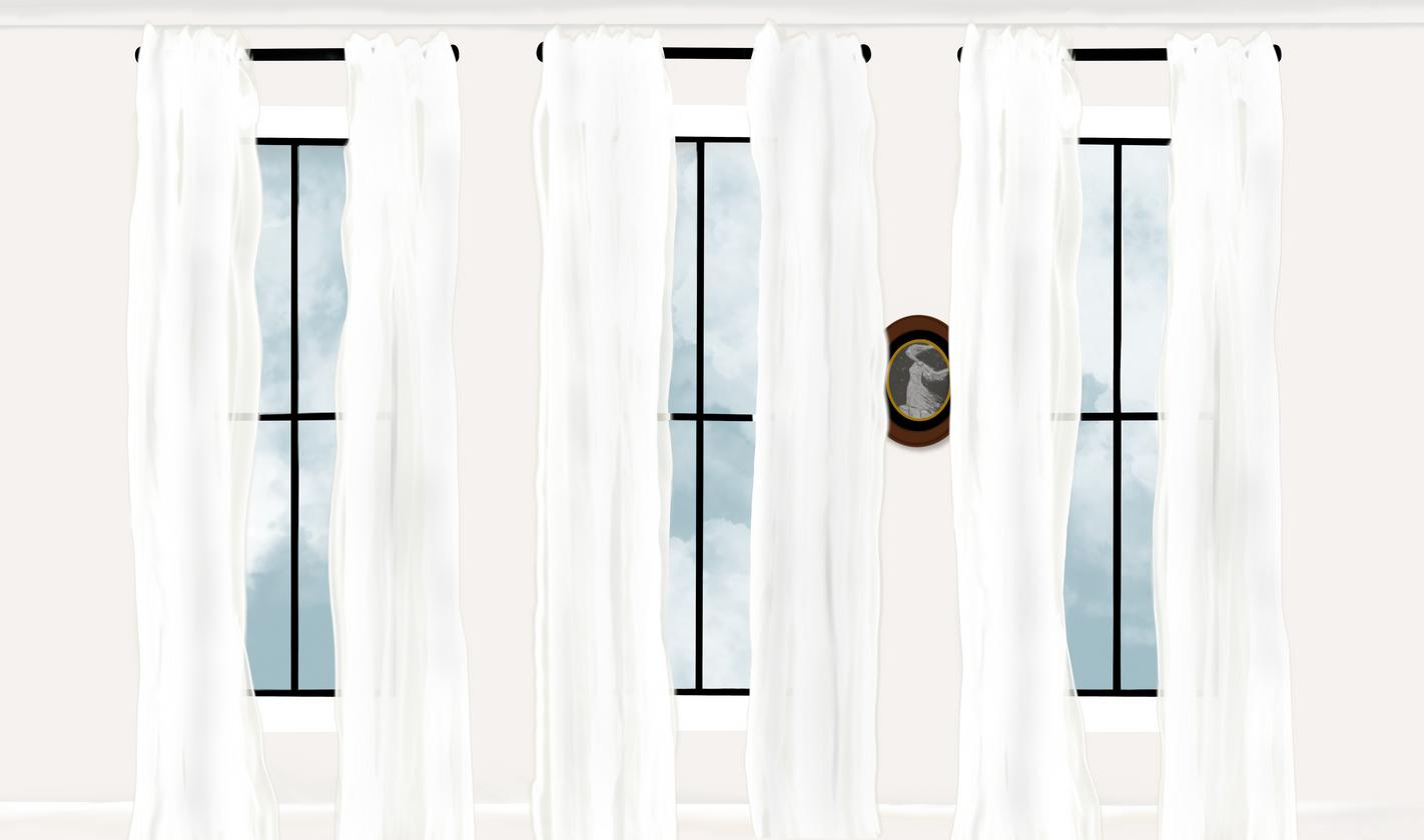
Drawn Renderings
Drawn on the ProCreate app using an Apple Pencil and IpadPro.
PLAN VIEW PERSPECTIVE VIEW
9
NORTHERN ELEVATION
WESTERN ELEVATION
I tried to stay close to the warm, earth-tone palette of my precedent, selecting finishes and materials that emphasized texture. I didn't want there to be one item that stole the attention of the room, rather a cohesive space that felt peaceful on the eye. I chose semi-sheer curtains to provide privacy when needed but allow for maximum light during the day.

SOUTHERN ELEVATION
EASTERN ELEVATION
10
The
GARDEN APARTMENT D E S I G N E D 2 0 2 2
Project Brief
For: PCID 0101
This was a semester-long project for my Space Planning course. We were given a simple client profile and the plan of a garden-level apartment (without room divisions). The task was to advance through the design process from initial space planning to final design presentation.
Client Profile and Design
Requests
Kenji and Lily are moving to a garden-level apartment in San Francisco, California. They love to travel, most frequently to Japan, and want Japanese culture included in the design. They have no kids or pets, and are planning on staying in this unit long term. Important for their design:
ability to host family and friends in living space keep kitchen, dining, and living space openly connected emphasis on greenery in outdoor space
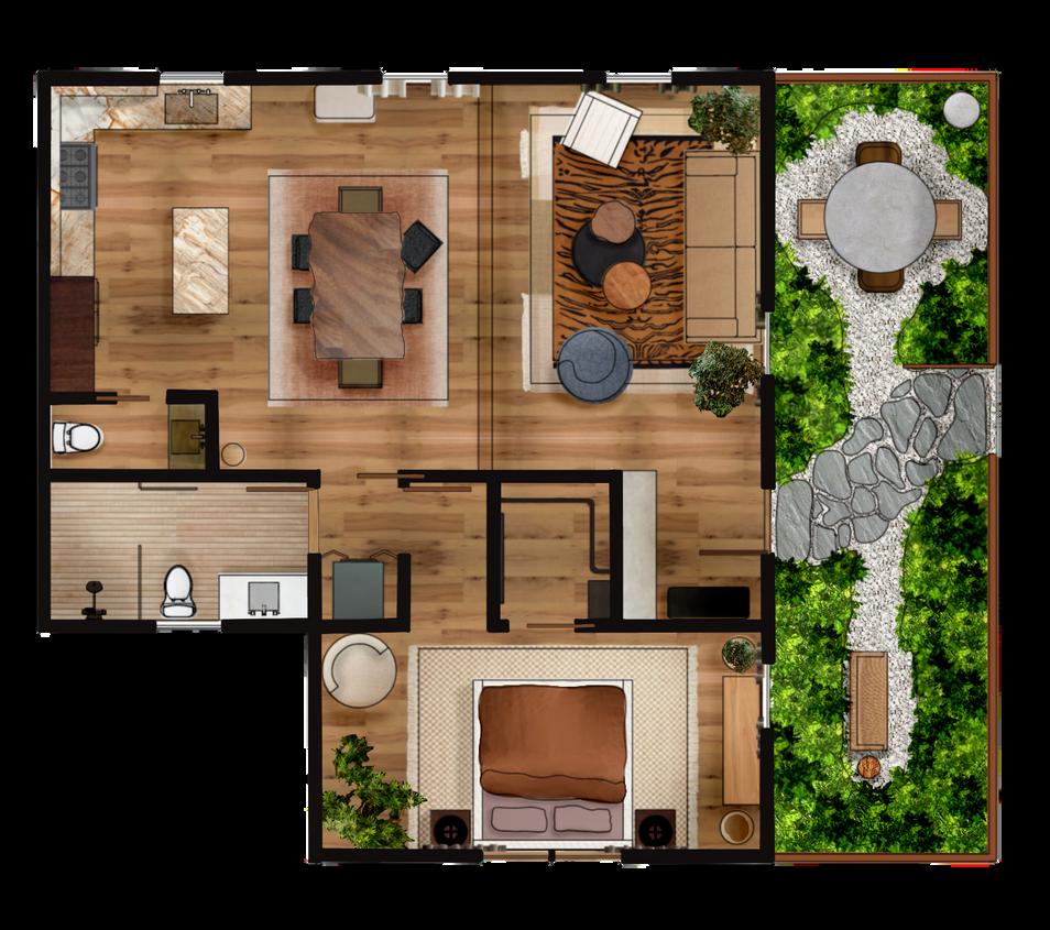
two separate zones:
dining area
small sitting area for morning coffee/meditation display space for collection of found items from travels
All floor plans and elevations drafted on Rhino and rendered using Photoshop and ProCreate.
blend of Eastern and Western style love many elements of Wabi Sabi design philosophy, but want their own eclectic, contemporary style incorporated as well
12
Reflected ceiling and lighting plan
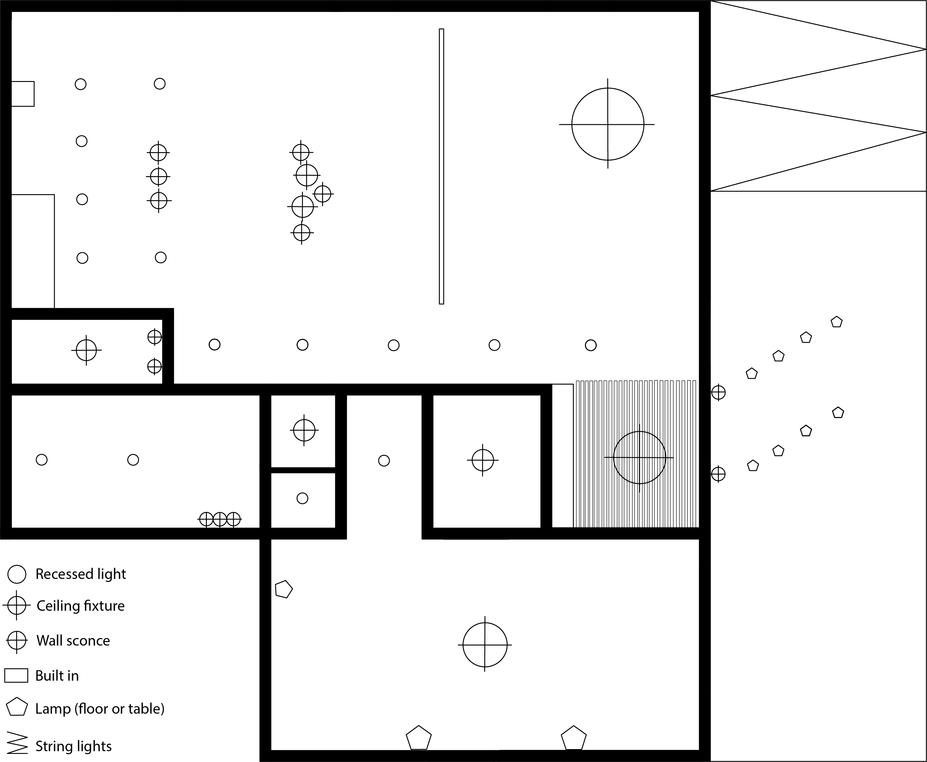

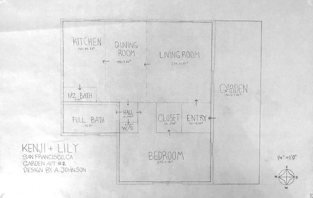
13
The Garden Apartment Selected final room arrangement Plans
FF&E Selection
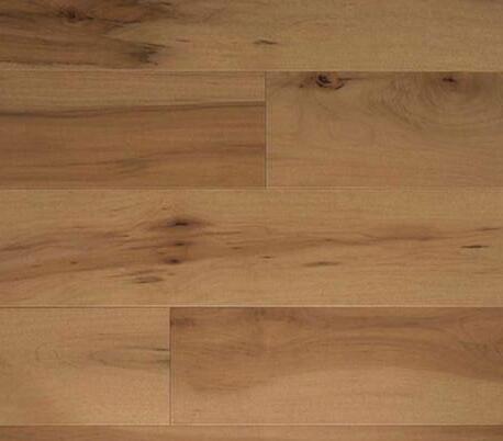
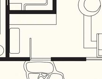




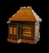

G A R D E N A N D E N T R A N C E

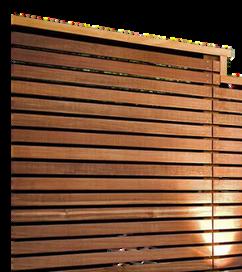
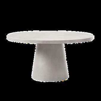
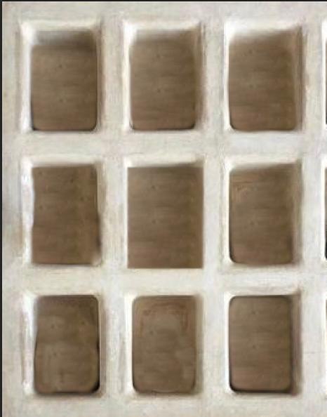
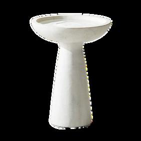
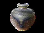
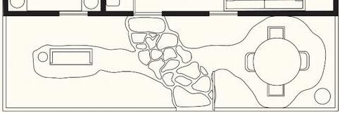
For the front garden, I wanted the greenery to shine, so I selected pieces with neutral tones and rich textures. The various wood tones and light gravel allow the green to pop, and create a peaceful, private alcove to enjoy a moment within nature.

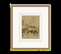


N T R Y W A Y
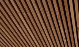
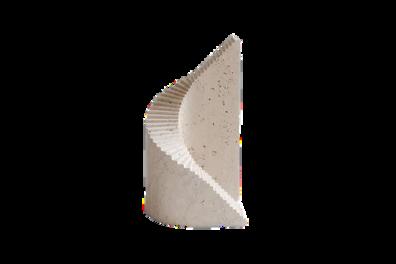
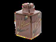
The entryway provided the perfect place to display the client's collected objects. To highlight the shelving, everything else was kept simple and warm, with a slatted ceiling to help delineate the entry from the living space.

g,





to




14
mult -purpose bird bath d d k/i h d
mahogany front door
fluted glass sconces flanking door
white gravel under flagstone pathway, and as substrate for sitting areas
grey quartzite flagstone pathway from gate to door
LED globe ground light
string lights above dining area
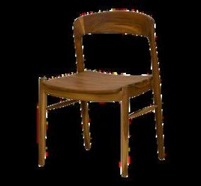
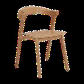
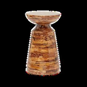
concrete dining table, chairs with varying wood fin sh
greenery fill ng all non-gravel ground area
seating area for morning coffee
E
gescale, plaster ve shelves to splay objects
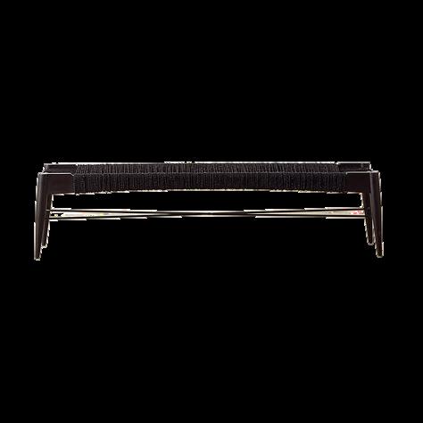
bench for putting on shoes
pendant hanging through slatt ng
mirror for ast-minute checks
Benjamin Moore "Wh te Dove"
flooring
fencing
L I V I N G R O O M

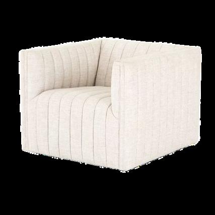
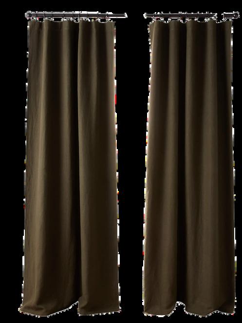

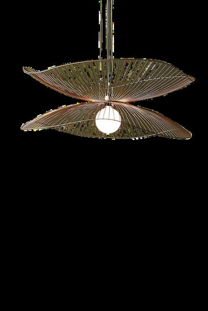
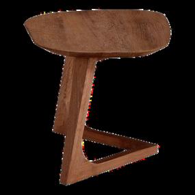
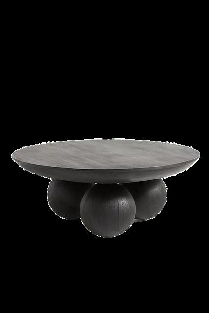
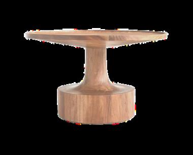

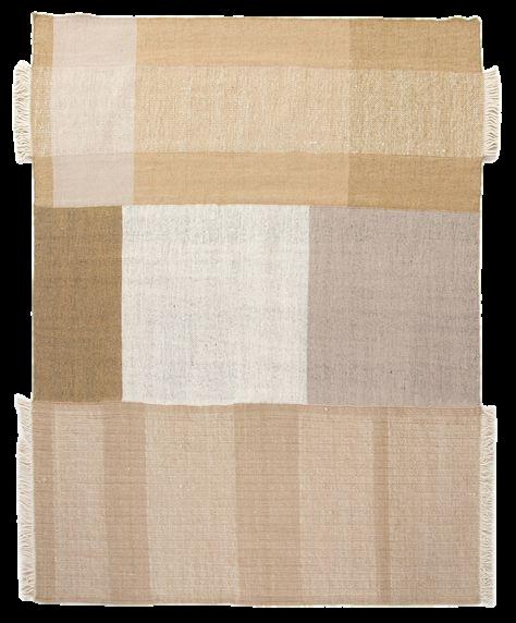
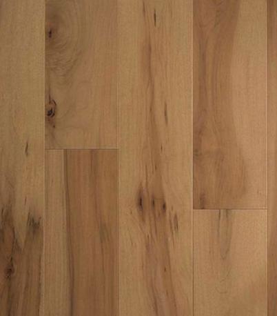
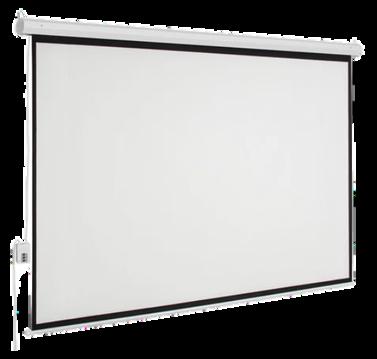
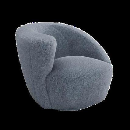
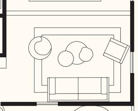
The living space is all about layers and modularity. I wanted it to be able to serve multiple purposes: a place to relax, converse, or watch TV. Adding swivel chairs, layered coffee tables, and a built-in, ceiling-hung projector allows for the room to easily adapt to any situation. Everyone can have a comfortable place to sit and a spot to set their drink.

f oor ng
layere
drop down, ceiling mounted, projector screen
velvet sofa
ayered coffee tables with var ed heights
inen curtains
Benjamin Moore "Wh te Dove"
two arge weeping figs flanking couch
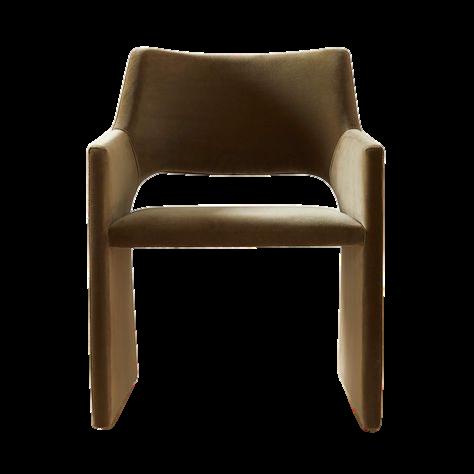
green chairs for ends
D I N I N G

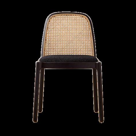
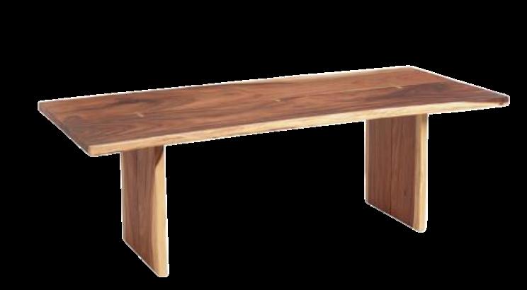
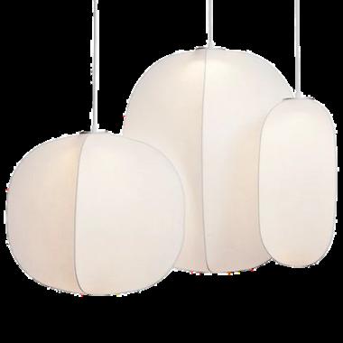
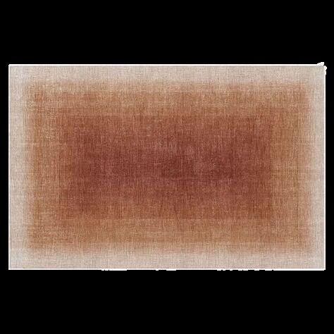
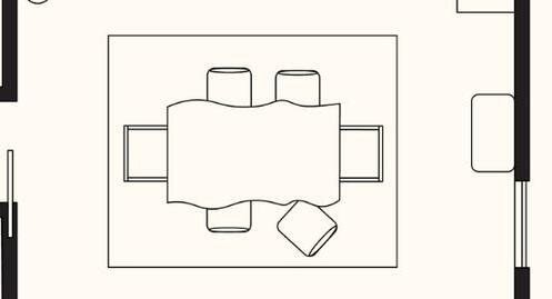
The dining space is two steps up from the living room, providing separation while allowing them to stay visually and spatially open to each other. I chose warm, neutral tones to make the dining space welcoming, but not too visually intrusive since it sits in the center of the open living area. The fabric lanterns act as a central focal point while providing a soft glow for nighttime
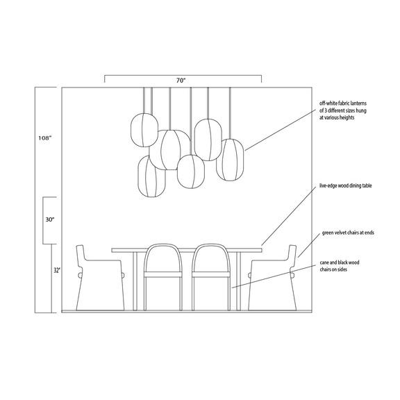
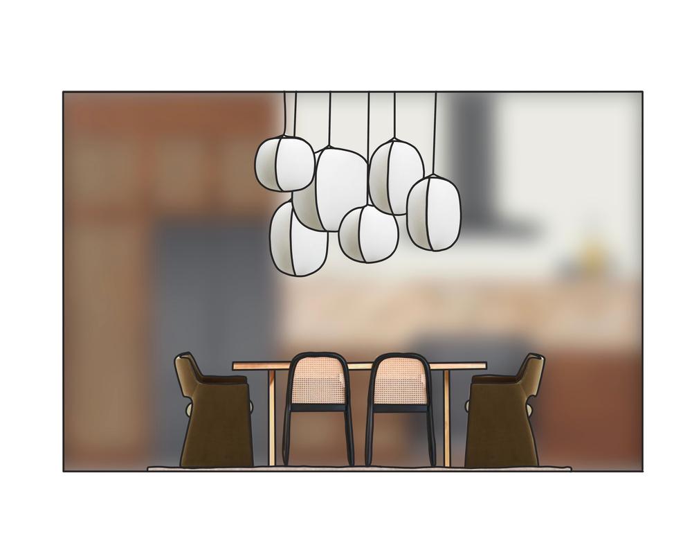
b ack and cane dining cha rs for sides


16
various pendant fabric anterns hanging at different heights
dark
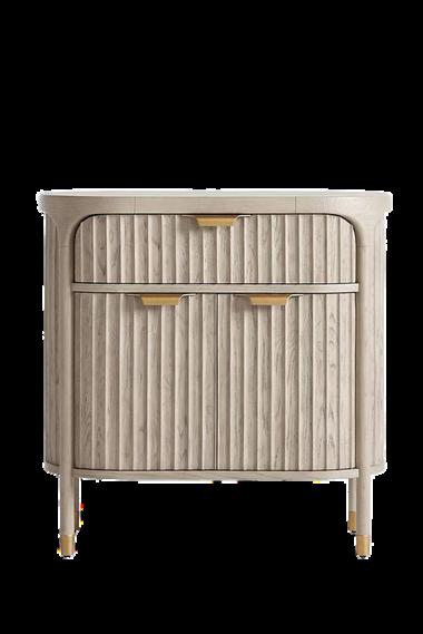
bar cab net
Ben amin Moore "White Dove"
flooring
live edge table
K I T C H E N
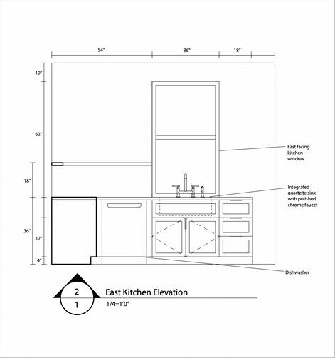
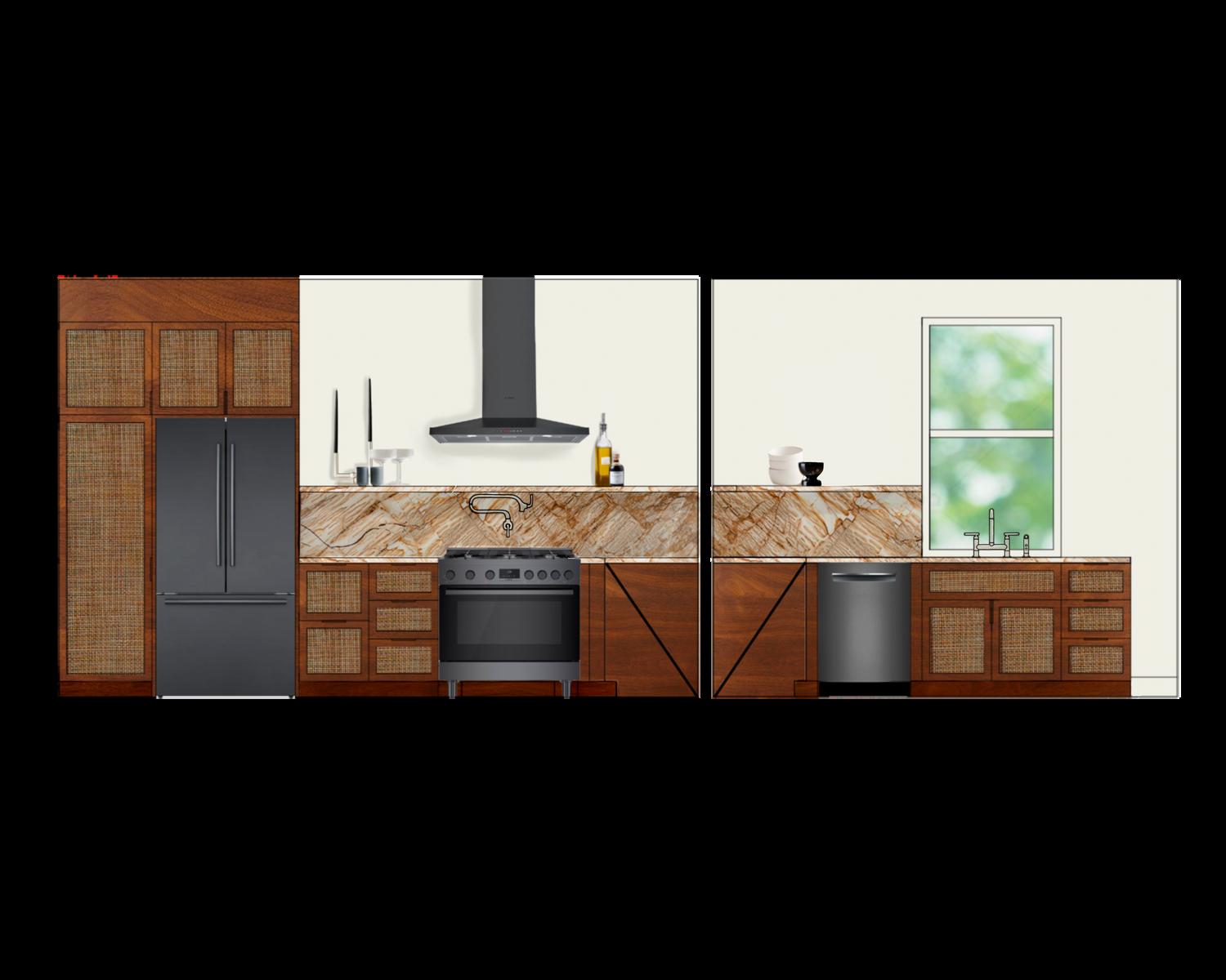
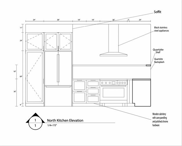
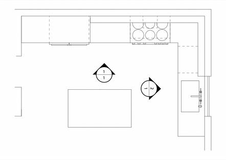
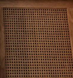
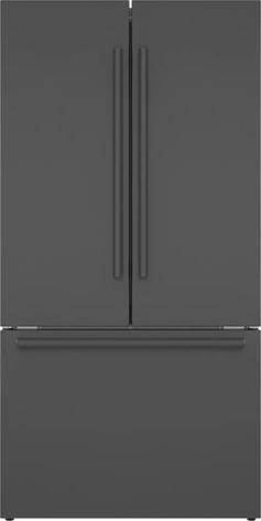
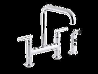
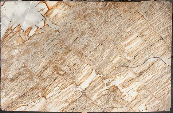
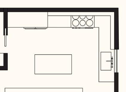
The kitchen FF&E started with the slab of quartzite, and grew from there. I wanted to really highlight this gorgeous stone, so I brought it up as the backsplash, and added a ledge for storage and display. To provide an anchoring force at the end of the open living space, I chose a deep, rich wood finish for the cabinets, and added caning in the same color to bring in some texture.
flooring





17
polished chrome faucets and hardware
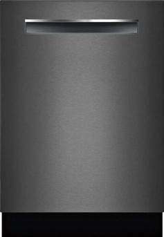
black stain ess steel appliances
cabinets with cane panels, sland base in same fin sh
Benjam n Moore "White Dove"
quartzite countertops, backsplash, and shelf
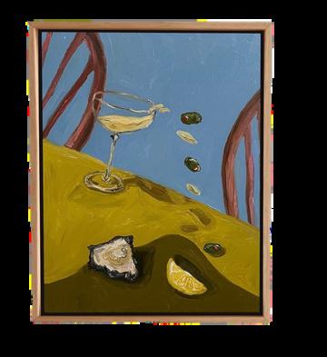
oil painting by Libby Haines leaning on she f
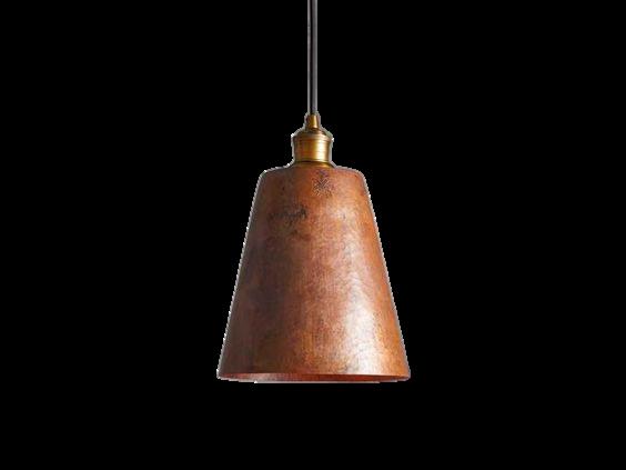
copper pendants over island
1 / 2 B A T H




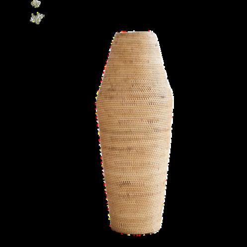
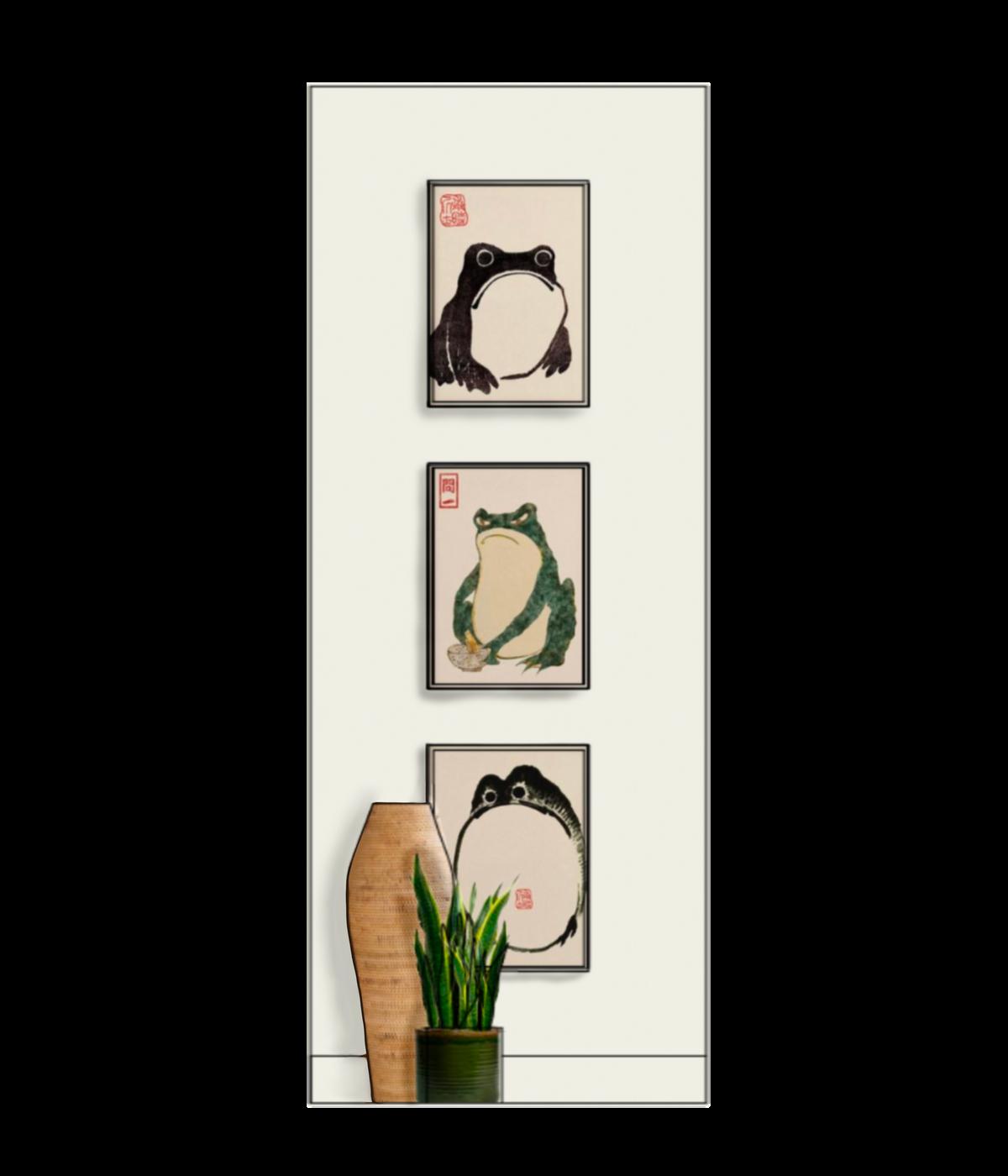



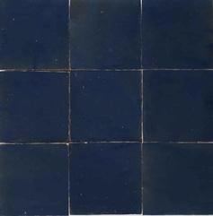
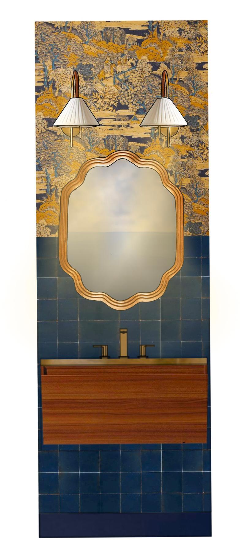
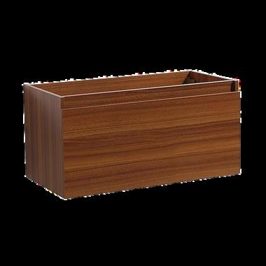
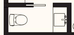
I wanted the half bath to be a bold space, since it would see lower traffic than the main living spaces. I knew I wanted a complex wallpaper, then after finding that, I worked from the colors in it to develop the rest of the space. I didn't want the bath to be too visually busy, so I decided to bring tiles up 2/3 of the wall, and then complete the top section with the wallpaper.
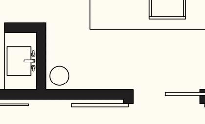
The end of the hall, created by the 1/2 bathroom outshoot, seemed like a d y t




18
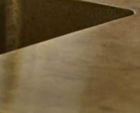
navy blue Zellige t les on bottom 2/3 of walls
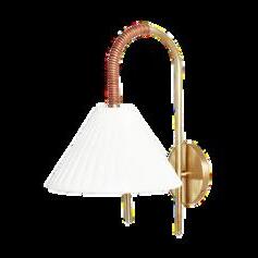
all brass hardware
b co w in
floating vanity base
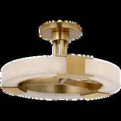
Japanese art wallpaper on top 1/3 of wa ls sem -f ush mount
wooden vanity mirror
Farrow and Ball "Scotch Blue" for cei ing and trims toilet in color "Dune" to meld with other finishes
flooring
C E N T R A L H A L L E N D
P R I M A R Y S U I T E H A L L
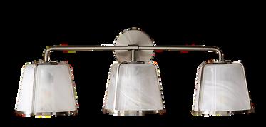


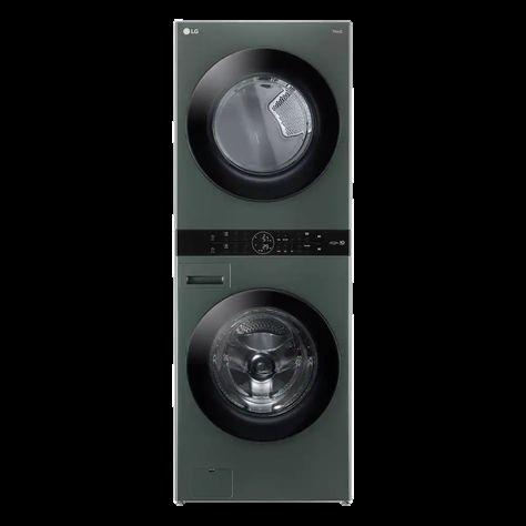
This vestibule into the primary suite allows access to the main bedroom and bathroom. The entrance door to the hall is a pocket door to reduce its footprint on the plan. The door provides separation and privacy, but allows light through its frosted glass panels. Double bi-fold doors contain the laundry closet, which has a stacking unit and room for other cleaning supplies. To the right, is the entrance to the bathroom, and to the left, the bedroom.
P R I M A R Y B A T H

The primary bath was designed to be a peaceful, rejuvenating space for selfcare. Unlike the half-bath, I chose more muted, calming colors and finishes.
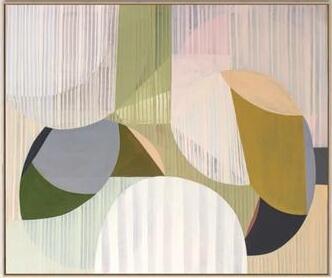
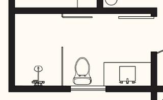
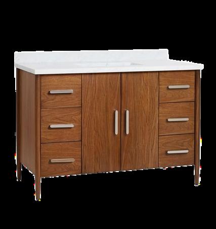
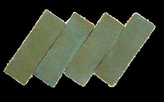
Transitioning away from the hardwood floors throughout the rest of the apartment, I chose a thin ribbon tile that brightens the room. The shower is anchored by a wall of vertically arranged subway tiles, continuing the long lines of the floor tiles.

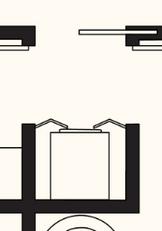
ong shower wal , vertically arranged green Zellige subway tiles





 Benjamin Moore "White Dove"
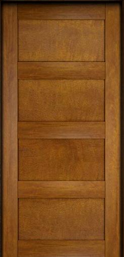
bedroom and bathroom door
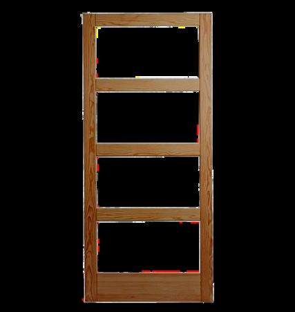
hallway entrance door with frosted glass panels
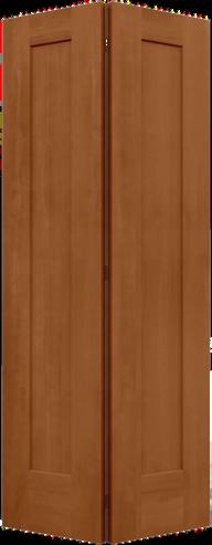
laundry closet double bifold doors
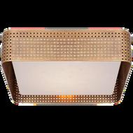
flush mount
stacking dark green washer and dryer
flooring
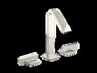
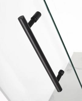
polished nicke hardware and faucet matte black shower hardware, inc uding rain shower head, hand shower, and wal -mounted body sprayers
Farrow and Ball "Mizzle" clear glass, hinged shower door with matte black hardware
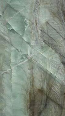
white marble top and porcelain sink bowl
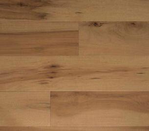
flooring thin ribbon t les in "Maple"
60" x 72" oil painting by Rebekah Andrade
polished n ckel wa l sconce
19
black, wide vanity mirror
short shower walls
P R I M A R Y B E D R O O M
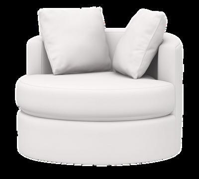



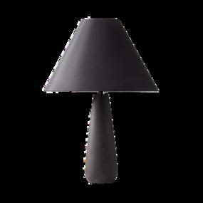
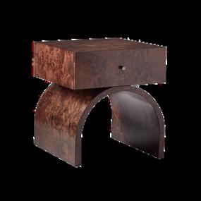
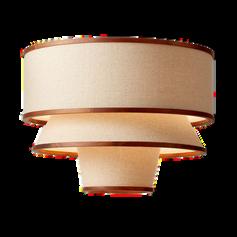
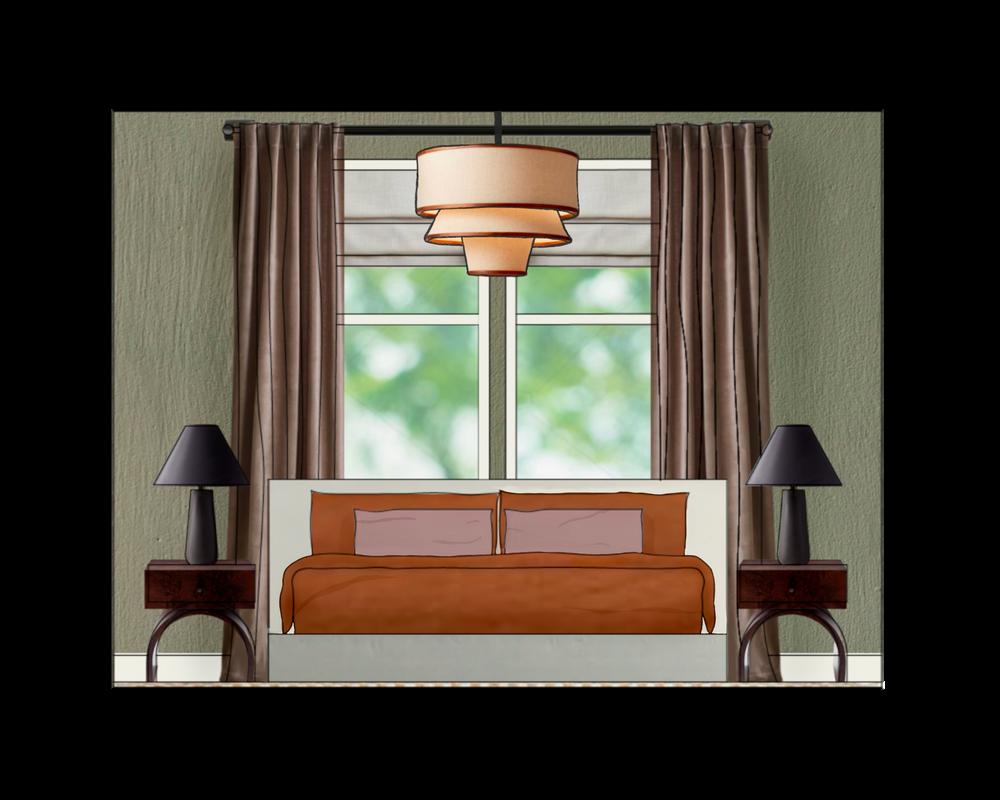
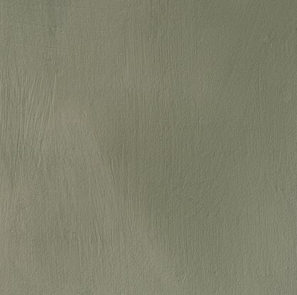
I wanted the primary bedroom to feel a bit more enclosed and cozy than the open living space, so I chose a more mid-tone green color for the walls, as well as mid-tone bedding. A neutral rug grounds the bed area, and provides some soft texture underfoot. I selected a Japanese Maple for the corner, which only requires indirect light, to brings in some greenery. I centered the bed with the main window, to make the best of the window placement while allowing plenty of room for nightstands on either side of the bed.
P R I M A R Y C L O S E T

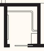
The primary closet has a simple layout, with the focal point being a giant floor length mirror that allows space for two people to view their outfits at once. The frosted door provides privacy, and dampens the visual business of the clothes within, but lets light into the closet







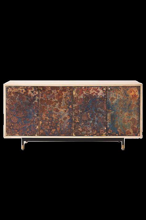

 pendant l ght storage credenza
burl wood nightstands with black lamps
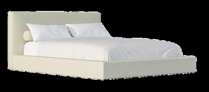
soft bed frame
mauve and rust linen bedding
black out roman shade, l nen curtains
arge Japanese maple in northwest corner
Porto a "Shelter"
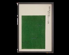
oversized round c and floor lamp reading co large art opposite bedroom door
ooring
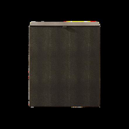
dark green textured aundry hamper
oversized floor mirror
closet door with frosted glass pane s
20
Benjamin Moore "Wh te Dove"
The
MEDITATION RETREAT PRACTICE SPACE D E S I G N E D 2 0 2 2
Project Brief
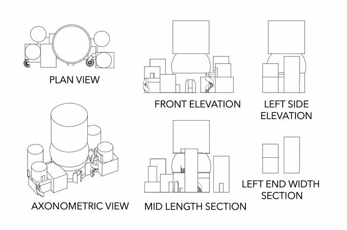
The final project of my Architectural Design course (CAS AR412) was to design the structure of a meditation space using Rhino 3D. I chose to also design the interior spaces. After interviewing people who practice meditation, I determined my design needed to include the following elements to be successful:
minimalist/non-distracting design connection to nature and surrounding environment space for multiple meditation methods comfortable furniture sensory focal points to guide meditation
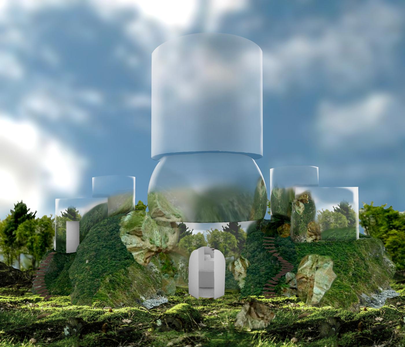
For the exterior, I wanted to play with the idea of reflection: making the entire exterior a mirrored surface that camouflages with the surrounding nature.
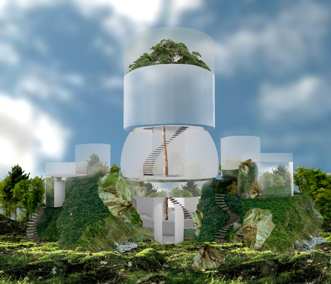
The rendering on the left shows what the exterior would look like in reality.
The rendering on the right shows where the material would act as windows from the interior versus where it would be solid walls.
22
All drafting and modeling done in Rhino, all renderings done in Photoshop and ProCreate.
The Meditation Retreat Practice Space
FF&E Selections and Space Breakdown
LOBBY AND BATHROOM
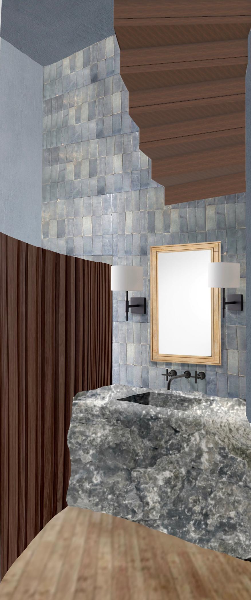
I wanted the lobby to be a warm, welcoming space where clients could get some tea or water while waiting for their class. I kept it fairly minimalist, like the rest of the interior, but used rich textures to maintain some depth. Small touches like the tapestry mounted on the front desk give the lobby character while softening the space. The bathroom highlights material and texture, with a focal point being the natural stone vanity reminiscent of the surrounding environment.
Central atrium with Italian Stone Pine


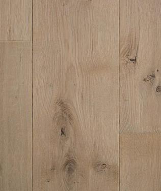
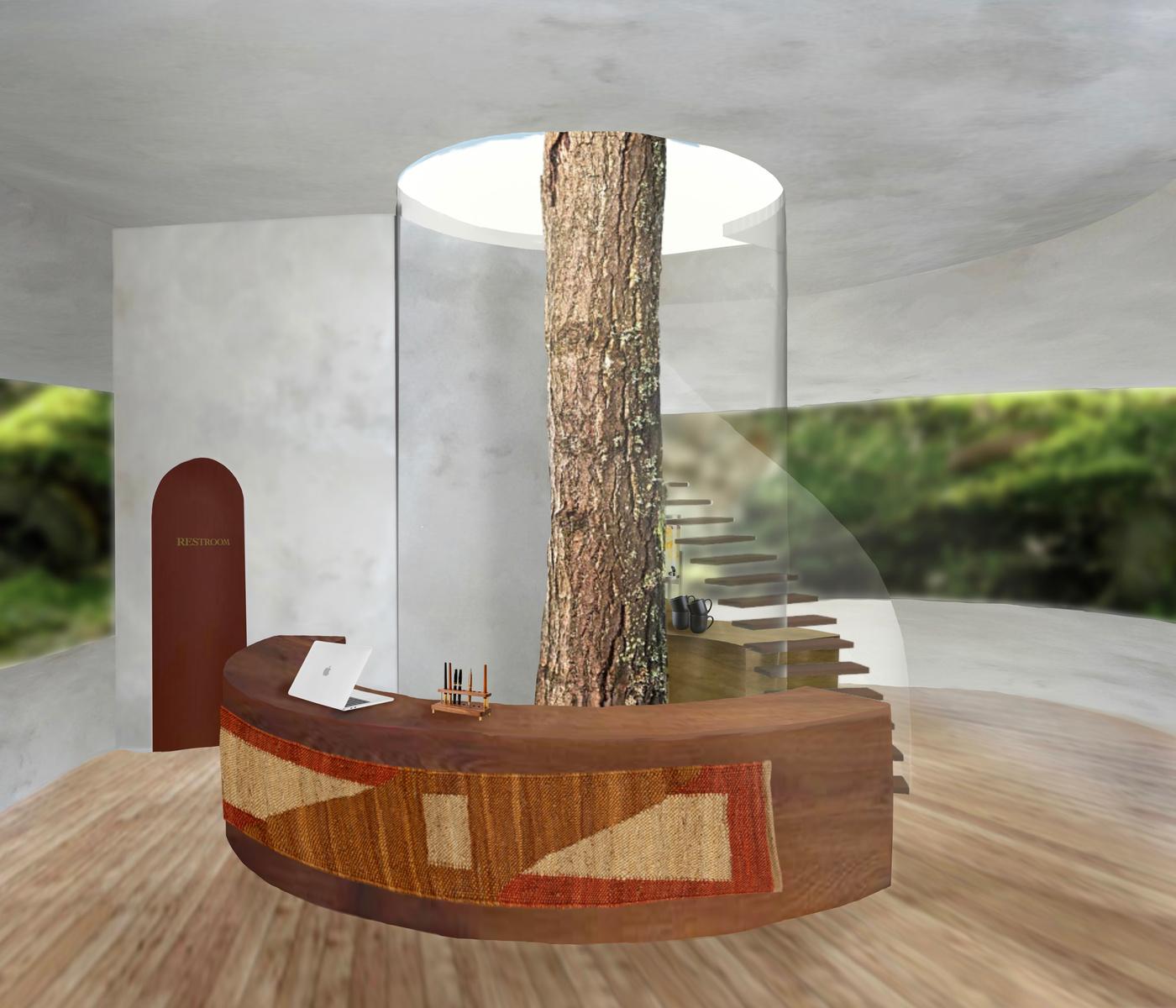
Tea/drink bar
Bathroom

Beginning of spiral staircase
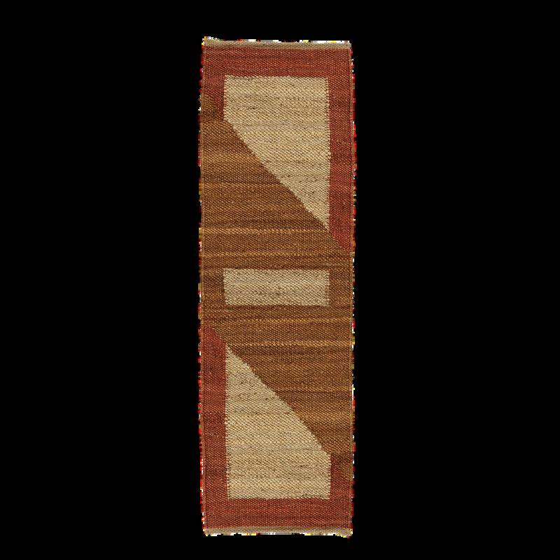
Front desk
23
MEDITATION SPACES 24



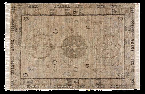
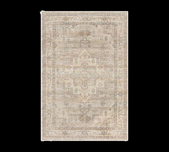
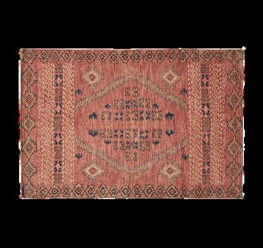
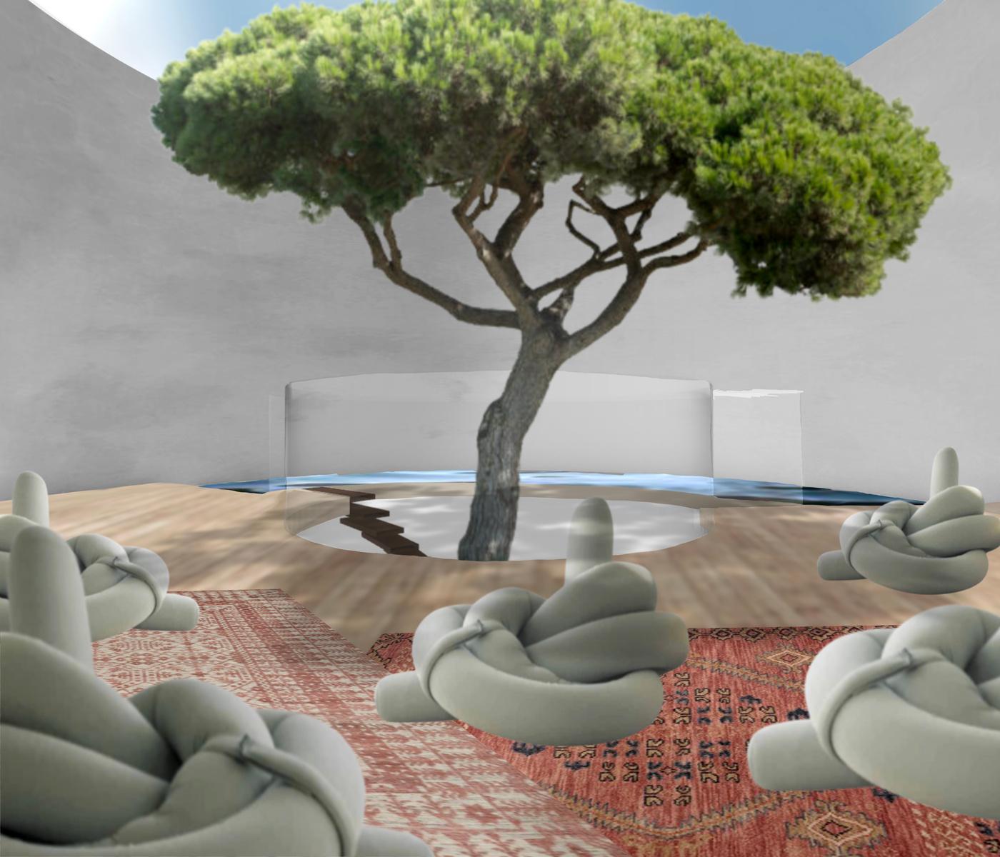
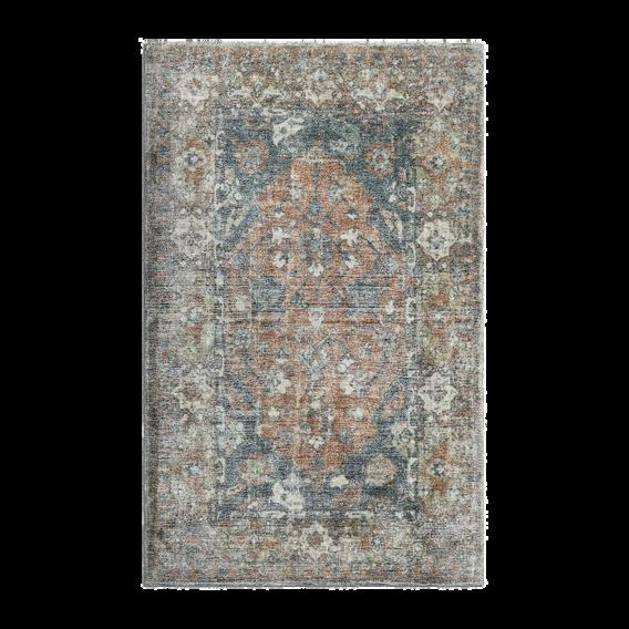
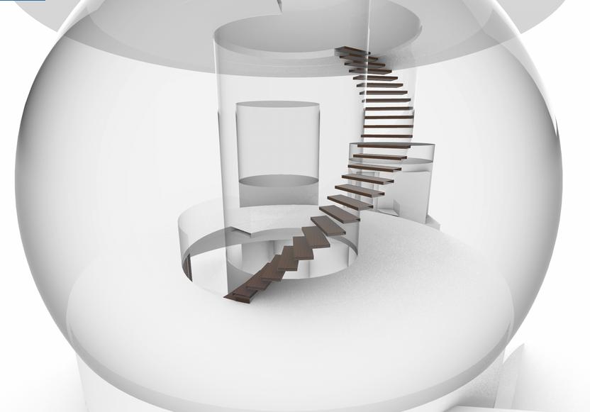
I wanted there to be two meditation spaces in the main tower, along with individual meditation pods surrounding the building. The first space is the entire second floor, and it is a walking and standing meditation space. It has floor to ceiling windows to immerse oneself in the surrounding nature. The main group meditation space is the top floor: where the tree growing in the atrium comes to a canopy. A segment of its footprint is a shallow pond with bubblers to add an auditory focal point to the room. The rest of the room is filled with rugs and ergonomic chairs that can be adjusted to your desired position, creating the perfect setting for guided meditation classes.
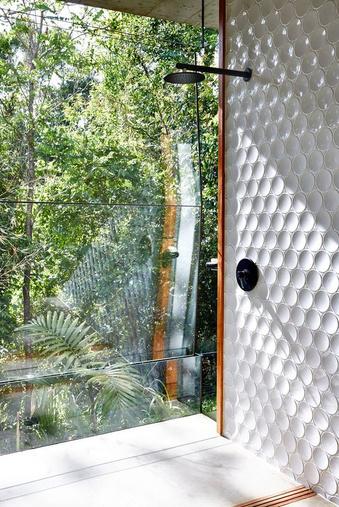 Walking meditation space
Reference
photo from ArchDailiy
Group meditation space
The
ALCOVE APARTMENT
D E S I G N E D 2 0 2 2
Project Brief
Project For: PCDD 0201
All work done in AutoCAD
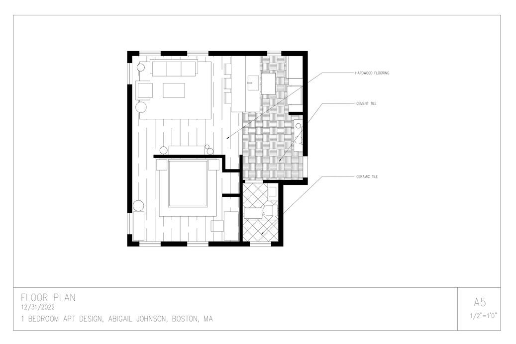
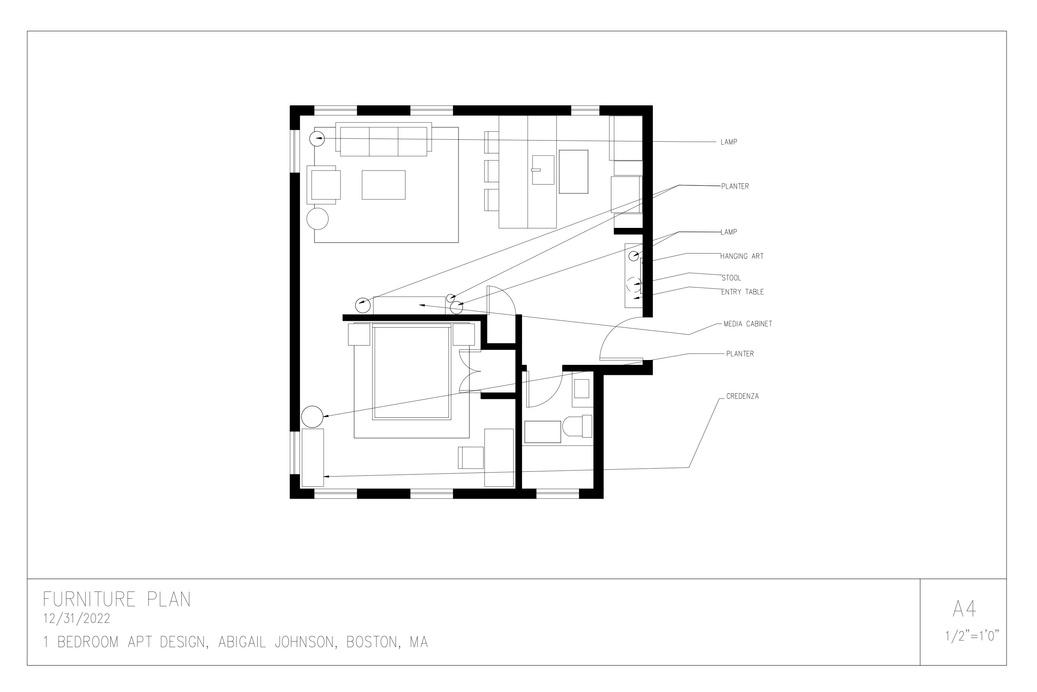
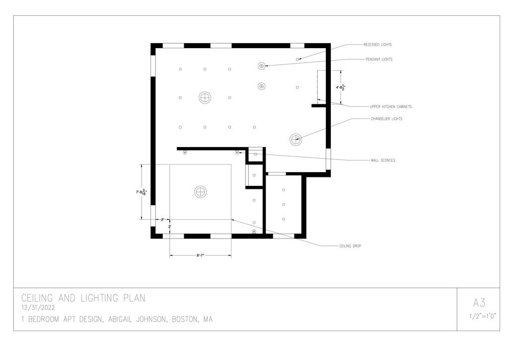
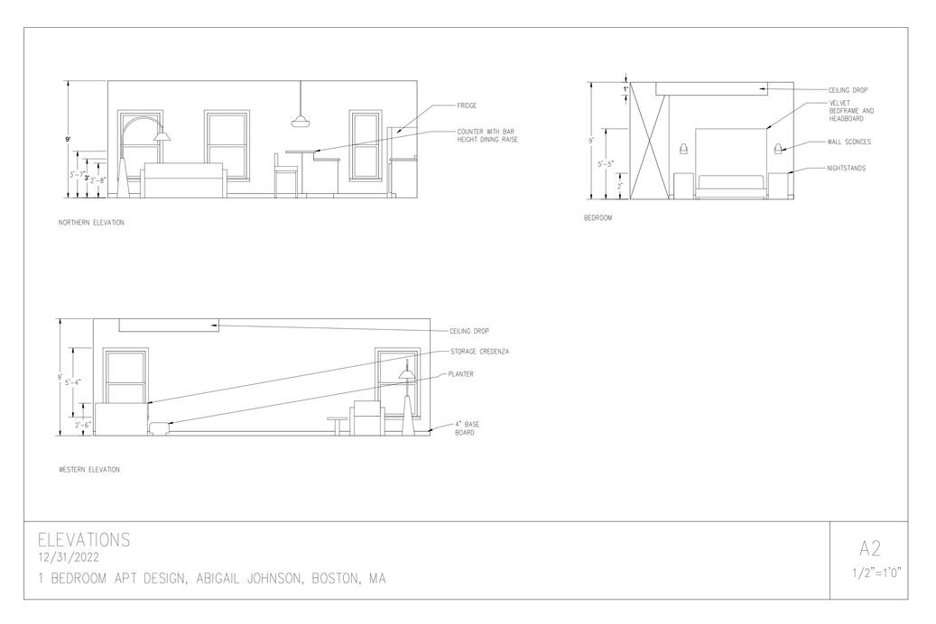
This is the result of an assignment from my AutoCAD course. Provided with the basic measurements and room layout, I was instructed to design, furnish, and present this apartment's interior plan, including drafting its plans and elevations.

26
The Alcove Apartment Plans and Elevations


To help separate the spaces of this alcove apartment, I incorporated different floor types for different major zones. I also added a ceiling drop in the bedroom to define the space and make it feel a bit more cozy and contained.

27
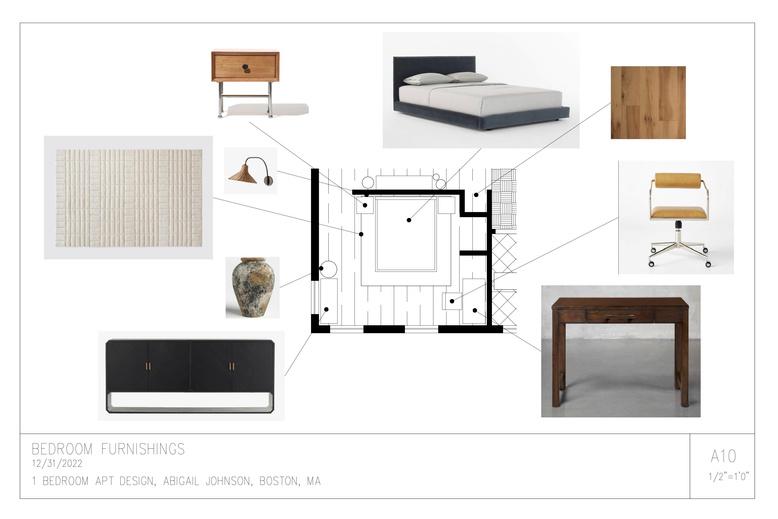
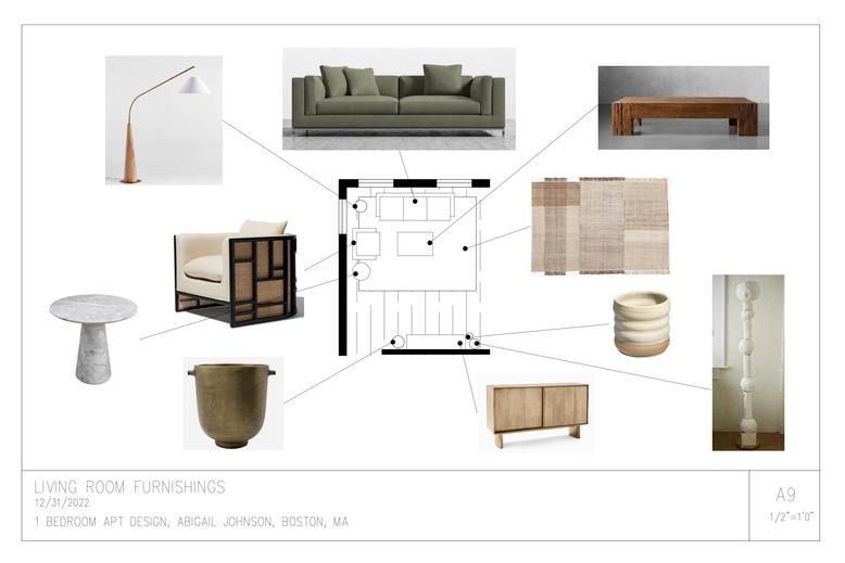
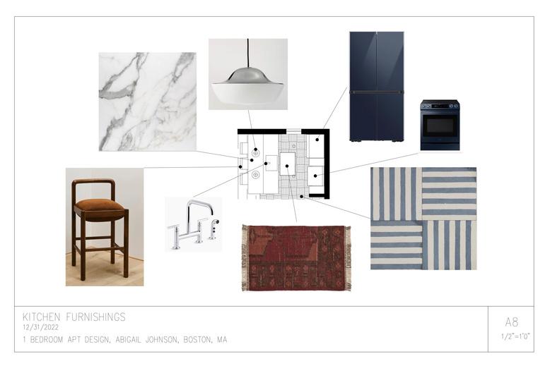
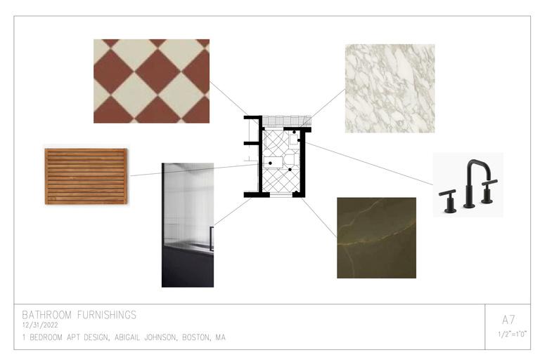
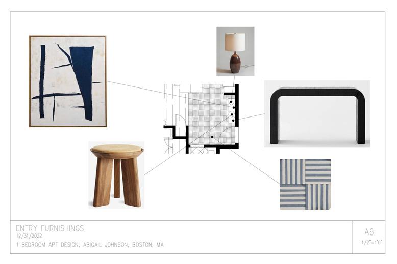
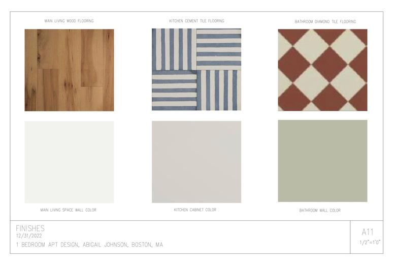
FF&E Mood Boards and Selections


I wanted to create a color palette with a balance of warm and cool tones while also playing with a lot of variety in texture and finishes.

28
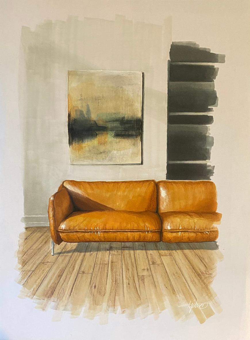
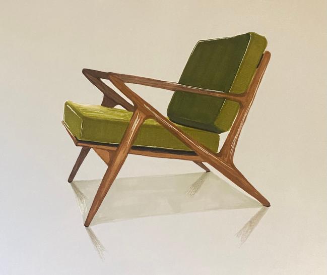
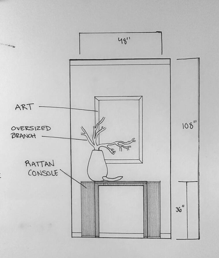
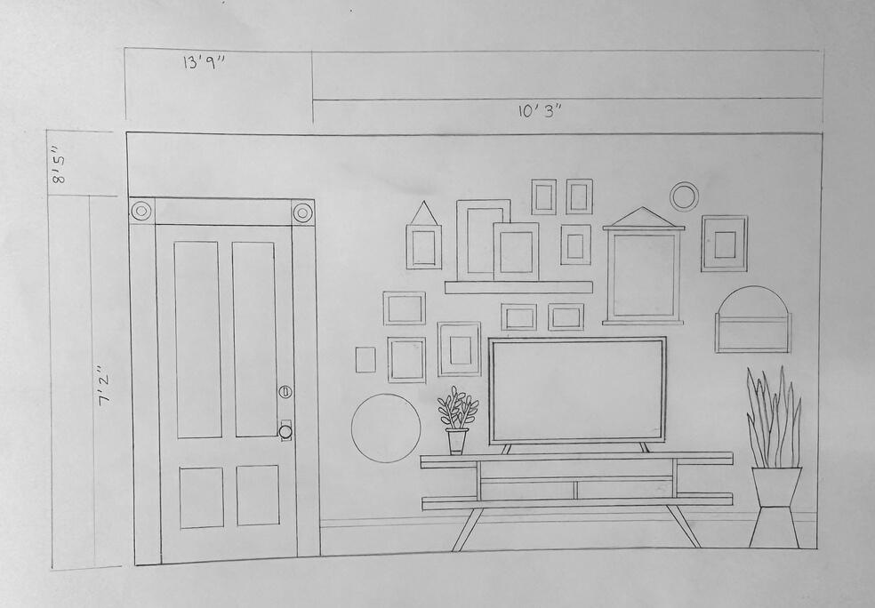
Hand
DRAFTS AND RENDERINGS
D E S I G N E D 2 0 2 2


30
Drawn with AD Markers, colored pencil, and white gel pen.
Drawn with AD Markers, colored pencil, and white gel pen.
Drawn at 1/2"=1'0" scale with 2h and 2b pencils.
Drawn at 1/2"=1'0" scale with 05, 03, and 01 Micron pens.
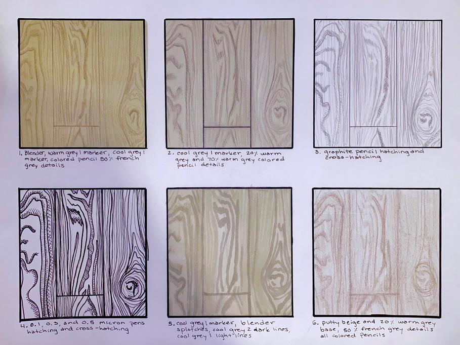
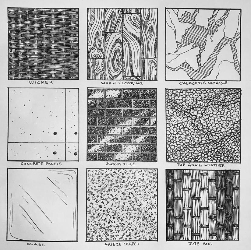
MATERIAL STUDIES
D E S I G N E D 2 0 2 2 - 2 0 2 3
Mixing drawing tool combinations to best convey wood floor paneling.

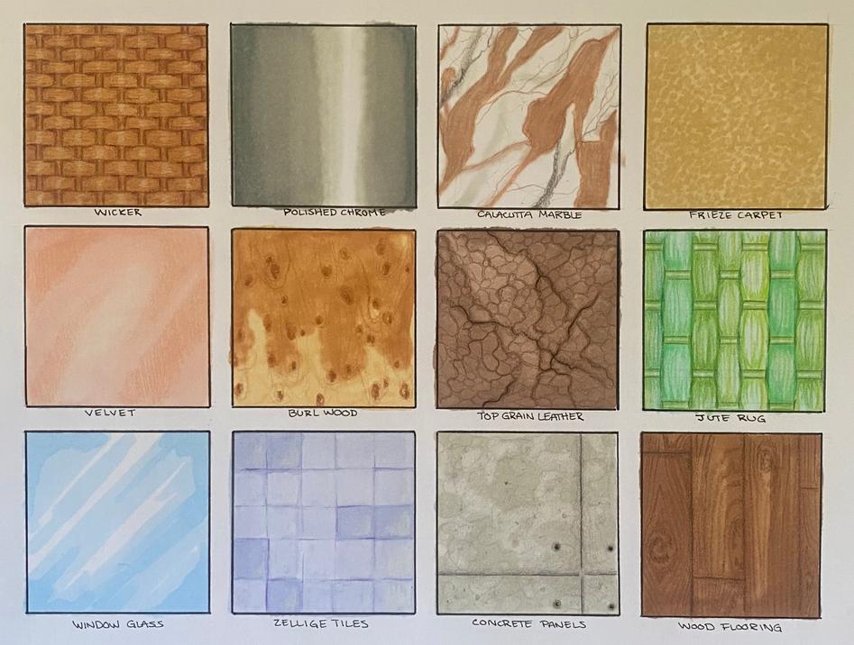
Exploration of drawing interior materials using line-weight and hatching.

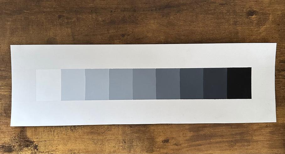
Mixing acrylic paint to create a 9-step even

Exploration of properties of various finishes through hand rendering interior materials.


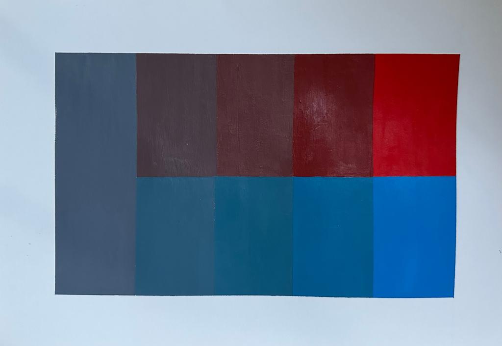
Exploration of saturation values through mixing acrylic paint.

32
grayscale.
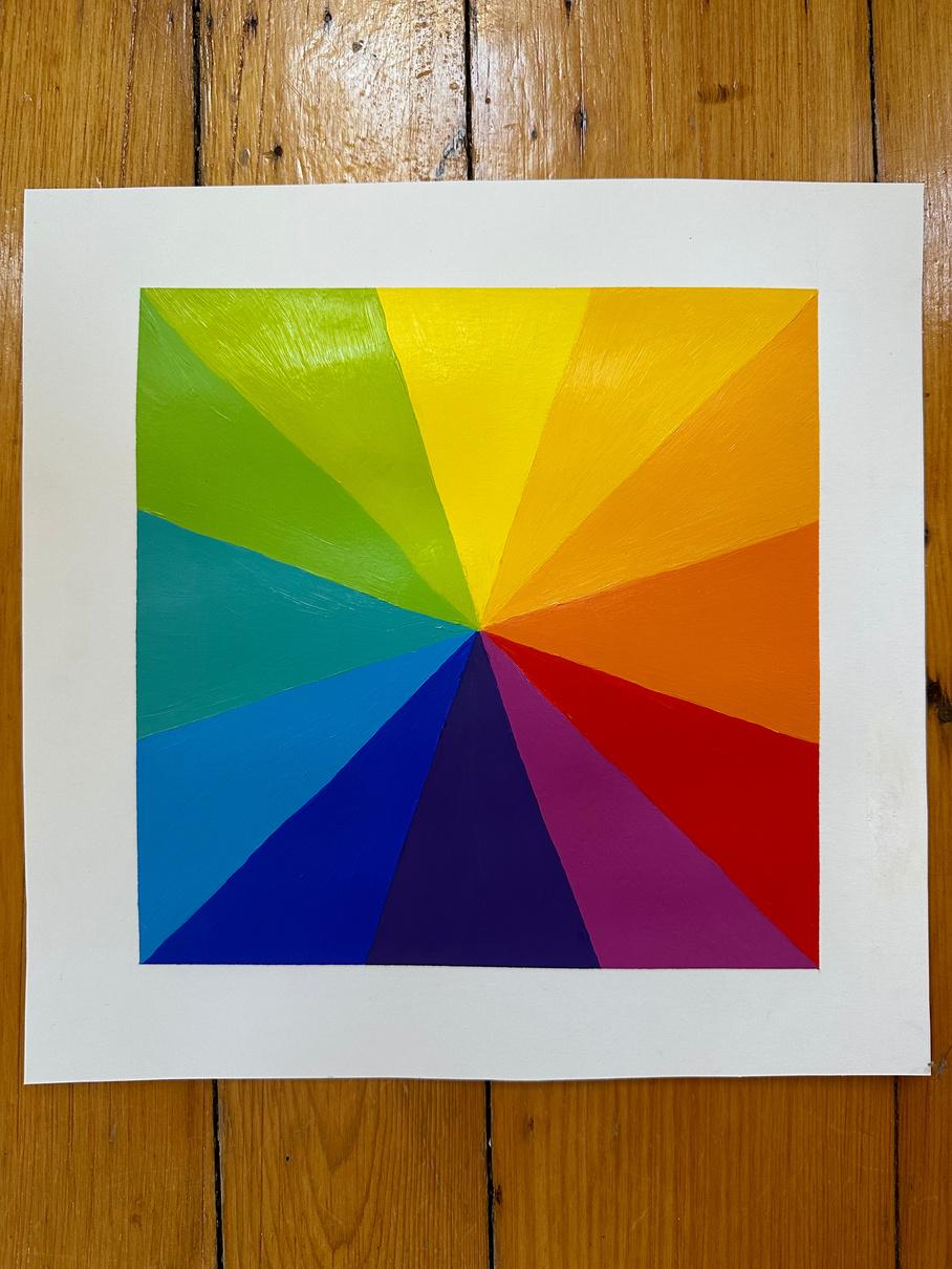
Creating the 12-hue color wheel through mixing acrylic paint.
FOREST MURAL Home Office
D E S I G N E D 2 0 2 1
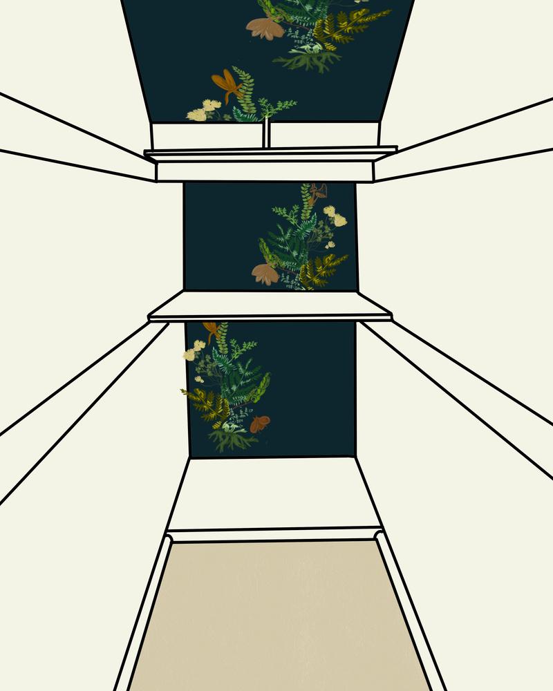
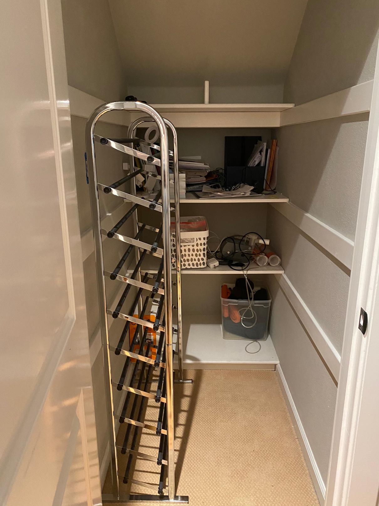
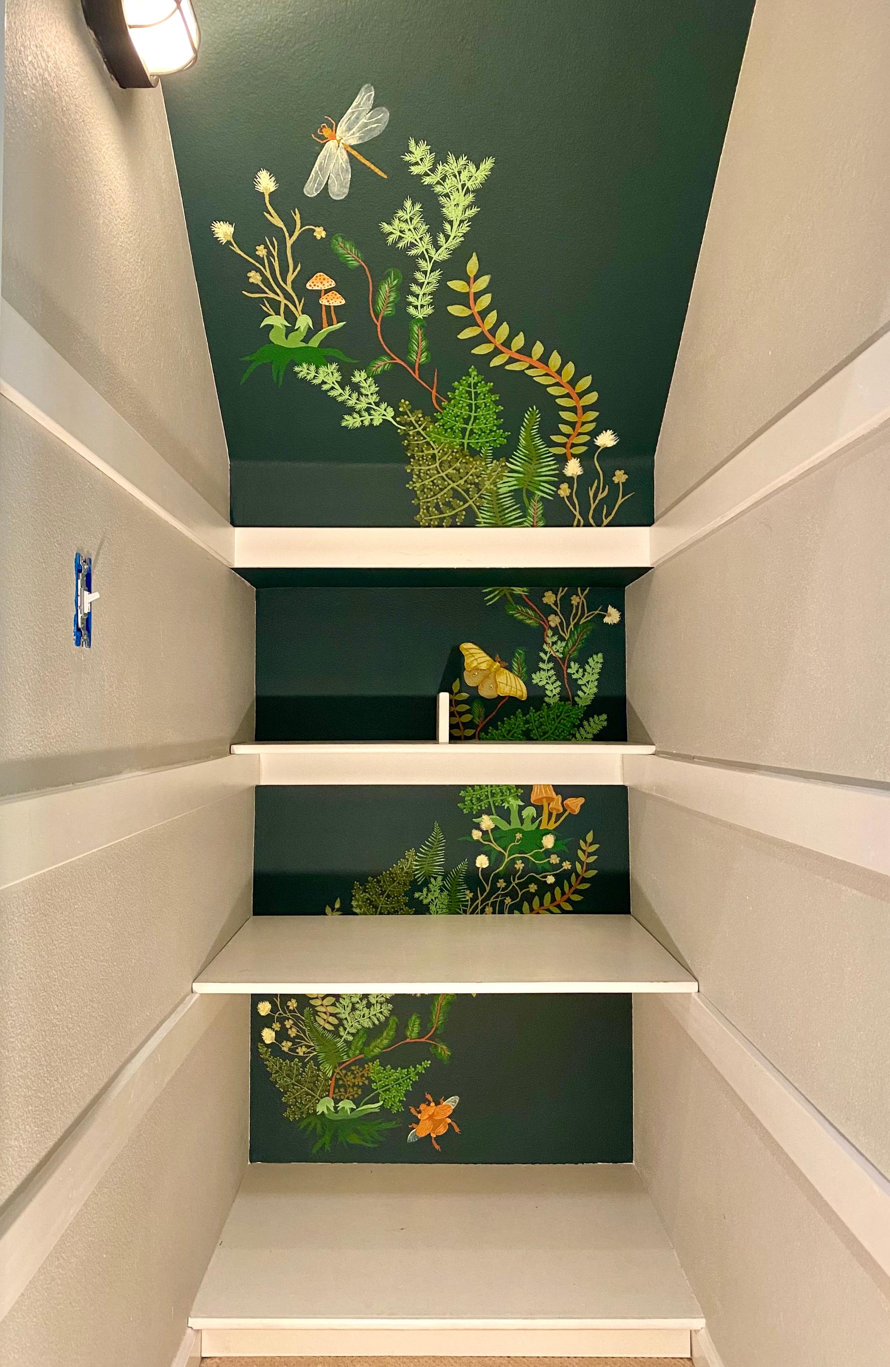
I was asked to create an accent mural for this under-the-stair closet to help turn it into an at-home office space for a young student during the pandemic. The client suggested some inspiration from nature and foliage, but otherwise gave complete artistic freedom.


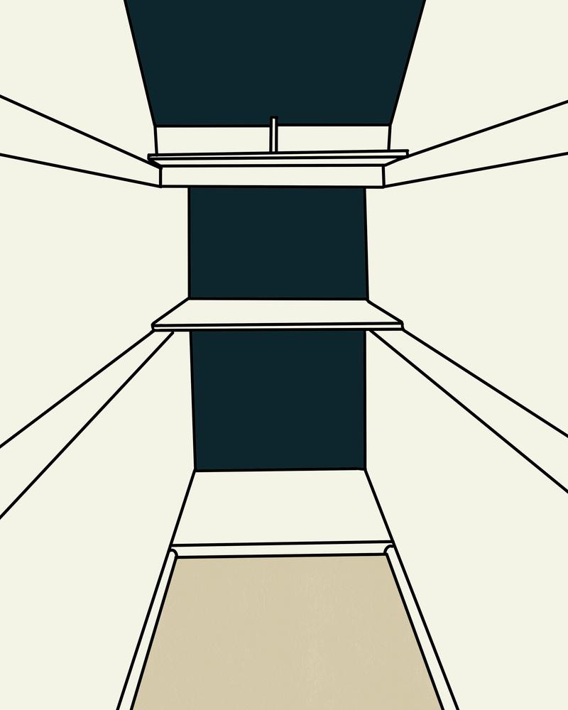
I did a quick sketch to help visualize the colors and placement of the mural, before starting the free-hand painting.

34
I chose a dark color which helped the back wall recede to visually lengthen the space. The blue-green tone coordinated with paint colors in surrounding rooms. The dark value allowed the lighter colors of the design to stand out, while keeping all of the hues in the forest-inspired palette.


Irregularly repeating a variety of greenery throughout the mural gave a cohesive but natural look.


35
The design travels up the wall and slanted ceiling in a vine-like fashion.


I diluted paint with water to play with transparency, adding a more realistic touch to the insects' wings.

36
VISUAL ARTS Other
2 0 2 0 - 2 0 2 3
For: Personal Project
Date: 2020
Medium: Watercolor Paint

I painted this after being inspired by the environment described in a book I was reading. I wanted it to feel collage-like in composition.
PAINTING
For: Personal Project
Date: 2022
Medium: Pencil, Acrylic Paint

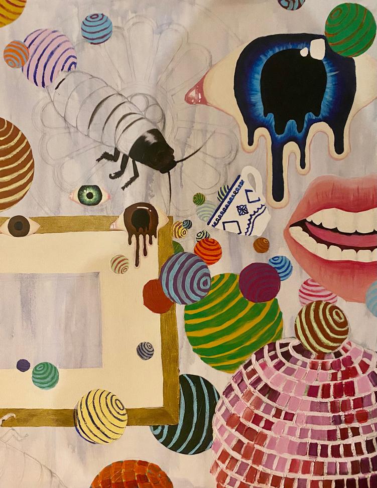
I started this piece with absolutely no plan for what I was going to produce.
I just wanted to create for the sake of creating, and ended up leaving it in seemingly unfinished state to honor the process.
For: CAS AR141
Date: 2023
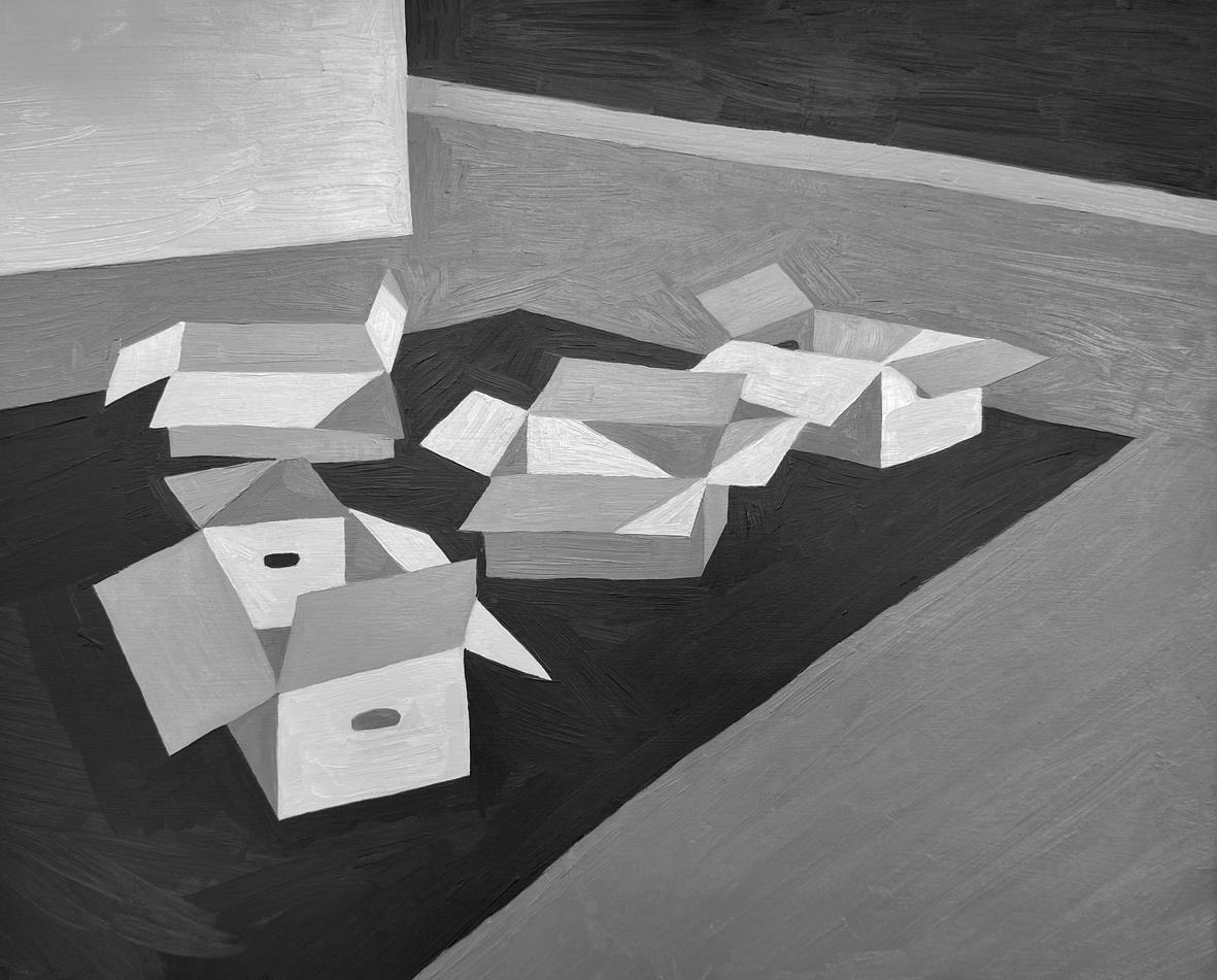
Medium: Oil Paint
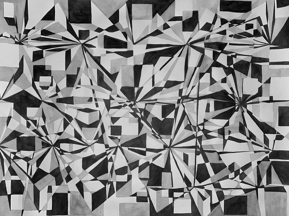
This still life assignment consisted of sketching a set up of boxes, and painting them using color blocks of 4 grey values.

38
For: CAS AR131
Date: 2020
Medium: pencil, ink, wooden ink holder, water
For: CAS AR131
Date: 2020
Medium: charcoal pencils (black and white)

DRAWING
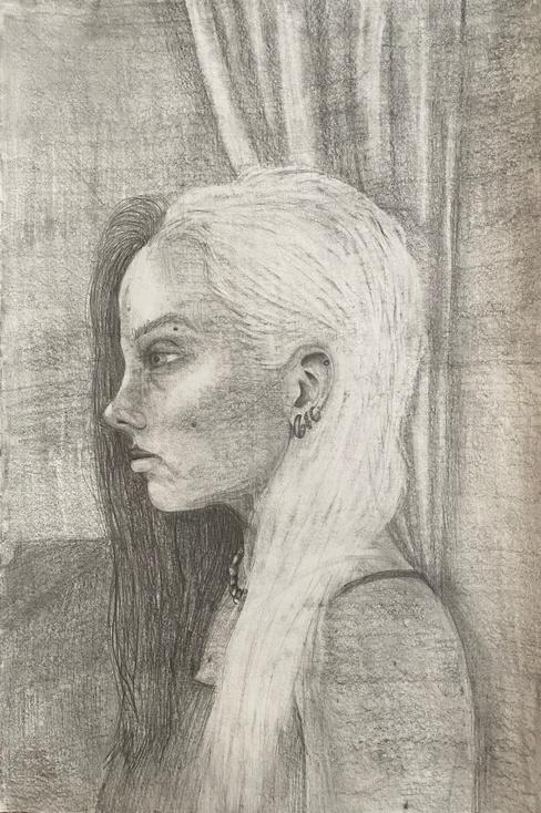
For: CAS AR131
Date: 2020
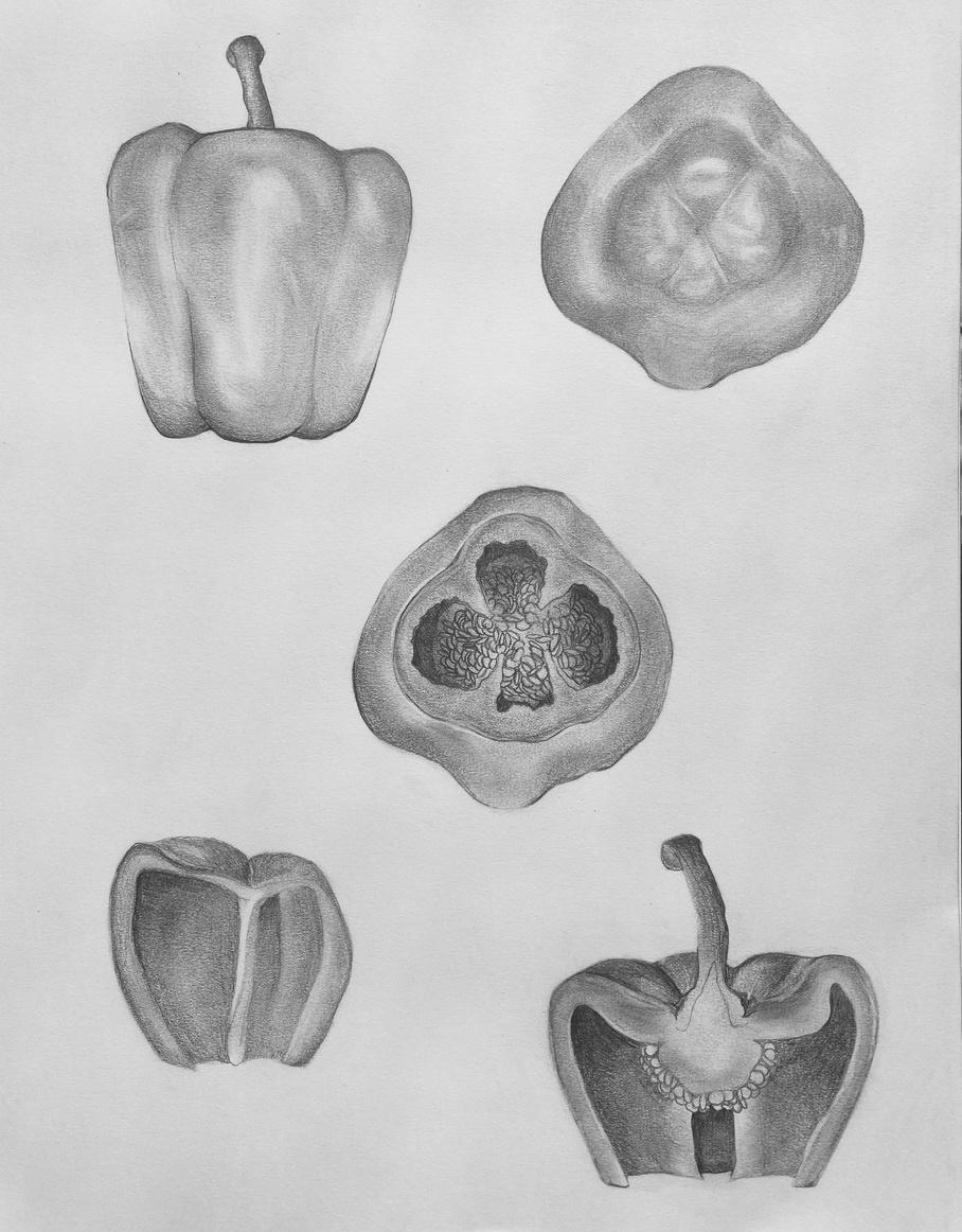
Medium: 2B Pencil

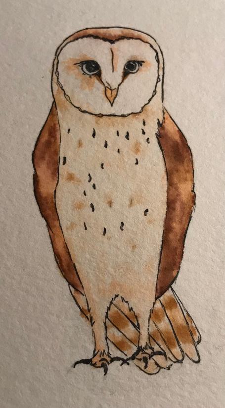
For: Personal project
Date: 2020
Medium: Micron pen, marker

For: PCID 0102

Date: 2022
Medium: HB Pencil

39
DIGITAL DRAWING


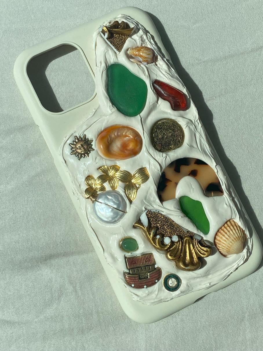
IPhone case made with collected objects and 100% silicone.

OTHER MEDIUMS

40
Drawn on Ipad Pro using ProCreate app.
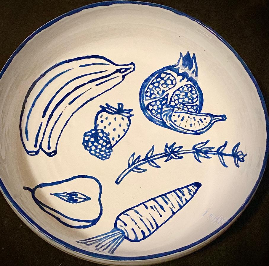
Painted with acrylic ceramic glaze.
Title: "Oracle of Growing Woman"
For: CFA AR224
Date: February 17, 2022
Materials: Wood, Nails, Cardboard, Paper Mâché, Plaster, Spray Paint, Stuffing, Lightbulb, Speaker
SCULP
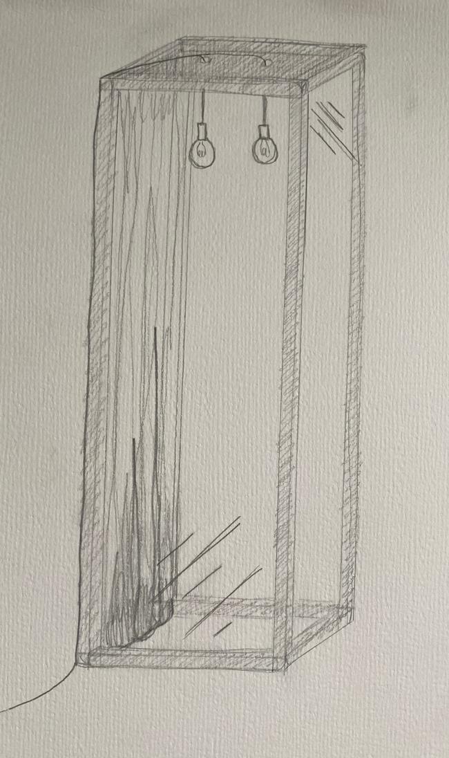
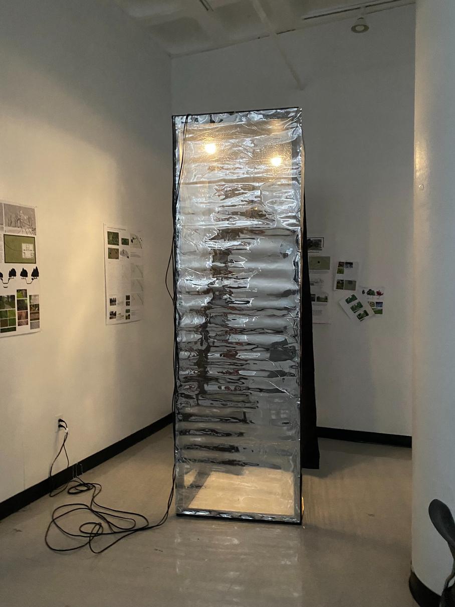
Inspired by reflection, both physical and metaphorical, I c manipulate vision, the room is wrapped in one-way mirro interior of the room. From within, it appears to be a room reflection, unknowing of what exists on the exterior.
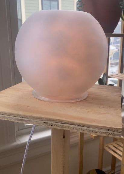
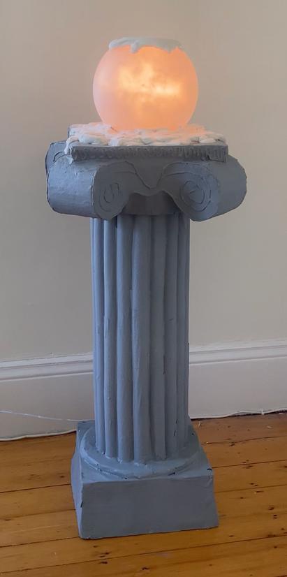
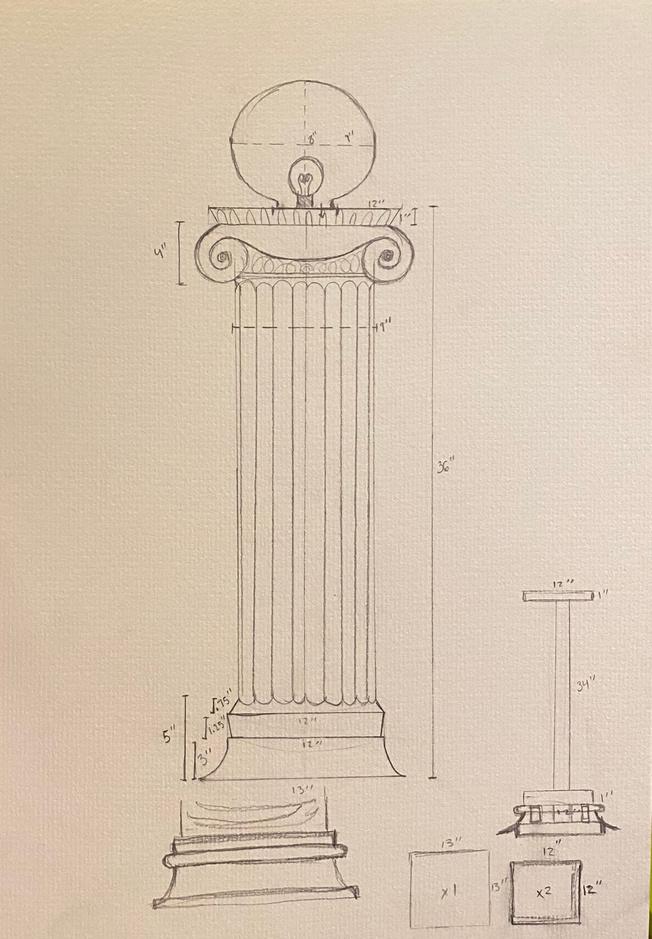
Inspired by the architecture of the Greek Ionic column and its anthropomorphic origins of proportion, I constructed this podium-height, multi-media sculpture. A Bluetooth speaker within plays a custom track of audio clips (relating to the essence of being a women) on loop. The lighted orb is synced to this audio: reacting to it as it plays.


Title: "O
For: CFA
Date: Apr
Materials: W Paint, Plasti One Wa Blackout Light
41
PTURE
onstructed this single-person room. Using light to red sheets. From the outside, one can observe the m of four solid mirrored walls: only faced with one's own
Observe"
A AR224 il 5, 2022 Wood, Nails, c Sheeting, ay Film, Curtain, bulbs
Title: "It's Alive?"
For: CFA AR221
Date: December 9, 2021
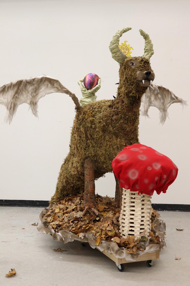
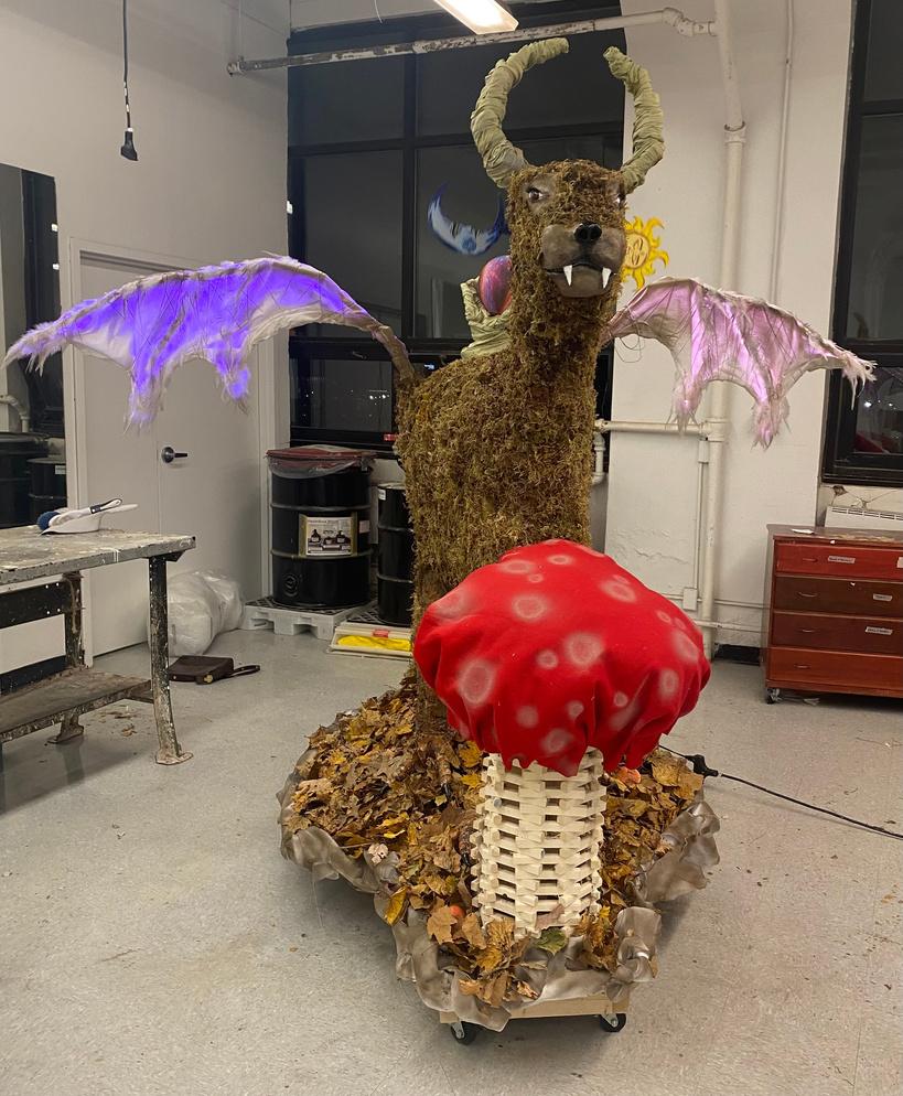
Materials: Wood, Nails, Wiring, Circular Motor, LED Strips, Moss, Fallen Leaves, Feathers, Fabric, Cardboard, Air-dry Clay, Cement, Paint

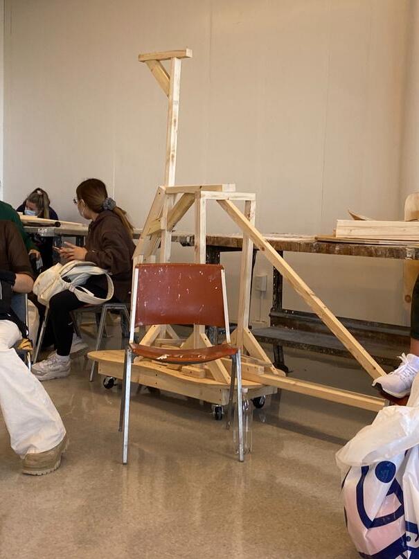
A semester-long project: this beast was my first ever sculpture. Starting with a minimalistic wood frame, cumulative assignments on the exploration of sculptural mediums and theories led to this 9-foot by 12-foot creature. Blending the use of natural and synthetic materials blurred the lines of hyper-realism, fantasy, and theatricality to create an air of unknown intentions.


42
Thankyou for taking the time to view my portfolio.


 Benjamin Moore "White Dove"
bedroom and bathroom door
hallway entrance door with frosted glass panels
laundry closet double bifold doors
flush mount
stacking dark green washer and dryer
flooring
polished nicke hardware and faucet matte black shower hardware, inc uding rain shower head, hand shower, and wal -mounted body sprayers
Farrow and Ball "Mizzle" clear glass, hinged shower door with matte black hardware
white marble top and porcelain sink bowl
flooring thin ribbon t les in "Maple"
60" x 72" oil painting by Rebekah Andrade
polished n ckel wa l sconce


 pendant l ght storage credenza
burl wood nightstands with black lamps
soft bed frame
mauve and rust linen bedding
black out roman shade, l nen curtains
arge Japanese maple in northwest corner
Porto a "Shelter"
oversized round c and floor lamp reading co large art opposite bedroom door
ooring
dark green textured aundry hamper
oversized floor mirror
closet door with frosted glass pane s


 Walking meditation space
Reference
photo from ArchDailiy
Group meditation space

