

a co-living space for two families drawer of offices
an office of flexibility, mobility, and openness candy-like
a gathering space for LGBTQIA+ organization other
furniture deisgn/digital drawings


a co-living space for two families drawer of offices
an office of flexibility, mobility, and openness candy-like
a gathering space for LGBTQIA+ organization other
furniture deisgn/digital drawings
a co-living space for two families
fall 2021
Instructor: Francine Monaco
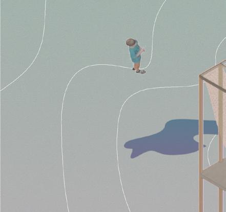
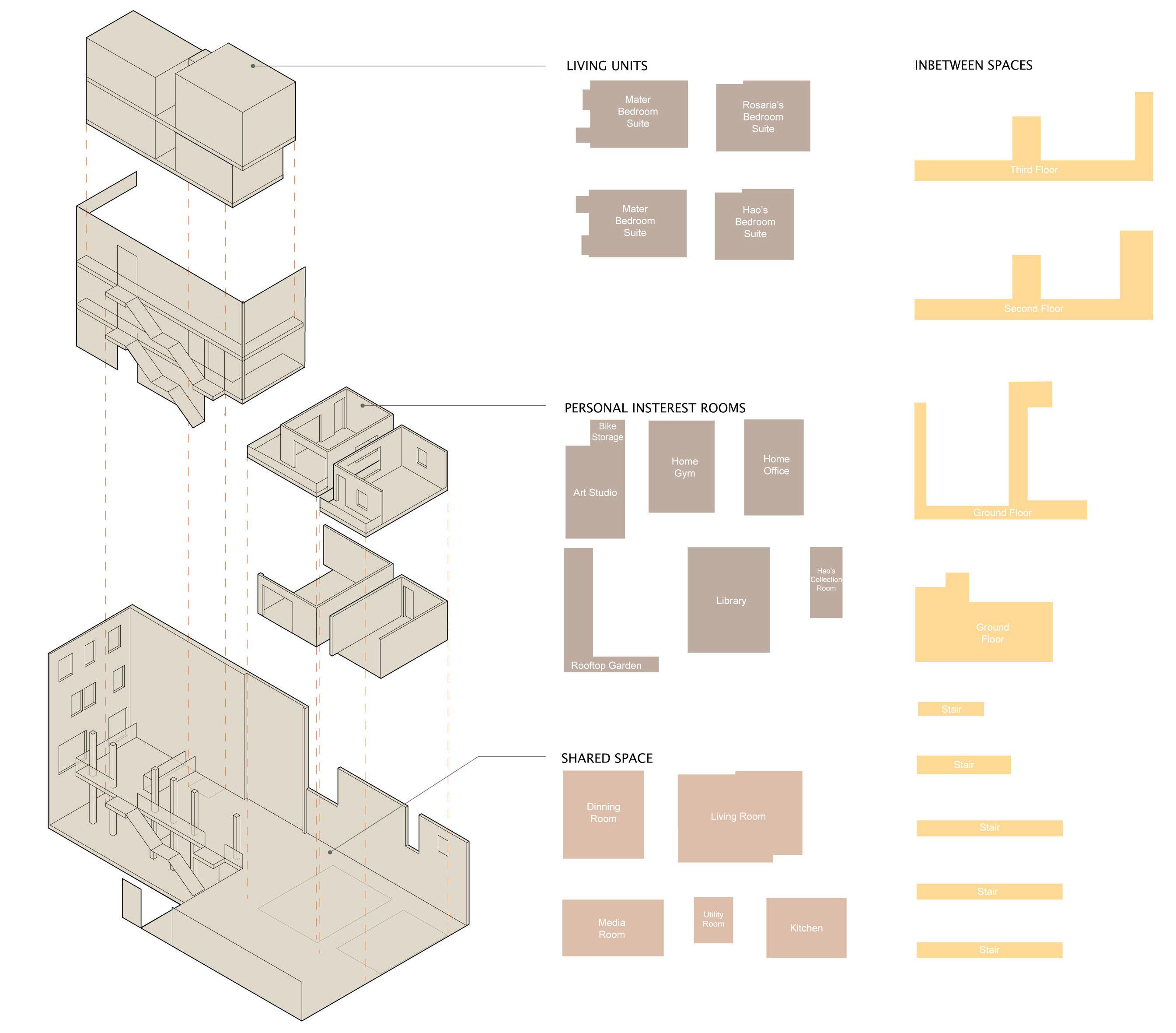
This project aims to accommodate two families in a single building preserving privacy while fostering a sense of community. The design is inspired by the Moriyama House by Ryue Nishizawa to split the original building into several units to cater to three programmatic groups: living units, shared space, and personal interest units. The living units are the most private rooms, while the shared space comprises all functions that the residents share. The personal interest units are housed in individual boxes to accomodate each resident's personal habit. The design also incorporates many in-between spaces that encourage constant encounters between the residents from the two families.

Two families living together
As the inhabitants have varying lifestyles, regulating public and private spaces became crucial for spatial planning. Encouraging interpersonal interactions among inhabitants from different professions and generations while respecting individual privacy is essential for creating a comfortable living space.


MICHAEL: Artworks
MICHAEL: artworks

HAO: cooking MINA: planting rooftop
HAO: Cooking HAO: Collecting
HAO: collect

ROSARIA: Six-year-old

ROSARIA:
TREVOR: Cycling & Running MINA: Rooftop Garden
WILLIAM:
William: Writer


TREVOR: business consultant
TREVOR: Business Consultant

TREVOR: cyclist & runner
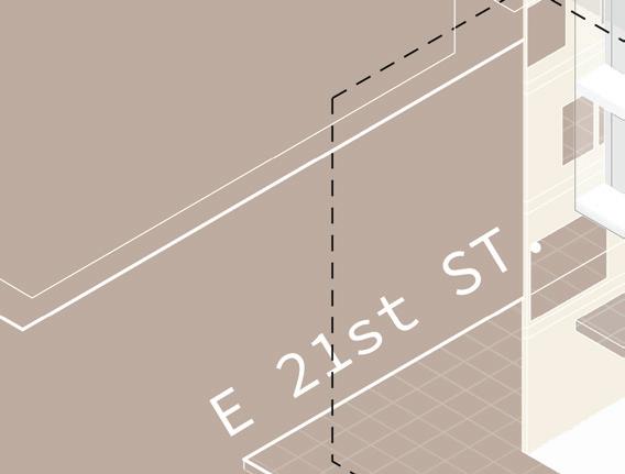
Located at the intersection of E 21st ST. and 2nd Ave. creating a vast space for the courtyard.

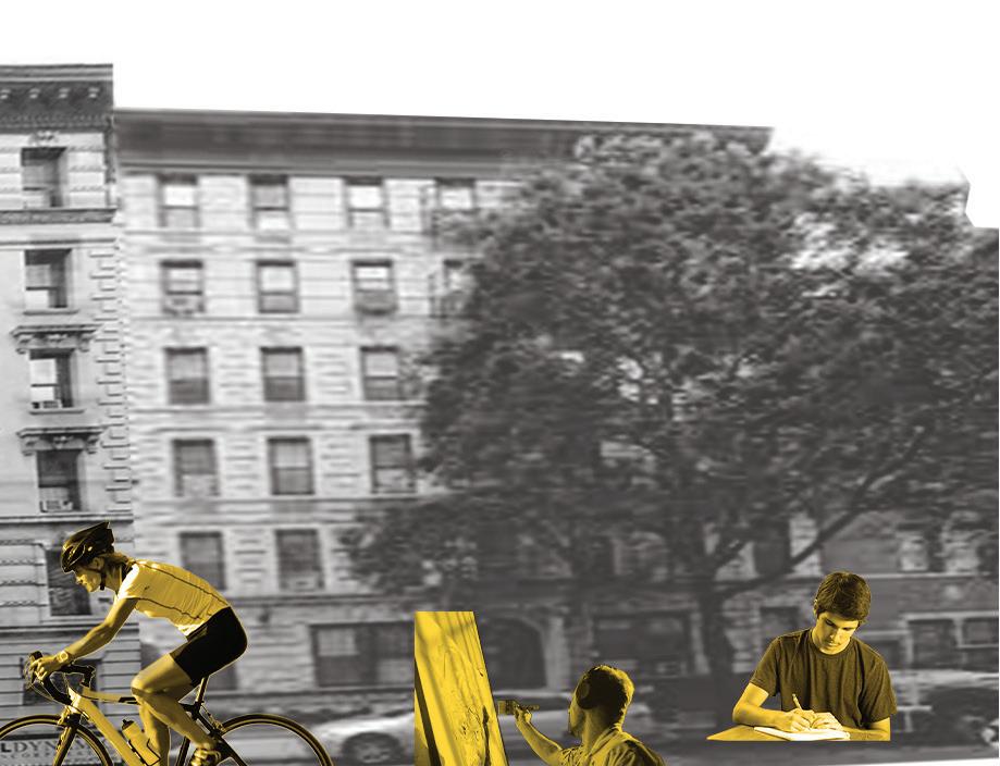
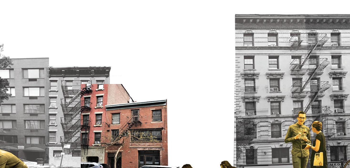
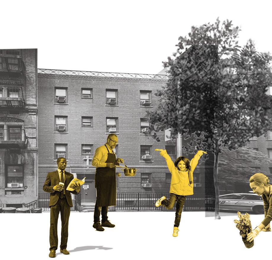
Breaking into several units


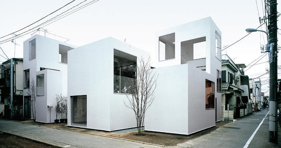

The arrangement of separate but adjacent units, with communal spaces placed in between them, defines a new social dynamic that fosters interaction and community within the house.
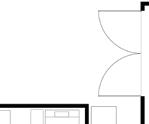
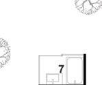
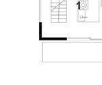
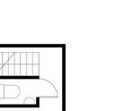

Relationship to surrounding context with similar grid pattern



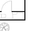
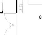
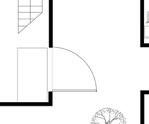
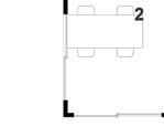
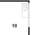
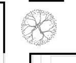
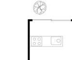
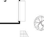
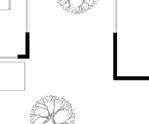
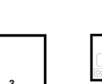


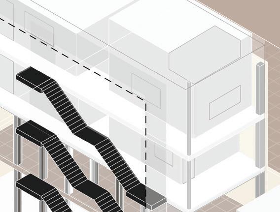
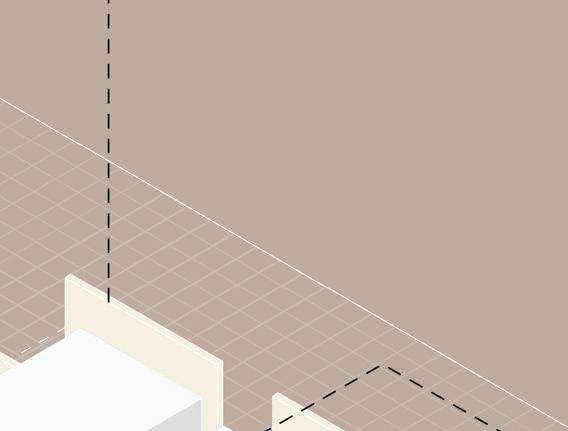

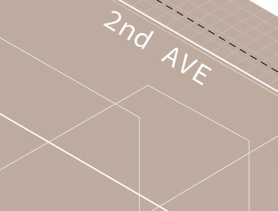
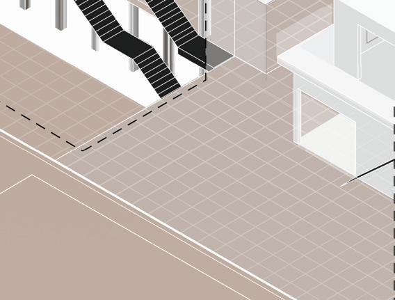
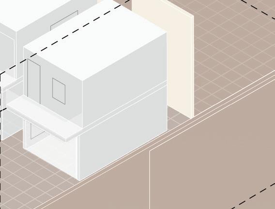








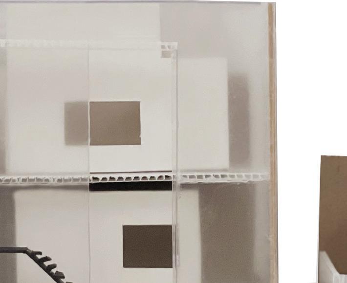
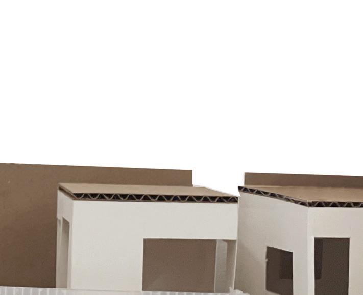
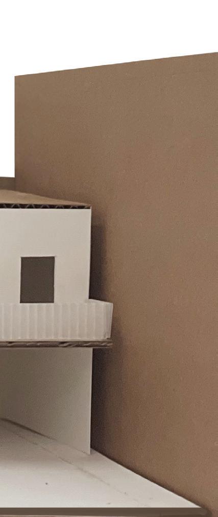
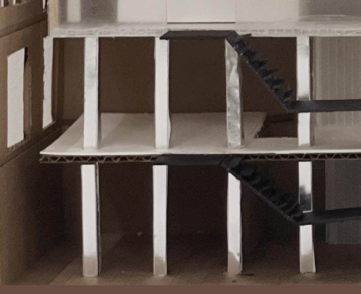
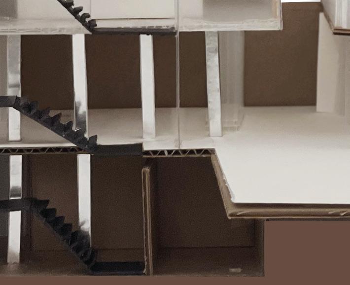
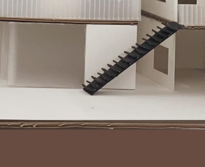

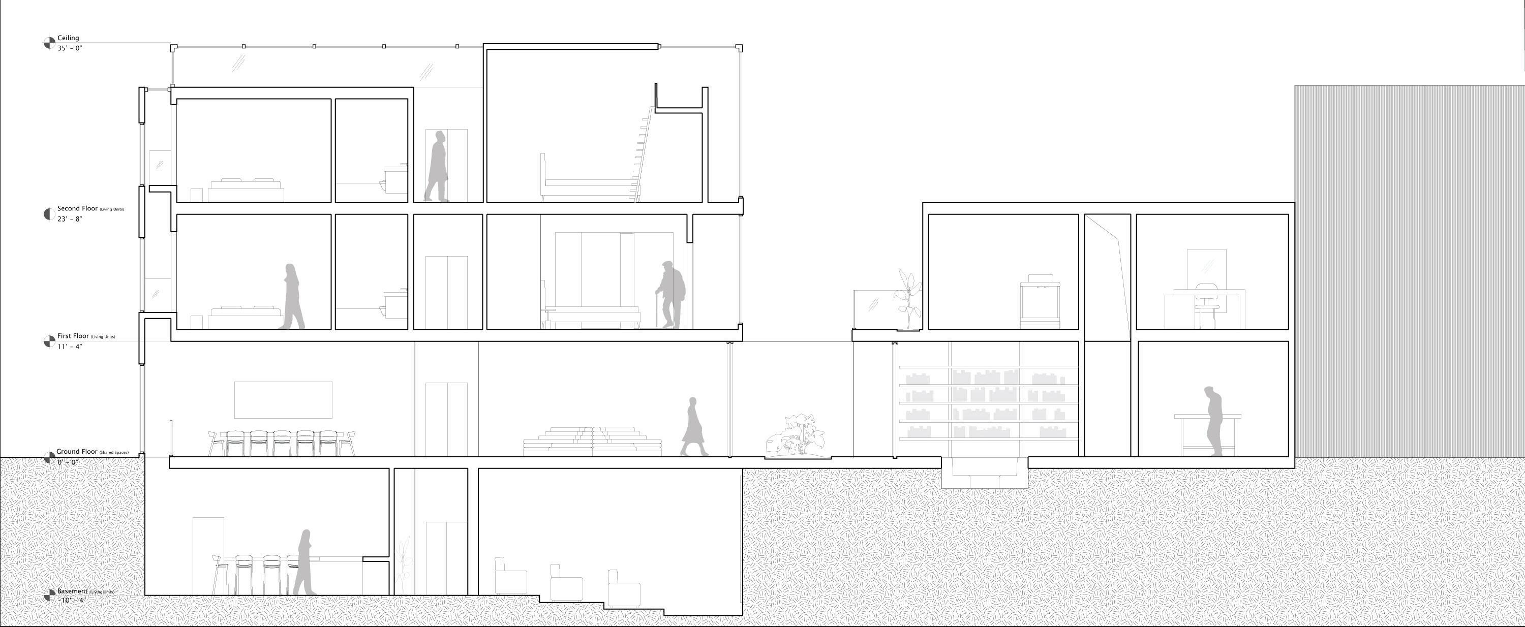












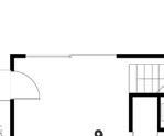
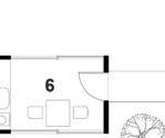
To regulate private and public spaces, individual rooms are provided and separated by in-between walkways to encourage interactions between the inhabitants. The use of translucent and solid materials emphasizes the contrast between individual and shared spaces.




Floorplans

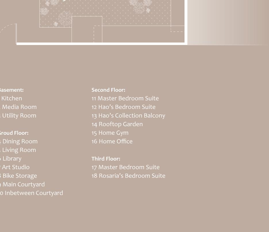
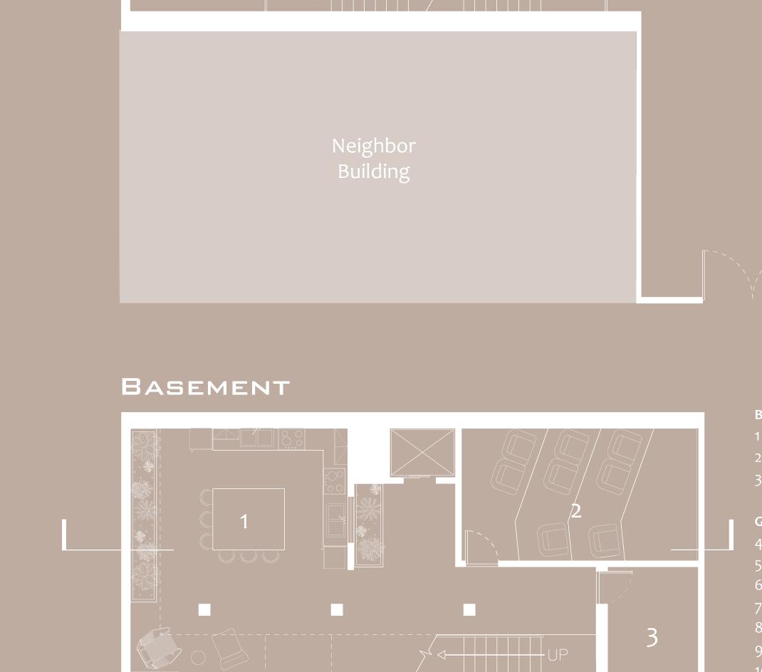
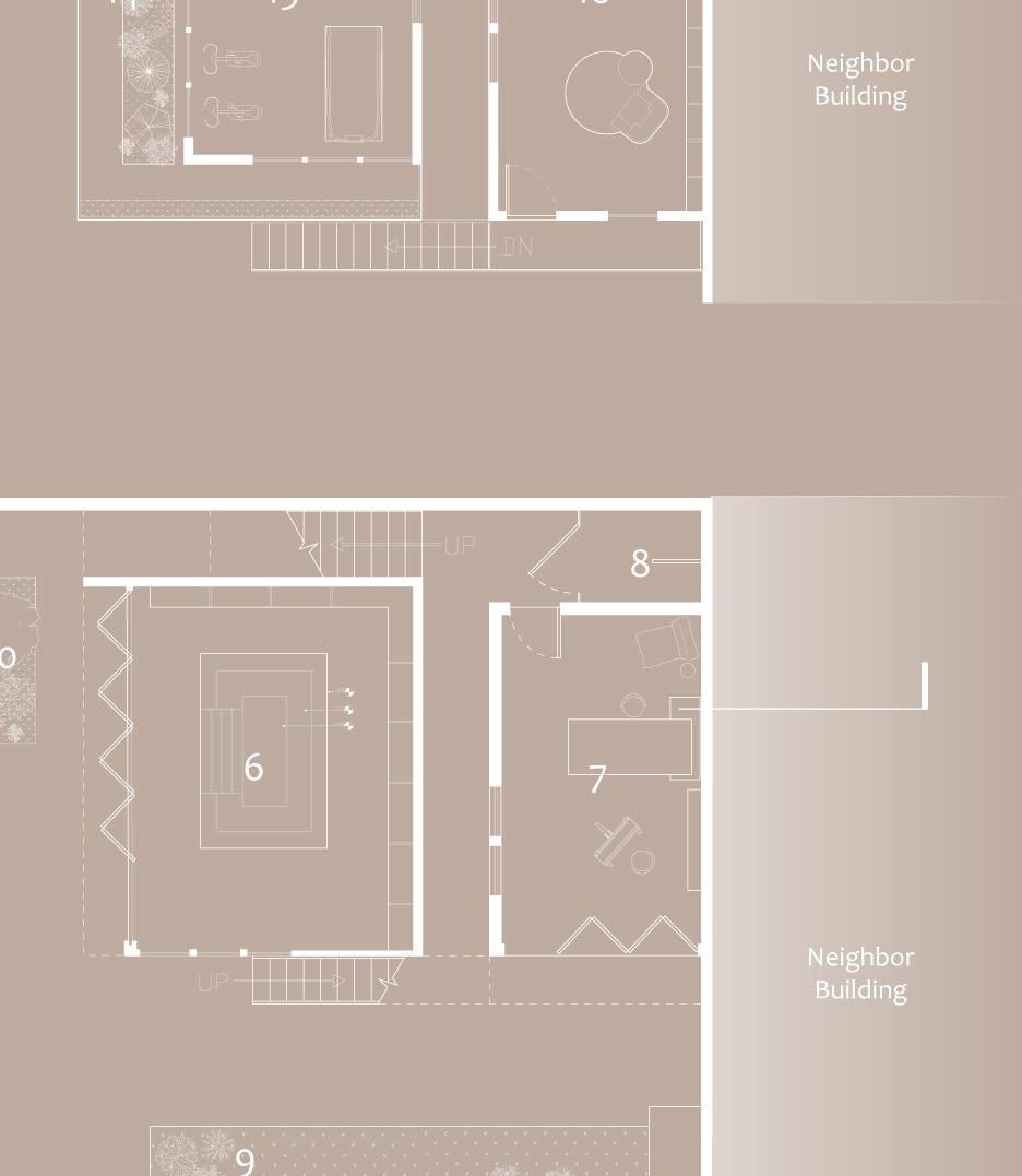
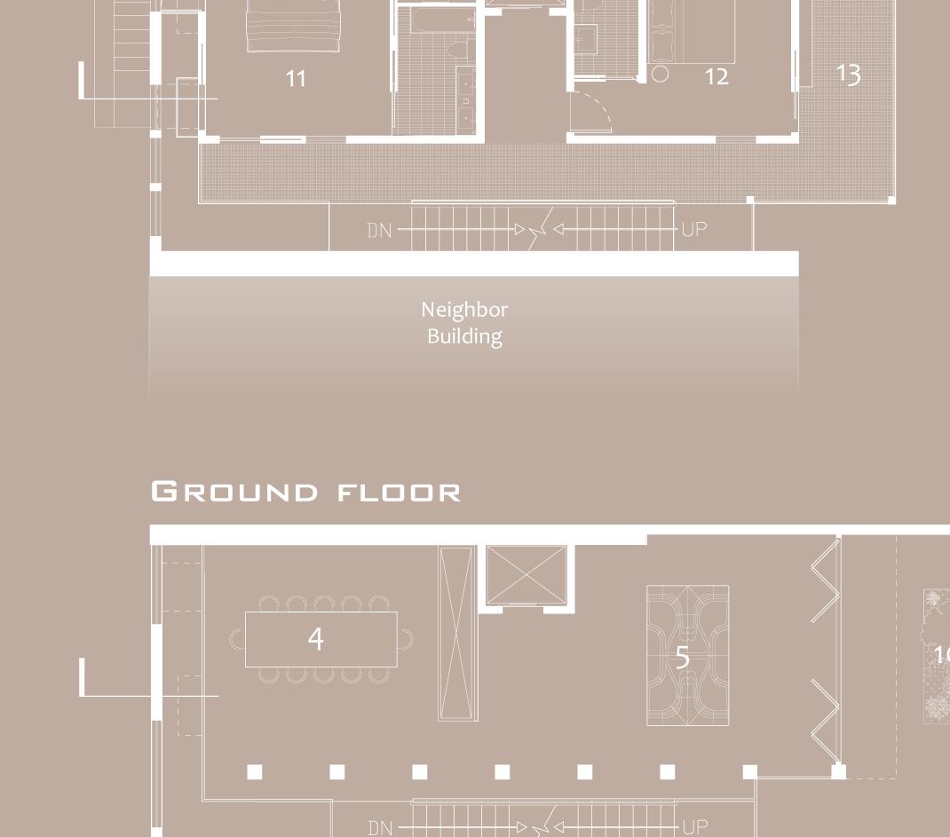
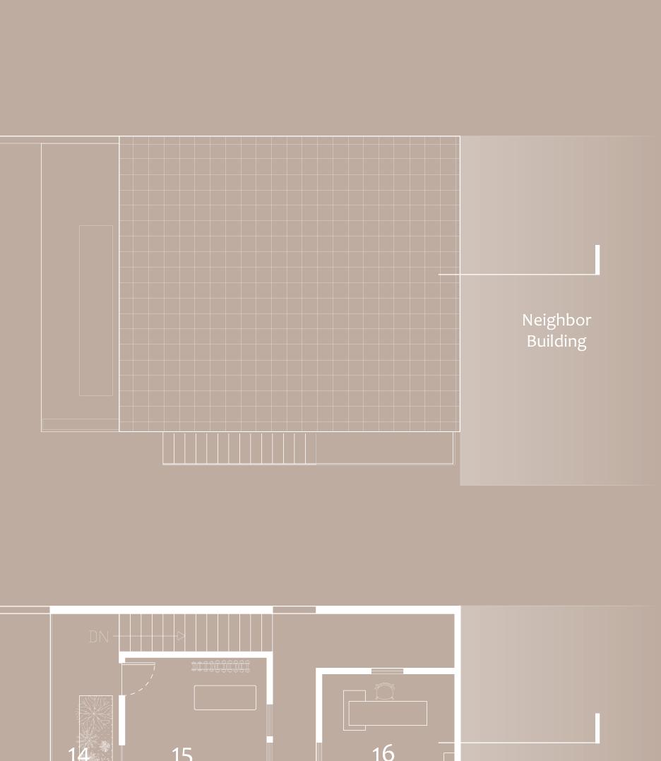
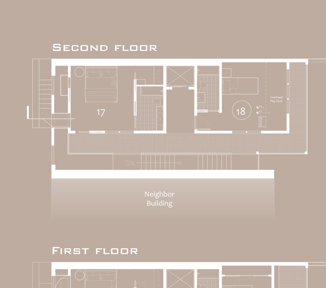
Second floor
First floor
Ground floor
Basement
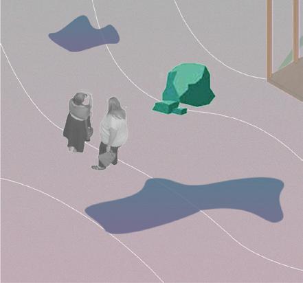
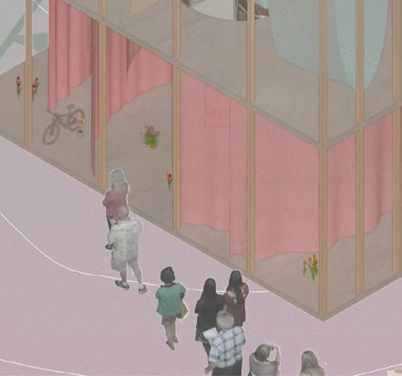
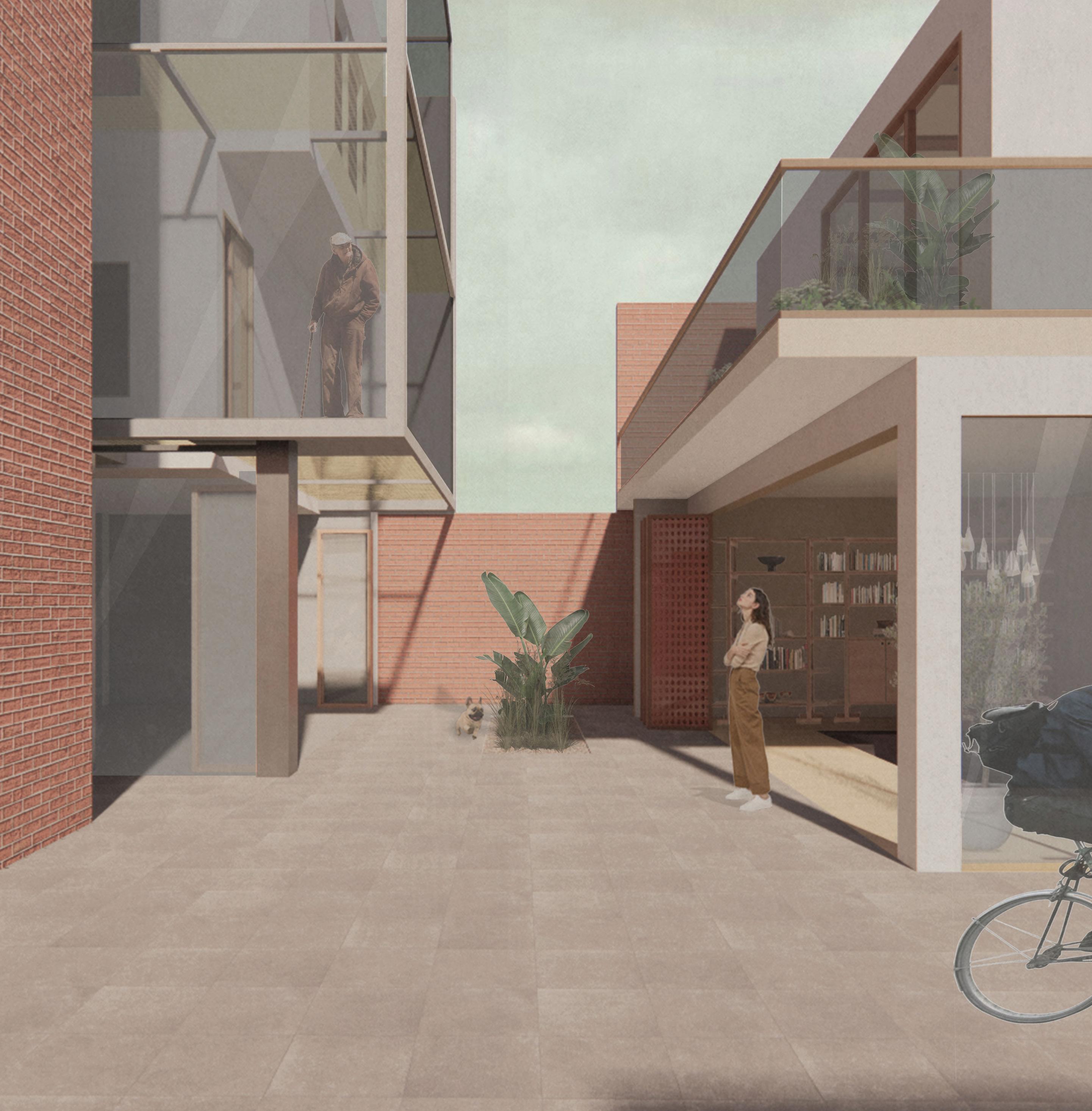
In-between courtyard | Many in-between spaces were created for habitants to see and encounter each other to encourage communication with each other
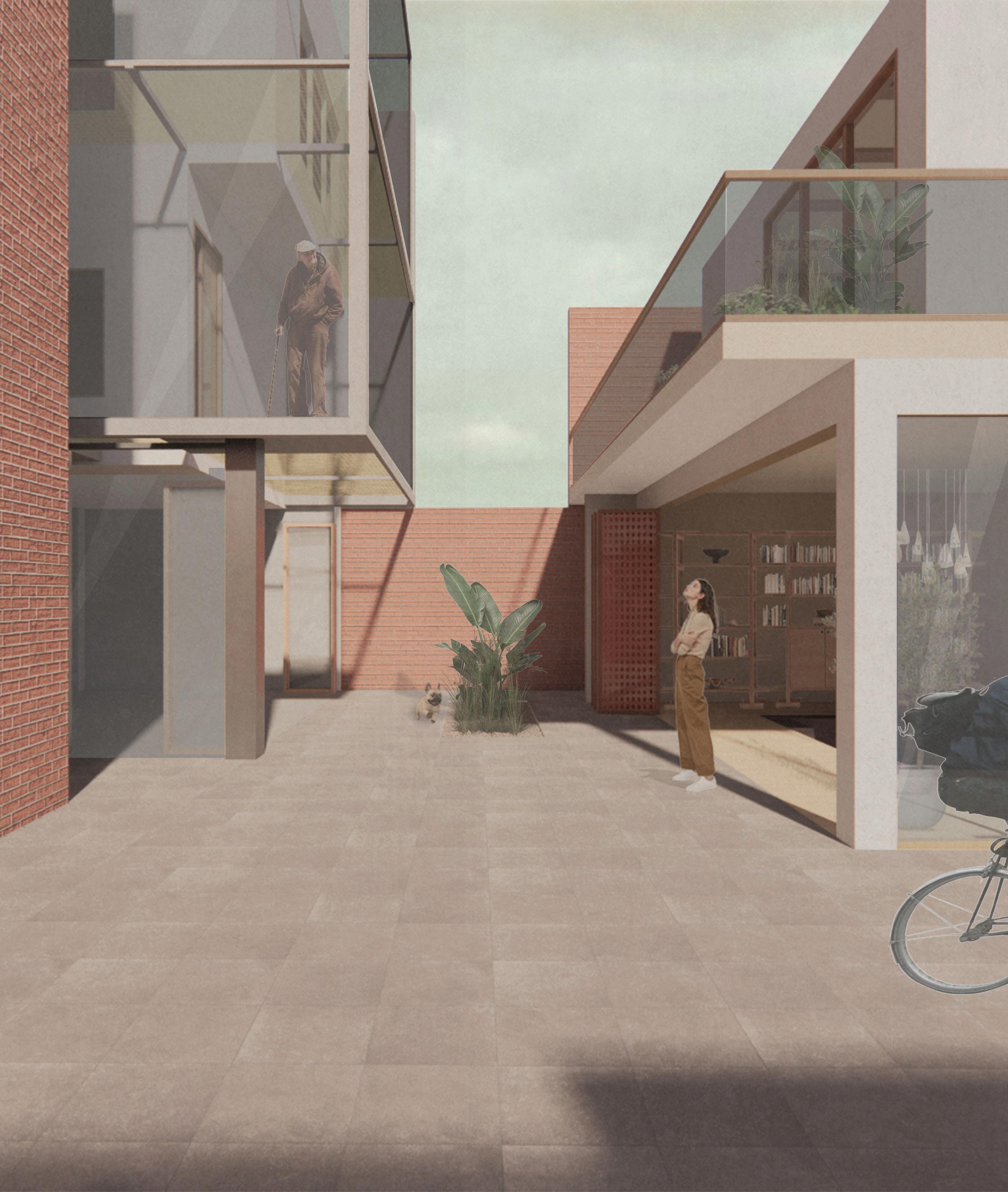
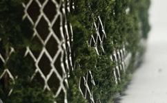
in-between space | Hallways in-between stair and bedrooms use translucent materials Ib allow sunlight coming in and to mark the difference between public and private areas
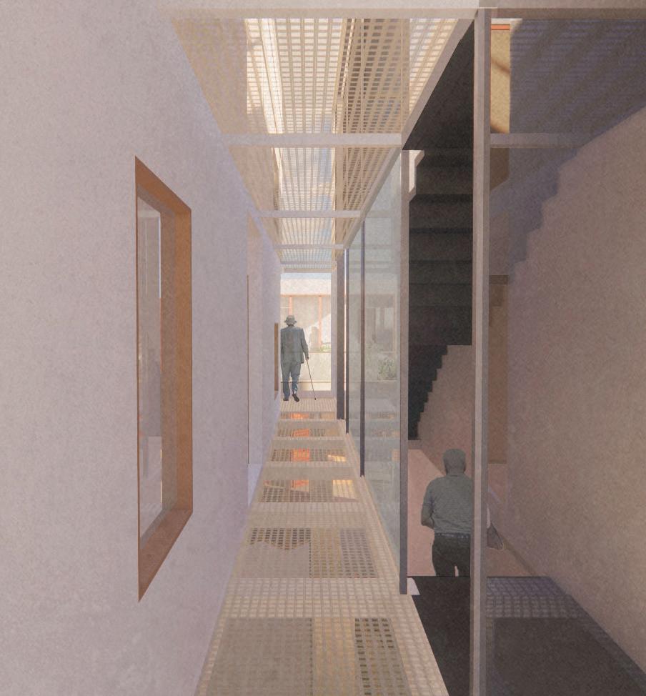

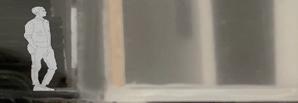


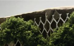
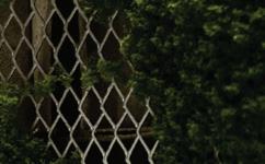
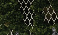
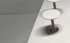
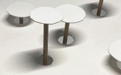
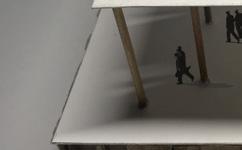
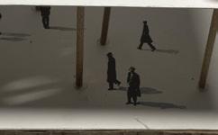
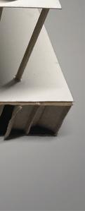
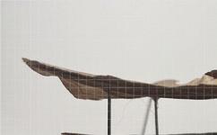
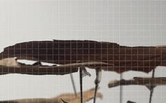
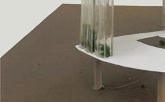
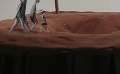
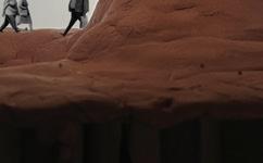
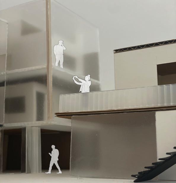 Model photos | Visual interaction between different building units
Model photos | Visibility between building units
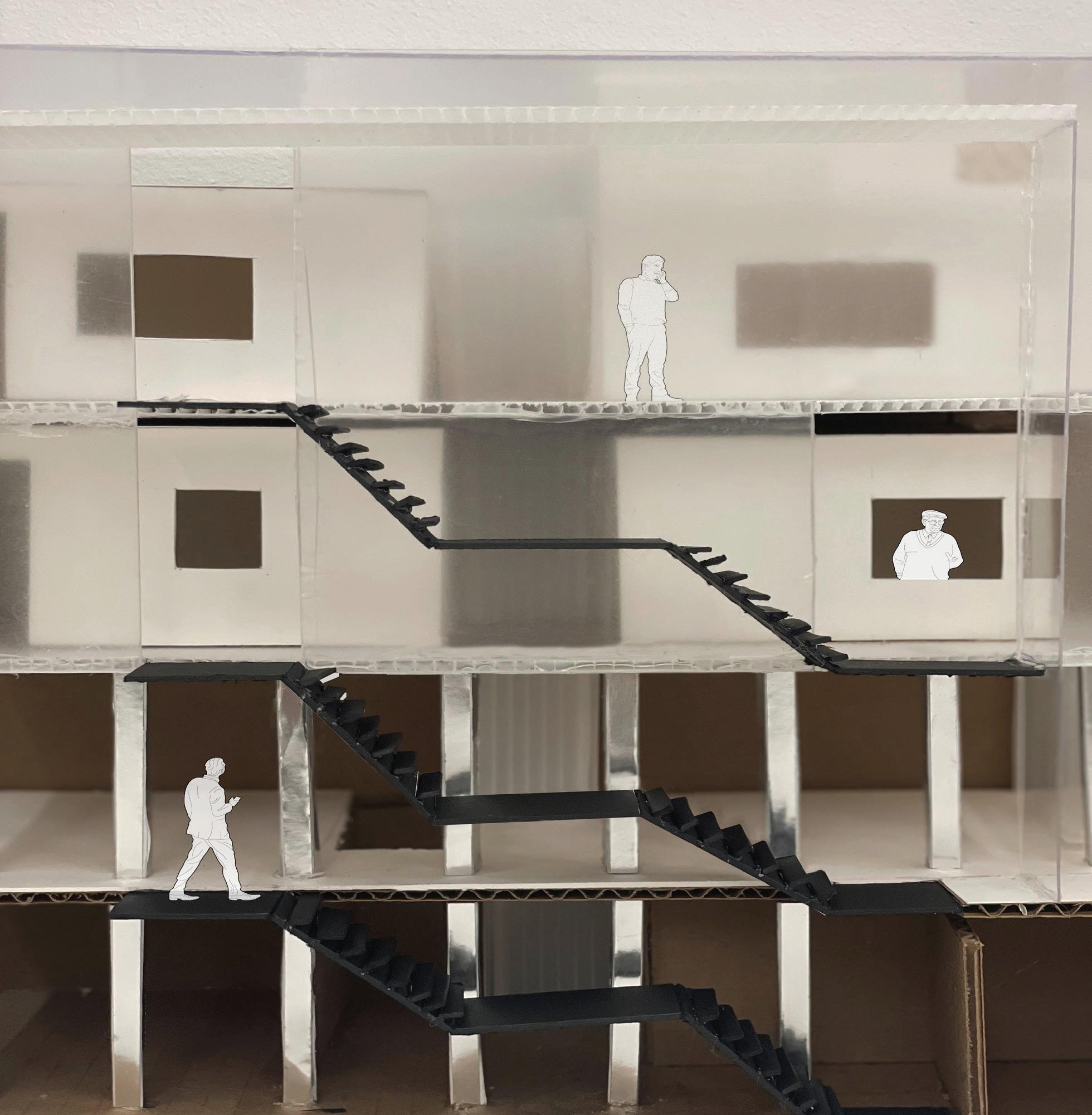
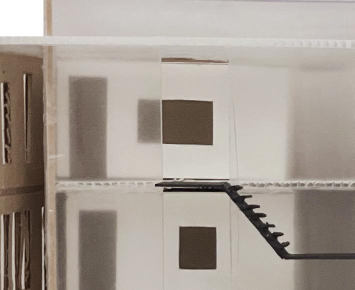
Model photos | Looking into the stair connecting to the living unit.
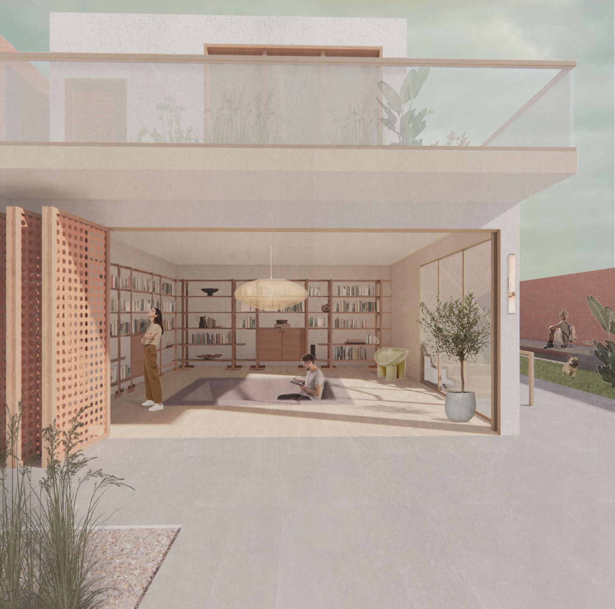
home library | Looking from inbetween courtyard into the home library
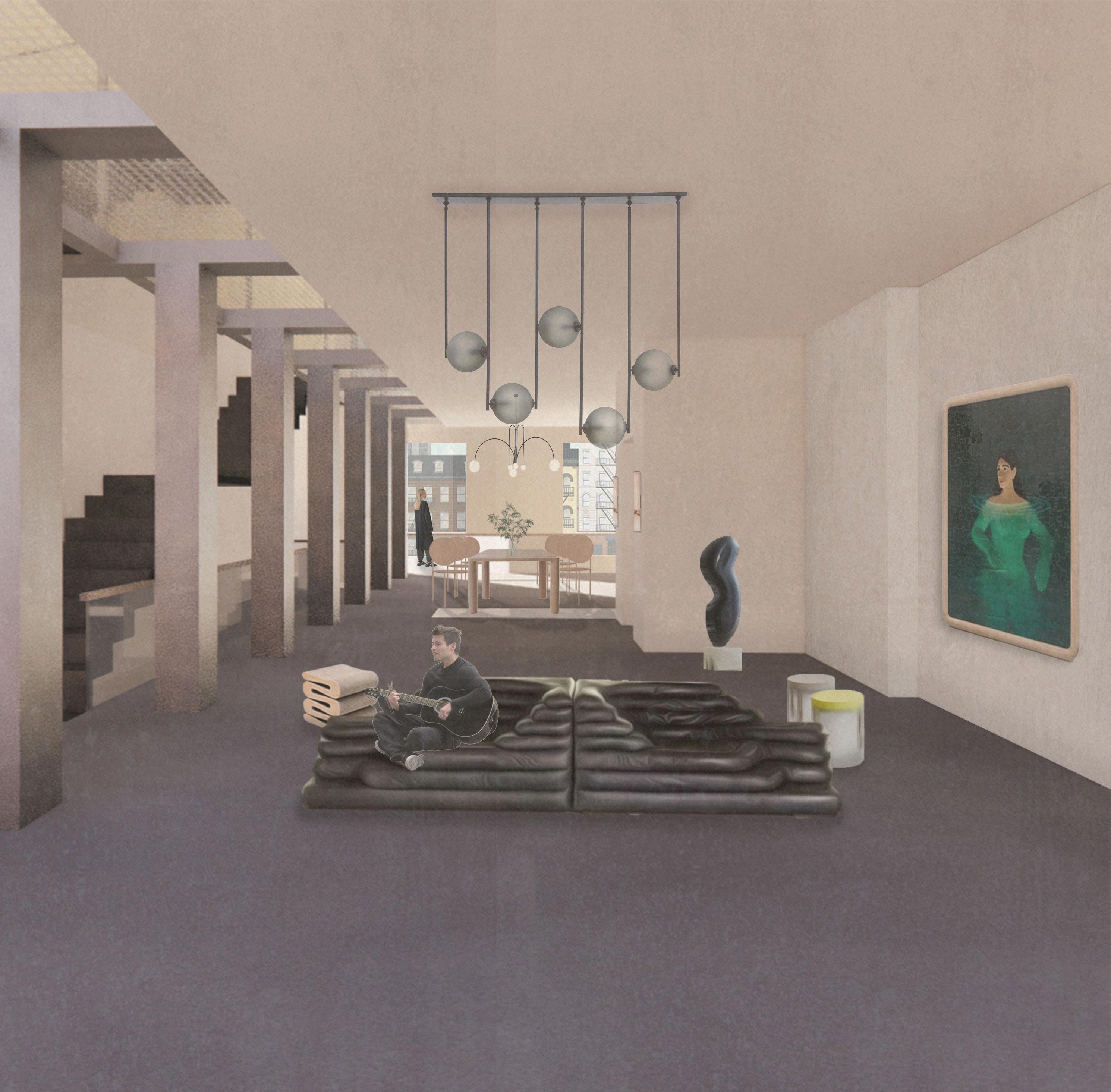
shared space | Living room & dinning room






an office of flexibility, mobility, and openness






Instructor: Francine Monaco

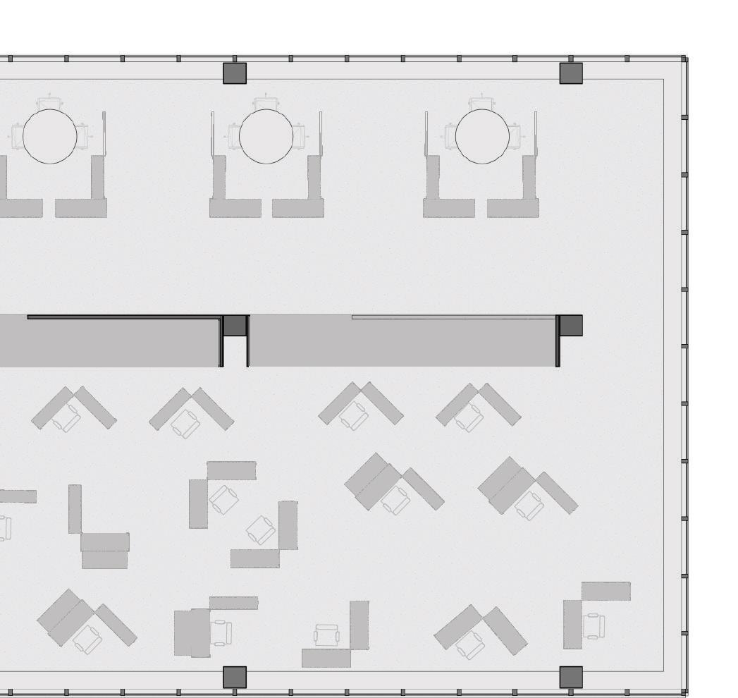
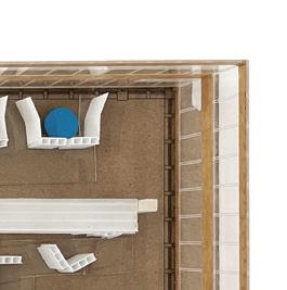
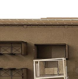
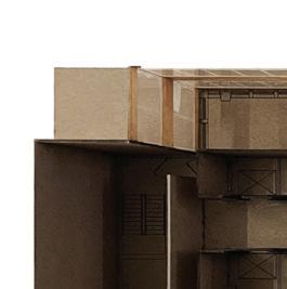
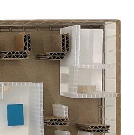
This two-story office space was designed with mobile and fixed components to accommodate the current staff structure, working process, and client requirements of RETI Center. Four mobile unit types, distinguished by different materials and colors, were designed for various purposes. Longitudinal unit collectors were placed at the center to store units when not in use. All mobile units can be moved to RETI Center's next office site due to the site's two-year operational limit, minimizing waste and reconstruction. Pivot components were installed on the second floor to form more stable staff with individual offices.
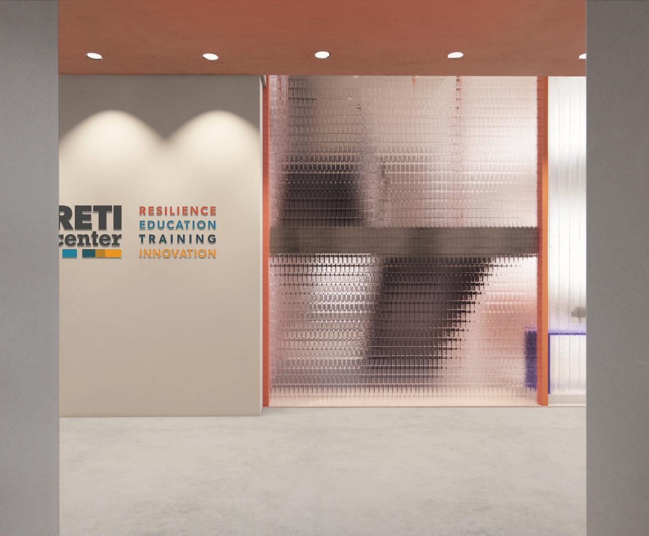
Flexible staff structure

Part-time employees Groups formed base on different projects
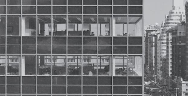
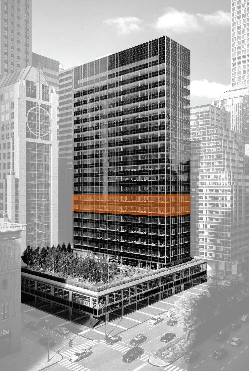
The iconic building with a clear glass facade, the Lever House, is donating its 8th and 9th floors to the RETI Center as the organization's new office space for two years. To minimize waste and reconstruction, the design focuses on creating less permanent components that the client can reuse in their next site.
Enhancing collaboration Possibility for problem solving

Event & Exhibition Training & Consultation

The office's design strategy is based on RETI Center's flexible working structure, creating a transformative office that adapts to its functions and activities. Key components were extracted and simplified for mobility, then sorted and combined to form a movable unit system. The system allows people to pull together units with the components they need to create a customized space for individual or group work.
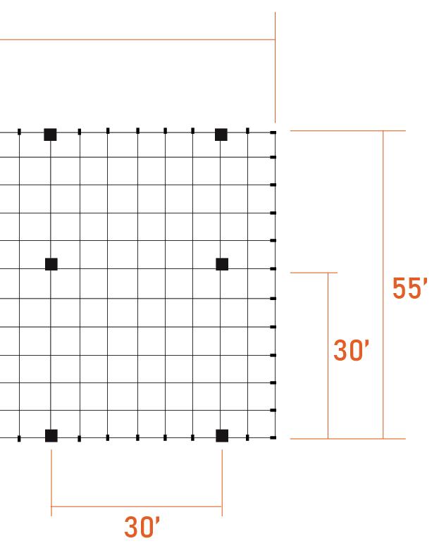
 Site: exterior facade pattern
Key components needed for all functions
Creating spaces based on activities
Different ways to form space









Mobile units catalog
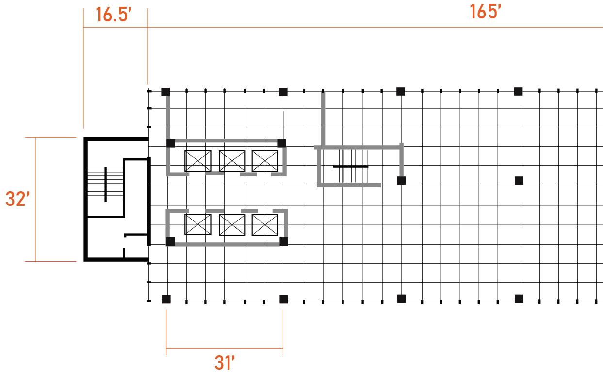
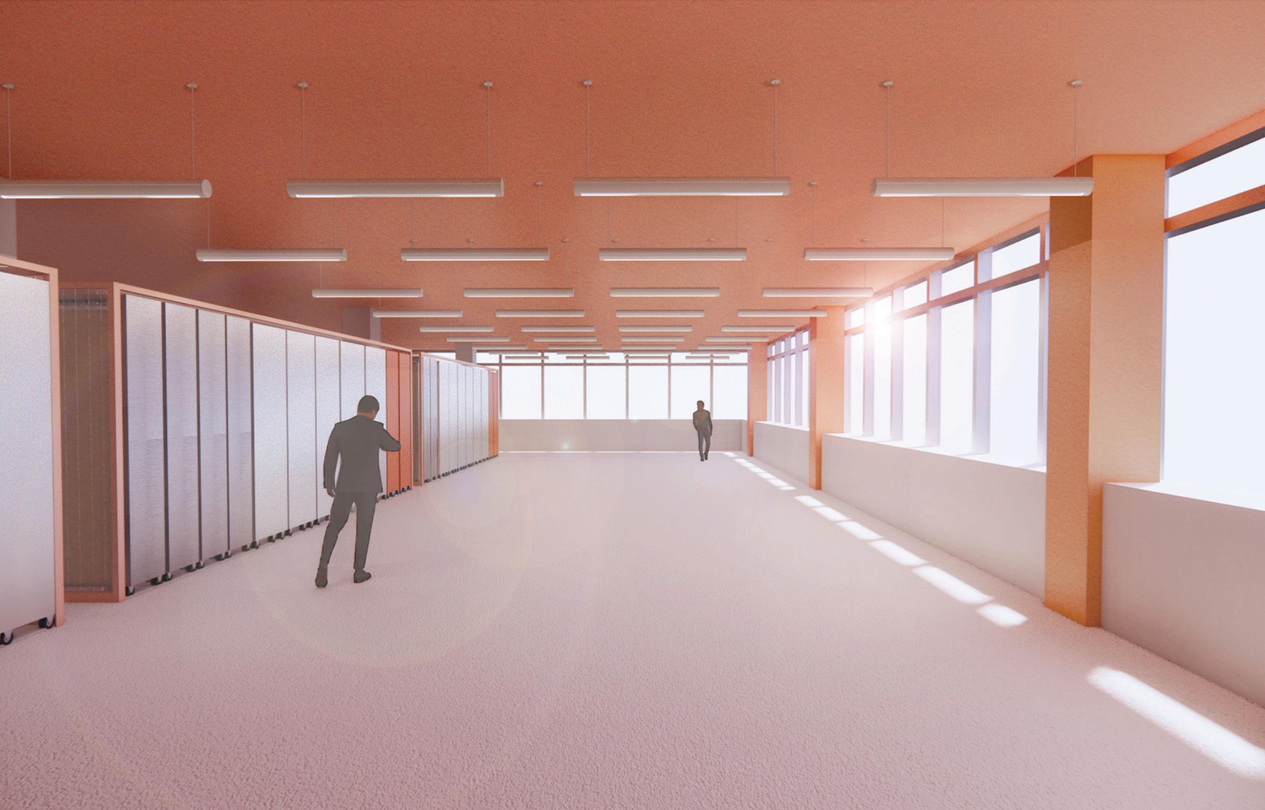
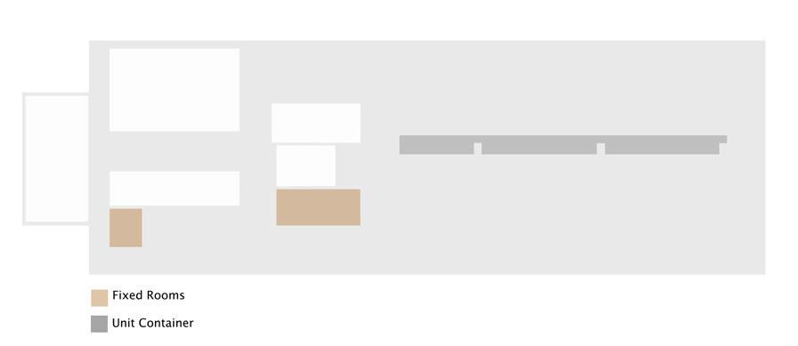
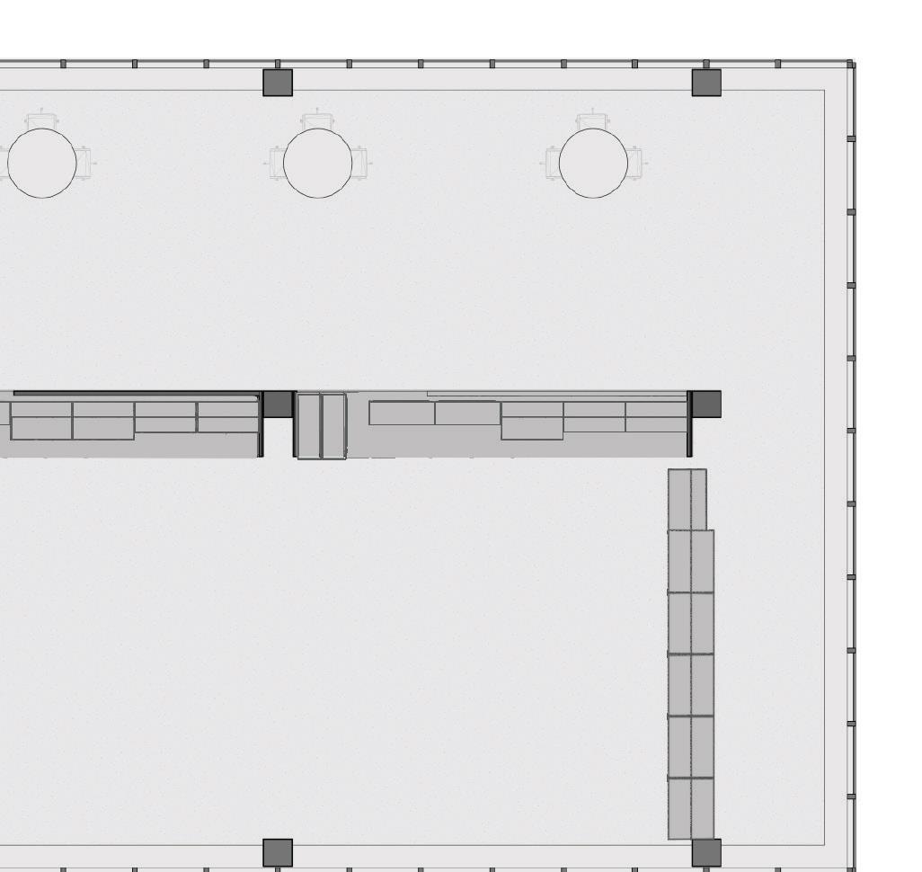
Open plan | Unit collectors located in the center of the floor plan allow the whole space to be opened up when all units were collected. The units could be easily moved to RETI Center's next location after two-year usage of the current site.
Event |

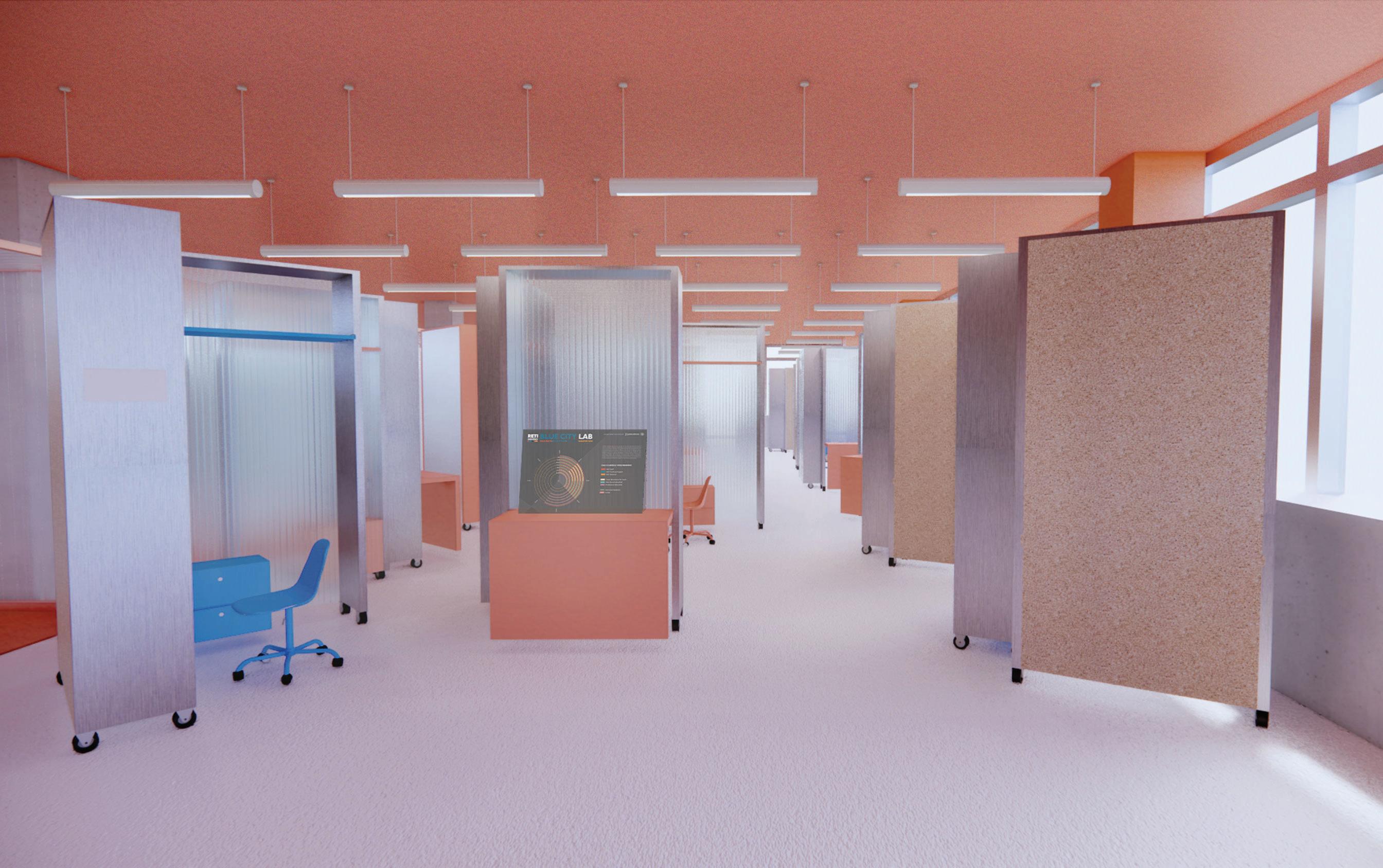 Units can be aligned to enclose a space for speech or workshop, the unit also includes lockers, display, and projection.
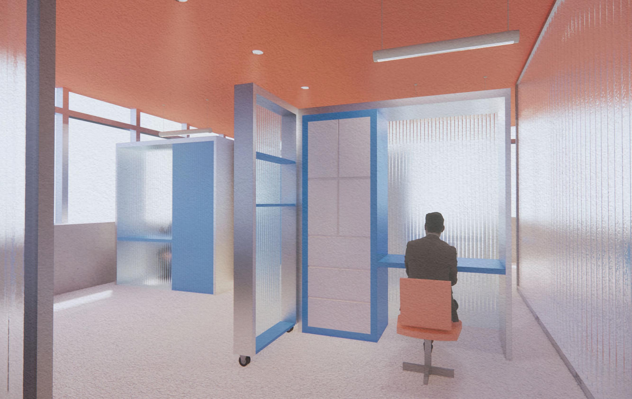
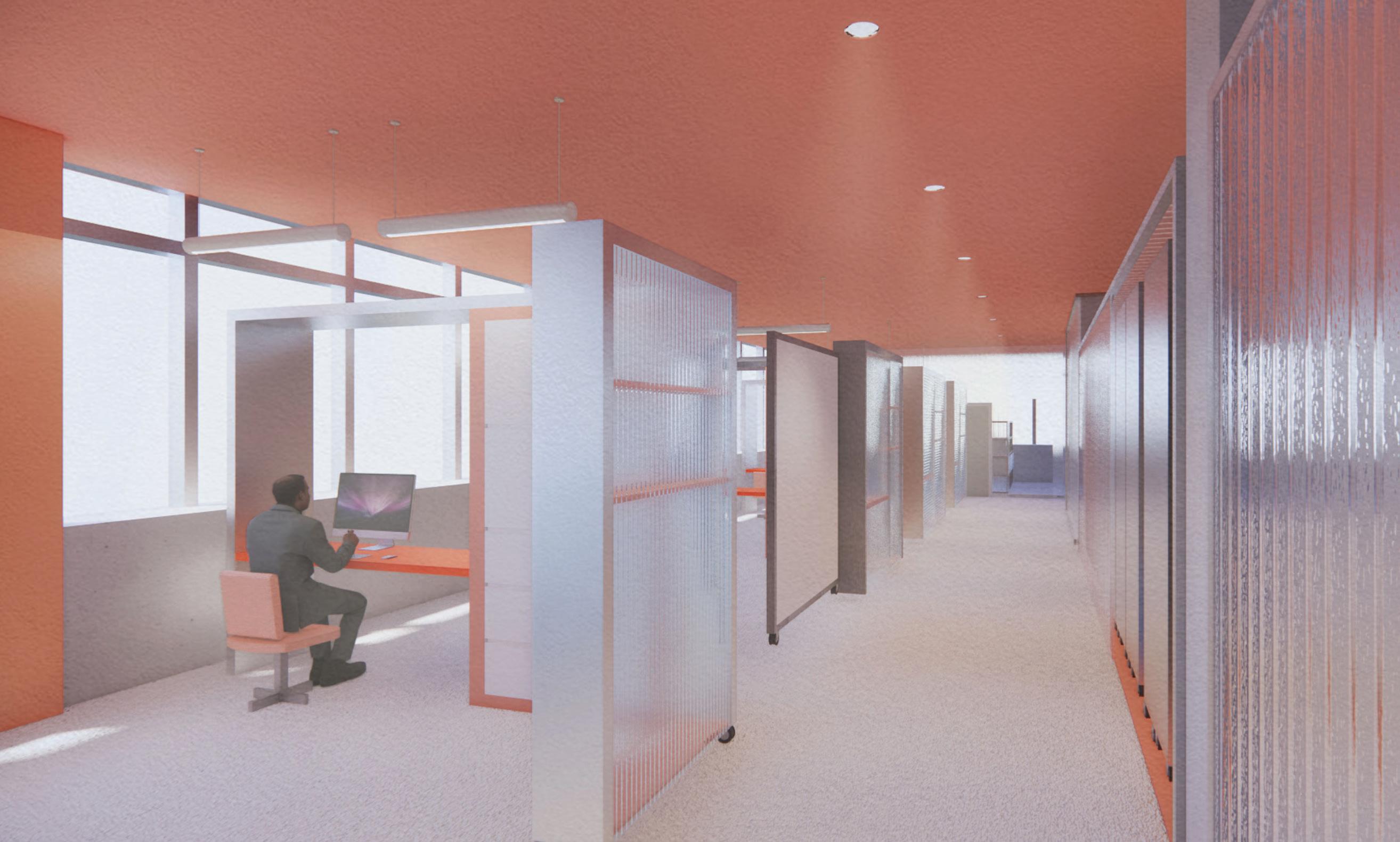
Office | The day-to-day mode of an office is formed by spreading and opening the workstation units assigned to individual employees.
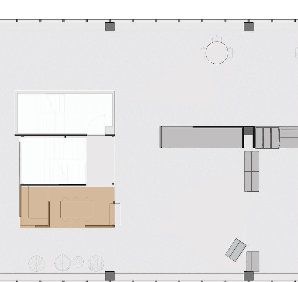
8th Floor | Units spread as workstations
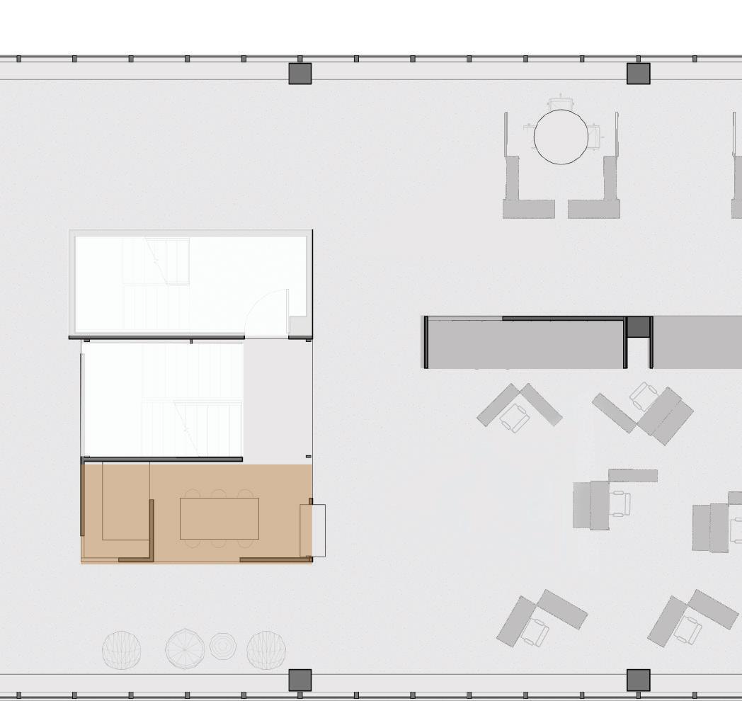
8th Floor | Units aligned to form event space

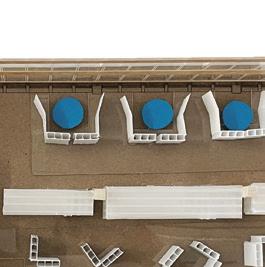

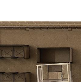
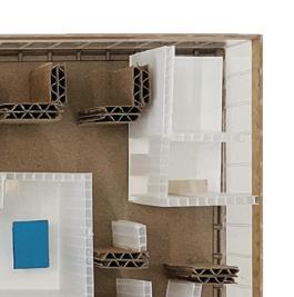
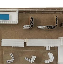
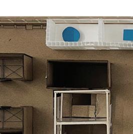
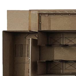
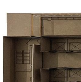
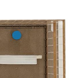
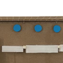
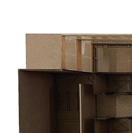
Sketch model | Conveying the concept of flexible spatial strategy








9th
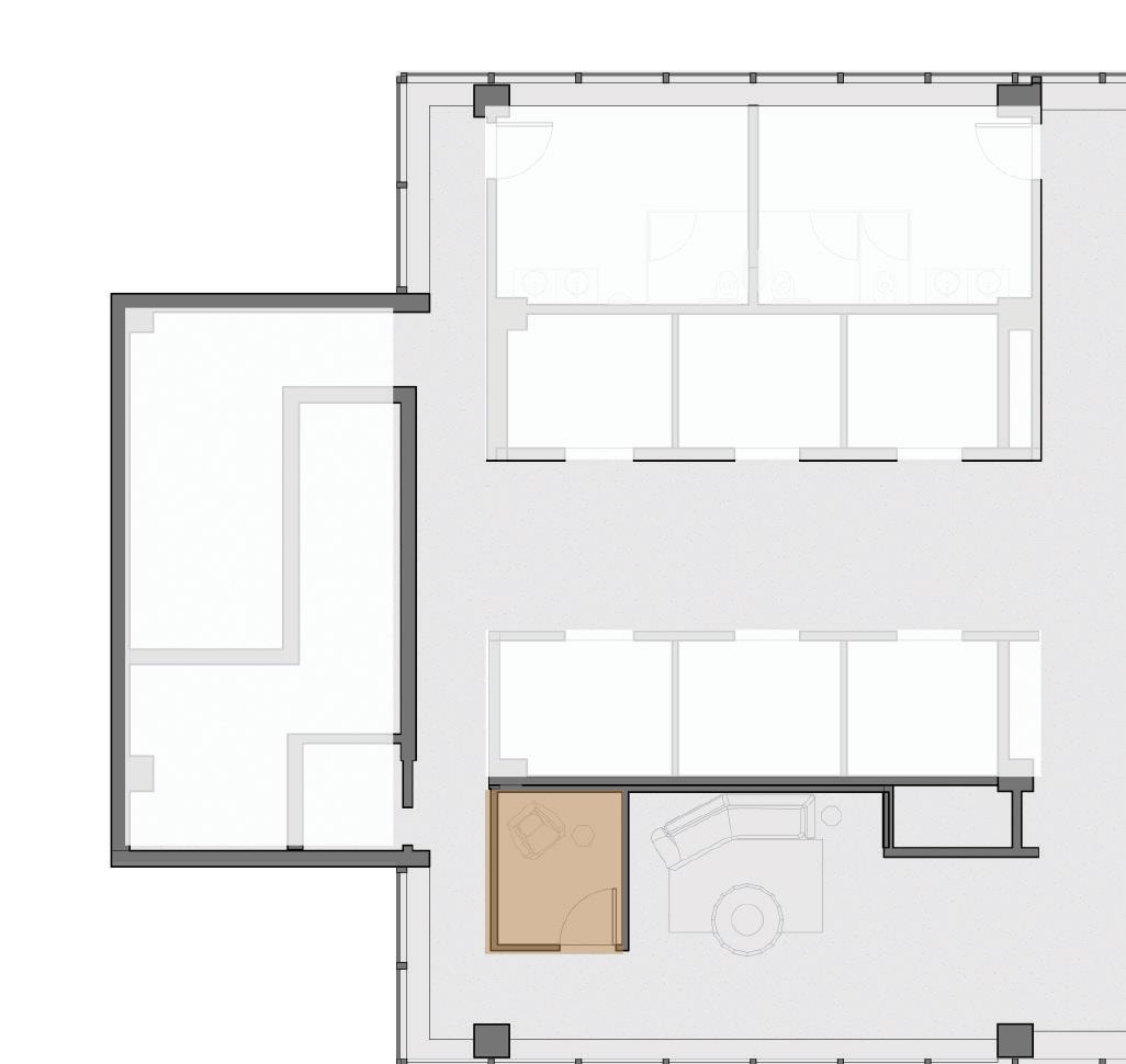
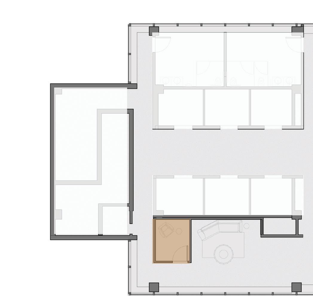
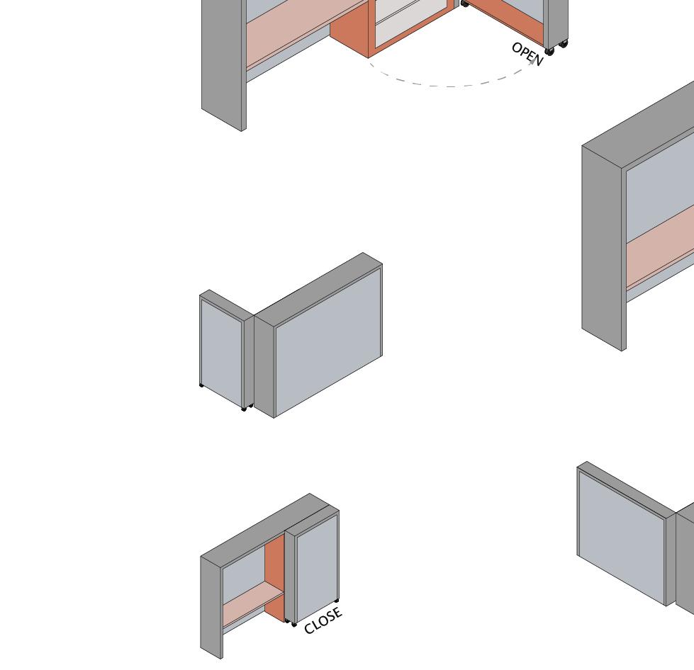
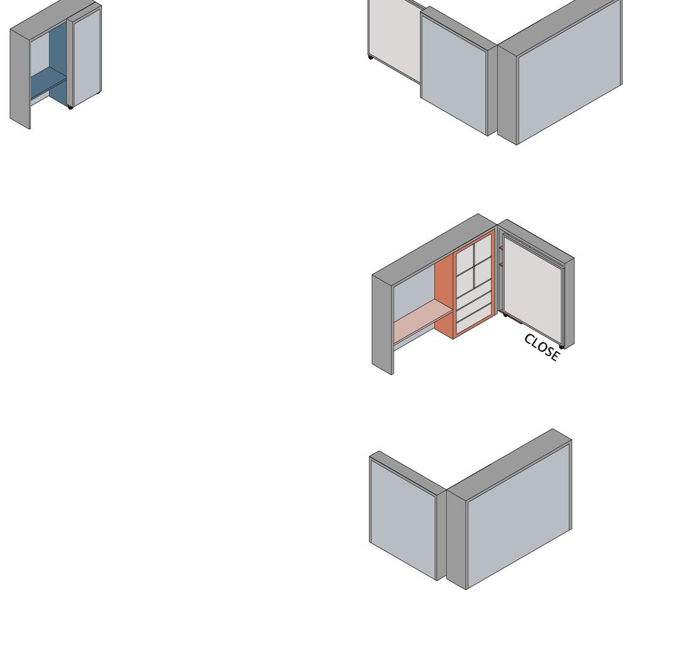
 floor fixed office | Offices for high-level staff occupy more space and more storage.
9th floor fixed office | Fixed offices for full-time staff have less space but the fixed location and more storage space.
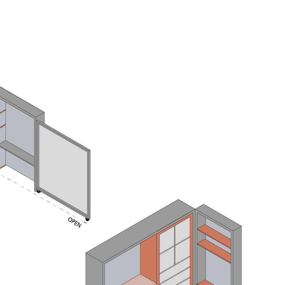
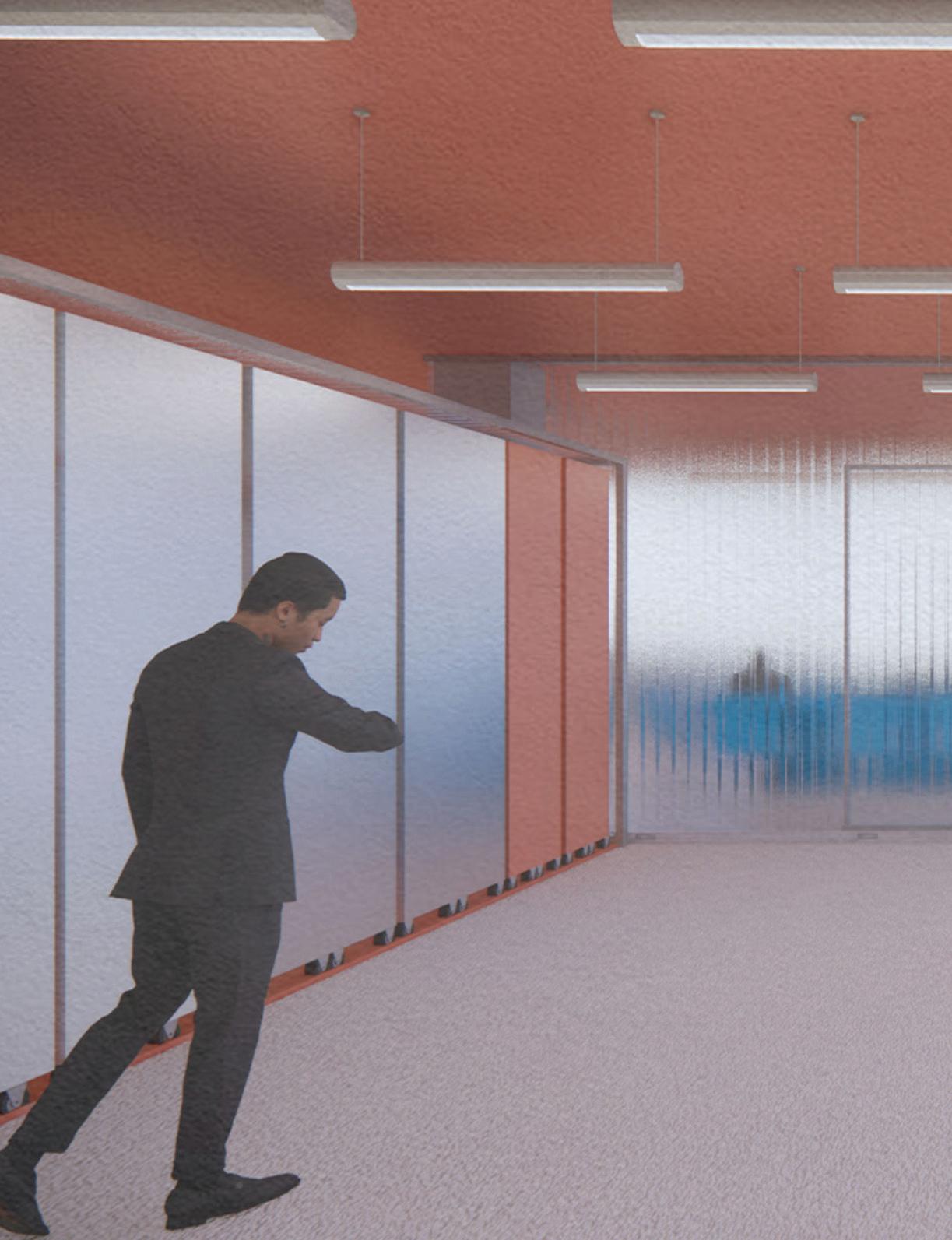
Fixed office units | A more stable unit system was developed on the upper level for permanent employees and the administrative department. These units have one fixed part on the floor to demarcate a room and another movable part that can be opened or closed.


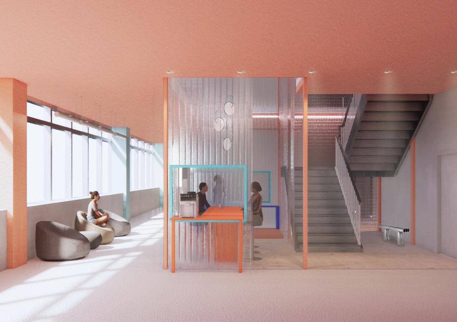
 Employee's lounge | The cafe, lounge, and reception areas were all located next to the stair.
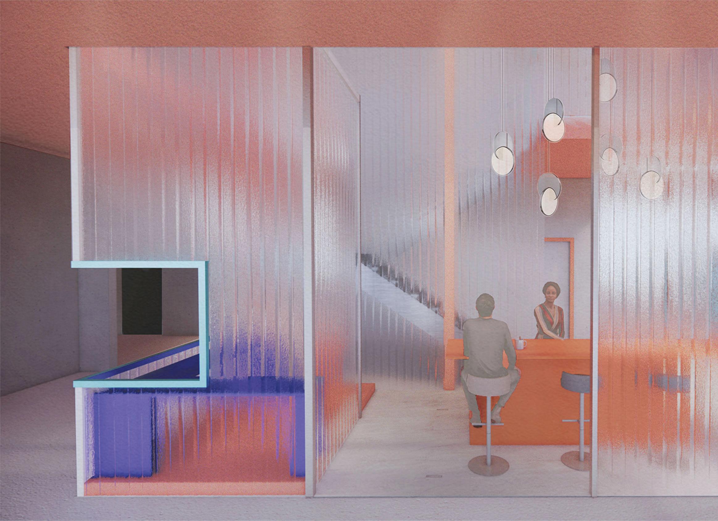
9th floor conference room | Fixed offices the upper floor, enclosed by translucent glasses from the inside.
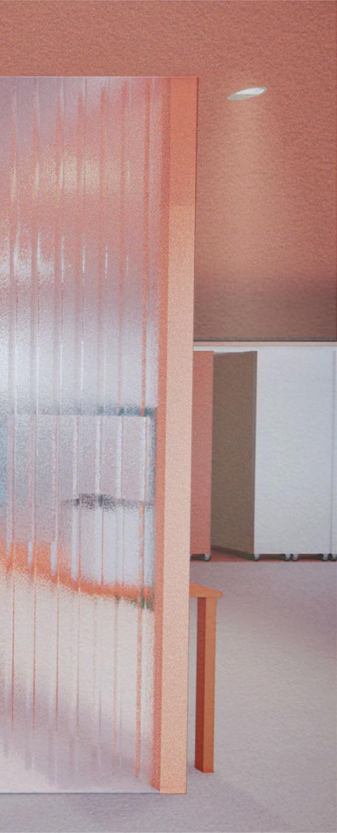
offices and meeting rooms are located on glasses to reveal colors and movement
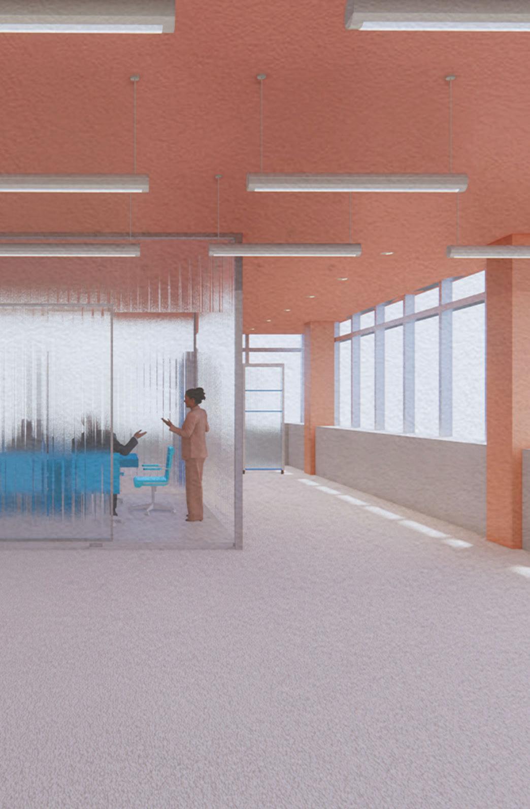
Material selection | The use of transluscent glass make the space feels more open and connected. It also brings more color by revealing the colorful furnitures from each room.
employee's lounge & reception | The central volume that connects the lower and upper floor.
a center for black transgender community
spring 2021
Instructor: Virginia Black
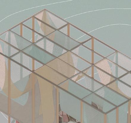
The Candy-like Space is a gathering space for GLITS, a transgender community based in New York. Located in the cellar and rooftop of a 12-unit apartment building, the project was designed with founder Ceyenne Doroshaw's specific requirements for aesthetics and program layout. Playful and comfortable, a candy-like color palette for each room were developed from a candy image to create a welcoming environment, with a focus on purple for visual impact. Light and reflective materials interact with color frequently throughout the space to create a candy effect. We also developed a cabinetry system to provide flexibility and color


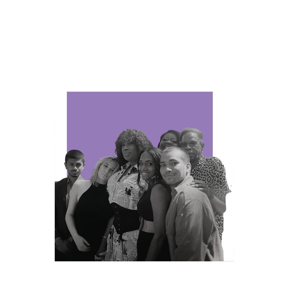
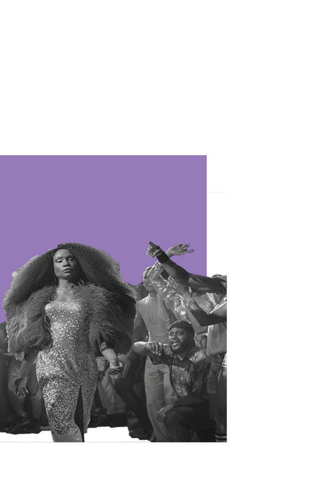
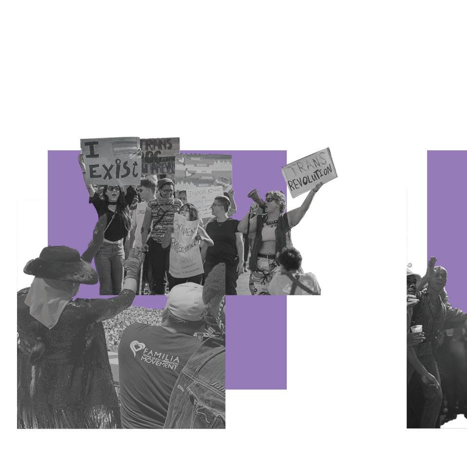
A grassroots organization dedicated to supporting the LGBTQIA+ community on a global scale
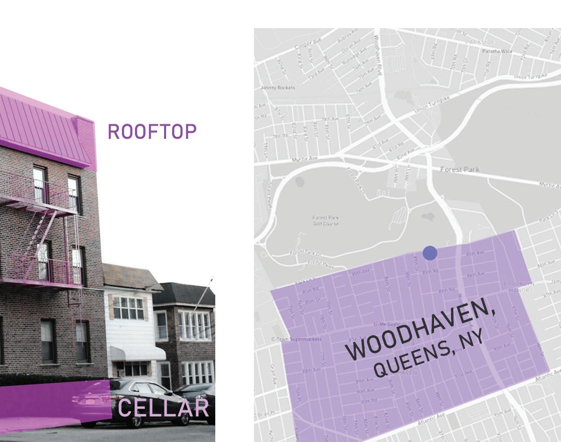
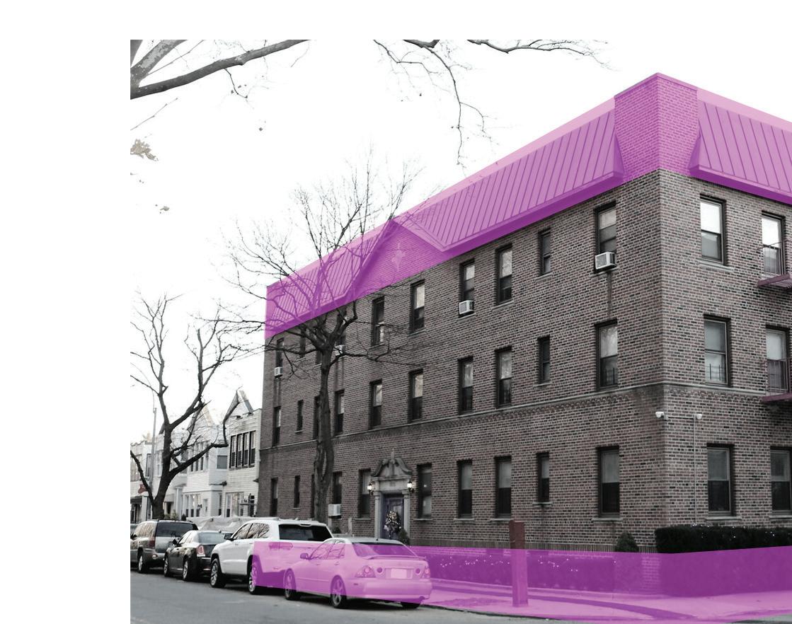
Site | The project is located in Woodhaven, Queens and includes the cellar and rooftop of a 12-unit apartment building. It provides long-term stable transitional housing for members of the LGBTQIA+ community who experience homelessness. The cellar and rooftop also serve as a gathering space for the GLITS community and are occasionally open to the public for events.

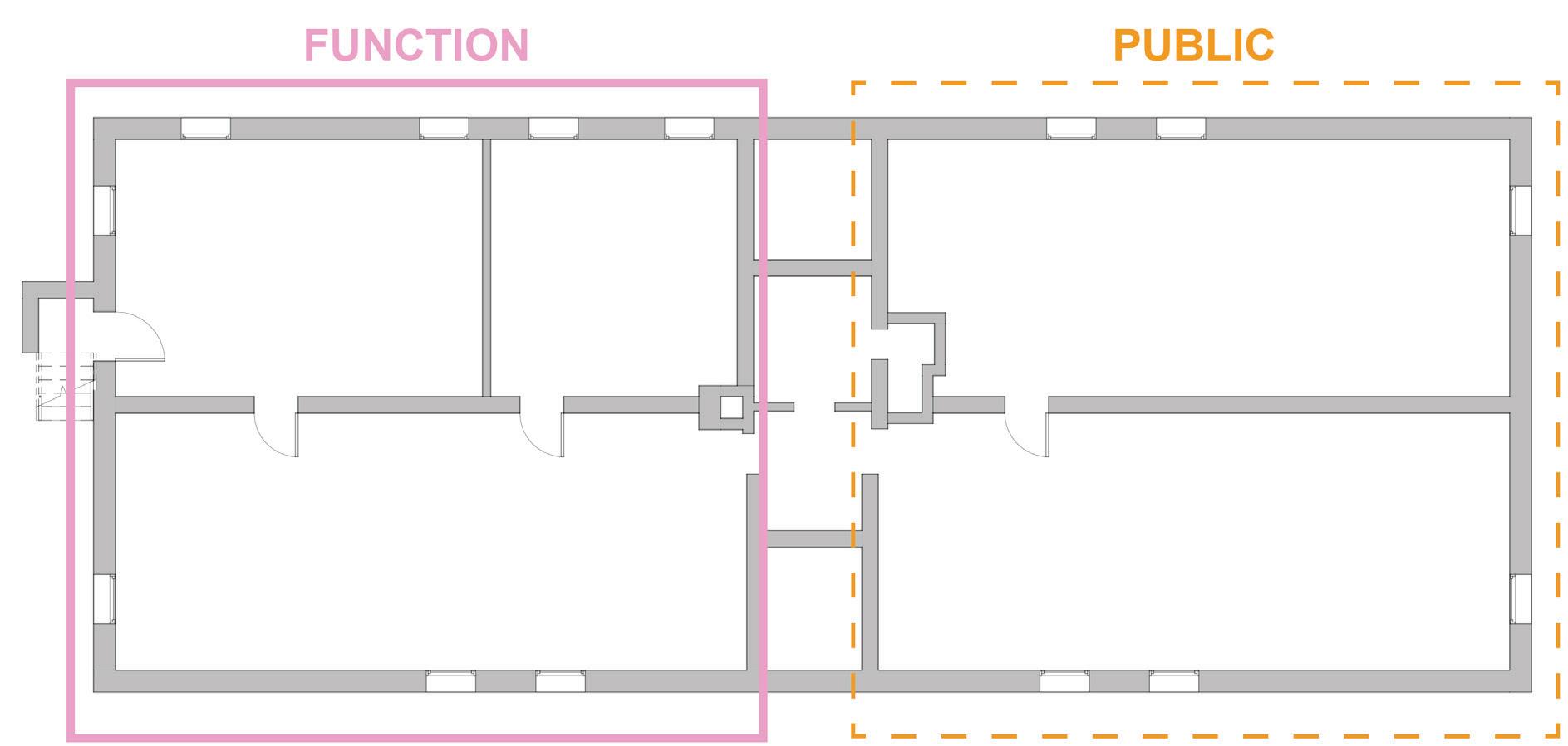
Initial cellar space planning | Since the programming was given by the client, an emerging spatial division between public-facing and the private-facing area was developed.
 The founder of GLITS, Ceyenne Doroshow, is dedicated to providing holistic care to LGBTQIA+ sex workers and enjoys cooking for the commu-
GLITS is a prominent advocate for the rights of transgender and sex worker communities, aiming to address systemic oppression in marginalized groups.
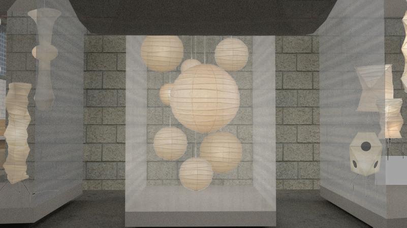
With specific aesthetic preferences, Ceyenne has a fondness for the color purple and chandeliers.
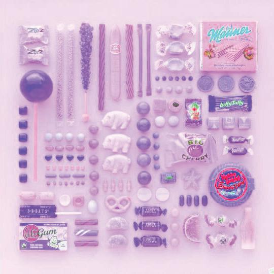
Inspiration | Color palette extracted from assorted candy.
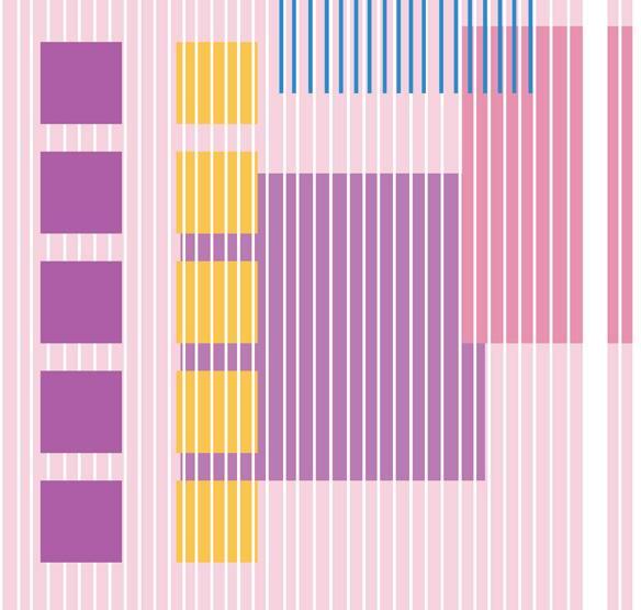








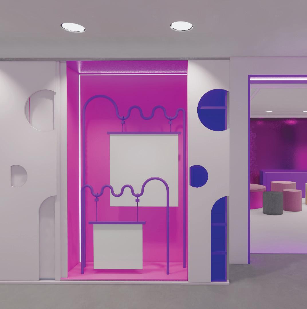
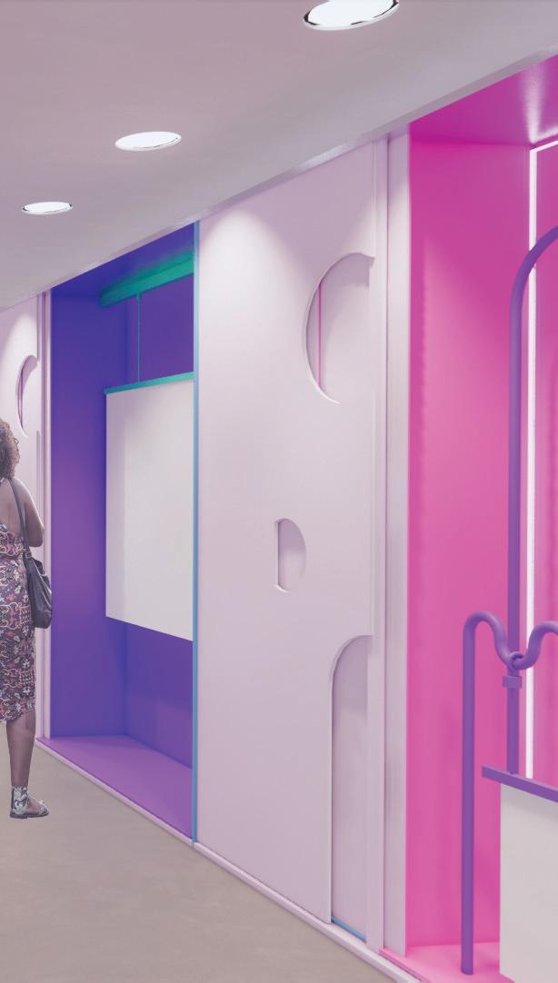
Flexible design strategy | To make the space more versatile, a key design element was developed: the cabinetry system, which can easily transform the space according to different functions. This system was then expanded into all rooms for additional storage space as per the client’s request, and also for other purposes, such as a divider for the phone booth.
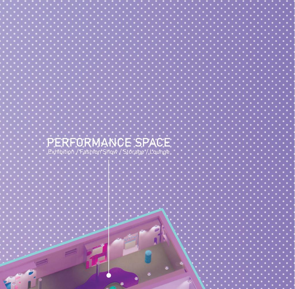
Cabinetry system | The performance space is designed to be versatile and adaptable to different functions through the use of cabinetry system. These functions include exhibitions, computer labs, and storage, each marked with a different color. This allows the client to easily transform the space and create a different atmosphere by simply sliding or opening the cabinetry doors.
Cabinetry variation | Similar cabinetry units were created and utilized in other areas to provide functional spaces and storage, such as partition panels and storage for the phone booth.
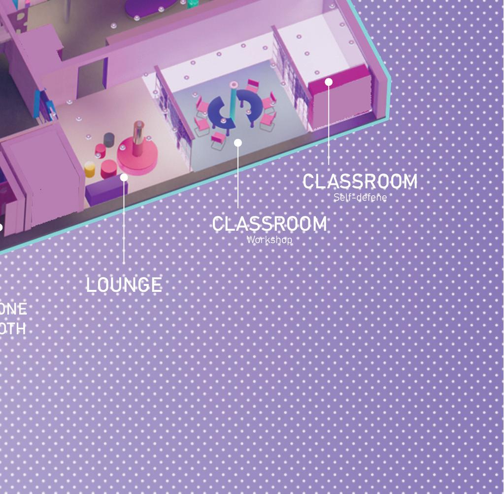
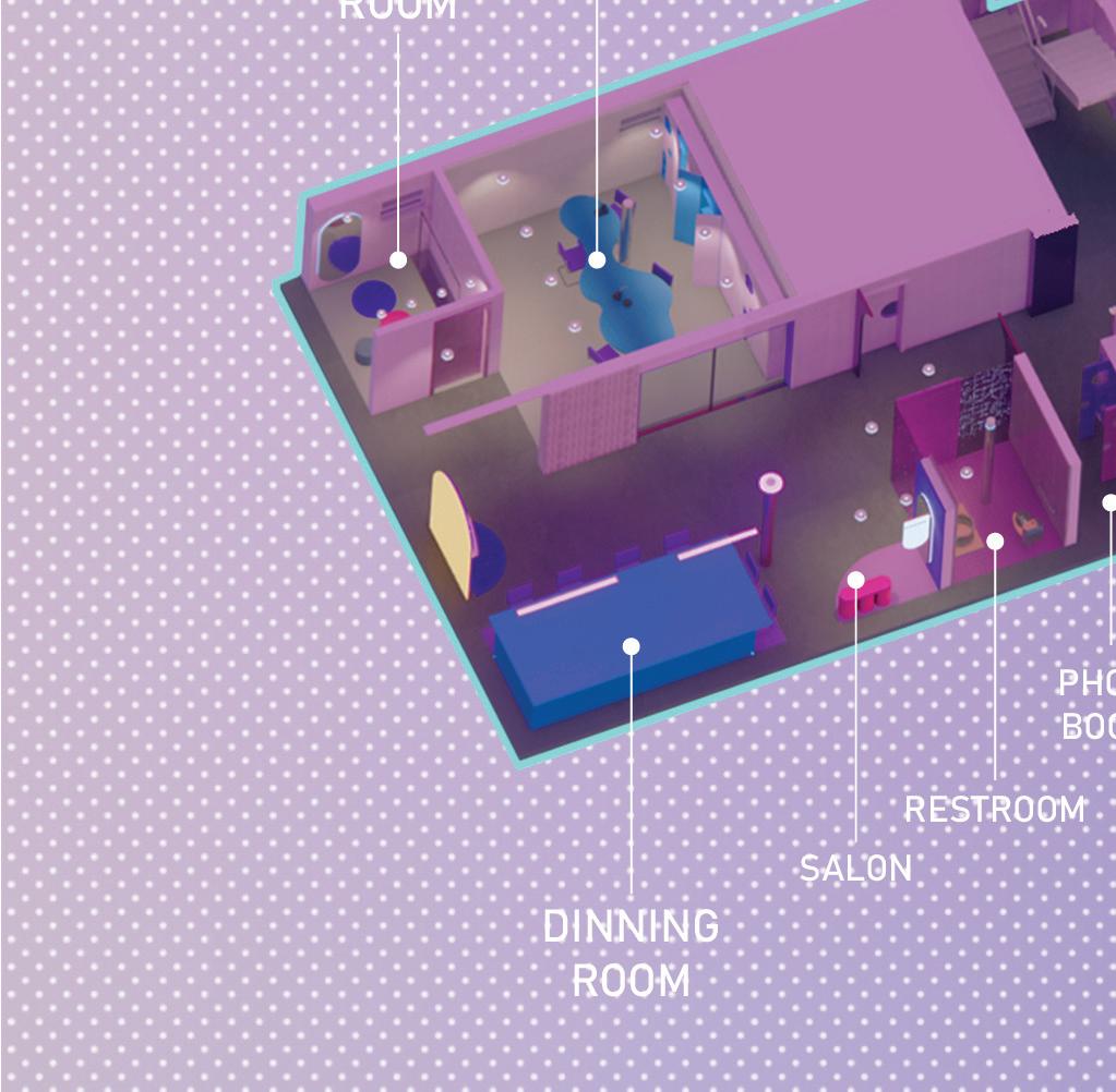
Cellar axonometric | The cellar serves as a space for both apartment residents and community members to gather, receive continuing education, training, counseling, and career development. This is achieved through weekly guest lectures, workshops, exhibitions, events, and more.

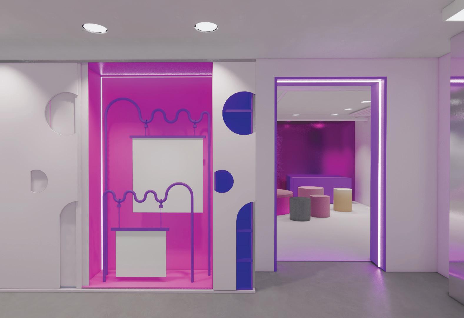
Display methods | Hanging system for display or projection.
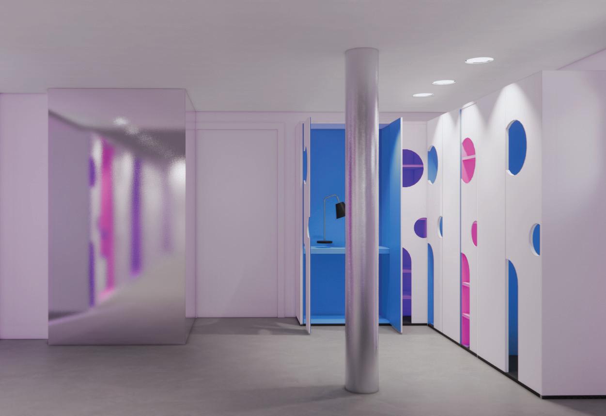
Computer station | Blue colored panel represents computer lab mode
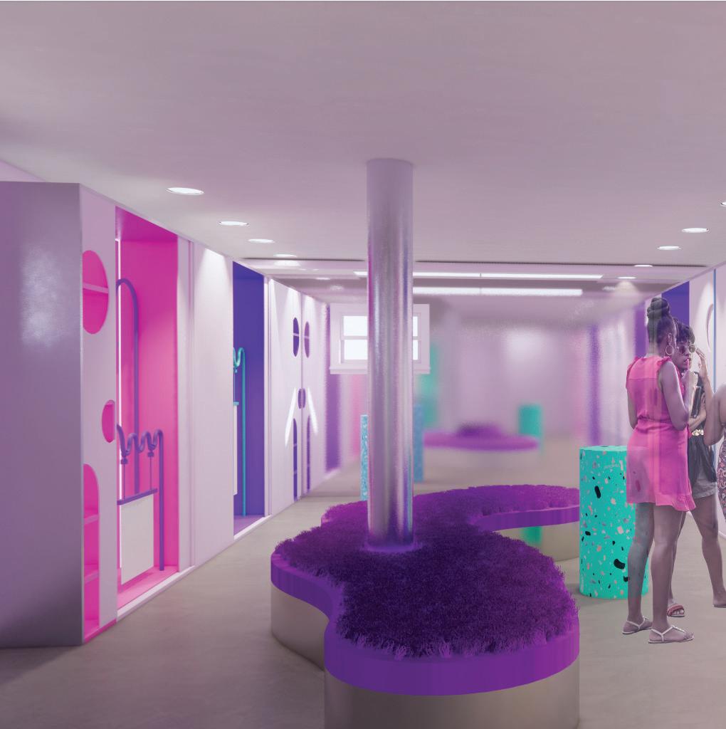
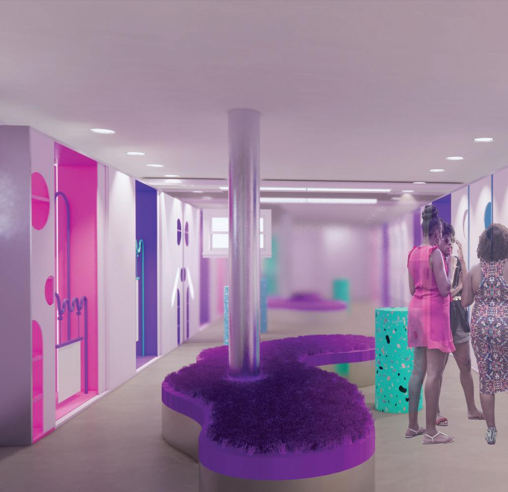
Performance space | The display of objects in different mediums was arranged on the sides of the space, with curved seating placed in the center to enhance circulation.


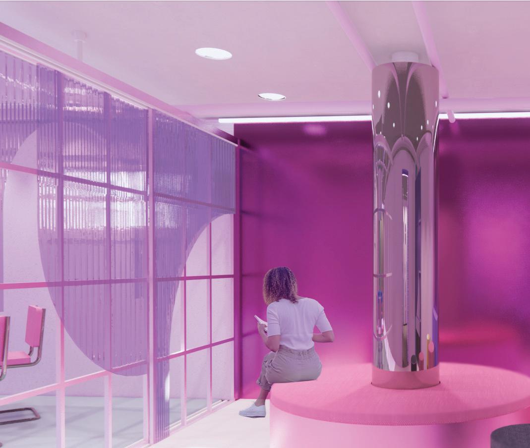


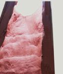
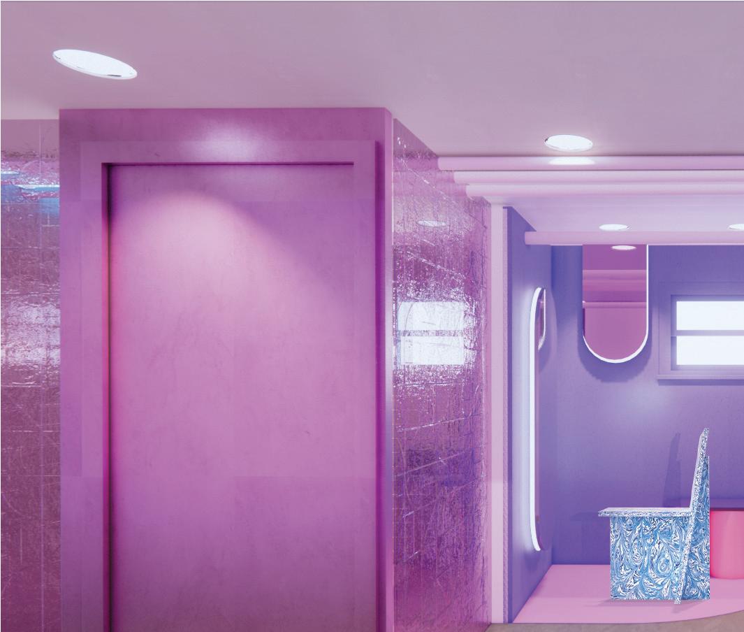
| Reflective materials were employed to create an illusion of spaciousness, while also mimicking the texture of candy wrapping paper. The candy-inspired colors and materials contribute to a more intimate and playful atmosphere, which is well-suited to the community's needs.
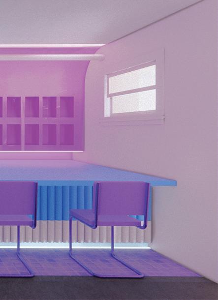

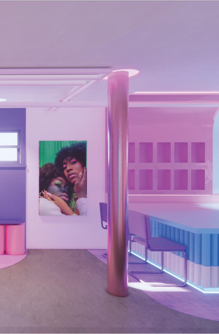




Dinning space | The dining table is situated on a concrete block that cannot be removed from the site, creating a distinct contrast in color between the dining area and walkway, which defines and highlights the space.
Salon & bathroom
Rooptop garden axonometric |

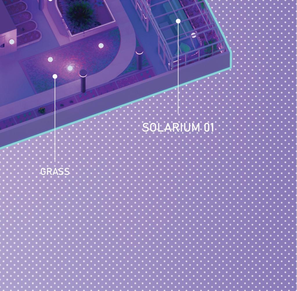
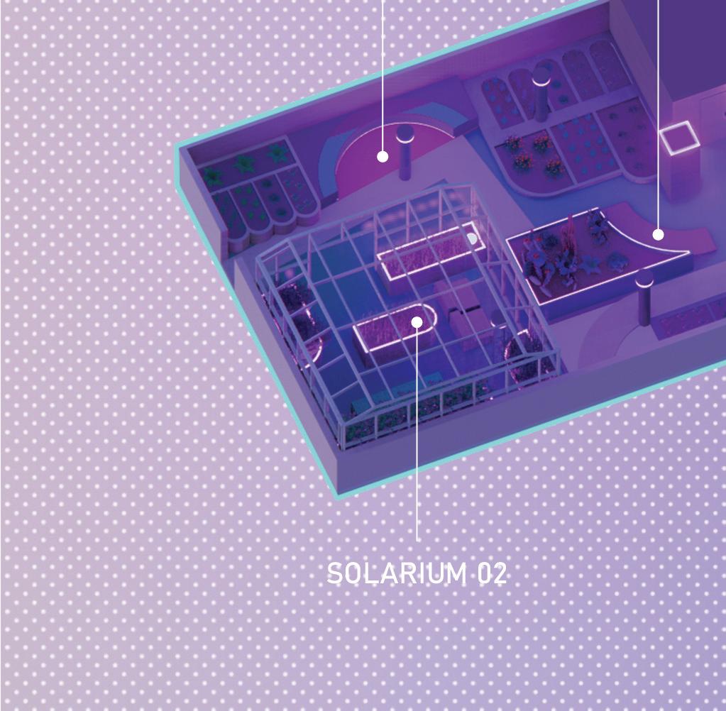
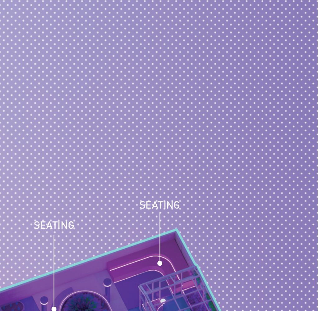
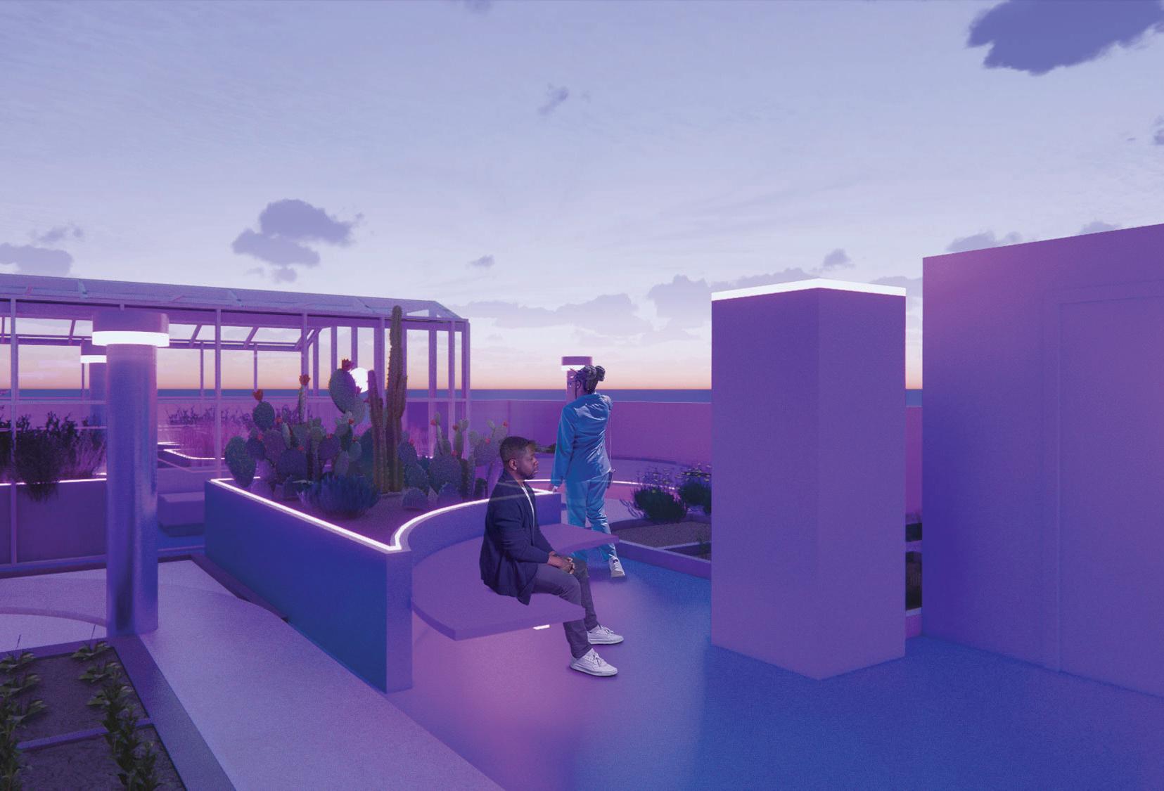
The rooftop garden offers ample seating for community members to gather, along with two solariums located in the corners for the winter season. In response to the community’s love for planting, individual planting sections were created, featuring small units for each member to occupy and plant according to their preferences. Varying planter heights were incorporated to accommodate a wider variety of plants.
Rooftop garden 01 |
Two solariums have been strategically placed on opposite corners of the rooftop garden to allow for maximum appreciation of the surrounding views.
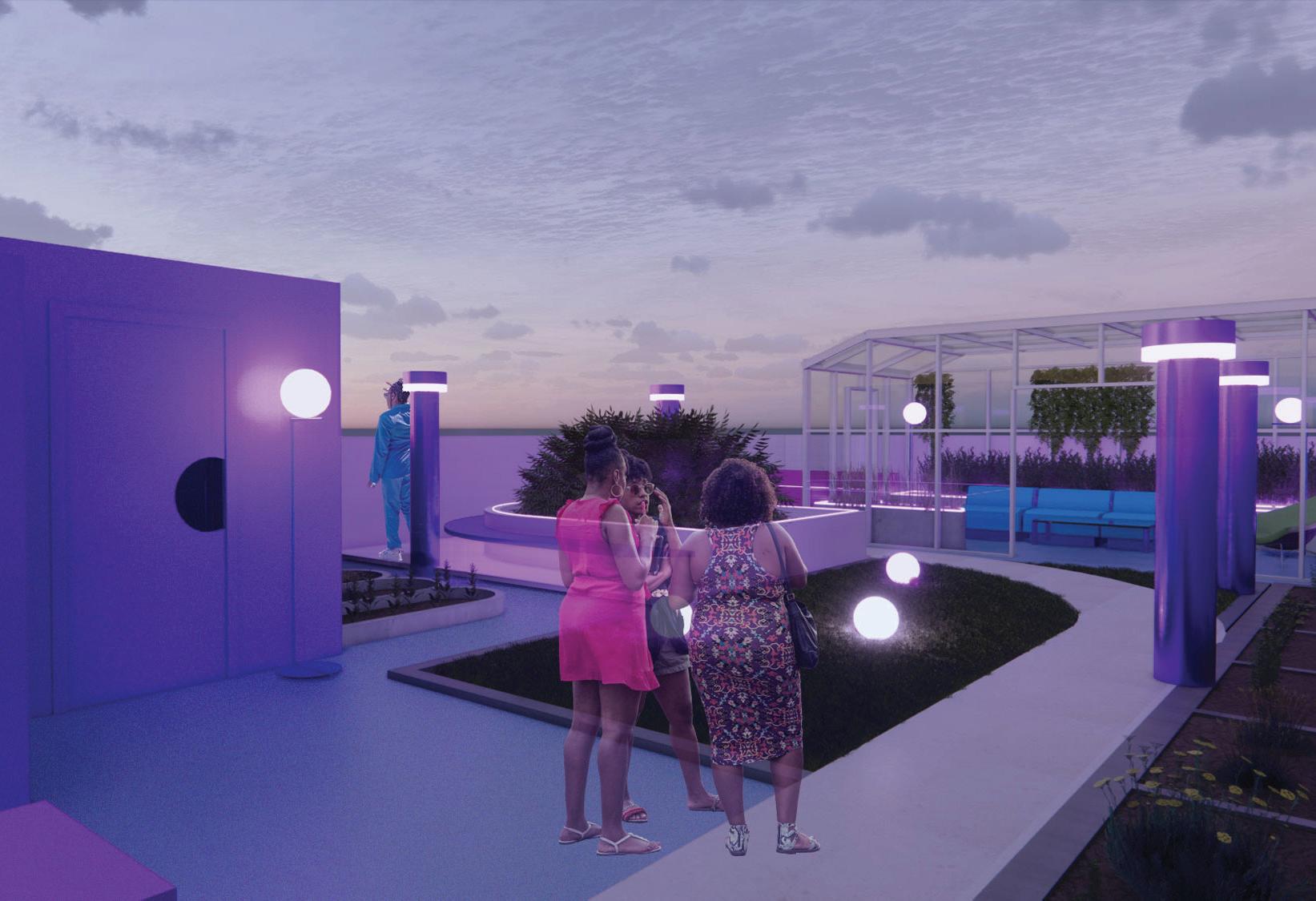
Rooftop garden 02 |
Multiple seatings were positioned around the planters to accommodate guests and encourage socializing.
Furniture design
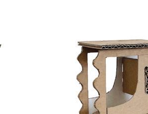
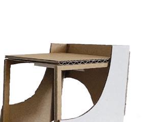
Concept models
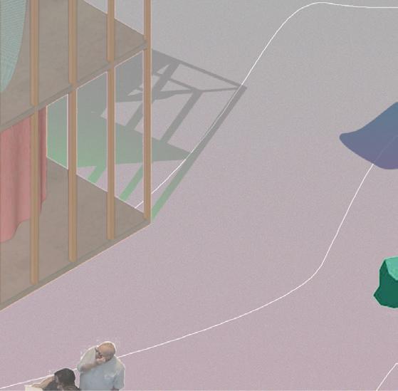


Digital drawings
Junger Xia
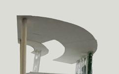
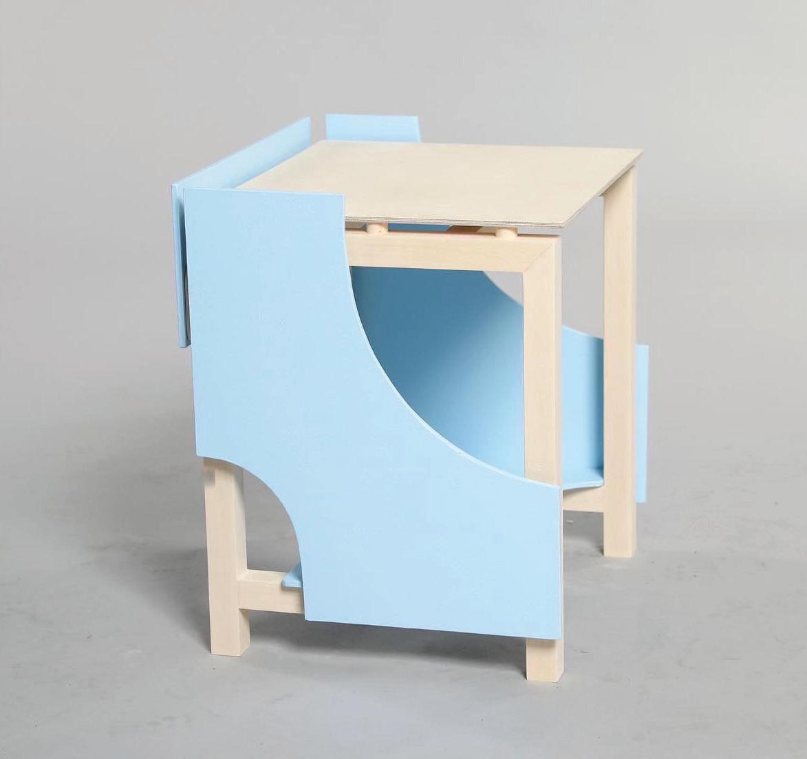
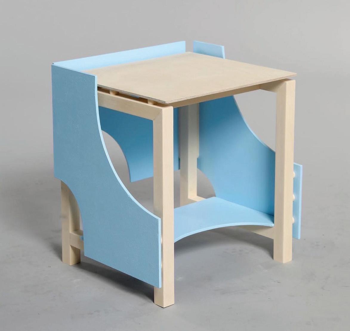
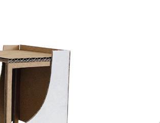
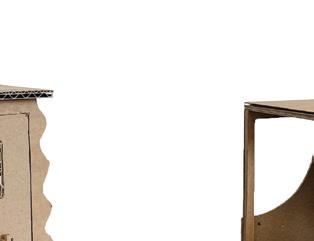
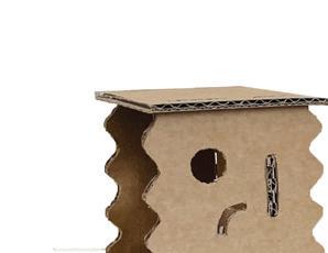
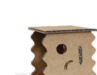
The Exploded Stool is designed for short-time reading which combines a stool and a bookshelf, users can easily grab books from underneath and start reading while sitting. The supporting skeleton made of solid wood serves as a simple stool and the plywood panels attached on its exterior with narrow gaps serve as a bookshelf. Each arc on the panels vary so the shape changes as you look from different angles.

2022 copenhagen summer program
A stool made for short-time magazine reading, combining the functions of seating and storing magazines or books. The center part was made with solid wood for support & seating. The wrapping system was made with plywood serve as book shelf, which exploded and elevated instructing the user the direction to seat.




Junger Xia

