
2 minute read
C2 Paint COLOR COLLECTION 2021


Sophisticated, timeless, transitional
BELLA DONNA
Advertisement
C2-782
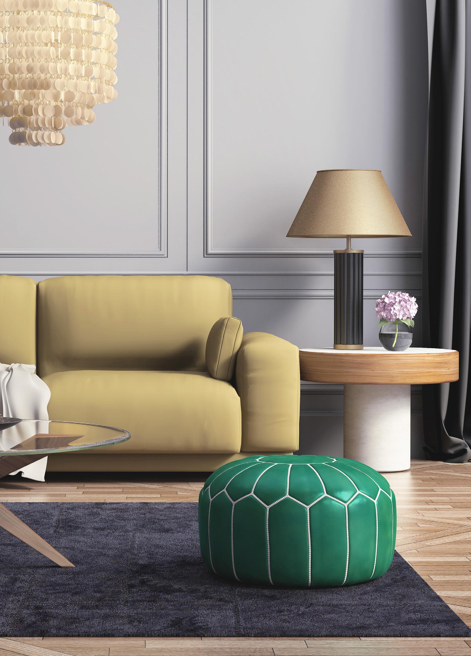
This “beautiful lady” proves that lavender tones are an unquestionable design force. Lingering between grey and violet, this sophisticated color has made its way into the neutral category, given its timeless and transitional appeal. Its morphing subtleties and serene nature make it a perfect choice for bedroom. Its popularity as a color for shared spaces is on the rise because of its free-spirited yet cultured bohemian vibe.
WHERE Try in a shared space as a unique neutral, anchoring it with metals and natural-toned light textures. It’s a perfect choice for the bedroom.
WITH Creams, greys, and dusty soft off-green neutrals — or with darker tones of the same color to build a monochromatic, layered story.

Illuminating, moody, versatile
BRIGAND
C2-757
This bold and mysterious blue-black introduces a confident new wave in the modern neutral Collection by reversing the traditional role of darker furnishings and accents against a light color. Brigand is not all it appears. With the introduction of light, it radiates shades of blue, showcasing a color that’s moody and dramatic. In its darker moments, it remains illuminated through multiple layers of pigments and colorants, which create a user-friendly, intense depth of color. A true rebel, it’s made with no black ink, so it’s approachable and not over-saturated.
WHERE Reception areas, powder rooms, living rooms, hallways, and other areas that open into a lighter palette for a high contrast experience. Use as a dramatic exterior color for wood, trim, or brickwork. The deep color is also perfect for a bookcase accent color and looks stunning with jeweled or hammered hardware.
WITH Brighten with crisp white, near-blacks, or go monochromatic with varying shades of blue.
PAPER CLIP
C2-928
A true chameleon, Paper Clip is one of the most adaptable colors in the C2 palette. Not grey, not taupe, it shines as a true traditional neutral. The addition of red and yellow undertones gives it an embracing element that adds a warm, robust energy to the room. Though it’s lighter in color, it’s deep enough to contrast beautifully off white or dark trim. This color can truly hold a space together!
Embracing, warm, adaptable
WHERE An attractive choice for an entry hallway with a black and white checkerboard floor and a dark ceiling. It’s a neutral that picks up the vibration of all other colors around it.
WITH Pair with tarnished metals or white golds, classic Calcutta marbles, or rich deeper wood tones as a salute to this color’s historical English roots.
WATER CHESTNUT
C2-818
Dusty, muted, sophisticated
This renaissance color delivers some powerful punches considering its quiet, ethereal, earthy tone. With the ability to bathe any space in its dusty, muted warmth and sophisticated beauty, it performs with an uncomplicated sense of ease and confidence. Water Chestnut thrives — as easily in a traditional space, delivering a soothing, classic feel — as is does in a more open industrial environment set against stronger, more rigid lines and dark metals.
WHERE Bedrooms, baby rooms, glamorous bathrooms or spa-inspired areas.
WITH Other light colors like soft grays and creams or with darker colors for more dramatic contrast.
Read more at:
https://c2paint.com/blogs/color-confidential/introducing-the-c2-paint-color-collection-for-2021
