
8 minute read
UX / UI project for the printing system of NCSU
UX / UI NCSU Printing system 5.
Advertisement
A project to realize the requirements of the user and improve the adding fund function of NCSU printing system.
Persona
Tim is a person who uses WolfPrint often. We will find out how he feels with whole adding fund process of WolfPrint in the afterwards few pages.

Tim Undergraduate Design Student at NCSU
Always busy, rather impatient, frequently procrastinates printing his homework
Original Process
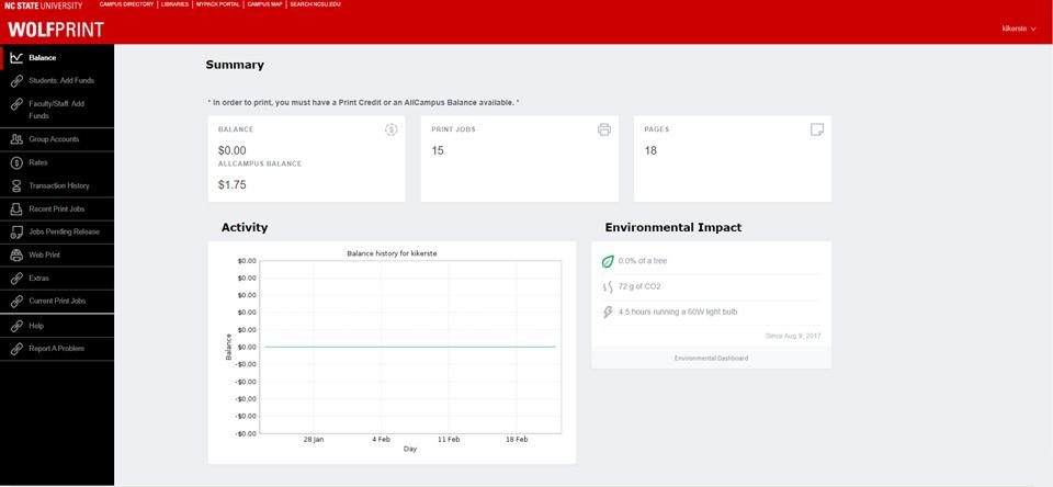
Log in
Home Page
Click Add Fund on the Homepage
The whole process that Tim should go through to execute the function ogf adding fund and the mood that tim feel when executing the process.

Current Experience

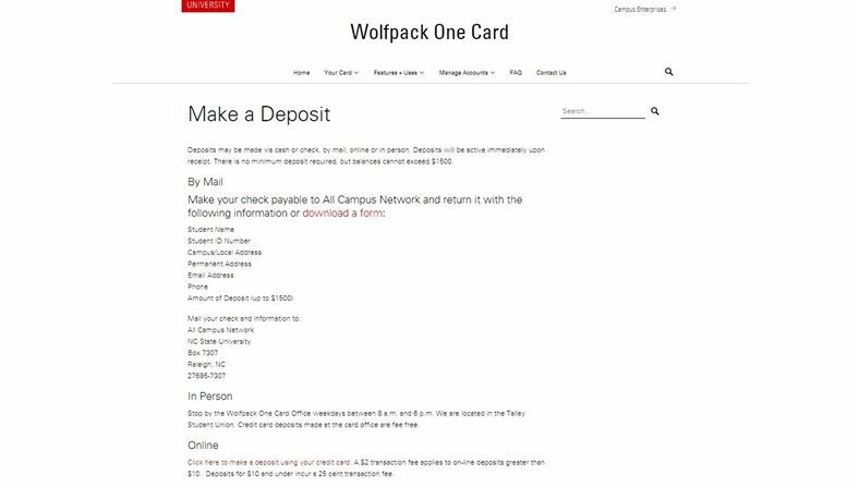
Info Page
To choose the option of online payment we have to roll down to the end of the page and that make user miss easily.
Website of Campus Account
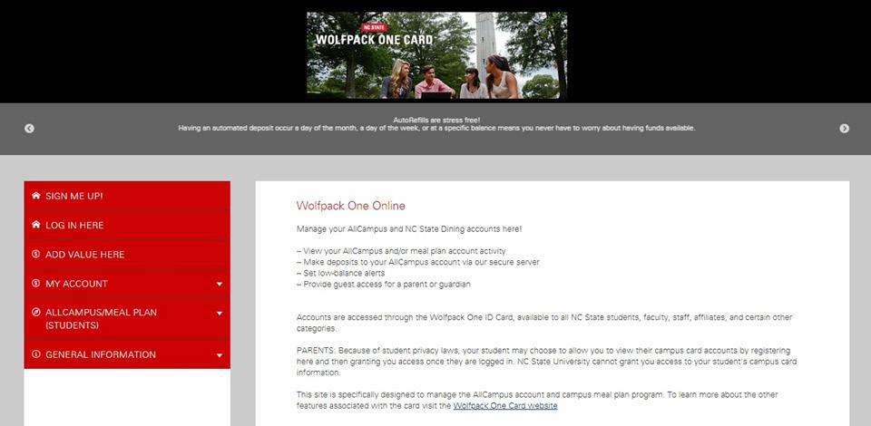
Whole different website and account makes user confuse.
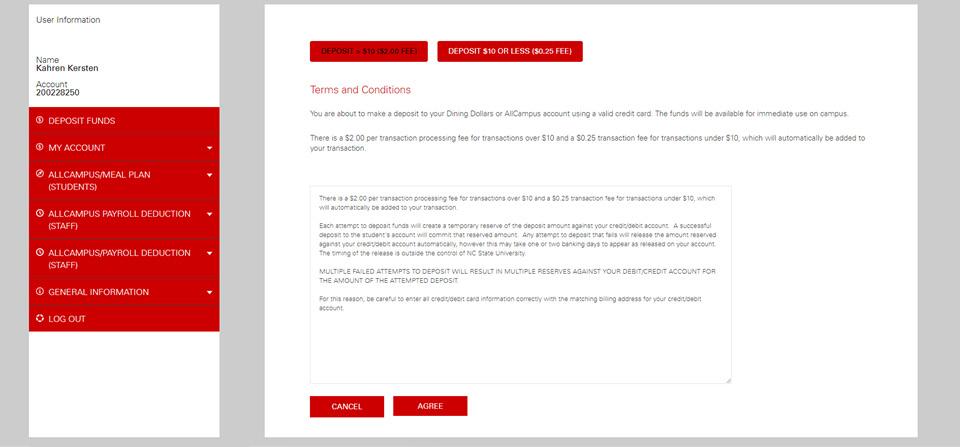
Page of Options Once we are logged in, we have an option if we want to add less or more than $10, which isn’t really necessary. Also it’s hard to distinguish which one is selected.

Current Experience

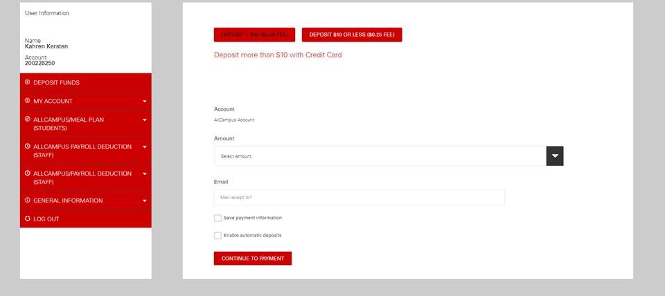
Payment Info
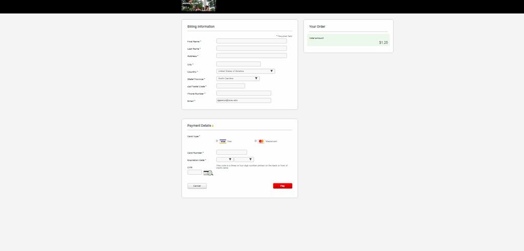
It’s more like a normal process to fill the info of payment and billing address.
End Page and Receipt
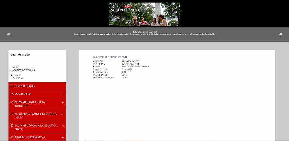
Once we add our funds, to go back to our Wofprint dashboard, we have to either google Wolfprint again or press the back button 5 times.

Interviews
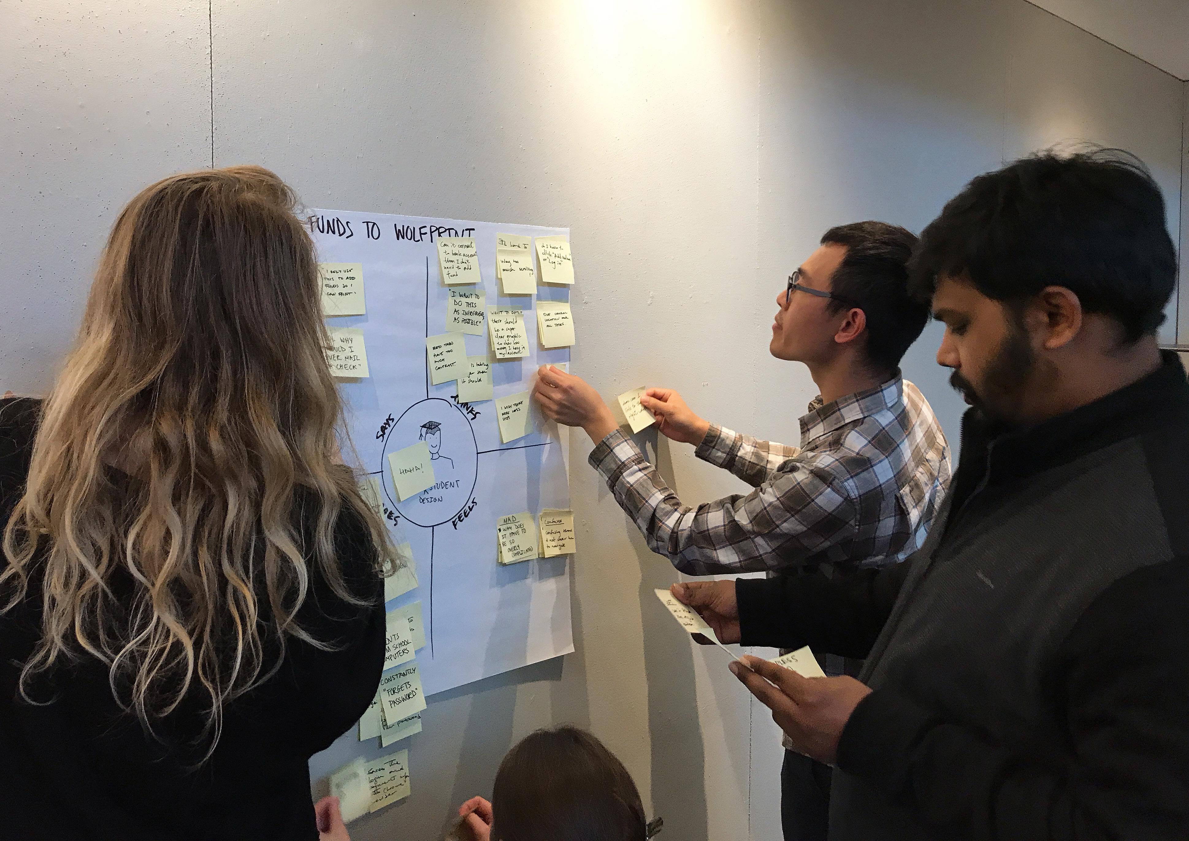
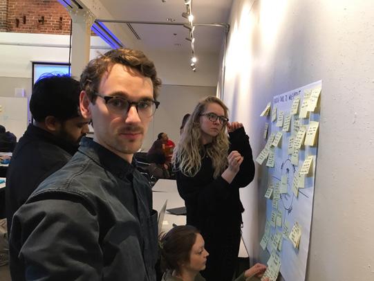
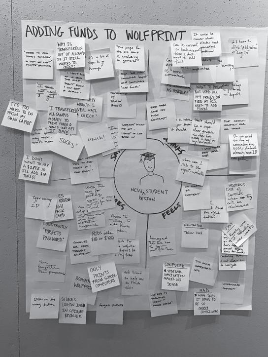
After experiencing the process with Tim, we interviewed other three users to confirm and discover the user need. Then we defined the pain points.
Interviews
“I often have to reset my password to add funds to my account, because I tend to forget the associated password.” Raunak

“I’m not sure where I am supposed to click since there are no real action indicators.” Abby

“Often, the information isn’t relevant to what you want to do. I have to constantly go back and forth between pages.” Jack
Pain Points
NCSU students need a simpler and more intuitive process to add funds to their WolfPrint account.

Unnecessary steps

Lack of navigation

Lack of action indicators

Lack of consistency in text and layout

Lack of efficiency

Unnecessary information
What does Tim need?
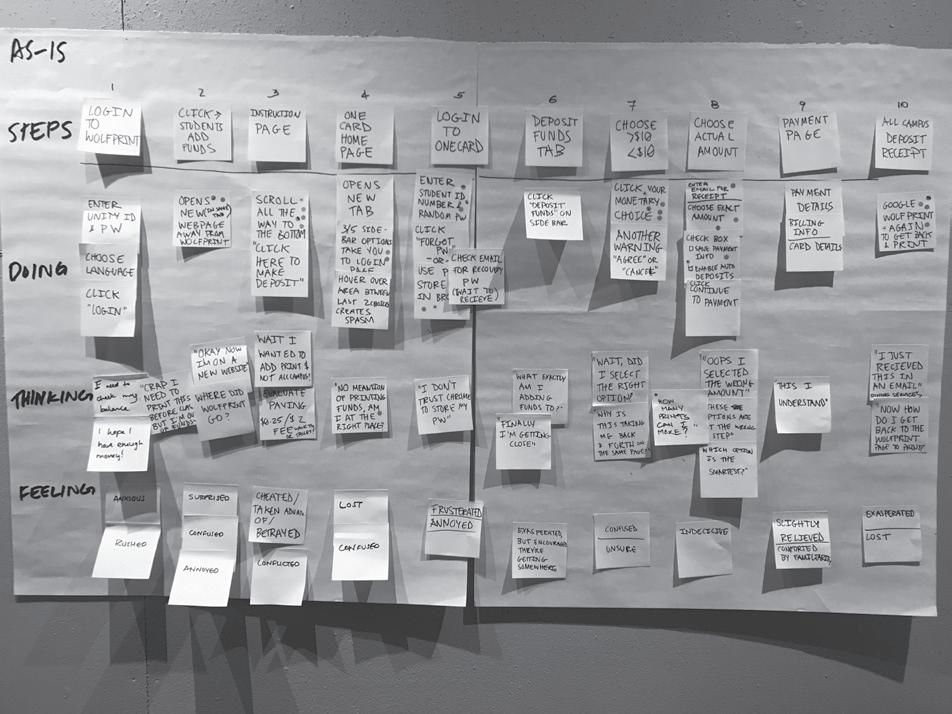
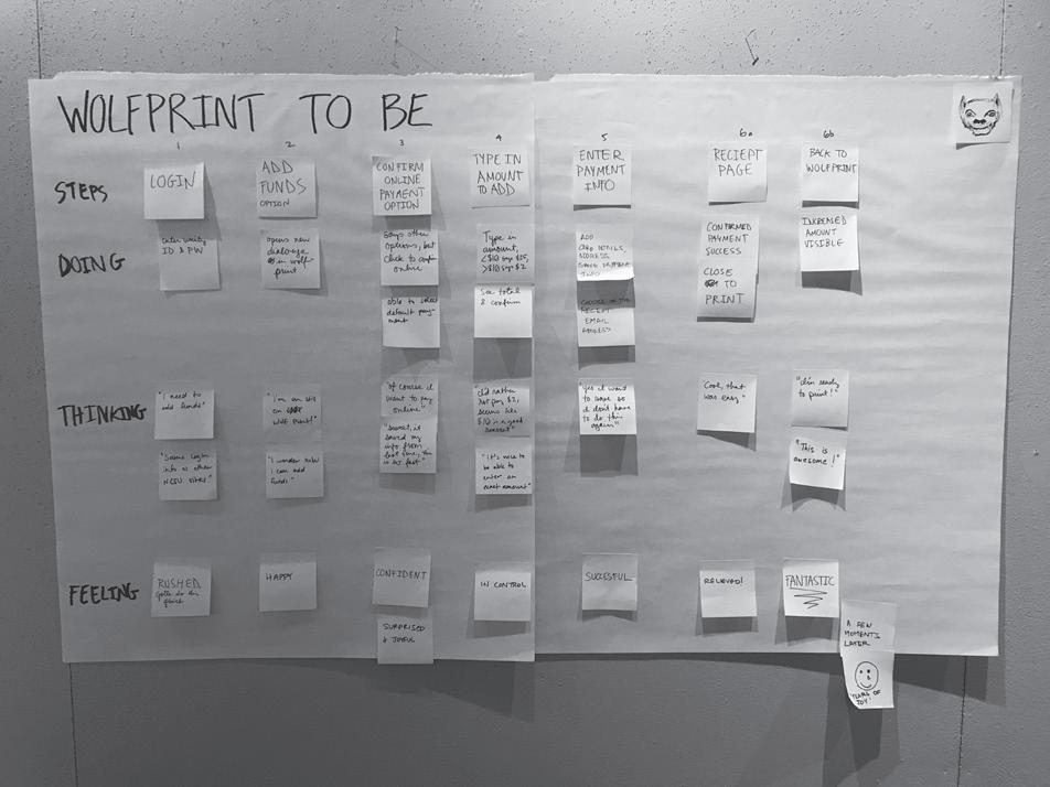
Then we applied variety of maps to concluded how people think in each step, what does Tim really need, what feature can hit the need and we should focus on.
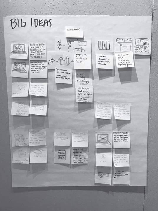
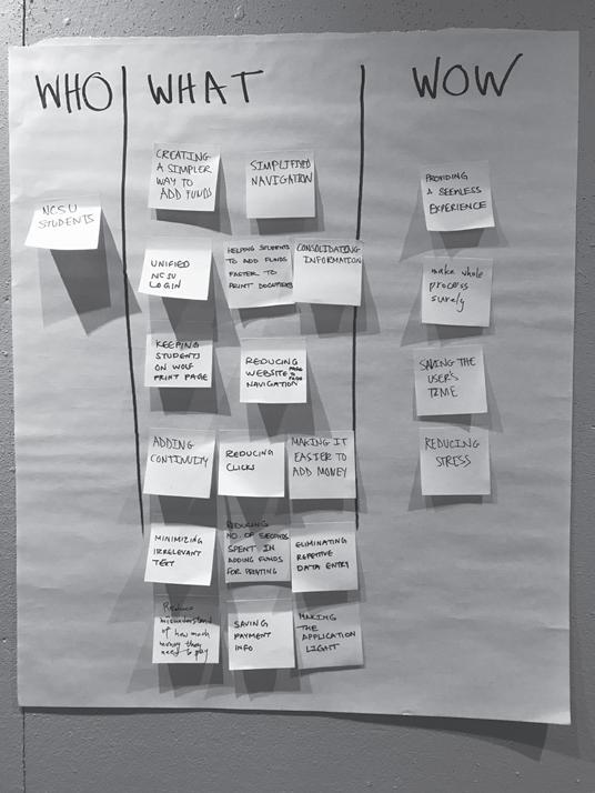


One Click to Add Funds Clear Actions Simple Continuity No Hassle Printing
Those who have established a preferred online buying default should be able to add funds to their Wolf Print accounts through the click of 1 button.
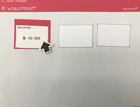
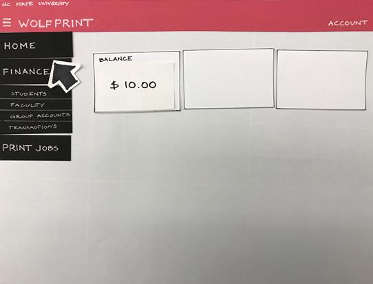
The balance should be clearly stated and act as an actionable item for ease of adding funds.
A clear and direct path to online payment needs to eliminate unnecessary logins, information and website redirection, while establishing consistency in language, icons and other visuals.
Once the user has added funds, printing should be easy and fast with no need to navigate back to the Wolf Print site.
Prototype
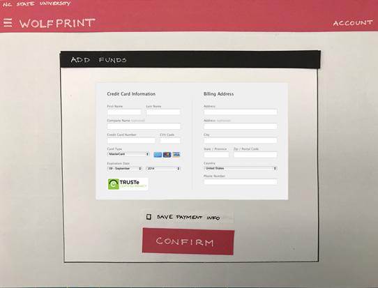
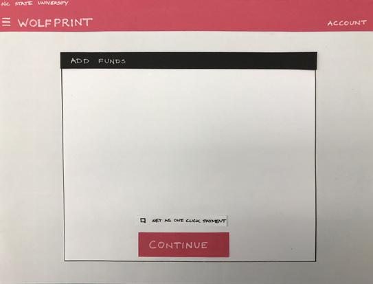
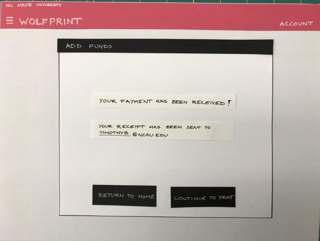
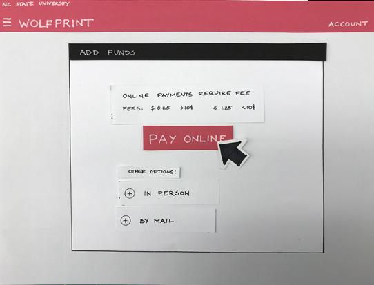
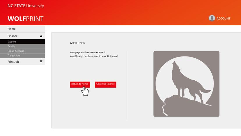
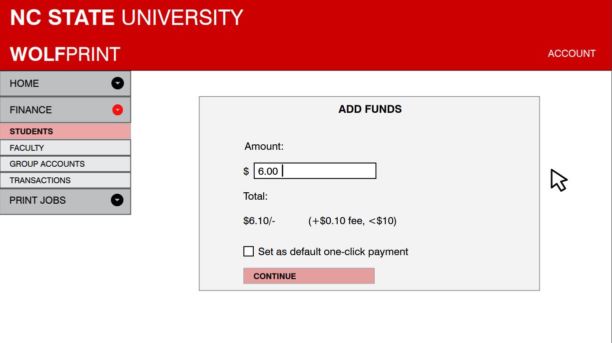
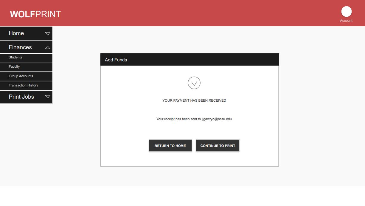
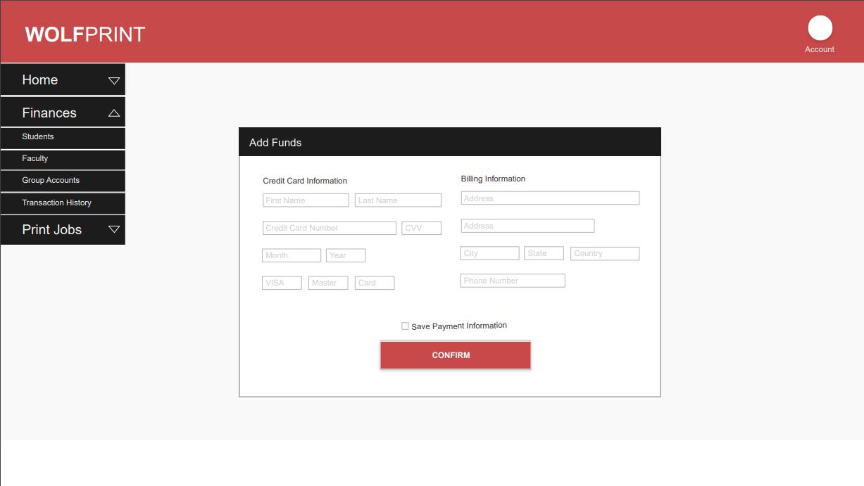
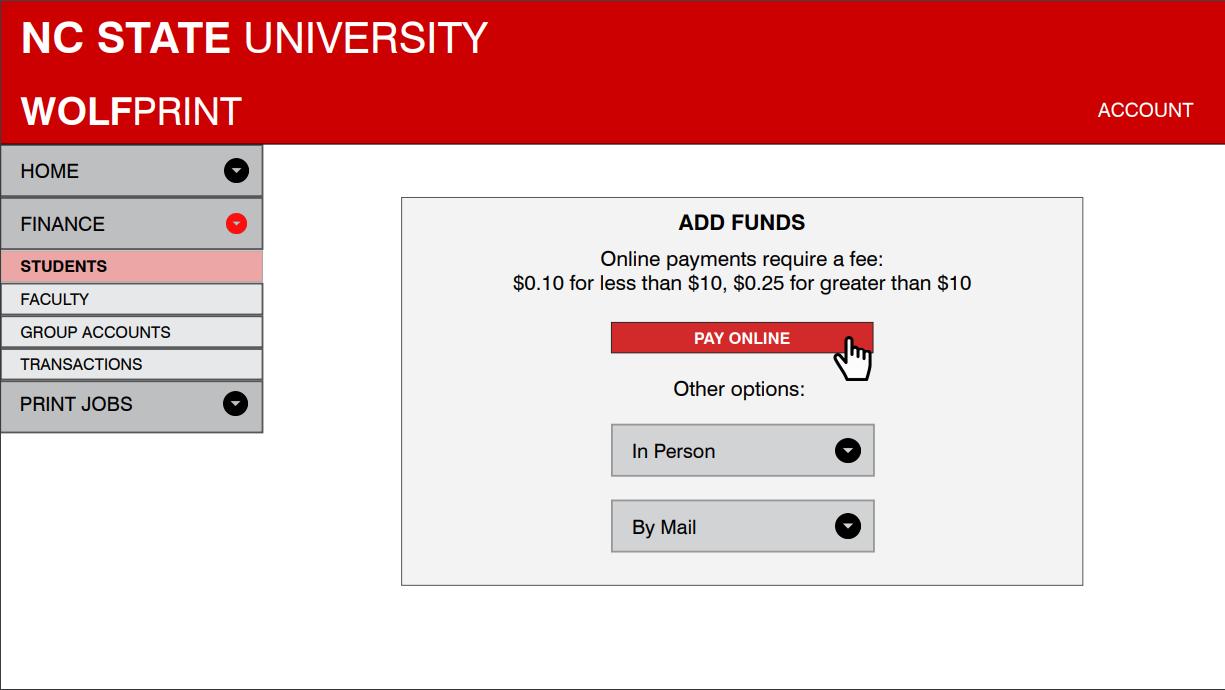
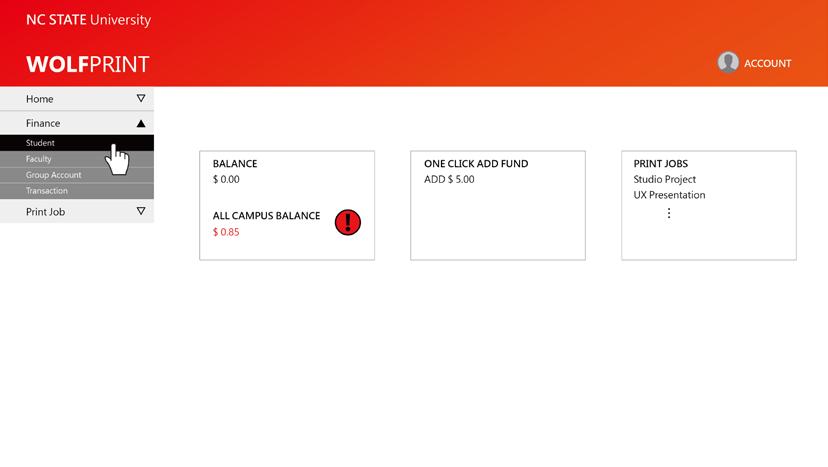
We did paper prototype to confirm the features. In mid-fidelity prototype, we remove extra machine learning feature and keep layout and process simple and consistent.
Paper Prototype Mid-Fidelity Prototype
Pattern Library
We defined the style guide as a concise style because we hope the whole process could be sense as an easy process, easy as the icons they see.
Colors Icons



Typography: Helvetica Neue


Low balance


Home



Plus icon


Good balance

Print summary


Pages summary
Finance


Minus icon
Print jobs


Checkmark
Final Design
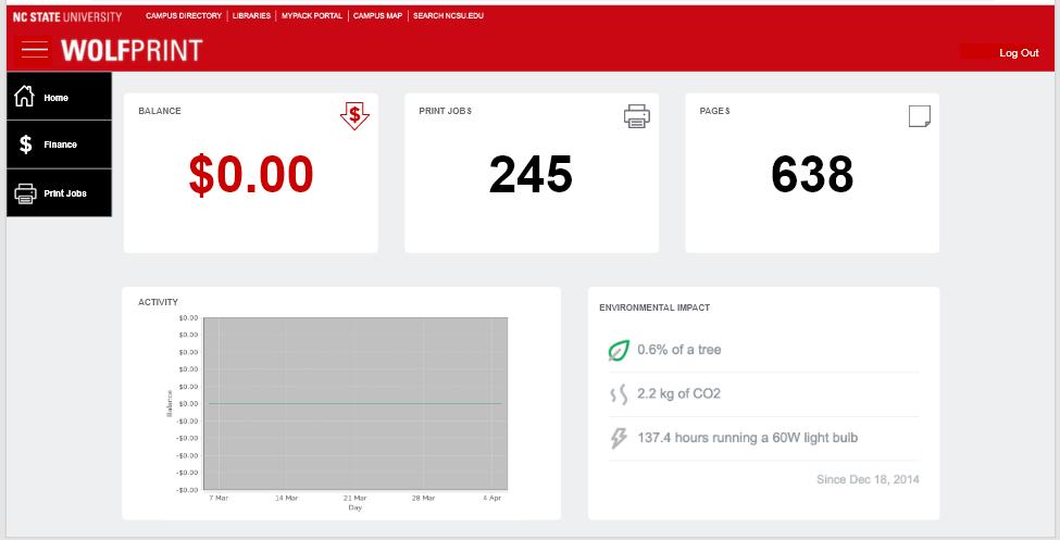
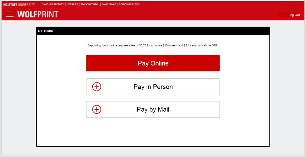
After we improve the whole process of adding fund, Tim thinks it is intuitive, easy to understand and quick to finish the process. Also, it meets all the requirments that Tim needs.
Home Page
Low balance be showed by strong color to remind Tim to add fund.Find the Add Fund in the Finance option of drop-down menu. The spare options have been removed.

Current Experience

Info Page
Apply strong color to guide Tim into the page of Pay Online of click plus icon to understand more about other options.
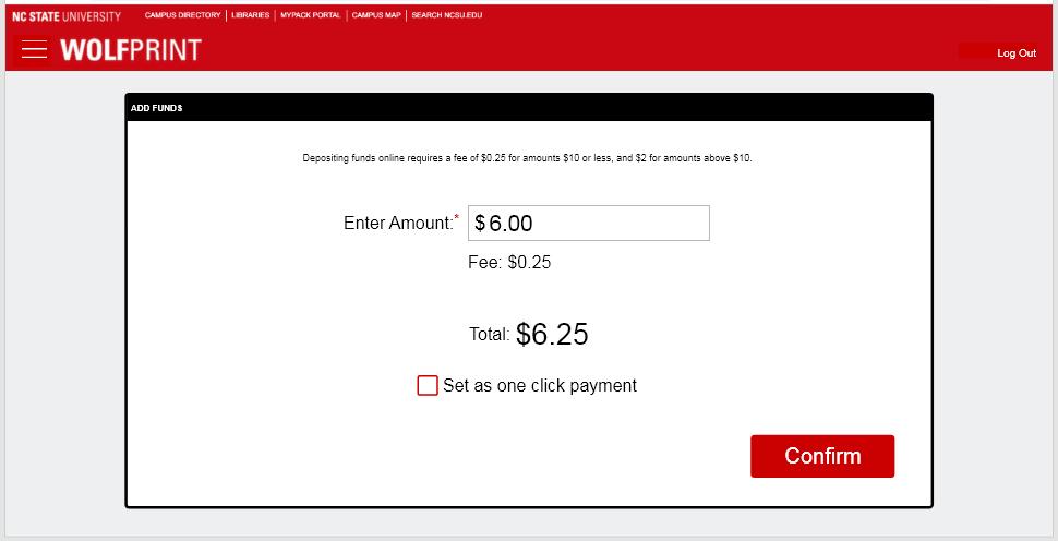
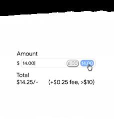
Page of Payment Concise page to show the description of the fee. Once Tim enters the amount he plans to add, the page will auto calculate the total fee he has to pay. He can also set the amount as a one-click payment amount.
Payment Info
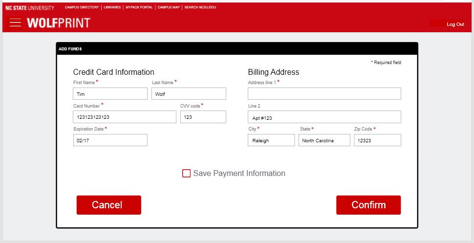
An easily understand page for payment info without scrolling down. Tim will not miss any information.
End Page
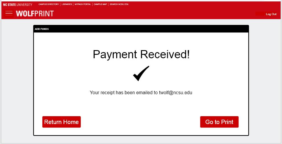
Go back to the page of the print job of the home page directly. The receipt is sent to the mailbox of the school account.

Current Experience


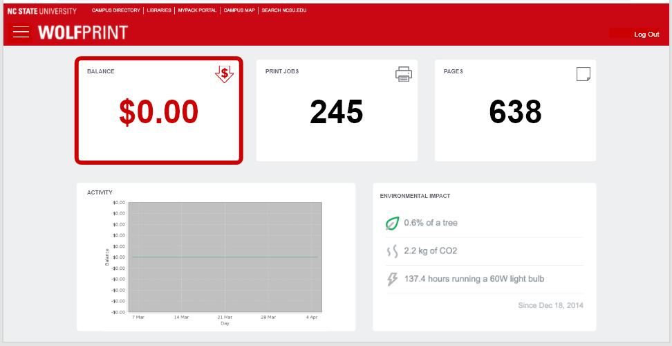
One-Click Add Fund
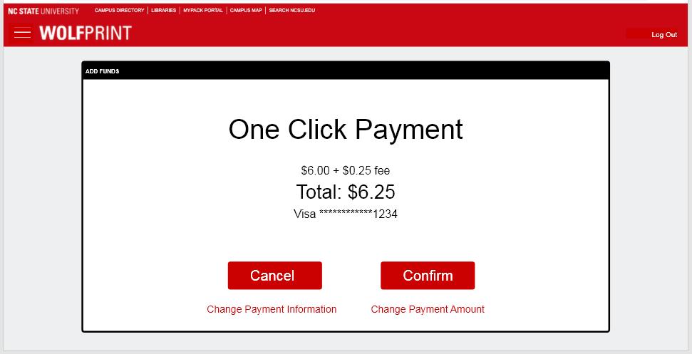
Click the balance square to execute one-click add fud. Then confirm the infomation and finish the payment.
Quick Intuitive Easy


