INTERIOR DESIGN PORTFOLIO


I am a recent graduate of Belmont University with a Fine Arts degree in Interior Design. I am also the mother of two boys, ages five and nine. Prior to pursuing a degree in Interior Design, I taught high school English for six years. Although I will always have a passion for education, my creative talents truly lie in Interior Design.

I am particularly interested in commercial design, and specifically in creating designs that improve health and well-being for all.

Design Philosophy:
I belive that design is powerful. Just as a beautiful piece of art can move people to tears, so too can design. Great design is unique, and although many people think that design can simply be copy and pasted, real de-

sign is creative and bold. It draws people in and makes them notice their surroundings.
Wonderful design lasts and is inviting. It should be sustainable in that it does not harm the environment, but it should also be well-crafted so that it lasts. It should be just as beautiful from the day it is created to hundreds of years later. It also welcomes all regardless of ability, race, ethnicity, gender, age, or sexual orientation.
Design can move us, inspire us, embrace us, and enhance us. I am proud to say that I am a designer because design has the power to shape with world in which we live.
katiebonds@hotmail.com
I am an interior design graduate, looking for a position as an Entry Level Interior Designer in 2023.“The quality of our environment can be health giving or health destroying.” - T. Howard
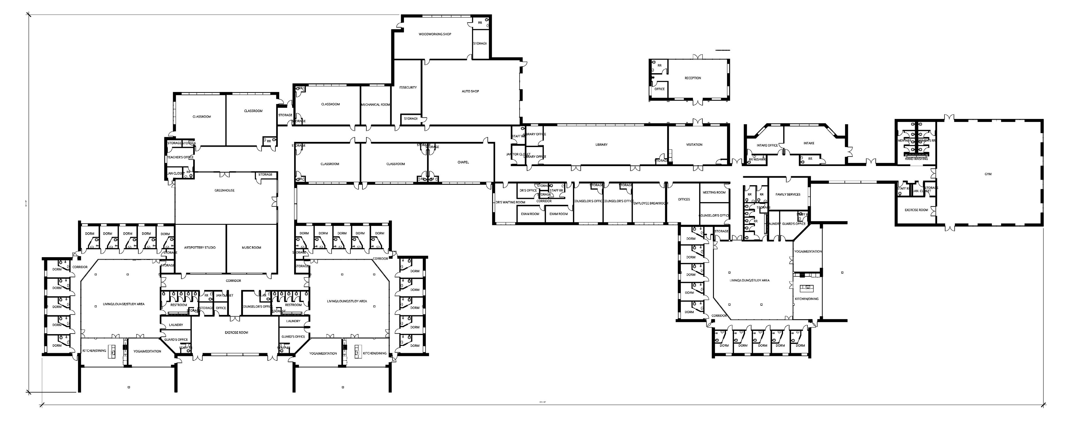
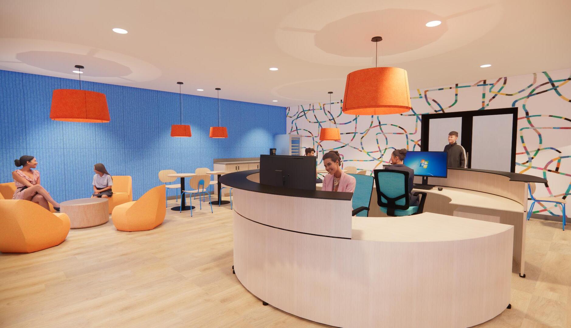
This project proposes an adaptive resuse of the former GraMar Middle School in Nashville, Tennessee. The old site would become a Juvenile Justice Facility. This facility would be a residential style design with a maximum of thirty detainees broken up into three groups of ten in separate living units based on age. This design proposes that the environment should be rehabilatative rather than punitive.
±65,000 square feet
Designed spaces include reception, visitation, classroom, corridor, living unit, including dorm and kitchen, greenhouse.
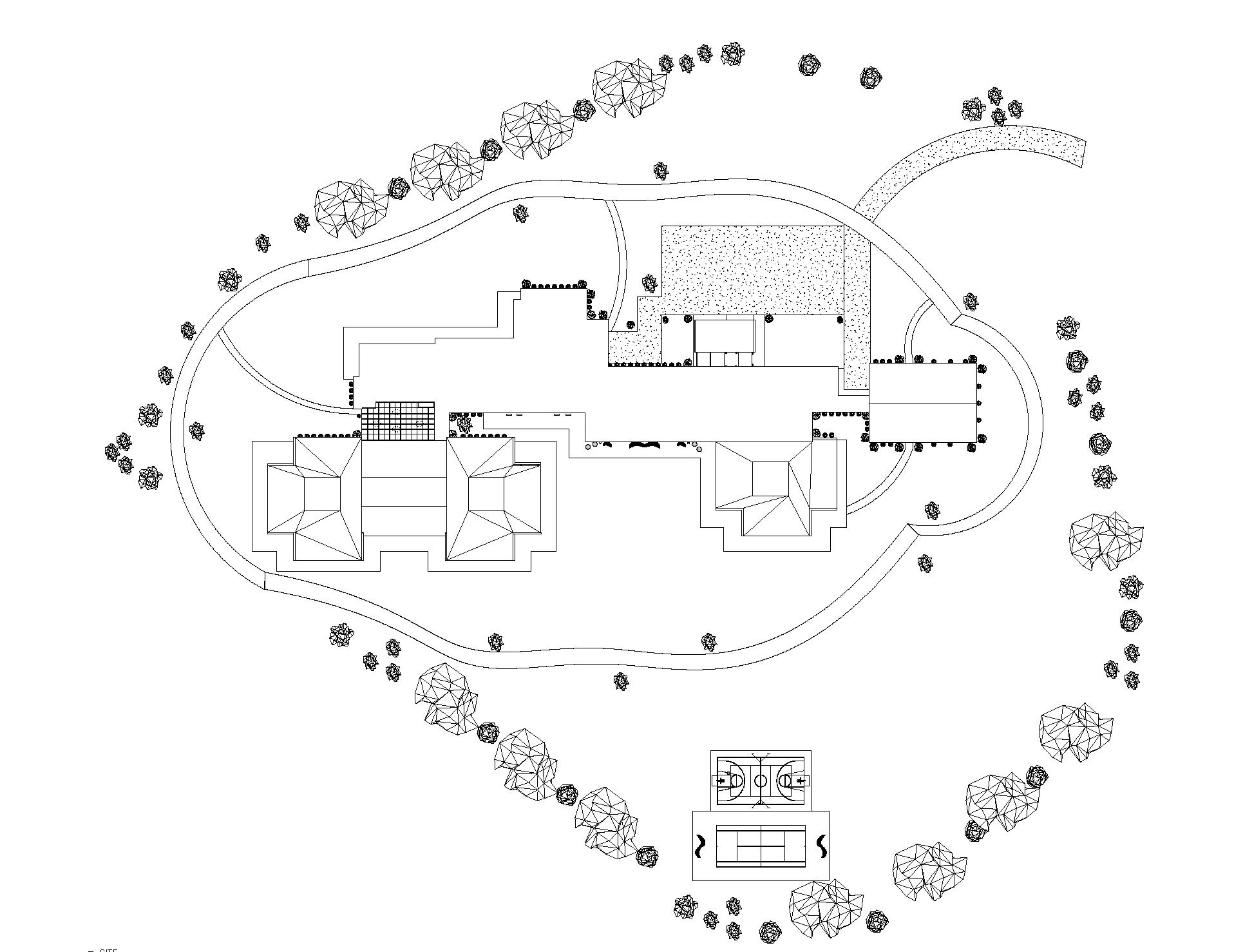
10 acres
The vast outdoor areas, and the ability to utilize the sidewalks around the building were an important part of the design.
1 level
The layout of the building naturally lent itself to the design, and the clerestory windows provide natural light in enclosed areas.
This facility will be a cairn, a place where detainees can find guidance on life’s complicated path. The space will be designed so that these often traumatized, vulnerable, and mentally fragile youth will be able to properly rehabilitate and re-enter the community as healthy members of society.

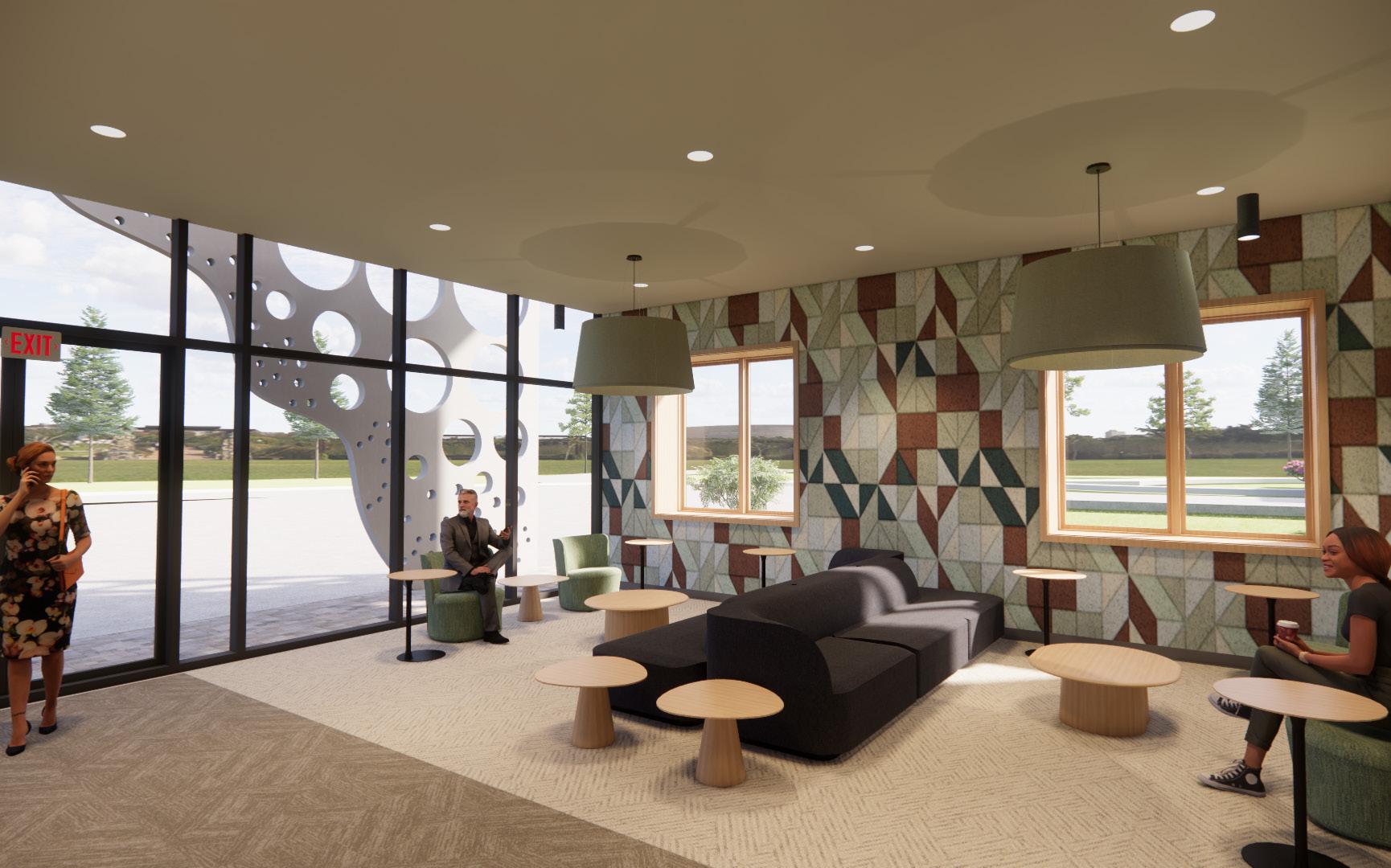
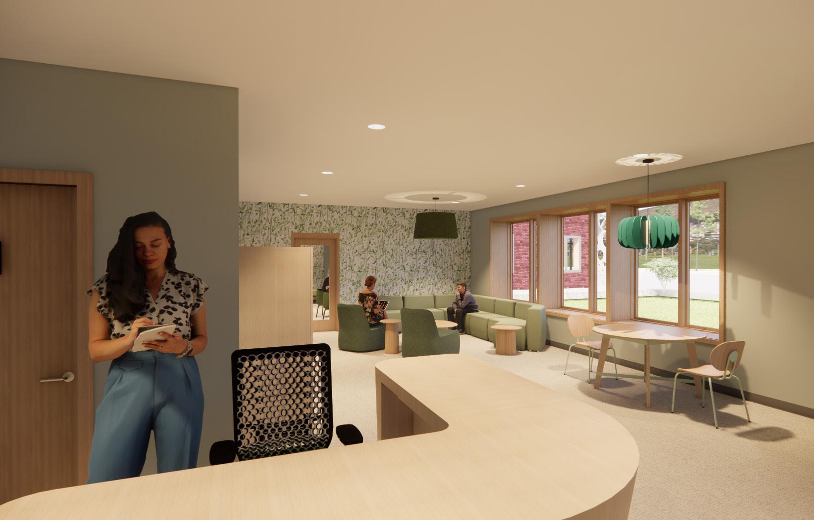
This design was supported by extensive research into three areas:
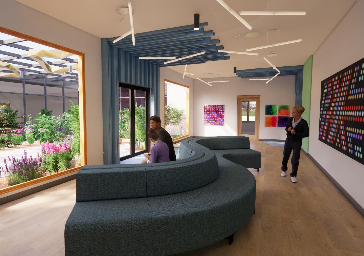
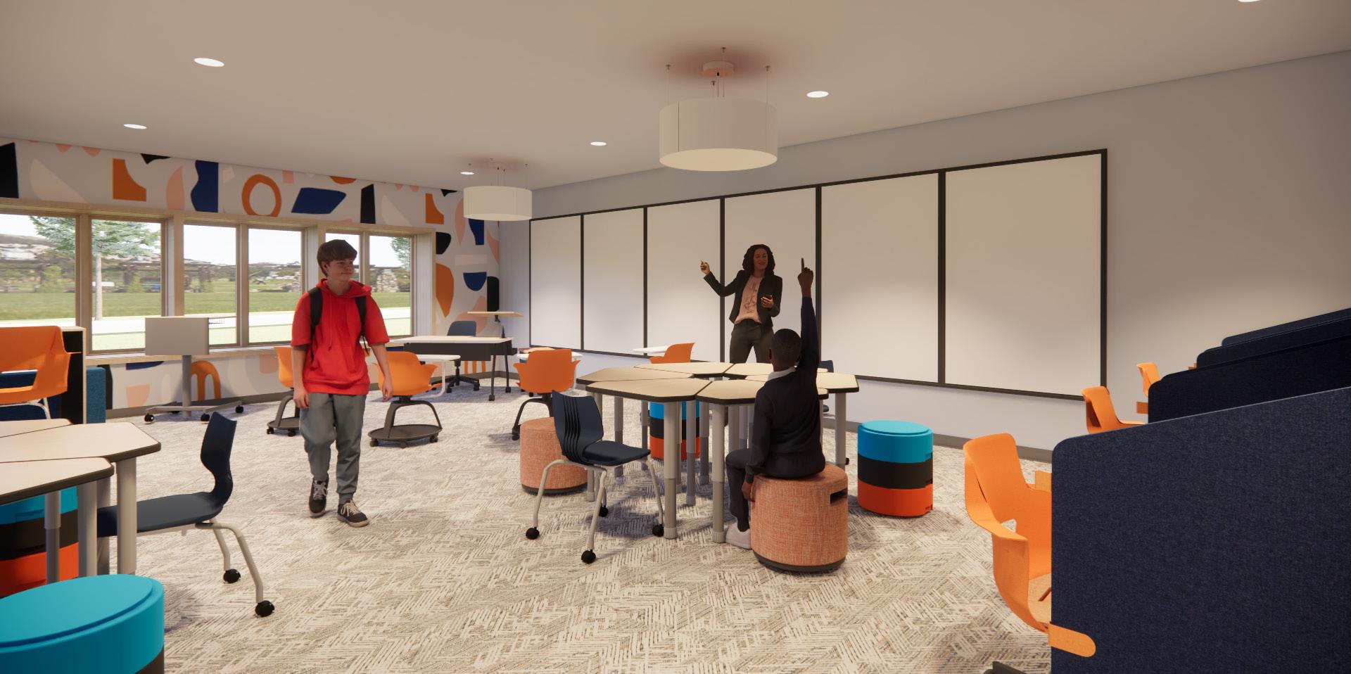
Attention Restoration Theory - spending time in nature reduces mental fatigue
Sensory Integration Theory - sensory processing is linked to emotional regulation, learning, behavior, and participation in daily life
Trauma-informed Design - encompasses adaptations in the built environment that are grounded in responsiveness to trauma that emphasize physical, psychological, and emotional safety for both providers and survivors, and that create opportunities for survivors to rebuild a sense of control and empowerment
Evidence has shown that when custodial environments become rehabilitative rather than punitive, recidivism rates can drop by as much as 40%. Thus, by reforming the youth custodial environment, the U.S. could save an average of over $5 billion a year on youth incarceration.
When dynamic security is utilized, guards interact with inmates - playing games, eating meals, talking, almost constant interaction. This is opposed to static security which includes heavy use of video surveillance, restraints, and very little interaction between guards and inmates.
• Large window
• Wet room restroom
• Weighted furniture from behavioral health contractor
• Carpet tile and acoustic panels adjacent to bed for noise reduction
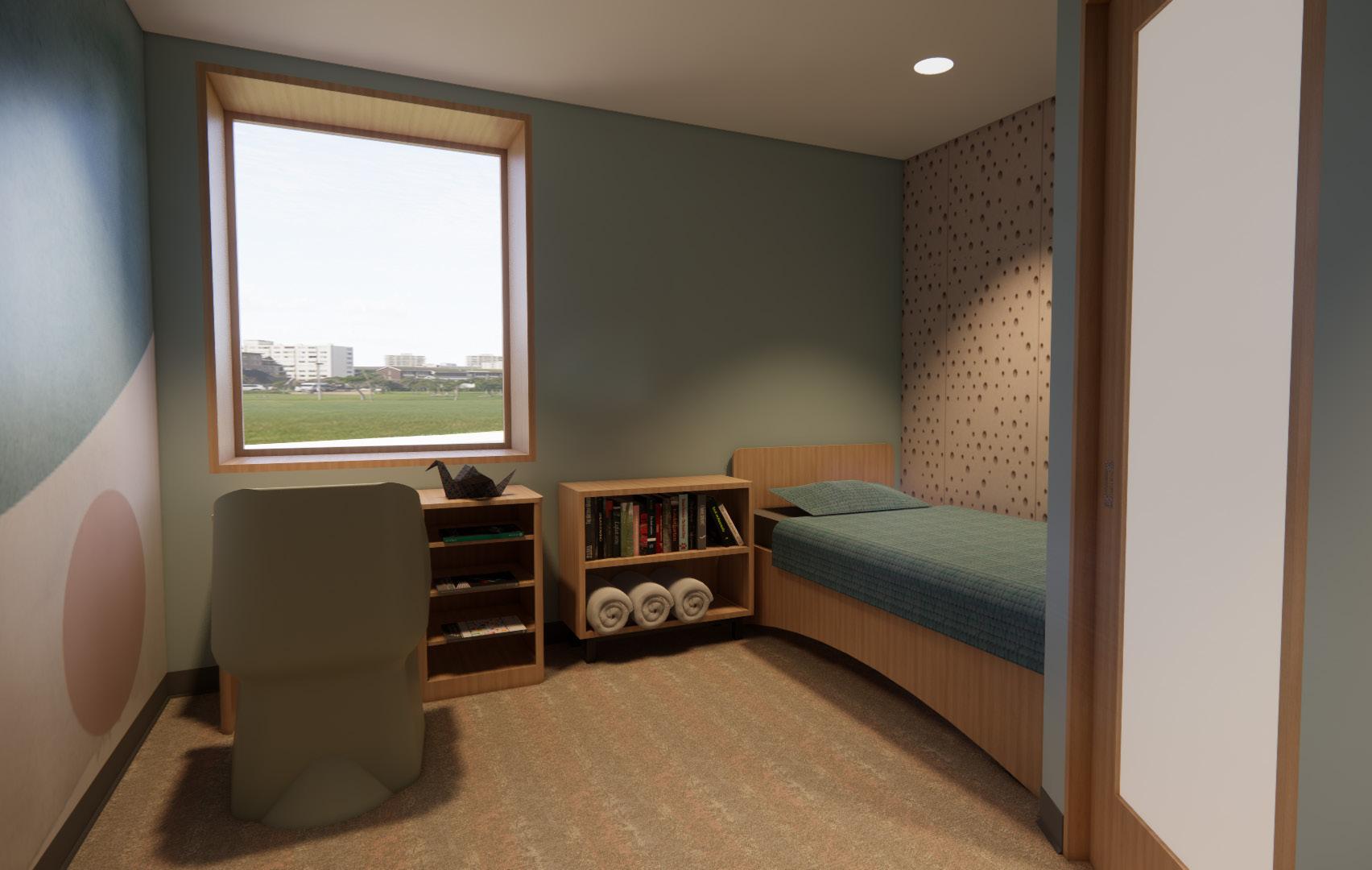
• Door with polycarbonite panel which provides clear sightlines in to and out of room
• Wall mural and soothing, neutral colors
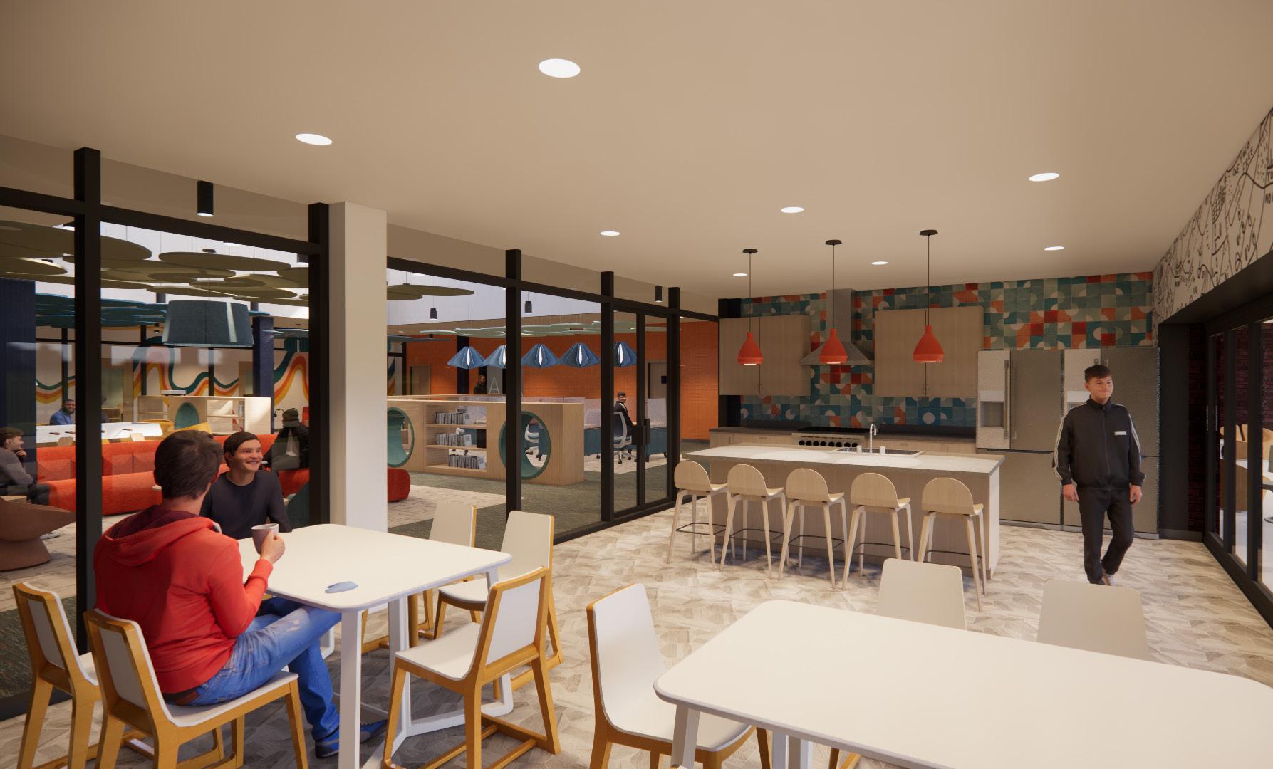
• Clear sightlines
• Natural light
• Organic shapes/patterns
• Asymmetrical balance
• Durable contract grade furniture chosen for weight and durability (some weighted furniture from behavioral health contractor)
• Sensory wall panels in several areas
• Abundant and clear wayfinding
• Acoustic panels, clouds, and light fixtures for noise reduction

±10,000 square feet


The building consists of a police precinct, a bookstore, bakery, and bicycle shop.
2 acres
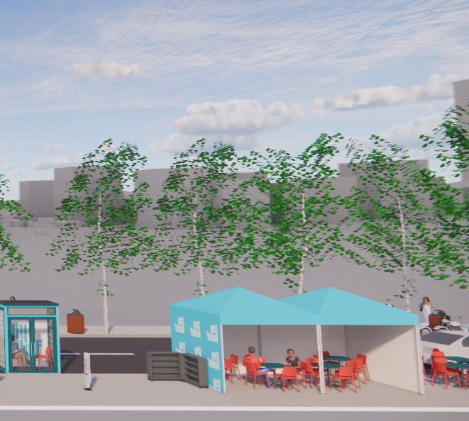
Outdoor seating, sidewalks, landscaping, and parking were added.

2 levels
The second level houses law enforcement offices.
This project is an adaptive reuse of a dilapidated pumphouse on the bank of the Cumberland River in Nashville. Being located behind the Nashville courthouse, this seemed an ideal location for a police precinct and mixed used development.
Second Level
This project is meant to create unity, and that goal is shown in a myriad of ways throughout the project. First, unity is shown in the community police precinct which is a reimagining of a police station as a place in which the community is welcome, and where the wall of fear, distrust, and/or tension between the community and law enforcement is broken down.
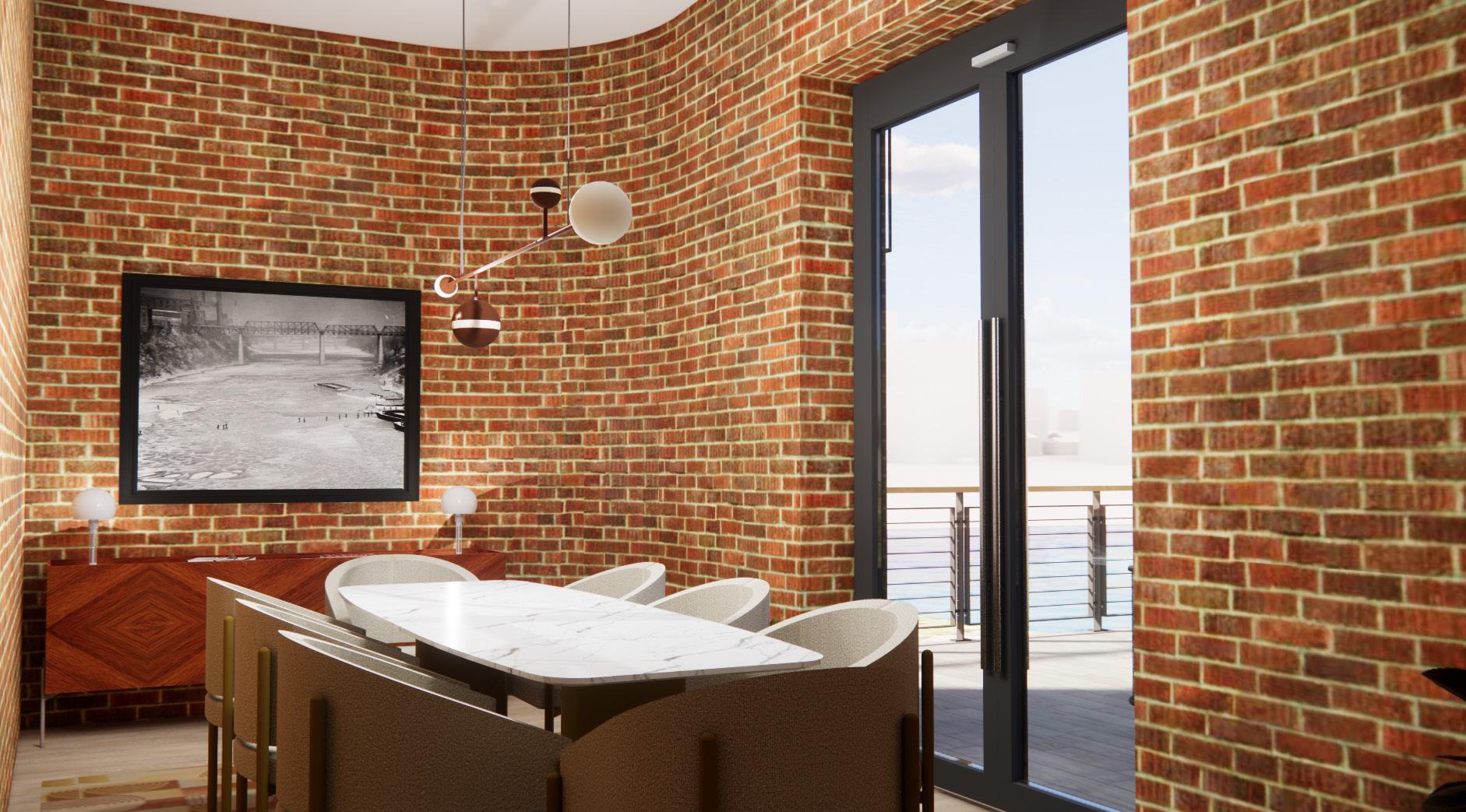
Unity is realized in the links between the past and the present and manifests in the Bauhaus style used in the project. Bauhaus was specifically chosen due to its founding principles of unity and sense of belonging to the community.
First Level
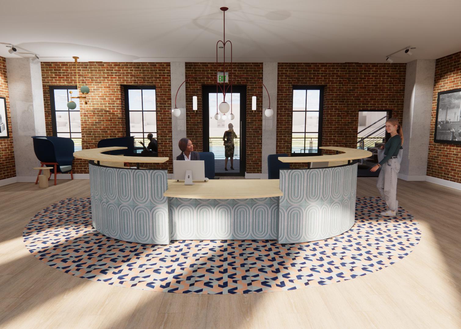
COMMUNITY MEETING ROOM

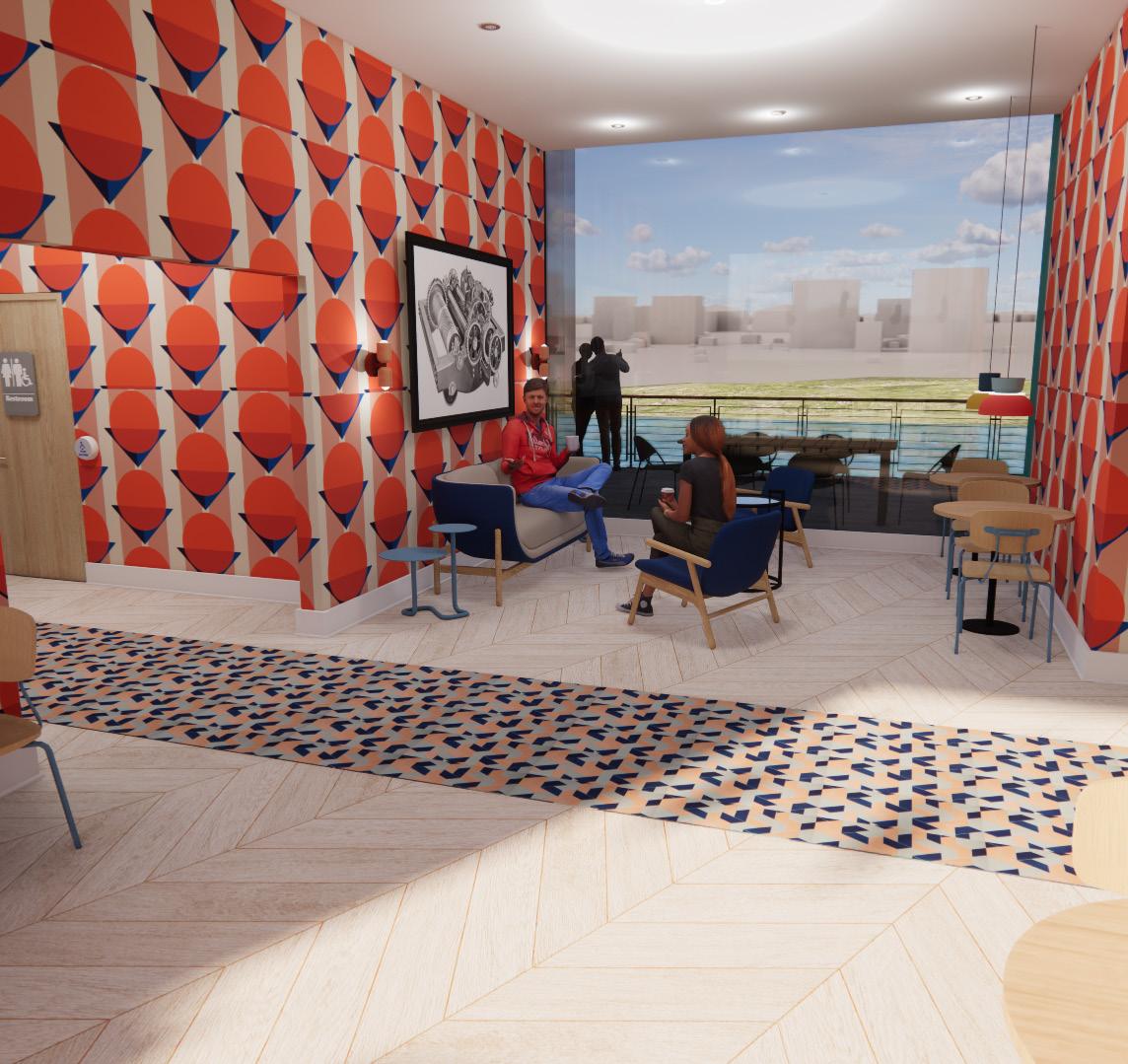
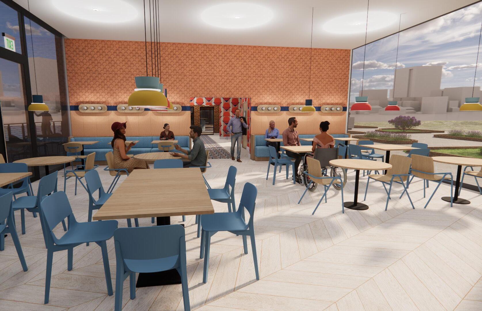
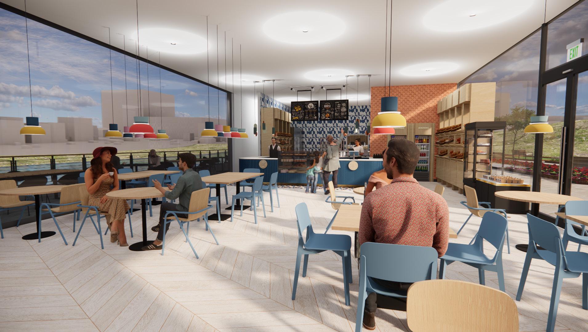
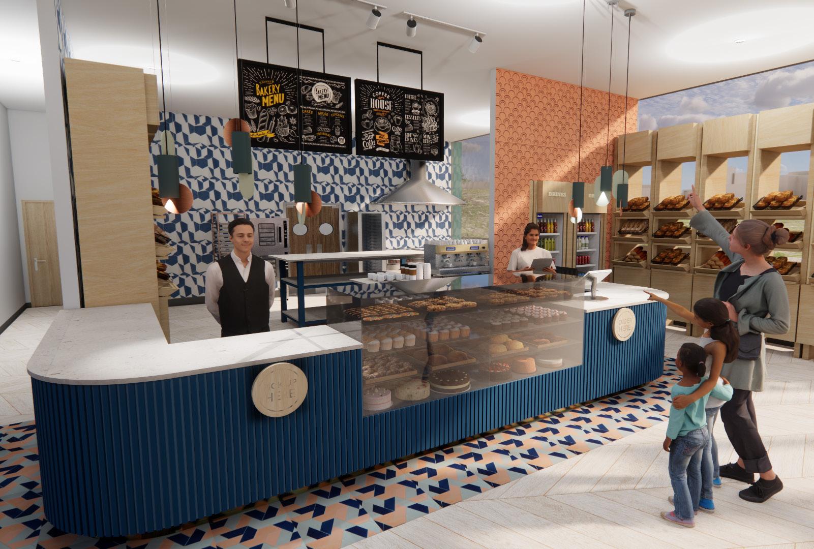
The bakery and bike shop were additions to the original pumphouse. This lounge area provides a transition between the police precinct and the bakery. Floor to ceiling windows were utilized as much as possible throughout the building to take advantage of the views of the Cumberland River and the newly designed walking paths in front of the building. The artwork displays historical maps of the site and photographs of the original pumphouse and pumphouse equipment.


Studio II - Spring 2022
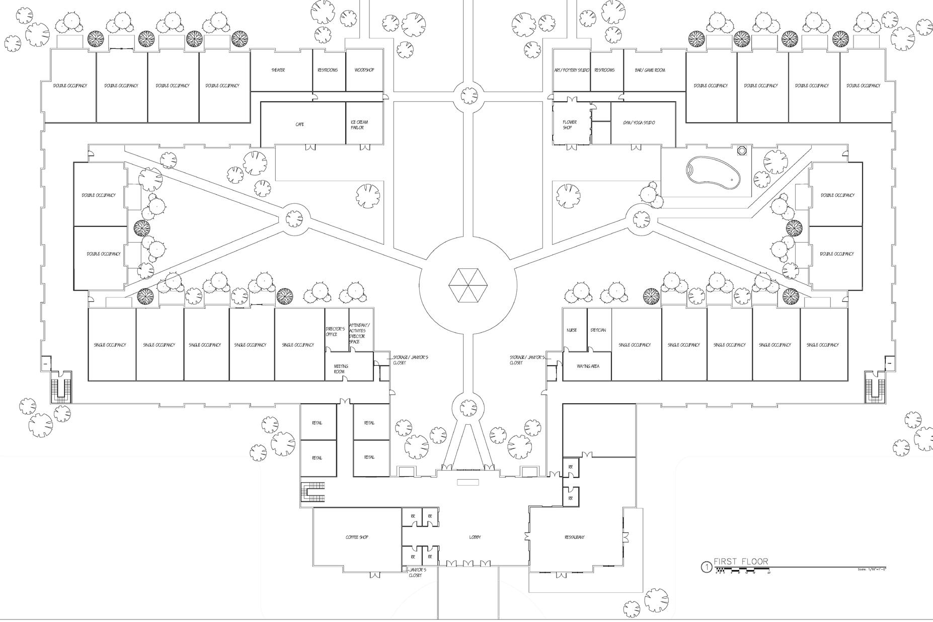
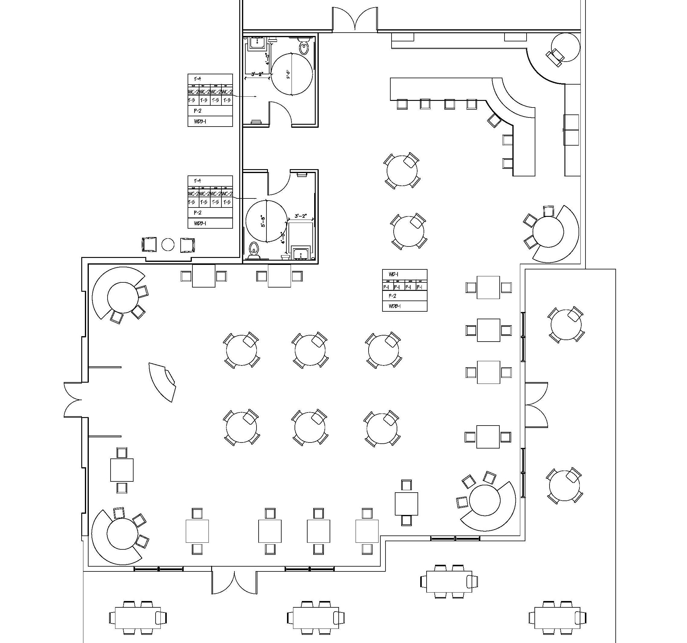
The development is an assisted living facility with several spaces open to public. The lower level includes a lobby, restaurant, coffee shop, retail spaces, flower shop, woodshop, fitness center, pottery studio, ice cream parlor, cafe, theater, offices, and single and double occupancy rooms.
5 acres
Outdoor seating, sidewalks, and landscaping were added.
2 levels
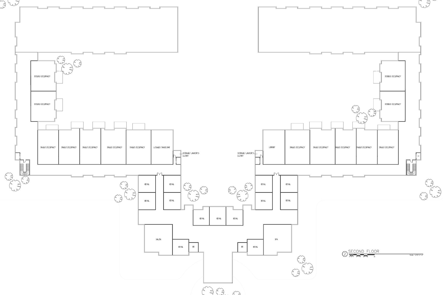
The second level houses a salon, retail spaces, lounge, library, and single and double occupancy rooms.
This project is a new, high end assisted living development located in Brentwood, Tennessee, designed to bring aging populations and the community together by including mixed used facilities. Designed spaces include a lobby, restaurant, flower shop, and single and double occupancy rooms.
Second Level
Just as grapes thrive on the vine and are held aloft by a strong support system, so too can residents flourish at an assisted living facility, supported by one another and their community. Like a fined aged wine, life becomes (in the words of Leo Buscaglia), “more satisfying, more refreshing, more valuable, more appreciated, and more intoxicating.” These sentiments are reflected in this assisted living facility.
First Level

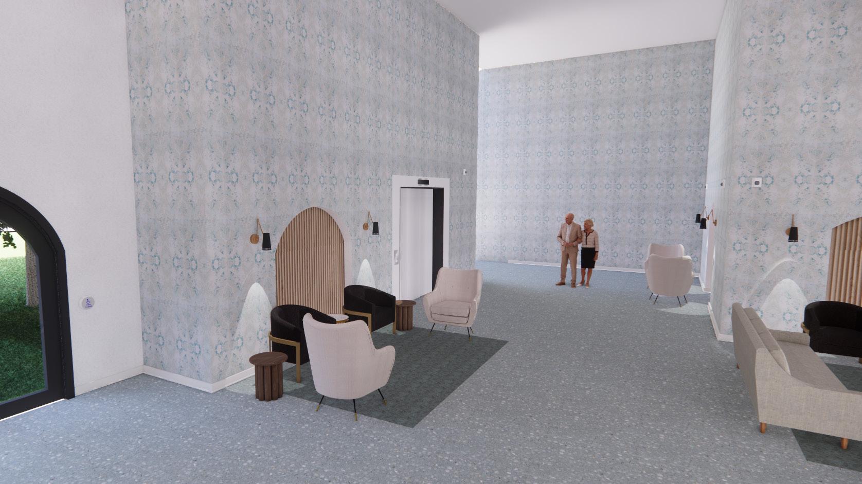
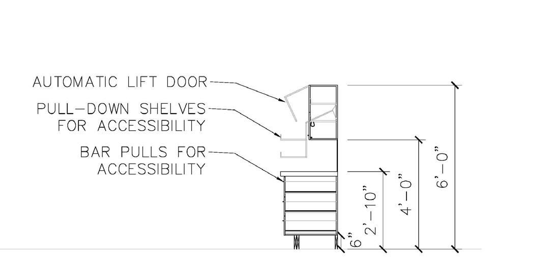
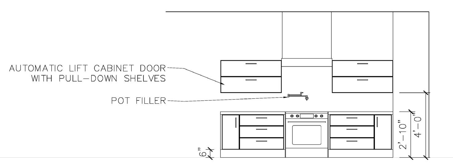
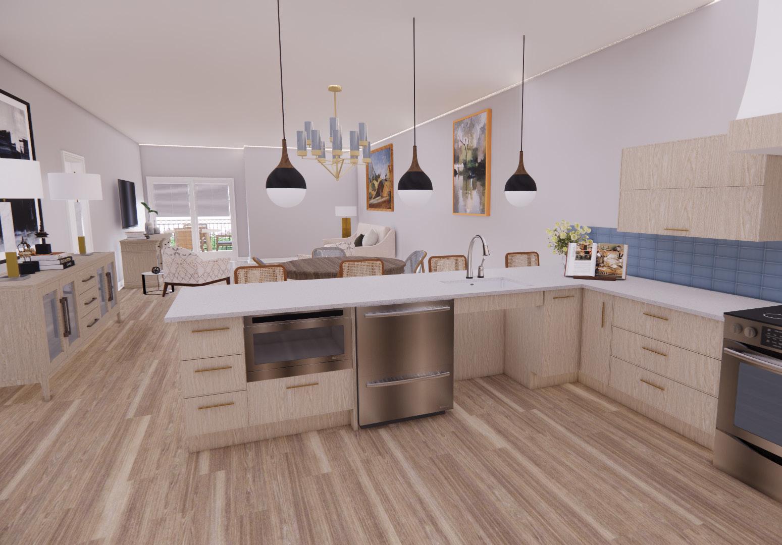
This development was specially designed with considerations for aging populations. Some features include no exposed bulbs, high contrast between walls and floor, zero entry showers, inset area rugs, flush transitions between rooms, furniture for comfort and stability, and all spaces being wheelchair and walker accessible.




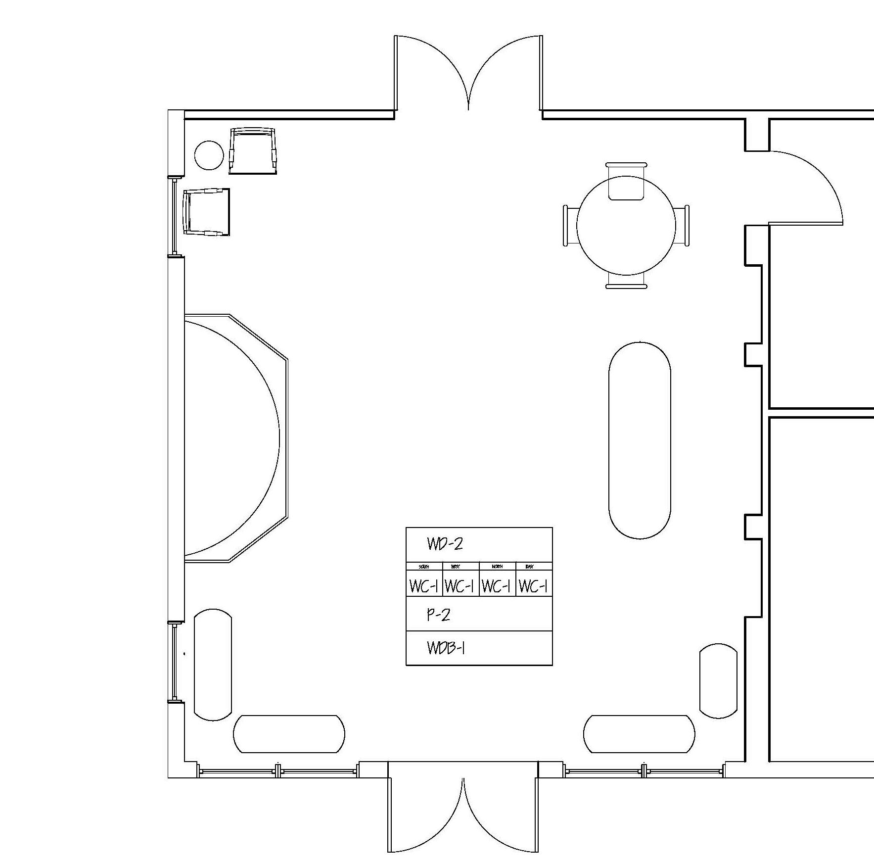
This occupational thearpy center was designed in an existing retail space. It was designed to accomodate pediatric occupational therapy patients, their caregivers, and the staff employed there. This project was awarded the Design Equity Award by the O’More College of Design at Belmont University.
±10,000 square feet
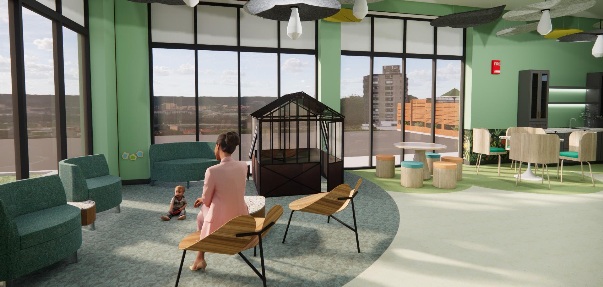
This pediatric occupational therapy center includes a lobby, waiting area (with a child-sized greenhouse for playing), a snack area, an outdoor waiting area, large therapy room, outdoor therapy, individual therapy rooms, and offices and a lounge area for employees.
.5 acres
This facility would be located in a strip mall with other businesses and abundant parking.
1 level
The available square footage provided ample space for the project parameters.
This facility was designed to be a healing garden. Pediatric occupational therapy can be compared to gardening in several ways. Although they are both work, they can also both be enjoyable activities. They also parallel each other in that both can be challenging at times, but those challenges reap bountiful rewards.
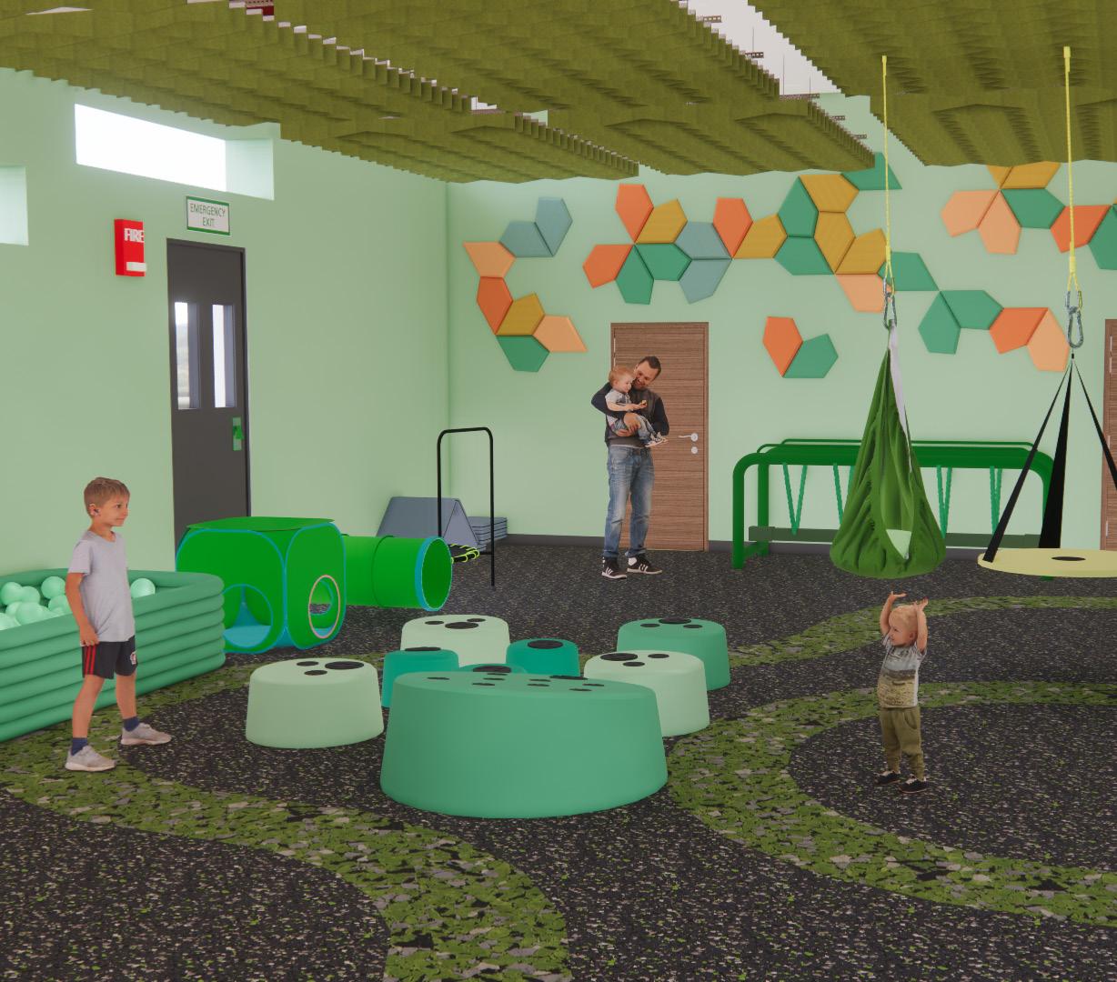
Every design decision was made with pediatric accessibility, safety, and inclusivity in mind, while still creating an appealing design for both children and adults. Some of the considerations include:


• push to exit buttons at all exterior doors for safety and automatic door open push buttons on all major doors for accessibility
• acoustic clouds and tiles for noise reduction
• tulip tables for accessibility
• wayfinding at lower heights for pediatric patients
• accessible play structures
• one way viewing glass in large therapy and individual therapy rooms
• various seating options
• extra wide corridors and door openings for accessibility
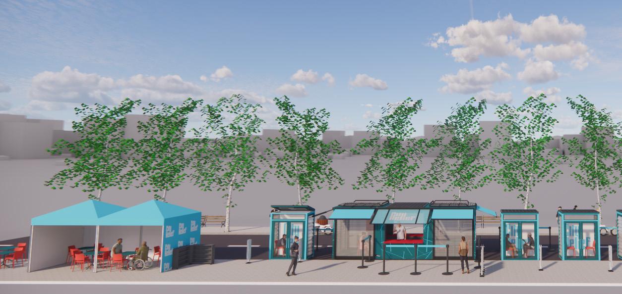
SOFTWARE USED: SKETCHUP, ENSCAPE INDIVIDUAL THERAPY ROOM LARGE THERAPY ROOM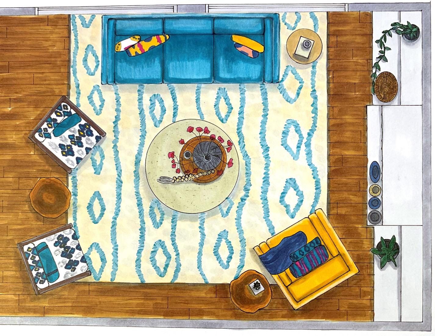
IF YOU WOULD LIKE TO SEE THESE PROJECTS & MORE IN THEIR ENTIRETY, PLEASE VISIT KATIEBONDS9165.MYPORTFOLIO.COM
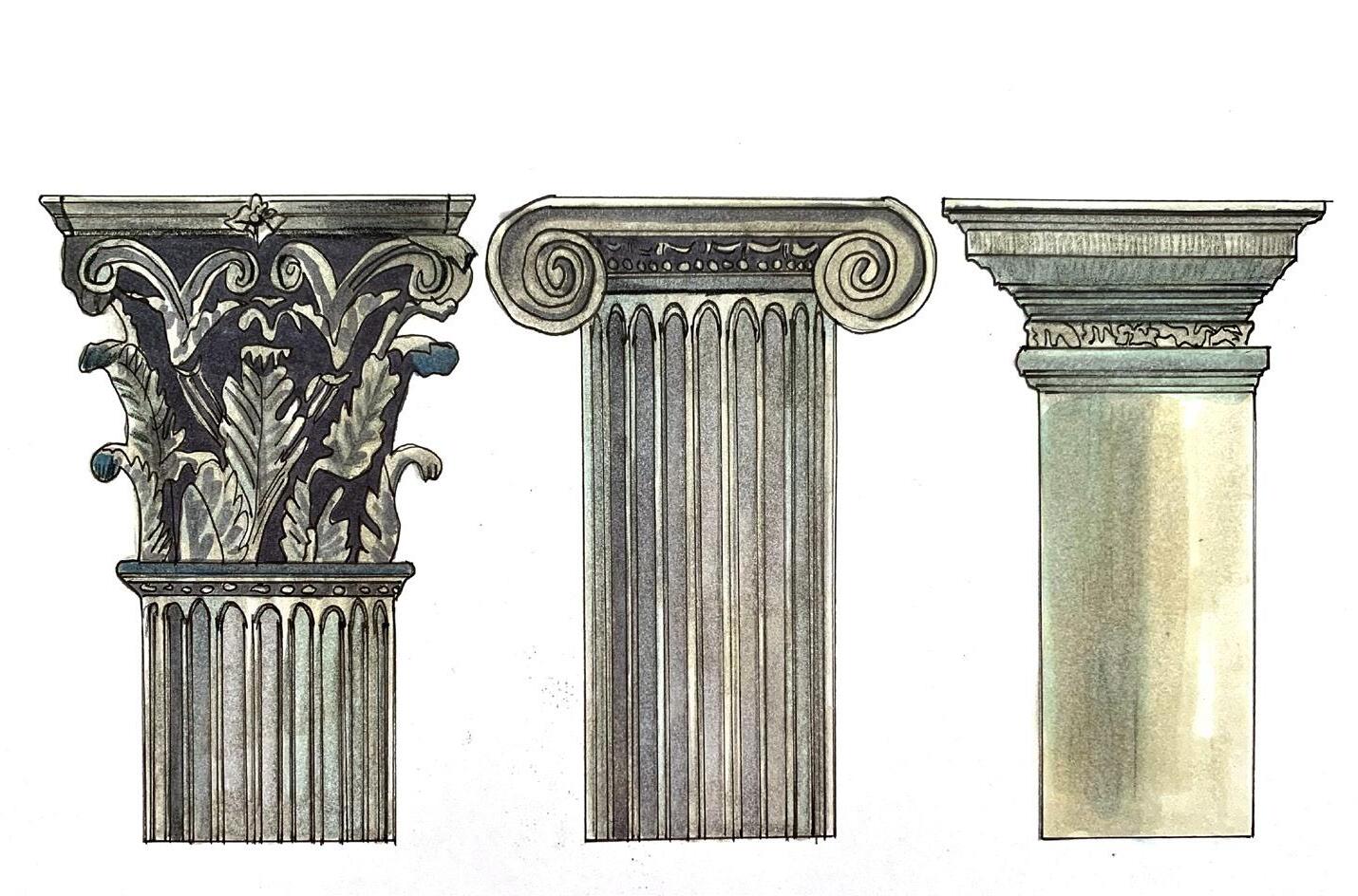

 GREEK ARCHITECTURAL ORDERS
BOMB CHEST INSPIRED NIGHTSTAND

